True Maps, False Impressions: Making, Manipulating, and Interpreting Maps · 2019-11-30 · True...
32
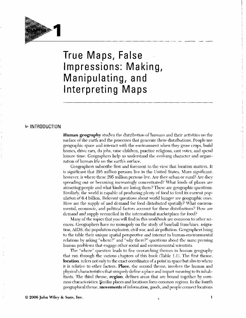
1 True Maps, False Impressions: Making, Manipulating, and Interpreting Maps INTRODUCTION Human geography studies the distribution of humans and their activities on the surface of the earth and the processes that generate these distributions. People use geographic space and interact with the environment when they grow crops, build homes, drive cars, do jobs, raise children, practice religions, cast votes, and spend leisure time. Geographers help us understand the evolving character and organi- zation of human life on the earth's surfaee. Geographers subscribe first and foremost to the view that location matters. It is significant that 295 million persons live in the United States. More significant, however, is where these 295 million persons live. Are they urban or rural? Are they spreading out or becoming increaSingly concentrated? What kinds of places are attracting people and what kinds are losing them? These are geographiC questions. Similarly, the world is capable of producing plenty of food to feed its current pop- ulation of 6.4 billion. Relevant questions about world hunger are geographic ones. How are the supply of and demand for food distributed spatially? What environ- mental, economic, and political factors account for these distributions? How are demand and supply reconciled in the international marketplace for food? Many of the topics that you will find in this workbook are common to other sci- ences. Geographers have no monopoly on the study of baseball franchises, migra- tion, AIDS, the population explOSion, civil war, and air pollution. Geographers bring to the table their unique spatial perspective and interest in human-environmental relations by asking "where?" and "why there?" questions about the same pressing human problems that engage other social and environmental scientists. The "where" question leads to five overarching themes in human geography that run through the various chapters of this book (Table 1.1). The first theme, location, refers not only to the exact coordinates of a point in space but also to where it is relative to other factors. Place, the second theme, involves the human and physical characteristics that uniquely define a place and impart meaning to its inhab- itants. The third theme, region, defines areas that are bound together by com- mon characteristics: Similar places and locations form common regions. In the fourth geographical theme, movements of information, goods, and people connect locations © 2006 John Wiley & Sons, Inc. 1
Transcript of True Maps, False Impressions: Making, Manipulating, and Interpreting Maps · 2019-11-30 · True...
1 True Maps False Impressions Making Manipulating and Interpreting Maps
INTRODUCTION
Human geography studies the distribution of humans and their activities on the surface of the earth and the processes that generate these distributions People use geographic space and interact with the environment when they grow crops build homes drive cars do jobs raise children practice religions cast votes and spend leisure time Geographers help us understand the evolving character and organishyzation of human life on the earths surfaee
Geographers subscribe first and foremost to the view that location matters It is significant that 295 million persons live in the United States More significant however is where these 295 million persons live Are they urban or rural Are they spreading out or becoming increaSingly concentrated What kinds of places are attracting people and what kinds are losing them These are geographiC questions Similarly the world is capable of producing plenty of food to feed its current popshyulation of 64 billion Relevant questions about world hunger are geographic ones How are the supply of and demand for food distributed spatially What environshymental economic and political factors account for these distributions How are demand and supply reconciled in the international marketplace for food
Many of the topics that you will find in this workbook are common to other scishyences Geographers have no monopoly on the study of baseball franchises migrashytion AIDS the population explOSion civil war and air pollution Geographers bring to the table their unique spatial perspective and interest in human-environmental relations by asking where and why there questions about the same pressing human problems that engage other social and environmental scientists
The where question leads to five overarching themes in human geography that run through the various chapters of this book (Table 11) The first theme location refers not only to the exact coordinates of a point in space but also to where it is relative to other factors Place the second theme involves the human and physical characteristics that uniquely define a place and impart meaning to its inhabshyitants The third theme region defines areas that are bound together by comshymon characteristics Similar places and locations form common regions In the fourth geographical theme movements of information goods and people connect locations
copy 2006 John Wiley amp Sons Inc 1
2 Chapter 1 True Maps False Impressions Making Manipulating and Interpreting Maps
TABLE 11 Five Themes in Human Geography
Theme Definition Selected -lIallll-Jlt~
Location The absolute position of something on the surface of the earth and its relative proximity to other related things
Place The local human and physical characteristics that uniquely define a place and impart meaning to its inhabitants
Region An area characterized by similarity or by cohesiveness that sets it apart from other areas
Ylovement The flow of people goods money ideas or materials betveen locations near and far
Human- The ways in which Environmental human society Interaction and the natural
environment affect each other
Chapter 1 Where do African-Americans live and why Chapter 6 Where are different kinds of jobs concentrated
and why Chapter 7 What is the spatial pattern of development and why Chapter 8 here are different crops and livestock grown and why Chapter 9 Where are major league baseball teams located and
where should new ones be put and why Chapter 11 here should new housing be built in the urban area
and why Chapter 12 Are the locations of Catholics and Protestants in
Northem Ireland growing more mixed or more segregated over time
Chapter 2 What characteristics of the place where you live are portrayed on postcards and why
Chapter 10 What can you tell about a neighborhood by observing it and how does it compare to census data
Chapter 13 Why are people of the former Yugoslavia and Kurdistan so attacbed to their places of birth
Cbapter 2 What are the boundaries of the Yliddle East or American Southwest culture regions
Chapter 6 Which regions specialize in which industries and why Chapter 9 How and why would a new baseball team affect the
market areas of existing teams Chapter 10 What kinds of subregions exist within a city and why Chapter 11 How and why have urban regions expanded over time Chapter 13 How did mismatches betveen political and ethnic
regions lead to war in YugoslaVia and Iraq
Chapter 3 How and why has AIDS spread throughout the United States
Chapter 4 From where do people move to your state and why Chapter 8 What kinds of food are imported from other countries
and why Chapter 11 How vill different urban growth strategies affect
traffic congestion Chapter 13 When did Islam spread to Bosnia and why Chapter 14 How does the movement of water or beef lead to
environmental problems
Chapter 2 How have humans adapted to arid climates in the Middle East and the American Southwest
Chapter 5 How does population grOvth in India affect the environment
Chapter 8 Which crops grow best in which climates Chapter 11 How does urban sprawl affect the environment Chapter 14 Vhat are the causes and effects of environmental
problems and what are the positions of the various stakeholders
copy 2006 John Wiley amp Sons Inc
3 Introduction
and regions to one another The final theme is human-environmental intershyactions Humans and their environment interact in both directions environshymental resources constrain and benefit human societies while human activities refashion and degrade their environments Notice in Table 11 that some of the case studies in the book involve several themes (ie the themes are not mutually exclusive)
Geographys spatial perspective~and all five themes-lead to the he my use of maps In the broadest sense a map is a two-dimensional graphical representation of the snrface of the earth No map can perfectly represent reality People tend to think of maps as unalterable facts as if produced by an all-seeing overhead camshyera In practice however mapmakers (or cartographers as they are known in the field) exercise considerable discretion in the spatial information they display and the way they display it You must always keep in mind that any map you look at could have been made in countless different ways sometimes drastically altering your perception of what you see
Cartographers (mapmakers) make Bve critical decisions about map construcshytion that greatly influence the message conveyed by the map First they choose a particular map projection which is a systematic method of transferring the sphershyical surface of the earth to a flat map There is an old saying that all maps lie flat and all flat maps lie It is utterly impossible to represent the three-dimensional world on a flat two-dimensional piece ofpaper or video screen vvithout stretching or comshypressing it in some way Every projection is therefore distorted in one way or another and this distortion influences the impression in the viewers mind about the size and proximity of different regions of the world (Figure 11)
For example Figure lIA shows the Mercator projection of the world a map used in early navigation because all compass bearings (directions) are correct The British Empire based on sea power used the Mercator projection extensively and spread it around the world However this projection grossly exaggerates area as you move away from the equator For this reason Mercator maps were a favorite of President Reagan during the Cold War because they made the Soviet Union appear much larger than it actually was reinforcing the impression that the USSR was a dangerous threat and thereby justifying a tough anti-Soviet stance For the same reason Mercator projections are unpopular among equatorial countries whose size appears diminished A popular projection that attempts to preserve the area of map features and avoid high-latitude distortions is Mollweide shown in Figure 11B Many international agencies such as the World Bank have changed map projections they use in an effort to more accurately depict relationships between countries and not bias anyone region For example Figure lle shows the Van Der Grinten projection that portrays both Russia and Canada at over 200 percent larger than they actually are The National Geographic Society used this projection for over50 years but changed to the Robinson projection (Figure LID) in 1998 The Robinson projection better portrays the relationship between land and water areas in the world and does not distort countries at high latitudes nearly as much
Although these four examples of map projections show distortions in shape and size that can occur they all still adhere to certain conventions that can also mislead For instance they all split the world through the PaciBc Ocean making Japan appear far from Hawaii and the United States This false impression may have contributed to the surprise Japanese attack on Pearl Harbor during World War II Polar projections centered on the North Pole in Figure lIE clearly show how close the
copy 2006 John Wiley amp Sons Inc
4 Chapter 1 True Maps False Impressions Making Manipulating and Interpreting Maps
A
Figure 11 The projection choscn to draw the spherical earth on flat papcr affects the shape of the map and onr perception of the relationships between thc map featnres
fonner Soviet Union and the United States were to each other over the Arctic Ocean a relationship you cannot see in the flrst four projections Looking at this projecshytion it becomes obvious that northern Canada and Alaska were good locations for warning stations designed to detect incoming Soviet nuclear missiles A less common view of the polar projection focused on the South Pole and Antarctica (Figure 11F) makes Australia New Zealand Chile and Argentina appear central to the world In fact there is no compelling reason for adhering to the convention of showing north at the top on a map Europe and North America typically occupy
copy 2006 John Wiley amp Sons Inc
5 Introduction
the privileged position on a map where our eyes tend to focus reinforcing the perception oftheir dominant status in the world The earth as seen from space could just as easily be depicted with south up (Figure lIG) a radical change that calls into question global geopolitical relations
Finally the Dymaxion MapTM (Figure lIH) reveals the landmasses situated in a worldwide oeean without visible distortion of the relative shapes and sizes and without splitting any continents This map deSigned by the Bnckminster Fuller Institute is an attempt to show the global connections of all humanity rather than disassociated countries and places competing against each other
The second critical decision cartographers routinely make is simplification Simplification can take many forms such as omission straightening exaggeration and distortion depending upon the maps ultimate use Maps of Canada for educashytional purposes frequently omit small uninhabited islands and straighten jagged coastshylines in the Canadian Arctic wherealt maps for navigation try to show the same features vvith great accuracy as well as water depth and eurrents Highly simplified subway maps emphaSize information of potential use to a subway rider and ignore features of the human and natural environment that are unimportant to navigating the subway network (Figure 12) Stations five or six blocks apart in the central city appear on the map as far apart as suburban stations separated by several miles because for most subway travelers distance is unimportant Vhat matters is whether they are on the right line how many stops until they need to get off and whether they need to change trains To make road lines readable on the map they are drawn thicker than if they were drawn proportional to their width in the real world Some buildshyings are considered important enough to include but most are not No two cartogshyraphers make these ultimately subjective decisions in the same way
A third way to manipulate the way a map looks is by chOOSing a different map scale Map scale refers to the degree to which a map zooms in on an area Map scale can be defined as the ratio of map distance (distance between two points on a map) to earth distance (distance between those two points on the surface of the earth) measured in the same units Every map has a scale and the degree of genshyeralization of information depends on that seale A large-scale map depicts a small area (such as downtown Phoenix) vith great detail A small-scale map depicts a large area (such as the state of Arizona) but with less detail You can remember this by conSidering the size of a particular feature on a map For example the larger your city or country appears on a map the larger the map scale Another way to rememshyber it is by the fraction that defines the ratio of map distance to earth distance On a large-scale map of downtown Phoenix the scale might be 110000 which is a larger number than 111000000 for a typical small-scale map of Arizona A large fraction means large scale a small fraction means small scale
The case studies in this book explore human geography at a variety of scales Activities at the global scale (ie small-scale maps) include Chapter 7 on international development levels Activity 1 of Chapter 8 on global agriculture and Activity 1 of Chapter 14 on global carbon dioxide emissions At the national or regional scale are Chapter 2 on the Middle East and American Southwest culture regions Chapter 3 on AIDS diffusion Chapter 4 on migration to your state or province Chapter 5 on Indias population Chapter 6 on eeonomic specialization Chapter 9 on halteball market areas Chapter 12 on segregation in Northern Ireland Chapter 13 on the wars in the former Yugoslavia and Iraq and Chapter 14 on environmental case studies Finally the activities at the local scale (large-scale maps) include Activity 3 of Chapter 8 on
copy 2006 John Wiley amp Sons Inc
6 ~ Chapter 1 True Maps False Impressions Making Manipulating and Interpreting Maps
Figure 12 The DC Metro inset map is highly selective in that it shows only the sequential relationshyship between subway stops All underlying detail is suppressed so that even distance is distorted
local agricultural change in Latin America Activity 1 of Chapter 9 on pizza restaushyrants in your state Chapter 10 on your local urban landscape and Chapter 11 on urban sprawl in Colorado Splings
Defining the scale of analysis is important in geography Many geographical research questions -will have different answers when asked at different scales Take for instance airport location Americas airports are bursting at the seams Departures have rnore than doubled since 1980 while only a single rnajor new airport has been built Most major airlines with the notable exception of Southwest operate a hubshyand-spokes system where flights converge at several times of day from all over the
copy 2006 John Wiley amp Sons Inc
Introduction 7
country passengers debark and sitch planes if necessary and then an outgoing bank of flights take passengers to their final destinations If the question is whether to locate a new hub airport at a central or peripheral location the answer is very difshyferent at the national and local scales At the national scale most hubs for domesshytic airlines are located in the central region of the United States to minimize detours for passengers smtching planes Major hubs are at Chicago (United American) Atlanta (Delta) Dallas (Delta American) Detroit (Northwest) Minneapolis (Northwest) Denver (United) Cincinnati (Delta) Salt Lake City (Delta) Charlotte (US Air) Philadelphia (US Air) and Phoenix (US Air) Cities on the periphery of the United States such as Boston Miami San Diego and Seattle are not used as domestic hubs because they would create huge detours for passengers traveling between most US airport pairs At the local scale on the other hand it would be nearly impossible to locate a new airport in a central location even though centrality would maximize the airports accessibility to the entire metropolitan area The cost of the land the security risk the number of residents and businesses it would disshyplace and the large populations that would be affected by noise and traffic would pose insurmountable problems for a new centrally located airport The only major metropolitan airport built in the last two decades-Denver International Airportshyis located on Denvers eastern periphery out on the prairie (Figure 13) Airport location at the local scale thus depends on an entirely different range of issues from those at the national scale
Related to map scale is the fourth cartographic issue of data aggregation The level of data aggregation influences the spatial patterns we see By level of aggreshygation we are referring to the size of the geographic units under investigation (ie cities counties states regions countries or groupings of countries such as Central America Western Europe or Eastern Africa) A particular pattern that is revealed at one level of aggregation does not necessarily appear at another For example the spatial pattern of college graduates depends on whether you consider counties or states as your unit of analysis If asked by a high-tech employer Where are the highest percentages of people mth a college degree a good geographer would answer that it depends on the level of geographic resolution you have in mind At the state level of aggregation Massachusetts has the highest percentage of people
Figure 13 Denver International Airport built in 1995 is located 20 miles east of the city center
copy 2006 John Wiley amp Sons Inc
8 Chapter 1 True Maps False Impressions Making Manipulating and Interpreting Maps
with a bachelors degree or higher at 272 percent and West Virginia has the lowshyest at 123 percent (Figure 14) Maps at the county level however show that some urban counties and counties with universities in West Virginia have higher percentages of college graduates than do some rural counties in Massachusetts (Figure 15)
Finally the fifth way to influence the way a map looks is through the type of map you choose General-purpose maps with a variety of common features such as cities boundaries mountains and roads are known as reference maps Maps that highlight a particular feature or a single variable such as temperature city size or acreage in potatoes are called thematic maps There are several types of thematic maps (Figure 16) Isoline maps show lines that connect points of equal value (iso means equal in Greek) A topographic map for instance shows lines of equal
middot2~d 200 400 Miles i7ii2
Percent over 25 with Bachelors Degree = 123-161 0162 189
190 218 219 - 249
bull 250-333L~-Figure 14 Percent of the population over 2) years old with a bachelors degree 1990
10 0 10 20 Mies ~
MassachuseHs
Figure 15 Percent over 25 with bachelors degree for West Virginia and Massachusetts eounties 1990
copy 2006 John Wiley amp Sons Inc
Introduction ~ 9
Isoline Average Daily Solar Radiation
0=250000Proportional Symbol 150000
NE Ohio Population )J
langleys per day
Percent of the Population 65 or Older 1970
18-35
bull 9-179
D 3-89
Choropleth Florida Senior Citizens
Each dot represents 40 acres
Dot Wisconsin Acerage in Potatoes
Sources Adapted from Muehrcke P 1978 Map Use Reading Analysis and Interpretation Courtesy JP Publications Elements of Cartography 5th Ed Robinson A at al copy19S4 reprinted by permission of John Wiley amp Sons Inc
Figure 16 Four types of thematic maps
elevation above sea level Crossing an isoline amounts to going up or down that surshyface (increasing or decreasing the value of the variable being mapped) A choroshypleth map shows the level of some variable within predefined regions such as counties states or countries It categorizes a variable into classes and depicts each class with different shading patterns or colors A proportional symbol map uses a symbol such as a circle to show intensity or frequency the size ofthe symbol varies vith the frequency or size of the variable being mapped Finally dot maps use a dot to represent the occurrence of some phenomenon in order to depict variation in density in a given area
copy 2006 John Wiley amp Sons Inc
10 po Chapter 1 True Maps False Impressions Making Manipulating and Interpreting Maps
The project you will work on in this chapter asks you to use spatial data which have a geographic or locational component You can place them on the surface of the earth and therefore you can map them Geographers commonly use two types ofgeographic data primary and secondary Primary data are measured or obtained directly by the researchers or their equipment without any intermediary For instance survey research involves asking people about their shopping behavior travel patterns or migration history Traffic counts can be measured by video cameras sensor plates or wires or human observers Geographers obtain secondary data from another source that previously collected processed and catalogued the data Agencies of international national state and local governments collect and disseminate a veritable treasure trove of geographic information Examples are agencies of the United Nations (wwwunorgl) the US Census Bureau (wwwcensusgov) National Oceanographic and AtmospheriC Administration (wwwnesdisnoaagov) state govshyernments and local planning agencies Using secondary data can be efficient (imagshyine conducting your own census) and can enable you to greatly extend the scope of your research by including a wide array of factors In this book most of the data you will use were obtained from secondary sources but you will have a chance to collect primary data in Chapter 2 (postcards) Chapter 8 on agriculture (foods availshyable in your local supermarket) Chapter 9 (pizza restaurants in your state) and Chapter 10 (field observations of landscapes)
One of the most important recent trends in geography is the development of geographic information systems (GIS) A GIS is in short a spatial database linked to a graphic display Geographers and scientists in related fields use a GIS to store access analyze and display geographic information in electronic form with user-friendly software Addresses and locations can be given x1J earth coordinates (geocoded) within a GIS enabling the user to pinpoint and interrelate a variety of phenomena in geographic space The volume and variety of geographic data that can be linked using space as the reference grid literally have no limit Different geographic information is stored in different layers that can be viewed in any comshybination and their relations to each other can be analyzed
A GIS has many useful applications in planning environmental management market research and demographic analysis You will use GIS in the following mapshyping exercise and observe its power to enrich geographiC analysis
copy 2006 John Wiley amp Sons Inc
Case Study 411 11
TRUE MAPS FALSE IMPRESSIONS
GOAL To interpret and critically evaluate maps to understand how scale influences data representation on maps and to recognize three types of map scale representative fraction verbal and graphic You ill also learn how to represent data With differshyent types of thematic maps-the dot map the isoline map the choropleth map and the proportional symhol map-shyand see that your choice of map type profoundly influences the resulting spatial pattern
LEARNING OUTCOMES After completing the chapter you will be able to
bull Convert map scale to real-world distances
bull Recognize choropleth proportional symbol isoline and dot maps
bull Recognize that changing the scale and type of a map changes its message
bull Understand the difference between changing scale and changing level of aggregation
bull Use GIS to change the class limits on a choropleth map
bull Describe the geographic distribution of AfricanshyAmericans in the United States
SPECIAL MATERIALS NEEDED bull Calculator
bull Computer With high-speed Internet access and Internet EPlorer 60 and above Click on Help for system requireshyments and technical support
BACKGROUND Africans were first brought to what is nrn the United States between 1619 and 1808 as slaves to work on tobacco rice sligar and cotton plantations mostly in the South Although the pracshytice of bringing slaves into the country was made illegal in 1808 some smuggling ofslaves continued into the nineteenth century Importation was replaced by programs ofslave breeding and trade Within the South Although concentrated in the South a small number ofslaves escaped to the North and other parts ofthe counshytry where they were represented across nianyo-alks oflife A free black man living in Baltimore was commissioned by Thomas Jefferson to survey the District ofColumbia ~lack cowboys based in Texas were well known on cattle drives throughout the West
Many people are surprised to learn that African-Americans represented a sizable share of the us population during the seventeenth and eighteenth centuries At the time of the fIrst LBnSUS in 1790 one of every five residents of the new country was African-American Concentrations were highest in SQuthshyern states 54 percent of South Carolinas population was AfricanshyAmerican 40 percent of Virginias 37 percent of Geergias 34 percent of North Carolinas and 33 percent of Marylands
After emancipation in 1863 most African-Americans remained in the South working as sharecroppers or tenants on white-OVlled
cottpri farms barely getting by Although the reasons to leave the South were compelling including crushing poverty antiblack tershyrorism and a lack ofcivil rights few actually left the region Many black farmers were illiterate and therefore unaware ofeconomic opportunities in other parts of the country White landOVllers desperate to preserve their favored way oflife sustained by cheap black labor promulgated an economic system that put shareshycroppers in a position ofpermanent indebtedness making deparshyture illegal In the late nineteenth century Northern labor unions lobbied against the importation of African-Americans from the South fearing it would depress their wages They preferred European immigrants to meet the demand for new industrial workers in Americas burgeoning manufacturing sector
All of that changed after the end of World War I and thus began one ofthe most dramatic migration streams in US hisshytory At the turn of the twentieth century 90 percent of the nations African-American population lived in the South mostly in the rural South By 1970 barely 50 percent lived in the South (Figure 17) after millions sought a better life in northern cities Reasons for leaving were many and complicated The supply of cheap immigrant labor was cut off by World War I and recruiters went south bringing literally trainloads of AfricanshyAmerican workers to the steel mills automobile factOries and meatpacking plants of Pittsburgh Detroit Chicago and other northern cities (Figure 18) Once these connections had been established thousands of migrants followed and established themselves in predominantly black neighborhoods sueh as the South Side of Chicago and Harlem in northern Manhattan (Figure 19) The Great DepreSSion of the 19305 and the mechshyanization of cotton harvesting after 1945 further spurred the African-American exodus from the South The mechanical cotshyton picker rendered sharecroppers obsolete by drastically reducshying the need for their labor Early models of the cotton picker reduced the costs of picking cotton from $40 to $5 per bale Each machine did the work of 50 pickers As the mainstay for southern African-American employment evaporated many left the rural South in search of northern jobs A second wave of black migration headed to California from 1940 to 1970 lured by both industrial and agricultural jobs
The story does not end here as migration flows between the South and ~orth were reversed after 1970 Fewer AfricanshyAmericans left the South and many more moved from the North to the South Race riots and deteriorating economic conditions in northern cities served as push factors and the favorable ecoshynomic opportunities and improved social conditions of the New South attractf(d migrants from the North Whereas the earlier migration streams conneeted the rural South to the urban North todays streams primarily link the urban ~orth With the urban South California after several decades as a magnet for black migrants lost more than it gained in the late 1990s Many blacks returned to the South and others spilled over into nearby Arizona Nevada and Washington College-educated AfricanshyAmericans are migrating to the South at higher rates than are those With a high-school education or less (Figure LIO)
2006 John Wtley amp Sons Inc
12 Chapter 1 True Maps False Impressions Making Manipulating and Interpreting Maps
Figure 17 Farmer and son in Daphne Alabama
Figure 19 African-American culture featuJing jazz and Figure 18 Many of todays Afiican-Americans such as blues music flourished in their neighborhoods in northern this constmction worker at lewark Airport continue to cities OlympiC great Jesse Owens and his wife danced at the work in hIlle-collar industries opening of the Cotton Clnh in Harlem September 25 1936
copy 2006 John Wiley amp Sons Inc
Case Study 13
This exercise invohing mapping tw distribution of Afl1canshyAmericans relies hea il- on information about race from the Us Census Census race data are used to enforce antidiscrimination laws on voting rights equal job and housing opportunity ltnul access to credit as well as in studies of migration residential segregashytion health education and poverty Until recentl) the US Census Bureau had established five racial categories-American Indian or Alaskan Native Asian or Pacific Islander Black White and Some Other Race-and asked respondents to self~identif into one of the five groups In 2000 for the first time the censlls allowed AmerieUls to select more thml one racial category rdlectc
ing the growing rates of racial intermaniage and the increasing racial ltnd ethnic diversity of the nations population In addition the number of racial categories was incrtlttsed to six and they have been renamed as Amelican Indian or Alaskan Native Asian Black or African-American Native Hawaiian or Other PacifIC Islander hite and Some Othcr Hace Also the cenSllS catshyegory Hispanic or Latino is independent of these racial cateshygories Hispanics can be of any racc
The way racial categories are constructed has a social (limenshysion Some geographers go so far as to argue that emphasis on racial distinctions is a means of privileging whites aboe those of color~r vice versa At the very least we must recognize that racial categories are not perfectly objective ways of orgashynizing pcople who after all self-identify themselves into catshyegories vith increasinglY fuzzy boundalies Although Censns 2000 recognizes greater racial divers i and intermixing ith 63 possible racial combinations questions of what race means in our society and why we continlle to collect data b~ race remain important social and political issues
Figure 110 Recent data show a hlack brain drain from New York Pennsylvania and Ohio and a brain gain in Georgia vlmylalHL Texas ami North Carolina where the existence of a large black middle class in cities like Atlanta and Dallas exerts a strong attraction
copy 2006 John Wiley amp Sons Inc
ActivitylScale 15
True Maps False Impressions Making Manipulating and Interpreting Maps
ACTIVITY 1 SCALE
Map scale is the ratio of the distance on the map to the distance on the ground where both are measured in the same units Scale can be represented in three different wavs
lt
Representative Fraction The map distance to ground distance ratio is written as a simple fraction (eg 1150000) or ratio (150000) In this example it simply means that one unit (inches centimeters etc) on the map represents 50000 of the same units on the ground
Verbal Scale Words instead of numbers are used to express the scale The vershybal scale can thus be thought of as a translation of the representative fraction into words For example the scale of 1100000 can also be expressed as one centimeshyter to one kilometer or one centimeter represents one kilometer This is because there are 100 centimeters in 1 meter and 1000 meters in 1 kilometer
100 em 1 000 m = 100000 em m x km km
Multiply 100 by 1000 and cancel the ms on top and bottom and you get 100000 centimeters in a kilometer Therefore in a map with a scale of 1100000 one censhytimeter on the map represents 100000 centimeters or one kilometer on the ground Likewise a verbal scale of one inch to one mile translates to a representative fracshytion of 163360 because there are 63360 inches in a mile
inches feet inches 12 fi X 5280 -1 = 63360 -Zshy
oat mt e ml e
Graphic Scale This normally appears as a line or bar divided into conveniently numbered segments You can think of this as a picture of the words in the verbal scale In the example below two centimeters represents one kilometer (use a nIler to test it out)
o 12 2 3 4 5 I I I I I I
Kilometers
copy 2006 John Wiley amp Sons Inc
16 ~ Chapter 1 True Maps False Impressions Making Manipulating and Interpreting Maps
Questions 11 to 13 assume a scale of 125000 Note that this scale is different from those in either of the examples just given
11 Suppose that City A is four centimeters away from City B on the map How many centimeters apart are they on the surface of the earth
12 How many kilometers apart are Cities A and B on the surface of the earth
13 A bakery needs to supply bread to every store within a six-kilometer radius How many centimeters will this radius be when drawn on the map Hint First convert 6 km to cm and then multiply by the representative fraction 125000
104 Which is the largest-scale map a 1124000 b 1162500 c 11100000 d 11250000
15 Which of the follOwing maps is larger scale
16 Would your college campus appear larger on a map at a scale of 1500 or 15000
Scale is more than just a way of zooming in or out for a closer look or a broader perspective When you change scales you can actually see a different spatial proshycess at work The process you will investigate in Questions 17 to 19 involves whether the northeastern Us population became more concentrated or more spread out during the twentieth century
copy 2006 John Wiley amp Sons Inc
Activity 1 Scale 17
Figure 111 shows each countys percentage of the northeast regional populashytion for 1900 (top) and 2000 (bottom) at a relatively small scale of 112000000 At this scale you can see the whole northeastern section of the United States and each county is fairly small We could call this a regional-scale map
Percentage of Population 1900
Note We chose to map the Northeast United States rather
o 50 100 200
-
than the whole United States because many counties in the South and West did not exist in 1900 which leaves confusing gaps in the 1900 map Also the Northeast makes a better example of the process at work than the other regions do _ 0301-1100because it was more fully settled You can focus more on redistribution of the population than on in-migration _ 1101 - 5000
0002 - 0050
0051 - 0300
Percentage of Population 2000
Figure 112 zoom
o 50 100 200
Figure 111 Regional-scale map of population by county in the northeastern United States 1900 and 2000
copy 2006 John Wiley amp Sons Inc
18 Ill- Chapter 1 True Maps False Impressions Making Manipulating and Interpreting Maps
17 On the regional-scale maps (Figure 111) did the population become more spread out (people distributed more uniformly and evenly across counties) or more conshycentrated (more people living in a few places) from 1900 to 2000 Explain how you interpreted the map pattern to reach this conclusion
Now look at Figure 112 which zooms in on the Baltimore-Washington region This is a larger-scale map at 11200000 In fact it is exactly 10 times larger This is a more local-scale map Notice that the level of aggregation has stayed the same as in Figure 111 It still shows the percentage of regional population by county
18 On the local-scale maps (Figure 112) did the population of the BaltimoreshyWashington region become more spread out or more concentrated from 1900 to 2000 Explain how you interpreted the map pattern to reach this conclusion
copy 2006 John Wiley amp Sons Inc
Activity 1 Scale lit 19
Percentage of Regional Population C~0002-0050 ~jJtJO051-0300 _0301-1100 _1101- 5000
Figure 112 Populations in Baltimore-Vvashington region 1900 and 2000
copy 2006 John Wiley amp Sons Inc
20 Chapter 1 True Maps False Impressions Making Manipulating and Interpreting Maps
19 Geographers are fascinated by the links hetween processes at different scales The pattems of change you see in the regional-scale maps (Figure 111) are a funcshytion of Ameticans moving from the countryside to cities How is this related to the patterns of change you see at the local scale (Figure 112)
copy 2006 John Wiley amp Sons Inc
Activity 2 Thematic Maps 21
Instructor_________________
True Maps False Impressions Making Manipulating and Interpreting Maps
ACTIVITY 2 THEMATIC MAPS
This activity involves looking at the distribution ofAfrican-Americans in the United States (or Aboriginals in Canada) using different types of thematic maps You will use some of the functions of a geographic information system (GIS) to look at the various maps and choose the most useful ones A GIS is a sofhvare package that makes maps and allows the user to analyze spatial data A GIS is a powerful tool used by utility companies city planners engineers cartographers environmental scientists and many others You vill be using the mapping capabilities of a GIS to interactively change the maps on your computer screen
A To start your activity log onto the Human Geography in Action Web site or insert your CD into your computer
B Select this chapter from the drop-down list and then click on Computerized Chapter Activities
C Click on Activity 2 Thematic maps (USA) or (Canada) according to your instructors directions
D Students who chose Canada should first read the short background article on the geography of the AbOriginal population in the window that appears Follo~ing the background article Canadian students will find the computer instructions and questions to answer and hand in for the Canadian case study You can print these if you like Proceed ~ith the digital instructions for the Canadian version
E You will see the first of four types of thematic maps you will use to evaluate the distribution of African-Americans in the United States In the right margin are the names for all of tbe maps The map displayed is County Choropleth which classifies each county into one of four classes and assigns a pattern as shown in the map legend Notice that this map shows the percentage of African-Americans per county not the actual number Choropleth maps are usually used to show intenSity such as percentages rather than magnitude such as total numbers You will later see maps that show magnitude such as the total number of African-Americans
If you ~ish you can zoom in on portions of the map to get a better view of a smaller area (you would then be looking at a larger-scale map) Simply move the slider at the upper right toward the plus sign To zoom back out slide it toward the minus sign The percentage enlargeshyment is shown in the box below Next to the percentage is a menu for chOOSing low medium or high resolution You can move the map around on the screen if you click and hold the mouse button on the red square in the small map in the upper right and move the square around You also
copy 2006 John Wiley amp Sons Inc
22 Chapter 1 True Maps False Impressions Making Manipulating and Interpreting Maps
have a layer of boundaries of States and another of City Names that you can click on or off for reference
21 According to the County Choropleth where would you say most AfricanshyAmericans live in the United States
Based on the map approximately what percentage ofAfrican-Americans would you guess live in the dominant region No need to write an answer just think about it Would you say the overwhelming majority Maybe two-thirds Less than one-half
In fact only about one-half of all African-Americans live in the South About the same number live outside the South in large urban areas of the Northeast Midwest and West
F Click on the County Circle icon in the right margin Now do you believe the previous statement This map is called a graduated circle map A graduated circle is a type of proportional symbol whose size varies with the value for each county This graduated circle map shows magnitude with each circle a different size depending on the total number of African-Americans per county
22 Based on this map name four cities with the largest number ofAfrican-American residents (Dont forget you can zoom in and also tum on City Names)
23 Now you see that the way in which data are presented on maps can greatly alter your perception of the distribution of the information being mapped By using a different type of thematic map and by presenting the data in absolute rather than percentage terms the latter maps message changes even though both maps are based on exactly the same data What are the false impressions created by the County Choropleth and County Circle maps
copy 2006 John Wiley amp Sons Inc
Activity 2 Thematic Maps 23
24 Zoom in on the New York City area What graphic or visual problems do you see with the way the graduated circle map represents the African-American popushylation of the counties adjacent to New York City
G Click on the icon entitled County Dot Dot maps are another way to preshysent the distribution of African-Americans According to the legend each dot represents 15000 people Any county with fewer than 15000 African-Americans has no dots those with 15000 to 29999 get one dot those with 30000 to 44999 get two dots and so on
25 What is a drawback ofusing this kind of map to compare the number ofAfricanshyAmericans in different counties
H Change the threshold that sets the number of people per dot to 50000 and then to 5000 by clicking on the buttons with these resolutions Toggle between the three dot resolutions to see the different impressions they portray
26 Which map emphasizes urban areas while deemphasizing the rural South Why
I The level of aggregation (Le the size of the spatial unit of analysis) is also important to the pattern depicted on the map Click on the County Choropleth map again to get a fresh image of it in your mind and then click on State Choropleth This shows the same data but by state rather than by county Note that as you move your mouse over each state you see the state name and the percentage of African-Americans included in the states total population
27 What different impression of spatial pattern do you get from the state map as compared to the county map
copy 2006 John Wiley amp Sons Inc
24 Chapter 1 True Maps False Impressions Making Manipulating and Interpreting Maps
J Experiment with the different Color Scheme options seen at the bottom of the window Think about how the colors relate to the percentage of African-Americans
28 Which color scheme if any does a poor job of portraying the percentage of African-Americans Why
K Restore the original color scheme Next you will interactively define your own class limits using the graphic array to the left of the map This graph shows the distribution of data on the x-axis in this case the percentage of African-Americans for each state from low to high The y-axis which ranges from 0 to 50 states shows the states in rank order from highest to lowest percentage of African-Americans As you move your mouse over the dots in the graph the state name and percentage of AfricanshyAmericans appear Starting at the upper left you can see that the lowest 13 states are between 0 and 22 percent the next 13 states are between 22 and 68 percent and so on Cartographers use graphic arrays to help in setting class break points that divide the data into natural classes or groupings Look for vertical groupings that indicate a group of states with similar percentages of African-Americans and set your class limits in the empty horizontal gaps
The vertical red bars show your class limits in this distribution You can select a bar by clicking on the top triangle with your mouse Holding the mouse button down on the triangle move it left or right to set new class limits The shading pattems between the bars match those of the map When you move the bars the break points in the boxes below change to reflect the new position These boxes can also be edited Click in a break-point box edit the value and hit the Enter key You will use this interactive graphic array andor the editable boxes to make your final map but we arent quite there yet You will experiment with several other options first
L As you just discovered changing break pOints between classes can alter the impression the map gives Buttons at the lower left use standard carshytographic rules for establishing break pOints known as Equal Frequency and Equal Interval
Equal Frequency Divides the data distribution into classes with equal numbers of states (this is the default you first looked at) Click this button and look at the histogram (bar graph) below the map to see the number of states in each class
Equal Interval Divides the data distribution into classes (intershyvals) of equal size between the smallest and largest numbers Click this button and look at the break points on the graphic array (the red vertical
copy 2006 John Wiley amp Sons Inc
Activity 2 Thematic Maps 11 25
lines) to see that they are equally spaced The boxes below the graphic array also list the breakshypoint values and they too will be evenly spaced between the minimum and maximum values
The default map uses the equal frequency settings Click back and forth between the Equal Frequency and Equal Interval buttons to see their effects on the maps
M Another way to customize a choropleth map is to change the number of classes The initial map has only four classes You can change the number of classes to 5 or 6 using the small window at the lower left Set the map to 5 classes and click Equal Interval and then Equal Frequency Finally set 6 classes and click Equal Interval and Equal Frequency From these six distinct maps (Equal Frequency with 4 5 or 6 classes and the same for Equal Interval) choose the map you consider to be the most misleadshying (ie it creates the most inaccurate impression of where AfricanshyAmericans live) You mav consult the actual data values for each state in
Table 12 to compare actual values to perceived values from the map You
TABLE 12 Number and Percentage of African-Americans by State 2000 (ranked by )
Percent Percent Total African- African- Total African- African-
State population American American State population American American
District of Columbia 572059 343312 600 California 33871648 2263882 67 Mississippi 2844658 1033809 363 Kansas 2688418 154198 57 Louisiana 4468976 1451944 325 Wisconsin 5363675 304460 57 South Carolina 4012012 1185216 295 Massachusetts 6349097 343454 504 Georgia 8186453 2349542 287 Rhode Island 1048319 46908 4 5 Maryland 5296486 1477411 279 Nebraska 1711263 68541 40 Alabama 4447100 1155930 260 Colorado 4301261 165063 38 North Carolina 8049313 1737545 216 Minnesota 4919479 171731 35 Virginia 7078515 1390293 196 Alaska 626932 21787 35 Delaware 783600 150666 192 Washington 5894121 190267 32 Tennessee 5689283 932809 164 West Virginia 1808344 57232 32 New York 18976457 3014385 159 Arizona 5130632 158873 31 Arkansas 2673400 418950 157 Iowa 2926324 61853 21 Illinois 12419293 1876875 151 New Mexico 1819046 34343 19 Florida 15982378 2335505 146 Hawaii 1211537 22003 18 Michigan 9938444 1412742 142 Oregon 3421399 55662 16 New Jersey 8414350 1141821 136 Utah 2233169 17657 08 Texas 20851820 2404566 115 Wyoming 493782 3722 08 Ohio 11353140 1301307 115 New Hampshire 1235786 9035 07 Missouri 5595211 629391 112 South Dakota 754844 4685 06 Pennsylvania 12281054 1224612 100 North Dakota 642200 3916 06 Connecticut 3405565 309843 91 Maine 1274923 6760 0 5 Indiana 6080485 510034 804 Vermont 608827 3063 05 Oklahoma 3450654 260968 76 IdallO 1293153 5456 04 Kentucky 4041769 295994 73 Montana 902195 2692 03 Nevada 1998257 135477 68
Washington DC has been omitted from the maps on the CD
copy 2006 John Wiley amp Sons Inc
26 IIgt Chapter 1 True Maps False Impressions Making Manipulating and Interpreting Maps
also may refer to the graphic array to look for natural groupings that you can separate with break points
N Using the window above the map change the map title to the Most Misleading Map Click on the Print button in the lower-right comer Hand in the map with this assignment
29 How many classes did your most misleading map have (4 5 or 6) ______ Which rule for establishing class break points did you choose (Equal Frequency or Equal Interval) In what way is the map you chose misleading
O It is clear that many African-Americans live in the South So far however many of your maps have probably lumped all southern states into one high-percentage category Suppose you want a map to differentiate among the southern states Look at the data for each state in Table 12 and choose class categories that show differences in the percentage of African-Americans within the South Set the map to 4 classes Using either the graphic array or the editable boxes set the break points to highlight the differences within the South Study your map and repeat the process if necessary When finished label the map Differentiation among Southern States Click on the Print button in the lower-right comer Hand in this map with your exercise
210 What happens to the West when you choose classes that differentiate among southern states Would this map be useful to show differences in the percentage of African-Americans in California and Oregon
P Finally using the interactive graphics array and thinking about the varishyous options you have already seen set the number of classes and the break points to produce the best map Print and hand in this map clearly labeled Best Map
copy 2006 John Wiley amp Sons Inc
Activity 2 Thematic Maps 27
211 Why did you select this classification scheme
Q Click on State Isaline Isolines connect pOints of equal value in this case equal percentages of African-Americans Therefore as you cross an isoshyline you are going into an area with either higher or lower percentages of African-Americans By interpreting the spacing and configuration you can read a third dimension portrayed on the map an African-American surface with peaks of high percentage and valleys of low percentage (Figure 113)
The legend says the isoline interval is 3 percent Therefore the map has isoshylines at 3 percent 6 percent 9 percent and on up to 33 percent Try to picture the surface that the map represents As you move from very low percentages in South Dakota toward the peak in Mississippi each time you cross an isoline you are going up hy 3 percent The surface peaks at higher than 33 percent in the ring censhytered over Mississippi and then starts back down as you head toward Florida which is below 15 percent Elsewhere in the map you can really see the gradient decline sharply from New York to New England as the percentage of African-Americans drops rapidly You can also see the West Virginia gapl
212 a Is the change more rapid between South Carolina and Kentucky or between South Carolina and Alabama
IThe isoline maps are based on state data in Table 12 The surface is defined by 50 data pOints (excludshying Washington DG) not by thousands of county data points Therefore the map cannot be used for studying variations within states
copy 2006 John Wiley amp Sons Inc
28 Chapter 1 True Maps False Impressions Making Manipulating and Interpreting Maps
1 Imaginary pns are erected proportional to the data values they represent
~~-
- T7--~~=~~~ 3 Hypothetical planes are ~~-=~ passed through the volume E~~
4 The traces of the intersections of the planes and the surface form the fsolines
5 A planimetric plot of the traces forms the isoline map
The following six rules help you read an isoline map
1 Evenly spaced isolines represent comparatively steady or constant slopes 2 Closely spaced isolines represent steep slopes 3 Widely spaced isolines represent slight slopes 4 Isolines that form the peaks of your variable become closed circles 5 Isolines either start and end at the edges of the map or form closed circles
There are no other possibilities 6 Isolines never split intersect or cross each other
Figure 113 Rules and visual aids for isoline maps
Source Adapted from Dent B Cartographymiddot Thematic Map Desigll 3rd Ed copy 1993 reproduced with permission of the McGraw-Hili Companies Abler H j S Adams and P Gould 197L SpatialOrgaTlizatioll The Geographer~ Viele ofthe World Prentice Hall Robinson A et al Elements of Cartogmpillf 5th E(L copy 1984 reprinted by permission of john Wiley amp Sons lne
b Is the change more rapid between New Mexico and Louisiana or between New Mexico and California
copy 2006 John Wiley amp Sons Inc
Activity 2 Thematic Maps 29
c Look at the range within which most of Oklahoma falls Based on this what impression does the map give for the average percentage of African-Americans in Oklahoma
213 Does the isoline surface accurately depict where African-Americans are conshycentrated Look at the state and county choropleth maps to get a feel for the conshycentration of African-Americans and then compare your isoline peaks and valleys to see whether this concentration is accurately shown Point out some noticeable similarities or dissimilarities between the two maps
214 Think about 1V shows and movies you have seen that prominently feature African-Americans Based on the maps you have seen of the distribution of AfricanshyAmericans does Hollywood accurately represent where African-Americans live What stereotypes are embodied in these media images
copy 2006 John Wiley amp Sons Inc
30 Chapter 1 True Maps False Impressions Making Manipulating and Interpreting Maps
Census 2000 asked Americans to list their race and Hispanic origin separately because race and ethnicity are two entirely different concepts Of those who idenshytified with a single race 21146 million (751 percent) considered themselves White 3466 million (123 percent) considered themselves to be Black or African-American 248 million (09 percent) were American Indian or Alaskan Native 1024 million (36 percent) were Asian and another 1566 million (56 percent) belonged to other races Reflecting increasing intermarriage and growing racial diversity some 683 million (24 percent) regarded themselves as belonging to more than one racial group
Separate from racial status is Hispanic or Latino origin As of the 2000 Census 3531 million (125 percent) of the US population identified as Hispanic The vast majority of Hispanics considered themselves to be White (1691 million) although some 710000 indi~duals were both Black and Hispanic many of them immigrants from Cuba and other parts of the Caribbean
i
R In the right margin click on Other Ethnic Groups
S In the right margin click on the Choropleth and Circle maps for these other groups (all maps based on county-level data)
215 Many atlases show ethnic population distribution via county choropleth maps rather than circle maps In the follOwing table briefly summarize in a few words the overall impression you get from each map for each ethnic group If the circle map gives the same impression write same
T When you have finished the activity exit from the CD or log out from the Web page Dont forget your CD if you are using one
Note With tjle experience you now have in map making and map reading you might want to think about taking a GIS or cartography class next semester You are also ready to make your own ethnic maps on the US Census Bureau Web site Keep in mind however that you can make only choropldh maps which as you know will create a certain impression of the data The Census Bureau site lets you make choropleth maps at either the state or national scale with either the state or county level of aggregation You can select from varieties of ethnicities and other socioeshyconomic characteristics
The following instructions were valid at the time this book went into producshytion Go to wwwcensusgovClickonAmericanFactFinderClick on the Data Sets button and then select a data set you want to us~ Click Thenwtic Maps You next select a geographic type and geographic area (these are your units of analysiS and the location) Hit the Map It button for a reference map of the location you chose or go to Next You then pick a theme which is the thematic variable you want mapped and click Show Results Once the map is displayed you can change the zoom or elements visible on the map and then print it or download it to a file
This exercise has demonstrated that maps can be manipulated in a variety ofways to produce different impressions of spatial data We hope it has opened your eyes regarding the careful use of symbols for representing data on maps We also hope it has correeted any false impressions you may have had about the historical and conshytemporary geography of the African-American population of the United States
copy 2006 John Wiley amp Sons Inc
Activity 2 Thematic Maps -ltII 31
County Choropleth Map County Circle Map
White
Hispanic or Latino (of any race)
Asian
American Indian and Native Alaskan
I
copy 2006 John Wiley amp Sons Inc
I
32 ~ Chapter 1 True Maps False Impressions Making Manipulating and Interpreting Maps
DEFINITIONS OF KEY TERMS
Aggregation The level of detail for dividing a thematic map into geographic units ranging from a coarse division (eg countries) to a fine division (eg zip codes)
Choropleth Map A thematic map in which ranked classes of some variable are depicted with shading patterns or colors for predefmed zones
Dot Map A thematic map in which a dot represents some frequency of the mapped variable
Geographic Information Systems A computer hardware and software system that handles geographically referenced data A GIS uses and produces maps and has the ability to perform many types of spatial analysis
Human-Environmental Interaction The ways in which human society and the natural environment affect each other (the fifth theme of geography)
Human Geography The study of the distribution of humans and their activities on the surface of the earth and of the processes that generate these distributions
Isoline Map A thematic map 1th lines that connect pOints of equal value
Legend Explanatory list of symbols in a map Usually appears in a box in a lower comer
Location The absolute position of something on the surface of the earth and its relative proximity to other related things (the first theme of geography)
Map A two-dimensional graphical representation of the surface of the earth (or of events that occur on the earth)
Map Projection A systematic method of transferring a spherical surface to a flat map
Map Scale The ratio of map distance to earth distance measured in the same units
FURTHER READINGS
Movement The flow of people goods money ideas or materials between locations near or far (the fourth theme of geography)
Place The local human and physical characteristics that uniquely define a place and give it meaning to its inhabitants (the second theme of geography)
Primary Data Information collected directly by the researchers or their equipment without any intermediary This can include surveys interviews observations or measurements obtained in the field
Proportional Symbol Map A thematic map in which the size of a symbol varies in proportion to the frequency or intensity of the mapped variable
Reference Map A general-purpose map that shows recognizable landmarks roads and political units
Region An area characterized by similarity or by cohesiveness that sets it apart from other areas (the third theme of geography)
Secondary Data Information obtained indirectly from another source that was previously colleeted processed and made available to a larger audience
Simplification Elimination of unimportant detail on maps and retention and pOSSibly exaggeration and distortion of important information depending on the purpose of the map
Spatial Data Information that has a geographical or locational component
Thematic Map A map that demonstrates a particular feature or a single variable Four types of thematie maps are (1) dot maps (2) choropleth maps (3) proportional symhol maps and (4) isoline maps
Allen James R and Eugene J Turner 1988 We The People An Atlas of Americas Ethnic Diversity New York Macmillan Asante Molefi K and Mark T Mattson 1991 Historical and Cultural Atla~ ofAfrican Americans New York Macmillan Assiniwi Bernard 2000 The Beothuk Saga A Novel Translated by Wayne Grady Toronto MampS Dewar Elaine 2001 Bones Discovering the First Americans Toronto Random House Canada IAryer Owen J 1997 Geographical Research about African-Americans A Survey ofJournals 1911-1995 Professional Geographer
49441-451 FUgstein Neil 1981 Going North Migration ofWhites and Blacks from the South 19()()-1950 New York Academic Press Geography Education Standards Project 1994 Geography for Life Washington DC National Geographic Research and
Exploration Hanson Susan (ed) 199710 Geographic Ideas that Changed the World New Brunswick NJ Rutgers University Press McHugh Kevin E 1987 Black Migration Reversal in the United States Geographical Review 77171-182 Monmonier Mark 1991 How to Lie with Maps Chicago University of Chicago Press Monmonier Mark 1995 Drawing the Line Tales ofMaps and Cartocontroversy New York Henry Holt National Research Council 1997 Rediscovering Geography The New Relevance for Science and Society Washington DC National
Academy Press
copy 2006 John Wiley amp Sons Inc
Items to Hand In 33
WEB RESOURCES
Amistad Research Center wwwtulaneedul-amistad Assembly of First Nations wwwafncal Buckminster Fuller Institute wwwbfiorglmaphtm Buckymap Puzzle erisbytecampnetl-sulbuckymapindexhtm Canadian Broadcasting Corp Canadas Oldest Nation5 cbccalnewsindepthlaboriginalsl Center for Voting and Democracy Redistricting Introduction and Index wwwfairvoteorglredistrictingl Dymaxion Projection Animation wwwwestnetcoml-crywaltlunfoldhtml Encyclopedia Britannica The Encyclopedia Britannica Guide to Black History blackhistoryebcoml FirstN ationscom firstnationscoml Frey William H 2004 The New Great Migration Black Americans Return to the South 1965-2000 wwwbrookingseduiurbauJ
pubs20040524_Freypdf Geographers Craft Map Projections wwwcoloradoeduigeographygcraftinotesmapprojimapprojJhtmI Indiana University Archives ofAfrican American Music and Culture Wvwindianaedul-aaamcindex2html Kearl Michael C Race and Ethnicity viwwtrinityedu-mkearVracehtmI Ubrary of Congress The African-American Mosaic A Library ofCongress Resource Guide for the Study ofBlack History and
Culture IcwebIocgovexhibitsafricaniintrohtml National Geographic Society Xpedition Hall (Xpedition I Globe Projector) wwwnationalgeographiccomxpeditionshaIV National Geographic SOCiety Map Machine plasmanationalgeographiccomlmapmachinel Population Reference Bureau wwwprborg Statistics Canada wwwstatcancal Turner Eugene and Dennis Fitzsimmons Bring the Internet into Cartography webuccsedulgeogenvsges199urlhtml US Bureau of the Census wwwcensusgov US Bureau of the Census factfindercensusgov US Department of the Interior nationalatlasgovl US GeolOgical Survey Geography geographyusgsgovl USA Today Census 2000 wwwusatodaycomlnewslnatioulcensusfronthtm
ITEMS TO HAND IN
Activity 1 bull Questions 11-19 Activity 2 bull Questions 21-215 including your most misleading map (29) the map that best differentiates among southern
states (210) and your best overall map (211)
copy 2006 John Wiley amp Sons Inc
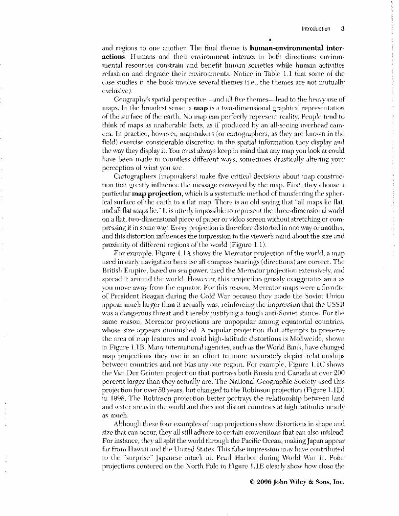
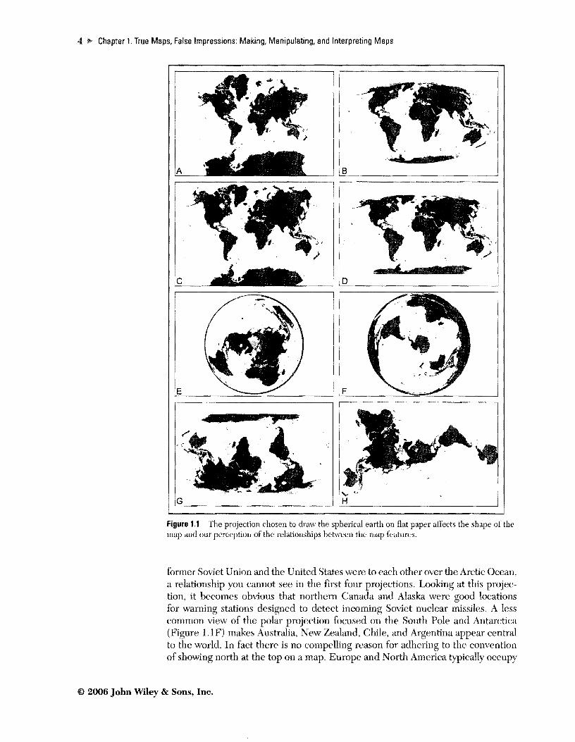
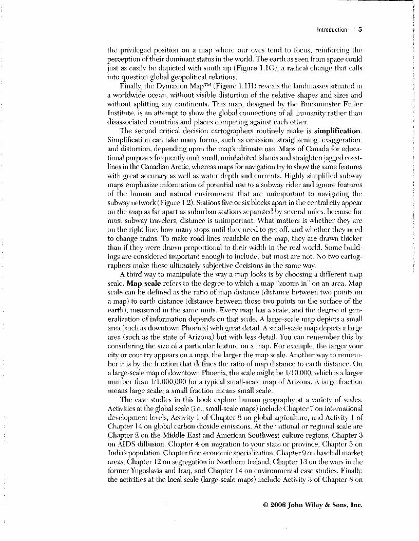
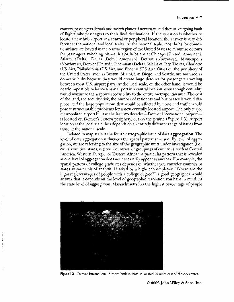
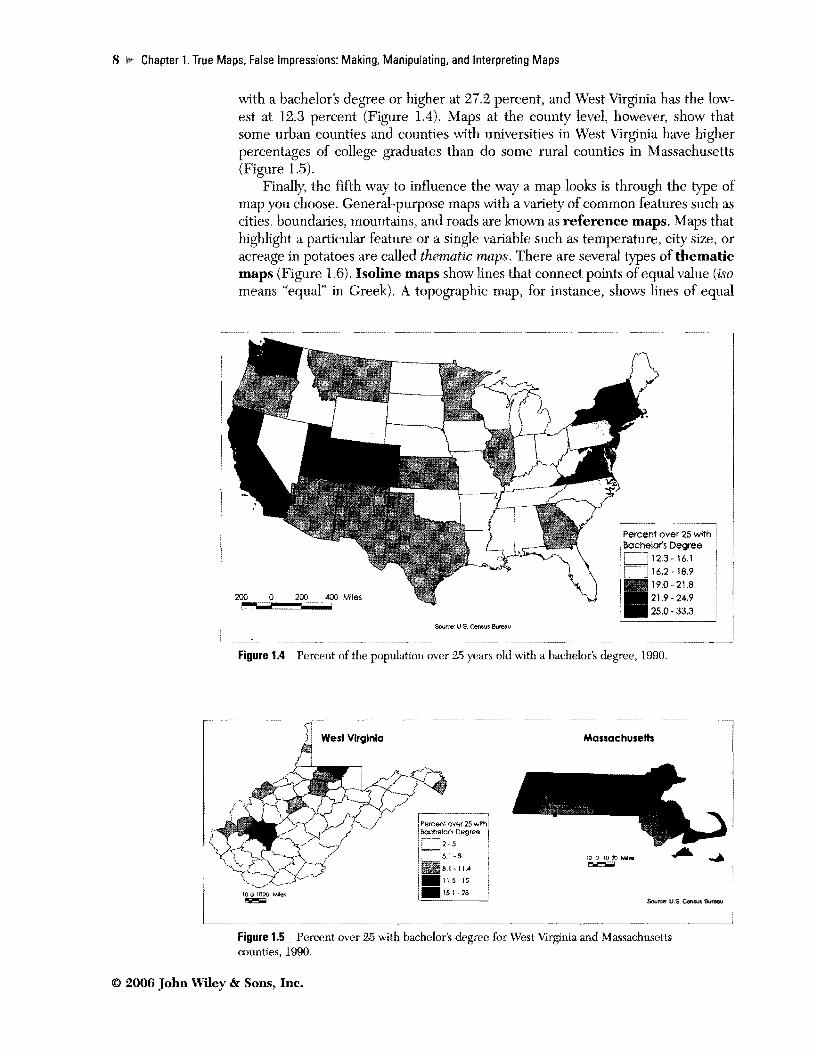
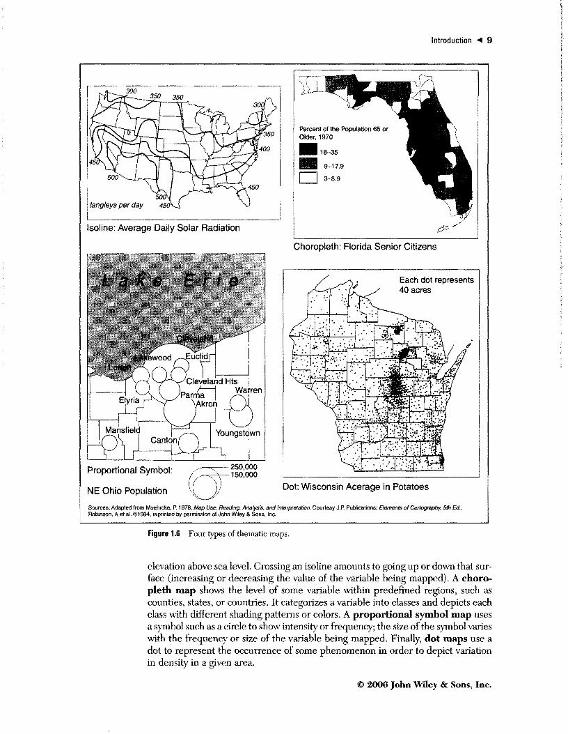
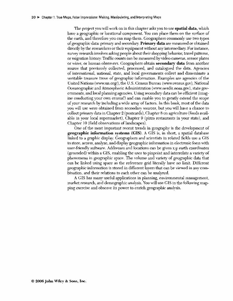
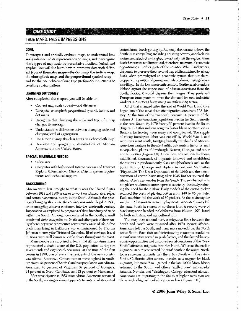
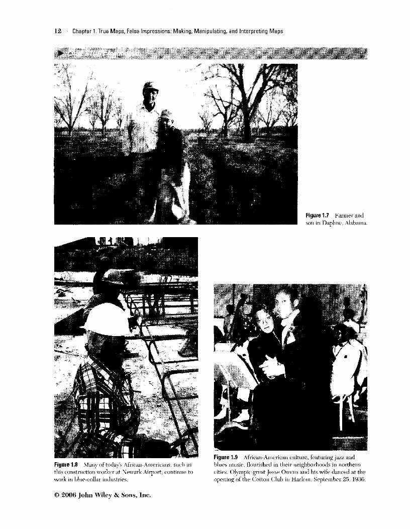
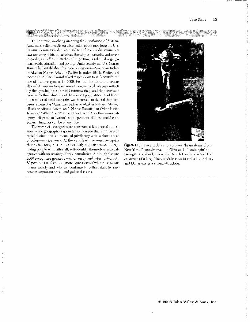
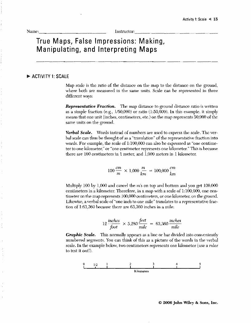
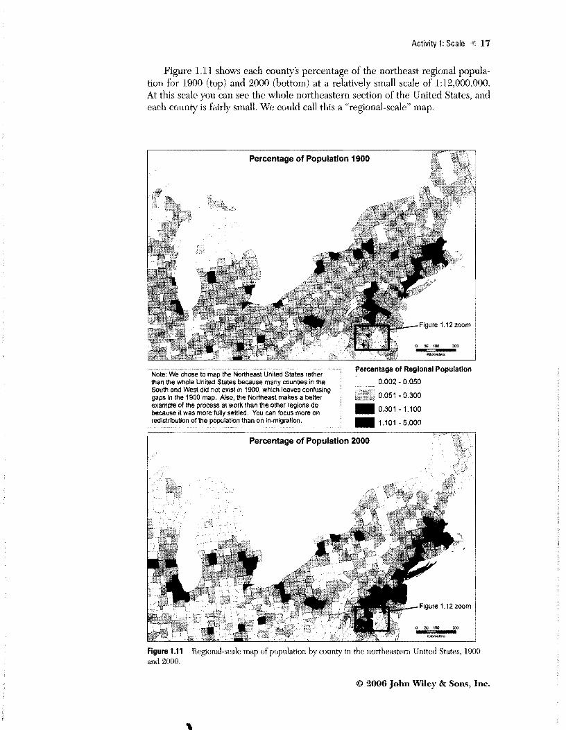
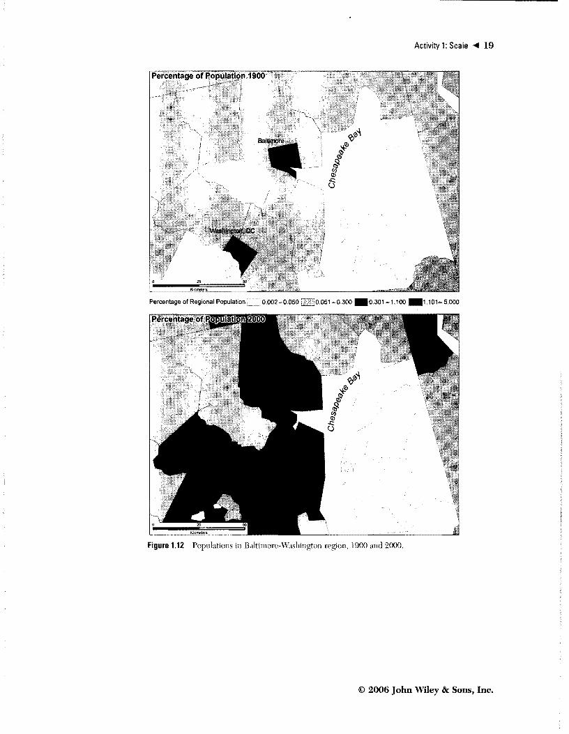
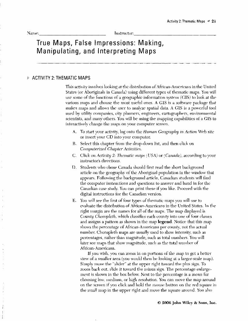
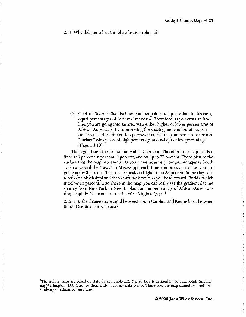
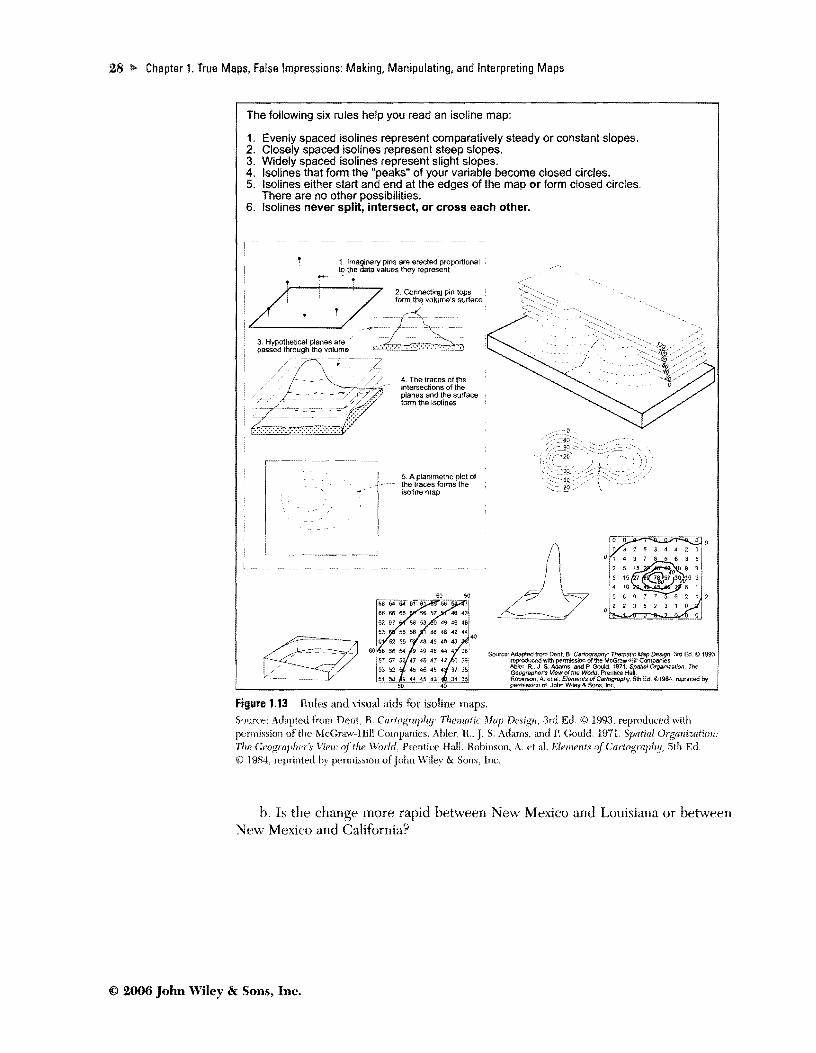
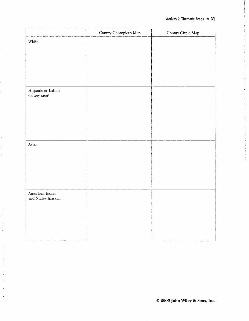