Graphical User Interfaces. Graphical input and output with JOptionPane.
Mathieu Zen Jean Vanderdonckt
Louvain School of Management
WORKING PAPER 2014/30
Towards an Evaluation of Graphical User Interfaces Aesthetics based on Metrics
LOUVAIN SCHOOL OF MANAGEMENT RESEARCH INSTITUTE
Towards an Evaluation of Graphical User Interfaces Aesthetics based on Metrics
Mathieu Zen, Jean Vanderdonckt
Louvain School of Management
Summary
The graphical user interface (GUI) of an interactive system is nowadays the most frequently used interaction modality. While the contents are of high importance, the Look and Feel is an equally essential factor determining the GUI quality that is impacted by several determinants such as but not limited to aesthetics, pleasurability, fun, etc. Therefore, GUIs aesthetics is a potential element to focus on in order to facilitate communication between device and user. On that basis, one question that comes up is: “Is it possible to evaluate the quality of a GUI by estimating its aesthetics through a series of measurable geometric metrics?”. This paper suggests possible directions to address the previous question by, first, introducing a simplifying model of GUIs aesthetics that captures aesthetics aspects and regions-related metrics. In a second phase, a methodology for the evaluation of GUIs aesthetics is defined based on the underlying model. The paper finally puts forwards a model-based implementation of the aforementioned methodology in the form of a web service tool for metrics-based evaluation of GUIs and discuss the results of a survey on users aesthetics perceptions.
Keywords: user interface aesthetics, metrics-based evaluation.
JEL Classification:
Louvain School of Management Working Paper Series Editor : Prof. Jean Vanderdonckt ([email protected])
Corresponding authors : Mathieu Zen CEMIS Research Center Louvain School of Management / Université catholique of Louvain Place des Doyens, 1 B-1348 Louvain-la-Neuve, BELGIUM E-mail : [email protected]
Towards an Evaluation of Graphical UserInterfaces Aesthetics based on Metrics
Mathieu Zen, Jean VanderdoncktLouvain School of ManagementUniversite catholique de Louvain
Louvain-la-Neuve, [email protected], [email protected]
Abstract—The graphical user interface (GUI) of an interactivesystem is nowadays the most frequently used interaction modality.While the contents are of high importance, the Look and Feelis an equally essential factor determining the GUI quality thatis impacted by several determinants such as but not limited toaesthetics, pleasurability, fun, etc. Therefore, GUIs aesthetics is apotential element to focus on in order to facilitate communicationbetween device and user. On that basis, one question that comesup is: “Is it possible to evaluate the quality of a GUI by estimatingits aesthetics through a series of measurable geometric metrics?”.This paper suggests possible directions to address the previousquestion by, first, introducing a simplifying model of GUIsaesthetics that captures aesthetics aspects and regions-relatedmetrics. In a second phase, a methodology for the evaluationof GUIs aesthetics is defined based on the underlying model. Thepaper finally puts forwards a model-based implementation of theaforementioned methodology in the form of a web service toolfor metrics-based evaluation of GUIs and discuss the results ofa survey on users aesthetics perceptions.
Keywords - user interface aesthetics, metrics-based evaluation
I. INTRODUCTION
Graphical User Interfaces (GUIs) have nowadays a largepresence in humans everyday life and this is not likely todecrease. According to Cisco’s white paper about mobile datatraffic forecast, the number of mobile devices per capita willamount to 1.4 by 2018, therefore exceeding the number ofpeople on earth [1]. Whether it is for working on a computerat the office, or for entertaining on a video game console,or even for communicating with others on a smartphone andsimultaneously entering an address in a G.P.S. device whiledriving a car, people are constantly confronted with GUIs forproviding electronic information.
Considered as a medium, GUIs are intended to conveya message. In the first place they are designed to attractusers eyes and secondly to make them consult it easily andefficiently. While the contents are of high importance, the formis equally essential. Indeed, design appreciation is the initialinteraction people have with an interface when they first faceit – some works report that this interaction takes less thanhalf a second to be completed [2, 3]. Moreover, there is astrong indication that perceived quality of a UI has a positiveimpact on the idea users have about the system’s usefulnessand usability [4]. Other works in human-computer interactionhave shown that UI conception represents a substantial partof software development [5]. Therefore, the Look and Feel ofGUIs, or in other words GUIs aesthetics is a potential target
for optimization when it comes to improve the communicationbetween device and user.
By focusing on the improvement of this process, designerswould be able to provide a more optimized output that comescloser to the final UI. Therefore, this paper brings a reflectionon “How to model GUIs aesthetics evaluation?’ and on theunderlying concepts that have to be taken into account toset up such a model. Our hypothesis is that a systematicapproach to GUI aesthetics is possible, by using a set ofobjective criteria (i.e. metrics) to generate recommendations.These criteria would be derived from and be validated by aseries of experiments, such as the one presented in this work.
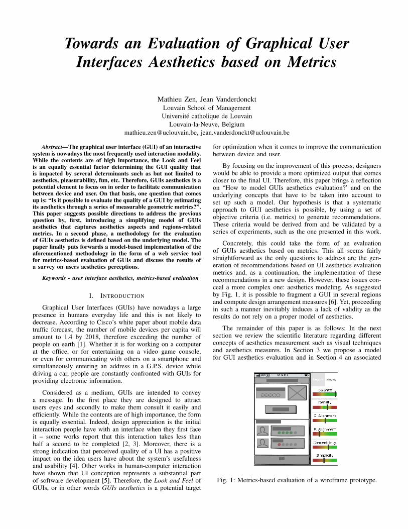
Concretely, this could take the form of an evaluationof GUIs aesthetics based on metrics. This all seems fairlystraightforward as the only questions to address are the gen-eration of recommendations based on UI aesthetics evaluationmetrics and, as a continuation, the implementation of theserecommendations in a new design. However, these issues con-ceal a more complex one: aesthetics modeling. As suggestedby Fig. 1, it is possible to fragment a GUI in several regionsand compute design arrangement measures [6]. Yet, proceedingin such a manner inevitably induces a lack of validity as theresults do not rely on a proper model of aesthetics.
The remainder of this paper is as follows: In the nextsection we review the scientific literature regarding differentconcepts of aesthetics measurement such as visual techniquesand aesthetics measures. In Section 3 we propose a modelfor GUI aesthetics evaluation and in Section 4 an associated
Fig. 1: Metrics-based evaluation of a wireframe prototype.
method for evaluating different types of interfaces. In Section5 we present a brief description of an implementation of themethod in the form of a webservice. In Section 6 we presentthe results of a preliminary survey carried out to investigateusers aesthetics perceptions, and in Section 7 we conclude withsome final remarks and future work.
II. STATE OF THE ART AND RELATED LITERATURE
A. What is aesthetics?
Before considering a problem, it is of good note to firstdescribe the concepts that are questioned. One may ask what isactually aesthetics? And why is it so important to be consideredin computer science?
Aesthetics, or beauty, is a complex subject and its definitiontend to vary among authors, certainly due to its subjectivenature. One can find different definitions in the literature:
• Baumgarten 1750 [7] : The first definition of theterm in modern philosophy comes from his book“Aesthetica”. “The end of aesthetics is the perfectionof sense cognition as such”. It is strictly a quest forperfection, implying that all kind of imperfection mustbe avoided.
• Clay 1908 [8] : Aesthetics is the criterion by whichbeautiful things are to be judged. It can be expressedas a degree with which things approximate an idealstandard.
• van Damme 1996 [9] : There exists a concept ofuniversal aesthetics seen as the existence of a standardof beauty that is shared between cultures, races andgenders. If it cannot be proved for all characteristicsof forms, some aspects such as symmetry, smoothness,brightness and balance can be regarded as widespreadaesthetics principles. Forms manifesting these prin-ciples can be appreciated both interculturally andtransculturally.
• Lavie and Tractinsky 2004 [10] : Aesthetics user’sperceptions encompass two main dimensions, “clas-sical aesthetics” and “expressive aesthetics”. While“classical aesthetics” refers to standard principles ofbeauty such as sequence, tidiness and symmetry, “ex-pressive aesthetics” represents qualities that go beyondthe classical principles and that stress the designer’screativity and expressive power. “Originality”, “fasci-nating design” and “special effects” are non-standarddesign aspects that are part of this category.
Through several studies in multiple fields, researchers haveshown that aesthetics has an impact on preferences [11], usabil-ity perception [12, 13, 14], credibility [15] and performance[16]. Not only interface design itself has an impact on itsperceived usability [13] but the design of the device displayingthe interface as well [12]. Furthermore, interface design mustbe chosen adequately with respect to the nature of a targetedaudience – some works indicate that, in website design, theuse of vertical symmetry is often preferred by designers whentargeting a male audience [11] while for targeting women thereis a preference for rounded lines, various font colors and forthe use of “sweeter” colors such as pink and yellow [17].
Obviously, GUI aesthetics matters; hence, it is clearlysubject to evaluation. In this respect, a qualitative approachcan be used to evaluate UI visual quality. This is the topic weare investigating in the following subsection.
B. A qualitative approach
Aesthetics in Computer Science refers mainly to UI design,where requirements can typically concern the overall usabilityof the system as well as specific aesthetic considerations. Yet,a distinction can be drawn between aesthetics and usability[18]. If usability requirements should be focused on how todesign UIs (leading to more effective and productive tools),aesthetics considerations, on their side, should serve to improvesatisfaction, User eXperience (UX) and social acceptance.
Ideally, these requirements need to be discussed in thelight of popular usability and aesthetics recommendations– resulting from guides and various software related to ausability and involving specific guidelines [19, 20] or relatedto a more aesthetic based approach focusing on the needs torespect a set of visual techniques [21, 22, 23, 24]. The latterapproach implies not only a qualitative evaluation consideringhow a design fulfill a set of visual criteria [25] but also aquantitative evaluation with metrics, all of which specific to adesign aesthetics property [26, 27].
One concept we use in this paper and that was firstintroduced by Vanderdonckt [25] is that of visual techniqueand is defined as follows:
A visual technique relies on a commonly acceptedvisual principle to suggest the arrangement of thelayout frame components.
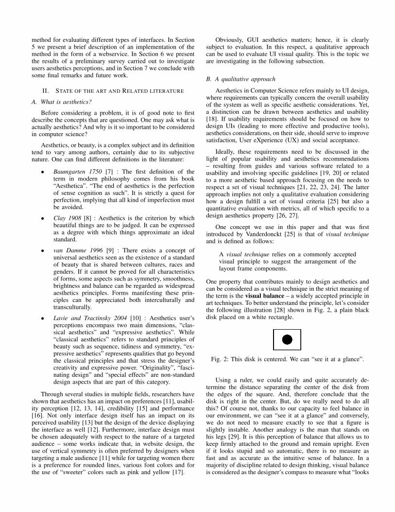
One property that contributes mainly to design aesthetics andcan be considered as a visual technique in the strict meaning ofthe term is the visual balance – a widely accepted principle inart techniques. To better understand the principle, let’s considerthe following illustration [28] shown in Fig. 2, a plain blackdisk placed on a white rectangle.
Fig. 2: This disk is centered. We can “see it at a glance”.
Using a ruler, we could easily and quite accurately de-termine the distance separating the center of the disk fromthe edges of the square. And, therefore conclude that thedisk is right in the center. But, do we really need to do allthis? Of course not, thanks to our capacity to feel balance inour environment, we can “see it at a glance” and conversely,we do not need to measure exactly to see that a figure isslightly instable. Another analogy is the man that stands onhis legs [29]. It is this perception of balance that allows us tokeep firmly attached to the ground and remain upright. Evenif it looks stupid and so automatic, there is no measure asfast and as accurate as the intuitive sense of balance. In amajority of discipline related to design thinking, visual balanceis considered as the designer’s compass to measure what “looks
right” and what “looks bad” [30]. Therefore, a qualitativedefinition for the visual technique of balance is:
Visual balance is a search for equilibrium alonga vertical or horizontal axis in the layout objectsweights.
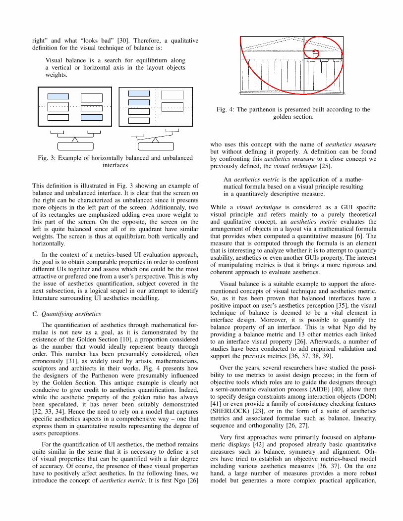
Fig. 3: Example of horizontally balanced and unbalancedinterfaces
This definition is illustrated in Fig. 3 showing an example ofbalance and unbalanced interface. It is clear that the screen onthe right can be characterized as unbalanced since it presentsmore objects in the left part of the screen. Additionnaly, twoof its rectangles are emphasized adding even more weight tothis part of the screen. On the opposite, the screen on theleft is quite balanced since all of its quadrant have similarweights. The screen is thus at equilibrium both vertically andhorizontally.
In the context of a metrics-based UI evaluation approach,the goal is to obtain comparable properties in order to confrontdifferent UIs together and assess which one could be the mostattractive or prefered one from a user’s perspective. This is whythe issue of aesthetics quantification, subject covered in thenext subsection, is a logical sequel in our attempt to identifylitterature surrounding UI aesthetics modelling.
C. Quantifying aesthetics
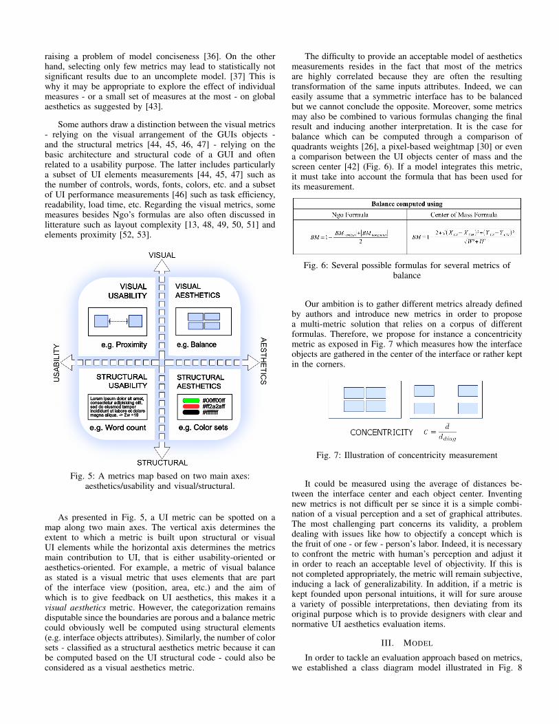
The quantification of aesthetics through mathematical for-mulae is not new as a goal, as it is demonstrated by theexistence of the Golden Section [10], a proportion consideredas the number that would ideally represent beauty throughorder. This number has been presumably considered, oftenerroneously [31], as widely used by artists, mathematicians,sculptors and architects in their works. Fig. 4 presents howthe designers of the Parthenon were presumably influencedby the Golden Section. This antique example is clearly notconducive to give credit to aesthetics quantification. Indeed,while the aesthetic property of the golden ratio has alwaysbeen speculated, it has never been suitably demonstrated[32, 33, 34]. Hence the need to rely on a model that capturesspecific aesthetics aspects in a comprehensive way – one thatexpress them in quantitative results representing the degree ofusers perceptions.
For the quantification of UI aesthetics, the method remainsquite similar in the sense that it is necessary to define a setof visual properties that can be quantified with a fair degreeof accuracy. Of course, the presence of these visual propertieshave to positively affect aesthetics. In the following lines, weintroduce the concept of aesthetics metric. It is first Ngo [26]
Fig. 4: The parthenon is presumed built according to thegolden section.
who uses this concept with the name of aesthetics measurebut without defining it properly. A definition can be foundby confronting this aesthetics measure to a close concept wepreviously defined, the visual technique [25].
An aesthetics metric is the application of a mathe-matical formula based on a visual principle resultingin a quantitavely descriptive measure.
While a visual technique is considered as a GUI specificvisual principle and refers mainly to a purely theoreticaland qualitative concept, an aesthetics metric evaluates thearrangement of objects in a layout via a mathematical formulathat provides when computed a quantitative measure [6]. Themeasure that is computed through the formula is an elementthat is interesting to analyze whether it is to attempt to quantifyusability, aesthetics or even another GUIs property. The interestof manipulating metrics is that it brings a more rigorous andcoherent approach to evaluate aesthetics.
Visual balance is a suitable example to support the afore-mentioned concepts of visual technique and aesthetics metric.So, as it has been proven that balanced interfaces have apositive impact on user’s aesthetics perception [35], the visualtechnique of balance is deemed to be a vital element ininterface design. Moreover, it is possible to quantify thebalance property of an interface. This is what Ngo did byproviding a balance metric and 13 other metrics each linkedto an interface visual property [26]. Afterwards, a number ofstudies have been conducted to add empirical validation andsupport the previous metrics [36, 37, 38, 39].
Over the years, several researchers have studied the possi-bility to use metrics to assist design process; in the form ofobjective tools which roles are to guide the designers througha semi-automatic evaluation process (AIDE) [40], allow themto specify design constraints among interaction objects (DON)[41] or even provide a family of consistency checking features(SHERLOCK) [23], or in the form of a suite of aestheticsmetrics and associated formulae such as balance, linearity,sequence and orthogonality [26, 27].
Very first approaches were primarily focused on alphanu-meric displays [42] and proposed already basic quantitativemeasures such as balance, symmetry and alignment. Oth-ers have tried to establish an objective metrics-based modelincluding various aesthetics measures [36, 37]. On the onehand, a large number of measures provides a more robustmodel but generates a more complex practical application,
raising a problem of model conciseness [36]. On the otherhand, selecting only few metrics may lead to statistically notsignificant results due to an uncomplete model. [37] This iswhy it may be appropriate to explore the effect of individualmeasures - or a small set of measures at the most - on globalaesthetics as suggested by [43].
Some authors draw a distinction between the visual metrics- relying on the visual arrangement of the GUIs objects -and the structural metrics [44, 45, 46, 47] - relying on thebasic architecture and structural code of a GUI and oftenrelated to a usability purpose. The latter includes particularlya subset of UI elements measurements [44, 45, 47] such asthe number of controls, words, fonts, colors, etc. and a subsetof UI performance measurements [46] such as task efficiency,readability, load time, etc. Regarding the visual metrics, somemeasures besides Ngo’s formulas are also often discussed inlitterature such as layout complexity [13, 48, 49, 50, 51] andelements proximity [52, 53].
Fig. 5: A metrics map based on two main axes:aesthetics/usability and visual/structural.
As presented in Fig. 5, a UI metric can be spotted on amap along two main axes. The vertical axis determines theextent to which a metric is built upon structural or visualUI elements while the horizontal axis determines the metricsmain contribution to UI, that is either usability-oriented oraesthetics-oriented. For example, a metric of visual balanceas stated is a visual metric that uses elements that are partof the interface view (position, area, etc.) and the aim ofwhich is to give feedback on UI aesthetics, this makes it avisual aesthetics metric. However, the categorization remainsdisputable since the boundaries are porous and a balance metriccould obviously well be computed using structural elements(e.g. interface objects attributes). Similarly, the number of colorsets - classified as a structural aesthetics metric because it canbe computed based on the UI structural code - could also beconsidered as a visual aesthetics metric.
The difficulty to provide an acceptable model of aestheticsmeasurements resides in the fact that most of the metricsare highly correlated because they are often the resultingtransformation of the same inputs attributes. Indeed, we caneasily assume that a symmetric interface has to be balancedbut we cannot conclude the opposite. Moreover, some metricsmay also be combined to various formulas changing the finalresult and inducing another interpretation. It is the case forbalance which can be computed through a comparison ofquadrants weights [26], a pixel-based weightmap [30] or evena comparison between the UI objects center of mass and thescreen center [42] (Fig. 6). If a model integrates this metric,it must take into account the formula that has been used forits measurement.
Fig. 6: Several possible formulas for several metrics ofbalance
Our ambition is to gather different metrics already definedby authors and introduce new metrics in order to proposea multi-metric solution that relies on a corpus of differentformulas. Therefore, we propose for instance a concentricitymetric as exposed in Fig. 7 which measures how the interfaceobjects are gathered in the center of the interface or rather keptin the corners.
Fig. 7: Illustration of concentricity measurement
It could be measured using the average of distances be-tween the interface center and each object center. Inventingnew metrics is not difficult per se since it is a simple combi-nation of a visual perception and a set of graphical attributes.The most challenging part concerns its validity, a problemdealing with issues like how to objectify a concept which isthe fruit of one - or few - person’s labor. Indeed, it is necessaryto confront the metric with human’s perception and adjust itin order to reach an acceptable level of objectivity. If this isnot completed appropriately, the metric will remain subjective,inducing a lack of generalizability. In addition, if a metric iskept founded upon personal intuitions, it will for sure arousea variety of possible interpretations, then deviating from itsoriginal purpose which is to provide designers with clear andnormative UI aesthetics evaluation items.
III. MODEL
In order to tackle an evaluation approach based on metrics,we established a class diagram model illustrated in Fig. 8
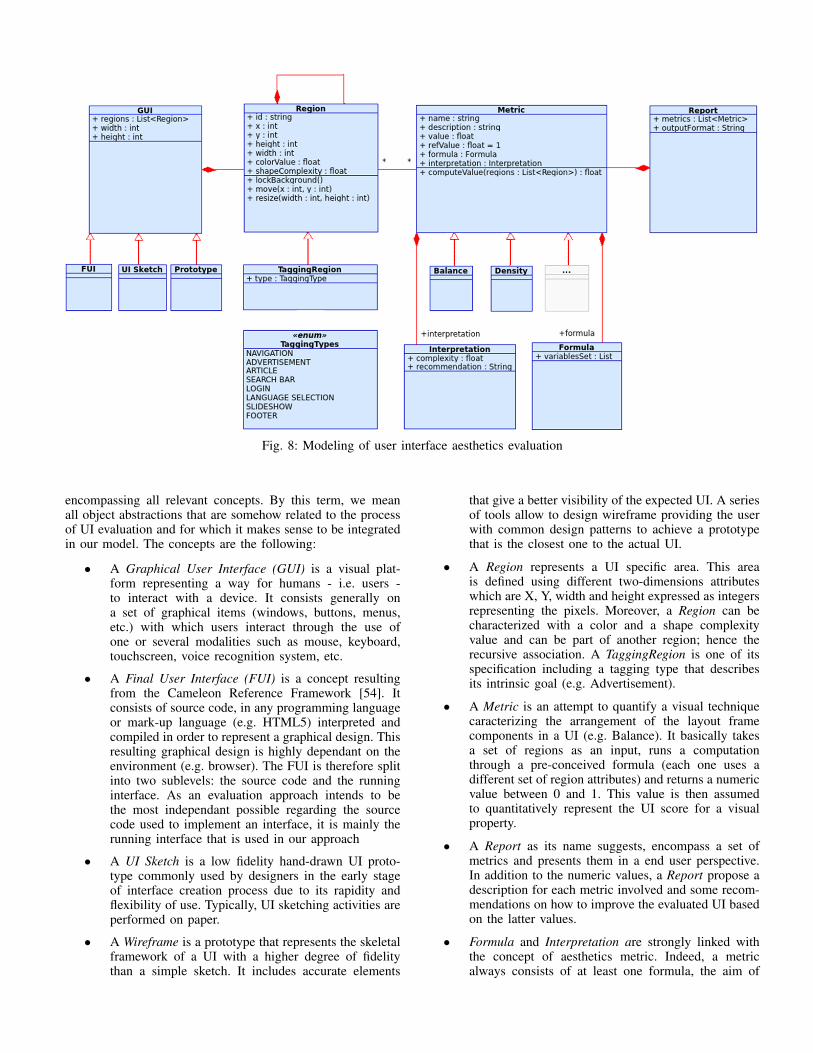
Fig. 8: Modeling of user interface aesthetics evaluation
encompassing all relevant concepts. By this term, we meanall object abstractions that are somehow related to the processof UI evaluation and for which it makes sense to be integratedin our model. The concepts are the following:
• A Graphical User Interface (GUI) is a visual plat-form representing a way for humans - i.e. users -to interact with a device. It consists generally ona set of graphical items (windows, buttons, menus,etc.) with which users interact through the use ofone or several modalities such as mouse, keyboard,touchscreen, voice recognition system, etc.
• A Final User Interface (FUI) is a concept resultingfrom the Cameleon Reference Framework [54]. Itconsists of source code, in any programming languageor mark-up language (e.g. HTML5) interpreted andcompiled in order to represent a graphical design. Thisresulting graphical design is highly dependant on theenvironment (e.g. browser). The FUI is therefore splitinto two sublevels: the source code and the runninginterface. As an evaluation approach intends to bethe most independant possible regarding the sourcecode used to implement an interface, it is mainly therunning interface that is used in our approach
• A UI Sketch is a low fidelity hand-drawn UI proto-type commonly used by designers in the early stageof interface creation process due to its rapidity andflexibility of use. Typically, UI sketching activities areperformed on paper.
• A Wireframe is a prototype that represents the skeletalframework of a UI with a higher degree of fidelitythan a simple sketch. It includes accurate elements
that give a better visibility of the expected UI. A seriesof tools allow to design wireframe providing the userwith common design patterns to achieve a prototypethat is the closest one to the actual UI.
• A Region represents a UI specific area. This areais defined using different two-dimensions attributeswhich are X, Y, width and height expressed as integersrepresenting the pixels. Moreover, a Region can becharacterized with a color and a shape complexityvalue and can be part of another region; hence therecursive association. A TaggingRegion is one of itsspecification including a tagging type that describesits intrinsic goal (e.g. Advertisement).
• A Metric is an attempt to quantify a visual techniquecaracterizing the arrangement of the layout framecomponents in a UI (e.g. Balance). It basically takesa set of regions as an input, runs a computationthrough a pre-conceived formula (each one uses adifferent set of region attributes) and returns a numericvalue between 0 and 1. This value is then assumedto quantitatively represent the UI score for a visualproperty.
• A Report as its name suggests, encompass a set ofmetrics and presents them in a end user perspective.In addition to the numeric values, a Report propose adescription for each metric involved and some recom-mendations on how to improve the evaluated UI basedon the latter values.
• Formula and Interpretation are strongly linked withthe concept of aesthetics metric. Indeed, a metricalways consists of at least one formula, the aim of
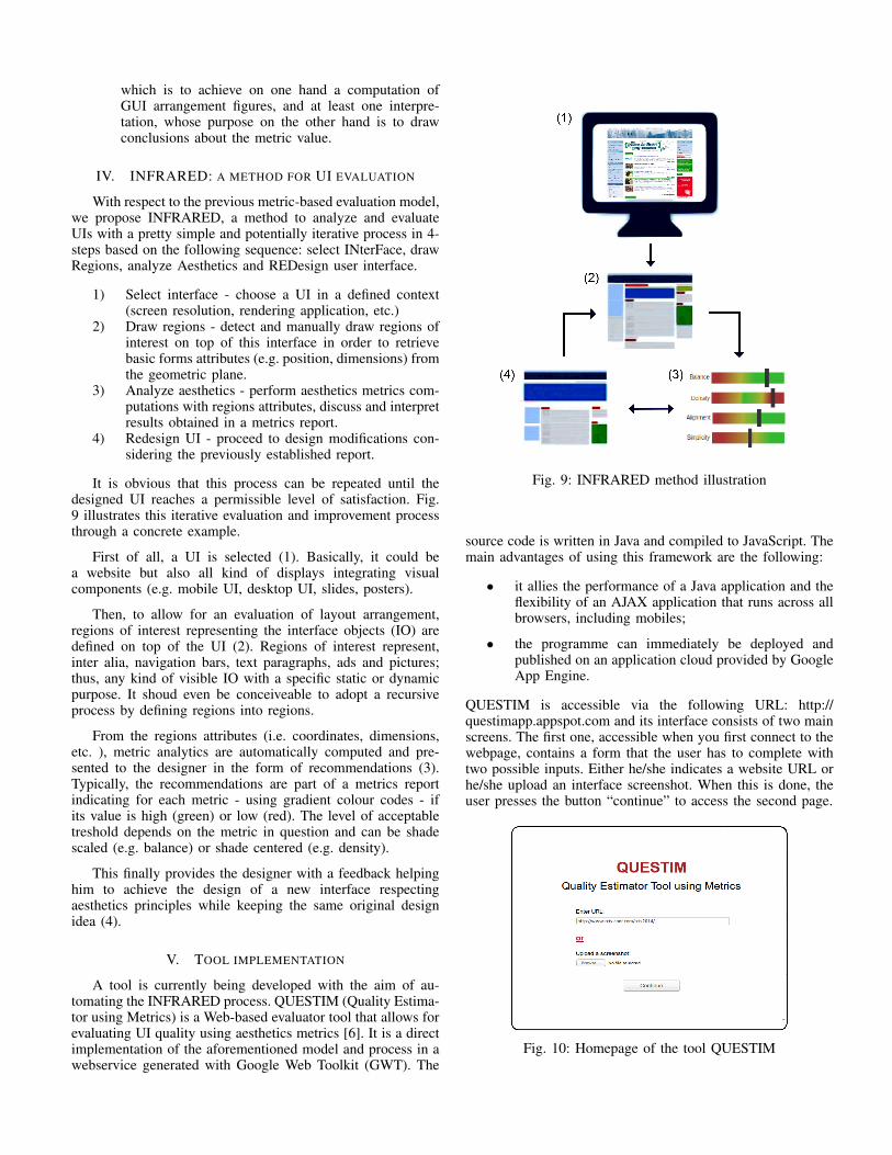
which is to achieve on one hand a computation ofGUI arrangement figures, and at least one interpre-tation, whose purpose on the other hand is to drawconclusions about the metric value.
IV. INFRARED: A METHOD FOR UI EVALUATION
With respect to the previous metric-based evaluation model,we propose INFRARED, a method to analyze and evaluateUIs with a pretty simple and potentially iterative process in 4-steps based on the following sequence: select INterFace, drawRegions, analyze Aesthetics and REDesign user interface.
1) Select interface - choose a UI in a defined context(screen resolution, rendering application, etc.)
2) Draw regions - detect and manually draw regions ofinterest on top of this interface in order to retrievebasic forms attributes (e.g. position, dimensions) fromthe geometric plane.
3) Analyze aesthetics - perform aesthetics metrics com-putations with regions attributes, discuss and interpretresults obtained in a metrics report.
4) Redesign UI - proceed to design modifications con-sidering the previously established report.
It is obvious that this process can be repeated until thedesigned UI reaches a permissible level of satisfaction. Fig.9 illustrates this iterative evaluation and improvement processthrough a concrete example.
First of all, a UI is selected (1). Basically, it could bea website but also all kind of displays integrating visualcomponents (e.g. mobile UI, desktop UI, slides, posters).
Then, to allow for an evaluation of layout arrangement,regions of interest representing the interface objects (IO) aredefined on top of the UI (2). Regions of interest represent,inter alia, navigation bars, text paragraphs, ads and pictures;thus, any kind of visible IO with a specific static or dynamicpurpose. It shoud even be conceiveable to adopt a recursiveprocess by defining regions into regions.
From the regions attributes (i.e. coordinates, dimensions,etc. ), metric analytics are automatically computed and pre-sented to the designer in the form of recommendations (3).Typically, the recommendations are part of a metrics reportindicating for each metric - using gradient colour codes - ifits value is high (green) or low (red). The level of acceptabletreshold depends on the metric in question and can be shadescaled (e.g. balance) or shade centered (e.g. density).
This finally provides the designer with a feedback helpinghim to achieve the design of a new interface respectingaesthetics principles while keeping the same original designidea (4).
V. TOOL IMPLEMENTATION
A tool is currently being developed with the aim of au-tomating the INFRARED process. QUESTIM (Quality Estima-tor using Metrics) is a Web-based evaluator tool that allows forevaluating UI quality using aesthetics metrics [6]. It is a directimplementation of the aforementioned model and process in awebservice generated with Google Web Toolkit (GWT). The
Fig. 9: INFRARED method illustration
source code is written in Java and compiled to JavaScript. Themain advantages of using this framework are the following:
• it allies the performance of a Java application and theflexibility of an AJAX application that runs across allbrowsers, including mobiles;
• the programme can immediately be deployed andpublished on an application cloud provided by GoogleApp Engine.
QUESTIM is accessible via the following URL: http://questimapp.appspot.com and its interface consists of two mainscreens. The first one, accessible when you first connect to thewebpage, contains a form that the user has to complete withtwo possible inputs. Either he/she indicates a website URL orhe/she upload an interface screenshot. When this is done, theuser presses the button “continue” to access the second page.
Fig. 10: Homepage of the tool QUESTIM

On this second page, several information are presented tothe user:
• a drawable canvas in the center of the screen within background, the webpage or screenshot previouslyloaded as shown on Fig. 11. This is the main part ofthe tool where the user is able to draw regions on topof the webpage or modify existing drawn regions;
• a vertical tool panel on the far left part containingbuttons offering certain functionalities such as zoom,browse - allowing to browse the webpage - and capture- a feature which captures a screenshot of the websiteas it is exposed at that moment and give the possibilityafterwards to directly modify superposed screenshotregions in order to redesign IO while receiving animmediate visual feedback;
• a vertical analytics panel on the far right part ofthe interface showing some analytics divided in twotabs: a regions tab providing information about drawnregions (x, y, width, height) on top of canvas - anda metrics tab providing aesthetics metrics in the formof a report (Fig. 12).
Fig. 11: Drawable canvas with regions drawn on top of RCISwebpage
Fig. 12: Analytics panel showing metrics of balance anddensity
To put it in a nutshell, the tool’s ultimate goal is to provideweb designers with an objective feedback about their designedwebpages. At the moment, QUESTIM allows the user to load awebpage (URL) or screenshot and proceed to semi-automaticcomputation with interest regions drawn by this same user.Then, the tool provides an immediate response in the form
of a metrics report. For each metric result, an interpretationcan be defined and a link can be made with the incidence onusers preferences and/or performances. Fig. 13 is a concreteillustration of the use that may be made of QUESTIM toevaluate and redesign a website (i.e. RCIS 2014 webpage).
Fig. 13: Evaluation of the RCIS webpage using QUESTIM
VI. PILOT STUDY
This section presents a pilot study performed to provideempirical validation to Ngo’s metrics [26]. We addressed 12metrics - balance, sequence, equilibrium, unity, symmetry,proportion, economy, density, homogeneity, regularity, rhythmand order - for which a mathematical formula was providedand gave a quantitative value to each existing arrangementproperty. These formulas were based on UI objects attributessuch as measures of area, size, angle, color and form.
A. Goal
The goal of this pilot study was to show relevance of themetrics while considering final users perceptions. To reach thisobjective, we basically calculated each of Ngo’s metrics for aset of 4 interfaces and confronted the results to users reviewson the percepetion of the arrangement property related to that
metric. In other words, the aim was therefore to verify whetherthe results that can be obtained using these formulas could belegitimate as corresponding to users reviews, what the usersreally perceive. In order to complete this task, we applied thefollowing methodology:
1) select metrics to validate2) select UIs onto which could be applied the metrics3) quantify for each UI the corresponding metrics4) conduct a survey among users to get their own
opinions about the related visual techniques for eachUI
5) confront users reviews with metrics values and dis-cuss the results
B. Description
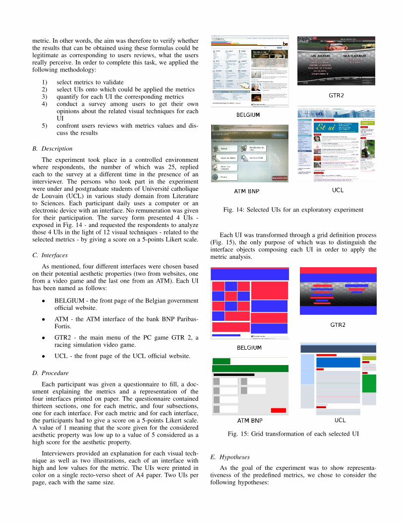
The experiment took place in a controlled environmentwhere respondents, the number of which was 25, repliedeach to the survey at a different time in the presence of aninterviewer. The persons who took part in the experimentwere under and postgraduate students of Universite catholiquede Louvain (UCL) in various study domain from Literatureto Sciences. Each participant daily uses a computer or anelectronic device with an interface. No remuneration was givenfor their participation. The survey form presented 4 UIs -exposed in Fig. 14 - and requested the respondents to analyzethose 4 UIs in the light of 12 visual techniques - related to theselected metrics - by giving a score on a 5-points Likert scale.
C. Interfaces
As mentioned, four different interfaces were chosen basedon their potential aesthetic properties (two from websites, onefrom a video game and the last one from an ATM). Each UIhas been named as follows:
• BELGIUM - the front page of the Belgian governmentofficial website.
• ATM - the ATM interface of the bank BNP Paribas-Fortis.
• GTR2 - the main menu of the PC game GTR 2, aracing simulation video game.
• UCL - the front page of the UCL official website.
D. Procedure
Each participant was given a questionnaire to fill, a doc-ument explaining the metrics and a representation of thefour interfaces printed on paper. The questionnaire containedthirteen sections, one for each metric, and four subsections,one for each interface. For each metric and for each interface,the participants had to give a score on a 5-points Likert scale.A value of 1 meaning that the score given for the consideredaesthetic property was low up to a value of 5 considered as ahigh score for the aesthetic property.
Interviewers provided an explanation for each visual tech-nique as well as two illustrations, each of an interface withhigh and low values for the metric. The UIs were printed incolor on a single recto-verso sheet of A4 paper. Two UIs perpage, each with the same size.
Fig. 14: Selected UIs for an exploratory experiment
Each UI was transformed through a grid definition process(Fig. 15), the only purpose of which was to distinguish theinterface objects composing each UI in order to apply themetric analysis.
Fig. 15: Grid transformation of each selected UI
E. Hypotheses
As the goal of the experiment was to show representa-tiveness of the predefined metrics, we chose to consider thefollowing hypotheses:
• H1: There is a perfect similarity between scores ofmetrics and users reviews.
• H2: There is a relative similarity between scores ofmetrics and users reviews.
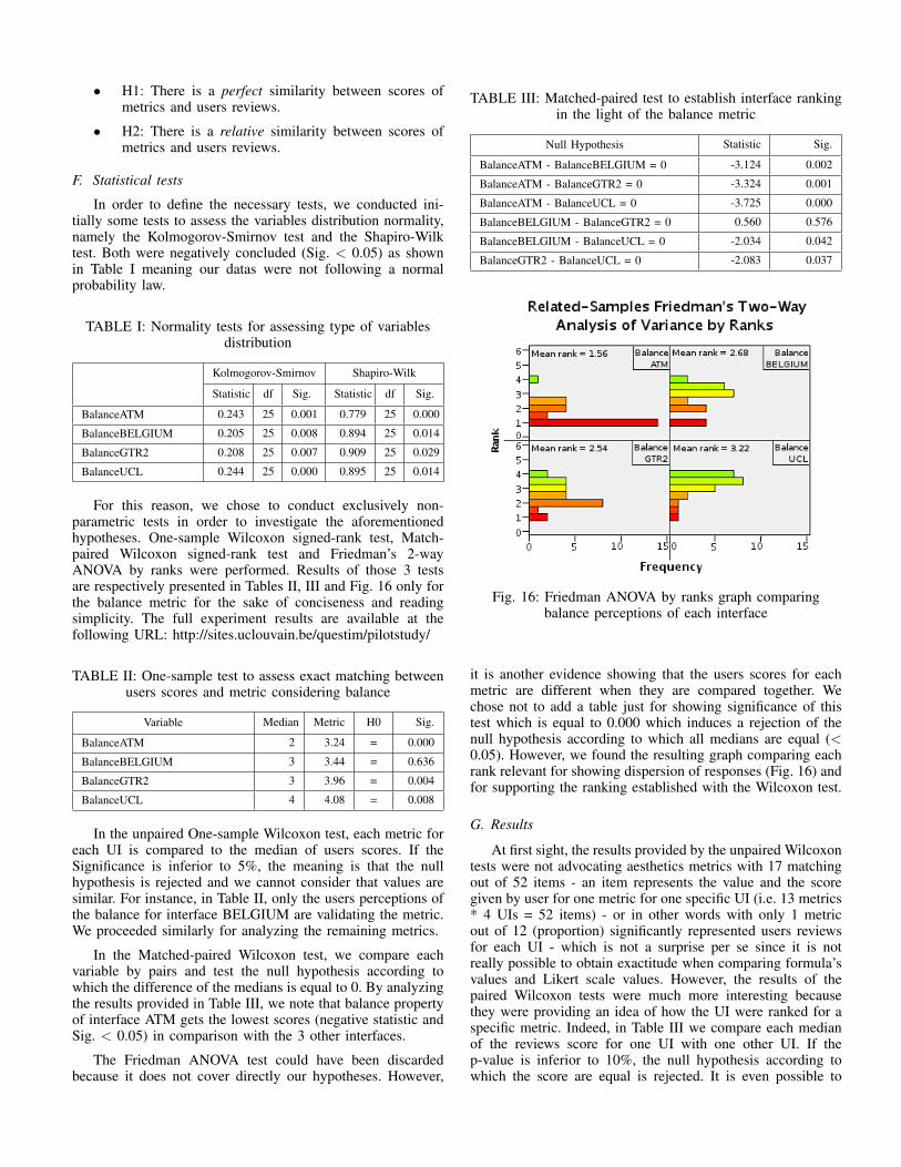
F. Statistical tests
In order to define the necessary tests, we conducted ini-tially some tests to assess the variables distribution normality,namely the Kolmogorov-Smirnov test and the Shapiro-Wilktest. Both were negatively concluded (Sig. < 0.05) as shownin Table I meaning our datas were not following a normalprobability law.
TABLE I: Normality tests for assessing type of variablesdistribution
Kolmogorov-Smirnov Shapiro-Wilk
Statistic df Sig. Statistic df Sig.
BalanceATM 0.243 25 0.001 0.779 25 0.000
BalanceBELGIUM 0.205 25 0.008 0.894 25 0.014
BalanceGTR2 0.208 25 0.007 0.909 25 0.029
BalanceUCL 0.244 25 0.000 0.895 25 0.014
For this reason, we chose to conduct exclusively non-parametric tests in order to investigate the aforementionedhypotheses. One-sample Wilcoxon signed-rank test, Match-paired Wilcoxon signed-rank test and Friedman’s 2-wayANOVA by ranks were performed. Results of those 3 testsare respectively presented in Tables II, III and Fig. 16 only forthe balance metric for the sake of conciseness and readingsimplicity. The full experiment results are available at thefollowing URL: http://sites.uclouvain.be/questim/pilotstudy/
TABLE II: One-sample test to assess exact matching betweenusers scores and metric considering balance
Variable Median Metric H0 Sig.
BalanceATM 2 3.24 = 0.000
BalanceBELGIUM 3 3.44 = 0.636
BalanceGTR2 3 3.96 = 0.004
BalanceUCL 4 4.08 = 0.008
In the unpaired One-sample Wilcoxon test, each metric foreach UI is compared to the median of users scores. If theSignificance is inferior to 5%, the meaning is that the nullhypothesis is rejected and we cannot consider that values aresimilar. For instance, in Table II, only the users perceptions ofthe balance for interface BELGIUM are validating the metric.We proceeded similarly for analyzing the remaining metrics.
In the Matched-paired Wilcoxon test, we compare eachvariable by pairs and test the null hypothesis according towhich the difference of the medians is equal to 0. By analyzingthe results provided in Table III, we note that balance propertyof interface ATM gets the lowest scores (negative statistic andSig. < 0.05) in comparison with the 3 other interfaces.
The Friedman ANOVA test could have been discardedbecause it does not cover directly our hypotheses. However,
TABLE III: Matched-paired test to establish interface rankingin the light of the balance metric
Null Hypothesis Statistic Sig.
BalanceATM - BalanceBELGIUM = 0 -3.124 0.002
BalanceATM - BalanceGTR2 = 0 -3.324 0.001
BalanceATM - BalanceUCL = 0 -3.725 0.000
BalanceBELGIUM - BalanceGTR2 = 0 0.560 0.576
BalanceBELGIUM - BalanceUCL = 0 -2.034 0.042
BalanceGTR2 - BalanceUCL = 0 -2.083 0.037
Fig. 16: Friedman ANOVA by ranks graph comparingbalance perceptions of each interface
it is another evidence showing that the users scores for eachmetric are different when they are compared together. Wechose not to add a table just for showing significance of thistest which is equal to 0.000 which induces a rejection of thenull hypothesis according to which all medians are equal (<0.05). However, we found the resulting graph comparing eachrank relevant for showing dispersion of responses (Fig. 16) andfor supporting the ranking established with the Wilcoxon test.
G. Results
At first sight, the results provided by the unpaired Wilcoxontests were not advocating aesthetics metrics with 17 matchingout of 52 items - an item represents the value and the scoregiven by user for one metric for one specific UI (i.e. 13 metrics* 4 UIs = 52 items) - or in other words with only 1 metricout of 12 (proportion) significantly represented users reviewsfor each UI - which is not a surprise per se since it is notreally possible to obtain exactitude when comparing formula’svalues and Likert scale values. However, the results of thepaired Wilcoxon tests were much more interesting becausethey were providing an idea of how the UI were ranked for aspecific metric. Indeed, in Table III we compare each medianof the reviews score for one UI with one other UI. If thep-value is inferior to 10%, the null hypothesis according towhich the score are equal is rejected. It is even possible to
determine the superior UI taking into account the positive ornegative sign of the statistic outcome. That leads to a possiblecomparison between UI rankings (as exposed in Fig. IV onlyfor the metric of balance) for each metric by formulas on onehand and by users on the other hand. The result is then anumber of 4 metrics out of 12 for which UIs were rankedmainly similarly by both criteria showing that metrics formulaswere representative of human eye. Those metrics were balance,equilibrium, density, and economy.
TABLE IV: Ranking of UIs exclusively considering balanceaccording to the users and the metric
Visual technique UI ranking according to
METRIC USERS
UCL UCL
Balance GTR2 GTR2/BELGIUMBELGIUM
ATM ATM
H. Discussion
First of all, the fact that results indicate 4 representativemetrics out of 12 does not imply that the other metricshave to be rejected when considering potential elements foraesthetics evaluation. Indeed, it just points out that the resultswere not significant for the remaining 8 metrics. Anotherpossible interpretation is relative to the metric itself that maybe reconsidered in order to obtain relevant results.
Regarding the validation of the whole experiment, a critichas to be made. Indeed, we used a set of only 4 UIs andthat implies a lack of significance in the results. Therefore, wecannot assess a sufficient margin error in the constitution ofprevious rankings to be assured that they are representative.The results obtained give thus an indication of a possible GUIevaluation by metrics but need to be treated with caution andrequest further empirical support.
Finally, another critic that can be made is about thesubjective nature of the UI grid transformation process, thatdoes not follow specific rules and is let to the judgementof the researchers. Indeed, another grid proposition for a UIcould change considerably results obtained by the metrics. Itshould be appropriate for a metrics-based evaluation to rely ona consistent process for defining UI regions of interests.
VII. FINAL REMARKS
Qualitative evaluation of a design provided by several usersjudgements remains an appropriate solution to improve UI de-sign. However, this kind of evaluation process is cumbersomeand can often only be undertaken when the UI is alreadyreleased. A better approach for first design evaluation couldbe to objectively quantify aesthetics through an evaluation bymetrics. The interest of such an approach lies in the quickand objective feedback the designer may receive. Indeed,rather than having to gather people and optionally conducta survey to receive comments on some way to improve the UIaesthetics, he/she may simply define UI regions and request a
metrics report. Afterwards, he/she has the necessary elementsto modify the GUI in order to improve its aesthetics.
Through this research work, we hope to provide interfacedesigners with methodologies and tools using validation bymetrics that can be called upon at any time during designprocess. That is why we have chosen to focus our efforts on thedefinition of a method (INFRARED) and a tool (QUESTIM)in order to give concrete examples of what can be achieved inthe design process when a particular attention is accorded tometrics for GUI aesthetics evaluation.
Therefore, improvements can be made in the way of ad-dressing the model. At the moment, it only takes into accountUI objects arrangement on a layout. It is necessary, as previ-ously mentioned by other works [36, 37], to propose a modelconsidering other potential UI aesthetics aspects such as colorscombinations and shapes complexity. Another suggestion is totake into consideration the fact that UI aesthetics vary with thedomain in which it belongs. Indeed, it may be nonsense forsome designers to achieve a UI in which objects are completelybalanced. Therefore, an idea is to split each metric in such away that it represents no more one positive and one negativevalue (Balance/Unbalance) but rather two distinct components.With this point of view, it is possible to analyze joint effectson UI aesthetics (e.g. effect of an unbalanced and misalignedUI).
Finally, the last but not the least point to consider is thenecessity to provide more robust and significant empiricalvalidation of how metrics express aesthetics aspects throughseveral experiments focusing on the relevance - the extent towhich a metric is an important aesthetics criterion - and therepresentativeness - the extent to which the value provided bya metric is representative of what a human being may assess.We made a small step in supporting metrics representativenessthrough a pilot study, the results of which are encouragingsince we were able to highlight some correlation between anumber of metrics and the users perception of the related vi-sual technique. However, the experiment keeps an exploratoryproperty and triggers the need for advanced empirical support.
VIII. FUTURE WORK
This section describes some lines of research to undertakeor to further investigate in the context of GUIs aestheticsevaluation:
• Regarding the evaluation by metrics, we made a smallstep in providing a tool for drawing objects of aninterface and get a quantitative result. It would beinteresting to automate most of this evaluation processand propose a system of recognition of shapes andcolors. The interest would be, on the one hand, toavoid manual drawing of objects and, on the otherhand, the evaluation could be applied to any interfaceregardless of the language which is used for definingthe interface.
• Some metrics may be optimized to better reflectperceptions of human eye. For example, it is neces-sary to provide an accurate and validated thresholdfor categorizing correctly values of density that areconsidered by users as efficient or unefficient from an
aesthetics perspective. Moreover, the thresholds usedin the analytics panel of QUESTIM were arbitrarydefined. It is therefore necessary in a research processto provide empirical validation for these thresholds inorder to propose a reliable evaluation tool.
• In the same vein, it is necessary to provide furtherempirical validation for the previously defined metricswith a final goal of solving the representativenessand relevance issues raised by such a quantitativeapproach of aesthetics evaluation. An attempt to solvethe representativeness issue could be to reproduce thepilot study at a larger scale (i.e. exploring a largercorpus of interfaces with a larger sample of users)in order to support formulas represented for eachmetric. In another experiment, it could be possible totackle the relevance issue by investigating professionaldesigners methods and principles when it comes toGUI aesthetics. It could be in the form of a survey onthe visual techniques they actually use in their work.Confronting the results of such a survey to a set ofmetrics would allow to make a distinction betweenthose that are relevant for aesthetics validation andthose that are irrelevant.
ACKNOWLEDGMENT
This work is partially supported by the QualIHM project(Tool-Supported Methodology for the Quality of Human-Computer Interfaces) of the CWality research programme byDirection Generale DGO6 of Region Wallonne. A specialthank goes to our colleague Ugo Sangiorgi for comments onearlier version of this paper.
REFERENCES
[1] Cisco, “Cisco Visual Networking Index : Global Mobile Data TrafficForecast Update , 2012 – 2017,” pp. 2012–2017, 2013.
[2] G. Lindgaard, G. Fernandes, C. Dudek, and J. Brown, “Attention webdesigners: You have 50 milliseconds to make a good first impression!”Behav. Inf. Technol., vol. 25, no. 2, pp. 115–126, Mar. 2006.
[3] E. Papachristos and N. Avouris, “Are first impressions about websitesonly related to visual appeal?” in Human-Computer Interact. Lisbon:Springer, 2011, pp. 489–496.
[4] P. Zhang and N. Li, “Love at first sight or sustained effect? The roleof perceived affective quality on users’ cognitive reactions to IT,” inProc. Int. Conf. Inf. Syst., Washington, DC., 2004, pp. 283–296.
[5] B. A. Myers and M. B. Rosson, “Survey on user interfaceprogramming,” in Proc. SIGCHI Conf. Hum. factors Comput. Syst. -CHI ’92, vol. 7, no. 1. New York, New York, USA: ACM Press,Mar. 1992, pp. 195–202.
[6] M. Zen, “Metric-based evaluation of graphical user interfaces: model,method, and software support,” Proc. 5th ACM SIGCHI Symp. Eng.Interact. Comput. Syst., 2013.
[7] M. J. Gregor, “Baumgarten’s Aesthetica,” Rev. Metaphys., vol. 37, p.357, 1983.
[8] F. Clay, “The origin of the aesthetic emotion,” Sammelbande der Int.Musik., pp. 282–290, 1908.
[9] W. Van Damme, Beauty in Context: Towards an Anthropoligical Ap-proach to Aesthetics, E.J. Brill, Ed., 1996.
[10] T. Lavie and N. Tractinsky, “Assessing dimensions of perceived visualaesthetics of web sites,” Int. J. Hum. Comput. Stud., pp. 1–41, 2004.
[11] A. N. Tuch, J. a. Bargas-Avila, and K. Opwis, “Symmetry andaesthetics in website design: It’s a man’s business,” Comput. HumanBehav., vol. 26, no. 6, pp. 1831–1837, Nov. 2010.
[12] A. Sonderegger and J. Sauer, “The influence of design aesthetics inusability testing: effects on user performance and perceived usability.”Appl. Ergon., vol. 41, no. 3, pp. 403–10, May 2010.
[13] A. N. Tuch, J. A. Bargas-Avila, K. Opwis, and F. H. Wilhelm, “Visualcomplexity of websites: Effects on users’ experience, physiology,performance, and memory,” Int. J. Hum. Comput. Stud., vol. 67, no. 9,pp. 703–715, Sep. 2009.
[14] A. Altaboli and Y. Lin, “Effects of Unity of Form and Symmetry onVisual Aesthetics of Website Interface Design,” Proc. Hum. FactorsErgon. Soc. Annu. Meet., vol. 56, no. 1, pp. 728–732, Oct. 2012.
[15] F. Alsudani and M. Casey, “The effect of aesthetics on web credibility,”in Proc. 23rd Br. HCI Gr. Annu. Conf. People Comput. Celebr. PeopleTechnol. British Computer Society, 2009, pp. 512–519.
[16] C. Salimun, H. C. Purchase, D. R. Simmons, and S. Brewster,“The effect of aesthetically pleasing composition on visual searchperformance,” Proc. 6th Nord. Conf. Human-Computer Interact.Extending Boundaries - Nord. ’10, p. 422, 2010.
[17] G. Moss, R. Gunn, and J. Heller, “Some men like it black, somewomen like it pink: consumer implications of differences in male andfemale website design,” J. Consum. Behav., vol. 341, no. 2006, pp.328–341, 2006.
[18] N. Bevan, “Classifying and selecting UX and usability measures,”in Proc. Meaningful Meas. Valid Useful User Exp. Meas., 5thCOST294-MAUSE Open Workshop, Ed., vol. 11, no. June, Reykjavik,2008.
[19] W. O. Galitz, The Essential Guide to User Interface Design : AnIntroduction to GUI Design Principles and Techniques. John Wiley& Sons, 2002.
[20] W. Horton, Illustrating Computer Documentation : The art of presentinginformation. John Wiley & Sons, 1991.
[21] K. Mullet and D. Sano, Designing visual interfaces: Communicationoriented techniques. Englewood Cliffs NJ: SunSoft Press, Apr. 1995,vol. 28, no. 2.
[22] F. Montero, V. Manuel, and L. Jaquero, “GUILayout ++ : SupportingPrototype Creation and Quality Evaluation for Abstract User InterfaceGeneration,” in Proc. 1 st Work. USer Interface eXtensible MarkupLang. UsiXML’2010, vol. 2010, no. June. Berlin: Thales, 2010, pp.39–44.
[23] R. Mahajan and B. Shneiderman, “Visual and textual consistencychecking tools for graphical user interfaces,” IEEE Trans. Softw. Eng.,vol. 23, no. 11, pp. 722–735, 1997.
[24] T. Tullis, “A computer-based tool for evaluating alphanumeric displays,”in INTERACT ’87, 2nd IFIP Conf. Human-Computer Interact., 1987,pp. 123–127.
[25] J. Vanderdonckt and X. Gillo, “Visual techniques for traditional andmultimedia layouts,” in Proc. Work. Adv. Vis. interfaces. ACM, 1994,pp. 95–104.
[26] D. Ngo, A. Samsudin, and R. Abdullah, “Aesthetic measures forassessing graphic screens,” J. Inf. Sci. Eng, vol. 16, pp. 97–116, 2000.
[27] S. Gonzalez, F. Montero, and P. Gonzalez, “BaLOReS,” in Proc. 13thInt. Conf. Interaccion Pers. - INTERACCION ’12. New York, NewYork, USA: ACM Press, 2012, pp. 1–2.
[28] R. Arnheim, Art and Visual Perception: a Psychology of the CreativeEye. University of California Press, 1954.
[29] D. A. Dondis, A Primer for Visual Literacy. The MIT Press, Jun.1973, vol. 3, no. 2.
[30] S. Lok, S. Feiner, and G. Ngai, “Evaluation of visual balance forautomated layout,” in Proc. 9th Int. Conf. Intell. user interface - IUI’04. New York, New York, USA: ACM, 2004, p. 101.
[31] G. Markowsky, “Misconceptions about the golden ratio,” Coll. Math.J., vol. 23, no. 1, pp. 2–19, 1992.
[32] F. Boselie, “The aesthetic attractivity of the golden section,” Psychol.Res., no. 45, pp. 367–375, 1984.
[33] G. T. Fechner, “Various Attempts to Establish a Basic Form of Beauty:Experimental Aesthetics, Golden Section, and Square,” pp. 115–130,1997.
[34] F. Phillips, J. F. Norman, and A. M. Beers, “Fechner’s aestheticsrevisited.” Seeing Perceiving, vol. 23, no. 3, pp. 263–71, Jan. 2010.
[35] L. Brady and C. Phillips, “Aesthetics and usability: A look at colorand balance,” Usability News, vol. 5, no. 1, pp. 2–5, 2003.
[36] D. Ngo and J. Byrne, “Another look at a model for evaluatinginterface aesthetics,” Int. J. Appl. Math. Comput. Sci., vol. 11, no. 2,pp. 515–535, 2001.
[37] J. M. Zain, M. Tey, and Y. Goh, “Probing a Self-Developed AestheticsMeasurement Application (SDA) in Measuring Aesthetics of MandarinLearning Web Page Interfaces,” vol. 8, no. 1, 2011.
[38] H. Purchase and J. Hamer, “Investigating objective measures ofweb page aesthetics and usability,” in Proc. Twelfth Australas. UserInterface Conf., vol. 117. Australian Computer Society, 2011, pp.19–28.
[39] M. Mottus, D. Lamas, M. Pajusalu, and R. Torres, “The evaluation ofinterface aesthetics,” Proc. Int. Conf. Multimedia, Interact. Des. Innov.- MIDI ’13, p. 1, 2013.
[40] A. Sears, “AIDE: A tool to assist in the design and evaluation of userinterfaces,” Interact. Syst. Res. Center, Balt., pp. 1–19, 1993.
[41] W. C. Kim and J. D. Foley, “DON : User Interface Presentation DesignAssistant,” vol. 20052, no. Figure 1, 1990.
[42] D. Streveler and A. Wasserman, “Quantitative measures of the spatialproperties of screen designs,” in Proc. IFIP TC13 First Int. Conf.Human-Computer Interact., 1984, pp. 81–89.
[43] A. Altaboli and Y. Lin, “Investigating Effects of Screen LayoutElements on Interface and Screen Design Aesthetics,” Adv. Human-Computer Interact., vol. 2011, pp. 1–10, 2011.
[44] I. Alsmadi and M. Al-Kabi, “The Introduction of Several UserInterface Structural Metrics to Make Test Automation More Effective,”Open Softw. Eng. J., vol. 3, no. 1, pp. 72–77, Jul. 2009.
[45] M. Ivory, R. Sinha, and M. Hearst, “Empirically validated web pagedesign metrics,” in Proc. SIGCHI Conf. Hum. factors Comput. Syst. -CHI ’92. ACM, 2001, pp. 53–60.
[46] A. Seffah, M. Donyaee, R. B. Kline, and H. K. Padda, “Usabilitymeasurement and metrics: A consolidated model,” Softw. Qual. J.,vol. 14, no. 2, pp. 159–178, Jun. 2006.
[47] M. Nebeling, F. Matulic, and M. C. Norrie, “Metrics for the evaluationof news site content layout in large-screen contexts,” Proc. 2011 Annu.Conf. Hum. factors Comput. Syst. - CHI ’11, p. 1511, 2011.
[48] T. Comber and J. Maltby, “Layout complexity: does it measureusability?” in Human-Computer Interact. INTERACT’97. SpringerUS, 1997, pp. 623–626.
[49] J. Noble and L. Constantine, “Interactive design metric visualization:visual metric support for user interface design,” Proc. Sixth Aust. Conf.Comput. Interact., pp. 213–220, 1996.
[50] K. Reinecke, T. Yeh, L. Miratrix, R. Mardiko, Y. Zhao, J. Liu, andK. Z. Gajos, “Predicting users’ first impressions of website aestheticswith a quantification of perceived visual complexity and colorfulness,”Proc. SIGCHI Conf. Hum. Factors Comput. Syst. - CHI ’13, p. 2049,2013.
[51] A. Parush, R. Nadir, and A. Shtub, “Evaluating the layout of graphicaluser interface screens: Validation of a numerical computerized model,”Int. J. Hum. Comput. Interact., vol. 10, no. 4, pp. 343–360, 1998.
[52] R. Kothari, J. Basak, and I. Block, “Perceptually motivated measuresfor capturing proximity of web page elements: Towards automatedevaluation of web page layouts,” 11th Int. World Wide Web Conf., pp.1–14, 2002.
[53] C. Carswell, “Graphical information processing: The effects ofproximity compatibility,” Proc. Hum. Factors Ergon. Soc. Annu. Meet.,vol. 34, no. 19, pp. 1494–1498, 1990.
[54] Q. Limbourg and J. Vanderdonckt, “USIXML: A language supportingmulti-path development of user interfaces,” Eng. Hum. Comput.Interact. Interact. Syst., pp. 200–220, 2005.