
TOPIC 2.ASSET RELATIONSHIPS. -...
41
Topic 2. Asset Relationships. CMT III. 2016. Pag. 104/420 ©FINANCER TRAINING Alexey De La Loma CFA, CMT, CAIA, FRM, EFA, CFTe TOPIC 2.ASSET RELATIONSHIPS. CMT Level III Exam Topics, Learning Objectives, and Question Weightings Exam Weights Topic 2. Asset Relationships. 18% Intermarket analysis. Analyze correlations between two or more asset classes. Analyze and explain the difference of risk between two different asset classes. Sector rotation. Forecast possible progression of a business cycle model. Explain the relationship between the business and financial cycles. Identify leading, coincident and lagging indicators of economic activity. Relative strength. Analyze and interpret relative strength of asset classes. Analyze and interpret relative strength of Stock sectors. Analyze and interpret relative strength of individual securities. Chapter 3 Behavioral Techniques Perry J. Kaufman, Trading Systems and Methods, 5 th edition (Hoboken, New Jersey: John Wiley & Sons, 2013), Chapter 14 Commitment of Traders Report (*) Chapter 13 Regression Markos Katsanos, Intermarket Trading Strategies (Hoboken, New Jersey: John Wiley & Sons, 2008), Chapter 3 All sections included Chapter 14 International Indices and Commodities Markos Katsanos, Intermarket Trading Strategies (Hoboken, New Jersey: John Wiley & Sons, 2008), Chapter 4 All sections included Chapter 15 The S&P 500 Markos Katsanos, Intermarket Trading Strategies (Hoboken, New Jersey: John Wiley & Sons, 2008), Chapter 5 All sections included Chapter 16 European Indices Markos Katsanos, Intermarket Trading Strategies (Hoboken, New Jersey: John Wiley & Sons, 2008), Chapter 6 All sections included Chapter 17 Gold Markos Katsanos, Intermarket Trading Strategies (Hoboken, New Jersey: John Wiley & Sons, 2008), Chapter 7 All sections included Chapter 18 Intraday Correlations Markos Katsanos, Intermarket Trading Strategies (Hoboken, New Jersey: John Wiley & Sons, 2008), Chapter 8 All sections included Chapter 19 Intermarket Indicators Markos Katsanos, Intermarket Trading Strategies (Hoboken, New Jersey: John Wiley & Sons, 2008), Chapter 9 All sections included Chapter 20 Everything Is Relative Strength Is Everything Paul Ciana, New Frontiers in Technical Analysis (Hoboken, New Jersey: Bloomberg Press, 2011), Chapter 2 Relative Rotational Graphs (*) This section is included in Topic 4 Classical Methods.
Transcript of TOPIC 2.ASSET RELATIONSHIPS. -...
Topic 2. Asset Relationships. CMT III. 2016.
Pag. 104/420 ©FINANCER TRAINING Alexey De La Loma CFA, CMT, CAIA, FRM, EFA, CFTe
TOPIC 2.ASSET RELATIONSHIPS.
CMT Level III Exam Topics, Learning Objectives, and Question Weightings Exam Weights
Topic 2. Asset Relationships. 18%
Intermarket analysis.
Analyze correlations between two or more asset classes.
Analyze and explain the difference of risk between two different asset classes.
Sector rotation.
Forecast possible progression of a business cycle model.
Explain the relationship between the business and financial cycles.
Identify leading, coincident and lagging indicators of economic activity.
Relative strength.
Analyze and interpret relative strength of asset classes.
Analyze and interpret relative strength of Stock sectors.
Analyze and interpret relative strength of individual securities.
Chapter 3 Behavioral Techniques
Perry J. Kaufman, Trading Systems and Methods, 5th edition (Hoboken, New Jersey: John Wiley & Sons, 2013), Chapter 14
Commitment of Traders Report (*)
Chapter 13 Regression
Markos Katsanos, Intermarket Trading Strategies (Hoboken, New Jersey: John Wiley & Sons, 2008), Chapter 3
All sections included
Chapter 14 International Indices and Commodities
Markos Katsanos, Intermarket Trading Strategies (Hoboken, New Jersey: John Wiley & Sons, 2008), Chapter 4
All sections included
Chapter 15 The S&P 500
Markos Katsanos, Intermarket Trading Strategies (Hoboken, New Jersey: John Wiley & Sons, 2008), Chapter 5
All sections included
Chapter 16 European Indices
Markos Katsanos, Intermarket Trading Strategies (Hoboken, New Jersey: John Wiley & Sons, 2008), Chapter 6
All sections included
Chapter 17 Gold
Markos Katsanos, Intermarket Trading Strategies (Hoboken, New Jersey: John Wiley & Sons, 2008), Chapter 7
All sections included
Chapter 18 Intraday Correlations
Markos Katsanos, Intermarket Trading Strategies (Hoboken, New Jersey: John Wiley & Sons, 2008), Chapter 8
All sections included
Chapter 19 Intermarket Indicators
Markos Katsanos, Intermarket Trading Strategies (Hoboken, New Jersey: John Wiley & Sons, 2008), Chapter 9
All sections included
Chapter 20 Everything Is Relative Strength Is Everything
Paul Ciana, New Frontiers in Technical Analysis (Hoboken, New Jersey: Bloomberg Press, 2011), Chapter 2
Relative Rotational Graphs
(*) This section is included in Topic 4 Classical Methods.
CMT III. 2016. Topic 2. Asset Relationships.
Alexey De La Loma ©FINANCER TRAINING Pag. 105/420 CFA, CMT, CAIA, FRM, EFA, CFTe
1-year trendline shows inflation
Seasonal lows
Seasonal highs
6-month moving average
2.1. Regression Analysis.
Regression analysis is a way of measuring the relationship between two or more sets of data. A stock analyst
might want to know the relationship between the price of gold per ounce and the share price of Barrick Gold
Corporation. Regression analysis involves statistical measurements to determine the type of relationship that
exists between the data studied. Many of the concepts are important in technical analysis and should be
understood by all technicians.
2.1.1. Components of a time series.
Regression analysis is often applied separately to the basic components of a time series. These basic
components are the trend, seasonal, and cyclic elements. These three factors are present in all price data. The
part of the data that cannot be explained by these three elements is considered random, or unaccountable
price movement.
Trends are the basis of many trading systems. Long-term trends can be related to economic factors, such as
changing interest rates, inflation, and even consumer confidence.
Major fluctuations above and below the long-term trend are attributed to cycles. Both business and industrial
cycles respond to changes in supply and demand.
Seasonality, the third component of price movement, is a form of cycle that depends on the calendar year.
The travel industry is much more active in the summer than winter, and there is a much higher demand for
electricity in the summer. This chapter concentrates on trend identification, using the methods of regression
analysis.
2.1.2. Characteristics of Price Data.
A time series is not just a series of numbers, but ordered pairs of price and time. Most trading strategies use
one price per day, usually the closing price, although some methods average the high, low, and closing
prices. The use of less frequent data causes a smoothing effect. The highest and lowest prices will usually not
appear, and the data will seem less volatile. Even when using daily closing price data, the intraday highs and
lows have been eliminated, and the closing prices show less erratic movement.
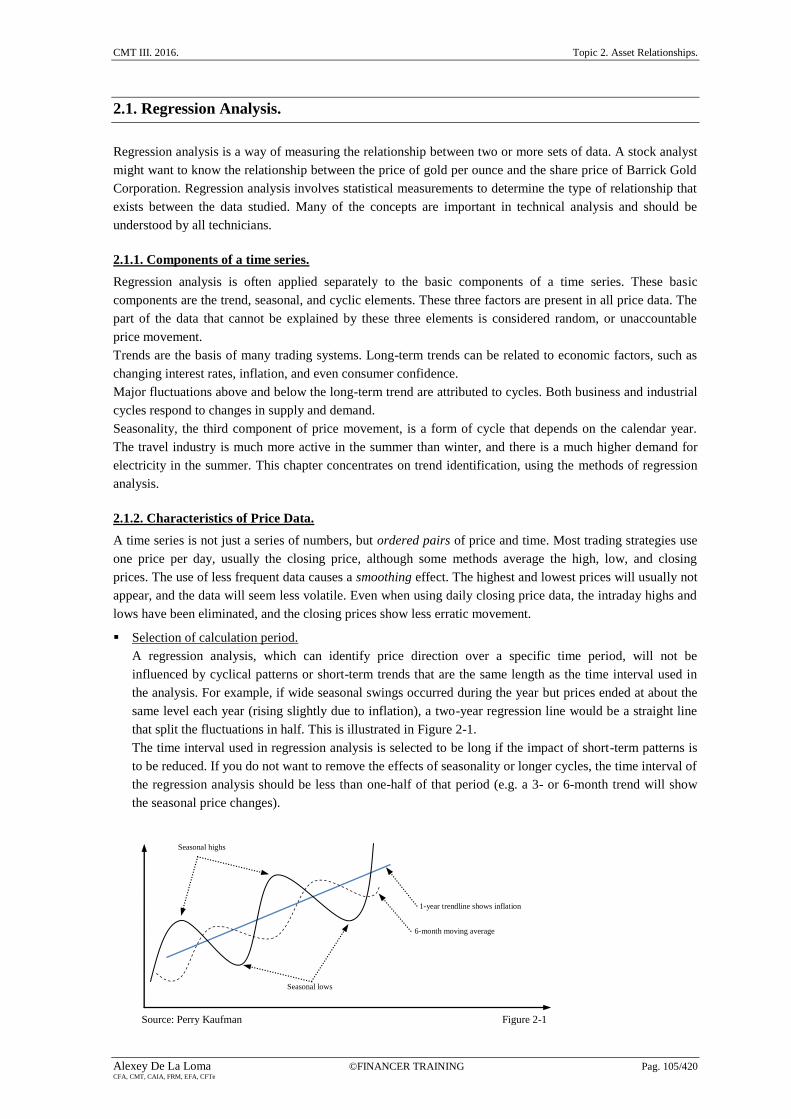
Selection of calculation period.
A regression analysis, which can identify price direction over a specific time period, will not be
influenced by cyclical patterns or short-term trends that are the same length as the time interval used in
the analysis. For example, if wide seasonal swings occurred during the year but prices ended at about the
same level each year (rising slightly due to inflation), a two-year regression line would be a straight line
that split the fluctuations in half. This is illustrated in Figure 2-1.
The time interval used in regression analysis is selected to be long if the impact of short-term patterns is
to be reduced. If you do not want to remove the effects of seasonality or longer cycles, the time interval of
the regression analysis should be less than one-half of that period (e.g. a 3- or 6-month trend will show
the seasonal price changes).
Source: Perry Kaufman Figure 2-1

Topic 2. Asset Relationships. CMT III. 2016.
Pag. 106/420 ©FINANCER TRAINING Alexey De La Loma CFA, CMT, CAIA, FRM, EFA, CFTe
2.1.3. Linear Regression
When most people talk about regression, they think about drawing a straight line through the center of some
period of price movement. But regression is a simple and powerful tool for explaining the relationship
between two time series. Those series may be two related stocks or futures or, in the case of a single time
series, the relationship between price and time series. At the end of this chapter, we will use the slope of a
linear regression applied to a single price series to create a trend trading method.
In this chapter we focus on explaining the price movement of one market by using another. Both are time
series, that is, they post a new price each day. We start with the linear relationship between two price series,
X and Y. A linear relationship will try to find the value of Y for each value of X using the formula for a
straight line, Y=aX+b, where a is the slope of the line, and b is the Y-intercept, the point where the line
crosses the Y axis when the value of X is zero. The linear regression is also called a straight-line fit or simply
a best fit.
Explaining, not predicting.
You may have noticed that we refer to explaining instead of predicting when talking about the regression
implications. We are finding the past relationship between two price series. The regression analysis may
establish what you see as a fair value for one market based on the price of the other. In order to forecast a
price, you will need to establish that conditions at the date of your forecast are likely to be the same as the
period over which the regression was calculated.
Calculating the best straight-line fit.
The simplest example of linear regression is the one used most often by traders, calculating the best
straight-line fit through a selected period of price movement. This is done in the same way as finding the
relationship between two price series, except that we will substitute the simple sequence 1, 2, 3, 4, …. for
the second series. The technique used is called the method of least squares. We choose ten days of price
movement in Wall-Mart during 2001 (Table 2-1). In order to find the best straight-line fit, we begin with
the equation for a straight line:
( 2.1)
In this equation, Y is the dependent variable because it is created from the value of X, the independent
variable. The slope, b, is the relative change in Y for every unit change in X. Therefore, if b=2 then Y
moves twice as fast as X. The Y-intercept, a, is an adjustment in the price level to bring X and Y into
alignment. It is also the point at which the straight line crosses the Y-axis when X=0.
Method of Least Squares.
The method of least squares finds the straight line which comes closest to all prices. To do this, calculate
the sum of the squares of all the differences between the price and the corresponding value of the straight
line and choose the line that has the smallest total deviation. The mathematical expression for this is:
( 2.2)
where,
S = the sum of the squares of the error at each of the ten points on the straight line (one
point for each price, designated by i = 1, 2, 3,…)
n = number of data points (10 in our example)
yi = one of the actual prices of Wal-Mart
ŷi= the estimated value of this price on the straight line (it is usually written with a hat)
yi – ŷ = the difference between the actual value of y at i and the predicted line value at ŷi
Graphically, the individual deviations, or errors, for the first four points may look like those in Figure 2-2.
Each actual data point is (1, y1), (2, y2), (3, y3),….., and the corresponding position on the straight line is
(1, ŷ1), (2, ŷ2), (3, ŷ3),….. The square of all (yi – ŷi) is always positive, thereby magnifying the importance

CMT III. 2016. Topic 2. Asset Relationships.
Alexey De La Loma ©FINANCER TRAINING Pag. 107/420 CFA, CMT, CAIA, FRM, EFA, CFTe
Approximation line
Approximated point Price
Actual point (observed)
Time
y1
y2
y3
y4 ŷ1
ŷ2 ŷ3
ŷ4
x1 x2 x3 x4
of those data points that are farther from the approximated line on either side and reducing the
significance of those points for which the approximation is good.
Source: Perry Kaufman Figure 2-2
To use the least-square method for solving the Wal-Mart time/price relationship, look for the solution to
the straight line Y=a+bX, expressed as:
( 2.3)
In order to solve these equations, construct a table where all of the individual expressions in the two
formulas can be calculated (Table 2-1). We can now substitute the values on the Sums line into the two
equations:
The equation for the least-squares approximation is
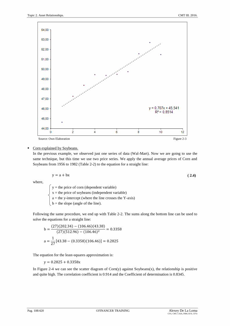
Selecting values for X and Y and solving for Y gives the results shown in the right column of Table 2-1
and drawn along with the original prices for Wal-Mart in Figure 2-3. The straight line approximation
increased by $0.707 per day and the approximation starts at $45.54, where X=0.
Dates
Wal-Mart
Price
Y
Sequence
Number
X X2 XY Y2
Straight
Line
Value
9/21/2001 44,66 1 1 44,66 1994,52 46,25
9/24/2001 47,28 2 4 94,56 2235,40 46,96 9/25/2001 48,40 3 9 145,20 2342,56 47,66
9/26/2001 49,48 4 16 197,92 2448,27 48,37
9/27/2001 49,39 5 25 246,95 2439,37 49,08 9/28/2001 49,50 6 36 297,00 2450,25 49,78
10/01/2001 49,76 7 49 348,32 2476,06 50,49
10/02/2001 51,60 8 64 412,80 2662,56 51,20 10/03/2001 52,73 9 81 474,57 2780,45 51,90
10/04/2001 51,50 10 100 515,00 2652,25 52,61
Sums 494,30 55,00 385,00 2776,98 24481,69
Source: Perry Kaufman Table 2-1
Topic 2. Asset Relationships. CMT III. 2016.
Pag. 108/420 ©FINANCER TRAINING Alexey De La Loma CFA, CMT, CAIA, FRM, EFA, CFTe
Source: Own Elaboration Figure 2-3
Corn explained by Soybeans.
In the previous example, we observed just one series of data (Wal-Mart). Now we are going to use the
same technique, but this time we use two price series. We apply the annual average prices of Corn and
Soybeans from 1956 to 1982 (Table 2-2) to the equation for a straight line:
( 2.4)
where,
y = the price of corn (dependent variable)
x = the price of soybeans (independent variable)
a = the y-intercept (where the line crosses the Y-axis)
b = the slope (angle of the line).
Following the same procedure, we end up with Table 2-2. The sums along the bottom line can be used to
solve the equations for a straight line:
The equation for the least-squares approximation is:
In Figure 2-4 we can see the scatter diagram of Corn(y) against Soybeans(x), the relationship is positive
and quite high. The correlation coefficient is 0.914 and the Coefficient of determination is 0.8345.

CMT III. 2016. Topic 2. Asset Relationships.
Alexey De La Loma ©FINANCER TRAINING Pag. 109/420 CFA, CMT, CAIA, FRM, EFA, CFTe
Source: Own Elaboration Figure 2-4
i
Corn
Yi
Soybeans
Xi Xi
2 XiYi Yi2
1956 1 1,27 2,43 5,90 3,09 1,61
1957 2 1,19 2,26 5,11 2,69 1,42
1958 3 1,10 2,15 4,62 2,37 1,21 1959 4 1,10 2,07 4,28 2,28 1,21
1960 5 1,05 2,03 4,12 2,13 1,10
1961 6 1,00 2,45 6,00 2,45 1,00 1962 7 0,98 2,36 5,57 2,31 0,96
1963 8 1,09 2,44 5,95 2,66 1,19
1964 9 1,12 2,52 6,35 2,82 1,25 1965 10 1,18 2,74 7,51 3,23 1,39
1966 11 1,16 2,98 8,88 3,46 1,35
1967 12 1,24 2,93 8,58 3,63 1,54 1968 13 1,03 2,69 7,24 2,77 1,06
1969 14 1,08 2,63 6,92 2,84 1,17
1970 15 1,15 2,63 6,92 3,02 1,32 1971 16 1,33 3,08 9,49 4,10 1,77
1972 17 1,08 3,24 10,50 3,50 1,17
1973 18 1,57 6,22 38,69 9,77 2,46 1974 19 2,55 6,12 37,45 15,61 6,50
1975 20 3,02 6,33 40,07 19,12 9,12
1976 21 2,54 4,92 24,21 12,50 6,45 1977 22 2,15 6,81 46,38 14,64 4,62
1978 23 2,02 5,88 34,57 11,88 4,08
1979 24 2,25 6,61 43,69 14,87 5,06 1980 25 2,52 6,28 39,44 15,83 6,35
1981 26 3,11 7,61 57,91 23,67 9,67
1982 27 2,50 6,05 36,60 15,13 6,25
Sums Σy
43,38
Σx
106,46
Σx2
512,96
ΣxΣy
202,34
Σy2
82,29
Source: Perry Kaufman Table 2-2
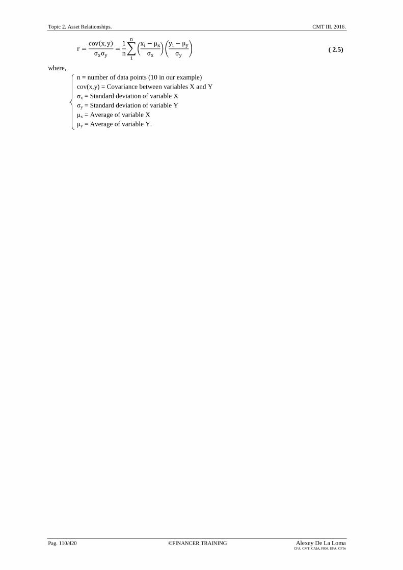
2.1.4. Linear Correlation.
In the previous sections we used price series that had a clear relationship; therefore, the results appeared
valid. The linear correlation, which produces a value called the coefficient of determination (R2), or the
correlation coefficient (r), expresses the strength of the relationship between the data and it can vary from -1
to +1. If R2 is less than about 0.20, then the linear regression has no practical value. To calculate the Pearson
Correlation Coefficient we use the following formula:
Topic 2. Asset Relationships. CMT III. 2016.
Pag. 110/420 ©FINANCER TRAINING Alexey De La Loma CFA, CMT, CAIA, FRM, EFA, CFTe
( 2.5)
where,
n = number of data points (10 in our example)
cov(x,y) = Covariance between variables X and Y
σx = Standard deviation of variable X
σy = Standard deviation of variable Y
μx = Average of variable X
μy = Average of variable Y.

CMT III. 2016. Topic 2. Asset Relationships.
Alexey De La Loma ©FINANCER TRAINING Pag. 111/420 CFA, CMT, CAIA, FRM, EFA, CFTe
In the following examples we can see the different values of r and their significance in a regression analysis
of two price series:
r > 0.
If r is positive, we have a positive linear correlation. The data points are
above and below a straight line going upward to the right. In Figure
2-5, r = 0.514.
Figure 2-5
r < 0.
If r is negative, we have a negative linear correlation. The data points
are above and below a straight line going downward to the right. In
Figure 2-6, r = - 0.634. This means that when one variable goes up, the
other goes down.
Figure 2-6
r = 0.
If the correlation coefficient is zero or near zero, we have no linear
correlation at all. In Figure 2-7, r = 0.03.
Figure 2-7
r = +1.
If r is equal to +1, a perfect positive correlation exists. The data points
are along a straight line going upward to the right. In Figure 2-8,
r = 0.98.
Figure 2-8
r = –1.
If r is equal to –1, a perfect negative correlation exists. The data points
are along a straight line going downward to the right. In Figure 2-9, r = –
0.98.
Figure 2-9
Forecasting using Regression.
A distinct advantage of regression analysis is that it allows the analyst to forecast price movement. In the
case of the linear regression, the forecast is simply an extension of the line. For example in the corn (y)
and soybeans (x) model, where the equation for the least-squares approximation is:

Topic 2. Asset Relationships. CMT III. 2016.
Pag. 112/420 ©FINANCER TRAINING Alexey De La Loma CFA, CMT, CAIA, FRM, EFA, CFTe
95% confidence interval
“Outliers” Price
Regression line
Time
If we have an estimation of soybeans with a value of 30, the forecast value of corn comes from:
Confidence Bands.
Regression analysis includes its own measure of accuracy called confidence bands. It is based on a
probability distribution of the errors in the fitted equation and the size of the data sample. Looking at
Figure 2-9, the straight line cannot touch all the points, but its “goodness of fit” may be measured by
using the standard deviation of the errors to determine the variance over the total number of data points
(n). If the actual data points are yi, their corresponding value on the fitted line ŷi and ei = yi– ŷi , then, the
standard deviation of errors is:
( 2.6)
Referring to the table of normal distribution, the 95% level is equivalent to 1.96 standard deviations.
Then, a confidence band of 95% placed around the forecast line, is written:
( 2.7)
( 2.8)
The points that are outside the band (Figure 2-10) are of particular interest and can be interpreted in two
ways:
They are not representative of normal price behavior and are expected to correct the levels within the
bands.
The model was not performed on representative or adequate data and should be reestimated.
Source: Perry Kaufman Figure 2-10
2.1.5. Nonlinear approximations of two variables.
The linear regression, also called a first-order equation, is the simplest way of finding the relationship
between two price series. It uses only one multiplier (the slope). By adding a third term, cx2, the
approximation can be made much more accurate. The third term, x2, allows the approximation to use a
parabolic curve. The fourth term, dx3, adds inflection. The general polynomial form that approximates any
curve is:
( 2.9)

CMT III. 2016. Topic 2. Asset Relationships.
Alexey De La Loma ©FINANCER TRAINING Pag. 113/420 CFA, CMT, CAIA, FRM, EFA, CFTe
Log
Price
Linear
Time
Exponential
Curvilinear
Price
The first two terms on the right side of the equal sign form the equation for a straight line (where a0 was
called a and a1 was called b). For most price forecasting, the second-order equation, also called curvilinear,
which uses three terms, is sufficient:
( 2.10)
2.1.6.Transforming nonlinear to linear.
Two curves that are often used to forecast prices are logarithmic and exponential. The exponential, curving
up, is used to scale price data that become more volatile at higher levels. Each of these forms can be easily
transformed into linear relationships and solved using the method of least squares. This will allow you to fool
the computer into solving a nonlinear problem using a linear regression tool. To solve the logarithmic
relationship, substitute ln x for x, ln a for a, and ln y for y.
2.1.7. Evaluation of two-variable techniques.
Of the three curve-fitting techniques, the curvilinear and exponential results are very similar, both curving
upward and passing through the main cluster of data points at about the same incline. The log approximation
curves downward after passing through the main group of data points at about the same place as the other
approximations. To evaluate objectively whether any of the nonlinear methods are a better fit than the linear
approximation, find the standard deviation of the errors, which gives a statistical measurement of how close
the fitted line comes to the original data points. In the example of Figure 2-11, the curvilinear approximation
is the best, and the logarithmic, which curves downward, is noticeably the worst.
Source: Perry Kaufman Figure 2-11
2.1.8. Multivariate approximations.
Regression analysis is most often used in complex economic models to find the combination of two or more
independent variables that best explain or forecast prices. A simple application of annual production and
distribution of soybeans will determine whether these factors are significant in determining the price of
soybeans. Applying the method of least squares which was used for a simple linear regression, the equation
for two independent variables is:
( 2.11)
where,
y = the resulting price, in this case soybeans
x1 = the total production (supply)
x2 = the total distribution (demand)
a, b, c = constants, or weighting factors, to be calculated
As in the linear approximation, the solution to this problem will be found by minimizing the sum of the
squares of the errors at each point:

Topic 2. Asset Relationships. CMT III. 2016.
Pag. 114/420 ©FINANCER TRAINING Alexey De La Loma CFA, CMT, CAIA, FRM, EFA, CFTe
( 2.12)
The solution to the multivariate problem of two independent variables x1 and x2 requires the following three
least-squares equations:
( 2.13)
( 2.14)
( 2.15)
If after calculating the sums, we obtain the following equations:
We just solve this three-variable system of three equations and the resulting multiple regression is:
( 2.16)
where,
x1 = the production of soybeans in billions of bushels.
x2 = demand in billions of bushels.
The coefficient of supply is much larger than the coefficient of demand, therefore it is the principal factor in
the determination of price.
2.1.9. Assumptions and nonparametric regression.
Correlation and regression analysis share some characteristics, such as the model assumptions, being linearity
the most relevant assumption in both cases. Although regression analysis can also be calculated as a
non-linear model, the most frequent models are the SLR (simple linear regression) and the MLR (multiple
linear regression). Linearity can be visually assessed by a simple inspection of the scatterplots.
Normality (Gaussian distribution) is another assumption that represents a problem especially when raw stock
or index prices are used, because if we apply log differences or percentage yields, normality is not a big
concern. Normality can be visually assessed by looking at frequency histograms, or it can be assessed
through statistical tests (normality tests), such as the Shapiro-Wilks W test or the Kolmogorov-Smirnov D
test. Finally, long-term tails problem can be partially solved by removing some of the most extreme outliers.
If we are interested in making no assumptions about the population distribution (normality), and relaxing the
assumption about linearity, we should use a nonparametric regression. Markos Katsanos recommends the
following two methods to perform a nonparametric regression:
Smoothing Splines.
This methodology minimizes the sum of squared residuals, adding a term in order to penalize the
roughness of the fit.
Kernel Regression.
This methodology is based on a class of algorithms called SVMs or Support Vector Machines, which are
closely related to neural networks. This method applies a Kernel function to find an optimal separating
hyperplane in order to separate two classes of patterns with maximal margin. This method is usually
preferred because it achieves a good performance in forecasting high noise and non-stationary financial
time series, even when dealing with a large number of inputs.

CMT III. 2016. Topic 2. Asset Relationships.
Alexey De La Loma ©FINANCER TRAINING Pag. 115/420 CFA, CMT, CAIA, FRM, EFA, CFTe
2.2. International Indices and Commodities.
When you study this chapter, do not forget that all statistics and characteristics of these indices are based on a
reading assignment published by Markos Katsanos in 2008, so some data could be outdated. Let us stats with
some definitions:
Performance Index.
All income from dividends and bonus distributions are reinvested into the index.
Capitalization-Weighted or market-value weighted Index.
It is a type of market index whose individual components are weighted according to their market
capitalization, so that larger components carry a larger percentage weighting.
Market Capitalization.
It is the total market value (in dollars, euros, etc) of all of a company's outstanding shares. Market
capitalization is calculated by multiplying a company's shares outstanding by the current market price of
each share.
2.2.1. The DAX Index (symbol: GDAXI).
This is the leading index of the Deutsche Börse, and it is composed by the 30 largest and most actively traded
German equities (blue chips). It is highly cyclical and the inclusions and exclusions are performed each
September by the Deutsche Börse. It is a performance and capitalization-weighted index. This index is used
as the underlying for futures (symbol: FDAX) and options in the Eurex Exchange from 8:00 to 22:00 CET.
The multiplier of the future contract is 25€ per index point, and futures are highly liquid with an average
volume of more than 200,000 contracts per day, according to Markos Katsanos. Although the DAX index is
the leading index of the Deutsche Börse, this market also calculates other indices:
MDAX.
It is based on the 50 largest companies from the classic sector of the Frankfurt Stock Exchange, that rank
below the DAX components in terms of market capitalization and trading volume.
TecDAX.
It is based on the 30 largest companies from the technology sector of the Frankfurt Stock Exchange, that
rank below the DAX components in terms of market capitalization and trading volume. It is equivalent to
the U.S. Nasdaq 100 index.
SDAX.
It is based on 50 shares (small caps) from the classic sector that rank directly below the MDAX in terms
of market capitalization and trading volume. It is equivalent to the U.S. Russell 2000 index.
HDAX.
It is based on the largest (large cap index) 110 German equities from all sectors of the economy. It is
equivalent to the U.S. Russell 1000 index.
LDAX.
It is a late index based on the price development of DAX index after the Xetra electronic-trading system
closes and it is based on the floor trading at the Frankfurt Stock Exchange. It is computed daily between
17:30 and 20:00 CET.
VDAX and VDAX-NEW.
These are DAX Volatility indices that track the implied volatility of the DAX index. The equivalent to the
CBOE volatility index (VIX). Volatility indices measure in percentage terms whether the DAX options
are selling above or below their fair values. The new volatility DAX index is based on options that are
both ATM (at the money) and OTM (out of the money), while the VDAX takes into account only ATM
options.

Topic 2. Asset Relationships. CMT III. 2016.
Pag. 116/420 ©FINANCER TRAINING Alexey De La Loma CFA, CMT, CAIA, FRM, EFA, CFTe
2.2.2. The CAC 40 Index (symbol: FCHI).
This is the leading index of the French market (Euronext Paris), and it is composed by the 40 largest and
most actively traded French equities (blue chips). The base value of this index was 1000 when it was born on
the 31st of December, 1987. The acronym CAC stands for Cotation Assitée en Continu (Continuous Assisted
Quotation).
It is a performance and capitalization-weighted index. However, since the 1st of December, 2003, CAC-40
index is no longer weighted by the total market capitalization of their component stocks but by their free float
adjusted market capitalization. This methodology is now applied to other major indices and it ensures greater
coherence with the real allocation of companies. It also limits the volatility caused by the difference between
the weight of a stock in the index, and the corresponding free float or available shares in the market. The
index composition (inclusions and exclusions) is reviewed quarterly and the maximum weight allowed for an
individual component is 15%.
This index is used as the underlying for futures and options in the MONEP Exchange (Euronext). The
multiplier of the CAC-40 future contract is 10€ per index point, and futures are highly liquid with an average
volume of more than 120,000 contracts per day, according to Markos Katsanos. MONEP also trades equity
options, and long- and short-term options.
2.2.3. The FTSE 100 Index.
This is the leading index of the British market, and it is composed by the 100 largest and most actively traded
equities on the LSE (London Stock Exchange). The FTSE, pronounced “footsie”, was born on the 3rd
of
January, 1984. It is a performance and capitalization-weighted index, and it is very sensitive to oil prices. The
index composition is reviewed quarterly and it is maintained by the FTSE Group, a now independent
company which originated as a joint venture between the Financial Times and the LSE. Remember that the
acronym FTSE stands for Financial Times Stock Exchange. This index is used as the underlying for futures
and options in LIFFE (London International Futures & Options Exchange).
2.2.4. The Dow Jones Stoxx 50 (STXX50) and the Euro Stoxx 50 (STOXX50E or ESTX50).
The Dow Jones Stoxx 50 is composed by the 50 most actively traded stocks in the pan-European area, while
the Dow Jones Euro Stoxx 50 tracks the 50 most actively traded stocks in the Euro Zone (Austria, Belgium,
Finland, France, Germany, Greece, Ireland, Italy, Luxembourg, the Netherlands, Portugal and Spain). Both
are market-value weighted indices and both have actively traded futures that trade at the Eurex (DTB) market
from 8:00 to 22:10 CET. The base value of the DJ Euro Stoxx 50 index was 1000 when it was born on the
31st of December, 1991. This index uses the free float to determine the market capitalization of its
components.
2.2.5. The Nikkei 225 Index.
This is the leading index of the Japanese market, and it is composed by the 225 largest and most liquid
Japanese equities traded in the Tokyo Stock Exchange (TSE). It is not a market capitalization index, but a
price-weighted index whose components are reviewed once a year. A price-weighted index is similar to a
simple average but the divisor is adjusted to maintain continuity and to reduce the effect of external factors
not directly related to the market. The denominator is, for example, adjusted by splits.
The Nikkei index reached its all-time high on the 29th
of December, 1989, and from this top it has dropped
down more than 80%. This top index level was achieved due to an impressive real estate bubble. This index
is used as the underlying for futures and options in Osaka, and in the Chicago Mercantile Exchange (CME).
2.2.6. The Hang Seng Index (HSI).
This is the leading index of the Stock Exchange of Hong Kong (SEHK). This index was born on the 24th
of
November, 1969, and Hang Seng futures trade in the Hong Kong Futures Exchange since 1986, with a
multiplier of HKD 50 per index point, while mini contracts have a multiplier of HKD 10.

CMT III. 2016. Topic 2. Asset Relationships.
Alexey De La Loma ©FINANCER TRAINING Pag. 117/420 CFA, CMT, CAIA, FRM, EFA, CFTe
2.2.7. The uptick rule in the U.S. equity markets.
The uptick rule, a regulation prohibiting equity short sales following downticks, was created after the 1929
stock market crash in order to increase downward momentum in bear markets. The rule tries to avoid sharp
declines requiring every short sale to be executed only on a higher price than a previous trade (uptick). This
rule was in effect from 1929 to 2007 (78 years), when the Securities and Exchange Commission (SEC)
removed it.
2.2.8. The Dollar Index.
This index indicates the international value of the U.S. Dollar in terms of its more relevant partners, by
averaging the exchange rates between the USD and six major world currencies: EUR, JPY, GBP, CAD, SEK,
and CHF, according to a geometric weighted average, in which the power of each currency represents its
weight into the final value, and each currency is expressed in U.S. dollars (USD). Therefore, the Dollar Index
represents the value of the USD against a basket of six currencies. The constant of this equation
(50.14348112) was introduced when the index was born in order to start with a 100 base value in 1973, when
the world’s major trading nations abandoned the 25-year-old Bretton Woods agreement to fix their currency
rates:
( 2.17)
where,
USDI = US Dollar Index
EUR = Euro (57.6%).
JPY = Japanese Yen (13.6%).
GBP = Great Britain Pound (11.9%).
CAD = Canadian Dollar (9.1%).
SEK = Swedish Krona (4.2%).
CHF = Swiss franc (3.6%).
0.576 + 0.136 + 0.119 + 0.091 + 0.042 + 0.036 = 1.00
If we want to express the JPY, the CAD, the SEK, and the CHF in their more familiar format in JPY per
USD, in CAD per USD, in SEK per USD, and in CHF per USD, we just have to change the sign of the
exponents.
( 2.18)
Dollar Index derivatives started trading in the NYBOT (New York Board of Trade), and this exchange was
then bought by the Intercontinental Exchange or ICE. The future multiplier is $1,000 per index point. The
Dollar Index is a crucial element when intermarket relationships (currencies, fixed income, equities,
commodities, etc) are analyzed, because the U.S. Dollar plays a key role in the current configuration of
international financial markets. According to Markos Katsanos, the more relevant factors affecting the Dollar
Index are:
The U.S. trade deficit.
The U.S., Japanese, Canadian, and European interest rate and bond yields.
CPI inflation.
Quarterly Gross Domestic Product (GDP).
Non-farm payroll.
2.2.9. Oil indices: XOI and OIX.
In the last decades, oil has become a predominant commodity, such as gold or natural gas. The never-ending
increasing demand, especially by China and India has caused oil price to rise dramatically, and some analysts
try to determine when the world crude productivity will start to decline, leading us to a permanent oil shock
era.

Topic 2. Asset Relationships. CMT III. 2016.
Pag. 118/420 ©FINANCER TRAINING Alexey De La Loma CFA, CMT, CAIA, FRM, EFA, CFTe
The most popular indices to measure oil prices are the AMEX oil index (XOI) and the CBOE oil index
(OIX). According to Markos Katsanos, XOI is slightly preferred to OIX. Both indices are price weighted and
based on a basket of widely-held corporations (e.g., Apache, Exxon Mobil, Total, British Petroleum, etc)
involved in the exploration, production, and development of petroleum.
XOI was established with a base value of 125 on the 27th
of August, 1984, and it is made up of 12 component
companies, with a great range of market capitalizations, and this is cause of its main disadvantage. As each
price-weighted index (e.g., DJIA, DJUA, DJTA, etc), shares with the higher prices are over-weighted, while
shares with lower prices are under-weighted, independently of their market capitalization (true value). It is
worth noting that share prices are meaningless, and a company of any size can have whatever share price
range it wants by splitting or reverse-splitting its stock.
2.2.10. The CRB (Commodity Research Bureau) Index.
This is an index based on a basket of commodities, so it is ideal to follow commodity prices as an asset class.
Since its creation, as the commodity markets evolved, it has changed its composition and its name
periodically. Let us show the evolution of this well-known commodity index.
The CRB was created by the Commodity Research Bureau in 1957, taking the prices of 28 commodities. In
1987, the basket was reduced to 21 items. In 1995, the basket was again reduced to 17 items. From the
original 28 items included in 1957, the commodities eliminated were those that lost its relevance, such as
onions, rye or potatoes. In 2005 three new commodities were added: unleaded gas, aluminum, and nickel,
and the calculation methodology also changed from a geometric average to a weighting arithmetic average in
order to better reflect the commodity prices in a more volatile environment. By its very mathematical nature,
geometric averaging continually rebalanced the index, decreasing exposure to rising commodities and
increasing exposure to declining commodities. As an example of the different weights, the weight of crude
oil is 23 times larger than orange juice or hogs, and 4.6 times larger than sugar’s weight. When this reading
assignment was published, the RJ/CRB Index has the following composition:
Metals: 20%.
Energy: 39%.
Tropicals: 21%.
Meats: 7%.
Grains: 13%.
In relation to its name, in 2001 it was changed from CRB Index to Reuters CRB Index, and it changed again,
in 2001, to Reuters/Jefferies CRB Index (RJ/CRB). This index is truly relevant because commodities are
excellent to diversify a traditional fixed-income or equity portfolio.
From an individual perspective, a long- position in commodities provides hedging against inflation and dollar
depreciation, and it also provides additional returns from commodity price appreciation. From a portfolio
perspective, commodities help to achieve desirable long-term results, and to reduce the overall volatility of
their portfolio. In order to help traders and portfolio managers to hold a position in this index, the NYBOT
(New York Board of Trade) offers a future contract with a price multiplier of $200 per index point.
Finally, to conclude this section it is worth noting that Reuters/Jefferies CRB Index has been recognized as
the most relevant barometer for commodity prices, and it is now accepted globally as a standard for tracking
commodity future prices.
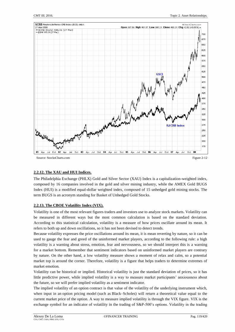
2.2.11. The GSCI (Goldman Sachs Commodity Index).
This is another commodity index, created by Goldman Sachs in 1991, and it is composed by 24 items. The
principal difference between GSCI and CRB is that GSCI is heavily weighted in energy futures contracts,
with a 72.5% compared with only 39% in the CRB Index. This overweight in energy, especially crude oil,
explains the exponential growth of GSCI when comparing both commodity indices, as we do in Figure 2-12.
Take note that having an excessive weight in a predetermined sector is not necessarily an advantage, because
it limits the diversification into other commodities which is especially beneficial in periods of declining oil
prices.
CMT III. 2016. Topic 2. Asset Relationships.
Alexey De La Loma ©FINANCER TRAINING Pag. 119/420 CFA, CMT, CAIA, FRM, EFA, CFTe
Source: StocksCharts.com Figure 2-12
2.2.12. The XAU and HUI Indices.
The Philadelphia Exchange (PHLX) Gold and Silver Sector (XAU) Index is a capitalization-weighted index,
composed by 16 companies involved in the gold and silver mining industry, while the AMEX Gold BUGS
Index (HUI) is a modified equal-dollar weighted index, composed of 15 unhedged gold mining stocks. The
term BUGS is an acronym standing for Basket of Unhedged Gold Stocks.
2.2.13. The CBOE Volatility Index (VIX).
Volatility is one of the most relevant figures traders and investors use to analyze stock markets. Volatility can
be measured in different ways but the most common calculation is based on the standard deviation.
According to this statistical calculation, volatility is a measure of how prices oscillate around its mean. It
refers to both up and down oscillations, so it has not been devised to detect trends.
Because volatility expresses the price oscillations around its mean, it is mean reverting by nature, so it can be
used to gauge the fear and greed of the uninformed market players, according to the following rule: a high
volatility is a warning about stress, emotion, fear and nervousness, so we should interpret this is a warning
for a market bottom. Remember that sentiment indicators based on uninformed market players are contrary
by nature. On the other hand, a low volatility measure shows a moment of relax and calm, so a potential
market top is around the corner. Therefore, volatility is a figure that helps traders to determine extremes of
market emotion.
Volatility can be historical or implied. Historical volatility is just the standard deviation of prices, so it has
little predictive power, while implied volatility is a way to measure market participants’ anxiousness about
the future, so we will prefer implied volatility as a sentiment indicator.
The implied volatility of an option contract is that value of the volatility of the underlying instrument which,
when input in an option pricing model (such as Black–Scholes) will return a theoretical value equal to the
current market price of the option. A way to measure implied volatility is through the VIX figure. VIX is the
exchange symbol for an indicator of volatility in the trading of S&P-500’s options. Volatility in the trading
Topic 2. Asset Relationships. CMT III. 2016.
Pag. 120/420 ©FINANCER TRAINING Alexey De La Loma CFA, CMT, CAIA, FRM, EFA, CFTe
options of the NASDAQ composite and the S&P-100 Index are represented by VXN and VXO, respectively.
VIX, VXN and VXO are traded on the CBOE. Additionally, the VXD tracks the volatility of the DJIA (Dow
Jones Industrial Average).
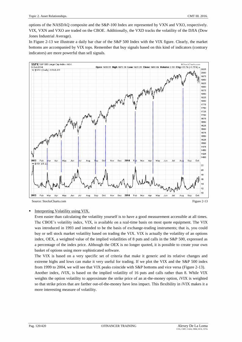
In Figure 2-13 we illustrate a daily bar char of the S&P 500 Index with the VIX figure. Clearly, the market
bottoms are accompanied by VIX tops. Remember that buy signals based on this kind of indicators (contrary
indicators) are more powerful than sell signals.
Source: StocksCharts.com Figure 2-13
Interpreting Volatility using VIX.
Even easier than calculating the volatility yourself is to have a good measurement accessible at all times.
The CBOE’s volatility index, VIX, is available on a real-time basis on most quote equipment. The VIX
was introduced in 1993 and intended to be the basis of exchange-trading instruments; that is, you could
buy or sell stock market volatility based on trading the VIX. VIX is actually the volatility of an options
index, OEX, a weighted value of the implied volatilities of 8 puts and calls in the S&P 500, expressed as
a percentage of the index price. Although the OEX is no longer quoted, it is possible to create your own
basket of options using more sophisticated software.
The VIX is based on a very specific set of criteria that make it generic and its relative changes and
extreme highs and lows can make it very useful for trading. If we plot the VIX and the S&P 500 index
from 1999 to 2004, we will see that VIX peaks coincide with S&P bottoms and vice versa (Figure 2-13).
Another index, iVIX, is based on the implied volatility of 16 puts and calls rather than 8. While VIX
weights the option volatility to approximate the strike price of an at-the-money option, iVIX is weighted
so that strike prices that are farther out-of-the-money have less impact. This flexibility in iVIX makes it a
more interesting measure of volatility.

CMT III. 2016. Topic 2. Asset Relationships.
Alexey De La Loma ©FINANCER TRAINING Pag. 121/420 CFA, CMT, CAIA, FRM, EFA, CFTe
2.3. The S&P 500.
In this chapter, Markos Katsanos starts to study intermarket analysis using the most relevant U.S. equity
index, that is, the S&P 500. Evidently, intermarket analysis relies on the premise that previous relationships
will not suffer a severe change in the future, so before making any conclusion it is necessary to determine
whether the correlation coefficient is stable over time. Markets may decouple and a strategy based on a false
assumption might produce a considerable drawdown.
2.3.1. Correlation between the S&P 500 and the international indices.
Before applying a correlation or a regression analysis to two markets, it is necessary to determine the
timeframe of both price series: intraday, daily, weekly, monthly, quarterly, or even annually. The use of
long-term timeframes has the advantage of avoiding windowing error and daily noise (remember that in any
financial time series, the shorter the timeframe the higher the noise). In the empirical tests conducted by
Markos Katsanos in this chapter, correlations rise relevantly when weekly returns replace daily data. The
author conducts nonparametric (Spearman) price correlations between a set of international indices (e.g.,
DJIA, DAX, CAC, Hang-Seng, FTSE, TSX, etc) and the S&P 500 using daily prices and daily percentages
from CSI Data. A different number of years is considered to compare the evolution of the correlation
measure (e.g., 2, 4, 5, 10 and 15 years), so both short-term and long-term relationships are analyzed by
Katsanos.
It is worth noting that a correlation matrix among international indices should be analyzed with extraordinary
care, especially the long-term price correlations, because some of the relationships could be nonlinear.
Because of this, Markos Katsanos always recommends to check a scatterplot or a chart of the related index
before making any significant investment decision based on the figures included in a correlation matrix. An
example of a scatterplot can be found in Figure 2-3.
In order to analyze the evolution of correlations over time, the correlations are calculated, yearly, taking daily
time series from CSI Data. Therefore, if a 16-year period (1992-2007) is analyzed, we have 16 correlations to
see how relationships evolve. Then, Katsanos calculate the average, mean, standard deviation and the
maximum range (highest minus lowest correlation value over each time span) to have a better understanding
of this evolution. However, the standard deviation may not be the best measure of variance as most value
were concentrated at the far right of the histogram (negative skew) making the correlation distribution to
deviate from the Normal or Gaussian distribution. In order to solve this limitation, Markos Katsanos divided
the yearly correlations in percentiles, so, for example, if the 10% percentile of the correlations between the
S&P 500 and the DJIA is 0.61 it means that only 10% of the yearly correlations were below 0.61.
Conclusions about the S&P 500 versus international indices correlation:
The correlation is more stable with high capitalization indices, such as the DJIA or the FTSE, and less
stable with small capitalization indices, such as the Russell 2000.
The correlation is less volatile with European indices, than it is with U.S. indices
The correlations are highly erratic when yearly time segments, over the 16-year study, are considered.
The most and the less unstable correlations correspond to the Nikkei and the FTSE indices,
respectively.
The impact of globalization and free money flow across national borders has caused an increase in
correlations, and this is illustrated in the higher numbers shown in short-term periods (e.g., last 2 years
or last 4 years) when compared to longer-term periods (e.g. last 10 years or last 15 years).
Correlations among the S&P 500 and all non-US indices decrease when using daily percentage yields
instead of prices, and this is partially caused by differences in time zones. This is also a problem when
calculating actual real-time correlations.
How to estimate future correlations?
Instead of taking the historical value of a correlation as a way to predict future correlations, Marko
Katsanos recommends adjusting the correlation coefficient by the trend or rate of change of the

Topic 2. Asset Relationships. CMT III. 2016.
Pag. 122/420 ©FINANCER TRAINING Alexey De La Loma CFA, CMT, CAIA, FRM, EFA, CFTe
correlation during the most recent 5-year period. The goal of this adjustment is to take into account the
most recent trend.
2.3.2. Interest rates, commodities, Forex, and the VIX index.
Technical analysts and traders have always used interest rates as a relevant factor in equity markets
evolution. One way to estimate future correlation is just based on taking historical correlations. However, in
terms of interest rates, this method has experienced some empirical problems. During the 20th
century,
interest rates and stock prices experienced negative correlation, and this was illustrated by the old saying
“Don’t fight the Fed”. This maxim suggests buying (selling) stocks when the Fed starts to lower (raise)
interest rates. However, an investor who followed this analysis and bought stocks when the Fed started
lowering interest rates in 2001, and again in August 2007, would have suffered severe losses. Figure 2-14
illustrates the comparison between the S&P 500 index (solid thick line) and the 10 year T-Note yield (solid
thin line) weekly time series, and it also shows the 18-week correlation (bottom chart) between both series. In
this figure we can see how the correlation coefficient changed with the new century, from negative to
positive values (this is illustrated with two ovals, one before 2000, and the other after 2000).
Source: StocksCharts.com Figure 2-14
When searching for factors that affect price correlations, we might look for market corrections, uncertainties
or perceived risks. This is illustrated in Figure 2-14 when the 1987 crash, the 1997 Asian financial crisis, and
the 1999 LTCM financial crisis produced sharp declines in stock prices and subsequent rallies in bonds, as
investors fled to safety. These extreme events (shaded in grey) resulted in negative correlation between
stocks and bonds, that is, positive correlation between stock prices and bond yields. Additionally to
recessions or price shocks, inflation expectations or rising commodity prices also cause correlation reversals
because rising inflation is negative for bonds and therefore positive for yields. This fluctuation of correlations
can also be seen when comparing the S&P 500 index with currencies (JPY) and commodities (CRB Index).
This is illustrated in Figure 2-15 and in Figure 2-16, where the S&P 500 index (solid thick line) is compared

CMT III. 2016. Topic 2. Asset Relationships.
Alexey De La Loma ©FINANCER TRAINING Pag. 123/420 CFA, CMT, CAIA, FRM, EFA, CFTe
to the JPYUSD and to the CRB Index, both in solid thin line. The timeframe is weekly, and the fluctuations
of correlation are represented with a vertical line.
Source: StocksCharts.com Figure 2-15
Source: StocksCharts.com Figure 2-16

Topic 2. Asset Relationships. CMT III. 2016.
Pag. 124/420 ©FINANCER TRAINING Alexey De La Loma CFA, CMT, CAIA, FRM, EFA, CFTe
2.4. European Indices.
2.4.1. The DAX-30.
Correlation with international indices, especially U.S. equity indices.
Trading DAX futures has now become very popular among US and Australian traders due to the
following three advantages: (1) it is a liquid market, (2) it adds currency diversification, and (3) it offers a
wider range of trading times. The German futures market (Eurex) is open 14 hours a day from 8:00 to
22:00 CET (02:00 – 16:00 US). When analyzing a correlation matrix between DAX and major
international indices, forex, and commodities, the highest values correspond to the Euro Stoxx 50 in first
place, and the CAC 40 index in second place. The DAX and the Euro Stoxx 50 share some stocks so their
correlation is not a big surprise. If we are interested in comparing American indices with the DAX index,
in order to predict the DAX movements, we have two options: (1) we can shift back one day the
American indices because all American exchanges close four and a half hours later than DAX, or (2) we
can correlate the DAX opening price with the previous day’s closing price of the corresponding American
index. Both alternatives can also be applied to other international indices (American, European or Asian
indices).
Correlation with U.S. stocks.
When correlations are applied to individual U.S. stocks, the analysis concludes that the DAX-30 index
shows the highest positive correlation with interest rate sensitive groups, such as Utilities, Financials, and
Building Material stocks.
Correlation with European Futures.
European indices futures trade long after the closing of equity trading in their corresponding exchanges
(cash indices), so a more realistic correlation should be established between the European index future
with the corresponding U.S. future, instead of using the indices. For example, the correlation between the
DAX and the S&P index increased from 0.13 to 0.55, when the future of the S&P 500 was used instead of
the cash index.

CMT III. 2016. Topic 2. Asset Relationships.
Alexey De La Loma ©FINANCER TRAINING Pag. 125/420 CFA, CMT, CAIA, FRM, EFA, CFTe
2.4.2. The time factor.
According to the correlations matrix among international indices, the correlation of weekly percentage yields
is stronger than the corresponding daily one; but what about higher timeframes? Markos Katsanos calculates
the Pearson’s correlation coefficient of percentage yields for time intervals ranging from 1 to 100 days
between DAX and S&P e-mini futures and plots the results. The graphical representation shows an
exponential movement for the first 5-day period. Then it makes a short-term peak at the 10-day increment,
decreases slightly, and then increases very slightly to level off at 75 days. Therefore a time increment of five
to ten days, when dealing with percentage differences, might be the optimum to use when creating a
intermarket trading strategy for the short and medium term. Figure 2-17 shows the correlation variation for
time intervals ranging from 1 to 100 days of percent yields between DAX and S&P futures for the 5-year
period from the 1st of July, 2002 to the 30
th of June, 2007.
According to Markos Katsanos, the correlation of intraday percentage changes follows a similar pattern to the
daily yields of Figure 2-17. For example, the correlation between the DAX and the Euro Stoxx 50 improved
exponentially for the first 10-min period, made a short-term peak at the 75-min increment, making only
marginal improvements for the next 200 minutes.
Source: Markos Katsanos Figure 2-17

Topic 2. Asset Relationships. CMT III. 2016.
Pag. 126/420 ©FINANCER TRAINING Alexey De La Loma CFA, CMT, CAIA, FRM, EFA, CFTe
2.5. Gold.
Gold as a commodity has experienced an incredible bull market from to 2002 to 2012 (Figure 2-18) and one
of the reasons of this exponential movement is that gold is much more accessible for ordinary investors. In
previous decades the minimum amount needed to buy a gold bullion was $1 million. Additionally, buying
gold coins or jewelry were not the solution because of the storing and reselling inconveniences. Although
gold futures can be traded on the New York Commodities Exchange (COMEX), futures are not a popular
security among ordinary investors. The popularity of gold as an investment changed with the arrival of
exchange-traded funds (ETFs). Investors can buy and sell shares of SPDR Gold Trust (ETF), each share
represents one-tenth of an ounce of gold, and the shares are highly liquid.
Generally, Gold has a good performance in times of increasing inflation, a weak dollar or financial
turbulences. However, is it a good long-term investment? As we can see in Figure 2-18 (monthly line chart
from 1980 to 2015 showing Gold in a solid thick line and the S&P 500 in solid thin line), Gold peaked in
1980 and it was in a continuous bear market until 2002, and that is a long-term trend of more than 20 years.
Evidently, if inflation is considered, results are even worse, especially if we compare an investment in gold
with an investment in U.S. equities (S&P-500)
Therefore, investing in stocks is usually a better hedge against inflation over the long term because
companies raise prices when inflation goes up, and growing productivity also helps stock prices keep ahead
of inflation, and this is not the case with gold. Another reason for this limited gold long-term performance is
based on the fundamental law of supply and demand. Commodities that are used in industry should be
continuously replenished, and this is not the case with gold, that stays in the market.
Positive factors affecting the price of gold: expansionary policy, the USD, negative interest rates in the
US, inflation, and high commodity prices.
Negative factors affecting the price of gold: central Bank selling which can affect gold in the short term.
Source: StockCharts.com Figure 2-18

CMT III. 2016. Topic 2. Asset Relationships.
Alexey De La Loma ©FINANCER TRAINING Pag. 127/420 CFA, CMT, CAIA, FRM, EFA, CFTe
2.5.1. Correlations with equities and commodities.
A visual inspection of Figure 2-18 shows that gold and equities are usually uncorrelated, except for relatively
short periods (2003-2008 or 2009-2012). Take note that more than 35 years are illustrated in this figure, so a
5-year period can be considered as relatively short. According to Markos Katsanos, the positive correlation
that started in 2003 was due to external reasons, such as the heavy decline of the dollar, a raising inflation,
and the bull market in the rest of the commodities. So this positive correlation only happened by chance, and
we should expect both markets to be uncorrelated, as it is the case in the last 4 years (2011-2015).
Gold and Silver have always been positively correlated markets, so their prices move in the same direction.
Because they have the same fundamentals, the price of one does not move in a particular direction because
the other market is moving the same way. Although they move in the same direction, short-term market
inefficiencies can be found and exploited between these two metals.
Another important factor explaining the gold behavior is the U.S. dollar. As this commodity is denominated
in the U.S. currency, gold is affected by the Fed monetary policy. As an example, because of the
expansionary monetary policy followed by the Fed in 2004, gold broke out from historical prices to develop a
new 10-year top. It is worth noting that gold, unlike paper money, cannot be printed.
Another example of the close relationship between gold and US dollar is represented when comparing gold
denominated in USD with gold denominated in euros from 2002 to 2005. In this period, the first experienced
a strong uptrend, while the second moved in a sideways range. The gold in US dollars experienced an
uptrend caused by the USD bear market, not because of a real bull market in gold. This is represented in
Figure 2-19. As a little review of the correlation coefficients showed by Markos Katsanos, gold is positively
correlated with the CRB Index ( = 0.63), with silver ( = 0.82), and with crude oil ( = 0.41), and
negatively correlated with the Dollar Index ( = -0.55).
Source: StockCharts.com Figure 2-19
To conclude with this session, do not forget that all commodities are subject to seasonal changes, and gold is
not an exception. Demand for gold is driven principally by the jewellery industry, and this demand is

Topic 2. Asset Relationships. CMT III. 2016.
Pag. 128/420 ©FINANCER TRAINING Alexey De La Loma CFA, CMT, CAIA, FRM, EFA, CFTe
especially strong from September to December, prior to the Christmas time. This recurrence in ups and
downs repeat regularly except when external factors, such as the weakness of the dollar (Figure 2-19).
2.5.2. Leading or lagging?
In this section Markos Katsanos introduces an interesting discussion about whether gold prices are leading or
lagging other related commodities. A visual inspection of charts is not enough to make a clear conclusion.
Looking at the charts reveals that gold sometimes lead and sometimes lag other correlated commodities. In
order to solve this question, Markos Katsanos shift gold yields one to ten days forward and up (positive
values) to ten days back in time (negative values). This is done to infer which commodities have stronger
leading or lagging correlations with gold, with the final goal of predicting future movements. Keep in mind
that this analysis is only appropriate for the short term (10 days or less).
The Philadelphia Exchange (PHLX) Gold and Silver Sector (XAU) Index.
According to the lag analysis, the XAU is leading gold for both weekly and daily yields. The weekly
yield weighted average of 10-day leading correlations was 0.29, while the lagging correlation was 0.15.
This study showed a strong positive correlation between the XAU and gold for both weekly ( =0.68) and
daily ( =0.62) yields. John Murphy also mentions a long-term lead of gold stocks over gold bullion in
his book Trading with Intermarket Analysis.
The Dollar Index.
There is a weak negative correlation when daily percent differences (yields) were used, while this
negative correlation increased when raw prices were used. It seems evident that, as gold is denominated
in US dollars, it should lag the dollar. However, this initial impression was only confirmed by the first
two days of the lag, and then gold took the lead.
Silver.
This commodity had the second best correlation of weekly and daily yields, the first correlation
corresponds to the XAU. Silver moves more or less coincidentally with gold.
Canada’s Venture Index.
This index had the best coincident correlation based on raw prices ( =0.965). The Venture Index leads
gold prices.
The CRB Index.
This commodity index had the worst positive coincident correlation for both weekly and daily yields, so
no significant lead or lag was detected.
According to this analysis, gold prices either lag or move with other commodities. Therefore, the best way to
trade this relationship is using related markets to forecast gold prices, and not the other way around.
2.5.3. Which timeframe should we use to calculate the percentage changes?
When using raw price data to determine statistical metrics, such as correlations or regression, we encounter
two drawbacks:
Financial market prices do not follow a normal or Gaussian distribution.
Relationships between markets are not linear.
In order to sort it out both problems, we have to calculate price differences or percentage changes, but what is
the optimal timeframe to calculate these percentages? Markos Katsanos calculates the Pearson correlation
coefficient between gold and the Dollar Index, and between gold and the XAU Index making the following
conclusion: The pattern is similar for both assets, and a period of 9 days could be used when designing a
short to medium term intermarket trading strategy.

CMT III. 2016. Topic 2. Asset Relationships.
Alexey De La Loma ©FINANCER TRAINING Pag. 129/420 CFA, CMT, CAIA, FRM, EFA, CFTe
2.6. Intraday Correlations.
Up until now we have focused on daily and weekly yields to calculate correlation coefficients. However, if
you are a daytrader or a scalper, these timeframes are too long. In order to detect intraday relationships,
Markos Katsanos calculates correlations among the e-min S&P 500 futures and the DAX, Euro Stoxx 50,
and e-mini Dow futures for a wide range of intraday timeframes (from 5min to 1500-min). The results are
illustrated in Table 2-3 and in Figure 2-20, where we can see how correlations increase exponentially up to a
certain increment (about 75-min) when it suddenly starts to move horizontally.
Timeframe (minutes) Euro Stoxx 50 DAX 30 DJIA
5 0.725 0.724 0.614
10 0.750 0.741 0.655
15 0.767 0.754 0.667
20 0.779 0.763 0.679
25 0.783 0.768 0.683
30 0.788 0.774 0.690
35 0.782 0.78 0.694
40 0.776 0.782 0.696
45 0.780 0.787 0.700
50 0.783 0.789 0.703
55 0.787 0.793 0.706
60 0.785 0.797 0.707
65 0.786 0.802 0.724
70 0.788 0.807 0.737
75 0.788 0.810 0.750
80 0.788 0.812 0.761
85 0.788 0.813 0.771
90 0.787 0.814 0.779
95 0.786 0.815 0.787
100 0.785 0.816 0.794
125 0.785 0.823 0.818
150 0.786 0.830 0.830
200 0.783 0.836 0.851
250 0.780 0.842 0.868
375 0.778 0.850 0.889
500 0.786 0.862 0.902
750 0.812 0.884 0.913
1000 0.830 0.897 0.921
1250 0.831 0.900 0.925
1500 0.842 0.910 0.928
Source: Markos Katsanos. Table 2-3

Topic 2. Asset Relationships. CMT III. 2016.
Pag. 130/420 ©FINANCER TRAINING Alexey De La Loma CFA, CMT, CAIA, FRM, EFA, CFTe
Source: Markos Katsanos Figure 2-20
These are the equations related to the relationship between DAX-30 and the e-mini S&P-500:
( 2.19 )
( 2.20 )
where
ri = Pearson’s intraday correlation coefficient for time interval i.
rj = Pearson’s intraday correlation coefficient for time interval j.
T = time in minutes
For example, the estimation of the 60-min correlation between DAX-30 and the e-mini S&P-500 futures is
based on the first equation:
Additionally, if we are interested in converting correlations between intraday timeframes, that is, if we know
that the 15-min correlation between DAX-30 and the e-mini S&P-500 futures is 0.754, the corresponding
60-min correlation coefficient is based on the second equation:

CMT III. 2016. Topic 2. Asset Relationships.
Alexey De La Loma ©FINANCER TRAINING Pag. 131/420 CFA, CMT, CAIA, FRM, EFA, CFTe
Which timeframe is optimal?.
According to Table 2-3 and to Figure 2-20, Markos Katsanos infer the following conclusions when
choosing the best time span for calculating percentage yields in a trading strategy or indicator:
Surprisingly, the S&P-500 correlated better with the European futures than with the US index (DJIA),
but only for shorter time segments up to 35minutes of yields.
Correlations between the S&P-500 and the European futures peaked between 30- and 35-min yields
and this is probably the best value to use for short-term predictions.
The e-mini S&P-500 correlated better with the Euro Stoxx 50 for very short yields (up to 35 minutes),
with the DAX-30 for medium (40- to 150-min) yields and with DJIA for longer term (over 150-min).
The correlation coefficient between the e-mini S&P-500 and the Euro Stoxx 50 futures improved only
by 7% for longer than 30-min yields, where the correlation with the DJIA futures improved by more
than 30%. Therefore, it a trader is developing a system based on the correlation between the DJIA and
the S&P, it is better to use longer timeframes.
Leading or lagging?
When dealing with a correlation coefficient analysis, the goal of a predictive model is not just predicting
the future prices according to the contemporaneous correlations, but to determine a predictive model that
shows changes and disparities between forecasted and observed values, in an attempt to be ahead of
potential dangers and opportunities. This can only be achieved applying a leading and lagging
methodology which is simply a list of the correlations between values of a time series displaced at
specific time intervals (lags and leads).

Topic 2. Asset Relationships. CMT III. 2016.
Pag. 132/420 ©FINANCER TRAINING Alexey De La Loma CFA, CMT, CAIA, FRM, EFA, CFTe
2.7. Intermarket Indicators.
Traditional technical indicators, such as moving averages or the RSI (Relative Strength Index), in order to
determine the future trend (short-, medium, or long-term) are based on a unique market time series. However,
intermarket indicators, as those that will be explained in this chapter, are based on more than one time series,
so they benefit from the power of intermarket relationships.
2.7.1. Relative Strength.
A relative strength indicator is nothing more than a ratio between two securities, or a ratio between a security
and its benchmark. For example the price of gold divided by the CRB Index, the price of Apple divided by
the Nasdaq-100, or the price of the September e-mini S&P future contract divided by the December e-mini
S&P-500 future contract. Relative Strength was popularized by William O’Neil in his classic book How to
Trade Money in Stocks. Markos Katsanos recommends applying a moving average to the relative strength
indicator in order to eliminate the effect of erratic price movements or “noise”. If a stock and its benchmark
are used to determine a relative strength line, we can make the following conclusions:
An up trendline means that the stock is performing better than its benchmark, that is, if both are going up,
the stock is much stronger, while if both are going down, the stock is falling by a smaller percentage.
A down trendline means that the stock is performing worse than its benchmark, that is, if both are going
up, the stock is much weaker, while if both are going down, the stock is falling by a larger percentage.
A trendless line gives us no clue about the relationship between both securities.
In order to determine overbought and oversold levels, Markos Katsanos normalize the relative strength line
from 1 to 100 using the Intermarket Momentum Indicator, which will be explained in a subsequent section in
this chapter. Values over a specific band (e.g. 80) are indicative of an overbought level, while values below
another specific band (e.g., 50) are indicative of an oversold level. Markos Katsanos identifies the following
entry rules: buy when the oscillator crosses its 4-day moving average from below on an oversold market
(<50), and sell when the oscillator crosses its 4-day moving average from above on an overbought market
(>80).
2.7.2. Bollinger Band Divergence Indicator.
This indicator was developed by Markos Katsanos to detect divergences between price and money flow,
although it can also be used to detect divergences between a security and a related market (intermarket
relationship). Let us see how to create this indicator:
First step: Relative position of a security in the Bollinger Bands.
In the first step we determine the relative position of both securities in the Bollinger bands. In this step we
determine variables SEC2BOL’ for the base security, which is the one that you want to predict; and
SEC1BOL’ for the intermarket security. Let us show the calculation for the base security:
( 2.21 )
where
BBB = Bollinger Band Bottom (SMA – 2).
BBT = Bollinger Band Top (SMA + 2).
SEC1BOL’ = Relative position of the base security in the Bollinger bands.
SEC2BOL’ = Relative position of the intermarket security in the Bollinger bands.
SMA = Simple Moving Average.
= Standard deviation.

CMT III. 2016. Topic 2. Asset Relationships.
Alexey De La Loma ©FINANCER TRAINING Pag. 133/420 CFA, CMT, CAIA, FRM, EFA, CFTe
A value of 1 in both SEC1BOL’ and SEC2BOL’ indicates that the security has reached the top band,
while a value of zero indicates that it has reached the bottom band. In order to get rid of negative values
(prices going down below the bottom band), the final value is increased by one:
( 2.22 )
( 2.23 )
Second step: Divergence between a security and its related market..
In the second step we determine the divergence between both securities through a 3-period exponential
moving average (EMA).
( 2.24 )
The indicator value varies from -100 to +100. Values less than zero indicate negative divergence, while
values above zero are indicative of positive divergence. Buy signals are triggered when the indicator reaches
a peak above a predetermined level (usually 10 to 30) and subsequently declines. On the other side, sell
signals are triggered when the indicator reaches a bottom below a predetermined level (usually -10 to -30)
and subsequently rises. According to Markos Katsanos, this indicator has two major drawbacks that are
worth noting:
Because Bollinger bands are based on a standard deviation, it assumes prices follow a Gaussian or normal
distribution.
Because of scaling factors, this indicator does not work properly when markets are negatively correlated.
2.7.3. Intermarket Disparity Indicator.
This indicator was introduced by Steve Nison in his book Beyond Candlestick: New Japanese Charting
Techniques Revealed. Let us see how to create this indicator:
First step: Disparity of the most recent close to a chosen simple moving average for both securities.
In the first step we determine the disparity or difference of the latest close to a chosen moving average for
both securities: the base (1), and the intermarket (2) security.
( 2.25 )
( 2.26 )
where
C1 = Close of the intermarket security.
C2 = Close of the base security, which the one you want to predict.
DS1= Disparity index of security 1.
DS2 = Disparity index of security 2.
SMA = Simple Moving Average.
Second step: Determine the intermarket disparity index.
In the second step, we determine the intermarket disparity index subtracting the disparity index of the
base security from the disparity index of the intermarket security.
( 2.27 )
where

Topic 2. Asset Relationships. CMT III. 2016.
Pag. 134/420 ©FINANCER TRAINING Alexey De La Loma CFA, CMT, CAIA, FRM, EFA, CFTe
c = constant introduced to take into account the sign of the correlation coefficient. It can be +1 if
correlation between securities is positive; and -1 if correlation is negative.
The interpretation of the Intermarket Disparity Indicator is similar to the Bollinger Band Divergence
Indicator. A positive value means that a positive divergence between both securities is present, while a
negative value indicates a negative divergence between both securities. Buy signals are triggered when the
indicator reaches a peak above a predetermined level and subsequently declines. On the other side, sell
signals are triggered when the indicator reaches a bottom below a predetermined level and then, subsequently
rises.
Unlike the Intermarket Momentum Indicator, which will be explained in a subsequent section in this chapter,
there are no upper or lower limits as these vary according to the securities being compared and their
correlation.
Murray Ruggiero in his book Cybernetic Trading Strategies includes a trading system that is similar to the
one explained in this section, except for the following difference: Ruggiero’s strategy considers buy signals
between positively correlated markets only when DS1 < 0 and DS2 > 0; and sell signals only when DS1 > 0
and DS2 < 0.
2.7.4. Intermarket LRS Divergence Indicator.
This indicator was developed by Markos Katsanos to detect divergences between the linear regression slopes
(LRS) of two securities. Let us see how to create this indicator:
First, we determine the linear regression slope of both securities and the intermarket (security #2) slope is
then adjusted to take into account the difference in volatilities between the two securities. Second, the
divergence is obtained by subtracting the base security (#1) slope from the intermarket (#2).
( 2.28 )
where
SEC1LRS = Linear Regression Slope of the base security.
SEC2LRSadjusted = Linear Regression Slope of the intermarket security, adjusted by volatility.
The interpretation of the Intermarket LRS Divergence Indicator is similar to that of the Bollinger Band
Divergence Indicator. A positive value means that a positive divergence between both securities is present,
while a negative value indicates a negative divergence between both securities. Buy signals are triggered
when the indicator reaches a peak above a predetermined level (usually between 10 and 40) and subsequently
declines. On the other side, sell signals are triggered when the indicator reaches a bottom below a
predetermined level (usually between -10 and -40) and then, subsequently rises.
2.7.5. Intermarket Regression Divergence Indicator.
This indicator is based on linear regression analysis. Remember that a LR model is mainly used to determine
the future value of dependent variable (base security) based on the value of another correlated security
(intermarket security), and also remember that the liner regression models is based on two basic assumptions:
linearity and normality, and because of both assumptions, this model can only be used with price differences
or yields, excluding raw prices.

CMT III. 2016. Topic 2. Asset Relationships.
Alexey De La Loma ©FINANCER TRAINING Pag. 135/420 CFA, CMT, CAIA, FRM, EFA, CFTe
( 2.29 )
where
r = Pearson’s correlation between both securities.
Y = Percentage yield of the base security, the one you want to predict.
Y(predicted) = Predicted percentage yield.
X = Percentage yield of the intermarket security.
i = Standard deviation of variable i.
SMAi = Simple moving average of variable i.
However, if we make the assumption that there is no constant term and the regression line crosses the origin,
the regression line can be reduced to:
( 2.30 )
Independently of which model you apply to determine the predicted percentage yield, the Intermarket
Regression Divergence Indicator is:
( 2.31 )
2.7.6. Intermarket Momentum Indicator.
This is an indicator devised by Markos Katsanos to sort out a severe drawback that share all divergence
indicators explained until now: extreme levels vary according to the markets being analyzed, and the reason
of this behavior is based on the price scaling differences between the base and the intermarket security.
Therefore, the Intermarket Momentum Indicator (IMI) is designed to identify the indicator extremes values,
according to the next equation, that is very similar to that of the Stochastic Oscillator:
( 2.32 )
where
Highesti(Indicator) = Highest value of the indicator in the last i periods.
Lowesti(Indicator) = Lowest value of the indicator in the last i periods.
Indicator = Current value of the Indicator whose extreme values we want to calculate.
This equation normalizes the divergence indicators in a range that goes between 1 and 100. According to
Markos Katsanos there are three potential buy and sell rules:
1) Buy when the oscillator is oversold (e.g., < 30) and then rises above that level. Sells when the oscillator is
overbought (e.g., > 70) and then falls below that level. These are the typical oscillator rules (e.g. RSI,
Stochastic, etc.).
2) Buy when the oscillator is oversold (e.g., < 30) and then rises above a higher level (e.g. 40). Sell when the
oscillator is overbought (e.g., > 70) and then falls below a lower level (e.g. 20).
3) Buy and Sell with a combination of the first two methods.
2.7.7. Z-Score Divergence Indicator.
This is another methodology to normalize the time series prices of both securities in order to sort out the
limitation caused by differences in price scales. In a typical z-score test, a mean is subtracted and the result of
this calculation is divided by the standard deviation. Then zero is used as the reference point: a positive value
means that the value of the variable is above its means, and the result is provided in terms of standard
deviations (e.g., if we obtain 2, that means that the current value is 2 standard deviations above the mean):
( 2.33 )

Topic 2. Asset Relationships. CMT III. 2016.
Pag. 136/420 ©FINANCER TRAINING Alexey De La Loma CFA, CMT, CAIA, FRM, EFA, CFTe
In order to compute a Z-score Divergence Indicator between two securities we subtract the Z-score of the
base security (#1) from the intermarket security (#2) and then we multiply by the correlation coefficient.
Then, a visual inspection of this divergence indicator can tell us whether we are correctly positioned and
which one of both securities is leading or lagging.
( 2.34 )
where
r = Pearson’s correlation between both securities.
SEC1ZS = Z-score of the base security, which the one you want to predict.
SEC2ZS = Z-score of the intermarket security.
Evidently, this normalizing methodology is only 100% correct if both security time series are normally
distributed. As we know that this is not the case of financial time series, we have to pay attention to potential
serious deviations from normality (e.g., extreme events), because these events will be more likely than those
of a normal or Gaussian distribution.
2.7.8. Multiple Intermarket Divergence Indicator.
Up to this moment we have included divergence indicators designed to compare two correlated markets (base
security which is the one we want to predict versus the intermarket security). Now, we are expanding our
analysis including multiple markets (a base security explained by multiple intermarket securities or multiple
predictor markets).
The Multiple Intermarket Divergence Indicator adds the divergences for each predictor market after the cross
correlation between the rest of the predictor markets are removed. In order to accomplish it, this indicator
weights each predictor variable to its partial correlation coefficient with the dependent variable (the security
to be predicted).
A partial correlation coefficient represents the proportion of the variance of a predictor market (independent
variable) that is not associated with any other predictors and is calculated by removing all variance which
may be accounted for by the other independent variables. The remaining unique component of the
independent variable is then correlated with the dependent variable. Let us see the equation when working
with two independent variables (1 and 2):
( 2.35 )
( 2.36 )
where
r1,2 = Pearson’s correlation between both independent variables (1 and 2).
ry,1 = Pearson’s correlation between the dependent variable (y) and the first independent variable.
ry,2 = Pearson’s correlation between the dependent variable (y) and the second independent
variable.
ry,1(2) = Pearson’s correlation between the dependent variable (y) and the first independent variable
once removed the influence of the second variable from the first variable.
ry,2(1) = Pearson’s correlation between the dependent variable (y) and the second independent
variable once removed the influence of the first variable from the second variable.
Partial correlations are also the basis of the multiple regression model which is used to create the next
indicator.

CMT III. 2016. Topic 2. Asset Relationships.
Alexey De La Loma ©FINANCER TRAINING Pag. 137/420 CFA, CMT, CAIA, FRM, EFA, CFTe
2.7.9. Multiple Linear Regression Divergence Indicator.
Multiple Linear Regression models are used to predict the value of a dependent variable (the base security),
using multiple dependent variables (the intermarket securities), according to the next equation:
( 2.37 )
where
Y = Dependent variable, the one which you want to predict.
Xi = Independent variables (markets predictors).
βi = Regression coefficients.
The betas or partial regression coefficients represent the amount by which the dependent value increases
when one independent variable (market predictor) increases by one unit, holding the rest of the independent
variables constant. These coefficients are calculated using a method discovered by Gauss, and called ordinary
least squares (OLS). However, for a trader who is interested in a few markets, it is an easier method. The
linear regression coefficients can be determined using any specialized software package, and once they are
calculated, they are introduced into the trading software code (e.g. MetaStock, TradeStation, etc). This
method has the advantage of being able to select an effective set of predictor intermarket securities that will
maximize the coefficient of determination (R2).
The success of a multiple regression model depends on finding predictor variables that are highly correlated
with the dependent variable, and hardly correlated (Pearson’s correlation coefficient < 0.80) among
themselves. Highly correlated dependent variables may cause an unstable regression. Usually, there is a
tendency to increase the number of independent variable as long as the R2 keeps on improving. In practice,
finding more than three predictor variables that are uncorrelated is quite difficult.
As we already know, independent variables should be highly correlated with the dependent variable, so we
could be tempted to consider that an independent variable that has zero or very low correlation with the
dependent variable can lead to improvement in prediction because it reduces the irrelevant variance or noise
that it shares with other predictors but is not present in the dependent variable. In the next example taken
from Markos Katsanos’ reading assignments we can see that this is not true.
Predicting gold prices using a multiple regression model (Markos Katsanos).
The first step is determining which independent variables and the best timeframe to use when calculating
percent changes. Markos Katsanos uses 9-day yields and 10 years of data to calculate the Pearson’s
correlation coefficients. Table 2-4 illustrates a correlation matrix taking gold, and silver as raw
commodities; indices as the XAU the CRB, and the 10-year Treasury yield Index (TNX); and currencies,
such as the dollar, the euro, and the yen.
From this table, we exclude the 10-year T-Note yield (TNX) because of its low correlation with the
dependent variable (-0.09), and we also exclude the euro because of its high negative correlation with the
US dollar (-0.97). Therefore, the independent variables of our model are: XAU, silver, USD, CRB, and
JPY. Then, Markos Katsanos design five multiple regression models: model 1 takes just XAU as the only
independent variable, model 2 takes XAU and Silver, and so on. The correlation coefficients and
coefficients of determination of these models are illustrated in Table 2-5.

Topic 2. Asset Relationships. CMT III. 2016.
Pag. 138/420 ©FINANCER TRAINING Alexey De La Loma CFA, CMT, CAIA, FRM, EFA, CFTe
10-year correlation matrix of 9-day yields
Gold XAU Silver USD EUR CRB JPY TNX
Gold 1.00 0.70 0.58 -0.43 0.40 0.44 -0.22 -0.09
XAU 0.70 1.00 0.52 -0.31 0.28 0.43 -0.19 -0.03
Silver 0.58 0.52 1.00 -0.26 0.23 0.43 -0.13 0.01
USD -0.43 -0.31 -0.26 1.00 -0.97 -0.27 0.54 0.24
EUR 0.40 0.28 0.23 -0.97 1.00 0.21 -0.35 -0.24
CRB 0.44 0.43 0.43 -0.27 0.21 1.00 -0.25 0.10
JPY -0.22 -0.19 -0.13 0.54 -0.35 -0.25 1.00 0.10
TNX -0.09 -0.13 0.01 0.24 -0.24 0.10 0.10 1.00
Source: Markos Katsanos. Table 2-4
Regression Coefficients Standardized Regression Coefficients
Model R2 R2 change XAU Silver USD CRB JPY XAU Silver USD CRB JPY
1 0.484 0.484
0.31 0.969
100% 100%
2 0.549 0.065
0.24 0.18 0.540 0.299
13.4% 64% 36%
3 0.587 0.038
0.216 0.166 -0.43 0.490 0.270 -0.208
6.9% 51% 28% 21%
4 0.592 0.005
0.207 0.153 -0.41 0.117 0.469 0.249 -0.199 0.080
0.9% 47% 25% 20% 8%
5 0.593 0.001
0.207 0.151 -0.45 0.123 0.049 0.469 0.247 -0.216 0.085 0.034
0.2% 45% 24% 21% 8% 3%
Source: Markos Katsanos. Table 2-5
Each of the regression coefficients showed in Table 2-5 estimates the amount of change produced in the
dependent variable. For example, in model 1, if XAU increases 1 unit, gold increases just 0.31. However,
we cannot reach a conclusion about which independent variable is more relevant just looking at these raw
values, that is, in model 2 XAU is not better than silver just because its regression coefficient is larger. In
order to make effective comparisons we have to normalize them, multiplying each variable by the ratio of
its standard deviation to the standard deviation of the dependent variable (gold). Finally, once the
coefficient regressions are normalized, according to model 5, the XAU index has the largest impact on
gold (45%), followed by silver, and the US dollar.
In order to see how well the independent variables predict the dependent variable (gold), we can analyze
the coefficient of determination. For example, for model 4, its value is 0.592, meaning that a multiple
regression model with XAU, silver, the USD, and the CRB Index explain 59.2% of the variance in gold
price. Evidently, XAU is the largest contributor to R2 with a 0.484. Then, if we add silver, the coefficient
of determination improves by a 13%, and if we take a look at the rest of the contributions, it looks evident
that CRB and JPY are the poorest contributors, so we can eliminate them from our multiple regression
model.

CMT III. 2016. Topic 2. Asset Relationships.
Alexey De La Loma ©FINANCER TRAINING Pag. 139/420 CFA, CMT, CAIA, FRM, EFA, CFTe
Once we have determined the exact independent variables that we are introducing in our model, we
calculate the divergence indicator according to the next equation. Remember that divergence indicators,
unlike traditional technical indicators, are leading indicators so it pays to wait until the indicators
confirms a bottom or a top by reversing its direction before taking any position.
( 2.38 )
2.7.10. Congestion Index.
Although this indicator has nothing to do with intermarket indicators, Markos Katsanos decided to include it
in this chapter, so I am going to review it here. From a broad standpoint, markets can be trending (up or
down) or moving sideways. In the first type of markets, trend-following (e.g., moving averages, MACD, etc.)
indicators are the most efficient option, while oscillators or overbought/oversold indicators (e.g., RSI,
Stochastic, etc.) are better for the second type of market movement.
Therefore, successful trading is just as simple as applying a trend-following indicator when markets are
trending, and applying an oscillator when markets are moving sideways. This is easier said than done, and it
is very difficult for all trading systems to detect the actual market phase (trending or non-trending). The
Congestion Index, like ADX or VHF, attempts to identify the market phase, and it is based on this equation:
( 2.39 )
where
EMAP = p-period exponential moving average.
C = Current closing price.
Ci = Closing price i periods ago.
Highestp(High) = Highest high from the last p periods.
Lowestp(Low) = Lowest low from the last p periods.
CI moves in the range [-100,100], and the higher the absolute value of this indicator, the higher the trending
mode of the market. An absolute value below 20 indicates the market is moving in a congestion area.
Crossings from below the 20 line predict a bull trend, while crossings from above the -20 line indicate a
falling movement. The CI can also be used to determine mean-reverting signals according to the following
rules: An overbought level takes place when the CI is above 85, and a value below -85 indicates an oversold
market.
The Congestion Index can be included in the same category as the ADX or the VHF, that is, indicators
designed to detect the market status (trending or non-trending), but CI not only indicates if markets are
trending or not, but it also indicates if the trend is up or down, and according to Markos Katsanos this can be
possible for the following four reasons:
It is self-contained in the sense that it eliminates the need for a second indicator to identify the trend
direction.
It is better in identifying trend reversals.
It provides more accurate readings in cases of temporary pullbacks.
The chart space is less congested.

Topic 2. Asset Relationships. CMT III. 2016.
Pag. 140/420 ©FINANCER TRAINING Alexey De La Loma CFA, CMT, CAIA, FRM, EFA, CFTe
2.8. Relative Rotational Graphs.
This chapter is devoted to show a scatter diagram created by Paul Ciana and known as Relative Rotation
Groups (RRGs). These charts are meant to explain the situation and evolution of different sectors, stocks,
currencies, etc. The classification is made according to two factors: relative strength ratio and relative
strength momentum.
The JdK RS-Ratio and the JdK RS-Momentum.
The first step is creating some numerical variables to be able to rank all elements in our universe. These
numerical readings will show that high values are good and low values are bad. Relative strength concept
is excellent to rank a universe of elements, especially if the number of elements is significantly high (e.g.,
universe of US stocks). In order to do this, Paul Ciana developed two proprietary indicators. In first place,
the JdK RS-Ratio measures the relative strength of all elements in a predefined universe and tells us
whether an element is better than other (in terms of RS), and also whether this element is doing better
than the benchmark (100 level). In second place, Paul Ciana also devised a momentum indicator, an
indicator showing if relative strength is improving or not, and this is called the JdK RS-Momentum. JdK
RS-Ratio is considered to be the most important and most influential numerical measure. However, it is
clear that JdK RS-Momentum is leading the JdK RS-Ratio and thus serves as an early warning signal.
When the JdK RS-Momentum drops below the 100-level, the JdK RS-Ratio has formed a peak and has
started to move down. When the JdK RS-Momentum crosses above the 100-level, the JdK RS-Ratio line
has formed a low and has started to move up.
Improving Leading
Jd
K R
S-M
om
entu
m
4
1
104
102 Eventually also this weak RS will come to an
end. This starts with an improvement of the
relative momentum, which will push an
element into the top-left quadrant.
Elements in the top-right quadrant have
positive relative strength and positive
momentum, which means that the RS is still
getting stronger.
100
When relative momentum continues to
weaken it will eventually push the element
into the bottom-left quadrant; this means
negative RS, which is still getting weaker.
Before relative strength becomes negative,
relative momentum starts to level off and
weaken first. When this happens an element
moves into the bottom-right quadrant. 98
96
3
2
Lagging Weakening
96 98 100 102 104
JdK RS-Ratio
Source: Paul Ciana Figure 2-21

CMT III. 2016. Topic 2. Asset Relationships.
Alexey De La Loma ©FINANCER TRAINING Pag. 141/420 CFA, CMT, CAIA, FRM, EFA, CFTe
Then, sectors, stocks, currencies, and all kind of securities can be ranked and represented in a RRG
diagram as the one illustrated in Figure 2-21. The JdK RS-Ratio is the x-value while the JdK
RS-Momentum is positioned as the y-value. There are four quadrants and the explanation of what is
inside each quadrant and the normal evolution inside quadrants is explained in this figure.
The dynamic expression of RRGs.
As we will see in the examples that will follow, Relative Rotational Graphs are full of lines representing
the evolution (last 3, 4, 10, etc) weeks of each sector or security included in the study. Each week is
represented by a point and the most recent data is market with an arrow or with a larger point (in my case,
I will use an arrow to mark the most recent data and a line, without points, to indicate the evolution of the
Relative Strength ratio and momentum. Therefore, RRGs have a “trail” that makes it possible to
determine the direction and the pace of the movement. Depending on the number of elements displayed in
the scatter plot, trails can be longer or shorter and each analyst should find the optimal number of
elements and the length of the tails. Too many elements mixed with long tails can make the graph
completely useless.
Paul Ciana recommends the analyst to use longer trailing periods (in weeks) if there are a small number
of elements to include in the rotation study. On the other side, if you are interested in seeing the evolution
of all elements in the universe, then RRGs should be charted with shorter tails. It is worthwhile noting
that this kind of graphs serve as a monitoring tool that investors and traders can use to determine whether
their portfolios are still on track to outperform their benchmark.

Topic 2. Asset Relationships. CMT III. 2016.
Pag. 142/420 ©FINANCER TRAINING Alexey De La Loma CFA, CMT, CAIA, FRM, EFA, CFTe
1) 10 sectors with a short trailing period (e.g., 2 or 3 weeks).
In the first example, taken from Paul Ciana’s book New Frontiers in Technical Analysis, we are
considering 10 elements (named with cap letters). The author in this example uses the 10 economic
sectors according to the Global Industry Classification System (GICS) level I of the S&P 500 universe:
Energy, Financials, Industrials, Technology, Materials, Consumer Discretionary, Utilities, Health Care,
Consumer Staples, and Telecom Services.
In this example, a portfolio manager has to beat the S&P-500 index (our benchmark), so he analyzes a
RRG to see which sectors are behaving with a strong relative strength and must be overweighted, and
which sectors should the manager underweight because of their poor relative strength behavior. From all
these ten sectors, A is the leading one and B has just entered the top-right quadrant and looks likely to
continue higher on the JdK RS-Ratio scale, so both sectors are candidates for a long position or an
overweight. Sector D is inside the top-right quadrant, although it shows little momentum, while C is
inside the bottom-right quadrant and it shows a poor movement in the last weeks. Sectors or elements in a
universe that move very close to the benchmark (sector C) are unlikely to generate a strong out- or
underperformance. According to Paul Ciana “you should ignore the elements that are moving in a small
circle around the benchmark and concentrate on the elements that are moving on the outskirts of the
diagram.”
Sectors E and G are heading toward the bottom-left quadrant, so long positions should be closed or
reduced in these sectors. In negative territory (bottom-left) we have sectors F, H, J, and I, being the first
three clear candidates for opening short positions or for underweighting. Sector I is in negative territory
but its momentum is in the right direction so it needs a closer examination.
Improving Leading
Jd
K R
S-M
om
entu
m
104
102
100
98
96
Lagging Weakening
96 98 100 102 104
JdK RS-Ratio
Source: Paul Ciana Figure 2-22
A
B
C
D
E
F
J
I
H
G

CMT III. 2016. Topic 2. Asset Relationships.
Alexey De La Loma ©FINANCER TRAINING Pag. 143/420 CFA, CMT, CAIA, FRM, EFA, CFTe
2) 2 sectors with a long trailing period (e.g., >15 weeks).
In our second example we are illustrating how RRG can be used to generate a pair-trade strategy. In this
case, we can take a long position in those elements that are crossing into or have just crossed into the
top-right quadrant, and go short on those that have crossed or are crossing into the bottom-left quadrant.
Remember that top-right quadrant include sectors that show positive relative strength combined by a
positive relative momentum, and this means that the relative strength is still getting stronger, while the
bottom-left quadrant shows weak relative strength mixed with relative momentum that is accelerating to
the downside, and this means that the relative strength is getting weaker. This is illustrated in the next
example, when only two sectors (A and B) are represented with relatively long tails. At the beginning of
the trailing period, A entered the top-right quadrant, so you could expect it to show a stronger
performance than its benchmark. At the same time, sector B entered the bottom-left quadrant, so we could
expect a weaker performance than the benchmark. The strategy is clear, buy or overweigh sector or
security A, and short sell or underweight sector or security B.
Improving Leading
Jd
K R
S-M
om
entu
m
104
102
100
98
96
Lagging Weakening
96 98 100 102 104
JdK RS-Ratio
Source: Paul Ciana Figure 2-23
A
B

Topic 2. Asset Relationships. CMT III. 2016.
Pag. 144/420 ©FINANCER TRAINING Alexey De La Loma CFA, CMT, CAIA, FRM, EFA, CFTe
3) 2 sectors with a long trailing period (e.g., >15 weeks).
Because the JdK RS-Ratio calculation is based on a lagging indicator (moving averages), you should take
this lag into consideration, and this means that sectors that have entered into the top-right or into the
bottom-left have already gone through a decent move before their crossing into positive and negative
territory. Therefore, aggressive traders should also take a look at sectors in the top-left and bottom-right
quadrants for trading opportunities, assuming that a rotation will continue in the expected direction
(Figure 2-21). In our example, a trader assuming a normal rotation should go long sector A when the
movement starts, and also open a short position when sector B starts to head into the bottom-left
quadrant.
Improving Leading
Jd
K R
S-M
om
entu
m
104
102
100
98
96
Lagging Weakening
96 98 100 102 104
JdK RS-Ratio
Source: Paul Ciana Figure 2-24
A
B


