Title of Presentation Authors’ names Institution or affiliation Website/email contact (if...
12
Title of Presentation Authors’ names Institution or affiliation Website/email contact (if necessary) Acknowledgements: e.g. International Science Foundation project XW100 Professor J. Blogs, Dr W. Ho (your institution logo)
-
Upload
braydon-huskins -
Category
Documents
-
view
213 -
download
0
Transcript of Title of Presentation Authors’ names Institution or affiliation Website/email contact (if...

Title of Presentation
Authors’ names
Institution or affiliation
Website/email contact (if necessary)
Acknowledgements:
e.g. International Science Foundation project XW100Professor J. Blogs, Dr W. Ho
(your institution logo)

Rules for presentations
• All slide backgrounds must be white• Author names, logo, acknowledgments only on
title slide.• Keep titles brief.• Use reasonable fonts (e.g. Arial).• Maximum number of slides: 25.• Avoid movies.• Total size of presentation file should not exceed
about 20 Mb. Prefer 10 Mb.

Example of bad slide
Too many micrographs, no magnification markers, fails to make effective use space available

Martensite in Fe-4Mo-0.2C wt%
Good slide: has legible micrometre marker, reasonable sized and informative title, micrographs occupy the majority of space

Martensitic transformation in Fe-4Mo-0.2C % steel for undersea applications
Bad slide: title has unnecessary detail, the slide has too much text of the type that is best limited to the written form of the paper, units of concentration incorrectly specified, magnification marker illegible.
The materials was homogenised at 1200°C for 30 days while protected in a non-oxidising foil, then air cooled, and again austenitised at 800°C for 30 s before quenching rapidly in water. The water was stirred while quenching but we are not sure that this made much of a difference.
The steel was manufactured by melting pure constituents, cast, forged and extruded before swaging into 3 mm rods on a hot day.

Bad slide: there is unnecessary information at the bottom of this SEM image, and the micrometre marker is illegible.

Bad slide: remove grid lines, axes labels missing, font too small.

Bad slide: remove grid lines, fonts too small, key (Series 1) unnecessary.
0 5 10 15 20 25 30 350
0.1
0.2
0.3
0.4
0.5
0.6
0.7
0.8
0.9
1
Series1
Logical number
Random number

Surface per unit volume versus inverse strain
Good slide: legible fonts, clarity, mathematics and units properly presented.
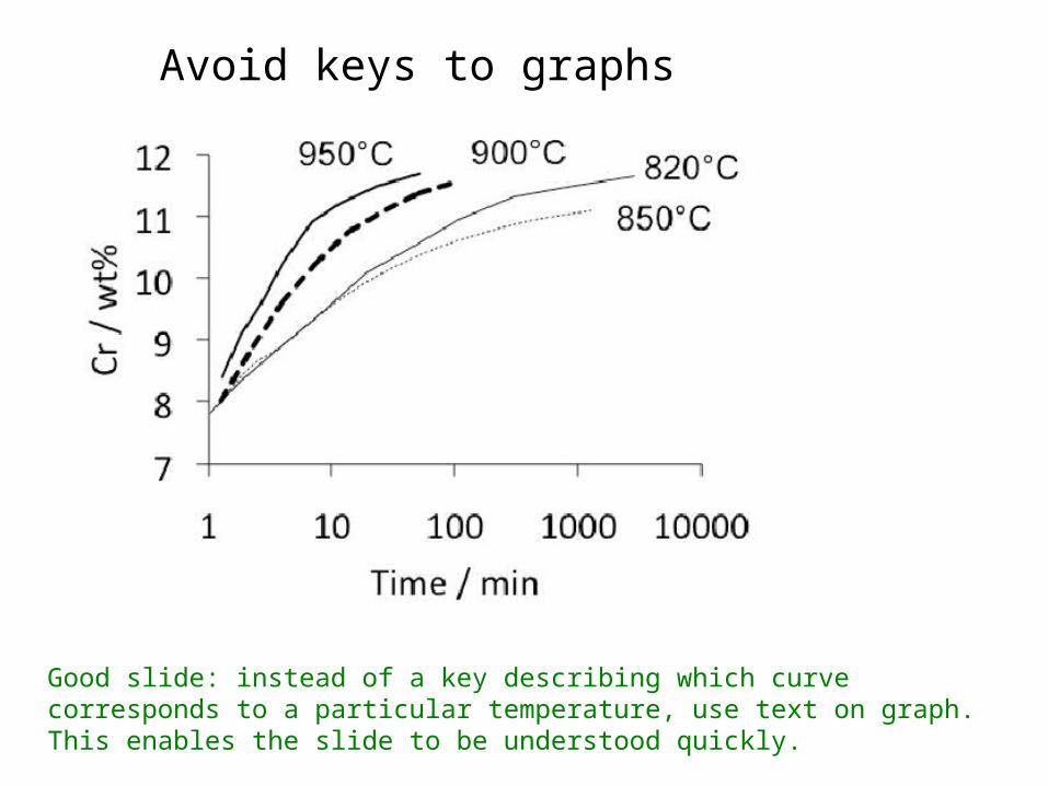
Avoid keys to graphs
Good slide: instead of a key describing which curve corresponds to a particular temperature, use text on graph. This enables the slide to be understood quickly.
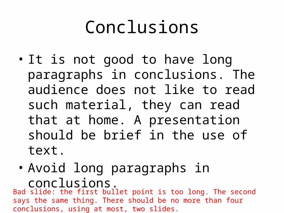
Conclusions
• It is not good to have long paragraphs in conclusions. The audience does not like to read such material, they can read that at home. A presentation should be brief in the use of text.
• Avoid long paragraphs in conclusions.
Bad slide: the first bullet point is too long. The second says the same thing. There should be no more than four conclusions, using at most, two slides.

Thank YOU
Bad slide: this is a waste of a slide of the 25 permitted. Better to leave the conclusions slide in position whilst questions are asked.