
Thinking with Type, 2nd Edition: Sample Pages
19
type a critical guide for designers, writers, editors, & students theory how why practice thinking with entertaining economical essential ellen lupton 2 ND EDITION REVISED & EXPANDED principles examples exercises type crimes fonts factoids fun { MORE
-
Upload
ellen-lupton -
Category
Documents
-
view
258 -
download
0
description
A completely revised, expanded edition of "Thinking with Type" will be published in September 2010, with 48 pages of new content and dozens of additional illustrations and examples. Shown here is a sample of the new content.
Transcript of Thinking with Type, 2nd Edition: Sample Pages

typea critical guide
for designers,
writers, editors,
& students
theory
how
why
practice
thinking with
entertaining economical essential
ellen lupton
2ND EDITIONREVISED & EXPANDED
principlesexamplesexercisestype crimesfontsfactoidsfun
{MORE
6 | thinking with tyPe
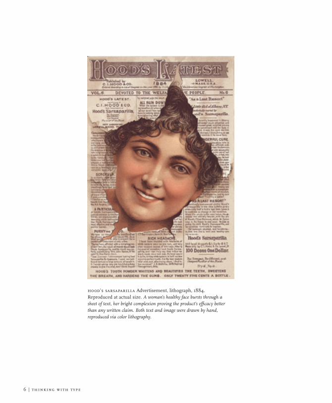
hood’s sarsaParilla Advertisement, lithograph, 1884. Reproduced at actual size. A woman’s healthy face bursts through a sheet of text, her bright complexion proving the product’s efficacy better than any written claim. Both text and image were drawn by hand, reproduced via color lithography.

iNtroductioN
Since the first edition of Thinking with Type appeared in 2004, this book has been widely adopted in design programs around the world. Whenever a young designer hands me a battered copy of Thinking with Type to sign at a lecture or event, I am warmed with joy from serif to stem. Those scuffed covers and dinged corners are evidence that typography is thriving in the hands and minds of the next generation. I’ve put on some weight since 2004, and so has this book. For the new edition, I decided to let out the seams and give the content more room to breathe. If you—like most graphic designers—like to sweat the little stuff, you’ll find a lot to love, honor, and worry about in the pages that follow. Finicky matters such as kerning, small capitals, non-lining numerals, punctuation, alignment, and baseline grids that were touched on briefly in the first edition are developed here in more detail, along with new topics that were previously omitted, such as how to style a drop capital, what you need to know about optical sizes, and when to say “typeface” instead of “font” at your next AIGA wine-and-carrot-stick party. This new book has more of everything: more fonts, more exercises, more examples, a more bodacious index, and best of all, more type crimes—more disgraceful “don’ts” to complement the dignified “do’s.” I was inspired to write the first edition of this book while searching for a textbook for my own type classes, which I have been teaching at Maryland Institute College of Art (MICA) since 1997. Some books on typography focus on the classical page; others are vast and encyclopedic, overflowing with facts and details. Some rely heavily on illustrations of their authors’ own work, providing narrow views of a diverse practice, while others are chatty and dumbed down, presented in a condescending tone. I sought a book that is serene and intelligible, a volume where design and text gently collaborate to enhance understanding. I sought a work that is small and compact, economical yet well constructed—a handbook designed for the hands. I sought a book that reflects the diversity of typographic life, past and present, exposing my students to history, theory, and ideas. Finally, I sought a book that would be relevant across the media of visual design, from the printed page to the glowing screen. I found no alternative but to write the book myself.
introduction | 7
Worried? See page 81
42 | thinking with tyPe
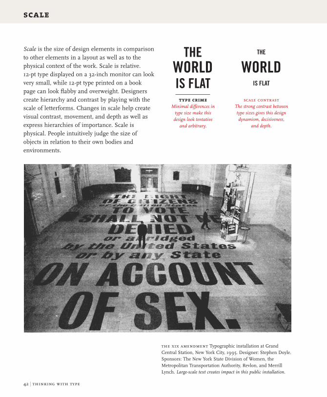
scale
Scale is the size of design elements in comparison to other elements in a layout as well as to the physical context of the work. Scale is relative. 12-pt type displayed on a 32-inch monitor can look very small, while 12-pt type printed on a book page can look flabby and overweight. Designers create hierarchy and contrast by playing with the scale of letterforms. Changes in scale help create visual contrast, movement, and depth as well as express hierarchies of importance. Scale is physical. People intuitively judge the size of objects in relation to their own bodies and environments.
tHe world is FlAt
tHe world
is FlAt
typecrime Minimal differences in
type size make this design look tentative
and arbitrary.
scale contrastThe strong contrast between type sizes gives this design dynamism, decisiveness,
and depth.
the xix amendment Typographic installation at Grand Central Station, New York City, 1995. Designer: Stephen Doyle. Sponsors: The New York State Division of Women, the Metropolitan Transportation Authority, Revlon, and Merrill Lynch. Large-scale text creates impact in this public installation.

letter | 53
96 AMUSEMENT NUMÉRO 5 JUIN 2009
AMUSEMENT x SIMS 3
97 AMUSEMENT NUMÉRO 5 JUIN 2009
AMUSEMENT x SIMS 3
« JE FINIRAI PAR METTRE LE
BAZAR UN PEU PARTOUT ! »
SARA FORESTIER
CASSE LA BARAQUE DANS
LES SIMS 3Simuler avec une grande finesse ses traits psychologiques, personnaliser son avatar
avec tant de possibilités qu'elles le rendent unique, proposer une expérience interactive qui va au-delà du simple jeu, et vous propulse dans les subtilités de nos modes de vie ? Voici un petit aperçu
de ce que propose Les Sims 3, dernier épisode de la saga culte lancée il y a tout juste dix ans.
Jeune actrice pleine d’énergie et aux réactions imprévisibles, Sara Forestier montre dans chacun de ses rôles une grande créativité qu’elle exprime également depuis plusieurs années
dans la réalisation de courts-métrages. À l’affiche à la rentrée dans Victor, une comédie de Thomas Gilou sur les relations familiales, Sara était toute trouvée pour casser la baraque dans Les Sims 3 ! Et elle ne s’est pas gênée !
Photographie François Rousseau
96 AMUSEMENT NUMÉRO 5 JUIN 2009
AMUSEMENT x SIMS 3Jean Apc
Veste blazer Louis Vuitton
Bague et collier Bon Ton ,
quartz fumé/Diamants Pasquale Bruni
Chaussures Louis Vuitton
Sièges Eames Plastic Side Chair verte,
Organic Chair rouge,
Tom Vac Rouge,
Pantone Chair Orange,
Wire Chair DKR rouge
Vitra
44 AMUSEMENT NUMÉRO 5 JUIN 2009
FREE PLAYERS
45 AMUSEMENT NUMÉRO 5 JUIN 2009
FREE PLAYERS
« MA PHILOSOPHIE PASSE PAR
LE GAMEPLAY » KEITA TAKAHASHI
En cette fin du mois de mars, Keita Takahashi fait escale en France. Quelques jours plus tôt, le game designer japonais était à San Francisco
pour la Game Developers Conference, grand raout annuel de la profession où, comme à son habitude, il a abreuvé ses confrères de réflexions rafraîchissantes sur le jeu vidéo.
Mais, avant toute chose, il leur a montré sa nouvelle écharpe, qu’il porte encore sur lui pour ce mini-séjour parisien. Confectionnée par Madame Takahashi mère, celle-ci
a notamment pour avantage de permettre au fiston d’y glisser ses mains afin de les protéger en cas de grand froid. Ce précieux tricot est aussi
le premier « produit dérivé » de Noby Noby Boy, le dernier jeu en date de Keita Takahashi, disponible depuis le mois de février
sur le service de téléchargement de la PS3 pour la somme quasi-ridicule de 3,99 euros. Cette écharpe à l’effigie du souriant Boy se révèle même
remarquablement en phase avec le jeu qui l’a inspirée : tranquillement singulière, résolument artisanale et conçue
pour qu’on se sente bien quand on y met les mains.
Clay Fighter Erwan HiguinenPhotographie Sébastien Agnetti
FREE PLAYERS FREE PLAYERS
amusement magazineDesign: Alice Litscher, 2009. This French culture magazine employs a startling mix of tightly leaded Didot capitals in roman and italic. Running text is set in Glypha.
lines of text set in all caPs can be tightly line-sPaced because they have no ascenders or descenders

54 | thinking with tyPe
mixingtypefaces
Combining typefaces is like making a salad. Start with a small number of elements representing different colors, tastes, and textures. Strive for contrast rather than harmony, looking for emphatic differences rather than mushy transitions. Give each ingredient a role to play: sweet tomatoes, crunchy cucumbers, and the pungent shock of an occasional anchovy. When mixing typefaces on the same line, designers usually adjust the point size so that the x-heights align. When placing typefaces on separate lines, it often makes sense to create contrast in scale as well as style or weight. Try mixing big, light type with small, dark type for a criss-cross of contrasting flavors and textures.
Creamy and Extra Crunchy | Differences within a single family
Sweet Child of mine | Differences within a superfamily
Noodles with Potato Sauce | Bland and blander
Jack Sprat and his voluptuous wife | Two-way contrast
Sweet, sour, and hot | Three-way contrast
Mr. Potatohead and Mrs. Pearbutt | Too close for comfort
single-familymixes
univers 47 light condensed and univers 67 bold condensed
quadraat regular and italic; quadraat sans bold
helvetica neue 56 medium and helvetica neue 75 bold
multiple-familymixes
thesis serif extra light and vag rounded bold
bodoni roman, thesis serif extra light small caPs, and futura bold
adobe garamond Pro bold and adobe jenson Pro bold
typecrimeThese typefaces are from the same family, but they are too close in weight to mix well.
typecrimeThese two type styles are too similar to provide a counter-point to each other.
typecrime:who’s accountable for this? A slightly squeezed variant of the primary font has been used to make the second line fit better (as if we wouldn’t notice). Yet another weight appears on the bottom line.

the word: new york magazine Design: Chris Dixon, 2010. This content-intensive page detail mixes four different type families from various points in history, ranging from the early advertising face Egyptian Bold Condensed to the functional contemporary sans Verlag. These diverse ingredients are mixed here at different scales to create typographic tension and contrast.
glyPha thin, designed by Adrian Frutiger, 1979. The large scale of the letters is counterbalanced by the fine line of the stroke.
miller small caPs, designed by Matthew Carter with Jonathan Hoefler and Tobias Frere-Jones, 1997–2000. Known as a Scotch Roman typeface, it has crisp serifs and strong contrast between thick and thin.
egyPtian bold condensed, a Linotype font based on a typeface from 1820. This quirky, chunky face has been used intermittently at New York Magazine since the publication was first designed by Milton Glaser in the 1970s. Here, the ultra-black type set at a relatively small size makes an incisive bite in the page.
verlag, designed by Jonathan Hoefler, 1996. Originally commissioned by Abbott Miller for exclusive use by the Guggenheim Museum, Verlag has become a widely used general-purpose typeface. Its approachable geometric forms are based on Frank Lloyd Wright’s lettering for the facade of the Guggenheim.
a tyPograPhic smorgasbord assembled to Please the eye
letter | 55
68 | thinking with tyPe
logotypesandbranding
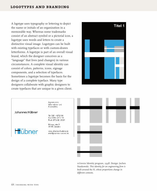
A logotype uses typography or lettering to depict the name or initials of an organization in a memorable way. Whereas some trademarks consist of an abstract symbol or a pictorial icon, a logotype uses words and letters to create a distinctive visual image. Logotypes can be built with existing typefaces or with custom-drawn letterforms. A logotype is part of an overall visual brand, which the designer conceives as a “language” that lives (and changes) in various circumstances. A complete visual identity can consist of colors, patterns, icons, signage components, and a selection of typefaces. Sometimes a logotype becomes the basis for the design of a complete typeface. Many type designers collaborate with graphic designers to create typefaces that are unique to a given client.
hübner Identity program, 1998. Design: Jochen Stankowski. This identity for an engineering firm is built around the H, whose proportions change in different contexts.

letter | 69
utrecht city theaterIdentity, 2009. Design: Edenspiek ermann.This ambitious visual identity program uses custom letterforms based on the typeface Agenda. The letters in the custom typeface are designed to split apart into elements that can be mirrored, layered, flipped, and animated for a variety of applications, including signage, posters, printed matter, and web communications.
logos live on the Page, the screen, and in the built environment

72 | thinking with tyPe
typefacesonscreen
Verdana was designed by the
legendary typographer Matthew Carter in 1996
for digital display. Verdana has a large x-height,
simple curves, open forms, and loose spacing.
Georgia is a serif screen face built with
sturdy strokes, simple curves, open counters,
and generous spacing. Designed by Matthew
Carter in 1996 for Microsoft, Georgia is widely
used on the web.
During the early years of the World Wide Web, designers were forced to work within the narrow range of typefaces commonly installed on the computers of their end users. Since then, several techniques have been developed for embedding fonts within web content. A successful solution needs to prevent users from illegally downloading typefaces as well as ensuring the consistent representation of letterforms on screen. One promising approach is the @font-face rule in CSS3, which allows a web page to download fonts hosted on a server rather than relying on fonts installed on the end user’s device. The typefaces must be licensed for this purpose. Font embedding has opened up the typographic future of the web.
verdana and georgia Released in 1996 by Microsoft, these typefaces were designed specifically for the web. Prior to the rise of font embedding, these were among a handful of typefaces that could be relilably used online.
font embedding Screen shot, detail, 2009. Designer: Peter Bilak, Typotheque. In 2009, the digital type foundry Typotheque launched a pioneering font embedding service that allows designers to license Typotheque’s fonts and display them on any website in exchange for a one-time fee. The fonts are hosted by Typotheque and accessed using the CSS @font-face rule. This screen shot features the type families Greta and Fedra, designed by Peter Bilak.
webfonts1.0
bobulate Website, 2009. Designed by Jason Santa Maria for Liz Danzico. This site design uses the text face Skolar, designed by David Brezina for TypeTogether and served by Typekit, a font embedding service.

letter | 73
letterscaPes Website, 2002. Design: Peter Cho. Simple bitmapped letters are animated in three-dimensional space.
Anti-aliasing creates the appearance of smooth curves on screen by changing the brightness of the pixels or sub-pixels along the edges of each letterform. Photoshop and other software packages allow designers to select strong or weak anti-aliasing. When displayed at very small sizes, strongly anti-aliased type can look blurry. It also increases the number of colors in an image file.
bitmaPPed letteranti-aliased letter
anti-aliased tyPe: smooth setting (simulated screen capture)
anti-aliasing disabled: none setting (simulated screen capture)
anti-aliasing creates an illusion of curves

130 | thinking with type
captions
The placement and styling of captions affect the reader’s experience as well as the visual economy and impact of page layouts. Some readers are primarily attracted to pictures and captions, while others prefer to follow a dominant written narrative, consulting illustrations in support of the text. From a reader’s perspective, close proximity of captions and images is a welcome convenience. Placing captions adjacent to pictures is not always an efficient use of space, however. Designers should approach such problems editorially. If captions are essential to understanding the visual content, keep them close to the pictures. If their function is merely documentary, adjacency is more easily sacrificed.
—13Maio 200916
Zoom //C Política 2.0
José Sócratescontrata equipade Obama paraas legislativas
AempresaBlue State trabalhou aáreaonline dacandidaturadeObama. Amaioria absolutaPS é o novo desafio
O caminho para a maioria absoluta atépode não passar pelo Twitter,mas a cam-panha de José Sócrates nas próximaseleições legislativas vai ter nas redessociais um palco privilegiado para ten-tar criar uma onda de entusiasmo emili-tância socialista entre os eleitores.A candidatura de BarackObama à pre-sidência dos Estados Unidos é a referên-cia desta estratégia. E a tentativa de repli-car a “mudança” democrata emWashing-ton vai contar com um contributo depeso: o Partido Socialista contratou osserviços da Blue State Digital, empresaresponsável pelo desenvolvimento davertente online emultimédia da campa-nha do agora presidente Barack Obama.Segundo informações recolhidas pelo
i junto do gabinete do primeiro-minis-tro, o objectivo é transportar para Por-tugal o conceito de campanha de proxi-midade adoptada por Obama. Com con-tactos diários através de emails, SMS,fóruns online e redes sociais comooFace-book, o Hi5, o Twitter ou o Flickr.As palavras deordemsãoangariarnovosmilitantes, cimentar simpatias e garan-tir presenças nas actividades da campa-nha socialista – ou seja, um trabalho defundo junto das bases do partido com oobjectivo de alargar ao máximo o uni-verso de votantes do PS. E que terá naimagem de Sócrates – à semelhança deObama nas eleições norte-americanas –o foco essencial de toda a comunicação.O acordo com a Blue State Digital sóserá anunciado oficialmente no final deJunho, data em que alguns administra-dores da empresa virão a Portugal “paradefinir toda a metodologia de trabalhoaté às eleições legislativas”, avançou aoi a mesma fonte.A colaboração da empresa norte-ame-ricana comoPS teve início antes do con-
gresso do partido, em Fevereiro. “Esti-veramno congresso, onde já deramalgu-mas ideias, e desde então temos estadoem contacto permanente para decidir aparte operacional de algumas iniciativasquequeremosdesenvolver”, comoo enviode SMS por bluetooth para as localida-des por onde passar a caravana da cam-panha socialista nas legislativas.O site Sócrates2009, descrito como ummovimento online de apoio à reeleiçãodo primeiro-ministro, é umexemplo des-sa colaboração. O projecto replica algu-mas receitas online na candidatura deObama à presidência norte-americana,como a aposta em chats, emissão devídeos ou a promoção de fóruns. O des-taquevai porémparaa rede socialMyMov,que pretende unir simpatizantes e criar“uma estrutura paralela de pessoas nãovinculadas ao partido”.A Blue State foi a empresa que criou osite my.barackobama.com, plataformaque recolheu os donativos e a angaria-ção de voluntários para a candidatura.E o resultado foi avassalador: 3milhõesde donativos pessoais, 368 milhões deeuros angariados e 2milhões de partici-pantes em redes sociais na internet.Além de ter trabalhado nestes projec-tos com os democratas, a Blue State jácolaborou com o Partido Trabalhistainglês. O acordo comoPS é umnovo pas-so na internacionalização da empresa,que vê nesta colaboração uma possívelponte para o mercado brasileiro.
ADRIANO [email protected]
A concepção dosite Sócrates2009foi o primeiro frutoda colaboraçãocom a Blue State
COMO SÉ FAZ UMACAMPANHAWEB 2.0
INTERNETAcampanha de BarackObamapara as eleiçõespresidenciais norte-americanas pôs a internet nocentro das atenções de todos os políticos. Osprincipais partidos portugueses já estão online hávários anos, mas dão cada vezmais importânciaa esta plataforma na sua comunicação comos eleitores. A aposta em vídeos epodcasts é um hábito. As emissões
em directo crescem. Não estaronline é não existir.
FACEBOOKSe uma rede social serve para alimentar relaçõesde amizade ou trabalho em suporte online, por quenão aproveitá-la para aumentar a quantidade devotos? Adiferença está apenas na transformaçãodo conceito de “amigo” em “eleitor”. BarackObama conseguiu reunirmais de 6milhõesde “amigos” no Facebook. Os partidosportugueses não são assim tão
ambiciosos, mas vão estartodos presentes.
TWITTERSão 140 caracteres de cada vez. O limitemáximode cada texto nesta nova forma de comunicação,que replica o estilo de linguagem dos SMS, masémais concisa e directa. Com a diferença deasmensagens enviadas ficarem acessíveis atodos os seguidores. Há quem diga que éapenas umamoda, mas a PresidênciadaRepública já aderiu, tal como
16 deputados portugueses.
—13Maio 2009 17
>>
“Essencial”, “prioritário” e “indispensá-vel”. As palavras são unânimes no dis-curso dos responsáveis pelos principaispartidos portugueses: estar online é essen-cial, ser visto nas redes sociais é priori-tário, alimentar a interactividade comos cidadãos é indispensável. Por isso,estão todos presentes. PS, PSD, CDS, Blo-co de Esquerda (BE) e PCP apostam cadavezmais naweb 2.0 para comunicar como eleitor. O retorno, garantem, “émuitoimportante”. Mas ainda não é decisivo.“Em 2005 houve uma primeira vira-gema sério para o online,mas ainda inci-piente. Agora vai ser um poucomelhor,embora às vezes sinta que as aposta sãofeitas não tanto pelo conteúdo comopelasnotícias que podem gerar”, diz o secre-tário-geral adjunto do PSD, Emídio Guer-reiro. Apesar das reticências, o social--democrata não tem dúvidas: “É inegá-vel que estas formas de comunicaçãoenvolvem mais as pessoas e é impossí-vel um partido moderno não estar pre-sente.” Assim, o PSD está a “alimentaruma presença dinâmica e de interacção”com os eleitores. Além do site oficial, opartido já tem conta no Twitter e noFacebook. Na próxima semana apresen-tará novidades: “Toda a nossa campa-nha vai apostar na envolvência e na pro-cura de feedback dos cidadãos”, garan-te Emídio Guerreiro.O PCP também não nega a importân-cia da internet, mas não a considera
“essencial para garantir o voto, ou criarlaços mais fortes”. “Nesse aspecto, con-tinuamos convictos de que o contactopessoal e directo continua a ser amelhorarma”, defende Sofia Grilo, colaborado-ra do departamento de propaganda doPCP e gestora dos sites institucionais.O partido sublinha que foi “o primeiroa estar online”, desde 1996. E temaumen-tado sucessivamente a oferta de conteú-dos. Vídeos online, fóruns digitais e pro-grama de rádio em podcast são já umhábito. Para a semana, e porque é “neces-sário ter uma visão integrada da comu-nicação política”, serão anunciadas con-tas no Twitter, no Facebook e no Flickr.Redes onde o BE já marca presença.Tal comonoMySpace eHi5. Tudo “agre-gado no portal Esquerda.net, um canalinformativo actualizado diariamente”.“O acesso às notícias alterou-se muito ejá há pessoas que só consomem infor-mação através de sites ou redes sociais.Os partidos não podem alhear-se disso”,constata Jorge Costa, director de cam-panha do BE para as europeias. Daí aemissão de debates na internet ou o apro-veitamento “dos perfis, ou blogues dosmilitantes”, como “instrumento de comu-nicação, comentário ou alerta para acti-vidades do BE”.É o caminho que o CDS quer trilhar,até porque “o número de adesões e res-postas” às iniciativas do partido na inter-net “tem aumentado consideravelmen-te”, diz o secretário-geral, João Almeida.Embora “convicto da importância daweb 2.0”, o responsável defende que nes-ta área “é impossível comparar Portugalcom os Estados Unidos”. “O nosso elei-torado não tem amesma apetência queos norte-americanos pela internet.”
Não vá o diabo tecê-las:é melhor estar na internetPartidos já não dispensama presença nas redes sociais,mas ainda acreditam quea campanha vai decidir-senosmedia tradicionais
SMSO contacto porSMS já pode ser considerado umaforma de comunicação antiquada entre os partidose os seusmilitantes. Foi desta forma que PauloPortas anunciou, por exemplo, os candidatos doCDS às eleições europeias. Agora o PS querintroduzir uma novidade: enviar SMS porbluetooth aos habitantes que tenhamessa tecnologia activa nas regiões
por onde passar a caravana dacampanha socialista.
E-MAILÉ a forma de comunicaçãomais tradicional dospartidos com os seusmilitantes e simpatizantes.Não apenas para enviar informações sobreactividades partidárias, mas sobretudo pararecolher opiniões. “Na altura em que criámosum endereço específico para receberqueixas sobre aASAE recebíamosmaisde 300 emails por dia”, aponta o
secretário-geral do CDS,JoãoMoreira.
el banco de uno Signage proposal Agency: Saffron Design: Joshua Distler, Mike Abbink, Gabor Schreier, Virginia Sardón
el banco de uno Signage proposal Agency: Saffron Design: Joshua Distler, Mike Abbink, Gabor Schreier, Virginia Sardón
el banco de uno | Signage proposal | Agency: Saffron | Design: Joshua Distler, Mike Abbink, Gabor Schreier, Virginia Sardón
el banco de un
o Signage proposal A
gency: Saffron D
esign: Joshua Distler,
Mike Abbink, G
abor Schreier, V
irginia Sardón
i newspaper, 2009. Design: Nick Mrozowski. © www.ionline.pt. Captions tell a story in this layout from the Portuguese newspaper i.

text | 131
captions for the web Online content management systems coordinate pictures and captions in a database. Designers use rules, frames, overlays, and color blocks to visually connect images and captions, creating coherent units. Shown here are four different ways to style captions for the web.
interactive web captions: guardian.co.uk Design director: Mark Porter. A secondary caption reveals itself when users rolls over this image on the Guardian’s home page.
Don’t put a tiny piece of furniture under a large painting, or vice versa.
Don’t hang objects over a child’s bed, especially depressing objects.
Why is the clown sad? How to artfully display a work of art.
Avoid overpowering a delicate work of art with a heavy frame.
captions change the meaning of pictures

134 | thinking with type
hierarchy
communicating hierarchy Complex content requires a deeply layered hierarchy. In magazines and websites, a typographic format is often implemented by multiple users, including authors, editors, designers, and web producers. If a hierarchy is clearly organized, users are more likely to apply it consistently. Designers create style guides to explain the princples of a hierarchy to the system’s users and demonstrate how the system should be implemented.
solidarietà internazionale Magazine redesign, 2009. Design: Sezione Aurea. Publications often commission design firms to create new formats that can be implemented by staff designers and editors. This redesign uses the typefaces Myriad and Utopia, designed by Robert Slimbach. A comprehensive style guide serves to communicate the new format to the magazine’s staff.

text | 135
the city Web site, 2010. Designer: Graham Stinson. The City is a social networking site that helps churches and non-profits engage in community activities. Auto-detection determines whether the reader is using a desktop or mobile phone and then re-routes layout characteristics in order to create a custom view. Each layout references a different CSS file; the main HTML for each page remains the same.
structural hierarchy Designers and editors should organize content structurally rather than stylistically, especially in digital documents. When creating style sheets in a page layout program, label the elements with terms such as “title,” “subtitle,” and “caption” rather than “bold,” “tiny,” or “apple green Arial.” In CSS, elements such as em (emphasis), strong, and p (paragraph) are structural, whereas i (italic), b (bold), and br (break) are visual. As a body of content is translated into different media, the styles should continue to refer to the parts of the document rather than to specific visual attributes.
Structural hierarchies help make websites understandable to search engines and accessible to diverse users. A document should have only one h1 heading, because search engines apply the strongest value to this level of the document. Thus to conform with web standards, designers should apply heading levels (h1, h2, and so on) structurally, even when they choose to make some levels look the same. Using structural, semantic markup is a central principle of web standards.
For more on web standards, see Jeffrey Zeldman with Ethan Marcotte, Designing with Web Standards, third edition (Berkeley, CA: New Riders, 2009).
structure trumps presentation

136 | thinking with type
hierarchy
hierarchy and accessibility The web was invented in order to provide universal access to information, regardless of a person’s physical abilities or access to specialized hardware or software. Many users lack the browsers or software plug-ins required for displaying certain kinds of files, while visually impaired users have difficulty with small type and non-verbal content. Creating structural hierarchies allows designers to plan alternate layouts suited to the software, hardware, and physical needs of diverse audiences.
claphaminstitute.org Website, 2003.Designer: Colin Day, Exclamation Communications. Publisher: The Clapham Institute. This site was designed to be accessible to sighted and non-sighted users. Below is a linearized version of the home page. A visually impaired reader would hear this text, including the alt tags for each image. The “skip to content” anchor allows users to avoid listening to a list of navigation elements.
Sometimes good typography is heard, not seeen. Visually impaired users employ automated screen readers that linearize websites into a continuous text that can be read aloud by a machine. Techniques for achieving successful linearization include avoiding layout tables; consistently using alt tags, image captions, and image descriptions; and placing page anchors in front of repeated navigation elements that enable users to go directly to the main content. Various software programs allow designers to test the linearization of their pages.

text | 137
the web was invented for universal access
lighthouse.org Website, 2010. Design: Dan Mall and Kevin Sharon, Happy Cog. Front-end code: Jenn Lukas. Information architecure: Kevin Hoffman. Accessibility research and testing: Angela Colter and Jennifer Sutton. The visual layout of this website (left) is optimized for sighted users, while the source order of the code (below) is optimized for the visually impaired, allowing users to linearize the text with an automated screen reader. For example, in the visual display the navigation menu appears immediately below the logo. In the source code, however, the organization name is followed directly by the tagline, preventing the top of the page from clogging up with navigation elements. Such differences between the visual display and the source order are kept to a minimum because not everyone who uses a screen reader is blind, and some people with disabilities who navigate via source order can see the visual layout with their eyes. If the visual layout differs too much from the source code, these users would be confused. The relationship between the visual layout and the source order is also optimized for search engines.

144 | thinking with type
Crime Blotter6:00AM | EAST VILLAGE
Noun Found Smothered by AdjectivesMessage lost in dense cloud of confused signals.
11:30AM | UPPER EAST SIDE
Missing the point, revenge is sought by victim.
7:00PM | WILLIAMSBURG
Flood of Clichés Wreaks HavocHipster kicks bucket after biting bullet.
Katie Burk, Paulo Lopez
exercise: hierarchy
Choose a text that has a recurring structure, such as a table of contents, a news aggregator, or a calendar of events. Analyze the structure of the content (main title, subtitles, time, location, body text, and so on) and create a visual hierarchy that expresses this structure. Make it easy for readers to find the information they want. For example, in a crime report some readers might scan for location, looking for data about their neighborhood, while others might be more drawn to the lurid details of particular crimes. Use changes in size, weight, leading, style, and column structure to distinguish the levels of the hierarchy. Make a style sheet (in a page layout program for print or in CSS for the web) in order to create several variations quickly.
Callie Neylan, Betsy Martin
Callie Neylan, Betsy Martin

text | 145
applying styles structurally
David Wright, Nelson Hsu
<h1>
<h2>
<h3>
<class=“time”>
<p>
These typographic variations were generated in CSS using the structural hierarchy presented above.


![[Matthew Lipman] Thinking in Education, 2nd Editio(BookFi.org)](https://static.fdocuments.net/doc/165x107/55cf9901550346d0339afa6c/matthew-lipman-thinking-in-education-2nd-editiobookfiorg.jpg)
