harvest residue utilization in small- and large-scale bioenergy Systems:

The Utilization of
VISUAL DESIGN SYSTEMSto Promote Higher Levels of Learning
in Educational Environments
Keenan Sultanik
2 The Utilization of Visual Design Systems to Promote Higher Levels of Learning in Educational Environments
© 2019 Keenan Sultanik
Written and designed by Keenan Sultanik
Book set in Korolev and Minion Pro
For more information, visit
www.sultanik.net

3The Master of Fine Arts Thesis of Keenan Sultanik • Creative Arts Academic Brand Identity System
Final SignaturesThe Utilization of Visual Design Systems to Promote Higher Levels of Learning in Educational
Environments, a thesis submitted to Liberty University for Master of Fine Arts in Graphic Design
Professor Monique Maloney, Chair
Professor Jennifer Pride, First Reader
Professor David Meyer, Second Reader
Professor A. Todd Smith, Department Chair
4 The Utilization of Visual Design Systems to Promote Higher Levels of Learning in Educational Environments
I first wish to convey my greatest admiration and appreciation for my wife,
Alyssa, who has encouraged, challenged, and supported me through my
undergraduate and graduate education. Partnering with her in life is one of
the greatest honors I could ever hold.
I also want to thank Dr. Paul Chappell, Dr. John Goetsch, and Dr. Mark
Rasmussen for their influence and personal investment in my life, the
opportunity to impact lives through teaching, and their lifelong work in
ministry and education.
It is also my wish to thank Mark Jellema for his mentorship and teaching
in photography during my teen years, first introducing me to the world of
lenses, exposure, and visual storytelling.
Finally, I want to thank Tim and Janis Eastwood for giving me my first
position in professional graphic design, for being more friends and mentors
than bosses, and especially for teaching me how to kern.
Acknowledgments
5The Master of Fine Arts Thesis of Keenan Sultanik • Creative Arts Academic Brand Identity System
This master of fine arts thesis is dedicated my mother, Wynn Yuhas, for
her example in fine art education and her support of everything I have
ever set out to accomplish, even through great personal sacrifice. She
inspired and cultivated my creativity and opened to me the world of art
and design, all the while challenging me to make a difference for Christ.
Dedication
6 The Utilization of Visual Design Systems to Promote Higher Levels of Learning in Educational Environments
Table of Contents
INTRODUCTION � � � � � � � � � � � � � � � � � � � � � � � � � � � � � � � � � � � � � � � � � � � � � � � � � � 8
RESEARCH � � � � � � � � � � � � � � � � � � � � � � � � � � � � � � � � � � � � � � � � � � � � � � � � � � � � � 14
PROCESS � � � � � � � � � � � � � � � � � � � � � � � � � � � � � � � � � � � � � � � � � � � � � � � � � � � � � 54
SOLUTION � � � � � � � � � � � � � � � � � � � � � � � � � � � � � � � � � � � � � � � � � � � � � � � � � � � � � � 78
CONCLUSION � � � � � � � � � � � � � � � � � � � � � � � � � � � � � � � � � � � � � � � � � � � � � � � � � � �90
APPENDIX � � � � � � � � � � � � � � � � � � � � � � � � � � � � � � � � � � � � � � � � � � � � � � � � � � � � � �94

7The Master of Fine Arts Thesis of Keenan Sultanik • Creative Arts Academic Brand Identity System
Traditional higher education environments
have changed very little in the last hundred
and fifty years, while technology has advanced
in nearly every other area of society making
each more productive and more capable. This
study identifies key aspects of a comprehensive
and universal visual learning system that
incorporates a more holistic approach to design
and interactivity in educational environments.
The desired effect of this is elevating classroom
learning to higher levels as defined by Bloom’s
Taxonomy. In this thesis, I have collected and
explored empirical and observational data to
examine the relationship between effective
learning environments and the use of visual
aids and interactive experiences. Research in the
forms of case studies and personae will present
how effective educators are utilizing technology
and visuals in and out of the classroom and
how individuals associate information through
relationships of color, shape, form, hierarchy and
other visuals. This research has been applied to
a brand identity system designed to facilitate
deeper learning and specifically applied to the
hypothetical department of Creative Arts at West
Coast Baptist College.
Visual support of a presentation must include
powerful storytelling, the establishment of an
emotional connection between speaker and
audience, a rigorous and thorough preparation,
and content mastery on the part of the presenter.
Online learning-based video content should take
advantage of bilateral cognitive processing of both
visuals and audio, should be limited in length
to capitalize on the ideal attention span of the
viewer, and should be bundled with interactive,
actionable content or questions for the best long-
term retention rates.
The aim of the research was to establish a set
of guidelines for the evolution of education in the
adoption of modern visual and interactive design
systems to better engage a new generation of
learners. The research has been applied to create
a f lexible, comprehensive, and universal design
system that can be packaged for implementation
in the classroom environment in nearly any
teaching field.
Thesis Abstract

C H A P T E R O N E
Introduction

9The Master of Fine Arts Thesis of Keenan Sultanik • Creative Arts Academic Brand Identity System
INTRODUCTION
Because education has changed very little
since the mid-nineteenth century, research
in visually enhanced learning and interactive
design systems will inform the creation of a set
of standards to aid the adoption and utilization
of visual design and interactive experiences in
educational environments to modernize education
at large and to promote higher levels of student
learning with specific application being made to
its use in the Visual Arts program of West Coast
Baptist College in Lancaster, California.
A spark is a charged particle thrown off by
an energy source that can serve to ignite a fuel
source elsewhere. This project seeks to empower
educators to throw off academic “sparks” of
learning through the use of visual design in
educational environments to light a fire in the
hearts of their students for continued, deeper, and
more meaningful learning. To “spark learning” is
the goal and essence of this system.
The traditional classroom of higher education
has changed very little over the last several
centuries, while technology throughout the rest
of society has advanced rapidly, making each
facet of life more productive and more capable.
This study and the resulting visual learning
system that will be presented alongside will
incorporate a more holistic approach to design
and interactivity in educational environments
to elevate classroom learning to higher levels as
defined by Bloom’s Taxonomy. Research data will
be explored to define the relationship between
effective learning environments and the use of
visual aids and interactive experiences. Research
will be presented to establish how effective
educators are utilizing technology and visuals
in and out of the classroom and how individuals
associate information through relationships of
color, shape, form, hierarchy and other visuals.
The study will determine a set of best practices,
particularly for engaging visual and kinesthetic
learners, to promote and facilitate an evolution
of education in the adoption of modern visual
and interactive design systems to better engage a
This project seeks to empower educators to throw off academic ‘sparks’ of learning.”

10 The Utilization of Visual Design Systems to Promote Higher Levels of Learning in Educational Environments
INTRODUCTION
new generation of student learners. This research
and accompanying visual learning system will seek
to provide educators at West Coast Baptist College
with a visual standard and the means to implement
it in an educational environment as well as to
provide students with tools to better understand and
utilize their own personal learning styles and the
significance of the visual system’s components.
The primary audience for this project
would be divided into two broad groups.
The first group would include educators and
administrative personnel in higher education,
particularly those at West Coast Baptist College,
in whose classrooms the following study and
communicative principles seek to f ind use and
relevancy. For this system to become widely
adopted, it has to solve intrinsic problems for
faculty in such a way as to justify the time
and effort required in its implementation. It
has to produce positive and obvious results in
addition to being easy to implement in the course
design. Without both aspects being present, the
implementation of the system and principles will
be limited in scope.
The second target audience is the students
who will benefit from the design system’s
implementation in their learning environments.
While the students could not be classified
as decision-making stakeholders, they are
nevertheless the primary benefactors of the system
and the quality of their learning environment is
the primary concern of the project, making them
a crucial audience for this project. The website
will contain resources which will aid students
in better understanding their own individual
learning styles and the best ways to capitalize on
its strengths and limit its weaknesses.
In the domain of educational visual aids at
West Coast Baptist College, there are no competing
products or services available either for faculty to
utilize in the preparation of their visuals or for
For this system to become widely adopted, it has to solve intrinsic problems.”

11The Master of Fine Arts Thesis of Keenan Sultanik • Creative Arts Academic Brand Identity System
INTRODUCTION
students to determine and assist their individual
learning styles. This project seeks to fill this
necessary void at this institution.
The goal of this study will be to create a visual
learning system that incorporates a more holistic
approach to design and interactivity in educational
environments to elevate classroom learning to
higher levels as defined by Bloom’s Taxonomy.
Visual design is a key component in the presentation
of visual information. The communicative value
and visual syntax of each component will be
considered and carefully applied to the final visual
design system to maximize the effectiveness of its
utilization in the classroom to promote higher levels
of learning. The following list will be used as a
checklist for the proposed deliverables for the visual
design solution:
Subject-matter or learning-based logos or
symbolism. To provide students with a visual system
that distinguishes educational departments and
courses, symbolism and color will be used to create
a identification system so they can better identify
course material and areas of study. This type of
identification system will help with providing a
context of familiarity and recognition.
Slide templates. Slide graphics form the
foundation of visual learning in the classroom,
and as nearly all classrooms are equipped with
screens or projectors, a standardized set of slide

12 The Utilization of Visual Design Systems to Promote Higher Levels of Learning in Educational Environments
INTRODUCTION
templates will be designed for use by educators for
visual presentation in the classroom.
Notes/handouts template. Notes and printed
handouts are notorious for poor design and
organization and need to be clear and concise to
reinforce the visual and auditory content received
in class.
Syllabus template. The syllabus is the heart
of the course content, as it provides a context and
a framework upon which all of the requirements
and motivations for the course sit. Uniformity
is crucial as students collect and organize
content from syllabi from multiple courses at the
beginning of each semester. The syllabus will
form the key academic component.
LMS title graphics template. West Coast
Baptist College uses Canvas as its web-based
learning management system, and as students f lip
from one course’s section to another’s, they need a
visual anchor to provide clarity as to which course
and subject they are currently viewing and for
continuity. A standardized template for a header
graphic which ties into the visual identity system
mentioned above could be used at the top of the
course’s home page could provide the needed
visual anchor for students moving from class to
class in the online system.
Color and symbolism (such as through the
use of icons to rapidly communicate basic visual
information in a consistent method) will both
take a crucial role in the design and development
of the visual design system. Symbolism will be a
key deliverable in the visual design system, with a
standardized set of symbols and icons to quickly
communicate various concepts. The scope and
number of symbols that will be developed will be
determined once the design system begins to mature
from a visual standpoint.
The templates must be easy for less technically
astute faculty to be able to deploy in their
classrooms. The development of a training program
will be considered to help aid the faculty adoption
rate of the visual system. The technologies currently
used must be considered.

13The Master of Fine Arts Thesis of Keenan Sultanik • Creative Arts Academic Brand Identity System
INTRODUCTION

C H A P T E R T W O
Research

15The Master of Fine Arts Thesis of Keenan Sultanik • Creative Arts Academic Brand Identity System
RESEARCH
Educators understand the importance of
utilizing multiple teaching styles and
techniques to reach different types of students with
learning hooks that prompt them to dive deeper
into a topic with the hope that they will ultimately
impact the world in their field. Imagine an
educational environment where teacher and student
alike are on-point and learning is fostered through
the visual design that permeates the classroom.
Visual design can be effectively used to create
bridges and build connections in the mind for more
effective learning. A universal visual design system,
presented through an interactive presentation, will
help equip educators to utilize this important tool
in their own educational environment.
Research, consisting of case studies,
the creation of user personas, and practical
observations has been performed to inform the
concept and design phases of this project, which
will culminate in a set of best practices derived
from each study. These best practices are codified,
listed at the end of each study results, and
implemented in the visual portion of the thesis
and in a set of instructions for faculty utilization
of the learning system.

16 The Utilization of Visual Design Systems to Promote Higher Levels of Learning in Educational Environments
RESEARCH
This document seeks to present the need
for a visual design system which would assist
educators with promoting higher levels of learning
in educational environments. Because education
has changed very little since the mid-nineteenth
century, research in visually enhanced learning
and interactive design systems will inform the
creation of a set of standards to aid the adoption
and utilization of visual design and interactive
experiences in educational environments to
modernize education at large and promote higher
levels of student learning.
Traditional higher education classrooms
have changed very little in the last century, while
the world for which educators are preparing
students has changed quite dramatically along
with the characteristics of society at large. The
goal of this study is to create a visual learning
system that promotes higher levels of learning
as defined by Bloom’s Taxonomy through
easier understanding and sythesis of learning
materials by applying principles of branding
design to the learning resources. Observations
and research data will be presented and explored
to examine the relationship between effective
learning environments and the use of visual aids
and interactive experiences. Research will be
presented to establish how effective educators
and education platforms are utilizing technology
and visuals in and out of the classroom and
how individuals associate information through
relationships of color, shape, form, hierarchy
and other visuals. The aim of the research is to
establish a set of guidelines for the evolution of
education in the adoption of modern visual and
interactive design systems to better engage a new
generation of learners.
Through a series of peer-reviewed research
and articles on a wide range of subjects related to
the thesis topic including education, technology,
design, visual communication, visual literacy,
color, and new media, the following insight into
the topic of the utilization of visual design systems
in educational environments has been developed.
The static approach to learning fails to leverage
interactive design to engage with the younger
17The Master of Fine Arts Thesis of Keenan Sultanik • Creative Arts Academic Brand Identity System
RESEARCH
generations the way they learn best. For better or
worse, social media and interactive experiences
have changed the way younger generations think
and respond to stimuli, and therefore, learning
experiences must change to meet the new demands
of educating them. One author writing for the
International Journal of Emerging Technologies in
Learning writes the following:
“The modern child is a product of this new
context. Now children develop in a visually rich
environment and perceive the world through
visual communications from birth. It is hard for
a child to become accustomed to the traditional
educational process, which often ignores
particularities of perception and learning. Many
studies show that the modern child, and people
in general, have changed recently. According
to research, children’s creativity has decreased;
their emotional discomfort has increased; the
need for screen stimulation of cognitive processes
has appeared; and the so-called ‘file’ memory is
developing” (Yarkova 7).
Curricula generally rely on rote learning
techniques which were essential when access to
particular information was limited to certain
libraries or the archives of universities. In the
modern world, information is merely a voice
search away—a reality that much of the current
educational systems fail to consider. Young people
then perceive that education is outdated and
useless. While this is far from true and there is
much to be gained through formal education, the
methods may need to be revised to adequately
prepare students for the future.
The gap between the way information was
accessed in the past and the way it is today is
accentuated by the gap in thinking between
generational groups. One author writes,
“Today digital-device-outfitted Millennials
comprise the majority of university students.
Concern over these digital natives’ tendency to
perform lower than expected as a group in college
after completing a commendable high school
experience, has some eyeing character traits as a
possible culprit. Conversely, university faculties
are comprised primarily of Baby Boomers and

18 The Utilization of Visual Design Systems to Promote Higher Levels of Learning in Educational Environments
RESEARCH
older members who grew up in lower-tech, lesser-
interactive-media environments” (Arnold 281).
He goes on to state, “The most avid users of
technology, Millennials ‘are ‘digital natives’—the
only generation for which these new technologies
are not something they’ve had to adapt to’
(Pew Research Center, 2014). Our students have
changed radically, they are no longer the people
our educational system was designed to teach
(Prensky, 2001)” (Arnold 281).
Another problem to address if the proposed
system is to elevate learning to higher levels is
to define said levels of learning. Much attention
and study has gone into Bloom’s Taxonomy and
has established it as a definitive way to measure
distinct levels of learning based on measurable
learning outcomes and assessments. In addition to
defining the higher levels of learning, the benefits
of visual facilitation in the classroom must be
presented, defended, and integrated into the final
project. Effective teaching methodology will
also be incorporated through a focus on student
learning and interaction. Howard Hendricks,
a notable educator, stated, “You see, effective
teaching comes only through a changed person.
The more you change, the more you become an
instrument of change in the lives of others. If you
want to become a change agent, you also must
change” (Hendricks 21).
Visual design is a key component in
the presentation of visual information. The
communicative value and visual syntax of each
component will be considered and carefully
applied to the final visual design system to
maximize the effectiveness of its utilization in the
classroom to promote higher levels of learning.
Lih-Juan ChanLin, the author of A Theoretical
Analysis of Learning with Graphics, states, “The
use of graphics in communication has had a long
history. Through art and technology, human
beings have been engaged in reconstructing
their perceptual world for thousands of years
(Bolter, 1991). Ever since human beings learned
to communicate, symbols have been created and
used to communicate” (ChanLin 3).
Color and symbolism (such as through the

19The Master of Fine Arts Thesis of Keenan Sultanik • Creative Arts Academic Brand Identity System
RESEARCH
use of icons to rapidly communicate basic visual
information in a consistent method) will both
take a crucial role in the design and development
of the visual design system. An author for the
journal Memory and Cognition states, “If color
is part of the stored memory representation of an
object, it will provide an additional attribute to
assist in matching the retrieval cue to the internal
representation at retrieval. Thus, when color
information is preserved at study and test, one
would expect accuracy for colored objects to be
better than accuracy for black-and-white objects.
Research results confirm this: Recognition is more
accurate for colored than for black-and-white
stimuli (Tanaka & Bunosky, 1993; Wurm, Legge,
Isenberg, & Luebker, 1993)” (Hanna 322-323). A
set of standards and a quick reference guide for
educators who seek to integrate these standards
in their educational environments will be created
and presented in parallel with the system itself.
In the specific context of higher education, one
author states, “Visual learning is an approach to
helping learners communicate with imagery. In
the graphic design environment, learners deal
with vast quantities of visual information and
have developed ways of being able to process
this information effectively. The visual learning
style is useful for learners who prefer the visual
modality of learning in order to better recall what
has been observed or read” (Chmela-Jones 630).
In order to create a baseline of student
comprehension of the visual design system,
some elements of visual literacy should be
canonized and integrated into the curricula to
ensure a consistency in interpreting the visual
communication on the part of the student. “One of
the most important considerations in the process of
developing an assessment instrument is the correct
identification of the characteristics to be measured.
Visual literacy is a multi-layered concept. Since
it contains many skills, the definition should be
formed correctly” (Arslan 61).
Much of interactive and graphic design is
based on a medium of technology upon which
to display it. Educational technology is a rapidly
growing sector because of the decreasing prices

20 The Utilization of Visual Design Systems to Promote Higher Levels of Learning in Educational Environments
RESEARCH
of large displays, portable computing devices such
as iPads and Chromebooks, and the growing need
for utilizing and teaching technological literacy as
part of common core standards. Online learning
is also a burgeoning field, and young people
increasingly expect learning opportunities to be
as portable and f lexible as their other forms of
media—accessible on demand from anywhere.
Media in online education is more than a nicety to
supplement the classroom environment, media is
the educational environment. As such, standards
must be developed for its effective usage in this
context just as there are standards of presentation
and teaching in the traditional classroom learning
environment that must be used if effective
learning is to occur in the lives of the students.
Bloom’s Taxonomy and Levels of LearningPublished in 1956, Benjamin S. Bloom’s Taxonomy
of Educational Objectives has long been the
established standard for evaluating the level of
student learning in educational environments. This
standard, often visualized as a pyramid, introduces
the most basic levels of learning at the bottom with
the highest forms at the pinnacle. Bloom’s original
taxonomy focused on educational objectives and
featured nouns for the levels of learning. This
original system was revised in 2001 by a team of
instructional researchers and curriculum designers
to focus on the dynamics of the holistic learning
experience and thus used action words in place of
the original nouns. Patricia Armstrong, the former
Assistant Director of Vanderbilt University’s Center
for Teaching summarizes the scale by stating,
“While each category contained subcategories, all
lying along a continuum from simple to complex
and concrete to abstract, the taxonomy is popularly
remembered according to the six main categories”
(Armstrong). Those six categories in the revised
system are as follows: remember, understand, apply,
analyze, evaluate, and create.
The first category of “remember” includes
recognizing simple information, like terms
or names, and recalling such information.
Educators sometimes term this level as “rote
learning,” which relies primarily on recall of

21The Master of Fine Arts Thesis of Keenan Sultanik • Creative Arts Academic Brand Identity System
RESEARCH
basic information without the necessity of
understanding or interpreting said information.
The second category is “understand” and
includes the concepts of interpreting, explaining,
comparing, and classifying information. This is
more complex because an understanding of the
interrelationships of various pieces of information
is required to be able to construct a mental
pattern of the information as the student classifies
or summarizes the information.
The third category is “apply” and forms the
basis for action taken as a result of the learning
that has taken place. This includes the concepts
of implementing the information or executing
actions taken as a direct result of the information.
Fourthly, the category of “analyze” requires
that the student understand enough of the
subject to know the scope of the information set
in order to attribute, differentiate, and organize
the information, possibly producing original
classification taxonomies in order to do so.
Next is the category of “evaluate.” This takes
information and applies critical thinking through
the determination of whether the information is
good or bad. This concept includes critiquing and
checking information with the intent to analyze
the information.
The final category is the apex of learning
in the new system and is called “create.” This
category includes generating new works in the
field through planning and producing original
work that expands the information set or genre.
These categories will form the basis for
classification and evaluation of levels of student
learning throughout this study and its resulting
visual identification system to aid visual learning.
Creation of original works is the pinnacle of
learning and directly related to effectiveness in
the visual arts fields specifically.
Visual LiteracyVisual literacy is difficult to define, primarily
because one must frame the study of something
visual into the context of a written description.
Some definitions are so vague that they could
encompass nearly anything non-textual. Visual

22 The Utilization of Visual Design Systems to Promote Higher Levels of Learning in Educational Environments
RESEARCH
literacy was perhaps defined best in the following
statement by Braden and Hortin (1982): “Visual
literacy is the ability to understand and use images,
including the ability to think, learn and express
oneself in terms of images” (Braden 38).
This ability to take visual input without
the concrete guidance and context of textual
communication and to correctly interpret
them into ideas, emotions, and meaningful
communication is vital to visual literacy and in
living and relating to others in this culture.
The importance of visual literacy has
increased as the speed of society has increased.
There is a factor of cultural relevancy in visual
literacy. Technology allows people today to
move and do more and faster than ever. Mobile
devices and the ubiquity of the Internet enables
people to connect and communicate with nearly
anyone anywhere and anytime. Business moves
faster, images are shared around the world at
the moment of capture, and visuals are able to
be created with equally increasing speed. All of
these moving components of society require a
form of communication that can keep pace. Robyn
Seglem, in a journal article on teaching visual
literacy in the classroom, stated, “No longer are
the abilities to read and write in a linear, left-
to-right fashion the sole indicators of successful
communications. Rather, the world is made up
of visual symbols that require more complex
thinking skills than traditional literacy requires”
(Seglem 216). These visual symbols permeate
culture and society. A mere trip to a department
store or airport can reveal this.
“Instantaneously, students can receive
imagery and information from television
shows and movies, cartoons, websites, and
advertisements. Helping students to understand
the diversity of print and nonprint texts as well as
the visual connections that can be made between
them is a practical way to connect the concrete
and abstract thinking of students who struggle
to make meaning from text” (Seglem 217). Visual
communication of necessity has an abstract
component to it that must be correctly interpreted
(visual literacy) for the viewer to receive the

23The Master of Fine Arts Thesis of Keenan Sultanik • Creative Arts Academic Brand Identity System
RESEARCH
communication in the way that it was meant.
With the great importance of visual literacy in
culture and society, it follows that educators should
be preparing their students to live and work in a
world in which visual literacy is key to effective
communication. When you compare the number
of jobs that require memorizing raw facts versus
the number of jobs that require a specific level of
competency with visuals or technology, the general
emphasis of most educational systems is seen to
be dated when compared to the skills students
will need to live in a world five to ten years from
now. Seglem states, “If educators want students
to perform well in both the world and on new
assessments, students need a critical understanding
of print and nonprint texts in relationship
to themselves as readers and viewers within
different social, cultural, and historical contexts.
Incorporating visual literacy into the curriculum is
vital for student success” (Seglem 216-217).
The patterns of recognition that education
in visual literacy create allows young adults to
process and understand more of what they see and
experience around them. This education can also
allow them to connect abstract concepts together
and form new links between subjects and between
patterns to synthesize the information they learn
and apply it in new ways. “If the culture teens
are immersed in revolves around the visual and
the media, their minds recognize the patterns
created by these images, creating a persuasive
argument for incorporating these patterns within
the classroom” (Seglem 222). By using pathways
that young adults already have active, teachers
can leverage these stronger mental connectors
to connect with students at a deeper level and
promote deeper learning and cultivate more
engaged students.
Learning Theory and the Use of VisualsThere is a physiological superiority of visuals to
words as a purer form of communication. Science
indicates that the brain can process visual cues
faster and more reliably than textual information
(Kouyoumdjian 1). Dr. Haig Kouyoumdjian, a
published author in the field of psychology and

24 The Utilization of Visual Design Systems to Promote Higher Levels of Learning in Educational Environments
RESEARCH
visual learning states, “The research outcomes on
visual learning make complete sense when you
consider that our brain (link is external) is mainly
an image processor (much of our sensory cortex is
devoted to vision), not a word processor. In fact,
the part of the brain used to process words is quite
small in comparison to the part that processes
visual images” (Kouyoumdjian 1). He goes on to
describe the benefits of visual learning over auditory
repetition, “Students who tried to remember the
words by repeating them over and over again did
poorly on recall. In comparison, students who
made the effort to make visual associations with
the three words, such as imagining a dog riding a
bike down the street, had significantly better recall”
(Kouyoumdjian 1).
This research is at the heart of this project—
connecting abstract concepts through the
implementation of a visual system to promote
learning in college students. The brain’s role of
visual processing takes prominence over its other
roles, allowing connections between information
related to visuals to be formed faster and more
reliably than those connecting information merely
presented verbally or textually.
There are distinct benefits to education
when visuals are introduced into the learning
environment. People are unique and learn in
different ways, but there is a natural affinity for
visual learning over the other forms in many
people. Juliana Stancampiano, CEO of a Seattle-
based company specializing in corporate training
and adult learning theory, discusses the benefits
and best practices of incorporating visuals into
education through adult learning theory by the
following: “Visual learning often rates higher than
audio or kinesthetic learning for many people.
We have found that when setting up the corporate
classroom, using drawings truly does help people
learn” (Stancampiano 1).
This project seeks to make visual connections
between the divergent subjects under the wide
umbrella of visual arts in the program at WCBC.
By integrating the colors and symbolism of this
design system, student learning and synthesis of
information should increase.
25The Master of Fine Arts Thesis of Keenan Sultanik • Creative Arts Academic Brand Identity System
RESEARCH
The Application of Colorin Learning TheoryColor will form an important aspect of this project,
because color communicates faster than visual
symbols and each proficiency will features its own
predominant color. Color has importance in society,
conveys emotion, contains inherent meaning, and
helps to make connections between information.
In any comprehensive visual system, color is
a particularly important component for a variety
of reasons. One such reason stems from color’s
important place in society. The referencing of job
types by the color of the worker’s collar would be
one illustration of this; another would be the use
of color to bring order to society though colored
traffic lights with uniform meaning.
Color could also be considered the visual
language of emotion. Each hue has distinct
emotional connotations that are difficult to backup
with reasoning. Passion is often communicated
through red, calmness and serenity through blue,
and life and energy through green. Perhaps the
emotional qualities of color are best felt rather than
explained. Color is important to the visual design
system for the Visual Arts disciplines’ icons, and
explanation for the colors chosen will be displayed
on the informative poster.
There is a certain amount of inherent
meaning conveyed through color as well. This
concept is illustrated by a recent trip to a Mexican
restaurant. When examining the hot sauce
packets, there were three choices which were
color coded—black, red, and orange. One would
likely assume that orange was the mild, that red
was medium, and that black was the hottest.
Surprisingly this is not the case; orange is hottest,
while black is medium, and red is actually the
mild. Although the color-based visual system
that the restaurant created for its hot sauce
branding is consistent across all of its stores and
online presence, this system contradicted some
inherent meaning that they carried for the user—a
paradigm that was brought into the store that had
its origin in some external inf luence.
Color allows people to make connections
between information sets faster than could

26 The Utilization of Visual Design Systems to Promote Higher Levels of Learning in Educational Environments
RESEARCH
be done through patterns or otherwise, one
way is through color coding. Color coding is
everywhere—from the pages of how-to manuals
to weather maps to election night results. By
distinguishing information by use of color,
the viewer can visually separate and associate
information more quickly and accurately. In a
study done to determine whether color coding
could help children with Down Syndrome to find
specific symbols and connect related information,
the researcher states, “Color is an important
dimension both in clinical practice and in
scientific research on human visual processing.
Clinically, colorful symbols are standard
features of commercially available symbol set
‘dictionaries’” (Wilkinson 2). If color is such an
important factor in people’s visual processing, it
stands that when used in education it may allow
the student to connect abstract concepts faster,
more accurately, and it a more structured fashion.
This research on how color cues promote learning
in the learning disabled has informed the process
of selecting and applying color palettes into the
course icon design systems. Each department
of the college will get its own unique color and
gradient. Specific colors will also be defined for
each discipline within each department.
Again Wilkinson states, “Structural
characteristics of the stimulus array inf luence
speed and, in some cases, accuracy for finding
a target symbol, in children with and without
[Down Syndrome]. These findings support
the argument that understanding human
visual processing may be critically important
to constructing effective displays for aided
communication” (Wilkinson 20). If color coding
dramatically helped children with this learning
disability connect related information together
using abstract symbolism, using color coding to
enhance adult learning seems that it would also be
an effective way to connect abstract concepts.
The Application of Typography and Type Classification Systems in Learning Particularly in Creative Arts EducationThis section will present the emotional impact

27The Master of Fine Arts Thesis of Keenan Sultanik • Creative Arts Academic Brand Identity System
RESEARCH
of typography on design through history and its
application in collegiate typographic education. The
emotional communication of typography will be
presented in an effort to ultimately reach past the
head of the learner and impact the heart. Emotions
are powerful vehicles for memories and meaningful
learning and are often incorporated into effective
teaching methodology.
Classification systems are a continual subject
for debate by designers, with seemingly infinite
combinations of categorization and evaluation.
The Vox-ATypI system has been long regarded
as standard, but with its last revision preceding
the computer age, many have determined
that it needs to be replaced or updated. Some
systems are too complex to be approachable to
undergraduate students studying typography for
the first time, while others overlook entire groups
of difficult-to-categorize typefaces completely.
A new categorization system will be presented
that is approachable to students while including
the necessary groups and remaining true to
the historical progression from Old Style Serif
typefaces to Geometric Sans-serif typefaces. In
this system, the focus is placed education and
therefore retains the major divisions based on
serif and sans-serif, with the incorporation of
scripts and display styles.
The historical context of the typefaces will
also be examined and featured as a component of
the organizational system to provide students with
a cultural and social context for the development
and even abandonment of particular styles and
typefaces. The historical element is important in
the educational environment and provides insight
into emotional factors based on historical events
and cultural factors unique to the time period in
which the typeface was created.
A communicative profile for each of the
seven typefaces being evaluated and represented
is included below to help further define each of
the classifications in the system to help students
in selection and usage. Metaphor and inherent
emotional connotation remain important
factors in this study and in typographic usage in
educational contexts.

28 The Utilization of Visual Design Systems to Promote Higher Levels of Learning in Educational Environments
RESEARCH
Old Style
Transitional
Modern
Slab
Humanist
Realist
Geometric
Formal
HandwritingBlackletter
Display
Serif Sans-serif
Script
TypefaceClassification SystemKeenan Sultanik
A model for classifying type families which maintainsvisual classification and a historical progression

29The Master of Fine Arts Thesis of Keenan Sultanik • Creative Arts Academic Brand Identity System
RESEARCH
The Vox-ATypI system is well known and widely
used by designers and typography educators, but
its age and lack of revision since the beginning
of the computer age has caused even the ATypI
organization to form a special interest group to
research its replacement: “ATypI members have
started a Type Classification special interest group
(SIG) to explore type classification” (atypi.org).
With this, the classification system proposed by
Robert Bringhurst in 2000 would have been the most
suitable choice for the project. His system focuses
on serif styles from the beginning of typography
through the present. But, while this system shows a
historical progression of typography, to convey the
range of emotional characteristics properly, a system
should be chosen or created that separates slab serifs
and sans-serifs to unique categories for more precise
emotional representation.
Thus, a new classification system was created
which is based on the work of Ellen Lupton, a
visual arts professor at the Maryland Institute
College of Art, Baltimore. The divisions in this
new system are as follows:
1. Serif: Old Style (Garamond)
2. Serif: Transitional (Baskerville)
3. Serif: Modern (Bodoni)
4. Serif: Slab (Clarendon)
5. Sans-serif: Humanist (Gill Sans)
6. Sans-serif: Realist (Helvetica)
7. Sans-serif: Geometric (Futura)
8. Script: Formal
9. Script: Handwriting
10. Script: Blackletter
11. Display
This hybrid system is based on the serif/sans/
script/display divisions with several subdivisions,
with eleven categories in total. This would be
helpful when introducing type classifications
to students and demonstrating variance in
emotional connotation, while also remaining true
to the historical progression. For each serif and
sans-serif sub-category, the representative and
historically significant typeface has been provided
in parentheses. The complete categorization
is displayed below in the form of a pie chart
consistent with the information display system
30 The Utilization of Visual Design Systems to Promote Higher Levels of Learning in Educational Environments
RESEARCH
from the Parsons Journal for Information
Mapping (Childers).
Typographic history represents the framework
and context in which the typeface was designed.
Much of the character and emotion of the era is
tied with this context and likewise in the design of
the typeface. While seemingly a detour from the
instruction of the execution of proper typesetting,
this historical context allows the typography
student insight into the meaning and mindset of
the typeface, which can be used to craft refined and
coordinating meaning into the design as a whole.
Technology contributed much to the evolution
of typography and often provided the necessity
and the means for change to the industry as a
whole. The creation of the printing press with
standardized interchangeable type birthed the
craft, which would later be refined and reborn by
the monotype and linotype systems of typesetting.
The photographic typesetting process again
changed the industry and introduced improved
workf lows for layout artists and printers while
reducing the precision of the craft through the
need for only one design of a letter, rather than
multiple designs at different sizes.
The personal computer enabled great
advances in typography by granting the ability for
anyone to practice page layout and typesetting,
while also empowering those with little skill or
knowledge to propagate the poor use of the same.
Technology often dictated to typeface
designers how to design or cut their specimens
so that they may be compatible with the latest
equipment. This resulted in typeface design
drift away from the original letterforms as the
typeface is redesigned for newer equipment time
and time again. Continual reinterpretation of
classical typefaces, the ease with which a digital
font can be produced, and the lack of typographic
copyright laws in the United States have
encouraged the introduction of hundreds of copies
of traditional typefaces ranging from faithful
interpretations to nearly satirical renderings in
the marketplace, weakening the original designs.
A modern resurgence of interest in the
“original” designs of classical typefaces has

31The Master of Fine Arts Thesis of Keenan Sultanik • Creative Arts Academic Brand Identity System
RESEARCH
been a healthy aspect of the twentieth century,
encouraged by foundries like Adobe and others.
The histories of typefaces provide cultural
and social insight into the inspiration and design
of these typefaces and their designers. Current
events, social optimism or depression, technology,
the advancement of the arts, and philosophical
ideologies all contribute to the development of
typography and the letterform through its inherent
tie with language and learning.
These brief summaries will be incorporated
into the curriculum design of related courses to
provide the typography student with a historical
context for the development of the typeface and
cultural insight into the emotions of the era and
to provide the student with distinctive features of
the typeface’s construction.
Old Style Serif: Garamond. Claude Garamond
(ca. 1480–1561) lived in Paris, France, and worked
for scholar and printer Robert Estienne during
the sixteenth century. His work inspired Jean
Jannon (1580-1635) to produce specimens similar
to Garamond’s work, which later experienced a
revival in the early 1900’s. French Renaissance
style is pronounced in Garamond, which is known
for its readability and gracefulness.
Transitional Serif: Baskerville. Determined to
improve that venerable Caslon typeface, designer
John Baskerville (1706–1775) created Baskerville,
which built on the readability of its predecessor
and bridged the old style faces with the modern.
Higher contrast strokes and geometric letterforms
were characteristics of his typefaces which were not
shared by Caslon, a humanist old style typeface.
Modern Serif: Bodoni. Vertical stress and
narrow unbracketed serifs are representative
of the Modern style of serif typefaces, of which
Bodoni is an exemplary member. This typeface
was created by Italian type designer Giambattista
Bodoni (1740–1813), who borrowed the high
Technology contributedmuch to the evolution of typography and often provided the necessity andthe means for change.”

32 The Utilization of Visual Design Systems to Promote Higher Levels of Learning in Educational Environments
RESEARCH
contrast of John Baskerville’s work and the f lat
serifs of the Romains du Roi, a typographical
remnant of the Age of Enlightenment.
Slab Serif: Clarendon. Robert Besley (1794–
1876) designed Clarendon, named after the
Clarendon Press at Oxford and the first registered
typeface, for Thorowgood and Co. in 1845. This
Egyptian, or slab serif, typeface gained quick
popularity and has been used by governments and
companies since, including the German Empire
during World War I, AAA auto club, Sony, and the
US National Parks Service.
Humanist Sans-serif: Gill Sans. Eric Gill
(1882–1940) worked as an engraver, calligrapher,
and sculptor in the United Kingdom. He designed
Gill Sans in 1928, drawing inspiration from
signage of the London Underground Railway.
Originally, this typeface only included uppercase
glyphs, with the lowercase letters not added until
the following year.
Transitional Sans-serif: Helvetica. Swiss
designer Max Miedinger (1910–1980) created
Helvetica in 1957 as an alternative to Akzidenz-
Grotesk. Clarity of the letterform and ambiguity of
intrinsic meaning were strong goals for the project,
which resulted in Helvetica being created in the
Haas type foundry of Münchenstein, Switzerland.
Its high legibility and nondescript features have
encouraged its use in way-finding signs, in modern
graphics, and in corporate branding.
Geometric Sans-serif: Futura. German
Designer Paul Renner (1878–1956) created Futura,
a geometric sans-serif typeface, in 1927 with
three weights. Additional weights were added to
the family over the next few years. The design of
Futura, based on simple geometry and inspired by
Bauhaus designers, features limited contrast and
even widths to produce a modern interpretation of
the alphabet.
Connotations, formed by taking concepts from
one “domain” and mixing them with concepts
from another. This provides “meaning potential”
and affects (along with contextual usage) ultimate
meaning. The structures and design of typefaces
definitely produce an emotional response that may
be defined and evaluated. One researcher states,

33The Master of Fine Arts Thesis of Keenan Sultanik • Creative Arts Academic Brand Identity System
RESEARCH
“Because people reported similar emotion response
to the design features, this study suggests that
design’s underlying features represent a common
visual language” (Koch 1). Designers have intuitively
known this since the beginning of textural
illustration and graphic design. One may say that
a typeface is suitable or unsuitable for a particular
usage. The ‘suitability’ of a typeface suggests that
its design inherently communicates something
that either matches or contradicts the visual
communicative qualities of the rest of the design.
The concept of metaphor is very important
in understanding the emotional significance of
typography. “Not all typefaces can be understood
on the basis of connotation, because it is not
always possible to ‘place’ typefaces, to understand
them on the basis of ‘where we have seen them
before,’ ‘where they come from.’ In that case
another semiotic principle can nevertheless
provide meaning, the principle of metaphor, or,
more precisely, of the metaphoric potential of
specific features of letterforms” (Van Leeuwen
140). In Koch’s study on the emotional response
to typography, she states that “culture, visual
trends and even age” (Koch 4) play a part in the
emotional conveyance and were factors evaluated
in her study. These metaphors provided a context
for visual communication in education.
The educational importance of such
concepts are growing ever more significant as
the students’ exposure to powerful layout and
text tools become increasingly more common.
When the personal computer brought desktop
publishing to non-professionals, society’s need
for increased typographic literacy increased
exponentially. As professional layout tools
and font creation software have become more
accessible, the need to educate in typography
must become more prominent. “As the means
for typographic expression have now become
accessible to everyone who uses a word processor,
teaching typographic literacy should also become
an integral part of teaching writing, at all levels,
and this inevitably requires the development of
concepts and methods” (Van Leeuwen 142).

34 The Utilization of Visual Design Systems to Promote Higher Levels of Learning in Educational Environments
RESEARCH
Iconographic Design Principles and Specific ApplicationThe scope of this project is larger than the icons
themselves. By incorporating meaning through
basic shapes, colors, and visual styles, this project
requires development of a more comprehensive
design system. Sean Hodge of Envato puts it this
way: “Icons fit within graphic systems. Whether
they are designed for desktop applications or Web
sites, an icon is one of many graphic elements that
need to work together harmoniously” (Hodge 1).
The design system created for this project should be
varied enough to make visual distinctions between
the three different disciplines of the Visual Arts
program while at the same time making the entire
program feel unified and connected.
The intended audience should always be taken
into account when working on a visual design
project. The target audience for this project is very
specific—college students enrolled in the Visual
Arts program at West Coast Baptist College.
Symbols are interpreted differently depending
on the audience. “When creating icons, cultural
considerations are important. Symbols may
differ for common elements you may use for
your designs” (Hodge 2). Symbols carry different
meaning based on experience and culture. One
application of this principle in the project would
be to choose varying shapes that can be easily
distinguished from a distance and not associated
with other well known symbols.
Proportion in icon design is also important.
Icons can vary in complexity and detail based
on the size at which they will be viewed. The
intended visual style for this project has always
included a high level of detail from the beginning,
which in turn necessitates display at larger
proportions. The logos will appear large on screen
graphics and in print to show off the detail of
the designs. They are to never be used as bulletin
points or reproduced smaller than one inch in
print. “If you go vector and make your icon in
Illustrator, there is an inherent temptation to
scale the design, and try to use it at any size…
The approach taken for small icons and large icon
design is immensely different” (Hodge 3).

35The Master of Fine Arts Thesis of Keenan Sultanik • Creative Arts Academic Brand Identity System
RESEARCH
When designing iconic symbols, there has to
be a balance between visual complexity and the
speed at which the symbols can be recognized.
Simplicity is key, but detail is also necessary to
maintain a connection with reality rather than
letting the symbol slip into total abstraction.
Recognition speed is a more important factor
in situations where the viewer has limited time
to observe and understand the symbol, such as
in wayfinding icons. The author at Envato says,
“There are times when the aesthetic interest of
the icon may be worth losing some of its iconic
impact. it’s always a judgment call, and needs will
vary with each design…It requires a judgment,
though, as to whether the loss of some of the quick
recognition of the symbol is worth the added
design around the symbol” (Hodge 4). Because the
context of this project is a controlled classroom
environment (speed of recognition is less of a
factor) and the repetitive nature of the viewing
(students are viewing the design elements over the
course of an entire semester), the designs for this
visual system may be more complex.
Because of the realism in the intended visual
style of the icons (multi-colored with gradients
rather than primarily one-color), consistent use
of shadows, highlights, and shading is required
to maintain a level of detail. “It’s important that
the realism you add to your designs all function
coherently. If you use a light source coming from
one direction then stick with it or you risk losing
the integrated design of your icons” (Hodge 5).
Because of this, the icons in the set will have
consistent use of gradients and shadowing, while
one-color varients will provide the set with the
f lexibility needed in a range of contexts.
While this may seem obvious, the angle and
perspective of the icons must be consistent to
provide uniformity to the presentation. A limited
perspective must be maintained. “If you place one
at a specific angle, then make sure all the icons
function that way. Imagine a camera being placed
from a specific vantage point and looking at all the
objects from the same perspective. This helps to
maintain consistency in your icon designs” (Hodge
6). For this project, the designs of the icons will

36 The Utilization of Visual Design Systems to Promote Higher Levels of Learning in Educational Environments
RESEARCH
be rendered straight-on to provide consistency
with the surfaces on which the icon will be viewed
(f lat slides and f lat pieces of paper) making the
application of this principle straightforward.
The visual style must be carefully maintained
through the entire set to make them appear to
function in unity. Hodge states, “Lighting and
Perspective certainly contribute to the style of
an icon, though there are many other factors that
can contribute to the style as well” (Hodge 6).
One of the important elements of visual style in
this project is the use of gradients to add visual
interest along with simple outer shapes which
provide clarity when viewed at smaller sizes or
from great distances. This will help create depth
and uniformity though the icons are colored
differently. The colors and base shapes will be
unique to each department and discipline.
The Application of Visual Theory in the WCBC Visual Arts Identity SystemIntegrating and leveraging visual literacy into the
Visual Arts program and corresponding identity
system is important, if for no other reason than
to educate students to become visually literate.
By introducing them to a comprehensive design
system, they will begin to understand how design
systems work and be able to apply the theory to
their own school projects and professional work
after graduation. By teaching students the meaning
of the design system for the Visual Arts program,
they will begin to interpret other design systems and
hopefully be able to create their own.
By using the visual identity system created
through this project throughout the Visual
Arts program at West Coast Baptist College,
students should begin to associate abstract
concepts together to synthesize knowledge in a
more comprehensive way that before, connecting
what they learned about a topic in one class with
something from another class along similar
lines. Consistent use of colors, shapes, and other
branding elements should help to improve the
learning environment and aid their brains in the
creation of new neural pathways.
Because icon designs are components of larger

37The Master of Fine Arts Thesis of Keenan Sultanik • Creative Arts Academic Brand Identity System
RESEARCH
design systems, there are certain design principles
that must be adhered to for best practices. The
first consideration examined above is that of
the audience. As college students are used to
a stimulating level of complexity, the designs
may be more complex (both in visual style and
in meaning) than that which would be ideal for
the general public. The next consideration is
that of the icons’ proportion and scale. Because
they will be viewed larger than most icons based
on the context of screen graphics and printed
documents, they may also exhibit an increased
level of visual and meaningful complexity. The
heart of the identity system is communication. If
the designs fail to communicate the programs and
courses they are intended to communicate, their
use is irrelevant. The shapes chosen as frames for
the icons are different enough so as to be easily
distinguishable at a distance. The color schemes
were also selected to be easily discerned among
the others. Value, color, and accompanying text
placement must all be consistent to maintain the
visual style and be believable when placed directly
next to each other. A limited perspective (straight-
on in most situations) also helps with this.
Utilizing visual literacy within the Visual
Arts program and corresponding identity system
is important to assist students in becoming
visually literate and will also serve as a model
for the other departments’ brand identities to
form a more universal system. By introducing
students to a comprehensive design system, they
will begin to understand how design systems
work and be able to design similar systems
for their own school projects and professional
work after they graduate. By using the visual
identity system created through this project
throughout the Visual Arts program at West
Coast Baptist College, students should begin to
associate abstract concepts together to synthesize
knowledge in a more comprehensive way that
before, connecting what they learned about a
topic in one class with something from another
class along similar lines. Consistent use of colors,
shapes, and other branding elements should help
to improve the learning environment and aid their

38 The Utilization of Visual Design Systems to Promote Higher Levels of Learning in Educational Environments
RESEARCH
brains in the creation of new neural pathways.
The colors for each discipline of the Visual
Arts program (green for Visual Productions, blue
for Web Development, orange for Graphic Design,
and purple for Foundational Media) were chosen to
be easily distinguished from each other, along with
some other factors. The following describes the
qualities that each color possess or communicates.
Purple is vibrant and thoughtfully ref lective in
nature. It is said that purple is associate with
creativity and creative individuals. This color was
chosen for the Foundational Media courses where
students are first exploring the idea of creativity
and learning the tools necessary to express their
own creativity. Green conveys a sense of life and
growth and motion. The idea of life leads to the
idea of a story. This color of growth and story
was selected for the Visual Productions track,
which focuses on video production, photography,
and audio. Blue is the color for the Web
Development track and exhibits a sense of calm
and logical, rational existence—appropriate for
the most technical track in the program. Orange
communicates passion, energy, and boldness. This
color was chosen to represent the Graphic Design
track. All of these concepts help to inform the
design process. These specific applications of visual
theory make the accompanying designs more
effective as tools of the educational process and
integrate visual literacy and theory into WCBC’s
Visual Arts program. In addition to teaching more
effectively, students will be more visually literate.
Visual design systems can indeed promote
learning by tapping into the visual processing
ability of the human mind and allow students
in the college classroom to more accurately
synthesize knowledge and abstract concepts
presented through slides, handouts, and other
materials that are part of the learning process.
Visual literacy is an important component,
because students must first know that something
is significant before they can understand the
meaning and purpose behind it. Learning theory
strongly indicates that the use of visuals is not
only helpful but essential to the more permanent
conveyance of information in an educational

39The Master of Fine Arts Thesis of Keenan Sultanik • Creative Arts Academic Brand Identity System
RESEARCH
setting. The icons themselves can serve as these
visuals in this design system and allow students
to attribute what they are learning as a piece of
the whole just as the icon of their current class is a
piece of the entire design system.
Color is key to connecting concepts and will
be used heavily to separate concepts and tracks
of the program. Icons must be designed and there
are design principles to govern and guide the
creation process. While the designs accompanying
this research are more visually complex than
most icons, the proportion at which they will be
viewed and their intended audience allow for this
as is explained above. In addition to providing a
system to students in which learning can be more
effective, the intent of this visual design system
is that through its promotion, students will learn
how to create their own comprehensive design
systems and to think of design more holistically
than is considered with a single isolated project.
The primary benefactors of this project would
be divided into two distinct groups. The first
group would include teaching faculty, particularly
those at West Coast Baptist College. For this
project to achieve long-term success, it has to be
adopted by faculty and it has to produce positive
and obvious results in addition to being easy to
implement in the course design.
Students will also be impacted by the results
of this visual learning system as they will benefit
from the design system’s implementation in their
classroom and digital learning environments.
Research ImplicationsThis project has great potential to launch higher
education into the 21st century with the integration
of visual design systems and the use of technology
to enhance the student learning experience and
promote higher levels of student learning. The
administration of the institution at West Coast
Baptist College is interested in using the results
of this project as a set of codified visual design
standards for the college’s faculty that could aid
course design, preparation, and instructional
design. In addition, the institution plans to adopt
the visual designs produced in this project as a set of

40 The Utilization of Visual Design Systems to Promote Higher Levels of Learning in Educational Environments
RESEARCH
templates to bring the visual communication of all
of the faculty up to a unified standard.
Because education has changed so little over
time, research in visually enhanced learning
and interactive design systems will inform the
creation of a set of standards to aid the adoption
and utilization of visual design and interactive
experiences in educational environments to
modernize education at large and promote higher
levels of student learning.
Research data has been collected and explored
to define the connection between the use of
graphic and interactive design and the level and
effectiveness of student learning. The following
research methods explore and illustrate how
effective educators are utilizing technology and
visuals within and without the classroom and
how students associate information through
relationships of color, shape, form, hierarchy and
other visuals. The primary goal of the research is
to establish a set of guidelines for the evolution of
education in the adoption of modern visual and
interactive design systems to better engage a new
generation of learners and specifically apply these
standards through a brand identity system for the
Visual Arts program of WCBC.
Another aim of the research for this project
was to discover the weaknesses/absence of current
visual communication in the classroom from both
groups of stakeholders and define what types of
design would be most effective to bring learning
in educational environments to the next level.
Also, a set of standards would have to be codified
into a list of guidelines (serving as a reference and
implementation guide) for faculty to follow in the
adoption of visual design into their courses.
Research Method 1: User Personas for Thesis Website and Distribution of the Final DeliverableWritten personas were used to answer the following
research question: “What are existing pain points
in online and in-classroom visual communicative
methods and how could students be educated on
their own personal learning styles and the use of
the visual system used by their instructors?” The

41The Master of Fine Arts Thesis of Keenan Sultanik • Creative Arts Academic Brand Identity System
RESEARCH
personas below are fictional characters who will
provide empathetic insight into the motivations,
behavior, and needs of the typical user. Some
fictional background is provided to give context and
understanding into the background of the target
audience. Along with a written persona representing
the faculty and the students, a chart has been
included for each containing a f lowchart visualizing
the website usage and discovery process of a faculty
member seeking to improve visual aids in the
classroom and one visualizing a student seeking to
understand the visual learning system used in the
classroom. These personas will guide the design and
usability of the website.
The personas below are fictional characters
who will provide empathetic insight into the
motivations, behavior, and needs of the typical
user. Some fictional background is provided to give
context and understanding into the background of
the target audience.
The first persona will be for Dr. Philip
Stevens, a college faculty member, age 55, with
10+ years of teaching experience. Dr. Stevens,
42 The Utilization of Visual Design Systems to Promote Higher Levels of Learning in Educational Environments
RESEARCH
carrying several advanced degrees, is an expert in
his field and tries to connect with students in the
classroom but is often met with students’ lack of
attention, lack of knowledge retention, and lack
of motivation to learn the material despite Dr.
Sevens’ efforts. He is looking for new methods
of presentation to use in his classroom to better
connect with a generation that is often defined by
visual stimuli. Dr. Stevens is not very comfortable
using a computer for more than composing
email, writing documents, and preparing slide
presentations and may need additional instruction
and help in implementing the visual design
system he seeks. He will be motivated to visit the
project’s website to discover resources that could
improve his teaching potential, which he sees as
his life’s work, thus elevating the importance of
improvement in this area.
The second persona is Hannah Martins, a
20-year-old sophomore in college with a desire
to learn but who is often distracted by social
media when trying to pay attention in class, while
studying for exams, and while working on related
research projects. She wants to improve her GPA
but fails to connect with the teaching style of the
learning environment and sometimes considers
dropping out of college thinking that higher
education is simply not for her. Martins would
be motivated to visit the project website with the
desire to understand the visual design system
that the professor is using in class and her own
personal learning style (and how to capitalize on
it) to a greater degree. She might be connecting
with the class more now that the visual design
system is being employed and wants to more
fully understand the system and perhaps how to
utilize it herself in her own teaching/presentation
opportunities. As a “digital native,” someone who
was raised with the Internet and prolific digital
devices, she is familiar with digital interfaces
and websites, but the educational concepts and
motivations behind the visual design system
would need to be explained for her to understand
that different people learn in different ways and
how the use of technology can help cater to a wide
variety of learning styles effectively. Knowing

43The Master of Fine Arts Thesis of Keenan Sultanik • Creative Arts Academic Brand Identity System
RESEARCH
what her learning style is would also help her
study more effectively by taking advantage of the
resources available to her specific style.
Both of these personas forced the designer
to think in the perspective of a member of both
groups of stakeholders. These perspectives
brought to light certain key shortcomings of the
website that were previously unconsidered and
will positively inform the final design of the thesis
website with the goal of making it functional and
beneficial to both groups simultaneously.
Research Method 2: Case Studiesinto Visual Design Systems inEducational EnvironmentsThis research method answers the second research
question, “How are effective communicators
utilizing visual and interactive design in educational
environments?” In this component of the research,
information was collected on (and then analyzed)
case studies of effective presenters who used design
as a key component of education, college faculty
in other institutions who are using visual design
as instructional instruments to promote higher
forms of learning. Observations will be made as
to the components that made cases successful or
unsuccessful. Conclusions will be drawn from the
case studies and application will be made in the
form of itemized lists of best practices included at
the end of each as drawn from the study.
Study 1: A Case Study on Steve Jobsand Presentation TechniqueSteve Jobs was the epitome of success within the
technology industry, but unlike most technology
entrepreneurs, his every word was studied by
the masses. His presentations launched products
that created and redefined entire industries and
were sought after by millions. Why was Jobs such
a brilliant presenter? Could his techniques and
presentation style be adapted for use in education to
better connect with students and effect higher levels
of learning through visuals and interactive media?
The following case study will explore this.
Steve Jobs is the subject of this case study
because of his captivating presentation style and

44 The Utilization of Visual Design Systems to Promote Higher Levels of Learning in Educational Environments
RESEARCH
his ability to connect deeply with his audience,
effecting change in perspective and action
in the lives of those present. His technique
and presentation principles will be explained,
analyzed, and interpreted to show how they
can be applied to education for a better rate of
comprehension and higher levels of learning with
a longer-lasting impact on students.
When considering the best presenters, one
must think of Steve Jobs. His presentations have
captivated audiences and shifted entire industries.
When the iPad was first introduced, industry
analysts said that it would not catch on because
it served too niche of a purpose. Steve Jobs
presented it as a computer for everyday tasks and
consuming media and information with power
and persuasion. Today, all one must do to see the
effect of his presentation is to walk through an
airport and count the number of people using
iPads. This long-lasting, meaningful, and change-
effecting impact is the goal of any passionate
educator, and yet, so many teachers fail to connect
with a portion of their students.
Jeff Black, founder of Black Sheep, a company
specializing in leadership development, told CNBC
that Steve Jobs’ presentation success stemmed from
three points: powerful storytelling, an emotional
connection, and obsessive preparation. He also
said, “What Steve Jobs did brilliantly is he just put
pictures or a word, and it was just enough to ignite
what he wanted to say” (Mejia).
These three points will be examined and a
set of guidelines will be presented to show how
Jobs’ powerful techniques can be applied to an
educational environment through the establishment
of best practices based on this study.
Powerful storytelling was always a cornerstone
of Jobs’ presentations and product releases. He
would tell the story of its development and then
directly insert the new product into the lives of the
audience by telling stories of how it might open new
possibilities and solve problems that they did not
even knew existed. When educators teach, it should
be with the thought that what is being presented
could and will change the lives of the students
present rather than simply “conveying knowledge”

45The Master of Fine Arts Thesis of Keenan Sultanik • Creative Arts Academic Brand Identity System
RESEARCH
or “going through the course material.” Part of
the beauty of Jobs’ presentations, particularly with
new product releases like the iPad, was that he
went beyond the verbal explanation by actually
showing how tasks could be done on the device
and connecting it with everyday experiences and
problem-solving. The audience could picture
themselves using the device and solving their own
problems through its use. Educators need to connect
course material with application in everyday life
and demonstrate how this could be utilized by
the student to better their life or improve their
interactions and experiences. Jobs regularly used
a screen that mirrored the device’s to demonstrate
new features and show the audience exactly what he
was seeing. The use of screens and demonstrations
rather than simple static slide decks would connect
better with students, allow for more directly guided
learning experiences, and demonstrate practical
tasks and application of the knowledge. Storytelling
connects facts with everyday experiences and was
critical to Jobs’ presentation success.
Emotional connection was another aspect of
his presentations that contributed to audience
engagement. One tool Jobs used to keep the
audience emotionally connected and engaged
with the topic he was presenting was through
the use of screen graphics in a particular way.
The graphics were subtle with rarely more than a
word or two being displayed at once. This allowed
the audience’s attention to return to him more
quickly and enabled him to be in command of
the presentation and to thus emotionally connect
with the audience through his person and verbal
presentation. The screen graphics also helped keep
the audience on topic, following along with the
more technical explanations with ease. Educators
often use slide decks filled with slides containing
multiple bullet points and then simply read the
slide. Not only does this not connect emotionally
with students, it actually relinquishes control
of the presentation to the slide deck rather than
the speaker retaining attention and the ability
to connect emotionally with those listening
and watching. This emotional connection was
initiated by the slides, but their simplicity allowed
46 The Utilization of Visual Design Systems to Promote Higher Levels of Learning in Educational Environments
RESEARCH
the attention to return to Jobs and his ability to
chat with the audience—which established the
emotional connection. The authors in Mastering
Teaching wrote, “Successful teaching not only
opens the mind but also stirs the emotions, fires
the imagination, galvanizes the will. If I didn’t
embrace that, I would despair, for I live not just
to teach truth but to change people” (Palmer 72).
Educators can apply these principles to their own
slide decks by only including a single point per
slide, limiting the amount of content introduced
per slide, keeping the slides’ design simple with
readable typesetting, and limiting the use of
distracting colors and transitions—all of which
enable the students’ attention to return to the
teacher faster and allow for an authentic person-
to-person emotional connection to form.
The last component of Jobs’ presentation
success is what Black called “obsessive
preparation.” Brent Schlender, co-author of
Becoming Steve Jobs, said, “I once spent an entire
day watching him run through multiple rehearsals
of a single presentation, tweaking everything
from the color and angle of certain spotlights, to
editing and rearranging the order of the keynote
presentation slides to improve his pacing,” he
said[2] (Mejia). This level of dedication to the
presentation process is often overlooked by
educators and substituted for excessive jargon
and canned statements which fail to connect
with onlooking students. True, deep preparation
allows for freedom of delivery through intimate
familiarity with the topic and the learning
path through the facts to the conclusion. This
familiarity allows for impromptu interactions
with the audience without derailing from the
objective, resulting in better student engagement
and a more authentic presentation.
Best practices derived from this study would include
the following:
1. Use photography, illustrations, and graphics to
connect course material with students’ lives.
2. Use visuals that help to tell a story.
3. Demonstrate through live presentations rather
than show slides whenever possible.

47The Master of Fine Arts Thesis of Keenan Sultanik • Creative Arts Academic Brand Identity System
RESEARCH
4. Limit each slide’s text to one new point being
introduced at a time.
5. Limit slides to a single image whenever possible.
6. Use high contrast between the text and
background color.
7. Use dark backgrounds whenever possible.
8. Limit the use of all transitions except fade/dissolve.
9. Prepare and rehearse to memorize the sequence
and content of each slide.
Study 2: A Case Study on EffectiveOnline-based LearningYouTube.com, Lynda.com, and recently SkillShare
all have attracted an audience of online learners
who enjoy learning new skills through their
online platforms. West Coast Baptist College has
recently expanded its online learning platform and
program to include new degrees and a new learning
management system, and the online program has
become an important arm of the college with many
faculty who primarily teach on-campus courses
Steve Jobs presenting
the original iPhone in
2007. Keynote featured
minimal photos/graphics
to maintain attention on
Jobs’ presentation while
providing context and
visual interest.

48 The Utilization of Visual Design Systems to Promote Higher Levels of Learning in Educational Environments
RESEARCH
also now teaching in an online format. These three
websites will be the focus of the following case study
to ascertain a set of best practices for interactive
learning in an online format.
A study of effective use of the video medium
for educational contexts states, “What, then, are
the principles that allow instructors to choose
or develop videos that are effective in moving
students toward the desired learning outcomes?
Consideration of three elements for video
design and implementation can help instructors
maximize video’s utility in the biology classroom:
cognitive load, student engagement, active
learning. Together, these elements provide a solid
base for the development and use of video as an
effective educational tool” (Brame).
These three aspects of cognitive load, student
engagement, and active learning apply to the
success of the three online learning platforms
named above and can provide insight into the
creation of a set of best practices for online,
blended, and f lipped-classroom eduction
Cognitive load research, introduced and
pioneered by J. Sweller in 1988 in an article
entitled, “Cognitive load during problem solving:
effects on learning,” suggests that, while the
human brain has limited short term memory
for processing information, auditory and visual
information are processed separately. Thus when
sensory information includes both a visual and
auditory component, the available short term
memory for processing the input can handle
double the load making the brain twice as
effective at processing it into long-term memory.
The effective educator can use this principle to
create an advantage by including relevant visuals
or video demonstrations that support the learning
material along with their auditory presentation
rather than simply talking into the camera. This
reveals one of the key components of the three
online learning platforms listed above: the power
of location, demonstration, and visual support
of the verbal presentation. Photography training
videos, for example, could be recorded on-location
to include better visual support.
Student engagement is another important
49The Master of Fine Arts Thesis of Keenan Sultanik • Creative Arts Academic Brand Identity System
RESEARCH
component of online learning. Obviously, if the
student does not find the video to be engaging, he
will either stop watching it or his mind will begin
to wander. The study quoted above goes on to
state, “The first and most important guideline for
maximizing student attention to educational video
is to keep it short” (Brame). The same study finds
that six minutes is the ideal length for maximizing
student attention and engagement. Videos of
traditional classroom length of forty minutes or
more drops to roughly a 20% engagement rate.
This would explain why courses on Lynda that
are several hours in length are subdivided into
individual videos, each with a short but specific
topic, under five minutes long each.
The last component is active learning. Brame
states that “we have abundant evidence that
active learning in the classroom provides clear
advantages over passive encounters with course
material through lecture”(Brame). By including
interactive components to the online platform,
the brain is allowed to exercise action on what
it is learning immediately which helps place
the information being learned into long-term
memory. The author above suggests packaging
the video with interactive questions, utilizing
interactive features that give the student some
control, using guided questions, and making the
video a part of a larger homework assignment
which would encourage immediate application.
Best practices derived from this study would include
the following:
1. Include both audio and visuals which
support the learning objectives.
2. Limit online videos to six to nine minutes
when possible.
3. Include interactive/actionable content with
videos whenever possible.
Future Research: Focus Groups to Evaluate Visual Design System Concepts by StakeholdersThe following final research method may be
employed in the future if deemed necessary
as part of a plan to move forward for student
efficacy. The third research question is as follows:
50 The Utilization of Visual Design Systems to Promote Higher Levels of Learning in Educational Environments
RESEARCH
“What technologies and visual/interactive
design do the best teachers utilize and what
new technologies or interactive media could be
included in a self-contained visual design system
for educational environments?”
This question would be best answered through
the Focus Group method applied to two or three
individual groups. If moderated effectively, this
qualitative research method should produce a
collection of innovative ideas (which could guide
the design process of the visual system and what
elements to include or exclude) and identify issues
from a variety of perspectives in a collaborative
environment. The first group would be key faculty
who are utilizing visual design and learning
theory effectively in their classrooms. The second
group could be done in two stages but would be
comprised of students. If done in two groups, one
focus group could be organized from successful
students in the visual arts and media program
while the other could be comprised of students in
the Education department who are enrolled in or
have completed the course Classroom Technology
and have a grounding on the principles involved
in the study. Universal Methods of Design
describes this method by the following: “The
dynamic created by a small group of well-chosen
people, when guided by a skilled moderator, can
provide deep insight into themes, patterns, and
trends” (Hanington 92).

51The Master of Fine Arts Thesis of Keenan Sultanik • Creative Arts Academic Brand Identity System
The research conducted has provided key
insight into several factors that are both
relevant and crucial to the success of the final
project deliverables. Also completed is the
designing and building of a website to act as an
educational tool for both faculty and students
who want to learn more about how technology
and visual design can promote higher levels
of learning and how to identify and capitalize
upon the user’s personal learning style based
on accepted educational standards. Research
has been performed into the visual design,
information architecture, and user behavior and is
included in this section.
This system needs to be easy to utilize by
faculty who may not be designers or advanced
computer users, otherwise adoption rates will
be too low to be considered effective as an
institutional standard. One of the primary goals
of this project is to codify and facilitate the
use of visual design in the classrooms of West
Coast Baptist College to promote higher levels of
learning, which requires widespread adoption in
order to be considered effective.
Another important aspect is that the students
are primary stakeholders too, and the system
must be both easy to understand and promote
a sense of ability and potential achievement on
a personal level. This requires a certain level of
empowerment of students to take control of their
own learning styles and understand the important
use of visuals in their classrooms. The website
mentioned above will also help achieve this by
providing students a place to both discover and
utilize their personal learning styles.
For visual support of in-person presentations,
the educator can make use of powerful storytelling
techniques to better connect with students,
emotional connection formation in part through
simple slides that allow the audience’s attention
to return to the speaker more quickly, and finally
Conclusions
The educator can make use of powerful storytelling techniques to better connect.
52 The Utilization of Visual Design Systems to Promote Higher Levels of Learning in Educational Environments
RESEARCH
thorough preparation and knowledge of the
content being presented to allow more freedom
and interaction during the presentation. For video
content, particularly that which is viewed as part
of a massive open online course (MOOC) or online
learning platform, content should be limited in
length to six minutes to best retain the viewer’s
complete attention, should include both auditory
explanation and meaningful visual support to take
advantage of bilateral mental processing of visual
and auditory stimuli, and should include actionable
or interactive content along with the video content
whenever possible.

53The Master of Fine Arts Thesis of Keenan Sultanik • Creative Arts Academic Brand Identity System
RESEARCH
Keenan Sultanik presenting a seminar held in the West Coast Baptist College Library

C H A PTER TH R EE
Process

55The Master of Fine Arts Thesis of Keenan Sultanik • Creative Arts Academic Brand Identity System
PROCESS
Brand Strategy and Voice
Visual Style Inspiration and Moodboard
Typography
Color System
Logo Exploration Sketches
Final Logo Vector Design
Collateral Mockups
Interactive App Prototype
Brand Identity Style Guide
Presentation
Brand Development Process
1
5
3
7
2
6
4
8
9
10
56 The Utilization of Visual Design Systems to Promote Higher Levels of Learning in Educational Environments
This project is to create a design system
which prominently features a set of uniquely
designed icons and graphic visual aids to
enhance classroom learning. Some of the goals
established before visual research was done is
to create a design system that included vibrant
colors, shapes, and icons which carry meaning
through their design, help anchor the student
to what they are learning at the moment, and
visually communicate the diversity of media fields
represented by the program.
There were many takeaways from the visual
research, which will be summarized here before
showing the research itself. The use of gradients
and textures in the icons makes them more
visually rich and helps the symbols to carry
more importance. This will be explored and
possibly incorporated into the final design of
the icons. The colors used should be vibrant
and carry meaning to help the student connect
the area of study with the icon itself. The colors
will then directly help in the communication of
the symbolism. Also, Apple’s use of icons and
digital “badges” as achievements and awards will
be explored and incorporated into the design
system. Students may be able to earn these graphic
symbols for achieving a certain grade on an
evaluation or for completing a certain activity.
Bold typography, while it might not be included
in the icons themselves, will become an important
feature of the overall design system in which
the icons will be incorporated. This will include
classroom presentations, handouts, and other
educational collateral. Thought the next several
pages, the visual research will be presented.
Apple’s Activity app
on both iPhone and iOS
is designed to encourage
physical exercise and
activity among it users
through the earning of
“achievement badges,”
which are icons designed
as awards for particular
behavior. This type of
badge could be used to
Preliminary Style ExplorationsConcepts for the visual learning system used in the Visual Arts program of WCBC
Earn Activity Achievements Using Your Apple Watch

57The Master of Fine Arts Thesis of Keenan Sultanik • Creative Arts Academic Brand Identity System
PROCESS
promote learning among students by not only giving
them a graphical representation of the material at
hand, but also allowing them to be earned through
passing certain checkpoints in the curriculum. They
would then become both the graphic marker on
handouts, slides, and tests, and other collateral, as
well as earned awards.
Apple’s Activity app also features specific
colors to represent different metrics. The awards
are similarly colored to match the type of
achievement. For example, the “Stand” metric is
always shown in the cyan color, which coordinates
with any achievement badges earned for standing
records. Different skill sets or subjects could be
similarly colored to differentiate different areas
of study and allow students to separate classes or
proficiencies more readily. Earned achievements
could also be connected to particular areas of
study at a glance, with colors lacking from the
student’s portfolio showing areas that need
improvement simply by their color’s lack of
representation in the interface.
MoMA Exhibition Poster Series designed
for exhibitions at MoMA demonstrate a simple
color palette and bold typography. While the
icons themselves may not be able to contain
bold typography, this should be part of the
complete visual system that is to accompany
them through the design of informational slides,
presentations, handouts, etc. Words are at the
foundation of communication, so it would make
sense to prominently feature typography in the
design of the overall visual system. The idea of
several distinct pieces (individual posters in the
preceeding example) making up a more complete
picture is intriguing, because the pieces quite
literally make up the whole just as concepts would
combine to form a complete view of a particular
subject or curriculum.
The Material Design System, created and
Earn Activity Achievements Using Your Apple Watch
MoMA Exhibitions Poster Series

58 The Utilization of Visual Design Systems to Promote Higher Levels of Learning in Educational Environments
PROCESS
popularized by Google, has been of particular
value to this study as a complete holistic system
of designing any number of applications and
graphics. It is not just a design style but rather is
a complete design system. This holistic approach
to design is something that will be important
for the project, as it will have to accommodate a
wide variety of subject matter, designs, layouts,
and applications while maintaining cohesion and
consistency. Material Design’s icon set is also
noteworthy, which unlike some icon sets has some
variety in its members, containing filled, line,
simple, and complex icons. The thicker strokes of
this system’s icons are preferred to Apple’s thinner
icons for their better visibility, as they have
increased recognition when viewed at a distance.
Most students will be viewing the icons at a glance
or from far away, such as on the screen in the
front of the classroom.
The bright and bold coloring and design of
the Caribou Coffee Brand Idenity is certainly
eye-catching, but what was most interesting is the
way the logo (designed with relatively thin lines)
had textures and gradients applied to it. This
design was then set into a gold field to form a sort
of medallion, showing its versatility and just how
well the texturing and coloration work for it. This
metallic texturing and gradient is also present in
Apple’s Activity achievement badges. It is visually
attractive and has a sense of value to it.
The design of the President’s Medal for the
2012 Act Architecture Awards has a similar
gradient and texture as the coffee banding and
the Apple badges. This style is very similar to the

59The Master of Fine Arts Thesis of Keenan Sultanik • Creative Arts Academic Brand Identity System
PROCESS
visual goal of this project’s designs. It is visually
sophisticated and attractive while not being overly
assertive. The gradient-based color palette would
also pair nicely with bold vibrant colors which
will be used in the overall design system for the
slides and graphics used in the classroom to
denote the four types of thinking.
Color is an important aspect of any design
system, but especially one where complex meaning
must be conveyed very quickly and just as quickly
understood, such as wayfinding systems, maps,
statistical graphics, and branding.
West Coast Baptist College offers a wide
variety of media and visual arts classes including
topics ranging from graphic design to video
production to communication. As such, students
have to synthesize learning across many different
fields and often work on multi-disciplinary
projects. Visual aids are known to enhance
learning and promote synthesis across subjects.
This preliminary exploration was intended to
create a comprehensive icon system to serve
as visual anchors to help the learner connect
abstract concepts and better facilitate learning.
The resulting designs incorporate consistent
use of color and visual symbolism to enhance
classroom learning. The end result is the
beginnings of a system of colors and symbols
that can be used on slides and visual aids across
different forms of media to help ground the
learner in the subject being examined in and
out of the classroom. Like reading and writing,
students who are to function in the increasing
visually oriented society must understand
the signif icance and interpretation of visuals
that they see around them, including intricate
design systems like the one presented along
with this research. Learning theory wil l be
uti lized when visuals are added to the standard
educational process. Color, being key to many
design systems, is crucial to this uti lization
and is incorporated to promote learning. This
visual and conceptual research asserts that the
consistent use of a holistic visual design system
in the college classroom can and wil l promote
learning through the more accurate synthesis of
knowledge and abstract concepts presented in
the educational environment.

60 The Utilization of Visual Design Systems to Promote Higher Levels of Learning in Educational Environments
PROCESS
Exploration of Geometric Patterns
Line art versions were created to
reduce the concepts to their basic
forms, to create effective one-color
options, and to be used as design
elements in the branding system.
Initial Concept Sketches
Several sketches were created to
explore the forms and create the
overall impression of the set.
Basic Outer Shapes
Shapes were explored to create the
outer forms of the icons. Originally
this included a shield, but this was
replaced by a more simple rectangle.

61The Master of Fine Arts Thesis of Keenan Sultanik • Creative Arts Academic Brand Identity System
PROCESS
Preliminary Elements and Collateral
Slight changes were made to the
Graphic Design icon set and the final
version of the vectors were made.
Collateral designs were created to
further progress the design of the
branding system.
Foundational Media Sketches
The fourth set of icons proved to
be the most difficult, primarily
because it was a component of
each of the other tracks. A triangle
was eventually chosen as it forms
a natural base and represents a
foundation well.
Visual Styles Explored
The final gradient-based concept
was developed and a comparison was
made with previous visual styles.

62 The Utilization of Visual Design Systems to Promote Higher Levels of Learning in Educational Environments
Brand Purpose“To inspire, innovate, and inf luence—together.”
This phrase emphasizes aspects of innovative
problem solving, creativity and design, impacting
the world for Christ, and teamwork through
creative collaboration.
PhilosophyThe goal is to provide an ideal creative environment
to facilitate instruction and practical experience in
creative arts to students for the purpose of changing
their world for the cause of Christ. The Creative
Arts program is designed exclusively to support
projects and requirements unique to local churches
and Christian ministry.
Emotional ProfileThe following words best describe the emotional
profile of the Creative Arts Department brand
identity: bold, collaborative, communicative,
conceptual, connecting, creative, daring, dynamic,
engaging, exciting, f luid, futuristic, imaginative,
immersive, innovative, modern, practical,
responsible, spirited, structured, and technical.
Naming StrategyNaming the department is difficult, because it
encompasses so many disciplines in design, media,
filmmaking, audio, and interactive development.
The most practical name for the department would
be Visual Arts, but there is a unique opportunity
to include more than merely visual arts with the
inclusion of audio engineering and design as well as
the performing arts with speech and drama. A more
holistic and f lexible approach would be to name the
department Creative Arts.
ResearchTrend forecasting. Pastors are increasingly looking
to fill full time visual arts roles in churches. The
increasing learning curve of creative arts (such
as virtual realtity or augmented/mixed reality)
demands increasingly more staff work hours in
churches, resulting in more staff positions becoming
available whose role is primarily in creative and
design tasks. The need for ministry leaders with
creative/design skills will continue to increase for
the foreseeable future, in order to meet the future
needs of ministry.
Stage 01: Strategy and Voice

63The Master of Fine Arts Thesis of Keenan Sultanik • Creative Arts Academic Brand Identity System
PROCESS
Brand history. West Coast Baptist College was
founded in 1995 for the sole purpose of “training
laborers for His harvest”—equipping students to
become the next generation of ministry leaders.
This ministry emphasis permeates everything the
college does, including the creative arts program,
which was started in 2012 and expanded into its
current scope in 2014.
Market analysis. Other Bible colleges are now
offering bachelor’s degrees in church media, such
as Hyles-Anderson College’s Media program. The
ministry-specific Visual Arts programs found
(as is also the case with Hyles-Anderson) are all
unaccredited, giving WCBC an advantage and
distinction.
Visual analysis. Visual analysis would
include referring to the WCBC Style Guide along
with research into other brands with similar
design systems that featured elements or colors
that could inspire this design system.
Unique Selling Points (USP). West Coast
Baptist College alone offers accredited collegiate-
level training in the visual and creative arts with a
distinct local church ministry focus in a cutting-
edge learning environment. This provides a
unique selling point to potential students.
64 The Utilization of Visual Design Systems to Promote Higher Levels of Learning in Educational Environments
Stage 02: Inspiration Board
SOURCEBranding People. “Pixology.” Behance.net.
N. p., 2019. Web. 17 Mar. 2019.
TAKEAWAYS• Flat color palette
• Geometric forms
• Color and separation of visual style
with a clear grid and contrast with
critical detail

65The Master of Fine Arts Thesis of Keenan Sultanik • Creative Arts Academic Brand Identity System
PROCESS
SOURCERai, Asim. “Transnational Academic
Group - Logo & Branding Design.”
Behance.net. N. p., 2019. Web. 17
Mar. 2019.
TAKEAWAYS• Academic visual style
• Four elements symbolically coming
together to form a pattern
• Lamp of Knowledge stands out in the
positive space

66 The Utilization of Visual Design Systems to Promote Higher Levels of Learning in Educational Environments
PROCESS
SOURCEDias, John. “PAYN’GO Branding.”
Behance.net. N. p., 2019. Web. 17
Mar. 2019.
TAKEAWAYS• Vibrant color palette
• Modern gradients
• Simple geometric form
• Works well on light and dark and
multiple colored backgrounds
67The Master of Fine Arts Thesis of Keenan Sultanik • Creative Arts Academic Brand Identity System
PROCESS
SOURCE“Evernote Rebrand.” Design Studio. N.
p., 2019. Web. 17 Mar. 2019.
TAKEAWAYS• Symbols and patterns connected
to their five core values
• Visual style of the posters which
tie into the brand design
• Photography that ties into the five
core values and vector design of
the brand

68 The Utilization of Visual Design Systems to Promote Higher Levels of Learning in Educational Environments
PROCESS
TAKEAWAYS• Vibrant and diverse color palette with good
separation between bright elements
• Consistent typography and placement brings
uniformity and visual cohesion
• Overlapping typography with colored fields
• Line-based logo mark and similar-width
horizontal rules to match
SOURCEFarm Design Agency. “Better Booch.” Behance.net.
N. p., 2019. Web. 19 Mar. 2019.

69The Master of Fine Arts Thesis of Keenan Sultanik • Creative Arts Academic Brand Identity System
PROCESS
SOURCE“Slack.” Pentagram. N. p., 2019. Web. 17
Mar. 2019.
TAKEAWAYS• Diverse but complimentary color palette
• Geometric f lat mark which incorporates
the chat bubble subtly
• Logo explorations are refinements in a
theme rather than dissimilar concepts

70 The Utilization of Visual Design Systems to Promote Higher Levels of Learning in Educational Environments
Stage 03: Typography
Korolev ThinKorolev LightKorolev MediumKorolev BoldKorolev Heavy
Adelle RegularAdelle Semibold Italic
Minion Pro RegularMinion Pro Semibold Italic
Korolev Thin ItalicKorolev Light ItalicKorolev Medium ItalicKorolev Bold ItalicKorolev Heavy Italic
Korolev, designed by Rian Hughes, available from Adobe Typekit
is intended for titles and main headings.
Adelle, designed by José Scaglione and Veronika Burian, available from Adobe Typekit
is intended for subordinate headings and some body copy.
Minion Pro, designed by Robert Slimbach, available from Adobe
is intended for body copy where readability is the primary concern.
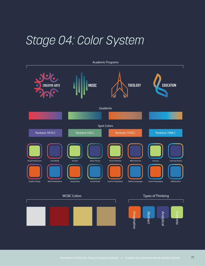
71The Master of Fine Arts Thesis of Keenan Sultanik • Creative Arts Academic Brand Identity System
Stage 04: Color System
Visual Productions Core Media
Graphic Design Web Development
Vocalist Music Theory
Songwriting Instrumental
Church Ministry Bible Doctrine
Sermon Preparation Biblical Languages
Sciences Learning Theory
Lesson Preparation Mathematics
Academic Programs
Gradients
Spot Colors
Concrete
Analytical
Abstract
Imaginative
Types of ThinkingWCBC Colors
Pantone 7670 C Pantone 556 C Pantone 7578 C Pantone 7688 C
THEOLOGY EDUCATION

72 The Utilization of Visual Design Systems to Promote Higher Levels of Learning in Educational Environments
Stage 05: Exploratory Sketches

73The Master of Fine Arts Thesis of Keenan Sultanik • Creative Arts Academic Brand Identity System
PROCESS

74 The Utilization of Visual Design Systems to Promote Higher Levels of Learning in Educational Environments
Stage 06: Vector Mark Concepts
EDUCATION
THEOLOGY
THEOLOGY
CREATIVE VISION

75The Master of Fine Arts Thesis of Keenan Sultanik • Creative Arts Academic Brand Identity System
VIDEO PRODUCTION
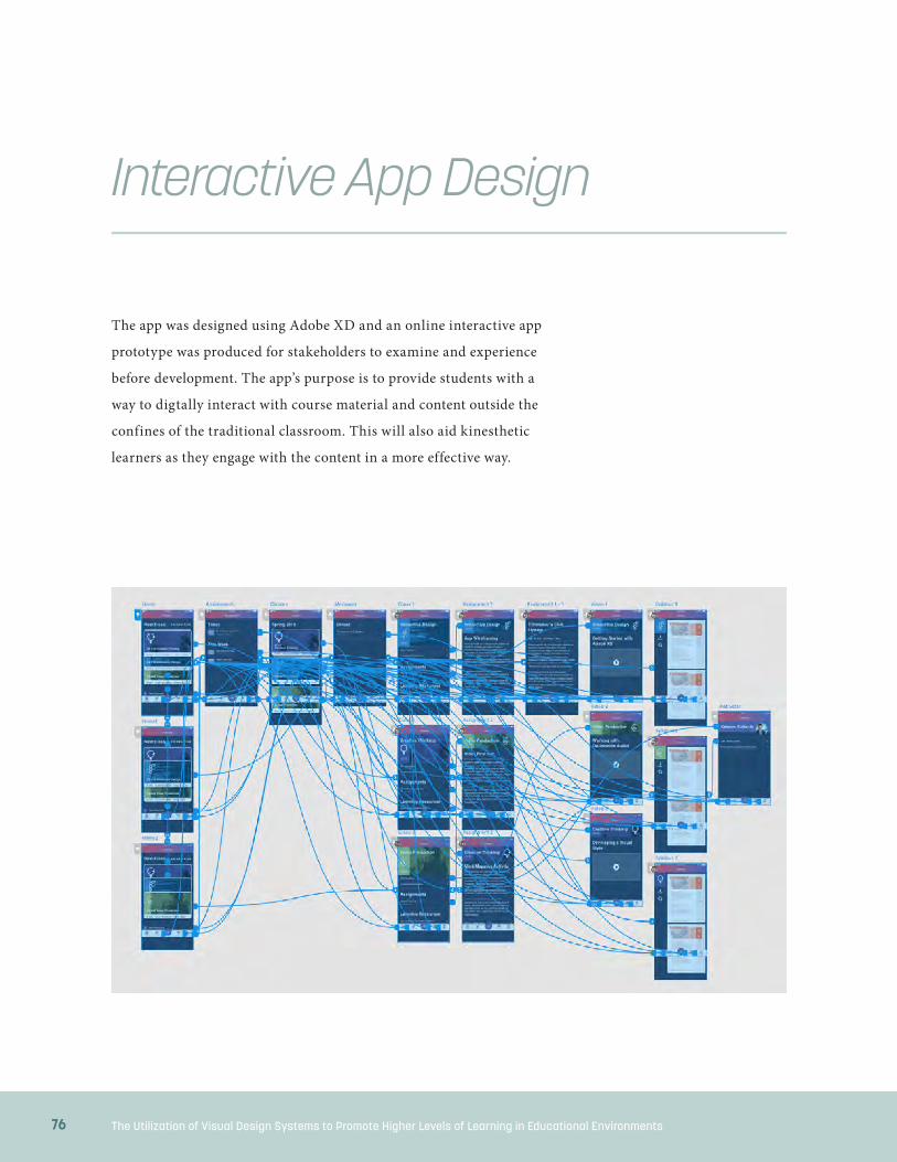
76 The Utilization of Visual Design Systems to Promote Higher Levels of Learning in Educational Environments
Interactive App Design
The app was designed using Adobe XD and an online interactive app
prototype was produced for stakeholders to examine and experience
before development. The app’s purpose is to provide students with a
way to digtally interact with course material and content outside the
confines of the traditional classroom. This will also aid kinesthetic
learners as they engage with the content in a more effective way.

77The Master of Fine Arts Thesis of Keenan Sultanik • Creative Arts Academic Brand Identity System
PROCESS

C H A P T E R F O U R
Solution

79The Master of Fine Arts Thesis of Keenan Sultanik • Creative Arts Academic Brand Identity System
SOLUTION
The following brand identity package for the Creative Arts Department of West Coast Baptist College provides a visual framework for identification and association within the learning environment. This framework will help students associate learning material with course identity to help them build mental pathways from course to content to application. In the following pages, the logo system will be presented along with a comprehensive color system for color coding based on department and type of
thinking/learning required for the skillset of that particular course. Icons are important for rapid visual association and thus are important for this identity system. Each department has a unique logo, but the Creative Arts Department has four disciplines which each get their own logo and defining color. The brand is presented with academic mockups of templates for syllabi, slide decks, and banner graphics. Also featured is an innovative app design to provide an interactive component to the learning experience.
CREATIVE ARTS ACADEMIC DEPARTMENT BRAND IDENTITY PACKAGE

80 The Utilization of Visual Design Systems to Promote Higher Levels of Learning in Educational Environments
SOLUTION
Department Logos
Department Logos in Four Color Process
Department Logos in One Color
The Theology Department’s logo was created using a triangular grid system to symbolize the triune Godhead and designed in the form of a church with a steeple and negative space for the doorway. The Creative Arts Department logo is designed with an overlapping set of circles forming a series of abstract letter A’s which, when put together, creates a letter C around the department title.
Education’s logo is an abstracted representation of the Lamp of Knowledge with the bottom portion of the logo being the lamp and the upper portion symbolizing a flame. The Music Department’s logo is a series of digital sound waves with an exact spacing between each element to show rhythm. The text placement is consistent across the series in case they would need to appear together.

81The Master of Fine Arts Thesis of Keenan Sultanik • Creative Arts Academic Brand Identity System
SOLUTION
GRAPHICDESIGN
VIDEOPRODUCTION
INTERACTIVEDESIGN
GRAPHICDESIGN
VIDEOPRODUCTION
INTERACTIVEDESIGN
Creative Arts Disciplines Logos
Creative Arts Disciplines Logos in Four Color Process
Creative Arts Disciplines Logos in One Color
For the Creative Arts Department, the classes are divided up into four different disciplines—Creative Vision, Video Production, Graphic Design, and Interactive Design. Creative Vision is a lightbulb combined with an eye shown from the side. Video Production’s logo is representative of looking into the front of a lens at an angle along with an abstracted form of the Golden Circle, which
is often used in video as a compositional aid. Graphic Design’s logo shows a page with the star representing point and is made up of both line and plane symbolizing the three primary elements of design. Interactive Design is comprised of several interlocking shapes to illustrate the variety of interactive media that can be utilized but the unified experience they must create.

82 The Utilization of Visual Design Systems to Promote Higher Levels of Learning in Educational Environments
SOLUTION
Visual Productions Core Media
Graphic Design Web Development
Vocalist Music Theory
Songwriting Instrumental
Church Ministry Bible Doctrine
Sermon Preparation Biblical Languages
Sciences Learning Theory
Lesson Preparation Mathematics
Academic Programs
Gradients
Spot Colors
Concrete
Analytical
Abstract
Imaginative
Types of ThinkingWCBC Colors
Pantone 7670 C Pantone 556 C Pantone 7578 C Pantone 7688 C
Color System

83The Master of Fine Arts Thesis of Keenan Sultanik • Creative Arts Academic Brand Identity System
Syllabus and Notes Templates
Left: Syllabus template for the Typography class within the Graphic Design discipline
Above: Notes template for the App Design I class within the Interactive Design discipline

84 The Utilization of Visual Design Systems to Promote Higher Levels of Learning in Educational Environments
Slide presentations form the basis for graphic support and visual display during classroom learning. As the primary visual support for a lecture, slide design must follow rules of visibility and typographic readability while retaining a quality aesthetic that can help keep learners engaged and on track with presentation content and context. These slides incorporate a subtle hint at the visual gradient used for their department—in this case Creative Arts. The particular discipline of which the class is a part is featured prominently
on the title screen along with the course code and course title. The color of the form of thinking primarily used in course is then featured on the right side to provide context on learning format along with a subtle overlay of the particular grid system used for the design of the discipline logo featured on the left side to emphasize the creative aspect of the department and course content. A relevant photo is blended into the background for context and as another type of visual anchor to the course material.
Slide Deck Templates

85The Master of Fine Arts Thesis of Keenan Sultanik • Creative Arts Academic Brand Identity System
SOLUTION

86 The Utilization of Visual Design Systems to Promote Higher Levels of Learning in Educational Environments
With the institution-wide use of Canvas as West Coast Baptist College’s web-based learning management system (LMS), the ability to uniquely brand the online spaces of each class presents an opportunity to help students connect visually with the digital learning environment and connect it with the other branded materials they have already received, connecting everything together for better association. The branding
here is simple—insert a banner that has hints of the department’s color gradient along with the discipline’s unique color and logo elements. However, this serves as a mental anchor to orientate them as students flip from one course’s section to another’s, providing continuity. Graphics templates for class titles have been designed for inclusion on the course introduction pages in the learning management system.
Learning Management System Banner Graphics
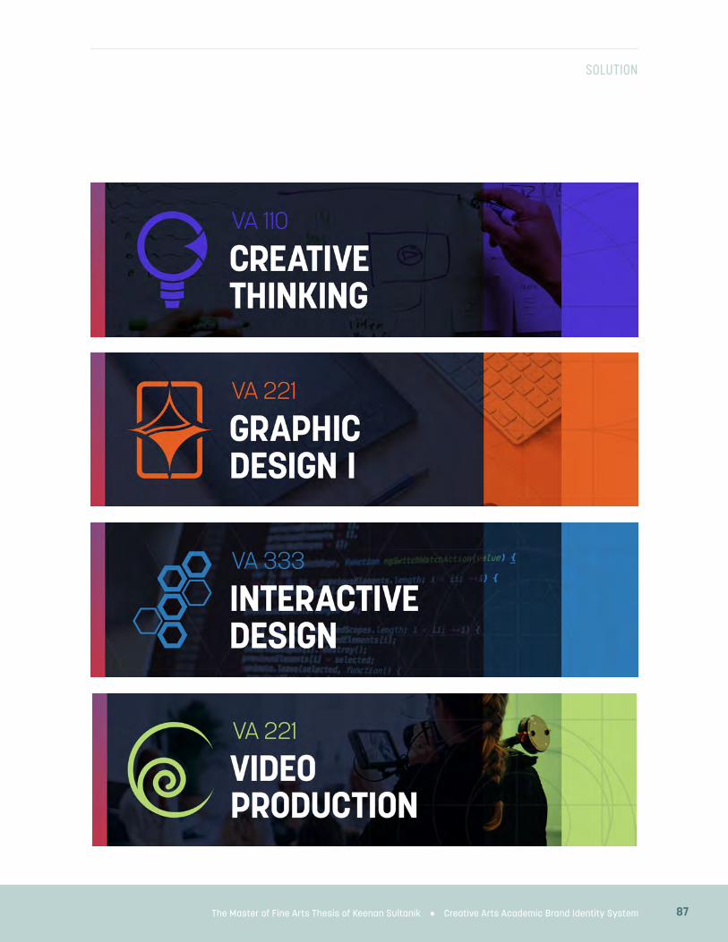
87The Master of Fine Arts Thesis of Keenan Sultanik • Creative Arts Academic Brand Identity System
SOLUTION

88 The Utilization of Visual Design Systems to Promote Higher Levels of Learning in Educational Environments
The following app concept and prototype is purposed to create an interactive experience that would engage kinesthetic learners through a hands-on experience that can reinforce material given in class and allow for both types of exceptional learners—those who need additional opportunities for learning course material and those who need to be challenged with more
advanced content—to gain needed learning resources to continue their education outside of the classroom setting. The purpose of the app is twofold: allow students to engage with the academic aspects of the course in a streamlined interface and allow students to consume additional learning resources to help struggling students and challenge more advanced learners.
Academic App Concept Design and Prototype

89The Master of Fine Arts Thesis of Keenan Sultanik • Creative Arts Academic Brand Identity System
SOLUTION

C H A P T E R F I V E
Conclusion

91The Master of Fine Arts Thesis of Keenan Sultanik • Creative Arts Academic Brand Identity System
CONCLUSION
The colors for each track of the Visual Arts
program (green for Visual Productions, blue
for Web Development, orange for Graphic Design,
and purple for the foundational Creative Vision
courses) were chosen to be easily distinguished
from each other, along with connecting back with
the brand’s color system and its color scheme for
denoting the four types of thinking in academia.
The following describes the qualities that each
color possess or communicates. Purple is vibrant
and thoughtfully ref lective in nature and is
associated with creativity and creative individuals.
This color was chosen for the Creative Vision
courses where students are first exploring the
idea of creativity and learning the tools necessary
to express their own creativity. Green conveys
a sense of life and growth and motion. The idea
of life leads to the idea of a story. This color of
growth and story was selected for the Video
Productions. Blue is the used for the Interactive
Design discipline and exhibits a sense of calm
and logical, rational existence—appropriate for
the most technical track in the program. Orange
communicates passion, energy, and boldness. This
color was chosen to represent the Graphic Design
discipline within the program.
The typefaces of Korolev and Adelle were
chosen for their modern x-height and sense of
progressive optimism along with the variety of
styles and weights available within each family
and their accessibility through Adobe Fonts.
The combination of a geometric sans-serif with
a slab serif also provides a wide visual set of
combinations and pairings between the two
typeface families.
All of these concepts help to inform the
design process. These specific applications
of visual theory will hopefully make the
accompanying designs more effective as tools
of the educational process and integrate visual
literacy and theory into West Coast Baptist
College’s Creative Arts program.
The intension of this research was to develop
a set of standards that could be applied to the
education at West Coast Baptist College through
unified instructional visual design. Before
92 The Utilization of Visual Design Systems to Promote Higher Levels of Learning in Educational Environments
CONCLUSION
the research began, the importance of design
was obvious, but what was lacking was a set of
standards that faculty who are not in the design
industry could follow to improve the visual design
of their teaching and elevate student learning. The
research has not only informed the design process
of this project but has even refined the processes
and design habits of this author.
Although changing long time habits can prove
difficult for veteran educators, a sound case may
be made through this research and design system
for the incorporation of a visual identity system
in education despite the effort in incorporating
it into the classroom. The increasing emphasis
on visual stimuli by society at large necessitates
that educators conform in order to reach and
educate their students who have grown up in
this society. From the perspective of visual arts
eduction in college, educators should model this
level of visual communication in their classrooms
to provide students with a solid example of what
a comprehensive design system looks and feels
like. This would allow them to experience a brand
system first hand and give them the tools to be
able to design one for themselves in the future.
Visual design is at its heart a form of
communication, and while it is more than
that, communication is an important aspect.
Communication is about connecting information
in a meaningful way. The world is not lacking
for available information, but connecting it in
ways that builds knowledge and furthers society
requires a framework in which to do so. This
brand identity system, tailored specifically to an
academic context, seeks to do just that by allowing
students to make more meaningful connections
between pieces of information in order to
construct a more effective learning environment.
The future of visual communication will
only grow more complex as new technologies
are released. Technology has historically been a
driver of innovation in design by opening up new
opportunities for visual design and by closing
others that become irrelevant. While this could be
viewed by designers with frustration, it actually
opens exciting new worlds in which designers

93The Master of Fine Arts Thesis of Keenan Sultanik • Creative Arts Academic Brand Identity System
CONCLUSION
can provide beauty and significance. Creative
professionals will seek to fill these new contexts
with order, meaning, and pleasing aesthetics.
Educators likewise have opportunity here
to leverage these new technological and creative
tools and contexts to create learning opportunities
for students that will help them to connect
information in ways to which they can relate and
that will prepare them to live and communicate in
the society of the future.

Appendix

95The Master of Fine Arts Thesis of Keenan Sultanik • Creative Arts Academic Brand Identity System
APPENDIX
Aldalalah, Osamah Ahmad, and Ziad Waleed
Mohamed Ababneh. “Standards of
Multimedia Graphic Design in Education.”
Journal of Education and Practice, vol. 6, no.
17, Jan. 2015, pp. 102–110.
Ambrose, Gavin. “Basics Design 01: Format:
Second Edition.” Paul Harris, A&C Black,
May 2012, p. 151.
Anderson, Lorin W., Krathwohl, David R., and
Bloom, Benjamin S. A Taxonomy for Learning,
Teaching, and Assessing: a Revision of Bloom’s
Taxonomy of Educational Objectives. Abridged
edition. New York; Longman, 2002. Print.
Armstrong, Patricia. “Bloom’s Taxonomy.”
Vanderbilt University. N. p., 2010. Web. 07
April 2019.
Arnold, Stephen. “Rethinking E-Learning Media:
What Happens When Student ‘Like’ Meets
Professor ‘Me’?” International Association for
Development of the Information Society, Dec.
2016, p. 6.
Arslan, Rumiye, and Zeren Nelinci Gülbin.
“Development of Visual Literacy Levels Scale
in Higher Education.” TOJET : The Turkish
Online Journal of Educational Technology 13.2
(2014) ProQuest. Web. 23 Sep. 2018.
Bain, Ken. What The Best College Teachers Do.
Harvard University Press, 2004.
Barratt, Mark. “Type Classif ication SIG
launched.” ATypI. 26 Aug. 2015. Web. 22
Sept. 2016.
Braden, R. A., and J. A. Hortin. “Identifying the
Theoretical Foundations of Visual Literacy.”
Journal of Visual Verbal Languaging (1982).
37–42.
Brame, Cynthia J. “Effective Educational Videos:
Principles And Guidelines For Maximizing
Student Learning From Video Content”.
CBE—Life Sciences Education, vol 15, no.
4, 2016, p. es6. American Society For Cell
Biology (ASCB), doi:10.1187/cbe.16-03-0125.
Bringhurst, Robert. Elements of Typographic
Style: Version 4.0: 20th Anniversary
Edition. 4th ed. Seattle: Hartley and Marks
Publishers, 2013. Print.
Brown, Loren. “Best Practices of Leadership
Bibliography

96 The Utilization of Visual Design Systems to Promote Higher Levels of Learning in Educational Environments
APPENDIX
in Educational Technology.” Journal of
Educational Technology, vol. 11, no. 1, Jan.
2014, pp. 1–6.
ChanLin, Lih-Juan. A Theoretical Analysis of
Learning with Graphics—Implications for
Computer Graphics Design. Jan. 1994.
Childers, Taylor, Jessica Griscti, and Liberty
Leben. “25 Systems for Classifying
Typography: A Study in Naming Frequency.”
Parsons Journal for Information Mapping.
2013. Web. 3 Oct. 2016.
Chmela-Jones, K. A., et al. “Visual Learning and
Graphic Design: A Cooperative Strategy.”
South African Journal of Higher Education,
vol. 21, no. 4, July 2007, pp. 628–639.
Chugh, Ritesh. “The Role And Use Of
Social Media In Higher Education.”
Thehighereducationreview.com. N. p., 2018.
Web. 23 Sept. 2018.
Farwell, Stephen. “Clarendon typeface.”
HistoryGraphicDesign.com. 2016. Web. 2
Oct. 2016.
Faye, Marcia. “Camera As Compass.” Illinois Tech
Magazine. N. p., 2010. Web. 15 Apr. 2019.
Gouveia, Anna Paula Silva, et al. “Letters and
Cities: Reading the Urban Environment with
the Help of Perception Theories.” Visual
Communication, vol. 8, issue 3, pp. 339-348,
2009. Web. 30 Sep. 2018.
Hanington, Bruce and Bella Martin. Universal
Methods of Design. Rockport Publishers, 2012.
Hanna, Aura, and Roger Remington. “The
Representation of Color and Form in Long-
term Memory.” Memory and Cognition, vol.
24, 1996.
Hendricks, Howard. Teaching To Change Lives.
Multnomah Books, 2011.
Hodge, Sean. “Seven Principles of Effective Icon
Design.” Design & Illustration Envato Tuts+.
N. p., 2008. Web. 11 Feb. 2018.
I Love Typography. “A Brief History of Type — I
love typography.” Ilovetypography.com. 30
May 2008. Web. 2 Oct. 2016.
Jobs, Steve. “A Quote By Steve Jobs.” Goodreads.
com. N. p., 2019. Web. 15 Apr. 2019.
Koch, Beth E. “Emotion in Typographic Design: an

97The Master of Fine Arts Thesis of Keenan Sultanik • Creative Arts Academic Brand Identity System
APPENDIX
Empirical Examination.” Visible Language 46.3
(2012): 206-27. ProQuest. Web. 8 Sep. 2016.
Kouyoumdjian, Haig. “Learning through Visuals.”
Psychology Today. N. p., 2018. Web. 11 Feb. 2018.
Lazaros, Edward J., and Thomas H. Spotts. “Teach
Graphic Design Basics with PowerPoint.” Tech
Directions, vol. 67, no. 3, Nov. 2007, pp. 21–23.
Leeuwen, Theo. “Typographic Meaning.” Visual
Communication 4.2 (2005): 137–143. Print.
Mejia, Zameena. “Three Tricks Steve Jobs Used That
Will Help You Give Better Presentations.” CNBC.
N. p., 2017. Web. 3 Feb. 2019.
Morrison, Gary Ray. An Investigation of
the Communicability of the Emotional
Connotation of Type. Dissertation, Indiana
University. ProQuest Dissertations
Publishing, 1977. Web. 11 Sept. 2016.
Niu, Li, Leiqing Xu, and Zhong Tang. “Use of
Gestalt in Wayfinding Design and Analysis of
Wayfinding Process.” Frontiers of Architecture
and Civil Engineering in China 2.4 (2008):
386-90. ProQuest. Web. 30 Sep. 2018.
Palmer, Earl, Roberta Hestenes, and Howard
Hendricks. Mastering Teaching. Multnomah
Press, 1991.
Puckett, Rhonda. “Leadership in Educational
Technology.” Journal of Educational
Technology, vol. 10, no. 4, Jan. 2014, pp. 1–5.
Rand, Paul. “Paul Rand Quotes, Author Of
Thoughts On Design.” Goodreads.com. N. p.,
2019. Web. 15 Apr. 2019.
Rennie, Frank, and Tara Morrison. E-Learning
And Social Networking Handbook. Taylor And
Francis, 2013.
Rothwell, William J., et al. Mastering the
Instructional Design Process : A Systematic
Approach, Center for Creative Leadership,
2015. ProQuest Ebook Central
Seglem, Robyn. “You Gotta See It to Believe
It: Teaching Visual Literacy in the English
Classroom.” Journal of Adolescent and Adult
Literacy 53.3 (2009): 216-26. Web.
Simonson, Michael, et al. “Annual Proceedings of
Selected Papers on the Practice of Educational
Communications and Technology Presented
at the Annual Convention of the Association

98 The Utilization of Visual Design Systems to Promote Higher Levels of Learning in Educational Environments
APPENDIX
for Educational Communications and
Technology (40th, Jacksonville, Florida, 2017).
Volumes 1, 2.” Association for Educational
Communications and Technology, Jan. 2017.
Stancampiano, Juliana. “The Benefits of Visual
Facilitation in the Classroom” Training
Industry. N. p., 2013. Web. 31 Jan. 2018.
Tannenbaum, Percy H., Harvey K. Jacobson,
and Eleanor L. Norris. “An Experimental
Investigation of Typeface Connotations.”
Journalism Quarterly 41.1 (1964): 65–73. Web.
11 Sept. 2016.
Tyler, Jacob. “17 Great Quotes On Design
Philosophy From Apple’s Sir Jony Ive.”
JacobTyler.com. N. p., 2015. Web. 15 Apr. 2019.
Typedia. “Typedia: Adobe Garamond.” Typedia.
com. 22 Nov. 2014. Web. 2 Oct. 2016.
- -. “Typedia: Baskerville.” Typedia.com. 22 Nov.
2014. Web. 2 Oct. 2016.
- -. “Typedia: Futura.” Typedia.com. 9 Nov. 2015.
Web. 2 Oct. 2016.
- -. “Typedia: Gill Sans.” Typedia.com. 9 Nov.
2015. Web. 2 Oct. 2016.
- -. “Typedia: Helvetica.” Typedia.com. 9 Nov.
2015. Web. 2 Oct. 2016.
Wilkinson, Krista, Michael Carlin, and Jennifer
Thistle. “The Role of Color Cues in Facilitating
Accurate and Rapid Location of Aided
Symbols by Children with and without Down
Syndrome.” American Journal of Speech-
Language Pathology 17.2 (2008): 179. Web.
Yarkova, T. A., et al. “Preparing Teachers to
Use New Media Visual Communications in
Education.” International Journal of Emerging
Technologies in Learning, vol. 12, no. 2, Feb.
2017, pp. 4–15.
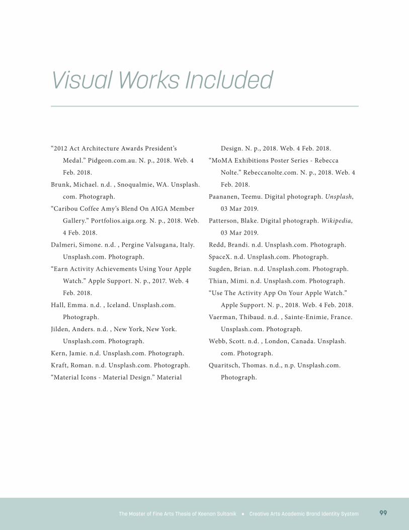
99The Master of Fine Arts Thesis of Keenan Sultanik • Creative Arts Academic Brand Identity System
“2012 Act Architecture Awards President’s
Medal.” Pidgeon.com.au. N. p., 2018. Web. 4
Feb. 2018.
Brunk, Michael. n.d. , Snoqualmie, WA. Unsplash.
com. Photograph.
“Caribou Coffee Amy’s Blend On AIGA Member
Gallery.” Portfolios.aiga.org. N. p., 2018. Web.
4 Feb. 2018.
Dalmeri, Simone. n.d. , Pergine Valsugana, Italy.
Unsplash.com. Photograph.
“Earn Activity Achievements Using Your Apple
Watch.” Apple Support. N. p., 2017. Web. 4
Feb. 2018.
Hall, Emma. n.d. , Iceland. Unsplash.com.
Photograph.
Jilden, Anders. n.d. , New York, New York.
Unsplash.com. Photograph.
Kern, Jamie. n.d. Unsplash.com. Photograph.
Kraft, Roman. n.d. Unsplash.com. Photograph.
“Material Icons - Material Design.” Material
Design. N. p., 2018. Web. 4 Feb. 2018.
“MoMA Exhibitions Poster Series - Rebecca
Nolte.” Rebeccanolte.com. N. p., 2018. Web. 4
Feb. 2018.
Paananen, Teemu. Digital photograph. Unsplash,
03 Mar 2019.
Patterson, Blake. Digital photograph. Wikipedia,
03 Mar 2019.
Redd, Brandi. n.d. Unsplash.com. Photograph.
SpaceX. n.d. Unsplash.com. Photograph.
Sugden, Brian. n.d. Unsplash.com. Photograph.
Thian, Mimi. n.d. Unsplash.com. Photograph.
“Use The Activity App On Your Apple Watch.”
Apple Support. N. p., 2018. Web. 4 Feb. 2018.
Vaerman, Thibaud. n.d. , Sainte-Enimie, France.
Unsplash.com. Photograph.
Webb, Scott. n.d. , London, Canada. Unsplash.
com. Photograph.
Quaritsch, Thomas. n.d., n.p. Unsplash.com.
Photograph.
Visual Works Included

100 The Utilization of Visual Design Systems to Promote Higher Levels of Learning in Educational Environments
Copyright Release
The following release of copyright proves that the author of this thesis has
permission to reproduce the images taken by Alyssa Sultanik shown below.

101
APPENDIX
The Master of Fine Arts Thesis of Keenan Sultanik • Creative Arts Academic Brand Identity System 101

102 The Utilization of Visual Design Systems to Promote Higher Levels of Learning in Educational Environments
About the Author
Keenan Sultanik directs the Visual Arts program of West Coast Baptist
College and teaches courses in design, communications, media, technology,
and education. He has experience founding a startup web development
studio and in photography, graphic and interactive design, web and app
development, video production, broadcasting, and 3D modeling. Keenan is
an Adobe Education Leader (AEL) and an Adobe Partners by Design member.
After receiving a call to ministry, he earned a bachelor’s degree in Theology
from WCBC and now works passionately to train the next generation in
effective visual arts with a distinctive ministry emphasis.
Keenan Sultanik
103The Master of Fine Arts Thesis of Keenan Sultanik • Creative Arts Academic Brand Identity System
APPENDIX
“Photography, as a powerful medium of expression and
communications, offers an infinite variety of perception,
interpretation, and execution.”
—Ansel Adams
“Good design is making something intelligible and memorable.
Great design is making something memorable and meaningful.”
—Dieter Rams
“Design can be art. Design can be aesthetics.
Design is so simple, that’s why it is so complicated.”
—Paul Rand
“Design is not just what it looks like and feels like;
design is how it works.”
—Steve Jobs
“A small change at the beginning of the design process
defines an entirely different product at the end.”
—Jonathan Ive

THE UTILIZATION OF
VISUAL DESIGN SYSTEMSTO PROMOTE HIGHER LEVELS OF LEARNING
IN EDUCATIONAL ENVIRONMENTS
Master of Fine Arts Thesis
Keenan Sultanik