The Pyramid Scheme: Visual Metaphors and the USDAâ•Žs ...
14
University of Pennsylvania University of Pennsylvania ScholarlyCommons ScholarlyCommons Departmental Papers (ASC) Annenberg School for Communication 7-2011 The Pyramid Scheme: Visual Metaphors and the USDA’s Pyramid The Pyramid Scheme: Visual Metaphors and the USDA’s Pyramid Food Guides Food Guides Alison Perelman University of Pennsylvania, [email protected] Follow this and additional works at: https://repository.upenn.edu/asc_papers Part of the Communication Commons Recommended Citation Recommended Citation Perelman, A. (2011). The Pyramid Scheme: Visual Metaphors and the USDA’s Pyramid Food Guides. Design Issues, 27 (3), 60-71. https://doi.org/10.1162/DESI_a_00091 This paper is posted at ScholarlyCommons. https://repository.upenn.edu/asc_papers/280 For more information, please contact [email protected].
Transcript of The Pyramid Scheme: Visual Metaphors and the USDAâ•Žs ...

University of Pennsylvania University of Pennsylvania
ScholarlyCommons ScholarlyCommons
Departmental Papers (ASC) Annenberg School for Communication
7-2011
The Pyramid Scheme: Visual Metaphors and the USDA’s Pyramid The Pyramid Scheme: Visual Metaphors and the USDA’s Pyramid
Food Guides Food Guides
Alison Perelman University of Pennsylvania, [email protected]
Follow this and additional works at: https://repository.upenn.edu/asc_papers
Part of the Communication Commons
Recommended Citation Recommended Citation Perelman, A. (2011). The Pyramid Scheme: Visual Metaphors and the USDA’s Pyramid Food Guides. Design Issues, 27 (3), 60-71. https://doi.org/10.1162/DESI_a_00091
This paper is posted at ScholarlyCommons. https://repository.upenn.edu/asc_papers/280 For more information, please contact [email protected].

The Pyramid Scheme: Visual Metaphors and the USDA’s Pyramid Food Guides The Pyramid Scheme: Visual Metaphors and the USDA’s Pyramid Food Guides
Abstract Abstract In 1991 the United States Department of Agriculture (USDA) announced the creation of the Eating Right Pyramid, an icon designed to illustrate the federal government’s recommendations for a healthy diet. Even before its release, the Pyramid was a source of controversy; nutritionists and public health officials criticized the project as an exercise in jurisdictional malfeasance, while beef and dairy farmers complained that the new diet deemphasized the nutritional benefits of their products. The greatest source of conflict, however, did not derive from the information the guide displayed, but from the way in which that information was presented...
Disciplines Disciplines Communication | Social and Behavioral Sciences
This journal article is available at ScholarlyCommons: https://repository.upenn.edu/asc_papers/280

The Pyramid Scheme: Visual Metaphors and the USDA’s Pyramid Food GuidesAlison Perelman
In 1991 the United States Department of Agriculture (USDA) announced the creation of the Eating Right Pyramid, an icon designed to illustrate the federal government’s recommendations for a healthy diet. Even before its release, the Pyramid was a source of controversy; nutritionists and public health officials criticized the project as an exercise in jurisdictional malfeasance, while beef and dairy farmers complained that the new diet deemphasized the nutritional benefits of their products. The greatest source of conflict, however, did not derive from the information the guide displayed, but from the way in which that information was presented. While criticism was hurled against both the specifics of the diet and the fact that the Agriculture Department was responsible for generating nutritional recommendations,1 the most contentious debate was borne of the perceived hierarchical implications of the design itself. Critics interpreted the Pyramid, the design selected because it best reflected the proportion of a healthy diet each food group represented, as a source of symbolic and value-laden meaning. To the agriculture lobbies, the Eating Right Pyramid inappropriately categorized foods as good and bad, while to doctors and nutritionists the Pyramid presented the least healthy foods in the most positive light. Consequently, the hierarchical implications of the pyramidal shape defined the public discourse, and the Eating Right Pyramid was reframed as a site of conflicting visual metaphors.
This paper analyzes the public discourse around the perceived problems with the Pyramid’s design. While much research has addressed the efficacy of the USDA’s nutritional policies from a public health perspective, this paper considers the status of the food pyramid, by far the most recognizable American nutritional guide, as a cultural object that is subject to visual interpretation. To that end, it tracks the discussion of the design’s development through a discourse analysis of all articles about the Pyramid published in the Washington Post, The New York Times, and USA Today—the three newspapers that provided nearly all national coverage of the design’s journey from the drawing board to the back of nearly all packaged food products in the United States. This analysis is situated in Lakoff and Johnson’s framework for understanding metaphors and focuses on three stages in the food guide’s development: the unveiling of the © 2011 Massachusetts Institute of Technology Design Issues: Volume 27, Number 3 Summer 2011
1 While beyond the scope of this paper, it is critical to note the potential conflict of interest inherent in the USDA’s position as both agricultural advocate and national nutritionist. Much excel-lent scholarship has interrogated this problematic dynamic, preeminently Marion Nestle’s Food Politics (Berkeley: University of California Press, 2007).
60

Design Issues: Volume 27, Number 3 Summer 2011 61
Eating Right Pyramid, the decision to reassess the design, and the subsequent release of the renamed Food Guide Pyramid one year later. Finally, the paper will interrogate the discourse surrounding the release of MyPyramid, the USDA’s first and only major overhaul of the Food Guide, in light of the issues presented in the case of the first Pyramid.
A History of American Food GuidesEstablished in 1862, the mission of the United States Department of Agriculture included the task of “acquiring and diffusing among the people of the United States useful information on human nutrition.”2 The USDA released its first dietary recommendations at the end of the nineteenth century in the form of food composition tables; the first graphical depictions of the food guide were produced in the 1940s. Initially, the guides were more concerned with variety than proportionality. In the face of rationing during World War II, the federal government told Americans to eat from eight food groups, photographs of which were arranged in two rows of four equally sized squares in the accompanying visual guide3 (Figure 1). In the 12 years following the end of the war the number of food groups dropped to 7, which were depicted in the illustrated Basic Seven food guide as a single column of identically-sized boxes containing images of the foods represented (Figure 2). In 1956, in an effort to simplify what was considered an overly complicated model, the USDA released its consolidated food guide, the Basic Four4 (Figure 3). In the associated graphic the milk and bread groups were housed in abstract, egg-like yellow and orange shapes, and the meat and fruit and vegetable groups in red and green rectangles. While the
2 K. Dun Gifford, “Dietary Fats, Eating Guides, and Public Policy: History, Critique, and Recommendations,” The American Journal of Medicine 113:9, (2002) 89–106.
3 A visual archive of food guides is available through the USDA at http://www.nal.usda.gov/fnic/history/index.html (accessed May 27, 2011)
4 Nestle, Food Politics, 36–7.
Figure 1From the United States Department of Agriculture, http://www.nal.usda.gov/fnic/history/ww2.htm

Design Issues: Volume 27, Number 3 Summer 201162
Basic Four marked the first time the food groups weren’t represented as identical units, the motivation for the shift in design was strictly visual and did not derive from a concern with depicting the relative proportionality of a healthy diet.
A congressional review in 1977 found an increase in cases of preventable diseases believed to be related to diet, and in response the USDA released an informational booklet, Food, which included a new dietary scheme that had at its foundation the Basic Four food groups but amended the model to include a fifth group consisting of fats, sweets, and alcohol5 (Figure 4). To display these new recommen-dations, which for the first time included a call for moderation, the accompanying guide depicted a stack of rectangular photomontages of some foods that were found in the Basic Four groups but included at the bottom a box half the size of the others, representing the new fats, sweets, and alcohol group. This image marked the first time a group’s visual illustration mirrored its recommended consumption relative to other foods.
Seven years later the USDA partnered with the American Red Cross to create the Food Wheel, the first graphic designed primarily with the issue of proportionality in mind.6 After four years, the USDA conducted an analysis of the new design; the guide tested poorly, due in large part to the consumers’ sense that it was outdated. Subsequently, the department began developing a new icon to display nutritional recommendations. The USDA revealed the Eating Right Pyramid after three years of testing, during which time the design was demonstrated as the best option to illustrate the ideas of proportionality and moderation.
Figure 2 (left)From the United States Department of Agriculture, http://www.nal.usda.gov/fnic/history/basic7.htm
Figure 3 (right)From the United States Department of Agriculture, http://www.nal.usda.gov/fnic/history/basic4.htm
5 Ibid, 40–2.6 Carole Davis and Etta Saltos, “Dietary
Recommendations and How They Have Changed Over Time,” in America’s Eating Habits: Changes and Consequences, Agriculture Information Bulletin No. 750: 33–50, ed. Elizabeth Frazao (Washington, DC: Economic Research Service, United States Dept of Agriculture, 1999).

Design Issues: Volume 27, Number 3 Summer 2011 63
Development of the PyramidIn 1988 the Human Nutrition Information Service, the branch of the USDA responsible for the development of nutritional recommen-dations, contracted with a Washington, DC-based market research firm, Porter Novelli, to develop and evaluate design options for a new food guide. Until that point Porter Novelli was perhaps best known for its work in Richard Nixon’s reelection campaign. In the early stages of the new food guide’s development, the firm considered five principle designs: a circle, blocks arranged in a circle, blocks in a row, a pyramid, and an inverted pyramid, referred to as a funnel. According to results generated by the initial focus group, every design but the pyramid was flawed in a fundamental way: The blocks arranged in a circle were “too hard on the eyes;” the circle, reminiscent of the Food Wheel, was deemed too familiar; and the blocks in a row seemed too unbalanced.7
The inverted pyramid, meanwhile, generated the most contentious results. While it received some extremely high marks, many found the design unsettling and off-balance—so much so that the “awkward” illustration interfered with viewers’ understanding of the message.8 Results from these preliminary tests indicated that people best understood the necessary nutritional concepts—proportionality, variety, and moderation—when they were depicted by the non-inverted pyramid.9 Due in large part to the design’s success at displaying the recommended proportions of each food group, the USDA adopted the pyramid and entered into the final stages of its development.
After Porter Novelli determined the effectiveness of the pyramid design, the project was turned over to the USDA’s Design Division of Public Affairs for the second and third rounds of analysis.10 At this point, in addition to re-testing many of the designs the firm included in its evaluation, the USDA’s design group also considered illustrations submitted to USA Today in response to an article soliciting readers’ suggestions. The final rounds of analysis, therefore, included discussion of the original graphic options, as well as a bowl of food, a pie chart made to look like a plate, and a grocery cart stocked with a bar graph depicting each food group.11 The USDA’s final decision came down to the bowl and the pyramid, with both designs drawing high marks from important constituencies, including children and minorities. In the end, the pyramid was determined to be the best at communicating the message of proportionality and was thus scheduled for national release in 1991 (Figure 5).
Criticism of the Eating Right PyramidFollowing the release of a preview of the Eating Right Pyramid, a group of physicians issued a request to the USDA asking that the department better integrate current medical opinion into the new food guide’s recommended diet. Specifically, the physicians
7 Susan O. Welsh, Carole Davis, and Anne Shaw, “USDA’s Food Guide: Background and Development,” U.S. Department of Agriculture, Human Nutrition Information Services, Miscellaneous Publication Number 1514 (Hyattsville, MD: USDA, 1993)
8 Ibid.9 Nestle, Food Politics, 55.10 Welsh, et al., “USDA’s Food Guide:
Background and Development.”
Figure 4From the United States Department of Agriculture, http://www.nal.usda.gov/fnic/history/has.htm

Design Issues: Volume 27, Number 3 Summer 201164
proposed that the five major food groups be reorganized into four new categories of fruits, grains, vegetables, and legumes; meat and dairy products, they argued, should be considered secondary options.12 The story entered into the national conversation when John Block, a former secretary of the USDA and then head of the nation’s largest pork lobby, argued that the physicians’ position amounted to irresponsible nutritional advice. Malcolm Gladwell, then a journalist at the Washington Post, interviewed nutritional professionals and public interest groups about the Eating Right Pyramid and the government’s new diet.
Perhaps expecting that they, like the physicians, would want to discuss the finer points of the USDA’s nutritional recommen-dations, Gladwell’s conversations with nutritional activists instead revealed major points of contention about the design itself. Specifically, the stakeholders’ criticisms of the Pyramid derived from conflicting assessments of the design’s metaphorical entailments. At the heart of the critiques offered by industry groups, nutritional advocates, and public citizens was the notion that the Pyramid, as a shape, was inherently hierarchical and consequently categorized foods as good and bad. At this point it was clear that the yet-unre-leased Pyramid would be a contested design—a symbol to which two antithetical, but equally hierarchical, readings could be attached.
In interviews with the groups representing the meat and dairy industries, Gladwell encountered the concern that the icon, because it was a pyramid, unfairly ranked foods. Specifically, the food lobbies took something of a Gestalt position, insisting that the proximity of their products to the bad fats and sweets group at the top rendered meat and dairy guilty by association. Jeannine Kenney, a lobbyist with the National Milk Producers, surmised that the pyramidal design “stigmatizes dairy products because they are next to fats and oils.”13 As a result, she later stated, the dairy farmers “are not happy with the way we look”14 because they were so close to the bad foods meant to be enjoyed only sparingly.
11 Ibid.12 Marian Burros, “U.S. Delays Issuing
Nutrition Chart,” The New York Times, April 27, 1991, National Desk.
13 Ibid. 14 Carole Sugarman and Malcolm Gladwell,
“U.S. Drops New Food Chart: Meat, dairy groups pressure the Agriculture Department,” Washington Post, April 27, 1991, First Section.
Figure 5From the United States Department of Agriculture, http://www.cnpp.usda.gov/FGPGraphicResources.htm
Design Issues: Volume 27, Number 3 Summer 2011 65
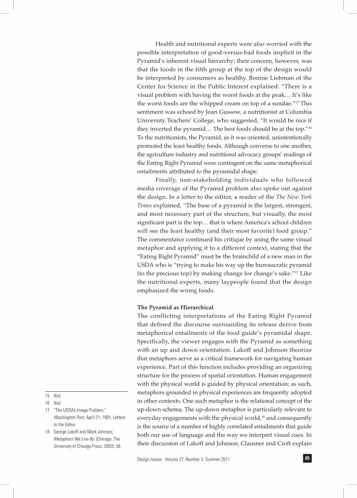
Health and nutritional experts were also worried with the possible interpretation of good-versus-bad foods implicit in the Pyramid’s inherent visual hierarchy; their concern, however, was that the foods in the fifth group at the top of the design would be interpreted by consumers as healthy. Bonnie Liebman of the Center for Science in the Public Interest explained: “There is a visual problem with having the worst foods at the peak… It’s like the worst foods are the whipped cream on top of a sundae.”15 This sentiment was echoed by Joan Gussow, a nutritionist at Columbia University Teachers’ College, who suggested, “It would be nice if they inverted the pyramid… The best foods should be at the top.”16 To the nutritionists, the Pyramid, as it was oriented, unintentionally promoted the least healthy foods. Although converse to one another, the agriculture industry and nutritional advocacy groups’ readings of the Eating Right Pyramid were contingent on the same metaphorical entailments attributed to the pyramidal shape.
Finally, non-stakeholding individuals who followed media coverage of the Pyramid problem also spoke out against the design. In a letter to the editor, a reader of the The New York Times explained, “The base of a pyramid is the largest, strongest, and most necessary part of the structure, but visually, the most significant part is the top… that is where America’s school children will see the least healthy (and their most favorite) food group.” The commentator continued his critique by using the same visual metaphor and applying it to a different context, stating that the “Eating Right Pyramid” must be the brainchild of a new man in the USDA who is “trying to make his way up the bureaucratic pyramid (to the precious top) by making change for change’s sake.”17 Like the nutritional experts, many laypeople found that the design emphasized the wrong foods.
The Pyramid as Hierarchical The conflicting interpretations of the Eating Right Pyramid that defined the discourse surrounding its release derive from metaphorical entailments of the food guide’s pyramidal shape. Specifically, the viewer engages with the Pyramid as something with an up and down orientation. Lakoff and Johnson theorize that metaphors serve as a critical framework for navigating human experience. Part of this function includes providing an organizing structure for the process of spatial orientation. Human engagement with the physical world is guided by physical orientation; as such, metaphors grounded in physical experiences are frequently adopted in other contexts. One such metaphor is the relational concept of the up-down schema. The up-down metaphor is particularly relevant to everyday engagements with the physical world,18 and consequently is the source of a number of highly correlated entailments that guide both our use of language and the way we interpret visual cues. In their discussion of Lakoff and Johnson, Clausner and Croft explain
15 Ibid.16 Ibid. 17 “The USDA’s Image Problem,”
Washington Post, April 21, 1991, Letters to the Editor.
18 George Lakoff and Mark Johnson, Metaphors We Live By: (Chicago: The University of Chicago Press, 2003), 56.

Design Issues: Volume 27, Number 3 Summer 201166
that the up-down metaphor is so comprehensively conceived as to be fully productive; that is, nearly any term related to verticality can be understood in terms of quantity or quality.19 For this reason, because the pyramid is conceptualized according to the up-down schema, the Eating Right Pyramid is interpreted with the entailments of that metaphor in mind.
The Pyramid is understood according to the up-down metaphor in part because it is readily connected to the physical world. The dynamic between the visual object and its spatial orientation is most apparent in the ways the Pyramid is imagined as an object in space by those assessing its design. In his explanation as to why the Pyramid was not inverted (inversion being the alternative proposed by nutritional advocates), the creative director for Porter Novelli explained that such a design was considered but ruled out because the testers “saw it as being very unstable;” he continued, “The thing about the pyramid [base down] is that its center of gravity is very low. It’s not going to blow over.”20 Given these comments, viewers clearly endowed the design with a considerable degree of tangibility and attributed to it physical laws that do not apply to two-dimensional renderings.
Hierarchical structure is understood in terms of up-down schemas;21 consequently, the viewer engages with the Pyramid as an object with inherent hierarchical implications. For this reason, the foods at the top—those in the narrowest sections so as to illustrate they should account for the fewest number of servings—were regarded by some viewers as appearing to be the best. However, an alternative—but equally hierarchical—reading of the Pyramid is revealed in the critiques offered by those representing the meat and dairy producers. Because the text accompanying the Pyramid discourages the use of the foods at the apex of the design, they argue, the foods at the top could be interpreted as being the best at being the worst. According to this reading, the Pyramid is still perceived as a hierarchical form, although the typical connotation of each position within the hierarchy is reversed. To these critics, even though the design is subject to an uncommon interpretation, the issue is still related to the shape’s hierarchical implications. As Gary Wilson, the director of food policy for the National Cattleman’s Association explained, “We wanted to be sure that consumers did not misinterpret the pyramid to be a ranking of food… we wanted to avoid a good-foods, bad-foods ranking.”22 The complications born of the converse yet similarly hierarchical readings of the Pyramid offered by nutritional advocates and agricultural lobbyists dominated the discourse about the design and illustrate the issues that delayed the release of the Eating Right Pyramid.
Back to the Drawing BoardIn late April 1991, less than two weeks after Gladwell’s article was published, the release of the Eating Right Pyramid was officially
19 Timothy C. Clausner and William Croft, “Productivity and Schematicity in Metaphors,” Cognitive Science, 21:3, (Summer 1997) 247:82.
20 Gladwell, “U.S. Rethinks, Redraws the Food Groups.”
21 George Lakoff, Women, Fire, and Dangerous Things (Chicago: University of Chicago Press, 1987), 283.
22 Marian Burros, “Plain Talk About Eating Right,” The New York Times, October 6, 1991, Magazine Desk.

Design Issues: Volume 27, Number 3 Summer 2011 67
delayed to allow for further analysis of the design. In response to the delay, Secretary Madigan, who stated he didn’t know the USDA was developing the Pyramid until he read about the backlash in a newspaper, believed it was necessary to reconsider the design.23 “I was amazed, just amazed,” Madigan explained, “I was on a government plane with members of the House and Senate, and they were quizzing me and saying, ‘Don’t you think this [the Pyramid] is confusing? The bad things are at the top.’”24 Consequently, despite calls by the American Cancer Association, American Diabetic Association, and Public Voice for Food and Health Policy to move forward with the Pyramid, the Eating Right Pyramid was not released.25
In the initial stages of the reevaluation project, focus groups were consulted and the data they provided were used to create alternative designs that included variations on the pyramid, as well as a bowl, a shopping cart, and a pie chart. After 11 months, the consulting firm Bell Associates tested these options and found the pyramid and a bowl, which ordered the five groups horizontally rather than vertically, to be the most effective designs.26 Opinions were mixed among the various stakeholders, as food industry lobbyists preferred pie charts and bowl designs that didn’t depict the food groups hierarchically, while nutrition professionals preferred the pyramid designs because they more clearly conveyed the messages of moderation and proportionality.27 The USDA, however, was primarily concerned with relaying two messages: that diet should be varied and that consumption of fats, oils, and sugars should be reduced. The bowl design more successfully displayed variety, while the Pyramid was found to better express proportionality. Because the latter was considered the single most important issue, in April 1992 the renamed Food Guide Pyramid was released to the public.
(Slight) Variations on a Theme: The New PyramidAside from the revamped nomenclature, the Food Guide Pyramid included 33 changes from the original design. All of the changes were cosmetic; the macaroni, which looked like hot dogs to some people, was dropped in favor of spaghetti, and a wedge of cheese that resembled a slice of cake was made Swiss with the addition of some holes.28, 29 However, the changes did nothing to make the design appear any less like a pyramid. In fact, the most substantial changes were to the shape and apparent dimensionality of the Pyramid—alterations that made the revised version of the food guide look even more pyramidal. Three-dimensionality was ever more heavily implied in the Food Guide Pyramid, as a much more pronounced second face was added for depth. As a result, the new Pyramid adopted to an even greater degree the structure from which it derives its name.
As the USDA returned from its delay with a variation on the same model, critics of the Food Guide Pyramid raised the same
23 Carole Sugarman, “A Hard Row to Hoe: Secretary of Agriculture Ed Madigan Tries to Cultivate Both Farmers and Consumers,” Washington Post, March 25, 1992, Food Section.
24 Ibid.25 Mike Snider, “USDA Needled for Inaction
on Food Chart,” USA Today, May 9, 1991, Life Section.
26 Marian Burros, “Testing of Food Pyramid Comes Full Circle,” The New York Times, March 25, 1992, Living Desk.
27 Nestle, Food Politics, 62.28 Mike Snider, “Food Pyramid Changed
Slightly,” USA Today, April 28, 1992, Life Section.
29 Carole Sugarman, “The $855,000 Pyramid: U.S. revises nutritional guidelines,” Washington Post, April 28, 1992, First Section.

Design Issues: Volume 27, Number 3 Summer 201168
objections they had offered in response to the Eating Right Pyramid. A lobbyist for the National Milk Producers Federation explained, “The industry would have preferred anything but the pyramid.”30 Such requests would fall on deaf ears. In response to the rehashing of the same critiques, Secretary of Agriculture Edward Madigan stated, “The Food Guide Pyramid was the most effective symbol to convey our message of proportion, moderation, and variety… We have done a very, very thorough job of arriving at this final symbol.”31 While all criticisms of the new Pyramid mirrored those offered 11 months earlier, for the first time in its coverage of the project the press spoke of the design as explicitly hierarchical.
In covering the brouhaha surrounding the Pyramid’s aborted release in 1991, the press did not adopt a position regarding the hierarchical nature of the Pyramid or the question of whether the icon was promoting the idea that foods were either good or bad. While reporting on the release of the new design, however, journalists took a clearer stance on the implications of the pyramidal icon. Carole Sugarman, who covered the entire process for the Washington Post, introduced discussion of the new Pyramid by explaining that “Previous symbols have emphasized variety in the diet, rather than stressing which were more important than others, and they have not stressed a reduction in consumption of fat.”32 In addition, an article in USA Today described the new Pyramid as “The new pyramidal graphic that ranks food.”33 By describing the Pyramid as an icon that ranks foods rather than one that illustrates them in proper proportions, the press adopted the language that framed the design as inherently hierarchical.
The Anti-Hierarchical Design of MyPyramid In early 2004, the USDA announced that it was considering alternatives to the Eating Right Pyramid. At the time, the most viable alternatives were a wheel, a square, and a “radiant” pyramid developed by Porter Novelli.34 In 2005, the Agriculture department settled on the radiant pyramid design, an icon frequently described as the Food Guide Pyramid flipped on its side. In addition, the new Pyramid includes a figure climbing a staircase running along the left side in an effort to promote physical activity (Figure 6).
While MyPyramid was lauded for its customizability—the resource is online and can be personalized according to age, sex, and level of physical activity—the new design was nonetheless subject to derision. Detractors offered scathing critiques of the new design, arguing that the Pyramid “is the nutritional equivalent of the Homeland Security advisory system, and about as useful”35 and that it looks like “the kind of undecipherable road sign drivers might encounter while motoring in one of the former Soviet Republics.”36 It would appear that the new design was both a direct response to, and a preemptive strike against, problems that arose from the hierarchical entailments of the previous designs.
30 Burros, “Testing of Food Pyramid Comes Full Circle.”
31 Mike Snider, “New Logo’s Cost: 1 million lunches,” USA Today, April 29, 1992, Life Section.
32 Sugarman, “The $855,000 Pyramid.” 33 “The Great Pyramid at USDA,”
Washington Post, April 30, 1992, Opinion. 34 Sally Squires, “Eyeing the Food Pyramid,”
Washington Post, February 3, 2004, Health Section.
35 Kim Severson, “The Government’s Pyramid Scheme,” The New York Times, April 24, 2005, Week in Review.
36 Brooke Gladstone, “On the Media” radio program. Guest Speaker Marion Nestle. New York: NPR Radio, January 20, 2006.

Design Issues: Volume 27, Number 3 Summer 2011 69
Much of the criticism derived from the fact that MyPyramid looks very little like a pyramid. In an interview about the design of the new Pyramid, an art director for Newsweek, The New York Times, and Rolling Stone, explains, “A pyramid… should indicate hierarchy or quantity” and by “turning it on its side,” he continues, “it’s no longer a pyramid.”37 The original pyramid was a pyramid not simply in name but also in design, as the rows of horizontal blocks and three-dimensional effects served to identify it as such. And while the controversy surrounding the Food Guide Pyramid and the Eating Guide Pyramid was a direct consequence of the hierarchical entailment of the design, the hierarchical implication of previous Pyramids, in particular, found support as the guides aged.
Not surprisingly, players in the food industry did not express concern about the new design; in fact, in concert with the new Pyramid’s release, grocery manufacturers and food producers launched “Take a Peak,” a program designed to help consumers use the nutritional advice provided by MyPyramid.38 While the food industry had complained about the hierarchical nature of the previous Pyramids, such a critique would not, and could not, be leveled against the new, rotated design. In fact, the groups’ spelling of “peek” as “peak” draws particular attention to the apex of the new Pyramid—a small white triangle atop the colored bars—a space that is visually disassociated from any of the food groups and thus actively resists any kind of hierarchical interpretation.
Some of the changes to the Pyramid’s design seem to be in direct conversation with earlier discourse. The reorientation of the food groups as vertical sections, as opposed to the horizontal blocks, negates the possibility that any one group could be seen as above or below any other. In the new design, no food is at the base and none is at the top. Consequently, with no single food group at the literal base of the pyramid, food industry analysts suggested that many foods could be identified as the (figurative) foundation of a healthy diet.39 In addition, the fats, oils, and sweets group, which was in many
37 Lynne Perri, “Designers’ Challenge: Redo the Food Pyramid,” USA Today, September 6, 2005, Life Section.
38 Sally Squires, “Secrets of the Food Pyramid, Revealed,” The Washington Post, January 16, 2007, Health Section.
39 “Trade Associations Anxious About USDA’s Food Pyramid Design,” Food and Drink Weekly, January 31, 2005.
Figure 6From the United States Department of Agriculture, http://www.mypyramid.gov/global_nav/media_resources.html

Design Issues: Volume 27, Number 3 Summer 201170
ways the root of all problems in the first two iterations, is hidden in plain sight. The group, which is referred to as the oil group in the new Pyramid, is represented by a thin, yellow stripe with a picture of a bottle of oil below it; however, and the word “oil” is not listed alongside the other food groups and, but for the single, small bottle, is almost unidentifiable. In all, the vertical reorientation contributes to a sense that MyPyramid is a pyramid in name only.
Conclusion By 2004, the Pyramid was widely accepted as the most effective way to illustrate nutritional information in large part because it was inherently hierarchical. As Marion Nestle, one of the most prominent early critics of the Pyramid explained, “I like its hierarchical nature—the way it shows that it’s better to eat some foods than others.”40 This sense was shared among health professionals, as the Mayo Clinic, Harvard School of Public Health, and American Heart Association created modified food pyramids to depict their primary nutritional concerns. In addition, a 2007 World Health Organization evaluation of food-based dietary guides reported that 16 of 35 of the world’s food guides were pyramids.41 The advantages of the pyramid that resulted in its widespread adoption, however, were lost in the MyPyramid redesign.
The drastic reconfiguring of the Pyramid highlights the extent to which the shape is interpreted through an up-down spatial orientation. Following extensive testing, the Eating Right and Food Guide Pyramids demonstrated that they were the best possible designs to illustrate the principles of proportionality and moderation, in large part because they were inherently hierarchical. In that respect, MyPyramid fails as a design because it does not allow for a hierarchical—that is, up-down—reading by the viewer. The failure to retain the aspect of the Pyramid believed to be most visually effective was not lost on those responsible for creating the new icon. When pressed to explain the decision to completely overhaul this design, Porter Novelli directed all inquiries to the USDA; the USDA, however, would not comment on the guide on the grounds that it was not the agency’s pyramid.42 It may or may not have been the responsibility of the USDA, but the design in question was certainly not a typical pyramid.
While some critics challenged the particulars of the USDA’s nutritional message, backlash generated by the USDA’s diagrams arose primarily as a result of the metaphorical entailments of the icon’s pyramidal design. Those concerned about the design were equally troubled by the hierarchical implications of the shape but understood the Pyramid to rank the identified food groups in contrasting ways: While the meat and dairy lobbies argued that proximity to the fats, oils, and sweets group rendered their foods guilty by association, nutritionists contended that the positioning of the worst foods at the top of the Pyramid conflicted with the
40 Judith Weinraub, “The Power of the Pyramid: The government’s symbol of healthful eating still reigns supreme. But should it?” The Washington Post, January 15, 2003, Food Section.
41 Jurgen Koenig, “Visualization of Food-Based Dietary Guidelines Examples,” Annals of Nutrition and Metabolism 51 (2007), 36-43.
42 Marian Burros, “U.S. Introduces a Revised Food Pyramid,” The New York Times, April 20, 2005.

Design Issues: Volume 27, Number 3 Summer 2011 71
nutritional recommendations the guide was designed to convey. Consequently, the USDA returned the Eating Right Pyramid to the drawingboard, and a year and nearly $1 million later, the resulting limited cosmetic changes did nothing to address the underlying concerns with the design. However, the 2004 major retooling of the guide—MyPyramid—seems to have been a direct response to the problematic hierarchical implications of the pyramid food guides. These concerns were mitigated by the aggressively anti-hierarchical nature of the new design; in sum, the Eating Right and Food Guide Pyramids were replaced with a pyramid without a base or peak, a design against which hierarchical critiques could not be leveled.