
1st Quarter 2014 Lesson 13 the Cost of Discipleship Powerpoint Presentation
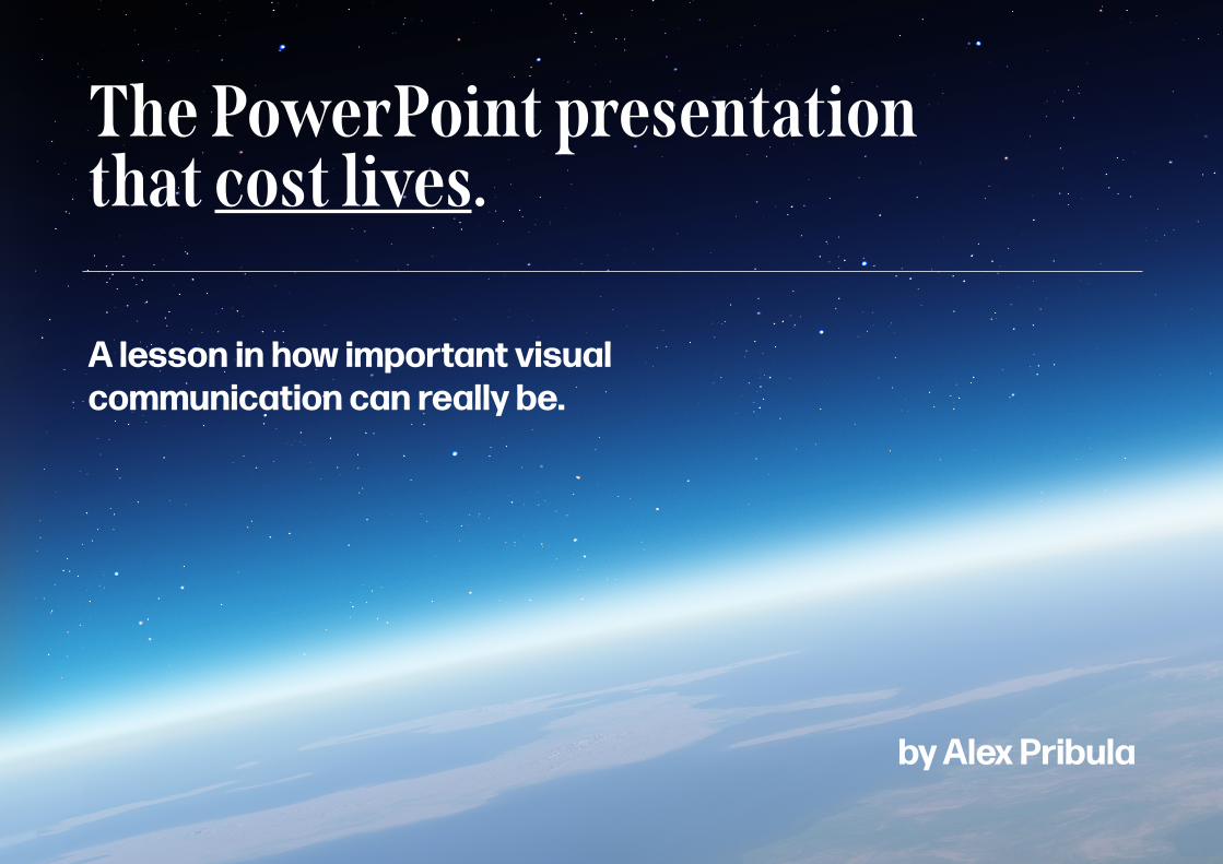
The PowerPoint presentation that cost lives.
A lesson in how important visual communication can really be.
by Alex Pribula

What happened?
On the 16th of January 2003, NASA launched space shuttle Columbia into orbit.
It was assumed that the launch was successful.
NASA reviewed the launch footage and discovered a piece of foam detached and damaged some tiles on the left wing of the shuttle.
NASA officials sat down with Boeing engineers who had created a 28 slide PowerPoint presentation on the issue.
It was decided that re-entry would be completed as normal, due to the NASA officials’ understanding of the presentation.
Columbia and her seven person crew were lost on re-entry.

What went wrong?After the incident, an investigation by the Columbia Accident Investigation board was completed.
They came to a tragic, regrettable conclusion.
The Board views the endemic use of PowerPoint briefing slides instead of technical papers as an illustration of the problematic methods of technical communication at NASA.
— the Columbia Accident Investigation Board
“”

Legibility.
What was on those slides?It wasn’t as much what was on those slides, as to how those slides were put together that led to the Columbia disaster (Lasoen, 2015).
Multiple design principles were violated.
Before we can attempt to ‘fix’ the Columbia slides and design a solution that would have prevented the disaster, we first have to understand why the slides were ineffective.
Let’s break down one of the Columbia slides in detail to find out. Hierarchy.
Highlighting.Readability.

title is misleadingly reassuring.
bad bullet point hierarchy.
the most important point was written in the smallest font size.
qualitative wording is ambiguous in this situation.
what does “significantly” actually mean?
6 levels of hierarchy.
the 4 core messages are lost.
…it is easy to understand how a senior manager might read this PowerPoint slide and not realize that it addresses a life-threatening situation.“
”— the Columbia Accident Investigation Board
Slide retrieved from the Columbia Accident Investigation Board
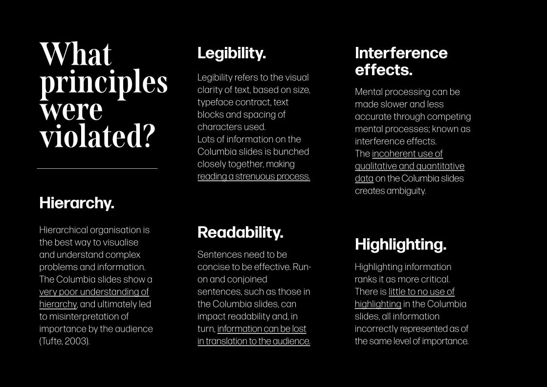
Hierarchy.
Interference effects.
Highlighting.
Legibility.
Readability.Hierarchical organisation is the best way to visualise and understand complex problems and information. The Columbia slides show a very poor understanding of hierarchy, and ultimately led to misinterpretation of importance by the audience (Tufte, 2003).
Legibility refers to the visual clarity of text, based on size, typeface contract, text blocks and spacing of characters used. Lots of information on the Columbia slides is bunched closely together, making reading a strenuous process.
Mental processing can be made slower and less accurate through competing mental processes; known as interference effects. The incoherent use of qualitative and quantitative data on the Columbia slides creates ambiguity.
Sentences need to be concise to be effective. Run-on and conjoined sentences, such as those in the Columbia slides, can impact readability and, in turn, information can be lost in translation to the audience.
Highlighting information ranks it as more critical. There is little to no use of highlighting in the Columbia slides, all information incorrectly represented as of the same level of importance.
What principles were violated?

How do we prevent this from happening again? A framework.
We need to build a framework that prevents misunderstanding, miscommunication, and room for error when presenting information. Visual communication is always important.
However, when in the context of life threatening information, there is no room for misinterpretation.
All presentations of information, regardless of medium, need to follow a strict set of guidelines, or rather a framework, in order to be as effective and risk-avoiding as possible; mitigating room for error in the conveyance of critical information.

LegibilityHierarchy
HighlightingLayering
Serialposition
StorytellingPicturesuperiority
Consist
ency
Interferenceeffects
Chu
nking
Readability
Forgiv
eness
A frameworktomitigate
room for errorin the conveyance
of criticalinformation.
These design principles are core to the framework.
The framework is designed to apply to scenarios involving
What makes up the framework?
These principles must all be considered
when applying the framework to
different disciplinary areas and contexts.

The framework. Workplace culture.
Clarity and care needs to be paramount within every workplace, especially ones concerning such operations as space travel.
Operant conditioning.It was determined that by the time of the Columbia disaster “inadequate concern over deviations from expected performance, a silent safety program, and schedule pressure”(CAIB) was the culture at NASA. By reinforcing safety-focused behaviour throughout the company, unsafe scenarios should not exist in future.
Development cycle.The Space Shuttle program as a whole was less efficient, more expensive, and more dangerous (Schwartz, 2003) than prior programs at NASA. “Go fever”, a term that refers to NASA being in a rush to meet deadlines while overlooking mistakes, could be mitigated by a more stringent and thorough development cycle with more iterating and achievable deadlines.
Hierarchy of needs.By establishing a hierarchy of needs within a company, a tone of safety and transparency can be set amongst the workplace, filtering down through the ranks. Within NASA, setting the tone of safety would draw the company away from it’s “get-home-itis” attitude; achieving goals no matter the human cost (Woods).

The five rules to effective conveyance of critical information: ◆ Never overload users or audiences with more than 3 chunks of information at a time. Our minds
can’t process more than this, and we don’t want information to be missed; interference effects.
◆ Use visual representations when appropriate. Based on the idea of the picture superiority effect, visuals can very simply communicate important ideas effectively and with ease.
◆ Critical information should always be more prominent than regular copy. Users and audiences need
to know this information in particular, and as such it should be hierarchically above regular information.
◆ Understand hierarchy and stick to it. Don’t use sub bullets, you shouldn’t have to. Find a way to present information that is relevant, clear and easy to understand.
◆ Engage audiences. Use rhetorical questions, statements, and keep it succinct. Don’t just leave prose on your slides, make it fun to listen to, make it engaging, whatever the purpose. Create a narrative;
use storytelling.
The framework. Presentation protocol.

Let’s apply the framework to the Columbia slide from earlier.
The title should surmise the key points on the slide. Misleading titles like the one for the Columbia slides can lead to jumping to conclusions and missing the point of the information.
Too many ideas on one slide can lead to confusion. The Columbia presentation had too much info on each slide, our working memory is not able to process this much.
Bullet points can be good, but sub-bullets can be confusing. Information gets lost, and information hierarchy becomes too complex to handle. The Columbia slides have 6 levels of hierarchy, at which point it becomes useless.
Pictures really do ‘tell a thousand words’. With critical information like that on the Columbia slides, an annotated image would have told the best and worst case scenario clearly and effortlessly. Let’s see what the
slide would look like.

We need to determine if the wing has been damaged before proceeding.
• The simulations predicted the foam strike completely penetrated through to the wing’s frame.
• However, the results are inconclusive as the foam strike was 600 times larger than anything previously recorded in the database.
• The damage would be insignificant if the heat tiles were hit.
• If the wing was struck, we have a critical problem.

We need in-orbit photos of the wing.
this is the worst case. (critical problem)
this is the best case. (insignificant)
We need to check these two coloured areas for damage:

Applying the framework. Medicine.
Applications in medicine. Between 44,000 and 98,000 people die every year because of medication errors (Institute of Medicine, 2000).
Current medicinal packaging templates “do not differentiate between medicines, users, actions, languages, and contexts.” (Van de Waarde, 2005). Templates don’t always accomodate for the “most relevant information” for users, in direct conflict with the EU guidelines.
Instead of a template based approach, medicinal packaging would benefit from adhering to the framework, designing for each individual case instead of blanket-designing for all medicine types.
A “for skin use only” was added, however a “DO NOT DRINK” label
would be more concise.
Marketing terms distract from critical information concerning users health. Instead, directions and dosage should be front and
centre.
There were 121 cases of ingestion of this product
in the year 2010.
Images of Tylenol and Benadryl packaging. Retrieved from: https://consumermedsafety.org

Applying the framework. Instruction.
Applications in giving directions. Operation manuals are ancillary means of support. Almost in a state of “existential limbo” (Ballard, 2018), operation manuals should ideally not exist; products should be well-designed enough to be used without their aid, however in reality they are still necessary in many cases.
Optimal operation manuals, that abide by the framework, should be easy to navigate and understand. This is important in terms of findability; referring to the ease at which information can be discovered by a user.
A Planet Bike bicycle manual. Retrieved from: https://karleyfoy.files.wordpress.com/2014/03/planetbike-protege9-0a.jpg
This information is not critical, and unnecessary in an instruction booklet.
This is FAR too complex.
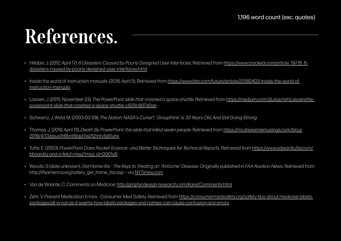
• Hillabin, J. (2012, April 17). 6 Disasters Caused by Poorly Designed User Interfaces. Retrieved from https://www.cracked.com/article_19776_6-disasters-caused-by-poorly-designed-user-interfaces.html
• Inside the world of instruction manuals. (2018, April 5). Retrieved from https://www.bbc.com/future/article/20180403-inside-the-world-of-instruction-manuals
• Lasoen, J. (2015, November 23). The PowerPoint slide that crashed a space shuttle. Retrieved from https://medium.com/@JoachimLasoen/the-powerpoint-slide-that-crashed-a-space-shuttle-c820c907d0ae
• Schwartz, J; Wald, M. (2003-03-09). The Nation: NASA's Curse?; 'Groupthink' Is 30 Years Old, And Still Going Strong
• Thomas, J. (2019, April 15). Death By PowerPoint: the slide that killed seven people. Retrieved from https://mcdreeamiemusings.com/blog/2019/4/13/gsux1h6bnt8lqjd7w2t2mtvfg81uhx
• Tufte, E. (2003). PowerPoint Does Rocket Science--and Better Techniques for Technical Reports. Retrieved from https://www.edwardtufte.com/bboard/q-and-a-fetch-msg?msg_id=0001yB
• Woods, S (date unknown). Get-Home-Itis - The Keys to Treating an "Airborne" Disease. Originally published in FAA Aviation News. Retrieved from http://iflyamerica.org/safety_get_home_itis.asp. – via NYTimes.com
• Van de Waarde, C. Comments on Medicine. http://graphicdesign-research.com/Karel/Comments.html
• Zehr, V. Prevent Medication Errors - Consumer Med Safety. Retrieved from https://consumermedsafety.org/safety-tips-about-medicine-labels-packages/all-is-not-as-it-seems-how-labels-packages-and-names-can-cause-confusion-and-errors
References.1,196 word count (exc. quotes)


