
The “Native” UI Framework for Windows 10 Apps and Experiences Supports C++ or C#/VB.
44
park the future. May 4 – 8, 2015 Chicago, IL
-
Upload
cathleen-hawkins -
Category
Documents
-
view
220 -
download
2
Transcript of The “Native” UI Framework for Windows 10 Apps and Experiences Supports C++ or C#/VB.

Spark the future.
May 4 – 8, 2015Chicago, IL

What’s New in XAML UWP: How building apps with XAML just got easier Harini Kannan Program Manager, XAMLJoe Stegman
BRK1306

This Session: XAML UIThe “Native” UI Framework for Windows 10 Apps and ExperiencesSupports C++ or C#/VB
<!-- XAML Outline --><Page> <StackPanel Orientation="Horizontal"> <AppBarButton/> <AutoSuggestBox/> </StackPanel>
<Grid> <ListView/> <TextBlock Text="Spoken Language"/> <ComboBox/> <CheckBox/> <Slider/> <Button/> </Grid></Page>

Windows 10 Goal: Increase reach and opportunityUWP Goal: Reduce developer cost to deliver on the increased opportunity
UWP in Windows 10

XAML in Windows 10: Beyond UW AppsNew/enhanced controls, performance, much more…
We are listening…

Demo (s)


Getting to Universal Windows Controls

“Universal” Controls in 8.1Some differences in look, feel and APIs
Phone 8.1 (Blue)
Windows 8.1 Desktop
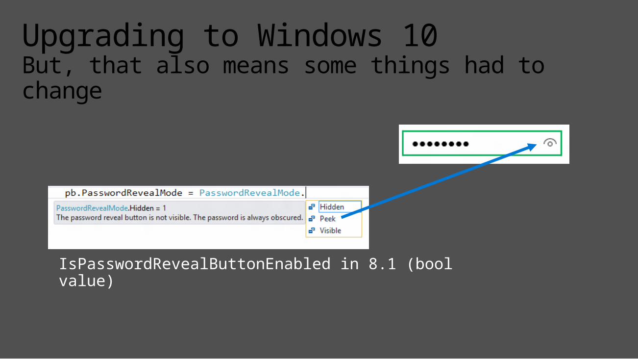
Upgrading to Windows 10But, that also means some things had to change
IsPasswordRevealButtonEnabled in 8.1 (bool value)

Newly Universal Controls

Newly Universal Controls: PivotGreat for 1-handed on Mobile, Tabs on desktop

Newly Universal Controls: ContentDialogApp model, XAML child content

Newly Universal Controls: AutoSuggestBoxAnd IME support, glyph

Newly Universal Controls: MapsPlus Offline, 3D, Street Side Panoramas

Using XAML to Build UW AppsIt’s more than just universal controls

Common ControlsCommon Branding, Behavior, Scaling, Support Diverse Inputs

Controls Reusable Across Devices/DisplaysViews may be reusable (but likely to need tailoring)

Tailoring App ExperiencesTypically via responsive pages or multiple views
Windows 10 has new features to help with responsive designs

New XAML Features for Building Responsive UW Apps

SplitViewAdaptive Navigation Pane
<SplitView DisplayMode="Inline|Overlay|CompactInline|CompactOverlay">
<SplitView.Pane><!-- Navigation Content Here --></SplitView.Pane>
<!-- Main Content Here -->
</SplitView>

Note:SplitView.IsPaneOpen="True"
SplitView: DisplayMode
InlineOverlayCompactInline

Simplifying Responsive View DevelopmentTriggers and Setters (XAML equivalent of Media Queries) <VisualState.Setters>
<Setter Target="splitView.DisplayMode" Value="Inline" /> </VisualState.Setters> <VisualState.StateTriggers> <AdaptiveTrigger MinWindowWidth="720" /> </VisualState.StateTriggers>
<VisualState.Setters> <Setter Target="splitView.DisplayMode" Value="Overlay" /> </VisualState.Setters> <VisualState.StateTriggers> <AdaptiveTrigger MinWindowWidth= "0" /> </VisualState.StateTriggers>
If the Window width is >= 720 effective pixels, then show SplitView in Inline mode

RelativePanelEnables elements to layout relative to other elements<Grid> <Grid.ColumnDefinitions> <ColumnDefinition Width="Auto"/> <ColumnDefinition Width="*"/> </Grid.ColumnDefinitions> <Image x:Name="img" …/> <StackPanel Grid.Column="1" …> <TextBlock x:Name="title" …/> <TextBlock x:Name="authors" …/> <TextBlock x:Name="summary" …/> <Button Content="Download" …/> </StackPanel></Grid>
“Traditional” nested panel layout can be challenging for more complex layouts

RelativePanel
<RelativePanel> <Image x:Name="img" …/> <TextBlock x:Name="title" RelativePanel.RightOf="img" RP.AlignTopWith="img" …/> <TextBlock x:Name="authors" RP.RightOf="img" RP.Below="title" …/> <TextBlock x:Name="summary" RP.RightOf="img" RP.Below="authors" …/> <Button Content="Download" RP.RightOf="img" RP.AlignBottomWithPanel="True" …/></RelativePanel>
Use with Triggers and Setters for more advanced responsive designsNote: RP above should be replaced with RelativePanel (shortened for readability)

Demo
XAML Performance in Windows 10

Validating XAML in Windows 10

<ListView> <ListView.ItemTemplate> <DataTemplate> <StackPanel> <SymbolIcon Symbol="{Binding Symbol}"/> <TextBlock Text="{Binding Name}"/> <Button Click="{Binding Click}"/> </StackPanel> </DataTemplate> </ListView.ItemTemplate></ListView>
Notable New Performance FeaturesCompiled Bindings AKA {x:Bind}: Like {Binding}, only they go to 11<ListView> <ListView.ItemTemplate> <DataTemplate x:DataType="local:FreeBookCategory"> <StackPanel> <SymbolIcon Symbol="{x:Bind Symbol}"/> <TextBlock Text="{x:Bind Name}"/> <Button Click="{x:Bind Click}"/> </StackPanel> </DataTemplate> </ListView.ItemTemplate></ListView>
Resolved at compile time and produce compiler errors.

Other New UI Features

PerspectiveTransform3DComposable 3D Transforms (Effects: 3D Rotations, Parallax)<Grid> <Grid.Transform3D> <!– Parent Camera --> <PerspectiveTransform3D/> </Grid.Transform3D>
<Border Background="#FF7F00"> <Border.Transform3D> <CompositeTransform3D RotationX="-90 " …/> </Border.Transform3D> </Border>
<Border Background="#FF6700"> <Border.Transform3D> <CompositeTransform3D RotationY="-90" …/> </Border.Transform3D> </Border></Grid>

WindowingCustom chrome, branding, sizing
// Remove Standard Title BarCoreApplication.GetCurrentView().TitleBar.ExtendViewIntoTitleBar = true;
// Indicate Custom App UI to use as the TitleBar (for move, resize)Window.Current.SetTitleBar(customTitleBar);
<!-- XAML --><StackPanel x:Name="customTitleBar" Height="32" …> <FontIcon …/> <TextBlock Text="Belize 2015" …/></StackPanel>

Ink CanvasPalm rejection, smoothing, high fidelity
<Grid> <!-- It’s this simple --> <InkCanvas/></Grid>

Drag and DropExtended for “Windowed” Apps
<!-- XAML --><Grid AllowDrop="True" DragOver=“Do_DragOver" Drop=“Do_Drop" …>…</Grid>
My AppFile Explorer

Demo

“Edge” in Windows 10WinRT AccessAnd More…
XAML WebView Enhancements

XAML Improvements in Visual Studio

Visual StudioNew design modes, performance instrumentation timeline tool and more…

Visual StudioVisual Tree Inspector

Demo

• CommandBar Updates• Vector Fonts• Property Change Improvements• New Content Presenter APIs• IME Composition Events• Directional Navigation• ListView Enhancements• Framework Element Loading
Event
And More…
• Improved Animation Experiences
• Improved XAML/DX Interopability
• Software Bitmap Source• Silverlight memory
improvements• Printing APIs on Mobile• Improved BiDi handling• Improved ScrollViewer APIs• Casting in media elements

• Try it out and provide feedback• Windows Feedback -> Developer Platform -> UI Frameworks and
Controls (XAML)• http://wpdev.uservoice.com
Call to Action

Visit Myignite at http://myignite.microsoft.com or download and use the Ignite Mobile App with the QR code above.
Please evaluate this sessionYour feedback is important to us!

© 2015 Microsoft Corporation. All rights reserved.