

The Impact of Mobile First and Responsive Web Designs Kevin Tharp [email protected].
15
-
Upload
sophie-chapman -
Category
Documents
-
view
216 -
download
1
Transcript of The Impact of Mobile First and Responsive Web Designs Kevin Tharp [email protected].

The Impact of Mobile First and Responsive Web Designs
— Leon Trotsky Me
“You might not be interested in war mobile surveys but war is they are interested in you.”

The Impact of Mobile First and Responsive Web Designs
The Mobile Challenge
• More respondents are going mobile.• Mobile break-off rates are higher.• Maintaining two designs can be costly and can
impact data quality.
• Can we apply general web design principles to address these problems?
• Can one design improve the experience for mobile users without negatively impacting desktop users?

The Impact of Mobile First and Responsive Web Designs
Experiment #1: Methods
• Web design assigned randomly• 50% standard• 50% mobile first (M1)
• Device chosen by respondent• Post-survey evaluation items (de Bruijne and
Wijnant 2013)
• Pleasant layout, easy to complete, could be learned quickly, professional look
• Analyze break-off rates, survey duration, response distribution

The Impact of Mobile First and Responsive Web Designs
Experiment #1: Administration
• Survey on campus computing• Field period: spring 2014• Sample size: 4000
– Faculty, staff, students
• Average duration: 8.7 minutes• Response rate: 40% (RR2)• Smartphone component: 7%
– Students: 14%

The Impact of Mobile First and Responsive Web Designs
Experiment #1: Standard Design
Desktop: Smartphone:

The Impact of Mobile First and Responsive Web Designs
Experiment #1: M1 Design
Desktop: Smartphone:

Experiment #1 Findings:• Impact of M1 on smartphones
• Break-off rate declined: 29.8% to 20.7%• Shorter duration: 8.84 to 7.2 minutes • Rated higher on “easy to complete” by .7%*
• Impact of M1 on desktops• Break-off rate increased: 6.7% to 7.2%• Shorter duration: 9.25 to 8.29 minutes*• Rated lower on “professional look” by .4%*• Many comments on scrolling
• Minimal impact found in means comparison* = Statistically significant at p < 0.05
The Impact of Mobile First and Responsive Web Designs

The Impact of Mobile First and Responsive Web Designs
Experiment #2: Methods
• Web design assigned randomly• 65% standard• 35% responsive web design (RWD)
• Device chosen by respondent• Post-survey evaluation items• Analyze break-off rate, duration times,
response distribution

The Impact of Mobile First and Responsive Web Designs
Experiment #2: Administration
• Student survey on campus transportation• Field period: fall 2014• Sample size: 35,689
– Faculty, staff, students
• Average duration: 7.1 minutes• Response rate: 38% (RR2)• Smartphone component: 16.3%
– Students: 24%

The Impact of Mobile First and Responsive Web Designs
Experiment #2: Standard Design
Desktop: Smartphone:
The Impact of Mobile First and Responsive Web Designs
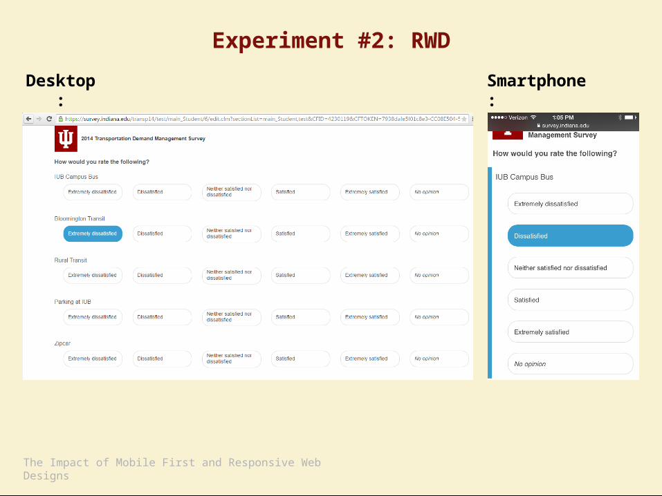
Experiment #2: RWD
Desktop: Smartphone:

Experiment #2 Findings:• Impact of RWD on smartphones
• Break-off rate declined: 17.0% to 15.2%• Shorter duration: 7.35 to 7.25 minutes • Rated higher on all evaluation items
• Impact of RWD on desktops• Break-off rate increased: 5.4% to 6.8%*• Shorter duration: 7.27 to 6.72 minutes*• Rated higher on all evaluation items*
• Minimal impact on response distribution* = Statistically significant at p < 0.05
The Impact of Mobile First and Responsive Web Designs

The Impact of Mobile First and Responsive Web Designs
Summary
• While our mobile first design performed well for smartphone users, most improvements were not significant, and the design rated lower with desktop users.
• Our responsive web design scored better with both device groups, but desktop breakoffs were still an issue.

Future Research• Impact on longer studies• Different sample make-up • Item non-response analysis • Evaluation feedback from non-respondents• Usability testing on response buttons, visual
hierarchy, and other elements
The Impact of Mobile First and Responsive Web Designs