The Housing Market(s) of San Diego
56
NBER WORKING PAPER SERIES THE HOUSING MARKET(S) OF SAN DIEGO Tim Landvoigt Monika Piazzesi Martin Schneider Working Paper 17723 http://www.nber.org/papers/w17723 NATIONAL BUREAU OF ECONOMIC RESEARCH 1050 Massachusetts Avenue Cambridge, MA 02138 January 2012 We are endebted to Trulia for access and help with their data. We thank Markus Baldauf, John Campbell, Boyan Jovanovic, Lars Ljunqvist, Hanno Lustig, Ellan McGrattan, Francois Ortalo-Magne, Sven Rady, Sergio Rebelo, and seminar participants at Boston University, Carnegie-Mellon University, ECB, Federal Reserve Board, Kellogg, Munich, NYU, Princeton, UNC as well as conference participants at CASEE 2010 at Arizona State, ERID Duke Conference 2010, Duke Macoeconomics Conference 2011, EEA Congress 2010 in Glasgow, HULM Conference 2010 in St. Louis, NBER AP Summer Institute 2011, Richmond Fed 2009 PER Conference, SED 2010 in Montreal, SITE 2010, the 2010 USC Macro Conference, and the 2011 Jerusalem Conference. The views expressed herein are those of the authors and do not necessarily reflect the views of the National Bureau of Economic Research. At least one co-author has disclosed a financial relationship of potential relevance for this research. Further information is available online at http://www.nber.org/papers/w17723.ack NBER working papers are circulated for discussion and comment purposes. They have not been peer- reviewed or been subject to the review by the NBER Board of Directors that accompanies official NBER publications. © 2012 by Tim Landvoigt, Monika Piazzesi, and Martin Schneider. All rights reserved. Short sections of text, not to exceed two paragraphs, may be quoted without explicit permission provided that full credit, including © notice, is given to the source.
Transcript of The Housing Market(s) of San Diego
NBER WORKING PAPER SERIES
THE HOUSING MARKET(S) OF SAN DIEGO
Tim LandvoigtMonika PiazzesiMartin Schneider
Working Paper 17723http://www.nber.org/papers/w17723
NATIONAL BUREAU OF ECONOMIC RESEARCH1050 Massachusetts Avenue
Cambridge, MA 02138January 2012
We are endebted to Trulia for access and help with their data. We thank Markus Baldauf, John Campbell,Boyan Jovanovic, Lars Ljunqvist, Hanno Lustig, Ellan McGrattan, Francois Ortalo-Magne, Sven Rady,Sergio Rebelo, and seminar participants at Boston University, Carnegie-Mellon University, ECB, FederalReserve Board, Kellogg, Munich, NYU, Princeton, UNC as well as conference participants at CASEE2010 at Arizona State, ERID Duke Conference 2010, Duke Macoeconomics Conference 2011, EEACongress 2010 in Glasgow, HULM Conference 2010 in St. Louis, NBER AP Summer Institute 2011,Richmond Fed 2009 PER Conference, SED 2010 in Montreal, SITE 2010, the 2010 USC Macro Conference,and the 2011 Jerusalem Conference. The views expressed herein are those of the authors and do notnecessarily reflect the views of the National Bureau of Economic Research.
At least one co-author has disclosed a financial relationship of potential relevance for this research.Further information is available online at http://www.nber.org/papers/w17723.ack
NBER working papers are circulated for discussion and comment purposes. They have not been peer-reviewed or been subject to the review by the NBER Board of Directors that accompanies officialNBER publications.
© 2012 by Tim Landvoigt, Monika Piazzesi, and Martin Schneider. All rights reserved. Short sectionsof text, not to exceed two paragraphs, may be quoted without explicit permission provided that fullcredit, including © notice, is given to the source.

The Housing Market(s) of San DiegoTim Landvoigt, Monika Piazzesi, and Martin SchneiderNBER Working Paper No. 17723January 2012, Revised January 2012, Revised February 2015JEL No. E21,G10,R20
ABSTRACT
This paper uses an assignment model to understand the cross section of house prices within a metroarea. Movers' demand for housing is derived from a lifecycle problem with credit market frictions.Equilibrium house prices adjust to assign houses that differ by quality to movers who differ by age,income and wealth. To quantify the model, we measure distributions of house prices, house qualitiesand mover characteristics from micro data on San Diego County during the 2000s boom. The mainresult is that cheaper credit for poor households was a major driver of prices, especially at the lowend of the market.
Tim LandvoigtDepartment of EconomicsStanford University579 Serra MallStanford CA [email protected]
Monika PiazzesiDepartment of EconomicsStanford University579 Serra MallStanford, CA 94305-6072and [email protected]
Martin SchneiderDepartment of EconomicsStanford University579 Serra MallStanford, CA 94305-6072and [email protected]

1 Introduction
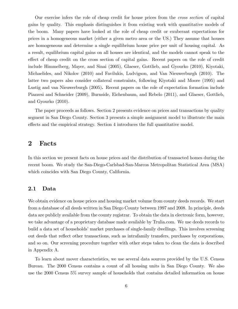
During the recent housing boom, there were large differences in capital gains across houses, even
within the same metro area. Figure 1 illustrates the basic stylized fact for San Diego County,
California. Every dot corresponds to a home that was sold in both year 2000 and year 2005. On
the horizontal axis is the 2000 sales price. On the vertical axis is the annualized real capital gain
between 2000 and 2005. The solid line is the capital gain predicted by a regression of capital gain
on log price. It is clear that capital gains during the boom were much higher on low end homes.
For example, the average house worth $200K in the year 2000 appreciated by 17% (per year) over
the subsequent five years. In contrast, the average house worth $500K in the year 2000 appreciated
by only 12% over the subsequent five years.1
200 400 600 800 1000 12005
0
5
10
15
20
25
30Repeat sales 2000 2005; San Diego County, CA
capi
tal g
ain
2000
5, %
p.a
.
House Value in 2000 (thousands of dollars)
repeat salesfitted value
Figure 1: Repeat sales in San Diego County, CA, during the years 2000-2005. Every dot representsa residential property that was sold in 2000 and had its next sale in 2005. The horizontal axis showsthe sales price in 2000. The vertical axis shows the real capital gain per year (annualized change inlog price less CPI inflation) between 2000 and 2005.
This paper considers a quantitative model of the housing market in the San Diego metro area
1While Figure 1 only has repeat sales from two particular years, Table 1 below documents the basic stylized factin a joint estimation using all repeat sales in San Diego County over the last decade.
2
over the boom period. Its key feature is that houses are indivisible and movers are assigned, in
equilibrium, to one of a large number of house types. We use the model to examine the connection
between various changes in the San Diego housing market (or markets —one for each type) with the
cross section of capital gains. In particular, we look at changes in the composition of houses that
were transacted, shifts in the distribution of movers’characteristics, and the availability of cheap
credit.
We find that the model is consistent with the large and uneven price changes apparent in Figure
1. Two changes in the environment are particularly important for this result. First, the availability
of cheap credit has larger effects on housing demand at the low end of the market, thus increasing
relative prices there. Second, the relatively larger number of low quality houses transacted during
the boom led richer marginal investors to drive up prices at the low end. Once these two features
are taken into account, the lifecycle model of housing demand matches not only prices but also key
moments of the joint distribution of house quality, age, wealth and income.
In the model, movers meet houses. Houses differ by quality: there is a continuum of indivisible
houses provide different flows of housing services. Movers differ by age, income, and wealth: their
demand for housing is derived from an intertemporal savings and portfolio choice problem with
transaction costs and collateral constraints. In equilibrium, prices adjust to induce agents with
lower demand for housing services to move into lower quality houses. The distribution of equilibrium
prices thus depends on the (three-dimensional) distribution of movers’characteristics as well as the
distribution of house qualities.
To implement the model quantitatively, we use micro data to measure the distribution of movers’
characteristics and the quality distribution of transacted houses. We do this both for the year 2000
and for the year 2005 —the peak of the boom. We then compute model predictions for equilibrium
prices in both years and derive the cross section of capital gains by quality. We compare those
predictions to a repeat sales model estimated on transaction data. Our numerical solution not only
finds equilibrium prices, but also an equilibrium assignment that we compare to the assignment in
the data. To understand how the model works, we explore model-implied capital gains for different
assumptions on changes in the environment; in particular, we capture cheaper credit by lower
interest rates and downpayment constraints.
Changes in the distribution of mover characteristics as well as credit conditions jointly generate
a housing boom that is very similar to that shown in Figure 1. The only difference is that the
model somewhat overpredicts price increases at the high end of the market. At the same time, we
check that the equilibrium assignment predicted by the model resembles the assignment observed in
the data. In particular, the model matches the fact that house quality rises faster with wealth and
income for younger cohorts of households. The reason is that in a lifecycle model with nontradable
labor income and collateral constraints, younger households choose more levered portfolios and thus
3
invest a larger share of cash on hand in housing.
Our exercise fits into a tradition that links asset prices to fundamentals through household
optimality conditions. For housing, this tradition has given rise to the “user cost equation”: the
per-unit price of housing is such that all households choose their optimal level of a divisible housing
asset. With a single per-unit price of housing, capital gains on all houses are the same. In our
model, there is no single user cost equation since there are many types of indivisible houses, with
marginal investors who differ across house types.2 Instead, there is a separate user cost equation
for every house type, each reflecting the borrowing costs, transaction costs, and risk premia of only
those movers who buy that house type. Changes in the environment thus typically give rise to a
nondegenerate cross section of capital gains.
The fact that there is a family of user cost equations is crucial for our results in two ways. First,
it implies that changes in the environment that more strongly affect a subset of movers will more
strongly affect prices of houses which those movers buy. For example, lower minimum downpayment
requirements more strongly affect poor households for whom this constraint is more likely to be
binding. As a result, lower downpayment constraints lead to higher capital gains at the low end of
the market.
Second, higher moments of the quality and mover distributions matter. For example, we show
that the quality distribution of transacted homes in San Diego County at the peak of the boom
had fatter tails than at the beginning of the boom. This implied, in particular, that relatively lower
quality homes had to be assigned to relatively richer households than before the boom. For richer
households to be happy with a low quality home, homes of slightly higher quality had to become
relatively more expensive. The price function thus had to become steeper at the low end of the
market, which contributed to high capital gains in that segment.
Since we measure the quality distribution of transacted homes directly from the data, we do
not take a stand on where the supply of houses comes from. A more elaborate model might add
an explicit supply side, thus incorporating sellers’choice of when to put their house on the market,
the effects of the availability of land to developers (as in Glaeser, Gyourko, and Saks 2005), or
gentrification (as in Guerrieri, Hartley, and Hurst 2013.) At the same time, any model with an
explicit supply side also gives rise to an equilibrium distribution of transacted homes that has to be
priced and assigned to an equilibrium distribution of movers. The assignment and pricing equations
we study thus hold also in equilibrium ofmany larger models with different supply side assumptions.
Our results show what it takes to jointly match prices and mover characteristics, independently of
the supply side. In this sense, our exercise is similar to consumption-based asset pricing, where the
goal is to jointly match consumption and prices, also independently of the supply side.
2In contrast, the user cost equation determines a unique price per unit of housing, so every investor is marginalwith respect to every house.
4
This paper is the first to study a quantitative assignment model with a continuum of houses
and a multidimensional distribution of mover characteristics. Assignment models with indivisible
heterogeneous goods and heterogeneous agents have been used in several areas of economics, most
prominently to study labor markets where firms with different characteristics hire workers with
different skill profiles (for an overview, see Sattinger, 1993.) In the context of housing, an early
reference is Kaneko (1982). Caplin and Leahy (2010) characterize comparative statics of competitive
equilibria in a general setting with a finite number of agents and goods. Stein (1995), Ortalo-Magne
and Rady (2006) and Rios-Rull and Sanchez-Marcos (2008) study models with two types of houses
and credit constraints. Määttänen and Terviö (2013) study no trade equilibria of a continuous
assignment model with income heterogeneity but no credit frictions; they use their model to relate
changes in income inequality to house price distributions across US cities.
We provide new evidence on the cross section of capital gains as well as the composition of
trading volume by quality over the recent housing boom. Our results use property level data for
San Diego County and several statistical models of price change. Our finding of a nontrivial cross
section of capital gains is related to existing empirical studies that compare house price dynamics
across price segments within a metro area, for example Poterba (1991), Case and Mayer (1996),
Case and Shiller (2005), and Guerrieri, Hartley, and Hurst (2013).3 Existing studies of volume
emphasize the comovement of volume and price changes over time as "hot" markets with high
prices and high volume turn into "cold" markets with low prices and low volume (for example,
Stein 1995.) Our results show that during the recent boom the relationship between prices and
volume in the cross section was nonmonotonic: volume became relatively higher both for cheap
houses and for expensive houses.
Our quantitative model considers jointly the effect of credit constraints and changes in the
house quality and mover distributions on prices as well as the cross section of household portfolios.
Reduced form evidence has suggested that both credit and changes in distributions can matter for
prices. For example, Poterba (1991) points to the role of demographics, whereas Bayer, Ferreira,
and McMillan (2007) highlight the importance of amenities (such as schools), and Guerrieri, Hartley
and Hurst (2013) relate price changes to gentrification, that is, changes in neighborhood quality.
Empirical studies have also shown that credit constraints matter for house prices at the regional
level. Lamont and Stein (1999) show that house prices react more strongly to shocks in cities where
more households are classified as “borrowing constrained”. Mian and Sufi(2010) show for the recent
US boom that house price appreciation and borrowing were correlated across zip codes. Mian and
Sufi (2009) show that areas with many subprime borrowers saw a lot of borrowing even though
income there declined.3Interestingly, these studies do not find a common capital gain pattern across all booms —depending on time and
region, low quality houses may appreciate more or less than high quality houses during a boom. This suggests thatit is fruitful to study a single episode in detail, as we do in this paper.
5
Our exercise infers the role of cheap credit for house prices from the cross section of capital
gains by quality. This emphasis distinguishes it from existing work with quantitative models of
the boom. Many papers have looked at the role of cheap credit or exuberant expectations for
prices in a homogeneous market (either a given metro area or the US.) They assume that houses
are homogeneous and determine a single equilibrium house price per unit of housing capital. As
a result, equilibrium capital gains on all houses are identical, and the models cannot speak to the
effect of cheap credit on the cross section of capital gains. Recent papers on the role of credit
include Himmelberg, Mayer, and Sinai (2005), Glaeser, Gottlieb, and Gyourko (2010), Kiyotaki,
Michaelides, and Nikolov (2010) and Favilukis, Ludvigson, and Van Nieuwerburgh (2010). The
latter two papers also consider collateral constraints, following Kiyotaki and Moore (1995) and
Lustig and van Nieuwerburgh (2005). Recent papers on the role of expectation formation includePiazzesi and Schneider (2009), Burnside, Eichenbaum, and Rebelo (2011), and Glaeser, Gottlieb,
and Gyourko (2010).
The paper proceeds as follows. Section 2 presents evidence on prices and transactions by quality
segment in San Diego County. Section 3 presents a simple assignment model to illustrate the main
effects and the empirical strategy. Section 4 introduces the full quantitative model.
2 Facts
In this section we present facts on house prices and the distribution of transacted homes during the
recent boom. We study the San-Diego-Carlsbad-San-Marcos Metropolitan Statistical Area (MSA)
which coincides with San Diego County, California.
2.1 Data
We obtain evidence on house prices and housing market volume from county deeds records. We start
from a database of all deeds written in San Diego County between 1997 and 2008. In principle, deeds
data are publicly available from the county registrar. To obtain the data in electronic form, however,
we take advantage of a proprietary database made available by Trulia.com. We use deeds records to
build a data set of households’market purchases of single-family dwellings. This involves screening
out deeds that reflect other transactions, such as intrafamily transfers, purchases by corporations,
and so on. Our screening procedure together with other steps taken to clean the data is described
in Appendix A.
To learn about mover characteristics, we use several data sources provided by the U.S. Census
Bureau. The 2000 Census contains a count of all housing units in San Diego County. We also
use the 2000 Census 5% survey sample of households that contains detailed information on house
6
and household characteristics for a representative sample of about 25,000 households in San Diego
County. We obtain information for 2005 from the American Community Survey (ACS), a represen-
tative sample of about 6,500 households in San Diego Country. A unit of observation in the Census
surveys is a dwelling, together with the household who lives there. The surveys report household
income, the age of the head of the household, housing tenure, as well the age of the dwelling, and a
flag on whether the household moved in recently.4 For owner-occupied dwellings, the census surveys
also report the house value and mortgage payments.
2.2 The cross section of house prices and qualities
In this section we describe how we measure price changes over time conditional on quality as well as
changes over time in the quality distribution. We first outline our approach. We want to understand
systematic patterns in the cross section of capital gains between 2000 and 2005. We establish those
patterns using statistical models that relate capital gain to 2000 price. The simplest such model
is the black regression line in Figure 1. Below we describe a more elaborate model of repeat sales
as well as a model of price changes in narrow geographic areas —the patterns are similar across all
these models.
If there is a one-dimensional quality index that households care about, then house quality at
any point in time is reflected one-for-one in the house price. In other words, the horizontal axis
in Figure 1 can be viewed as measuring quality in the year 2000. The regression line measures
common changes in price experienced by all houses of the same initial quality. More generally, any
statistical model of price changes gives rise to an expected price change that picks common changes
in price by quality.
There are two potential reasons for common changes in price by quality. On the one hand,
there could be common changes in quality itself. For example, quality might increase because the
average house in some quality range is remodeled, or the average neighborhood in some quality
range obtains better amenities.5 On the other hand, there could simply be revaluation of houses
in some quality range while the average quality in that range stays the same. For example, prices
may change because more houses of similar quality become available for purchase. In practice, both
reasons for common changes in price by quality are likely to matter, and our structural model below
thus incorporates both.
Independently of the underlying reason for price changes, we can determine the number of houses
4In the 2005 ACS, the survey asks households whether they moved in the last year. In the 2000 Census, thesurvey asks whether they moved in the last two years.
5Importantly, changes in quality will be picked up by the expected price change only if they are common to allhouses of the same initial quality, that is, they are experienced by the average house in the segment. The figureshows that, in addition, there are also large idiosyncratic shocks to houses or neighborhoods.
7
in the year 2005 that are “similar”to (and thus compete with) houses in some given quality range in
the year 2000. This determination uses a statistical model of price changes together with the cross
section of transaction prices. Consider some initial house quality in the year 2000. A statistical
model of price changes —such as the regression line in Figure 1 —says at what price the average
house of that initial quality trades in 2005. For example, from the regression line we can compute
a predicted 2005 price by adding the predicted capital gain to the 2000 price. Once we know the
predicted 2005 prices for the initial quality range, we can read the number of similar houses off the
cross sectional distribution of 2005 transaction prices.
In our context, we can say more: counting for every initial 2000 quality range the “similar”
houses in 2005 actually delivers the 2005 quality distribution, up to a monotonic transformation of
quality. This is because the predicted 2005 price from a statistical model is strictly increasing in the
initial 2000 price, as we document below using both parametric and nonparametric specifications.
Since price reflects quality in both years, it follows that for a given 2005 quality level, there is a
unique initial 2000 quality level such that the average house of that initial quality resembled the
given house in 2005.6
Of course, we do not know the mapping from initial 2000 quality to average 2005 quality, because
a model of price changes does not distinguish between common changes in quality and revaluation.
Nevertheless, since we know that the mapping is monotonic, we can represent the 2005 quality
distribution, up to a monotonic transformation, by the distribution of “similar” 2005 houses by
2000 quality. In other words, the 2000 price can serve as an ordinal index of quality. Quality
distributions for both 2000 and 2005 can be measured in terms of this index and then used as an
input into the quantitative implementation of our structural model below.
Statistical model of price changes by quality
Consider a loglinear model of price changes at the individual property level. This is the statistical
model we use to produce inputs for the structural model. To capture the cross section of capital
gains by quality, we allow the expected capital gain to depend on the current price. Formally, let pitdenote the price of a house i at date t. We assume that the capital gain on house i between dates t
and t+ 1 is
log pit+1 − log pit = at + bt log pit + εit+1, (1)
where the idiosyncratic shocks εit+1 have mean zero and are such that a law of large numbers holds
in the cross section of houses. For fixed t and t+ 1, the model looks like the regression displayed in
Figure 1.
6In the San Diego housing market, common changes in quality between 2000 and 2005 did thus not upset therelative ranking of house quality segments: the average house from a high quality range in 2000 was worth more– andhence of higher quality– than the average house from a low quality range in 2000. This does not mean, of course,that there were no changes in the ranking of individual houses or neighborhoods– in our statistical model those arecaptured by idiosyncratic shocks.
8
The model estimated here differs from a simple regression since (1) is assumed to hold for every t
in our sample, so that the coeffi cients can be estimated with data on all repeat sales simultaneously.
We find this approach useful since a regression based only on 2000-2005 repeat sales might suffer
from selection bias —it would be based only on houses that were bought at the beginning of the
boom and sold at the peak.7 In contrast, under our approach the estimated coeffi cient at reflects
any repeat sale that brackets the year t. For example, the coeffi cients for t = 2004, say, reflect
repeat sales in the hot phase of the boom between 2002 and 2005, but also repeat sales between
2003 and 2008.
Equation (1) differs from a typical time series model for returns in that the coeffi cients are time
dependent. It is possible to identify a separate set of coeffi cients for every date because we have
data on many repeat sales. The coeffi cients bt determine whether there is a nontrivial cross section
of expected capital gains. If housing were a homogenous capital good, then it should not be possible
to forecast the capital gain using the initial price level pt, that is, bt = 0. The expected capital gain
on all houses would be the same (and equal to at), much like the expected capital gain is the same
for all shares of a given company. More generally, a nonzero coeffi cient for bt indicates that quality
matters for capital gains. For example bt < 0 means that prices of low quality houses that are
initially cheaper will on average have higher capital gains. In contrast, bt > 0 says that expensive
houses are expected to appreciate more (or depreciate less).
Suppose(pit, p
it+k
)is a pair of prices on transactions of the same house that took place in years
t and t+ k, respectively. Equation (1) implies a conditional distribution for the capital gain over k
periods,
log pit+k − log pit = at,t+k + bt,t+k log pit + εit,t+k, (2)
where the coeffi cients at,t+k, bt,t+k are derived by iterating on equation (1). We estimate the para-
meters (at, bt) by GMM; the objective function is the sum of squared prediction errors, weighted
by the inverse of their variance. The GMM estimation uses data from repeat sales between all
pairs of years jointly by imposing the restriction that the multiperiod coeffi cients at,t+k and bt,t+kare appropriate weighted sums and products of future at and bt coeffi cients between t and t + k,
respectively.
Table 1 reports point estimates based on 70,315 repeat sales in San Diego County that occurred
during 1997-2008. Details of how we screen repeat sales are in Appendix A. The first row in the
table shows the sequence of estimates for the intercept at. For example, the estimated at for the year
1999 is the intercept in the expected capital gain from 1999 to 2000. The intercept is positive for
expected capital gains during the boom phase 2000-2005, and negative during 2006-2008, reflecting
average capital gains during those two phases. The middle row shows the slope coeffi cients bt.
7Below we compare GMM estimation results to regression results based on property level, zip code, and censustract prices reported in Appendix B. These results also suggest that selection bias is not a problem.
9
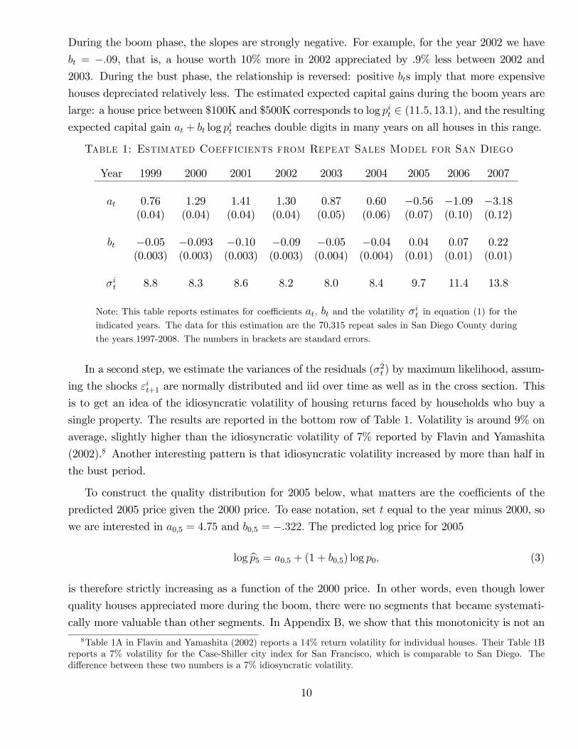
During the boom phase, the slopes are strongly negative. For example, for the year 2002 we have
bt = −.09, that is, a house worth 10% more in 2002 appreciated by .9% less between 2002 and
2003. During the bust phase, the relationship is reversed: positive bts imply that more expensive
houses depreciated relatively less. The estimated expected capital gains during the boom years are
large: a house price between $100K and $500K corresponds to log pit ∈ (11.5, 13.1), and the resulting
expected capital gain at + bt log pit reaches double digits in many years on all houses in this range.
Table 1: Estimated Coefficients from Repeat Sales Model for San Diego
Year 1999 2000 2001 2002 2003 2004 2005 2006 2007
at 0.76 1.29 1.41 1.30 0.87 0.60 −0.56 −1.09 −3.18(0.04) (0.04) (0.04) (0.04) (0.05) (0.06) (0.07) (0.10) (0.12)
bt −0.05 −0.093 −0.10 −0.09 −0.05 −0.04 0.04 0.07 0.22(0.003) (0.003) (0.003) (0.003) (0.004) (0.004) (0.01) (0.01) (0.01)
σit 8.8 8.3 8.6 8.2 8.0 8.4 9.7 11.4 13.8
Note: This table reports estimates for coeffi cients at, bt and the volatility σit in equation (1) for the
indicated years. The data for this estimation are the 70,315 repeat sales in San Diego County during
the years 1997-2008. The numbers in brackets are standard errors.
In a second step, we estimate the variances of the residuals (σ2t ) by maximum likelihood, assum-
ing the shocks εit+1 are normally distributed and iid over time as well as in the cross section. This
is to get an idea of the idiosyncratic volatility of housing returns faced by households who buy a
single property. The results are reported in the bottom row of Table 1. Volatility is around 9% on
average, slightly higher than the idiosyncratic volatility of 7% reported by Flavin and Yamashita
(2002).8 Another interesting pattern is that idiosyncratic volatility increased by more than half in
the bust period.
To construct the quality distribution for 2005 below, what matters are the coeffi cients of the
predicted 2005 price given the 2000 price. To ease notation, set t equal to the year minus 2000, so
we are interested in a0,5 = 4.75 and b0,5 = −.322. The predicted log price for 2005
log p5 = a0,5 + (1 + b0,5) log p0, (3)
is therefore strictly increasing as a function of the 2000 price. In other words, even though lower
quality houses appreciated more during the boom, there were no segments that became systemati-
cally more valuable than other segments. In Appendix B, we show that this monotonicity is not an8Table 1A in Flavin and Yamashita (2002) reports a 14% return volatility for individual houses. Their Table 1B
reports a 7% volatility for the Case-Shiller city index for San Francisco, which is comparable to San Diego. Thedifference between these two numbers is a 7% idiosyncratic volatility.
10
artifact of our loglinear functional form (1). Nonparametric regressions of 2005 log price on 2000
log price reveal only small deviations from linearity, and the predicted price function is also strictly
increasing.
Quality distributions
Let Φ0 denote the cumulative distribution function (cdf) of log transaction prices in the year 2000
(or t = 0). With the 2000 price as the quality index, the cdf of house qualities is G0 (p0) = Φ0 (p0).
This cdf is constructed from all 2000 transactions, not only repeat sales. The repeat sales model
describes price movements of houses that exist both in 2000 and in later years. In particular,
between 2000 and 2005 (that is, t = 0 and t = 5), say, common shocks move the price of the
average house that starts at quality p0 in year 0 to the predicted price (3) in year t = 5. Since the
mapping from year 0 quality p0 to year t price is monotonic (1 + b0,5 > 0), we know that common
changes in quality do not upset the relative ranking of house qualities. Of course, the quality ranking
of individual houses may change because of idiosyncratic shocks —for example, some houses may
depreciate more than others. These shocks average to zero because of the law of large numbers.
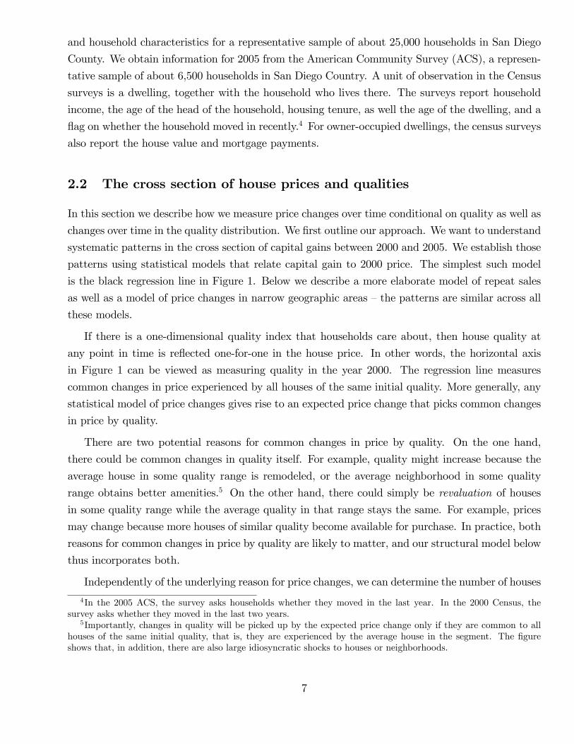
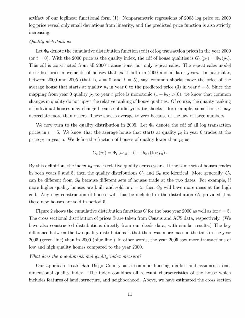
We now turn to the quality distribution in 2005. Let Φ5 denote the cdf of all log transaction
prices in t = 5. We know that the average house that starts at quality p0 in year 0 trades at the
price p5 in year 5. We define the fraction of houses of quality lower than p0 as
Gt (p0) = Φt (a0,5 + (1 + b0,5) log p0) .
By this definition, the index p0 tracks relative quality across years. If the same set of houses trades
in both years 0 and 5, then the quality distributions G5 and G0 are identical. More generally, G5can be different from G0 because different sets of houses trade at the two dates. For example, if
more higher quality houses are built and sold in t = 5, then G5 will have more mass at the high
end. Any new construction of houses will thus be included in the distribution G5 provided that
these new houses are sold in period 5.
Figure 2 shows the cumulative distribution functions G for the base year 2000 as well as for t = 5.
The cross sectional distribution of prices Φ are taken from Census and ACS data, respectively. (We
have also constructed distributions directly from our deeds data, with similar results.) The key
difference between the two quality distributions is that there was more mass in the tails in the year
2005 (green line) than in 2000 (blue line.) In other words, the year 2005 saw more transactions of
low and high quality homes compared to the year 2000.
What does the one-dimensional quality index measure?
Our approach treats San Diego County as a common housing market and assumes a one-
dimensional quality index. The index combines all relevant characteristics of the house which
includes features of land, structure, and neighborhood. Above, we have estimated the cross section
11
0 200 400 600 800 1000 12000
0.1
0.2
0.3
0.4
0.5
0.6
0.7
0.8
0.9
1
Quality ( = house value in 2000)
20002005
Figure 2: Cumulative distribution function of house qualities in 2000 and 2005
of capital gains by quality from property-level price data. An alternative approach is to look at
median prices in narrow geographic areas such as zipcodes or census tracts. If market prices ap-
proximately reflect a one dimensional quality index, then the two approaches should lead to similar
predictions for the cross section of capital gains. Moreover, adding geographic information should
not markedly improve capital gain forecasts for individual houses.
Appendix B investigates the role of geography by running predictive regressions for annualized
capital gains between 2000 and 2005. First, we consider the cross section of capital gains by area,
with area equal to either zipcode or census tract, defined as the difference in log median price in
the area. We regress the area capital gain from 2000 to 2005 on the 2000 median area price (in
logs). We compare the results to a regression of property capital gain on the initial property price
as considered above. The coeffi cients on the initial area price variables are close (between .06 and
.07) and the R2 is similar (around 60%). The GMM estimate for b0,5 implied by our repeat sales
model above was b0,5 = −.322 = −.064 × 5 and is thus also in the same range on an annualized
basis. Moreover, the predicted capital gains for the median house (log pi2000 = log 247, 000 = 12.42)
are within one percentage point of each other. We conclude that the price patterns we find are not
specific to a repeat sales approach.
Second, we consider predictive regressions for property level capital gains that include not only
the initial property price but also the initial area median price. For both zipcode and census tract,
the coeffi cient on the area price is economically small (less than .015), and in the case of census
tract it is not significant. The coeffi cient on the initial property price is almost unchanged. In both
cases, the R2 increases only marginally by 0.01 percentage points. These results are again consistent
12
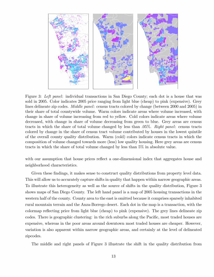
Figure 3: Left panel : individual transactions in San Diego County; each dot is a house that wassold in 2005. Color indicates 2005 price ranging from light blue (cheap) to pink (expensive). Greylines delineate zip codes. Middle panel : census tracts colored by change (between 2000 and 2005) intheir share of total countywide volume. Warm colors indicate areas where volume increased, withchange in share of volume increasing from red to yellow. Cold colors indicate areas where volumedecreased, with change in share of volume decreasing from green to blue. Grey areas are censustracts in which the share of total volume changed by less than .05%. Right panel : census tractscolored by change in the share of census tract volume contributed by houses in the lowest quintileof the overall county quality distribution. Warm (cold) colors indicate census tracts in which thecomposition of volume changed towards more (less) low quality housing. Here grey areas are censustracts in which the share of total volume changed by less than 5% in absolute value.
with our assumption that house prices reflect a one-dimensional index that aggregates house and
neighborhood characteristics.
Given these findings, it makes sense to construct quality distributions from property level data.
This will allow us to accurately capture shifts in quality that happen within narrow geographic areas.
To illustrate this heterogeneity as well as the source of shifts in the quality distribution, Figure 3
shows maps of San Diego County. The left hand panel is a map of 2005 housing transactions in the
western half of the county. County area to the east is omitted because it comprises sparsely inhabited
rural mountain terrain and the Anza-Borrego desert. Each dot in the map is a transaction, with the
colormap reflecting price from light blue (cheap) to pink (expensive). The grey lines delineate zip
codes. There is geographic clustering: in the rich suburbs along the Pacific, most traded houses are
expensive, whereas in the poor areas around downtown most traded houses are cheaper. However,
variation is also apparent within narrow geographic areas, and certainly at the level of delineated
zipcodes.
The middle and right panels of Figure 3 illustrate the shift in the quality distribution from
13
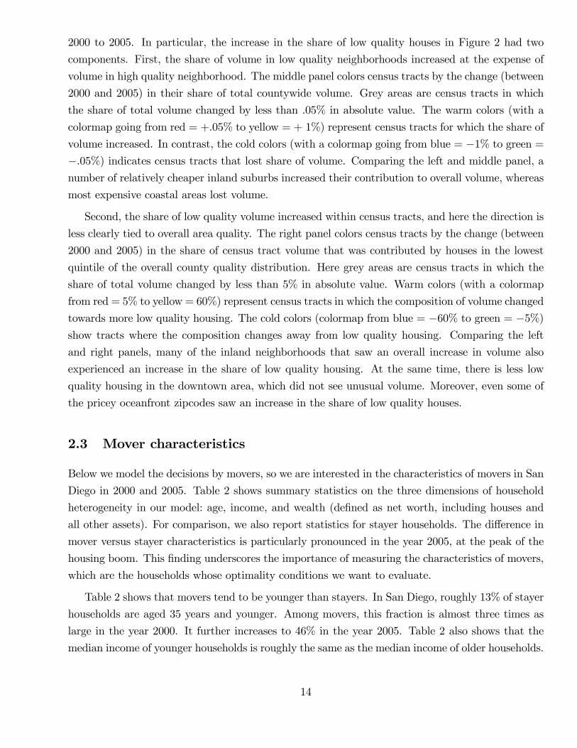
2000 to 2005. In particular, the increase in the share of low quality houses in Figure 2 had two
components. First, the share of volume in low quality neighborhoods increased at the expense of
volume in high quality neighborhood. The middle panel colors census tracts by the change (between
2000 and 2005) in their share of total countywide volume. Grey areas are census tracts in which
the share of total volume changed by less than .05% in absolute value. The warm colors (with a
colormap going from red = +.05% to yellow = + 1%) represent census tracts for which the share of
volume increased. In contrast, the cold colors (with a colormap going from blue = −1% to green =−.05%) indicates census tracts that lost share of volume. Comparing the left and middle panel, anumber of relatively cheaper inland suburbs increased their contribution to overall volume, whereas
most expensive coastal areas lost volume.
Second, the share of low quality volume increased within census tracts, and here the direction is
less clearly tied to overall area quality. The right panel colors census tracts by the change (between
2000 and 2005) in the share of census tract volume that was contributed by houses in the lowest
quintile of the overall county quality distribution. Here grey areas are census tracts in which the
share of total volume changed by less than 5% in absolute value. Warm colors (with a colormap
from red = 5% to yellow = 60%) represent census tracts in which the composition of volume changed
towards more low quality housing. The cold colors (colormap from blue = −60% to green = −5%)show tracts where the composition changes away from low quality housing. Comparing the left
and right panels, many of the inland neighborhoods that saw an overall increase in volume also
experienced an increase in the share of low quality housing. At the same time, there is less low
quality housing in the downtown area, which did not see unusual volume. Moreover, even some of
the pricey oceanfront zipcodes saw an increase in the share of low quality houses.
2.3 Mover characteristics
Below we model the decisions by movers, so we are interested in the characteristics of movers in San
Diego in 2000 and 2005. Table 2 shows summary statistics on the three dimensions of household
heterogeneity in our model: age, income, and wealth (defined as net worth, including houses and
all other assets). For comparison, we also report statistics for stayer households. The difference in
mover versus stayer characteristics is particularly pronounced in the year 2005, at the peak of the
housing boom. This finding underscores the importance of measuring the characteristics of movers,
which are the households whose optimality conditions we want to evaluate.
Table 2 shows that movers tend to be younger than stayers. In San Diego, roughly 13% of stayer
households are aged 35 years and younger. Among movers, this fraction is almost three times as
large in the year 2000. It further increases to 46% in the year 2005. Table 2 also shows that the
median income of younger households is roughly the same as the median income of older households.
14
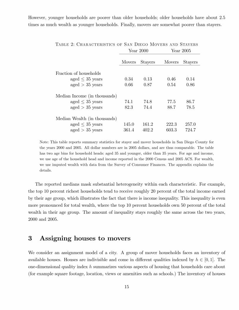
However, younger households are poorer than older households; older households have about 2.5
times as much wealth as younger households. Finally, movers are somewhat poorer than stayers.
Table 2: Characteristics of San Diego Movers and StayersYear 2000 Year 2005
Movers Stayers Movers Stayers
Fraction of householdsaged ≤ 35 years 0.34 0.13 0.46 0.14aged > 35 years 0.66 0.87 0.54 0.86
Median Income (in thousands)aged ≤ 35 years 74.1 74.8 77.5 86.7aged > 35 years 82.3 74.4 88.7 78.5
Median Wealth (in thousands)aged ≤ 35 years 145.0 161.2 222.3 257.0aged > 35 years 361.4 402.2 603.3 724.7
Note: This table reports summary statistics for stayer and mover households in San Diego County for
the years 2000 and 2005. All dollar numbers are in 2005 dollars, and are thus comparable. The table
has two age bins for household heads: aged 35 and younger, older than 35 years. For age and income,
we use age of the household head and income reported in the 2000 Census and 2005 ACS. For wealth,
we use imputed wealth with data from the Survey of Consumer Finances. The appendix explains the
details.
The reported medians mask substantial heterogeneity within each characteristic. For example,
the top 10 percent richest households tend to receive roughly 20 percent of the total income earned
by their age group, which illustrates the fact that there is income inequality. This inequality is even
more pronounced for total wealth, where the top 10 percent households own 50 percent of the total
wealth in their age group. The amount of inequality stays roughly the same across the two years,
2000 and 2005.
3 Assigning houses to movers
We consider an assignment model of a city. A group of mover households faces an inventory of
available houses. Houses are indivisible and come in different qualities indexed by h ∈ [0, 1]. The
one-dimensional quality index h summarizes various aspects of housing that households care about
(for example square footage, location, views or amenities such as schools.) The inventory of houses
15
is described by a strictly increasing cumulative distribution function G (h). A house of quality h
trades in a competitive market at the price p (h).
Every mover household buys exactly one house. Let h∗ (p, i) denote the housing demand function
of household i. It depends on the house price function p as well as on household i’s characteristics.
In equilibrium, the markets for all house types clear. For every h ∈ [0, 1], the number of households
who demand houses of quality less than h must therefore be equal to the number of such houses in
the inventory:
Pr (h∗ (p, i) ≤ h) = G (h) . (4)
The price function p (h) describes a set of house prices at which households are happy to be assigned
to the available inventory of houses.
How hard it is to solve a model like this depends on (i) how housing demand h∗ is derived and (ii)
what the distribution of mover characteristics looks like. Our quantitative model derives housing
demand from an intertemporal optimization program with uncertainty and frictions (borrowing
constraints and transaction costs.) Moreover, households differ by age, wealth, and income so that
the distribution of movers is three-dimensional. Both housing demand and equilibrium prices must
then be determined numerically.
Before introducing the full model, we consider a simpler version. In particular, we assume
that (i) the housing demand is derived from a frictionless, deterministic, one-period optimization
problem and (ii) the distribution of mover characteristics is one-dimensional. While this version is
not suitable for quantitative work, prices and assignments are available in closed form. We use this
model to illustrate how changes in the house quality and mover distributions as well as shocks to a
subpopulation (in the vein of a change in credit conditions for poor households) differentially affect
prices at the high and low end of the quality spectrum. We also clarify how our setup differs from
other models in which houses are priced linearly.
A simple model
Households care about two goods: housing and other (numeraire) consumption. Households
start with wealth w and buy a house of quality h at the price p (h). Households also choose their
consumption of numeraire c. A household maximizes utility
u (c, h) (5)
subject to the budget constraint
c+ p (h) = w.
Let F (w) denote the strictly increasing cumulative distribution function of wealth w defined on
the nonnegative real line. An equilibrium consists of a consumption and house allocation together
16
with a price function such that households optimize and markets clear.
The first order condition for the household problem is
p′ (h) =u2 (c, h)
u1 (c, h). (6)
It says that the marginal rate of substitution (MRS) of housing for numeraire consumption equals
the marginal value of a house p′ (h) at the quality level h that the household chooses. Intratemporal
Euler equations that equate MRS and house prices hold in many models of housing. What is special
here is that house value does not need to be linear in quality. The MRS is thus equated to a marginal
house value that may differ across quality levels. In this sense, houses of different quality are priced
by different marginal investors.
Consider an equilibrium such that optimal house quality is unique and strictly increasing in
wealth. The assignment of houses to wealth levels is then given by a strictly increasing function
h∗ : R+0 → [0, 1]. It is convenient to work with its inverse w∗ (h), which gives the wealth level of an
agent who is assigned a house of quality h. The market clearing condition (4) now says that, for all
h,
F (w∗ (h)) = G (h) =⇒ w∗ (h) = F−1 (G (h)) ,
where w∗ is well defined because F is strictly increasing. The assignment of wealth levels to house
qualities depends only on the respective distributions, and is independent of preferences. Of course,
prices will depend on preferences through the Euler equations.
The function w∗ describes a QQ plot commonly used to compare probability distributions. Its
graph is a curve in (h,w)-space that is parametrized by the common cdf value in [0, 1]. The shape
of the graph w∗ is determined by the relative dispersion of house quality and wealth. If the relative
dispersion is similar, the graph of w∗ is close to the 45 degree line. In the special case of identical
quality and wealth distributions, the graph of w∗ is exactly the 45 degree line. If the distribution
of wealth F is more dispersed than the quality distribution G, the graph of w∗ is steeper than the
45 degree line. For example, if all houses are essentially of the same quality, but there is some
dispersion in wealth, then w∗ must be close to a vertical line and is thus very steep. In contrast, if
wealth is less dispersed than quality then w∗ is flatter than the 45 degree line.
To characterize equilibrium prices in closed form, we specialize further and assume separable
log utility, that is, u (c, h) = log c + θ log h. From the Euler equations, the marginal house price at
quality h must be equal to the MRS between housing and wealth spent on other goods:
p′ (h) = θw∗ (h)− p (h)
h. (7)
An agent with wealth w∗ (h) must be indifferent between buying a house of quality h and spending
17
w∗ (h)−p (h) on other goods, or instead buying a slightly larger house and spending slightly less on
other goods. An agent who already spends a lot on other goods is willing to pay more for a larger
house (because of diminishing marginal utility of nonhousing consumption.) Therefore, if the house
of quality h is assigned to an agent who spends more on nonhousing consumption per unit of house
quality, then the slope of the house price function must be steeper at the point h.
To obtain closed form solutions for equilibrium prices, we further assume distributions G and F
such that the assignment function is a polynomial of degree n
w∗ (h) =
n∑i=1
aihi. (8)
The lowest-quality house must have a zero price since it is purchased by the buyer who has zero
wealth. The unique solution to the ordinary differential equation (7) that satisfies p (0) = 0 is given
by
p (h) =
∫ h
0
(h
h
)θ θw∗(h)
hdh =
n∑i=1
aiθ
θ + ihi. (9)
If this solution is strictly increasing, then it is an equilibrium house price function. The price for a
house of quality h is the weighted average of MRS for all agents who buy quality less than h, with
the MRS evaluated at total wealth.
When is the price function linear?
In general, the equilibrium price (9) is a nonlinear function of quality. Higher powers of h matter
for prices if they matter for the assignment (8). Linear pricing emerges in equilibrium, however, for
particular pairs of distributions. Indeed, suppose the distributions F and G are scaled version of
each other, that is, F (w) = G (w/k) for some positive constant k. The assignment function is then
w∗ (h) = kh. Let W =∫w dF (w) and H =
∫h dG (h) = W/k denote average wealth and house
quality, respectively. The price function can be written as p (h) = ph with
p =θ
θ + 1
W
H. (10)
It depends on the distributions F and G only through their respective means. More generally, the
segment-specific house price (9) can depend on details of the distributions through the parameters
of the assignment (8).
The emergence of linear pricing as a knife-edge case is not limited to log utility. Indeed, given a
utility function such that housing is a normal good, a cdf F (w) for movers and an average housing
quality H =∫h dG (h), we can find a cdf G (h) with mean H such that (i) the assignment can
be represented by an increasing function w∗ (h) = F−1(G (h)) and (ii) the price function is linear
18
p (h) = ph, where for all h we have
p =u2 (c, h)
u1 (c, h). (11)
When pricing is linear, the per-unit house price p enters the Euler equations of all households: The
marginal (or, equivalently, the average, per unit) user cost can be read off the Euler equation of
any household —in this sense every household is a marginal investor for every house h ∈ [0, 1]. In
contrast, in the nonlinear pricing case, the marginal user cost at quality h can be read off only one
Euler equation (6), that of the marginal investor with wealth w∗ (h) .
The linear special case is imposed in macroeconomic models with divisible housing capital. In
these models, there is a production technology that converts different houses into each other which
is linear; the marginal rate of transformation between different houses is thus set equal to one.
Moreover, the cdf G (h) is assumed to adjust so as to ensure linear pricing. As a result, the per unit
price of housing p changes if and only if the marginal rate of substitution of all investors changes.
In our quantitative approach below, we do not take a stance on the production technology or the
house quality distribution G (h). Instead, we measure the cdf G (h) directly from the data — in
other words, we let the data tell us whether the pricing is linear or nonlinear.
Graphical example
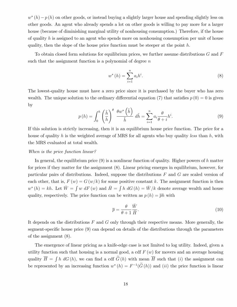
Figure 4 illustrates equilibria with separable log utility. The top left panel shows a wealth
density f (w) = F ′ (w). The top right panel shows a uniform house density g (h) = G′ (h). In both
panels, the second and fourth quintile have been shaded for easier comparison. The bottom left
panel shows house prices. The solid line is the house price function p (h). Its nonlinearity reflects
the different shapes of F and G that lead to a nonlinear assignment w∗. The dotted line is the
price function for a comparison economy with the same mean house quality but linear pricing. In
the comparison economy, at least one of the distributions must be different so w∗ is linear. For
example, we could have the uniform house quality distribution G together with a uniform wealth
distribution F . Alternatively, we could have the wealth distribution could be F together with a
house quality distribution G adjusted so quality is a scaled version of wealth. The latter would
emerge in equilibrium in a model with divisible housing.
To understand in more detail how the shape of the price function depends on F and G, consider
first the assignment function w∗ (h) = F−1 (G (h)), plotted in the bottom right panel. It is relatively
steep for low and high house qualities, and relatively flat in between. Locally, the slope of w∗ is
higher at a point h if house quality near that point is less dispersed than wealth. Indeed, if there
are many houses of quality close to h, but few movers have wealth close to w∗ (h), then some houses
close to h must be assigned to movers who are much richer or poorer than w∗ (h), so the function
w∗ is steep around h. The overall effect can be seen in the figure by focusing on relative dispersion
of wealth and house quality within quintiles. The dispersion of house quality is the same in each
19
Figure 4: Equilibrium prices and assignment with lognormal wealth density f (w) and uniformhouse quality density g (h) . Top left: wealth density f (w). Top right: house quality density g (h).Bottom left: the equilibrium house price function p (h) in the indivisible model (solid line) and thedivisible model (dotted line). Bottom right: assignment w∗ (h) and house prices. Shaded areasindicate the quintiles of the distribution.
quintile due to the uniform distribution. The dispersion of wealth is relatively high in the first and
fifth quintile (where w∗ is therefore steep), but relatively low in the second and third quintile (where
w∗ is flatter).
The house price function is determined by the segment-specific Euler equation (7). For a given
quality h, the price function is steeper if the marginal investor spends more on nonhousing con-
sumption per unit of house quality. In particular, for a given p (h), the house price must rise more
if the marginal investor is richer. The house price function thus inherits from the assignment w∗
the property that it steepens for very high and very low qualities. There is less steepening at high
qualities where wealth per unit of quality responds less to w∗. In addition, the house price function
must be consistent with pricing by all marginal investors at qualities less than h. More dispersion
in wealth relative to house quality in lower quintiles thus leads to higher prices in higher quintiles.
20
For the very smallest houses, the closed form solution for price (9) analytically illustrates the
role of relative dispersion. First order expansion of p at h = 0 delivers9
p (h) ≈θ
θ + 1a1h (12)
In general, the slope of the price function at h = 0 thus depends not only on θ, but also on the
slope of the assignment function w∗ and thus the relative shape of the cdfs near zero For example,
if the densities f and g are defined for positive w and h, respectively, then a1 is the limit, as h goes
to zero, of the density ratio g (h) /f (w∗ (h)). If, say, the house density is higher than the wealth
density near zero then the price function has to slope up steeply. This is because many similar small
houses have to be assigned to movers of different wealth. In contrast, with linear pricing, a1 = 1
and the slope p′ (0) depends only on preferences.
Comparative statics
Figure 5 shows what happens if the house quality distribution has fatter tails: there is more
mass at both the low and high end. The new density —the green line in the top right panel —is
U-shaped and symmetric around one half. The mean house quality is thus the same as under the
original uniform density. While the densities here are stylized, a move from the blue to the green
density qualitatively mimics the move from the 2000 to the 2005 quality distribution displayed in
Figure 2 and studied quantitatively in Section 5 below. The green line in the bottom left panel is the
new price function, p (h) say. Prices change to reflect the new relative shapes of the distributions.
In contrast, if pricing was linear, then prices would not change since the means have not changed.
The bottom right panel shows capital gains by house value. It plots the log house value in the
“blue economy” (log p (h), or the log of the blue line in the bottom left panel) on the horizontal
axis against the capital gain from blue to green (log p (h) − log p (h) or the log difference between
the green and blue lines in the bottom left panel) on the vertical axis. Capital gains are positive
and higher at the low end than at the high end. Indivisibility of housing is crucial for this result —
in a model with divisible housing and hence linear pricing, capital gains would be zero.
To understand the intuition, it is again helpful to consider the relative dispersion of wealth and
quality within quintiles. In the bottom quintile, the dispersion of house qualities has now decreased,
making wealth even more dispersed relative to quality. The assignment w∗ must become steeper in
this region as richer agents must buy lower quality houses. A steeper assignment in turn implies
a steeper house price function.10 Starting from the smallest house, prices rise faster to keep richer
9In particular we have a1 = g (0) /f (0) if the densities are defined at zero, but this is not necessary for a polynomialw∗.10For example, for the smallest houses, the increase in the house quality density at zero induces an increase in a1,
to a1 say. The capital gain satisfies
limh→0
(log p (h)− p (h)) = log a1a1
21
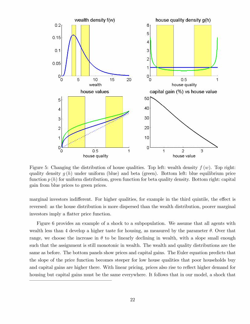
Figure 5: Changing the distribution of house qualities. Top left: wealth density f (w). Top right:quality density g (h) under uniform (blue) and beta (green). Bottom left: blue equilibrium pricefunction p (h) for uniform distribution, green function for beta quality density. Bottom right: capitalgain from blue prices to green prices.
marginal investors indifferent. For higher qualities, for example in the third quintile, the effect is
reversed: as the house distribution is more dispersed than the wealth distribution, poorer marginal
investors imply a flatter price function.
Figure 6 provides an example of a shock to a subpopulation. We assume that all agents with
wealth less than 4 develop a higher taste for housing, as measured by the parameter θ. Over that
range, we choose the increase in θ to be linearly declining in wealth, with a slope small enough
such that the assignment is still monotonic in wealth. The wealth and quality distributions are the
same as before. The bottom panels show prices and capital gains. The Euler equation predicts that
the slope of the price function becomes steeper for low house qualities that poor households buy
and capital gains are higher there. With linear pricing, prices also rise to reflect higher demand for
housing but capital gains must be the same everywhere. It follows that in our model, a shock that
22
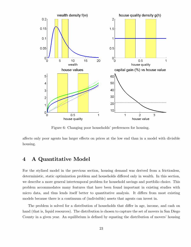
Figure 6: Changing poor households’preferences for housing.
affects only poor agents has larger effects on prices at the low end than in a model with divisible
housing.
4 A Quantitative Model
For the stylized model in the previous section, housing demand was derived from a frictionless,
deterministic, static optimization problem and households differed only in wealth. In this section,
we describe a more general intertemporal problem for household savings and portfolio choice. This
problem accommodates many features that have been found important in existing studies with
micro data, and thus lends itself better to quantitative analysis. It differs from most existing
models because there is a continuum of (indivisible) assets that agents can invest in.
The problem is solved for a distribution of households that differ in age, income, and cash on
hand (that is, liquid resources). The distribution is chosen to capture the set of movers in San Diego
County in a given year. An equilibrium is defined by equating the distribution of movers’housing
23
demand derived from the dynamic problem to the distribution of transacted houses. Appendix D
contains a detailed description of our computations.
4.1 Setup
Households live for at most T periods and die at random. Let Dt denote a death indicator that
equals one if the household dies in period t or earlier. This indicator is independent over time but
has an age-dependent probability. Preferences are defined over streams of housing services s and
other (numeraire) consumption c during lifetime, as well as the amount of numeraire consumption
w left as bequest in the period of death. Conditional on period τ , utility for an agent aged aτ in
period τ is
Eτ
[τ+T−aτ∑t=τ
βt[(1−Dt) u(ct, st (ht)) + (Dt −Dt−1) vb (wt)
]](13)
Households have access to two types of assets. First they can buy houses of different qualities
h ∈ [0, 1] that trade at prices pt (h). Owning a house is the only way to obtain housing services
for consumption. A house of size ht owned at the end of period t produces a period t service flow
st (ht) where the function st is strictly increasing. It may depend on time to accommodate growth.
Households also participate in the credit market. Between period t and t + 1, the household
can either lend at the rate Rt or borrow at the rate Rt + ρt. The spread ρt is strictly positive so
the household never simultaneously borrows and lends.11 We denote net borrowing by bt so bt < 0
represents bond purchases. We assume that a household can only borrow up to a fraction 1− δt ofthe value of his house. In other words, the amount bt must satisfy
bt ≤ (1− δt)pt(ht). (14)
The fraction δt is the downpayment requirement on a house.
We introduce three further features that distinguish housing from bonds. First, selling houses
is costly: the seller pays a transaction cost ν that is proportional to the value the house. Second,
every period an owner pays a maintenance cost ψ, also proportional to the value of the house.
Finally, a household can be hit by a moving shock mt ∈ {0, 1}, where mt = 1 means that they must
sell their current house. Formally, the moving shock may be thought of as a shock to the housing
services production function st (·) that permanently leads to zero production unless a new house isbought. Of course, households may also choose to move when they do not receive a moving shock,
11The spread here accounts for screening costs on the part of lenders. It does not incorporate expected costs ofdefault since the number of mortgage defaults during the boom period we study was negligible. For an application tothe bust period, it would be important to include these mortgage defaults explicitly in to the model (as in Chatterjeeand Eyigungor 2009, Corbae and Quintin 2010, Campbell and Cocco 2010.)
24
for example because their income has increased suffi ciently relative to the size of their current home.
Households receive stochastic income
yt = f (at) ypt y
trt (15)
every period, where f (at) is a deterministic age profile, ypt is a permanent stochastic component,
and ytrt is a transitory component.
Our approach to incorporating the tax system is simple. We assume that income is taxed at a
rate τ . So the aftertax income (1− τ) yt enters cash on hand and the budget constraint. Mortgage
interest can be deducted at the same rate τ . Interest on bond holdings is also taxed at rate τ .
Therefore, the aftertax interest rate (1− τ)Rt enters cash on hand and the budget constraint. We
assume that housing capital gains are sheltered from tax.
To write the budget constraint, it is helpful to define cash on hand net of transaction costs. The
cash wt are the resources available if the household sells:
wt = (1− τ) yt + pt(ht−1)(1− ν)− (1− τ) (Rt−1 + ρt−11{bt−1>0})bt−1 (16)
The budget constraint is then
ct + (1 + ψ)pt(ht) = wt + 1[ht=ht−1&mt=0]νpt(ht−1) + bt (17)
Households can spend resources on numeraire consumption and houses, which also need to be
maintained. If a household does not change houses, resources are larger than wt since the households
does not pay a transaction cost. The household can also borrow additional resources.
Consider a population of movers at date t. A mover comes into the period with cash wt, including
perhaps the proceeds from selling a previous home. Given his age at, current house prices pt as
well as stochastic processes for future income yτ , future house prices pτ , the interest rate Rτ , the
spread ρτ , and the moving shock mτ , the mover maximizes utility (13) subject to the budget and
borrowing constraints. We assume that the only individual-specific variables needed to forecast the
future are age and the permanent component of income ypt . The optimal housing demand at date t
can then be written as h∗t (pt; at, ypt , wt).
As in the previous section, the distribution of available houses is summarized by a cdfGt (h). The
distribution of movers is described by the joint distribution of the mover characteristics (at, ypt , wt).
An equilibrium for date t is a price function pt and an assignment of movers to houses such that
households optimize and market clear, that is, for all h,
Pr (h∗t (pt; at, ypt , wt) ≤ h) ≤ Gt (h) .
25

This equation involves the optimality conditions of movers. We do not explore the optimality
conditions of non-movers as well as developers or other sellers. These conditions impose additional
restrictions on equilibrium prices.
The dynamic programming problem for movers does not offer them the option to rent a house in
the future. There are certain states of the world (with extremely low income or cash), in which such
a rental option might be attractive. However, transitions from owning to renting happen rarely in
the data. For example, Bajari, Chan, Krueger, and Miller (2012) estimate this transition probability
to be 5% for all age cohorts. Moreover, our continuous distribution of house qualities includes some
extremely small homes for households who want to downscale. The absence of a rental option will
thus not matter much for our quantitative results below.
4.2 Numbers
We now explain how we quantify the model. In this section, we describe our benchmark specification.
Section 5 discusses results based on several alternatives. It is helpful to group the model inputs into
four categories
1. Preferences and Technology
(Parameters fixed throughout all experiments.)
(a) Felicity u, bequest function v, discount factor β
(b) conditional distributions of death and moving shocks
(c) conditional distribution of income
(d) maintenance costs ψ, transaction costs ν
(e) service flow function (relative to trend)
2. Distributions of house qualities and mover characteristics
3. Credit market conditions
(a) current and expected future values for the interest rate R and the spread ρ
(b) current and expected future values for the downpayment constraint δ
4. House price expectations
Our goal is to explain house price changes during the boom. We thus implement the model for
two different trading periods: once before the boom, in the year 2000, and then again at the peak
26
of the boom, the year t = 2005. Preferences and technology are held fixed across trading periods.
In contrast, the distributions of house qualities and mover characteristics, credit conditions as well
as expectations about prices and credit conditions change across dates. To select numbers use data
on distributions and market conditions together with survey expectations.
For the pre-boom implementation (labeled t = 2000), distributions are measured using the 2000
Census cross section. Credit market conditions are based on 2000 market data and are expected
to remain unchanged in the future. Moreover, households expect all house prices to grow at trend
together with income, so relative prices remain unchanged. The service flow function is chosen to
match 2000 house prices at these expectations. At the same time, preference parameters are fixed
to match moments of the wealth distribution.
For the peak-of-the-boom implementation (labeled t = 2005), distributions are measured using
the 2005 ACS. For the baseline exercise, we assume that (i) credit market conditions are based on
2005 market data, (ii) interest rates are expected to mean revert, while other borrowing conditions
are expected to remain unchanged and (iii) all house prices grow at trend together with income.
We then compare predictions for 2005 equilibrium house prices with 2005 data. Other exercises
varying (i) − (iii) are described below. In particular, Appendix E considers a scenario in which
households anticipate the Great Recession, expecting tighter credit and lower house prices. We now
describe all elements of the quantitative strategy in detail.
Preferences and technology
The period length for the household problem is three years. Households enter the economy at
age 22 and live at most 23 periods until age 91. Survival probabilities are taken from the 2004 Life
Table (U.S. population) published by the National Center of Health Statistics. Felicity is given by
CRRA utility over a Cobb-Douglas aggregator of housing services and other consumption:
u(c, s) =[c1−ρ sρ]1−γ
1− γ , (18)
where ρ is the weight on housing services consumption, and γ governs the willingness to substitute
consumption bundles across both time period and states of the world. We work with a Cobb-
Douglas aggregator of the two goods, with ρ = .2. If divisible housing services are sold in a
perfect rental market, the expenditure share on housing services should be constant at 20%. This
magnitude is consistent with evidence on the cross section of renters’expenditure shares (see for
example, Piazzesi, Schneider, and Tuzel 2007.) We also assume γ = 5, which implies an elasticity
of substitution for consumption bundles across periods and states of 1/5.
Utility from bequests takes the form vb (w) = vbw1−γ/ (1− γ) with γ = 5. We choose the
constant vb as well as the discount factor to match average household wealth as well as average
wealth of households older than 81, both in 2000. The resulting constant vb is 0.54 and the discount
27
factor is β = .95.
The moving shocks are computed based on two sources. First, we compute the fraction of
households who move by age, which is about a third per year on average. The fraction is higher for
younger households. To obtain the fraction of movers who move for exogenous reasons, we use the
2002 American Housing Survey which asks households in San Diego about their reasons for moving.
A third of movers provides reasons that are exogenous to our model (e.g., disaster loss (fire, flood
etc.), married, widower, divorced or separated.)
We estimate the deterministic life-cycle component f (at) in equation (15) from the income data
by movers. The permanent component of income is a random walk with drift
ypt = ypt−1 exp (µ+ ηt) , (19)
where µ is a constant growth factor of 2% and ηt is iid normal with mean −σ2/2. The transitorycomponent ytrt of income is iid. The standard deviation of permanent shocks ηt is 11% and the
standard deviation of the transitory component is 14% per year, consistent with estimates in Cocco,
Gomes, and Maenhout (2005).
We assume that maintenance expenses cover the depreciation of the house. Based on evidence
from the 2002 American Housing Survey, maintenance ψ is roughly 1% of the house value per year.
The transaction costs ν are 6% of the value of the house, which corresponds to real estate fees in
California.
The housing services produced by a house of quality h grow at the same rate µ as income.
Starting from an initial service flow function st (h), households expect
st+1(h) = exp (µ) st(h). (20)
As discussed above, the initial service flow function s0 is backed out so that the model exactly fits
the 2000 price distribution. Constant growth of service flow over time is consistent with evidence
on improvements in the cross section of houses discussed in Appendix C.
Distributions of house qualities and mover characteristics
House quality is expressed in terms of 2000 prices as described in Subsection 2.2; the relevant
2000 and 2005 quality cdfs are shown in Figure 2. The problem of an individual household depends
on characteristics (at, ypt , wt). For age and income, we use age of the household head and income
reported in the 2000 Census (for t = 2000) and 2005 ACS (for t = 2005). The Census data does not
contain wealth information. We impute wealth using data from the Survey of Consumer Finances.
The appendix contains the details of this procedure.
28
Credit market conditions
Current lending and borrowing rates are set to their corresponding values in the data. For the
lending rates Rt, the data counterpart is the three-year interest rate on Treasury Inflation-Protected
Securities (TIPS), since the model period is three years. We thus set the lending rate to 3% for 2000
and to 1% for 2005. For the spread ρt between borrowing and lending rates, we use the difference
between mortgage and Treasury rates. The spread is thus 2% in 2000 and 1.3% in 2005.
Expectations about future (real) lending rates and spreads are set according to consensus long
range forecasts on nominal interest rates and inflation from Bluechip Surveys. Survey forecasts
suggest a belief in mean reversion for lending rates at the peak of the boom. Indeed, in both 2000
and 2005, long-run forecasts for nominal Treasury rates were about 5.5% and long forecasts for
inflation were about 2.5%, pointing to the same expected real rate of 3%. We thus assume that, in
2000, real rates in 2000 were expected to remain at 3%, whereas in 2005, real rates were expected
to increase from 1% to 3%.
Survey forecasts further suggest a belief that future spreads between lending and borrowing
rates would persist. Indeed, long run consensus forecasts for nominal mortgage rates in 2000 and
2005 were 7.5% and 6.7%, respectively. Together with the nominal Treasury rate forecasts above,
we obtain spread forecasts that are close to the current values of 2% and 1.3%, respectively. We
thus assume that spreads are expected to remain at their respective current values in both 2000
and 2005.
For the current downpayment constraint δt, we use 20% to describe conditions before the housing
boom in 2000, and 5% for the peak of the boom in 2005. These assumptions are in line with recent
evidence that credit became looser, although there is some uncertainty about the magnitude of
the shift. Geanakoplos (2010) shows that average CLTV ratios for securitized subprime and Alt-A
loans among the top 50% leveraged homeowners increased from 86.4% to 97.3%. Lee, Mayer and
Tracy (2012) look at coastal areas of the US; they show average combined loan-to-value ratios at
origination of 94% in 2001 and 96% in 2006 as well as significant increase in the fraction of high
LTV mortgages. Keys, Piskorski, Seru and Vig (2014) show that average CLTV ratios increased
from 83% in 2000 to 95% in 2005. Similar to the case of spread forecasts, households expect the
current downpayment constraints to remain in place in the future.
House price expectations
Under our baseline scenario, households believe that capital gains on houses of quality h are
given by
pt+1 (h) = pt (h) exp (µ+ ut+1 (h)) . (21)
where ut+1 (h) is an idiosyncratic property-level shock that is realized only when the house is sold.
Expected capital gains on all houses are given by the trend growth rate of labor income µ which is
29
the same in both 2000 and 2005. This approach is motivated by two considerations. On the one
hand, it is consistent with evidence that homebuyers during recent housing booms in California did
not anticipate subsequent price declines.12 On the other hand, it implies that return expectations
are not assumed to be special at the peak of the boom, but instead allows us to focus on the role
of credit market conditions.13
We set the volatility of the property-level shock equal to 9% per year over the three year model
period. We have also investigated adding an aggregate risk component that shifts the price function
for all houses. We have found that the results are not very sensitive to adding the modest amounts of
aggregate risk that are commonly measured from regional house prices (e.g., Flavin and Yamashita
2002.) We thus omit aggregate regional risk, and model agents’views about the San Diego market
as a whole only through different scenarios for the conditional mean (as described below).
5 Quantitative Results
In this section we compare pricing by quality segment in our base year 2000 to pricing at the peak of
the boom in 2005. The 2005 environment differs from the base year environment in three respects:
the house quality and mover distributions (in particular, the 2005 house quality distribution has
fatter tails), credit conditions (in particular, interest rates and downpayment constraints are lower
in 2005) and house price growth expectations (in particular, 2005 households expect prices to revert
to 2000 levels). Below we also report on experiments that consider each feature in isolation.
5.1 Prices and service flow in the base year 2000
The first step in our quantitative analysis considers the base year 2000. Here we take as given (i) the
distributions of house quality and mover characteristics, (ii) credit conditions that were prevalent
in the year 2000, and (iii) constant capital gains in price expectations. We then determine a service
flow function s0 (h) such that the model exactly fits the cross section of observed house prices in
the year 2000.
Figure 7 shows the resulting service flow function. It is strictly increasing in house quality. It is
also concave over almost all of the quality range (except for the lowest qualities.). Since our quality
12It is diffi cult to come up with sharp measures of return expectations for houses in San Diego. Case, Quigley andShiller (2004) performed mail surveys of homebuyers in Orange and Alameda county during the California boomyears of 1988 and 2002. Their point estimates suggest high capital gains expectations —above 10% per year over 10years —in both years, although they are rather imprecise.13In contrast, some recent literature has attributed features of the housing boom to exceptionally high capital gain
expectations, for example because of higher expected growth rates to the local cost of housing (Himmelberg, Mayerand Sinai, 2005) or extrapolation of past capital gains by a small subset of investors in a search market (Piazzesiand Schneider, 2009). Such effects are shut down here.
30
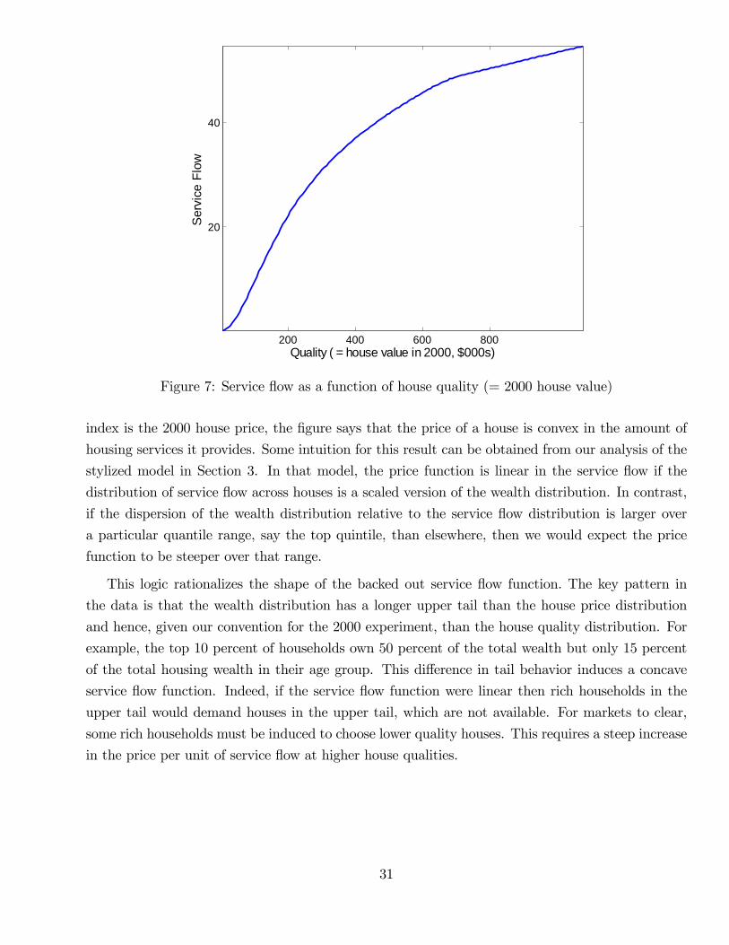
200 400 600 800
20
40
Quality ( = house value in 2000, $000s)
Serv
ice
Flow
Figure 7: Service flow as a function of house quality (= 2000 house value)
index is the 2000 house price, the figure says that the price of a house is convex in the amount of
housing services it provides. Some intuition for this result can be obtained from our analysis of the
stylized model in Section 3. In that model, the price function is linear in the service flow if the
distribution of service flow across houses is a scaled version of the wealth distribution. In contrast,
if the dispersion of the wealth distribution relative to the service flow distribution is larger over
a particular quantile range, say the top quintile, than elsewhere, then we would expect the price
function to be steeper over that range.
This logic rationalizes the shape of the backed out service flow function. The key pattern in
the data is that the wealth distribution has a longer upper tail than the house price distribution
and hence, given our convention for the 2000 experiment, than the house quality distribution. For
example, the top 10 percent of households own 50 percent of the total wealth but only 15 percent
of the total housing wealth in their age group. This difference in tail behavior induces a concave
service flow function. Indeed, if the service flow function were linear then rich households in the
upper tail would demand houses in the upper tail, which are not available. For markets to clear,
some rich households must be induced to choose lower quality houses. This requires a steep increase
in the price per unit of service flow at higher house qualities.
31
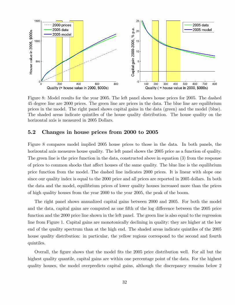
Figure 8: Model results for the year 2005. The left panel shows house prices for 2005. The dashed45 degree line are 2000 prices. The green line are prices in the data. The blue line are equilibriumprices in the model. The right panel shows capital gains in the data (green) and the model (blue).The shaded areas indicate quintiles of the house quality distribution. The house quality on thehorizontal axis is measured in 2005 Dollars.
5.2 Changes in house prices from 2000 to 2005
Figure 8 compares model implied 2005 house prices to those in the data. In both panels, the
horizontal axis measures house quality. The left panel shows the 2005 price as a function of quality.
The green line is the price function in the data, constructed above in equation (3) from the response
of prices to common shocks that affect houses of the same quality. The blue line is the equilibrium
price function from the model. The dashed line indicates 2000 prices. It is linear with slope one
since our quality index is equal to the 2000 price and all prices are reported in 2005 dollars. In both
the data and the model, equilibrium prices of lower quality houses increased more than the prices
of high quality houses from the year 2000 to the year 2005, the peak of the boom.
The right panel shows annualized capital gains between 2000 and 2005. For both the model
and the data, capital gains are computed as one fifth of the log difference between the 2005 price
function and the 2000 price line shown in the left panel. The green line is also equal to the regression
line from Figure 1. Capital gains are monotonically declining in quality: they are higher at the low
end of the quality spectrum than at the high end. The shaded areas indicate quintiles of the 2005
house quality distribution: in particular, the yellow regions correspond to the second and fourth
quintiles.
Overall, the figure shows that the model fits the 2005 price distribution well. For all but the
highest quality quantile, capital gains are within one percentage point of the data. For the highest
quality houses, the model overpredicts capital gains, although the discrepancy remains below 2
32

percentage points over the entire range. Changes in the distributions of movers and house qualities,
as well as in credit market conditions can thus jointly account for the cross section of capital gains
over the boom.
5.3 Properties of the assignment
To understand how the model works, we now consider the assignment of movers to houses. In
the stylized model of Section 3, cash on hand was the only dimension of heterogeneity and the
assignment could be represented as a line in the plane. In the model considered here, movers differ
not only in cash (asset wealth plus income), but also in income and age. Age matters for housing
demand if movers’savings and portfolio choice depends on their planning horizon. Income matters
(other than through its effect on cash) because it helps forecast future income and thus human
wealth.
Figure 9 provides a first impression for how all three dimensions of heterogeneity affect the
equilibrium assignment. In both panels, the horizontal axis measures house quality, the vertical
axis measures cash and every dot is a mover household in the 2005 ACS. The panels differ only in
the color of the dots, which illustrate a second dimension of heterogeneity. In the top panel, color
represents age, whereas in the bottom panel color represents the ratio of income to cash.
The cloud of points extends from southwest to northeast: not surprisingly, the model assigns
houses of higher quality to households with more cash. If cash were the only relevant dimension of
heterogeneity, all dots would be on a line, as for the stylized model of Section 3 (for example, in
the bottom left panel of Figure 4). Since the cloud looks very different from this benchmark, we
can conclude that cash is not the only dimension that matters in the assignment. Indeed, the figure
displays many pairs of movers such that one mover has twice the house quality but the same cash
level as the other mover. At the same time, houses of the same quality are frequently bought by
pairs of movers such that one has more than twice as much cash as the other.
In the top panel of Figure 9, light blue dots represent the youngest households. For a given
quality range, most young households have little cash and thus cluster at the bottom of the cloud.
In contrast, pink and violet dots representing the older households scatter towards the top of the
cloud — those households have more cash. Comparison of similarly colored dots shows that the
assigned quality is more sensitive to cash for younger households. Indeed, for the cloud of light blue
dots, the orientation from southwest to northeast is less pronounced than for the cloud of pink and
violet dots. Put differently, young households increase house quality more quickly with cash than
older households.
In the bottom panel of Figure 9, light blue dots correspond to a higher ratio of income to cash.
The light blue dots at the bottom of the cloud represent households with income-cash ratios close
33
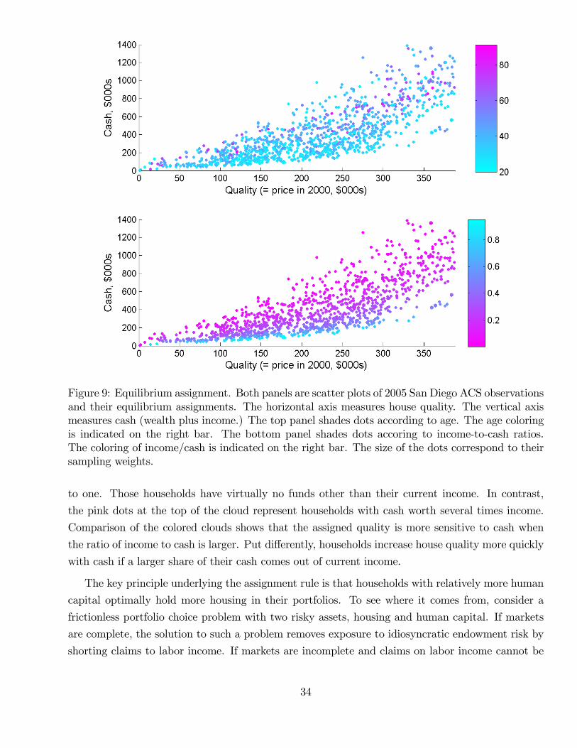
Figure 9: Equilibrium assignment. Both panels are scatter plots of 2005 San Diego ACS observationsand their equilibrium assignments. The horizontal axis measures house quality. The vertical axismeasures cash (wealth plus income.) The top panel shades dots according to age. The age coloringis indicated on the right bar. The bottom panel shades dots accoring to income-to-cash ratios.The coloring of income/cash is indicated on the right bar. The size of the dots correspond to theirsampling weights.
to one. Those households have virtually no funds other than their current income. In contrast,
the pink dots at the top of the cloud represent households with cash worth several times income.
Comparison of the colored clouds shows that the assigned quality is more sensitive to cash when
the ratio of income to cash is larger. Put differently, households increase house quality more quickly
with cash if a larger share of their cash comes out of current income.
The key principle underlying the assignment rule is that households with relatively more human
capital optimally hold more housing in their portfolios. To see where it comes from, consider a
frictionless portfolio choice problem with two risky assets, housing and human capital. If markets
are complete, the solution to such a problem removes exposure to idiosyncratic endowment risk by
shorting claims to labor income. If markets are incomplete and claims on labor income cannot be
34
traded, it still makes sense to remove exposure to endowment risk by shorting a tradable portfolio
that mimics labor income. In our model, this mimicking portfolio essentially consists of bonds.
At the same time, the collateral constraint implies that shorting bonds requires borrowing against
housing.
Optimal portfolio choice thus suggests that households who have more human wealth relative to
total wealth buy houses of higher quality. The facts shown in both panels follow directly. On the
one hand, labor income is persistent and hence serves a proxy for human wealth, holding fixed age.
House quality should thus increase more quickly with cash if the share of labor income in cash is
higher. On the other hand, younger households have a longer working life ahead of them and thus
larger human wealth, holding fixed labor income. House quality should thus increase more quickly
with cash for younger households.
Assignment by age and wealth —comparing model and data
We now investigate whether the data are consistent with the assignment predicted by the model.
Table 3 compares the assignment of house quality by cash, income and age in the data and the
model. Panels A and B contain numbers for the years 2000 and 2005, respectively. In both panels,
the columns labeled I, II, III and IV correspond to four house quality bins: houses worth less than
$150K, between $150-200K, $200-400K, and above $400K, all expressed in terms of prices in the
base year 2000. For each quality bin, the rows of the table report key moments of the distribution
of movers who buy houses in that bin, namely, median income and cash for young (≤ 35 years) andolder movers as well as the top and bottom deciles the cash distribution for the bin.
Higher quality houses are bought by richer households, whether "rich" is measured by income
or cash. Over the quality range covered by the first three bins, both measures of wealth actually
grow roughly linearly in quality once we condition on broad age groups. Indeed, the first three bins
are approximately equally spaced at 75K, 175K and 300K. At the same time, for both young (≤ 35
years) and old (≥ 35 years) households, income and cash increase by similar amounts between bins
I and II and between bins II and III. In contrast, there is typically a sharp increase between bin III
and bin IV —the top bin that has no upper bound.
The model also predicts that income and cash increase with quality, and that the relationship
is close to linear over the first three bins. As a measure of “slope”over that range, consider the
average increase from moving up one bin from bin I or bin II. For median income, this slope measure
is essentially independent of age: in the data for the year 2000 (2005) it is 19K (20K) for the young
and 23K (23K) for the old. The model exhibits the same pattern: slopes for the year 2000 (2005)
are 31K (32K) for the young and 31K (40K) for the old. The model is also close to the level of
median income for bin II and thus captures the linear relationship quite well.
In contrast to the case of income, the relationship between quality and median cash strongly
35
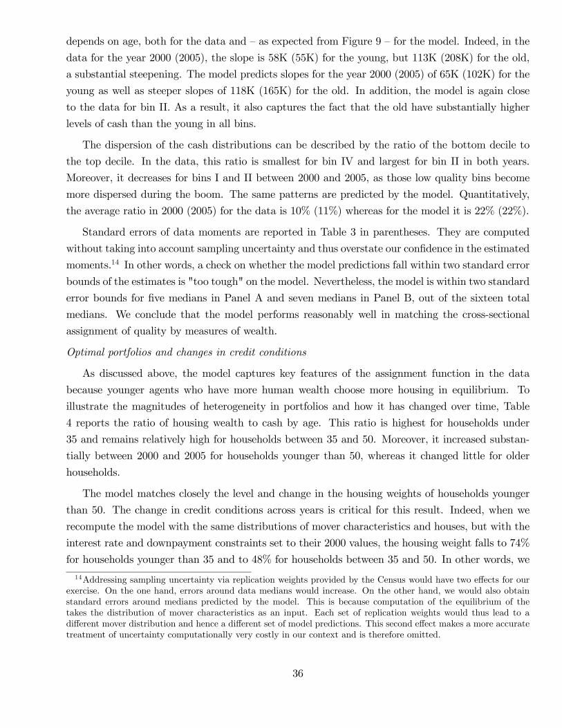
depends on age, both for the data and —as expected from Figure 9 —for the model. Indeed, in the
data for the year 2000 (2005), the slope is 58K (55K) for the young, but 113K (208K) for the old,
a substantial steepening. The model predicts slopes for the year 2000 (2005) of 65K (102K) for the
young as well as steeper slopes of 118K (165K) for the old. In addition, the model is again close
to the data for bin II. As a result, it also captures the fact that the old have substantially higher
levels of cash than the young in all bins.
The dispersion of the cash distributions can be described by the ratio of the bottom decile to
the top decile. In the data, this ratio is smallest for bin IV and largest for bin II in both years.
Moreover, it decreases for bins I and II between 2000 and 2005, as those low quality bins become
more dispersed during the boom. The same patterns are predicted by the model. Quantitatively,
the average ratio in 2000 (2005) for the data is 10% (11%) whereas for the model it is 22% (22%).
Standard errors of data moments are reported in Table 3 in parentheses. They are computed
without taking into account sampling uncertainty and thus overstate our confidence in the estimated
moments.14 In other words, a check on whether the model predictions fall within two standard error
bounds of the estimates is "too tough" on the model. Nevertheless, the model is within two standard
error bounds for five medians in Panel A and seven medians in Panel B, out of the sixteen total
medians. We conclude that the model performs reasonably well in matching the cross-sectional
assignment of quality by measures of wealth.
Optimal portfolios and changes in credit conditions
As discussed above, the model captures key features of the assignment function in the data
because younger agents who have more human wealth choose more housing in equilibrium. To
illustrate the magnitudes of heterogeneity in portfolios and how it has changed over time, Table
4 reports the ratio of housing wealth to cash by age. This ratio is highest for households under
35 and remains relatively high for households between 35 and 50. Moreover, it increased substan-
tially between 2000 and 2005 for households younger than 50, whereas it changed little for older
households.
The model matches closely the level and change in the housing weights of households younger
than 50. The change in credit conditions across years is critical for this result. Indeed, when we
recompute the model with the same distributions of mover characteristics and houses, but with the
interest rate and downpayment constraints set to their 2000 values, the housing weight falls to 74%
for households younger than 35 and to 48% for households between 35 and 50. In other words, we
14Addressing sampling uncertainty via replication weights provided by the Census would have two effects for ourexercise. On the one hand, errors around data medians would increase. On the other hand, we would also obtainstandard errors around medians predicted by the model. This is because computation of the equilibrium of thetakes the distribution of mover characteristics as an input. Each set of replication weights would thus lead to adifferent mover distribution and hence a different set of model predictions. This second effect makes a more accuratetreatment of uncertainty computationally very costly in our context and is therefore omitted.
36
are almost back to the 2000 numbers (61% and 43%, respectively).
Table 3: Assignment Of House Qualities in Data and Model
Data Model
House quality bins I II III IV I II III IV
Panel A: Year 2000
Median Income (in thousands)aged ≤ 35 years 48.5 68.7 88.1 128.5 38.3 67.6 100.3 206.3
(1.8) (2.5) (4.0) (7.1)aged > 35 years 44.0 63.4 90.3 152.3 33.4 67.4 95.9 182.2
(2.2) (2.3) (4.5) (8.5)
Median Cash (wealth plus income, in thousands)aged ≤ 35 years 112.0 169.7 284.6 646.8 93.2 158.5 361.9 1,551.4
(5.4) (7.8) (15.3) (39.7)aged > 35 years 172.3 284.8 496.4 1,141.8 122.9 241.1 547.1 1,721.0
(9.2) (15.4) (27.6) (71.5)
Percentiles of the Cash Distribution (in thousands)bottom 10% 60.2 94.9 146.0 310.9 59.6 114.5 221.0 763.0top 10% 471.1 721.8 1,443.9 3,941.9 205.6 362.5 1,007.1 4,378.9
Panel B: Year 2005
Median Income (in thousands)aged ≤ 35 years 61.3 73.6 101.9 132.5 51.0 82.0 115.7 137.4
(4.0) (3.5) (8.1) (7.1)aged > 35 years 45.9 78.5 91.7 144.7 35.7 76.4 96.8 244.6
(4.3) (4.9) (5.7) (12.5)
Median Cash (wealth plus income, in thousands)aged ≤ 35 years 203.4 258.5 421.3 735.2 136.7 238.6 526.0 1,689.8
(18.0) (22.5) (43.8) (76.4)aged > 35 years 251.6 459.7 712.2 1,645.6 196.3 360.6 749.3 2,601.8
(29.5) (45.2) (70.9) (187.7)
Percentiles of the Cash Distribution (in thousands)bottom 10% 79.1 125.3 180.4 391.3 67.0 146.5 314.9 1,093.0top 10% 714.4 1,099.0 1,733.7 5,582.6 324.8 553.8 1,244.4 6,262.4
Note: This table reports moments of the assignment of house quality to income and cash (wealth plus
37

current income) in the data and in the benchmark model. Panel A contains results for the year 2000,
while Panel B reports results for the year 2005. Across both panels, house quality is measured in four
bins. Bin I contains houses worth less than $150K in the 2000 base year. Bin II contains houses worth
between $150-200K. Bin III contains houses worth $200-400K. Bin IV contains houses above $400K. All
dollar amounts are reported in 2005 Dollars. The medians are computed for the households who bought
a house in the indicated bin. The row "aged ≤ 35 years" ("aged > 35 years") reports the medians of
households aged 35 years or younger (above 35 years). The row "bottom 10%" ("top 10%") reports
the 10th (90th) percentile of the cash distribution. The left columns show the assignment in the data
computed from the 2000 Census and the 2005 American Community Survey. The right columns show
the assignment in our benchmark model.
Table 4: Housing Wealth relative to Cash (Wealth Plus Income)
Age
below 35 35-50 years 50-65 years above 65
Panel A: Year 2000
Data 0.632 0.459 0.369 0.317Model 0.613 0.435 0.385 0.403
Panel B: Year 2005
Data 0.968 0.677 0.317 0.387Model 0.959 0.627 0.423 0.522
5.4 Understanding the cross section of capital gains
Figure 10 presents results for two hypothetical scenarios in order to illustrate the different forces
shaping the cross section of capital gains. For both exercises, we start from the 2000 distributions
of houses and mover characteristics as well as 2000 credit conditions. The left hand panel changes
only the distribution of houses to its shape in 2005. It is thus analogous to the experiment reported
in Figure 5 for our simple illustrative model. The results are qualitatively similar to that earlier
experiment: a shift towards more low quality houses increases capital gains at the low end. It is
clear however, that the distributional shift by itself would not be suffi cient to explain the cross
section of capital gains quantitatively. In particular, gains for the top quintile of houses are close
to zero.15
The right hand panel of Figure 10 changes only credit conditions, again starting from the 2000
15The exercise shifts only the distribution of houses, leaving mover characteristics unchanged. An exercise thatshifts only the distribution of mover characteristics has very small effects on equilibrium capital gains and is notreported here.
38
environment. It is thus similar in spirit to the experiment reported in Figure 6. The analogy is
not as clean as for a distributional change, however, because downpayment constraints and interest
rates have partly offsetting effects on households. On the one hand, lower downpayment constraints
are more relevant for poor households who are close to their collateral constraint. They account
for the sharp increase in capital gains at the low end. On the other hand, a given percentage drop
in interest rates has strong effects on present values computed with the lending rate which is lower
already in 2000. This effect helps prop up capital gains also at the higher end.
The appendix presents a number of other exercises that explore the sensitivity of the results to
our assumptions. First, we consider what happens when households in 2005 are able to perfectly
foresee future house prices and credit conditions. This means that households in 2005 anticipate
that after one model period (three years) house prices, downpayment constraints and mortgage
spreads revert to their 2000 levels. The results show that if households had perfectly foreseen
conditions during the housing bust of the Great Recession, the house price boom would have been
substantially smaller. However, the boom would have generated the same cross sectional patterns
in capital gains, with capital gains being roughly 10% per year for low quality houses and 0% at
the upper end of the quality distribution.
We also investigate the role of our assumption that the service flow function remains the same
over time, up to a growth factor. Formally, we compute a new service flow function that exactly
matches 2005 observed house prices. This computation also uses (i) 2005 distributions for house
qualities and mover characteristics, (ii) 2005 credit conditions, and (iii) constant capital gain ex-
pectations. The new service flow function is steeper for qualities below 400K, which makes the price
function less steep in that region compared to the benchmark in Figure 8. We also show that even
if differential home improvement is allowed, credit conditions play an important role in explaining
the cross section of capital gains.
6 Conclusion
The extraordinary housing boom experienced by the United States in the early 2000s has generated
an active literature trying to understand its roots. Financial innovation, changes in relative housing
supply, shifts in the income distribution and exuberant expectations have all been discussed as
candidate explanations. An exciting feature of this research is that it employs detailed cross sectional
data to compare implications of different hypotheses. A natural starting point for the analysis of
cross sectional data is a model of a homogenous housing market. Comparative static predictions
from such a model are easily compared to data on house prices and trading across geographical
areas, for example.
The approach taken by this paper is slightly different: we view a narrow geographical area as a
39
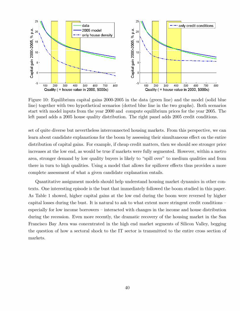
Figure 10: Equilibrium capital gains 2000-2005 in the data (green line) and the model (solid blueline) together with two hypothetical scenarios (dotted blue line in the two graphs). Both scenariosstart with model inputs from the year 2000 and compute equilibrium prices for the year 2005. Theleft panel adds a 2005 house quality distribution. The right panel adds 2005 credit conditions.
set of quite diverse but nevertheless interconnected housing markets. From this perspective, we can
learn about candidate explanations for the boom by assessing their simultaneous effect on the entire
distribution of capital gains. For example, if cheap credit matters, then we should see stronger price
increases at the low end, as would be true if markets were fully segmented. However, within a metro
area, stronger demand by low quality buyers is likely to “spill over”to medium qualities and from
there in turn to high qualities. Using a model that allows for spillover effects thus provides a more
complete assessment of what a given candidate explanation entails.
Quantitative assignment models should help understand housing market dynamics in other con-
texts. One interesting episode is the bust that immediately followed the boom studied in this paper.
As Table 1 showed, higher capital gains at the low end during the boom were reversed by higher
capital losses during the bust. It is natural to ask to what extent more stringent credit conditions —
especially for low income borrowers —interacted with changes in the income and house distribution
during the recession. Even more recently, the dramatic recovery of the housing market in the San
Francisco Bay Area was concentrated in the high end market segments of Silicon Valley, begging
the question of how a sectoral shock to the IT sector is transmitted to the entire cross section of
markets.
40
References
Bajari, Patrick, Phoebe Chan, Dirk Krueger, and Dan Miller 2012. “A Dynamic Model of Housing
Demand: Estimation and Policy Implications.”International Economic Review 54, 409-442.
Bayer, Patrick, Fernando Ferreira, and Robert McMillan 2007. “A Unified Framework for Measur-
ing Preferences for Schools and Neighborhoods.” Journal of Political Economy 115, 588-638.
Burnside, Craig, Martin Eichenbaum, and Sergio Rebelo 2011. “Understanding Booms and Busts
in Housing Markets.”NBER Working Paper 16734.
Campbell, John and Joao Cocco 2010. “A Model of Mortgage Default.”Working Paper, Harvard.
Case, Karl E. and Christopher J. Mayer 1996. “House Price Dynamics within a Metropolitan
Area.”Regional Science and Urban Economics 26, 387-407.
Case, Karl E., John M. Quigley and Robert J. Shiller 2004. “Home-buyers, Housing and the
Macroeconomy.” in Anthony Richards and Tim Robinson, eds., Asset Prices and Monetary
Policy, Reserve Bank of Australia, 2004, pp. 149—88.
Caplin, Andrew and John Leahy 2010. “A Graph Theoretic Approach to Markets for Indivisible
Goods.”Working Paper, NYU.
Chatterjee, Satyajit and Burcu Eyigungor 2009. “Foreclosures and House Price Dynamics: A
Quantitative Analysis of the Mortgage Crisis and the Foreclosure Prevention Policy.”Working
Paper, Philadelphia Fed.
Cocco, Joao F., Francisco J. Gomes, and Pascal J. Maenhout 2005. “Consumption and Portfolio
Choice over the Life Cycle.”Review of Financial Studies 18, 491-533.
Corbae, Dean and Erwan Quintin 2010. “Mortgage Innovation and the Foreclosure Boom.”Work-
ing Paper, University of Wisconsin.
Favilukis, Jack, Sydney Ludvigson, and Stijn van Nieuwerburgh 2010. “TheMacroeconomic Effects
of Housing Wealth, Housing Finance, and Limited Risk-Sharing in General Equilibrium.”
Working Paper, NYU.
Flavin, Marjorie and Takashi Yamashita 2002. “Owner-Occupied Housing and the Composition
of the Household Portfolio.”American Economic Review 92(1), 345-362.
Geanakoplos, John 2010. “What’s Missing from Macroeconomics: Endogenous Leverage and
Default.” in Marek Jarocinski, Frank Smets, and Christian Thimann, eds., Approaches to
Monetary Policy Revisited – Lesson from the Crisis, Sixth ECB Central Banking Conference
18-19 November 2010, pp. 220-238.
41

Glaeser, Edward L., Joshua Gottleb, and Joseph Gyourko 2010. “Can Cheap Credit Explain the
Housing Boom?”Working Paper, Harvard.
Glaeser, Edward L., Joseph Gyourko, and Raven E. Saks 2005. “Why Have Housing Prices Gone
Up?”American Economic Review 95 (2), 329-333.
Guerrieri, Veronica, Daniel Hartley, and Erik Hurst 2013. “Endogenous Gentrification and Housing
Price Dynamics.”Journal of Public Economics, Forthcoming.
Himmelberg, Charles, Christopher Mayer, and Todd Sinai 2005. “Assessing High House Prices:
Bubbles, Fundamentals and Misperceptions.”Journal of Economic Perspectives 19, 67-92.
Keys, Ben, Tomasz Piskorski, Amit Seru, and Vikrant Vig 2014. “Mortgage Financing in the
Housing Boom and Bust.”Forthcoming in the Housing and Financial Crisis, Edward Glaeser
and Todd Sinai, editors, NBER and University of Chicago Press.
Kiyotaki, Nobuhiro, Alexander Michaelides, and Kalin Nikolov 2010. “Winners and Losers in
Housing Markets.”Working Paper, Princeton.
Kiyotaki, Nobuhiro and John Moore 1995. “Credit Cycles.” Journal of Political Economy 105,
211-248.
Kaneko, Mamoru 1982. “The Central Assignment Game and the Assignment of Markets". Journal
of Mathematical Economics 10, 205-232.
Lamont, Owen and Jeremy Stein 1999. "Leverage and House-Price Dynamics in U.S. Cities."
Rand Journal of Economics, 30(3), 498-514.
Lee, Donghoon, Christopher J. Mayer, and Joseph Tracy 2012. "A New Look at Second Liens."
NBER Working Paper 18269.
Lustig, Hanno and Stijn Van Nieuwerburgh 2005. “Housing Collateral, Consumption Insurance
and Risk Premia: an Empirical Perspective.”Journal of Finance 60 (3), 1167-1219.
Määttänen, Niku and Marko Terviö 2013. “Income Distribution and House Prices: An Assignment
Model Approach.”Working Paper, Aalto School of Business.
Mian, Atif and Amir Sufi2009. “The Consequences of Mortgage Credit Expansion: Evidence from
the U.S. Mortgage Default Crisis.”Quarterly Journal of Economics 124(4), 1449-1496.
Mian, Atif and Amir Sufi 2010. “House Prices, Home Equity-Based Borrowing, and the U.S.
Household Leverage Crisis.”Forthcoming, American Economic Review.
42

Ortalo-Magne, Francois and Sven Rady 2006. “Housing Market Dynamics: On the Contribution
of Income Shocks and Credit Constraints.”Review of Economic Studies 73, 459—485.
Piazzesi, Monika, Martin Schneider, and Selale Tuzel 2007. “Housing, Consumption and Asset
Pricing.”Journal of Financial Economics 83, 531-569.
Piazzesi, Monika and Martin Schneider 2009. “Momentum Traders in the Housing Market: Survey
Evidence and a Search Model.”American Economic Review 99(2), 406-411.
Poterba, Jim 1991. “House Price Dynamics: The Role of Tax Policy and Demography.”Brookings
Papers on Economic Activity 2, 143-202
Rios-Rull, Jose-Victor and Virginia Sanchez-Marcos 2008. “An Aggregate Economy with Different
House Sizes.”Journal of The European Economic Association 6, 705-14.
Sattinger, Michael 1993. “Assignment Models of the Distribution of Earnings.”Journal of Eco-
nomic Literature 31(2), 831-880.
Stein, Jeremy 1995. “Prices and Trading Volume in the Housing Market: A Model with Down-
Payment Effects.”Quarterly Journal of Economics 110(2), 379-406.
43
Appendix for online publication
A San Diego County Transactions Data
In this appendix we describe our selection of sales and repeat sales. We begin by describing our
sample of sales which not only forms the basis for selecting repeat sales but is also used to illustrate
the shift in distributions in Section 2. Our goal is to compile a dataset of households’market
purchases of single-family dwellings. We start from a record of all deeds in San Diego County,
1999-2008 and then screen out deeds according to three criteria.
First, we look at qualitative information in the deed record on what the deed is used for. We
drop deed types that are not typically used in arms length transfers of homes to households in
California. In particular, we keep only grant deeds, condo deeds, corporate deeds and individual
deeds. The most important types eliminated are intrafamily deeds and deeds used in foreclosures.
Even for the types of deeds we keep, the deed record sometimes indicates that the transaction is
not “arms length”or that the sale is only for a share of a house —we drop those cases as well.
Second, we drop some deeds based on characteristics of the house or the buyer. We use only
deeds for which a geocode allows us to precisely identify latitude and longitude. We eliminate deeds
that transfer multiple parcels (as identified by APN number.) Information about property use allow
us to eliminate second homes and trailers. To further zero in on household buyers, we eliminate
deeds where the buyer is not a couple or a single person (thus dropping transaction where the buyer
is a corporation, a trust or the beneficiary of a trust.)
Third, we drop some deeds based on the recorded price or transaction dates. We drop deeds
with prices below $15,000 or with loan-to-value ratios (first plus second mortgage) above 120%. We
also consolidate deeds that have the same sales price for the same contract date. We drop deeds
that have the same contract date but different prices.
Our repeat sales sample is used to estimate our statistical model of price changes in Section 2.2.
A repeat sale is a pair of consecutive sales of the same property within the above sales sample. Since
we are interested in long term price changes, we want to avoid undue influence of house flipping on
our estimates. We thus drop all pairs of sales that are less than 180 days apart. To guard against
outliers, we drop repeat sales with annualized capital gains or losses above 50%.
B Robustness of facts on capital gains
Table B.1 reports additional results for the repeat sales model that incorporate zip code and census
tract level information. Regression (i) reports the basic regression of capital gains on the own
44
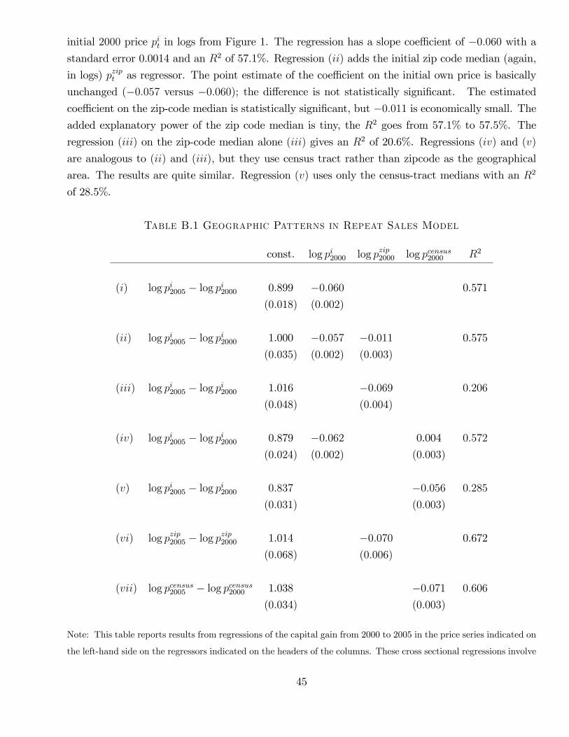
initial 2000 price pit in logs from Figure 1. The regression has a slope coeffi cient of −0.060 with a
standard error 0.0014 and an R2 of 57.1%. Regression (ii) adds the initial zip code median (again,
in logs) pzipt as regressor. The point estimate of the coeffi cient on the initial own price is basically
unchanged (−0.057 versus −0.060); the difference is not statistically significant. The estimated
coeffi cient on the zip-code median is statistically significant, but −0.011 is economically small. The
added explanatory power of the zip code median is tiny, the R2 goes from 57.1% to 57.5%. The
regression (iii) on the zip-code median alone (iii) gives an R2 of 20.6%. Regressions (iv) and (v)
are analogous to (ii) and (iii), but they use census tract rather than zipcode as the geographical
area. The results are quite similar. Regression (v) uses only the census-tract medians with an R2
of 28.5%.
Table B.1 Geographic Patterns in Repeat Sales Model
const. log pi2000 log pzip2000 log pcensus2000 R2
(i) log pi2005 − log pi2000 0.899 −0.060 0.571
(0.018) (0.002)
(ii) log pi2005 − log pi2000 1.000 −0.057 −0.011 0.575
(0.035) (0.002) (0.003)
(iii) log pi2005 − log pi2000 1.016 −0.069 0.206
(0.048) (0.004)
(iv) log pi2005 − log pi2000 0.879 −0.062 0.004 0.572
(0.024) (0.002) (0.003)
(v) log pi2005 − log pi2000 0.837 −0.056 0.285
(0.031) (0.003)
(vi) log pzip2005 − log pzip2000 1.014 −0.070 0.672
(0.068) (0.006)
(vii) log pcensus2005 − log pcensus2000 1.038 −0.071 0.606
(0.034) (0.003)
Note: This table reports results from regressions of the capital gain from 2000 to 2005 in the price series indicated on
the left-hand side on the regressors indicated on the headers of the columns. These cross sectional regressions involve
45

individual house prices pit from houses that were repeat sales in the two years 2000 and 2005, zip code medians pzipt ,
and census tract medians pcensust in San Diego County.
Regression (vi) runs the capital gains in the zip-code medians on the initial zip-code medians.
The results are comparable to row (i) with a slope coeffi cient of −0.070, a somewhat higher standard
error of 0.0055, and a higher R2 of 67.2%. Regression (vii) does the same exercise for census tracts,
again with similar slope as row (i) .
Figure 11 plots the repeat sales observations from Figure 1 with the 2005 log price on the y-axis.
The black line is the predicted value from a linear regression of 2005 log prices on 2000 log prices.
The green line is the predicted value from a nonparametric regression, using a Nadaraya-Watson
estimator with a Gaussian kernel and a bandwidth of 0.15. The nonparametric regression line is
strictly increasing in the initial 2000 price. This monotonicity property implies that the relative
ranking of houses by quality according to the nonparametric regression is the same as the relative
ranking according to the linear regression.
The nonparametric regression line is close to linear for a large range of house values, with the
largest deviation at the low end. This deviation does not matter for our approach, because we use
the pricing model only to derive an ordinal index. The absolute amount of service flow due to a
house of a certain ordinal quality is backed out using the structural model. Section 5.1 uses 2000
house prices to back out a service flow function for that year and assumes a constant rate between
2000 and 2005 to derive the 2005 service flow function. Section E uses 2000 house prices and 2005
house prices to back out service flow functions for the two years, respectively.
C Details on quantitative implementation
This appendix provides details on the calculations of home improvements, house quality and wealth
reported in the text.
Improvements
The 2002 American Housing Survey contains data on home improvements in San Diego County.
Table C.1 shows the means and medians of annual improvement expenses in San Diego as a percent
of house values. We find that San Diego homeowners spend an amount equal to roughly 1% of
their house value on improvements each year. The mean percentage spent on improvements is
2% for homes in the lowest bin, worth less than $50,000. However, this higher mean is estimated
imprecisely. A test that the mean improvement percentage in the lowest bin and homes in the next
bin (worth between $50,000 and $100,000) are identical cannot be rejected at the 10% level. A joint
test whether mean improvements across all bins are equal can also not be rejected. We also test
whether the data are drawn from populations that have the same median and cannot reject.
46
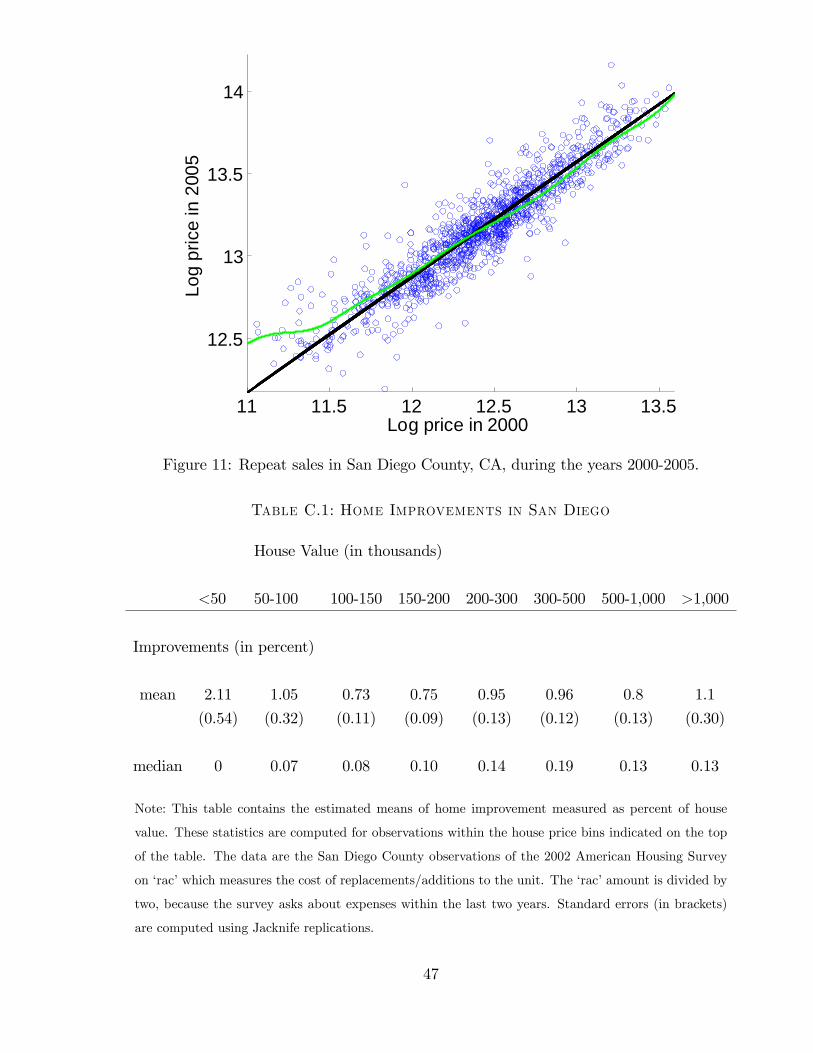
11 11.5 12 12.5 13 13.5
12.5
13
13.5
14
Log
pric
e in
200
5
Log price in 2000
Figure 11: Repeat sales in San Diego County, CA, during the years 2000-2005.
Table C.1: Home Improvements in San Diego
House Value (in thousands)
<50 50-100 100-150 150-200 200-300 300-500 500-1,000 >1,000
Improvements (in percent)
mean 2.11 1.05 0.73 0.75 0.95 0.96 0.8 1.1
(0.54) (0.32) (0.11) (0.09) (0.13) (0.12) (0.13) (0.30)
median 0 0.07 0.08 0.10 0.14 0.19 0.13 0.13
Note: This table contains the estimated means of home improvement measured as percent of house
value. These statistics are computed for observations within the house price bins indicated on the top
of the table. The data are the San Diego County observations of the 2002 American Housing Survey
on ‘rac’which measures the cost of replacements/additions to the unit. The ‘rac’amount is divided by
two, because the survey asks about expenses within the last two years. Standard errors (in brackets)
are computed using Jacknife replications.
47
Census house values
The Census data does not contain actual prices but rather price ranges, including a top range
for houses worth more than one million dollars. The topcoded range contains 9.6% of houses in
2005 and 1.8% of houses in 2000. To obtain cross sectional distributions of houses sold in a given
year, we fit splines through the bounds of the Census house binds. Let pc a vector that contains
those bounds, as well as a lower bound of zero and an upper bound. We can obtain a continuous
distribution for every upper bound by fitting a shape-preserving cubic spline through (pc, G0 (pc)).
We choose the upper bound such that the median house value in the topcoded range equals the
median in that range in our transaction data. To prepare the imputation of wealth (described
below) we set a household’s housing wealth to the midpoint of its bin, and we use the median of
the topcoded range for the top bin.
Imputation of wealth
For age and income, we use age of the household head and income reported in the 2000 Census
(for t = 2000) and 2005 ACS (for t = 2005). We are thus given age and income, as well as a survey
weight, for every survey household. However, Census data do not contain wealth. We construct a
conditional distribution of wealth using data from the Survey of Consumer Finances (SCF). We use
the 1998 and 2004 SCF to build the conditional distributions for 2000 and 2005, respectively.
We use a chained equations approach to perform imputations. The estimation is in two steps. In
the first step, we use SCF data to run regressions of log net worth on log housing wealth, a dummy
for whether the household has a mortgage and if yes, the log mortgage value, and log income for
each age decade separately. In the second step, we use a regression switching approach described in
Schenker and Taylor (1996), and implemented in the Stata commands ’mi’or ’ice’. The procedure
draws simulated regression coeffi cients from the posterior distribution of the coeffi cients estimated
using the SCF data. Using these simulated coeffi cients and the observed covariates in the census
data, a predicted value for log networth is calculated for each census household. The imputed log
networth for each census household is then randomly drawn from a set of SCF households whose
actual log networth is close to the predicted log networth of the missing observation.
By repeating this second step multiple times (i.e. drawing multiple sets of simulated coeffi cients),
we can generate multiple imputed observations for each original census observation. We choose to
create three different imputations, following the recommended quantity for this kind of procedure.
A survey weight for each new household is obtained by dividing the original survey weight by three.
48
D Computation
This section describes the computational methods used to solve the quantitative model in Section 4.
We need to (i) solve a household problem with a continuum of housing assets with different service
flows and prices and (ii) solve for the equilibrium objects (service flow for 2000, and price for
2005) given the three-dimensional distribution of household characteristics and the one-dimensional
distribution of house qualities.
Both the price and service flow functions are defined on the interval of available house qual-
ities [h, h]. Both functions are parametrized as shape-preserving cubic splines, defined by a set
{hi, si, pi}Ii=1, where hi ∈ [h, h] are the break points, pi ∈ [0,∞) is the price pi at hi and si is
the service flow at hi. We impose strict monotonicity on both functions, that is, hj > hi implies
pj > pi and sj > si. Denote the approximating price and service flow functions by p(h) and s(h),
respectively. The intertemporal household problem is tractable even with a continuum of assets be-
cause agents expect permanent shocks to not alter relative prices across houses. The price function
expected in the future equals the cumulative permanent innovation to house prices plus the price
function p(h).
To accurately capture the covariation in the three mover characteristics (age, income and wealth),
we use the distribution derived from the Census and SCF using the imputation procedure in Ap-
pendix C. For every survey household i at date t, we have a tuple (ait, yit,wit) as well as a survey
weight. We solve the household problem for every survey household i and obtain his preferred house
quality. We then use the survey weights to construct a cumulative distribution function for house
quality. In equilibrium, this cdf must be equal to the house quality cdf from the data, shown in
Figure 2. The equilibrium object (price or service flow) is found by minimizing a distance between
those cdfs.
Household problem
The solution to the household problem is calculated using finite-horizon dynamic programming.
Value and policy functions are approximated by discretizing the state space on a fine grid. Consider
the optimization problem faced by a household of age a, with cash w as defined in equation (16),
income y, and house of quality h. Each period, the household receives an exogenous mobility shock:
m = 1 indicates that the household must move and m = 0 otherwise. The vector of state variables
at time t is
xt = [at, yt, wt,mt, ht].
The value function at time t is denoted v(xt). Income is a separate state variable even though the
only shocks to income are permanent. This is because house prices are hit by shocks other than
income shocks —the common approach of working with the wealth/income ratio and house/income
ratio as state variables does not apply.
49
It is helpful to separate the household’s moving decision from the other choices he makes condi-
tional on moving or staying. Consider first a household who is moving within the period. He decides
how to allocate cash on hand (which could come from a prior sale of a house) to consumption, hous-
ing or bonds, subject to the budget and collateral constraints. Denote the "mover value function"
for this problem by vm; it depends on the state as well as the approximating price and service flow
functions. Consider next a household who is staying in a house of quality h. He decides how to
allocate cash on hand to consumption or bonds, again subject to budget and collateral constraints.
A stayer household is thus allowed to change his mortgage — this assumption is appropriate for
the boom period where refinancing and home equity loans were common. Denote the stayer value
function by vs.
A homeowner who lives in a house of quality h and who does not have to move (m = 0) has the
option of either selling the house and incurring the transaction cost for selling, or staying in the
same house. The selling household faces the same optimization problem as a moving household, with
cash adjusted for the sales transaction costs. The optimization problem of the staying household is
characterized by the stayer value function we defined above. Thus the value function of the owner
household v0 is the maximum of both options
vo (a, y, w, h; p, s) = max {vs (a, y, w, h; p, s) , vm (a, y, w, h; p, s)} .
The beginning-of-period value function v takes into account both forced moves (m = 1) and
endogenous moves:
v(x) = mvm(a, y, w; p, s) + (1−m) vo (a, y, w, h; p, s)
We specify separate approximating functions for vm(·), vo(·), as well as the housing policy functionhm(a, y, w; p, s) associated with vm(·). Since the downpayment constraint may induce kinks in
the cash dimension w, we perform a discrete approximation of both functions separately for each
age. In particular, for each age a, we specify a two-dimensional grid in (y, w)-space for the mover
function vm(·), and a three-dimensional grid in (h, y, w)-space for the stayer function vs(·). We thenmaximize the value function at each grid point by searching over the set of all feasible choices at
that point. To capture the effect of the downpayment constraint as precisely as possible, the grid
in the cash dimension has a higher density of points for low levels of cash.
Specifically, we use 25 grid points each for cash and income dimensions, and 175 grid points for
the housing dimension of the owner value function. For income and cash, 15 equally spaced points
are used to cover the interval between $0 and $600K, and the remaining 10 points are equally
spaced between $600K and the upper bounds of the grids. The upper bounds are set to the 98th
percentile of the respective distribution in the data. Policy functions are linearly extrapolated for
those observations above the upper bounds.
50
The discrete choice of moving in combination with the transaction cost of selling introduces a
“region of inaction” for the owner households. In absence of the transaction cost, the mover and
owner value functions would be identical, since we have defined cash to include the sales price of the
house,. Thus, without selling frictions, there is a unique optimal house quality choice hm(a, y, w; p, s)
for each level of cash and income. In the presence of transaction costs, however, the homeowner
may decide to stay in a house of quality different from the frictionless optimum hm(a, y, w; p, s).
This is the case if the endowed house h is not too far from hm(a, y, w; p, s) given the size of the
transaction cost. More precisely, for a given level of transaction cost ν, there exists an interval[h(a, y, w; p, s, ν), h(a, y, w; p, s, ν)
]around the optimal mover choice hm(a, y, w; p, s), such that —if
the endowed quality h is located within this interval —the owner will optimally stay in the current
house. Intuitively, if the endowed quality h is close to the frictionless optimum, then saving the
transaction cost outweighs the benefit of adjusting the consumption bundle over housing and other
goods.
We use this structure of the problem to effi ciently compute the owner function vo (a, y, w, h; p, s) .
We first solve the mover problem by searching over all feasible choices for each combination of
age a, income y and cash w to obtain hm(a, y, w; p, s). We then find the bounds of the inaction
interval[h(a, y, w; p, s, ν), h(a, y, w; p, s, ν)
]for each combination of age a, income y, and cash w.
We do this by checking for different house quality levels whether a household with characteristics
(a, y, w) who is endowed with quality h would prefer to stay in house h instead of selling the current
house and buying the mover optimum hm(a, y, w; p, s). We start this search at the mover optimum
hm(a, y, w; p, s), and then search on a fine grid upwards and downwards from this point in the house
quality space. In either direction, once we have a found a house quality level at which selling and
moving is preferred over staying, we know that we have found the bound of the inaction region.
This procedure minimizes the number of optimization problems we need to solve to compute the
owner value function.
Figure 12 plots the policy function for a young mover (aged 28 years). Since age a is fixed, the
policy function depends on the income-cash ratio y/w and cash w. Higher y/w ratios mean a larger
share of human wealth out of total wealth. Movers with higher y/w ratios choose a riskier portfolio
with more housing. Housing demand is also increasing in cash w. In a dynamic programming
problem with collateral constraints and linear pricing, we expect the policy function to be convex
in the constrained region and then to become linear for higher income-cash ratios and cash levels.
Figure 12 shows more curvature throughout the state space, because the price of house quality is
nonlinear.
Older movers have policy functions that look qualitatively similar to Figure 12. The older movers
choose lower house qualities, especially at low income-cash levels and overall cash levels. Moreover,
their policy function reaches the unconstrained region sooner, i.e. at lower values of the two state
51
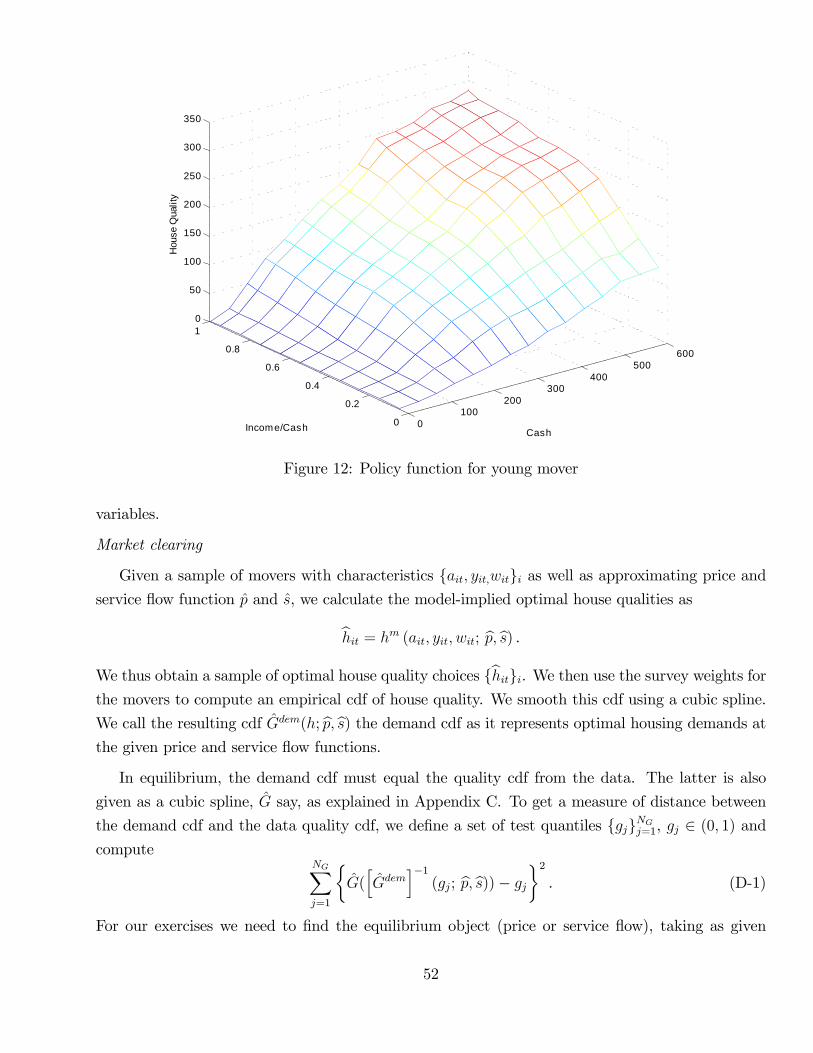
0100
200300
400500
600
0
0.2
0.4
0.6
0.8
10
50
100
150
200
250
300
350
CashIncome/Cash
Hou
se Q
ualit
y
Figure 12: Policy function for young mover
variables.
Market clearing
Given a sample of movers with characteristics {ait, yit,wit}i as well as approximating price andservice flow function p and s, we calculate the model-implied optimal house qualities as
hit = hm (ait, yit, wit; p, s) .
We thus obtain a sample of optimal house quality choices {hit}i. We then use the survey weights forthe movers to compute an empirical cdf of house quality. We smooth this cdf using a cubic spline.
We call the resulting cdf Gdem(h; p, s) the demand cdf as it represents optimal housing demands at
the given price and service flow functions.
In equilibrium, the demand cdf must equal the quality cdf from the data. The latter is also
given as a cubic spline, G say, as explained in Appendix C. To get a measure of distance between
the demand cdf and the data quality cdf, we define a set of test quantiles {gj}NGj=1, gj ∈ (0, 1) and
computeNG∑j=1
{G([Gdem
]−1(gj; p, s))− gj
}2. (D-1)
For our exercises we need to find the equilibrium object (price or service flow), taking as given
52
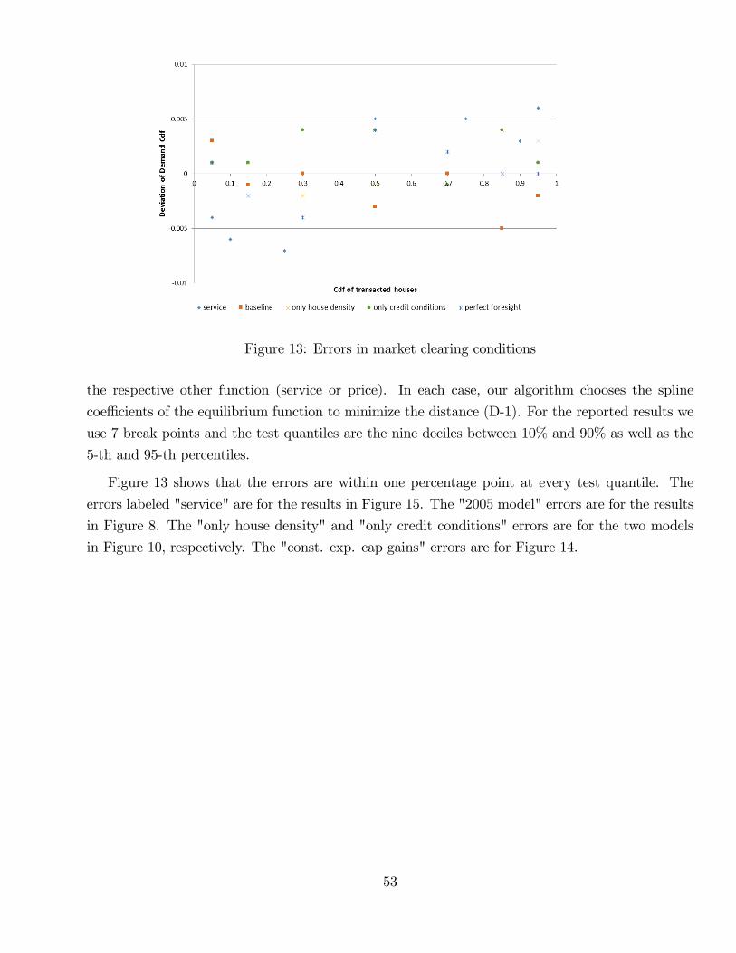
Figure 13: Errors in market clearing conditions
the respective other function (service or price). In each case, our algorithm chooses the spline
coeffi cients of the equilibrium function to minimize the distance (D-1). For the reported results we
use 7 break points and the test quantiles are the nine deciles between 10% and 90% as well as the
5-th and 95-th percentiles.
Figure 13 shows that the errors are within one percentage point at every test quantile. The
errors labeled "service" are for the results in Figure 15. The "2005 model" errors are for the results
in Figure 8. The "only house density" and "only credit conditions" errors are for the two models
in Figure 10, respectively. The "const. exp. cap gains" errors are for Figure 14.
53
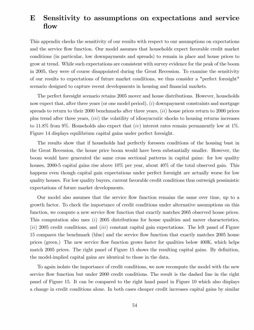
E Sensitivity to assumptions on expectations and serviceflow
This appendix checks the sensitivity of our results with respect to our assumptions on expectations
and the service flow function. Our model assumes that households expect favorable credit market
conditions (in particular, low downpayments and spreads) to remain in place and house prices to
grow at trend. While such expectations are consistent with survey evidence for the peak of the boom
in 2005, they were of course disappointed during the Great Recession. To examine the sensitivity
of our results to expectations of future market conditions, we thus consider a "perfect foresight"
scenario designed to capture recent developments in housing and financial markets.
The perfect foresight scenario retains 2005 mover and house distributions. However, households
now expect that, after three years (or one model period), (i) downpayment constraints and mortgage
spreads to return to their 2000 benchmarks after three years, (ii) house prices return to 2000 prices
plus trend after three years, (iii) the volatility of idiosyncratic shocks to housing returns increases
to 11.8% from 9%. Households also expect that (iv) interest rates remain permanently low at 1%.
Figure 14 displays equilibrium capital gains under perfect foresight.
The results show that if households had perfectly foreseen conditions of the housing bust in
the Great Recession, the house price boom would have been substantially smaller. However, the
boom would have generated the same cross sectional patterns in capital gains: for low quality
houses, 2000-5 capital gains rise above 10% per year, about 40% of the total observed gain. This
happens even though capital gain expectations under perfect foresight are actually worse for low
quality houses. For low quality buyers, current favorable credit conditions thus outweigh pessimistic
expectations of future market developments.
Our model also assumes that the service flow function remains the same over time, up to a
growth factor. To check the importance of credit conditions under alternative assumptions on this
function, we compute a new service flow function that exactly matches 2005 observed house prices.
This computation also uses (i) 2005 distributions for house qualities and mover characteristics,
(ii) 2005 credit conditions, and (iii) constant capital gain expectations. The left panel of Figure
15 compares the benchmark (blue) and the service flow function that exactly matches 2005 house
prices (green.) The new service flow function grows faster for qualities below 400K, which helps
match 2005 prices. The right panel of Figure 15 shows the resulting capital gains. By definition,
the model-implied capital gains are identical to those in the data.
To again isolate the importance of credit conditions, we now recompute the model with the new
service flow function but under 2000 credit conditions. The result is the dashed line in the right
panel of Figure 15. It can be compared to the right hand panel in Figure 10 which also displays
a change in credit conditions alone. In both cases cheaper credit increases capital gains by similar
54
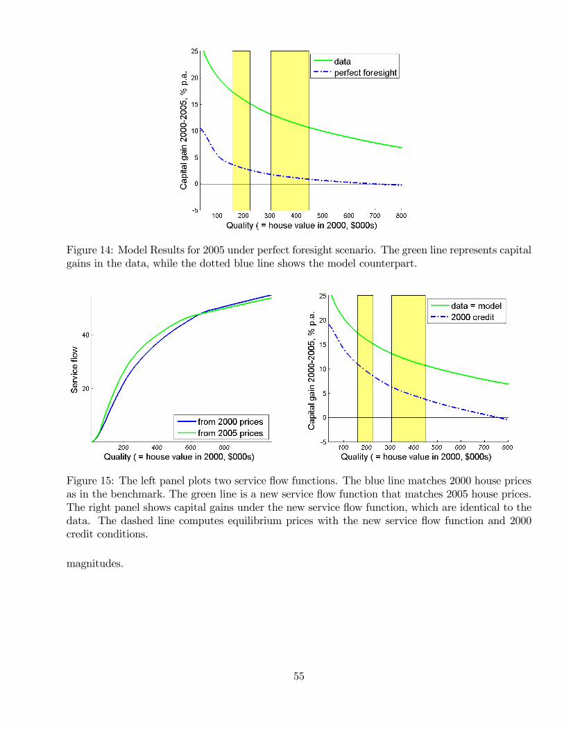
Figure 14: Model Results for 2005 under perfect foresight scenario. The green line represents capitalgains in the data, while the dotted blue line shows the model counterpart.
Figure 15: The left panel plots two service flow functions. The blue line matches 2000 house pricesas in the benchmark. The green line is a new service flow function that matches 2005 house prices.The right panel shows capital gains under the new service flow function, which are identical to thedata. The dashed line computes equilibrium prices with the new service flow function and 2000credit conditions.
magnitudes.
55