The Graphical Display of Information Metode Grafik untuk ... 4 Sajian... · Metode Grafik untuk...
28
Tim Dosen: Prof. Dr. Khairil Anwar Notodiputro Dr. Ir. Aji Hamim Wigena Dr. Agus M Soleh STK 573 Metode Grafik untuk Analisis dan Penyajian Data Pertemuan 5 Sajian Peubah Diskret Tunggal
Transcript of The Graphical Display of Information Metode Grafik untuk ... 4 Sajian... · Metode Grafik untuk...

Tim Dosen:
Prof. Dr. Khairil Anwar Notodiputro
Dr. Ir. Aji Hamim Wigena
Dr. Agus M Soleh
STK 573Metode Grafik untuk Analisis dan Penyajian Data
Pertemuan 5Sajian Peubah Diskret Tunggal

Pendahuluan
• Chart:
– present summary data
– used as an eye-catching alternative to statistical tables
– depicting the distribution of a single discrete variable
• scales of measurement:
– Nominal, Ordinal, Interval, Ratio

Discret of Variables
• can be put into a one-to-one correspondence with the natural numbers
• primary purpose:
– Descriptive for graphical displays that depict distributions of the population of values for a single variable.
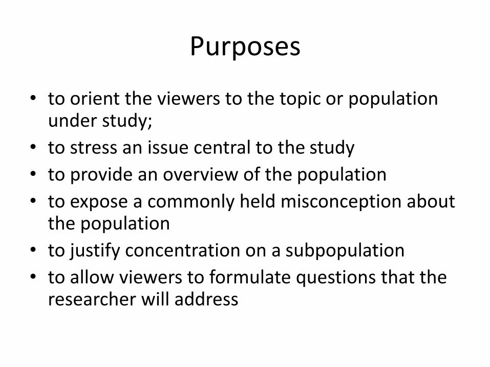
Purposes
• to orient the viewers to the topic or population under study;
• to stress an issue central to the study
• to provide an overview of the population
• to expose a commonly held misconception about the population
• to justify concentration on a subpopulation
• to allow viewers to formulate questions that the researcher will address

• three basic charts for plotting the distribution of a single discrete variable:– The Dot Chart
– The Bar Chart
– The Pie Chart
• Advanced– The Stacked Bar Chart
– The Pictograph
– Variations on the Dot and Bar Charts

Example of Data
• Appropriations in Resolution 62/327 of the United Nations General Assembly

• To attempt to extract more information than this by just reading the table would appear to be a questionable effort
• consider several different graphical means of depicting the data

The Dot Chart
• Plotting standart:
– The categories, or values, are listed in a vertical column with labels to the left
– A horizontal dotted line is adjacent to the category with the value indicated by a large dot
– The horizontal and vertical axes are framed in a rectangular box with the category labels and the horizontal coordinates, with tick marks, displayed outside the framing box

The Dot Chart
• Plotting standart (continued…):
– There are no tick marks for the vertical categories, presumably because
– this is not required due to the horizontal lines for the categories within the box
– There are no tick marks for the vertical categories, presumably because this is not required due to the horizontal lines for the categories within the box


The Bar Chart
• most frequently used graphical display for summarizing data with respect to a single discrete variable
• Depicts the distribution of a categorical variable with the lengths of bars scaled accordingly
• problem with the label orientation


• A frame can be useful by providing visual cues for locating the end of the bars in a Cartesian coordinate plane
• the more difficult it is to discern the length of the bar

The Pie Chart
• conveyed visually by the different sizes of the slices for each category
• The slices in a pie chart are adjacent, so it is essential that the slices are differentiated from each other different color for each slice

• Avoid:
– putting a region in yellow adjacent to a regioninblue
– putting a region in red adjacent to a region in green
• The use of grayscale is one way around the problem of color blindness among viewers


• Hatching or cross-hatching, or both, can unintentionally add the illusion of motion in a graphic due to the Moir´e effect
• Hatching is the use of close parallel lines to give the effect of shading
• Cross-hatching uses intersecting sets of parallel lines to the same effect

• how many categories are too many for a pie chart?
• One rule of thumb is that the upper limit for the number of categories is six

• A question worth considering is
– how do viewers extract information from a pie chart.
– Do viewers rely on comparison of areas, arc length, chord length, or central angles of the wedges?
– Do all viewers uniformly use just one of these comparisons?

• Recommendation:– Do not draft pseudo three-dimensional pie charts
because of the perceptual difficulties in assessing or comparing the sizes of pie segments. The relevant axioms are those of Apprehension, Clarity, Efficiency, and Truthfulness.
– Do not use a pie chart if the number of categories exceeds six because of perceptual difficulty related to the axioms of Apprehension, Clarity, and Efficiency

• Recommendation:
– Do not use hatching or cross-hatching as either will likely result in the perception of a Moir´eeffect in the graphic by viewers. The Moir´e effect interferes with Apprehension, Clarity, and fficiency
– Do not choose graytone shading or colors that could lead to difficulty in identifying distinct pie segments. To do so would lead to a conflict with the axioms of Apprehension, Clarity, and Efficiency

• Recommendation:
– Do not use a legend with a color key to identify categories with segments because this will require the viewer to take more time to study the graph. This would violate the Efficiency and Necessity axioms and interfere with Apprehension
– Do not place labels adjacent to pie segments in such a manner that the identification of the referenced pie segment is ambiguous. This would lead to a conflict with Apprehension, Clarity, and Efficiency

• Recommendation:
– Do not use pullouts in pie charts, or so-called exploded wedges if using pseudo three-dimensional pie charts. To do so interferes with the process of comparing wedge sizes and leads to conflicts with Apprehension and Efficiency

Advanced
• The Stacked Bar Chart

• The Pictograph

• Variations on the Dot and Bar Charts

Selesai