THE FINE ART OF SETTING TYPE 3 - Higher Ed eBooks ...€¦ · exploring indesign cs6 • © 2012...
10
EXPLORING INDESIGN CS6 • © 2012 DELMAR, CENGAGE LEARNING CHAPTER 3 • PAGE 1 ▶ KEYBOARD SHORTCUTS Function Mac Windows Show/hide hidden characters Cmd+Opt+I Ctrl+Alt +I Define paragraph Return Enter Soft return Shift+Return Shift+Enter Select a single word Double click Double click Select a whole line Triple click Triple click Select whole paragraph Click 4 times Click 4 times Selection tool when Type tool is active Esc Esc Access grabber hand when not using Type tool Spacebar Spacebar Access grabber hand when using Type tool Option Alt Increase view size Cmd + Ctrl + Decrease view size Cmd - Ctrl - Left alignment Shift+Cmd+L Shift+Ctrl+L Right alignment Shift+Cmd+R Shift+Ctrl+R Center alignment Shift+Cmd+C Shift+Ctrl+C Justified alignment Shift+Cmd+J Shift+Ctrl+J Em dash Shift+Opt+- Shift+Alt+- En dash Option+- Alt+ - Em space Shift+Cmd+M Shift+Ctrl+M En space Shift+Cmd+N Shift+Ctrl+N ▶ production tips • Turn off hyphenation paragraph-by-paragraph by deselecting Hyphenate in the Control panel. • Manage hyphenation settings for the entire document by selecting Hyphenation from the Control panel options menu. THE FINE ART OF SETTING TYPE Student Handout ▶ A NEW LANGUAGE Review the terminology that has been covered in the last three chapters and you will see that you are learning a whole new language! Like any language, the more you use it, the easier it becomes. By the time you have completed this book these three chapters will seem very basic…guaranteed! ▶ CHAPTER GOALS • Identify the anatomical parts of letters • Interpret hidden characters to identify hard and soft returns, spaces, and other formatting • Use paragraph formatting features and punctuation: space before and after, drop and raised caps, hyphenation, optical margin alignment, balance ragged lines, alignment, quotation marks, and prime marks • Differentiate between hyphens and dashes, and use each correctly • Calculate ideal line measure • Interpret proofreading marks ▶ TERMINOLOGY X-height Mean line Cap height Ascender Descender Ascent Point size Hidden characters Setting line for line Soft return Paragraph Hard return Space after Undo Raised cap Drop cap Automatic hyphenation Non-breaking space Non-breaking hyphen Ragged right alignment Flush left alignment Ragged left alignment Flush right alignment Justified alignment Left and right indent First line indent Hanging indent Balance ragged lines Typewriter quotation marks Curly quotes Prime marks Typographer’s quotation marks Discretionary hyphen Em En Em dash En dash Line measure Line length ▶ PROJECTS 03A Mystery Typefaces 03B Wedding Invitation 03C Desserts Menu 03D Fine Woodworking 03E Production Sequence 03F Reading Markup 3
Transcript of THE FINE ART OF SETTING TYPE 3 - Higher Ed eBooks ...€¦ · exploring indesign cs6 • © 2012...

EXPLORING INDESIGN CS6 • © 2012 DELMAR, CENGAGE LEARNING CHAPTER 3 • PAGE 1
▶ KEYBOARD SHORTCUTS
Function Mac WindowsShow/hide hidden characters Cmd+Opt+I Ctrl+Alt +I
Define paragraph Return Enter
Soft return Shift+Return Shift+Enter
Select a single word Double click Double click
Select a whole line Triple click Triple click
Select whole paragraph Click 4 times Click 4 times
Selection tool when Type tool is active Esc Esc
Access grabber hand when not using Type tool Spacebar Spacebar
Access grabber hand when using Type tool Option Alt
Increase view size Cmd + Ctrl +
Decrease view size Cmd - Ctrl -
Left alignment Shift+Cmd+L Shift+Ctrl+L
Right alignment Shift+Cmd+R Shift+Ctrl+R
Center alignment Shift+Cmd+C Shift+Ctrl+C
Justified alignment Shift+Cmd+J Shift+Ctrl+J
Em dash Shift+Opt+- Shift+Alt+-
En dash Option+- Alt+ -
Em space Shift+Cmd+M Shift+Ctrl+M
En space Shift+Cmd+N Shift+Ctrl+N
▶ production tips• Turn off hyphenation paragraph-by-paragraph
by deselecting Hyphenate in the Control panel.• Manage hyphenation settings for the entire document by
selecting Hyphenation from the Control panel options menu.
THE FINE ART OF SETTING TYPEStudent Handout
▶ A NEW LANGUAGEReview the terminology that has been covered in the last three chapters and you will see that you are learning a whole new language! Like any language, the more you use it, the easier it becomes. By the time you have completed this book these three chapters will seem very basic…guaranteed!
▶ CHAPTER GOALS• Identifytheanatomicalpartsofletters• Interprethiddencharacterstoidentifyhardandsoftreturns,spaces,andotherformatting
• Useparagraphformattingfeaturesandpunctuation:spacebeforeandafter,dropandraisedcaps,hyphenation,opticalmarginalignment,balanceraggedlines,alignment,quotationmarks,andprimemarks
• Differentiatebetweenhyphensanddashes,anduseeachcorrectly• Calculateideallinemeasure• Interpretproofreadingmarks
▶ TERMINOLOGY
X-height Meanline CapheightAscender Descender AscentPointsize Hiddencharacters SettinglineforlineSoftreturn Paragraph HardreturnSpaceafter Undo RaisedcapDropcap Automatichyphenation Non-breakingspaceNon-breakinghyphen Raggedrightalignment FlushleftalignmentRaggedleftalignment Flushrightalignment JustifiedalignmentLeftandrightindent Firstlineindent HangingindentBalanceraggedlines Typewriterquotationmarks CurlyquotesPrimemarks Typographer’squotationmarks DiscretionaryhyphenEm En EmdashEndash Linemeasure Linelength
▶ PROJECTS03A Mystery Typefaces03B Wedding Invitation03C Desserts Menu03D Fine Woodworking03E Production Sequence03F Reading Markup
3

EXPLORING INDESIGN CS6 • © 2012 DELMAR, CENGAGE LEARNING CHAPTER 3 • PAGE 2
▶ 03A MYSTERY TYPEFACES1. Go to www.identifont.com.
2. Click on the Fonts by Appearance link and identify the following type samples by answering the questions about letter anatomy. Select “Not sure” when you cannot positively answer the question. When you have answered all the questions, the most likely typeface will be displayed in the window. If that typeface is not correct, check the alternate typefaces listed in the left column. Examine all the typeface options to correctly identify each font. Write the name of the typeface on the line below each sample.
A
B
C
Name

EXPLORING INDESIGN CS6 • © 2012 DELMAR, CENGAGE LEARNING CHAPTER 3 • PAGE 3
▶ PROJECT 03B WEDDING INVITATION
1. Open 03B Wedding Invitation from the 03 Artwork and Resources folder.
2. Click to activate the text frame. Set text line for line, using soft returns to create the line endings. Center text horizontally.
3. Change the typeface to Adobe Caslon Pro Italic. From the Control Panel menu, select OpenType and turn on Swash.
4. Search through your available typefaces to find an ornamental glyph that would be appropriate to insert.
5. Use shortcut key Cmd+B (Mac) or Ctrl+B (Windows) to access Text Frame Options. Choose Vertical Justification>Align: Justified.
6. Proof for the following: •Correctuseofdashesandhyphens •Date/times/namescorrect •Spelling/correctcopy •Turnonhiddencharactersand
check that lines end with soft returns and that there are no double spaces.
7. Type your name at the bottom of the text, as shown in the example.
8. Proof your project carefully.
9. In the Print dialog box, go to Setup and select Centered. Go to Marks and Bleed and select Crop Marks. Print your document. The corner marks show the final trim size of the invitation.
© 2009 Cari Cruz
Joe King
and
Bell E. Flopp
invite you to
share their joy
as they are
united in marriage on
Saturday, September 25, 2010
3:00 p.m.
at the
Winschel-Harris Wedding Chapel
300 North Broadway
Oconomowoc, Wisconsin.
1
Dinner will be served from
4:30–10:00 p.m.
at the
Blue Eagle American Legion Hall
301 North Broadway
RSVP—regrets only
Type your name here
Phot
ogra
phy
© 2
009
Car
i Cru
z, W
auke
sha
Cou
nty
Tech
nica
l Col
lege
Keyboard Shortcut
OPT+hyphenEn Dash
ALT+hyphen
Keyboard Shortcut
+OPT+hyphenEm Dash
+ALT+hyphen

EXPLORING INDESIGN CS6 • © 2012 DELMAR, CENGAGE LEARNING CHAPTER 3 • PAGE 4
▶ 03C DESSERTS MENU1. Locate the folder 03 Artwork and Resources. Open
the document named 03CDessertsMenu.
2. Study the hidden characters on the screen shot to the right. Notice that hard returns are used only after the headline, glyph, and after the price of each dessert selection. Select the text frame that has been created on the document, to the right of the photo, and turn off hyphenation. Then type the copy. Remember to type a z for a placeholder for the decorativeglyphafterthe“DessertsMenu”paragraph.Don’tadd a soft return at the end of each line as you set the italic type. Instead, let the type wrap from one line to the next.
3. Follow the markup (show right) to format the copy. Note: the headline and name and price of each dessert are Black. The glyph and the description copy under each dessert selection are Blue. Use Text Frame Options to set the Vertical Justification Alignment to Center.
4. Replace the placeholder z with a glyph. Proof your work and print.
Artwork shown above: © 2006 Christopher Pollack, Waukesha County Technical College
Raised cap TrajanProRegular23.5/14.5 Space after p6
Adobe Garamond Pro Reg 23.5/14.5 Spaceafterp3
Trajan Pro Regular 11.5/13
Insert Em space here
Trajan Pro Regular 7.5/13
Minion Pro Italic 10.5/13 Space after p9No hyphenation
Keyboard Shortcut
+CMD+MEm Space
+CTRL+ M
This is the hidden character for an Em space. Shift+Cmd+M (Mac) or Shift+Ctrl+M (Windows

EXPLORING INDESIGN CS6 • © 2012 DELMAR, CENGAGE LEARNING CHAPTER 3 • PAGE 5
▶ 03D FINE WOODWORKING1. Locate the folder 03 Artwork and Resources. Open
the document named 03DFineWoodworking.
2. The project looks amazingly simple, but it requires you to incorporate many typesetting skills. Examine the project and type specifications above, and create this project to look as close to the actual-size project (shown on the next page), as possible. Use family members from Adobe Caslon Pro for all the type. There should be a single text frame that extends from the upper left to the lower right margin corners. Use Space After in the Paragraph Formatting mode of the Control panel toseparatethesectionsoftext.Donotusedoublereturns!
3. Highlight the type and select the gold fill from the Swatches panel. Add a Black stroke, but adjust the stroke width to 0.5 pt.
4. To create the decorative frame, select the text frame with the Selection tool. Go to Menu>Object>Corner Options. Select Fancy in the pull down menu. Select the Make All Settings the Same button, if it is not already turned on.
Assign the color [Paper] in the Stroke menu and a width of 1.5pt. in the Stroke Width field.
5. Add a drop shadow to the type. Select the text framewiththeSelectiontool.ClicktheDropShadow button on the Control panel.
6. Proof, print and compare your copy to the original shown on the next page. Make revisions, and print again.
Raised cap. Go to Control Panel>OpenType>Swash to create decorative “A.”
Create a raised cap on capital letters and apply Small Caps style to lower case letters.
Use correct dashes. Place an en space on each side of the glyph.ChangetheD,H,andS letters to italic and turn on OpenType>Swash. Notice the small caps.Change dollar sign to Superscript. Place an en space on each side of the glyph.
Fill type with Paper.
Add stroke. Seestep4,below.

EXPLORING INDESIGN CS6 • © 2012 DELMAR, CENGAGE LEARNING CHAPTER 3 • PAGE 6
A Century ofFine WoodWorkingOctober 1–18 c Daily 1– 4 pmOconomowoc Historical SocietyTickets: $9 c Senior Citizens: $5
Info: (262) 567-6377
© 2009 Diahann Lohr
▶ 03D FINE WOODWORKING actual size
EXPLORING INDESIGN CS6 • © 2012 DELMAR, CENGAGE LEARNING CHAPTER 3 • PAGE 7
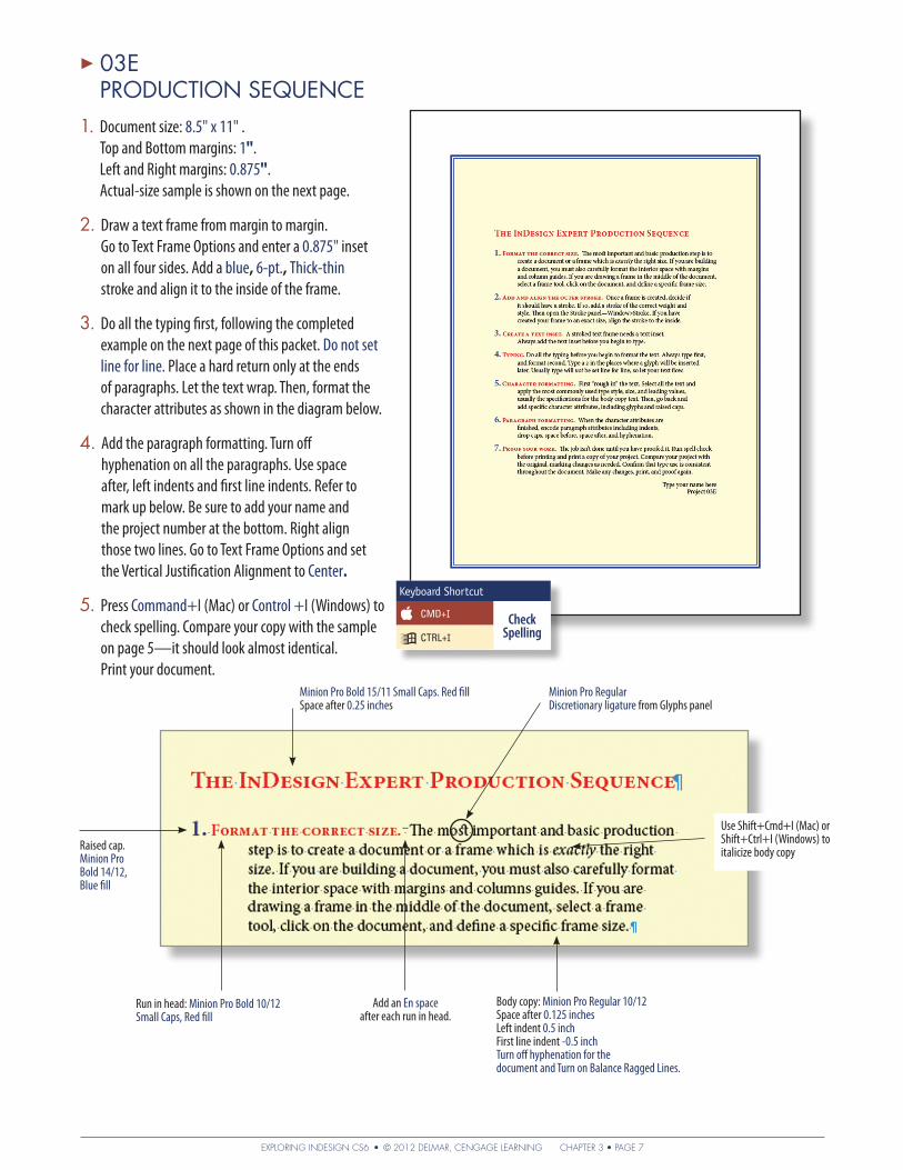
▶ 03E PRODUCTION SEQUENCE
1. Documentsize: 8.5"x11" . Top and Bottom margins: 1". Left and Right margins: 0.875". Actual-size sample is shown on the next page.
2. Drawatextframefrommargintomargin. Go to Text Frame Options and enter a 0.875" inset on all four sides. Add a blue, 6-pt., Thick-thin stroke and align it to the inside of the frame.
3. Doallthetypingfirst,followingthecompletedexample on the next page of this packet. Donotsetline for line. Place a hard return only at the ends of paragraphs. Let the text wrap. Then, format the character attributes as shown in the diagram below.
4. Add the paragraph formatting. Turn off hyphenation on all the paragraphs. Use space after, left indents and first line indents. Refer to mark up below. Be sure to add your name and the project number at the bottom. Right align those two lines. Go to Text Frame Options and set the Vertical Justification Alignment to Center.
5. Press Command+I (Mac) or Control +I (Windows) to check spelling. Compare your copy with the sample on page 5—it should look almost identical. Print your document.
MinionProBold15/11SmallCaps.RedfillSpace after 0.25 inches
Raised cap. Minion Pro Bold14/12,Blue fill
Run in head:MinionProBold10/12 Small Caps, Red fill
Add an En space after each run in head.
Minion Pro RegularDiscretionaryligature from Glyphs panel
Use Shift+Cmd+I (Mac) or Shift+Ctrl+I (Windows) to italicize body copy
Body copy:MinionProRegular10/12Space after 0.125inchesLeft indent 0.5 inchFirst line indent -0.5 inchTurn off hyphenation for the document and Turn on Balance Ragged Lines.
Keyboard Shortcut
CMD+I CheckSpellingCTRL+I

EXPLORING INDESIGN CS6 • © 2012 DELMAR, CENGAGE LEARNING CHAPTER 3 • PAGE 8
The InDesign Expert Production Sequence
1. Format the correct size. The most important and basic production step is to create a document or a frame which is exactly the right size. If you are building a document, you must also carefully format the interior space with margins and column guides. If you are drawing a frame in the middle of the document, select a frame tool, click on the document, and define a specific frame size.
2. Add and align the outer stroke. Once a frame is created, decide if it should have a stroke. If so, add a stroke of the correct weight and style. Then open the Stroke panel—Window>Stroke. If you have created your frame to an exact size, align the stroke to the inside.
3. Create a text inset. A stroked text frame needs a text inset. Always add the text inset before you begin to type.
4. Typing. Do all the typing before you begin to format the text. Always type first, and format second. Type a z in the places where a glyph will be inserted later. Usually type will not be set line for line, so let your text flow.
5. Character formatting. First “rough in” the text. Select all the text and apply the most commonly used type style, size, and leading values, usually the specifications for the body copy text. Then, go back and add specific character attributes, including glyphs and raised caps.
6. Paragraph formatting. When the character attributes are finished, encode paragraph attributes including indents, drop caps, space before, space after, and hyphenation.
7. Proof your work. The job isn’t done until you have proofed it. Run spell check before printing and print a copy of your project. Compare your project with the original, marking changes as needed. Confirm that type use is consistent throughout the document. Make any changes, print, and proof again.
Type your name here Project 03E
▶ 03E PRODUCTION SEQUENCE actual size

EXPLORING INDESIGN CS6 • © 2012 DELMAR, CENGAGE LEARNING CHAPTER 3 • PAGE 9
1. Documentsize:8.5"x11". All margins: 0.
2. Readthenotationsandproofreader’smarksonthecopyabove. Remember: the problem is noted within the line, and the solution is noted at the edge of each line.
3. Set the copy according to the markup. To create the 20 pica wide text frame, draw a text frame and select it with the Selection tool. In the W field of the Control panel, enter 20p.
4. Proof carefully. Your copy will not look like the sample above!Double-checkyourtypespecifications.Printyour document. Turn this page in with your project.
1.
2.
3.
4.
5.
6.
7.
8.
9.
10.
5.
6.
7.
8.
10.
9.
4.1. 2. 3.
▶ 03F READING MARKUPDirections: First, write the meaning of each circled proofreader’s mark on the lines below.
Then, open InDesign and set the copy according to the markup and corrections.
Name _____________________________________________

EXPLORING INDESIGN CS6 • © 2012 DELMAR, CENGAGE LEARNING CHAPTER 3 • PAGE 10
1. How is a font’s point size determined?
2. Why is it helpful to see hidden characters?
3. What is the difference between a hard and soft return?
4. How can space be added between paragraphs without pressing the Return key more than once?
5. What does the notation Myriad Pro Semibold Condensed 12/15 × 30 mean?
6. How do you make a drop cap? How do you make a raised cap?
7. Which panel holds the Optical Margin Alignment option?
8. Describe the uses for each of the following: hyphen, em dash, en dash.
9. What is the guideline for calculating an acceptable line measure?
10. How is a typographer’s quotation mark different from a typewriter quotation mark?
11. What does it mean to set text “line for line”?
12. The client has asked you to duplicate a project, but does not know what font was used. What steps would you take to identify the font?
13. What is a discretionary hyphen and how is it entered?
14. When might you use a nonbreaking space?
15. How do you make No Hyphenation the default for an entire document?
NAME ���������������������������������������� Review Questions EXPLORING INDESIGN CS6
3