The Development of the Adult Deterioration Detection ... · The Development of the Adult...
26
The Development of the Adult Deterioration Detection System (ADDS) Chart Report prepared for the Australian Commission on Safety and Quality in Health Care’s program for Recognising and Responding to Clinical Deterioration Megan H. W. Preece, Mark S. Horswill, Andrew Hill, and Marcus O. Watson May 2010
-
Upload
truongdang -
Category
Documents
-
view
215 -
download
2
Transcript of The Development of the Adult Deterioration Detection ... · The Development of the Adult...

The Development of
the Adult Deterioration
Detection System
(ADDS) Chart Report prepared for the Australian Commission on Safety and Quality in Health Care’s program for Recognising and Responding to Clinical Deterioration Megan H. W. Preece, Mark S. Horswill, Andrew Hill, and Marcus O. Watson May 2010

The Development of the Adult Deterioration Detection System (ADDS) Chart
2
Preface
Chief Investigator: Project Manager:
Dr Mark Horswill Ms Megan Preece
School of Psychology School of Psychology
The University of Queensland The University of Queensland
Principal Investigator: Senior Consultant:
Associate Professor Marcus Watson Mr Andrew Hill
Queensland Health School of Psychology
Skills Development Centre The University of Queensland
Corresponding author:
Dr Mark Horswill
(07) 3346 9520
School of Psychology, The University of Queensland, St Lucia, QLD 4072, Australia
Acknowledgments
We would like to thank all of the interested parties who provided us with observation charts from
their hospital or area health service for inclusion the project. We would also like to thank Nicola
Dunbar and Alexandra Sonsie from the Commission, and Jillann Farmer, Lynette Adams, and Kirsten
Price from the Patient Safety Centre, Queensland Health, for their support throughout the project.
We thank David Collard (Information Division, Queensland Health) for adapting our draft versions of
the Adult Deterioration Detection System (ADDS) charts into a desktop publishing format.
The Development of the Adult Deterioration Detection System (ADDS) Chart
3
Contents Preface ....................................................................................................................................... 2
Acknowledgments...................................................................................................................... 2
1. Background to the project ................................................................................................. 4
Phase 1. Heuristic analysis of 25 observation charts ....................................................... 4
Phase 2. Online survey of health professionals ............................................................... 4
Phase 3. Behavioural experiments ................................................................................... 5
2. Adult Deterioration Detection System (ADDS) chart ......................................................... 6
2.1 Resources used to design the ADDS Chart .......................................................... 6
2.2 Rationale for the design of the ADDS chart ......................................................... 7
2.3 Design features of the ADDS chart ...................................................................... 7
3. Usability Principles Used to Develop the ADDS Chart with the Rationale for Their Use
Explained .................................................................................................................................. 19
References ............................................................................................................................... 23
Appendix A: How to use the Systolic BP table ......................................................................... 24

The Development of the Adult Deterioration Detection System (ADDS) Chart
4
1. Background to the project
The Adult Deterioration Detection System (ADDS) observation chart described in this short report
was developed as part of a research project carried out at The University of Queensland for
Queensland Health and the Australian Commission on Safety and Quality in Health Care (ACSQHC).
The aim of the project was to investigate the design and use of observation charts in recognising and
managing patient deterioration, including the design and evaluation of a new adult observation
chart that incorporated human factors principles.
Phase 1. Heuristic analysis of 25 observation charts
The initial phase of the project was a systematic usability evaluation of the quality and extent of
design problems in 25 existing observation charts (1). A total of 1,189 usability problems were
identified in the observation charts. Usability problems were identified as affecting the observation
charts’ page layout, information layout, recording of vital signs, integration of track and trigger
systems, language and labelling, cognitive and memory load, use of fonts, use of colour,
photocopying legibility, and night-time legibility. In compiling lists of the various usability problems
present in the observation charts, principles for producing a better designed observation chart were
developed (see Section 3) (1).
Phase 2. Online survey of health professionals
Using the information obtained from the heuristic analysis, the new ADDS chart was designed by
combining what were considered to be the best design features of existing charts. The ADDS chart
was then included in an online survey of health professionals’ opinions regarding observation charts
(2). As part of the survey, participants (N = 333) were asked to respond to 13 statements regarding
the design of one of nine randomly assigned observation charts. The nine observation charts
included the ADDS chart and eight observation charts of “good”, “average”, or “poor” design quality
from the heuristic analysis. There was a statistically significant effect of chart type on the aggregated
rating. Charts 7, 8, and 9 (collectively, the a priori “poor” quality charts) were each rated as having a
significantly poorer design compared to each of the other charts (collectively, the a priori “average”
and “good” quality charts).
As a result of collecting data regarding the preferences of participants in the online survey, we made
some changes to the terms used in new ADDS chart. We changed ‘O2 Delivery’ to ‘O2 Flow Rate’, as
‘O2 Flow Rate’ was the second most popular term after ‘O2 LPM’ for that observation (we did not
include ‘O2 LPM’ as this would introduce a new and unnecessary abbreviation into the chart). We
changed ‘Urine for 4 Hours’ to ‘4 Hour Urine Output’ as it was the most popular term for that vital
sign. We also changed ‘Pulse’ to ‘Heart Rate’ as the combined preferences for ‘Heart Rate’, ‘HR’, and
‘H.R.’ eclipsed those for ‘Pulse’ and ‘P’ (we did not include the single most popular term, ‘HR’, as this
would introduce an unnecessary abbreviation into the chart). We kept other terms unchanged on

The Development of the Adult Deterioration Detection System (ADDS) Chart
5
the ADDS chart as we generally preferenced using the full word over more popular abbreviations
(i.e. ‘Temperature’, not ‘Temp’).
Responses to other sections of the online survey also suggested that we not modify the overall
design of the ADDS chart. First, participants expressed a preference for “plotting the value [for a vital
sign] on a graph with graded colouring, where the colours correspond to a scoring system or graded
responses for abnormality” for both recording observations and detecting patient deterioration. All
of the ADDS chart’s vital signs are plotted in this manner (except blood pressure [BP] on one version
of the chart, for which users have to consult a look-up table). Second, participants’ aggregated rating
for the ADDS chart was no worse than that of any other chart (and significantly better than that of
the “poor” quality charts), even though the ADDS chart could be argued to be radically different
from many existing observation charts that participants may be familiar with.
Phase 3. Behavioural experiments
Detecting abnormal vital signs experiment
This study involved an empirical comparison of six charts (two versions of the ADDS chart and four
existing observation charts of “good”, “average”, or “poor” design quality) (3). Chart novices and
health professionals (doctors and nurses) were recruited as participants. Each chart design was
shown to each participant four times displaying different physiological data with one abnormal vital
sign (e.g. a high systolic blood pressure), and four times displaying different normal physiological
data. Participants had to classify the physiological data on the charts as “normal” or “abnormal”
(after memorising the normal ranges for each vital sign). Error rates and response times were
measured.
Chart design was found to have a statistically significant effect on both error rates and response
time, with the charts identified as having better design tending to yield fewer errors and shorter
decision times. Specifically, the two versions of the ADDS chart outperformed all the existing charts
on both metrics, where the other charts yielded between 2.5 and 3.3 times the number of errors as
the ADDS chart.
Recording patient data experiment
Again, this study involved an empirical comparison of six charts (two versions of the ADDS chart and
four existing observation charts of “good”, “average”, or “poor” design quality) (4). Chart novices
and health professionals were recruited as participants to record patient data onto the six charts in a
simulated ward environment. Error rate was the main outcome of interest.
Chart design was found to have a statistically significant effect on the numbers of errors committed
while recording patient data, indicating that chart design influenced performance. The rank order of
charts in terms of error rates was completely different from that in the previous experiment, where
the best-performing chart in the current study (the “poor” design quality chart) was the worst-
performing chart in the previous study, and the ADDS charts were ranked in fourth and fifth place
rather than first and second place. This was presumably because the task of recording data onto the
“poor” chart simply involved the transposing of numbers directly from the simulated vital signs
The Development of the Adult Deterioration Detection System (ADDS) Chart
6
display onto the chart. However, the error rates were substantially smaller than those found in the
first experiment (0.2% to 2% errors vs. 10% to 33% errors, respectively).
For the three charts that included multiple parameter track and trigger systems (the two versions of
the ADDS chart and one of the existing “good” design-quality charts), there was the opportunity for
participants to make additional errors when scoring these systems. The existing “good” chart
performed significantly worse than the ADDS chart without the Systolic BP table but otherwise there
were no significant differences between the charts for this measure.
At the end of the experiment, participants were asked to nominate the chart that they liked using
the best. Both groups of participants appeared to prefer the ADDS chart (especially the ADDS chart
without the Systolic BP table) to the other charts, despite this chart being associated with higher
data-recording errors than some of the existing charts. This would seem to suggest that individuals
were taking more account of the ease of interpreting the data (at which the ADDS charts
outperformed the other charts in the previous experiment), rather than the ease of recording data.
2. Adult Deterioration Detection System (ADDS) chart
2.1 Resources used to design the ADDS Chart
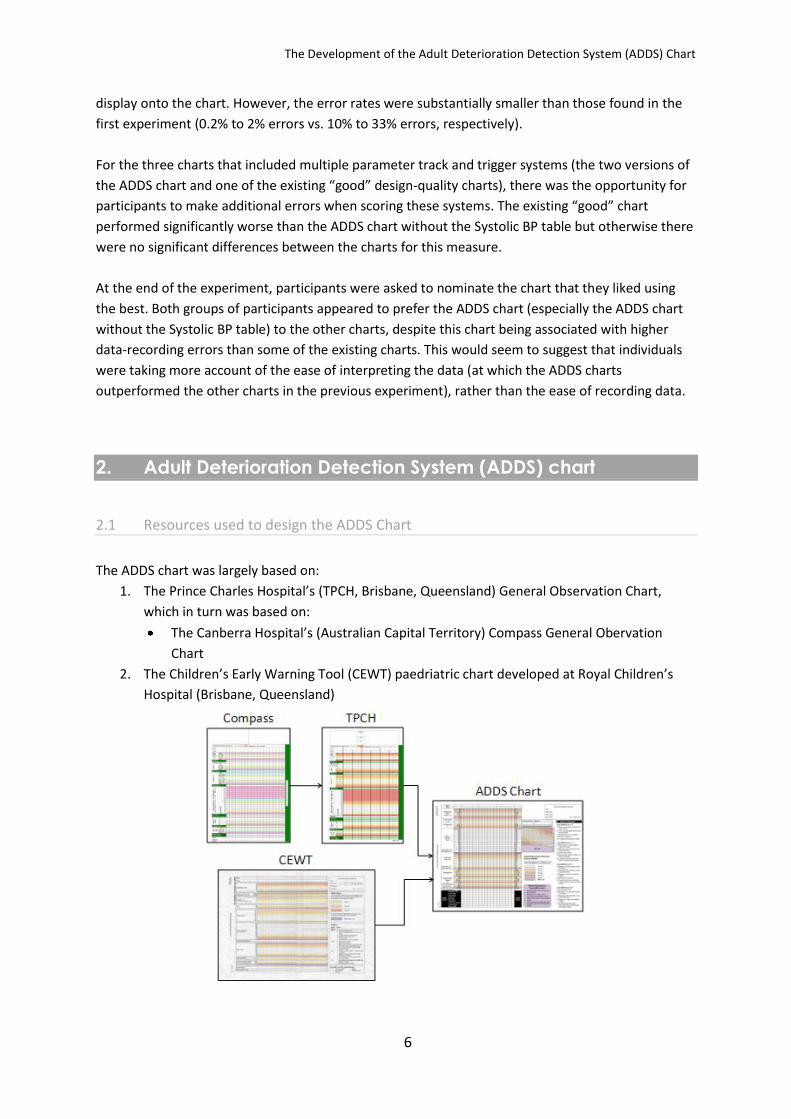
The ADDS chart was largely based on:
1. The Prince Charles Hospital’s (TPCH, Brisbane, Queensland) General Observation Chart,
which in turn was based on:
The Canberra Hospital’s (Australian Capital Territory) Compass General Obervation
Chart
2. The Children’s Early Warning Tool (CEWT) paedriatric chart developed at Royal Children’s
Hospital (Brisbane, Queensland)

The Development of the Adult Deterioration Detection System (ADDS) Chart
7
A Clincial Forms Design Officer (Information Division, Queensland Health) assessed drafts of the
ADDS chart for compliance with the relevant standards (e.g. Queensland Health’s Clinical Form
Design Standard Guidelines) (5).
The chart was developed according the usability principles specific to paper-based observation
charts that were developed in the heuristic analysis (listed in Appendix B of that report and
reproduced in Section 3 of this report) (1).
2.2 Rationale for the design of the ADDS chart
The ADDS chart was designed with the very specific aim of being a tool to detect patient
deterioration, rather than being an all-encompassing general observation chart. Given that the
project brief was to produce an evidence-based observation chart that prompted the recognition
and appropriate management of patient deterioration, the focus on the chart was on presenting the
most important vital signs for detecting deterioration in most patients in a user-friendly manner.
We avoided the temptation to include additional observations as, from a human factors perspective,
every additional piece of information included could potentially compete with the existing (and,
presumably, more important) information for the user’s attention.
2.3 Design features of the ADDS chart
The ADDS chart and incorporated the following features designed to minimise the design problems
that might lead to human error in both recording and interpreting patient observations.
Page layout
Only one mention of the facility name, relegated to the outside pages of the chart. The
facility name is among the least important features of an observation chart with regards to
detecting patient deterioration.
Only one instance of vertically-oriented text (see Figure 1). Vertically-oriented text takes
longer for a user to read (6).

The Development of the Adult Deterioration Detection System (ADDS) Chart
8
Figure 1. Yellow oval highlights the instance of vertically-oriented text
Information layout
Information was displayed in decreasing order of importance. The most critical vital signs
(e.g. Respiratory Rate) were placed towards the top-left of the page, as this is where users
would look first (see Figure 2). Most existing charts did not follow this practice (1).
Figure 2. Yellow rectangle highlights Respiratory Rate being placed towards the top-left of the page
Nine vital signs (Respiratory Rate, O2 Flow Rate, O2 Saturation, Blood Pressure, Heart Rate,
Temperature, 4 Hour Urine Output, Consciousness, Increased Pain) are recorded on one half
of an A3 page.
No irrelevant information is present on the inside pages of the chart (e.g. facility name,
Queensland Health logo, etc.). By ‘irrelevant information’ we mean information irrelevant to
detecting patient deterioration.
The Development of the Adult Deterioration Detection System (ADDS) Chart
9
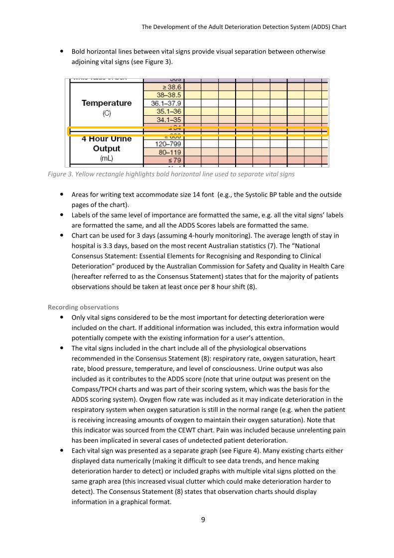
Bold horizontal lines between vital signs provide visual separation between otherwise
adjoining vital signs (see Figure 3).
Figure 3. Yellow rectangle highlights bold horizontal line used to separate vital signs
Areas for writing text accommodate size 14 font (e.g., the Systolic BP table and the outside
pages of the chart).
Labels of the same level of importance are formatted the same, e.g. all the vital signs’ labels
are formatted the same, and all the ADDS Scores labels are formatted the same.
Chart can be used for 3 days (assuming 4-hourly monitoring). The average length of stay in
hospital is 3.3 days, based on the most recent Australian statistics (7). The “National
Consensus Statement: Essential Elements for Recognising and Responding to Clinical
Deterioration” produced by the Australian Commission for Safety and Quality in Health Care
(hereafter referred to as the Consensus Statement) states that for the majority of patients
observations should be taken at least once per 8 hour shift (8).
Recording observations
Only vital signs considered to be the most important for detecting deterioration were
included on the chart. If additional information was included, this extra information would
potentially compete with the existing information for a user’s attention.
The vital signs included in the chart include all of the physiological observations
recommended in the Consensus Statement (8): respiratory rate, oxygen saturation, heart
rate, blood pressure, temperature, and level of consciousness. Urine output was also
included as it contributes to the ADDS score (note that urine output was present on the
Compass/TPCH charts and was part of their scoring system, which was the basis for the
ADDS scoring system). Oxygen flow rate was included as it may indicate deterioration in the
respiratory system when oxygen saturation is still in the normal range (e.g. when the patient
is receiving increasing amounts of oxygen to maintain their oxygen saturation). Note that
this indicator was sourced from the CEWT chart. Pain was included because unrelenting pain
has been implicated in several cases of undetected patient deterioration.
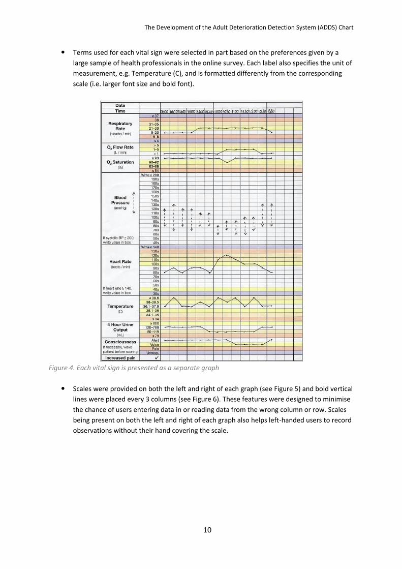
Each vital sign was presented as a separate graph (see Figure 4). Many existing charts either
displayed data numerically (making it difficult to see data trends, and hence making
deterioration harder to detect) or included graphs with multiple vital signs plotted on the
same graph area (this increased visual clutter which could make deterioration harder to
detect). The Consensus Statement (8) states that observation charts should display
information in a graphical format.
The Development of the Adult Deterioration Detection System (ADDS) Chart
10
Terms used for each vital sign were selected in part based on the preferences given by a
large sample of health professionals in the online survey. Each label also specifies the unit of
measurement, e.g. Temperature (C), and is formatted differently from the corresponding
scale (i.e. larger font size and bold font).
Figure 4. Each vital sign is presented as a separate graph
Scales were provided on both the left and right of each graph (see Figure 5) and bold vertical
lines were placed every 3 columns (see Figure 6). These features were designed to minimise
the chance of users entering data in or reading data from the wrong column or row. Scales
being present on both the left and right of each graph also helps left-handed users to record
observations without their hand covering the scale.

The Development of the Adult Deterioration Detection System (ADDS) Chart
11
Figure 5. Yellow rectangle highlights scales on the left and right of each graph
Figure 6. Yellow rectangle highlights bold vertical line used to prevent column shift
Values within the scale for each vital sign are mutually exclusive.
Consciousness is measured using the AVPU scale (see Figure 7). The AVPU scale seemed to
be a simpler, less subjective, more behavioural measure of consciousness than other
measures (such as ‘Sedation Scores’, which involve assigning descriptors such as “mild”,
“moderate”, etc.). The AVPU scale’s validity is supported by the finding that each AVPU
category corresponds to a restricted range of Glasgow Coma Scale scores (9, 10).
Figure 7. AVPU scale for measuring a patient’s level of consciousness
We created two versions of the ADDS charts. The first version included a Systolic BP table to
allow the patient’s usual systolic blood pressure to be taken into account when deciding the
scoring thresholds for this vital sign (see Appendix A for how to use the Systolic BP table).

The Development of the Adult Deterioration Detection System (ADDS) Chart
12
This was based on tables included in the Compass and TPCH charts. The second version did
not have this table; instead, the scoring thesholds were based on the assumption that the
patient’s usual systolic blood pressure was 120 mmHg. The second version was potentially
simpler to read than the first version, but the first version was likely to yield a more accurate
decision as to whether a patient’s blood pressure was abnormal or not.
Figure 8. Two versions of the ADDS chart, the top panel shows the version that included a Systolic BP
table and the bottom panel shows the version in which blood pressure is in the same manner as the
other vital signs
Track and trigger systems
The Consensus Statement (8) states that observation charts should include a system for
tracking changes in vital signs over time (i.e. thresholds for each individual vital sign or a
system for combining individual thresholds). Consistent with this, the ADDS chart integrated
both a single parameter (MET criteria) and a multiple parameter (ADDS scores) colour-coded
track and trigger system to facilitate the detection of deterioration (note that the Consensus
Statement did not specify what type of system should be used). The scoring system values

The Development of the Adult Deterioration Detection System (ADDS) Chart
13
and cut-off scores used in the ADDS chart were based on those used in the Compass and
TPCH charts and should be regarded as placeholders and subject to clinical review (especially
as oxygen flow was not included as part of these systems).
The single parameter system (in which a emergency response was required when any single
observation was outside a given range) has the advantage of simplicity of use (see Figure 9).
The multiple parameter system (in which vital signs were scored using a colour-coded key
and scores were summed to give an overall indication of the patient’s condition) is
potentially more sensitive to deterioration and could lead to earlier detection of
deterioration or fewer false alarms (see Figure 10).
How can the multiple parameter system potentially lead to earlier detection of
deterioration as well as fewer false alarms than single parameter systems? As with any
situation which requires the discrimination of a signal (in this case, a deteriorating patient)
from noise (a patient who is not deteriorating), it is useful to apply signal detection theory to
understand how different track and trigger systems using different cut-offs might affect
outcomes. If we created two charts with the same track and trigger system but altered vital
sign thresholds then the two charts would yield different rates of correct identifications of
deterioration. However the false alarm rates would vary monotonically with correct
identification rate, such that the chart with higher rates of correct identifications would also
have a higher rate of false alarms. By only changing cut-off ranges, we are not varying the
overall ability of the system to tell apart deteriorating and non-deteriorating patients; we
are just varying the threshold of classification of patients into deteriorating or non-
deteriorating groups. However, if we compare two different track and trigger systems that
use different mechanisms for detecting deterioration (e.g. single versus multiple-parameter)
then there is the opportunity for the overall discriminatory power to differ. This means that
it is possible that one system could have both a higher rate of correct identifications of
deterioration and a lower rate of false alarms than another system. The multiple parameter
system has the potential to have greater overall discriminatory power than a single
parameter system because it involves aggregating information across vital signs (where vital
signs seldom change independent of one another). This means it can potentially pick up
more subtle but genuine patterns of deterioration (deterioration apparent when multiple
vital signs are observed together but not apparent when vital signs are observed in
isolation). Hence it could potentially result in greater detection rates and fewer false alarms
than a single parameter system. However, this proposal is a theoretical claim and one that
has not yet been convincingly verified or refuted by empirical work. As a result, we have
included both types of track and trigger systems in the ADDS chart given they are not
mutually exclusive.
A staff member’s “serious worry” about a patient is included as a MET criterion (see Figure
9). This is consistent with the Consensus Statement (8) regarding escalation of care for
clinical deterioration.
The colour-coded key for the multiple parameter system is as close as possible to the vital
signs area (see Figure 10).

The Development of the Adult Deterioration Detection System (ADDS) Chart
14
Figure 9.The single parameter track and trigger system (MET criteria)
Figure 10. The multiple parameter track and trigger system (ADDS Scores)
There is space to record modifications to vital sign thresholds (see Figure 11). This
information was placed so that it would be in view when a user first picked up the chart. This
is consistent with the Consensus Statement (8), in which it is stated that observation charts
should include space to document the normal physiological range for the patient.

The Development of the Adult Deterioration Detection System (ADDS) Chart
15
Figure 11. Area for recording modifications to the vital sign thresholds
The list of actions required in response to certain total score ranges is listed on the same
side of the chart as the vital signs and the ADDS scores (i.e. no page-turning required). The
instructions are intended to be clear and descriptive (see Figure 12). Checkboxes were used
as bullet-points for the lists, so that users can even tick the boxes as they complete certain
actions. This is consistent with the Consensus Statement (8), in which it is stated that
observation charts should include information about the action required when thresholds
for abnormality are reached. However, it should be noted that all documented actions in the
ADDS chart should be regarded as no more than placeholders: it would be expected that the
list of actions would be adapted according to local circumstances.

The Development of the Adult Deterioration Detection System (ADDS) Chart
16
Figure 12. Actions required
Cognitive and memory load
All information normally required to use the system (for example, the colour-coded key, the
MET criteria, and the actions to be taken when different levels of deterioration were
detected) is provided on the same page as the vital signs data (see Figure 13). This was in
order to reduce cognitive load (e.g. to avoid the user having to hold vital sign data in
memory, while turning the page to access further information).

The Development of the Adult Deterioration Detection System (ADDS) Chart
17
Figure 13. Colour-coded key, the MET criteria, and actions recquired list are all provided on the same
page
The chart requires the following simple actions from the user:
◦ Recording of the observation for each vital sign
◦ Checking whether any vital signs trigger a MET call
◦ Transformation of the observation into an ADDS score (based on the row colour or
consulting the Systolic BP table)
◦ Calculation of the total ADDS score
◦ Comparison of the total ADDS score to the Actions Required list
Language and labelling
Terms and abbreviations used on the chart were selected in part based on the preferences
given by a large sample of health professionals in the online survey.
The chart only contains 14 unique abbreviations (ADDS, BP, C, ENT, F, L, M, MET, min, mL,
mmHg, O2, Unresp., URN). The average number of unique abbreviations (i.e. discounting
repetitions of the same abbreviation) in a chart included in the heuristic analysis was 19, and
the maximum was 51 (1). Of the 14 unique abbreviations in the ADDS chart, two are defined
in the chart itself (i.e., ADDS and MET), four are internationally recognised standard
abbreviations for units of measurement, one is the standard abbreviation for oxygen, and
one was the abbreviation preferred by health professionals in the online survey (i.e. BP).
Font
All text is in HelveticaNeue font.
The font used does not have serifs, as serifs slow the reading of short pieces of text (11).
Similarly, the font used is not compressed, as crowding the letters within words slows
reading (12, 13).
Capitalisation is used infrequently, as capitalised text takes 10% more time to read than
upper and lower case text (12, 14).

The Development of the Adult Deterioration Detection System (ADDS) Chart
18
Colour
Chart colours were chosen such that colour density is correlated with the extent to which a
patient’s vital signs are outside the normal range (apart from being an intuitive progression,
this strategy aids colour-blind users).
A red-green colour-blind individual was able to differentiate the colours that we chose.

The Development of the Adult Deterioration Detection System (ADDS) Chart
19
3. Usability Principles Used to Develop the ADDS Chart with the
Rationale for Their Use Explained
This section is taken from Appendix B of the heuristic analysis report (1).
Each usability principle specific to paper-based observation charts that was used in the current
project is listed below. In order to be relatively concise, only the most applicable rationales (adapted
from the more general published usability principles listed in Section 2.2 of the heuristic analysis
report) are listed for each usability principle. For some principles related to formatting (page margin
size, pastel colouring, and font size), Queensland Health’s Clinical Form Design Standard Guidelines
were used (5).
Usability principle Rationale
Page layout Minimal space should be used for hospital name or logo
The system should not contain information that is rarely needed
Bureaucratic codes that do not relate to the chart’s clinical usage should not be present
The system should not contain information that is rarely needed
Landscape orientation preferred Increases the size of the display that a user can simultaneously attend to
Page margins should be: left 2 cm, all others 1 cm
Queensland Health’s Clinical Form Design Standard Guidelines
Should not have mixture of vertically-oriented & horizontally-oriented data points
The system’s graphic design & colour should be carefully considered – chart should not have to be turned during use & vertically-oriented text takes longer to read (6)
Page should be A4 size if possible The system should match the user’s task in as natural a way as possible
Information layout Information should be displayed in decreasing order of importance
Information presented in the top left of a display normally gets more attention
Eight vital signs should all be on 1 side of a page
The aim of any system should be to present exactly the information the user needs at exactly the time & place that it is needed
No redundant or irrelevant information The system should not contain information that is rarely needed
Two vital signs or track & trigger scores should be clearly separated
Avoid unrelated elements being formatted in a such a way that they seem to belong together
Areas for writing should accommodate 14 point font
Queensland Health’s Clinical Form Design Standard Guidelines
Amount of space devoted to something should not be too big
The system should not contain information that is rarely needed
Labels of the same level of importance should be formatted the same
Avoid related elements being formatted in a such a way that they seem to belong to different categories
The Development of the Adult Deterioration Detection System (ADDS) Chart
20
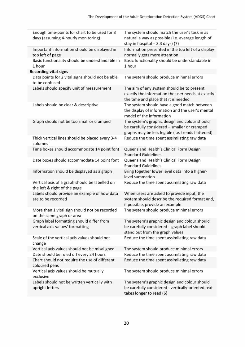
Enough time-points for chart to be used for 3 days (assuming 4-hourly monitoring)
The system should match the user’s task in as natural a way as possible (i.e. average length of stay in hospital = 3.3 days) (7)
Important information should be displayed in top left of page
Information presented in the top left of a display normally gets more attention
Basic functionality should be understandable in 1 hour
Basic functionality should be understandable in 1 hour
Recording vital signs Data points for 2 vital signs should not be able to be confused
The system should produce minimal errors
Labels should specify unit of measurement The aim of any system should be to present exactly the information the user needs at exactly the time and place that it is needed
Labels should be clear & descriptive The system should have a good match between the display of information and the user’s mental model of the information
Graph should not be too small or cramped The system’s graphic design and colour should be carefully considered – smaller or cramped graphs may be less legible (i.e. trends flattened)
Thick vertical lines should be placed every 3-4 columns
Reduce the time spent assimilating raw data
Time boxes should accommodate 14 point font Queensland Health’s Clinical Form Design Standard Guidelines
Date boxes should accommodate 14 point font Queensland Health’s Clinical Form Design Standard Guidelines
Information should be displayed as a graph Bring together lower level data into a higher-level summation
Vertical axis of a graph should be labelled on the left & right of the page
Reduce the time spent assimilating raw data
Labels should provide an example of how data are to be recorded
When users are asked to provide input, the system should describe the required format and, if possible, provide an example
More than 1 vital sign should not be recorded on the same graph or area
The system should produce minimal errors
Graph label formatting should differ from vertical axis values’ formatting
The system’s graphic design and colour should be carefully considered – graph label should stand out from the graph values
Scale of the vertical axis values should not change
Reduce the time spent assimilating raw data
Vertical axis values should not be misaligned The system should produce minimal errors Date should be ruled off every 24 hours Reduce the time spent assimilating raw data Chart should not require the use of different coloured pens
Reduce the time spent assimilating raw data
Vertical axis values should be mutually exclusive
The system should produce minimal errors
Labels should not be written vertically with upright letters
The system’s graphic design and colour should be carefully considered - vertically-oriented text takes longer to read (6)
The Development of the Adult Deterioration Detection System (ADDS) Chart
21
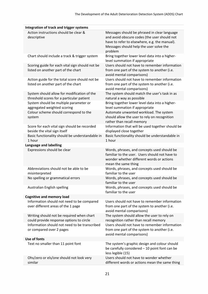
Integration of track and trigger systems
Action instructions should be clear & descriptive
Messages should be phrased in clear language and avoid obscure codes (the user should not have to refer to elsewhere, e.g. the manual). Messages should help the user solve the problem
Chart should include a track & trigger system Bring together lower level data into a higher-level summation if appropriate
Scoring guide for each vital sign should not be listed on another part of the chart
Users should not have to remember information from one part of the system to another (i.e. avoid mental comparisons)
Action guide for the total score should not be listed on another part of the chart
Users should not have to remember information from one part of the system to another (i.e. avoid mental comparisons)
System should allow for modification of the threshold scores for a particular patient
The system should match the user’s task in as natural a way as possible
System should be multiple parameter or aggregated weighted scoring
Bring together lower level data into a higher-level summation if appropriate
Colour scheme should correspond to the system
Automate unwanted workload. The system should allow the user to rely on recognition rather than recall memory
Score for each vital sign should be recorded beside the vital sign itself
Information that will be used together should be displayed close together
Basic functionality should be understandable in 1 hour
Basic functionality should be understandable in 1 hour
Language and labelling Expressions should be clear Words, phrases, and concepts used should be
familiar to the user. Users should not have to wonder whether different words or actions mean the same thing
Abbreviations should not be able to be misinterpreted
Words, phrases, and concepts used should be familiar to the user
No spelling or grammatical errors Words, phrases, and concepts used should be familiar to the user
Australian English spelling Words, phrases, and concepts used should be familiar to the user
Cognitive and memory load Information should not need to be compared over different areas of the 1 page
Users should not have to remember information from one part of the system to another (i.e. avoid mental comparisons)
Writing should not be required when chart could provide response options to circle
The system should allow the user to rely on recognition rather than recall memory
Information should not need to be transcribed or compared over 2 pages
Users should not have to remember information from one part of the system to another (i.e. avoid mental comparisons)
Use of fonts Text no smaller than 11 point font The system’s graphic design and colour should
be carefully considered – 10 point font can be less legible (15)
Ohs/zero or els/one should not look very similar
Users should not have to wonder whether different words or actions mean the same thing

The Development of the Adult Deterioration Detection System (ADDS) Chart
22
Capitalisation should be used sparingly Avoid over-using upper-case text, it attracts attention, but is slower to read than mixed-case text (12, 14)
Text size should not be misleading (e.g. important information very small & vice versa)
The system should have a good match between the display of information and the user’s mental model of the information.
Should not use more than 1 font type The system’s graphic design and colour should be carefully considered – may slow reading as user must ‘switch’ between fonts
Should not use compressed font (e.g. Arial
Narrow) The system’s graphic design and colour should be carefully considered – crowding the letters in words slow reading (12, 13)
Text should not be too big The system’s graphic design and colour should be carefully considered – larger fonts (12 & 14 point) can be less legible (16)
Serifs should not be used The system’s graphic design and colour should be carefully considered – serifs slow reading of short pieces of text (11)
Use of colour Colour should be used in a meaningful way Reduce the time spent assimilating raw data Colours should be distinguishable to colour-blind users
If colour is to be used, the system requires redundant cues so that colour-blind users are able to use the system with ease
Redundant cues should be included, i.e. scheme can be used without the colours
If colour is to be used, the system requires redundant cues so that colour-blind users are able to use the system with ease
Pastel colours preferred Queensland Health’s Clinical Form Design Standard Guidelines
Should not be more than 5 colours in chart as a whole (including white space, text, logos)
Adapted from: avoid more than 7 colours (on a webpage), or the display will look too “busy”
Colour choice should not be potentially deceptive (e.g. green = bad)
The system should have a good match between the display of information and the user’s mental model of the information
Should not be more than 5 colours in vital signs' area (including white space)
Adapted from: avoid more than 7 colours (on a webpage), or the display will look too “busy”
Photocopying legibility Chart should be reproduced legibly at a range of photocopier settings, especially vital signs’ data and labels
The system should match the user’s task in as natural a way as possible
Low light legibility Chart should be legible in realistic low-light levels
The system should match the user’s task in as natural a way as possible

The Development of the Adult Deterioration Detection System (ADDS) Chart
23
References
1. Preece M, Horswill M, Hill A, Karamatic R, Hewett D, Watson M. Heuristic Analysis of 25 Australian and New Zealand Adult General Observation Charts. Sydney, New South Wales, Australia: Australian Commission on Safety and Quality in Health Care; 2009. 2. Preece MHW, Horswill MS, Hill A, Karamatic R, Watson MO. An Online Survey of Health Professionals’ Opinions Regarding Observation Charts. Sydney, New South Wales, Australia: Australian Commission on Safety and Quality in Health Care; 2010. 3. Horswill MS, Preece MHW, Hill A, Watson MO. Detecting abnormal vital signs on six observation charts: An experimental comparison Sydney, New South Wales, Australia: Australian Commission on Safety and Quality in Health Care; 2010. 4. Horswill MS, Preece MHW, Hill A, Watson MO. Recording patient data on six observation charts: An experimental comparison. Sydney, New South Wales, Australia: Australian Commission on Safety and Quality in Health Care; 2010. 5. Queensland Health data management policy: Queensland Health clinical form design standard guidelines: Queensland Health2003 Apr. Report No.: QHEPS Number 19006. 6. Yu D, Gerold D, Park H, Legge GE. Reading horizontal and vertical english text [Abstract]. Journal of Vision. 2008;8(6):629a. 7. Australian Institute of Health and Welfare. Australian hospital statistics 2007–08. Canberra: Australian Institute of Health and Welfare, Australian Government; 2009 Jun Contract No. 33. 8. Australian Commission on Safety and Quality in Health Care. National consensus statement: Essential elements for recognising and responding to clinical deterioration. Sydney, New South Wales, Australia: Australian Commission on Safety and Quality in Health Care; 2010. 9. McNarry AF, Goldhill DR. Simple bedside assessment of level of consciousness: Comparison of two simple assessment scales with the Glasgow Coma scale. Anaesthesia. 2004;59:34-7. 10. Kelly CA, Upex A, Bateman DN. Comparison of consciousness level assessment in the poisoned patient using the alert/verbal/painful/unresponsive scale and the Glasgow Coma Scale. Annals Of Emergency Medicine. 2004;44(2):108-13. 11. Yager D, Aquilante K, Plass R. High and low luminance letters, acuity reserve, and font effects on reading speed. Vision Research. 1998;38(17):2527-31. 12. Frascara J. Typography and the visual design of warnings. In: Wogalter MS, editor. Handbook of Warnings. Mahwah, NJ: Lawrence Erlbaum Associates; 2005. p. 385-406. 13. Pelli DG, Tillman KA, Freeman J, Su M, Berger TD, Majaj NJ. Crowding and eccentricity determine reading rate. Journal of Vision. 2007;7(2):1-36. 14. Lorch Jr. RF, Pugzles Lorch E, Klusewitz MA. Effects of typographical cues on reading and recall of text. Contemporary Educational Psychology. 1995;20(1):51-64. 15. Bernard ML, Chaparro BS, Mills MM, Halcomb CG. Comparing the effects of text size and format on the readability of computer-displayed Times New Roman and Arial text. International Journal of Human-Computer Studies. 2003;59(6):823-35 16. Tinker MA, Paterson DG. Studies of typographical factors influencing speed of reading. V. Simultaneous variation of type size and line length. Journal of Applied Psychology. 1931;15(1):72-8.

The Development of the Adult Deterioration Detection System (ADDS) Chart
24
Appendix A: How to use the Systolic BP table
1.
Blood pressure observations are plotted on a “blank” graph area. To score blood pressure, you have to input the patient’s current systolic blood pressure and the patient’s usual systolic blood pressure in to the Systolic BP scoring table on the right-hand-side of the page.

The Development of the Adult Deterioration Detection System (ADDS) Chart
25
2.
For example, let’s say your patient’s usual systolic blood pressure is 134 and their current systolic blood pressure is in the 120s. 3.
You would begin by checking that the column showing the patient’s usual systolic blood pressure is circled correctly on the scoring table on the right-hand-side of the page.

The Development of the Adult Deterioration Detection System (ADDS) Chart
26
4.
Each time that you need to score blood pressure, you use the patient’s current systolic blood pressure and move your finger across the row until you reach the circled column. The cell where the row and column intersect contains the correct ADDS score. In this example, the score in the correct cell is zero… 5.
… so you would write zero in the row for blood pressure scores, indicating that the observation was normal.