Screen Shots in creating a sample front end page in Peoplesoft Application Designer
Upload
bethellisonCategory
view
70download
1
The beginning of creating my front cover.
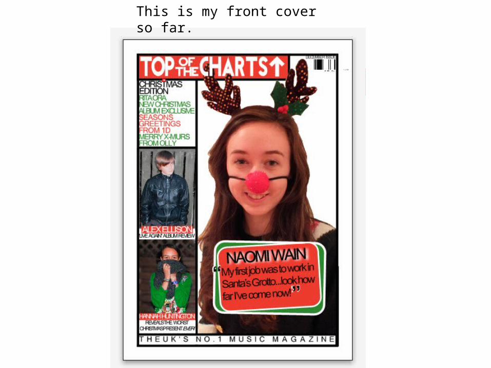
This is my front cover so far.
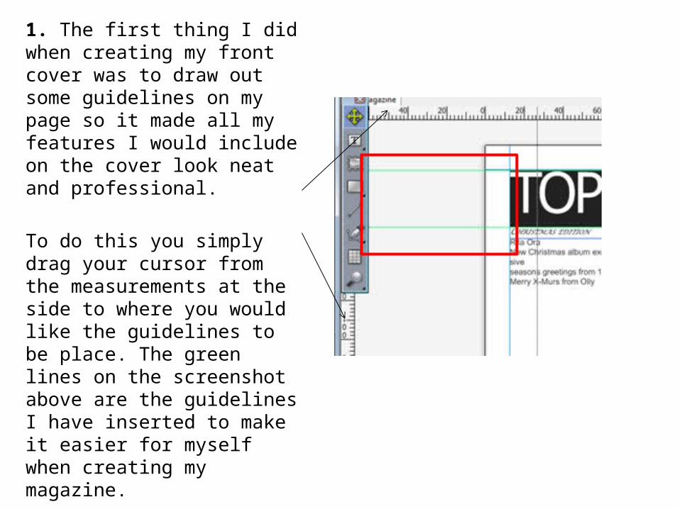
1. The first thing I did when creating my front cover was to draw out some guidelines on my page so it made all my features I would include on the cover look neat and professional.
To do this you simply drag your cursor from the measurements at the side to where you would like the guidelines to be place. The green lines on the screenshot above are the guidelines I have inserted to make it easier for myself when creating my magazine.

Creating the masthead:
1. First of all I drew a text box using this tool.
2. For the text I chose a font called
‘revolution’ from dafonts.com, I
chose the fonts from this option
here.
3. I changed the colour to
white by clicking here.
4. I changed the size here.
4. I had to compress the letters together so there were no gaps. So I clicked the bottom arrow on this option.
7. To create the arrow here is what I did.• I clicked on this button which
let me draw a line.
• Then I thickened the line by choosing this option.
• I then changed the colour of the arrow.
5. Then to change the background colour all I did was click on the text box and chose the colour from the right hand side of the page.
6. Then to create the border I chose the option ‘6 pt.’ which thickened the border.

Inserting the images:1. The next thing I did was import all the images. Firstly I clicked on this icon.2. This then let me draw a blue box with a cross in it..
3. I then right clicked inside the box and clicked on the option ‘import’.
4. I then just had to resize my images to fit the box I drew before. This is how I imported all my images.
5. I then added the anchorage to all the images. I did this by using the same process of how the masthead was created (the slide before.)

The headlines:
1. Firstly I chose the font ‘Microsoft sans serif’ and put it in capital letters in the colours red and green. I had to create a new colour and I did this by clicking on this button.
2. This then brings up this colour wheel where you can choose any colour you want.
3. Then I clicked ok and simply changed the colour.
4. I put each headline into alternate colours so it would be easier to see they’re separate. I then made the ‘Christmas edition’ bigger and in black so it would stand out from the rest of the text.
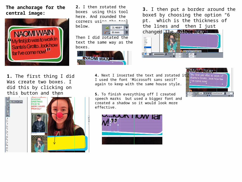
The anchorage for the central image:
1. The first thing I did Was create two boxes. I did this by clicking on this button and then drawing the boxes.
2. I then rotated the boxes using this tool here. And rounded the corners using the tool below.
Then I did rotated the text the same way as the boxes.
3. I then put a border around the boxes by choosing the option “6 pt.” which is the thickness of the lines and then I just changed the colour
4. Next I inserted the text and rotated it. I used the font ‘Microsoft sans serif’ again to keep with the same house style.
5. To finish everything off I created speech marks but used a bigger font and created a shadow so it would look more effective.
The tagline:Firstly I inserted the text, changed background to white, chose the font and the size.I then decided I would like it to be at the bottom of my front cover so I needed to space it out a bit.
So I used this button again except I increased the size using the top arrow. Until my letters were spaced out enough to fit across the cover.
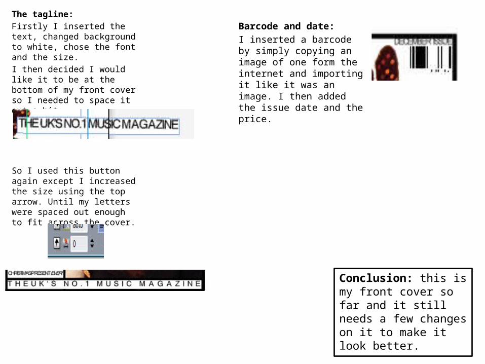
Barcode and date:I inserted a barcode by simply copying an image of one form the internet and importing it like it was an image. I then added the issue date and the price.
Conclusion: this is my front cover so far and it still needs a few changes on it to make it look better.