The Bad & The Ugly
14
disgusti ng The Bad & The Ugly How to design the worst slide share presentation you have ever seen
-
Upload
shelley-trudeau -
Category
Design
-
view
547 -
download
3
Transcript of The Bad & The Ugly
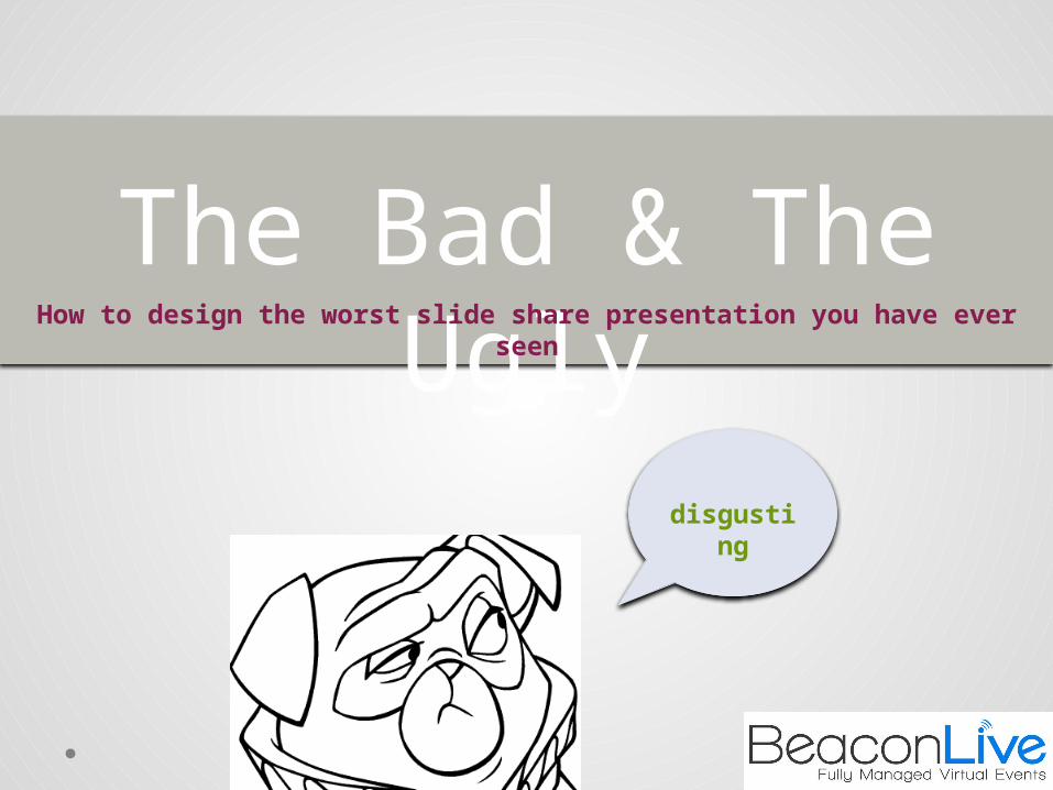
disgusting
The Bad & The UglyHow to design the worst slide share presentation you have ever seen
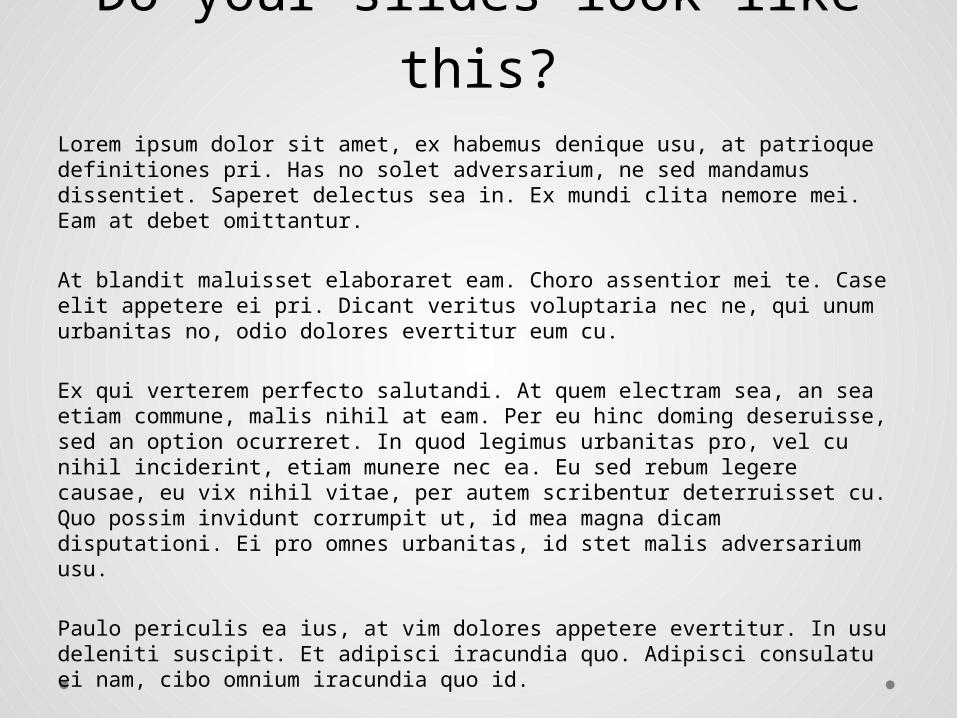
Do your slides look like this?Lorem ipsum dolor sit amet, ex habemus denique usu, at patrioque definitiones pri. Has no solet adversarium, ne sed mandamus dissentiet. Saperet delectus sea in. Ex mundi clita nemore mei. Eam at debet omittantur.
At blandit maluisset elaboraret eam. Choro assentior mei te. Case elit appetere ei pri. Dicant veritus voluptaria nec ne, qui unum urbanitas no, odio dolores evertitur eum cu.
Ex qui verterem perfecto salutandi. At quem electram sea, an sea etiam commune, malis nihil at eam. Per eu hinc doming deseruisse, sed an option ocurreret. In quod legimus urbanitas pro, vel cu nihil inciderint, etiam munere nec ea. Eu sed rebum legere causae, eu vix nihil vitae, per autem scribentur deterruisset cu. Quo possim invidunt corrumpit ut, id mea magna dicam disputationi. Ei pro omnes urbanitas, id stet malis adversarium usu.
Paulo periculis ea ius, at vim dolores appetere evertitur. In usu deleniti suscipit. Et adipisci iracundia quo. Adipisci consulatu ei nam, cibo omnium iracundia quo id.
In duo veri corrumpit. Eu convenire elaboraret pri, quo munere timeam expetendis ei, ex ius solum expetendis. Saepe prompta platonem ei mei, fabellas iudicabit torquatos duo cu, ullum invidunt nam et. Meis dolorum per no, cu reque fabulas vis. Nec cu nonumes accusata, ex mel epicuri salutatus incorrupte.
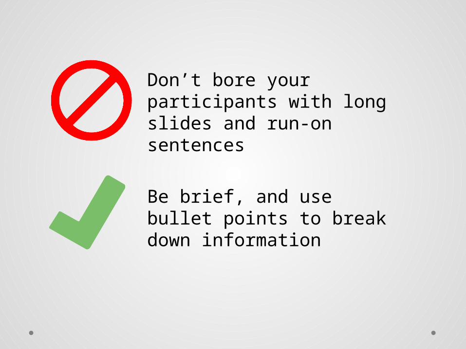
Don’t bore your participants with long slides and run-on sentences
Be brief, and use bullet points to break down information
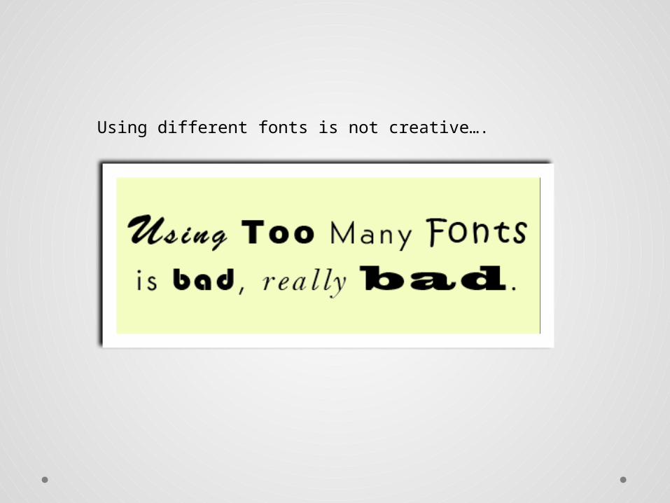
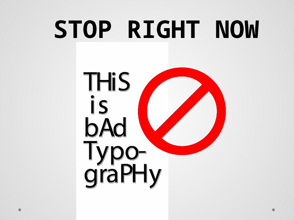
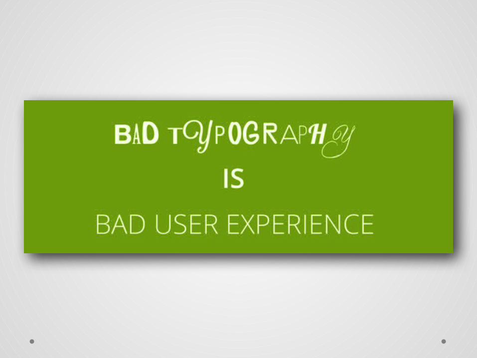
Using different fonts is not creative….
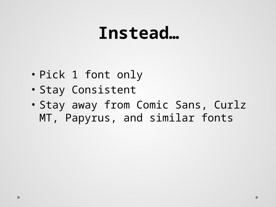
• Pick 1 font only• Stay Consistent• Stay away from Comic Sans, Curlz MT,
Papyrus, and similar fonts
Instead…
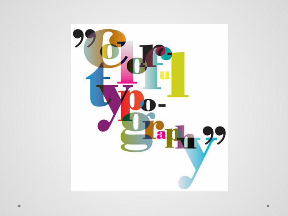
Do your slides need a little bit of color?
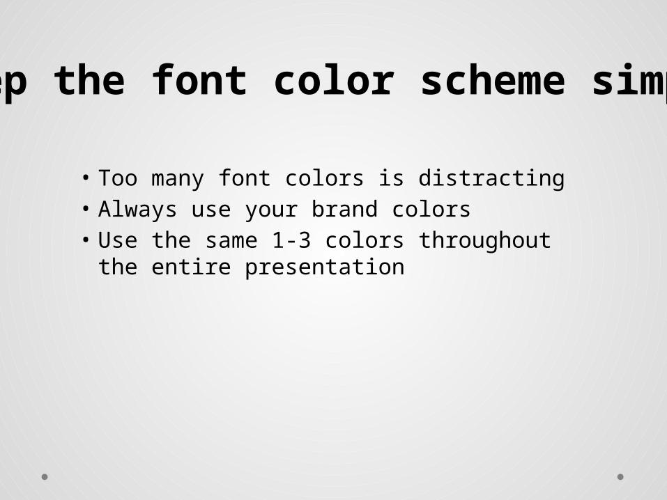
• Too many font colors is distracting• Always use your brand colors • Use the same 1-3 colors throughout the entire
presentation
Keep the font color scheme simple
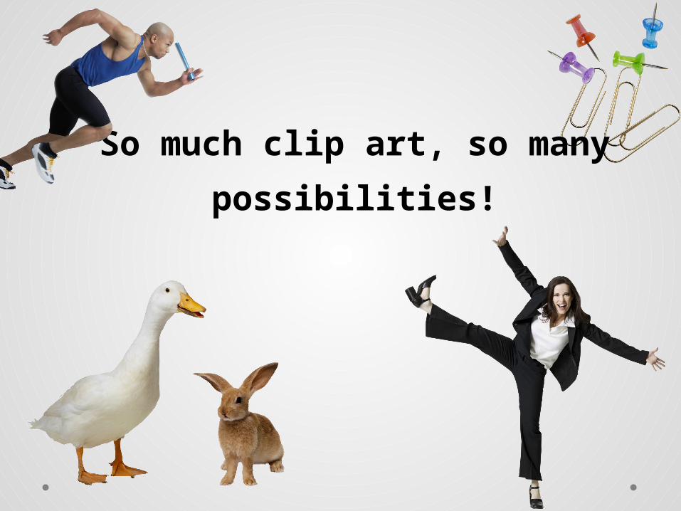
So much clip art, so many possibilities!
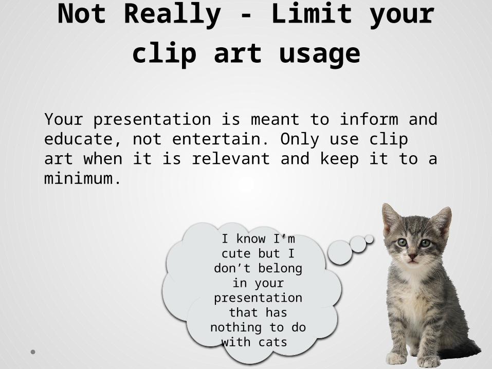
Not Really - Limit your clip art usage
Your presentation is meant to inform and educate, not entertain. Only use clip art when it is relevant and keep it to a minimum.
I know I’m cute but I don’t belong in your
presentation that has nothing to do
with cats
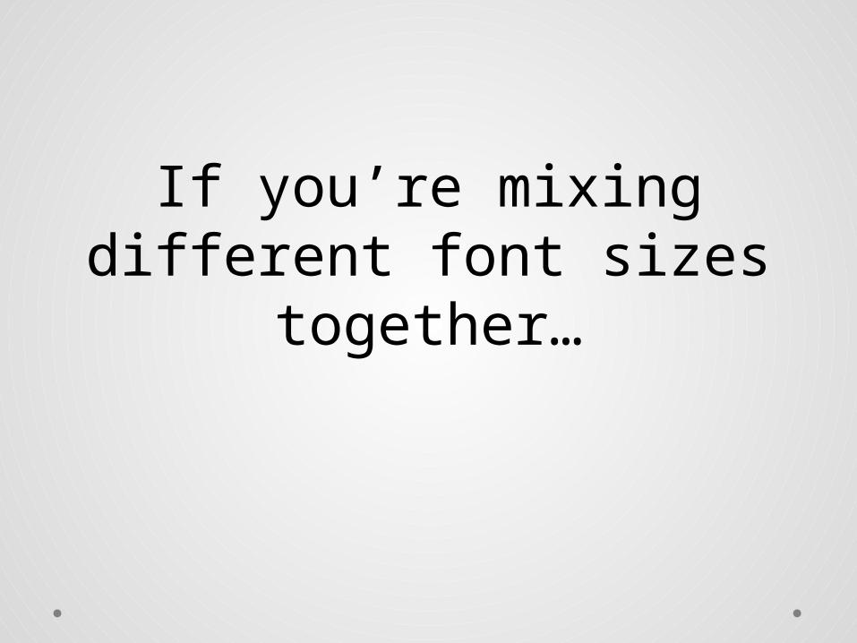
If you’re mixing different font sizes together…
STOP RIGHT NOW
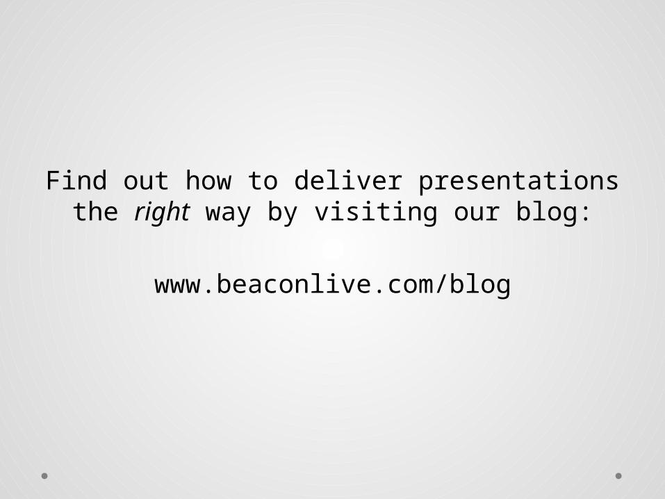
Find out how to deliver presentations the right way by visiting our blog:
www.beaconlive.com/blog