Team 41 Betty Liu-- Culver City Wai Lam -- Long Beach Chintan Kathiriya -- Campus CSCI 588 Project...
25
Team 41 Betty Liu -- Culver City Wai Lam -- Long Beach Chintan Kathiriya -- Campus CSCI 588 Project Status Review Grocery Shopping Assistant Module
-
Upload
edith-green -
Category
Documents
-
view
216 -
download
1
Transcript of Team 41 Betty Liu-- Culver City Wai Lam -- Long Beach Chintan Kathiriya -- Campus CSCI 588 Project...
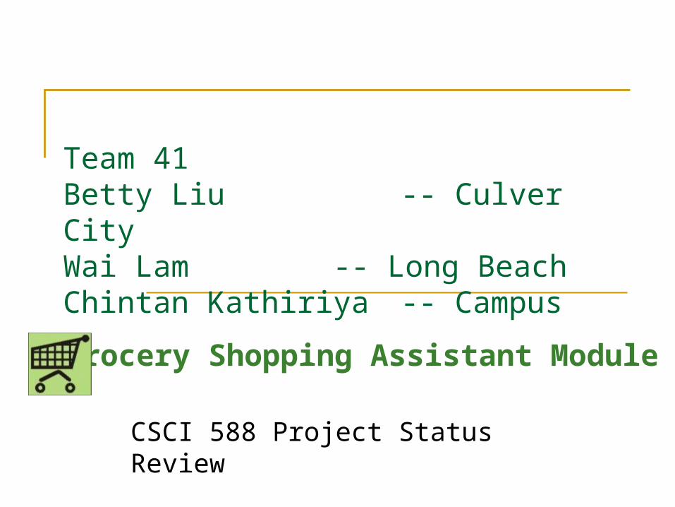
Team 41Betty Liu -- Culver CityWai Lam -- Long BeachChintan Kathiriya -- Campus
CSCI 588 Project Status Review
Grocery Shopping Assistant Module

Grocery Shopping Assistant Module What is it?
An application designed to improve the grocery shopping experience for shoppers by offering features such as: Interactive advertisement Product information and locator Price comparison tool Recipe finder Shopping list
Assumptions The application runs on a device attached to the shopping cart The device has a touch screen monitor of size 8” by 7”
Motivation Prompted by our own and friends’ grocery shopping
experiences and needs.
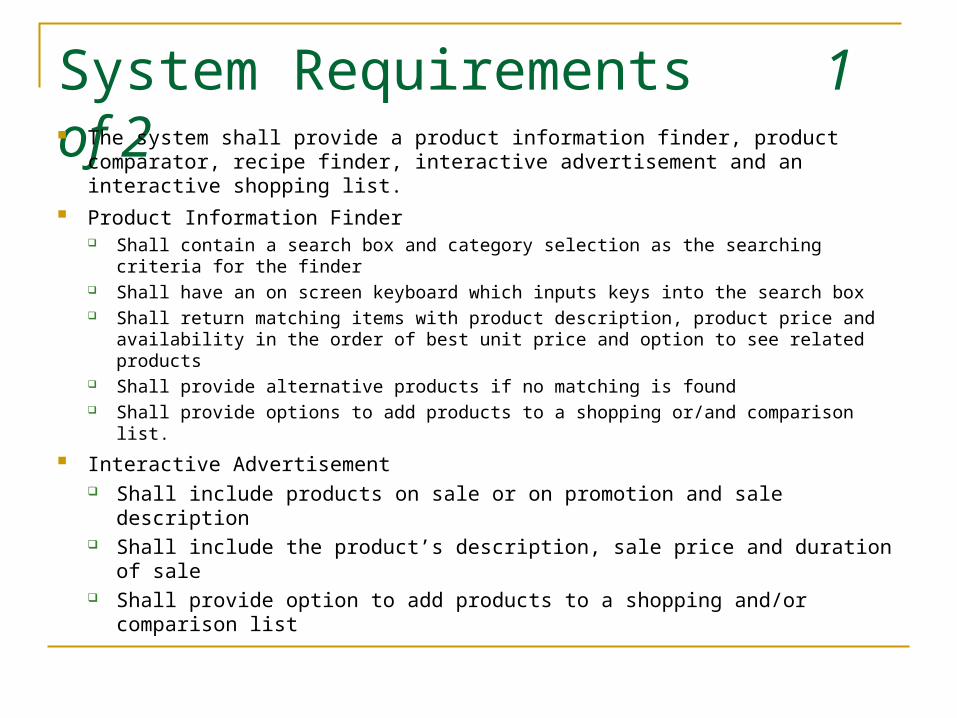
System Requirements 1 of 2 The system shall provide a product information finder, product comparator,
recipe finder, interactive advertisement and an interactive shopping list. Product Information Finder
Shall contain a search box and category selection as the searching criteria for the finder
Shall have an on screen keyboard which inputs keys into the search box Shall return matching items with product description, product price and availability
in the order of best unit price and option to see related products Shall provide alternative products if no matching is found Shall provide options to add products to a shopping or/and comparison list.
Interactive Advertisement Shall include products on sale or on promotion and sale description Shall include the product’s description, sale price and duration of sale Shall provide option to add products to a shopping and/or comparison list
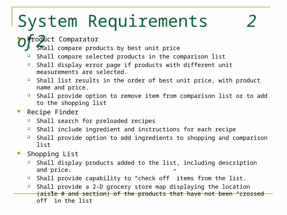
System Requirements 2 of 2 Product Comparator
Shall compare products by best unit price Shall compare selected products in the comparison list Shall display error page if products with different unit measurements are selected. Shall list results in the order of best unit price, with product name and price. Shall provide option to remove item from comparison list or to add to the shopping
list Recipe Finder
Shall search for preloaded recipes Shall include ingredient and instructions for each recipe Shall provide option to add ingredients to shopping and comparison list
Shopping List Shall display products added to the list, including description and price. Shall provide capability to “check off” items from the list. Shall provide a 2-D grocery store map displaying the location (aisle # and section)
of the products that have not been “crossed off” in the list

Navigation map
Home with introduction to the tool and short descriptions of the features
Product Search with keyboard to enter search criteria
Product Category provide matching product categories selection to
limit search results
Search results search results with description and price
Recipe Search with keyboard to enter search criteria
Search results search results with recipe title
Recipe recipe with ingredients and instructions
Product advertisement with sale and promotional items
Product Comparator list product to be compared
Comparison results list items in best unit price
Comparison Error inform product cannot be compared
Shopping List lists items added and their locations on a map

User Analysis – User profile User is a regular grocery store shopper with little technical knowledge, and would use the application to ease their shopping experience
Pscychological CharacteristicsCognitive Style: Spatial/Intuitive
Attitude: Neutral
Motivation: Moderate
Job and Task CharacteristicsFrequency of use: Medium
Primary training: None
System Use: Discretionary
Turnover: High
Task Importance: Low
Task Structure: Low
Physical CharacteristicsGender: Both
Knowledge and ExperienceReading Level: 12th grade +
Type Skill: Low
Education: High School
System Experience: Novice
Task Experience: Novice
Application Experience: No similar system
Native Language: English
Use of other systems: Little or Non
Computer Literacy: Low
OtherVision: Moderate
Cooking Experience: Moderate
Time availability: little
Job function: Cook of the house

User Analysis – Dialog Styles
Why? (in summary) Direct manipulation menu buttons as the chosen integrated style. Users are not technical or familiar with this type of system
Dialog styles that are user friendly and easy to learn would be preferred
Menu received the highest score in our dialog style analysis Direct manipulation, natural language and fill-in forms also
received high scores in our analysis
First Choice Menu
Second Choices Direct manipulation Natural language Fill-in forms
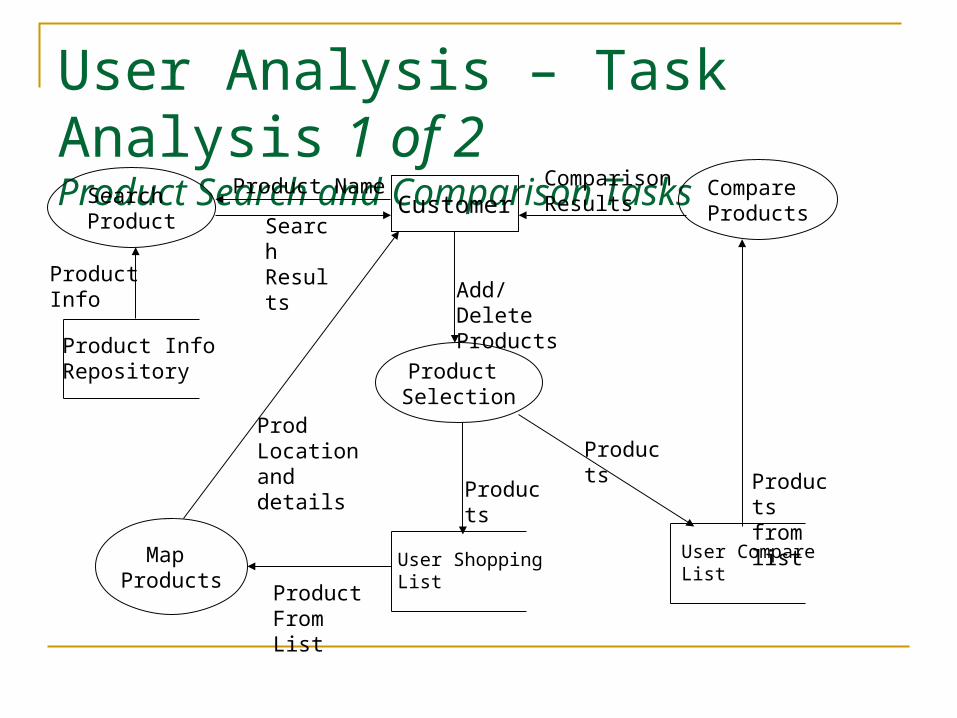
User Analysis – Task Analysis1 of 2
Product Search and Comparison Tasks
CustomerSearch Product
Product Name
Product InfoRepository
ProductInfo
Product Selection
Search Results
Add/Delete Products
User ShoppingList
Products
User CompareList
Products
Compare Products
Products from list
Comparison Results
Map Products
Product From List
Prod Location and details
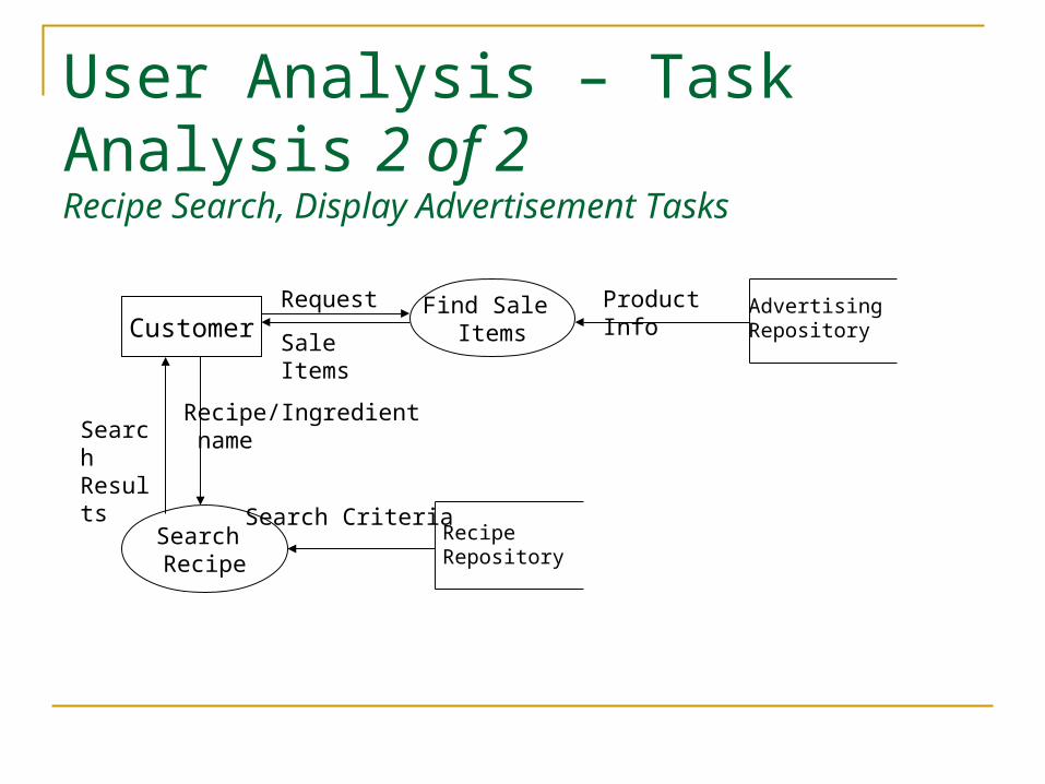
User Analysis – Task Analysis2 of 2
Recipe Search, Display Advertisement Tasks
Search Recipe
Recipe/Ingredient name
Advertising Repository
Find Sale Items
Product Info
Sale Items
RequestCustomer
Recipe Repository
Search Criteria
Search Results
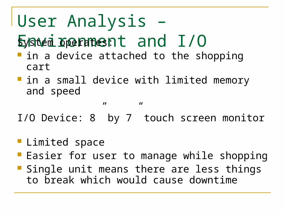
User Analysis – Environment and I/OSystem operates: in a device attached to the shopping cart in a small device with limited memory and
speed
I/O Device: 8” by 7” touch screen monitor Limited space Easier for user to manage while shopping Single unit means there are less things to
break which would cause downtime
Summary Style Guide 1 of 2 General page layout
No browser scrolling is required for any pages. Any scrolling should be programmed on the page itself.
No minimize or maximize options are available Background color is Green
Green represents vegetables Navigation panel is on the left hand side
Navigation panel contains all navigational buttons and in the same size for all pages
Button background color - #FBEAA4 Button font color – #F68225 Font – Arial Narrow Must contain buttons that link to every major component of the
application Button color changes when the user is on the component the button links
to
Summary Style Guide 2 of 2 Buttons to perform major tasks on homepage
have different colors Top part of the button contains an image – use of image relating to the task helps
associate the action with the button Bottom part of the button contains a description Both image and description are clickable Font for description – Arial Narrow
Header Contains title of the task which is the same as the button name Title color is in white Font - Arial
Back and Next control button on the footer background color – #F68225 Button font color – #FBEAA4 Font – Arial Narrow
Main content section Has white background Uses a border to group all related content
Visual Design – Icons/Symbols Checkbox
A checkbox is often used for selecting items, even for non-technical users The icons clearly shows when an item is selected or not
Color All screen background color is “green” to evoke images of fresh produce which is
associated with grocery store. Color numbers are limited to green, peach, white and such matching neutral colors.
User will be pushing cart and looking at the screen. Do not want to overwhelm users with too many color choices. Need to easily identify screen contents.
The two types of navigational buttons use the same color but reverse background color and font color. It indicates the difference on the function of the button without introducing too many new colors.
Buttons size Size of the buttons is the main way users interact (touch) to navigate, therefore they
need to be extra big for easy manipulation. Fonts
Fonts are pretty big in general because the screen is small and users may not have very good eyesight. Bigger fonts make it easier to read.
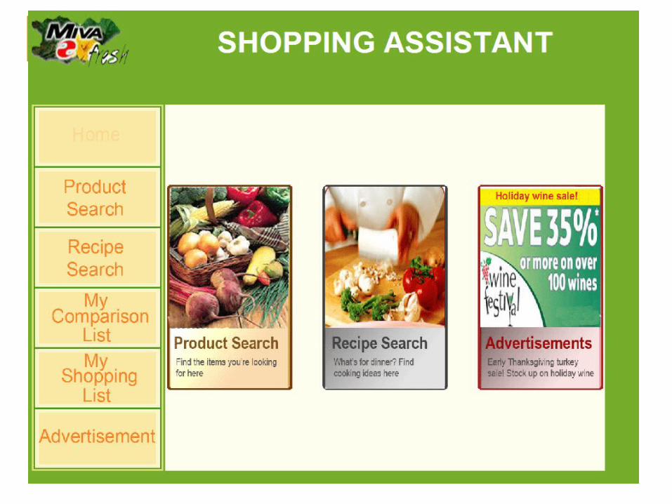

Homepage Design Considerations Same background color as is used throughout the application for consistency Contains the same layout as the rest of the application Main content
Contains 3 big buttons for user to navigate to other pages. They show the user what main features are provided for the application
Uses a different background color to help group the main content from the navigation panel Uses different color for each main feature to distinguish the differences
Clear description on the big buttons Provide clear descriptions on all the main features of the application. So user does not have to guess
what the application does. Image driven
Images are used in addition to description to associate the use of the functions Suitable for standalone application with small screen
Navigation panel Provides links to all other pages. Contains some repetition of what the main buttons link to so the panel would be uniform among all
pages. Company Logo
is on the top left corner so the customer knows this is a tool provided by the grocery store, but not from a particular store brand.
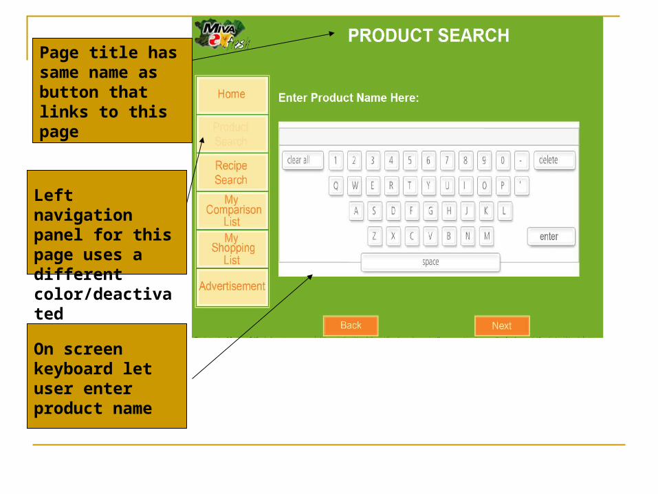
On screen keyboard let user enter product name
Left navigation panel for this page uses a different color/deactivated
Page title has same name as button that links to this page

Title specifies component and page description
What user entered in previous page is shown here in quotes
These links leads to diff search results
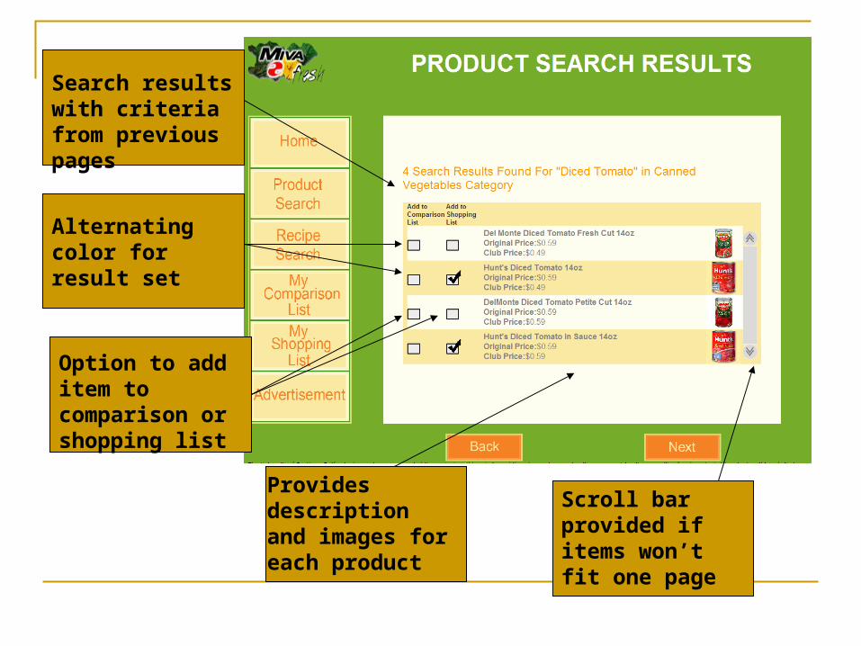
Search results with criteria from previous pages
Alternating color for result set
Option to add item to comparison or shopping list
Provides description and images for each product
Scroll bar provided if items won’t fit one page
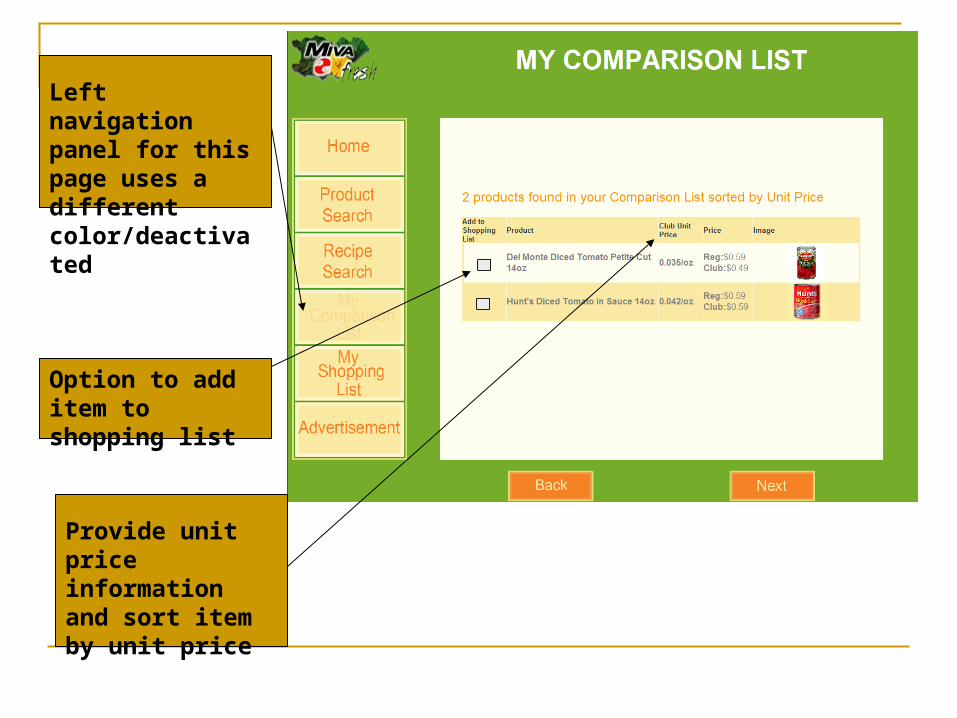
Left navigation panel for this page uses a different color/deactivated
Option to add item to shopping list
Provide unit price information and sort item by unit price

Store map showing items on shopping list with number-coded indicators.
Allows adding/removal to Shopping List.

Large keyboard for touch screen entry.
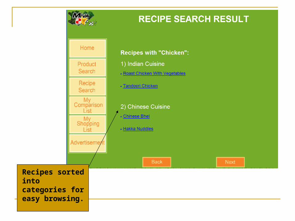
Recipes sorted into categories for easy browsing.
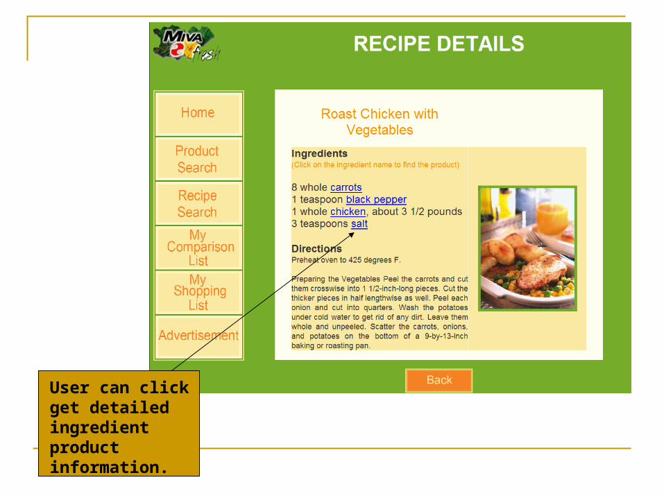
User can click get detailed ingredient product information.

Sale priceslabeled in red.
Allows user toadd items to Shopping orComparison list.

Comments Tools:
Photoshop CS for designing images and buttons Frontpage, Dreamweaver, Textpad for web development W3C HTML validator
Lessons: Iterative process of color design. Sometimes what we think would look good doesn't. Concept ideas v.s. Implementation feasibility. Ideas are great but not as easy to
implement. Plans for rest of semester
Week 1 after presentation Implement rest of the screens Implement keyboard feature
Week 2 after presentation Refine images, button sizes and layout Implement all the links, add more description to pages.
Week 3 after presentation Refine color and start converting static pages to dynamic pages
Week 4 after presentation Finish converting static pages to dynamic pages.
Link http://www-scf.usc.edu/~bettyliu/GSA/homepage.html