Task 7
17
EVALUATION Task 7
-
Upload
jordanne-thorpe -
Category
Technology
-
view
162 -
download
0
description
Transcript of Task 7

EVALUATIONTask 7
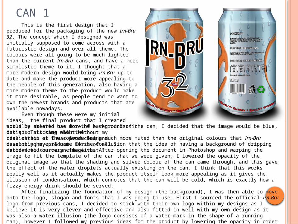
CAN 1This is the first design that I produced for
the packaging of the new Irn-Bru 32. The concept which I designed was initially supposed to come across with a futuristic design and over all theme. The colours were all going to be much lighter than the current Irn-Bru cans, and have a more simplistic theme to it. I thought that a more modern design would bring Irn-Bru up to date and make the product more appealing to the people of this generation, also having a more modern theme to the product would make it more desirable, as people tend to want to own the newest brands and products that are available nowadays.
Even though these were my initial ideas, the final product that I created actually created has more of a retro/classic design. This came about without my realisation as I was producing and developing my product. First of all I decided to source an image that Iwould be able to use for the background of the can, I decided that the image would be blue, but also sticking with the idea of all of the colours being much more muted than the original colours that Irn-Bru currently have. I came to the conclusion that the idea of having a background of dripping water would be very effective. After opening the document in Photoshop and warping the image to fit the template of the can that we were given, I lowered the opacity of the original image so that the shading and silver colour of the can came through, and this gave the effect of the water droplets actually existing on the can. I think that this works really well as it actually makes the product itself look more appealing as it gives the illusion of condensation, which connotes that the can will be cold, which is exactly how a fizzy energy drink should be served.
After finalizing the foundation of my design (the background), I was then able to move onto the logo, slogan and fonts that I was going to use. First I sourced the official Irn-Bru logo from previous cans, I decided to stick with their own logo within my designs as I believe it is very clever and effective and also fitted in well with my own design as it was also a water illusion (the logo consists of a water mark in the shape of a running man), however I followed my previous ideas for the product by lowering the opacity in order to make the colour seem less vivid, however gave the image a drop shadow and a bevelled effect for it to stand out from the can. I then looked through a selection of fonts that I had sourced for this specific idea within the mood board I produced, and chose two fonts that I thought would work well with what I had produced so far, and inserted them into my Photoshop document. I was then able to
eliminate one font, leaving me with a font that I would use within my final design. The font that I chose changed the over all look and theme of my product, the was the point at which I noticed that instead of having the modern, futuristic appearance of my initial idea, the font I chose gave my product a more retro/vintage look. Although this was the exact opposite of what I was wanting to achieve, I personally thought that the product had a classic look which would appeal to both the older and younger generation as an older generation would find this style memorable of their youth, and it would also appeal to a younger generation as vintage and retro styles are known to be popular for them. After deciding to carry on with this style I then went on to insert a slogan I had chosen when I was working on the copy development for my designs. I decided on using the slogan: ‘Quality Energy’ for the tag line. I used the pen tool to create a work path on which my slogan would follow and then decided on a font and colour. The colour was red as it ties in with the current colour scheme of Irn-Bru and also connects to the Barr logo, I also thought that it was important that the slogan had a simple an easily legible font in order for it to stand out.
CAN 1 CONTINUED
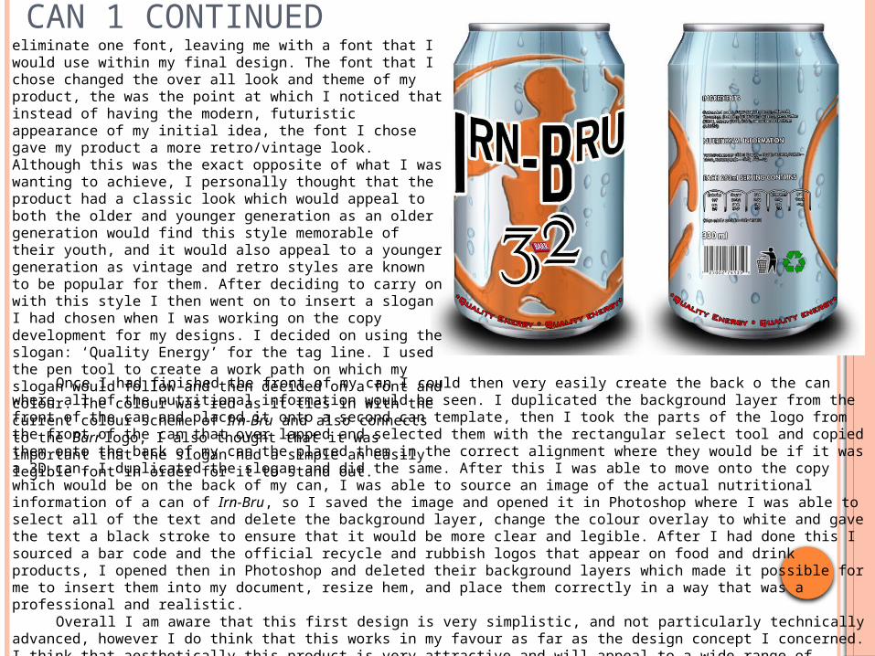
Once I had finished the front of my can I could then very easily create the back o the can where all of the nutritional information would be seen. I duplicated the background layer from the front of the can and placed it onto a second can template, then I took the parts of the logo from the front of the can that over lapped and selected them with the rectangular select tool and copied them onto the back of my can the placed them in the correct alignment where they would be if it was a 3D can, I duplicated the slogan and did the same. After this I was able to move onto the copy which would be on the back of my can, I was able to source an image of the actual nutritional information of a can of Irn-Bru, so I saved the image and opened it in Photoshop where I was able to select all of the text and delete the background layer, change the colour overlay to white and gave the text a black stroke to ensure that it would be more clear and legible. After I had done this I sourced a bar code and the official recycle and rubbish logos that appear on food and drink products, I opened then in Photoshop and deleted their background layers which made it possible for me to insert them into my document, resize hem, and place them correctly in a way that was a professional and realistic.
Overall I am aware that this first design is very simplistic, and not particularly technically advanced, however I do think that this works in my favour as far as the design concept I concerned. I think that aesthetically this product is very attractive and will appeal to a wide range of people, however I do think that I could have put more effort into thinking about my target audience, and what would be more appealing specifically to them, the fact that I did not to this in great detail lets my product down slightly, however I do think that this can has a classic design which will be appealing to many different people of both genders and many ages. I am very happy with this design and think that it is a strong first idea.
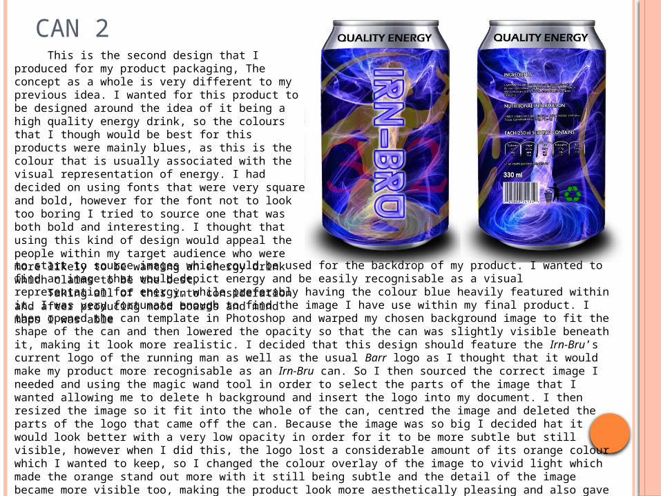
CAN 2This is the second design that I produced
for my product packaging, The concept as a whole is very different to my previous idea. I wanted for this product to be designed around the idea of it being a high quality energy drink, so the colours that I though would be best for this products were mainly blues, as this is the colour that is usually associated with the visual representation of energy. I had decided on using fonts that were very square and bold, however for the font not to look too boring I tried to source one that was both bold and interesting. I thought that using this kind of design would appeal the people within my target audience who were more likely to be wanting an energy drink which claims to be the best.
Taking all of this into consideration and after producing mood boards and mind maps I was ableto start to source images which could be used for the backdrop of my product. I wanted to find an image that would depict energy and be easily recognisable as a visual representation for energy, while preferably having the colour blue heavily featured within it. I was very fortunate enough to find the image I have use within my final product. I then opened the can template in Photoshop and warped my chosen background image to fit the shape of the can and then lowered the opacity so that the can was slightly visible beneath it, making it look more realistic. I decided that this design should feature the Irn-Bru’s current logo of the running man as well as the usual Barr logo as I thought that it would make my product more recognisable as an Irn-Bru can. So I then sourced the correct image I needed and using the magic wand tool in order to select the parts of the image that I wanted allowing me to delete h background and insert the logo into my document. I then resized the image so it fit into the whole of the can, centred the image and deleted the parts of the logo that came off the can. Because the image was so big I decided hat it would look better with a very low opacity in order for it to be more subtle but still visible, however when I did this, the logo lost a considerable amount of its orange colour which I wanted to keep, so I changed the colour overlay of the image to vivid light which made the orange stand out more with it still being subtle and the detail of the image became more visible too, making the product look more aesthetically pleasing and also gave the image more depth.
After I had the general look to my can finished, I then moved onto the copy. I started on the font that I would use for the title of the can, I had sourced a few different fonts that I thought would be appropriate and through elimination I chose to use this font which is perfect for the look that I was trying to achieve and I think that it is simple enough to be legible when placed vertically as opposed to horizontally like I had done on my previous idea. c

CAN 2 CONTINUEDOnce I had the copy in my desired
position I then started to think about how to colour the copy, as having it black did not work within the deign. I changed the colour overlay to white which looked much better however was still very plain and I thought that the copy should have some blue within it to tie in with the background image. In order to achieve this I then added a stroke o the image and selected one of the lighter blue colours from the background image in order to make sure that the copy was both bold and not sinking into the background, I added an outer glow with a small drop shadow to create the illusion of the text coming out from the can. After this process I added a texture to the copy which added to the look of the text having energy inside it, after this process I was very happy with the look of the main copy and was able to move on.
I though that it would have been a good idea for the ‘3’ and ‘2’ form the ‘32’ to be on either side of the ‘Irn-Bru’ and have it at the same opacity as the Irn-Bru logo, however being the colour red in order for the can to still have the original colour scheme of the current Irn-Bru products in order for them to be recognized. Due to the fact that the copy was so translucent, I thought it was a good idea for it to be quite large, and also this is where it being the colour red comes into play – it is easily noticeable, and also ties in with the Barr logo. After I had finished with this process I added the finishing touch which was the slogan ‘Quality Energy’, I thought that this could just be in a plain simple font at the top of the can, I inserted the text in and automatically the colour was black, I did not feel the need to change the colour as I think that it works very well and is simple yet effective in standing out but not taking attention away from the design on the can. Once I had finished the whole front of the can I was able to sue the same process as I did for the previous can and start on the back of my can. I copied the process I used before however obviously adapted to the design fo this second packaging idea.
I think that compared to my previous design this one is much more technically complex. The processes which I used compliment all elements of the design, and the can as a whole works very well as it does not seem that there is anything out of place, aesthetically this overall design is very appealing and I think that it will attract the right target audience. I think that my design works very well as a brand new Irn-Bru product as it is clearly very different to how their products usually look, however I have included their well known colour scheme, which shown that the product is not completely different and is still Irn-Bru. I think that the only weakness that this product has is that the ‘32’ is perhaps slightly too transparent, however I do think that this works well within the design overall.

CAN 3This is the third design that I produced
for my product packaging, I created this design in a different way to the others choosing a slogan first and deciding on the images and fonts I could use afterwards. When I was developing my copy one of the slogans I came up with was ‘Gets you out of the dark’, I liked this slogan as when partnered with an energy drink it connotes a change of feeling within the consumer, for example if you are in a ‘dark place’ this can be seen as feeling tired or unmotivated, so using this tag line will claim that the energy drink will take you out of this place and give the consumer more energy. I thought that I could use an image which contained beams of light shining down in some way, showing a difference between light and dark.
When I came to producing my product I sourced a collection of very good images which contained both the beams of light which I was wanting, and also
had a lot of bright and bold colours which would make my product more appealing and would ensure that it would stand out to my audience. I opened the can template in Photoshop along with the different images that I sourced and started to make drafts of what my can could look like by warping the images to fit the can and trying to decide which one I could use. I found it very difficult to chose one out of the two that I favoured the most, however I then placed one beneath the other and altered the opacity of the image on the top layer so that the second one was slightly visible, which gave the product more depth and added more interest to the look of the background.
After I had decided on the background layer of my can I then chose a font which I would use for the front title of the can, I sourced a selection of fonts that I though had a simplistic yet sophisticated look to them and inserted them one by one until I fount the font which I thought looked best within the design of this can. I chose this particular font as I liked how it was both slim and bold, I had to add a small white stroke around the image to make sure that it did not fade into the background with the colour overlay still being black. I left the colour of the font black because I thought it matched with the theme of the product, which was now looked quite sleek and modern. I could then add the rest of the copy to the front of the can, which was the slogan and the ‘32’. First of all I used the pen tool to draw a path for my slogan to follow, I then typed the slogan ‘Gets you out of the dark’ out and changed the colour overlay to red in order for me to see it clearly on the black background so that I could then scroll through the fonts available on Photoshop and chose an appropriate one. I chose this particular font as I think that it looks futuristic and eye catching as it is very dissimilar to the font which was used for the title of the can. I was going to change the colour of

CAN 3 CONTINUEDthe slogan, however as it stood, red both stood out and matched the background of the top section of the background as it contained shades of red, and also due to the rest of my designs, I knew that it would match with the Barr logo which I would insert at the end.
Once I had finished this process I could then move on to add the ‘32’ into my design. I actually liked the font that I used within my first design so much that I used the same one here for this part of the copy, I did this because when I was thinking about the placement and colour of the copy I wanted the ‘32’ to be in the colour blue, however was having a slight issue because it was going to be on a black background and I was worried it would not stand out. I tackled this constraint in a very interesting way, I decided that I should use an unusual font in order for the eye to be drawn to it, I made sure that the copy was placed in such a way that it was filling in the gap where
the black of the background image was whilst being central in order for it to be easily seen. I then changed the colour to a vivid blue and lowered the opacity to 30%, I know that initially this seems like a bad idea if I was worried about the ‘32’ not being seen, however I think that it has the opposite effect, I think that the fact that it is so translucent draws the eye to it even more. First of all when you look at this can you see the ‘Irn-Bru’ at the top, because this is in the section of the can where all the bright colours are , then immediately in the corner of your eye you can see a hint of blue beneath the colour in the darkness, which draws the eye down to read the ‘32’, it makes the viewer curious. Even though the copy is at 30% opacity, because of the font, it is still legible, this also fits in more with the slogan ‘Gets your out of the dark’.
When I created the back of the can I used the same process that I used when creating my other two designs as it was both fast and effective, however this time I mad sure that some of the images, like the rubbish logo, had a thicker white stroke around them to make sure that they did not blend into the black background. I also decided that the slogan at the bottom of the can would curve around the whole circumference of the can so that it would be visible from every angle.
Overall I think that this product is very effective as the design fits in well with the slogan and there is a specific theme to the whole packaging which means that it would be very easy to fit a whole advertising campaign around the design concept. I think that technically it is not too simple and I put a lot of thought into how each of the components of the design should be, and overall they all correspond with each other, they are all balanced and do not look out of place. With regards to my target audience I think that this product will be appealing to a range of people, the product is not restricted to one gender or age group, the design depicts the product to be an effective energy drink, which is what the current target audience of Irn-Bru want.
MAGAZINE ADVERTS – IDEA 1

MAGAZINE ADVERTS – IDEA 2
MAGAZINE ADVERTS – IDEA 3
MAGAZINE ADVERTS – IDEA 4

MAGAZINE ADVERTS
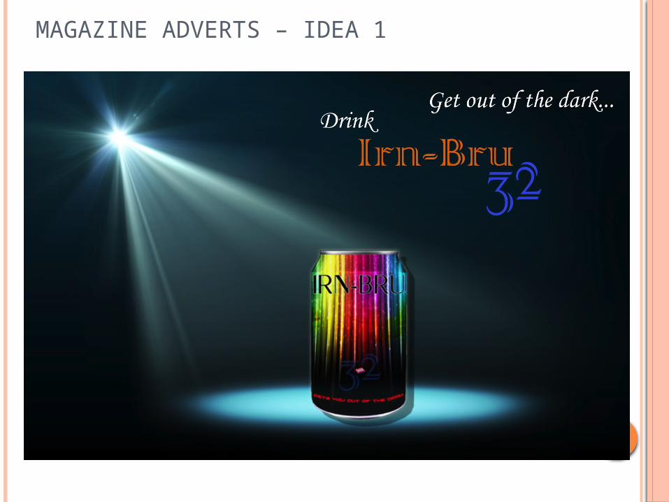
After I had produced my product packaging I then went on to produce a magazine advert. At first I decided that I would create a poster for each of the cans that I produced, I found this very difficult with regards to the first can packaging idea that I had, so I moved onto the can which I thought would be easiest to create a magazine advert for, which was my third can idea. The first magazine advert that I created was based around the design concept of the third can I produced, I decided that it would have a spot light shining down onto my can and that the tag line would be similar to the slogan with there being a light and dark theme. When I created the draft for this advert I simply inserted all of the images that I wanted to use within the poster and place them in the right places, then chose a font within Photoshop to use. I was not happy at all with the way that this design was going as I thought that I was looking very weak and would not be eye catching enough to be put in a magazine, so I started a fresh with a different can.
With my second can idea I started to produce another magazine advert which would be more appropriate. I did some research into existing rinks magazine adverts and come to the conclusion that I would have an image of my can being poured into a glass, as I thought that would make my product look very appealing and for the viewer to want to taste it. For me to achieve this I had to source an image that was right for my idea and using Photoshop I warped my can design around the existing one within the image, then I had to use the magic wad tool to select all of the liquid and change the colour overlay to orange with a vivid light and lower the opacity to give the liquid the realistic colour of the Irn-Bru drink. On its own this looked very effective and was technically very advanced for me, however when it came to putting this image into an advertisement I again found it very difficult to come up with a good concept. The final idea that I produced for my second magazine advert was very weak, there was not enough colour and the advert as a whole was not very eye-catching or appealing, it would not have attracted the correct target audience and did not make my product seem like something that had to be tried.
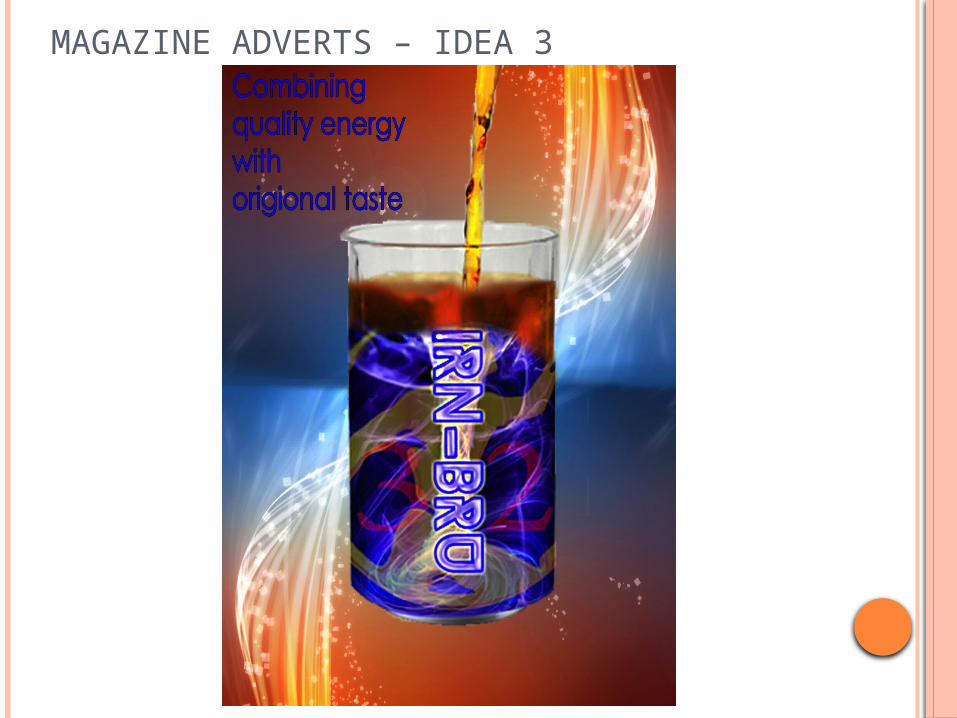
Since I was not happy with this advert I continued to try and come up with a different design concept. Due to the fact that I put so much effort into creating the image of the Irn-Bru being poured into the glass which was featured within my second magazine advert design, I thought that I would try to develop that idea further. I took the image and opened it up in Photoshop then took my second product packaging design and placed it where the glass was. I thought that it would be a good idea if I cropped out the can at the top which was being poured into the glass and created an image of Irn-Bru liquid being poured into a glass which then faded into a can. I did this by layering the glass and the can then using the eraser tool with a soft brush and a low opacity to create the illusion that the glass was fading into the can. After I had developed this image until it looked very realistic I then sourced an image that I could use as a background to the magazine advert, I thought that having a mixture of colours that were featured within my can would be a good idea as it would be promoting my product even more.
MAGAZINE ADVERTS CONTINUED
I was able to source an image which had both blue and oranges featured within it and also looked like the colours had a liquid like movement to them, which corresponded with the liquid being poured into the glass/can. When I put this background image behind my layers this gave the advert more depth, I then added my desired copy, however I still felt like I could create something which was different to other adverts in order to be eye-catching and appealing to my target audience.
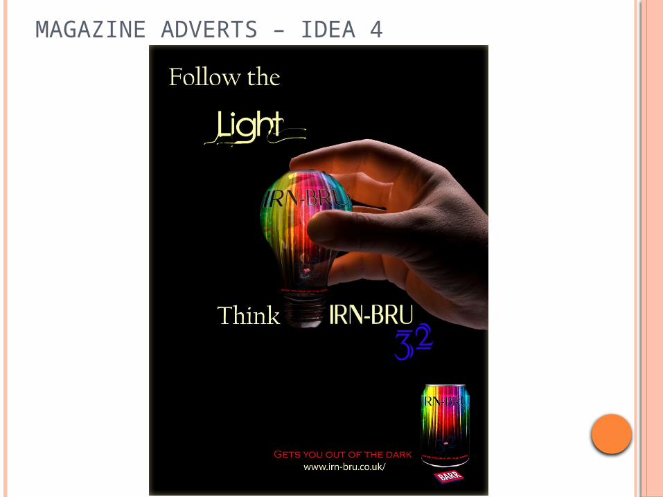
The final magazine advert that I created is my preferred design out of the 4 I produced. From the start of creating this concept I felt like I knew exactly what I wanted it to look like, what the copy should say, and how o create my main image. I thought that I would use my third can design, and source an image of a light bulb to be a visual pun on the slogan ‘gets you out of the dark’ which was featured within the can. I was able to warp my can into the shape of the light bulb that I had sourced and lowered its opacity so that the light bulb behind it became visible alone with the light which it was emanating. Since the background to this image was already black, I carried on this colour to make the canvas A4 size so it would be applicable for a usual magazine advert. I then started to insert my copy, which I decided should be ‘Follow the light, Think Irn-Bru 32’, I decided upon this as it was an amusing pun to go with he imagery, also light bulb are sometimes connected to having an idea, this is why I used the wording ‘Think’ instead of ‘Drink’ which was my first idea. I found a suitable font and took a colour from the light coming off the light bulb for most of the copy, however used the same font that was included on the can for the part of the magazine which said ‘Irn-Bru’ an sourced a font which visually looked like it corresponded with light for the word ‘Light’. With all of this finished, I then inserted an un warped image of the can in the bottom corner and added the slogan ‘Gets you out of the dark’ next to it, then below I included the official Irn-Bru website so that the viewer would be able to access it if seeing this poster made them want to know more about the product, which I think it would.
Overall I strongly believe that this final poster is very clever, as visually it s very stimulation as the main image could make the viewer curious as to what the product is due to the fact that it is warped. The fact hat there is a hand reaching for the product featured within the advert will also make the viewer feel like it is already wanted and could even make them feel like they are the one reaching for the can since there is no face attached to the hand. Therefore I think that this advert will be appealing not just to my target audience, but also to a large variety of different people, young and old, male and female. I am very happy with this last magazine advert and am happy that at the beginning of the production process I did not give up just because the ideas that I was producing were very weak. If I were to design this poster again I think that I could possible add more contact information, such as a QR code to the website, a phone number or some sort of promotional code in order to advertise the product fully.

WEBSITE BANNERS – IDEAS 1&2

WEBSITE BANNER – IDEA 1
Finally, to ensure that I completed all of the tasks set within the brief, I had to produce a website banner to advertise the new Irn-Bru 32. After having trouble with my designs for the magazine adverts I thought that I would have trouble with this task, however I created these two designs easily and quickly. First of all I decided to try and come up with a design that was not following a certain design that I had created within my product packaging, but to see what kind of design I could come up with from scratch, I had an idea that instead of just having the usual square banner, that I would have one in the shape o bubbles, which would be depicting the bubbles of air which create the fizz in the drink, which meant that the image on its own would be advertising the drink. I sourced some images of bubbles and found one that had the correct kind of dimensions that wanted to use and that I would also be able to use well within Photoshop. I opened the image within the program and started to select all of the bubbles so that I could then go on to change the colour overlay to a bright orange, which is already well associated with the current Irn-Bru products, and added a vivid light to the colour to give it more depth and slightly lowered the opacity to retain some of the detail within the original image.
Once I had finished with this process I could then add my copy which was simply ‘Irn-Bru 32’. I inserted the ‘Irn’-Bru’ and the ‘32’ separately, first finding a suitable font for the ‘Irn-Bru’ and resizing it so that it spanned the whole of the background. The font that I chose was also made of bubbles which matched perfectly with the background. I put a gradient overlay on the font which included both orange and blue, again the current colours that are within the recognized Irn-Bru brand, and added a small black stroke and drop shadow to ensure that it would stand out from the background. After I was happy with this element of the copy I then added the ‘32’. I decided that this should be a simplistic font and should be the colour red so that the whole banner would be following the current colour scheme adopted by Irn-Bru, when I had found the right font I placed the layer behind the ‘Irn-Bru’ however made it big enough to be legible and added a slightly larger drop shadow to give the illusion that it was hovering over the bubbles in the background.
After this I thought that the web banner was finished however I then found an animation tool in Photoshop that meant that I could make my advert move, so I used this which enabled me create different layers of bubbles and make them appear at different times within the animation, which gave the illusion of the bubbles popping. I made the copy visible within the middle of the animation and made everything else disappear towards the end of the animation leaving just the ‘32’ visible at the very end, emphasizing that this is a brand new product.
I think that this advert is very strong, but mostly due to it being an animation, if this were just a plain jpeg the advert would be very weak as it would not be eye-catching enough and there would not be enough information within the advert to make sure that it would be attracting the correct target audience. However I do think that creating this banner has given me a further understanding of different tools that are available within the Photoshop application and how having an animated advertisement can be very effective.
WEBSITE BANNER – IDEA 2
After creating an animated website banner that did not follow any of the previous designs I had done, I thought that it was important for me to produce one that did match a design of one of the cans I had produced and for it not to be animated to see if I could create a strong website banner that would be eye-catching and appeal to my target audience. I chose to base this website banner on my second can design as I thought it was the most eye-catching and visually stimulating. I took the same image that I used for the background of my can and inserted it into my rectangular canvas then resized it and rotated it slightly so that the tornado like image in the middle was central. I then took the same font that I had used on the can and placed it into the banner, I made sure that the font was still clear and not pixelated and resized it so that the font spanned a large section of the advert. I could not think o a way to make the advert more interesting, so I decided to emphasize the fact that it was a brand new product, I did some research into different ways that have been used to promote a product as being brand new, I found that the usual and most recognized way was to use a star shape with the word ‘New’ bold and large inside it. I thought that this would be the best way to advertise my product as it has been used so much in the past that the image of a star will now be widely associated with the release of a new product.
Taking all of this into consideration I used the custom shape tool to insert an 11 pointed star into my image and used yellow as its colour overlay. I placed it in the top left corner, which is where other products seem to have this star placed, and resized it so that it was not covering too much of the background or copy and was not taking too much attention away from the advertisement itself. I was then able to insert the work ‘New!’ into the middle of the star, I chose a bold font and used all upper case letters to make the word stand out even more along with an exclamation mark to emphasize the word even more. This element made the web banner look more like an advertisement and added depth to the image.
Although I believe that this website banner looks more professional, I think that I could have added much more information to the image to express that his was a brand new Irn-Bru product in order to promote it even more. If I had done this it also could have appealed to more people and may have been seen by more people. Technically this advert is not very advanced, mainly because I was able to use aspects of my can which had already been developed within Photoshop, so this banner was very easy to create and took no time at all, I’m not sure if I prefer this advert of my previous animated advert, as I think that this one looks much more realistic and professional, however the last one was more interesting and I prefer the concept which I developed. The design of my can could have been the constraint that meant that it was harder for me to produce a good banner idea, however I find this hard to believe as I think that my can’s design was very strong. Overall I do think that this is an average advert, however it will work well a a website banner as it still has bold eye-catching qualities which will attract the correct target audience.
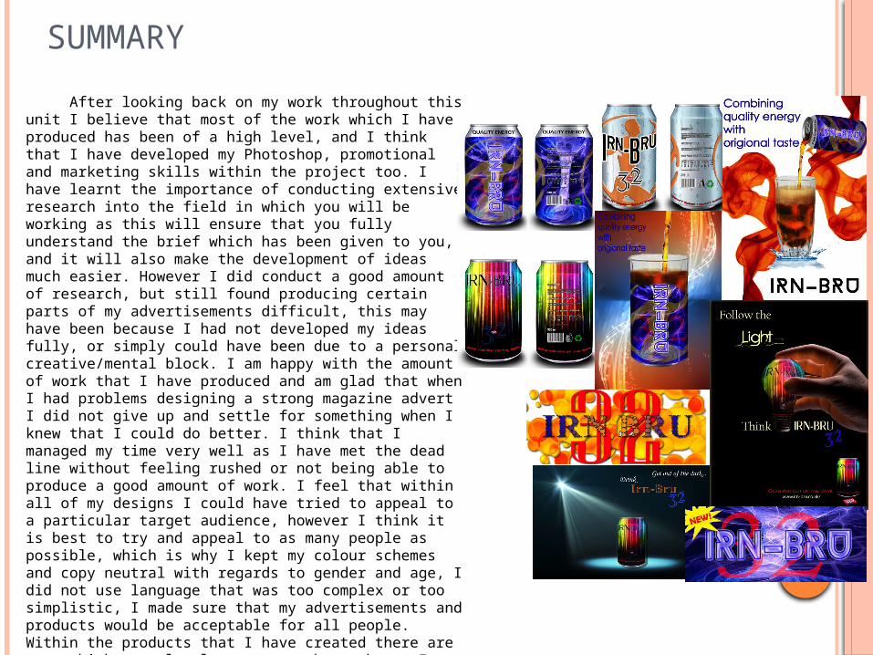
SUMMARY
After looking back on my work throughout this unit I believe that most of the work which I have produced has been of a high level, and I think that I have developed my Photoshop, promotional and marketing skills within the project too. I have learnt the importance of conducting extensive research into the field in which you will be working as this will ensure that you fully understand the brief which has been given to you, and it will also make the development of ideas much easier. However I did conduct a good amount of research, but still found producing certain parts of my advertisements difficult, this may have been because I had not developed my ideas fully, or simply could have been due to a personal creative/mental block. I am happy with the amount of work that I have produced and am glad that when I had problems designing a strong magazine advert I did not give up and settle for something when I knew that I could do better. I think that I managed my time very well as I have met the dead line without feeling rushed or not being able to produce a good amount of work. I feel that within all of my designs I could have tried to appeal to a particular target audience, however I think it is best to try and appeal to as many people as possible, which is why I kept my colour schemes and copy neutral with regards to gender and age, I did not use language that was too complex or too simplistic, I made sure that my advertisements and products would be acceptable for all people. Within the products that I have created there are some which are clearly stronger than others, I think that this shows clearly the development of my products and ideas along the way, and I could possibly use some of these ideas again in future work.