Task 4 final images review work sheet
10
Unit 57: Photography and Photographic Practice Selection of final images & review (P4, M4, D4) Image No: Paste image here
Transcript of Task 4 final images review work sheet
Unit 57: Photography and Photographic Practice
Selection of final images & review (P4, M4, D4)
Image No:Paste image here
Theme or focus of image & reasons for choice
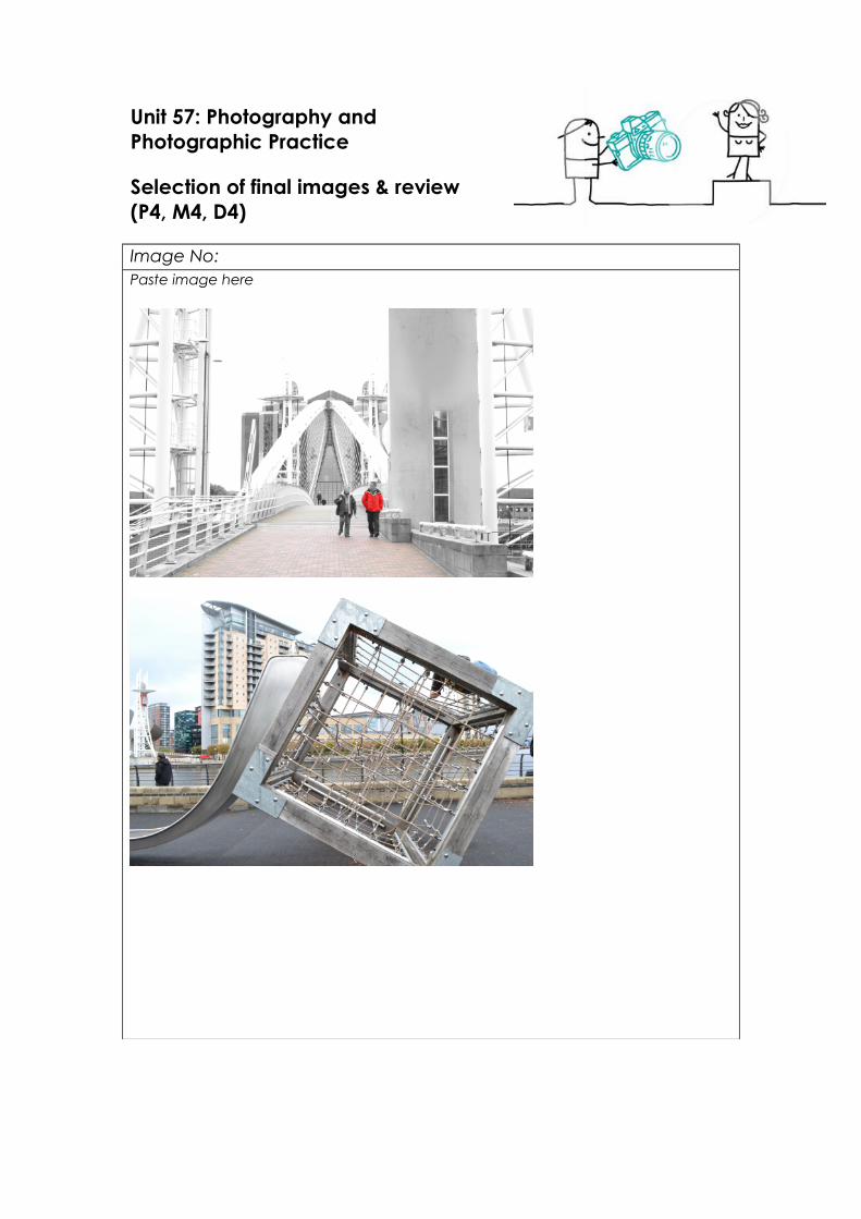
Image 1 – The theme of image one is a grey, washed out kind of feel. When editing I wanted it to show more cold to the image. I made the building on the right taller to fill in space and so it looked fuller as a photo. I like this image because the walk way centres of the image making it the main focus point.
Image 2 – The theme of this image is to show one of the many interesting things scattered around Salford quays. The reason I chose this image is because of the good depth of field. When it came to editing this photo I didn’t want to do anything to change its appearance to much because I liked its effect so I made it a little bit brighter and turned down the hue to make it look a little more colour blended.
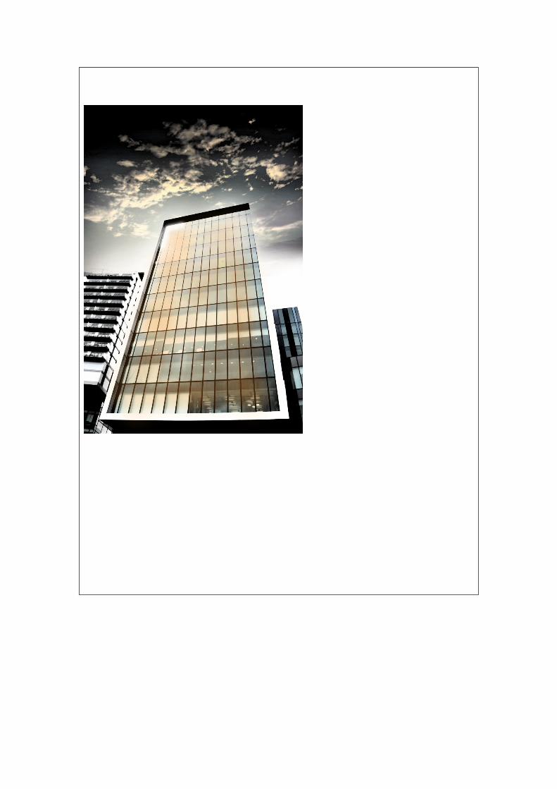
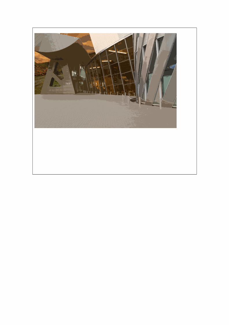
Image 3 – The theme of image three is to show a warmer side of Salford quays, the idea was the capture the light bouncing of the main building in the image. The main focus of the image is the building in the middle, I emphasised this by adding a tint to that building only and washing out the ones either side of it. I chose this image because I like the angle of the shot.
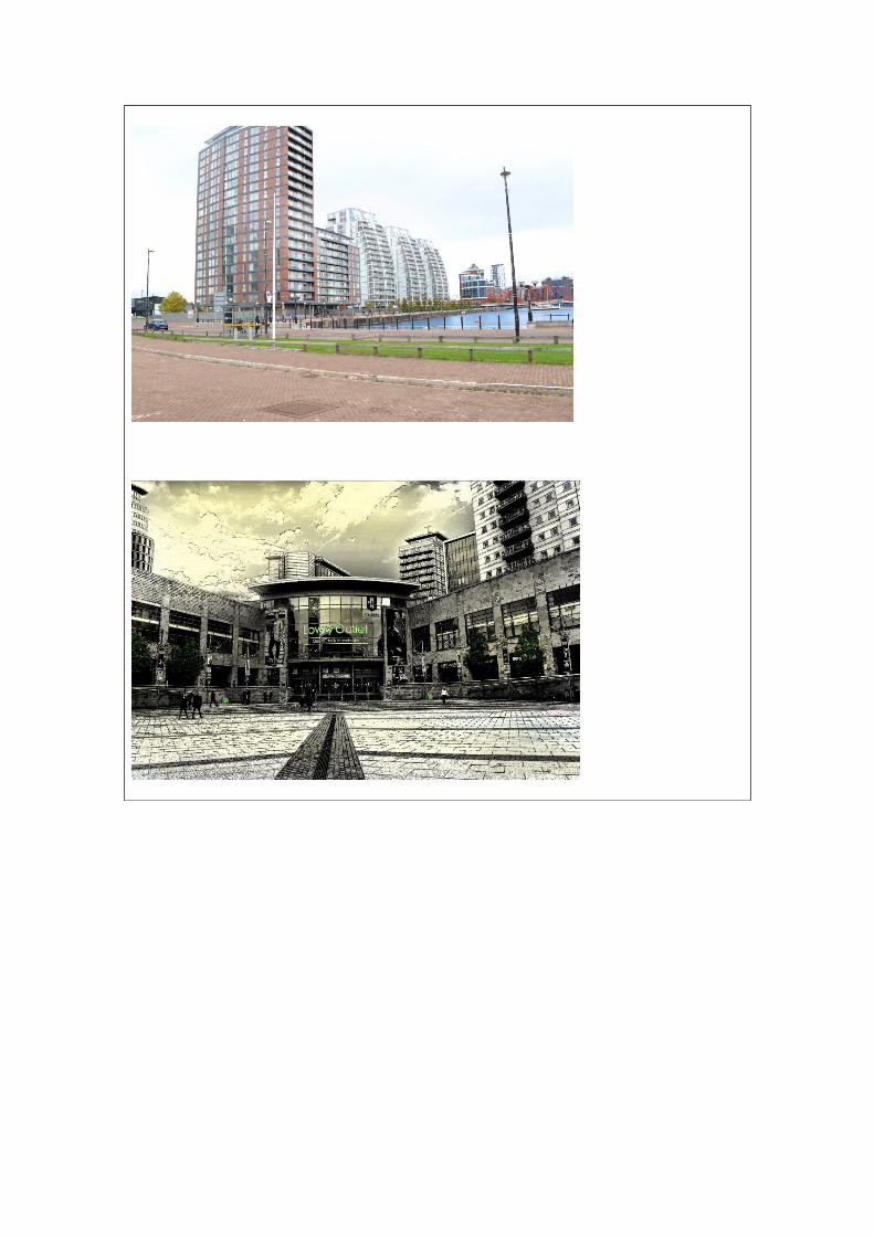
Image 4 – The theme of image 4 is showing off the architecture at Salford keys. The main focus of the image is the row of buildings. I chose this image because it shows some of the buildings clearly from top to bottom and it’s different from the others.
Image 5 – The theme of this image is more abstract than realistic. The focus point of the image is the doors of the Lowry. I chose his image because from either side the walls lead into the centre of the image and it shows of the main shopping outlet at Salford keys.
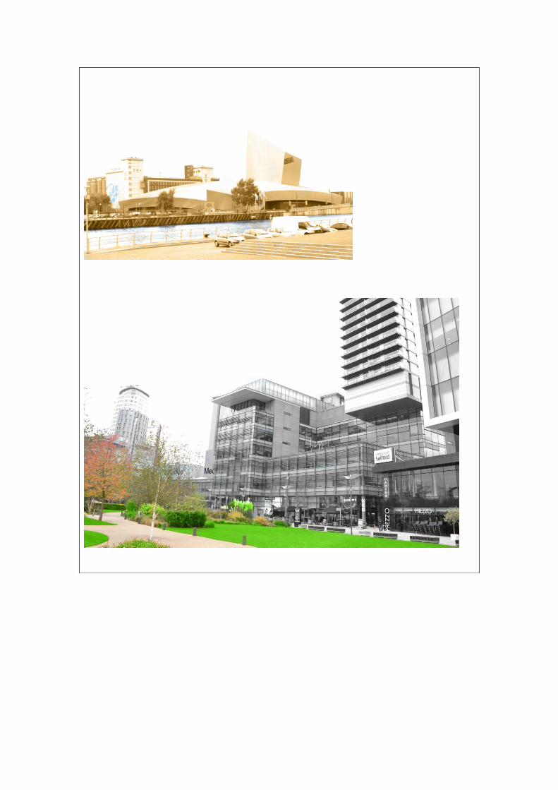
Image 6 – The theme for this image is blue and orange. The focus is the museum in the middle and the keys running by the side of it. I chose this image because it shows of the landscape of Salford keys.
Image 7 - Image seven is a split between the more Nature side of Salford keys and the architectural side. To emphasis this I greyscale dine side and highlighted certain parts of the other side to give a clear comparison.
Image 8 – For image 8 I originally wanted to take out the background and make it look more open, but it didn’t fit the colour palette in the image so I messed around with some of the filters and produced a very abstract piece, but I chose this image because even though it is abstract you can still clearly tell that it is the Lowry.
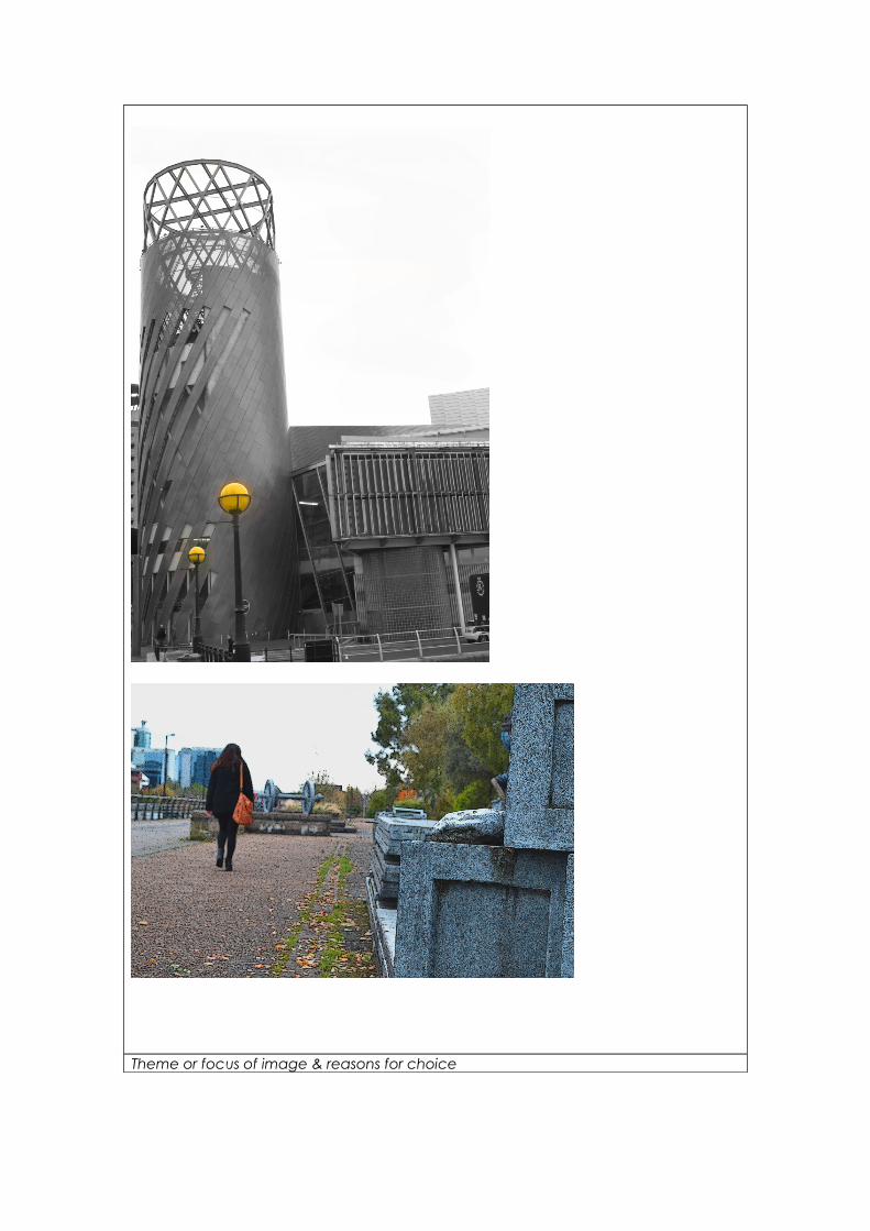
Image 9 – The reason I took image 8 because it’s one of the main featured buildings in Salford quays and I wanted to get a good clear picture of, but I also wanted it seem as you were looking up at it. I changed the colour of the background the building to a dark grey, and added an orange light to the lamps to make it feel warmer.
Image 10 - I taken image 10 because I thought it looked interesting and shows of some of the small monuments In Salford quays. I added a poster edged filter to this image but made the lines super thin, so it still looked real but also kind of like a comic/vintage look to it.
Techniques usedImage 1 – In this image I used the rule of thirds to place the top of the bridge intersecting with the top horizontal line, I also used to help centre the bridge. Also because people were walking through I had to turn the shutter speed up to make
sure they weren’t blurry.
Image 2 – For image 2 I didn’t use rule of thirds because there was already a lot in the shot, I put the aperture down as well as switching to manual focus, so I could get as clear as a picture as I could of the cube.
Image 3 – For image 3 I had to turn down the shutter speed and the f-stop so I could capture a clear image of the building as the light shining of the windows was very bright.
Image 4 – In image 4 I used Rule of thirds to make sure I had something in all of the intersecting lines, including the lamp-post. I had a slow shutter speed and high f-stop to compensate for darkness.
Image 5 – Image 5 is a combination of one main image and some smaller ones were I edited the buildings in the background, For the main image I had normal shutter speed and an F-stop of 12, this allowed me to capture an image with out to much light bouncing of the windows.
Image 6 – In image six I had a high shutter speed and high aperture to capture a bright image, the idea in my head was to make it seem as the building was fading into the sky.
Image 7 – When taking this image I wanted to capture two sides of Salford quays. I didn’t use that much of a depth of field I wanted the entire image to be as clear as possible.
Image 8, 9, and 10 – are the first 3 images I took there so I used the same F-stop and shutter speed for them all, I did this because I wanted to capture the same light in all the photos. I didn’t use rule of thirds for these photos but for number 10 I focused on a block to the far side of the image to give a significant depth of field on the path and trees to make it seem like a longer path.
Strengths & suggested improvementsI think strength of some of my images is the placement and angle of the shot, I feel the way I took some of the picture is effective in betraying Salford quays as positive. Also feel that blending pictures together like sky’s and buildings has worked well. Although for some it didn’t work well like image 8, the background doesn’t quite fit.
A weakness of my images, are in my opinion that some of them look to overly edited and some don’t look professional. This is maybe because of the colours I used or the filters I added to the image.
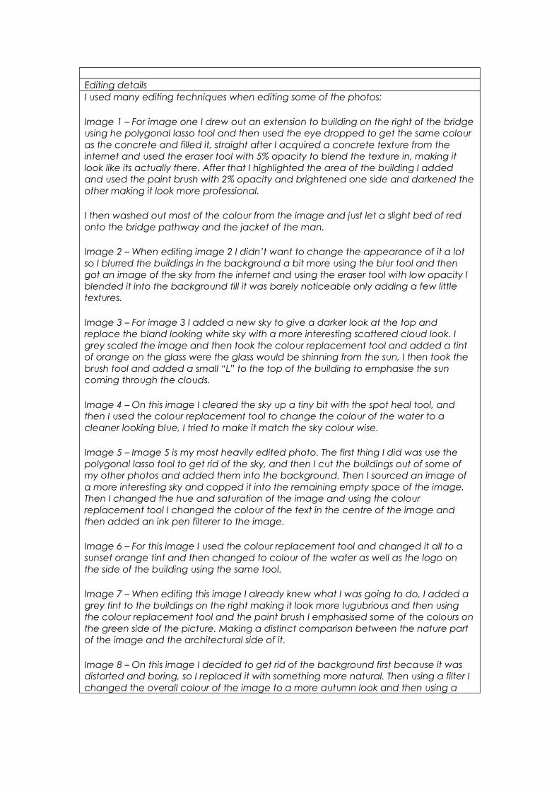
Editing detailsI used many editing techniques when editing some of the photos:
Image 1 – For image one I drew out an extension to building on the right of the bridge using he polygonal lasso tool and then used the eye dropped to get the same colour as the concrete and filled it, straight after I acquired a concrete texture from the internet and used the eraser tool with 5% opacity to blend the texture in, making it look like its actually there. After that I highlighted the area of the building I added and used the paint brush with 2% opacity and brightened one side and darkened the other making it look more professional.
I then washed out most of the colour from the image and just let a slight bed of red onto the bridge pathway and the jacket of the man.
Image 2 – When editing image 2 I didn’t want to change the appearance of it a lot so I blurred the buildings in the background a bit more using the blur tool and then got an image of the sky from the internet and using the eraser tool with low opacity I blended it into the background till it was barely noticeable only adding a few little textures.
Image 3 – For image 3 I added a new sky to give a darker look at the top and replace the bland looking white sky with a more interesting scattered cloud look. I grey scaled the image and then took the colour replacement tool and added a tint of orange on the glass were the glass would be shinning from the sun, I then took the brush tool and added a small “L” to the top of the building to emphasise the sun coming through the clouds.
Image 4 – On this image I cleared the sky up a tiny bit with the spot heal tool, and then I used the colour replacement tool to change the colour of the water to a cleaner looking blue, I tried to make it match the sky colour wise.
Image 5 – Image 5 is my most heavily edited photo. The first thing I did was use the polygonal lasso tool to get rid of the sky, and then I cut the buildings out of some of my other photos and added them into the background. Then I sourced an image of a more interesting sky and copped it into the remaining empty space of the image. Then I changed the hue and saturation of the image and using the colour replacement tool I changed the colour of the text in the centre of the image and then added an ink pen filterer to the image.
Image 6 – For this image I used the colour replacement tool and changed it all to a sunset orange tint and then changed to colour of the water as well as the logo on the side of the building using the same tool.
Image 7 – When editing this image I already knew what I was going to do, I added a grey tint to the buildings on the right making it look more lugubrious and then using the colour replacement tool and the paint brush I emphasised some of the colours on the green side of the picture. Making a distinct comparison between the nature part of the image and the architectural side of it.
Image 8 – On this image I decided to get rid of the background first because it was distorted and boring, so I replaced it with something more natural. Then using a filter I changed the overall colour of the image to a more autumn look and then using a
filter gave it a more abstract look.
Image 9 – With image 9 I wanted to keep the metal look of the building prominent so I used a contrast filter and changed the image to a grey washed out look and then using the brush tool with low opacity I added an orange tint to both lights.
Image 10 - Finally image 10, I didn’t want to edit this picture to much because I liked the way it looked, but I wanted to try and give it a vintage look so I used the poster edge filter with very thin lines.
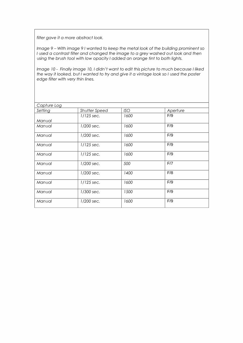
Capture LogSetting Shutter Speed ISO Aperture
Manual1/125 sec. 1600 F/9
Manual 1/200 sec. 1600 F/9
Manual 1/200 sec. 1600 F/9
Manual 1/125 sec. 1600 F/9
Manual 1/125 sec. 1600 F/9
Manual 1/200 sec. 500 F/7
Manual 1/200 sec. 1400 F/8
Manual 1/125 sec. 1600 F/9
Manual 1/300 sec. 1500 F/9
Manual 1/200 sec. 1600 F/9