Table of Contents - The Map Kiwi · The IML (ImageJ Macro Language) is used to create automated...
24
Page 1
Transcript of Table of Contents - The Map Kiwi · The IML (ImageJ Macro Language) is used to create automated...

Page 1

Page 2
Table of Contents
Introduction to ArcGIS Desktop and Map Projections 3
- Organization of GIS data
- Projecting and re-projecting data
- Creating simple map layouts
Aerial Photos, Feature Capturing and Digitizing 8
- Geo-referencing a layer
- Feature Capture and Digitalizing
- Adding Feature Attributes
Map Layouts and Cartographic Elements 10
- Symbolizing data and using Labels
- Using cartographic elements
Introductory Image Processing using ImageJ 13
- Using the ImageJ Macro Language to automate tasks
- Using image processing filters
Spatial Analyst 14
- Creating a hillshade
- Creating a model using Model Builder
- Reclassification and weighting values
Network Analyst 18
- Finding the shortest route
- Finding the closest facility
- Creating service areas
Viewshed Analysis and Visualization 21
- Viewshed Analysis
- 3D Visualization
GPS to GIS 23
- Using a GPS Unit
- Post processing GPS data using Differential Correction
REFERENCES 24

Page 3
Introduction to ArcGIS Desktop and Map
Projections (Lab 1)
Organization of GIS data
GIS data should be well organized by doing the following:
All relevant files for a project are in one folder, ArcCatalog or the Catalog window is used
to manage in project data, and relative paths are used by default in ArcGIS. This allows
the GIS project to be moved as a coherent whole by preserving the paths between data.
All file names are alphanumeric with no special characters. This minimizes errors that
may result when other programs or operating systems use the file.
Managing data correctly is a very important skill, because it affects the entire workflow of a
Figure 2: The catalog view in ArcMap with data organized correctly by project
Figure 1: The Data Frame properties allow the user to select a different projection to display their data with.

Page 4
GIS project. A well-organized project with easily accessible data saves time in the long run,
and makes it easier for others to find their way around your work.
Projecting and Re-Projecting Data
Projections are ways of representing the planet’s 3D globe surface on a flat 2D surface. In
ArcMap, projection of data in the current data frame is changed within the Data Frame
properties (Figure 2).
As different projections each favour preserving different aspects of the Earth’s surface (such
as distance, angle and direction), the one chosen will affect the way that your data is displayed
on a flat medium. For this reason, choosing the correct projection is a vitally important skill.
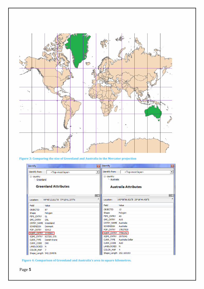
An example for why this is the case is seen when projecting the world using Mercator (Figure
3). Greenland appears to be much larger than Australia, however when comparing them by
square kilometre, Australia is actually the larger land mass (Figure 4).
Page 5
Figure 3: Comparing the size of Greenland and Australia in the Mercator projection
Figure 4: Comparison of Greenland and Australia's area in square kilometres.

Page 6
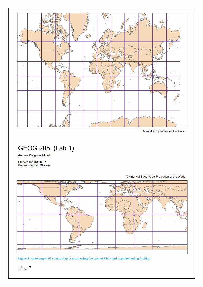
Creating Basic Map layouts
The layout view in ArcMap is used to create map layouts that incorporate the data that was
worked with in the Data view, and incorporates cartographic elements such as titles, legends,
scale bars and more. The way a map is presented is important, as it needs to effectively
communicate spatial information to the map user. In this example (Figure 5), the map is
simple, but communicates effectively how two types of projections differ from one another.
Page 7
Figure 5: An example of a basic map created using the Layout View and exported using ArcMap

Page 8
Aerial Photos, Feature Capture and Digitizing
(Lab 2)
Geo-referencing a Layer
Images that come from scanning paper maps and taking photographs need to be geo-
referenced before they can be used within a Geographic Information system, as the images
contain no spatial location (existing only in image space). Geo-referencing uses a series of
points on the image that match up to known spatial coordinates used in the chosen coordinate
system, to allow every other point in the image to have a spatial location. It is important to be
able to do this, as aerial photography is widely used in improving the usefulness of a GIS
(Land Trust GIS, 2011). Figure 6 below shows how many of the buildings in the image now
have a spatial location that can be used in a GIS.
Figure 6: An aerial photograph geo-referenced using the road grid (afterwards surrounded with a satellite imagery base map for comparison)

Page 9
Feature Capture and Digitalizing
Digitalization is used to capture features from one format (such as raster data) into
another using polygons (stored as vector data), often using a digitizer such as a pen or a
mouse. This process is essential when working with scanned maps or aerial imagery, as
features such as buildings can’t be recognized as separate entities from the surrounding
image by software.
Adding Feature Attributes
Once a feature is digitized, it has a table of attributes associated with it that describes the
feature both spatially and non-spatially. This is important for attaching various quantities
and qualities to features, such as property values, species of tree in a forest, or the rank of
popularity a feature holds (Heywood, Cornelius, & Carver, 2011); attributes are especially
useful part of the analysis process in a GIS. Figure 7 shows how different polygons are able to
show different allocations of a car parking area to different groups of people.
Figure 7: An example of a car park digitized from a raster aerial photo to a vector polygon. These were then sliced to form multiple areas each with their own individual car park allocation attributes.

Page 10
Map Layouts and Cartographic Elements (Lab 3)
Symbolizing Data and using Labels
Symbolization changes how data is represented on a map through the use of colour, size,
texture or shape. It is important to know how specific data should be symbolized, as it
directly influences the map user’s understanding of the map. If a feature (like a river) is blue
in the real world, it should henceforth reflect this on map; this enables near instant
recognition of the map’s features by the person using the map (Heywood et al., 2011) and
allows information to be communicated effectively. Symbolizing data incorrectly by using
inappropriate colours can make the map less readable and confusing for the user. Labels are
used to identify features individually; for example, the cities in Figure 8 below. It is
important to only label features selectively by importance. Labelling too many features in one
area will reduce the map’s readability.
Figure 8: A map of France and bordering countries. Each country is assigned a slightly different colour to differentiate political boundaries, and the capital cities of these countries have been symbolized with a star to differentiate them from normal cities.

Page 11
Using Cartographic Elements
A map presented in its final form requires the use of Cartographic elements such as a title,
legend, scale, north arrow and more that assist the map user in interpreting and
understanding the map in the correct way. As with symbolism, ensuring the map serves the
purpose of communicating the necessary ideas in a clear and concise manner is a very
important skill (Cote, 2008); cartographic map elements such as a legend help the user to
identify symbols on the map and what they mean, and the use of a scale and north arrow helps
the user orientate themselves spatially with the map and its representation of the real world.
Lastly, a title concisely sums up the core purpose of the map.

Page 12
Figure 9: An example of a map with associated cartographic features such as a legend, north arrow, and scale.

Page 13
Introductory Image Processing using ImageJ
(Lab 4)
Using the ImageJ Macro Language to automate tasks
The IML (ImageJ Macro Language) is used to create automated tasks where image
adjustments can be carried out multiple times over multiple images in the form of macros.
Macros can be created, recorded, edited and shared using the ImageJ software, and can
automate just about anything the software does in the order that is required. Macros are an
important way of reducing the amount of time manually repeating tedious tasks and speed up
the GIS project workflow. Examples include applying contrast adjustments to multiple files,
arranging ImageJ windows in a useful way or applying multiple filters to one image.
Figure 10: Using a macro that duplicates an image, applies an adjustment to the duplicate, and presents it alongside a histogram and the original. The macro is also shown in the editor.
Page 14
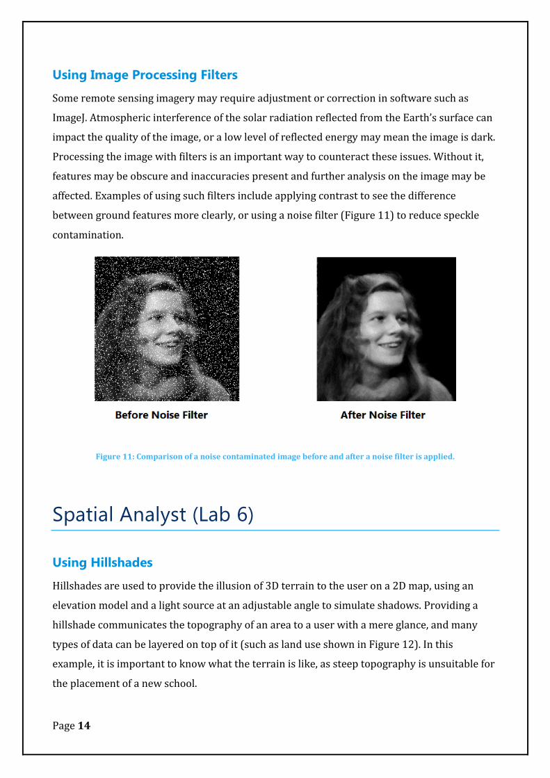
Using Image Processing Filters
Some remote sensing imagery may require adjustment or correction in software such as
ImageJ. Atmospheric interference of the solar radiation reflected from the Earth’s surface can
impact the quality of the image, or a low level of reflected energy may mean the image is dark.
Processing the image with filters is an important way to counteract these issues. Without it,
features may be obscure and inaccuracies present and further analysis on the image may be
affected. Examples of using such filters include applying contrast to see the difference
between ground features more clearly, or using a noise filter (Figure 11) to reduce speckle
contamination.
Figure 11: Comparison of a noise contaminated image before and after a noise filter is applied.
Spatial Analyst (Lab 6)
Using Hillshades
Hillshades are used to provide the illusion of 3D terrain to the user on a 2D map, using an
elevation model and a light source at an adjustable angle to simulate shadows. Providing a
hillshade communicates the topography of an area to a user with a mere glance, and many
types of data can be layered on top of it (such as land use shown in Figure 12). In this
example, it is important to know what the terrain is like, as steep topography is unsuitable for
the placement of a new school.

Page 15
Figure 12: A comparison of a land use map shown with and without a hillshade. It is easiest to see at a glance on the shaded map what locations are unsuitable, while the map without it provides little to no indication of terrain.
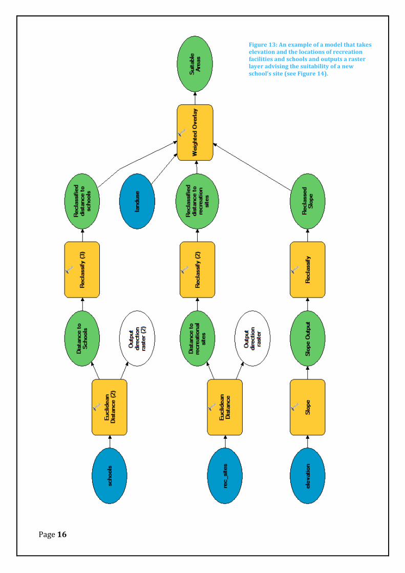
Creating a model using Model Builder
The Model Builder in ArcGIS is used to create visual workflows that string together a series of
geo-processing tasks, taking in inputs and producing raster outputs. Much like macros,
models provide an important way of carrying out a series of action in sequence, thereby
reducing the time it takes to carry out each process individually and for the project overall.
Models can range from a few inputs and outputs (such as in Figure 12) to powerful large scale
workflows using the same basic concepts.
Page 16
Figure 13: An example of a model that takes elevation and the locations of recreation facilities and schools and outputs a raster layer advising the suitability of a new school’s site (see Figure 14).

Page 17
Figure 14: A map displaying the areas suitable for constructing a new school in Stowe, Vermont (USA)
Reclassification and weighting of values
Reclassification and weighting is used to provide a common measurement for multiple sets of
data (in this example, elevation, land use, and distance from recreational facilities and schools
are used), and to put emphasis on particular datasets over others. Reclassification is
important as it allows each dataset to be directly compared, while weighting particular
datasets places the importance that is relevant in the real world. In the example below,
distance from other schools is prioritized so that it has the most bearing on the suitability of a

Page 18
location, while locations such as lakes and wetlands are severely unsuitable, so are minimally
weighted.
Network Analyst (Lab 7)
Finding the shortest route
Figure 15: An example of finding the shortest route between a series of destinations, and the impact of a potential traffic accident on the route. Note that since San Francisco has a dense street grid, finding an alternate route makes little difference to the trip.
The Network analyst tool in ArcMap can be used to find the most efficient route between
destinations. It is important to know how to do this as the reality many companies and
individuals face today is that time is money. Choosing the most efficient route between
destinations allows people to get there faster and move on to another destination sooner than
they would have otherwise. A skill like this is especially useful for businesses involving
courier services or travelling salespersons, where taking the most efficient route creates a
huge saving in cost over what it would be otherwise. It is also important to consider real

Page 19
world restrictions such as roads that are impassable due to a traffic accident or other event,
and how plausible alternative routes are when using network analysis to find a route.
Finding the closest Facility
Network analyst can also be used to find the closest facility to any given event or incident.
This is an extremely important, because if the incident is a fire, crime or accident, lives are at
stake, and emergency services need to find the closest appropriate facility from which to send
assistance from. When there is a large concentration of facilities in an area, it can be difficult
to choose the quickest route to any given location using conventional paper maps, which can
impede the haste required to respond to an emergency. Using network analysis, exact
directions can be given with the knowledge that the route is the fastest it can be.
Figure 16: Using Network Analyst to determine the closest fire station to a fire incident. Note at first glance, the fire stations appear to roughly be the same distance, however analysis reveals that Fire Station 39 is the closest.

Page 20
Creating Service Areas
Service Areas are used to determine what areas can be reached within a certain time from a
particular location. They are an important way of determining how far people may need to
travel to reach a business or service, as distance decay reduces the interaction that potential
customers may have with the business the further they have to travel (Heywood et al., 2011).
If the time taken is too great, the business may consider opening up new outlets to reduce the
time taken. Similarly, retail outlets need to within a close distance of a distribution warehouse
so that goods can quickly be restocked (see Figure 17).
Figure 17: An example of using Network Analysis to determine the area that can be covered in 3, 5 and 10 minutes. This determines if distribution warehouses are suitably placed to provide for nearby retail outlets.

Page 21
Viewshed Analysis and Visualization (Lab 8)
Viewshed Analysis
A Viewshed is the area that can be viewed from any given point in the landscape. Viewshed
maps use a digital elevation model, combined with a viewing point (or line). During the
planning process for new developments such as wind farms or a new subdivision, it is
important to consider the visual impact that it could have on nearby residents, as property
prices could be affected.
Figure 18: A Viewshed analysis detailing areas where Viewshed is gained or lost after a proposed subdivision is built.

Page 22
3D Visualization
Using a digital elevation model (DEM), 2D data can be visualized on a 3D terrain. This is an
important way of visualizing and communicating data to a wider audience, (such as those that
may be affected by the proposed suburb development, as shown in Figures 18 and 19) as it
allows a closer representation of the real world with which the viewer can relate.
Figure 19: A 3D visualization of a proposed suburb development in the Port Hills, from the south.
Figure 20: Same as Figure 19, viewed from the north.
Page 23
GPS to GIS (Lab 10)
Using a GPS Unit
A GPS unit is a handheld device capable of receiving and recording the user’s position through
a series of orbiting satellites, and the creation of waypoints and routes that can be imported
into a GIS. Collecting field data using GPS is a very common occurrence when there is data
required for a GIS that cannot be obtained elsewhere (Chivers, 2003), and the practice is
favoured over analogue data recording as the data stays digital throughout the whole GIS
process (Heywood et al., 2011).
Because of this, it is therefore it is important to have a solid grasp of how a GPS devices
functions. When collecting field data, it is also important to consider that GPS devices require
a clear view of the sky in order to obtain a location and nearby buildings and trees may
prevent the GPS from receiving a signal from orbiting satellites.
Post processing GPS data using Differential Correction
Atmospheric conditions have the potential to affect the quality of the GPS readings, and
differential correction may be required to enhance its quality; this involves comparing the
field data with a nearby base station whose location is precisely known and making necessary
adjustments. Correcting inaccuracies is an important skill, as the quality of a GIS overall
heavily relies on the quality of the data that is used within it, and any analysis and conclusions
drawn from it will also be affected.

Page 24
References:
Chivers, M. (2003). Differential GPS Explained Retrieved 10th October, 2012, from http://www.esri.com/news/arcuser/0103/differential1of2.html
Cote, P. (2008). Effective Cartography: Elements of Cartographic Style Retrieved 10th
October, 2012, from http://www.gsd.harvard.edu/gis/manual/style/ Heywood, I., Cornelius, S., & Carver, S. (2011). An Introduction to Geographical
Information Systems (Fourth ed.). England: Prentice Hall. Land Trust GIS. (2011). Use Aerial or Satellite Imagery Retrieved 9 October, 2012, from
http://landtrustgis.org/technology/advanced/imagery