Subject: Science, Math, History, Arts, Graphic Design Simple Data Visualization...
5
Lesson Plan Timing: 50 minutes Age Level: 9-Post-Secondary Subject: Science, Math, History, Arts, Graphic Design Simple Data Visualization with Adobe® Illustrator® In this lesson, students learn how to create graphs in Adobe® Illustrator®. Then, participants work independently to create a graph that tells and story and which can be used in a variety of different contexts. Lesson Objectives By the end of this lesson, students will be able to: • Define “data visualization” • List types of data visualizations • Use the “Graph” tool in Adobe® Illustrator® to create a simple data visualization • Explore how Adobe® Illustrator® tools can be used to customize data visulaizations Lesson Outline • Motivation: Data Visualizations (10 minutes) • Direct Instruction: Using Adobe IIllustrator to create a data visualization (15 minutes) • Guided Practice (20 minutes) • Summary (5 mintues) Materials Needed • Computers with Adobe® Illustrator® installed (1 per participant) • OPTIONAL: Access to the internet to stream an Illustrator tutorial video Advance Preparation • Review the basics of data visualization and learn how to create graphs and charts in Adobe Illustrator using the professional development resources on the Adobe Education Exchange: edex.adobe.com/ professional-development • In the lesson plan example that follows, a social studies class is covering the American Civil War. The sample data set used highlights differences in casualties for the two sides. Find a data set that’s relevant to the unit you’re currently teaching in your subject area. • Practice creating a simple graph, and using features in Adobe Illustrator to improve it. Sample Data Set: Civil War Unit American Civil War Casualties Union Casualties Confederate Casualties Bale Deaths 110,100 94,000 Diseases 224,580 164,000 Wounded in Action 275,174 194,026 Died in Prison 30,218 25,976 Total Casualties 642,427 483,026 Mortality Rate 15.5% 12% Source: National Park Service. Available: hp://www.nps.gov/civilwar/ facts.htm
Transcript of Subject: Science, Math, History, Arts, Graphic Design Simple Data Visualization...

Lesson Plan
Timing: 50 minutes
Age Level: 9-Post-Secondary
Subject: Science, Math, History, Arts, Graphic Design
Simple Data Visualization with Adobe® Illustrator®
In this lesson, students learn how to create graphs in Adobe® Illustrator®. Then, participants work independently to create a graph that tells and story and which can be used in a variety of different contexts.
Lesson Objectives
By the end of this lesson, students will be able to:
• Defi ne “data visualization”
• List types of data visualizations
• Use the “Graph” tool in Adobe® Illustrator® to create a simple data visualization
• Explore how Adobe® Illustrator® tools can be used to customize data visulaizations
Lesson Outline
• Motivation: Data Visualizations (10 minutes)
• Direct Instruction: Using Adobe IIllustrator to create a data visualization (15 minutes)
• Guided Practice (20 minutes)
• Summary (5 mintues)
Materials Needed
• Computers with Adobe® Illustrator® installed (1 per participant)
• OPTIONAL: Access to the internet to stream an Illustrator tutorial video
Advance Preparation
• Review the basics of data visualization and learn how to create graphs and charts in Adobe Illustrator using the professional development resources on the Adobe Education Exchange: edex.adobe.com/professional-development
• In the lesson plan example that follows, a social studies class is covering the American Civil War. The sample data set used highlights differences in casualties for the two sides. Find a data set that’s relevant to the unit you’re currently teaching in your subject area.
• Practice creating a simple graph, and using features in Adobe Illustrator to improve it.
Sample Data Set: Civil War Unit
American Civil War Casualties
Union Casualties Confederate Casualties
Batt le Deaths 110,100 94,000
Diseases 224,580 164,000
Wounded in Action 275,174 194,026
Died in Prison 30,218 25,976
Total Casualties 642,427 483,026
Mortality Rate 15.5% 12%
Source: National Park Service. Available: htt p://www.nps.gov/civilwar/facts.htm

2Simple Data Visualization with Adobe Illustrator Lesson Plan
Lesson Procedure
Motivation: Data Visualization (10 minutes)1. Ask students to stand up.
• Say: We’re going to do a quick activity to give you an idea of the impact of the American Civil War on the Union and on the Confederacy.
2. Instruct 15% of the class to sit down.
• Say: During the American Civil War, the Union experienced a 15% mortality rate. Th at means that 15% of the total number of Union soldiers died are were injured during the course of the war. Look around you; if you were a member of the Union army, you would have experienced 15% of your fellow soldiers being wounded or killed.
3. Ask everyone to stand up again, and then ask another 12.2% of the class to sit down.
• Say: Th e Confederate army, meanwhile, had a mortality rate of 12.2%. Again, look around you. Imagine what it would have been like to lose so many friends and fellow soldiers.
4. Explain to students that by standing and sitt ing, you’ve just created a data visualization. Defi ne data visualization as a way to show, through images or pictures, what is meant by a set of numbers or statistics.
5. Ask students: what are some other ways you might “visualize” data? Students should mention graphs and charts.
6. Let students know that, today, they’re going to be creat-ing a data visualization in Adobe Illustrator.
Direct Instruction: Using Adobe® Illustrator® to create a custom graph (15 minutes)Demonstrate how to use Adobe® Illustrator® to create and
customize a graph.
Show How To:1. Create a new document
a. Select “File > New”
b. Choose a default profi le and size, or create a custom size.
Note: Th e profi le you choose will create a set of defaults that will maximize the quality of your image when you are ready to publish. You can edit the defaults by clicking on “Advanced” at the bott om of the dialog box.
Differentiation Suggestion:If your students are already familiar with the concept of data visualization, lead this brief activity to push their thinking further.
“It Doesn’t Matter How You Present It...” (5 minutes)
1. Screen the Verizon 4G LTE “Easy Choice 2.0” Commercial available here: htt p://youtu.be/P3SG8VkE6yA
• Ask students: when is it true that “it doesn’t matt er how you present it…”?
• Say: With really compelling data, it might not matt er how you present it. But in most cases, the messages we want our audience to draw from our data is a bit more subtle.
• Say: Let’s imagine I’ve done some research and collected the following data.
Facilitation Tip: Use the data set provided in the lesson plan, or your own data set related to classroom content.
• Show a plain graph created in Excel with the data set.
• Say: Th is graph is a data visualization, and it does the job of communicating my data. But what if I want to communiate a story with my data, so that I know my audience will walk away with a particular understanding or impression about this information. Let’s look at how I can use Adobe Illustrator to create a much more compelling and clear graph in just a few easy steps.

3Simple Data Visualization with Adobe Illustrator Lesson Plan
2. Create a simple graph or chart
a. Click and hold your mouse over the Graph Tool to select the type of graph or chart you want to create
b. Drag over the art board to defi ne the bounding box for your graph or chart
c. Release the mouse to create a blank graph
d. In the dialog box that opens, enter your data manually or import
e. Click the check mark to update the graph as you make changes
3. Customize your graph or chart
a. Use the Selection Tool to reposition your graph
b. Use the Group Selection Tool edit the properties of an entire data set (such as changing the color, fi ll and stroke)
c. Use the Direct Selection Tool to edit the properties of individual parts of the graph (such as reducing the Opacity of projected values on a graph)
d. Add and style titles and text
e. Add Eff ects like “Drop Shadow” to add depth
f. Right click on the graph to customize graph type sett ings like the width of columns or distance between them4. Publish your graph or chart
a. Save your work as an Illustrator fi le (.ai)
b. Save as an .eps or .pdf to export your graph to other Creative Suite products
c. Save as a .gif or .jpg to export your graph to Microsoft Offi ce or the web
d. Brush over the areas you want to improve
Note: Be sure to turn off Transparency. You will no longer be able to edit the graph or the data when publishing to .gif or .jpg
Guided Practice (20 minutes)1. Explain the directions for the remainder of the session:
Say: Now that you know how to use Adobe Illustrator create and customize a graph, we’re going to actually roll up our sleeves and get started on our own projects.
• Explain how students can refer to the technical guides, online step-by-step videos, ask their neighbors or call me over to help during the working session.
2. Support students as they begin their own projects using the civil war data set.
Differentiation Instruction:Rather than doing a live demo in Illustrator, consider challenging participants to watch this video and then try to create their own graphs. http://tv.adobe.com/watch/adobe-for-academics/make-a-custom-scatter-graph/

4
Summary (5 minutes)1. Facilitate a “Turn and Talk”:
• Ask students to pair up with someone near them.
• Explain the directions:
• Quickly decide who will be the designer and who will be the viewer for Round 1.
• The designer will show the viewer their graph without speaking.
• The viewer will try to guess the story the designer was trying to convey with the design of the graph, based on what they see on the screen only.
• The designer may then respond to the viewer’s assumptions.
• The viewer can give feedback on how to improve the visual design so that the graph better tells the story that the designer intends to tell.
• Switch roles for Round 2, so that both partners give and receive feedback.
• Debrief the activity:
• Ask: What did you learn from hearing how your graph was interpreted by an outside viewer? What would you do differently next time? When might you use your graphing skills again?
For more informationVisit the Adobe Education Exchange to download this and other resources for use in your classroom:
edex.adobe.com
Adobe Systems Incorporated 345 Park Avenue San Jose, CA 95110-2704 USA www.adobe.com
Adobe and the Adobe logoare either registered trademarks or trademarks of Adobe Systems Incorporated in the United States and/or other countries. All other trademarks are the property of their respective owners.
© 2013 Adobe Systems Incorporated. All rights reserved.
4. Publish your graph or charta. Save your work as an Illustrator fi le (.ai)
b. Save as an .eps or .pdf to export your graph to other Creative Suite products
c. Save as a .gif or .jpg to export your graph to Microsoft Offi ce or the web
d. Brush over the areas you want to improve
Note: Be sure to turn off Transparency. You will no longer be able to edit the graph or the data when publishing to .gif or .jpg
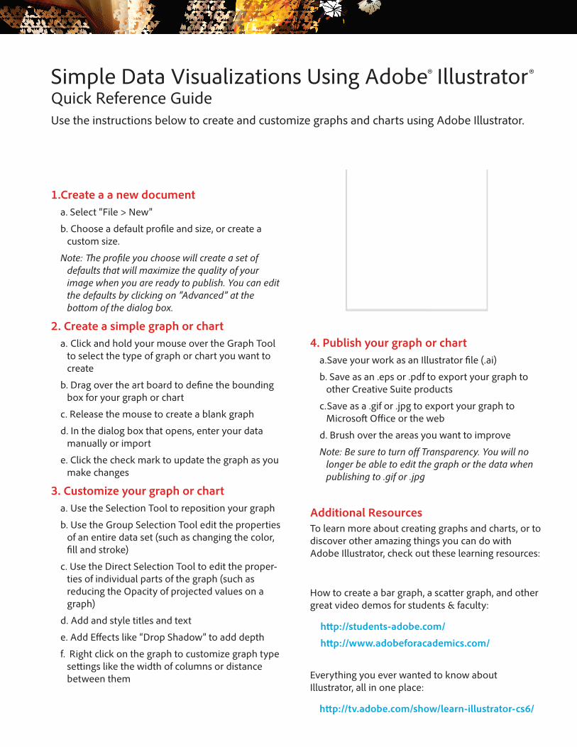
Simple Data Visualizations Using Adobe® Illustrator®Quick Reference GuideUse the instructions below to create and customize graphs and charts using Adobe Illustrator.
1.Create a a new documenta. Select “File > New”
b. Choose a default profi le and size, or create a custom size.
Note: Th e profi le you choose will create a set of defaults that will maximize the quality of your image when you are ready to publish. You can edit the defaults by clicking on “Advanced” at the bott om of the dialog box.
2. Create a simple graph or charta. Click and hold your mouse over the Graph Tool
to select the type of graph or chart you want to create
b. Drag over the art board to defi ne the bounding box for your graph or chart
c. Release the mouse to create a blank graph
d. In the dialog box that opens, enter your data manually or import
e. Click the check mark to update the graph as you make changes
3. Customize your graph or charta. Use the Selection Tool to reposition your graph
b. Use the Group Selection Tool edit the properties of an entire data set (such as changing the color, fi ll and stroke)
c. Use the Direct Selection Tool to edit the proper-ties of individual parts of the graph (such as reducing the Opacity of projected values on a graph)
d. Add and style titles and text
e. Add Eff ects like “Drop Shadow” to add depth
f. Right click on the graph to customize graph type sett ings like the width of columns or distance between them
Additional ResourcesTo learn more about creating graphs and charts, or to discover other amazing things you can do with Adobe Illustrator, check out these learning resources:
How to create a bar graph, a scatter graph, and other great video demos for students & faculty:
htt p://students-adobe.com/
htt p://www.adobeforacademics.com/
Everything you ever wanted to know about Illustrator, all in one place:
htt p://tv.adobe.com/show/learn-illustrator-cs6/