
Presentacindefinitivachileslideshare 13351962737836-phpapp01-120423105244-phpapp01
Upload
anjali-naiduCategory
view
217download
0
7/27/2019 stats12-100202074136-phpapp01
http://slidepdf.com/reader/full/stats12-100202074136-phpapp01 1/36
LESSON – 1
STATISTICS FOR MANAGEMENT
Session – 1 Duration: 1 hr
Meaning of Statistics
The term statistics mean that the numerical statement as well as statistical
methodology. When it is used in the sense of statistical data it refers to quantitative
aspects of things and is a numerical description.
Example: Income of family, production of automobile industry, sales of cars etc.
These quantities are numerical. But there are some quantities, which are not in
themselves numerical but can be made so by counting. The sex of a baby is not a
number, but by counting the number of boys, we can associate a numerical
description to sex of all newborn babies, for an example, when saying that 60% of all
live-born babies are boy. This information then, comes within the realm of statistics.
Definition
The word statistics can be used is two senses, viz, singular and plural. In
narrow sense and plural sense, statistics denotes some numerical data (statistical data).
In a wide and singular sense statistics refers to the statistical methods. Therefore,
these have been grouped under two heads – ‘Statistics as a data” and “Statistics as a
methods”.
Statistics as a Data
Some definitions of statistics as a data area) Statistics are numerical statement of facts in any department of enquiring placed
in relation to each other.
- Powley
b) By statistics we mean quantities data affected to a marked extent by multiple of
causes.
- Yule and Kendall
c) By statistics we mean aggregates of facts affected to a marked extent by
multiplicity of causes, numerically expressed, enumerated or estimated according
to reasonable standard of accuracy, collected in a systematic manner for pre-determined purpose and placed in relation to each other.
- H. Secrist
This definition is more comprehensive and exhaustive. It shows light on
characteristics of statistics and covers different aspects.
1

7/27/2019 stats12-100202074136-phpapp01
http://slidepdf.com/reader/full/stats12-100202074136-phpapp01 2/36
Some characteristics the statistics should possess by H. Secrist can be listed as
follows.
Statistics are aggregate of facts
Statistics are affected to a marked extent by multiplicity of causes.
Statistics are numerically expressed
Statistics should be enumerated / estimated
Statistics should be collected with reasonable standard of accuracy
Statistics should be placed is relation to each other.
Statistics as a method
Definition
a) “Statistics may be called to science of counting”
- A.L. Bowley
b) “Statistics is the science of estimates and probabilities”.
- Boddington
c) Dr. Croxton and Cowden have given a clear and concise definition.
“Statistics may be defined as the collection, presentation, analysis and
interpretation of numerical data”.
According to Croxton and Cowden there are 4 stages.
a) Collection of Data
A structure of statistical investigation is based on a systematic collection of
data. The data is classified into two groups
i) Internal data and
ii) External data
Internal data are obtained from internal records related to operations of
business organisation such as production, source of income and expenditure,
inventory, purchases and accounts.
The external data are collected and purchased by external agencies. The
external data could be either primary data or secondary data. The primary data are
collected for first time and original, while secondary data are collected by published
by some agencies.
b) Organisations of data
The collected data is a large mass of figures that needs to be organised. The
collected data must be edited to rectify for any omissions, irrelevant answers, and
wrong computations. The edited data must be classified and tabulated to suit further
analysis.
2

7/27/2019 stats12-100202074136-phpapp01
http://slidepdf.com/reader/full/stats12-100202074136-phpapp01 3/36
c) Presentation of data
The large data that are collected cannot be understand and analysis easily and
quickly. Therefore, collected data needs to be presented in tabular or graphic form.
This systematic order and graphical presentation helps for further analysis.d) Analysis of data
The analysis requires establishing the relationship between one or more
variables. Analysis of data includes condensation, abstracting, summarization,
conclusion etc. With the help of statistical tools and techniques like measures of
dispersion central tendency, correlation, variance analysis etc analysis can be done.
e) Interpretation of data
The interpretation requires deep insight of the subject. Interpretation involves
drawing the valid conclusions on the bases of the analysis of data. This work requires
good experience and skill. This process is very important as conclusions of results aredone based on interpretation.
We can define statistics as per Seligman as follows.
“Statistics is a science which deals with the method and of collecting,
classifying, presenting, comparing and interpreting the numerical data collected
to throw light on enquiry”.
Importance of statistics
In today’s context statistics is indispensable. As the use of statistics is
extended to various field of experiments to draw valid conclusions, it is foundincreased importance and usage. The number of research investigations in the field of
economics and commerce are largely statistical. Further, the importance and statistics
in various fields are listed as below.
a) State Affairs: In state affairs, statistics is useful in following ways
1. To collect the information and study the economic condition of people in the
states.
2. To asses the resources available in states.
3. To help state to take decision on accepting or rejecting its policy based on
statistics.
4. To provide information and analysis on various factors of state like wealth,
crimes, agriculture experts, education etc.
b) Economics: In economics, statistics is useful in following ways
1. Helps in formulation of economic laws and policies
2. Helps in studying economic problems
3. Helps in compiling the national income accounts.
4. Helps in economic planning.
3

7/27/2019 stats12-100202074136-phpapp01
http://slidepdf.com/reader/full/stats12-100202074136-phpapp01 4/36
c) Business
1. Helps to take decisions on location and size
2. Helps to study demand and supply
3. Helps in forecasting and planning
4. Helps controlling the quality of the product or process
5. Helps in making marketing decisions
6. Helps for production, planning and inventory management.
7. Helps in business risk analysis
8. Helps in resource long-term requirements, in estimating consumer’s
preference and helps in business research.
d) Education: Statistics is necessary to formulate the polices regarding start of newcourses, consideration of facilities available for proposed courses.
e) Accounts and Audits:
1. Helps to study the correlation between profits and dividends enable to know
trend of future profits.
2. In auditing sampling techniques are followed.
Functions of statistics
Some important functions of statistics are as follows
1. To collect and present facts in a systematic manner.2. Helps in formulation and testing of hypothesis.
3. Helps in facilitating the comparison of data.
4. Helps in predicting future trends.
5. Helps to find the relationship between variable.
6. Simplifies the mass of complex data.
7. Help to formulate polices.
8. Helps Government to take decisions.
Limitations of statistics
1. Does not study qualitative phenomenon.
2. Does not deal with individual items.
3. Statistical results are true only on an average.
4. Statistical data should be uniform and homogeneous.
5. A statistical result depends on the accuracy of data.
6. Statistical conclusions are not universally true.
4

7/27/2019 stats12-100202074136-phpapp01
http://slidepdf.com/reader/full/stats12-100202074136-phpapp01 5/36
7. Statistical results can be interpreted only if person has sound knowledge of
statistics.
Distrust of Statistics
Distrust of statistics is due to lack of knowledge and limitations of its uses, but
not due to statistical sciences.
Distrust of statistics is due to following reasons.
a) Figures are manipulated or incomplete.
b) Quoting figures without their context.
c) Inconsistent definitions.
d) Selection of non-representative statistical units.
e) Inappropriate comparison
f) Wrong inference drawn.
g) Errors in data collection.
Statistical Data
Statistical investigation is a long and comprehensive process and requires
systematic collection of data in large size. The validity and accuracy of the
conclusion or results of the study depends upon how well the data were gathered.
The quality of data will greatly influence the conclusions of the study and hence
importance is to be given to the data collection process.
Statistical data may be classified as Primary Data and Secondary Data basedon the sources of data collection.
♦ Primary data
Primary data are those which are collected for the first time by the investigator
/ researchers and are thus original in character. Thus, data collected by investigator
may be for the specific purpose / study at hand. Primary data are usually in the shape
of raw materials to which statistical methods are applied for the purpose of analysis
and interpretation.
♦ Secondary data
Secondary have been already collected for the purpose other than the problem
at hand. These data are those which have already been collected by some other
persons and which have passed through the statistical analysis at least once.
Secondary data are usually in the shape of finished products since they have been
already treated statistically in one or the other form. After statistical treatment the
primary data lose their original shape and becomes secondary data. Secondary data of
one organisation become the primary data of other organisation who first collect and
publish them.
5

7/27/2019 stats12-100202074136-phpapp01
http://slidepdf.com/reader/full/stats12-100202074136-phpapp01 6/36
Primary Vs Secondary Data
Researcher originates primary data for specific purpose / study at hand whilesecondary data have already been collected for purpose other than research
work at hand.
Primary data collection requires considerably more time, relatively expensive.
While the secondary data are easily accessible, inexpensive and quickly
obtained.
Table – A compression of Primary and Secondary Data
Primary data Secondary data
Collection purpose For the problem at hand For other problems
Collection process Very involved Rapid and easy
Collection cost High Relatively low
Collection time Long Short
Suitability Its suitability is positive It may or may not suit the
object of survey
Originality It is original It is not original
Precautions No extra precautions
required to use the data
It should be used with
extra case
Limitations of secondary data
a) Since secondary data is collected for ‘some other purpose, its usefulness to
current problem may be limited in several important ways, including
relevancies and accuracy.
b) The objectives, nature and methods used to collect secondary data may not be
appropriate to present situation.
c) The secondary data may not be accurate, or they may not be completely
current or dependable.
Criteria for evaluating secondary data
Before using the secondary data it is important to evaluate them on following
factors
a) Specification and methodology used to collect the data
b) Error and accuracy of data.
c) The currency
d) The objective – The purpose for which data were collectede) The nature – content of data
6

7/27/2019 stats12-100202074136-phpapp01
http://slidepdf.com/reader/full/stats12-100202074136-phpapp01 7/36
f) The dependability
Sources of data
Primary source – The methods of collecting primary data.
When data is neither internally available nor exists as a secondary source, then
the primary sources of data would be approximate.
The various method of collection of primary data are as follows
a) Direct personal investigation
- Interview
- Observation
b) Indirect or oral investigation
c) Information from local agents and correspondentsd) Mailed questionnaires and schedules
e) Through enumerations
Secondary source – The methods of collecting secondary data
i) Published Statistics
a) Official publications of Central Government
Ex : Central Statistical Organisation (CSO) – Ministry of planning
- National Sample Survey Organisation (NSSO)
- Office of the Registrar General and Census Committee – GOI
- Director of Statistics and Economics – Ministry of Agriculture
- Labour Bureau – Ministry of Labour etc.
ii) Publications of Semi-government organisation
Ex :
- The institute of foreign trade, New Delhi
- The institute of economic growth, New Delhi.
iii) Publication of research institutes
Ex :
- Indian Statistical Institute
- Indian Agriculture Statistical Institute
- NCRET Publications
- Indian Standards Institute etc.
iv) Publication of Business and Financial Institutions
Ex :
7
7/27/2019 stats12-100202074136-phpapp01
http://slidepdf.com/reader/full/stats12-100202074136-phpapp01 8/36
- Trade Association Publications like Sugar factory, Textile mill, Indian
chamber of Industry and Commerce.
- Stock exchange reports, Co-operative society reports etc.
v) News papers and periodicals
Ex :
- The Financial Express, Eastern Economics, Economic Times, Indian
Finance, etc.
vi) Reports of various committees and commissions
Ex :
- Kothari commission report on education
- Pay commission reports
- Land perform committee reports etc.
vii) Unpublished statistics
- Internal and administrative data like Periodical Loss, Profit, Sales,
Production Rate, Balance Sheet, Labour Turnover, Budges, etc.
8

7/27/2019 stats12-100202074136-phpapp01
http://slidepdf.com/reader/full/stats12-100202074136-phpapp01 9/36
LESSON – 1
STATISTICS FOR MANAGEMENT
Session – 2 Duration: 1 hr
Classification and Tabulation
The data collected for the purpose of a statistical inquiry some times consists
of a few fairly simple figures, which can be easily understood without any special
treatment. But more often there is an overwhelming mass of raw data without any
structure. Thus, unwieldy, unorganised and shapeless mass of collected is not capable
of being rapidly or easily associated or interpreted. Unorganised data are not fit for
further analysis and interpretation. In order to make the data simple and easily
understandable the first task is not condense and simplify them in such a way that
irrelevant data are removed and their significant features are stand out prominently.
The procedure adopted for this purpose is known as method of classification and
tabulation. Classification helps proper tabulation.
“Classified and arranged facts speak themselves; unarranged, unorganised
they are dead as mutton”.
- Prof. J.R. Hicks
♦ Meaning of Classification
Classification is a process of arranging things or data in groups or classes
according to their resemblances and affinities and gives expressions to the unity of
attributes that may subsit among a diversity of individuals.
♦ Definition of Classification
Classification is the process of arranging data into sequences and groups
according to their common characteristics or separating them into different but related
parts.
- Secrist
The process of grouping large number of individual facts and observations on
the basis of similarity among the items is called classification.
- Stockton & Clark
Characteristics of classification
a) Classification performs homogeneous grouping of data
b) It brings out points of similarity and dissimilarities.
c) The classification may be either real or imaginaryd) Classification is flexible to accommodate adjustments
9

7/27/2019 stats12-100202074136-phpapp01
http://slidepdf.com/reader/full/stats12-100202074136-phpapp01 10/36
Objectives / purposes of classifications
i) To simplify and condense the large data
ii) To present the facts to easily in understandable form
iii) To allow comparisons
iv) To help to draw valid inferences
v) To relate the variables among the data
vi) To help further analysis
vii)To eliminate unwanted data
viii) To prepare tabulation
Guiding principles (rules) of classifications
Following are the general guiding principles for good classifications
a) Exhaustive: Classification should be exhaustive. Each and every item
in data must belong to one of class. Introduction of residual class (i.e.
either, miscellaneous etc.) should be avoided.
b) Mutually exclusive: Each item should be placed at only one class
c) Suitability: The classification should confirm to object of inquiry.d) Stability: Only one principle must be maintained throughout the
classification and analysis.
e) Homogeneity: The items included in each class must be homogeneous.
f) Flexibility: A good classification should be flexible enough to
accommodate new situation or changed situations.
Modes / Types of Classification
Modes / Types of classification refers to the class categories into which thedata could be sorted out and tabulated. These categories depend on the nature of data
and purpose for which data is being sought.
Important types of classification
a) Geographical (i.e. on the basis of area or region wise)
b) Chronological (On the basis of Temporal / Historical, i.e. with respect to time)
c) Qualitative (on the basis of character / attributes)
d) Numerical, quantitative (on the basis of magnitude)
10

7/27/2019 stats12-100202074136-phpapp01
http://slidepdf.com/reader/full/stats12-100202074136-phpapp01 11/36
a) Geographical Classification
In geographical classification, the classification is based on the geographical
regions.
Ex : Sales of the company (In Million Rupees) (region – wise)
Region Sales
North 285
South 300
East 185
West 235
b) Chronological Classification
If the statistical data are classified according to the time of its occurrence, the
type of classification is called chronological classification.
Sales reported by a departmental store
MonthSales
(Rs.) in lakhs
January 22
February 26
March 32
April 25
May 27
June 30
c) Qualitative Classification
In qualitative classifications, the data are classified according to the presenceor absence of attributes in given units. Thus, the classification is based on some
quality characteristics / attributes.
Ex: Sex, Literacy, Education, Class grade etc.
Further, it may be classified as
a) Simple classification b) Manifold classification
i) Simple classification: If the classification is done into only two classes then
classification is known as simple classification.
Ex: a) Population in to Male / Female
b) Population into Educated / Uneducated
11

7/27/2019 stats12-100202074136-phpapp01
http://slidepdf.com/reader/full/stats12-100202074136-phpapp01 12/36
ii) Manifold classification: In this classification, the classification is based on
more than one attribute at a time.
Ex :
d) Quantitative Classification: In Quantitative classification, the classification is
based on quantitative measurements of some characteristics, such as age, marks,
income, production, sales etc. The quantitative phenomenon under study is
known as variable and hence this classification is also called as classification by
variable.
Ex :
For a 50 marks test, Marks obtained by students as classified as follows
Marks No. of students
0 – 10 5
10 – 20 7
20 – 30 10
30 – 40 25
40 – 50 3
Total Students = 50
In this classification marks obtained by students is variable and number of
students in each class represents the frequency.
Tabulation
Meaning and Definition of Tabulation
Tabulation may be defined, as systematic arrangement of data is column and
rows. It is designed to simplify presentation of data for the purpose of analysis andstatistical inferences.
Population
Smokers Non-smokers
Illiterate Literate
Male Female
Male Female
Literate Illiterate
Male Female
Male Female
12
7/27/2019 stats12-100202074136-phpapp01
http://slidepdf.com/reader/full/stats12-100202074136-phpapp01 13/36
Major Objectives of Tabulation
1. To simplify the complex data
2. To facilitate comparison
3. To economise the space
4. To draw valid inference / conclusions
5. To help for further analysis
Differences between Classification and Tabulation
1. First data are classified and presented in tables; classification is the basis for
tabulation.
2. Tabulation is a mechanical function of classification because is tabulationclassified data are placed in row and columns.
3. Classification is a process of statistical analysis while tabulation is a process of
presenting data is suitable structure.
Classification of tables
Classification is done based on
1. Coverage (Simple and complex table)
2. Objective / purpose (General purpose / Reference table / Special table or summary table)
3. Nature of inquiry (primary and derived table).
Ex:
a) Simple table: Data are classified based on only one characteristic
Distribution of marks
Class Marks No. of students
30 – 40 20
40 – 50 20
50 – 60 10
Total 50
13

7/27/2019 stats12-100202074136-phpapp01
http://slidepdf.com/reader/full/stats12-100202074136-phpapp01 14/36
b) Two-way table: Classification is based on two characteristics
Class MarksNo. of students
Boys Girls Total
30 – 40 10 10 20
40 – 50 15 5 20
50 – 60 3 7 10
Total 28 22 50
Frequency Distribution
Frequency distribution is a table used to organize the data. The left column
(called classes or groups) includes numerical intervals on a variable under study. Theright column contains the list of frequencies, or number of occurrences of each
class/group. Intervals are normally of equal size covering the sample observations
range.
It is simply a table in which the gathered data are grouped into classes and the
number of occurrences, which fall in each class, is recorded.
♦ Definition
A frequency distribution is a statistical table which shows the set of all distinct
values of the variable arranged in order of magnitude, either individually or in groups
with their corresponding frequencies.
- Croxton and Cowden
A frequency distribution can be classified as
a) Series of individual observation
b) Discrete frequency distribution
c) Continuous frequency distribution
a) Series of individual observation
Series of individual observation is a series where the items are listed one after
the each observation. For statistical calculations, these observation could be arranged
is either ascending or descending order. This is called as array.
14

7/27/2019 stats12-100202074136-phpapp01
http://slidepdf.com/reader/full/stats12-100202074136-phpapp01 15/36
Ex :
Roll No.
Marks obtained
in statistics
paper
1 83
2 80
3 75
4 92
5 65
The above data list is a raw data. The presentation of data in above formdoesn’t reveal any information. If the data is arranged in ascending / descending in
the order of their magnitude, which gives better presentation then, it is called arraying
of data.
Discrete (ungrouped) Frequency Distribution
If the data series are presented in such away that indicating its exact
measurement of units, then it is called as discrete frequency distribution. Discrete
variable is one where the variants differ from each other by definite amounts.
Ex :Assume that a survey has been made to know number of post-graduates in 10
families at random; the resulted raw data could be as follows.
0, 1, 3, 1, 0, 2, 2, 2, 2, 4
This data can be classified into an ungrouped frequency distribution. The
number of post-graduates becomes variable (x) for which we can list the frequency of
occurrence (f) in a tabular from as follows;
Number of post
graduates (x)
Frequency
(f)
0 2
1 2
2 4
3 1
4 1
The above example shows a discrete frequency distribution, where the
variable has discrete numerical values.
15

7/27/2019 stats12-100202074136-phpapp01
http://slidepdf.com/reader/full/stats12-100202074136-phpapp01 16/36
Continuous frequency distribution (grouped frequency distribution)
Continuous data series is one where the measurements are only
approximations and are expressed in class intervals within certain limits. In
continuous frequency distribution the class interval theoretically continuous from thestarting of the frequency distribution till the end without break. According to
Boddington ‘the variable which can take very intermediate value between the smallest
and largest value in the distribution is a continuous frequency distribution.
Ex :
Marks obtained by 20 students in students’ exam for 50 marks are as given
below – convert the data into continuous frequency distribution form.
18 23 28 29 44 28 48 33 32 43
24 29 32 39 49 42 27 33 28 29
By grouping the marks into class interval of 10 following frequency
distribution tables can be formed.
Marks No. of students
0 - 5 0
5 – 10 0
10 – 15 0
15 – 20 1
20 – 25 2
25 – 30 7
30 – 35 4
35 – 40 1
40 – 45 3
45 – 50 2
16

7/27/2019 stats12-100202074136-phpapp01
http://slidepdf.com/reader/full/stats12-100202074136-phpapp01 17/36
LESSON – 1
STATISTICS FOR MANAGEMENT
Session – 3 Duration: 1 hr
Technical terms used in formulation frequency distribution
a) Class limits:
The class limits are the smallest and largest values in the class.
Ex :
0 – 10, in this class, the lowest value is zero and highest value is 10. the two
boundaries of the class are called upper and lower limits of the class. Class limit is
also called as class boundaries.
b) Class intervals
The difference between upper and lower limit of class is known as class
interval.
Ex :
In the class 0 – 10, the class interval is (10 – 0) = 10.
The formula to find class interval is gives on below
R
SLi
−=
L = Largest value
S = Smallest value
R = the no. of classes
Ex :
If the mark of 60 students in a class varies between 40 and 100 and if we want
to form 6 classes, the class interval would be
I= (L-S ) / K =6
40100 −=
6
60= 10 L = 100
S = 40
K = 6
Therefore, class intervals would be 40 – 50, 50 – 60, 60 – 70, 70 – 80, 80 – 90
and 90 – 100.
♦ Methods of forming class-interval
a) Exclusive method (overlapping)
In this method, the upper limits of one class-interval are the lower limit of next
class. This method makes continuity of data.
17

7/27/2019 stats12-100202074136-phpapp01
http://slidepdf.com/reader/full/stats12-100202074136-phpapp01 18/36
Ex :
Marks No. of students
20 – 30 5
30 – 40 15
40 – 50 25
A student whose mark is between 20 to 29.9 will be included in the 20 – 30
class.
Better way of expressing is
Marks No. of students
20 to les than 30
(More than 20 but les than 30)
5
30 to les than 40 15
40 to les than 50 25
Total Students 50
b) Inclusive method (non-overlaping)
Ex :
Marks No. of students
20 – 29 5
30 – 39 15
40 – 49 25
A student whose mark is 29 is included in 20 – 29 class interval and a student
whose mark in 39 is included in 30 – 39 class interval.
♦ Class Frequency
The number of observations falling within class-interval is called its class
frequency.
18

7/27/2019 stats12-100202074136-phpapp01
http://slidepdf.com/reader/full/stats12-100202074136-phpapp01 19/36
Ex : The class frequency 90 – 100 is 5, represents that there are 5 students scored
between 90 and 100. If we add all the frequencies of individual classes, the total
frequency represents total number of items studied.
♦ Magnitude of class interval
The magnitude of class interval depends on range and number of classes. The
range is the difference between the highest and smallest values is the data series. A
class interval is generally in the multiples of 5, 10, 15 and 20.
Sturges formula to find number of classes is given below
K = 1 + 3.322 log N.
K = No. of class
log N = Logarithm of total no. of observations
Ex : If total number of observations are 100, then number of classes could be
K = 1 + 3.322 log 100
K = 1 + 3.322 x 2
K = 1 + 6.644
K = 7.644 = 8 (Rounded off)
NOTE: Under this formula number of class can’t be less than 4 and not greater than
20.
♦ Class mid point or class marks
The mid value or central value of the class interval is called mid point.
Mid point of a class =2
class)of limitupper classof limit(lower +
♦ Sturges formula to find size of class interval
Size of class interval (h) = Nlog322.31
Range
+
Ex : In a 5 group of worker, highest wage is Rs. 250 and lowest wage is 100 per day.
Find the size of interval.
h = Nlog322.31
Range
+=
50log322.31
100250
+
−
= 55.57 ≅ 56
Constructing a frequency distribution
The following guidelines may be considered for the construction of frequency
distribution.
a) The classes should be clearly defined and each observation must belong to one
and to only one class interval. Interval classes must be inclusive and non-overlapping.
19

7/27/2019 stats12-100202074136-phpapp01
http://slidepdf.com/reader/full/stats12-100202074136-phpapp01 20/36
b) The number of classes should be neither too large nor too small.
Too small classes result greater interval width with loss of accuracy. Too
many class interval result is complexity.
c) All intervals should be of the same width. This is preferred for easy
computations.
The width of interval =classesof Number
Range
d) Open end classes should be avoided since creates difficulty in analysis and
interpretation.
e) Intervals would be continuous throughout the distribution. This is important
for continuous distribution.
f) The lower limits of the class intervals should be simple multiples of the
interval.
Ex : A simple of 30 persons weight of a particular class students are as follows.Construct a frequency distribution for the given data.
62 58 58 52 48 53 54 63 69 63
57 56 46 48 53 56 57 59 58 53
52 56 57 52 52 53 54 58 61 63
♦ Steps of construction
Step 1
Find the range of data (H) Highest value = 70(L) Lowest value = 46
Range = H – L = 69 – 46 = 23
Step 2
Find the number of class intervals.
Sturges formula
K = 1 + 3.322 log N.
K = 1 + 3.222 log 30
K = 5.90 Say K = 6
∴ No. of classes = 6
Step 3
Width of class interval
Width of class interval =classesof Number
Range= 4883.3
6
23≅=
Step 4
Conclusions all frequencies belong to each class interval and assign this total
frequency to corresponding class intervals as follows.
20

7/27/2019 stats12-100202074136-phpapp01
http://slidepdf.com/reader/full/stats12-100202074136-phpapp01 21/36
Class interval Tally bars Frequency
46 – 50 | | | 3
50 – 54 | | | | | | | 8
54 – 58 | | | | | | | 8
58 – 62 | | | | | 6
62 – 66 | | | | 4
66 – 70 | 1
Cumulative frequency distribution
Cumulative frequency distribution indicating directly the number of units that
lie above or below the specified values of the class intervals. When the interest of the
investigator is on number of cases below the specified value, then the specified valuerepresents the upper limit of the class interval. It is known as ‘less than’ cumulative
frequency distribution. When the interest is lies in finding the number of cases above
specified value then this value is taken as lower limit of the specified class interval.
Then, it is known as ‘more than’ cumulative frequency distribution.
The cumulative frequency simply means that summing up the consecutive
frequency.
Ex :
Marks No. of students‘Less than’cumulative
frequency
0 – 10 5 5
10 – 20 3 8
20 – 30 10 18
30 – 40 20 38
40 – 50 12 50
In the above ‘less than’ cumulative frequency distribution, there are 5 students
less than 10, 3 less than 20 and 10 less than 30 and so on.
Similarly, following table shows ‘greater than’ cumulative frequency
distribution.
Ex :
Marks No. of students ‘Less than’cumulative
21

7/27/2019 stats12-100202074136-phpapp01
http://slidepdf.com/reader/full/stats12-100202074136-phpapp01 22/36
frequency
0 – 10 5 50
10 – 20 3 45
20 – 30 10 42
30 – 40 20 32
40 – 50 12 12
In the above ‘greater than’ cumulative frequency distribution, 50 students are
scored more than 0, 45 more than 10, 42 more than 20 and so on.
Diagrammatic and Graphic Representation
The data collected can be presented graphically or pictorially to be easy
understanding and for quick interpretation. Diagrams and graphs give visual
indications of magnitudes, groupings, trends and patterns in the data. These
parameter can be more simply presented in the graphical manner. The diagrams and
graphs help for comparison of the variables.
Diagrammatic presentation
A diagram is a visual form for presentation of statistical data. The diagram
refers various types of devices such as bars, circles, maps, pictorials and cartogramsetc.
Importance of Diagrams
1. They are simple, attractive and easy understandable
2. They give quick information
3. It helps to compare the variables
4. Diagrams are more suitable to illustrate discrete data
5. It will have more stable effect in the reader’s mind.
Limitations of diagrams
1. Diagrams shows approximate value
2. Diagrams are not suitable for further analysis
3. Some diagrams are limited to experts (multidimensional)
4. Details cannot be provided fully
5. It is useful only for comparison
General Rules for drawing the diagrams
22

7/27/2019 stats12-100202074136-phpapp01
http://slidepdf.com/reader/full/stats12-100202074136-phpapp01 23/36
i) Each diagram should have suitable title indicating the theme with which
diagram is intended at the top or bottom.
ii) The size of diagram should emphasize the important characteristics of data.
iii) Approximate proposition should be maintained for length and breadth of
diagram.iv) A proper / suitable scale to be adopted for diagram
v) Selection of approximate diagram is important and wrong selection may
mislead the reader.
vi) Source of data should be mentioned at bottom.
vii)Diagram should be simple and attractive
viii) Diagram should be effective than complex.
Some important types of diagrams
a) One dimensional diagrams (line and bar)
b) Two-dimensional diagram (rectangle, square, circle)
c) Three-dimensional diagram (cube, sphere, cylinder etc.)
d) Pictogram
e) Cartogram
a) One dimensional diagrams (line and bar)In one-dimensional diagrams, the length of the bars or lines is taken into
account. Widths of the bars are not considered. Bar diagrams are classified mainly as
follows.
i) Line diagram
ii) Bar diagram
- Vertical bar diagram
- Horizontal bar diagram
- Multiple (compound) bar diagram
- Sub-divided (component) bar diagram
- Percentage subdivided bar diagram
i) Line diagram
This is simplest type of one-dimensional diagram. On the basis of size of the
figures, heights of the bar / lines are drawn. The distances between bars are kept
uniform. The limitation of this diagram are it is not attractive cannot provide more
than one information.
Ex : Draw the line diagram for the following data
23

7/27/2019 stats12-100202074136-phpapp01
http://slidepdf.com/reader/full/stats12-100202074136-phpapp01 24/36
Year 2001 2002 2003 2004 2005 2006
No. of students passed in first
class with distinction5 7 12 5 13 15
2001 2002 2003 2004 2005 20064
6
8
10
12
14
16(15)
(13)
(5)
(12)
(7)
(5)
N o . o f s
t u d e n t s p a s s e d i n F C D
Year
Indication of diagram: Highest FCD is at 2006 and lowest FCD are at 2001 and 2004.
b) Simple bars diagram
A simple bar diagram can be drawn using horizontal or vertical bar. In
business and economics, it is very a common diagram.
Vertical bar diagram
The annual expresses of maintaining the car of various types are given below.
Draw the vertical bar diagram. The annual expenses of maintaining includes (fuel +
maintenance + repair + assistance + insurance).
Type of the car Expense in Rs. / Year
Maruthi Udyog 47533
Hyundai 59230
Tata Motors 63270
Source: 2005 TNS TCS Study
Published at : Vijaya Karnataka, dated: 03.08.2006
24

7/27/2019 stats12-100202074136-phpapp01
http://slidepdf.com/reader/full/stats12-100202074136-phpapp01 25/36
47533
59230
63270
30000
35000
40000
45000
50000
5500060000
65000
70000
Maruthi Udyog Hyundai Tata Motors
Source: 2005 TNS TCS Study
Published at : Vijaya Karnataka, dated: 03.08.2006
Indicating of diagram
a) Annual expenses of Maruthi Udyog brand car is comparatively less
with other brands depicted
b) High annual expenses of Tata motors brand can be seen from diagram.
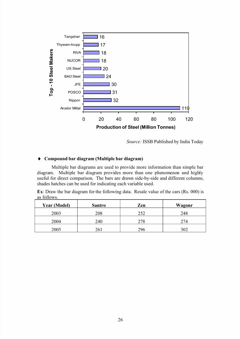
♦ Horizontal bar diagram
World biggest top 10 steel makers are data are given below. Draw horizontal
bar diagram.
Steel
maker
Arcelo
r Mittal
Nippo
nPOSCO JFE
BAO
Steel
US
Stee
l
NUCOR
RIVA Thyssen-
krupp
Tangshan
Prodn.
in
million
tonnes
110 32 31 30 24 20 18 18 17 16
25
7/27/2019 stats12-100202074136-phpapp01
http://slidepdf.com/reader/full/stats12-100202074136-phpapp01 26/36
110
32
31
30
24
20
18
18
17
16
0 20 40 60 80 100 120
Arcelor Mittal
Nippon
POSCO
JFE
BAO Steel
US Steel
NUCOR
RIVA
Thyssen-krupp
Tangshan
T o p - 1 0 S t e e l M a k e r s
Production of Steel (Million Tonnes)
Source: ISSB Published by India Today
♦ Compound bar diagram (Multiple bar diagram)
Multiple bar diagrams are used to provide more information than simple bar
diagram. Multiple bar diagram provides more than one phenomenon and highly
useful for direct comparison. The bars are drawn side-by-side and different columns,shades hatches can be used for indicating each variable used.
Ex: Draw the bar diagram for the following data. Resale value of the cars (Rs. 000) is
as follows.
Year (Model) Santro Zen Wagonr
2003 208 252 248
2004 240 278 274
2005 261 296 302
26

7/27/2019 stats12-100202074136-phpapp01
http://slidepdf.com/reader/full/stats12-100202074136-phpapp01 27/36
208
252 248240
278 274261
296 302
0
50
100
150
200
250
300
350
1 2 3Model of Car
V a l u e i n
R s .
Santro Zen Wagnor
Source: True value used car purchase data
Published by: Vijaya Karnataka, dated: 03.08.2006
Ex : Represent following in suitable diagram
Class A B C
Male 1000 1500 1500
Female 500 800 1000
Total 1500 2300 2500
1000
500
1500
800
1500
1000
0
500
1000
1500
2000
2500
P o p u l a t i o n
( i n N o s . )
1 2 3
Class
Male Female
27
1500
23002500

7/27/2019 stats12-100202074136-phpapp01
http://slidepdf.com/reader/full/stats12-100202074136-phpapp01 28/36
Ex : Draw the suitable diagram for following data
Mode of
investment
Investment in 2004 in Rs. Investment in 2005 in Rs.
Investment %age Investment %age
NSC 25000 43.10 30000 45.45
MIS 15000 25.86 10000 15.15
Mutual Fund 15000 25.86 25000 37.87
LIC 3000 5.17 1000 1.52
Total 58000 100 66000 100
2004 20050
10
20
30
40
50
60
70
80
90
100
110
45.45
15.15
37.87
1.525.17
25.86
25.86
43.10
% o
f I n v e s t m e n t
Year
Two-dimensional diagram
In two-dimensional diagram both breadth and length of the diagram (i.e. area
of the diagram) are considered as area of diagram represents the data. The important
two-dimensional diagrams are
a) Rectangular diagram
b) Square diagram
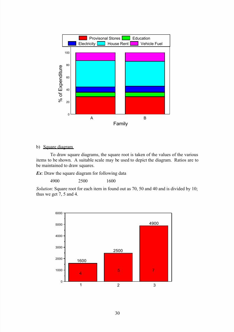
a) Rectangular diagram
Rectangular diagrams are used to depict two or more variables. This diagram
helps for direct comparison. The area of rectangular are kept in proportion to the
values. It may be of two types.
i) Percentage sub-divided rectangular diagram
ii) Sub-divided rectangular diagram
28

7/27/2019 stats12-100202074136-phpapp01
http://slidepdf.com/reader/full/stats12-100202074136-phpapp01 29/36
In former case, width of the rectangular are proportional to the values, the various
components of the values are converted into percentages and rectangles are divided
according to them. While later case is used to show some related phenomenon like
cost per unit, quality of production etc.
Ex : Draw the rectangle diagram for following data
Item ExpenditureExpenditure in Rs.
Family A Family B
Provisional stores 1000 2000
Education 250 500
Electricity 300 700
House Rent 1500 2800
Vehicle Fuel 500 1000
Total 3500 7000
Total expenditure will be taken as 100 and the expenditure on individual items
are expressed in percentage. The widths of two rectangles are in proportion to the
total expenses of the two families i.e. 3500: 7000 or 1: 2. The heights of rectangles
are according to percentage of expenses.
Item
Expenditure
Monthly expenditure
Family A (Rs. 3500) Family B(Rs. 7000)
Rs. %age Rs. %age
Provisional stores 1000 28.57 2000 28.57
Education 250 7.14 500 7.14
Electricity 300 8.57 700 10
House Rent 1500 42.85 2800 40
Vehicle Fuel 500 12.85 1000 14.28
Total 3500 100 7000 100
29
7/27/2019 stats12-100202074136-phpapp01
http://slidepdf.com/reader/full/stats12-100202074136-phpapp01 30/36
0
20
40
60
80
100
B A
% o
f E x p e n d i t u r e
Family
Provisonal Stores Education
Electricity House Rent Vehicle Fuel
b) Square diagram
To draw square diagrams, the square root is taken of the values of the various
items to be shown. A suitable scale may be used to depict the diagram. Ratios are to
be maintained to draw squares.
Ex : Draw the square diagram for following data4900 2500 1600
Solution: Square root for each item in found out as 70, 50 and 40 and is divided by 10;
thus we get 7, 5 and 4.
0
1000
2000
3000
4000
5000
6000
754
321
4900
2500
1600
30
7/27/2019 stats12-100202074136-phpapp01
http://slidepdf.com/reader/full/stats12-100202074136-phpapp01 31/36
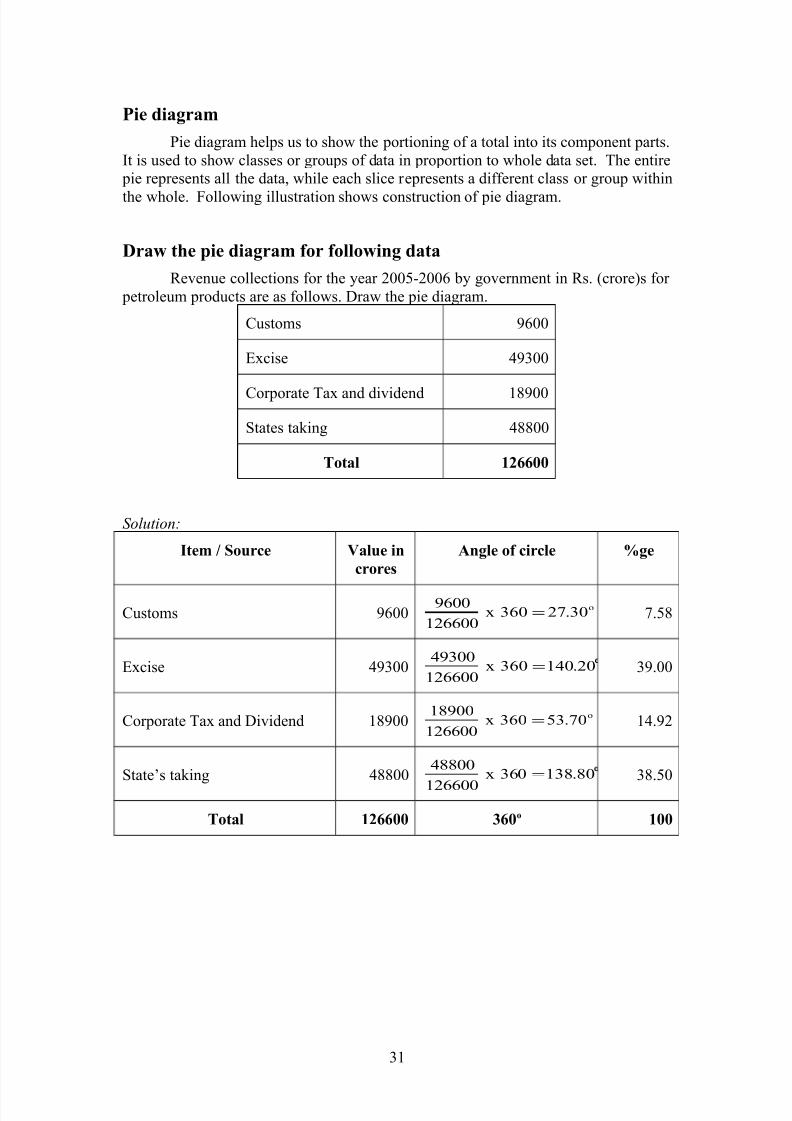
Pie diagram
Pie diagram helps us to show the portioning of a total into its component parts.
It is used to show classes or groups of data in proportion to whole data set. The entire
pie represents all the data, while each slice represents a different class or group within
the whole. Following illustration shows construction of pie diagram.
Draw the pie diagram for following data
Revenue collections for the year 2005-2006 by government in Rs. (crore)s for
petroleum products are as follows. Draw the pie diagram.
Customs 9600
Excise 49300
Corporate Tax and dividend 18900
States taking 48800
Total 126600
Solution:
Item / Source Value in
crores
Angle of circle %ge
Customs 9600o
30.27360x126600
9600= 7.58
Excise 49300 20.140360x126600
49300= 39.00
Corporate Tax and Dividend 18900o
70.53360x126600
18900= 14.92
State’s taking 48800 80.138360x
126600
48800= 38.50
Total 126600 360o 100
31

7/27/2019 stats12-100202074136-phpapp01
http://slidepdf.com/reader/full/stats12-100202074136-phpapp01 32/36
7.58
39
14.92
38.5
Customs
Excise
Corporate Tax
and Dividend
State’s taking
Source: India Today 19 June, 2006
Choice or selection of diagram
There are many methods to depict statistical data through diagram. No angle
diagram is suited for all purposes. The choice / selection of diagram to suit given set
of data requires skill, knowledge and experience. Primarily, the choice depends upon
the nature of data and purpose of presentation, to which it is meant. The nature of
data will help in taking a decision as to one-dimensional or two-dimensional or three-dimensional diagram. It is also required to know the audience for whom the diagram
is depicted.
The following points are to be kept in mind for the choice of diagram.
1. To common man, who has less knowledge in statistics cartogram and
pictograms are suited.
2. To present the components apart from magnitude of values, sub-divided bar
diagram can be used.
3. When a large number of components are to be shows, pie diagram is suitable.
Graphic presentation
A graphic presentation is a visual form of presentation graphs are drawn on a
special type of paper known are graph paper.
Common graphic representations are
a) Histogram
b) Frequency polygon
c) Cumulative frequency curve (ogive)
32

7/27/2019 stats12-100202074136-phpapp01
http://slidepdf.com/reader/full/stats12-100202074136-phpapp01 33/36
Advantages of graphic presentation
1. It provides attractive and impressive view
2. Simplifies complexity of data
3. Helps for direct comparison
4. It helps for further statistical analysis
5. It is simplest method of presentation of data
6. It shows trend and pattern of data
Difference between graph and diagram
Diagram Graph
1. Ordinary paper can be used 1. Graph paper is required
2. It is attractive and easily
understandable
2. Needs some effect to understand
3. It is appropriate and effective to
measure more variable
3. It creates problem
4. It can’t be used for further analysis 4. Can be used for further analysis
5. It gives comparison 5. It shows relationship between
variables
6. Data are represented by bars,
rectangles
6. Points and lines are used to represent
data
Frequency Histogram
In this type of representation the given data are plotted in the form of series of
rectangles. Class intervals are marked along the x-axis and the frequencies are along
the y-axis according to suitable scale. Unlike the bar chart, which is one-dimensional,
a histogram is two-dimensional in which the length and width are both important. A
histogram is constructed from a frequency distribution of grouped data, where the
height of rectangle is proportional to respective frequency and width represents the
class interval. Each rectangle is joined with other and the blank space between the
rectangles would mean that the category is empty and there are no values in that class
interval.
Ex : Construct a histogram for following data.
Marks obtained (x) No. of students (f) Mid point
15 – 25 5 20
25 – 35 3 30
35 – 45 7 40
45 – 55 5 50
55 – 65 3 60
65 – 75 7 70
Total 30
33

7/27/2019 stats12-100202074136-phpapp01
http://slidepdf.com/reader/full/stats12-100202074136-phpapp01 34/36
For convenience sake, we will present the frequency distribution along with
mid-point of each class interval, where the mid-point is simply the average of value of
lower and upper boundary of each class interval.
0
1
2
3
4
5
6
7
75655545352515
F r e q u e
n c y ( N o . o f s t u d e n t s )
Class Interval (Marks)
Frequency polygon
A frequency polygon is a line chart of frequency distribution in which either the values of discrete variables or the mid-point of class intervals are plotted against
the frequency and those plotted points are joined together by straight lines. Since, the
frequencies do not start at zero or end at zero, this diagram as such would not touch
horizontal axis. However, since the area under entire curve is the same as that of a
histogram which is 100%. The curve must be ‘enclosed’, so that starting mid-point is
jointed with ‘fictitious’ preceding mid-point whose value is zero. So that the
beginning of curve touches the horizontal axis and the last mid-point is joined with a
‘fictitious’ succeeding mid-point, whose value is also zero, so that the curve will end
at horizontal axis. This enclosed diagram is known as ‘frequency polygon’.
Ex : For following data construct frequency polygon.Marks (CI) No. of frequencies (f) Mid-point
15 – 25 5 20
25 – 35 3 30
35 – 45 7 40
45 – 55 5 50
55 – 65 3 60
65 – 75 7 70
34

7/27/2019 stats12-100202074136-phpapp01
http://slidepdf.com/reader/full/stats12-100202074136-phpapp01 35/36
0 10 20 30 40 50 60 70 80 90 100
0
2
4
6
8
10
A Frequency polygon
F r e q u e n c y
Mid point (x)
Cumulative frequency curve (ogive)
ogives are the graphic representations of a cumulative frequency distribution.
These ogives are classified as ‘less than’ and ‘more than ogives’. In case of ‘less
than’, cumulative frequencies are plotted against upper boundaries of their respective
class intervals. In case of ‘grater than’ cumulative frequencies are plotted against
upper boundaries of their respective class intervals. These ogives are used for
comparison purposes. Several ogves can be compared on same grid with different
colour for easier visualisation and differentiation.
Ex :
Marks
(CI)
No. of
frequencies (f)Mid-point
Cum. Freq.
Less than
Cum. Freq.
More than
15 – 25 5 20 5 30
25 – 35 3 30 8 25
35 – 45 7 40 15 22
45 – 55 5 50 20 15
55 – 65 3 60 23 10
65 – 75 7 70 30 7
35

7/27/2019 stats12-100202074136-phpapp01
http://slidepdf.com/reader/full/stats12-100202074136-phpapp01 36/36
Less than give diagram
20 30 40 50 60 70
5
10
15
20
25
30
'Less than' ogive
L e s s t h a n C u m u l a t i v e F r e q u e n c y
Upper Boundary (CI)
Less than give diagram
10 20 30 40 50 60 70
10
15
20
25
30
35
'More than' ogive
M o r e t h a n O g i v e
Lower Boundary (CI)