Sta220 - Statistics Mr. Smith Room 310 Class #3. Section 2.1-2.2.
62
Sta220 - Statistics Mr. Smith Room 310 Class #3
-
Upload
alison-simmons -
Category
Documents
-
view
218 -
download
1
Transcript of Sta220 - Statistics Mr. Smith Room 310 Class #3. Section 2.1-2.2.
Sta220 - Statistics Mr. SmithRoom 310Class #3
Section 2.1-2.2
1-3
Lesson ObjectivesYou will be able to:
1. Describe Qualitative Data with Graphs
2. Describe Quantitative Data with Graphs
1-4
Objective 1• Describe Qualitative Data with Graphs
Describing Data
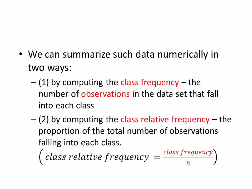
Two methods for describing data are presented in this chapter, one graphical and the other numerical.
Qualitative data are nonnumerical in nature; thus, the value of a qualitative variable can only be classified into categories called classes.
•

•
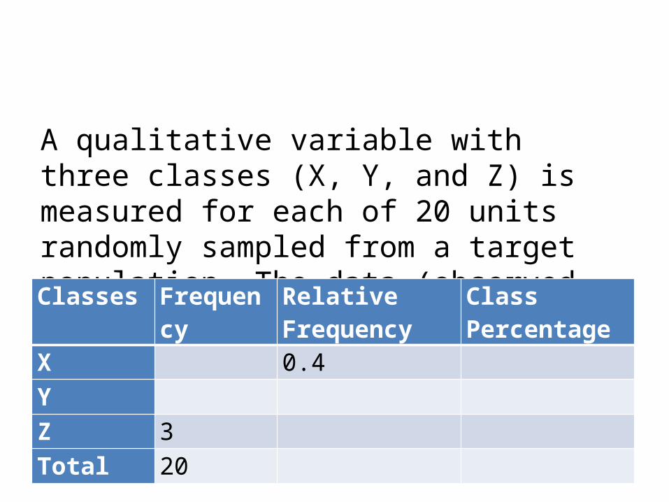
A qualitative variable with three classes (X, Y, and Z) is measured for each of 20 units randomly sampled from a target population. The data (observed class for each unit are as follows:Classes Frequency Relative
FrequencyClass Percentage
X 0.4 Y Z 3 Total 20

TYPES OF GRAPHS
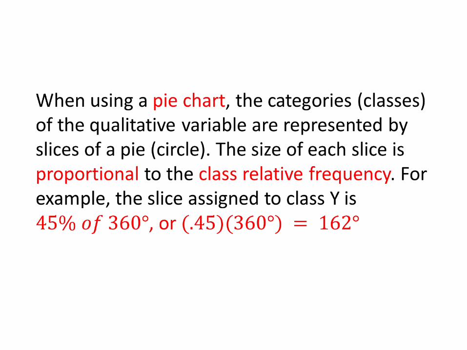
Three of the most widely used graphical methods for describing qualitative data: bar graphs, pie chart, and Pareto Diagram.
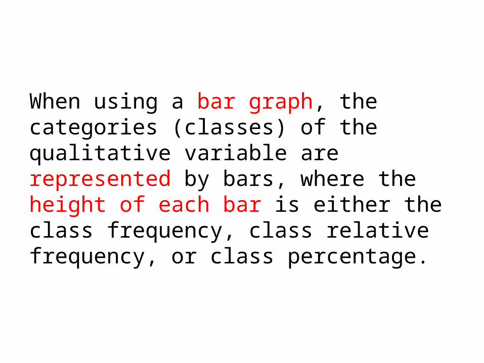
When using a bar graph, the categories (classes) of the qualitative variable are represented by bars, where the height of each bar is either the class frequency, class relative frequency, or class percentage.
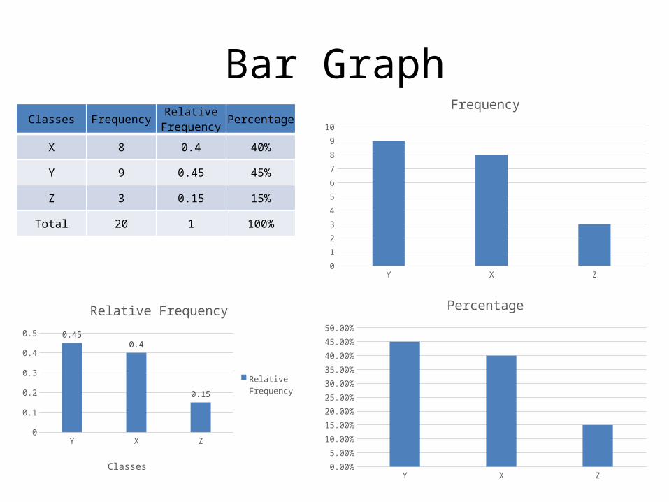
Bar GraphClasses Frequency
Relative Frequency
Percentage
X 8 0.4 40%
Y 9 0.45 45%
Z 3 0.15 15%
Total 20 1 100%
Y X Z0
1
2
3
4
5
6
7
8
9
10
Frequency
Y X Z0
0.050.1
0.150.2
0.250.3
0.350.4
0.450.5 0.45
0.4
0.15
Relative Frequency
Relative Frequency
ClassesY X Z
0.00%
5.00%
10.00%
15.00%
20.00%
25.00%
30.00%
35.00%
40.00%
45.00%
50.00%
Percentage
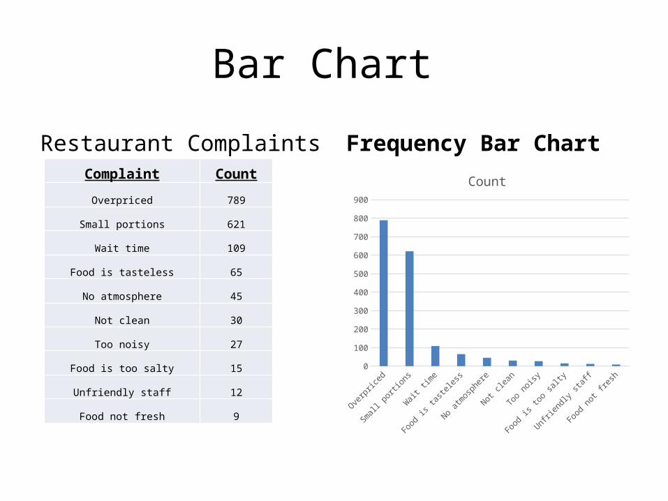
Bar Chart
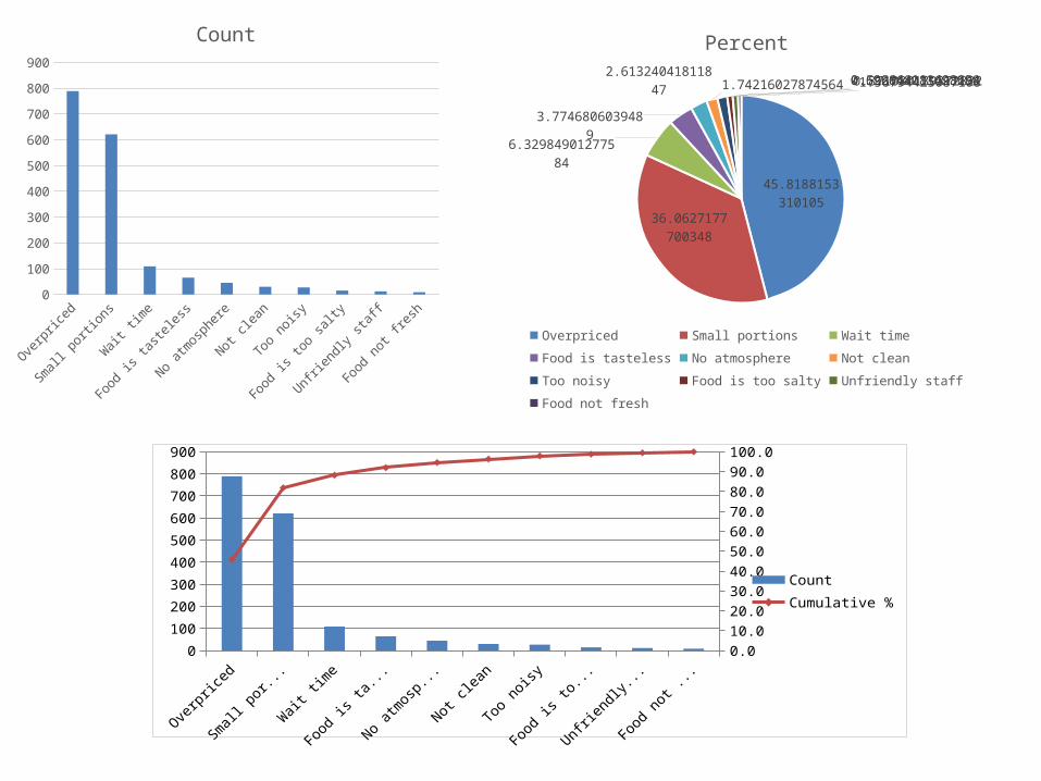
Restaurant Complaints Complaint Count
Overpriced 789
Small portions 621
Wait time 109
Food is tasteless 65
No atmosphere 45
Not clean 30
Too noisy 27
Food is too salty 15
Unfriendly staff 12
Food not fresh 9
Frequency Bar Chart
Overpric
ed
Small porti
ons
Wait ti
me
Food is ta
steless
No atmosp
here
Not clean
Too noisy
Food is to
o salty
Unfriendly
staff
Food not fresh
0
100
200
300
400
500
600
700
800
900
Count
•
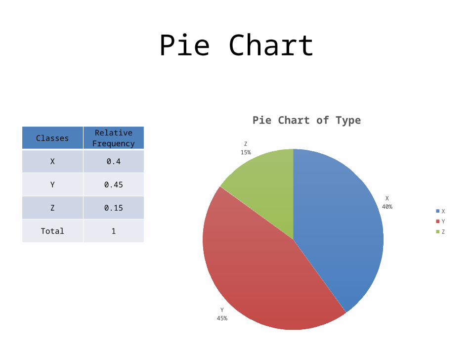
Pie Chart
ClassesRelative
Frequency
X 0.4
Y 0.45
Z 0.15
Total 1
X40%
Y45%
Z15%
Pie Chart of Type
XYZ
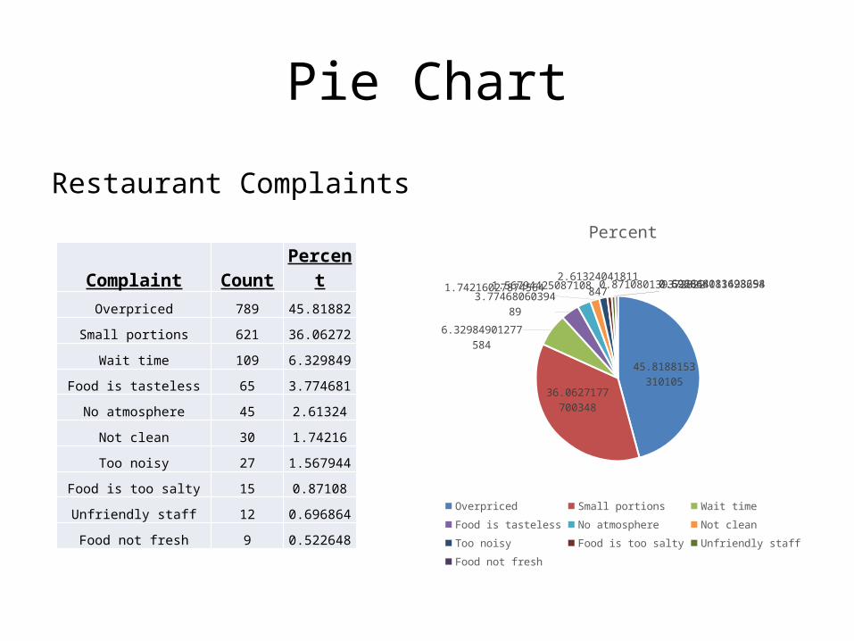
Pie Chart
Restaurant Complaints
Complaint Count PercentOverpriced 789 45.81882
Small portions 621 36.06272
Wait time 109 6.329849
Food is tasteless 65 3.774681
No atmosphere 45 2.61324
Not clean 30 1.74216
Too noisy 27 1.567944
Food is too salty 15 0.87108
Unfriendly staff 12 0.696864
Food not fresh 9 0.522648
45.8188153310105
36.0627177700349
6.32984901277584
3.7746806039489
2.613240418118471.742160278745641.56794425087108 0.8710801393728220.6968641114982580.522648083623694
Percent
Overpriced Small portions Wait time Food is tastelessNo atmosphere Not clean Too noisy Food is too saltyUnfriendly staff Food not fresh
Pareto diagram is a bar graph with the categories (classes) of the qualitative variable (i.e., the bars) arranged by height in descending order from left to right. The goal of the Pareto diagram is to make it easy to locate the “most important” categories – those with the largest frequencies.
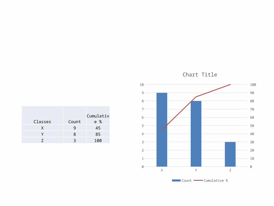
Classes CountCumulative
%X 9 45Y 8 85Z 3 100
X Y Z0
1
2
3
4
5
6
7
8
9
10
0
10
20
30
40
50
60
70
80
90
100
Chart Title
Count Cumulative %

Pareto DiagramComplaint Count Cumulative %
Overpriced 789 45.8
Small portions 621 81.9
Wait time 109 88.2
Food is tasteless 65 92.0
No atmosphere 45 94.6
Not clean 30 96.3
Too noisy 27 97.9
Food is too salty 15 98.8
Unfriendly staff 12 99.5
Overp
riced
Small
portions
Wait
time
Food is
tastel
ess
No atmosp
here
Not clea
n
Too noisy
Food is
too salty
Unfrien
dly sta
ff
Food not fr
esh0
100
200
300
400
500
600
700
800
900
0.0
10.0
20.0
30.0
40.0
50.0
60.0
70.0
80.0
90.0
100.0
CountCumulative %
Overpric
ed
Small porti
ons
Wait ti
me
Food is ta
steless
No atmosp
here
Not clean
Too noisy
Food is to
o salty
Unfriendly
staff
Food not fresh
0
100
200
300
400
500
600
700
800
900
Count
45.8188153310105
36.0627177700349
6.32984901277584
3.7746806039489
2.613240418118471.74216027874564 1.567944250871080.871080139372822 0.6968641114982580.522648083623694
Percent
Overpriced Small portions Wait time Food is tastelessNo atmosphere Not clean Too noisy Food is too saltyUnfriendly staff Food not fresh
Overp
riced
Small
portions
Wait
time
Food is
tastel
ess
No atmosp
here
Not clea
n
Too noisy
Food is
too salty
Unfrien
dly sta
ff
Food not fr
esh0
100
200
300
400
500
600
700
800
900
0.010.020.030.040.050.060.070.080.090.0100.0
CountCumulative %
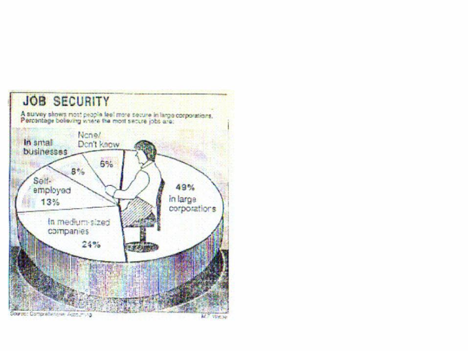
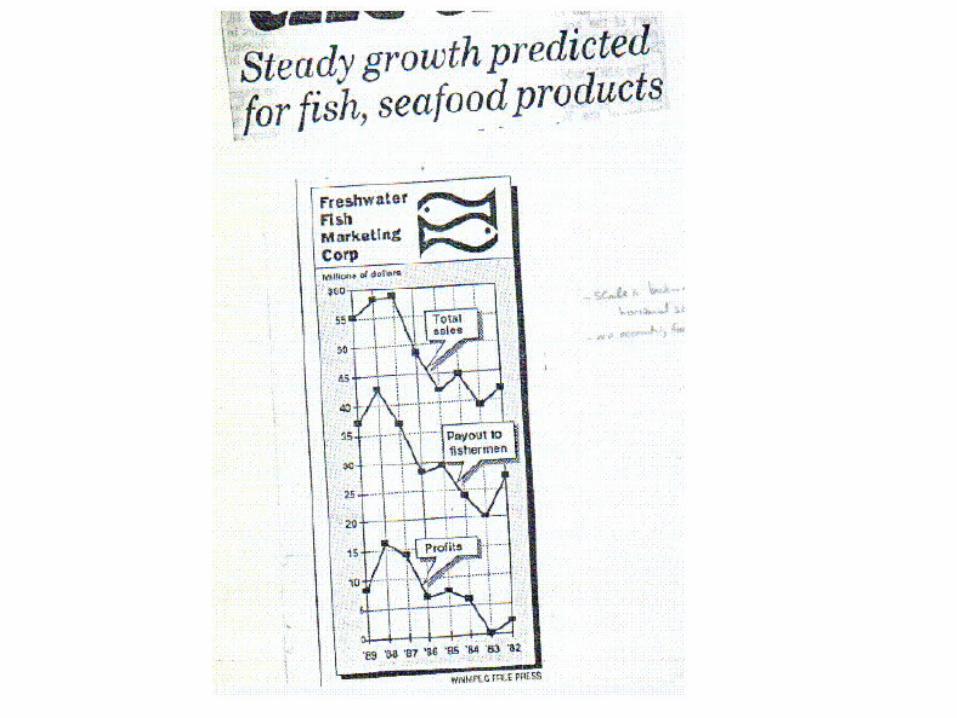
Some Bad/Misleading Graphs
Misleading Graphs
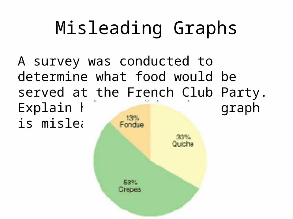
A survey was conducted to determine what food would be served at the French Club Party. Explain how the following graph is misleading.
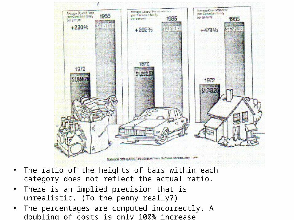
• The ratio of the heights of bars within each category does not reflect the actual ratio.
• There is an implied precision that is unrealistic. (To the penny really?)• The percentages are computed incorrectly. A doubling of costs is only
100% increase.


Sta220 - Statistics Mr. SmithRoom 310Class #4

Section 2.2-2.4

1-29
Lesson ObjectivesYou will be able to:
1. Describe Quantitative Data with Graphs
2. Use Summation Notation
3. Understanding Central Tendency
Lesson Objective # 2: Describe Quantitative Data with Graphs
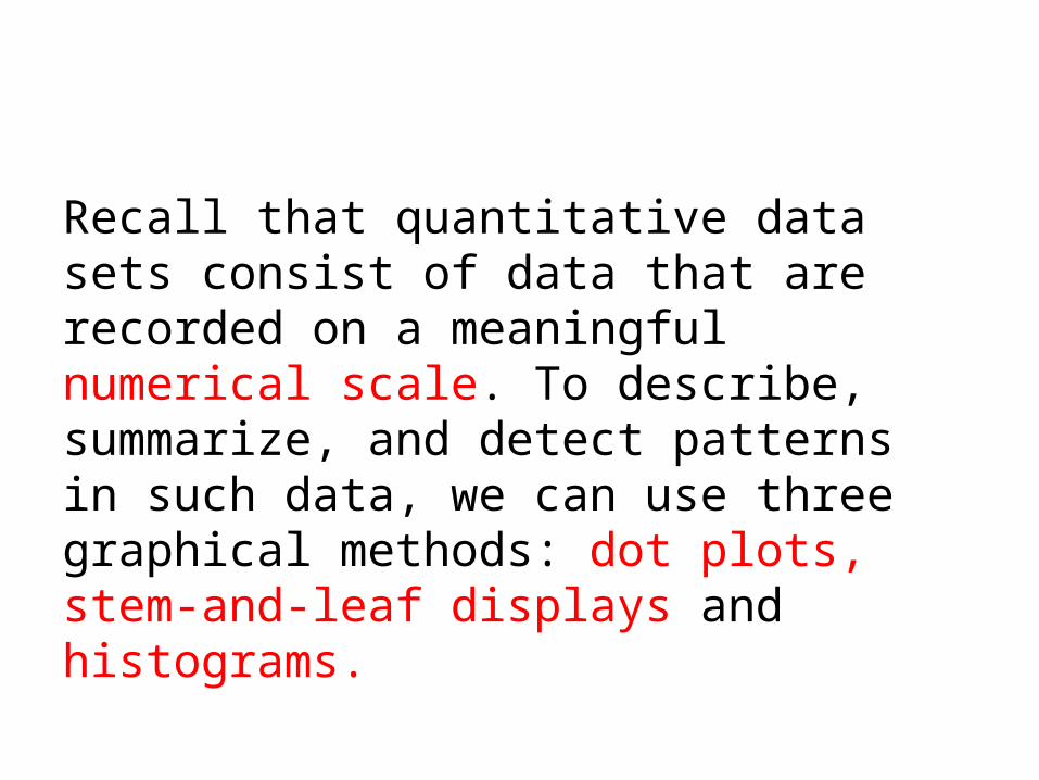
Recall that quantitative data sets consist of data that are recorded on a meaningful numerical scale. To describe, summarize, and detect patterns in such data, we can use three graphical methods: dot plots, stem-and-leaf displays and histograms.
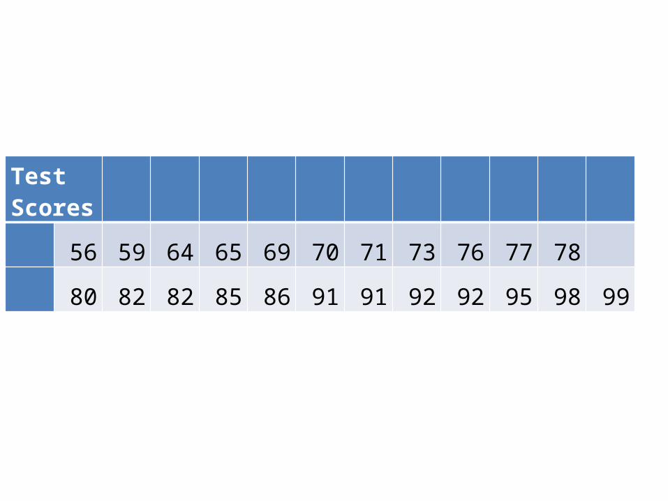
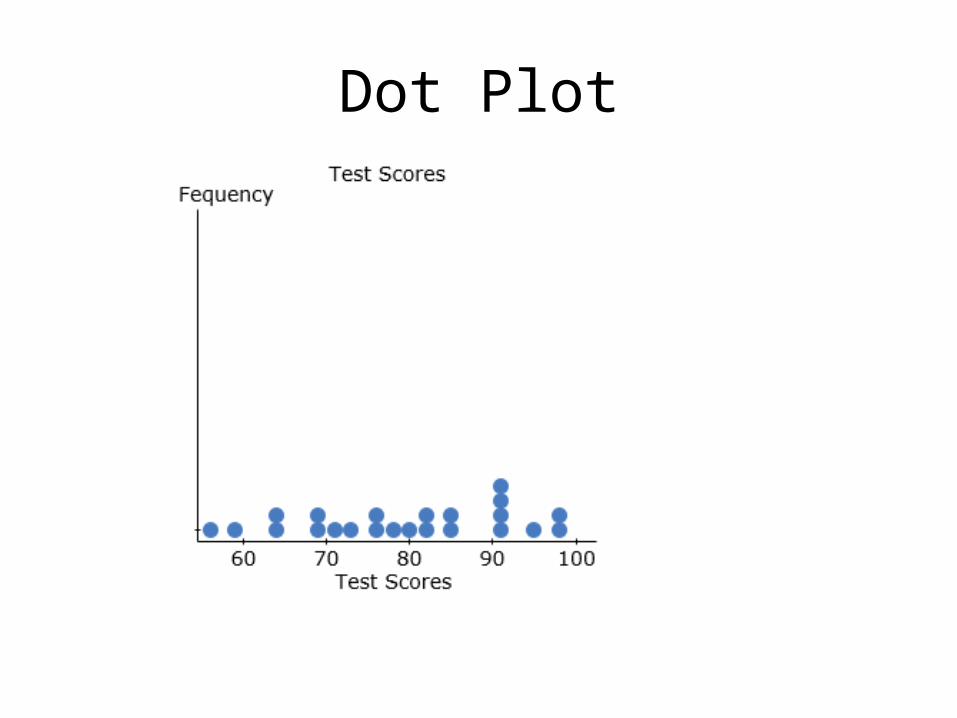
Test Scores
56 59 64 65 69 70 71 73 76 77 78
80 82 82 85 86 91 91 92 92 95 98 99
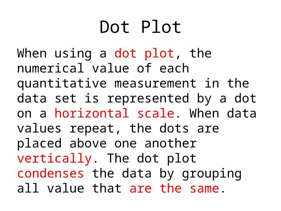
Dot PlotWhen using a dot plot, the numerical value of each quantitative measurement in the data set is represented by a dot on a horizontal scale. When data values repeat, the dots are placed above one another vertically. The dot plot condenses the data by grouping all value that are the same.
Dot Plot
Copyright © 2013 Pearson Education, Inc.. All rights
reserved.
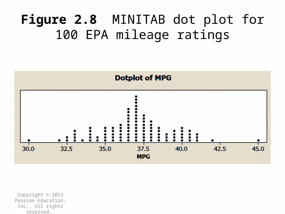
Figure 2.8 MINITAB dot plot for 100 EPA mileage ratings
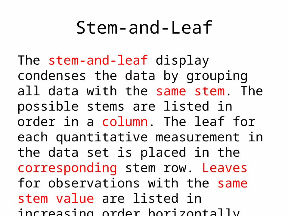
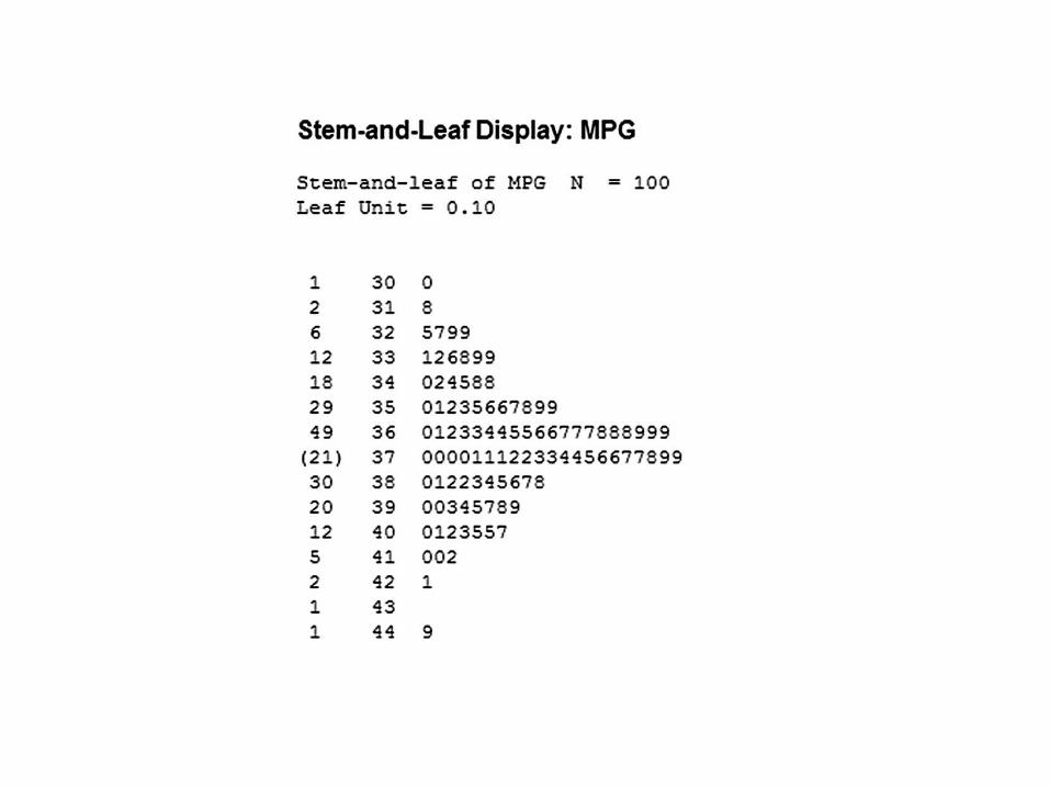
Stem-and-Leaf
The stem-and-leaf display condenses the data by grouping all data with the same stem. The possible stems are listed in order in a column. The leaf for each quantitative measurement in the data set is placed in the corresponding stem row. Leaves for observations with the same stem value are listed in increasing order horizontally.
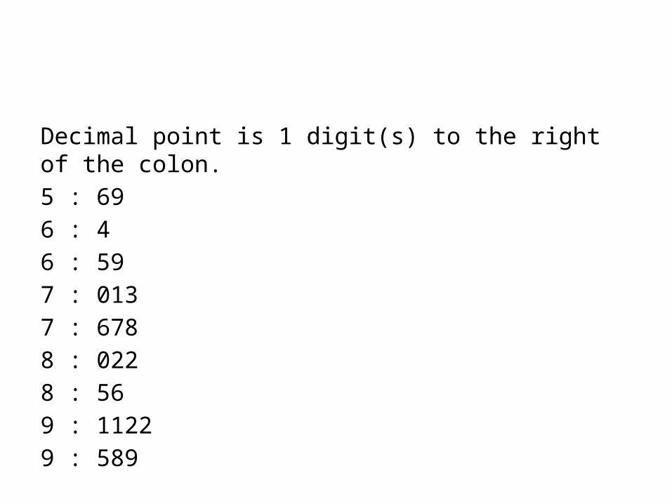
Decimal point is 1 digit(s) to the right of the colon.5 : 696 : 46 : 597 : 0137 : 6788 : 0228 : 569 : 11229 : 589
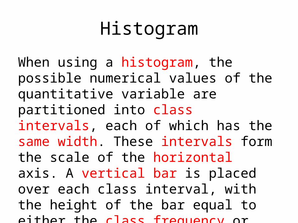
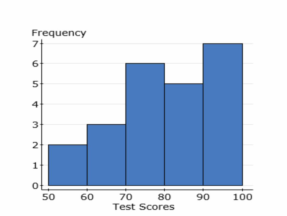
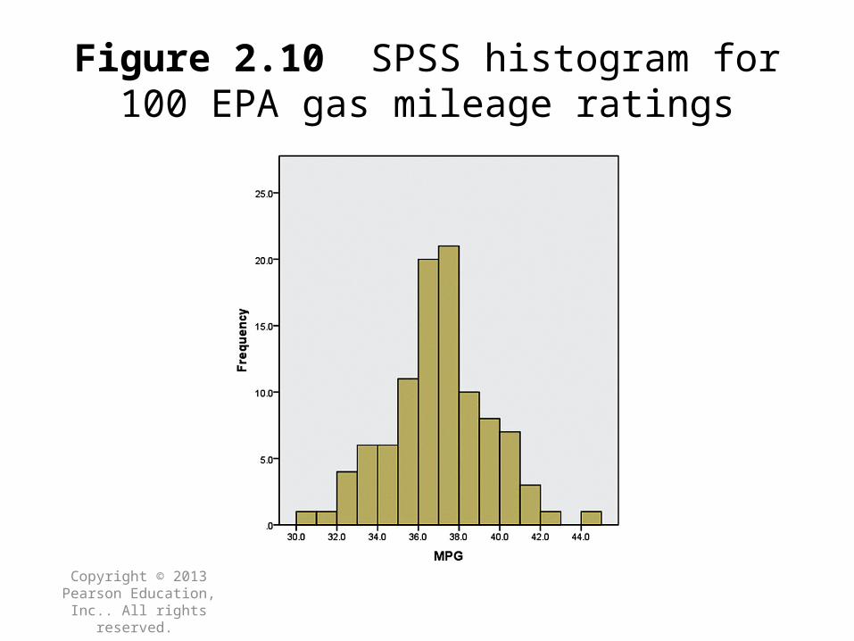
Histogram
When using a histogram, the possible numerical values of the quantitative variable are partitioned into class intervals, each of which has the same width. These intervals form the scale of the horizontal axis. A vertical bar is placed over each class interval, with the height of the bar equal to either the class frequency or class relative frequency. When constructing histograms, use more classes as the number of values in the data set gets larger.
Copyright © 2013 Pearson Education, Inc.. All rights
reserved.
Figure 2.10 SPSS histogram for 100 EPA gas mileage ratings
Copyright © 2013 Pearson Education, Inc.. All rights reserved.
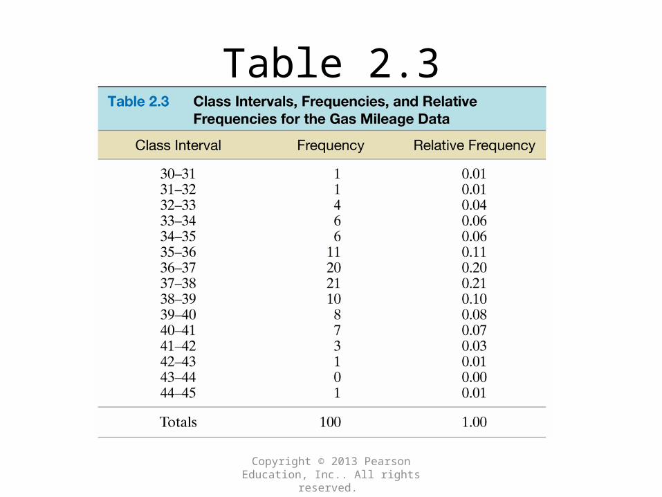
Table 2.3
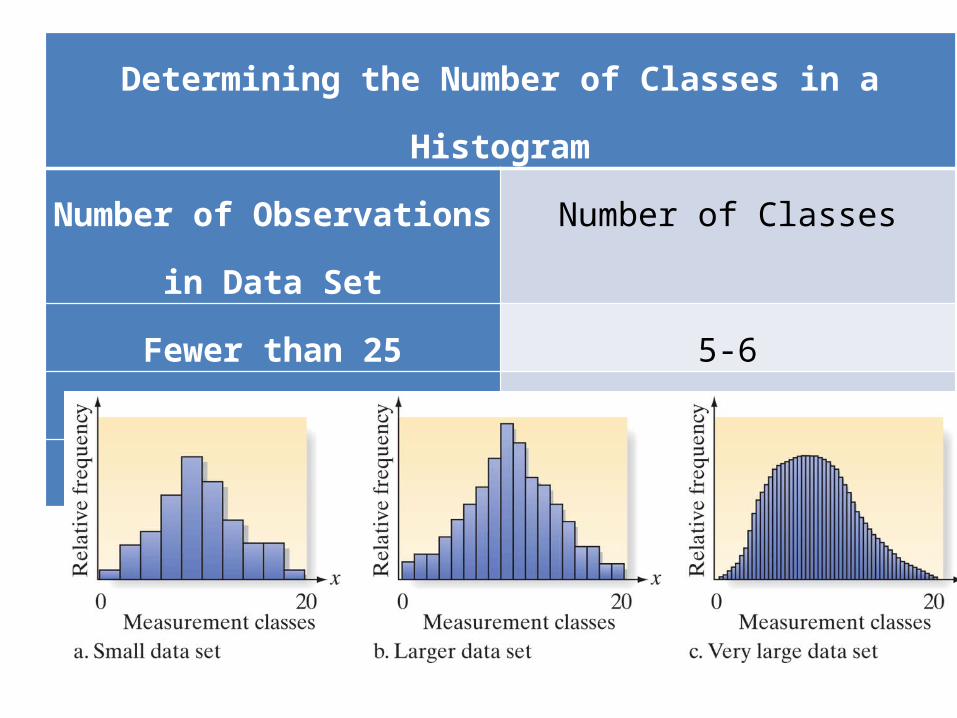
Determining the Number of Classes in a HistogramNumber of Observations in
Data SetNumber of Classes
Fewer than 25 5-625-50 7-14
More than 50 15-20

Lesson Objective # 3: Use Summation Notation
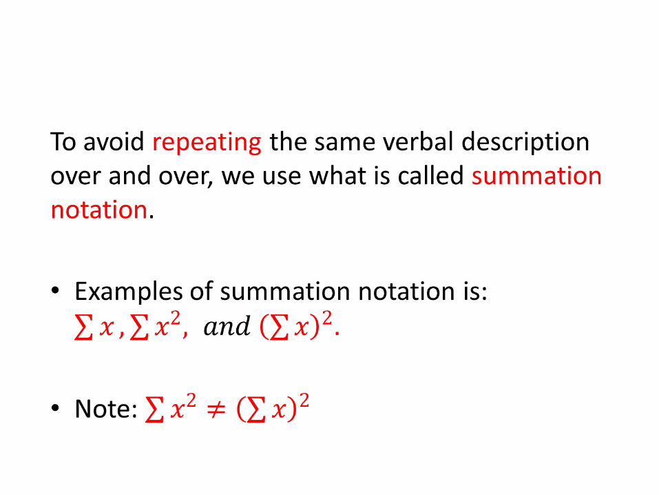
•
•
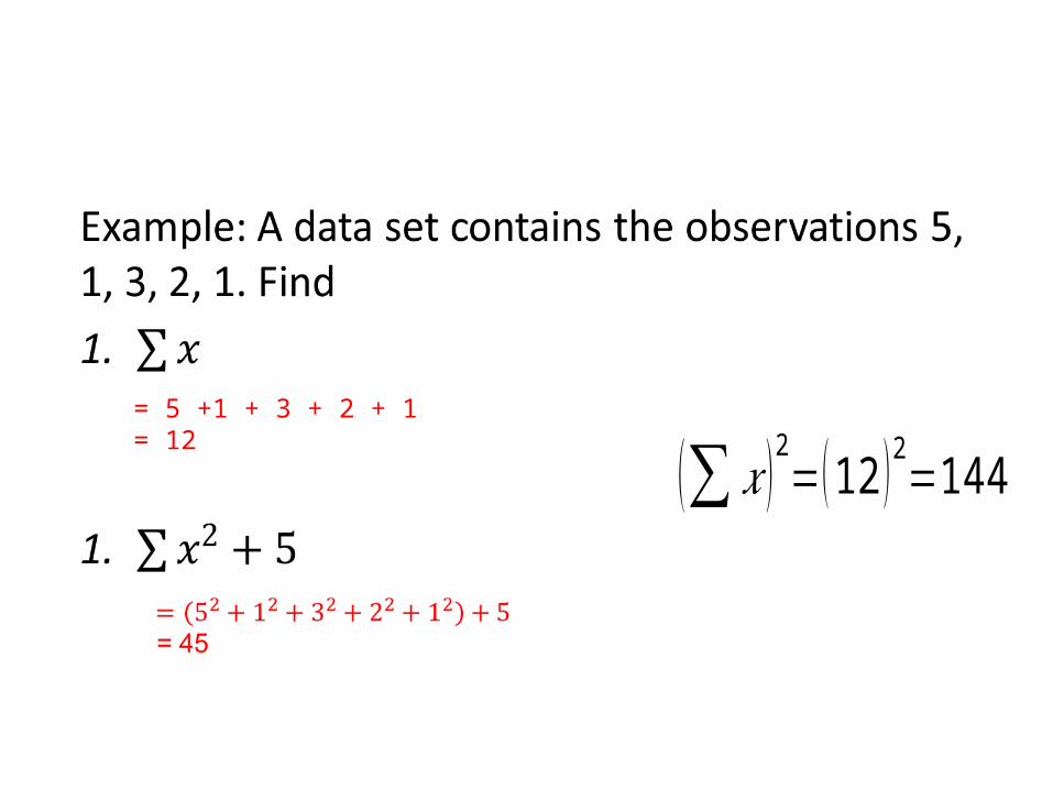
= 5 +1 + 3 + 2 + 1 = 12
(∑ 𝑥 )2=(12 )2=144
• Lesson Objective # 4: Understanding Central Tendency
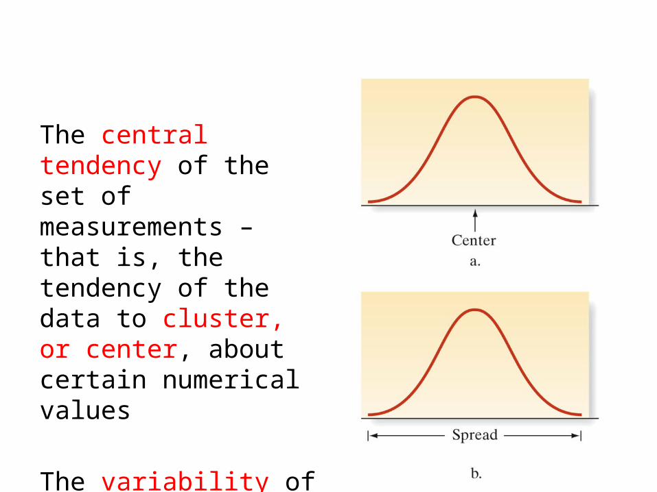
The central tendency of the set of measurements – that is, the tendency of the data to cluster, or center, about certain numerical values
The variability of the set of measurements – that is, the spread of the data.
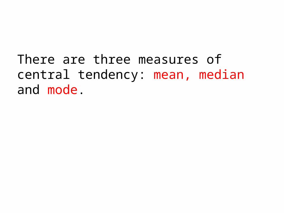
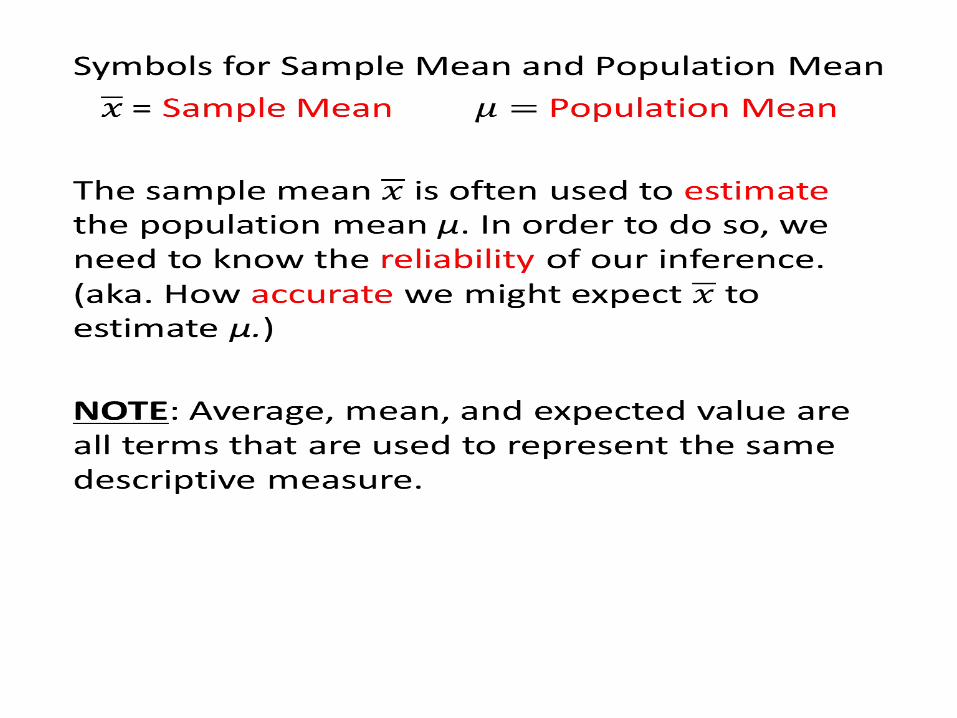
There are three measures of central tendency: mean, median and mode.
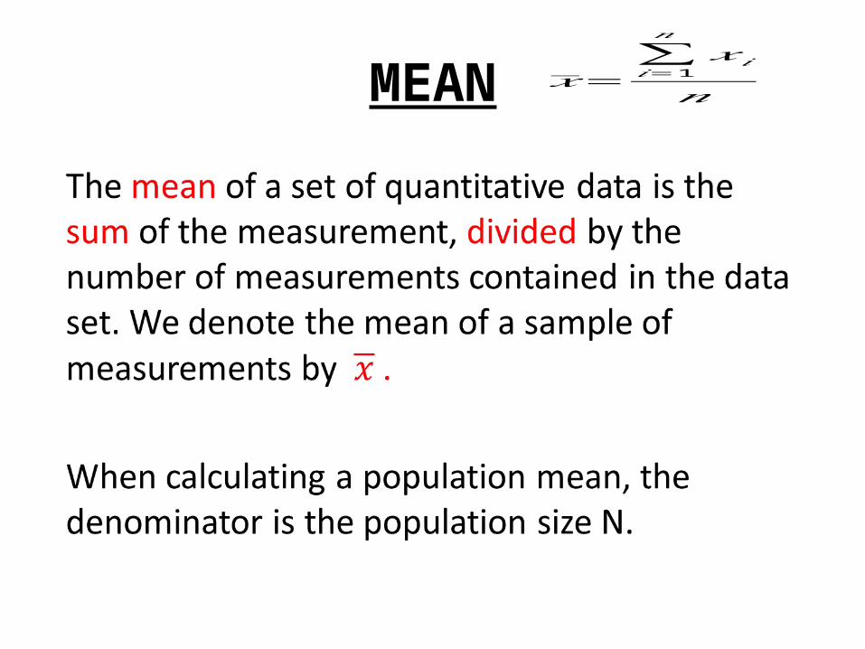
MEAN
•
𝑥=∑𝑖=1
𝑛
𝑥𝑖
𝑛
•
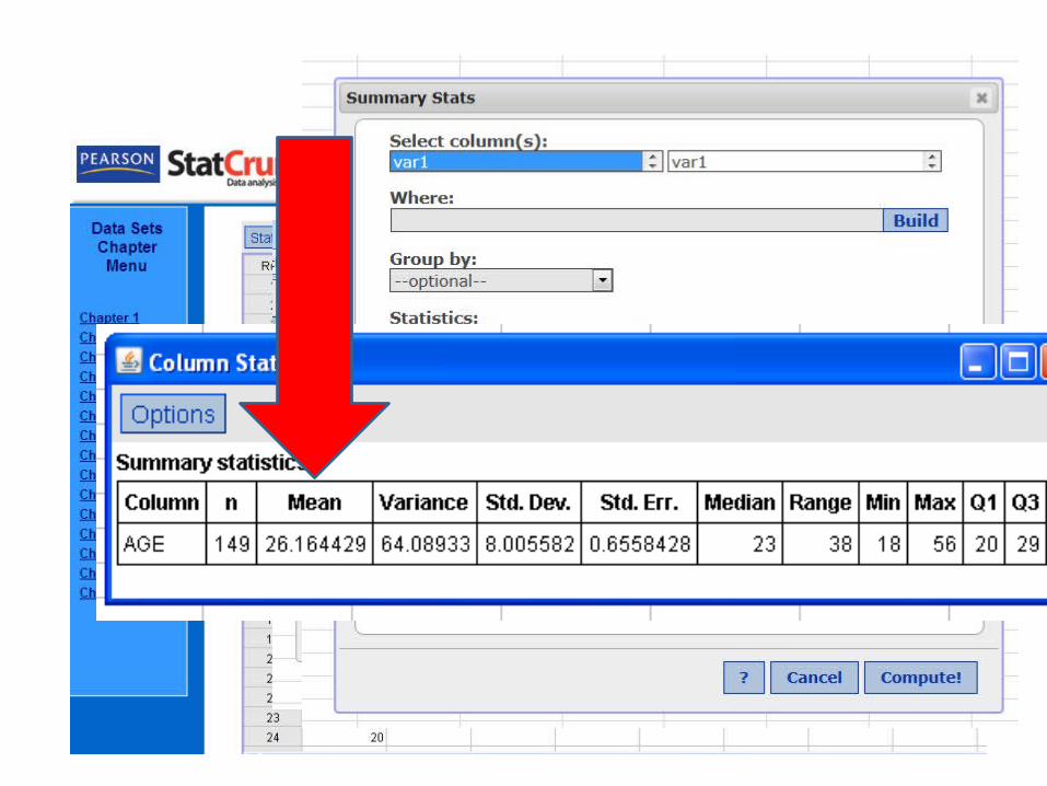
StatCrunch
MEDIAN
• The median of a quantitative data is the middle number when the measurements are arranged in ascending (or descending) order.

Calculating a Sample Median ΜArrange the n measurements from the smallest to the largest. 1. If n is odd, Μ is the
middle number.2. If n is even, Μ is the
mean of the middle two numbers.
NOTE: Remember to order the data before calculating a value for the median
MODE
The mode is the measurement that occurs most frequently in the data set. Mode is the only measure of center that has to be an actual data value in the samples.
NOTE: For some quantitative data sets, the mode may not be very meaningful.
• The modal class is the measurement class containing the largest relative frequency. (Ex. Relative frequency histogram for quantitative data.)

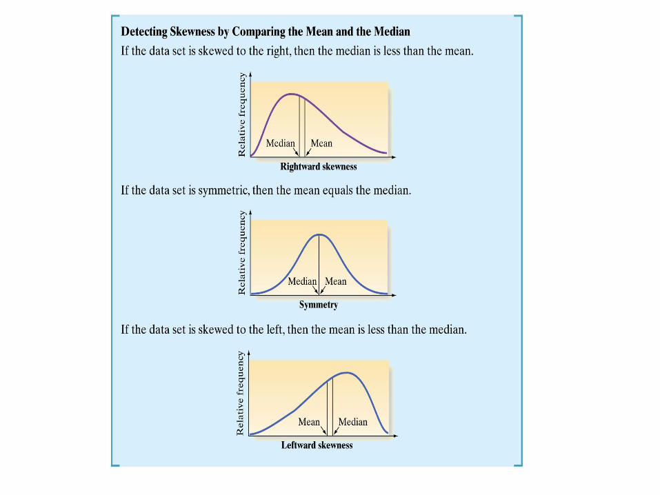
SKEWED
A data set is said to be skewed if one tail of the distribution has more extreme observations than the other tail.
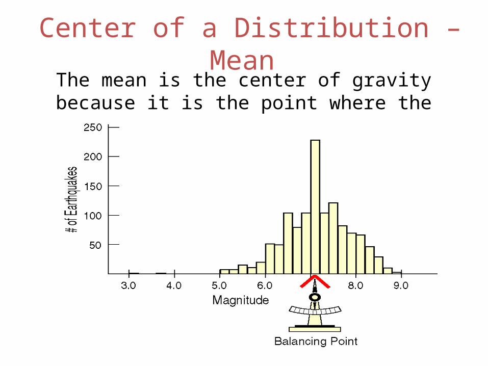
Center of a Distribution – Mean The mean is the center of gravity because it is the point where the histogram balances:
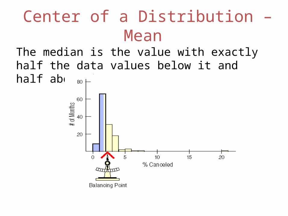
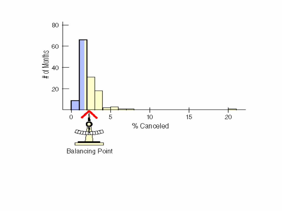
Center of a Distribution – Mean The median is the value with exactly half the data values below it and half above it.

With rightward skewed data, the right tail (high end) of the distribution has more extreme observations.
Conversely, with leftward skewed data, the left tail (low end) of the distribution has more extreme observations.