
SPOTTING DUBIOUS DATA - ACAPS · 2017-05-31 · ACAPS - Spotting dubious data 3. HOW WAS IT COUNTED...
12
ACAPS - Spotting dubious data SPOTTING DUBIOUS DATA November 2015
Transcript of SPOTTING DUBIOUS DATA - ACAPS · 2017-05-31 · ACAPS - Spotting dubious data 3. HOW WAS IT COUNTED...
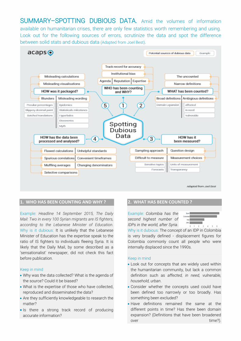
SUMMARY–SPOTTING DUBIOUS DATA. Amid the volumes of information
available on humanitarian crises, there are only few statistics worth remembering and using.
Look out for the following sources of errors, scrutinize the data and spot the difference
between solid stats and dubious data (Adapted from Joel Best).
1. WHO HAS BEEN COUNTING AND WHY ?
Example: Headline 14 September 2015, The Daily
Mail: Two in every 100 Syrian migrants are IS fighters,
according to the Lebanese Minister of Education.
Why is it dubious: It is unlikely that the Lebanese
Minister of Education has the expertise speak to the
ratio of IS fighters to individuals fleeing Syria. It is
likely that the Daily Mail, by some described as a
‘sensationalist’ newspaper, did not check this fact
before publication.
Keep in mind
Why was the data collected? What is the agenda of
the source? Could it be biased?
What is the expertise of those who have collected,
reproduced and disseminated the data?
Are they sufficiently knowledgeable to research the
matter?
Is there a strong track record of producing
accurate information?
2. WHAT HAS BEEN COUNTED ?
Example: Colombia has the
second highest number of
IDPs in the world, after Syria.
Why is it dubious: The concept of an IDP in Colombia
is very broadly defined - displacement figures for
Colombia commonly count all people who were
internally displaced since the 1990s.
Keep in mind
Look out for concepts that are widely used within
the humanitarian community, but lack a common
definition such as affected, in need, vulnerable,
household, urban.
Consider whether the concepts used could have
been defined too narrowly or too broadly. Has
something been excluded?
Have definitions remained the same at the
different points in time? Has there been domain
expansion? (Definitions that have been broadened
over time?).
ACAPS - Spotting dubious data
3. HOW WAS IT COUNTED ?
Example: 6.5 million people have been internally
displaced in Syria as of October 2015. Why is it
dubious: Data gathering in Syria is severely
hampered by the active conflict and lack of access
to parts of the country. (IDMC 07/2015) Statistics
regarding the Syria conflict are therefore broad
guesstimates, computed in a politically charged
context.
Keep in mind:
Does the data consist of numbers that seem hard
to produce—how could anyone calculate that?
Closely scrutinise information on sensitive topics,
such as SGBV or informal activities.
Numbers presented without sufficient information
about measurement choices or assessment tools?
Unusual units of analysis (e.g. extended families
instead of households) that might affect the
resulting statistic?
Criticisms of measurement choices by others
Particular caution is required when reviewing
forecasts or estimates about future trends
4. HOW WAS IT PROCESSED AND ANALYSED ?
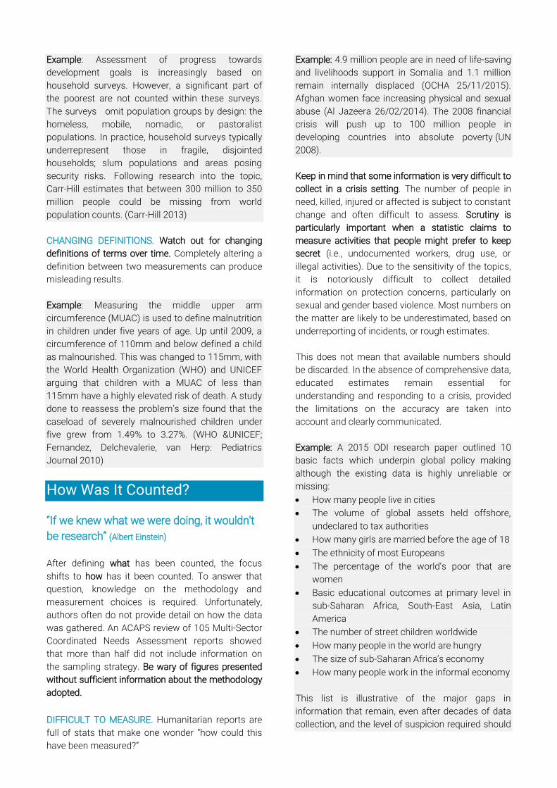
Example: 7.4
million people are
in need in
Afghanistan. Why is it
dubious: Double-
counting the number of people in need is common
and this example is illustrative of the underlying
thinking-error. The number of people in need per
sector has been combined to total 7.4 million.
However, the units of analysis are not mutually
exclusive categories - some people who are severely
food insecure, will have been affected by natural
disasters too, etc.
Example: Water shortages for refugees in camps in
Jordan have reached emergency levels; the supply is
as low as 30 liters per person per day — one-tenth of
what the average American uses. Why is it dubious:
A crisis situation is often compared to the reference
standards of those that organizations want to
provide funding. The United States is one of the
countries with the highest per capita water use in the
world and is therefore not an appropriate
comparison group. Sphere standards put total basic
water needs per person per day at 7.5 to 15 liters a
day.
Keep in mind:
Could the calculations be flawed?
Are there any misleading comparisons,
timeframes, comparison groups or standards
used?
Are there any stated relationships between two
variables (look out for reports that claim to identify
the key cause of complex problems, it is
impossible determine causality through
experimental design)
Calculations that highlight or muffle outliers?
5. HOW WAS IT PACKAGED ?
Example: Of the more than 80 million people
estimated to have been in need of humanitarian
assistance in 2014, over 75% were women and
children. Why is it dubious: 75% of all people in high
fertility countries are women and children – it is
unclear how this was calculated and it is most likely
only included for shock purposes.
Example: UNHCR says most of the Syrians arriving in
Greece are students. Why is it dubious: The results of
the survey indicate that ‘student’ was the most
frequently mentioned occupation, indicated by 16%
of respondents.
Example: Before the outbreak of violence in Burundi
following mass-protest, under 5 global acute
malnutrition rates were already at 41%. Why is it
dubious: Global Acute Malnutrition (GAM) rates
above 15% are considered critical, the most severe
level of the WHO scale. One of the highest levels of
GAM recently recorded was in South Sudan, at
22.7% (Generation Nutrition 2014)
Keep in mind:
Dramatic statements that take the form of
statistical claims, such as hyperboles, ‘the best’,
the most’, ‘myth’, ‘new discovery’?
Words that imply causation (such as leads to,
attributable to, caused by etc.). It is highly difficult
to determine causality, particularly in an
emergency setting.
Unhelpful denominators (x per hour) used for
shock purpose?

Have results been misinterpreted? Are visual
representation accurate or misleading?
Blunders (numbers that seem surprisingly large or
small)?
Are the figures in line with what I know and expect
or surprisingly different? Have decimal points been
misplaced?
Table of Contents Table of Contents .................................................... 5
Introduction ............................................................ 5
Benchmarks ............................................................. 5
Who Is Counting and Why? ..................................... 6
What Has Been Counted? ....................................... 6
How Was It Counted? ............................................. 7
How Was It Processed and Analysed? .................... 8
How Is It Packaged? .............................................. 10
Sources and Background Readings ....................... 12
Introduction
“27% of statistics are false” People often assume
that all numbers are hard facts: if it is reported,
someone must have calculated and checked the
figures. Some available figures are indeed accurately
reported findings of sound research. Others are
based on flawed research, or intended to mislead
the user. Bad numbers often take on a life of their
own: they continue being repeated, even after they
have been thoroughly debunked. This is particularly
true in the Internet age, when it is so easy to
circulate information.
The figure itself will not give away its true character -
a 9 million looks like a 9 million even if it is used to
present dubious data. The context is needed to
understand if numbers reflect an accurate statistic, a
wild guesstimate or anything in between. This
chapter provides practical guidance on how to
interpret the context. It provides a list of common
problems found in the numbers appearing in
humanitarian reports and illustrates these problems
with examples.
This note is adapted from Stat-Spotting: A Field Guide
to Identifying Dubious Data by Joel Best (2013).
Benchmarks
Knowledge of some basic statistical benchmarks is
the most effective method to spot dubious data and
recognise questionable statistics. Always be aware
of the following statistics for the relevant country:
The total pre-crisis population in affected areas
The demographic profile of the population
Estimated number of people affected or
displaced
Humanitarian profile of similar crises
Sector specific pre-crisis facts, such as the price
of staple foods, school attendance rates, etc.
Example: By the end of 2013, the UN estimated that
6.5 million people had been displaced in Syria as a
result of the civil war. The conflict, which had been
ongoing for over two years at that point, had resulted
in a widespread shortage of staff, damage to
infrastructure, and a lack of inputs such a medicines
and water purification tablets. As a result, the health
and WASH cluster estimated that 21 million people
were in need of humanitarian assistance.
It is generally agreed that an unprecedented number
of people in Syria were (and still are) in need of
support. However, a quick look at the total
population in Syria shows us that the 21 million
people in need is most likely an exaggeration.
Estimates on the pre-crisis population range from 21
to 24 million people. By the end of 2013, over 2
million Syrians had already registered as refugees in
neighbouring countries, with a significant additional
number of Syrians estimated to be unregistered.
This means that the reported WASH and Health
people in need (PIN) numbers actually total at least
the whole population in the country. By November
2015, the estimation on the number of people in
need of WASH and health support had decreased to
around 12 million – still an unprecedented high
number, but more likely to be a reflection of the
situation than the previously used 21 million.
(SHARP 12/2013, SHARP 10/2015)
Keep in mind that the most dramatic situations are
relatively rare, whereas the most common situations
are not especially dramatic. This point is important
because media coverage and fundraising
campaigns often include extreme examples that are
presented to illustrate a humanitarian crisis. These
examples are usually atypical.
Example: Most humanitarian crises display this
pattern: there are lots of less serious cases, and
relatively few very serious ones:
Number of people dying of starvation < number
of people borderline food insecure
Number of people killed < number of people
displaced
Number of children trafficked < number of
children unable to attend school every day
As a ‘rule of thumb’, subject every statistic to the
following 5 questions:
Who is counting and why?
What has been counted?
How was it counted?
How was it calculated and analysed?
How has it been packaged?
Who Is Counting and Why?
“There are three kinds of lies: lies,
damned lies, and statistics” (Disraeli)
Always scrutinise the original source of the
information and the entity that has (re)produced the
‘fact’. Start with considering the expertise of the
individual or organisation that has collected and
disseminated the data. Specific expertise is an asset
as well as a handicap. It provides the skills and
knowledge to count and analyse complex matters.
At the same time, subject matter experts are
vulnerable to confirmation bias, seeking only
information that is consistent with their worldview.
In humanitarian settings, individual agency biases
and agendas are a well-known risk to accurate
reporting.
Example: Interpreting data in a way that supports a
belief: How people interpret scientific reports related
to climate change is influenced by their political
preferences. A research in 2013 showed that 70% of
US Democratic voters saw evidence of man-made
climate change in recent weather patterns, whereas
only 19% of Republican voters did when reviewing
the same set of data. (Economist 28/11/2015)
Therefore, closely review the agenda, interests and
motive for bias of the source. Why has this data
been collected or quoted? Look out for studies
initiated or funded by groups supporting a specific
idea or cause.
Example: Deaths in the war in Iraq. During the 2003
Iraq intervention, critics used civilian deaths to prove
that the intervention was a mistake, while the Bush
administration insisted that the numbers were
exaggerated. Suspicions that the administration’s
death toll was too low led to new methodologies for
counting civilian deaths, notably incident-based
reporting and mortality surveys. Wide variations
between their estimations shows that counting
conflict casualties is fraught with difficulties, even
without competing interest influencing the results.
What Has Been Counted?
Counting requires the person who does the counting
to set up categories that determine cut-off points.
Definitions shape the result of a statistic and every
statistic involves some sort of definition. Because
definitions mark what gets counted, they can lead to
dubious data: Look out for concepts that are widely
used within the humanitarian community but lack a
common definition, including: affected, in need,
vulnerable, household, recently displaced, casualties,
injured, etc.
BROAD DEFINITIONS. Be aware of definitions that are
too broad. When advocating on social problems, it
often seems preferable to have broad definitions.
Broad definitions entail larger numbers, and can
therefore generate more attention to a problem.
Example: Displacement figures for Colombia
commonly count all people who were internally
displaced (IDPs) since the 1990s. The figure stood at
5.7 million IDPs by June 2014. If this number is
compared with other displacement crises, the figure
looks enormous, surpassed only by displacement in
Syria. However, the cumulative count of IDPs in
Colombia includes people who have since returned
to their place of origin; who have been displaced only
for a very short period of time; who have since died,
etc. This method includes too many cases to be
used for comparison or to give an accurate
representation of the current situation. For 2015, the
number of IDPs in Colombia is cited as 224,000 by
OCHA. (HDX 03/2015; UNHCR 2015)
Given the advantages of defining problems broadly,
definitions might be broadened over time, a
phenomenon called domain expansion. The obvious
consequence of a broader definition is that
statistical estimates for the problem’s size will
expand. Bigger numbers generate more attention to
the problem.
Example: The death toll for the Syrian civil war has
been controversial and hard to verify, with differing
estimates given by a number of different actors. The
Syrian Observatory for Human Rights, whose data is
widely reported in international media, changed their
definition of civilian casualties in early 2014.
Previously, opposition forces and civilian deaths had
been listed separately. This was changed to include
both armed opposition and civilians in the category
“civilian deaths”. Under the new definition the
number of reported civilian casualties increased
from around 50,000 to 75,000. (Council on Foreign
Relations, Washington Post 10/02/104, SOHR)
THE UNCOUNTED. Conversely, narrow definitions
can mean a problem might be underreported.
Definitions delineate what is and what is not
counted. It is often useful to reconsider a problem in
its broader context – what has been left out?
Example: Assessment of progress towards
development goals is increasingly based on
household surveys. However, a significant part of
the poorest are not counted within these surveys.
The surveys omit population groups by design: the
homeless, mobile, nomadic, or pastoralist
populations. In practice, household surveys typically
underrepresent those in fragile, disjointed
households; slum populations and areas posing
security risks. Following research into the topic,
Carr-Hill estimates that between 300 million to 350
million people could be missing from world
population counts. (Carr-Hill 2013)
CHANGING DEFINITIONS. Watch out for changing
definitions of terms over time. Completely altering a
definition between two measurements can produce
misleading results.
Example: Measuring the middle upper arm
circumference (MUAC) is used to define malnutrition
in children under five years of age. Up until 2009, a
circumference of 110mm and below defined a child
as malnourished. This was changed to 115mm, with
the World Health Organization (WHO) and UNICEF
arguing that children with a MUAC of less than
115mm have a highly elevated risk of death. A study
done to reassess the problem’s size found that the
caseload of severely malnourished children under
five grew from 1.49% to 3.27%. (WHO &UNICEF;
Fernandez, Delchevalerie, van Herp: Pediatrics
Journal 2010)
How Was It Counted?
“If we knew what we were doing, it wouldn't
be research” (Albert Einstein)
After defining what has been counted, the focus
shifts to how has it been counted. To answer that
question, knowledge on the methodology and
measurement choices is required. Unfortunately,
authors often do not provide detail on how the data
was gathered. An ACAPS review of 105 Multi-Sector
Coordinated Needs Assessment reports showed
that more than half did not include information on
the sampling strategy. Be wary of figures presented
without sufficient information about the methodology
adopted.
DIFFICULT TO MEASURE. Humanitarian reports are
full of stats that make one wonder “how could this
have been measured?”
Example: 4.9 million people are in need of life-saving
and livelihoods support in Somalia and 1.1 million
remain internally displaced (OCHA 25/11/2015).
Afghan women face increasing physical and sexual
abuse (Al Jazeera 26/02/2014). The 2008 financial
crisis will push up to 100 million people in
developing countries into absolute poverty (UN
2008).
Keep in mind that some information is very difficult to
collect in a crisis setting. The number of people in
need, killed, injured or affected is subject to constant
change and often difficult to assess. Scrutiny is
particularly important when a statistic claims to
measure activities that people might prefer to keep
secret (i.e., undocumented workers, drug use, or
illegal activities). Due to the sensitivity of the topics,
it is notoriously difficult to collect detailed
information on protection concerns, particularly on
sexual and gender based violence. Most numbers on
the matter are likely to be underestimated, based on
underreporting of incidents, or rough estimates.
This does not mean that available numbers should
be discarded. In the absence of comprehensive data,
educated estimates remain essential for
understanding and responding to a crisis, provided
the limitations on the accuracy are taken into
account and clearly communicated.
Example: A 2015 ODI research paper outlined 10
basic facts which underpin global policy making
although the existing data is highly unreliable or
missing:
How many people live in cities
The volume of global assets held offshore,
undeclared to tax authorities
How many girls are married before the age of 18
The ethnicity of most Europeans
The percentage of the world’s poor that are
women
Basic educational outcomes at primary level in
sub-Saharan Africa, South-East Asia, Latin
America
The number of street children worldwide
How many people in the world are hungry
The size of sub-Saharan Africa’s economy
How many people work in the informal economy
This list is illustrative of the major gaps in
information that remain, even after decades of data
collection, and the level of suspicion required should
a stat claim to address one of the major gaps. (ODI
04/2015)
Particular caution is required when reviewing
forecasts or estimates about future trends.
Predictions depend heavily on the specific
assumptions and measurement choices that have
been made. Different measurement choices might
yield significantly different numbers. As predictions
go farther into the future, their confidence interval
widens
ERRONOUS MEASUREMENT CHOICES. Every
statistic is the result of specific measurement
choices. Different choices produce different results.
With limited time and resources, studies in
humanitarian settings often make blunders or
crucial mistakes during the assessment design
stage. Review in detail the appropriateness of the
methodology used.
Example: A specific study in Kenya claimed to use
“cluster sampling” as a qualitative focus for group
discussions. This doesn’t make sense because
cluster sampling is a specific method for
quantitative household surveys. While the focus
groups may have been “clustered” around a
particular group and geographic area, “cluster
sampling” is a very specific methodology and the
term was not used appropriately in this case. (ACF
International, “Conducting KAP surveys”
15/01/2013)
MISLEADING SAMPLES. Many statistics involve
generalizations based on samples. The essential
step for any reader is to consider to what extent the
sample is representative of the whole population.
Example: A review of KAP surveys by ACF
highlighted common sample problems: “In a survey
conducted in Malualkon, South Sudan, it was not
clear which (if any) methodology was followed for
the sampling design. There are no sampling
methods in which a sample size of N=78
households will give any significant conclusions for
a large population. Alternatively, an example shared
from Indonesia had the opposite problem: 4,000
household questionnaires were administered. This is
a case of oversampling to the point of wasting time
and money for no added value.” (ACF International,
“Conducting KAP surveys” 15/01/2013)
UNITS OF MEASUREMENT. Look for unusual units of
analysis that might affect the resulting statistic. Most
humanitarian assessment reports use households
as the unit of analysis. Sometimes they refer to a
particular group of people (i.e., children, poor, etc.).
However, it is possible to select other units of
analysis such as extended families, individuals or
communities, which impacts data collection and
analysis.
Example: A Lakh (or lac) is a unit in the Indian
Numbering System equal to one hundred thousand
(100,000). In the Indian Numbering System, it is
written as 1,00,000. Although Lakhs are a very
popular measurement unit in India, it is confusing to
use it for a wider audience.
LOADED QUESTIONS. The way a survey question is
phrased can, intentionally or unintentionally,
influence how respondents answer the questions.
Look out for the results of questions that are loaded.
Examples of loaded words include democratic,
regime, opposition, free, healthy, natural, regular,
modern, etc.
How Was It Processed and
Analysed?
“Statistics are like political prisoners, if you
torture them long enough, they will confess
to anything” (Adapted from Coase, 1960)
There are a multitude of perverse incentives for
researchers to make survey results more striking. In
a 2005 article named ‘Why most published research
findings are false’, the author describes how
research teams manipulate the data until findings
are significant. (Ionnidis, 2005) This is not limited to
academic research. Humanitarian organisations
have an interest in producing assessment findings
that are sufficiently dramatic and compelling to
galvanise donor and public support.
CONVENIENT TIMEFRAMES. Short time frames will
not always capture all the changes. When data for
longer periods are available, check if the findings
pertaining to the short timeframe remain relevant.
Example: Food security data that focus only on one
period, the lean season or the food secure period,
will always present some bias. There are countries,
particularly in the Sahel belt, that experience chronic
food insecurity periods. An assessment that
includes only the lean season – also known as the
“hungry period”, will always present more severe
results, with a higher number of food insecure
people, than one covering a longer time frame.
SPURIOUS CORRELATIONS. Remember that
correlation is not causation. Finding a relationship
between two variables is not enough to define cause
and effect. Correlation does not prove causality.
Example: If the dataset is large enough, correlations
can be found for anything. The website ‘Spurious
Correlations’ identified 40,000 correlations that can
be made by putting together data from several
databases, including the US Census and CDC. The
site for instance shows the correlation between the
number of people who drowned by falling into a pool
with films Nicholas Cage appeared in (r = 0.666).
The age of Miss America correlates with murders by
steam, hot vapors and hot objects at r = 0.870.
In social sciences, it is impossible to determine
causality through experimental design, as it is not
possible to control for all factors in people’s lives to
isolate the effect of some specific cause. Further,
there are many competing explanations for social
problems. Look out for reports that claim to identify
the key cause of complex problems.
Example: There are a plethora of theories on the key
causes of the uprising in Syria in March 2011.
Depending on the source, the start of the
demonstrations is attributed to anything from the
uneven economy, the 2003 Iraq war, and climate
change. Most agree however that the there was a
complex combination of factors at play and that
highlighting only one key cause is misleading. (The
Atlantic 29/10/2015, MiddleEast 25/11/2014,
IamSyria 09/10/2015)
FLAWED CALCULATIONS. Many statistics are the
result of strings of calculations. Numbers —
sometimes from different sources — are added,
multiplied, or otherwise manipulated until a new
result emerges. It is easy to make a mistake during
those calculations, but not so easy to spot this error.
Often only the final number is reported and there is
no easy way of retracing the steps that led to it.
When a number is based on a calculation of different
sources, try to figure out how the number was
brought into being.
Example: Within the 2015 Afghanistan HNO, 7.4
million people are reportedly in need. However, a
quick look at how this number was computed shows
the figure is likely inflated, because the different
groups are not mutually exclusive:
It is for instance likely that some of the severely food
insecure have been displaced by the conflict and
have unmet shelter needs. Beware that double
counting is a common flaw of figures on people in
need or displaced.
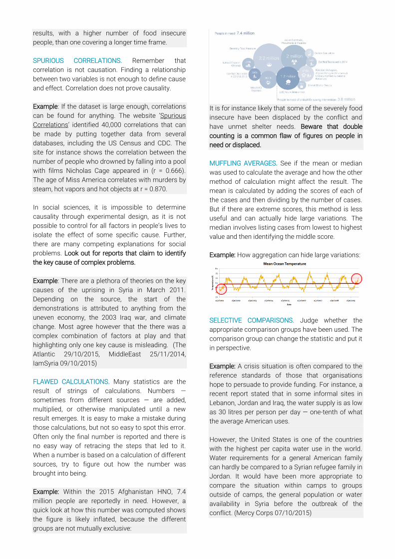
MUFFLING AVERAGES. See if the mean or median
was used to calculate the average and how the other
method of calculation might affect the result. The
mean is calculated by adding the scores of each of
the cases and then dividing by the number of cases.
But if there are extreme scores, this method is less
useful and can actually hide large variations. The
median involves listing cases from lowest to highest
value and then identifying the middle score.
Example: How aggregation can hide large variations:
SELECTIVE COMPARISONS. Judge whether the
appropriate comparison groups have been used. The
comparison group can change the statistic and put it
in perspective.
Example: A crisis situation is often compared to the
reference standards of those that organisations
hope to persuade to provide funding. For instance, a
recent report stated that in some informal sites in
Lebanon, Jordan and Iraq, the water supply is as low
as 30 litres per person per day — one-tenth of what
the average American uses.
However, the United States is one of the countries
with the highest per capita water use in the world.
Water requirements for a general American family
can hardly be compared to a Syrian refugee family in
Jordan. It would have been more appropriate to
compare the situation within camps to groups
outside of camps, the general population or water
availability in Syria before the outbreak of the
conflict. (Mercy Corps 07/10/2015)
UNHELPFUL STANDARDS. Carefully review
standards used. Compare results to standards only
if those standards are appropriate and relevant.
Example: The World Bank defines countries with a
per capita of USD 2.86 a day as middle income
countries as opposed to low income countries.
Several groups oppose this classification, which
impacts a country’s access to loans and aid, stating
that the bar is too low.
CHANGING DENOMINATORS. When looking at
comparisons over time, carefully scrutinise the
denominator.
Example: The number of mothers dying during
childbirth in a specific country could for instance be
10 per day in 1990, compared to 12 people a day
currently. At first sight, this reflects an increase in
maternal mortality. However, this absolute increase
might simply reflect the growing population. The
actual rate at which the problem is occurring might
be unchanged—or even declining.
How Is It Packaged?
“I have a great subject [statistics] to write
upon, but feel keenly my literary incapacity
to make it easily intelligible without
sacrificing accuracy and thoroughness” (Sir
Francis Galton)
There is a lot of information out there, and most of it
goes unnoticed, so there are several commonly used
methods to make findings stand out. However, these
methods often clash with the accuracy of reporting.
If a number is particularly salient or stands out,
consider the following traps.
MISLEADING WORDING. Look out for eye-catching
statistics that are easy to remember but trick the
readers:
Hyperboles: ‘the greatest’, ‘the largest’ ‘the most’,
‘record setting’. Superlatives imply comparison,
suggesting that someone has measured two or
more phenomena and determined which one is
most significant. However, just as often, this
qualification is not based on a comparison of similar
examples.
Myths: Watch out when something is called a ‘myth’,
which signals a contentious issue, that people
disagree about what is true and false. The evidence
supporting all parties should be reviewed.
Discoveries: The media often cover scientific
developments by packaging them as dramatic
discoveries and universal truths rather than a single
research finding. Subsequent reports that nuance or
challenge the discovery often receive less attention.
Reversal of long-term trends: Watch out for
arguments that long-term trends are about to be
reversed. This is very rare and deserves careful
examination.
Example: In April 2014, Nigeria’s estimated GDP was
revised from 42.4 trillion naira (USD 269 billion) to
80.2 trillion naira (USD 510 billion), a 90% increase.
Several media outlets made statements such as
“Nigeria has turned into the richest African country
overnight”. However, Nigerians are no richer than
they were before the GDP figures were revised, nor
was the economy any different. The sudden increase
was a result of a change in measurement choices, a
change in baseline year. Nigeria’s old GDP data
relied on a hopelessly dated snapshot of its
economy in 1990. The new figures, using 2010 as
the base year, gave due weight to fast-growing
industries such as mobile telecoms and filmmaking
that have sprung up since then. (Economist
14/04/2015)
Statistical milestones: Be wary of the significance of
statistical milestones. Reports that some statistical
threshold has been reached are popular, but most of
the time meaningless as they only underlie the
ongoing trend.
Example: International media reported with alarm
and fear that the threshold of 10,000 Ebola cases
was reached on 25 October 2014. However, taking
into account the trend of the previous weeks, it was
obvious this figure would be reached sooner or later.
In addition, 10,000 only included reported cases
while, at that time, almost 50% of cases were
unreported, meaning that this milestone must have
been reached long before WHO reported it.
Epidemics: Be wary of announcements of a new
“epidemic”. These often involves comparisons
between old numbers (when no one was paying
close attention) and new figures (collected by people
keeping much closer tabs on things).
MISLEADING CALCULATIONS. Every 3.6 seconds
one person dies of starvation. Every minute 28 girls
younger than 18 are married off. Every hour, more
than 10,000 sharks are killed by humans.
Social problems are often presented as occurring
every X minutes to increase the shock factor. People
who package statistics choose the mathematical
format that will make the most powerful impression.
Quantities can be expressed in different ways:
percentages, proportions, absolute numbers and still
refer to the same amount mathematically. The
choice of format used to present the statistic can
influence the reader’s perception of the reality.
Example: “Every two hours a woman dies from an
unsafe abortion in India.” This statistic is striking and
memorable. However, if the absolute number is
presented, 4,380, it is just another figure that will be
forgotten as soon as it is read. (The HINDU. Unsafe
abortions killing a woman every two hours, 2013)
Big round numbers: Big numbers make big
impressions. However, big round numbers are often
just estimates. These guesstimates are likely to err
on the side of exaggeration.
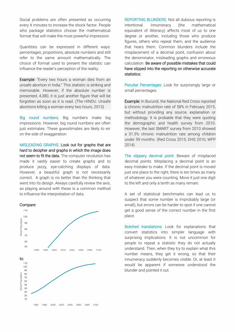
MISLEADING GRAPHS. Look out for graphs that are
hard to decipher and graphs in which the image does
not seem to fit the data. The computer revolution has
made it vastly easier to create graphs and to
produce jazzy, eye-catching displays of data.
However, a beautiful graph is not necessarily
correct. A graph is no better than the thinking that
went into its design. Always carefully review the axis,
as playing around with these is a common method
to influence the interpretation of data.
Compare:
to:
REPORTING BLUNDERS. Not all dubious reporting is
intentional. Innumeracy (the mathematical
equivalent of illiteracy) affects most of us to one
degree or another, including those who produce
figures, others who repeat them, and the audience
that hears them. Common blunders include the
misplacement of a decimal point, confusion about
the denominator, misleading graphs and erroneous
calculation. Be aware of possible mistakes that could
have slipped into the reporting on otherwise accurate
statistics:
Peculiar Percentages: Look for surprisingly large or
small percentages.
Example: In Burundi, the National Red Cross reported
a chronic malnutrition rate of 58% in February 2015,
but without providing any source, explanation or
methodology. It is probable that they were quoting
the demographic and health survey from 2010.
However, the last SMART survey from 2013 showed
a 31.5% chronic malnutrition rate among children
under 59 months. (Red Cross 2015, DHS 2010, WFP
2014)
The slippery decimal point: Beware of misplaced
decimal points. Misplacing a decimal point is an
easy mistake to make. If the decimal point is moved
just one place to the right, there is ten times as many
of whatever you were counting. Move it just one digit
to the left and only a tenth as many remain.
A set of statistical benchmarks can lead us to
suspect that some number is improbably large (or
small), but errors can be harder to spot if one cannot
get a good sense of the correct number in the first
place.
Botched translations: Look for explanations that
convert statistics into simpler language with
surprising implications. It is not uncommon for
people to repeat a statistic they do not actually
understand. Then, when they try to explain what this
number means, they get it wrong, so that their
innumeracy suddenly becomes visible. Or, at least it
would be apparent if someone understood the
blunder and pointed it out.
Sources and Background
Readings
Ellenberg, J. 2014. How Not to Be Wrong: The
Power of Mathematical Thinking. First Edition,
New York, Penguin Press.
Jerven, M. 2013. Poor Numbers: How We Are
Misled by African Development Statistics and
What to Do About It. First Edition, Cornell
University Press.
Paulos, J. A. 2001. Innumeracy: Mathematical
Illiteracy and Its Consequences. First Edition,
New York, Hill and Wang.
Stuart, E., Samman, E., Avis, W., Berliner, T. 2015.
The Data Revolution: Finding the Missing
Millions. London, Overseas Development
Institute (ODI).
Best, J. 2013. Stat-Spotting: A Field Guide to
Identifying Dubious Data. Updated and
Expanded, Berkeley, University of California
Press.