Spatial Interpolation Lecture 7-8. Purposes Estimating or interpolating values at unsampled sites...
63
Spatial Interpolation Lecture 7-8
-
Upload
isaac-king -
Category
Documents
-
view
219 -
download
0
Transcript of Spatial Interpolation Lecture 7-8. Purposes Estimating or interpolating values at unsampled sites...
Spatial Interpolation
Lecture 7-8
Purposes
• Estimating or interpolating values at unsampled sites within the area covered by existing observations – Visiting every location is usually difficult or
expensive.– Assumption: spatially distributed objects are
spatially correlated. in other words, things are close together tend to have similar characteristics (first law of geography, also called spatial autocorrelation).

example
• Few sample points – to fill all cells

Example: Point elevation to surface


Deterministic or Geostatistical
• Deterministic interpolation is directly based on the surrounding measured values or on specified mathematical formulas that determine the smoothness of the resulting surface.
• Geostatistical interpolation is based on statistical models that include autocorrelation (statistical relationshipsamong the measured points).
• In generally, deterministic method is less accurate but less computation expensive, geostatistic method is more accurate but more computation expensive.

Global interpolation
• global interpolators determine a single function which is mapped across the whole region – a change in one input value affects the entire
map – global algorithms tend to produce smoother
surfaces with less abrupt changes are used when there is an hypothesis about the form of the surface, e.g. a trend
Local interpolation
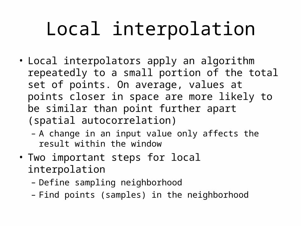
• Local interpolators apply an algorithm repeatedly to a small portion of the total set of points. On average, values at points closer in space are more likely to be similar than point further apart (spatial autocorrelation)– A change in an input value only affects the result
within the window
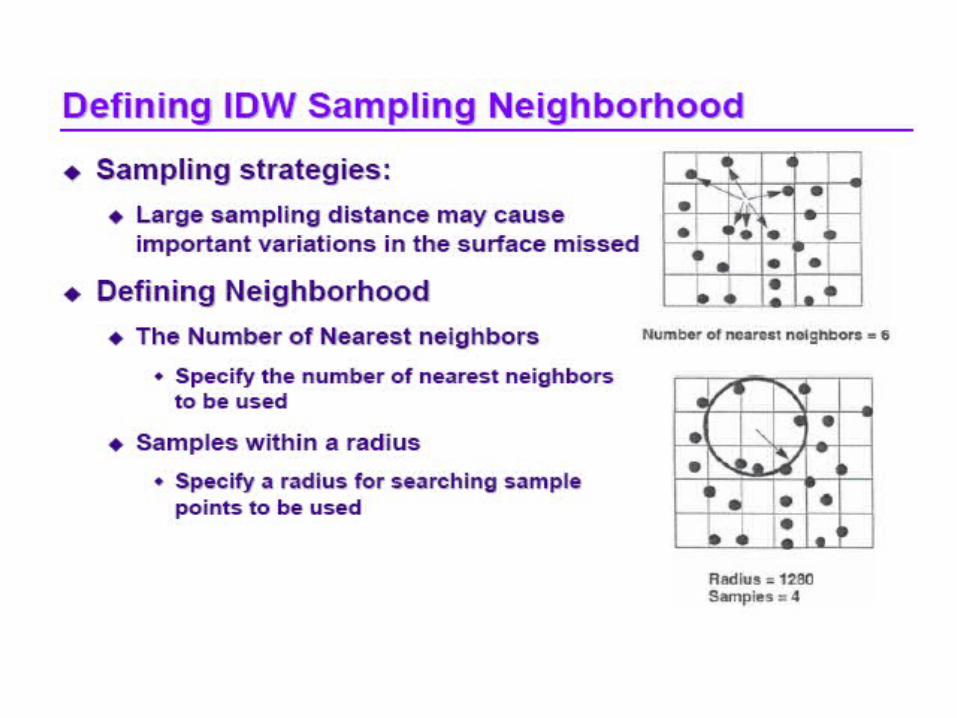
• Two important steps for local interpolation– Define sampling neighborhood– Find points (samples) in the neighborhood
If no directional influence
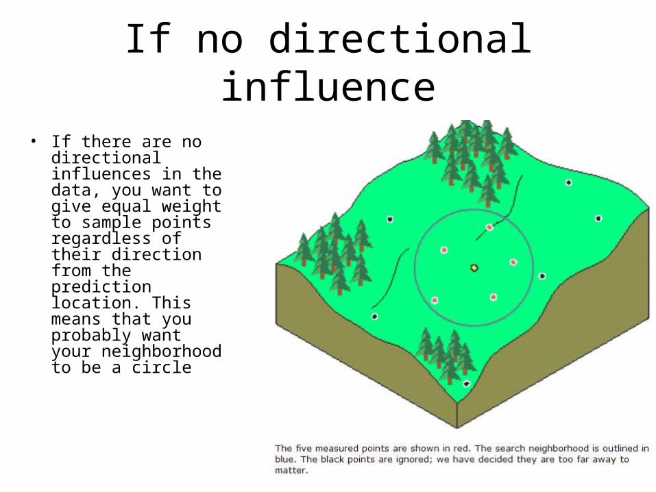
• If there are no directional influences in the data, you want to give equal weight to sample points regardless of their direction from the prediction location. This means that you probably want your neighborhood to be a circle

If directional influence• if there is directional
influence in your data (such as might be caused by water draining downhill), then you may want to make an ellipse with the major axis running uphill/downhill

Sample points• Once a shape is specified,
you can restrict which sample points within the neighborhood are used. You do this by specifying the maximum and minimum numbers of points to use and by dividing the neighborhood into sectors. If the neighborhood is sectored, then the maximum and minimum constraints are applied to each part
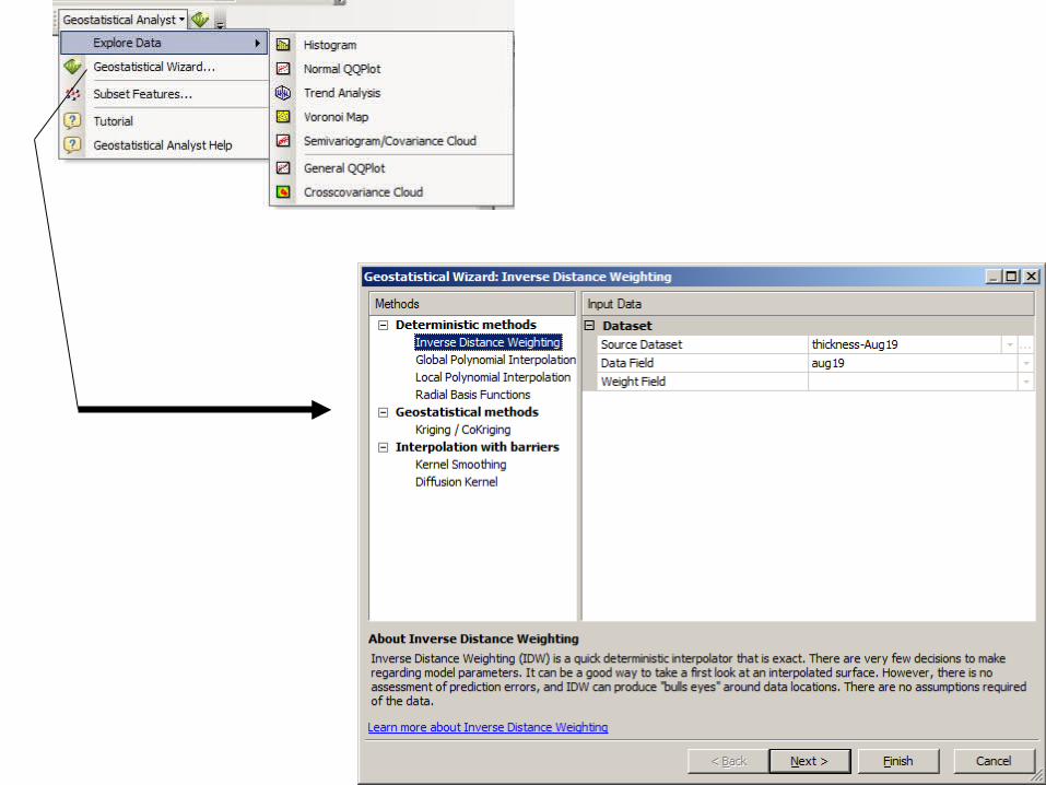
1. Explore data before interpolation
• Before creating a surface, explore data (ED) tool enables you to gain a deeper understanding of the phenomena you are investigating so that you can make better decisions on issues relating to your data.
• Exploring the distribution of the data, looking for global and local outliers, looking for global trends, examining spatial autocorrelation, and understanding the covariation among multiple datasets.
• Tools includes Histogram, Voronoi Map, Normal QQPlot, Trend Analysis, Semivariogram/Covariance Cloud, General QQPlot, and Crosscovariance Cloud.
• Only works on point and polygon layers

1.1 Histogram
• provides a univariate (one-variable) description of your data, displays the frequency distribution for the dataset of interest and calculates summary statistics.
• measures of location: - mean, median, and quartiles
• measures of spread: - standard deviation, variance
• measures of shape: - skewness, kurtosis
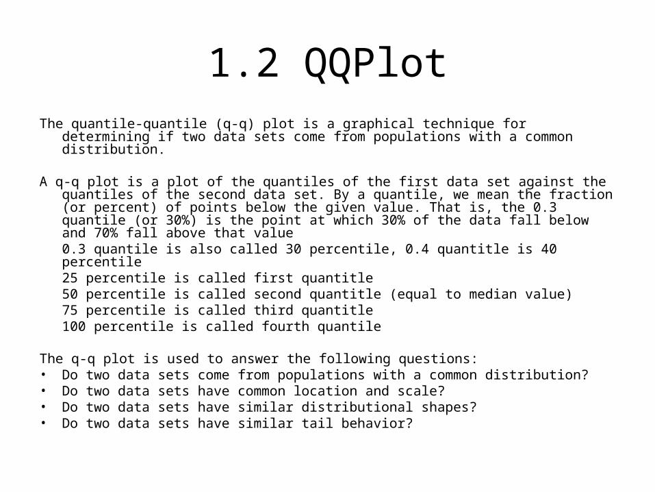
1.2 QQPlotThe quantile-quantile (q-q) plot is a graphical technique for determining if two data sets
come from populations with a common distribution.
A q-q plot is a plot of the quantiles of the first data set against the quantiles of the second data set. By a quantile, we mean the fraction (or percent) of points below the given value. That is, the 0.3 quantile (or 30%) is the point at which 30% of the data fall below and 70% fall above that value 0.3 quantile is also called 30 percentile, 0.4 quantitle is 40 percentile25 percentile is called first quantitle 50 percentile is called second quantitle (equal to median value)75 percentile is called third quantitle100 percentile is called fourth quantile
The q-q plot is used to answer the following questions: • Do two data sets come from populations with a common distribution? • Do two data sets have common location and scale? • Do two data sets have similar distributional shapes? • Do two data sets have similar tail behavior?
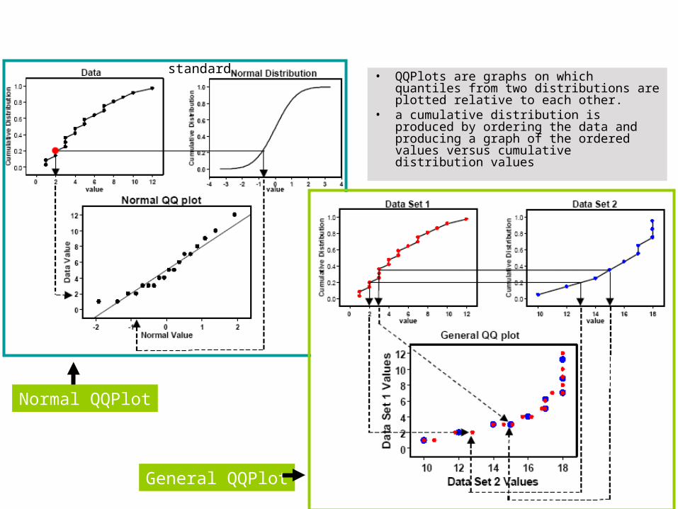
• QQPlots are graphs on which quantiles from two distributions are plotted relative to each other.
• a cumulative distribution is produced by ordering the data and producing a graph of the ordered values versus cumulative distribution values
Normal QQPlot
General QQPlot
standard
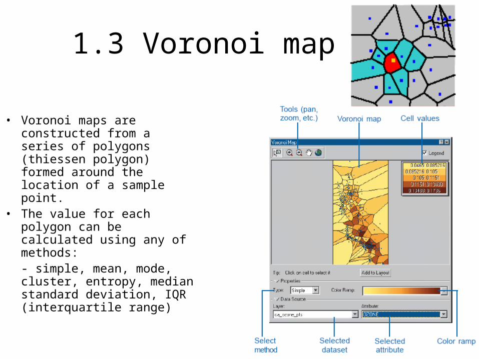
1.3 Voronoi map
• Voronoi maps are constructed from a series of polygons (thiessen polygon) formed around the location of a sample point.
• The value for each polygon can be calculated using any of methods:- simple, mean, mode, cluster, entropy, median standard deviation, IQR (interquartile range)

1.4 Trend analysis
• You may be interested in mapping a trend, or you may wish to remove a trend from the dataset before using kriging. The Trend Analysis tool can help identify global trends in the input dataset.
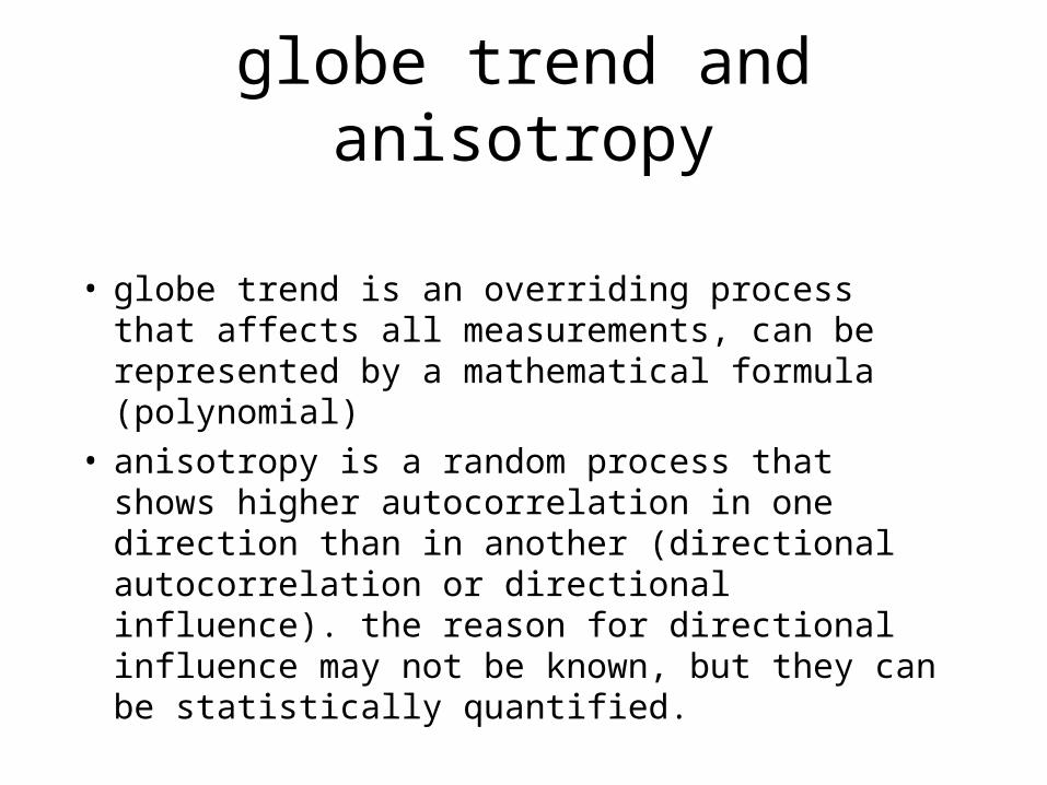
globe trend and anisotropy
• globe trend is an overriding process that affects all measurements, can be represented by a mathematical formula (polynomial)
• anisotropy is a random process that shows higher autocorrelation in one direction than in another (directional autocorrelation or directional influence). the reason for directional influence may not be known, but they can be statistically quantified.

1.5 Semivariogram/covariance cloud
• The semivariogram/covariance cloud shows the empirical semivariogram (half of the difference squared) and covariance for all pairs of locations within a dataset and plots them as a function of the distance between the two locations.
• the empirical semivariogram for the (i,j)th pair is simply
0.5*(z(si)-z(sj))2, and the empirical covariance is the cross-product
where is the average of the data. The semivariogram/covariance cloud can be used to examine the local characteristics of spatial autocorrelation within a dataset and look for outliers.

Semivariogram depicts the spatial autocorrelation
Creating Variography

Understanding a semivariogram -range, sill, and nugget
The distance where the model first flattens out is known as the rangeThe value at which the model attains the range is called the sillThe value at which the model intercepts the y-axis is called the nugget

Fitting the semivariogram
• Circular, spherical, exponential, Gaussian, and linear.

Making a prediction
• prediction based on the semivarioogram model and the measured values that are nearby (using search radius)
• fixed search radius: requires a distance and minimum number of points
• variable search radius: number of points needs to be specified. You can also specify a maximum distance (radius), that the search radius cannot exceed.

To explore a directional influence in the semivariogram cloud, we use the
Search Direction tools
• the direction the pointer is facing determiners which pairs of data locations are plotted on the semivariogram.
• lag size is the size of a lag distance, used to reduce the larger number of possible combinations. it is the size of the cells in the semivariogram surface.
• number of cells is called number of lags, counted as the number of adjacent cells in a straight horizontal or vertical line from the center to the edge of the figure.

1.6 Crosscovariance cloud
• The crosscovariance cloud shows the empirical crosscovariance for all pairs of locations between two datasets and plots them as a function of the distance between the two locations.
• Let z(si) denote the value at the i th location in dataset 1, and let y(tj) denote the value at the j th location in dataset 2.

Relation between variogram and covariance
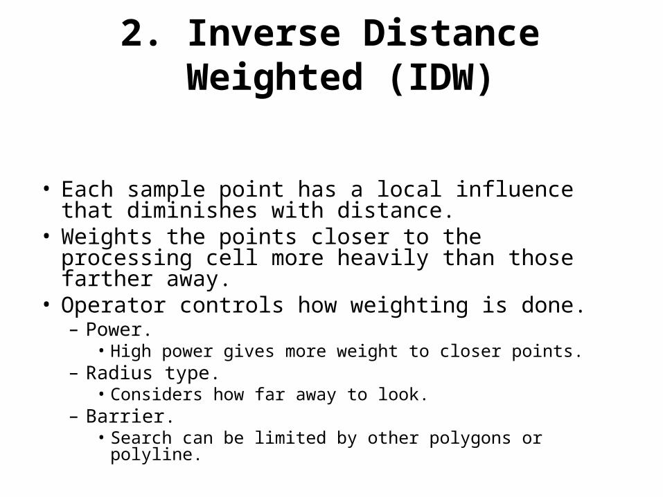
2. Inverse Distance Weighted (IDW)
• Each sample point has a local influence that diminishes with distance.
• Weights the points closer to the processing cell more heavily than those farther away.
• Operator controls how weighting is done.– Power.
• High power gives more weight to closer points.– Radius type.
• Considers how far away to look.– Barrier.
• Search can be limited by other polygons or polyline.

IDW Characteristics
• Inverse Distance Weighting (IDW) is a quick deterministic interpolator that is exact. There are very few decisions to make regarding model parameters. It can be a good way to take a first look at an interpolated surface. However, there is no assessment of prediction errors, and IDW can produce "bulls eyes" around data locations. There are no assumptions required of the data.

IDW: a local interpolator
rrr
We usually uses power functions greater than 1.A r = 2 is known as the inverse distance squared weighted interpolation.

Adv. and disadv.


3. Global Polynomial interpolator
• Global Polynomial (GP) is a quick deterministic global interpolator that is smooth (inexact). There are very few decisions to make regarding model parameters. It is best used for surfaces that change slowly and gradually. However, there is no assessment of prediction errors and it may be too smooth. Locations at the edge of the data can have a large effect on the surface. There are no assumptions required of the data.

GP interpolation fits a polynomial regression to x,y coordinates
First order
Second order:Third order:
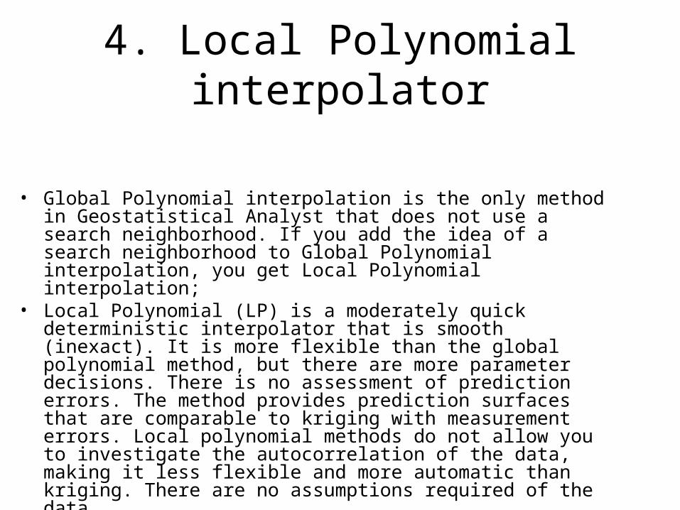
4. Local Polynomial interpolator
• Global Polynomial interpolation is the only method in Geostatistical Analyst that does not use a search neighborhood. If you add the idea of a search neighborhood to Global Polynomial interpolation, you get Local Polynomial interpolation;
• Local Polynomial (LP) is a moderately quick deterministic interpolator that is smooth (inexact). It is more flexible than the global polynomial method, but there are more parameter decisions. There is no assessment of prediction errors. The method provides prediction surfaces that are comparable to kriging with measurement errors. Local polynomial methods do not allow you to investigate the autocorrelation of the data, making it less flexible and more automatic than kriging. There are no assumptions required of the data.

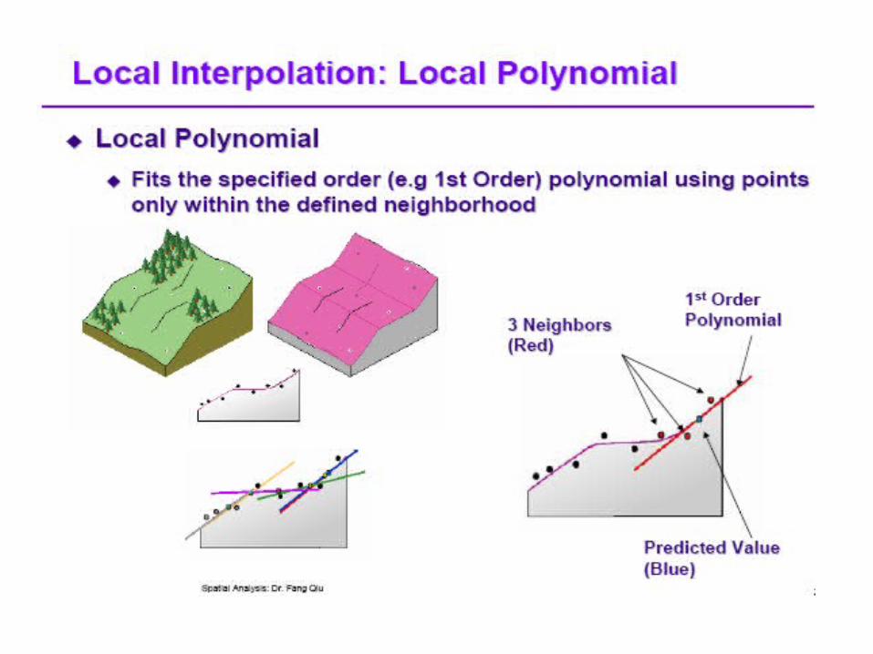
• Local polynomial interpolation creates a surface from many different formulas, each of which is optimized for a neighborhood
• The neighborhood shape, maximum and minimum number of points, and sector configuration can be specified. In addition, as with IDW, the sample points in a neighborhood can be weighted by their distance from the prediction location. Thus, local polynomial interpolation produces surfaces that better account for local variation.

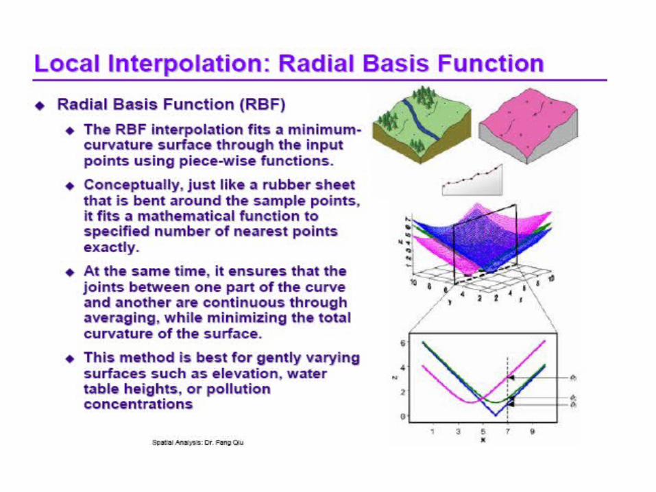
5. Radial Basis Functions
• Radial Basis Functions (RBF) are moderately quick deterministic interpolators that are exact. They are much more flexible than IDW, but there are more parameter decisions. There is no assessment of prediction errors. The method provides prediction surfaces that are comparable to the exact form of kriging. Radial Basis Functions do not allow you to investigate the autocorrelation of the data, making it less flexible and more automatic than kriging. Radial Basis Functions make no assumptions about the data.
• RBF seems like a rubber membrane that is fitted to each of the measured data points while minimizing the total curvature of the surface. Because the surface must pass through each sampled point, radial basis functions are exact interpolators
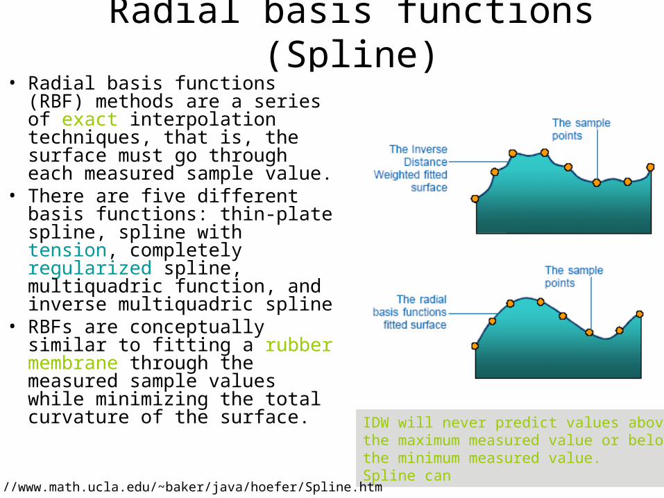
Radial basis functions (Spline)• Radial basis functions (RBF)
methods are a series of exact interpolation techniques, that is, the surface must go through each measured sample value.
• There are five different basis functions: thin-plate spline, spline with tension, completely regularized spline, multiquadric function, and inverse multiquadric spline
• RBFs are conceptually similar to fitting a rubber membrane through the measured sample values while minimizing the total curvature of the surface. IDW will never predict values above
the maximum measured value or belowthe minimum measured value. Spline can
http://www.math.ucla.edu/~baker/java/hoefer/Spline.htm

Radial basis functions
When running spline in Spatial Analyst
weight: - regularized: 0, 0.001, 0.01, 0.1, 0.5 the higher the weight, the smoother the surface - tension: 0, 1, 5, 10 the higher, the coarser
number of points: - used in the calculation. the more points. the smoother the surface
Wi
Wi
Bias or error

6. Kriging
• Kriging is a moderately quick interpolator that can be exact or smoothed depending on the measurement error model. It is very flexible and allows you to investigate graphs of spatial autocorrelation. Kriging uses statistical models that allow a variety of map outputs including predictions, prediction standard errors, probability, etc. The flexibility of kriging can require a lot of decision-making. Kriging assumes the data come from a stationary stochastic process, and some methods assume normally-distributed data.

Kriging assumptions
• Spatially continuous data (not event or discrete). – If your data is discrete data, density analysis
might be more appropriate analysis
• Spatial autocorrelation (the closer in distance, the closer in value, using semivariogram)– If your data is not spatially autocorrelated, the
Kridging is not appropriate. Other statistical methods may be appropriate.

Cont’
• Stationary (values depends on distance not on location).– you can test this using Voronoi map, high local
varation can be shown in the Voronoi map, then you should use IDW and others.
• Normally distributed data– Use QQ plot to test
• Global trends (not allowed for and need to be removed first)– Kridging assumes a constant mean across the
surface• Spatial clustering (not allowed and need to be removed
first)
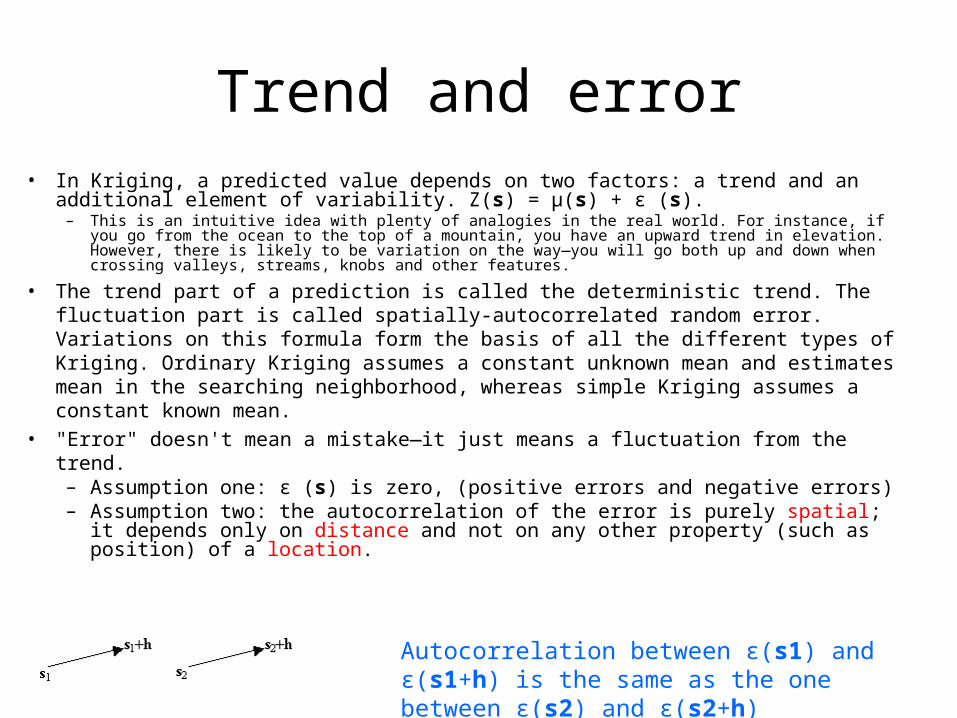
Trend and error• In Kriging, a predicted value depends on two factors: a trend and an additional
element of variability. Z(s) = μ(s) + ε (s).– This is an intuitive idea with plenty of analogies in the real world. For instance, if you go from the
ocean to the top of a mountain, you have an upward trend in elevation. However, there is likely to be variation on the way—you will go both up and down when crossing valleys, streams, knobs and other features.
• The trend part of a prediction is called the deterministic trend. The fluctuation part is called spatially-autocorrelated random error. Variations on this formula form the basis of all the different types of Kriging. Ordinary Kriging assumes a constant unknown mean and estimates mean in the searching neighborhood, whereas simple Kriging assumes a constant known mean.
• "Error" doesn't mean a mistake—it just means a fluctuation from the trend. – Assumption one: ε (s) is zero, (positive errors and negative errors)– Assumption two: the autocorrelation of the error is purely spatial; it
depends only on distance and not on any other property (such as position) of a location.
Autocorrelation between ε(s1) and ε(s1+h) is the same as the one between ε(s2) and ε(s2+h)

Ordinary Kriging• In many cases, however, there is
no trend in the data—or, if there is one, it is weak enough that your predictions are just as good when you ignore it. Assuming that there is no trend in the data is mathematically equivalent to assuming that the data have a constant mean value.
• If the mean is a simple constant, such as μ(s) = μ (i.e., no trend) for all locations s, and if µ is unknown (you do not have prior knowledge of the mean value), then this is the model on which Ordinary Kriging is based.

Universal Kriging
• Sometimes, there is a trend where the data values change consistently with the spatial coordinates. Mathematically, this is represented as a linear regression equation on the spatial x- and y-coordinates. Trends that vary (do not have a constant mean), and for which the regression coefficients are unknown, form models for Universal Kriging.

Simple Kriging and indicator Kriging
• A known constant mean for the entire dataset, then you have the model for Simple Kriging.
• look at the left side of the equation, Z(s) = μ(s) + ε(s). You can do some useful math operations on Z(s). For example, suppose you want to predict the probability that Z(s) is above or below some threshold value, such as 0.12 ppm for ozone concentration. You can transform Z(s) to an indicator variable, where it gets the value 0 if Z(s) is below the threshold and 1 if it is above it. This is called Indicator Kriging.

Ordinary Kriging Simple Kriging
Universal Kriging Indicator Kriging

7. Cokriging
• Cokriging is a moderately quick interpolator that can be exact or smoothed depending on the measurement error model. Cokriging uses multiple datasets and is very flexible, allowing you to investigate graphs of autocorrelation (one dataset) and cross-correlation (between two or more datasets). Cokriging uses statistical models that allow a variety of map outputs including predictions, prediction standard errors, probability, etc. The flexibility of cokriging requires the most decision-making. Cokriging assumes the data come from a stationary stochastic process, and some methods assume normally-distributed data.
• Read papers 3,4

8. definitions of output maps (for Kriging methods)
• Prediction maps (interpolated maps) estimate values at locations where measurements have not been taken.
• Standard error maps (the square root of the variance of a prediction) show the distribution of prediction error for a surface. Error tends to be highest in places where there is little or no sample data.
• Quantile maps show the values with 100 percent probability that the true values are less than the quantile map values.
• Probability maps show the odds that the true value at a location is greater than a threshold value. The probability of exceeding a threshold is determined from predicted values, the error distribution, and the specified threshold value

Kriging family and output maps
• Transformation and trend removal can help justify assumptions of normality and stationarity

creating a prediction map
• while applying a transformation
• while using detrending
• while considering error for nugget

9. Performing diagnostics
• before produce a final surface, you should know how well the model predicts the values at unknown locations. cross-validation and validation help you make an informed decision as to which model provides the best predictions.
• cross-validation uses all of the data to estimate the autocorrelation model. Then it removes each data location, one at a time, and predicts the associated data value. compare the predicted value with measured value
• validation first remove part of the data (test dataset) using Create Subset tool, and then uses the rest of the data (training dataset) to develop the trend and autocorrection models to be used for prediction
• in both methods, graphs and summary statistics used for diagnostics are the same: predicted, prediction error (predicted-measured), standardized error (error/estimated kriging standard error), normal QQPlot (standardized error and standard normal distribution)

create subset for validation
demo

Basic rules for good predicts
• Mean error should be close to 0, • RMS (root-mean-square) error, average standard error, and mean
standardized error should be as small as possible,• Root mean square stardardized error should be close to 1• uncertainty of prediction standard errors: average estimated
standard error versus RMS prediction error. - equal, good- larger than RMS, overestimate- less than RMS, underestimate
or RMS standardized error - =1, good,- <1, overestimate- >1, underestimate

10. Compare model results• model
surfaces can be compared using cross-validation statistics
• previous basic rules for good predict still use in here

11. Displaying geostatistical layers

12. Comparison of different mathods
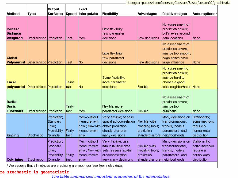
here stochastic is geostatistic

Summary
• Kriging performs statistical analysis of the error in its predictions. This allows it to create four kinds of surfaces: prediction, standard error, quantile, and probability.
• Prediction maps estimate values at locations where measurements have not been taken. (All interpolators make prediction maps.)
• Standard error maps show the distribution of prediction error for a surface. Error tends to be highest in places where there is little or no sample data.
• Quantile maps show the values that the true values are unlikely to exceed. • Probability maps show the odds that the true value at a location is greater than a
threshold value. • The various interpolation methods (Inverse Distance Weighting, Global
Polynomial, Local Polynomial, Radial Basis Functions, and Kriging) offer trade-offs in speed, flexibility, and their advantages and disadvantages.
• Fast interpolators produce output surfaces quickly, but are not as good at capturing subtle surface variations.
• Exact interpolators predict values equal to the observed value at all sampled locations. Smooth interpolators do not.
• Flexible interpolators allow users to fine-tune the output, while inflexible interpolators allow users to avoid making lots of choices

Main references
• ESRI book “using ArcGIS Geostatistical Analyst”
• ESRI visual campus at campus.esri.com


![Rootsbender.astro.sunysb.edu/.../interpolation-roots.pdf · Cubic Splines Cubic splines: 3rd order polynomial in [x i, xi+1] – 1. Start by linearly interpolating second derivatives](https://static.fdocuments.net/doc/165x107/5f0661bf7e708231d417b6bd/cubic-splines-cubic-splines-3rd-order-polynomial-in-x-i-xi1-a-1-start-by.jpg)