Southern Illinois Income and Employment - Office of Research
22
1 Southern Illinois Income and Employment Joanna Ganning, Courtney Flint, and Hua Qin Department of Urban and Regional Planning Department of Natural Resources and Environmental Sciences University of Illinois at Urbana-Champaign This report briefly describes income, employment (with specific attention to the mining and manufacturing sectors), and commuting patterns in Southern Illinois. The Southern Illinois region includes the southernmost 20 counties in Illinois: Alexander, Edwards, Franklin, Gallatin, Hamilton, Hardin, Jackson, Jefferson, Johnson, Massac, Perry, Pope, Pulaski, Randolph, Saline, Union, Wabash, Wayne, White and Williamson. This description is based primarily on data from the Census Bureau, the Bureau of Economic Analysis, the Bureau of Labor Statistics, and the County Business Patterns. Analysis is predominantly at the county level for this descriptive analysis. Key Findings: • Regardless of the measure used, incomes in Southern Illinois are substantially lower than incomes across Illinois. The median household income for all households in the region in 2000 was nearly twice the median household income among the region’s black or African American households. • After accounting for inflation, the real per capita personal income in the region increased by $8,801 between 1969 and 2004. The service sector has been the largest source of employment growth (133% employment growth) in the region, but its real incomes (inflation-adjusted) fell by almost one-quarter between 1969 and 2000. • Exaggerating a national trend, earnings in Southern Illinois accounted for a significantly larger share of per capita income in 1969 (74%) than in 2004 (60%). In turn, transfer payments constituted a much larger share of per capita income in 2004 than in 1969. • Recent employment data by mining sub-sector shows a distinct spatial pattern. Most counties suffered significant mining employment loss during the 1990s. Regardless, coal mining remains one of the top industries in Southern Illinois for industry output, total value added, and worker compensation. • Manufacturing employment did not change significantly in size between 1975 and 2000. It did, however, decrease as a percent of total employment, in tandem with manufacturing across the U.S.
Transcript of Southern Illinois Income and Employment - Office of Research
1
Southern Illinois Income and Employment
Joanna Ganning, Courtney Flint, and Hua Qin
Department of Urban and Regional Planning Department of Natural Resources and Environmental Sciences
University of Illinois at Urbana-Champaign
This report briefly describes income, employment (with specific attention to the mining and manufacturing sectors), and commuting patterns in Southern Illinois. The Southern Illinois region includes the southernmost 20 counties in Illinois: Alexander, Edwards, Franklin, Gallatin, Hamilton, Hardin, Jackson, Jefferson, Johnson, Massac, Perry, Pope, Pulaski, Randolph, Saline, Union, Wabash, Wayne, White and Williamson. This description is based primarily on data from the Census Bureau, the Bureau of Economic Analysis, the Bureau of Labor Statistics, and the County Business Patterns. Analysis is predominantly at the county level for this descriptive analysis.
Key Findings:
• Regardless of the measure used, incomes in Southern Illinois are substantially
lower than incomes across Illinois. The median household income for all households in the region in 2000 was nearly twice the median household income among the region’s black or African American households.
• After accounting for inflation, the real per capita personal income in the region increased by $8,801 between 1969 and 2004. The service sector has been the largest source of employment growth (133% employment growth) in the region, but its real incomes (inflation-adjusted) fell by almost one-quarter between 1969 and 2000.
• Exaggerating a national trend, earnings in Southern Illinois accounted for a significantly larger share of per capita income in 1969 (74%) than in 2004 (60%). In turn, transfer payments constituted a much larger share of per capita income in 2004 than in 1969.
• Recent employment data by mining sub-sector shows a distinct spatial pattern. Most counties suffered significant mining employment loss during the 1990s. Regardless, coal mining remains one of the top industries in Southern Illinois for industry output, total value added, and worker compensation.
• Manufacturing employment did not change significantly in size between 1975 and 2000. It did, however, decrease as a percent of total employment, in tandem with manufacturing across the U.S.
2
• The composition of manufacturing has changed over time. Available data shows that some counties grew and others declined in manufacturing dramatically, while the region as a whole remained stable. The industrial composition also changed, though a lack of complete data prevents a clear quantification of these trends.
• Commuting patterns are complex in the Southern Illinois region. Four counties have positive in-commuting rates (Edwards, Jackson, Jefferson, Randolph). There is a (untested) spatial pattern to the county commuting classifications. Regional Centers (counties with positive net in-commute rates with no clearly exclusive source county) lie along the northern border of the region. Disperser Counties (counties with negative net in-commute rates which send workers to several counties, rather than to an identifiably dominant county) are situated in the eastern and southern portions of Southern Illinois. Jackson and Williamson Counties have unique commuting relationships not found anywhere else in the region.
Income
The 2000 Census reports a median household income of $30,846 and a median family income of $39,260 in Southern Illinois for 1999. A discrepancy of this scale between household and family income is not unusual. By comparison, the Illinois statewide median household income was $46,590 in 1999 (US Census 2000). Comparing Southern Illinois to Illinois using any population-based measure may be inappropriate due to Chicago’s immense influence and Southern Illinois’s distance from Chicago. Chicago’s influence is easily demonstrated; in 2000, 98 of Illinois’s 102 counties had Bureau of Economic Analysis per capita personal income (PCPI) levels below the statewide PCPI ($32,185). Using a measure that does not discriminate based on county population (thus not skewing state data toward Chicago) allows a county-to-county comparison. Statewide, the median county PCPI in 2000 was $23,789. In Southern Illinois, the median county PCPI was $20,359. Using both the population-discriminatory income measure (statewide PCPI) and the population-non-discriminatory measure (median county PCPI), Southern Illinois had an income level roughly 15% lower than the state. In other words, regardless of the measure, Southern Illinois had a lower income level than other parts of the state. Poverty within the region was 15.8% in 2000; statewide poverty was 10.7%. Among African Americans the rate was 39%; the statewide rate was 26.0%. Across the region, the calculated median household income was $30,846; the state’s was $46,590. Among African American households, the calculated median was $16,659; statewide the median African American household earned $31,699. Regionally, 34% of African American households earned less than $10,000, while among all households, only 15% fell into this income bracket. Among African American households, 56% earned less than $20,000. Only 33% of total households earned less than $20,000. Among African American households, 2.6% earned over $100,000 regionally. Among all households in the region, 4.5% earned over $100,000.

3
Of the region’s total personal income in 2004, a full 60% came from net earnings by place of residence. One-sixth (16.5%) of total personal income stemmed from dividends, interest, and rent in both Southern Illinois and Illinois—the percentages match exactly. The remaining 23.3% in the region came from personal current transfer receipts. After accounting for inflation, regional per capita personal incomes increased by $8,801 (from $14,952 to $23,753) between 1969 and 2004 (Table 1). The composition of income by the three general sources of income (personal current transfer receipts; dividends, interest, and rent; net earnings by place of residence) also changed substantially. The percent of personal income deriving from personal current transfer receipts increased the most, by $3,569 (constant dollars), or from 13.1% of personal income in 1969 to 23.3% in 2004. Net earnings by place of residence accounted for far less of the total personal income in 2004 than it did in 1969—about 14% less. The contrast to the nation in this regard is striking. Nationwide in 1969, 84% of income derived from net earnings by place of residence. In 2004, this figure had decreased to 78%. Not only was the national decline in percent of PCPI from net earnings far less than the regional decline, but the difference between the nation and the region in 2004 is substantial—60% versus 78%. Nationally and regionally, dividends, interest, and rent constituted about 16% of total PCPI in 2004. These changes reflect an aging population, a stronger reliance on transfer payments, and a substantial decline in the real wage of the region’s fastest-growing sector, services (detailed below). Further research indicates that medical payments account for a considerable portion of the increase in transfer payments. The population grew 8.3% over this period, from 388,666 in 1969 to 420,972 in 2004.
Source
Per
Capita
Income
Amount
Percent of
Total PCPI
Per Capita
Income
Amount
Percent of
Total
PCPI
Personal current transfer receipts $1,956 13.1% 5,525$ 23.3%
Dividends, interest, and rent $1,868 12.5% 3,916$ 16.5%
Net earnings by place of residence $11,133 74.4% 14,312$ 60.3%
Total Per Capita Income $14,952 100.0% 23,753$ 100.0%
1969 (in 2004 dollars) 2004
Source: BEA-REIS Table CA05
Table 1: Components of Per Capita Personal Income (PCPI), 1969 and 2004,
Southern Illinois
Employment
Regionally, employment grew by 44.8% between 1969 and 2000 (Table 2). During this period, the region’s population grew by 9.0%, from 388,666 to 423,670. By a wide margin, the service sector contributed the most to employment growth (30,216 jobs). Certainly, 45 percent job growth sounds good, but policymakers must consider the pay,

4
health risks, and quality of life associated with the job growth. In 1969 the average service sector employee1 in Southern Illinois earned $5,077. Had that income kept up with inflation, each of those workers would have earned $23,822 in 2000. But the BEA data from 2000 shows that the average service sector worker in the region earned $19,368—a 19% decrease in the real wage. In Pope County, the decrease in service workers’ real wages was much more significant, at 41%. Increasing by 14,100 jobs, retail trade growth comes in as a distant second to the service sector. The agricultural and financial sectors also grew notably over the three decades. While most sectors grew, two conspicuously did not. Mining employment fell by roughly 3,300 jobs (in contrast to Pope County), while manufacturing lost about two thousand jobs. On-the-ground reconnaissance indicates that post-2000 manufacturing has likely continued its decline, with the closures of the Maytag (in Williamson County) and other manufacturing centers. Finally, government employment has kept pace with total employment change, at about 45%. As shown in Table 3, regional unemployment (5.6%) hovers around the state rate (5.7% in 2005). Alexander and Pulaski Counties, which consistently rate poorly on measures of socioeconomic standing, and which neighbor each other, have exceptionally high unemployment rates (8.8% and 8.0%, respectively). These findings might be used in the formation of a regional economic development plan, or in the development of targeted development plans. A more detailed evaluation of key industries, industry linkages, and emerging clusters or industries (potential sources of development) might be useful. Some of that work has been done at Western Illinois University. Additionally, population and employment projections for counties or the region may prove useful in expanding the portrait of economic change in Southern Illinois.
1 The average service sector worker wage was computed for 1969 and 2000 without Alexander, Hardin, or Massac Counties, due to data non-disclosure.

5
LineTitle
Total full-time and part-time employment 150,251 211,210
Wage and salary employment 114,849 161,202
Proprietors employment 35,402 50,008
Farm proprietors employment 12,262 11,006
Nonfarm proprietors employment 23,140 39,002
Farm employment 14,282 12,739
Nonfarm employment 135,969 198,471
Private employment 107,294 Percent 157,057 Percent
Agricultural services, forestry, fishing and other 611 0.6% 2,088 1.3%
Mining 8,823 8.2% 5,538 3.5%
Construction 7,841 7.3% 10,587 6.7%
Manufacturing 24,218 22.6% 22,166 14.1%
Transportation and public utilities 8,387 7.8% 8,868 5.6%
Wholesale trade 4,366 4.1% 5,499 3.5%
Retail trade 23,361 21.8% 37,461 23.9%
Finance, insurance, and real estate 6,888 6.4% 11,783 7.5%
Services 22,806 21.3% 53,022 33.8%
Government and government enterprises 28,675 41,414
Federal, civilian 2,044 3,264
Military 1,317 938
State and local 25,314 37,212
State government N/A 15,975
Local government N/A 21,237
Source: Bureau of Economic Analyais, REIS Table CA25. Some missing values estimated.
1969 2000
Table 2: Regional Employment by Sector, 1969 and 2000
6
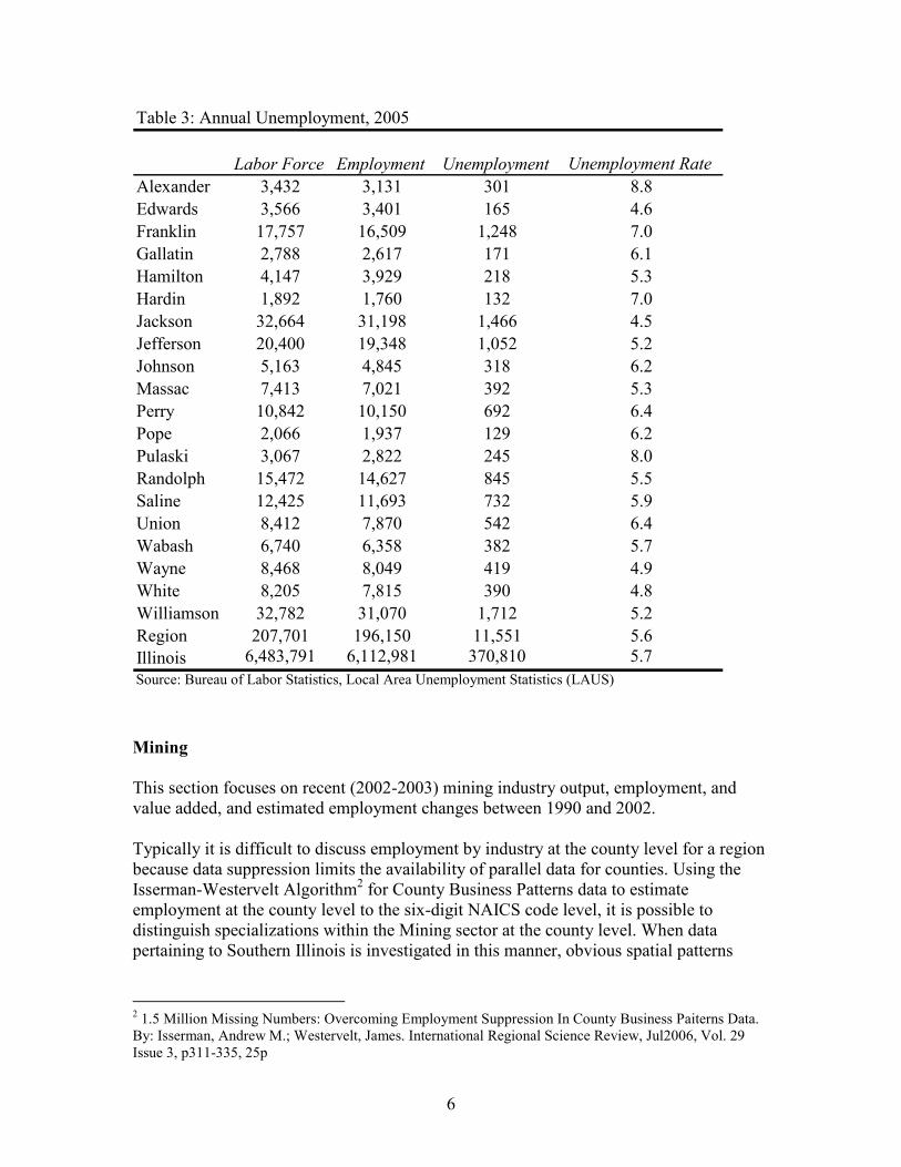
Labor Force Employment Unemployment Unemployment Rate
Alexander 3,432 3,131 301 8.8
Edwards 3,566 3,401 165 4.6
Franklin 17,757 16,509 1,248 7.0
Gallatin 2,788 2,617 171 6.1
Hamilton 4,147 3,929 218 5.3
Hardin 1,892 1,760 132 7.0
Jackson 32,664 31,198 1,466 4.5
Jefferson 20,400 19,348 1,052 5.2
Johnson 5,163 4,845 318 6.2
Massac 7,413 7,021 392 5.3
Perry 10,842 10,150 692 6.4
Pope 2,066 1,937 129 6.2
Pulaski 3,067 2,822 245 8.0
Randolph 15,472 14,627 845 5.5
Saline 12,425 11,693 732 5.9
Union 8,412 7,870 542 6.4
Wabash 6,740 6,358 382 5.7
Wayne 8,468 8,049 419 4.9
White 8,205 7,815 390 4.8
Williamson 32,782 31,070 1,712 5.2
Region 207,701 196,150 11,551 5.6
Illinois 6,483,791 6,112,981 370,810 5.7
Source: Bureau of Labor Statistics, Local Area Unemployment Statistics (LAUS)
Table 3: Annual Unemployment, 2005
Mining
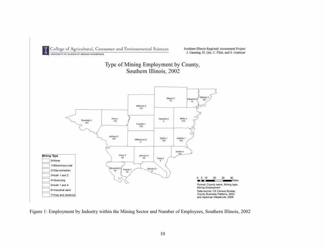
This section focuses on recent (2002-2003) mining industry output, employment, and value added, and estimated employment changes between 1990 and 2002. Typically it is difficult to discuss employment by industry at the county level for a region because data suppression limits the availability of parallel data for counties. Using the Isserman-Westervelt Algorithm2 for County Business Patterns data to estimate employment at the county level to the six-digit NAICS code level, it is possible to distinguish specializations within the Mining sector at the county level. When data pertaining to Southern Illinois is investigated in this manner, obvious spatial patterns
2 1.5 Million Missing Numbers: Overcoming Employment Suppression In County Business Paiterns Data. By: Isserman, Andrew M.; Westervelt, James. International Regional Science Review, Jul2006, Vol. 29 Issue 3, p311-335, 25p
7
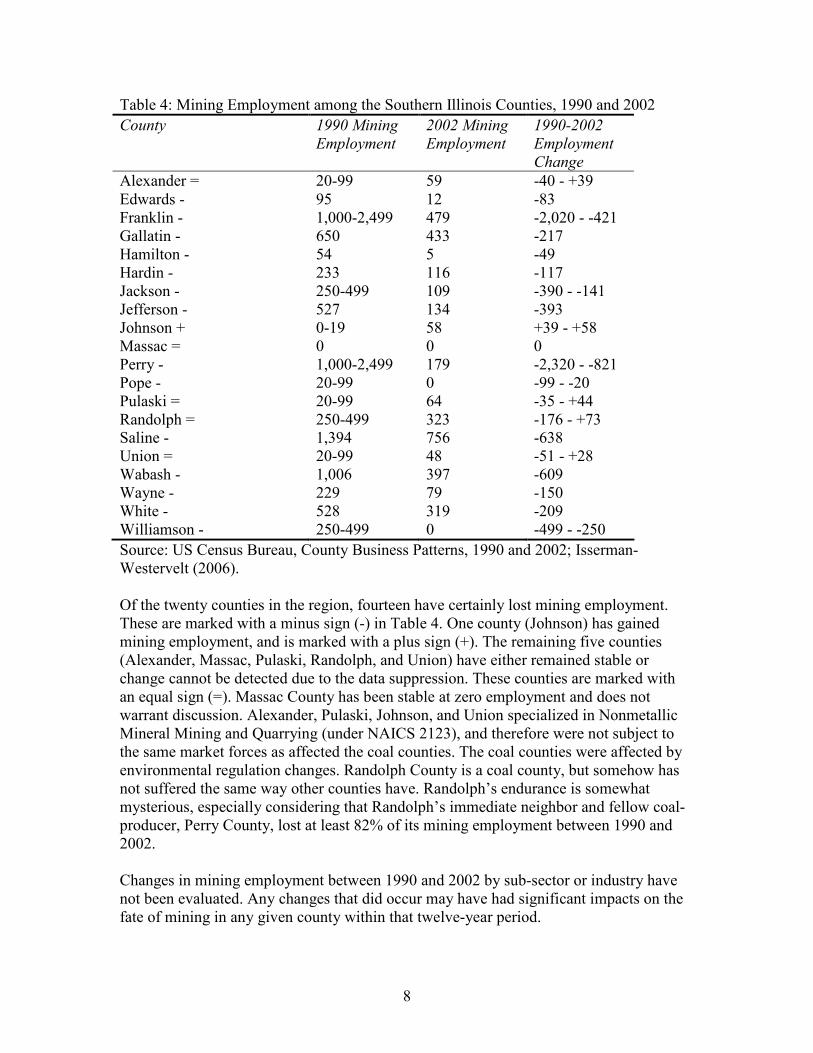
emerge among the specializations. Figure 1 roughly illustrates the spatial pattern of the data. Figure 1 shows that in 2002 there was very little mining employment in the southern portion of Southern Illinois. Alexander and Pulaski Counties have employment in industrial sand and clay and ceramics mining, respectively. They are the only regional counties working in those two specific industries. The remainder of the southern counties that have any mining employment (Johnson, Hardin, and Union) focus on quarrying. The mid-region counties (Gallatin, Saline, White, Franklin, Jackson, Randolph, and Perry) focus on bituminous coal mining. Jackson County specializes in both quarrying and bituminous coal mining. The northern counties (Wabash, Wayne, and Jefferson) specialize in gas extraction. Gas extraction is a secondary focus in White County, which borders Wayne County to the south. County names, codes for industrial specialization, and total mining employment, are given in Figure 1. Specializations are generally absolute; there is very little employment across industries within a county. Most counties suffered employment loss in mining in the 1990s. County Business Patterns data from 19903 paints a different broad-scale picture of the mining industry in Southern Illinois. Consider the employment by year, as shown in Table 4. Ranges are given where data is suppressed (see footnote 3).
3 1990 CBP data relies on the Standard Industrial Classification scheme rather than NAICS codes. The 1990 data is not eligible for the Isserman-Westervelt algorithm. Should the SICAP team decide that more accurate estimates of employment are required, they can be generated at the expense of time. Please also note that in the case of the mining sector, the SIC codes translate fairly easily to NAICS codes, so the data is nearly if not perfectly parallel.
8
Table 4: Mining Employment among the Southern Illinois Counties, 1990 and 2002
County 1990 Mining
Employment
2002 Mining
Employment
1990-2002
Employment
Change
Alexander = 20-99 59 -40 - +39 Edwards - 95 12 -83 Franklin - 1,000-2,499 479 -2,020 - -421 Gallatin - 650 433 -217 Hamilton - 54 5 -49 Hardin - 233 116 -117 Jackson - 250-499 109 -390 - -141 Jefferson - 527 134 -393 Johnson + 0-19 58 +39 - +58 Massac = 0 0 0 Perry - 1,000-2,499 179 -2,320 - -821 Pope - 20-99 0 -99 - -20 Pulaski = 20-99 64 -35 - +44 Randolph = 250-499 323 -176 - +73 Saline - 1,394 756 -638 Union = 20-99 48 -51 - +28 Wabash - 1,006 397 -609 Wayne - 229 79 -150 White - 528 319 -209 Williamson - 250-499 0 -499 - -250
Source: US Census Bureau, County Business Patterns, 1990 and 2002; Isserman-Westervelt (2006). Of the twenty counties in the region, fourteen have certainly lost mining employment. These are marked with a minus sign (-) in Table 4. One county (Johnson) has gained mining employment, and is marked with a plus sign (+). The remaining five counties (Alexander, Massac, Pulaski, Randolph, and Union) have either remained stable or change cannot be detected due to the data suppression. These counties are marked with an equal sign (=). Massac County has been stable at zero employment and does not warrant discussion. Alexander, Pulaski, Johnson, and Union specialized in Nonmetallic Mineral Mining and Quarrying (under NAICS 2123), and therefore were not subject to the same market forces as affected the coal counties. The coal counties were affected by environmental regulation changes. Randolph County is a coal county, but somehow has not suffered the same way other counties have. Randolph’s endurance is somewhat mysterious, especially considering that Randolph’s immediate neighbor and fellow coal-producer, Perry County, lost at least 82% of its mining employment between 1990 and 2002. Changes in mining employment between 1990 and 2002 by sub-sector or industry have not been evaluated. Any changes that did occur may have had significant impacts on the fate of mining in any given county within that twelve-year period.

9
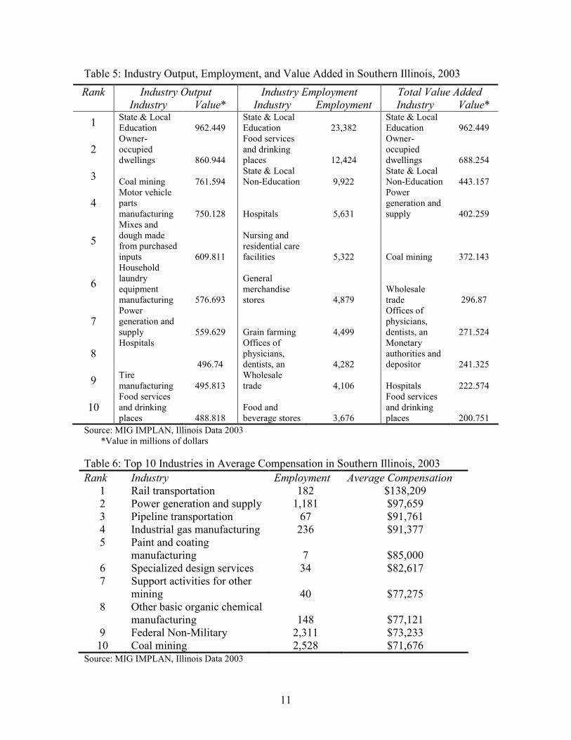
Regardless of regulations and employment decline, coal mining remains one of the top industries in Southern Illinois for industrial output, total value added, and worker compensation. According to 2003 IMPLAN data (Table 5), coal mining ranked third in terms of industry output (meaning value of production of the industry for a year). As one might expect, coal mining also appears in the top ten for total value added (defined as all income to workers paid by employers, including self-employed income; interests, rents, royalties, dividends, and profit payments; and excise and sales taxes paid by individuals to businesses.4 In contrast, coal mining does not appear on the top ten industries list for employment. That coal mining contributes so strongly to the economy without employing a large share of workers is not surprising. Incomes in mining and related sectors are quite high in the region. Furthermore, coal mining is also highly mechanized, which makes it more competitive and less dependent on human labor.5 Table 6 lists the top ten industries for average per worker compensation6 in 2003. Power generation and supply, support services for mining, and coal mining all appear in the top ten industries for employee compensation. Specialized manufacturing industries are also prominent in Table 6. Rail transportation, though a historic driver of development in Southern Illinois, is nonetheless surprising, if only for its very high income. Although it has nothing to do with coal mining, it bears noting that 215 of the 509 IMPLAN industries have no employment in Southern Illinois.
4 http://aimag.ag.utk.edu/popup/multipliers.html
5 Command and Control. (2006). E&MJ: Engineering & Mining Journal, 207(5), 58-59; DeGaspari, J. (2003). Armchair mining. Mechanical Engineering, 125(5), 42.
6 Employee compensation includes wages, salary, and non-cash compensation such as benefits
10
Figure 1: Employment by Industry within the Mining Sector and Number of Employees, Southern Illinois, 2002
11
Table 5: Industry Output, Employment, and Value Added in Southern Illinois, 2003
Source: MIG IMPLAN, Illinois Data 2003 *Value in millions of dollars
Table 6: Top 10 Industries in Average Compensation in Southern Illinois, 2003
Rank Industry Employment Average Compensation
1 Rail transportation 182 $138,209 2 Power generation and supply 1,181 $97,659 3 Pipeline transportation 67 $91,761 4 Industrial gas manufacturing 236 $91,377 5 Paint and coating
manufacturing 7 $85,000 6 Specialized design services 34 $82,617 7 Support activities for other
mining 40 $77,275 8 Other basic organic chemical
manufacturing 148 $77,121 9 Federal Non-Military 2,311 $73,233 10 Coal mining 2,528 $71,676
Source: MIG IMPLAN, Illinois Data 2003
Rank Industry Output Industry Employment Total Value Added
Industry Value* Industry Employment Industry Value*
1 State & Local Education 962.449
State & Local Education 23,382
State & Local Education 962.449
2 Owner-occupied dwellings 860.944
Food services and drinking places 12,424
Owner-occupied dwellings 688.254
3 Coal mining 761.594
State & Local Non-Education 9,922
State & Local Non-Education 443.157
4 Motor vehicle parts manufacturing 750.128 Hospitals 5,631
Power generation and supply 402.259
5
Mixes and dough made from purchased inputs 609.811
Nursing and residential care facilities 5,322 Coal mining 372.143
6
Household laundry equipment manufacturing 576.693
General merchandise stores 4,879
Wholesale trade 296.87
7 Power generation and supply 559.629 Grain farming 4,499
Offices of physicians, dentists, an 271.524
8 Hospitals
496.74
Offices of physicians, dentists, an 4,282
Monetary authorities and depositor 241.325
9 Tire manufacturing 495.813
Wholesale trade 4,106 Hospitals 222.574
10 Food services and drinking places 488.818
Food and beverage stores 3,676
Food services and drinking places 200.751
12
Manufacturing
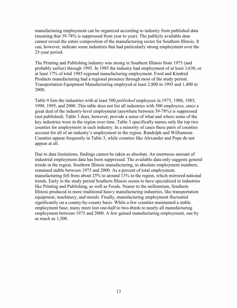
This section briefly describes the manufacturing sector in Southern Illinois between 1975 and 2000. Due to data non-continuity between 2000 and post-2000 years7, data is reported here only through 2000. Between 1975 and 2000, both regionally and nationally, absolute manufacturing employment remained stable. Nationally, manufacturing saw a 0.2% increase in employment; regionally, the change was probably similar. Nationally, the Bureau of Labor Statistic supplies employment figures for the manufacturing sector and its constituent industries. At the county level, however, employment in even the broadly defined manufacturing sector is sometimes suppressed for anonymity reasons. Where county-level manufacturing employment is known it is shown in Table 7. This table shows that while total manufacturing employment has remained stable over time, levels within counties have varied drastically. Alexander County, for instance, lost about two-thirds of manufacturing employment. Franklin County’s manufacturing presence more than tripled. In Gallatin, Hamilton, and Johnson, none of which were ever manufacturing giants, employment practically disappeared by 2000. Union and Wabash also lost about half of their 1975 manufacturing employment over the period. In contrast, Perry, Randolph, Wayne, and Williamson Counties remained remarkably stable. Franklin and Jefferson Counties grew substantially in manufacturing employment. The zeros shown in bold on Table 7 are false zeros; the data have been suppressed and cannot be informally estimated (formal means of estimation exist but are not undertaken here). Considering the consistent, if not increasing, manufacturing employment in Edwards County in previous years, it is probably conservative to estimate 2000 manufacturing employment at 1,000 workers. Given that estimate, manufacturing employment from 1975-2000 appears to be fairly stable; employment has fluctuated by less than 1,000 workers. It bears noting that manufacturing employment is known to have changed since 2000, with the closing of the Maytag in Williamson County and other industrial plants. Like the nation, the percent of total employment in manufacturing (rather than absolute manufacturing employment) narrowed considerably from 1975-2000. In fact, the region and the nation nearly matched each other in percent of employment in manufacturing in 1975 and 2000 (see Table 8). Manufacturing was slightly stronger nationally than in Southern Illinois in both 1975 and 2000. Occasionally employment in the entire manufacturing sector is suppressed for a given county in a given year. More frequently, employment within manufacturing industries (industries make up the sector) is suppressed to safeguard employer anonymity. Between 1975 and 2000, anywhere from 22% (in 2000) to 61% (1985) of the region’s
7 From 1975-2000 the Bureau of Labor Statistics reports employment by industries defined using the SIC system. Beginning in 2001, industries were defined using NAICS classifications. Industries are not always equal in the two systems. Using algorithms to estimate suppressed data, continuity can be constructed, though the process can be quite time consuming.
13
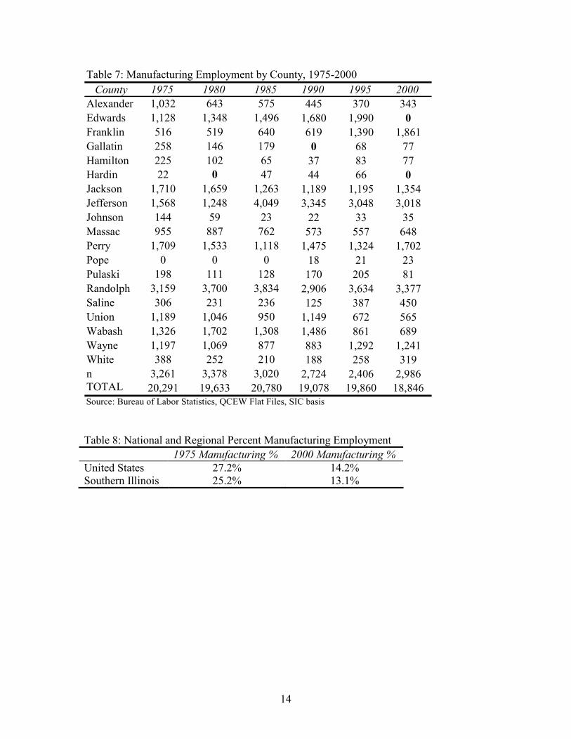
manufacturing employment can be organized according to industry from published data (meaning that 39-78% is suppressed from year to year). The publicly available data cannot reveal the entire composition of the manufacturing sector for Southern Illinois. It can, however, indicate some industries that had particularly strong employment over the 25-year period. The Printing and Publishing industry was strong in Southern Illinois from 1975 (and probably earlier) through 1995. In 1985 the industry had employment of at least 3,630, or at least 17% of total 1985 regional manufacturing employment. Food and Kindred Products manufacturing had a regional presence through most of the study period. Transportation Equipment Manufacturing employed at least 2,800 in 1995 and 1,400 in 2000. Table 9 lists the industries with at least 500 published employees in 1975, 1980, 1985, 1990, 1995, and 2000. This table does not list all industries with 500 employees, since a great deal of the industry-level employment (anywhere between 39-78%) is suppressed (not published). Table 3 does, however, provide a sense of what and where some of the key industries were in the region over time. Table 3 specifically names only the top two counties for employment in each industry. In a minority of cases these pairs of counties account for all of an industry’s employment in the region. Randolph and Williamson Counties appear frequently in Table 3, while counties like Alexander and Pope do not appear at all. Due to data limitations, findings cannot be taken as absolute. An enormous amount of industrial employment data has been suppressed. The available data only suggests general trends in the region. Southern Illinois manufacturing, in absolute employment numbers, remained stable between 1975 and 2000. As a percent of total employment, manufacturing fell from about 25% to around 13% in the region, which mirrored national trends. Early in the study period Southern Illinois seems to have specialized in industries like Printing and Publishing, as well as Foods. Nearer to the millennium, Southern Illinois produced in more traditional heavy manufacturing industries, like transportation equipment, machinery, and metals. Finally, manufacturing employment fluctuated significantly on a county-by-county basis. While a few counties maintained a stable employment base, many more lost one-half to two-thirds to nearly all manufacturing employment between 1975 and 2000. A few gained manufacturing employment, one by as much as 1,500.
14
County 1975 1980 1985 1990 1995 2000
Alexander 1,032 643 575 445 370 343
Edwards 1,128 1,348 1,496 1,680 1,990 0
Franklin 516 519 640 619 1,390 1,861
Gallatin 258 146 179 0 68 77
Hamilton 225 102 65 37 83 77
Hardin 22 0 47 44 66 0
Jackson 1,710 1,659 1,263 1,189 1,195 1,354
Jefferson 1,568 1,248 4,049 3,345 3,048 3,018
Johnson 144 59 23 22 33 35
Massac 955 887 762 573 557 648
Perry 1,709 1,533 1,118 1,475 1,324 1,702
Pope 0 0 0 18 21 23
Pulaski 198 111 128 170 205 81
Randolph 3,159 3,700 3,834 2,906 3,634 3,377
Saline 306 231 236 125 387 450
Union 1,189 1,046 950 1,149 672 565
Wabash 1,326 1,702 1,308 1,486 861 689
Wayne 1,197 1,069 877 883 1,292 1,241
White 388 252 210 188 258 319
n 3,261 3,378 3,020 2,724 2,406 2,986TOTAL 20,291 19,633 20,780 19,078 19,860 18,846
Table 7: Manufacturing Employment by County, 1975-2000
Source: Bureau of Labor Statistics, QCEW Flat Files, SIC basis Table 8: National and Regional Percent Manufacturing Employment
1975 Manufacturing % 2000 Manufacturing %
United States 27.2% 14.2% Southern Illinois 25.2% 13.1%
15
Name
Employ
ment Name
Employ
ment
1975
Printing and Publishing Randolph 1,584 Jackson 369 2,312
Food and Kindred Products Randolph 681 Perry 355 1,821
Electronic & Other Electic Equipment Williamson 1,338 1,338
Transportation Equipment Williamson 537 Jefferson 396 933
Apparel and Other Textile Products Jackson 413 Massac 361 774
Industrial Machinery and Equipment Jefferson 278 Wabash 250 620
1980
Printing and Publishing Randolph 1,596 Jackson 289 2,369
Food and Kindred Products Randolph 981 Perry 330 2,047
Industrial Machinery and Equipment Randolph 701 Wabash 377 1,623
Electronic & Other Eqiupment Williamson 1,361 1,361
1985
Printing and Publishing Randolph 2,175 Jefferson 914 3,633
Rubber and Miscellaneous Plastics
Products Jefferson 2,434 2,434
Industrial Machinery and Equipment Randolph 862 Jefferson 187 1,488
Food and Kindred Products Randolph 385 Williamson 313 1,333
Electronic & Other Electric Equipment Williamson 968 Jefferson 57 1,025
Transportation Equipment Jefferson 264 Franklin 263 527
1990
Printing and Publishing Randolph 1,211 Jefferson 525 2,298
Fabricated Metal Products Wabash 826 Williamson 587 1,820
Industrial Machinery and Equipment Randolph 744 Jefferson 302 1,256
Electronic & Other Electric Equipment Perry 490 Jefferson 441 1,000
Food and Kindred Products Randolph 446 Union 255 826
Lumber and Wood Products Wayne 151 Perry 130 525
1995
Transportation Equipment Edwards 1,931 Franklin 928 2,859
Food and Kindred Products Randolph 1,792 Perry 189 2,081
Printing and Publishing Randolph 938 Jackson 228 1,643
Industrial Machinery and Equipment Jefferson 432 Franklin 162 1,201
Fabricated Metal Products Wabash 522 Williamson 463 1,071
Lumber and Wood Products Wayne 186 Perry 83 653
Electronic & Other Electric Equipment Perry 422 Jefferson 143 645
2000
Transportation Equipment Franklin 1,383 1,383Industrial Machinery and Equipment Jefferson 422 Randolph 207 1,286
Total Known
Industrial
Employment
Table 9: Manufacturing Industries with at least 500 Employees and the Leading Counties for
Employment, 1975-2000
Primary County Secondary County

16
Commuting Patterns
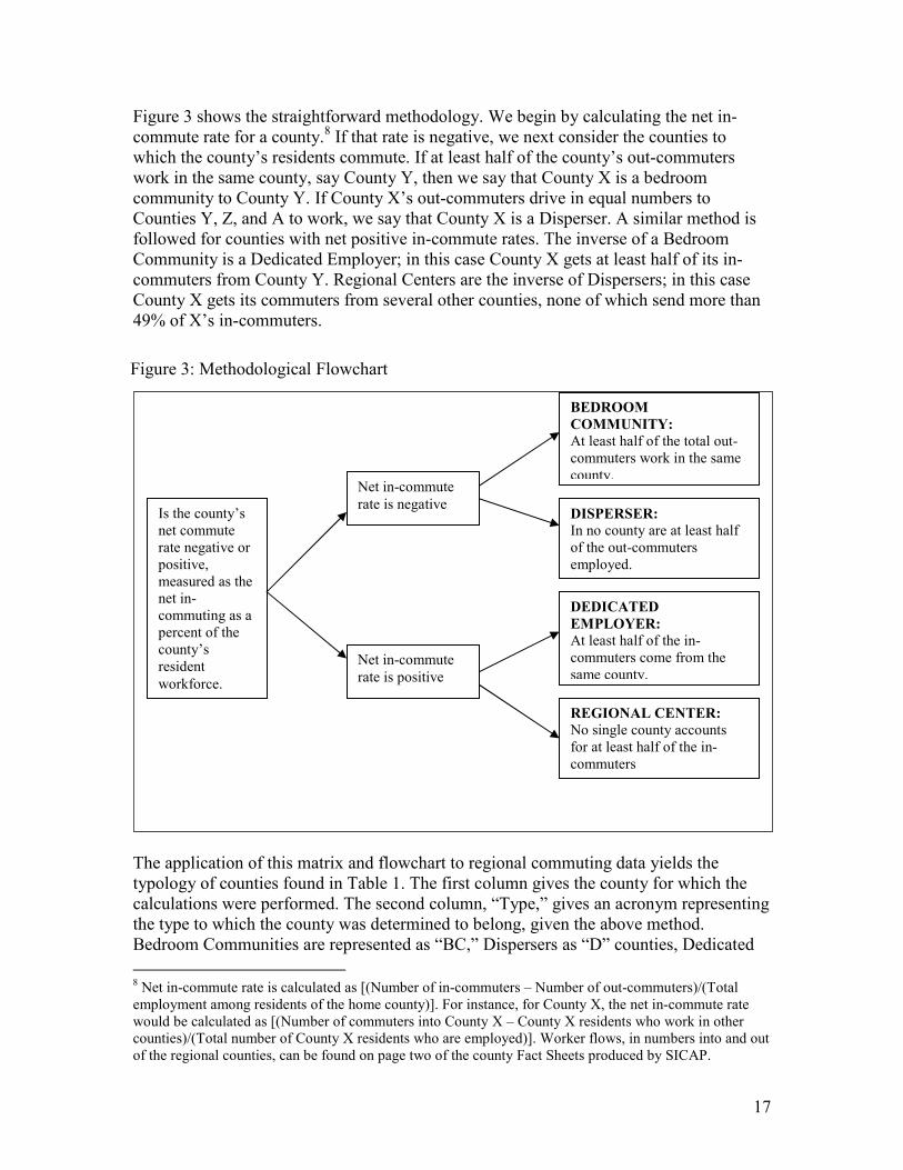
A typology matrix for commuting patterns in Southern Illinois was developed in late 2006 using two large-scale variables, net in-commute rate and percent of in- or out-commuters from or to each sending or receiving county. The types created from these variables are shown in Figure 2. These variables were selected because they easily specify how the residents of any given county likely view the movement of labor in and out of their communities. For instance, if a person lives in a county where nearly all employed residents also worked in the county, and residents of other counties in-commuted, the person would likely feel that the home county supported their neighbors. This is known as a regional center. In a county where more workers leave every day than commute in, and in which workers travel to a variety of work counties, the home county plays the role of a disperser. The term “dedicated employer” is meant to infer that a county employs commuters from predominantly one other county, as opposed to employing an equal numbers of workers from various counties. Finally, a bedroom community is a county in which more residents out-commute than in-commute, and the majority of out-commuters work in the same county.
Net out-commuting county Net in-commuting county
Majority of net in- or out-commuting from one other
county
Majority of net in- or out-commuting from multiple other counties
Bedroom
County
Dedicated
Employer
Disperser Regional
Center
Figure 2: Commuting Typology Matrix
17
Figure 3 shows the straightforward methodology. We begin by calculating the net in-commute rate for a county.8 If that rate is negative, we next consider the counties to which the county’s residents commute. If at least half of the county’s out-commuters work in the same county, say County Y, then we say that County X is a bedroom community to County Y. If County X’s out-commuters drive in equal numbers to Counties Y, Z, and A to work, we say that County X is a Disperser. A similar method is followed for counties with net positive in-commute rates. The inverse of a Bedroom Community is a Dedicated Employer; in this case County X gets at least half of its in-commuters from County Y. Regional Centers are the inverse of Dispersers; in this case County X gets its commuters from several other counties, none of which send more than 49% of X’s in-commuters.
The application of this matrix and flowchart to regional commuting data yields the typology of counties found in Table 1. The first column gives the county for which the calculations were performed. The second column, “Type,” gives an acronym representing the type to which the county was determined to belong, given the above method. Bedroom Communities are represented as “BC,” Dispersers as “D” counties, Dedicated
8 Net in-commute rate is calculated as [(Number of in-commuters – Number of out-commuters)/(Total employment among residents of the home county)]. For instance, for County X, the net in-commute rate would be calculated as [(Number of commuters into County X – County X residents who work in other counties)/(Total number of County X residents who are employed)]. Worker flows, in numbers into and out of the regional counties, can be found on page two of the county Fact Sheets produced by SICAP.
Is the county’s net commute rate negative or positive, measured as the net in-commuting as a percent of the county’s resident
workforce.
Net in-commute
rate is negative
Net in-commute
rate is positive
BEDROOM
COMMUNITY:
At least half of the total out-commuters work in the same county.
DISPERSER:
In no county are at least half of the out-commuters employed.
DEDICATED
EMPLOYER:
At least half of the in-commuters come from the same county.
REGIONAL CENTER:
No single county accounts for at least half of the in-commuters
Figure 3: Methodological Flowchart
18
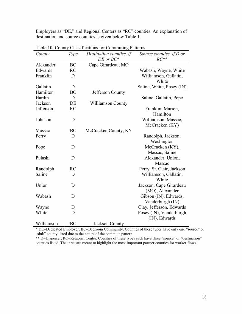
Employers as “DE,” and Regional Centers as “RC” counties. An explanation of destination and source counties is given below Table 1. Table 10: County Classifications for Commuting Patterns
County Type Destination counties, if
DE or BC*
Source counties, if D or
RC**
Alexander BC Cape Girardeau, MO Edwards RC Wabash, Wayne, White Franklin D Williamson, Gallatin,
White Gallatin D Saline, White, Posey (IN) Hamilton BC Jefferson County Hardin D Saline, Gallatin, Pope Jackson DE Williamson County Jefferson RC Franklin, Marion,
Hamilton Johnson D Williamson, Massac,
McCracken (KY) Massac BC McCracken County, KY Perry D Randolph, Jackson,
Washington Pope D McCracken (KY),
Massac, Saline Pulaski D Alexander, Union,
Massac Randolph RC Perry, St. Clair, Jackson Saline D Williamson, Gallatin,
White Union D Jackson, Cape Girardeau
(MO), Alexander Wabash D Gibson (IN), Edwards,
Vanderburgh (IN) Wayne D Clay, Jefferson, Edwards White D Posey (IN), Vanderburgh
(IN), Edwards Williamson BC Jackson County * DE=Dedicated Employer, BC=Bedroom Community. Counties of these types have only one “source” or “sink” county listed due to the nature of the commute pattern. ** D=Disperser, RC=Regional Center. Counties of these types each have three “source” or “destination” counties listed. The three are meant to highlight the most important partner counties for worker flows.

19
Figure 4: Net In-commuting Rate, as Percent of Employed County Labor Force, Southern Illinois, 2000
20
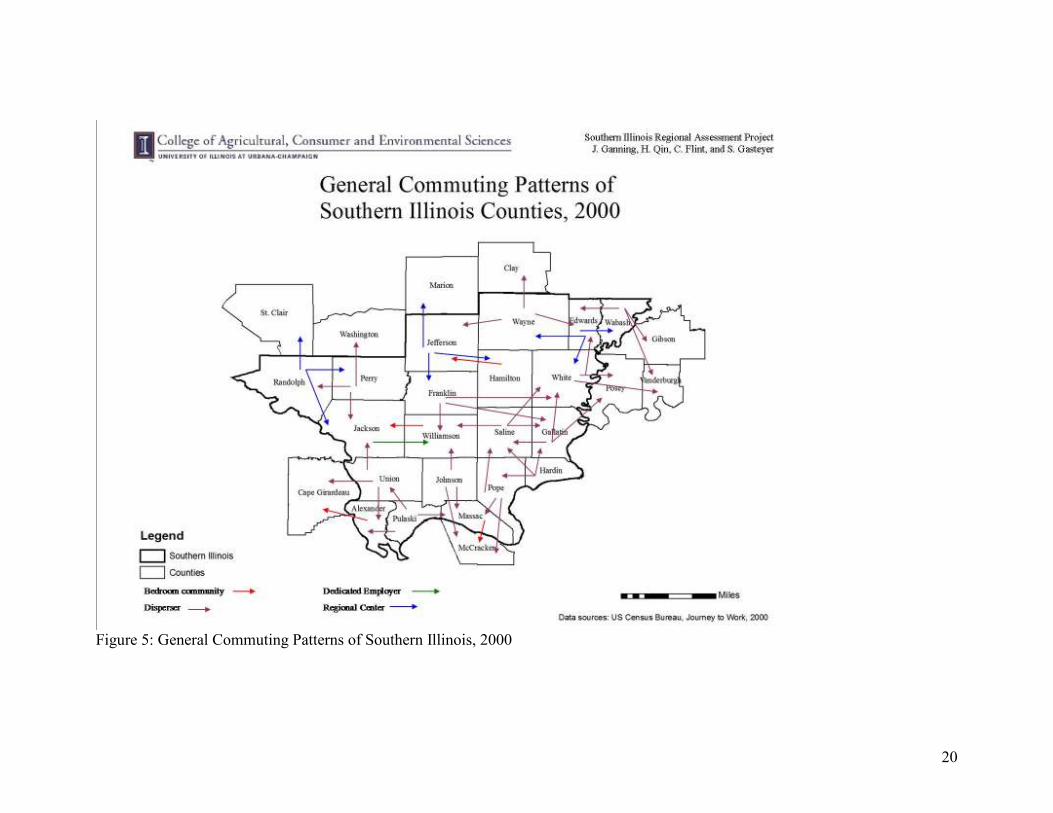
Figure 5: General Commuting Patterns of Southern Illinois, 2000

21
Of the four counties with a positive in-commuting rate shown in Figure 3, one is a Dedicated Employer (Jackson) and three are Regional Centers (Randolph, Jefferson, and Edwards). Of the sixteen counties with negative net in-commuting rates, four are Bedroom Communities (Hamilton, Williamson, Alexander, and Massac) and twelve are Dispersers. Figure 4 shows the spatial arrangement of the classified counties. Somewhat of a spatial pattern emerges. The Regional Centers lie along the northern border of the region. The Dispersers tend to sit on the eastern side of the region. Of the four counties with the most negative in-commute rates (Hamilton, Johnson, Pope, and Hardin, as shown in Figure 3), three of the four (all but Hamilton) are Disperser counties. Particular pairs of counties become interesting (see Figure 4). For instance, Williamson and Jackson Counties have a special relationship. Williamson County is not the only Bedroom Community in the region, but it is the only Bedroom Community that provides the employees to a Dedicated Employer within the region. Hamilton County, for instance, sends the majority of its out-commuters to a county (Jefferson) which draws labor from a wider region. The other two Bedroom Communities send workers outside the region, to Cape Girardeau, MO and McCracken, KY Counties. Jackson County draws labor predominantly from Williamson County, and Williamson’s out-commuters work predominantly in Jackson. No other pair of counties in the region has such an exclusive and reciprocal relationship. Saline, Gallatin, and particularly Hardin Counties appear to be in a particularly challenging employment environment. These three counties send their workers to counties which are not Regional Centers or Dedicated Employers. In other words, Saline, Gallatin, and particularly Hardin tend to send their workers to counties which ship their employees elsewhere. While it is possible that this chain of worker movements is caused by differences in demands for skilled labor and housing costs, such an explanation seems unlikely. Such an explanation would seem more plausible in a suburban setting, where a group of low-income workers infiltrates a higher-income area in the morning to fill service-sector positions, while residents out-commute to professional employment. In Southern Illinois, it is more likely that the residents of Saline, Gallatin, and Hardin Counties are simply searching for any available employment opportunities. Southern Illinois workers commute across state lines on every side of the region. Cape Girardeau draws workers into Missouri. McCracken County and likely its principal city of Paducah draw workers into Kentucky. Gibson, Posey, and Vanderburgh Counties in Indiana draw commuters. Additionally, Southern Illinois workers drive north within Illinois to work in Saint Clair, Washington, Marion, and Clay Counties. Certainly smaller flows of workers infiltrate other Illinois counties to the north as well. Fifteen of the twenty counties in the region border a county in another region. Of those 15 border counties, only Hardin, Pulaski, and Jackson Counties are particularly oriented toward the Southern Illinois region. Jackson County, as has been mentioned, is particularly oriented toward Williamson County. The other border counties integrate their workforce with extra-regional counties.
22
In most of the instances where commuters cross two county lines to get to work, they are commuting out of the region. For instance, Wabash and White workers cross two county lines to work in Vanderburgh County. Pope and Johnson County workers cross through Massac to get to McCracken County for work. Franklin County provides one exception, sending workers in significant numbers to both Gallatin and White Counties. The cause of this is not entirely clear, particularly since both Gallatin and White have negative in-commute rates in the double digits, unlike three of Franklin’s immediate neighbors. These findings, in conjunction with the maps presented above, might be used to distinguish sub-regions within Southern Illinois, or to explore relationships between workers and places, for instance within the Williamson-Jackson relationships. Paired with a deeper analysis of skills-housing-work balance studies, further trends may be uncovered.