Sophie Neilan Credentials
33
Sophie Neilan Brand Identity Designer / Consultant
-
Upload
sophie-neilan -
Category
Design
-
view
26 -
download
1
Transcript of Sophie Neilan Credentials

Sophie NeilanBrand Identity Designer / Consultant

Sophie Neilan : Work Samples : Heinz Beanz
Handling an Icon
Moving to the front of the cupboard

Sophie Neilan : Work Samples : Heinz Beanz
Previous design
PositioningTone of VoiceRange ArchitecturePackaging Design
ChallengeFrozen in time and design, burdened by its iconic classic status, Heinz Beans was losing ground to Own Label and aggressive price fighter, Crosse & Blackwell.I led my team at Landor Associates to win the project after a pitch against two other agencies.
InsightTaken for granted by the British public, it was drifting to back of mind and forgotten at the back of the cupboard.
StrategyDrive reappraisal and re-engagement by energizing the icon with consumer currency and appeal.
IdeaFeel the love: unlock the huge but latent emotive appeal - through the fun of the Z and the wonderful experience of the product.

Sophie Neilan : Work Samples : Heinz Beanz
Range and back of pack

Sophie Neilan : Work Samples : The Food Doctor
What the doctor ordered
Brand Guardianship

Sophie Neilan : Work Samples : The Food Doctor
Representing The Food Doctor at Tesco’s 48 hour ‘Health Hackathon’, October 2014
GuidelinesBrand GuardianshipDesign AdaptationPackaging DesignArtworkPoint of SaleExhibition Stand Design
ChallengeHaving parted ways with their incumbant agency, The Food Doctor has been working with me for the past four years, rolling out and adapting their design across a wide variety of products and pack formats.
Activities - Writing and producing guidelines based on existing design
and ‘dual’ palette colour scheme - Adapting design to work on ‘healthy’ crisps: from health
store to impulse buy - Artwork and print management across a variety of
packaging substrates and formats
StrategyWe have recently been working together on the strategy for the next stage of the brand’s development.

Sophie Neilan : Work Samples : The Food Doctor Crisps
Final packs
Design concepts
Packaging Design
ChallengeCreate packaging for a range of ‘healthy’ crisps to compete on shelf against the usual suspects in the premium snacking category. - Emphasise the ingredients
(soya and corn instead of potato - Demonstrate the unusual product format
(pressed instead of fried) - Highlight calories clearly - Ensure clear variety differentiation
Idea“Crisps with a lift”
Activities - Design - Art direction photography - Artwork - Print management

Sophie Neilan : Work Samples : Living Nutrition
Concentrated Wholefoods
An aura of life

Sophie Neilan : Work Samples : Living Nutrition
Brand IdentityPackaging DesignMoving Image
ChallengeBring to life the idea of highly concentrated wholefood nutrition in a distinctive brand identity.
InsightNatural wholefood: made more powerful.
IdeaA different colour from the chakra system represents the different benefits from each variety, helping to live life in full colour.
OutcomeThe brand has gained listings in a number of premium outlets including Wholefoods and Planet Organic.

Sophie Neilan : Work Samples : Living Nutrition
1st stage concepts

Sophie Neilan : Work Samples : Jolamy
Spanning Continents
From the heart of Africa

Sophie Neilan : Work Samples : Jolamy
Previous design
Brand IdentityPackaging Design
ChallengeThe Jolamy brand is a family-owned business operating from a small village in Nigeria. They produce Avarah Flour and offer a form of income and support for the entire community.
It is completely natural, gluten free and, unlike competitive producers, made solely from Cassava root. The packaging did nothing to convey these benefits and my challenge at Falcon was to highlight them and make the brand appeal to an educated upper/middle income consumer in both the UK and Nigerian market.
InsightCassava is an African and Asian staple, it survives the harshest of conditions and supports the people who live there and beyond.
StrategyEnhance the warmth and originality of the brand story and landscape from which it originated.
IdeaFruit of the Earth

Sophie Neilan : Work Samples : Jolamy
1st Stage Concepts
Concept 1 - Fruit of the Earth Concept 2 - Kitchen Versatility Concept 3 - From our family to yours Concept 4 - The heart of Africa

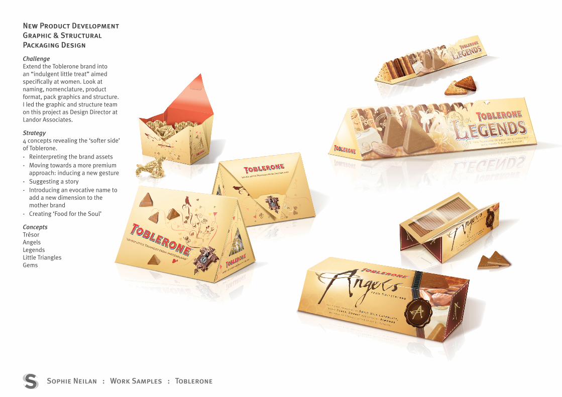
Sophie Neilan : Work Samples : Toblerone
An irresistable world of temptation
New Product Development
Sophie Neilan : Work Samples : Toblerone
New Product DevelopmentGraphic & Structural Packaging Design
ChallengeExtend the Toblerone brand into an “indulgent little treat” aimed specifically at women. Look at naming, nomenclature, product format, pack graphics and structure.I led the graphic and structure team on this project as Design Director at Landor Associates.
Strategy4 concepts revealing the ‘softer side’ of Toblerone. - Reinterpreting the brand assets - Moving towards a more premium
approach: inducing a new gesture - Suggesting a story - Introducing an evocative name to
add a new dimension to the mother brand
- Creating ‘Food for the Soul’
ConceptsTrésorAngelsLegendsLittle TrianglesGems

Sophie Neilan : Work Samples : Toblerone
Trésor

Sophie Neilan : Work Samples : Toblerone
Gems

Sophie Neilan : Work Samples : Morrisons
When North came South
Presenting to The Board
GOLD

Sophie Neilan : Work Samples : Morrisons
Previous brandmark
StrategyPositioningBrand Identity & GuidelinesPackaging Design System
ChallengeFounded over a century ago in the North of England, Morrisons was struggling after having bought Safeway in an effort to expand its reach in the South.In an effort to reverse the seemingly inexorable decline, management approached Landor Associates for a re-brand in 2007.I was Design Director of the team, regularly travelling to Bradford and presenting to Chairman, Sir Ken Morrison, and CEO, Marc Bolland.
InsightMorrisons’ ‘Market Street’ proposition offered fresh produce over the counter: stalls were manned by professional butchers, fishmongers etc. This was unique among the big 5 supermarkets at that time.
Strategy‘Fresh choice for you’
IdeaAn open, friendly and engaging look and feel brings the Market Street to life around the store.

Sophie Neilan : Work Samples : Morrisons
Market Street in-store identities

Sophie Neilan : Work Samples : Morrisons
Market Street packaging

Sophie Neilan : Work Samples : Beck’s Vier
Precision2
From On- to Off-Trade

Sophie Neilan : Work Samples : Beck’s Vier
Stage 1 sketches
Packaging Design(Structure & Graphics)
ChallengeSuccessful in the on-trade market, Beck’s Vier required a bottle and graphic identity to compete effectively off-trade. The packaging needed a premium feel and to clearly differentiate against the Becks masterbrand.I led the structure and graphics teams while Creative Director at Pi Global.
InsightThe German word “Vier” means “four” in English: it is 4% ABV.
StrategyDramatise the idea of the number 4 in a way that reflects the brand’s refreshing philosophy of “Think : Feel : Do”.
IdeaA four sided bottle and label representing a German precision that stands squarely against the competition.

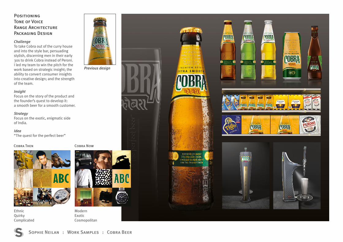
Sophie Neilan : Work Samples : Cobra Beer
Out of the curry house, into the style bar
Refining and Reframing
Sophie Neilan : Work Samples : Cobra Beer
Previous design
Cobra Then
EthnicQuirkyComplicated
ModernExoticCosmopolitan
Cobra Now
PositioningTone of VoiceRange ArchitecturePackaging Design
ChallengeTo take Cobra out of the curry house and into the style bar, persuading stylish, discerning men in their early 30s to drink Cobra instead of Peroni.I led my team to win the pitch for the work based on strategic insight; the ability to convert consumer insights into creative design; and the strength of the team.
InsightFocus on the story of the product and the founder’s quest to develop it: a smooth beer for a smooth customer.
StrategyFocus on the exotic, enigmatic side of India.
Idea“The quest for the perfect beer”

Sophie Neilan : Work Samples : Cobra Beer

Sophie Neilan : Work Samples : Murphy’s
The craic of the Irish
Telling the Story

Sophie Neilan : Work Samples : Murphy’s
Existing design
Brand StoryPackaging Design
ChallengeCork Irish Stout, Murphy’s, was being squeezed from both sides: Guinness from the premium end and a cheaper rival, Beamish.The challenge to the team I led at Landor was to bring out Murphy’s distictive qualities of natural ingredients and Cork heritage.
StrategyWe visited the brewery in Cork and “immersed ourselves” in the brand and the city of its birthplace. We unravelled a rich history and compelling story.
Concepts - Harvest Moon - Bringing it all Together - A Story Worth Telling

Sophie Neilan : Work Samples : Fernet Stock
Previous design
Fernet Stock
Packaging Design(Structure & Graphics)Brand World
ChallengeLovingly known as “Coffin paint” and “The breath of a dead lover”, Fernet Stock is a classic Czech liquor. Careful to retain the quirkiness that makes the brand so unique, I led the redesign with my team at Cocoon in Prague.
Activities - Graphic and structural redesign - Secondary packaging - Brand world based on Fernet as a
“Drink for Real Men”

Sophie Neilan : Work Samples : Rennie
‘Simply Resolved’
Building an Architecture

Sophie Neilan : Work Samples : Rennie
Previous packaging
Pack & Range ArchitecturePackaging Design
Challenge‘Simplicity’ should be at the heart of everything. Redesign the brand identity and packaging with the following as key objectives: - Refresh the EBU and pack graphics - Create a visual segmentation
system to differentiate between the core and “Additional Benefits” Rennie platforms
- Improve the benefit communication - Make sure NPD projects can
smoothly fit into the new portfolio
Design ChecklistThe design concepts were measured against the following: - Simple - Efficaceous - Confident and reassuring - Quality - Warm and approachable - Contemporary
Idea“Simply resolved with Rennie”
Route 1
Route 2
Route 3

Sophie Neilan : Work Samples : Rennie
Previous packaging
Chosen design

Sophie Neilan : Brand Identity : E [email protected] : T 07966 174198