Software Project Visualization Using Task Oriented Metaphors
12
J. Software Engineering & Applications, 2010, 3, 1015-1026 doi:10.4236/jsea.2010.311119 Published Online November 2010 (http://www.SciRP.org/journal/jsea) Copyright © 2010 SciRes. JSEA Software Project Visualization Using Task Oriented Metaphors Amaia Aguirregoitia 1 , José Javier Dolado Cosín 2 , Concepción Presedo 1 1 Department of Languages and Computer Systems, University of the Basque Country, La Casilla, Bilbao, Spain; 2 Department of Languages and Computer Systems, University of the Basque Country, Pº Manuel de Lardizabal, Donostia, Spain. Email: [email protected] Received September 13 th , 2010; revised September 30 th , 2010; accepted October 8 th , 2010. ABSTRACT This paper presents T-Cube and MetroMap, two new graphical representation models for controlling and managing the processes of software project development. They both use metaphors and visual representation techniques to address typical project management tasks. T-Cube uses a metaphor with the Rubik-Cube whereas MetroMap uses a metaphor with a metro map. The tools have been tested on real project data and a qualitative assessment shows the results of testing the visualizations with users attempting several information retrieval tasks. The utility of the tools has been positively evaluated and the article demonstrates the possibilities of visual approaches in project management. Keywords: Project Management Information Systems, Managing Information Systems, Managing Integration 1. Introduction and Related Work Management of software development processes in- volves a group of complex activities to keep projects on schedule and to ensure their quality. Managers require different types of data such as written reports or software metrics about productivity, quality, adherence to sche- dule and budget. Our research focuses on the design of a tool to assist in exploration and analysis of the required high volumes of data. The purpose of our work is to develop a proposal to efficiently process visual queries on the key measures for software development manage- ment. The use of visual tools in the software area is not a new issue, but prior research on software visualization (SV) has mainly focused on the representation of the technical implementation aspects of the project. More specifically, it has represented source code or data structures with the primary objective of understanding and improving the code. Animation of program behavior, presentation of relationships among functions and inter- actions for better comprehension or computation visuali- zation [1] are some other areas of activity. Source code changes or architecture aspects are frequently repre- sented using running time diagrams indicating function or module calls. Some other representations include graphs, statistics or relatively traditional diagrams representing certain code or performance aspects [2] and most of them have the primary objective of improving the code [3]. Augur [4], a comprehensive visualization system for configuration management of repositories of source code, contains multiple, dynamic views of data in an attempt to unify views of “activities” and “artifacts” and offers project’s source code, author network, and other develop- ment statistics. The system StarGate [5] is an infor- mation visualization project that uses different tech- niques to assist the user in understanding the complex interactions between developers and software. It visualizes the code repository and social network of developers associated with a software project in one integrated representation. One of the most frequently used graphical resources to model modern software applications is the Unified Modeling Language (UML) package diagram. The UML is the de facto standard for modeling modern software applications. It is typically used during the design phase of the software lifecycle to graphically represent different aspects of the system’s high-level architecture. There are also some other widespread formal and informal diagrams for the static view [6] such as class or component diagrams. In addition to a static view, a functional view can be provided through a use-case diagram with color-coding, which offers a quick overview of the functionalities of the present development state.
Transcript of Software Project Visualization Using Task Oriented Metaphors
J. Software Engineering & Applications, 2010, 3, 1015-1026 doi:10.4236/jsea.2010.311119 Published Online November 2010 (http://www.SciRP.org/journal/jsea)
Copyright © 2010 SciRes. JSEA
Software Project Visualization Using Task Oriented Metaphors
Amaia Aguirregoitia1, José Javier Dolado Cosín2, Concepción Presedo1 1Department of Languages and Computer Systems, University of the Basque Country, La Casilla, Bilbao, Spain; 2Department of Languages and Computer Systems, University of the Basque Country, Pº Manuel de Lardizabal, Donostia, Spain. Email: [email protected] Received September 13th, 2010; revised September 30th, 2010; accepted October 8th, 2010.
ABSTRACT
This paper presents T-Cube and MetroMap, two new graphical representation models for controlling and managing the processes of software project development. They both use metaphors and visual representation techniques to address typical project management tasks. T-Cube uses a metaphor with the Rubik-Cube whereas MetroMap uses a metaphor with a metro map. The tools have been tested on real project data and a qualitative assessment shows the results of testing the visualizations with users attempting several information retrieval tasks. The utility of the tools has been positively evaluated and the article demonstrates the possibilities of visual approaches in project management. Keywords: Project Management Information Systems, Managing Information Systems, Managing Integration
1. Introduction and Related Work
Management of software development processes in- volves a group of complex activities to keep projects on schedule and to ensure their quality. Managers require different types of data such as written reports or software metrics about productivity, quality, adherence to sche- dule and budget. Our research focuses on the design of a tool to assist in exploration and analysis of the required high volumes of data. The purpose of our work is to develop a proposal to efficiently process visual queries on the key measures for software development manage- ment.
The use of visual tools in the software area is not a new issue, but prior research on software visualization (SV) has mainly focused on the representation of the technical implementation aspects of the project. More specifically, it has represented source code or data structures with the primary objective of understanding and improving the code. Animation of program behavior, presentation of relationships among functions and inter- actions for better comprehension or computation visuali- zation [1] are some other areas of activity. Source code changes or architecture aspects are frequently repre-sented using running time diagrams indicating function or module calls. Some other representations include graphs, statistics or relatively traditional diagrams representing
certain code or performance aspects [2] and most of them have the primary objective of improving the code [3].
Augur [4], a comprehensive visualization system for configuration management of repositories of source code, contains multiple, dynamic views of data in an attempt to unify views of “activities” and “artifacts” and offers project’s source code, author network, and other develop- ment statistics. The system StarGate [5] is an infor- mation visualization project that uses different tech- niques to assist the user in understanding the complex interactions between developers and software. It visualizes the code repository and social network of developers associated with a software project in one integrated representation.
One of the most frequently used graphical resources to model modern software applications is the Unified Modeling Language (UML) package diagram. The UML is the de facto standard for modeling modern software applications. It is typically used during the design phase of the software lifecycle to graphically represent different aspects of the system’s high-level architecture. There are also some other widespread formal and informal diagrams for the static view [6] such as class or component diagrams. In addition to a static view, a functional view can be provided through a use-case diagram with color-coding, which offers a quick overview of the functionalities of the present development state.
Software Project Visualization Using Task Oriented Metaphors 1016
The functional view of status visualization is not an alternative to the static view, but a complementary view. Some other alternatives to visualize software archi- tectures can be found in [7].
In contrast to SV, visualization in the software project management area is not so much concerned with the construction, but with the analysis of the development process and its metrics. This area is becoming increasingly important in software engineering activities and much research has been recently dedicated to designing software metrics, initiatives for software process development improvement and decision making [8]. However, software measurement is a complex field and there are also a number of experiences reporting the problems in the measurement area, such as “most software engineers and managers did not use the measurement program”, “the data suppliers did not understand the definitions of metrics and measures”, “the project indicators focused on resources and deadlines and ignored the quality of software and few people were capable of interpreting the presented data” [9].
Another main issue is how to depict visually the measures to supply the information for software project management. At present, Gantt charts are predominantly used for the mapping of projects in organizations. While they are an effective graphical resource for planning a project they are not effective for communication purposes, especially when different groups are involved [10].
Some previous work in the field has led to the development of visualizations for software management but most of them address specific problems and are mainly focused on metrics of particular areas. One of them is Tarantula [11], which is useful for finding likely faulty sections of the code and gives the developer information about the results of a faulty program's execution on an entire test suite. Another example, SVAW [12] offers visual representations for assistance to human schedulers.
However, there are some other visualizations which are unknown and rarely used that have been reported as exceptionally powerful in the communication area such as the tube map proposal in [13]. The metro map is a well-known graph that is widely used in illustrating transportation networks. The metro map metaphor has also been used effectively for visualizing abstract information such as conceptual ‘‘train of thought’’ networks, biochemical pathways involved in the spread of cancer, networks of related book titles, and websites. Furthermore, it has served as a tool for the organization of learning resources and for the distribution of project planning information within an organization. The metro
map can be used as a powerful metaphor for the presentation and association of certain information and it provides a coherent overview of a complex system. Moreover, previous works consider it a useful visuali- zation technique for non-spatial data [14]. It has been established that a wide array of users find the metro map intuitive and engaging when navigating abstract data and that it is also a useful way to provide content and detail [15].
Concerning the project management area, previous evaluations have shown that the Metro Map visualization can be a powerful metaphor for communicating a complex project to different target groups. In addition, employees like the metaphor because it provides both overview and detailed information in one image and it has been reported as understandable by employees [10,13]. Here we investigate further the possibilities of using this metaphor to display information for effective software development management.
The remainder of this paper is organized as follows. The next section discusses the results of some studies in the field of Software project management and it presents the list of key measures used in our approaches. Section 3 and Section 4 describe the two visualizations and Section 5 compares both of them. We present the results of a preliminary assessment in Section 6 and summarize our conclusions in Section 7.
2. Software Project Management Metrics
2.1. Definitions
In this section, we provide definitions for some relevant concepts that will appear in the paper. A software project is the set of work activities, both technical and managerial, required to satisfy the terms and conditions of a project agreement. A software project should have specific starting and ending dates, well-defined objectives and constraints, established responsibilities, and a budget and schedule [16].
Project management is a system of procedures, practices, technologies, and know-how that provides the planning, organizing, staffing, directing and controlling necessary to successfully manage a project [17].
Measurement of diverse entities is fundamental to understand, control and manage a software project. The term entity refers to any distinguishable object in the empirical world for which a measurement can be applied [18]. In our research, the tasks of the software develop- ment processes are the entities to be measured. The term attribute refers to the property of an entity that can be determined quantitatively, that is, for which a magnitude can be assigned. The measurement of an attribute of an entity is the characterization of that attribute in terms of
Copyright © 2010 SciRes. JSEA
Software Project Visualization Using Task Oriented Metaphors 1017
numbers or symbols.
2.2. Task-Based Software Project Management
Classical project management functions can be grouped into Planning, Organizing, Staffing, Directing, Controlling and Integrating [19]. During the planning process, the manager must set goals and scope, identify what is to be done (create Work Breakdown Structure), identify tasks, estimate size, estimate effort, identify task dependencies, assigns resources and schedule work. The project manager often starts with the definition of a list of activities or tasks to be planned, performed and controlled regardless of the breakdown method used in the project (process, product, organizational…) or the lifecycle considered (Waterfall, “V”, Spiral…). This task definition is used for estimation, scheduling, and provides the basis for milestone and deliverable specification. The most widespread scheduling techniques used in software project management as PERT, CPM, milestone diagrams or Gantt charts are based in the definition of tasks, activities and their dependencies [20]. The task-based definition of the project stated at the planning stage establishes the foundation not only for schedule and cost monitoring but also for the overall project control. The two visualizations in this paper share the task-oriented perspective to depict the information.
2.3. The Key Measures
The information to be presented using the metaphor came out as a result of the analysis of data from several works and surveys in the software project management area [21,22]. A list of measures for each task involved in the development process is presented in Table 1. The visualizations described below present all these measures for each task and put them into visual form in such a way as to promote a deeper level of understanding and insight into the data and amplify cognition. Diverse task arrange- ment and visualization techniques are used to gain understanding on the aforementioned measures.
3. The Treemap Hypercube Metaphor
3.1. Treemaps and Metaphors
Metaphors are an important tool in information visuali- zations as they provide familiar cognitive models to help users to browse unfamiliar information spaces [23]. Six advantages of Visual Metaphors have been described in previous works: 1) to motivate people, 2) to present new perspectives, 3) to increase remembrance, 4) to support the process of learning, 5) to focus attention and support concentration of the viewer, 6) to structure and coordinate communication [24].
The T-Cube proposal applies the benefits of metaphors as well as a visualization technique known as Treemaps.
Table 1. List of measures.
Task effort
Estimated task effort
Task cost
Planned task cost
Number of Requirement failures
Number of Design failures
Number of Code failures
Number of Documentation failures
Number of other type failures
Number of total failures
Number of failures detected by the client
Number of failures detected by the developers
Requirement failure detection effort
Design failure detection effort
Code failure detection effort
Documentation failure detection effort
Other type failure detection effort
Failure detection total effort
Number of Requirement reviews
Number of Design reviews
Number of Code reviews
Number of Documentation reviews
Number of other type reviews
Number of total reviews
Requirement failure correction effort
Design failure correction effort
Code failure correction effort
Documentation failure correction effort
Other type failure correction effort
Failure correction total effort
Number of changes required
Number of changes rejected
Number of changes implemented
Number of changes pending
Number of deliverables planned
Number of deliverables rejected by the client
Number of deliverables accepted by the client
Number of pending deliverables
Number of detected risks ( with description and type)
Effort deviation
Cost deviation
Risk detection effort
A Treemap is a space-constrained visualization of hierar-chical structures. It is very effective in showing attributes of leaf nodes using size and colour coding. Treemap
Copyright © 2010 SciRes. JSEA
Software Project Visualization Using Task Oriented Metaphors
Copyright © 2010 SciRes. JSEA
1018
enables users to compare nodes and sub-trees even at varying depth in the tree, and help them spot patterns and exceptions. The Treemap was first designed by Ben Shneiderman during the 1990s. It is extremely efficient to represent extensive attributes (sizes, costs, value) of elements arranged in a hierarchy. In a treemap each node has a name and an associated size. The size of the leaves may represent, for instance, the effort of individual tasks; the size of non-leave nodes is the sum of the sizes of its children. The treemap is constructed via recursive subdivision of the initial rectangle. The size of each sub-rectangle is proportional to the size of the node. The direction of the subdivision alternates per level: first horizontally, next vertically, and so on. As a result, the initial rectangle is partitioned into smaller rectangles, such that the size of each rectangle reflects the size of the leaf. The structure of the tree is also reflected in the treemap, as a result of its construction. Colour and annotation can be used to give extra information about the leaves [25]. This technique has been applied to a wide variety of domains: to present large number of images grouped by directory, to analyze file systems, financial analysis [26] or sports reporting [27].
Most of us played with a Rubik Cube when we were children, so we use this metaphor as a way to leverage its familiarity to enable users to better understand the tool and how it organizes tasks. In a Rubik cube, the six faces are covered by nine stickers of six solid colours. A pivot mechanism enables each face to turn independently, thus scrambling the colors. For the puzzle to be solved, each
face must be a solid color. The purpose of using the metaphor with the Rubik
cube is to assist in the comprehension of the task structure using a rotation mechanism in the visualization. The Rubik cube is composed of smaller cubes and in order to solve it one needs to do two things: rotate the cube to see the different sides one by one and analyze colors. In the visualization, the project is divided into tasks (comparable to the small pieces or squares of the cube) which are organized into different facets (com- parable to the faces of the cube) and only one of the sides is visible at a time while the rest are hidden. The tool utilizes rotation to allow access to the different sides and within a side, the size and color of each square (as color in Rubik cube pieces) is defined by the attributes of the corresponding task. There are two main variables that affect the T-Cube visualization: the criteria selected to arrange tasks on one or another side of the cube (different categories of tasks) and an attribute to be used to determine the colour and size of the task.
3.2. The Treemap Hypercube Metaphor for Software Management
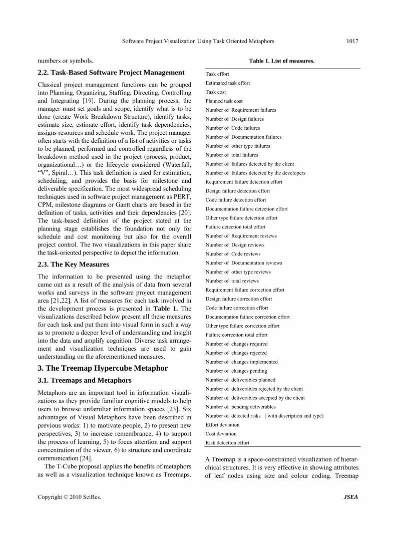
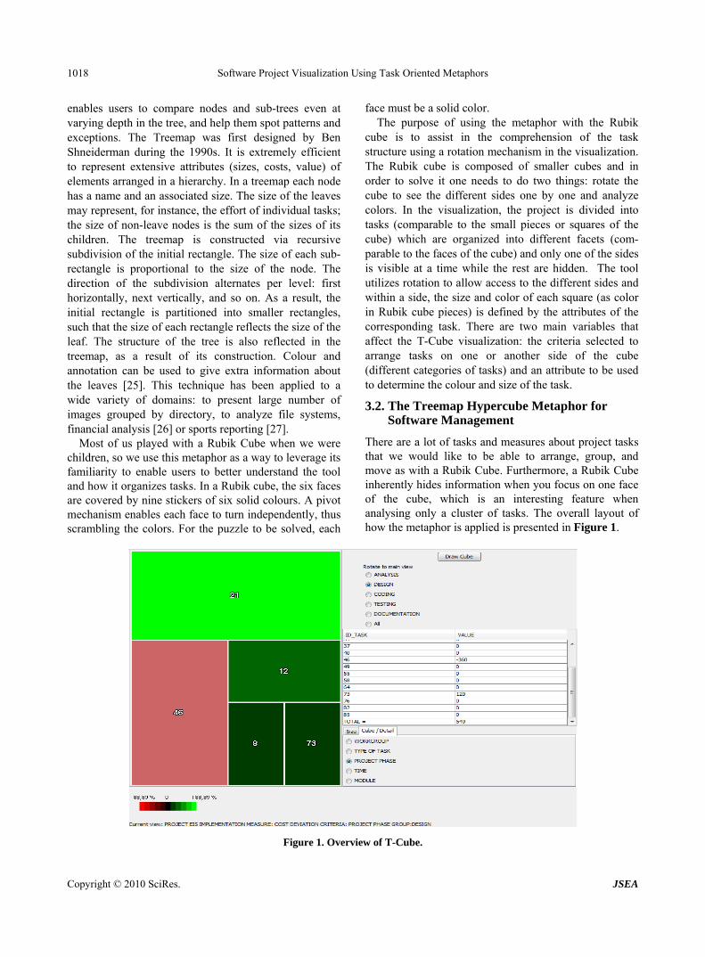
There are a lot of tasks and measures about project tasks that we would like to be able to arrange, group, and move as with a Rubik Cube. Furthermore, a Rubik Cube inherently hides information when you focus on one face of the cube, which is an interesting feature when analysing only a cluster of tasks. The overall layout of how the metaphor is applied is presented in Figure 1.
Figure 1. Overview of T-Cube.
Software Project Visualization Using Task Oriented Metaphors 1019
The first step of the analysis is to define what characteristic of the tasks will define the clusters or facets of the hypercube. The criterion selected defines the number of sides of the hypercube and therefore, the list of available faces in the upper right part of the screen.
In the example in Figure 1, when “Project phase” is selected, the system uses the previously defined phases to put together in a face the tasks corresponding to “Design” phase, in another side the ones related to “Testing” phase and so on.
The tasks in the example can also be arranged on faces using any of the following characteristics or criteria: workgroup, type of task, module or time. As an example, if the selection is workgroup, each face would contain all the tasks performed by the same workgroup and the hypercube would have as many faces as workgroups. The lower right part of Figure 1 presents the radio buttons with the different criteria for defining the sides of the hypercube, while the upper part shows the side selection and rotation method.
The information in the main view is presented using the treemap space-filling technique. In a typical treemap a square can represent either a leaf node or a group of items and the user moves from a group level to its leaves and vice versa by clicking on the square. In T-Cube, squares represent only the leaf nodes of the facet currently in the main view and the user is forced to make radio button selections to modify the grouping criteria or to change from one group to another. However, in a typical treemap, clicking on the squares makes all these operations possible. This design, which is consistent with the metaphor, has the objective of assisting the user in structuring the information into criteria and groups and keeping this structure in mind.
Once the cube has been defined, the user chooses what face is to be displayed. The user selects from the list one of the facets, clicks on “Redraw cube,” and the cube rotates, giving access to the side the user wants to analyze, what we call “Rotate to main view”. The visualization presents only one facet at a time but the user can select the “Show All” option for an overall view, which presents the information of all the tasks in a single view. It is worth noting that also a time based cluster creation and visualization is available. The flexibility for task arrangement of the tool is extremely useful since it enables to assess software from very different per- spectives. The cube changes when a different criterion is selected for task arrangement and the active view changes when the cube rotates as a different facet is selected.
It is worth noting that any of the indicators described in Table 1 can be selected to define the size of the presented tasks in the treemap. A very complete set of
data is available for analysis and therefore, the tool is valuable for studying problems in the development process of different nature and complexity. Planning deviations tracking, analysis of defect detection and correction patterns, overall assessment of change management policies, evaluation of deliverable status, or product quality estimation are some of the problems that can be addressed by selecting different measures.
In the lower part of the screen there is a text to inform the user about the currently visible data. The user can see the project name, the measure selected from the list, and the criteria and group currently in the view.
The values of the selected measure for each task in the main view are presented using a table. This table is accessible from the “Cube/Detail” tab as shown in Figure 1. The table complements the visual information and it also presents the sum of all the tasks for the selected variable. This information is really valuable since the Treemap offers individual data as a percentage of the group. The use of colour and size lets the user identify and focus on troublesome areas easily and the treemap allows the user to apply visual filters from the selected side.
The system has been implemented using Java and the JTreeMap library for coding and MySQL for data storage. The system presents all the data in a couple of seconds and after any interaction with the interface the visualization is refreshed in about two seconds. Figure 1 shows one of the views of an EIS (Executive Information System) development and implementation project used as an example to evaluate the representation with phases and projected dates of a real project. The view in Figure 1 presents the cost deviation for the design tasks. Some of the measures have been estimated for evaluation purposes since not every measure by phase had been previously recorded and, therefore, no data was available for some of the measures.
4. The MetroMap Metaphor
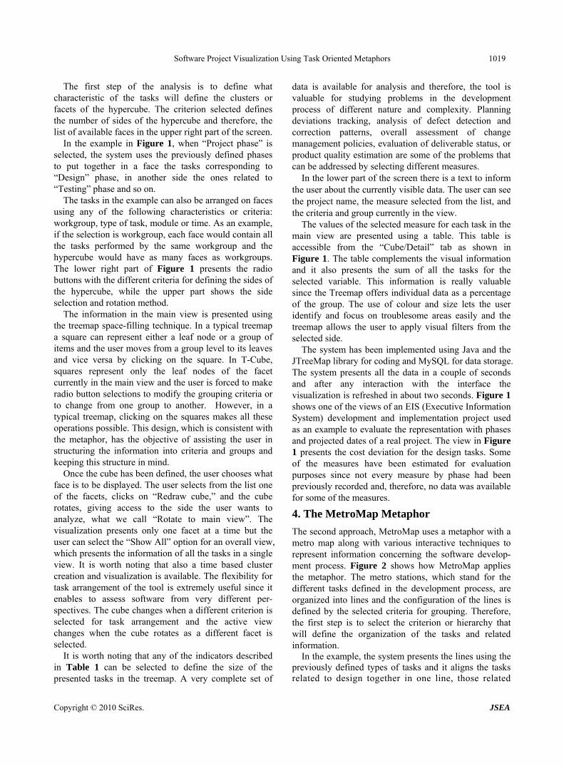
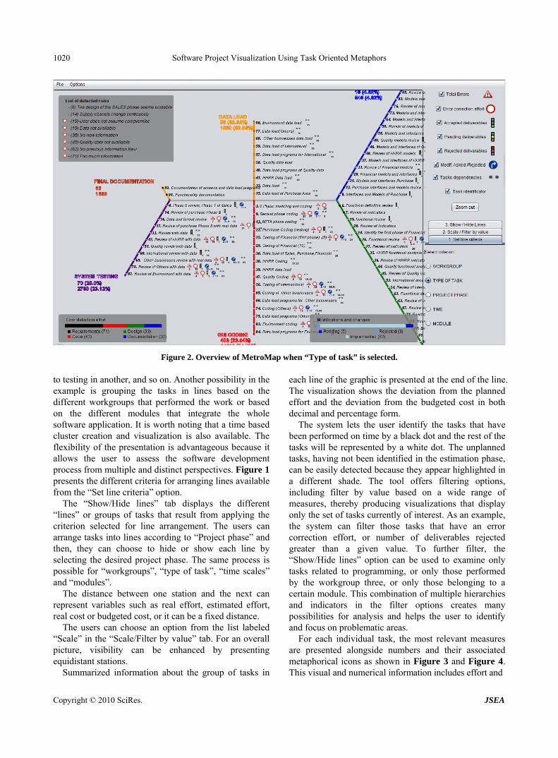
The second approach, MetroMap uses a metaphor with a metro map along with various interactive techniques to represent information concerning the software develop- ment process. Figure 2 shows how MetroMap applies the metaphor. The metro stations, which stand for the different tasks defined in the development process, are organized into lines and the configuration of the lines is defined by the selected criteria for grouping. Therefore, the first step is to select the criterion or hierarchy that will define the organization of the tasks and related information.
In the example, the system presents the lines using the previously defined types of tasks and it aligns the tasks related to design together in one line, those related
Copyright © 2010 SciRes. JSEA
Software Project Visualization Using Task Oriented Metaphors 1020
Figure 2. Overview of MetroMap when “Type of task” is selected.
to testing in another, and so on. Another possibility in the example is grouping the tasks in lines based on the different workgroups that performed the work or based on the different modules that integrate the whole software application. It is worth noting that a time based cluster creation and visualization is also available. The flexibility of the presentation is advantageous because it allows the user to assess the software development process from multiple and distinct perspectives. Figure 1 presents the different criteria for arranging lines available from the “Set line criteria” option.
The “Show/Hide lines” tab displays the different “lines” or groups of tasks that result from applying the criterion selected for line arrangement. The users can arrange tasks into lines according to “Project phase” and then, they can choose to hide or show each line by selecting the desired project phase. The same process is possible for “workgroups”, “type of task”, “time scales” and “modules”.
The distance between one station and the next can represent variables such as real effort, estimated effort, real cost or budgeted cost, or it can be a fixed distance.
The users can choose an option from the list labeled “Scale” in the “Scale/Filter by value” tab. For an overall picture, visibility can be enhanced by presenting equidistant stations.
Summarized information about the group of tasks in
each line of the graphic is presented at the end of the line. The visualization shows the deviation from the planned effort and the deviation from the budgeted cost in both decimal and percentage form.
The system lets the user identify the tasks that have been performed on time by a black dot and the rest of the tasks will be represented by a white dot. The unplanned tasks, having not been identified in the estimation phase, can be easily detected because they appear highlighted in a different shade. The tool offers filtering options, including filter by value based on a wide range of measures, thereby producing visualizations that display only the set of tasks currently of interest. As an example, the system can filter those tasks that have an error correction effort, or number of deliverables rejected greater than a given value. To further filter, the “Show/Hide lines” option can be used to examine only tasks related to programming, or only those performed by the workgroup three, or only those belonging to a certain module. This combination of multiple hierarchies and indicators in the filter options creates many possibilities for analysis and helps the user to identify and focus on problematic areas.
For each individual task, the most relevant measures are presented alongside numbers and their associated metaphorical icons as shown in Figure 3 and Figure 4. This visual and numerical information includes effort and
Copyright © 2010 SciRes. JSEA
Software Project Visualization Using Task Oriented Metaphors 1021
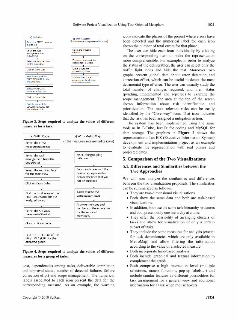
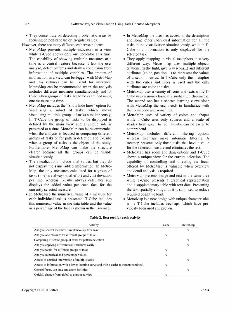
Figure 3. Steps required to analyze the values of different measures for a task.
Figure 4. Steps required to analyze the values of different measures for a group of tasks. cost, dependencies among tasks, deliverable completion and approval status, number of detected failures, failure correction effort and scope management. The numerical labels associated to each icon present the data for the corresponding measure. As an example, the warning
icons indicate the phases of the project where errors have been detected and the numerical label for each icon shows the number of total errors for that phase.
The user can hide each icon individually by clicking on the corresponding item to make the representation more comprehensible. For example, in order to analyze the status of the deliverables, the user can select only the traffic light icons and hide the rest. Moreover, two graphs present global data about error detection and correction effort, which can be useful to detect the most detrimental type of error. The user can visually study the total number of changes required, and their status (pending, implemented and rejected) to examine the scope management. The area at the top of the screen shows information about risk identification and prioritization. The most relevant risks can be easily identified by the “Give way” icon. That icon indicates that the risk has been assigned a mitigation action.
The system has been implemented using the same tools as in T-Cube, JavaFx for coding and MySQL for data storage. The graphics in Figure 2 shows the representation of an EIS (Executive Information System) development and implementation project as an example to evaluate the representation with real phases and projected dates.
5. Comparison of the Two Visualizations
5.1. Differences and Similarities between the Two Approaches
We will now analyze the similarities and differences between the two visualization proposals. The similarities can be summarized as follows: They are two-dimensional visualizations. Both show the same data and both are task-based
visualizations. In addition, both use the same task hierarchy structures
and both present only one hierarchy at a time. They offer the possibility of arranging clusters of
tasks and allow for visualization of only a certain subset of tasks.
They include the same measures for analysis (except for task dependencies which are only available in MetroMap) and allow filtering the information according to the value of a selected measure.
Both incorporate time-based analysis. Both include graphical and textual information to
complement the graph. Both comprise a high interaction level (multiple
selections, mouse functions, pop-up labels…) and include similar features as different possibilities for task arrangement for a general view and additional information for a task when mouse hovers.
Copyright © 2010 SciRes. JSEA
Software Project Visualization Using Task Oriented Metaphors
Copyright © 2010 SciRes. JSEA
1022
They concentrate on detecting problematic areas by focusing on nonstandard or irregular values.
However, there are many differences between them: MetroMap presents multiple indicators in a view
while T-Cube shows only one indicator at a time. The capability of showing multiple measures at a time is a central feature because it lets the user analyze, detect patterns and draw a conclusion from information of multiple variables. The amount of information in a view can be bigger with MetroMap and this richness can be useful for inference. MetroMap can be recommended when the analysis includes different measures simultaneously and T-Cube when groups of tasks are to be examined using one measure at a time.
MetroMap includes the “Show hide lines” option for visualizing a subset of tasks, which allows visualizing multiple groups of tasks simultaneously. In T-Cube the group of tasks to be displayed is defined by the main view and a unique side is presented at a time. MetroMap can be recommended when the analysis is focused in comparing different groups of tasks or for pattern detection and T-Cube when a group of tasks is the object of the study. Furthermore, MetroMap can make the structure clearer because all the groups can be visible simultaneously.
The visualizations include total values, but they do not display the same added information. In Metro- Map, the only measures calculated for a group of tasks (line) are always total effort and cost deviation per line, whereas T-Cube always calculates and displays the added value per each face for the currently selected measure.
In MetroMap the numerical value of a measure for each individual task is presented. T-Cube includes this numerical value in the data table and the value as a percentage of the face is shown in the Treemap.
In MetroMap the user has access to the description and some other individual information for all the tasks in the visualization simultaneously, while in T-Cube this information is only displayed for the selected task.
They apply mapping to visual metaphors in a very different way. Metro map uses multiple objects (stations, traffic light, give way icons...) and different attributes (color, position…) to represent the values of a set of metrics. In T-Cube only the metaphor with the cubes and faces is used and the only attributes are color and size.
MetroMap uses a variety of icons and texts while T-Cube uses a more classical visualization (treemaps). The second one has a shorter learning curve since with MetroMap the user needs to familiarize with the icons code and semantics.
MetroMap uses of variety of colors and shapes while T-Cube uses only squares and a scale of shades from green to red. T-Cube can be easier to comprehend.
MetroMap includes different filtering options whereas treemaps make automatic filtering. A treemap presents only those tasks that have a value for the selected measure and eliminates the rest.
MetroMap has zoom and drag options and T-Cube shows a unique view for the current selection. The capability of controlling and directing the focus offered by MetroMap is valuable when overview and detail analysis is required.
MetroMap presents image and text in the same area while T-Cube presents a graphical representation and a supplementary table with text data. Presenting the text spatially contiguous it is supposed to reduce required cognitive load.
MetroMap is a new design with unique characteristics while T-Cube includes treemaps, which have pre- viously been used and proven.
Table 2. Best tool for each activity.
Activity Cube MetroMap
Analyze several measures simultaneously for a task √
Analyze one measure for different groups of tasks √
Comparing different group of tasks for pattern detection √
Analyze applying different task structures easily √
Analyze totals for different groups of tasks √
Analyze numerical and percentage values. √
Access to detailed information of multiple tasks √
Access to information with a lower learning curve and with a easier to comprehend tool √
Control focus, use drag and zoom facilities √
Quickly change from global to a grouped view √
Software Project Visualization Using Task Oriented Metaphors 1023
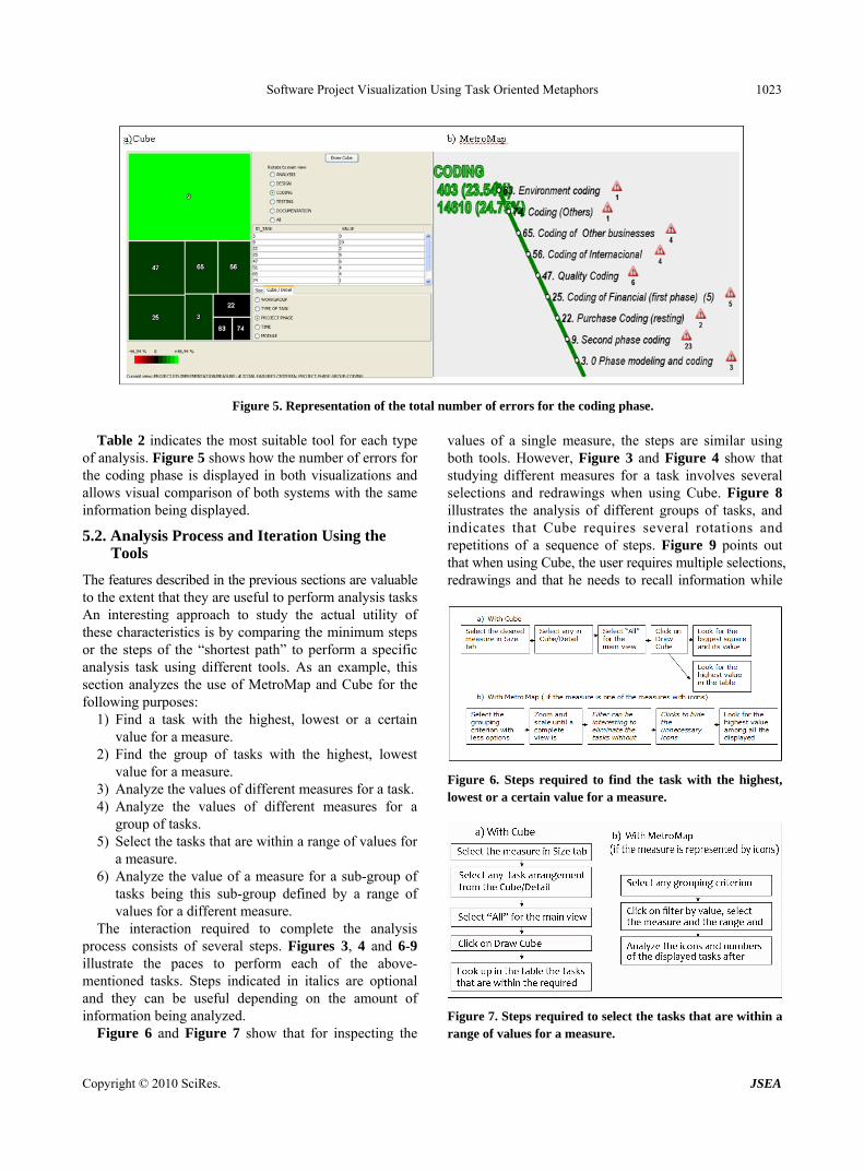
Figure 5. Representation of the total number of errors for the coding phase.
Table 2 indicates the most suitable tool for each type of analysis. Figure 5 shows how the number of errors for the coding phase is displayed in both visualizations and allows visual comparison of both systems with the same information being displayed.
5.2. Analysis Process and Iteration Using the Tools
The features described in the previous sections are valuable to the extent that they are useful to perform analysis tasks An interesting approach to study the actual utility of these characteristics is by comparing the minimum steps or the steps of the “shortest path” to perform a specific analysis task using different tools. As an example, this section analyzes the use of MetroMap and Cube for the following purposes:
1) Find a task with the highest, lowest or a certain value for a measure.
2) Find the group of tasks with the highest, lowest value for a measure.
3) Analyze the values of different measures for a task. 4) Analyze the values of different measures for a
group of tasks. 5) Select the tasks that are within a range of values for
a measure. 6) Analyze the value of a measure for a sub-group of
tasks being this sub-group defined by a range of values for a different measure.
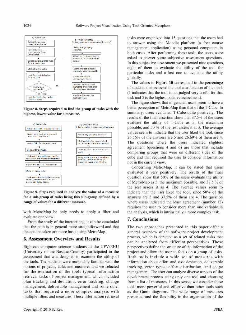
The interaction required to complete the analysis process consists of several steps. Figures 3, 4 and 6-9 illustrate the paces to perform each of the above-mentioned tasks. Steps indicated in italics are optional and they can be useful depending on the amount of information being analyzed.
Figure 6 and Figure 7 show that for inspecting the
values of a single measure, the steps are similar using both tools. However, Figure 3 and Figure 4 show that studying different measures for a task involves several selections and redrawings when using Cube. Figure 8 illustrates the analysis of different groups of tasks, and indicates that Cube requires several rotations and repetitions of a sequence of steps. Figure 9 points out that when using Cube, the user requires multiple selections, redrawings and that he needs to recall information while
Figure 6. Steps required to find the task with the highest, lowest or a certain value for a measure.
Figure 7. Steps required to select the tasks that are within a range of values for a measure.
Copyright © 2010 SciRes. JSEA
Software Project Visualization Using Task Oriented Metaphors 1024
Figure 8. Steps required to find the group of tasks with the highest, lowest value for a measure.
Figure 9. Steps required to analyze the value of a measure for a sub-group of tasks being this sub-group defined by a range of values for a different measure. with MetroMap he only needs to apply a filter and evaluate one view.
From the study of the interactions, it can be concluded that the path is in general more straightforward and that the actions taken are more basic using MetroMap.
6. Assessment Overview and Results
Eighteen computer science students at the UPV/EHU (University of the Basque Country) participated in the assessment that was designed to examine the utility of the tools. The students were reasonably familiar with the notions of projects, tasks and measures and we selected for the evaluation of the tools typical information retrieval tasks of project management, which included plan tracking and deviation, error tracking, change management, deliverable management and some other tasks that required a more complex analysis with multiple filters and measures. These information retrieval
tasks were organized into 15 questions that the users had to answer using the Moodle platform (a free course management application) using personal computers in both cases. After performing these tasks the users were asked to answer some subjective assessment questions. In this subjective assessment we presented nine questions, eight of them to evaluate the utility of the tool for particular tasks and a last one to evaluate the utility globally.
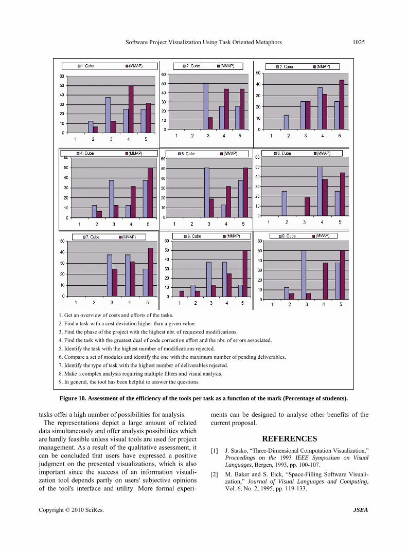
The values in Figure 10 correspond to the percentage of students that assessed the tool as a function of the mark (1 indicates that the tool is not judged very useful for that task and 5 is the highest positive assessment).
The figure shows that in general, users seem to have a better perception of MetroMap than that of the T-Cube. In summary, users evaluated T-Cube quite positively. The results of the final assertion show that 37.5% of the users evaluate the utility of T-Cube as 5, the maximum possible, and 50 % of the rest assess it at 3. The average values seem to indicate that the user liked the tool, since 26.56% of the answers are 5 and 26.69% of them are 4. The questions where the users indicated slightest agreement (questions 4 and 6) are those that include comparing groups that were on different sides of the cube and that required the user to consider information not in the current view.
Concerning MetroMap, it can be stated that users evaluated it very positively. The results of the final question show that 50% of the users evaluate the utility of MetroMap as 5, the maximum possible, and 37.5 % of the rest assess it as 4. The average values seem to indicate that the user liked the tool, since 50% of the answers are 5 and 37.5% of them are 4. The question where users indicated the least agreement (number 12) requires the user to consider more than one variable in the analysis, which is intrinsically a more complex task.
7. Conclusions
The two approaches presented in this paper offer a general overview of the software project development process, which is depicted as a set of related tasks that can be analyzed from different perspectives. These perspectives define the structure of the information of the project and allow the user to focus on a group of tasks. Both tools include a wide set of measures with information about effort and cost deviation, deliverable tracking, error types, effort distribution, and scope management. The user can analyze diverse aspects of the development process using only one tool and choosing from a list of measures. In this sense, we consider these tools more powerful and effective than other tools such as the Gantt diagrams. The wide range of measures presented and the flexibility in the organization of the
Copyright © 2010 SciRes. JSEA
Software Project Visualization Using Task Oriented Metaphors 1025
1. Get an overview of costs and efforts of the tasks.
2. Find a task with a cost deviation higher than a given value.
3. Find the phase of the project with the highest nbr. of requested modifications.
4. Find the task with the greatest deal of code correction effort and the nbr. of errors associated.
5. Identify the task with the highest number of modifications rejected.
6. Compare a set of modules and identify the one with the maximum number of pending deliverables.
7. Identify the type of task with the highest number of deliverables rejected.
8. Make a complex analysis requiring multiple filters and visual analysis.
9. In general, the tool has been helpful to answer the questions.
Figure 10. Assessment of the efficiency of the tools per task as a function of the mark (Percentage of students).
tasks offer a high number of possibilities for analysis. The representations depict a large amount of related
data simultaneously and offer analysis possibilities which are hardly feasible unless visual tools are used for project management. As a result of the qualitative assessment, it can be concluded that users have expressed a positive judgment on the presented visualizations, which is also important since the success of an information visuali- zation tool depends partly on users' subjective opinions of the tool's interface and utility. More formal experi-
ments can be designed to analyse other benefits of the current proposal.
REFERENCES [1] J. Stasko, “Three-Dimensional Computation Visualization,”
Proceedings on the 1993 IEEE Symposium on Visual Languages, Bergen, 1993, pp. 100-107.
[2] M. Baker and S. Eick, “Space-Filling Software Visuali- zation,” Journal of Visual Languages and Computing, Vol. 6, No. 2, 1995, pp. 119-133.
Copyright © 2010 SciRes. JSEA
Software Project Visualization Using Task Oriented Metaphors 1026
[3] D. A. Umphress, T. D. Hendrix, J. H. Cross II and S. Maghsoodloo, “Software Visualizations for Improving and Measuring the Comprehensibility of Source Code,” Science of Computer Programming, Vol. 60, No. 2, May 2006, pp. 121-133.
[4] C. de Souza, J. Froehlich and P. Dourish, “Seeking the Source: Software Source Code as a Social and Technical Artifact,” Proceedings of the 2005 International ACM SIGGROUP Conference on Supporting Group Work, Sanibel Island, 2005, pp. 197-206.
[5] M. Ogawa and K. Ma, “StarGate: A Unified, Interactive Visualization of Software Projects,” IEEE Pacific Visuali- zation Symposium (Pacific VIS'08), March 2008, pp. 191-198.
[6] K. Hansen, “Project Visualization for Software,” IEEE Software, Vol. 23, No. 4, July-August 2006, pp. 84-92.
[7] S. Diehl, “Software Visualization: Visualizing the Struc- ture, Behaviour and Evolution of Software,” Springer Verlag, Berlin Heidelberg, 2007.
[8] N. Fenton and M. Neil, “Software Metrics: Successes, Failures and New Directions,” The Journal of Systems & Software, Vol. 47, No. 2-3, 1999, pp. 149-157.
[9] F. H. Damborg and M. Lars, “A Contextual Approach to Improving Software Metrics Practices,” IEEE Transac- tions on Engineering Management, Vol. 55, No. 4, 2008, pp. 602-616.
[10] J. Stott, P. Rodgers, R. Burkhard, M. Meier and M. Smis, “Automatic Layout of Project Plans Using a Metro Map Metaphor,” Proceedings of the Ninth International Conference on Information Visualization, London, 2005, pp. 203-206.
[11] J. Jones, M. Harrold and J. Stasko, “Visualization for Fault Localization,” Proceedings of ICSE 2001 Workshop on Software Visualization, Toronto, 2001, pp. 71-75.
[12] P. Zhang and D. Zhu, “Information Visualization in Project Management and Scheduling,” Proceedings of the 4th Conference of the International Society for Decision Support Systems (ISDSS'97), University of Lausanne, Switzerland, 1997, pp. 1-9.
[13] R. Burkhard and M. Meier, “Tube Map Visualization: Evaluation of a Novel Knowledge Visualization Appli- cation for the Transfer of Knowledge in Long-Term Projects,” Journal of Universal Computer Science, Vol. 11, No. 4, April 2005, pp. 473-494,.
[14] E. Sandvad, K. Grønbæk, L. Sloth and J. L. Knudsen, “A Metro Map Metaphor for Guided Tours on the Web: The Webvise Guided Tour System,” Proceedings of the 10th
International Conference on World Wide Web, May 2001, pp. 326-333.
[15] K. V. Nesbitt, “Getting to More Abstract Places Using the Metro Map Metaphor,” Proceedings of the Eighth Inter- national Conference on Information Visualisation (IV’04), London, 2004, pp. 488-493.
[16] IEEE, “IEEE Std. 1058-1998 IEEE Standard for Software Project Management Plans,” 1998.
[17] R. Thayer, “Software Engineering Project Management: A Top-Down View,” Software Engineering Project Management, IEEE Computer Society Press, Los Alamitos, 1987, pp. 15-53.
[18] N. Fenton and S. Pfleeger, “Software Metrics: A Rigorous and Practical Approach,” PWS Publishing Company, Boston, 1997.
[19] D. J. Reifer, “Traditional Software Management Approaches,” Software Management, IEEE Computer Society, Washington DC, 2006.
[20] K. Cori, “Fundamentals of Master Scheduling for the Project Manager,” In: R. H. Thayer, Ed., Software Engi- neering Project Management, IEEE Computer Society, Washington DC, 1988.
[21] K. El Emam and A. Koru, “A Replicated Survey of IT Software Project Failures,” IEEE Software, Vol. 25, No. 5, 2008, pp. 84-90.
[22] T. DeMarco and T. Lister, “Waltzing with Bears: Managing Risk on Software Projects,” Dorset House Publishing Co. Inc., New York, 2003.
[23] B. Shneiderman, S. Card and J. Mackinlay, “Readings in Information Visualization: Using Vision to Think,” Morgan Kaufmann, San Fransisco, 1999.
[24] M. Eppler, “The Image of Insight: The Use of Visual Metaphors in the Communication of Knowledge,” Proceedings of I-KNOW'03, Graz, 2003, pp. 81-88.
[25] J. V. Wijk and H. V. de Wetering, “Cushion Treemaps: Visualization of Hierarchical Information,” IEEE Sym- posium on Information Visualization, 1999 (Info Vis'99) Proceedings, San Francisco, 1999, pp. 73-78.
[26] W. Jungmeister, “Adapting Treemaps to Stock Portfolio Visualization,” Center for Automation Research Tech- nical Report, University of Maryland, Baltimore, 1992.
[27] L. Jin and D. Banks, “Tennis Viewer: A Browser for Competition Trees,” IEEE Computer Graphics and Applications, Vol. 17, No. 4, July-August 1997, pp. 63-65.
Copyright © 2010 SciRes. JSEA