Sixth Form Magazine Denotation
6
Sixth Form Magazine
-
Upload
daniellefaldo -
Category
Education
-
view
254 -
download
2
Transcript of Sixth Form Magazine Denotation
Sixth Form Magazine
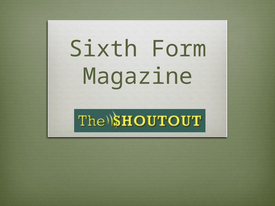
Front Cover The colour scheme for my magazine
cover is green and yellow because, green is Southend High School For Girls’ school colour so I wanted the cover to be associated to the school. I also used yellow because I wanted the cover to be appealing and eye-catching, additionally I thought as the magazine is called ‘The Shoutout’ the colour yellow is bright and loud so it coincides with the name.
My masthead for ‘The Shoutout’ has sound vibrations on it that I photoshopped in, to emphasise the volume of the word ‘Shoutout’. This is also why the word ‘The’ in my masthead is thin and small. I wanted the masthead to look like a student exclaiming their opinion to fit with the ethos of the magazine (The ethos was to be a more opinion-orientated magazine written by students).
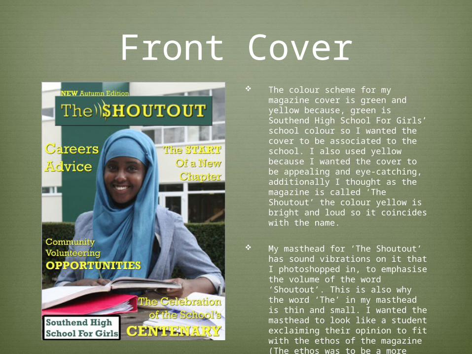
Front Cover Above my masthead I have the line
“NEW Autumn Edition” the ‘new’ is in capitals because it’s a buzz word and I wanted it to stand out, I also used the word ‘edition’ because then the reader feels like the magazine is a one-off special/worth-getting.
The puffs on my cover have certain words in bold/capitals/larger font so that the words spark interest in the reader. For example ‘opportunities’ is highlighted in my ‘community volunteering’ puff, opportunities is a direct word that students may be looking for in a sixth-form magazine. The purpose of my Sixth-Form magazine is to inform on school events and tell students about clubs etc. that might look good on their UCAS.
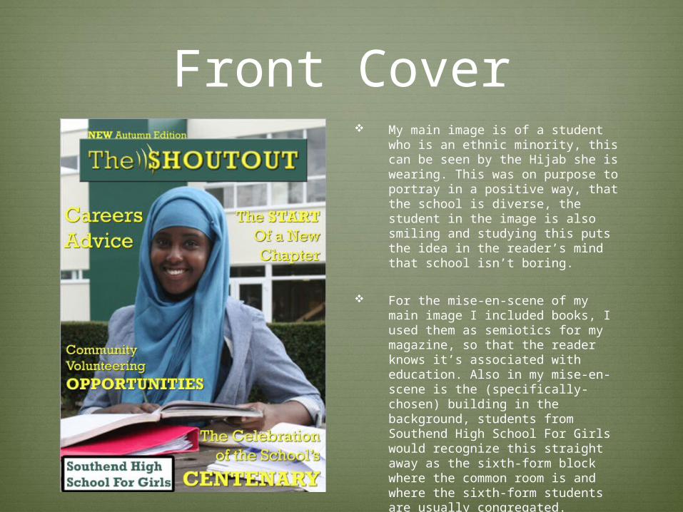
Front Cover My main image is of a student who is
an ethnic minority, this can be seen by the Hijab she is wearing. This was on purpose to portray in a positive way, that the school is diverse, the student in the image is also smiling and studying this puts the idea in the reader’s mind that school isn’t boring.
For the mise-en-scene of my main image I included books, I used them as semiotics for my magazine, so that the reader knows it’s associated with education. Also in my mise-en-scene is the (specifically-chosen) building in the background, students from Southend High School For Girls would recognize this straight away as the sixth-form block where the common room is and where the sixth-form students are usually congregated.
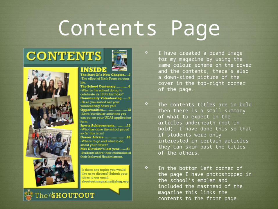
Contents Page I have created a brand image for my
magazine by using the same colour scheme on the cover and the contents, there’s also a down-sized picture of the cover in the top-right corner of the page.
The contents titles are in bold then there is a small summary of what to expect in the articles underneath (not in bold). I have done this so that if students were only interested in certain articles they can skim past the titles of the others.
In the bottom left corner of the page I have photoshopped in the school’s emblem and included the masthead of the magazine this links the contents to the front page.
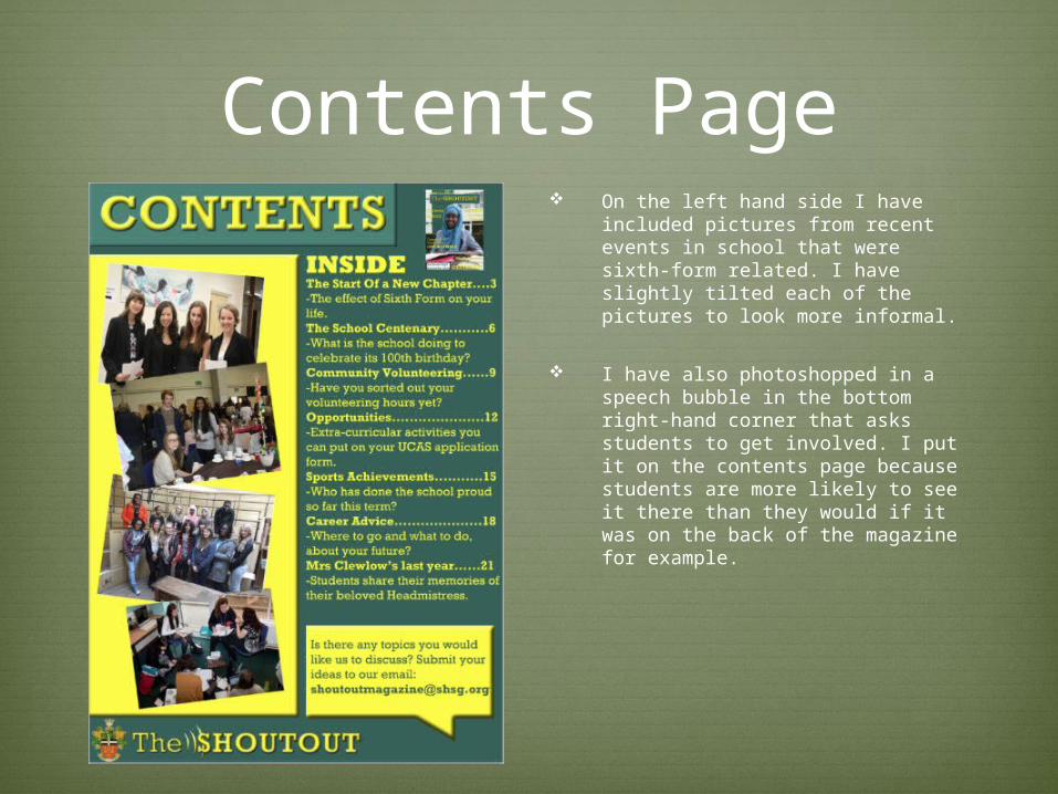
Contents Page On the left hand side I have included
pictures from recent events in school that were sixth-form related. I have slightly tilted each of the pictures to look more informal.
I have also photoshopped in a speech bubble in the bottom right-hand corner that asks students to get involved. I put it on the contents page because students are more likely to see it there than they would if it was on the back of the magazine for example.