SIMS 213: User Interface Design & Development Marti Hearst Thurs, March 18, 2004.
date post
22-Dec-2015Category
view
218download
2
SIMS 213: User Interface Design & Development
Marti HearstThurs, Feb 13, 2003

Project TimelineFe
brua
ry 4
Apr
il 3
Apr
il 17
May
13
Proj
ect I
dea
Pers
onas
, Int
ervi
ews,
Task
s Ana
lysis
Low
-fi U
ser T
est
UI P
roto
type
#1
Heu
ristic
Eva
luat
ion
UI P
roto
type
#2
Use
r Tes
ting
UI P
roto
type
#3
Mappings
Mapping: – Relationships between two things
• Between controls and their results– Related to metaphor discussion– Related to affordances

Slide adapted from Saul Greenberg

Mapping controls to physical outcomes
backright
frontleft
backleft
frontright
24 possibilities, requires: -visible labels -memory
arbitrary full mapping
back front front back
2 possibilities per side =4 total possibilities
paired

Mappings
For devices, appliances– Natural mappings use constraints and correspondences in the
physical world• Controls on a stove• Controls on a car
– Radio volume» Knob goes left to right to control volume» Should also go in and out for front to rear speakers
For computer UI design– Mapping between controls and their actions on the computer
• Controls on a digital watch• Controls on a word processor program

Based on slide by Saul Greenberg
Transfer Effects
People transfer their expectations from familiar objects to similar new ones– positive transfer: previous experience applies to new
situation– negative transfer: previous experience conflicts with
new situation

Based on slide by Saul Greenberg
Cultural Associations
Groups of people learn idioms– red = danger, green = go
But these differ in different places– Light switches
• America: down is off• Britain: down is on
– Faucets• America: counter-clockwise is on• Britain: counter-clockwise is off

Based on slide by Saul Greenberg
Mental Models
People have mental models of how things work:– how does your car start?– how does an ATM machine work?– how does your computer boot?
Allows people to make predictions about how things will work
Based on slide by Saul Greenberg
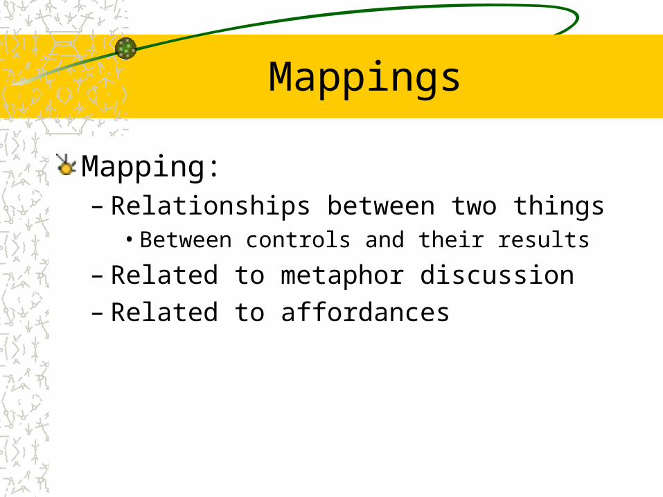
Mental Models
Mental models built from– affordances– constraints– mappings– positive transfer – cultural associations/standards– instructions– interactions
Mental models are often wrong!

Slide adapted from Saul Greenberg
Our mental models of how bicycles workcan “simulate” this to know it won’t work

People are always trying to make sense of things
Mental models often extracted from fragmentary evidencePeople find ways to explain things– Computer terminal breaks when accessing the
library catalog– Certain you’re driving on the correct road

Norman’s Action Cycle
Human action has two primary aspects– Execution: doing something– Evaluation: comparison of what happened to what
was desired

Action Cycle
Goals
EvaluationExecution
The World
start here

Norman’s Action Cycle
Execution has three stages:– Start with a goal– Translate into an intention– Translate into a sequence of actions
Now execute the actionsEvaluation has three stages:– Perceive world– Interpret what was perceived– Compare with respect to original intentions

Action Cycle
Goals
EvaluationEvaluation of interpretations
Interpreting the perception
Perceiving the state of the world
ExecutionIntention to act
Sequence of actions
Execution of seq uence of actions
The World
start here

Gulf of Evaluation
The amount of effort a person must exert to interpret – the physical state of the system– how well the expectations and intentions have been
met
We want a small gulf!

Based on slide by Saul Greenberg
Example
Scissors– affordances:
• holes for insertion of fingers• blades for cutting
– constraints• big hole for several fingers, small hole for thumb
– mapping• between holes and fingers suggested and constrained by appearance
– positive transfer• learnt when young
– conceptual model• implications clear of how the operating parts work

Based on slide by Saul Greenberg
Bad Example
Digital Watch– affordances
• four push buttons, not clear what they do
– contraints and mapping unknown• no visible relation between buttons and the end-result of their actions
– negative transfer• little association with analog watches
– cultural standards• somewhat standardized functionality, but highly variable
– conceptual model• must be taught; not obvious

Digital Watch Redesigned for Affordances (Rachna Dhamija)

Digital Watch Redesigned for Affordances (Ping Yee)

Interface Metaphors Revisited
Definition of Metaphor– application of name or descriptive term to an object to which it is not
literally applicable
Purpose– function as natural models – leverages our knowledge of familiar, concrete objects/experiences to
understand abstract computer and task concepts
Problem– metaphor may portray inaccurate or naive conceptual model of the system
A presentation toolis like
a slide projector

The Metaphor of Direct Manipulation
Direct Engagement– the feeling of working directly on the task
Direct Manipulation– An interface that behaves as though the interaction was with a real-world
object rather than with an abstract systemCentral ideas– visibility of the objects of interest– rapid, reversible, incremental actions– manipulation by pointing and moving– immediate and continuous display of results
Almost always based on a metaphor– mapped onto some facet of the real world task semantics)

Slide adapted from Saul Greenberg
Object-Action vs Action-Object
Select object, then do action– interface emphasizes 'nouns' (visible objects) rather than 'verbs' (actions)
Advantages– closer to real world– modeless interaction– actions always within context of object
• inappropriate ones can be hidden– generic commands
• the same type of action can be performed on the object• eg drag ‘n drop:
my.doc
move

Slide adapted from Saul Greenberg
Direct manipulation
Representation directly determines what can manipulated

Slide adapted from Saul Greenberg
Games
Slide adapted from Saul Greenberg
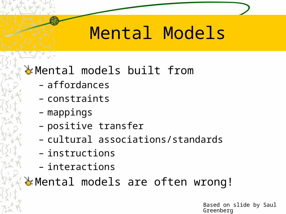
Is direct manipulation the way to go?
Some Disadvantages– Ill-suited for abstract operations
• spell-checker?Tedium
• manually search large database vs queryTask domain may not have adequate physical/visual metaphorMetaphor may be overly-restrictive
Solution: Most systems combine direct manipulation and abstractions
• word processor:– WYSIWYG document (direct manipulation)– buttons, menus, dialog boxes (abstractions, but direct manipulation “in
the small”)

Based on slide by Saul Greenberg
Guidelines for Design
Provide a good conceptual model– allows users to predict consequences of actions– communicated thorugh the image of the system
Make things visible– relations between user’s intentions, required actions, and
results should be• sensible• consistent• meaningful (non-arbitrary)
– make use of visible affordances, mappings, and constraints– remind person of what can be done and how to do it

Summary
Good Representations– captures essential elements of the event / world– deliberately leaves out / mutes the irrelevant– appropriate for the person, their task, and their interpretation
Metaphors– uses our knowledge of the familiar and concrete to represent abstract concepts– need not be literal– has limitations that must be understood
Direct manipulation– visibility of the objects of interest– rapid, reversible, incremental actions– manipulation by pointing and moving– immediate and continuous display of results

Discuss Readings

Raskin on Cognition
Cognitive Engineering– Ergonomics: sizes and capabilities of the human
body– Cognetics: Ergonomics of the mind– This is the applied side of cognitive science

Image from Newsweek, Jan 2001
Raskin on Cognition
Cognitive Conscious / Unconscious– Examples?– Differences?
Locus of Attention– What is it?– Why is it important for HCI?
Cooper on error dialog boxes
Why are they problematic?How related to locus of attention?What are the alternatives?– Cooper is talking to programmers
• “Silicon Sanctimony”• You should feel as guilty as for using a goto – an
admission of failure in design

What happens when you cancel a cancelled operation?
Do I have any choice in this?
Umm, thanks for the warning,but what should I do?
Uhhh… I give up on this one

Inane Dialog Boxes


Slide adapted from Saul Greenberg
“HIT ANY KEY TO CONTINUE”

Design Principles and Process

Designing the Interface
How to do the design itself?– Do your task analysis– Identify the important tasks and their steps
• Use personas to identify the important ones• Use card sorting to help organize the tasks• Use scenarios to give order to the task sequences
– Organize these into several different designs• Get the main interactions sketched out
– Make sketches, or– Use a tool, such as a flow chart– An example: http://www.jjg.net/ia/visvocab/
– Use design guidelines to help make decisions– Create low-fi prototypes to quickly assess the different designs
Design GuidelinesThere are LOTS of them– Based on common sense and experience
• Not necessarily proven– Often conflict with one another– Often don’t say HOW to implement them
What do to:– Focus on those guidelines most applicable to the kind of interface under
development– Focus on those emphasized in our readings
• Bloopers, chapter 1• Usability Engineering, chapter 5• Raskin, chapter 3• All of Don Norman’s concerns
– Use common sense

All-Star Usability Design Guidelines
An edited selection

Slide adapted from Saul Greenberg
1 Simple and natural dialogue
Use the user’s conceptual modelMatch the users’ task in as natural a way as possible– minimize mapping between interface and task
semantics
1 Simple and natural dialogue
Present exactly the information the user needs– less is more
• less to learn, to get wrong, to distract...
– information should appear in natural order• related information is graphically clustered• order of accessing information matches user’s expectations
– remove or hide irrelevant or rarely needed information• competes with important information on screen
– use windows frugally• don’t make navigation and window management excessively complex

Slide adapted from Saul Greenberg

Slide adapted from Saul Greenberg
2 Speak the users’ language
Slide adapted from Saul Greenberg
3 Minimize user’s memory load
Computers good at remembering things, people aren’t!Promote recognition over recall– menus, icons, choice dialog boxes vs command
lines, field formats– relies on visibility of objects to the user (but less is
more!)

Slide adapted from Saul Greenberg
3 Minimize user’s memory load

Slide adapted from Saul Greenberg
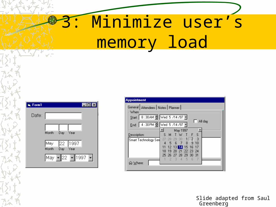
3: Minimize user’s memory load
Describe required input format and example, and default
Small number of rules applied universally– generic commands
• same command can be applied to all interface objects
• copy, cut, paste, drag ’n drop, ... for characters, words, paragraphs, circles, files
Slide adapted from Saul Greenberg
3: Minimize user’s memory load

Slide adapted from Saul Greenberg
4: Be consistent
Consistency of effects– same words, commands, actions will always have the same effect in
equivalent situationsConsistency of language and graphics– same information/controls in same location on all screens / dialog
boxes – same visual appearance across the system (e.g. widgets)
• e.g. different scroll bars in a single window system!
Consistency of input– consistent syntax across complete system
Slide adapted from Saul Greenberg
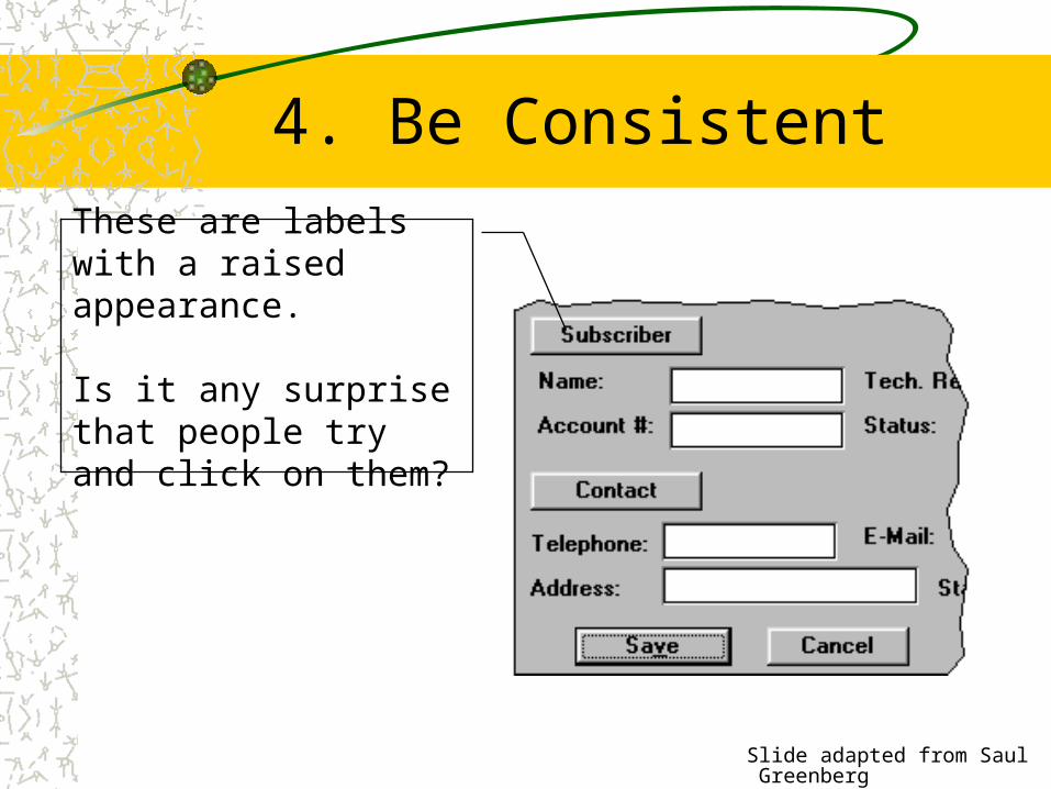
4. Be Consistent
These are labels with a raised appearance.
Is it any surprise that people try and click on them?

Slide adapted from Saul Greenberg
5: Provide feedback
Continuously inform the user about – what it is doing– how it is interpreting the user’s input– user should always be aware of what is going on
> Doit
What’s it
doing?
> DoitThis will take5 minutes...
Time for
coffee.

Slide adapted from Saul Greenberg
5. Provide feedback
Should be as specific as possible, based on user’s inputBest within the context of the action

Slide adapted from Saul Greenberg
5. Provide feedback
What did I select?
What mode am I in now?
How is the system
interpreting my actions?

Slide adapted from Saul Greenberg
Provide feedback
Drawing Board LT
Multiple files being copied, but feedback is file by file.

Slide adapted from Saul Greenberg
5. Provide feedback
Response time– how users perceive delays
0.1 second max: perceived as “instantaneous” 1 seconds max: user’s flow of thought stays
uninterrupted, but delay noticed 10 seconds: limit for keeping user’s attention focused
on the dialog> 10 seconds: user will want to perform other tasks while
waiting

Slide adapted from Saul Greenberg
How do I get
out of this?
6. Provide clearly marked exits

Slide adapted from Saul Greenberg
6. Provide clearly marked exits
Users don’t like to feel trapped by the computer!– should offer an easy way out of as many situations as
possible
Strategies:– Cancel button (for dialogs waiting for user input)– Universal Undo (can get back to previous state)– Interrupt (especially for lengthy operations)– Quit (for leaving the program at any time) – Defaults (for restoring a property sheet)

Slide adapted from Saul Greenberg
7. Provide shortcuts
Experienced users should be able to perform frequently used operations quicklyStrategies:– keyboard and mouse accelerators
• abbreviations• command completion• menu shortcuts• function keys• double clicking vs menu selection
– type-ahead (entering input before the system is ready for it) navigation jumps
• e.g., going to location directly, and avoiding intermediate nodes
– history systems • WWW: ~60% of pages are revisits

Keyboard accelerators for
menus
Customizable toolbars andpalettes for
frequent actions
Split menu, with recently used fonts on top
Scrolling controls for page-sized
increments
Double-click raises object-specific menu
Double-click raises toolbar
dialog box

Slide adapted from Saul Greenberg
8: Deal with errors in a positive and helpful manner
People will make errors!
Errors we make– Mistakes
• arise from conscious deliberations that lead to an error instead of the correct solution
– Slips• unconscious behaviour that gets misdirected en route to satisfying goal
– e.g. drive to store, end up in the office
• shows up frequently in skilled behaviour– usually due to inattention
• often arises from similarities of actions

Slide adapted from Saul Greenberg
Designing for slips
General rules– Prevent errors before they occur– Detect and correct errors when they do occur– User correction through feedback and undo
Examples– mode errors
• have as few modes as possible (preferably none)• make modes highly visible
– capture errors• instead of confirmation, make actions undoable• allows reconsideration of action by user
– loss of activation• if system knows goal, make it explicit• if not, allow person to see path taken
– description errors• in icon-based interfaces, make sure icons are not too similar, • check for reasonable input, etc.

Slide adapted from Saul Greenberg
8 Deal with errors in a positive and helpful manner
Prevent errors– try to make errors impossible– modern widgets: only “legal commands” selected, or
“legal data” entered
Provide reasonableness checks on input data– on entering order for office supplies
• 5000 pencils is an unusually large order. Do you really want to order that many?

Slide adapted from Saul Greenberg
9. Provide help
Help is not a replacement for bad design!
Simple systems:– walk up and use; minimal instructions
Most other systems:– feature rich– some users will want to become “experts” rather than “casual”
users– intermediate users need reminding, plus a learning path
Volume 37: A user's guide to...
Slide adapted from Saul Greenberg
Types of help
Tutorial and/or getting started manuals– short guides that people are likely to read when first
obtaining their systems• encourages exploration and getting to know the system• tries to get conceptual material across and essential
syntax
– on-line “tours”, exercises, and demos• demonstrates very basic principles through working
examples

Slide adapted from Saul Greenberg
Types of help
Reference manuals– used mostly for detailed lookup by experts– on-line hypertext
• search / find• table of contents• index• cross-index

Slide adapted from Saul Greenberg
Types of help
Reminders– short reference cards
• expert user who just wants to check facts• novice who wants to get overview of system’s capabilities
– keyboard templates• shortcuts/syntactic meanings of keys; recognition vs. recall;
capabilities
– tooltips• text over graphical items indicates their meaning or purpose
Slide adapted from Saul Greenberg
Types of help
Context-sensitive help– system provides help on the interface component the
user is currently working with• Tool tips• Macintosh “balloon help”• Microsoft “What’s this” help
– brief help explaining whatever the user is pointing at on the screen
Slide adapted from Saul Greenberg
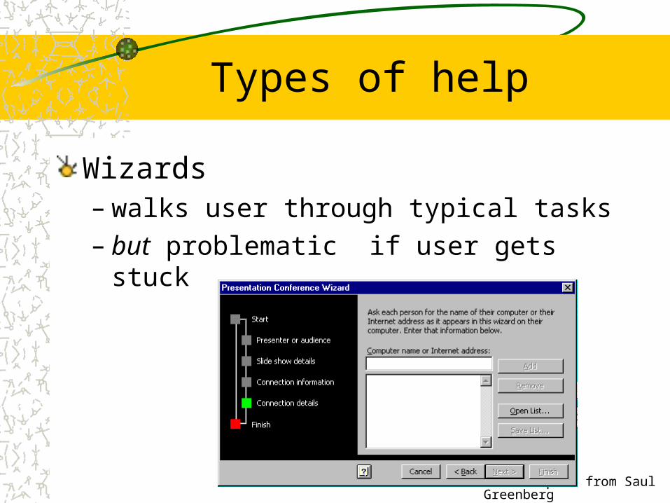
Types of help
Wizards– walks user through typical tasks– but problematic if user gets stuck

Slide adapted from Saul Greenberg
Types of help
Tips– migration path to learning system features– also context-specific tips on being more efficient– must be “smart”, otherwise boring and tedious

Summary
Design is a creative process, with many optionsYour design should reflect– The results of the interviews, task analysis– Existing conventions when applicable– Design guidelines when applicable
Usability testing helps you decide which of several options to pursue