Sign Design Guidelines
12
City of Pearl 2021 Edition Sign Design Guidelines
Transcript of Sign Design Guidelines

City of Pearl
2021 Edition
Sign Design Guidelines

Purpose and Goal
Purpose The purpose of the Guidelines are to establish standards for signs to help preserve and improve the appearance of the City, and to promote public safety by regulating the location, quality, construction and maintenance of signs. It is also the intent of the Guidelines to regulate signs in the context of the built and natural environment. Signs are an economical and effective way to communicate information and an asset to most businesses. Property values are protected and enhanced when signs are designed with these principles in mind.
Creating an effective sign involves careful design. It must take into consideration specific elements, such as your logo, fonts, and colors, as well as general principles like readability and traffic patterns. If you have hired a graphic artist to create your specific elements, you likely will need the expertise of a professional sign designer to assist.
Sign design is about much more than merely making the sign look good. Size, placement, lighting, and more are involved, and all must fit the needs of your building location.
Professional sign companies will understand all of this, of course. However, it’s important for you to have a basic working knowledge of sign design and lighting requirements so that you can better communicate with your sign company.
This guidance will assist the sign owner is complying with the City of Pearl’s Sign Ordinance.
Goal 1 Clarify sign types To explain definitions and standards for signs which help people (pedestrians and drivers) find what they need without difficulty or confusion.
2 Increase traffic safety To promote effective signage that allows passing motorists to absorb the most important information without distracting their attention from the road for an extended period of time.
3 Enhancing community appearance To reduce the occurrence of ineffective signage, and the proliferation of too much signage, which can adversely effect the appearance of a community, reduce surrounding property values and negatively effect business.
Measuring Signage
Sign Area Includes all faces of a sign measured as follows: A. When a sign is on a plate or framed or outlined, all of the
area of the plate or the area enclosed by the frame or outline is included in the area (HxW=Area);
B. When a sign is made of only letters, designs or figures that are painted, engraved, projected or in any manner attached to a wall, the total area of the sign is the area of a box that can be drawn around all of the matter that makes up the sign (HxW=Area).
C. For double sided signs, both sign faces will be used in the area calculation (HAxWA)+(HBxWB) = Area.
Sign Height Includes all faces of a sign measured as follows: A. For freestanding signs, height is calculated as the
vertical distance measured from the grade of the site where the sign is to be installed or the grade of the roadway, whichever is higher, to the highest point of the sign. Grade is considered the lower of the existing grade prior to construction or the newly established grade after construction.

Sign ComponentsColors A. The color tones between a sign’s
lettering/symbols and background should have sufficient contrast to make the sign clearly legible. Light letters on a dark background or dark letters on a light background have the highest legibility.
B. Excessively bright colors or over-scaled letters shall not be used as a means to attract attention.
C. The number of colors used on a sign should generally be limited to no more than three; competition between too many colors often results in decreased legibility.
D. In general, subdued and darker colors are the most appropriate for signs while bright or primary colors should be limited to accent areas.
E. Dark colored backgrounds on signs are generally encouraged. Stark white or extremely bright background colors such as bright red, orange or yellow are strongly discouraged. Where the design of the sign results in a large field of illuminated background, the use of white or off-white as a background color should be avoided.
F. The color of the trim caps should match the color of the letter face or the cabinet return.
3 Colors used with a dark background to give contrast and clean appearance.
Wall sign uses shape, materials, color, and 3D elements to achieve an aesthetically balanced design.
Simulated dark wood background against stainless steel lettering creates contrast and weathers well.
Design A. Signage should inform in a manner
and style that create an environment with character, color and interest.
B. Non-rectangular shapes are encouraged to enhance visual interest.
C. Signs with three dimensional qualities using raised or recessed copy are strongly encouraged to give relief to signs.
D. Not more than two letters styles should be used on a single sign.
E. Decorative motifs add variety and interest.
F. Use decorative caps, hardware, and bases for ground mounted signs using poles.
Materials A. Signs shall be professional
constructed using high quality materials
B. Sign materials should be compatible with the materials and character of the building façade.
C. Sign materials should be durable and easy to maintain.
D. Avoid the use of materials susceptible to decay.

Sign ComponentsCONTENT A. Simple, bold lettering should be
used to create signs that are easy to read for pedestrians on sidewalks as well as people driving in cars.
B. Overly-ornate and trendy typefaces that are hard-to-read should be avoided.
C. Three-dimensional letters/symbols, with at least one-half inch depth or reveal, are preferable.
D. Content should be minimal and avoid excessive lettering, such as lists of products/services, slogans, etc.
E. Use of symbols, logos, and other graphics as part of the sign content is encouraged to reduce the need for excessive lettering, make signs quicker to read, and contribute to the unique identity of downtown businesses.
Linear design with appropriate detailing to for contrast and relief.
Designed to keep raceway and mounting brackets discrete.
SCALE AND SHAPE A. The scale of a sign should reflect
the scale of the building’s façade in terms of width and height, as well as the rhythm and sizes of window and door openings.
B. Where a signboard space exists on a building façade, a wall sign should be scaled to proportionately fit this space.
C. Sign shapes should be relatively simple and understandable to complement the architecture of historic downtown buildings.
D. Symbol signs are encouraged as they are easy to recognize and contribute to the unique identity of businesses and downtown in general.
INSTALLATION A. Installation of a sign should avoid
irreversible damage to a building façade, e.g. a sign should be mounted through the mortar joints rather than through the historic masonry itself.
B. Existing sign mounting brackets, studs, or holes should be reused for new signage, whenever feasible.
C. The number of anchor points should be minimized.
D. The method of sign installation should prevent a sign from obscuring a building’s architectural features and window and door openings.
E. Visible raceways and transformers for individual letters are strongly discouraged. Sign installation details should indicate where the transformer and other mechanical equipment will be located.
F. Exposed supports or guy wires to stabilize signs are strongly discouraged.
G. Mounting brackets should be darker colors and authentic to the material used to construct them.
Simply logo that is scaled to fit within the buildings architectural elements yet boldly stands out.

Sign TypesAttached Sign A sign fastened to or painted on the wall of a building or structure in such a manner that the wall becomes the supporting structure for, or forms the background surface of the sign and which does not project more than six inches from such building or structure.
A. A wall sign should be located above the street-level windows/ door. For multi-story buildings, a wall sign should be located below the sills of second-story windows.
B. A wall sign should be placed and sized so that it does not obscure building architectural features. It should fit the scale of the building and be balanced within the buildings architectural elements.
C. A wall sign should usually be horizontally-oriented and centered.
D. If the sign has a background, the shape of a wall sign should reflect the architectural features of the building’s façade.
E. Where feasible, a wall sign should be placed to align with other signs on that building and other buildings on the same block face.
F. Internally illuminated Raceways, Box Sign, Can Signs, Cabinet/Canister signs are not appropriate sign types except in the case of lighting an individual letter or an individual logo symbol which does not include text are not appropriate sign types.
G. Avoid signs that are simply painted on a flat background, or flat attached vinyl graphics with no other 3D relief on the overall being.
H. Signs with three dimensional qualities using raised or recessed copy are strongly encouraged to give relief to signs.
I. The use of decorative boarders, trim or other elements on a background are encouraged.
J. Ultimately the build’s sign should be an extension of the business logo and not a blank “field” in which it floats.
Flat sign with no relief or detailing. White background with no boarder and no consistency with font types.
Can signs are not allowed. No design effort in logo or sign construction.
Flat sign with no relief or detailing. White background with no boarder. Mounted too high against building parapet.
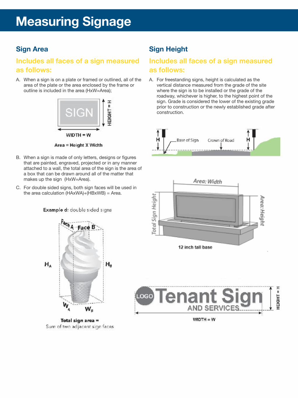
Directional Signs Signs directing vehicles and pedestrians to specific site locations such as entrances and exits.
A. Provide architectural elements on sides and top to frame sign panel B. Use columns, pilasters, cornices, etc. to provide design interest C. Sign structure should be an integral part of the overall design.
Architectural elements and details should be used to create visual interest and curb appeal.
D. Incorporate materials and colors into sign support to match or be compatible with the development.
E. Incorporation of unique architectural features, materials, and colors of the development site appropriately into the sign design.
F. Use a masonry base or Landscaping to soften any blank base of the sign. If using masonry base, the base should be a minimum of 12’ in height.
Sign Types
Billboard Sign A off-premises sign which advertises goods, products, or services commonly referred to as a billboard; such sign may be digital or consist of poster panels in the form of pasted paper or painted copy. The base of the structure should have a masonry enclosure with appropriate landscape surrounding the base.
Awning & Canopy Signs Awning/canopy/marquee signs are signs that are applied to the face of an awning or canopy that projects over a window or door opening. Awnings and canopies must be permanently attached to the buildings.A. The minimum height of awnings and canopies shall be 8-feet from the
lowest point to the sidewalk.B. Awnings and canopies shall be mounted on the horizontal framing
element separating the storefront window from the transom (the cross piece member separating a doorway from a window).
C. Awnings shall be designed to project over individual windows and door openings and not project as a single continuous feature extending over masonry piers or arches.
D. Internally, back-lit graphics, or any illumination is prohibited.E. The style and color of an awning should be complementary with awnings
on buildings on the same block face.F. Awnings with stripes or other patterns may be appropriate if there is not
signage on the awning and the pattern is complementary with surrounding awnings on the same block face.

Sign Types
Ground Mounted Sign Design All permanent ground mounted signs shall either utilize a double-pedestal base or a fully enclosed base. If the base is fully enclosed, the base will not be counted in the allowable square footage of the sign face. In either event, the area surrounding the base shall be appropriately landscaped.
A. Provide architectural elements on sides and top to frame sign panel B. Use columns, pilasters, cornices, etc. to provide design interest C. Sign structure should be an integral part of the overall design.
Architectural elements and details should be used to create visual interest and curb appeal.
D. Incorporate materials and colors into sign support to match or be compatible with the development.
E. Use of back-lighted (halo) lettering, or carved, routed, or sandblasted signs with a three-dimensional textured surface integral to the design.
F. Incorporation of unique architectural features, materials, and colors of the development site appropriately into the sign design.
G. Use a masonry base or Landscaping to soften any blank base of the sign. If using masonry base, the base should be a minimum of 12’ in height.
H. Extraneous information, such as services provided by the business, telephone numbers, hours of operation, etcetera, is not permitted.
Sign structure has no architectural details. Infill panel is flat and the design is graphically too busy.
Sign structure has no design elements. The infill panel needs 3D relief or broken up to add visual interest.
Sign panel is too thin and design seem temporary. Fasteners can be seen and there is no 3D elements.

Neon Sign Neon signs are decorative and allow greater design freedom, as the glass tubes can be formed into various shapes and colors. Neon signs should be placed within the signage zone of the building or behind the store window.
Sign Types
Marquee Signs A permanent structure attached to the front of a building which incorporates a large message center. Typically illuminated and often ornate in design, a marquee sign projects over the entrance of the building and provides a canopy over at least a portion of the sidewalk or street.
Pole Signs A sign that is mounted on a freestanding pole or other support so that the bottom edge of the face is six feet or more above grade.
Multi-Tenant Sign Signs are used to identify multi-tenant buildings and businesses that do not have direct frontage on a public street. Tenant signs shall be constructed and oriented to the pedestrian.
A. Tenant directory signs shall be mounted flat against a wallB. Directory signs shall not contain advertising.C. Tenant directory signs shall be constructed out of materials that
compliment both the building structure.D. Provide architectural elements on sides and top to frame sign panel E. Use columns, pilasters, cornices, etc. to provide design interest F. Sign structure should be an integral part of the overall design.
Architectural elements and details should be used to create visual interest and curb appeal.
G. Incorporate materials and colors into sign support to match or be compatible with the development.
H. Use of back-lighted (halo) lettering, or carved, routed, or sandblasted signs with a three-dimensional textured surface integral to the design.
I. Incorporation of unique architectural features, materials, and colors of the development site appropriately into the sign design.
J. Use a masonry base or Landscaping to soften any blank base of the sign. If using masonry base, the base should be a minimum of 12’ in height.
K. Extraneous information, such as services provided by the business, is not permitted.
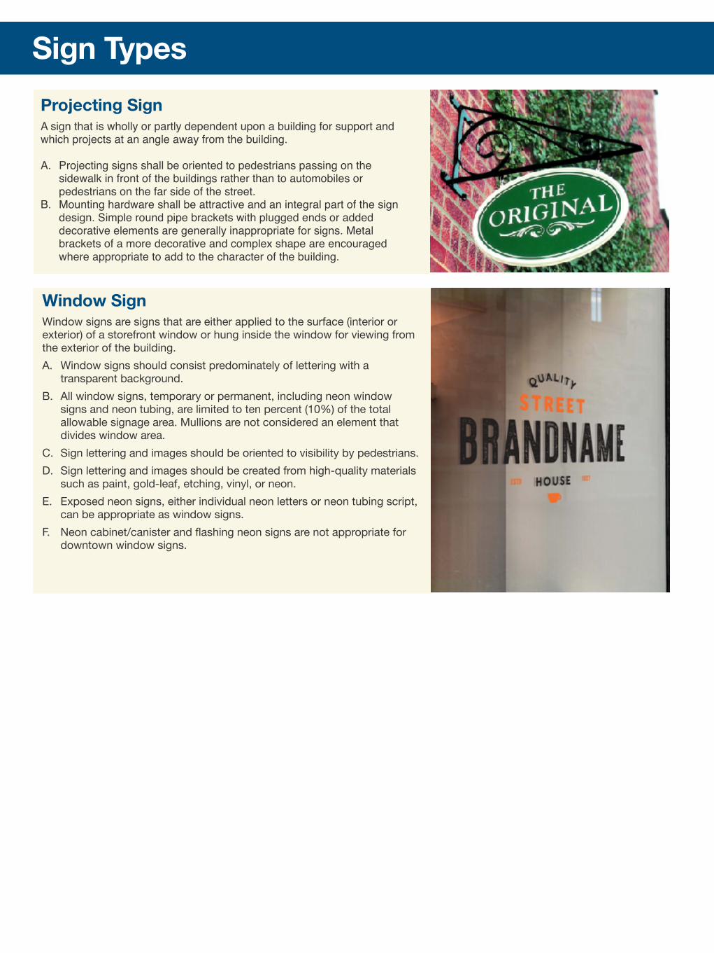
Window Sign Window signs are signs that are either applied to the surface (interior or exterior) of a storefront window or hung inside the window for viewing from the exterior of the building. A. Window signs should consist predominately of lettering with a
transparent background.B. All window signs, temporary or permanent, including neon window
signs and neon tubing, are limited to ten percent (10%) of the total allowable signage area. Mullions are not considered an element that divides window area.
C. Sign lettering and images should be oriented to visibility by pedestrians.D. Sign lettering and images should be created from high-quality materials
such as paint, gold-leaf, etching, vinyl, or neon.E. Exposed neon signs, either individual neon letters or neon tubing script,
can be appropriate as window signs.F. Neon cabinet/canister and flashing neon signs are not appropriate for
downtown window signs.
Sign TypesProjecting Sign A sign that is wholly or partly dependent upon a building for support and which projects at an angle away from the building.
A. Projecting signs shall be oriented to pedestrians passing on the sidewalk in front of the buildings rather than to automobiles or pedestrians on the far side of the street.
B. Mounting hardware shall be attractive and an integral part of the sign design. Simple round pipe brackets with plugged ends or added decorative elements are generally inappropriate for signs. Metal brackets of a more decorative and complex shape are encouraged where appropriate to add to the character of the building.

LightingLighting Guidelines A. All lighting shall concentrate the illumination upon the area of the sign to
prevent glare upon the street or adjacent property. All sign illumination shall be designed, located, shielded, and directed to prevent both the casting of glare or direct light upon adjacent publicly dedicated roadways and surrounding properties and the distraction of operators of vehicles or pedestrians in the public right-of-way.
B. The illumination of any sign within 50 feet of and facing a residential zone lot line shall be diffused or indirect and designed to prevent direct rays of light from shining into adjoining residential districts, and in no event shall flashing or intermittent illumination be permitted where the sign faces directly into and/or is nearer than 300 feet to dwellings in a residential district.
C. Any illumination of directional signage shall be nonflashing, uncolored and confined to the face of the sign.
Downward Projecting Upward Projecting
Illuminated Halo Lit Channel Letters
Lighting Examples
Neon Lighting -

Sign Design Guidelines1. GENERAL CONSTRUCTION STANDARDS
A. CONSTRUCTION - All signs constructed, erected, modified, or altered shall comply with the provisions of this Article and all requirements of the City Code.
B. SIGN STRUCTURE AND INSTALLATION - Supports and braces shall be designed as an integral part of the sign. Supports or braces shall be hidden from public view to the extent technically feasible. All signs attached to a building shall be installed and maintained so that wall penetrations are watertight and the structure does not exceed allowable stresses of supporting materials
C. WIND PRESSURE AND DIRECT LOAD REQUIREMENTS - All signs shall be designed and constructed to withstand a wind pressure and receive dead loads as required by the City Code.
D. ELECTRICAL COMPONENTS- All electrical fixtures, devices, circuits, conduits, raceways, or apparatus used to illuminate, move or project any sign shall be installed and maintained as required in the City Code. All signs with an electronic component require an electrical permit and sign permit.
E. GLASS - Glass forming any part of a sign shall be safety glass.
F. LETTERING - All letters, figures, characters, or representations in cut-out or irregular form, maintained in conjunction with, attached to, or superimposed upon any sign shall be safely and securely built or attached to the sign structure.
G. LANDSCAPING - Landscaping should be designed around the base of freestanding and monument signs to integrate the sign with the ground plane and screen out any low-level floodlights. Irrigation should be designed so it does not damage the sign.
2. SIGN SIZES AND SITE LOCATIONS: REFER TO SIGN ORDINANCE
3. ADDITIONAL CONDITIONS AND DESIGN CRITERIA. General requirements. The following general requirements apply to signs in the City of Pearl:
A. All signs requiring sign permits shall be subject to site plan review.
B. No sign shall be erected as to prevent free ingress or egress from any door, a window or fire escape, and no sign of any kind shall be attached to a standpipe, fire escape, stop sign, street sign or pole that supports any of the above.
C. No sign shall be erected at the intersection of any streets in such a manner as to create a traffic hazard or unsafe condition.
D. Reader boards shall be integrated into the overall design of a sign.
E. Reader boards may not exceed 30 percent of total allowable sign footage signs and displays exempt from permit.
4. SIGN AND PREMISES MAINTENANCE
A. All signs, and the premises surrounding the sign, shall be maintained in a clean, sanitary, and inoffensive condition, and free and clear of all noxious substances, rubbish, and weeds.
B. If the City finds that any sign is unsafe or insecure, is a menace to the public, or has been constructed, erected, or maintained in violation of this Article, the City shall be immediately advised of such condition and give written notice to the sign permit holder. If sign permit holder fails to remove or alter the structure to comply with the standards of this Article, the sign may be removed by City at the expense of the sign permit holder or the owner of the property upon which it is located. The City may cause any other sign that is an immediate peril to persons or property to be removed summarily and without notice.
C. All signs and components thereof, including supports, braces, and anchors, shall be maintained in like-new condition.
D. If a sign advertises a business, service, commodity, accommodation, attraction, or other enterprise or activity that is no longer operating or being offered or conducted, that sign shall be considered abandoned and shall remove the sign and its supporting structure in its entirety within 90 days after such abandonment by the sign owner, owner of the property where the sign is located, or other party having control over such sign.
E. The immediate area around a freestanding sign shall be kept clear of all debris and maintained by the landowner, or by the sign owner as agent of the landowner, in an attractive manner so as not to create visual blight.