Show & tell - Summary section user testing
21
There and back again An iterative design story
-
Upload
dandineenuob -
Category
Internet
-
view
73 -
download
0
Transcript of Show & tell - Summary section user testing

There and back again
An iterative design story
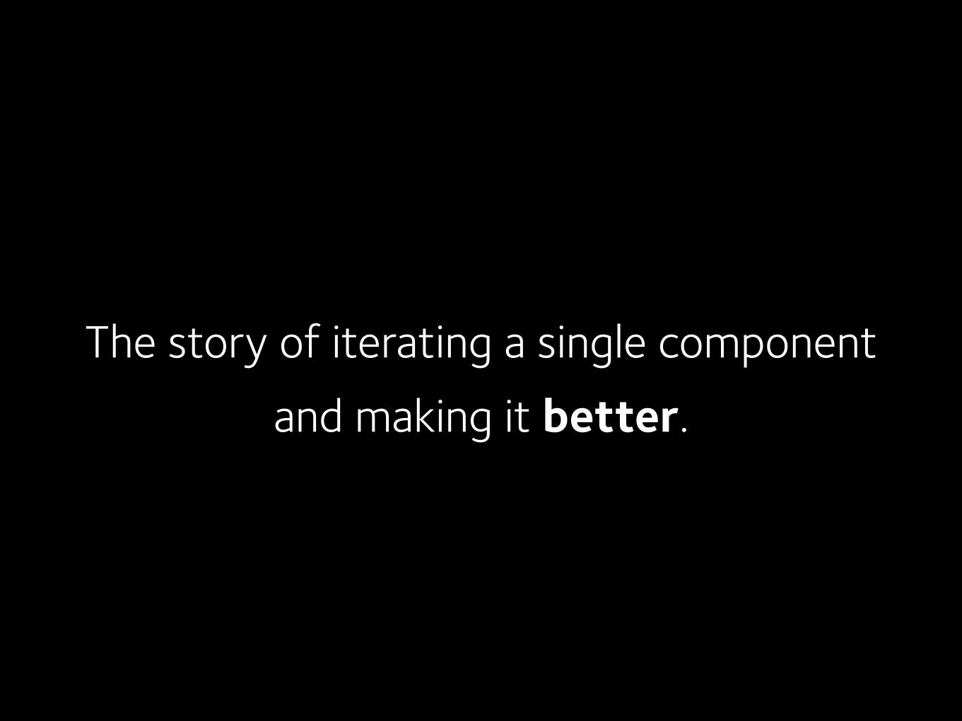
The story of iterating a single componentand making it better.

The lucky component was the Summary Section
It appears on every content type in one form or another
It is the first chunk of page-specific content the user sees. It sets the tone.
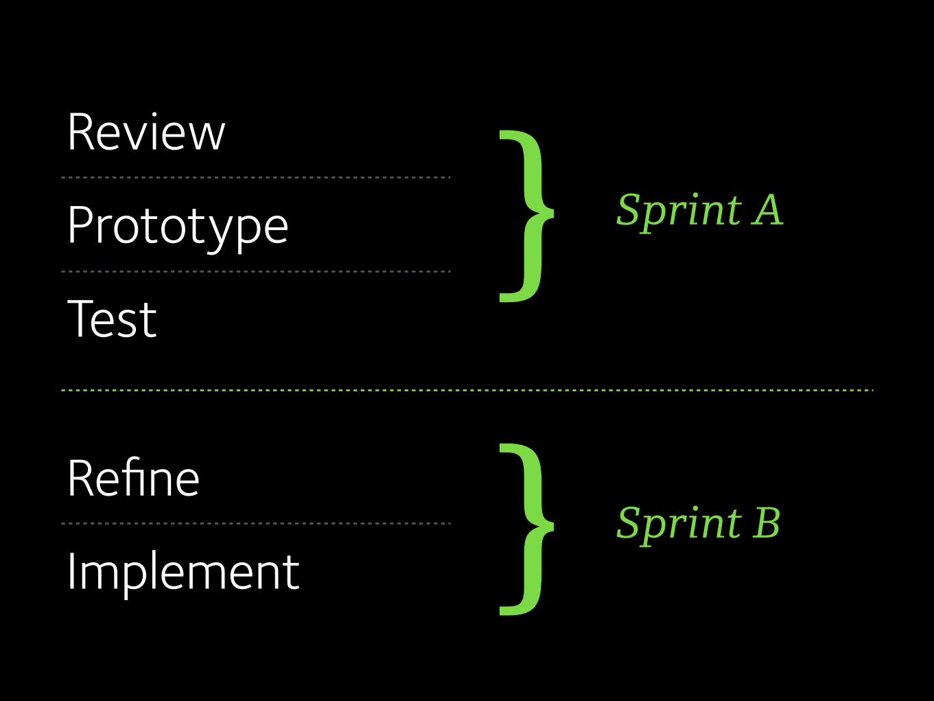
Review
Prototype
Test
Refine
Implement
} Sprint A
} Sprint B
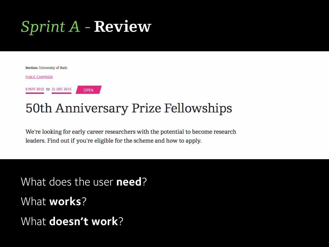
Sprint A - Review
What does the user need?
What works?
What doesn’t work?
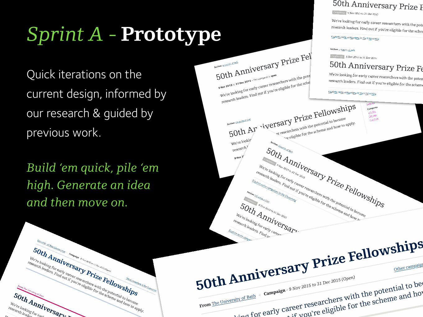
Sprint A - Prototype
Quick iterations on the current design, informed by our research & guided by previous work.
Build ‘em quick, pile ‘em high. Generate an idea and then move on.

Sprint A - Prototype
We then convened the greatest minds of our
generation, put them in a small room and let them
fight it out over which designs were ripe for testing.
Liam, Rich, Phil and I talked it through over
biscuits & tea.


And then we tested. On you. The real users.
As many as we could get in a short space of time, across as varied a set of departments and faculties as we could manage.
If you helped - Thank you :-)
Sprint A - Test
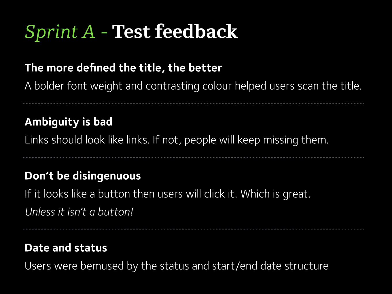
The more defined the title, the better A bolder font weight and contrasting colour helped users scan the title.
Ambiguity is bad Links should look like links. If not, people will keep missing them.
Don’t be disingenuous If it looks like a button then users will click it. Which is great.Unless it isn’t a button!
Date and status Users were bemused by the status and start/end date structure
Sprint A - Test feedback

TL;DR The current design got a bit of a kicking :-( Reaction to the prototype designs suggested we were heading in the right direction :-)
Sprint A - Test feedback

Tighten the summary section typography Group metadata in an easily readable area
Get the information hierarchy and balance right
Give links an appropriate level of prominence
Sprint B - Refine

Sprint B - Implement
<section class="summary-information"> <div class="row">
<!-- Title --> <div class="small-24 columns"> <h1>Renting a property to students</h1>
</div> <!-- Summary -->
<div class="small-24 medium-20 columns end"> <p class="summary">If you're thinking of renting accommodation to students…</p>
</div> <!-- Metadata -->
<div class="small-24 columns"> <ul class="meta-data">
<li class="content-type-label">Guide</li>

A results business
A cleaner, easier-to-scan summary section Considered semantic HTML structure - accessible
Clear, obvious navigation pathways
Understandable, relevant metadata grouped logically
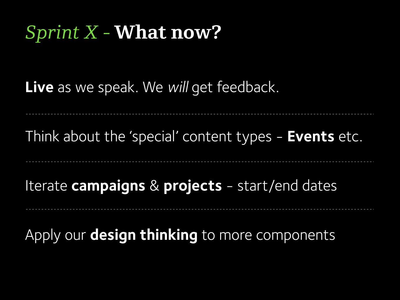
Sprint X - What now?
Live as we speak. We will get feedback. Think about the ‘special’ content types - Events etc.
Iterate campaigns & projects - start/end dates
Apply our design thinking to more components

https://wiki.bath.ac.uk/display/webservices/Summary+section+user+testing+-+Results
Anonymous results