PATIENT FLOW CHART Unit Seven HI 165 - Practicum Instructor: M. Stela Gallegos, ABD, CRT, (R), (M)

Seven Traits of a Healthy Control Chart
Is the control chart you are using healthy? Does it include relevant information to help gain insight about your process?
Control charts are valuable tools to help you and your team implement
fundamental process changes to improve manufacturing processes. But before you
can effectively utilize the information from the chart, you must first be confident
that the chart being reviewed is healthy. Just as you wouldn’t perform elective
surgery on a patient with an infection, you shouldn’t analyze a control chart
without first considering seven key traits.
Software is an invaluable tool for creating control charts; however, great diversity
among software programs exists. When choosing statistical process control (SPC)
software, use these seven traits as a guide.
1. Screen for excessive variation
2. Clear, extensive, and accurate titles
3. Underlying data visible on the chart
4. Control limits reflect process change
5. Out-of-control conditions clearly identified
6. Assignable causes shown but not used in overall calculations
7. Annotations used to increase understanding
(page 2)
(page 4)
(page 6)
(page 7)
(page 8)
(page 9)
(page 10)
7Traits OF A HEALTHY CONTROL CHART www.pqsystems.com800.777.3020
When choosing control charting software,
use these seven traits as a guide.
(page 1)

1. Screen for excessive variation
An important part of interpreting control charts is identifying special causes. A
sudden change in your data may render the moving range out of control. This spike
in the moving range artificially widens the control limits on the individuals chart,
making it more difficult to identify special causes. By not catching a sample that is
out of control, you can miss an opportunity for improvement.
(page 2)
Note the following chart with the out-of-control point on the moving range chart. The individuals chart, however, appears to be in control. }
{
7Traits OF A HEALTHY CONTROL CHART www.pqsystems.com800.777.3020

Screening for excessive variation renders individuals charts more effective in
identifying special causes by removing any moving range values that are above
the upper control limit (UCL). This can be a better option than marking the sample
as a special cause. When a sample is marked as a special cause, it is eliminated
from both the moving range and the individuals chart calculations. By screening
for excess variation, it is removed from the moving range and keeps the sample on
the individuals chart. Make sure your software provides the option to screen for
excessive variation so that you don’t miss any opportunities for improvement.
Here are the same two charts shown on the previous page, using the screening
option. There is clearly an out-of-control condition on the individuals chart that was
“missed” using traditional techniques.(page 3)
This procedure was suggested by Lloyd Nelson in the Technical Aids section of the Journal of Quality Technology (Vol. 14, No. 3, Pg. 172, July 1982). Lloyd Provost and his colleagues at Associates in Process Improvement (API) have popularized this method. }
{
7Traits OF A HEALTHY CONTROL CHART www.pqsystems.com800.777.3020

2. Clear, extensive, and accurate titles
On any control chart, the metric being evaluated should be obvious at a glance. The
chart may require additional explanatory titles, but one title, probably at the top,
should be larger than the others and clearly name the metric being considered.
Since the name of some metrics may be obscure, additional titles may be necessary
to help the viewer understand where the data comes from, how it has been
gathered, and what time frame is represented in the chart. Although the chart
should not be cluttered, several titles both above and below the control chart can
make it much easier for a viewer of the chart to understand what is being presented.
If any part of the title information is inaccurate or out of date, the viewer will
immediately question the entire chart. Choose software that can ensure that your
chart titles are current. For example, when a date is used as one of the titles, rather
than changing the date each time the chart is generated, use software that employs
a title code (such as @DATE) to represent the current date and ensure that titles are
current and useful every time the chart is generated.
Compare the charts on the next page and see which one is preferable.
(page 4)
7Traits OF A HEALTHY CONTROL CHART www.pqsystems.com800.777.3020

(page 5)
7Traits OF A HEALTHY CONTROL CHART www.pqsystems.com800.777.3020

3. Underlying data visible on the chart
To evaluate a control chart, you look for exceptional cases. Points beyond the
control limits are the best example, but other data points might raise questions as
well. These exceptional points demand more information. What is the actual data
value? When was the data value gathered? Who recorded the data?
Your software should offer the option to make this additional identifying
information visible on the chart, so that when you look at an exceptional point,
it is possible to glean additional information to understand what has happened.
Displaying the data value near the plotted point can help in understanding the
exceptional points. This allows the viewer to see the number immediately, rather
than looking over to the y-axis and trying to guess what the value is.
(page 6)
7Traits OF A HEALTHY CONTROL CHART www.pqsystems.com800.777.3020

4. Control limits reflect process changes
When using control charts for process improvement, you can expect to see changes
in the process over time. As a process improves, adjust the control limits to reflect
the new reality. If the data on a chart shows a significant improvement or change,
the chart should communicate this with multiple sets of control limits. For example,
it might be useful to see one set of limits before the improvement, and another set
of limits after the improvement. This visualization of an improving process can be
a powerful way to communicate feedback to workers in the process, management,
board members, and other stakeholders.
(page 7)
Here is the same data set shown with one set of control limits vs. two sets of control limits. }
{

5. Out-of-control conditions clearly identified
Some out-of-control conditions are easy to spot. A point above the upper control
limit or below the lower control limit is usually obvious. However, other conditions
can be more difficult to see. For example, the run rules, such as seven points
increasing or decreasing, and the zone rules, such as two points beyond two sigma
can be hard to pick up at a glance. In these cases, the software should help by
visually showing a difference and by showing the points that contribute to the out-
of-control conditions on the chart.
(page 8)
Same data set shown with and without clear out-of-control information. }
{
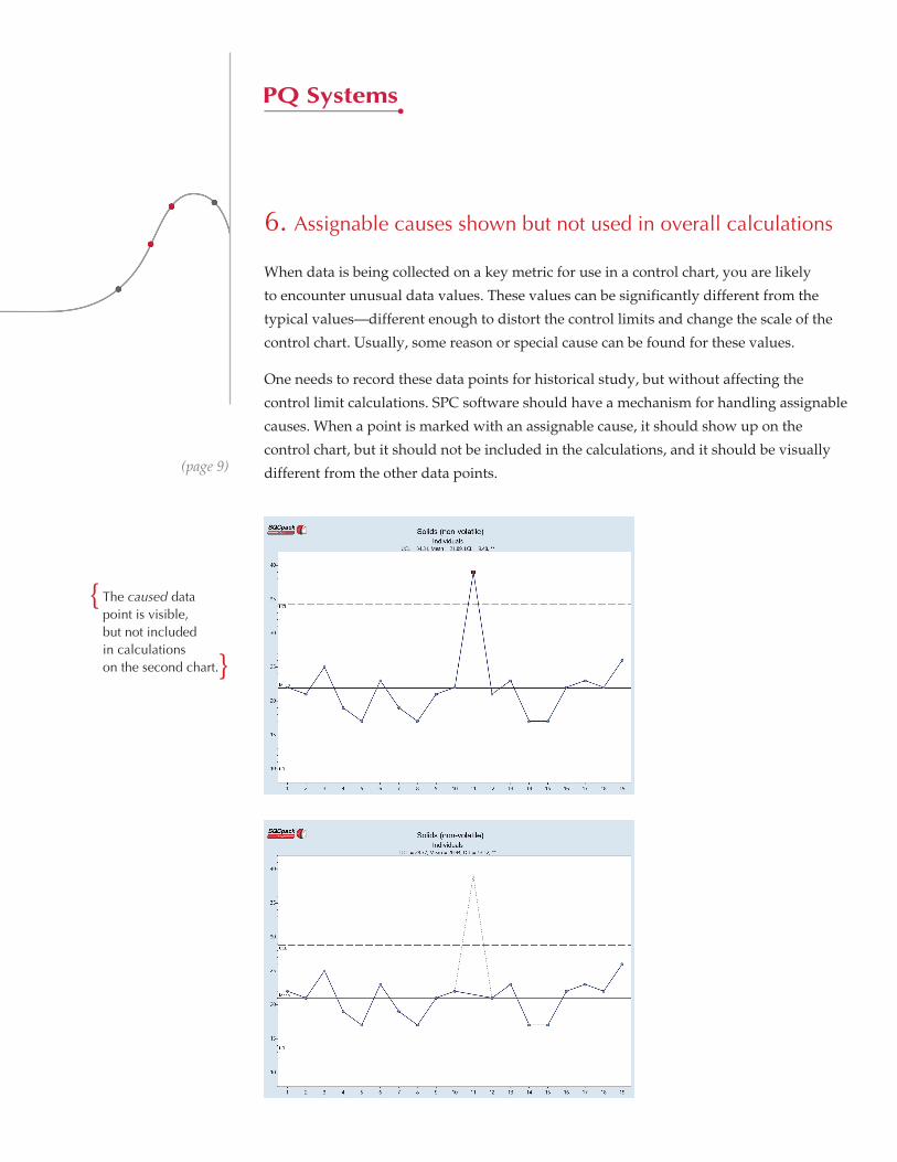
6. Assignable causes shown but not used in overall calculations
When data is being collected on a key metric for use in a control chart, you are likely
to encounter unusual data values. These values can be significantly different from the
typical values—different enough to distort the control limits and change the scale of the
control chart. Usually, some reason or special cause can be found for these values.
One needs to record these data points for historical study, but without affecting the
control limit calculations. SPC software should have a mechanism for handling assignable
causes. When a point is marked with an assignable cause, it should show up on the
control chart, but it should not be included in the calculations, and it should be visually
different from the other data points. (page 9)
The caused data point is visible, but not included in calculations on the second chart. }
{

7. Annotations used to increase understanding
Sometimes, a word is worth a thousand pictures. A control chart can be made much
more useful with the addition of some well-placed text, lines, and/or arrows. These
chart annotations can document process changes or note important events that
affect the chart. As long as you are careful not to overuse them, annotations can be
an important addition to most control charts.
(page 10)
7Traits OF A HEALTHY CONTROL CHART www.pqsystems.com800.777.3020

More on software
Software is an outstanding tool for creating control charts, but software by itself
cannot help you improve. Improvement will come from the data-based decisions
you make after interpreting the charts. That’s why your software tool should have
the features and flexibility to make the charts easy to interpret. If you follow the
seven guidelines presented in this paper, you’ll be well on your way to selecting the
best software for creating healthy control charts.
Since 1984, PQ Systems has been helping businesses drive strategic quality
outcomes. We provide intuitive solutions to help manufacturers optimize process
performance, improve product quality, and mitigate supply chain risk. Our SPC
software SQCpack is being used in high-performance organizations such as Federal
Mogul, Sonoco, Smuckers, AkzoNobel, and Citco. To learn more about SQCpack
and download a free trial, visit www.pqsystems.com or call 800-777-3020.
About the authors
Matthew J. Savage, M.B.A., is an experienced consultant to organizations that want
to utilize the power of data analysis to improve processes and enhance profitability.
He has been a presenter at quality conferences in England and the U.S., and has
published articles in a variety of trade publications. He has worked extensively
with technical advisory teams and has provided on-site consulting and training in
statistical process control and SQCpack applications for a variety of organizations
including Goodrich, Thyssen Krupp Steel, TRW, and DuPont.
M. Stephen Daum is director of software engineering for PQ Systems. Prior to
assuming responsibility for development, Steve was the lead programmer on PQ’s
statistical software products—a position he commenced in 1985. Steve has more than
20 years of experience with control charts and control charting software and has
shared that experience through presentations, training, and educational sessions for
organizations throughout the U.S., England, and South Africa.
(page 11)
7Traits OF A HEALTHY CONTROL CHART www.pqsystems.com800.777.3020


![Mandating the Standard Library: Clause 29 · ©ISO/IEC Dxxxx 29.3.2 Overview [iostream.forward.overview] 1 Theclasstemplatespecialization basic_ios servesasavirtualbaseclassfortheclass](https://static.fdocuments.net/doc/165x107/5f3321d4f84ae3258235c2a1/mandating-the-standard-library-clause-29-isoiec-dxxxx-2932-overview-iostreamforwardoverview.jpg)