
Seminar on Material Design by RapidValue Solutions
57
Material Design A discussion about the new visual language developed by Google. Presented by : Sugisha Sukumaran
-
Upload
rapidvalue-solutions -
Category
Design
-
view
315 -
download
0
Transcript of Seminar on Material Design by RapidValue Solutions

Material Design A discussion about the new visual language developed by Google.
Presented by : Sugisha Sukumaran

What is Material Design?
It is a design language developed by Google.
It is a design with increased use of grid-based layouts, responsive animations and transitions, padding, and
depth effects such as lighting and shadows.
A comprehensive guide for visual, motion, and interaction design across platforms and devices.
It is grounded in tactile reality, inspired by the study of paper and ink.
It is a skeuomorphed flat design.
Used extensively in Android 5.0 “Lollipop”.
© RapidValue Solutions

Material design as a skeuomorphed flat design
Material design is skeuomorphic in that it is an attempt to make design more realistic in how it
portrays elements, using layers and animation in a way that
makes sense outside of the browser. Skeuomorphism is adopting
the style of physical incantation of an object for its digital display.
Material design dictates a single physical incantation for the UI-
everything should feel like paper.
Figure shows the paper model developed by Google to
demonstrate material design.
© RapidValue Solutions

Evolution of Material Design
When google overhauled the Android design philosophy in Ice Cream Sandwich,
they introduced a whole theme called holo. The holo theme hasn’t been much of a
design highlight after the release of Android 4.4 Kitkat. Instead a more brighter and
minimalistic design status was showcased.
Matias Duarte introduces a new design language called material design alongside the Android L release.
© RapidValue Solutions
Matias Duarte (The man behind
material design)

Material UI
© RapidValue Solutions

Material Theme
Material Theme is a user interface style that determines the look and feel of views and activities in Android 5.0 (Lollipop)
© RapidValue Solutions
Material Dark
Material Light
Material Dark + Light
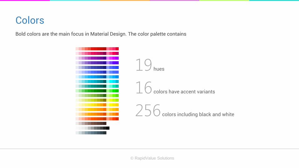
Colors Bold colors are the main focus in Material Design. The color palette contains
© RapidValue Solutions
19 hues
16 colors have accent variants
256 colors including black and white

UI Color Application

1. Choose your palette Limit your selection of colors by choosing three color hues from the primary palette and one accent color.
Example of a primary color palette Example of a secondary color palette
© RapidValue Solutions

2. Use alpha values for grey text, icons and dividers Standard alpha value for text on a white background is 87% (#000000), secondary text is 54%.
© RapidValue Solutions

3. Toolbars and status bars
Toolbars and larger color blocks should use the primary 500 color.
Status bar should be the darker 700 tint of the primary color.
© RapidValue Solutions

4. Accent Color
© RapidValue Solutions
Use the accent color for your primary action button and components like switches or sliders.
Don’t use the accent color for body text colors.
Don’t use the accent color for app bars or larger areas of color.
If your accent color is too light or dark for the background color, the general fallback rule is to choose a darker
or lighter tint of the accent color.

Typography
To support all languages worldwide, Google recommends using
Hinted fonts Hints are the instructions embedded in a font on how to modify
(distort) a glyph to look better on low-resolution displays.
Use the unhinted versions on Android and on Mac OS X.
Use hinted fonts on Chrome OS, Windows, and Linux.
© RapidValue Solutions
Roboto for languages that use the Latin, Greek, and Cyrillic scripts
Noto for all other languages.

Typography
The basic set of styles are based on a typographic scale of
12, 14, 16, 20 and 34.
Typographic scale and basic styles
© RapidValue Solutions

Typography
Text should maintain a minimum contrast ratio of 4:5:1.
Basic colors and color contrast
You should have around 60 characters per line if you
want a good reading experience.
Characters and line length
© RapidValue Solutions

Imagery A powerful tool to help you communicate and differentiate your product. Some best practices to incorporate
imagery are:
© RapidValue Solutions
Both illustration and photography can live within the same product.
Choose images that express personal relevance, information and delight.
Stay away from stock
Have a point of focus
Build narratives
Make sure your images are appropriately sized for their containers and cross platforms.

Iconography
To create an icon for different densities, you should follow the 2:3:4:6:8 scaling ratio between the five primary densities
(medium, high, x-high, xx-high, and xxx-high respectively). Some best practices for creating an icon are:
© RapidValue Solutions
Launcher icons on a mobile device must be 48x48 dp.
Launcher icons for display on Google Play must be 512x512 pixels.
Action bar icons for phones should be 32x32 dp.
Small icons should be 16x16dp.
Notification icons must be 24x24 dp.

Layout

Paper craft
In material design, every pixel drawn by an application resides on a sheet of paper. Paper has a flat background color and
can be sized to serve a variety of purposes. A typical layout is composed of multiple sheets of paper, arranging papers in
two ways - Seams and Steps
Example of a seam Example of a step
© RapidValue Solutions

Paper toolbars
A toolbar is a strip of paper used to present actions. The actions cluster
on either side of the toolbar. Navigation actions, such as a drawer menu
icon or an up arrow, appear at the left, while contextual actions appear at
the right.
Toolbars have a standard height, 56 dp on mobile and 64 dp on desktop,
but they can be taller.
© RapidValue Solutions

Paper toolbars
© RapidValue Solutions
Do’s Don’ts
Never allow a sheet of paper to be split by another one.

Floating actions A floating action is a circular sheet of paper separate from a toolbar. A floating action can straddle a step if it relates to the
content of the paper creating that step. A floating action can straddle a seam if it relates to the content of both of the
papers creating that seam.
© RapidValue Solutions

Metrics & Keylines All components align to an 8dp square baseline grid. Type aligns to a 4dp
baseline grid. Iconography in toolbars align to a 4dp square baseline grid.
This applies to mobile, tablet, and desktop.
© RapidValue Solutions
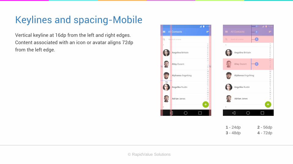
Keylines and spacing-Mobile
Vertical keyline at 16dp from the left and right edges.
Content associated with an icon or avatar aligns 72dp
from the left edge.
1 - 24dp 2 - 56dp
3 - 48dp 4 - 72dp
© RapidValue Solutions

Incremental Keylines An incremental keyline defines an increment, like the height of the action bar, and uses a multiple of that increment to
determine the size and position of other elements in the app.
© RapidValue Solutions

Structure
Put content forward.
Anchor navigation and actions.
Be opinionated about functionality.
Focus on a single view with embedded navigation.
Use tabs to switch between a small number of equally important views.
Manage more complex structure through a left navigation drawer.
© RapidValue Solutions

Mobile Structure
This structure includes an app bar and a floating
action button. If you have any additional
functionality or action overflow, you can add a
bottom bar. This is optional and side nav
overlays all other structural elements.
© RapidValue Solutions

Tablet Structure This structure includes an app bar and a floating action button. Bottom bar is optional and side nav overlays all other
structural elements. Right nav can be accessed temporarily or pinned for permanent display.
© RapidValue Solutions

Desktop Structure This structure includes an app bar and a floating action button. Side navigation menus accessed temporarily or pinned
for permanent display. Side navs and content canvas can have secondary toolbar.
© RapidValue Solutions

App bar The app bar, formerly known as the action bar in Android, is a special kind of toolbar that’s used for branding, navigation,
search, and actions.
Metrics
Mobile Landscape: 48dp
Mobile Portrait: 56dp
Tablet/Desktop: 64dp
© RapidValue Solutions

System bars – Status bar/window bar On Android, the status bar contains notification icons and system icons. On Chrome, the top bar contains the window
controls: minimize, full screen, and close. The color of the status or window bar is a darker tone of the app bar color. It
can also reference an element in the layout or it can be translucent.
Metrics
Android status bar height: 24dp
Chrome window height: 32dp
Android status bar
Chrome window bar
© RapidValue Solutions

System bars-Android navigation bar/window bar It contains the device navigation controls: Back, Home, and Recents. It also displays a menu for apps written for Android
2.3 or earlier.
Metrics
Height: 48dp
© RapidValue Solutions

Side Nav
The left and right nav bars can be pinned for permanent display or
they can float temporarily as overlays. The content in the left nav is
ideally navigation- or identity-based. The content in the right nav
should be secondary to the main content on a page.
Metrics
Mobile : Width = screen width - app bar height
Desktop: 400dp
© RapidValue Solutions

Components

Bottom sheets
A sheet of paper that slides up from the bottom edge of the screen. It is
suitable when three or more actions are displayed to the user and when the
actions do not require a description.
© RapidValue Solutions
Bottom Sheets - Spec
Text: Roboto Regular 16sp, #000 87%
Title (optional): Roboto Regular 16sp, #000 54%
Default bottom sheet background fill: #FFF
Overlay shield fill: #000 20%

Buttons
A button consists of text and/or an image that clearly communicates what action will occur when the user touches it.
There are three types of main buttons:
© RapidValue Solutions
Flat button: a button made of ink that emits ink reactions on press but does not lift.
Raised button: a typically rectangular button made of paper that lifts and emits ink reactions on press.
Floating action button: a circular button made of paper that lifts and emits ink reactions on press.

Cards A card is a piece of paper that contains unique related data. Cards do not
flip to reveal information on their back. Cards have a constant width and
variable height. The maximum height is limited to what can fit within a
single view on a platform.
Cards have rounded corners. It can have multiple actions. It can be
dismissible and rearranged.
© RapidValue Solutions

Chips Chips are small blocks that represent a complex entity, such as a calendar event or contact. Contact chips represent
people for whom the user has contact information.
© RapidValue Solutions
Chips - Layout guidelines
Closed contact chip
The contact name text is Roboto Regular 14sp.
Open contact chip
Contact name text: Roboto Regular 16sp
Address text: Roboto Regular 14sp

Dialogs Dialogs inform users about critical information, require users to make
decisions, or encapsulate multiple tasks within a discrete process. Use
dialogs carefully because they are interruptive in nature-their sudden
appearance forces users to stop their current task and refocus on the
dialog content.
© RapidValue Solutions

Dividers
Dividers group and separate content within lists and page layouts. The divider is a thin rule, which distinguish content
visually and spatially. Two types-
© RapidValue Solutions
Full-bleed dividers : It separate distinct content sections or distinct content elements in both lists and page
layouts. It can also indicate seams in material.
Inset dividers : It subdivide related content, such as phone numbers from email addresses from street
addresses in a contact detail.

Grids Grid lists are an alternative to standard list views. A grid list is
best suited to presenting a homogenous data type, typically
images, and is optimized for visual comprehension and
differentiating between like data types.
It consists of regular subdivisions called cells that contain tiles.
Cells are arrayed horizontally and vertically within the grid. Tiles
hold content and can span one or more cells vertically and
horizontally.
© RapidValue Solutions

Lists
Lists present multiple line items in a vertical arrangement as a single
continuous element. Lists are best suited to presenting a homogeneous data
type or sets of data types.
A list consists of a single continuous column of equal width called rows that
function as containers for tiles. Tiles hold content, and can vary in height
within a list. List tiles present collections of related content in a consistent
format, using hierarchy to enhance readability by prioritizing a consistent type
or set of content.
© RapidValue Solutions

List Controls List controls are icons that appear to the left or right
of the list text. They indicate the state of a list item,
information about a list item, or serve as an action
related to the list item.List controls fall under four
categories:
© RapidValue Solutions
State
Primary action (including text strings)
Secondary action
Secondary info

Types of list controls : Leave-behinds
A leave-behind is an informative hint as to what swiping a list item away will
do to that item. The leave-behind can transform into an action.
Swiping on a listing item from either direction will reveal an icon indicating
the action. After swiping, the action appears as a text button centered within
the space of the list item.
© RapidValue Solutions

Pickers Pickers provide a simple way to select a single value from a set. Ready-to-use
date and time pickers are included. The format of a time and date picker adjusts
automatically to the locale.
Each picker is a dialog with a set of controls for entering the parts of the date or
time. This ensure that a user’s specification of a date or time input is valid and
formatted correctly.
© RapidValue Solutions

Progress & activity
It is useful for minimizing the amount of visual change a user sees before they can view and interact with content.
Mainly 2 types:
© RapidValue Solutions
Linear
Circular

Sliders
Sliders let users select a value from a continuous or discrete range
of values by moving the slider thumb. Two types:
© RapidValue Solutions
Continuous Slider
Discrete Slider

Snackbars & toasts
Snackbars provide lightweight feedback about an operation. Toasts are similar to snackbars but do not contain actions
and cannot be swiped off screen. They automatically disappear after a timeout or after user interaction elsewhere on the
screen.
© RapidValue Solutions

Subheaders
Subheaders are special list tiles that delineate distinct sections of a
list or grid list and are typically related to the current filtering or
sorting criteria. 3 types:
© RapidValue Solutions
List subheaders
Grid subheaders
Menu subheaders
Subheaders metrics
Tile height: 48dp
Subheader font: Roboto Medium 14sp

Tabs
Tabs make it easy to explore and switch between different views or functional
aspects of an app or to browse categorized data sets. Depending on the
platform and the context of use, tabbed content can be presented as either
fixed tabs or scrollable (swipeable) tabs.
© RapidValue Solutions
Fixed tabs
Scrollable tabs

Text Fields
Text fields allow the user to input text. They can be single line, with or without
scrolling, or multi-line, and can have an icon. Text field can be used as
© RapidValue Solutions
Single-line text field
Floating labels
Multi-line text field
Full-width text field
Character counter
Auto-complete text field
Search filter

Animations
Animations in material design give users feedback on their actions and provide visual continuity as users interact with
your app. We can categorize this as five.
© RapidValue Solutions
Touch feedback
Circular reveal
Activity transitions
Curved motion
View state changes

Activity transitions
An enter transition determines how views in an activity enter the scene.
An exit transition determines how views in activity exit the scene.
A shared element transition determines how views that are shared between activities and the transition between these
activities.
© RapidValue Solutions

Usability
Help users to be fast and efficient.
Make touch targets at least 48x48 pixels.
Support mouse-free and standard gesture navigation.
Manage the focus of your user.
Ensure your app is visible with larger font sizes.
© RapidValue Solutions
Ensure critical text has enough contrast.
Provide clues about spatial relationships.
Give visual alternatives to sound.
Make interactive elements clear and discoverable
Provide alternative text for images and video.

Bidirectionality An app is bidirectional if it can be easily localized for language scripts that are written and read from RTL ar LTR.
Bidirectionality affects not only text but also layout and iconography.
An RTL layout is the mirror image of LTR layout. Icons are to the right of text fields. The navigation buttons are in
reverse order, with the back button on the right side.
Back and forward navigational buttons are reversed. An icon that shows forward movement should be mirrored. Icons
of people, heads or faces should typically mirror, if they appear close to text.
© RapidValue Solutions

Bibliography
© RapidValue Solutions
https://developer.android.com/design/material/index.html
http://www.google.co.in/design/spec/material-design/introduction.html#introduction-principles
http://megapowertech.blogspot.in/2014/07/when-google-overhauled-android-design-google-io2014-material-
design-matias-duarte.html


