Scientific Poster. Socialize your research reinventing the old good poster
19
Socialize your research reinventing the old good Poster Paper presented at CAP 2013 Conference | Warsaw | Poland Cristina Rigutto, Leopoldo Benacchio INAF National Institute of Astrophisycs | Observatory of Padova | Italy
-
Upload
cristina-rigutto -
Category
Science
-
view
1.754 -
download
0
description
Nowadays more and more researchers are uploading their poster online to reach broader and different audience. What they do is to take a picture of the poster and upload it on the web download full text at: bit.ly/socialposter But that’s not enoguh. When we go in the internet we are not talking only to a human audicence, we are talking to search engines. So our digital poster must be search engine friendly
Transcript of Scientific Poster. Socialize your research reinventing the old good poster
Socialize your research reinventing the old good Poster Paper presented at CAP 2013 Conference | Warsaw | Poland
Cristina Rigutto, Leopoldo Benacchio INAF National Institute of Astrophisycs | Observatory of Padova | Italy
Summary
Summary
Introduction _______________________________________________________________ 1
The Science poster _________________________________________________________ 2
Style ____________________________________________________________________ 3
Keywords _______________________________________________________________ 11
Abstract _________________________________________________________________ 12
Résumé_________________________________________________________________ 13
Social sharing ____________________________________________________________ 14
Hang Out on Air __________________________________________________________ 16
The authors ______________________________________________________________ 17
Pag. 01 Introduction
Introduction
The aim of this paper is to propose a different approach to scientific posters use, switching
from the classical A3 paper format to a digital product that can be continuously updated,
depending on the research progress. A very important point is that such a new type of poster
can be easily spread over the Net with the best and more appropriate social network tool.
The “traditional" poster can continue to exist and be used if we need it, since it can be easily
“produced” as a snapshot of the “in progress” digital version. We dwell in the following with
Astrophysics, but we could transfer most of the discussion and proposed solutions to other
disciplines.
With the new approach proposed here, we can also have a new chance of solving the
communication problem, which can no longer be confined to the usual poster sessions of
Workshops and Congresses that are going to become more and more crowded and nearly
useless.
This is only the first part of the business anyway, as we try to outline in the Social sharing
paragraph, the “digital” poster allows us to use the best Social Network tool. An important
point, not frequently realized, is that Social networks are very different one from the other and
we must pick up the one(s) that is(are) the best for the dissemination of our work. We outline,
in a short case study, as the Slideshare service is effective because of the powerful built-in
SEO tool, and can also fill up a gap between research and industry interested in finding new
(young) persons or new ideas. Slideshare is used in fact by Companies to “go fishing” there,
especially in integration with LinkedIn. This means also that aesthetics becomes an important
point because Slideshare pays attention to aesthetics, giving better search position to better
presented presentations. This is the reason why more classical, but not less important, items
as style, graphical and pictorial realization are outlined and solved in the next paragraphs.
The last really important point lead us to the discussion of the “keyword” problem, as
described below.
Pag. 02 The Science poster
The Science poster
Posters, as a tool for disseminating the results of a research, are used in astrophysics in an
increasingly way since the early 80s to give “visibility” in conferences to the youngest
researchers or to account for a progress report of a research with preliminary results of some
general interest.
Nowadays poster sessions are frequently plethoric with so many posters to read and discuss
that the scientist is overwhelmed and looks for the ones of colleagues working in the same
sub-field. Moreover, the bad habit to consider the presentation of a poster of the minimum
token, even from the point of view of administrative justification, in order to participate in a
conference is growing. Poster sessions are organized in various ways, with or without
collective visit to posters of the Conference, or introduced in special sessions of few minutes
talk. This last manner, if accompanied by appropriate documentation such as a well-done
poster, can raise awareness and interest, although frankly, it seems ill suited to communicate
scientific research and better for commercial environments where it is important to be known
and noticed. A similar consideration can be done for interesting events as contests of very
short presentation or of short video, certainly are useful to develop communication skills,
especially in young researchers, but are not the best solution if one wants an actual
communication of its research and results.
Finally let we stress some others negative points related to the present poster “classical “use.
The most serious is the general lack of attention of the authors for the communication in
graphic form, which should be very relevant for a poster. Generally, in fact, the poster is
considered as a very condensed version of a “to be published” paper, a sort of pre-print in A3
format. Too many poster in a session, quantity of information squeezed in each poster are
the main reason why any poster sessions to be viewed should require more than a day, that
means impossible to pursue. a Finally, the nature of the paper poster, makes it virtually
unusable for any further communication operation .
Pag. 03 Style
Style
Layout
Posters communicate your research with immediacy, thus graphic elements should be
organized in a wireframe with separate and discernable sections, but at the same time, the
overall appearance should give a sense of harmony. To create a cohesive wireframe,
information must follow a hierarchical structure, and flows logically from one section to
another. The focus is put on the most important point of the research, while supporting
elements are arranged to tell the rest of the story. Visual elements predominate and iconic
visual are chosen over text.
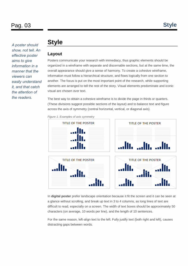
The best way to obtain a cohesive wireframe is to divide the page in thirds or quarters.
(These divisions suggest possible sections of the layout) and to balance text and figure
across the axis of symmetry (central horizontal, vertical, or diagonal axis).
Figure 1. Examples of axis symmetry
In digital poster prefer landscape orientation because it fit the screen and it can be seen at
a glance without scrolling, and break up text in 3 to 4 columns, as long lines of text are
difficult to read, especially on a screen. The width of text boxes should be approximately 50
characters (on average, 10 words per line), and the length of 10 sentences.
For the same reason, left-align text to the left. Fully justify text (both right and left), causes
distracting gaps between words.
A poster should
show, not tell. An
effective poster
aims to give
information in a
manner that the
viewers can
easily understand
it, and that catch
the attention of
the readers.
Pag. 04 Style
Color
Color overuse would distract instead of giving effective information. The readers will not be
able to read well and comprehend well the contents of the poster. Three colors are enough,
but we can use more colors as long as we choose the right combination, and that we take
note of color contrasts.
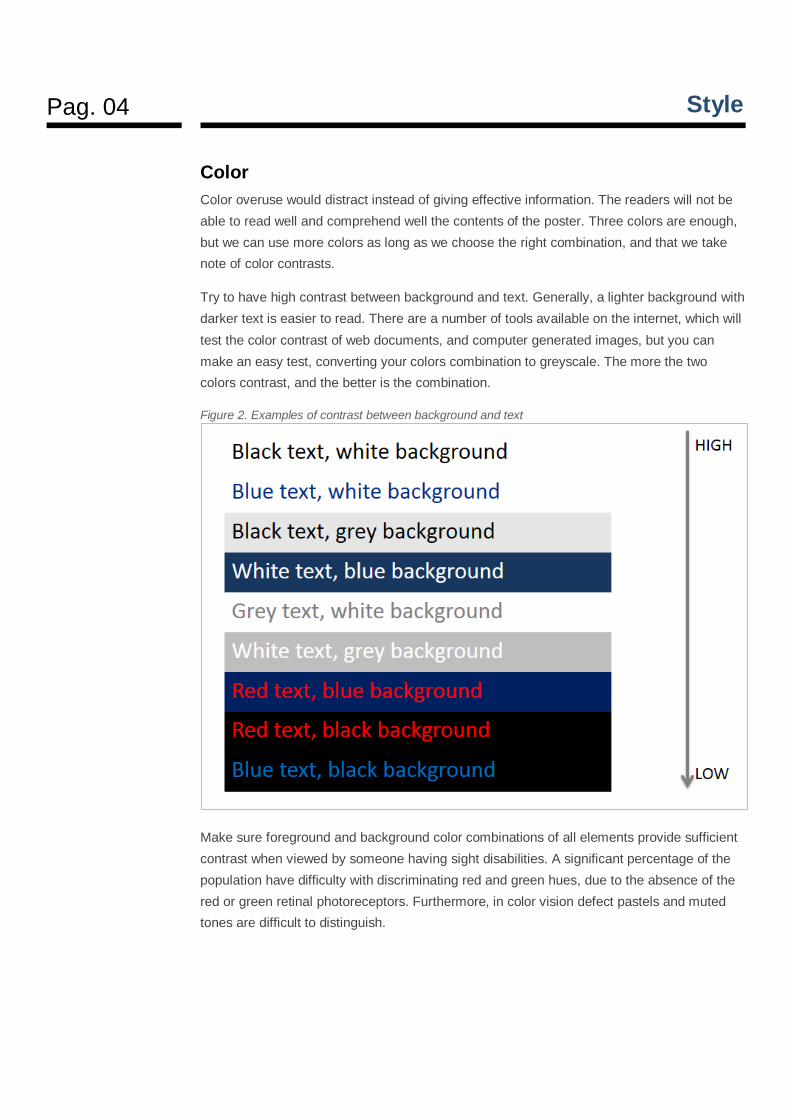
Try to have high contrast between background and text. Generally, a lighter background with
darker text is easier to read. There are a number of tools available on the internet, which will
test the color contrast of web documents, and computer generated images, but you can
make an easy test, converting your colors combination to greyscale. The more the two
colors contrast, and the better is the combination.
Figure 2. Examples of contrast between background and text
Make sure foreground and background color combinations of all elements provide sufficient
contrast when viewed by someone having sight disabilities. A significant percentage of the
population have difficulty with discriminating red and green hues, due to the absence of the
red or green retinal photoreceptors. Furthermore, in color vision defect pastels and muted
tones are difficult to distinguish.
Pag. 05 Style
Colors affect how people perceive relationships among data, and good decision about color
can improve communication while poor color choices are distracting and can make data
unintelligible.
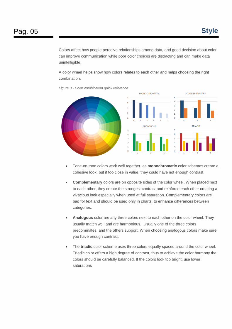
A color wheel helps show how colors relates to each other and helps choosing the right
combination.
Figure 3 - Color combination quick reference
Tone-on-tone colors work well together, as monochromatic color schemes create a
cohesive look, but if too close in value, they could have not enough contrast.
Complementary colors are on opposite sides of the color wheel. When placed next
to each other, they create the strongest contrast and reinforce each other creating a
vivacious look especially when used at full saturation. Complementary colors are
bad for text and should be used only in charts, to enhance differences between
categories.
Analogous color are any three colors next to each other on the color wheel. They
usually match well and are harmonious. Usually one of the three colors
predominates, and the others support. When choosing analogous colors make sure
you have enough contrast.
The triadic color scheme uses three colors equally spaced around the color wheel.
Triadic color offers a high degree of contrast, thus to achieve the color harmony the
colors should be carefully balanced. If the colors look too bright, use lower
saturations
Pag. 06 Style
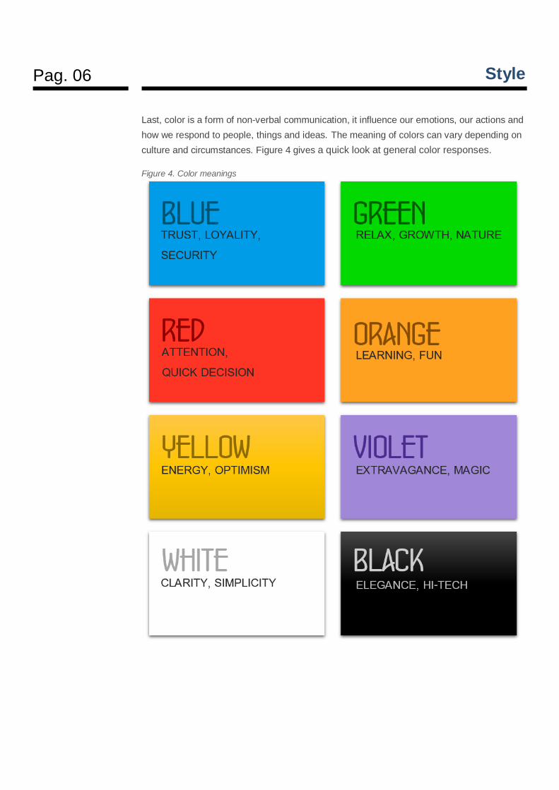
Last, color is a form of non-verbal communication, it influence our emotions, our actions and
how we respond to people, things and ideas. The meaning of colors can vary depending on
culture and circumstances. Figure 4 gives a quick look at general color responses.
Figure 4. Color meanings
Pag. 07 Style
Typography
Font matters, they can influence
the way we read, they can convey
trustworthiness or distrust.
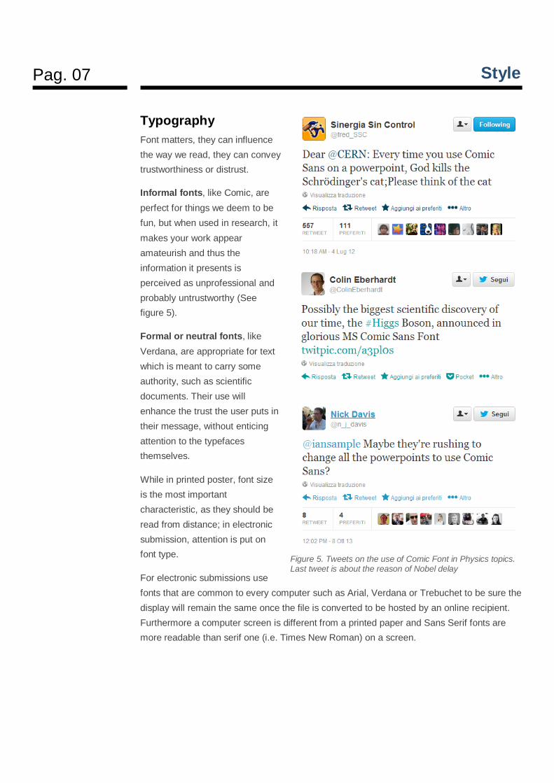
Informal fonts, like Comic, are
perfect for things we deem to be
fun, but when used in research, it
makes your work appear
amateurish and thus the
information it presents is
perceived as unprofessional and
probably untrustworthy (See
figure 5).
Formal or neutral fonts, like
Verdana, are appropriate for text
which is meant to carry some
authority, such as scientific
documents. Their use will
enhance the trust the user puts in
their message, without enticing
attention to the typefaces
themselves.
While in printed poster, font size
is the most important
characteristic, as they should be
read from distance; in electronic
submission, attention is put on
font type.
For electronic submissions use
fonts that are common to every computer such as Arial, Verdana or Trebuchet to be sure the
display will remain the same once the file is converted to be hosted by an online recipient.
Furthermore a computer screen is different from a printed paper and Sans Serif fonts are
more readable than serif one (i.e. Times New Roman) on a screen.
Figure 5. Tweets on the use of Comic Font in Physics topics. Last tweet is about the reason of Nobel delay
Pag. 08 Style
Avoid also type in all capital letters. Uppercase denotes yelling or shouting online, and words
are more difficult to read. If you need to write a word in all uppercase, reduce the font size of
one point to make the sentence look more harmonious.
Use bold face to highlight keywords, and a larger type to emphasize words and phrases.
Avoid underlining digital text, and prefer bold or italics. Colored text can be used to draw
attention to an important sentence, but use it sparingly.
Visuals
Visuals might be used to clarify complex sets of data and processes, to highlight results, or
to support some kind of argument.
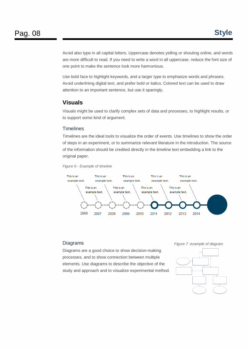
Timelines
Timelines are the ideal tools to visualize the order of events. Use timelines to show the order
of steps in an experiment, or to summarize relevant literature in the introduction. The source
of the information should be credited directly in the timeline text embedding a link to the
original paper.
Figure 6 - Example of timeline
Diagrams
Diagrams are a good choice to show decision-making
processes, and to show connection between multiple
elements. Use diagrams to describe the objective of the
study and approach and to visualize experimental method.
Figure 7 -example of diagram
Pag. 09 Style
Charts
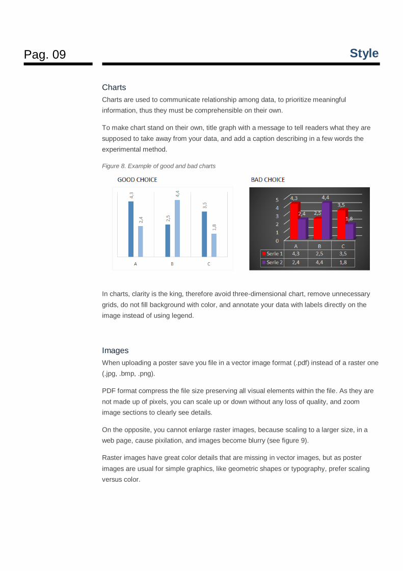
Charts are used to communicate relationship among data, to prioritize meaningful
information, thus they must be comprehensible on their own.
To make chart stand on their own, title graph with a message to tell readers what they are
supposed to take away from your data, and add a caption describing in a few words the
experimental method.
Figure 8. Example of good and bad charts
In charts, clarity is the king, therefore avoid three-dimensional chart, remove unnecessary
grids, do not fill background with color, and annotate your data with labels directly on the
image instead of using legend.
Images
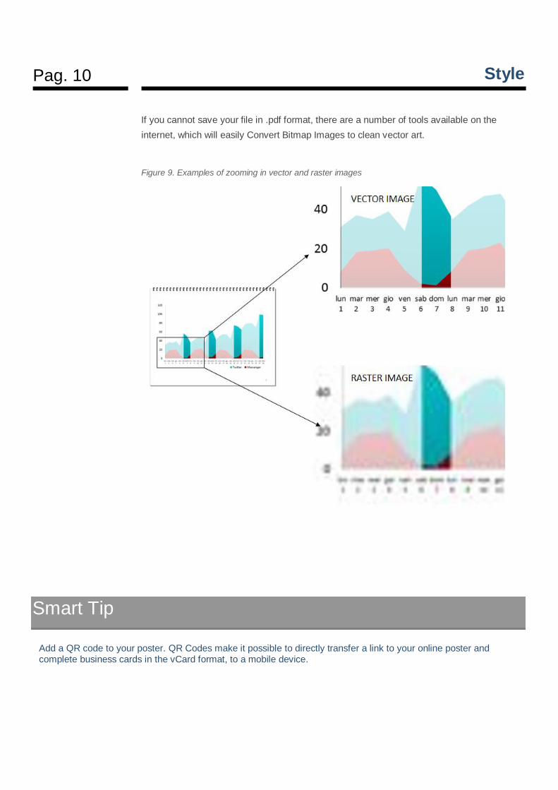
When uploading a poster save you file in a vector image format (.pdf) instead of a raster one
(.jpg, .bmp, .png).
PDF format compress the file size preserving all visual elements within the file. As they are
not made up of pixels, you can scale up or down without any loss of quality, and zoom
image sections to clearly see details.
On the opposite, you cannot enlarge raster images, because scaling to a larger size, in a
web page, cause pixilation, and images become blurry (see figure 9).
Raster images have great color details that are missing in vector images, but as poster
images are usual for simple graphics, like geometric shapes or typography, prefer scaling
versus color.
Pag. 10 Style
If you cannot save your file in .pdf format, there are a number of tools available on the
internet, which will easily Convert Bitmap Images to clean vector art.
Figure 9. Examples of zooming in vector and raster images
Smart Tip
Add a QR code to your poster. QR Codes make it possible to directly transfer a link to your online poster and complete business cards in the vCard format, to a mobile device.
Pag. 11 Keywords
Keywords
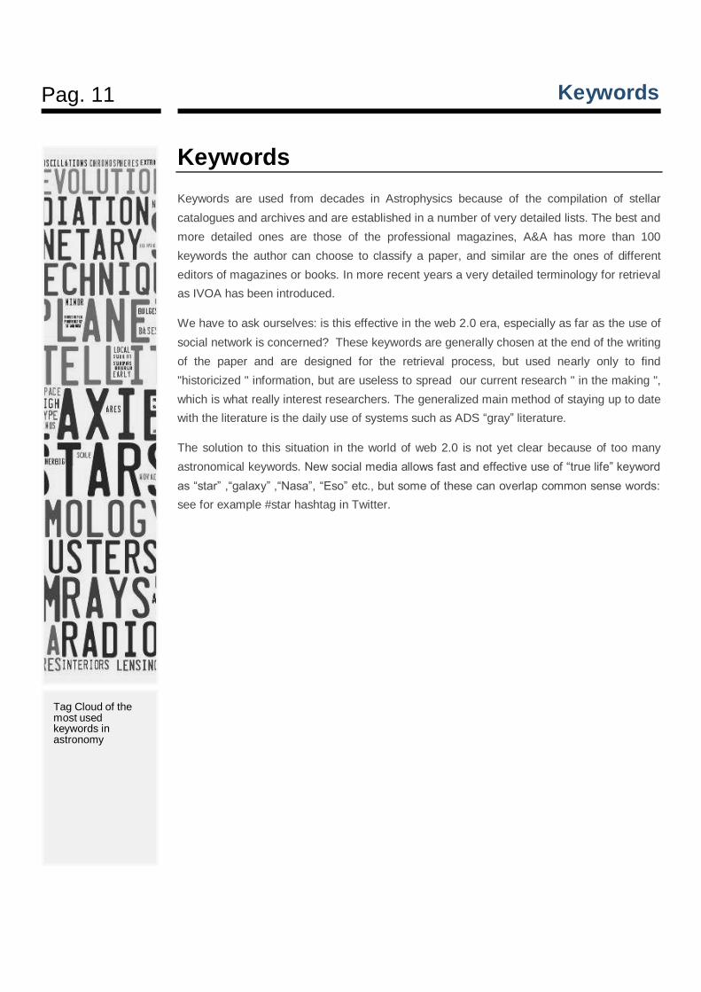
Keywords are used from decades in Astrophysics because of the compilation of stellar
catalogues and archives and are established in a number of very detailed lists. The best and
more detailed ones are those of the professional magazines, A&A has more than 100
keywords the author can choose to classify a paper, and similar are the ones of different
editors of magazines or books. In more recent years a very detailed terminology for retrieval
as IVOA has been introduced.
We have to ask ourselves: is this effective in the web 2.0 era, especially as far as the use of
social network is concerned? These keywords are generally chosen at the end of the writing
of the paper and are designed for the retrieval process, but used nearly only to find
"historicized " information, but are useless to spread our current research " in the making ",
which is what really interest researchers. The generalized main method of staying up to date
with the literature is the daily use of systems such as ADS “gray” literature.
The solution to this situation in the world of web 2.0 is not yet clear because of too many
astronomical keywords. New social media allows fast and effective use of “true life” keyword
as “star” ,“galaxy” ,“Nasa”, “Eso” etc., but some of these can overlap common sense words:
see for example #star hashtag in Twitter.
Tag Cloud of the most used keywords in astronomy
Pag. 12 Abstract
Abstract
A poster is a visual abstract of your research, so there is no need to include an abstract
session in a printed poster, but a digital poster should include it. Without an abstract, the
search engine would be forced to search titles, which may not be efficacious.
To increase the chance of people finding your on-line poster, it is vital to write a complete
but concise description of your work.
The “4S” of the perfect digital abstract:
Short. An abstract must be a fully self-contained, short description of the research.
Word limit in on line sharing services, varies from 1000 to 3000 characters, but
having a massive amount of space for the description it is not useful from a SEO
perspective. Start your abstract with an explanation of no more than 160
characters that matched the query and user intent.
Searchable. For best result incorporate keywords into the abstract. An abstract, to
be useful in an online retrieval system, should incorporate the key terms that a
potential researcher would use to search, but think also of a search phrases and
keywords that people looking for your work might use, and look at google search
suggestion. Be sure that those exact phrases appear in your abstract. Optimize the
poster content for SEO, including the same keywords in the title. Do not forget to
add at least 10 tags, to help people use the internal search function to find your
content. Last, but no least, to include links within your content: hyperlinked URLs are
better for search engine indexing as compared to anchor text. As an additional tip,
you could benefit by naming the file with the title containing the keywords.
Source. In digital submission put your name, affiliation, email address in the
abstract, so that they will turn up paired with the research topic, on search result
listing.
Simple. The audience for a digital abstract should be broad from expert to amateur
person. Find the right balance between writing an abstract that both provides
technical information and remains comprehensible to non-experts, keeping technical
language to a minimum.
Pag. 13 Résumé
Résumé
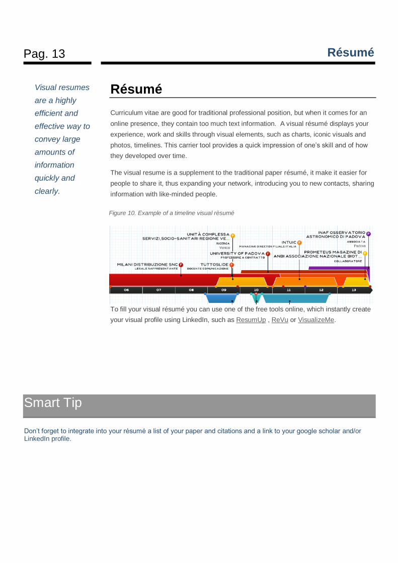
Curriculum vitae are good for traditional professional position, but when it comes for an
online presence, they contain too much text information. A visual résumé displays your
experience, work and skills through visual elements, such as charts, iconic visuals and
photos, timelines. This carrier tool provides a quick impression of one’s skill and of how
they developed over time.
The visual resume is a supplement to the traditional paper résumé, it make it easier for
people to share it, thus expanding your network, introducing you to new contacts, sharing
information with like-minded people.
To fill your visual résumé you can use one of the free tools online, which instantly create
your visual profile using LinkedIn, such as ResumUp , ReVu or VisualizeMe.
Visual resumes
are a highly
efficient and
effective way to
convey large
amounts of
information
quickly and
clearly.
Figure 10. Example of a timeline visual rèsumé
Smart Tip
Don’t forget to integrate into your résumé a list of your paper and citations and a link to your google scholar and/or LinkedIn profile.
Pag. 14 Social sharing
Social sharing
A great way to get more interest about you poster is to share it online. You take a broader
public, you encourage further contact, and you can enhance your credibility by comments of
appreciation of other scientists of your field.
The most common practice is to convert your poster to a JPG and post it to the “Pimp My
Poster” group on Flickr, then wait for others to add helpful notes. However, an even better
way to get Internet-based poster feedback is to upload your poster in more structured media
such as Slideshare.
SlideShare is a presentation hosting service and it is among the most visited 200 websites in
the world, and its content is optimized for easy viewing on iPads, iPhones and Android
devices; it is searchable, and it enable tagging and sharing in all the social networks.
Furthemore people willing to find in depth information on a certain subject search
presentations on SlideShare on the subject, cause of the high quality of information
shared. This make Slideshare one of the best tool to share poster and presentations.
The tool enable embedding both in your site or blog and in other websites, driving traffic to
your poster and site, and have measures in place to prevent spammers from ruining the site.
Furthermore, it works very well for long tail keywords. Long tail keywords are a type of
keyword phrase that has 3 up to 5 words in the phrase, and they are similar to natural
language. They are highly specific, and draw less traffic for the website, but tend to draw
more quality traffic. By using long tail keywords in the title of your digital poster, you can
easily reach the audience you are looking for.
Slideshare automatically made into transcripts the content of your poster, as well, thus do
not forget to apply keywords in poster text too, this will improve search engine rankings.
SlideShare has its own tagging system to identify the topics shared on its network. When
you upload your poster make sure you tag it (Tags are category labels) in this way, you will
make it more discoverable for people looking for content on that topic. Best tags are:
“research” (one of the six most used tag in slideshare) and the Conference name or
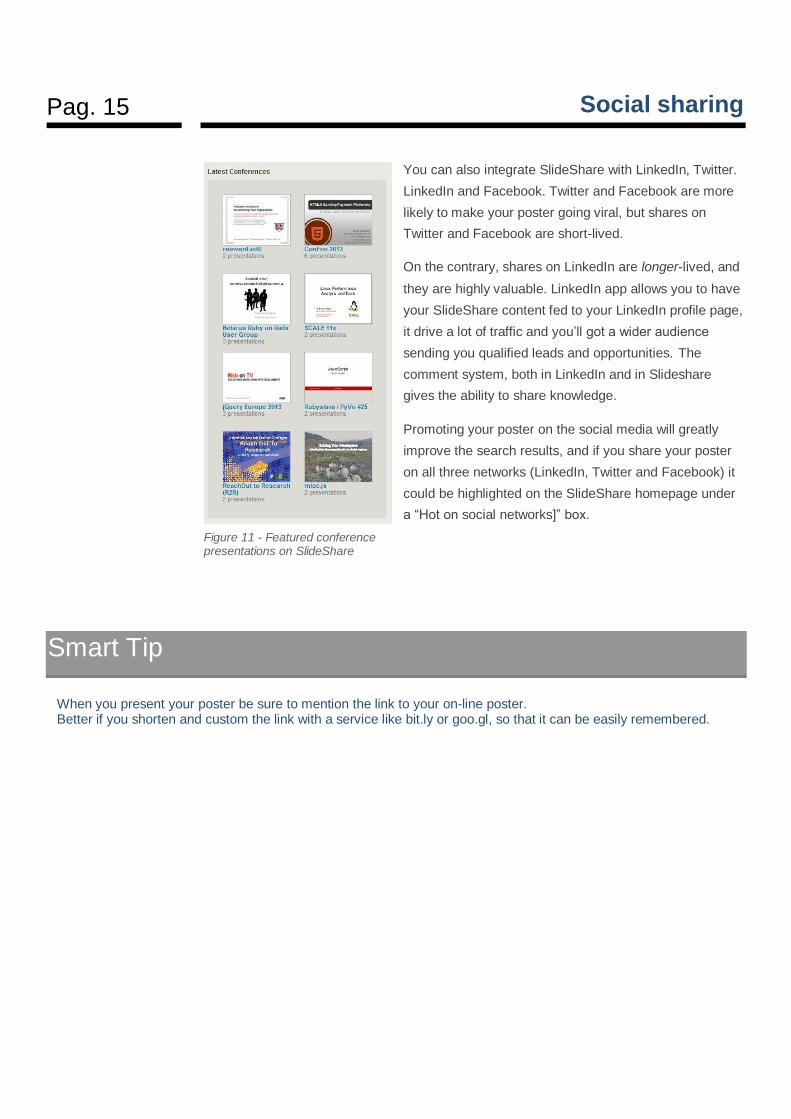
hashtag. This last tag will add your poster to the group of the conference presentations, that
is highlighted on the SlideShare homepage under a “Latest conferences” box (figure 11).
Share your
knowledge on the
net, to attract a
wider audience of
followers
interested in your
expertise.
Pag. 15 Social sharing
You can also integrate SlideShare with LinkedIn, Twitter.
LinkedIn and Facebook. Twitter and Facebook are more
likely to make your poster going viral, but shares on
Twitter and Facebook are short-lived.
On the contrary, shares on LinkedIn are longer-lived, and
they are highly valuable. LinkedIn app allows you to have
your SlideShare content fed to your LinkedIn profile page,
it drive a lot of traffic and you’ll got a wider audience
sending you qualified leads and opportunities. The
comment system, both in LinkedIn and in Slideshare
gives the ability to share knowledge.
Promoting your poster on the social media will greatly
improve the search results, and if you share your poster
on all three networks (LinkedIn, Twitter and Facebook) it
could be highlighted on the SlideShare homepage under
a “Hot on social networks]” box.
Smart Tip
When you present your poster be sure to mention the link to your on-line poster. Better if you shorten and custom the link with a service like bit.ly or goo.gl, so that it can be easily remembered.
Figure 11 - Featured conference presentations on SlideShare
Pag. 16 Hang Out on Air
Hang Out on Air
The transition from "paper poster" to digital format allows also the use of Hangout sessions to
present and discuss the research results. Google+ is the most sophisticated information
management platform at all, and growing use of this important new tool is evident in the
Science matter .
The Science on Google Plus community try to recreate a poster session like atmosphere,
hosting Posterside Hangouts. Through posterside HOA, researchers can individually present
their recent findings, and students can practice presenting their research.
To share a conference presentations or paper on Google Plus Community, and have a
Posterside Hangout planned fill this form.

Pag. 17 The authors
The authors
Cristina Rigutto
Visual and New Media Science Communicator
@cristinarigutto
http://www.slideshare.net/cristinarigutto
http://tuttoslide.com
Leopoldo Benacchio
Astronomer
@scienzaltro
http://lblog.it