
Sample Chapters from MCTS Self-Paced Training Kit...
130
Transcript of Sample Chapters from MCTS Self-Paced Training Kit...


Sample Chapters Copyright © 2011 by Matthew A. Stoecker
All rights reserved.
To learn more about this book visit:
http://go.microsoft.com/fwlink/?LinkId=207838
Contents
Introduction xv
Hardware Requirements . . . . . . . . . . . . . . . . . . . . . . . . . . . . . . . . . . . . . . . . . .xvi
Software Requirements . . . . . . . . . . . . . . . . . . . . . . . . . . . . . . . . . . . . . . . . . . xvii
Using the Companion Media . . . . . . . . . . . . . . . . . . . . . . . . . . . . . . . . . . . . . xvii
Microsoft Certified Professional Program . . . . . . . . . . . . . . . . . . . . . . . . . . . xix
Support for This Book . . . . . . . . . . . . . . . . . . . . . . . . . . . . . . . . . . . . . . . . . . . . xx
We Want to Hear from You . . . . . . . . . . . . . . . . . . . . . . . . . . . . . . . . . . . . . . . . xx
Chapter 1 Building a User Interface 1
Lesson 1: Using WPF Controls . . . . . . . . . . . . . . . . . . . . . . . . . . . . . . . . . . . . . . . 3
WPF Controls Overview 3
Content Controls 4
Other Controls 7
Setting the Tab Order for Controls 12
Item Controls 12
ListBox Control 12
ComboBox Control 13
TreeView Control and TreeViewItem Control 14
Menus 15
ToolBar Control 17
StatusBar Control 19
Layout Controls 19
Control Layout Properties 19
Using Attached Properties 21
What do you think of this book? We want to hear from you! Microsoft
is interested in hearing your feedback so we can continually improve our books and
learning resources for you. To participate in a brief online survey, please visit:
www.microsoft.com/learning/booksurvey/
i

ii Contents
Layout Panels 22
Accessing Child Elements Programmatically 31
Aligning Content 32
Lesson 2: Using Resources . . . . . . . . . . . . . . . . . . . . . . . . . . . . . . . . . . . . . . . . . 41
Using Binary Resources 41
Content Files 43
Using Logical Resources 46
Creating a Resource Dictionary 50
Retrieving Resources in Code 51
Lesson 3: Using Styles and Triggers . . . . . . . . . . . . . . . . . . . . . . . . . . . . . . . . . 57
Using Styles 57
Triggers 63
Understanding Property Value Precedence 66
Chapter 2 Working with Events and Commands 75
Lesson 1: Configuring Events and Event Handling . . . . . . . . . . . . . . . . . . . . 77
Types of Routed Events 78
RoutedEventArgs 79
Attaching an Event Handler 80
The EventManager Class 81
Defining a New Routed Event 81
Creating a Class-Level Event Handler 83
Application-Level Events 83
Lesson 2: Configuring Commands . . . . . . . . . . . . . . . . . . . . . . . . . . . . . . . . . . 89
A High-Level Procedure for Implementing a Command 90
Invoking Commands 90
Command Handlers and Command Bindings 92
Creating Custom Commands 95
Lesson 3: Implementing Animation . . . . . . . . . . . . . . . . . . . . . . . . . . . . . . . . 102
Using Animations 102
Chapter 3 Adding and Managing Content 119
Lesson 1: Managing the Visual Interface . . . . . . . . . . . . . . . . . . . . . . . . . . . 121
Brushes 121

Contents iii
Shapes 128
Transformations 133
The Visual Tree 136
Adding to and Removing Controls from the
Visual Interface at Run Time
139
Lesson 2: Adding Multimedia Content . . . . . . . . . . . . . . . . . . . . . . . . . . . . . 144
Using SoundPlayer 144
MediaPlayer and MediaElement 147
Handling Media-Specific Events 150
Chapter 4 Windows Forms and Windows Forms Controls 157
Lesson 1: Working with Windows Forms and Container Controls . . . . . . 159
Overview of Windows Forms 159
Adding Forms to Your Project 160
Properties of Windows Forms 161
Modifying the Appearance and Behavior of the Form 163
Overview of Container Controls 170
The GroupBox Control 173
The Panel Control 173
The FlowLayoutPanel Control 174
The TableLayoutPanel Control 176
The TabControl Control 179
The SplitContainer Control 181
Lesson 2: Configuring Controls in Windows Forms . . . . . . . . . . . . . . . . . . 191
Overview of Controls 191
Configuring Controls at Design Time 193
Modifying Control Properties at Design Time 196
The Button Control 197
The Label Control 201
Creating Access Keys for Controls without
Using Label Controls
202
The TextBox Control 203
The MaskedTextBox Control 204
Lesson 3: Using List-Display and Specialized Controls . . . . . . . . . . . . . . . . 212
Overview of List-Based Controls 212

iv Contents
ListBox Control 213
ComboBox Control 214
CheckedListBox Control 214
Adding Items to and Removing Items from a
List-Based Control
216
The ListView Control 223
TreeView Control 225
NumericUpDown Control 228
DomainUpDown Control 228
Value-Setting Controls 229
The CheckBox Control 229
The RadioButton Control 231
The TrackBar Control 232
Choosing Dates and Times 233
DateTimePicker Control 233
MonthCalendar Control 233
Working with Images 235
PictureBox Control 235
ImageList Component 236
Lesson 4: Using Tool Strips and Menus . . . . . . . . . . . . . . . . . . . . . . . . . . . . . 244
Overview of the ToolStrip Control 244
Tool Strip Items 246
Displaying Images on Tool Strip Items 248
The ToolStripContainer Class 249
Merging Tool Strips 249
Overview of the MenuStrip Control 251
Creating Menu Strips and Tool Strip Menu Items 253
Adding Enhancements to Menus 256
Moving Items between Menus 258
Disabling, Hiding, and Deleting Menu Items 259
Merging Menus 260
Switching between MenuStrip Controls Programmatically 261
Context Menus and the ContextMenuStrip Control 261

Contents v
Chapter 5 Working with User-Defined Controls 273
Lesson 1: Creating Controls in Windows Forms . . . . . . . . . . . . . . . . . . . . . . 275
Introduction to Composite Controls 275
Creating Extended Controls 282
Lesson 2: Using Control Templates . . . . . . . . . . . . . . . . . . . . . . . . . . . . . . . . 288
Creating Control Templates 288
Inserting a Trigger Object in a Template 291
Respecting the Templated Parent’s Properties 292
Applying Templates with Style 294
Viewing the Source Code for an Existing Template 294
Using Predefined Part Names in a Template 295
Lesson 3: Creating Custom Controls in WPF . . . . . . . . . . . . . . . . . . . . . . . . 300
Control Creation in WPF
Choosing among User Controls, Custom Controls,
300
and Templates 300
Implementing and Registering Dependency Properties 301
Creating User Controls 303
Creating Custom Controls 304
Consuming User Controls and Custom Controls 304
Rendering a Theme-Based Appearance 305
Chapter 6 Working with Data Binding 315
Lesson 1: Configuring Data Binding . . . . . . . . . . . . . . . . . . . . . . . . . . . . . . . 317
The Binding Class 317
Binding to a WPF Element 318
Binding to an Object 320
Setting the Binding Mode 323
Binding to a Nullable Value 323
Setting the UpdateSourceTrigger Property 324
Lesson 2: Converting Data . . . . . . . . . . . . . . . . . . . . . . . . . . . . . . . . . . . . . . . . 328
Implementing IValueConverter 328
Using Converters to Return Objects 335
Localizing Data with Converters 336

vi Contents
Using Multi-value Converters 338
Lesson 3: Validating Data and Configuring Change Notification . . . . . . . 346
Validating Data 346
Configuring Data Change Notification 350
Chapter 7 Configuring Data Binding 367
Lesson 1: Binding to Data Sources . . . . . . . . . . . . . . . . . . . . . . . . . . . . . . . . . 369
Binding to a List 369
Binding to ADO .NET Objects 373
Binding to Hierarchical Data 376
Binding to an Object with ObjectDataProvider 378
Binding to XML Using XmlDataProvider 379
Lesson 2: Manipulating and Displaying Data . . . . . . . . . . . . . . . . . . . . . . . . 385
Data Templates 385
Sorting Data 394
Grouping 396
Filtering Data 399
Chapter 8 Working with Data Grids and Validating User Input 407
Lesson 1: Implementing Data-bound Controls in Windows Forms . . . . . 409
Binding Controls to Data 409
Configuring DataGridView Columns 412
Adding Tables and Columns to DataGridView 413
Deleting Columns in DataGridView 413
Determining the Clicked Cell in DataGridView 414
Validating Input in the DataGridView Control 414
Format a DataGridView Control by Using Custom Painting 416
Using DataGrid in WPF Applications 417
Using DataGrid Columns 418
Lesson 2: Validating User Input . . . . . . . . . . . . . . . . . . . . . . . . . . . . . . . . . . . 427
Field-Level Validation 427
Using Events in Field-Level Validation 429
Handling the Focus 431

Contents vii
Form-Level Validation 433
Providing User Feedback 434
Implementing IDataErrorInfo in WPF Applications 436
Chapter 9 Enhancing Usability 447
Lesson 1: Implementing Asynchronous Processing . . . . . . . . . . . . . . . . . . 449
Running a Background Process 450
Using Delegates 456
Creating Process Threads 460
Using Dispatcher to Access Controls Safely on
Another Thread in WPF
464
Lesson 2: Implementing Globalization and Localization . . . . . . . . . . . . . 468
Globalization and Localization 468
Localizing a WPF application 472
Localizing an Application 472
Using Culture Settings in Validators and Converters 476
Lesson 3: Integrating Windows Forms Controls and WPF Controls . . . . . 483
Using Windows Forms Controls in WPF Applications 483
Using Dialog Boxes in WPF Applications 483
WindowsFormsHost 485
Adding a WPF User Control to Your Windows Form Project 487
Chapter 10 Advanced Topics 493
Lesson 1: Working with Security . . . . . . . . . . . . . . . . . . . . . . . . . . . . . . . . . . 495
Working with Code Access Security Policies 497
Requesting User Account Control Permissions 498
Software Restriction Policies 499
Lesson 2: Managing Settings . . . . . . . . . . . . . . . . . . . . . . . . . . . . . . . . . . . . . 503
Creating Settings at Design Time 504
Loading Settings at Run Time 504
Saving User Settings at Run Time 505
Lesson 3: Implementing Drag and Drop . . . . . . . . . . . . . . . . . . . . . . . . . . . . 510
Implementing Drag and Drop Functionality 510

viii Contents
Chapter 11 Testing and Debugging WPF Applications 521
Lesson 1: Testing the User Interface . . . . . . . . . . . . . . . . . . . . . . . . . . . . . . . 523
Using Automation Peers to Automate the User Interface 523
Using the WPF Tree Visualizer to Inspect the User Interface 527
Lesson 2: Debugging with Intellitrace and PresentationTraceSources . . 533
Using Intellitrace 533
Using PresentationTraceSources 535
Chapter 12 Deployment 545
Lesson 1: Creating a Windows Setup Project . . . . . . . . . . . . . . . . . . . . . . . . 547
Setup Projects 547
Lesson 2: Deploying Applications with ClickOnce . . . . . . . . . . . . . . . . . . . . 559
Deploying with ClickOnce 559
Configuring ClickOnce Update Options 562
Deploying an XBAP with ClickOnce 565
Configuring the Application Manifest 566
Associating a Certificate with the Application 567
Index 607

T
C H A P T E R 1
Building a User Interface
he user interface is the visual representation of your ap-
plication . Users of your application use the user inter-
face to interact with the application through the manipula- tion
of controls, which are hosted in windows . Currently, you can
use two Microsoft technologies in Visual Studio to build
Microsoft Windows applications: Windows Forms and Windows
Presentation Foundation (WPF) .
Windows Forms historically has been the basis for most
Microsoft Windows applications and can be configured to pro-
vide a variety of user interface (UI) options . The developer can
i m p o r t a n t
Have you read page xxi? It contains valuable
information regarding
the skills you need to
pass the exam.
create forms of various sizes and shapes and customize them to the user’s needs . Forms are
hosts for controls, which provide the main functionality of the UI .
WPF is the successor to Windows Forms for desktop application development . WPF
applications differ from traditional Windows Forms applications in several ways, the most
notable of which is that the code for the user interface is separate from the code for ap-
plication functionality . Although the code for the functionality of a project can be defined
using familiar languages such as Microsoft Visual Basic .NET or Microsoft Visual C#, the
user interface of a WPF project is typically defined using a relatively new declarative syntax
called Extensible Application Markup Language (XAML) .
Although this training kit does cover some elements of Windows Forms program-
ming, the primary focus for this training kit and the exam for which it prepares you is WPF
technology .
This chapter introduces you to the fundamentals of creating a Windows application .
Lesson 1 describes the kinds of WPF controls and how to use them . Lesson 2 explains using
resources, and Lesson 3 describes how to incorporate styles into your WPF application .
Exam objectives in this chapter: ■ Choose the most appropriate control class .
■ Implement screen layout by using nested control hierarchies .
■ Manage reusable resources .
■ Create and apply styles and theming .
■ Create data, event, and property triggers in WPF .
CHAPTER 1 1

2 CHAPTER 1 Building a User Interface
W
Lessons in this chapter:
■ Lesson 1: Using WPF Controls 3
■ Lesson 2: Using Resources 41
■ Lesson 3: Using Styles and Triggers 57
Before You Begin
To complete the lessons in this chapter, you must have:
■ A computer that meets or exceeds the minimum hardware requirements listed in the
“Introduction” section at the beginning of the book .
■ Microsoft Visual Studio 2010 Professional edition installed on your computer .
■ An understanding of Visual Basic or C# syntax and familiarity with Microsoft .NET
Framework 4 .
■ An understanding of XAML .
REAL WORLD
Matt Stoecker
hen I develop a Windows application, I pay special attention to the design
of the UI. A well thought out UI that flows logically can help provide a
consistent user experience from application to application and make learning new
applications easy for users. Familiarity and common themes translate into increased
productivity. With both Windows Forms and WPF available to create applications,
an unprecedented number of options are now available for your programming
tasks.

Lesson 1: Using WPF Controls CHAPTER 1 3
Lesson 1: Using WPF Controls
In this lesson, you learn to use WPF controls for WPF application development and how to use
individual controls, item controls, and layout controls, each of which is necessary for creating
WPF applications .
After this lesson, you will be able to:
■ Explain what a content control is .
■ Describe and use several common WPF controls .
■ Use a dependency property .
■ Create and use an item control in your user interface .
■ Create a menu .
■ Create a toolbar .
■ Create a status bar .
■ Explain the properties of a control that manage layout .
■ Explain how to use the Grid control .
■ Explain how to use the UniformGrid control .
■ Explain how to use the StackPanel control .
■ Explain how to use the WrapPanel control .
■ Explain how to use the DockPanel control .
■ Explain how to use the Canvas control .
■ Configure control sizing .
■ Align content at design time .
■ Use the GridSplitter control .
Estimated lesson time: 2 hours
WPF Controls Overview There are three basic types of controls in WPF . First, there are individual controls, which cor-
respond with many of the familiar controls from Windows Forms programming . Controls
such as Button, Label, and TextBox are familiar to developers and users alike . These controls
generally have a single purpose in an application; for example, buttons are clicked, text boxes
receive and display text, and so on . A subset of these controls comprises content controls,
which are designed to display a variety of kinds of content . Content controls, discussed later
in this lesson, typically contain a single nested element .
A second kind of WPF control is the item control, which is designed to contain groups of
related items . Examples of these include ListBox controls, Menu controls, and TreeView
controls . These controls typically enable the user to select an item from a list and perform an

4 CHAPTER 1 Building a User Interface
action with that item . Item controls can contain multiple nested elements . These controls are
discussed later in this lesson .
Finally, layout controls, which contain multiple nested controls of any type, provide built-in
logic for the visual layout of those controls . Examples include Grid, StackPanel, and Canvas .
These controls are also discussed later in this lesson .
Content Controls Many of the controls you use to build your WPF application are content controls . Simply, a
content control derives from the ContentControl class and can contain a single nested ele-
ment . This nested element can be of any type and can be set or retrieved in code through the
Content property . The following XAML example demonstrates setting the content of a Button
control to a string value (shown in bold):
<Button Height="23" Margin="36,0,84,15" Name="button2"
VerticalAlignment="Bottom">This is the content string</Button>
You also can set the content in code, as shown in the following example:
Sample of Visual Basic Code
Button2.Content = "This is the content string"
Sample of C# Code
button2.Content = "This is the content string";
The type of the Content property is Object, so it can accept any object as content . How
content is rendered, however, depends on the type of the object in the Content property .
For items that do not derive from UIElement, the ToString method is called, and the result-
ing string is rendered as the control content . Items that derive from UIElement, however, are
displayed as contained within the content control . The following example code demonstrates
how to render a button that has an image as its content:
<Button Margin="20,20,29,74" Name="button1">
<Image Source="C:\Pictures\HumpbackWhale.jpg"/>
</Button>
Assuming that the path to the image is valid, this code will render a button that displays a
picture file of a humpback whale named HumpbackWhale .jpg .
Note that even though content controls can contain only a single nested element, there is
no inherent limit on the number of nested elements that the content can contain . For
example, it is possible for a content control to host a layout control that itself contains several
additional UI elements . The following code shows a simple example of Button with a nested
StackPanel control that itself has nested elements:
<Button Margin="20,20,-12,20" Name="button1">
<StackPanel>
<Image Source="C:\Pictures\HumpbackWhale.jpg"></Image>
<TextBlock>This is a Humpback Whale</TextBlock>

Lesson 1: Using WPF Controls CHAPTER 1 5
</StackPanel>
</Button>
At run time, this will be rendered as an image of a humpback whale with text beneath it .
Label Control and Mnemonic Keys
The Label control is one of the simplest WPF controls . It is mostly just a container for content .
Typical usage for a Label control is as follows:
<Label Name="label1">This is a Label</Label>
Labels contain built-in support for mnemonic keys, which move the focus to a designated
control when the Alt key is pressed with the mnemonic key . For example, if R were the mne-
monic key for a particular control, the focus would shift to that control when Alt+R is pressed .
Typical usage for mnemonic keys in labels occurs when the label designates a control that
can receive the focus, such as TextBox. The mnemonic key is specified by preceding the
desired key with the underscore (_) symbol and appears underlined at run time when the Alt
key is pressed . For example, the following code appears as Press Alt+A at run time when you
press the Alt key:
<Label>Press Alt+_A</Label>
Although this code designates the mnemonic key for the label, it has no effect unless you
designate a target control as well . You can designate a target control by setting the Target
property of the Label control . The following example demonstrates how to create a mnemon-
ic key with a target control named TextBox1:
<Label Target="{Binding ElementName=TextBox1}" Height="27"
HorizontalAlignment="Left" VerticalAlignment="Top" Width="51">_Name
</Label> <TextBox Name="TextBox1" Margin="53,1,94,0" Height="26"
VerticalAlignment="Top">
</TextBox>
The syntax exemplified by {Binding ElementName=TextBox1} will be discussed further in
Chapter 6, “Working with Data Binding .”
Button Control
The Button control should be familiar to most developers . This control is designed to be
clicked to enable the user to make a choice, to close a dialog box, or to perform another ac-
tion . You can execute code by clicking the button to handle the Click event . (For information
about handling events, see Chapter 2, “Working with Events and Commands .”)
The Button control exposes two important properties useful when building user interfaces:
the IsDefault property and the IsCancel property .
The IsDefault property determines whether a particular button is considered the default
button for the user interface . When IsDefault is set to True, the button’s Click event is raised
when you press Enter . Similarly, the IsCancel property determines whether the button should

6 CHAPTER 1 Building a User Interface
be considered a Cancel button . When IsCancel is set to True, the button’s Click event is raised
when Esc is pressed .
ACCESS KEYS
Buttons provide support for access keys, which are similar to the mnemonic keys supported
by labels . When a letter in a button’s content is preceded by an underscore symbol (_), that
letter will appear underlined when the Alt key is pressed, and the button will be clicked when
the user presses Alt and that key together . For example, assume you have a button defined as
follows:
<Button>_Click Me!</Button>
The text in the button appears as “Click Me” when Alt is pressed, and the button is clicked
when Alt+C is pressed . If more than one button defines the same access key, neither is acti-
vated when the access key combination is pressed, but focus alternates between the buttons
that define that key .
CHECKBOX CONTROL
The Checkbox control actually inherits from the ButtonBase class and typically enables the
user to select whether an option is on or off . You can determine whether a check box is
selected by accessing the IsChecked property . The IsChecked property is a Boolean? (bool? in
C#) data type similar to the Boolean type but allows an indeterminate state as well . A check
box will be in the indeterminate state when a window first opens .
Because Checkbox inherits from ButtonBase, it raises a Click event whenever the user
selects or clears the check box . The best way to react to the user selecting or clearing a check
box is to handle the Click event .
RADIOBUTTON CONTROL
Like Checkbox, RadioButton inherits from the ButtonBase class . RadioButton controls are typi-
cally used in groups to enable the user to select one option from a group . Clicking a radio
button causes the Click event to be raised to react to user choices .
A fundamental feature of RadioButton controls is that they can be grouped . In a group of
RadioButton controls, selecting one automatically clears all the others . Thus, it is not possible
for more than one radio button in a group to be selected at one time .
Usually, all RadioButton controls in a single container are automatically in the same group .
If you want to have a single group of three RadioButton controls in a window, all you need
to do is add them to your window; they are automatically grouped . You can have multiple
groups in a single container by setting the GroupName property . The following example
demonstrates two groups of two radio buttons each .
<RadioButton GroupName="Group1" Name="RadioButton1" Height="22"
VerticalAlignment="Top" Margin="15,10,0,0"
HorizontalAlignment="Left" Width="76">Button 1</RadioButton>
<RadioButton GroupName="Group1" Name="RadioButton2"
Margin="15,34,0,0" Height="22" VerticalAlignment="Top"

Lesson 1: Using WPF Controls CHAPTER 1 7
HorizontalAlignment="Left" Width="76">Button 2</RadioButton>
<RadioButton GroupName="Group2" Name="RadioButton3"
Margin="15,58,0,0" Height="21" HorizontalAlignment="Left"
VerticalAlignment="Top" Width="76">Button 3</RadioButton>
<RadioButton GroupName="Group2" Name="RadioButton4"
Margin="15,85,0,0" Height="22" HorizontalAlignment="Left"
VerticalAlignment="Top" Width="76">Button 4</RadioButton>
You also can create groups of radio buttons by wrapping them in containers, such as in the
code shown here:
<StackPanel Height="29" VerticalAlignment="Top">
<RadioButton Name="RadioButton1">Button 1</RadioButton>
<RadioButton Name="RadioButton2">Button 2</RadioButton>
</StackPanel>
<StackPanel Height="34" Margin="0,34,0,0" VerticalAlignment="Top">
<RadioButton Name="RadioButton3">Button 3</RadioButton>
<RadioButton Name="RadioButton4">Button 4</RadioButton>
</StackPanel>
EXAM TIP
It is important to realize that even though a content control can host only a single element,
the element that it hosts can itself host child elements. Thus, a content control might host
a grid, which in turn might host a number of objects.
Other Controls There are other controls in the WPF suite that are not content controls . They do not have a
Content property and typically are more limited in how they display or more specialized in
terms of the content they display . For example, the TextBlock control displays text, and the
Image control represents an image .
TextBlock Control
TextBlock is one of the simplest WPF elements . It just represents an area of text that appears
in a window . The following example demonstrates a TextBlock control:
<TextBlock>Here is some text</TextBlock>
If you want to change the text in a TextBlock control in code, you must set the Name prop-
erty of the TextBlock control so that you can refer to it in code, as shown here:
<TextBlock Name="TextBlock1">Here is some text</TextBlock>
Then you can change the text or any other property by referring to it in the code, as
shown here:
Sample of Visual Basic Code
TextBlock1.Text = "Here is the changed text"

8 CHAPTER 1 Building a User Interface
Sample of C# Code
TextBlock1.Text = "Here is the changed text";
By default, the font of the text in the TextBlock element will be the same as the font of the
window . If you want different font settings for the TextBlock, you can set font-related proper-
ties, as shown here:
<TextBlock FontFamily="Batang" FontSize="12"
FontStyle="Italic" FontWeight="Bold"
FontStretch="Normal">Here is some text</TextBlock>
Image Control
The Image control represents an image . The chief property of the Image control is the Source
property, which takes a System.Windows.Media.ImageSource class in code, but, when set in
XAML, it can be set as the Uniform Resource Identifier (URI) from which the image is loaded .
For example, look at the following code .
<Image Source="C:\Pictures\Humpbackwhale.jpg"/>
The URI can be either a local disk resource or a Web resource .
The Image.Stretch property determines how an image is displayed, whether it is shown
at actual size and cropped (if necessary) to fit the image bounds, or whether it is shrunk or
stretched to fit the bounds of the Image control . Table 1-1 describes the possible values for
the Stretch property .
TABLE 1-1 Values for the Stretch Property
VALUE DESCRIPTION
None The image content is presented at its original size . If necessary, it is
cropped to fit the available space .
Fill The image content is resized (stretched or shrunk as needed) to fit the
Image control size .
Uniform The image content is resized to fit the destination dimensions while
preserving its native aspect ratio . No cropping will occur, but unfilled
space on the Image control edges might result .
UniformToFill The image content is resized to fit the destination dimensions while
preserving its native aspect ratio . If the aspect ratio of the Image con-
trol differs from the image content, the content is cropped to fit the
Image control .

Lesson 1: Using WPF Controls CHAPTER 1 9
TextBox Control
The TextBox control is designed for the editing and display of text . The Textbox control
enables the user to type text into the user interface . That text is accessible later by the ap-
plication in the TextBox.Text property . You can use a TextBox control solely for text display by
setting the IsReadOnly property to True, as shown in bold here:
<TextBox IsReadOnly="True" Height="93" Margin="16,14,97,0"
Name="TextBox1" VerticalAlignment="Top"/>
The preceding code disables user input for the TextBox1 control .
Although the TextBox control can be created as a rectangle of any size, it is single-line
by default . To enable text wrapping in a TextBox, set the TextWrapping property to Wrap, as
shown in bold here:
<TextBox TextWrapping="Wrap" Height="93" Margin="16,14,97,0"
Name="TextBox1" VerticalAlignment="Top"/>
You can also set the TextWrapping property to WrapWithOverflow, which allows some
words to overflow the edges of the text box if the wrapping algorithm is unable to break the
text in an appropriate location .
The TextBox control includes automatic support for scroll bars . You can enable vertical
scroll bars by setting the VerticalScrollBarVisibility property to Auto or Visible, as shown in
bold here:
<TextBox VerticalScrollBarVisibility="Visible" Height="93"
Margin="16,14,97,0" Name="TextBox1" VerticalAlignment="Top"/>
Setting VerticalScrollBarVisibility to Visible makes the vertical scroll bar visible at all times,
whereas setting it to Auto makes the vertical scroll bar appear only when scrollable content is
present . You also can enable a horizontal scroll bar by setting the HorizontalScrollBar prop-
erty, but this setting is less useful .
ProgressBar Control
The ProgressBar control is designed to allow the application to provide visual feedback to the
user regarding the progress of a time-consuming task . For example, you might use a progress
bar to display progress for a file download . The progress bar appears as an empty box that
gradually fills in to display progress . Table 1-2 shows important properties of the ProgressBar
control .

10 CHAPTER 1 Building a User Interface
TABLE 1-2 Properties of the ProgressBar Control
PROPERTY DESCRIPTION
IsEnabled Determines whether the ProgressBar control is enabled .
IsIndeterminate Determines whether the progress bar is showing the actual value or
generic progress . When IsIndeterminate is False, the progress bar will
show the actual value represented by the Value property . When True,
it will show generic progress .
LargeChange Represents the amount added to or subtracted from the Value prop-
erty when a large change is required .
Maximum The Maximum value for the ProgressBar control . When the Value
property equals the Maximum property, the ProgressBar control is
filled .
Minimum The Minimum value for the ProgressBar control . When the Value
property equals the Minimum property, the ProgressBar control is
empty .
Orientation Determines whether the progress bar is shown horizontally or
vertically .
SmallChange Represents the amount added to or subtracted from the Value prop-
erty when a small change is required .
Value The Value displayed in the ProgressBar control . The Value will always
be between the values of the Minimum and Maximum properties .
In code, you can change the ProgressBar display by adding to or subtracting from the
Value property, as shown here:
Sample of Visual Basic Code
' Adds 1 to the Value
ProgressBar1.Value += 1
Sample of C# Code
// Adds 1 to the Value
ProgressBar1.Value += 1;
Slider Control
The Slider control enables the user to set a value by grabbing a graphic handle, or thumb,
with the mouse and moving it along a track . This is often used to control volume, color
intensity, or other application properties that can vary along a continuum . Table 1-3 shows
important Slider properties .

Lesson 1: Using WPF Controls CHAPTER 1 11
TABLE 1-3 Properties of the Slider Control
PROPERTY DESCRIPTION
IsDirectionReversed Determines whether the direction is reversed . When set to False
(the default), the minimum value is on the left and the maximum
value is on the right . When set to True, the minimum is on the
right and the maximum is on the left .
IsEnabled Determines whether the slider is enabled .
LargeChange Represents the amount added to or subtracted from the Value
property when a large change is required . This amount is added
or subtracted from the slider when the user clicks it on either
side of the thumb or uses the PageUp or PageDown key .
Maximum The maximum value for the Slider control . When the Value
property equals the Maximum value, the thumb is completely on
the right side of the slider (assuming the default direction and
orientation of the control) .
Minimum The minimum value for the Slider control . When the Value prop-
erty equals the Minimum value, the thumb is completely on the
left side of the slider (assuming the default direction and orienta-
tion of the control) .
Orientation Determines whether the slider is shown horizontally or vertically .
SmallChange Represents the amount added to or subtracted from the Value
property when a small change is required . This amount is added
to or subtracted from the slider when you use the arrow keys .
TickFrequency Sets the interval between ticks that are displayed in the Slider
control .
TickPlacement Determines the location of ticks in the Slider control . The default
setting is None, meaning that no tick marks appear .
Ticks Used in advanced applications . You can determine the exact
number and placement of tick marks by setting the Ticks collec-
tion directly .
Value The value displayed in the Slider control . The Value property
always is between the Minimum and Maximum values .
The Slider control raises the ValueChanged event whenever its Value property changes .
You can handle this event to hook up the slider with whatever aspect of the application the
slider controls .

12 CHAPTER 1 Building a User Interface
Setting the Tab Order for Controls A common mode of user interaction with the user interface is to cycle the focus through the
controls by pressing the Tab key . By default, controls in the user interface will receive the fo-
cus from Tab key presses in the order in which they are defined in the XAML . You can set the
tab order manually by setting the attached TabIndex property to an integer, as shown here:
<Button TabIndex="2" Name="button1"/>
See “Using Attached Properties” later in this chapter for more information about attached
properties .
When the user presses the Tab key, the focus cycles through the controls in the order
determined by the TabIndex value . Lower values receive focus first, followed by higher val-
ues . Controls whose TabIndex property is not explicitly set receive the focus after controls
for which the property has been set, in the order that they are defined in the XAML . If two
controls have the same TabIndex value, they receive the focus in the order the controls are
defined in the XAML .
You can keep a control from receiving focus when the user presses the Tab key by setting
the KeyboardNavigation.IsTabStop attached property to False, as shown in bold here:
<Button KeyboardNavigation.IsTabStop="False" Name="button1"/>
Item Controls Item controls, also known as list-based controls, are designed to contain multiple child ele-
ments . Item controls are a familiar part of any user interface . Data is displayed frequently in
item controls, and lists are used to allow the user to choose from a series of options . Item
controls in WPF take the idea of lists one step further . Like content controls, item controls
do not have restrictions on the kind of content they can present . Thus, an item control could
present a list of strings or something more complex, such as a list of check box controls, or
even a list that included various kinds of controls .
ListBox Control The simplest form of item control is ListBox. As the name implies, ListBox is a simple control
designed to display a list of items . A ListBox control typically displays a list of ListBoxItem con-
trols, which are content controls, each of which hosts a single nested element . The simplest
way to populate a ListBox control is by adding items directly in XAML, as shown here:
<ListBox Margin="19,0,0,36" Name="listBox1"> <ListBoxItem>This</ListBoxItem>
<ListBoxItem>Is</ListBoxItem>
<ListBoxItem>A</ListBoxItem>
<ListBoxItem>List</ListBoxItem>
</ListBox>

Lesson 1: Using WPF Controls CHAPTER 1 13
The ListBox control automatically lays out its content in a stack and adds a vertical scroll
bar if the list is longer than the available space in the control .
By default, the ListBox control enables you to select a single item . You can retrieve the
index of the selected item from the ListBox.SelectedIndex property, or you can retrieve the
selected item itself through the ListBox.SelectedItem property . The ListBoxItem control also
exposes an IsSelected property that is positive when the item is selected .
You can set the SelectionMode property to enable the user to select multiple items .
Table 1-4 shows the possible values for the SelectionMode property .
TABLE 1-4 Values for the SelectionMode Property
VALUE DESCRIPTION
Single The user can select only one item at a time .
Multiple The user can select multiple items without holding down a modifier
key . Modifier keys have no effect .
Extended The user can select multiple consecutive items while holding down the
Shift key or nonconsecutive items by holding down the Ctrl key and
clicking the items .
You can set the SelectionMode property in XAML as shown here:
<ListBox SelectionMode="Extended">
</ListBox>
When multiple items are selected, you can retrieve the selected items through the ListBox.
SelectedItems property .
Although the ListBox control is used most commonly with ListBoxItem controls, it can
display a list of any item types . For example, you might want to create a list of CheckBox
controls . You can accomplish this by simply adding CheckBox controls to the ListBox control,
as shown here:
<ListBox Name="listbox1" VerticalAlignment="Top"> <CheckBox Name="Chk1">Option 1</CheckBox>
<CheckBox Name="Chk2">Option 2</CheckBox>
<CheckBox Name="Chk3">Option 3</CheckBox>
<CheckBox Name="Chk4">Option 4</CheckBox>
</ListBox>
ComboBox Control The ComboBox control works very similarly to the ListBox control . It can contain a list of items,
each of which can be an object of any type, as in the ListBox control . Thus, the ComboBox
control can host a list of strings, a list of controls such as for check boxes, or any other kind of
list . The difference between the ComboBox control and the ListBox control is how the control
is presented . The ComboBox control appears as a drop-down list . Like the ListBox control,

14 CHAPTER 1 Building a User Interface
you can get a reference to the selected item through the SelectedItem property, and you can
retrieve the index of the selected item through the SelectedIndex property .
When an item is selected, the string representation of the content of that item is displayed
in the ComboBox control . Thus, if the ComboBox control hosts a list of strings, the selected
string is displayed . If the ComboBox control hosts a list of CheckBox controls, the string repre-
sentation of the ComboBox.Content property is displayed . Then the selected value is available
through the ComboBox.Text property .
Users also can edit the text displayed in the ComboBox control . They can even type in
their own text, like in a text box . To make the ComboBox control editable, you must set the
IsReadOnly property to False and set the IsEditable property to True .
You can open and close the ComboBox control programmatically by setting the
IsDropDownOpen property to True (to open it) and False (to close it) .
TreeView Control and TreeViewItem Control TreeView is a simple item control that is very similar to ListBox in its implementation, but
in practice, it is quite different . The primary purpose of the TreeView control is to host
TreeViewItem controls, which enable the construction of trees of content .
The TreeViewItem control is the primary control used to construct trees . It exposes a Header
property that enables you to set the text displayed in the tree . The TreeViewItem control
itself also hosts a list of items . The list of items hosted in a TreeViewItem can be expanded or
collapsed by clicking the icon to the left of the header . The following XAML demonstrates a
TreeView control populated by a tree of items .
<TreeView> <TreeViewItem Header="Boy's Names">
<TreeViewItem Header="Jack"/>
<TreeViewItem Header="Jim"/>
<TreeViewItem Header="Mark"/>
<TreeViewItem Header="Ray"/>
</TreeViewItem>
<TreeViewItem Header="Girl's Names">
<TreeViewItem Header="Betty"/>
<TreeViewItem Header="Libby"/>
<TreeViewItem Header="Janet"/>
<TreeViewItem Header="Sandra"/>
</TreeViewItem>
</TreeView>
You can create TreeView controls that have controls as the terminal nodes just as easily, as
shown in this example:
<TreeView>
<TreeViewItem Header="Pizza Toppings">
<CheckBox Content="Pepperoni"/>
<CheckBox Content="Sausage"/>
<CheckBox Content="Mushroom"/>
<CheckBox Content="Tomato"/>

Lesson 1: Using WPF Controls CHAPTER 1 15
</TreeViewItem>
<TreeViewItem Header="Sandwich Items">
<CheckBox Content="Lettuce"/>
<CheckBox Content="Tomato"/>
<CheckBox Content="Mustard"/>
<CheckBox Content="Hot Peppers"/>
</TreeViewItem>
</TreeView>
You can obtain a reference to the selected item in the TreeView control with the TreeView.
SelectedItem property .
Menus Menus enable you to present the user with a list of controls that are typically associated with
commands . Menus are displayed in hierarchical lists of items, usually grouped into related
areas . WPF provides two types of menu controls: Menu, which is designed to be visible in the
user interface, and ContextMenu, which is designed to function as a pop-up menu in certain
situations .
Whereas the Menu control can be put anywhere in the user interface, it typically is docked
to the top of the window . Menus expose an IsMainMenu property . When this property is True,
pressing Alt or F10 causes the menu to receive focus, thereby enabling common Windows
application behavior .
Although a Menu control can contain controls of any kind, the Toolbar control is better
suited for presenting controls to the user . The Menu control is designed for presenting lists of
MenuItem controls.
MenuItem Control
The MenuItem control is the main unit used to build menus . A MenuItem control represents a
clickable section of the menu and has associated text . MenuItem controls are themselves item
controls and can contain their own list of controls, which typically are also MenuItem controls .
The following XAML example demonstrates a simple menu:
<Menu Height="22" Name="menu1" VerticalAlignment="Top"
HorizontalAlignment="Left" Width="278">
<MenuItem Header="_File"> <MenuItem Header="Open"/>
<MenuItem Header="Close"/>
<MenuItem Header="Save" Command="ApplicationCommands.Save"/>
</MenuItem>
</Menu>
The Command property indicates the command associated with that menu item . When
the user clicks the menu item, the command specified by the Command property is invoked .
If a shortcut key is associated with the command, it is displayed to the right of the MenuItem
header . Commands are discussed in detail in Chapter 2 of this text .
Table 1-5 describes the important properties of the MenuItem control .

16 CHAPTER 1 Building a User Interface
TABLE 1-5 Properties of the MenuItem Control
PROPERTY DESCRIPTION
Command The command associated with the menu item . This command is invoked
when the menu item is clicked . If a keyboard shortcut is associated with
the command, it is displayed to the right of the menu item .
Header The text displayed in the menu .
Icon The icon displayed to the left of the menu item . If IsChecked is set to True,
the icon is not displayed even if it is set .
IsChecked When this property is set to True, a check is displayed to the left of the
menu item . If the Icon property is set, the icon is not displayed while
IsChecked is set to True .
IsEnabled Determines whether the menu item is enabled . When set to False, the
item appears dimmed and does not invoke the command when clicked .
Items The list of items contained by the MenuItem control . The list typically
contains more MenuItem controls .
As with many other WPF controls, you can create an access key for a menu item by pre-
ceding the letter in the Header property with an underscore symbol (_), as shown here:
<MenuItem Header="_File">
The underscore symbol will not appear at run time, but when the Alt key is held down, it
appears under the key it precedes . Pressing that key with the Alt key held down has the same
effect as clicking the menu item .
Each MenuItem control can contain its own set of items, which are also typically MenuItem
controls . These can be created in XAML by nesting MenuItem elements inside the parent
MenuItem control . When a menu item that has sub-items is clicked, those items are shown in
a new menu .
BEST PRACTICES MENUITEM CONTROLS WITH SUB-ITEMS
It is best practice not to assign a command to MenuItem controls that contain sub-items.
Otherwise, the command is executed every time the user wants to view the list of sub-
items.
You can add a separator bar between menu items by using the Separator control, as shown
here:
<MenuItem Header="Close"/> <Separator/>
<MenuItem Header="Save" Command="ApplicationCommands.Save"/>
The separator bar appears as a horizontal line between menu items .

Lesson 1: Using WPF Controls CHAPTER 1 17
ContextMenu Control
Unlike Menu controls, the ContextMenu control does not have a fixed location in the user
interface . Rather, it is associated with other controls . To create a ContextMenu control for a
control, define it in the XAML code for the Control.ContextMenu property, as shown in the
following example with a ListBox control:
<ListBox Margin="77,123,81,39" Name="listBox1">
<ListBox.ContextMenu>
<ContextMenu>
<MenuItem Header="Cut" Command="ApplicationCommands.Cut"/>
<MenuItem Header="Copy" Command="ApplicationCommands.Copy"/>
<MenuItem Header="Paste" Command="ApplicationCommands.Paste"/>
</ContextMenu>
</ListBox.ContextMenu>
</ListBox>
After a ContextMenu control has been set for a control, it is displayed whenever the user
right-clicks the control or presses Shift+F10 while the control has the focus .
Another common scenario for adding ContextMenu controls to a control is to add them
as a resource in the Window.Resources collection . Resources are discussed in Lesson 2 of this
chapter, “Using Resources .”
ToolBar Control Like menus, the ToolBar control is designed to present controls to the user . The ToolBar
control is ideally suited to host controls such as Button, ComboBox, TextBox, CheckBox, and
RadioButton . The ToolBar control also can use the Separator control described in the previous
section .
Toolbars automatically override the style of some of the controls they host . Buttons, for
example, appear flat when shown in a toolbar and are highlighted in blue when the mouse is
over the control . This gives controls in a toolbar a consistent appearance by default .
You add items to the ToolBar control in the same manner as any other item control . An
example is shown here:
<ToolBar Height="26" Margin="43,23,35,0" Name="toolBar1"
VerticalAlignment="Top">
<Button>Back</Button>
<Button>Forward</Button>
<TextBox Name="textbox1" Width="100"/>
</ToolBar>
ToolBar.OverflowMode Property
When more controls are added to a ToolBar control than can fit, controls are removed until
the controls fit in the space . Controls removed from the ToolBar control are placed automati-
cally in the Overflow menu . The Overflow menu appears as a drop-down list on the right
side of the toolbar when the toolbar is in the horizontal configuration . You can manage how

18 CHAPTER 1 Building a User Interface
controls are placed in the Overflow menu by setting the attached ToolBar.OverflowMode
property . (See “Using Attached Properties” later in this chapter for more information .) Table
1-6 shows the possible values for this property .
Table 1-6 Values for the ToolBar.OverflowMode Property
VALUE DESCRIPTION
OverflowMode.Always The control always appears in the Overflow menu, even if
there is space available in the toolbar .
OverflowMode.AsNeeded The control is moved to the Overflow menu as needed . This
is the default setting for this property .
OverflowMode.Never Controls with this value are never placed in the Overflow
menu . If there are more controls with the
Toolbar.OverflowMode property set to Never than can be
displayed in the space allotted to the toolbar, some con-
trols will be cut off and unavailable to the user .
The following example demonstrates how to set the Toolbar .OverflowMode property:
<ToolBar Height="26" Margin="43,23,35,0" Name="toolBar1"
VerticalAlignment="Top">
<Button ToolBar.OverflowMode="Always">Back</Button> </ToolBar>
ToolBarTray Class
WPF provides a special container class for ToolBar controls, called ToolBarTray. ToolBarTray
enables the user to resize or move ToolBar controls that are contained in the tray at run time .
When ToolBar controls are hosted in a ToolBarTray control, the user can move the ToolBar
controls by grabbing the handle on the left side of the toolbar . The following example dem-
onstrates the ToolBarTray control .
<ToolBarTray Name="toolBarTray1" Height="65" VerticalAlignment="Top"> <ToolBar Name="toolBar1" Height="26" VerticalAlignment="Top">
<Button>Back</Button>
<Button>Forward</Button>
<Button>Stop</Button>
</ToolBar>
<ToolBar>
<TextBox Width="100"/>
<Button>Go</Button>
</ToolBar>
</ToolBarTray>

Lesson 1: Using WPF Controls CHAPTER 1 19
StatusBar Control The StatusBar control is quite similar to the ToolBar control . The primary difference is in us-
age . StatusBar is used most commonly to host controls that convey information, such as Label
and ProgressBar controls . Like the toolbar, the status bar overrides the visual style of many
of the controls it hosts, but it provides a different appearance and behavior than the toolbar .
The following example demonstrates a simple StatusBar control with hosted controls .
<StatusBar Height="32" Name="statusBar1" VerticalAlignment="Bottom">
<Label>Application is Loading</Label>
<Separator/>
<ProgressBar Height="20" Width="100" IsIndeterminate="True"/>
</StatusBar>
Quick Check
■ Describe the difference between a Menu control and a ContextMenu control.
Quick Check Answer
■ Both Menu elements and ContextMenu elements are list controls that host
MenuItem elements. The primary difference between them is that Menu ele-
ments are visible elements that are part of the visual tree and can be hosted
by content controls. ContextMenu elements, however, have no direct visual
representation and are added to another individual control by setting the
other control’s ContextMenu property.
Layout Controls WPF offers unprecedented support for a variety of layout styles . The addition of several spe-
cialized controls enables you to create a variety of layout models, and panels can be nested
inside each other to create user interfaces that exhibit complex layout behavior . In this lesson,
you learn how to use these specialized controls .
Control Layout Properties Controls in WPF manage a great deal of their own layout and positioning and further interact
with their container to determine their final positioning . Table 1-7 describes common control
properties that influence layout and positioning .

20 CHAPTER 1 Building a User Interface
TABLE 1-7 Properties That Control Layout
PROPERTY DESCRIPTION
FlowDirection Gets or sets the direction in which text and other UI
elements flow within any parent element that controls
their layout .
Height Gets or sets the height of the control . When set to Auto,
other layout properties determine the height .
HorizontalAlignment Gets or sets the horizontal alignment characteristics
applied to this element when it is composed within a
parent element such as a panel or item control .
HorizonalContentAlignment Gets or sets the horizontal alignment of the control’s
content .
Margin Gets or sets the distance between each of the control’s
edges and the edge of the container or the adjacent
controls, depending on the layout control hosting the
child control .
MaxHeight Gets or sets the maximum height for a control .
MaxWidth Gets or sets the maximum width for a control .
MinHeight Gets or sets the minimum height for a control .
MinWidth Gets or sets the minimum width for a control .
Padding Gets or sets the amount of space between a control and
its child element .
VerticalAlignment Gets or sets the vertical alignment characteristics ap-
plied to this element when it is composed within a par-
ent element such as a layout or item control .
VerticalContentAlignment Gets or sets the vertical alignment of the control’s
content .
Width Gets or sets the width of the control . When set to Auto,
other layout properties determine the width .
A few of these properties are worth a closer look .
Margin Property
The Margin property returns an instance of the Thickness structure that describes the space
between the edges of the control and other elements that are adjacent . Depending on which
layout panel is used, the adjacent element might be the edge of the container, such as a panel
or Grid cell, or it might be a peer control, as would be the case in the vertical margins in a
StackPanel control.

Lesson 1: Using WPF Controls CHAPTER 1 21
The Margin property can be set asymmetrically to allow different amounts of margin on
each side . Consider the following example:
<Button Margin="0,48,96,1" Name="button1">Button</Button>
In this example, a different margin distance is set for each control edge . The order of
edges in the Margin property is Left, Top, Right, Bottom, so in this example, the left margin is
0, the top margin is 48, the right margin is 96, and the bottom margin is 1 .
Margins are additive . For example, if you have two adjacent controls in a StackPanel
control and the topmost one has a bottom margin of 20 and the bottommost one has a top
margin of 10, the total distance between the two control edges will be 30 .
HorizontalAlignment and VerticalAlignment Properties
The HorizontalAlignment and VerticalAlignment properties determine how a control is aligned
inside its parent when there is extra horizontal or vertical space . The values for these proper-
ties are mostly self-explanatory . The HorizontalAlignment property has possible values of Left,
Right, Center, and Stretch . The VerticalAlignment property has possible values of Top, Bottom,
Center, and Stretch. As you might expect, setting the HorizontalAlignment property to Left,
Right, or Center aligns the control in its container to the left, right, or center, respectively .
Similar results are seen with the VerticalAlignment property . The setting that is worth noting
is the Stretch value . When set to Stretch, the control will stretch in the horizontal or vertical
directions (depending on the property) until the control is the size of the available space after
taking the value of the Margin property into account .
NOTE WHEN THERE IS NO EFFECT
In some containers, setting these properties might have no effect. For example, in
StackPanel, the vertical layout is handled by the container, so setting the VerticalAlignment
property has no effect, although setting the HorizontalAlignment property still does.
Using Attached Properties WPF introduces a new concept in properties: attached properties. Because WPF controls con-
tain the information required for their own layout and orientation in the user interface, it is
sometimes necessary for controls to define information about the control that contains them .
For example, a Button control contained by a Grid control will define in which grid column
and row it appears . This is accomplished through attached properties . The Grid control at-
taches a number of properties to every control it contains, such as properties that determine
the row and column in which the control exists . In XAML, you set an attached property with
code like the following:
<Button Grid.Row="1" Grid.Column="1"></Button>
Refer to the class name (that is, Grid) rather than to the instance name (for example, grid1)
when setting an attached property because attached properties are attached by the class and

22 CHAPTER 1 Building a User Interface
not by the instance of the class . In some cases, such as with the TabIndex property (shown in
the next section), the class name is assumed and can be omitted in XAML .
Here’s a full example of a Grid control that defines two rows and two columns and contains
a single button that uses attached properties to orient itself in the grid:
<Grid>
<Grid.ColumnDefinitions>
<ColumnDefinition Width="139*"/>
<ColumnDefinition Width="139*"/>
</Grid.ColumnDefinitions>
<Grid.RowDefinitions>
<RowDefinition Height="126*"/>
<RowDefinition Height="126*"/>
</Grid.RowDefinitions>
<Button Grid.Row="1" Grid.Column="1"></Button>
</Grid>
Layout Panels WPF includes a variety of layout panels with which to design your user interface . This section
explores these panels and explains when to use them .
Grid Panel
Grid is the most commonly used panel for creating user interfaces in WPF . The Grid panel
enables you to create layouts that depend on the Margin, HorizontalAlignment, and
VerticalAlignment properties of the child controls it contains . Controls hosted in a Grid control
are drawn in the order in which they appear in markup or code, thereby enabling you to cre-
ate layered user interfaces . In the case of overlapping controls, the last control to be drawn
will be on top .
With the Grid control, you can define columns and rows in the grid . Then you can assign
child controls to designated rows and columns to create a more structured layout . When
assigned to a column or row, a control’s Margin, HorizontalAlignment, and VerticalAlignment
properties operate with respect to the edge of the row or column, not to the edge of the
Grid container itself . Columns and rows are defined by creating ColumnDefinition and
RowDefinition properties, as seen here:
<Grid>
<Grid.RowDefinitions>
<RowDefinition Height="125*"/>
<RowDefinition Height="125*"/>
</Grid.RowDefinitions>
<Grid.ColumnDefinitions>
<ColumnDefinition Width="80*"/>
<ColumnDefinition Width="120*"/>
</Grid.ColumnDefinitions>
</Grid>

Lesson 1: Using WPF Controls CHAPTER 1 23
Rows and columns can be either fixed or variable in their width and height . To designate
a fixed width or height, simply set the Width or Height property to the size you would like, as
shown here:
<RowDefinition
Height="125"/>
In contrast, you can make a variable-sized row or column by appending an asterisk (*) to
the end of the Width or Height setting, as shown here:
<RowDefinition
Height="125*"/>
When the asterisk is added, the row or column grows or shrinks proportionally to fit the
available space . Look at the following example:
<RowDefinition Height="10*"/>
<RowDefinition Height="20*"/>
Both the rows created by this code grow and shrink to fit the available space, but one row
is always twice the height of the other . These numbers are proportional only among them-
selves . Thus, using 1* and 2* will have the same effect as using 100* and 200* .
You can have a Grid control that contains both fixed and variable rows or columns, as seen
here:
<RowDefinition
Height="125"/>
<RowDefinition
Height="125*"/>
In this example, the first row always maintains a height of 125, and the second grows or
shrinks as the window is resized .
GRID ATTACHED PROPERTIES
The Grid control provides attached properties to its child controls . You can position controls
into specific Grid rows or columns by setting the attached properties Grid.Column and Grid.
Row, as shown in bold here:
<Grid> <Grid.RowDefinitions>
<RowDefinition Height="10*"/>
<RowDefinition Height="5*"/>
</Grid.RowDefinitions>
<Grid.ColumnDefinitions>
<ColumnDefinition Width="117"/>
<ColumnDefinition Width="161"/>
</Grid.ColumnDefinitions>
<Button Name="button2" Grid.Row="0" Grid.Column="1">Button</Button>
</Grid>
Occasionally, you might have a control that spans more than one column or row . To indi-
cate this, you can set the Grid.ColumnSpan or Grid.RowSpan property as shown here:
<Button Name="button2" Grid.ColumnSpan="2">Button</Button>

24 CHAPTER 1 Building a User Interface
USING THE GRIDSPLITTER CONTROL
The GridSplitter control enables the user to resize grid rows or columns at run time and ap-
pears at run time as a vertical or horizontal bar between two rows or columns that the user
can grab with the mouse and move to adjust the size of those columns or rows . Table 1-8
shows the important properties of the GridSplitter control .
TABLE 1-8 Properties of the GridSplitter Control
PROPERTY DESCRIPTION
Grid.Column This attached property from the Grid control determines the
column in which the grid splitter exists .
Grid.ColumnSpan This attached property from the Grid control determines the
number of columns the grid splitter spans . For horizontal grid
splitters, this property should equal the number of columns in
the grid .
Grid.Row This attached property from the Grid control determines the row
in which the grid splitter exists .
Grid.RowSpan This attached property from the Grid control determines the
number of rows the grid splitter spans . For vertical grid splitters,
this property should equal the number of rows in the grid .
Height Determines the height of the grid splitter . For vertical grid split-
ters, this property should be set to Auto .
HorizontalAlignment Determines the horizontal alignment of the grid splitter . For
horizontal grid splitters, this property should be set to Stretch .
For vertical grid splitters, this property should be set to Top or
Bottom .
Margin Determines the margin around the grid splitter . Typically, your
margin will be set to 0 to make the grid splitter flush with grid
columns and rows .
ResizeBehavior Gets or sets which columns or rows are resized relative to the
column or row for which the GridSplitter control is defined . The
default value is BasedOnAlignment, which sets the resize behav-
ior based on the alignment of the GridSplitter control relative to
the row(s) or column(s) to which the grid splitter is adjacent .
ResizeDirection Gets or sets a value that indicates whether the GridSplitter
control resizes rows or columns . The default value is Auto, which
automatically sets the resize direction based on the positioning
of the GridSplitter control .
ShowsPreview Gets or sets a value that indicates whether the GridSplitter con-
trol updates the column or row size as the user drags the control .

Lesson 1: Using WPF Controls CHAPTER 1 25
VerticalAlignment Determines the vertical alignment of the grid splitter . For vertical
grid splitters, this property should be set to Stretch . For horizon-
tal grid splitters, this property should be set to Left or Right .
Width Determines the width of the grid splitter . For horizontal grid
splitters, this property should be set to Auto .
Although the GridSplitter control is easy for the user to use, it is not the most intuitive
control for developers to use . Although you can drag and drop the grid splitter onto your
window from the toolbox, you must do a fair amount of configuration to make the grid split-
ter useful . The GridSplitter control must be placed within a grid cell, even though it always
resizes entire rows or columns, and it should be positioned either adjacent to the edge of the
row or column that you want to resize or put into a dedicated row or column that is between
the rows or columns you want to resize . You can position the grid splitter manually in the de-
signer by grabbing the handle that appears at the upper left corner of the grid splitter . Figure
1-1 shows the grid splitter in the designer .
FIGURE 1-1 The grid splitter in the designer .
When the ResizeBehavior property is set to Auto, WPF automatically sets the correct resize
behavior based on the alignment of the grid splitter .
The typical UI experience for the grid splitter is to have a visual element that spans all the
rows or columns in a grid . Thus, you must manually set the Grid.ColumnSpan property for
horizontal grid splitters or the Grid.RowSpan property for vertical grid splitters to span all the
rows or columns the grid contains .
The following procedure describes how to add a grid splitter to your window at design
time . To add a grid splitter to your window:
1. From the toolbox, drag a grid splitter onto your window and drop it in a cell that is
adjacent to the row or column for which you want to set resizing . You might want to
create a dedicated row or column to hold the grid splitter alone so there is no interfer-
ence with other UI elements .

26 CHAPTER 1 Building a User Interface
2. Set the Margin property of the grid splitter to 0 .
3. For vertical grid splitters, set the VerticalAlignment property to Stretch . For horizontal
grid splitters, set the HorizontalAlignment property to Stretch . Set the remaining align-
ment property to the appropriate setting to position the GridSplitter control adjacent
to the column(s) or row(s) for which you want to enable resizing .
4. For horizontal grid splitters, set the Width property to Auto and set the Height prop-
erty to the appropriate height . For vertical grid splitters, set the Height property to
Auto and set the Width property to the appropriate width .
5. For vertical grid splitters, set the Grid.RowSpan property to the number of rows in the
grid . For horizontal grid splitters, set the Grid.ColumnSpan property to the number of
columns in the grid .
Note that you can perform this configuration in the Properties window, in XAML, or (in
most but not all cases) by manipulating the GridSplitter control in the designer with the
mouse .
UniformGrid Control
Although similar in name, the UniformGrid control has very different behavior from the Grid
control . In fact, the UniformGrid control is very limited . It automatically lays out controls in a
grid of uniform size, adjusting the size and number of rows and columns as more controls are
added . Grid cells are always the same size . The UniformGrid control typically is not used for
designing entire user interfaces, but it can be useful for quickly creating layouts that require a
grid of uniform size, such as a checkerboard or the buttons on a calculator .
You can set the number of rows and columns in the UniformGrid control by setting the
Rows and Columns properties, as shown here:
<UniformGrid Rows="2" Columns="2">
</UniformGrid>
If you set the number of rows and columns in this manner, you fix the number of cells (and
thus the controls that can be displayed) in a single uniform grid . If you add more controls
than a uniform grid has cells, the controls will not be displayed . Cells defined first in XAML are
the cells displayed in such a case .
If you set only the number of rows, additional columns will be added to accommodate new
controls . Likewise, if you set only the number of columns, additional rows will be added .
StackPanel Control
The StackPanel control provides a simple layout model . It stacks the controls it contains one
on top of the other in the order that they are defined . Typically, StackPanel containers stack
controls vertically . You can also create a horizontal stack by setting the Orientation property
to Horizontal, as shown here:
<StackPanel Orientation="Horizontal">
</StackPanel>

Lesson 1: Using WPF Controls CHAPTER 1 27
This creates a stack of controls from left to right . If you want to create a right-to-left stack
of controls, you can set the FlowDirection property to RightToLeft, as shown here:
<StackPanel Orientation="Horizontal" FlowDirection="RightToLeft"> </StackPanel>
No combination of property settings in the stack panel creates a bottom-to-top stack .
Note that the layout properties of the controls contained in the StackPanel control also
influence how the stack appears . For example, controls appear in the center of the StackPanel
by default, but if the HorizontalAlignment property of a specific control is set at Left, that
control appears on the left side of the StackPanel.
WrapPanel Control
The WrapPanel control provides another simple layout experience that typically is not used
for creating entire user interfaces . Simply, the WrapPanel control lays out controls in a hori-
zontal row side by side until the horizontal space available in the WrapPanel is used up . Then
it creates additional rows until all its contained controls are positioned . Thus, controls are
wrapped in the user interface like text is wrapped in a text editor like Notepad . A typical use
for this layout panel is to provide automatic layout for a related set of controls that might be
resized frequently, such as those in a toolbar .
You can wrap controls from right to left by setting the FlowDirection property to
RightToLeft, as shown here:
<WrapPanel FlowDirection="RightToLeft">
</WrapPanel>
DockPanel Control
The DockPanel control provides a container that enables you to dock contained controls to
the edges of the dock panel. In Windows Forms development, docking was accomplished by
setting the Dock property on each individual dockable control . In WPF development, how-
ever, you use the DockPanel control to create interfaces with docked controls . Docking typi-
cally is useful for attaching controls such as toolbars or menus to edges of the user interface .
The position of docked controls remains constant regardless of how the user resizes the user
interface .
The DockPanel control provides docking for contained controls by providing an attached
property called Dock . The following example demonstrates how to set the DockPanel.Dock
property in a contained control:
<Button DockPanel.Dock="Top">Button</Button>
The DockPanel.Dock property has four possible values: Top, Bottom, Left, and Right,
which indicate docking to the top, bottom, left, and right edges of the DockPanel control,
respectively .
28 CHAPTER 1 Building a User Interface
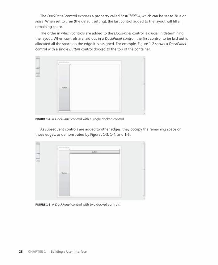
The DockPanel control exposes a property called LastChildFill, which can be set to True or
False . When set to True (the default setting), the last control added to the layout will fill all
remaining space .
The order in which controls are added to the DockPanel control is crucial in determining
the layout . When controls are laid out in a DockPanel control, the first control to be laid out is
allocated all the space on the edge it is assigned . For example, Figure 1-2 shows a DockPanel
control with a single Button control docked to the top of the container .
FIGURE 1-2 A DockPanel control with a single docked control .
As subsequent controls are added to other edges, they occupy the remaining space on
those edges, as demonstrated by Figures 1-3, 1-4, and 1-5 .
FIGURE 1-3 A DockPanel control with two docked controls .

Lesson 1: Using WPF Controls CHAPTER 1 29
FIGURE 1-4 A DockPanel control with three docked controls .
FIGURE 1-5 A DockPanel control with four docked controls .
In this sequence of figures, the second control is docked to the left edge . It occupies all
the edge that is not occupied by the first control . The next control is docked again to the top
edge, where it is docked adjacent to the first control that already is docked to the top, and it
occupies the remaining space on the top edge that was not taken by the button docked on
the left edge . The fourth figure shows a similar progression, with another control docked to
the left edge .
DockPanel controls are typically not used as the sole basis for user interfaces, but rather
are used to dock key components to invariant positions . Usually, the LastChildFill property in
a DockPanel control is set to True, and the last child added is a Grid or other container control
that can be used for the layout of the rest of the user interface . Figure 1-6 shows a sample
user interface that has a menu docked to the top edge, a list box docked to the left edge, and
a grid that fills the remaining space .

30 CHAPTER 1 Building a User Interface
FIGURE 1-6 A DockPanel control that contains a menu, a list box, and a grid .
Canvas Control
The Canvas control is a container that allows absolute positioning of contained controls . It
has no layout logic of its own, and all contained controls are positioned on the basis of four
attached properties: Canvas.Top, Canvas.Bottom, Canvas.Right, and Canvas.Left . The value
of each of these properties defines the distance between the indicated edge of the Canvas
control and the corresponding edge of the child control . For example, the following XAML
defines a button that is 20 units away from the top edge of the Canvas control and 30 units
away from the left edge .
<Canvas> <Button Canvas.Top="20" Canvas.Left="30">Button</Button>
</Canvas>
You can define only one horizontal and one vertical attached property for each contained
control . Thus, you can neither set the value of both Canvas.Left and Canvas.Right for a single
control, nor both Canvas.Top and Canvas.Bottom .
When the Canvas container is resized, contained controls retain their fixed distance from
the Canvas edges but can move relative to one another if different edges have been fixed for
different controls .
Because the Canvas control allows for a freeform layout and does not incorporate any
complex layout functionality of its own, contained controls can overlap in a Canvas control .
By default, controls declared later in the XAML are shown on top of controls declared earlier
in the XAML . However, you can set the Z-order (that is, which control appears on top) manu-
ally by setting the Canvas.ZIndex attached property. Canvas.ZIndex takes an arbitrary integer
value . Controls with a higher Canvas.ZIndex value always appear on top of controls with a
lower Canvas .ZIndex value . An example is shown here:
<Button Canvas.ZIndex="12">This one is on top</Button> <Button Canvas.ZIndex="5">This one is on the bottom</Button>

Lesson 1: Using WPF Controls CHAPTER 1 31
Quick Check
■ Describe what attached properties are and how they work.
Quick Check Answer
■ Attached properties are properties that a containing element, such as a
layout control, attaches to a contained element such as a content control.
Properties are set by the contained element but typically affect how that
element is rendered or laid out in the containing element. An example is the
Grid.Row attached property, which is attached to all elements contained by a
Grid element. By setting the Grid.Row property on a contained element, you
set what row of the grid that element is rendered in.
Accessing Child Elements Programmatically Layout controls expose a Children collection that enables you to access the child controls pro-
grammatically . You can obtain a reference to a child element by the index, as shown here:
Sample of Visual Basic Code
Dim aButton As Button
aButton = CType(grid1.Children(3), Button)
Sample of C# Code
Button aButton;
aButton = (Button)grid1.Children[3];
You can add a control programmatically by using the Children.Add method, as shown here:
Sample of Visual Basic Code
Dim aButton As New Button()
grid1.Children.Add(aButton)
Sample of C# Code
Button aButton = new Button();
grid1.Children.Add(aButton);
Similarly, you can remove a control programmatically with the Children.Remove method:
Sample of Visual Basic Code’
grid1.Children.Remove(aButton)
Sample of C# Code
grid1.Children.Remove(aButton);
And you can remove a control at a specified index by using the RemoveAt method, as
shown here:
Sample of Visual Basic Code
grid1.Children.RemoveAt(3)
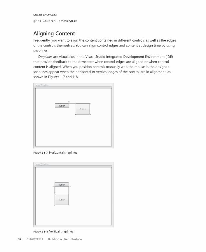
32 CHAPTER 1 Building a User Interface
Sample of C# Code
grid1.Children.RemoveAt(3);
Aligning Content Frequently, you want to align the content contained in different controls as well as the edges
of the controls themselves . You can align control edges and content at design time by using
snaplines .
Snaplines are visual aids in the Visual Studio Integrated Development Environment (IDE)
that provide feedback to the developer when control edges are aligned or when control
content is aligned . When you position controls manually with the mouse in the designer,
snaplines appear when the horizontal or vertical edges of the control are in alignment, as
shown in Figures 1-7 and 1-8 .
FIGURE 1-7 Horizontal snaplines .
FIGURE 1-8 Vertical snaplines .

Lesson 1: Using WPF Controls CHAPTER 1 33
Snaplines also indicate when content is aligned, enabling you to align content across mul-
tiple controls . Figure 1-9 shows an example of content snaplines .
FIGURE 1-9 Content snaplines .
P R AC T I C E Creating a Simple Application
In this practice, you create a simple application to change the font of text in a RichTextBox
control by using controls in a toolbar .
E X E R C I S E Using Layout Controls
1. In Visual Studio, create a new WPF application .
2. In XAML view, change the Grid opening and closing tags to be DockPanel tags, as
shown here:
<DockPanel>
</DockPanel>
3. From the toolbox, drag a ToolBar control onto the window . Add a full-length closing
tag and set the DockPanel.Dock property to Top, as shown here:
<ToolBar DockPanel.Dock="Top" Height="26" Name="toolBar1" Width="276">
</ToolBar>
Even though you have set the DockPanel.Dock property to Top, the toolbar remains in
the center of the window because the DockPanel.LastChildFill property is set to True by
default, and this setting overrides the DockPanel.Dock property .
4. In XAML view, use the following XAML to add a Grid container to the DockPanel
control:
<Grid Name="grid1"> </Grid>
The toolbar now is at the top of the DockPanel control.

34 CHAPTER 1 Building a User Interface
5. In XAML view, add the following ColumnDefinition elements to the Grid control:
<Grid.ColumnDefinitions>
<ColumnDefinition Width="100"/>
<ColumnDefinition Width="5"/>
<ColumnDefinition Width="*"/>
</Grid.ColumnDefinitions>
6. In XAML view, use the following XAML to add a ListBox control to the first column:
<ListBox Grid.Column="0" Name="listBox1"></ListBox>
7. In XAML view, use the following XAML to add a GridSplitter control to the second
column:
<GridSplitter Name="gridSplitter1" Margin="0" Width="5"
Grid.Column="1" HorizontalAlignment="Left"/>
In this practice, the GridSplitter control is given a dedicated column .
8. In XAML view, use the following XAML to add a RichTextBox control to the third
column:
<RichTextBox Grid.Column="2" Name="richTextBox1"/>
9. In the XAML for the ToolBar control, use the following XAML to add three controls to
the ToolBar control:
<Button>Bold</Button> <Button>Italic</Button>
<Slider Name="Slider1" Minimum="2" Maximum="72" Width="100"/>
10. Double-click the button labeled Bold to open the Click event handler . Add the follow-
ing code:
Sample of Visual Basic Code
richTextBox1.Selection.ApplyPropertyValue(FontWeightProperty, _
FontWeights.Bold)
Sample of C# Code
richTextBox1.Selection.ApplyPropertyValue(FontWeightProperty,
FontWeights.Bold);
11. In the designer, double-click the button labeled Italic to open the Click event handler .
Add the following code:
Sample of Visual Basic Code
richTextBox1.Selection.ApplyPropertyValue(FontStyleProperty, _
FontStyles.Italic)
Sample of C# Code
richTextBox1.Selection.ApplyPropertyValue(FontStyleProperty,
FontStyles.Italic);
Lesson 1: Using WPF Controls CHAPTER 1 35
12. In the designer, double-click the slider to open the ValueChanged event handler . Add
the following code:
Sample of Visual Basic Code
Try richTextBox1.Selection.ApplyPropertyValue(FontSizeProperty, _
Slider1.Value.ToString())
Catch End Try
Sample of C# Code
try {
richTextBox1.Selection.ApplyPropertyValue(FontSizeProperty,
Slider1.Value.ToString());
}
catch { }
13. In the Window1 constructor, add the following code after InitializeComponent . (In
Visual Basic, you will have to add the entire constructor .)
Sample of Visual Basic Code
Public Sub New()
InitializeComponent()
For Each F As FontFamily In Fonts.SystemFontFamilies Dim l As ListBoxItem = New ListBoxItem()
l.Content = F.ToString()
l.FontFamily = F
listBox1.Items.Add(l)
Next
End Sub
Sample of C# Code
foreach (FontFamily F in Fonts.SystemFontFamilies) {
ListBoxItem l = new ListBoxItem();
l.Content = F.ToString();
l.FontFamily = F;
listBox1.Items.Add(l);
}
14. In the designer, double-click the ListBox control to open the SelectionChanged event
handler . Add the following code:
Sample of Visual Basic Code
richTextBox1.Selection.ApplyPropertyValue(FontFamilyProperty, _
CType(listBox1.SelectedItem, ListBoxItem).FontFamily)
Sample of C# Code
richTextBox1.Selection.ApplyPropertyValue(FontFamilyProperty,
((ListBoxItem)listBox1.SelectedItem).FontFamily);

36 CHAPTER 1 Building a User Interface
15. Press F5 to build and run your application . Note that you can resize the columns
containing the RichTextBox and the ListBox by manipulating the grid splitter with the
mouse .
Lesson Summary ■ Controls in WPF are primarily divided into three types: content controls, which can
contain a single nested element; item controls, which can contain a list of nested ele-
ments; and layout controls, which are designed to host multiple controls and provide
layout logic for those controls . Certain specialized controls, such as the TextBox, Image,
and ProgressBar controls, are individual controls and can be considered part of the
content control category . Virtually any type of object can be assigned to the Content
property of a content control . If the object inherits from UIElement, the control is
rendered in the containing control . Other types are rendered as a string: the string
returned by their content’s ToString method .
■ Item controls are designed to present multiple child items . Examples of item controls
include ListBox, ComboBox, and TreeView as well as Menu, ToolBar, and StatusBar con-
trols .
■ Menu controls are designed to display hierarchical lists of MenuItem controls in the
familiar menu format . Each MenuItem control can contain its own list of MenuItem
controls and can have a command associated with it that is invoked when the
MenuItem control is clicked, although typically not both at once .
■ The ContextMenu control appears near an associated control when the user right-clicks
the associated control . You can define a ContextMenu control in XAML for the associ-
ated control’s Control.ContextMenu property .
■ ToolBar controls are designed for displaying groups of associated controls, usually with
related functionality . Controls displayed in a toolbar by default conform to the
appearance and behavior of the toolbar itself . StatusBar controls are similar to ToolBar
controls but typically are used more often for presenting information than for present-
ing controls that are an active part of the user interface .
■ Layout controls are containers that provide layout logic for contained controls . A layout
control is typically the child element in a window . How controls are arranged in a
layout panel depends largely on the layout properties of the contained controls . The
HorizontalAlignment and VerticalAlignment properties of child controls determine how
a control is aligned in the horizontal and vertical directions, and the Margin property
defines an area of space that surrounds the control . The impact of a control’s layout
properties can differ, depending on the control in which they are hosted .
■ Attached properties are properties provided to a control by its container or by another
class . Controls have these properties only when they are in the correct context to
express them . Examples of attached properties include the Grid.Row, Grid.Column, and
KeyboardNavigation.TabIndex properties .

Lesson 1: Using WPF Controls CHAPTER 1 37
■ The Grid control is the most commonly used layout panel for the development of user
interfaces . The Grid control enables you to define grid rows and columns and to host
multiple elements in each cell . The Grid control provides attached properties to child
controls that determine the grid column and row in which they are hosted .
■ The GridSplitter control enables the user to resize grid columns and rows at run time .
■ Layout panels such as UniformGrid, StackPanel, WrapPanel, DockPanel, and Canvas
controls are commonly used to create specialized parts of the user interface and are
usually not the highest-level panel in the user interface .
Lesson Review You can use the following questions to test your knowledge of the information in Lesson 1,
“Using WPF Controls .” The questions are also available on the companion CD if you prefer to
review them in electronic form .
NOTE ANSWERS
Answers to these questions and explanations of why each answer choice is correct or incor-
rect are located in the “Answers” section at the end of the book.
1. How many child controls can a content control contain?
A. 0
B. 1
C. No limit
D. Depends on the control
2. Which of the following XAML samples correctly shows a button in a cell created by the
intersection of the second column and the second row of a grid with four cells?
A.
<Grid>
<Grid.ColumnDefinitions>
<ColumnDefinition/>
<ColumnDefinition/>
</Grid.ColumnDefinitions>
<Grid.RowDefinitions>
<RowDefinition/>
<RowDefinition/>
</Grid.RowDefinitions>
<Button Grid.Cell="1,1"></Button>
</Grid>
B.
<Grid> <Grid.ColumnDefinitions>
<ColumnDefinition/>

38 CHAPTER 1 Building a User Interface
<ColumnDefinition/>
</Grid.ColumnDefinitions>
<Grid.RowDefinitions>
<RowDefinition/>
<RowDefinition/>
</Grid.RowDefinitions>
<Button Grid.Column="1" Grid.Row="1"></Button>
</Grid>
C.
<Grid>
<Grid.ColumnDefinitions>
<ColumnDefinition/>
<ColumnDefinition/>
</Grid.ColumnDefinitions>
<Grid.RowDefinitions>
<RowDefinition/>
<RowDefinition/>
</Grid.RowDefinitions>
<Button></Button>
</Grid>
D.
<Grid>
<Grid.ColumnDefinitions>
<ColumnDefinition/>
<ColumnDefinition/>
</Grid.ColumnDefinitions>
<Grid.RowDefinitions>
<RowDefinition/>
<RowDefinition/>
</Grid.RowDefinitions>
<Button Grid.Cell="2,2"></Button>
</Grid>
3. Which XAML sample correctly defines a context menu for Button1?
A.
<Grid>
<ContextMenu name="mymenu">
<MenuItem>MenuItem</MenuItem>
</ContextMenu>
<Button ContextMenu="mymenu" Height="23" HorizontalAlignment="Left"
Margin="54,57,0,0" Name="button1" VerticalAlignment="Top"
Width="75">Button</Button>
</Grid>
B.
<ContextMenu Name="mymenu">
<MenuItem>MenuItem</MenuItem>
</ContextMenu>
<Grid>
<Button ContextMenu="mymenu" Height="23" HorizontalAlignment="Left"

Lesson 1: Using WPF Controls CHAPTER 1 39
Margin="54,57,0,0" Name="button1" VerticalAlignment="Top"
Width="75">Button</Button>
</Grid>
C.
<Menu Name="mymenu" ContextMenu="True">
<MenuItem>MenuItem</MenuItem>
</Menu>
<Grid>
<Button ContextMenu="mymenu" Height="23" HorizontalAlignment="Left"
Margin="54,57,0,0" Name="button1" VerticalAlignment="Top"
Width="75">Button</Button>
</Grid>
D.
<Grid>
<Button Height="23" HorizontalAlignment="Left" Margin="54,57,0,0"
Name="button1" VerticalAlignment="Top" Width="75">
<Button.ContextMenu>
<ContextMenu>
<MenuItem>MenuItem</MenuItem>
</ContextMenu>
</Button.ContextMenu>
Button
</Button>
</Grid>
4. What is the maximum number of child elements that an item control can contain?
A. 0
B. 1
C. No limit
D. Depends on the control
5. Which layout panel would be the best choice for a user interface that requires evenly
spaced controls laid out in a regular pattern?
A. Grid
B. Canvas
C. UniformGrid
D. WrapPanel
6. You are working with a Button control contained in a Canvas control . Which XAML
sample will position the button edges 20 units from the bottom edge of the canvas
and 20 units from the right edge of the canvas as well as maintain that positioning
when the canvas is resized? (Each correct answer presents a complete solution . Choose
all that apply .)

40 CHAPTER 1 Building a User Interface
A.
<Button Margin="20" Canvas.Bottom="0" Canvas.Right="0"></Button>
B.
<Button Margin="20"></Button>
C.
<Button Canvas.Bottom="20" Canvas.Right="20"></Button>
D.
<Button Margin="20" Canvas.Bottom="20" Canvas.Right="20"></Button>
Lesson 2: Using Resources CHAPTER 1 41
Lesson 2: Using Resources
Resources are files or objects an application uses but are not created in the actual executable
code . Windows Forms uses binary resources to allow programs access to large files such as
images or large text files . Although WPF technology uses binary resources, it also introduces
the idea of logical resources, which define objects for use in your application and allow you
to share objects among elements . In this lesson, you learn how to access encoded and binary
resources in both Windows Forms and WPF applications . You learn how to create resource-
only dynamic-link libraries (DLLs) and load resource-only assemblies . You also learn how to
create logical resources and resource dictionaries and to access resources in code for your
WPF applications . Last, you learn the difference between static and dynamic resources and
when to use each .
After this lesson, you will be able to:
■ Embed a binary resource in an application .
■ Retrieve a binary resource by using code .
■ Retrieve a binary resource by using pack URI syntax .
■ Access a resource in another assembly by using pack URI syntax .
■ Add a content file to an application .
■ Create a resource-only DLL .
■ Load and access a resource-only DLL .
■ Create a logical resource .
■ Create an application resource .
■ Access a resource in XAML .
■ Explain the difference between a static resource and a dynamic resource .
■ Create a resource dictionary .
■ Merge resource dictionaries .
■ Decide where to store a resource .
■ Access a resource object in code .
Estimated lesson time: 1 hour
Using Binary Resources Binary resources enable you to compile large binary files in your application assemblies and
retrieve them for use in your application . Binary resources are different from logical resourc-
es, which can be defined and accessed in XAML files . Logical resources are discussed later in
this lesson .
42 CHAPTER 1 Building a User Interface
Embedding Resources
Embedding resources in your application is fairly easy . All you need to do is add the file to
your project and set the file’s Build Action property to Resource. When the application is
compiled, the resource is compiled automatically as a resource and embedded in your ap-
plication . You can use this procedure to embed resources in both Windows Forms and WPF
applications .
To embed a resource in your application,
1. From the Project menu, choose Add Existing Item . The Add Existing Item dialog box
opens .
2. Browse to the file you want to add . Click Add to add it to your project .
3. In the Properties window, set the Build Action property for this file to Resource .
NOTE THE BUILD ACTION PROPERTY
Do not set the Build Action property to Embedded Resource, which embeds the re-
source using a different resource management scheme that is less accessible from WPF
applications.
You can update a resource that has been previously added to an application by following
the previous procedure and recompiling your application .
Loading Resources
The WPF Image class is capable of interacting directly with embedded resources . To specify an
image resource, all you have to do is refer to the embedded file path, as shown in bold here:
<Image Source="myPic.bmp" Margin="17,90,61,22"
Name="Image1" Stretch="Fill"/>
This example refers to a resource that has been added directly to your project . In most
cases, you want to organize your resources in folders in your application . Naturally, you must
include the folder name in your path, as shown in bold here:
<Image Source="myFolder/myPic.bmp" Margin="17,90,61,22"
Name="Image1" Stretch="Fill"/>
When accessing embedded resources, the forward slash (/) is used in the URI by conven-
tion, but either the forward slash or the back slash (\) will work .
Pack URIs
The syntax previously shown to access embedded resources is actually a shorthand syntax
that represents the longer syntax for pack URIs, which is a way WPF accesses embedded
resources directly by specifying a URI to that resource . The full syntax for using pack URIs to
locate an embedded resource is as follows:
pack://<Authority>/<Folder>/<FileName>

Lesson 2: Using Resources CHAPTER 1 43
The <Authority> specified in the pack URI syntax is one of two possible values . It can be
either application:,,, which designates that the URI should look to the assembly the current
application is in for resource or content files, or siteOfOrigin:,,, which indicates that the ap-
plication should look to the site of the application’s origin for the indicated resource files . The
siteOfOrigin syntax is discussed further in the “Retrieving Loose Files with siteOfOrigin Pack
URIs” section later in this chapter . If a relative URI is used, application:,,, is assumed to be the
<Authority> .
Thus, the previous example of an Image element could be rewritten to use the full pack
URI syntax, as shown in bold here:
<Image Source="pack://application:,,,/myFolder/myPic.bmp"
Margin="17,90,61,22" Name="Image1" Stretch="Fill"/>
The full pack URI syntax comes in handy when you need to retrieve an embedded resource
in code, as shown here:
Sample of Visual Basic Code
Dim myImage As Image
myImage.Source = New BitmapImage(New _
Uri("pack://application:,,,/myFolder/myPic.bmp"))
Sample of C# Code
Image myImage;
myImage.Source = new BitmapImage(new
Uri("pack://application:,,,/myFolder/myPic.bmp"));
Using Resources in Other Assemblies
You can also use the pack URI syntax to access resources embedded in other assemblies . The
following example demonstrates the basic pack URI syntax for accessing embedded resources
in other assemblies:
pack://application:,,,/<AssemblyName>;component/<Folder>/<FileName>
Thus, if you wanted to locate a file named myPic .bmp in the folder myFolder in another
assembly named myAssembly, you would use the following pack URI:
Pack://application:,,,/myAssembly;component/myFolder/myPic.bmp
As with other pack URIs, if the embedded file does not exist within a folder, the folder is
omitted in the URI .
Content Files You do not want to embed all the files your application uses as resources . For example, files
that need to be updated frequently should not be embedded, because embedding such files
would require the application to be recompiled whenever a file is updated . Other examples
of files that you do not want to embed are sound and media files . Because MediaPlayer and

44 CHAPTER 1 Building a User Interface
MediaElement controls do not support the pack URI syntax, the only way to provide sound
files is as content files . Fortunately, it is easy to add content files as unembedded resources .
To add a content file,
1. From the Project menu, choose Add Existing Item . The Add Existing Item dialog box
opens .
2. Browse to the file you want to add . Click Add to add it to your project .
3. In the Properties window, set the Build Action property for this file to Content .
4. In the Properties window, set the Copy To Output Directory property to Copy Always .
This ensures that this file is copied to your application directory when your application
is built .
After a file has been added as a content file, you can refer to it using the relative URI, as
shown in bold here:
<MediaElement Margin="52,107,66,35" Source="crash.mp3"
Name="mediaElement1"/>
Retrieving Loose Files with siteOfOrigin Pack URIs
In some cases, you want to deploy an application that requires regular updating of resources .
Because compiled XAML cannot reference a binary resource in its current directory un-
less that file has been added to the project, this requires any files referenced in XAML to be
included as part of the application . That, in turn, requires users to install updated versions of a
desktop application every time content files have changed .
You can solve this problem by using siteOfOrigin pack URIs to refer to the site from which
the application was deployed .
The siteOfOrigin:,,, syntax means different things depending on the location from which
the application was originally installed . If the application is a full-trust desktop application
that was installed using Windows Installer, the siteOfOrigin:,,, syntax in a pack URI refers to
the root directory of the application .
If the application is a full-trust application that was installed using ClickOnce, the
siteOfOrigin:,,, syntax refers to the Uniform Resource Locator (URL) or the Universal Naming
Convention (UNC) path from which the application was originally deployed .
For a partial-trust application deployed with ClickOnce or an XAML Browser Application
(XBAP), siteOfOrigin:,,, refers to the URL or UNC path that hosts the application .
Pack URIs that use the siteOfOrigin:,,, syntax always point to loose files (that is, files that
are copied to the output directory but are not compiled); they never point to embedded
resources . Thus, the files they reference should always exist in the directory specified by the
siteOfOrigin:,,, syntax in a loose, uncompiled state .
The following example demonstrates use of the siteOfOrigin:,,, syntax:
<Image Source="pack://siteOfOrigin:,,,/OfficeFrontDoor.jpg"/>

Lesson 2: Using Resources CHAPTER 1 45
Retrieving Resources Manually
You might need to use resource files with objects that do not support the pack URI
syntax . In these cases, you must retrieve the resources manually using the Application
.GetResourceStream method . This method returns a System.Windows.Resources
.StreamResourceInfo object that exposes two properties: the ContentType property, which
describes the type of content contained in the resource, and the Stream property, which con-
tains an UnmanagedMemoryStream object that exposes the raw data of the resource . Then
you can manipulate that data programmatically . The following example demonstrates how to
retrieve the text contained in an embedded resource text file:
Sample of Visual Basic Code
Dim myInfo As System.Windows.Resources.StreamResourceInfo
Dim myString As String
myInfo = Application.GetResourceStream( _
New Uri("myTextFile.txt", UriKind.Relative))
Dim myReader As New System.IO.StreamReader(myInfo.Stream)
' myString is set to the text contained in myTextFile.txt
myString = myReader.ReadToEnd()
Sample of C# Code
System.Windows.Resources.StreamResourceInfo myInfo;
string myString;
myInfo = Application.GetResourceStream(
new Uri("myTextFile.txt", UriKind.Relative));
System.IO.StreamReader myReader =
new System.IO.StreamReader(myInfo.Stream);
// myString is set to the text contained in myTextFile.txt
myString = myReader.ReadToEnd();
Creating Resource-Only DLLs
You can create DLLs that contain only compiled resources . This can be useful in situations
when resource files need to change frequently but recompiling the application is not an op-
tion . You can update and recompile the resources and then swap the old resource DLL for the
new one .
Creating a resource-only DLL is fairly straightforward . To create a resource-only DLL,
simply create an empty project in Visual Studio and add resource files to it . You can access
resources in a resource-only DLL through the assembly resource stream .
To create a resource-only DLL:
1. In Visual Studio, create a new project with the Empty Project template .
2. In Solution Explorer, right-click the project name and choose Properties to open
the Project Properties page . In the Application tab, set the Application Type to Class
Library .
3. From the Project menu, choose Add Existing Item to add resource files to your project .

46 CHAPTER 1 Building a User Interface
4. In Solution Explorer, select a resource file . In the Properties window, set the Build
Action property to Embedded Resource . Repeat this step for each resource file .
5. From the Build menu, choose Build <application>, where <application> is the name of
your application, to compile your resource-only DLL .
To access resources programmatically using the assembly resource stream:
1. Get the AssemblyName object that represents the resource-only assembly, as shown
here:
Sample of Visual Basic Code
Dim aName As System.Reflection.AssemblyName
aName = System.Reflection.AssemblyName.GetAssemblyName("C:\myAssembly.dll"))
Sample of C# Code
System.Reflection.AssemblyName aName;
aName = System.Reflection.AssemblyName.GetAssemblyName("C:\\myAssembly.dll"));
2. Use the AssemblyName object to load the assembly, as shown here:
Sample of Visual Basic Code
Dim asm As System.Reflection.Assembly
asm = System.Reflection.Assembly.Load(aName)
Sample of C# Code
System.Reflection.Assembly asm;
asm = System.Reflection.Assembly.Load(aName);
3. After the assembly has been loaded, you can access the names of the resources
through the Assembly.GetManifestResourceNames method and the resource streams
through the Assembly.GetManifestResourceStream method . The following example
demonstrates how to retrieve the names of the resources in an assembly and then load
an image from the resource stream into a Windows Forms PictureBox control:
Sample of Visual Basic Code
Dim res() As String = asm.GetManifestResourceNames
PictureBox1.Image = New _
System.Drawing.Bitmap(asm.GetManifestResourceStream(res(0)))
Sample of C# Code
String res[] = asm.GetManifestResourceNames();
pictureBox1.Image = new
System.Drawing.Bitmap(asm.GetManifestResourceStream(res[0]));
Using Logical Resources Logical resources enable you to define objects in XAML that are not part of the visual tree but
are available for use by WPF elements in your user interface . Elements in your user interface
can access the resource as needed . An example of an object that you might define as a re-
source is Brush, used to provide a common color scheme for the application .

Lesson 2: Using Resources CHAPTER 1 47
By defining objects that several elements use in a Resources section, you gain a few ad-
vantages over defining an object each time you use it . First, you gain reusability because you
define your object only once rather than multiple times . You also gain flexibility: By separat-
ing the objects used by your user interface from the user interface itself, you can refactor
parts of the user interface without having to redesign it completely . For example, you might
use different collections of resources for different cultures in localization or for different ap-
plication conditions .
Any type of object can be defined as a resource . Every WPF element defines a Resources
collection, which you can use to define objects available to that element and the elements in
its visual tree . Although it is most common to define resources in the Resources collection of
the window, you can define a resource in any element’s Resources collection and access it so
long as the accessing element is part of the defining element’s visual tree .
Declaring a Logical Resource
You declare a logical resource by adding it to a Resources collection, as shown here:
<Window.Resources> <RadialGradientBrush x:Key="myBrush">
<GradientStop Color="CornflowerBlue" Offset="0" />
<GradientStop Color="Crimson" Offset="1" />
</RadialGradientBrush>
</Window.Resources>
If you don’t intend a resource to be available to the entire window, you can define it in the
Resources collection of an element in the window, as shown in this example:
<Grid>
<Grid.Resources>
<RadialGradientBrush x:Key="myBrush">
<GradientStop Color="CornflowerBlue" Offset="0" />
<GradientStop Color="Crimson" Offset="1" />
</RadialGradientBrush>
</Grid.Resources>
</Grid>
The usefulness of this is somewhat limited, and the most common scenario is to define re-
sources in the Window.Resources collection . One point to remember is that when using static
resources, you must define the resource in the XAML code before you refer to it . Static and
dynamic resources are explained later in this lesson .
Every object declared as a Resource must set the x:Key property . This is the name other
WPF elements will use to access the resource . There is one exception to this rule: Style objects
that set the TargetType property do not need to set the x:Key property explicitly because it is
set implicitly behind the scenes . In the previous two examples, the key is set to myBrush.
The x:Key property does not have to be unique in the application, but it must be unique
in the Resources collection in which it is defined . Thus, you could define one resource in the
Grid.Resources collection with a key of myBrush and another in the Window.Resources col-
lection with the same key . Objects within the visual tree of the grid that reference a resource

48 CHAPTER 1 Building a User Interface
with the key myBrush reference the object defined in the Grid.Resources collection, and
objects that are not in the visual tree of the grid but are within the visual tree of the Window
reference the object defined in the Window.Resources collection .
Application Resources
In addition to defining resources at the level of the element or Window, you can define
resources that are accessible by all objects in a particular application . You can create an ap-
plication resource by opening the App .xaml file (for C# projects) or the Application .xaml file
(for Visual Basic projects) and adding the resource to the Application.Resources collection, as
shown in bold here:
<Application x:Class="WpfApplication2.App"
xmlns="http://schemas.microsoft.com/winfx/2006/xaml/presentation"
xmlns:x="http://schemas.microsoft.com/winfx/2006/xaml"
StartupUri="Window1.xaml">
<Application.Resources> <SolidColorBrush x:Key="appBrush" Color="PapayaWhip" />
</Application.Resources>
</Application>
Accessing a Resource in XAML
You can access a resource in XAML by using the following syntax:
{StaticResource myBrush}
In this example, the markup declares that a static resource with the myBrush key is ac-
cessed. Because this resource is a Brush object, you can plug that markup into any place that
expects a Brush object . This example demonstrates how to use a resource in the context of a
WPF element:
<Grid Background="{StaticResource myBrush}">
</Grid>
When a resource is referenced in XAML, the Resources collection of the declaring object is
first searched for a resource with a matching key . If one is not found, the Resources collection
of that element’s parent is searched, and so on, up to the window that hosts the element and
to the application Resources collection .
Static and Dynamic Resources
In addition to the syntax described previously, you can reference a resource with the follow-
ing syntax:
{DynamicResource myBrush}
The difference between the DynamicResource and StaticResource syntax lies in how the
referencing elements retrieve the resources . Resources referenced by the StaticResource syn-
tax are retrieved once by the referencing element and used for the lifetime of the resource .

Lesson 2: Using Resources CHAPTER 1 49
Resources referenced with the DynamicResource syntax are acquired every time the refer-
enced object is used .
It might seem intuitive to think that, if you use StaticResource syntax, the referencing
object does not reflect changes to the underlying resource, but this is not necessarily the
case . WPF objects that implement dependency properties automatically incorporate change
notification, and changes made to the properties of the resource are picked up by any objects
using that resource . Take the following example:
<Window x:Class="WpfApplication2.Window1"
xmlns="http://schemas.microsoft.com/winfx/2006/xaml/presentation"
xmlns:x="http://schemas.microsoft.com/winfx/2006/xaml"
Title="Window1" Height="300" Width="300">
<Window.Resources> <SolidColorBrush x:Key="BlueBrush" Color="Blue" />
</Window.Resources>
<Grid Background="{StaticResource BlueBrush}">
</Grid>
</Window>
This example renders the grid in the window with a blue background . If the Color property
of the SolidColorBrush defined in the Window.Resources collection was changed in code to
red, for instance, the background of the grid would render as red because change notification
would notify all objects using that resource that the property had changed .
The difference between static and dynamic resources comes when the underlying object
changes . If Brush defined in the Windows.Resources collection were accessed in code and set
to a different object instance, the grid in the previous example would not detect this change .
However, if the grid used the following markup, the change of the object would be detected,
and the grid would render the background with the new brush:
<Grid Background="{DynamicResource BlueBrush}">
</Grid>
Accessing resources in code is discussed in the “Retrieving Resources in Code” section later
in this chapter .
The downside of using dynamic resources is that they tend to decrease application perfor-
mance because they are retrieved every time they are used, thus reducing the efficiency of
an application . The best practice is to use static resources unless there is a specific reason for
using a dynamic resource . Examples of instances in which you would want to use a dynamic
resource include when you use the SystemBrushes, SystemFonts, and SystemParameters
classes as resources (see Chapter 5, “Working With User Defined Controls,” Lesson 3, for more
information about these classes) or any other time when you expect the underlying object of
the resource to change .

50 CHAPTER 1 Building a User Interface
Creating a Resource Dictionary A resource dictionary is a collection of resources that reside in a separate XAML file and can
be imported into your application . They can be useful for organizing your resources in a
single place or for sharing resources between multiple projects in a single solution . The fol-
lowing procedure describes how to create a new resource dictionary in your application .
To create a resource dictionary:
1. From the Project menu, choose Add Resource Dictionary . The Add New Item dialog
box opens . Choose the name for the resource dictionary and click Add . The new re-
source dictionary is opened in XAML view .
2. Add resources to the new resource dictionary in XAML view . You can add resources to
the file in XAML view, as shown in bold here:
<ResourceDictionary
xmlns="http://schemas.microsoft.com/winfx/2006/xaml/presentation"
xmlns:x="http://schemas.microsoft.com/winfx/2006/xaml">
<SolidColorBrush x:Key="appBrush" Color="DarkSalmon" /> </ResourceDictionary>
Merging Resource Dictionaries
For objects in your application to access resources in a resource dictionary, you must merge
the resource dictionary file with a Resources collection that is accessible in your application,
such as the Window.Resources or Application.Resources collection . You merge resource dic-
tionaries by adding a reference to your resource dictionary file in the ResourceDictionary
.MergedDictionaries collection . The following example demonstrates how to merge the
resources in a Window.Resources collection with the resources in resource dictionary files
named Dictionary1 .xaml and Dictionary2 .xaml:
<Window.Resources> <ResourceDictionary>
<ResourceDictionary.MergedDictionaries>
<ResourceDictionary Source="Dictionary1.xaml" />
<ResourceDictionary Source="Dictionary2.xaml" />
</ResourceDictionary.MergedDictionaries>
<SolidColorBrush x:Key="BlueBrush" Color="Blue" />
</ResourceDictionary>
</Window.Resources>
If you define additional resources in your Resources collection, they must be defined within
the bounds of the ResourceDictionary tags .
Choosing Where to Store a Resource
You have seen several options regarding where resources should be stored . The factors that
should be weighed when deciding where to store a resource include ease of accessibility by
referencing elements, readability and maintainability of the code, and reusability .

Lesson 2: Using Resources CHAPTER 1 51
For resources to be accessed by all elements in an application, store resources in the
Application.Resources collection . The Window.Resources collection makes resources available
only to elements in that window, but that is typically sufficient for most purposes . If you need
to share individual resources over multiple projects in a solution, your best choice is to store
your resources in a resource dictionary that can be shared among different projects .
Readability is important for enabling maintenance of your code by other developers . The
best choice for readability is to store resources in the Window.Resources collection because
developers can then read your code in a single file rather than having to refer to other code
files .
If making your resources reusable is important the ideal method for storing them is to use
a resource dictionary . This allows you to reuse resources among different projects and extract
those resources easily for use in other solutions as well .
Retrieving Resources in Code You can access resources in code . The FindResource method enables you to obtain a reference
to a resource by using the Key value . To use the FindResource method, you must call it from
an element reference that has access to that resource . The following code example demon-
strates how to obtain a reference to a resource with a Key value of myBrush through a Button
element that has access to that resource:
Sample of Visual Basic Code
Dim aBrush As SolidColorBrush aBrush = CType(Button1.FindResource("myBrush"), SolidColorBrush)
Sample of C# Code
SolidColorBrush aBrush;
aBrush = (SolidColorBrush)Button1.FindResource("myBrush");
The FindResource method throws an exception if the named resource cannot be found . To
avoid possible exceptions, you can use the TryFindResource method instead .
You also can access resources directly through the Resources collection on the element
that contains it . The caveat here is that you must know in which collection the resource is
defined and use the correct Resources collection . The following example demonstrates how
to access a resource with the Key value of myBrush through the Resources collection of the
window:
Sample of Visual Basic Code
Dim aBrush As SolidColorBrush
aBrush = CType(Me.Resources("myBrush"), SolidColorBrush)
Sample of C# Code
SolidColorBrush aBrush;
aBrush = (SolidColorBrush)this.Resources["myBrush"];

52 CHAPTER 1 Building a User Interface
When used in code, resources are read-write . Thus, you actually can change the object to
which a resource refers . This example demonstrates how you can create a new object in code
and set an existing resource to it:
Sample of Visual Basic Code
Dim aBrush As New SolidColorBrush(Colors.Red)
Me.Resources("myBrush") = aBrush
Sample of C# Code
SolidColorBrush aBrush = new SolidColorBrush(Colors.Red);
this.Resources["myBrush"] = aBrush;
If the object a resource refers to is changed in code, objects that use that resource behave
differently, depending on how the resource is referenced . Resources referenced with the
DynamicResource markup use the new object when the resource is changed in code . Objects
that reference resources with the StaticResource markup continue to use the object they ini-
tially retrieved from the Resources collection and are unaware of the change .
P R AC T I C E Practice with Logical Resources
In this practice, you create two resource dictionaries and merge them with the resources in
your window .
E X E R C I S E Creating Resource Dictionaries
1. Open the partial solution for this practice .
2. From the Project menu, choose Add Resource Dictionary . Name the file
GridResources.xaml and click Add .
3. Add another resource dictionary and name it ButtonResources.xaml .
4. In Solution Explorer, double-click GridResources .xaml to open the GridResources re-
source dictionary . Add the following LinearGradientBrush object to the GridResources .
xaml file:
<LinearGradientBrush x:Key="GridBackgroundBrush"> <GradientStop Color="AliceBlue" Offset="0" />
<GradientStop Color="Blue" Offset=".5" />
<GradientStop Color="Black" Offset="1" />
</LinearGradientBrush>
5. Double-click ButtonResources .xaml to open the ButtonResources resource dictionary .
Add the following resources to this file:
<LinearGradientBrush x:Key="ButtonBackgroundBrush"> <GradientStop Color="Yellow" Offset="0" />
<GradientStop Color="Red" Offset="1" />
</LinearGradientBrush>
<SolidColorBrush Color="Purple" x:Key="ButtonForegroundBrush" />
<SolidColorBrush Color="LimeGreen" x:Key="ButtonBorderBrush" />
<Style TargetType="Button">

Lesson 2: Using Resources CHAPTER 1 53
<Setter Property="Background" Value="{StaticResource
ButtonBackgroundBrush}" />
<Setter Property="Foreground" Value="{StaticResource
ButtonForegroundBrush}" />
<Setter Property="BorderBrush" Value="{StaticResource
ButtonBorderBrush}" />
</Style>
These resources include brushes for the background, foreground, and border as well as
a style that automatically applies these brushes to Button elements .
6. Double-click Window1 to open the designer for the window. Above the definition for
the Grid element, add the following Resources section to the XAML code for the win-
dow:
<Window.Resources> <ResourceDictionary>
<ResourceDictionary.MergedDictionaries>
<ResourceDictionary Source="ButtonResources.xaml" />
<ResourceDictionary Source="GridResources.xaml" />
</ResourceDictionary.MergedDictionaries>
</ResourceDictionary>
</Window.Resources>
7. Modify the Grid definition to reference the resource that defines the brush to be used
for the background of the grid, as shown here:
<Grid Background="{StaticResource GridBackgroundBrush}">
8. Press F5 to build and run your application . The Brush objects defined in the resource
dictionaries are applied to your window.
Lesson Summary ■ You can add binary resources to an application by using the Add Existing Item menu in
Visual Studio and setting the Build Action property of the added file to Resource .
■ For resource-aware classes such as the Image element, you can retrieve embedded
resources by using pack URI syntax . The pack URI syntax also provides for accessing
resources in other assemblies .
■ If you are working with classes that are not resource-aware, you must retrieve re-
sources manually by using the Application.GetResourceStream method to retrieve the
UnmanagedMemoryStream that encodes the resource . Then you can use the File IO
classes to read the stream .
■ Content files can be added as loose files, which are files that are copied to the output
directory but are not compiled . You must use content files to add sound or media files
to an application because MediaPlayer and MediaElement are incapable of reading
embedded resources .

54 CHAPTER 1 Building a User Interface
■ You can create resource-only DLLs and retrieve the resources stored within by using
the Assembly.GetManifestResourceStream method .
■ Logical resources are objects defined in XAML and can be used by elements in your
application .
■ You can define a resource in several locations: in the Resources collection for Element,
in the Resources collection for the window, in the Resources collection for Application,
or in a resource dictionary . Where you define a resource depends largely on reusabil-
ity, maintainability of code, and how available the resource object needs to be to the
rest of the application .
■ Static resources retrieve an object from a Resources collection once, whereas dynamic
resources retrieve the object each time it is accessed . Although changes made to an
object are detected by static resources, a change within the actual underlying object is
not .
■ Resource dictionaries are separate XAML files that define resources . Resource diction-
aries can be merged with an existing Resources collection for an element .
■ Resources can be retrieved in code, either by accessing the Resources collection di-
rectly or by using the FindResource or TryFindResource method .
Lesson Review You can use the following questions to test your knowledge of the information in Lesson 2,
“Using Resources .” The questions are also available on the companion CD if you prefer to
review them in electronic form .
NOTE ANSWERS
Answers to these questions and explanations of why each answer choice is correct or incor-
rect are located in the “Answers” section at the end of the book.
1. Which of the following examples of the pack URI syntax accesses a file named
myImage .jpg in a folder named MyFolder in another assembly named myAssembly?
A.
Pack://application:,,,/myAssembly;component/MyFolder/myImage.jpg
B.
Pack://application:,,,/myAssembly;MyFolder/component/myImage.jpg
C.
Pack://application:,,,;component/myAssemby/MyFolder/myImage.jpg
D.
Pack://application:,,,/myAssembly;component/myImage.jpg

Lesson 2: Using Resources CHAPTER 1 55
2. You are adding an image to your application for use in an Image element . What is the
best setting for the Build Action property in Visual Studio?
A. Embedded Resource
B. Resource
C. None
D. Content
3. You are adding a media file to your application for use in a MediaElement element .
What is the best setting for the Build Action property in Visual Studio?
A. Embedded Resource
B. Resource
C. None
D. Content
4. You have created a series of customized Brush objects to create a common color
scheme for every window in each of several applications in your company . The Brush
objects have been implemented as resources . What is the best place to define these
resources?
A. In the Resources collection of each control that needs them
B. In the Resources collection of each window that needs them
C. In the Application.Resources collection
D. In a separate resource dictionary
5. Look at the following XAML:
<Window x:Class="Window1"
xmlns="http://schemas.microsoft.com/winfx/2006/xaml/presentation"
xmlns:x="http://schemas.microsoft.com/winfx/2006/xaml"
Title="Window1" Height="300" Width="300">
<Window.Resources> <SolidColorBrush Color="Red" x:Key="ForegroundBrush" />
<SolidColorBrush Color="Blue" x:Key="BackgroundBrush" />
</Window.Resources>
<Grid>
<Button Background="{StaticResource BackgroundBrush}"
Foreground="{DynamicResource ForegroundBrush}" Height="23"
Margin="111,104,92,0" Name="Button1"
VerticalAlignment="Top">Button</Button>
</Grid>
</Window>
What happens to the colors of the button when the following code is executed?
Sample of Visual Basic Code
Dim aBrush As New SolidColorBrush(Colors.Green)
Me.Resources("ForegroundBrush") = aBrush
Dim bBrush As SolidColorBrush bBrush = CType(Me.Resources("BackgroundBrush"), SolidColorBrush)
bBrush.Color = Colors.Black
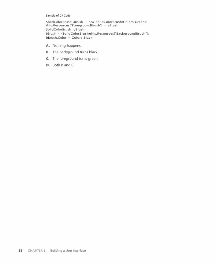
56 CHAPTER 1 Building a User Interface
Sample of C# Code
SolidColorBrush aBrush = new SolidColorBrush(Colors.Green);
this.Resources["ForegroundBrush"] = aBrush;
SolidColorBrush bBrush;
bBrush = (SolidColorBrush)this.Resources["BackgroundBrush"];
bBrush.Color = Colors.Black;
A. Nothing happens .
B. The background turns black .
C. The foreground turns green .
D. Both B and C .

Lesson 3: Using Styles and Triggers CHAPTER 1 57
Lesson 3: Using Styles and Triggers
Styles enable you to create a cohesive appearance and behavior for your application . You can
use styles to define a standard color and sizing scheme for your application and use triggers
to provide dynamic interaction with your UI elements . In this lesson, you learn to create and
implement styles, apply a style to all instances of a single type, and to implement style inheri-
tance . You learn to use setters to set properties and event handlers and triggers to change
property values dynamically . Finally, you learn about the order of property precedence .
After this lesson, you will be able to:
■ Create and implement a style .
■ Apply a style to all instances of a type .
■ Implement style inheritance .
■ Use property and event setters .
■ Explain the order of property value precedence .
■ Use and implement triggers, including property triggers, data triggers, event
triggers, and multiple triggers .
Estimated lesson time: 30 minutes
Using Styles Styles can be thought of as analogous to cascading style sheets as used in Hypertext Markup
Language (HTML) pages . Styles basically tell the presentation layer to substitute a new visual
appearance for the standard one . They enable you to make changes to the user interface as
a whole easily and to provide a consistent appearance and behavior for your application in a
variety of situations . Styles enable you to set properties and hook up events on UI elements
through the application of those styles . Further, you can create visual elements that respond
dynamically to property changes through the application of triggers, which listen for a prop-
erty change and then apply style changes in response .
Properties of Styles
The primary class in the application of styles is, unsurprisingly, the Style class, which contains
information about styling a group of properties . A style can be created to apply to a single
instance of an element, to all instances of an element type, or across multiple types . Table 1-9
shows the important properties of the Style class .

58 CHAPTER 1 Building a User Interface
TABLE 1-9 Important Properties of the Style Class
PROPERTY DESCRIPTION
BasedOn Indicates another style that this style is based on . This property is
useful for creating inherited styles .
Resources Contains a collection of local resources the style uses . The
Resources property is discussed in detail in Lesson 2 of this chapter .
Setters Contains a collection of Setter or EventSetter objects . These are
used to set properties or events on an element as part of a style .
TargetType Identifies the intended element type for the style .
Triggers Contains a collection of Trigger objects and related objects that en-
able you to designate a change in the user interface in response to
changes in properties .
The basic skeleton of a <Style> element in XAML markup looks like the following:
<Style>
<!-- A collection of setters is enumerated here -->
<Style.Triggers>
<!-- A collection of Trigger and related objects is enumerated here -->
</Style.Triggers>
<Style.Resources>
<!-- A collection of local resources for use in the style -->
</Style.Resources>
</Style>
Setters
The most common class you will use in the construction of styles is the Setter. As their name
implies, setters are responsible for setting some aspect of an element . Setters come in two
types: property setters (or just setters, as they are called in markup), which set values for
properties, and event setters, which set handlers for events .
PROPERTY SETTERS
Property setters, represented by the <Setter> tag in XAML, enable you to set properties
of elements to specific values . A property setter has two important properties: Property,
which designates the property to be set by the setter, and Value, which indicates the value
to which the property is to be set . The following example demonstrates a setter that sets the
Background property of a Button element to red:
<Setter Property="Button.Background" Value="Red" />
The value for the Property property must take the following form:
Element.PropertyName

Lesson 3: Using Styles and Triggers CHAPTER 1 59
If you want to create a style that sets a property on multiple types of elements, you can set
the style on a common class that the elements inherit, as shown here:
<Style> <Setter Property="Control.Background" Value="Red" />
</Style>
This style sets the Background property of all elements that inherit from the control to
which it is applied .
EVENT SETTERS
Event setters (represented by the <EventSetter> tag) are similar to property setters, but they
set event handlers rather than property values . The two important properties for EventSetter
are the Event property, which specifies the event for which the handler is being set, and the
Handler property, which specifies the event handler to attach to that event . An example is
shown here:
<EventSetter Event="Button.MouseEnter" Handler="Button_MouseEnter" />
The value of the Handler property must specify an extant event handler with the correct
signature for the type of event with which it is connected . Similar to property setters, the
format for the Event property is
Element.EventName
where the element type is specified, followed by the event name .
Creating a Style
You’ve seen the simplest possible implementation of a style—a single setter between two
Style tags—but you haven’t yet seen how to apply a style to an element . There are several
ways to do this . This section examines the various ways to apply a style to elements in your
user interface .
SETTING THE STYLE PROPERTY DIRECTLY
The most straightforward way to apply a style to an element is to set the Style property
directly in XAML . The following example demonstrates directly setting the Style property of a
Button element:
<Button Height="25" Name="Button1" Width="100">
<Button.Style>
<Style>
<Setter Property="Button.Content" Value="Style set directly" />
<Setter Property="Button.Background" Value="Red" />
</Style>
</Button.Style>
</Button>
Although setting the style directly in an element might be the most straightforward, it is
seldom the best method . When setting the style directly, you must set it for each element you

60 CHAPTER 1 Building a User Interface
want to be affected. In most cases, it is simpler to set the properties of the element directly at
design time .
One scenario in which you might want to set the style directly in an element is to pro- vide
a set of triggers for that element . Because triggers must be set in a style (except for
EventTrigger, as you will see in the next section), you could conceivably set the style directly to
set triggers for an element .
SETTING A STYLE IN A RESOURCES COLLECTION
The most common method for setting styles is to create the style as a member of a Resources
collection and then apply the style to elements in your user interface by referencing the re-
source . The following example demonstrates creating a style as part of the Windows
.Resources collection:
<Window.Resources> <Style x:Key="StyleOne">
<Setter Property="Button.Content" Value="Style defined in resources" />
<Setter Property="Button.Background" Value="Red" />
</Style>
</Window.Resources>
Under most circumstances, you must supply a key value for a style that you define in the
Resources collection . Then you can apply that style to an element by referencing the resource,
as shown in bold here:
<Button Name="Button1" Style="{StaticResource StyleOne}" Height="30"
Width="200" />
The advantage of defining a style in the resources section is that you can then apply that
style to multiple elements by simply referencing the resource .
APPLYING STYLES TO ALL CONTROLS OF A SPECIFIC TYPE
You can use the TargetType property to specify a type of element to be associated with the
style . When you set the TargetType property on a style, that style is applied to all elements of
that type automatically . Furthermore, you do not need to specify the qualifying type name in
the Property property of any setters you use; you can just refer to the property name . When
you specify TargetType for a style you have defined in a Resources collection, you do not
need to provide a key value for that style . The following example demonstrates the use of the
TargetType property:
<Window.Resources>
<Style TargetType="Button">
<Setter Property=" Content" Value="Style set for all buttons" />
<Setter Property="Background" Value="Red" />
</Style>
</Window.Resources>
When you apply the TargetType property, you do not need to add any additional markup
to the elements of that type to apply the style .

Lesson 3: Using Styles and Triggers CHAPTER 1 61
If you want an individual element to opt out of the style, you can set the style on that ele-
ment explicitly, as seen here:
<Button Style="{x:Null}" Margin="10">No Style</Button>
This example explicitly sets the style to Null, which causes the button to revert to its de-
fault look . You also can set the style to another style directly, as seen earlier in this lesson .
SETTING A STYLE PROGRAMMATICALLY
You can create and define a style programmatically . Although defining styles in XAML is
usually the best choice, creating a style programmatically might be useful when you want
to create and apply a new style dynamically, possibly based on user preferences . The typical
method for creating a style programmatically is to create the Style object in code; create set-
ters (and triggers if appropriate); add them to the appropriate collection on the Style object;
and then, when finished, set the Style property on the target elements . The following example
demonstrates creating and applying a simple style in code:
Sample of Visual Basic Code
Dim aStyle As New Style
Dim aSetter As New Setter
aSetter.Property = Button.BackgroundProperty
aSetter.Value = Brushes.Red
aStyle.Setters.Add(aSetter)
Dim bSetter As New Setter
bSetter.Property = Button.ContentProperty
bSetter.Value = "Style set programmatically"
aStyle.Setters.Add(bSetter)
Button1.Style = aStyle
Sample of C# Code
Style aStyle = new Style(); Setter aSetter =
new Setter(); aSetter.Property =
Button.BackgroundProperty; aSetter.Value =
Brushes.Red; aStyle.Setters.Add(aSetter);
Setter bSetter = new Setter();
bSetter.Property = Button.ContentProperty;
bSetter.Value = "Style set programmatically";
aStyle.Setters.Add(bSetter);
Button1.Style = aStyle;
You can also define a style in a Resources collection and apply that style in code, as shown
here:
Sample of XAML Code
<!-- XAML -->
<Window.Resources>
<Style x:Key="StyleOne">
<Setter Property="Button.Content" Value="Style applied in code" />
<Setter Property="Button.Background" Value="Red" />
</Style>
</Window.Resources>

62 CHAPTER 1 Building a User Interface
Sample of Visual Basic Code
Dim aStyle As Style
aStyle = CType(Me.Resources("StyleOne"), Style)
Button1.Style = aStyle
Sample of C# Code
Style aStyle;
aStyle = (Style)this.Resources["StyleOne"];
Button1.Style = aStyle;
Implementing Style Inheritance
You can use inheritance to create styles that conform to the basic appearance and behavior of
the original style but provide differences that offset some controls from others . For example,
you might create one style for all the Button elements in your user interface and create an
inherited style to provide emphasis for one of the buttons . You can use the BasedOn property
to create Style objects that inherit from other Style objects . The BasedOn property references
another style, automatically inherits all the members of that style, and then enables you to
build on that style by adding additional members . The following example demonstrates two
Style objects: an original style and a style that inherits it:
<Window.Resources> <Style x:Key="StyleOne">
<Setter Property="Button.Content" Value="Style set in original Style" />
<Setter Property="Button.Background" Value="Red" />
<Setter Property="Button.FontSize" Value="15" />
<Setter Property="Button.FontFamily" Value="Arial" />
</Style>
<Style x:Key="StyleTwo" BasedOn="{StaticResource StyleOne}">
<Setter Property="Button.Content" Value="Style set by inherited style" />
<Setter Property="Button.Background" Value="AliceBlue" />
<Setter Property="Button.FontStyle" Value="Italic" />
</Style>
</Window.Resources>
Figure 1-10 displays the result of applying these two styles .
FIGURE 1-10 Two buttons: the original style and an inherited style .

Lesson 3: Using Styles and Triggers CHAPTER 1 63
When a property is set in both the original style and the inherited style, the property value
set by the inherited style always takes precedence . But when a property is set by the original
style and not set by the inherited style, the original property setting is retained .
Quick Check
■ Under what circumstances is a style automatically applied to an element?
How else can a style be applied to an element?
Quick Check Answer
■ A style is applied to an element automatically when it is declared as a
resource in the page and the TargetType property of the style is set. If the
TargetType property is not set, you can apply a style to an element by setting
that element’s Style property, either in XAML or in code.
Triggers Along with setters, triggers make up the bulk of objects you use in creating styles . Trig-
gers enable you to implement property changes declaratively in response to other property
changes that would have required event-handling code in Windows Forms programming .
There are five kinds of Trigger objects, as listed in Table 1-10 .
TABLE 1-10 Types of Trigger Objects
TYPE CLASS NAME DESCRIPTION
Property trigger Trigger Monitors a property and activates when the value of that property matches the Value
property
Multi-trigger MultiTrigger Monitors multiple properties and activates only when all the monitored property values
match their corresponding Value properties
Data trigger DataTrigger Monitors a bound property and activates when the value of the bound property
matches the Value property
Multi-data trigger MultDataTrigger Monitors multiple bound properties and activates only when all the monitored bound
properties match their corresponding Value
properties
Event trigger EventTrigger Initiates a series of actions when a specified event is raised
A trigger is active only when it is part of a Style .Triggers collection, with one exception .
EventTrigger objects can be created within a Control .Triggers collection outside a style . The

64 CHAPTER 1 Building a User Interface
Control .Triggers collection can accommodate only EventTrigger, and any other trigger placed
in this collection causes an error . EventTrigger is used primarily with animation and is dis-
cussed further in Chapter 2, Lesson 3 .
Property Triggers
The most commonly used type of trigger is the property trigger, which monitors the value of
a property specified by the Property property . When the value of the specified property
equals the Value property, the trigger is activated . Table 1-11 shows the important properties
of property triggers .
TABLE 1-11 Important Properties of Property Triggers
PROPERTY DESCRIPTION
EnterActions Contains a collection of Action objects that are applied when the trigger
becomes active . Actions are discussed in greater detail in Lesson 2 of
this chapter .
ExitActions Contains a collection of Action objects that are applied when the trigger
becomes inactive . Actions are discussed in greater detail in Lesson 2 of
this chapter .
Property Indicates the property that is monitored for changes .
Setters Contains a collection of Setter objects that are applied when the trigger
becomes active .
Value Indicates the value that is compared to the property referenced by the
Property property .
Triggers listen to the property indicated by the Property property and compare that prop-
erty to the Value property . When the referenced property and the Value property are equal,
the trigger is activated . Any Setter objects in the Setters collection of the trigger are applied
to the style, and any actions in the EnterActions collections are initiated . When the referenced
property no longer matches the Value property, the trigger is inactivated . All Setter objects in
the Setters collection of the trigger are inactivated, and any actions in the ExitActions collec-
tion are initiated .
NOTE ACTIONS IN ANIMATIONS
Actions are used primarily in animations, and they are discussed in greater detail in
Lesson 2 of this chapter.
The following example demonstrates a simple Trigger object that changes the FontWeight
value of a Button element to Bold when the mouse enters the button:
<Style.Triggers>
<Trigger Property="Button.IsMouseOver" Value="True">

Lesson 3: Using Styles and Triggers CHAPTER 1 65
<Setter Property="Button.FontWeight" Value="Bold" />
</Trigger>
</Style.Triggers>
In this example, the trigger defines one setter in its Setters collection . When the trigger is
activated, that setter is applied .
Multi-triggers
Multi-triggers are similar to property triggers in that they monitor the value of properties
and activate when those properties meet a specified value . The difference is that multi-
triggers are capable of monitoring several properties at a time, and they activate only when
all monitored properties equal their corresponding Value properties . The properties that are
monitored, and their corresponding Value properties, are defined by a collection of Condition
objects . The following example demonstrates a MultiTrigger property that sets the Button.
FontWeight property to Bold only when the button is focused and the mouse has entered the
control:
<Style.Triggers>
<MultiTrigger>
<MultiTrigger.Conditions>
<Condition Property="Button.IsMouseOver" Value="True" />
<Condition Property="Button.IsFocused" Value="True" />
</MultiTrigger.Conditions>
<MultiTrigger.Setters>
<Setter Property="Button.FontWeight" Value="Bold" />
</MultiTrigger.Setters>
</MultiTrigger>
</Style.Triggers>
Data Triggers and Multi-data Triggers
Data triggers are similar to property triggers in that they monitor a property and activate
when the property meets a specified value, but they differ in that the property they monitor
is a bound property . Instead of a Property property, data triggers expose a Binding prop-
erty that indicates the bound property to listen to . The following shows a data trigger that
changes the Background property of a label to red when the bound property CustomerName
equals “Fabrikam”:
<Style.Triggers>
<DataTrigger Binding="{Binding Path=CustomerName}" Value="Fabrikam">
<Setter Property="Label.Background" Value="Red" />
</DataTrigger>
</Style.Triggers>
Multi-data triggers are to data triggers as multi-triggers are to property triggers. They
contain a collection of Condition objects, each of which specifies a bound property through
its Binding property, and a value to compare to that bound property . When all the condi-
tions are satisfied, the multi-data trigger activates . The following example demonstrates

66 CHAPTER 1 Building a User Interface
a multi-data trigger that sets the Label.Background property to red when CustomerName
equals “Fabrikam” and OrderSize equals 500:
<Style.Triggers>
<MultiDataTrigger>
<MultiDataTrigger.Conditions>
<Condition Binding="{Binding Path=CustomerName}" Value="Fabrikam" />
<Condition Binding="{Binding Path=OrderSize}" Value="500" />
</MultiDataTrigger.Conditions>
<MultiDataTrigger.Setters>
<Setter Property="Label.Background" Value="Red" />
</MultiDataTrigger.Setters>
</MultiDataTrigger>
</Style.Triggers>
Event Triggers
Event triggers are different from the other trigger types . Whereas other trigger types moni-
tor the value of a property and compare it to an indicated value, event triggers specify an
event and activate when that event is raised . In addition, event triggers do not have a Setters
collection; rather, they have an Actions collection . Most actions deal with animations, which
are discussed in detail in Lesson 3 of Chapter 2 . The following two examples demonstrate the
EventTrigger class . The first example uses SoundPlayerAction to play a sound when a button is
clicked:
<EventTrigger RoutedEvent="Button.Click">
<SoundPlayerAction Source="C:\myFile.wav" />
</EventTrigger>
The second example demonstrates a simple animation that causes the button to grow in
height by 200 units when clicked:
<EventTrigger RoutedEvent="Button.Click">
<EventTrigger.Actions>
<BeginStoryboard>
<Storyboard>
<DoubleAnimation Duration="0:0:5"
Storyboard.TargetProperty="Height" To="200" />
</Storyboard>
</BeginStoryboard>
</EventTrigger.Actions>
</EventTrigger>
Understanding Property Value Precedence By now, you have probably noticed that properties can be set in many ways . They can be
set in code, they can be set by styles, they can have default values, and so on . It might seem
logical at first to believe that a property will have the value to which it was last set, but this
is actually incorrect . A defined and strict order of precedence determines a property’s value

Lesson 3: Using Styles and Triggers CHAPTER 1 67
based on how it was set, not when . The precedence order is summarized here, with highest
precedence listed first:
1. Set by coercion by the property system .
2. Set by active animations or held animations . (See Chapter 2 for a detailed discussion of
animations .)
3. Set locally by code, by direct setting in XAML, or through data binding .
4. Set by TemplatedParent. Within this category is a sub-order of precedence, again listed
in descending order:
a. Set by triggers from the templated parent
b. Set by the templated parent through property sets
5. Implicit style; this applies only to the Style property .
6. Set by Style triggers .
7. Set by Template triggers .
8. Set by Style setters .
9. Set by the default Style. There is a sub-order within this category, again listed in de-
scending order:
a. Set by triggers in the default style
b. Set by setters in the default style
10. Set by inheritance .
11. Set by metadata .
EXAM TIP
The order of property precedence seems complicated, but actually it is fairly logical. Be
sure you understand the concept behind the property order in addition to knowing the
order itself.
This may seem like a complicated and arbitrary order of precedence, but upon closer ex-
amination it is actually very logical and based upon the needs of the application and the user .
The highest precedence is property coercion . This takes place in some elements if an attempt
is made to set a property beyond its allowed values . For example, if an attempt is made to set
the Value property of a Slider control to a value higher than the Maximum property, Value is
coerced to equal the Maximum property . Next in precedence come animations . For anima-
tions to have any meaningful use, they must be able to override preset property values . The
next highest level of precedence is properties that have been set explicitly through developer
or user action .
Properties set by TemplatedParent are next in the order of precedence . These are proper-
ties set on objects that come into being through a template, discussed further in Chapter
4 . Next in the order is a special precedence item that applies only to the Style property of
an element . Provided the Style property has not been set by any item with a higher-level

68 CHAPTER 1 Building a User Interface
precedence, it is set to a style whose TargetType property matches the type of element in
question . Then come properties set by triggers, first those set by Style, then those set by
Template. This is logical because for triggers to have any meaningful effect, they must over-
ride properties set by styles .
Properties set by styles come next, first properties set by user-defined styles and then
properties set by the default style (also called the theme, which typically is set by the operat-
ing system) . Finally come properties that are set through inheritance and the application of
metadata .
For developers, there are a few important implications that are not intuitively obvious . The
most important is that if you set a property explicitly—whether in XAML or in code—the ex-
plicitly set property blocks any changes dictated by a style or trigger . WPF assumes that you
want that property value to be there for a reason and does not allow it to be set by a style or
trigger, although it still can be overridden by an active animation .
A second, less obvious, implication is that when using the Visual Studio designer to drag
and drop items onto the design surface from the toolbox, the designer explicitly sets several
properties, especially layout properties . These property settings have the same precedence as
they would if you had set them yourself . So if you are designing a style-oriented user inter-
face, you should either enter XAML code directly in XAML view to create controls and set as
few properties explicitly as possible, or you should review the XAML Visual Studio generates
and delete settings as appropriate .
You can clear a property value that has been set in XAML or code manually by calling the
DependencyObject.ClearValue method . The following code example demonstrates how to
clear the value of the Width property on a button named Button1:
Sample of Visual Basic Code
Button1.ClearValue(WidthProperty)
Sample of C# Code
Button1.ClearValue(WidthProperty);
After the value has been cleared, it can be reset automatically by the property system .
P R AC T I C E Creating High-Contrast Styles
In this practice, you create a rudimentary, high-contrast style for Button, TextBox, and Label
elements .
E X E R C I S E 1 Using Styles to Create High-Contrast Elements
1. Create a new WPF application in Visual Studio .
2. In XAML view, just above the <Grid> declaration, create a Window.Resources section,
as shown here:
<Window.Resources>
</Window.Resources>
Lesson 3: Using Styles and Triggers CHAPTER 1 69
3. In the Window.Resources section, create a high-contrast style for TextBox controls that
sets the background color to Black and the foreground to White. The TextBox controls
also should be slightly larger by default . An example is shown here:
<Style TargetType="TextBox">
<Setter Property="Background" Value="Black" />
<Setter Property="Foreground" Value="White" />
<Setter Property="BorderBrush" Value="White" />
<Setter Property="Width" Value="135" />
<Setter Property="Height" Value="30" />
</Style>
4. Create similar styles for Button and Label, as shown here:
<Style TargetType="Label"> <Setter Property="Background" Value="Black" />
<Setter Property="Foreground" Value="White" />
<Setter Property="Width" Value="135" />
<Setter Property="Height" Value="33" />
</Style>
<Style TargetType="Button">
<Setter Property="Background" Value="Black" />
<Setter Property="Foreground" Value="White" />
<Setter Property="Width" Value="135" />
<Setter Property="Height" Value="30" />
</Style>
5. Type the following in XAML view . Note that you should not add controls from the
toolbox because that automatically sets some properties in the designer at a higher
property precedence than styles:
<Label Margin="26,62,126,0" VerticalAlignment="Top">
High-Contrast Label</Label>
<TextBox Margin="26,117,126,115">High-Contrast TextBox </TextBox>
<Button Margin="26,0,126,62" VerticalAlignment="Bottom">
High-Contrast Button</Button>
6. Press F5 to build and run your application . Note that while the behavior of these con-
trols is unaltered, their appearance has changed .
E X E R C I S E 2 Using Triggers to Enhance Visibility
1. In XAML view for the solution you completed in Exercise 1, add a Style .Triggers section
to the TextBox style, as shown here:
<Style.Triggers>
</Style.Triggers>
2. In the Style .Triggers section, add triggers that detect when the mouse is over the con-
trol and enlarge FontSize in the control, as shown here:
<Trigger Property="IsMouseOver" Value="True"> <Setter Property="FontSize" Value="20" />
</Trigger>

70 CHAPTER 1 Building a User Interface
3. Add similar Style.Triggers collections to your other two styles .
4. Press F5 to build and run your application . The font size of a control now increases
when you move the mouse over it .
Lesson Summary ■ Styles enable you to define consistent visual styles for your application . Styles use a
collection of setters to apply style changes . The most commonly used setter type is the
property setter, which enables you to set a property . Event setters enable you to hook
up event handlers as part of an applied style .
■ Styles can be set inline, but more frequently, they are defined in a Resources collec-
tion and are set by referring to the resource . You can apply a style to all instances of a
control by setting the TargetType property to the appropriate type .
■ Styles are most commonly applied declaratively, but they can be applied in code by
creating a new style dynamically or by obtaining a reference to a preexisting style
resource .
■ You can create styles that inherit from other styles by using the BasedOn property .
■ Property triggers monitor the value of a dependency property and can apply setters
from their Setters collection when the monitored property equals a predetermined
value . Multi-triggers monitor multiple properties and apply their setters when all mon-
itored properties match corresponding specified values . Data triggers and multi-data
triggers are analogous but monitor bound values instead of dependency properties .
■ Event triggers perform a set of actions when a particular event is raised . They are used
most commonly to control animations .
■ Property values follow a strict order of precedence, depending on how they are set .
Lesson Review You can use the following questions to test your knowledge of the information in Lesson
3, “Using Styles and Triggers .” The questions are also available on the companion CD if you
prefer to review them in electronic form .
NOTE ANSWERS
Answers to these questions and explanations of why each answer choice is correct or incor-
rect are located in the “Answers” section at the end of the book.
1. Look at the following XAML sample:
<Window.Resources>
<Style x:Key="Style1">
<Setter Property="Label.Background" Value="Blue" />
<Setter Property="Button.Foreground" Value="Red" />
<Setter Property="Button.Background" Value="LimeGreen" />

Lesson 3: Using Styles and Triggers CHAPTER 1 71
</Style>
</Window.Resources>
<Grid>
<Button Height="23" Margin="81,0,122,58" Name="Button1"
VerticalAlignment="Bottom">Button</Button>
</Grid>
Assuming that the developer hasn’t set any properties any other way, what is the back-
ground color of Button1?
A. Blue
B. Red
C. LimeGreen
D. System Default
2. Look at the following XAML sample:
<Window.Resources> <Style x:Key="Style1">
<Style.Triggers>
<MultiTrigger>
<MultiTrigger.Conditions>
<Condition Property="TextBox.IsMouseOver"
Value="True" />
<Condition Property="TextBox.IsFocused"
Value="True" />
</MultiTrigger.Conditions>
<Setter Property="TextBox.Background"
Value="Red" />
</MultiTrigger>
</Style.Triggers>
</Style>
</Window.Resources>
<Grid>
<TextBox Style="{StaticResource Style1}" Height="21"
Margin="75,0,83,108" Name="TextBox1"
VerticalAlignment="Bottom" />
</Grid>
When will TextBox1 appear with a red background?
A. When the mouse is over TextBox1
B. When TextBox1 is focused
C. When TextBox1 is focused and the mouse is over TextBox1
D. All of the above
E. Never
3. Look at the following XAML sample:
<Window.Resources> <Style TargetType="Button">
<Setter Property="Content" Value="Hello" />
<Style.Triggers>

72 CHAPTER 1 Building a User Interface
<Trigger Property="IsMouseOver" Value="True">
<Setter Property="Content" Value="World" />
</Trigger>
<Trigger Property="IsMouseOver" Value="False">
<Setter Property="Content" Value="How are you?" />
</Trigger>
</Style.Triggers>
</Style>
</Window.Resources>
<Grid>
<Button Height="23" Margin="81,0,122,58" Name="Button1"
VerticalAlignment="Bottom">Button</Button>
</Grid>
What does Button1 display when the mouse is NOT over the button?
A. Hello
B. World
C. Button
D. How are you?

Case Scenarios CHAPTER 1 73
Case Scenarios
In the following case scenario, you apply what you’ve learned about how to use controls to
design user interfaces . You can find answers to these questions in the “Answers” section at the
end of this book .
Case Scenario 1: Streaming Stock Quotes You’re creating an application for a client that he can use to view streaming stock quotes . The
geniuses in the Control Development department already have created a control that
connects to the stock quote server and displays real-time streaming stock quotes, as well as a
Chart control that displays live information about stocks in chart form . Your job is to create a
simple application that hosts these controls along with a few controls (a text box and a pair of
buttons) that the client can use to select the stock or stocks in which he is interested .
The technical requirements are:
■ Users always must be able to access the controls that enable them to select the stock
quote .
■ The Chart control requires a fair amount of two-dimensional room and cannot be
hosted in a toolbar .
■ The Stock Quote control behaves like a stock ticker and requires linear space but mini-
mal height .
Answer the following questions for your manager:
1. What kinds of item controls can be used to organize the controls that need to go into
this application?
2. What kind of layout controls enable the design of an easy-to-use user interface?
Case Scenario 2: Cup Fever You’ve had a little free time around the office, and you’ve decided to write a simple but
snazzy application to organize and display results from World Cup soccer matches . The
technical details are all complete: You’ve located a Web service that feeds up-to-date scores,
and you’ve created a database that automatically applies updates from this service for match
results and keeps track of upcoming matches . The database is exposed through a custom
data object built on ObservableCollection lists . All that remains are the finishing touches .
Specifically, when users choose an upcoming match from a drop-down list at the top of the
window, you want the window’s color scheme to match the colors of the teams in the selected
matchup .
You’ve also identified the technical requirements . The user interface is divided into two
sections, each of which is built on a Grid container . Each section represents a team in the cur-
rent or upcoming match . The user interface for each section must apply the appropriate team
colors automatically when the user chooses a new match .

74 CHAPTER 1 Building a User Interface
Answer the following question for all your office mates, who are eagerly awaiting the ap-
plication’s completion .
■ How can you implement these color changes to the user interface?
Suggested Practices
To help you successfully master the exam objectives presented in this chapter, complete the
following tasks .
On Your Own Complete these suggested practices on your own to reinforce the topics presented in this
chapter .
■ Practice 1 Build a calculator program that uses the UniformGrid control for the num-
ber button layout and a toolbar for the function key layout . Host both in a single Grid
control . Then modify your solution to create a version that hosts both in a DockPanel
control .
■ Practice 2 Practice creating resources by creating resource dictionaries that contain a
variety of Brush and Style objects . Incorporate these resource dictionaries into existing
applications or build new applications around them .
Take a Practice Test
The practice tests on this book’s companion CD offer many options . For example, you can test
yourself on just one exam objective, or you can test yourself on all the 70-511 certifica- tion
exam content . You can set up the test so that it closely simulates the experience of taking a
certification exam, or you can set it up in study mode so that you can look at the correct
answers and explanations after you answer each question .
MORE INFO PRACTICE TESTS
For details about all the practice test options available, see the “How to Use the Practice
Tests” section in this book’s Introduction.

CHAPTER 9 75
D
C H A P T E R 9
Enhancing Usability
evelopers of both Windows Presentation Foundation (WPF) and Windows Forms ap-
plications can access the built-in functionality of the Microsoft .NET Framework to
enhance the usability of the applications they develop . In this chapter, you learn to use this
built-in functionality to create applications that are responsive, global, and interoperational .
In Lesson 1, “Implementing Asynchronous Processing,” you learn how to implement asyn-
chronous processing and programming for your applications; in Lesson 2, “Incorporating
Globalization and Localization,” you learn how to globalize and localize your applications;
and in Lesson 3, “Integrating Windows Forms and WPF,” you learn how to use WPF controls
in Windows Forms applications, and vice versa .
Exam objectives in this chapter: ■ Implement asynchronous processes and threading .
■ Incorporate globalization and localization features .
■ Integrate WinForms and WPF within an application .
Lessons in this chapter:
■ Lesson 1: Implementing Asynchronous Processing 449
■ Lesson 2: Implementing Globalization and Localization 468
■ Lesson 3: Integrating Windows Forms Controls and WPF 483

76 CHAPTER 9 Enhancing Usability
E
Before You Begin
To complete the lessons in this chapter, you must have:
■ A computer that meets or exceeds the minimum hardware requirements listed in the
“About This Book” section at the beginning of the book .
■ Microsoft Visual Studio 2010 Professional installed on your computer .
■ An understanding of Microsoft Visual Basic or C# syntax and familiarity with
.NET Framework 4 .0 .
■ An understanding of Extensible Application Markup Language (XAML) .
REAL WORLD
Matthew Stoecker
ven with ever-increasing processor speeds, time-consuming tasks are still a cen-
tral part of many of the applications I write. The BackgroundWorker component
enables the creation of simple, asynchronous operations and is easily accessible to
programmers of all levels. For more advanced operations, delegates and threads
provide the needed level of functionality.

Lesson 1: Implementing Asynchronous Processing CHAPTER 9 77
Lesson 1: Implementing Asynchronous Processing
You are frequently required to perform tasks that consume fairly large amounts of time, such
as file downloads . The BackgroundWorker component provides an easy way to run time-
consuming processes in the background, thereby leaving the user interface (UI) responsive
and available for user input .
After this lesson, you will be able to:
■ Run a background process by using the BackgroundWorker component .
■ Announce the completion of a background process by using the
BackgroundWorker component .
■ Cancel a background process by using the BackgroundWorker component .
■ Report the progress of a background process by using the BackgroundWorker
component .
■ Request the status of a background process by using the BackgroundWorker
component .
Estimated lesson time: 45 minutes
The BackgroundWorker component is designed to enable you to execute time-consuming
operations on a separate, dedicated thread so you can run operations that take a lot of time,
such as file downloads and database transactions, asynchronously while the UI remains re-
sponsive .
The key method of the BackgroundWorker component is the RunWorkerAsync method .
When this method is called, the BackgroundWorker component raises the DoWork event . The
code in the DoWork event handler is executed on a separate, dedicated thread so that the
UI remains responsive . Table 9-1 shows the important members of the BackgroundWorker
component .
TABLE 9-1 Important Members of the BackgroundWorker Component
MEMBER DESCRIPTION
CancellationPending Property . Indicates whether the application has re-
quested cancellation of a background operation .
IsBusy Property . Indicates whether the BackgroundWorker is
currently running an asynchronous operation .
WorkerReportsProgress Property . Indicates whether the BackgroundWorker
component can report progress updates .
WorkerSupportsCancellation Property . Indicates whether the BackgroundWorker
component supports asynchronous cancellation .

78 CHAPTER 9 Enhancing Usability
CancelAsync Method . Requests cancellation of a pending back-
ground operation .
ReportProgress Method . Raises the ProgressChanged event .
RunWorkerAsync Method . Starts the execution of a background opera-
tion by raising the DoWork event .
DoWork Event . Occurs when the RunWorkerAsync method is
called . Code in the DoWork event handler is run on a
separate and dedicated thread .
ProgressChanged Event . Occurs when ReportProgress is called .
RunWorkerCompleted Event . Occurs when the background operation
has been completed or cancelled or has raised an
exception .
Running a Background Process The RunWorkerAsync method of the BackgroundWorker component starts the execution of
the background process by raising the DoWork event . The code in the DoWork event handler
is executed on a separate thread . The following procedure explains how to create a back-
ground process .
To create a background process with the BackgroundWorker component:
1. From the Toolbox, drag a BackgroundWorker component onto the form .
2. In the component tray, double-click the BackgroundWorker component to create the
default event handler for the DoWork event . Add the code that you want to run on the
separate thread . An example is shown here .
Sample of Visual Basic Code
Private Sub BackgroundWorker1_DoWork(ByVal sender As System.Object, _
ByVal e As System.ComponentModel.DoWorkEventArgs) _
Handles BackgroundWorker1.DoWork ' Insert time-consuming operation here
End Sub
Sample of C# Code
private void backgroundWorker1_DoWork(object sender, DoWorkEventArgs e) {
// Insert time-consuming operation here }
3. Elsewhere in your code, start the time-consuming operation on a separate thread by
calling the RunWorkerAsync method, as shown:
Sample of Visual Basic Code
BackgroundWorker1.RunWorkerAsync()

Lesson 1: Implementing Asynchronous Processing CHAPTER 9 79
Sample of C# Code
backgroundWorker1.RunWorkerAsync();
Providing Parameters to the Background Process
Sometimes you will want to run a background process that requires a parameter . For example,
you might want to provide the address of a file for download . You can provide a parameter
in the RunWorkerAsync method . This parameter will be available as the Argument property of
the instance of DoWorkEventArgs in the DoWork event handler .
To provide a parameter to a background process:
1. Include the parameter in the RunWorkerAsync call, as shown here:
Sample of Visual Basic Code
BackgroundWorker1.RunWorkerAsync("C:\myfile.txt")
Sample of C# Code
backgroundWorker1.RunWorkerAsync("C:\\myfile.txt");
2. Retrieve the parameter from the DoWorkEventArgs.Argument property and cast it ap-
propriately to use it in the background process . An example is shown here:
Sample of Visual Basic Code
Private Sub BackgroundWorker1_DoWork(ByVal sender As System.Object, _
ByVal e As System.ComponentModel.DoWorkEventArgs) _
Handles BackgroundWorker1.DoWork Dim myPath As String
myPath = CType(e.Argument, String)
' Use the argument in the process
RunTimeConsumingProcess()
End Sub
Sample of C# Code
private void backgroundWorker1_DoWork(object sender, DoWorkEventArgs e) {
string myPath; myPath = (string)e.Argument;
// Use the argument in the process
RunTimeConsumingProcess(); }
Announcing the Completion of a Background Process
When the background process terminates, whether because the process is completed or can-
celled, the RunWorkerCompleted event is raised . You can alert the user to the completion of a
background process by handling the RunWorkerCompleted event . Here is an example:
Sample of Visual Basic Code
Private Sub BackgroundWorker1_RunWorkerCompleted( _
ByVal sender As System.Object, _

80 CHAPTER 9 Enhancing Usability
ByVal e As System.ComponentModel.RunWorkerCompletedEventArgs) _
Handles BackgroundWorker1.RunWorkerCompleted
MsgBox("Background process completed!")
End Sub
Sample of C# Code
private void backgroundWorker1_RunWorkerCompleted(object sender,
RunWorkerCompletedEventArgs e)
{ System.Windows.Forms.MessageBox.Show("Background process completed");
}
You can ascertain whether the background process was cancelled by reading the
e.Cancelled property, as shown here:
Sample of Visual Basic Code
Private Sub BackgroundWorker1_RunWorkerCompleted( _
ByVal sender As System.Object, _
ByVal e As System.ComponentModel.RunWorkerCompletedEventArgs) _
Handles BackgroundWorker1.RunWorkerCompleted
If e.Cancelled Then MsgBox("Process was cancelled!")
Else
MsgBox("Process completed")
End If
End Sub
Sample of C# Code
private void backgroundWorker1_RunWorkerCompleted(object sender,
RunWorkerCompletedEventArgs e)
{ if (e.Cancelled) {
System.Windows.Forms.MessageBox.Show ("Process was cancelled!"); }
else {
System.Windows.Forms.MessageBox.Show("Process completed"); }
}
Returning a Value from a Background Process
You might want to return a value from a background process . For example, if your pro-
cess is a complex calculation, you would want to return the result . You can return a value
by setting the Result property of DoWorkEventArgs in DoWorkEventHandler . This value will
then be available in the RunWorkerCompleted event handler as the Result property of the
RunWorkerCompletedEventArgs parameter, as shown in the following example:
Sample of Visual Basic Code
Private Sub BackgroundWorker1_DoWork(ByVal sender As System.Object, _
ByVal e As System.ComponentModel.DoWorkEventArgs) _

Lesson 1: Implementing Asynchronous Processing CHAPTER 9 81
Handles BackgroundWorker1.DoWork
' Assigns the return value of a method named ComplexCalculation to
' e.Result
e.Result = ComplexCalculation()
End Sub
Private Sub BackgroundWorker1_RunWorkerCompleted( _
ByVal sender As System.Object, _
ByVal e As System.ComponentModel.RunWorkerCompletedEventArgs) _
Handles BackgroundWorker1.RunWorkerCompleted
MsgBox("The result is " & e.Result.ToString)
End Sub
Sample of C# Code
private void backgroundWorker1_DoWork(object sender, DoWorkEventArgs e) {
// Assigns the return value of a method named ComplexCalculation to // e.Result
e.Result = ComplexCalculation(); }
private void backgroundWorker1_RunWorkerCompleted(object sender,
RunWorkerCompletedEventArgs e)
{ System.Windows.Forms.MessageBox.Show("The result is " +
e.Result.ToString());
}
Cancelling a Background Process
You might want to implement the ability to cancel a background process . BackgroundWorker
supports this ability, but you must implement most of the cancellation code yourself . The
WorkerSupportsCancellation property of the BackgroundWorker component indicates
whether the component supports cancellation . You can call the CancelAsync method to
attempt to cancel the operation; doing so sets the CancellationPending property of the
BackgroundWorker component to True . By polling the CancellationPending property of the
BackgroundWorker component, you can determine whether to cancel the operation .
To implement cancellation for a background process:
1. In the Properties window, set the WorkerSupportsCancellation property to True to en-
able the BackgroundWorker component to support cancellation .
2. Create a method that is called to cancel the background operation . The following
example demonstrates how to cancel a background operation in a Button.Click event
handler:
Sample of Visual Basic Code
Private Sub btnCancel_Click(ByVal sender As System.Object, _
ByVal e As System.EventArgs) Handles btnCancel.Click
BackgroundWorker1.CancelAsync()
End Sub

82 CHAPTER 9 Enhancing Usability
Sample of C# Code
private void btnCancel_Click(object sender, EventArgs e) {
backgroundWorker1.CancelAsync(); }
3. In the BackgroundWorker.DoWork event handler, poll the BackgroundWorker
.CancellationPending property and implement code to cancel the operation if it is True .
You should also set the e.Cancel property to True, as shown in the following example:
Sample of Visual Basic Code
Private Sub BackgroundWorker1_DoWork(ByVal sender As System.Object, _
ByVal e As System.ComponentModel.DoWorkEventArgs) _
Handles BackgroundWorker1.DoWork For i As Integer = 1 to 1000000
TimeConsumingMethod()
If BackgroundWorker1.CancellationPending Then
e.Cancel = True
Exit Sub
End If
Next
End Sub
Sample of C# Code
private void backgroundWorker1_DoWork(object sender, DoWorkEventArgs e) {
for (int i = 0; i < 1000000; i++) {
TimeConsumingMethod(); if (backgroundWorker1.CancellationPending)
{
e.Cancel = true; return;
}
} }
Reporting Progress of a Background Process with BackgroundWorker
For particularly time-consuming operations, you might want to report progress back to the
primary thread . You can report progress of the background process by calling the
ReportProgress method . This method raises the BackgroundWorker.ProgressChanged event
and enables you to pass a parameter that indicates the percentage of progress that has been
completed to the methods that handle that event . The following example demonstrates how
to call the ReportProgress method from within the BackgroundWorker.DoWork event handler
and then how to update a ProgressBar control in the BackgroundWorker.ProgressChanged
event handler:
Sample of Visual Basic Code
Private Sub BackgroundWorker1_DoWork(ByVal sender As System.Object, _
ByVal e As System.ComponentModel.DoWorkEventArgs) _

Lesson 1: Implementing Asynchronous Processing CHAPTER 9 83
Handles BackgroundWorker1.DoWork
For i As Integer = 1 to 10
RunTimeConsumingProcess()
' Calls the Report Progress method, indicating the percentage
' complete
BackgroundWorker1.ReportProgress(i*10)
Next
End Sub
Private Sub BackgroundWorker1_ProgressChanged( _
ByVal sender As System.Object, _
ByVal e As System.ComponentModel.ProgressChangedEventArgs) _
Handles BackgroundWorker1.ProgressChanged
ProgressBar1.Value = e.ProgressPercentage
End Sub
Sample of C# Code
private void backgroundWorker1_DoWork(object sender, DoWorkEventArgs e) {
for (int i = 1;i < 11; i++) {
RunTimeConsumingProcess();
// Calls the Report Progress method, indicating the percentage
// complete
backgroundWorker1.ReportProgress(i*10);
}
} private void backgroundWorker1_ProgressChanged(object sender,
ProgressChangedEventArgs e)
{ progressBar1.Value = e.ProgressPercentage;
}
Note that to report progress with the BackgroundWorker component, you must set the
WorkerReportsProgress property to True .
Requesting the Status of a Background Process
You can determine whether a BackgroundWorker component is executing a background
process by reading the IsBusy property, which returns a Boolean value . If True, the
BackgroundWorker component is currently running a background process . If False, the
BackgroundWorker component is idle . An example follows:
Sample of Visual Basic Code
If Not BackgroundWorker1.IsBusy
BackgroundWorker1.RunWorkerAsync()
End If
Sample of C# Code
if (!(backgroundWorker1.IsBusy)) {
backgroundWorker1.RunWorkerAsync();
}

84 CHAPTER 9 Enhancing Usability
Quick Check
1. What is the purpose of the BackgroundWorker component?
2. Briefly describe how to implement cancellation for a background process with
BackgroundWorker.
Quick Check Answers
1. The BackgroundWorker component enables you to run operations on a separate
thread while allowing the UI to remain responsive without complicated imple-
mentation or coding patterns.
2. First, you set the WorkerSupportsCancellation property of the BackgroundWorker
component to True. Then you create a method that calls the BackgroundWorker
.CancelAsync method to cancel the operation. Finally, in the background process,
you poll the BackgroundWorker.CancellationPending property and set e.Cancel
to True if CancellationPending is True, and take appropriate action to halt the
process.
Using Delegates Special classes called delegates enable you to call methods in a variety of ways . A delegate is
essentially a type-safe function pointer that enables you to pass a reference to an entry point
for a method and invoke that method in a variety of ways without making an explicit func-
tion call . You use the Delegate keyword (delegate in C#) to declare a delegate, and you must
specify the same method signature as the method that you want to call with the delegate .
The following example demonstrates a sample method and the declaration of a delegate that
can be used to call that method:
Sample of Visual Basic Code
Public Function TestMethod(ByVal I As Integer) As String
' Insert method implementation here
End Function
Public Delegate Function myDelegate(ByVal I As Integer) As String
Sample of C# Code
public string TestMethod(int I) {
// Insert method implementation here }
public delegate string myDelegate(int i);
After a delegate has been declared, you can create an instance of it that specifies a
method that has the same signature . In C#, you can specify the method by simply naming
the method . In Visual Basic, you must use the AddressOf operator to specify the method . The
following example demonstrates how to create an instance of the delegate that specifies the
method shown in the previous example .

Lesson 1: Implementing Asynchronous Processing CHAPTER 9 85
Sample of Visual Basic Code
Dim del As New myDelegate(AddressOf TestMethod)
Sample of C# Code
myDelegate del = new myDelegate(TestMethod);
After an instance of a delegate has been created, you can invoke the method that refers to
the delegate by simply calling the delegate with the appropriate parameters or by using the
delegate’s Invoke method . Both are shown in the following example:
Sample of Visual Basic Code
del(342)
del.Invoke(342)
Sample of C# Code
del(342);
del.Invoke(342);
Using Delegates Asynchronously
Delegates can be used to call any method asynchronously . In addition to the Invoke method,
every delegate exposes two methods, BeginInvoke and EndInvoke, that call methods asyn-
chronously . Calling the BeginInvoke method on a delegate starts the method that it refers
to on a separate thread . Calling EndInvoke retrieves the results of that method and ends the
separate thread .
The BeginInvoke method begins the asynchronous call to the method represented by the
delegate . It requires the same parameters as the method the delegate represents, as well
as two additional parameters: an AsyncCallback delegate that references the method to be
called when the asynchronous method is completed, and a user-defined object that contains
information about the asynchronous call . BeginInvoke returns an instance of IAsyncResult,
which monitors the asynchronous call .
The EndInvoke method retrieves the results of the asynchronous call and can be called
any time after BeginInvoke has been called . The EndInvoke method signature requires as a
parameter the instance of IAsyncResult returned by BeginInvoke and returns the value that
is returned by the method represented by the delegate . The method signature also contains
any Out or ByRef parameters of the method it refers to in its signature .
You can use BeginInvoke and EndInvoke in several ways to implement asynchronous meth-
ods . Among them are the following:
■ Calling BeginInvoke, doing work, and then calling EndInvoke on the same thread
■ Calling BeginInvoke, polling IAsyncResult until the asynchronous operation is complet-
ed, and then calling EndInvoke
■ Calling BeginInvoke, specifying a callback method to be executed when the asynchro-
nous operation has completed, and calling EndInvoke on a separate thread

86 CHAPTER 9 Enhancing Usability
Waiting for an Asynchronous Call to Return with EndInvoke
The simplest way to implement an asynchronous method call is to call BeginInvoke, do some
work, and then call EndInvoke on the same thread that BeginInvoke was called on . Although
this approach is simplest, a potential disadvantage is that the EndInvoke call blocks execu-
tion of the thread until the asynchronous operation is completed if it has not completed yet .
Thus, your main thread might still be unresponsive if the asynchronous operation is particu-
larly time-consuming . The −DelegateCallback and −AsyncState parameters are not required
for this operation, so Nothing (null in C#) can be supplied for these parameters . The follow-
ing example demonstrates how to implement an asynchronous call in this way, using the
TestMethod and myDelegate methods that were defined in the preceding examples:
Sample of Visual Basic Code
Dim del As New myDelegate(AddressOf TestMethod)
Dim result As IAsyncResult
result = del.BeginInvoke(342, Nothing, Nothing)
' Do some work while the asynchronous operation runs
Dim ResultString As String
ResultString = del.EndInvoke(result)
Sample of C# Code
myDelegate del = new myDelegate(TestMethod);
IAsyncResult result;
result = del.BeginInvoke(342, null, null); // Do some work while the asynchronous operation runs
string ResultString;
ResultString = del.EndInvoke(result);
Polling IAsyncResult until Completion
Another way of executing an asynchronous operation is to call BeginInvoke and then poll the
IsCompleted property of IAsyncResult to determine whether the operation has finished . When
the operation has finished, you can then call EndInvoke . An advantage of this approach is
that you do not need to call EndInvoke until the operation is complete . Thus, you do not lose
any time by blocking your main thread . The following example demonstrates how to poll the
IsCompleted property:
Sample of Visual Basic Code
Dim del As New myDelegate(AddressOf TestMethod)
Dim result As IAsyncResult
result = del.BeginInvoke(342, Nothing, Nothing)
While Not result.IsCompleted
' Do some work End While
Dim ResultString As String
ResultString = del.EndInvoke(result)
Sample of C# Code
myDelegate del = new myDelegate(TestMethod);
IAsyncResult result;

Lesson 1: Implementing Asynchronous Processing CHAPTER 9 87
result = del.BeginInvoke(342, null, null);
while (!(result.IsCompleted))
{
// Do some work while the asynchronous operation runs }
string ResultString; ResultString = del.EndInvoke(result);
Executing a Callback Method When the Asynchronous Operation Returns
If you do not need to process the results of the asynchronous operation on the same thread
that started the operation, you can specify a callback method to be executed when the op-
eration is completed . This enables the operation to complete without interrupting the thread
that initiated it . To execute a callback method, you must provide an instance of AsyncCallback
that specifies the callback method . You can also supply a reference to the delegate itself so
that EndInvoke can be called in the callback method to complete the operation . The following
example demonstrates how to specify and run a callback method:
Sample of Visual Basic Code
Private Sub CallAsync()
Dim del As New myDelegate(AddressOf TestMethod)
Dim result As IAsyncResult
Dim callback As New AsyncCallback(AddressOf CallbackMethod)
result = del.BeginInvoke(342, callback, del)
End Sub
Private Sub CallbackMethod(ByVal result As IAsyncResult)
Dim del As myDelegate
Dim ResultString As String del = CType(result.AsyncState, myDelegate)
ResultString = del.EndInvoke(result)
End Sub
Sample of C# Code
private void CallAsync() {
myDelegate del = new myDelegate(TestMethod);
IAsyncResult result;
AsyncCallback callback = new AsyncCallback(CallbackMethod); result = del.BeginInvoke(342, callback, del);
}
private void CallbackMethod(IAsyncResult result) {
myDelegate del;
string ResultString;
del = (myDelegate)result.AsyncState;
ResultString = del.EndInvoke(result);
}

88 CHAPTER 9 Enhancing Usability
Creating Process Threads For applications that require more precise control over multiple threads, you can create new
threads with the Thread object, which represents a separate thread of execution that runs
concurrently with other threads . You can create as many Thread objects as you like, but the
more threads there are, the greater the impact on performance and the greater the possibility
of adverse threading conditions, such as deadlocks .
MORE INFO THREADING
Multithreading and use of the Thread object is an extremely complex and detailed subject.
The information in this section should not be considered comprehensive. For more infor-
mation, see Managed Threading at http://msdn.Microsoft.com/en-us/library/3e8s7xdd.aspx.
Creating and Starting a New Thread
The Thread object requires a delegate to the method that will serve as the starting point for
the thread . This method must be a Sub (void in C#) method and must either have no param-
eters or take a single −Object parameter . In the latter case, the −Object parameter passes any
required parameters to the method that starts the thread . After a thread is created, you can
start it by calling the Thread.Start method . The following example demonstrates how to cre-
ate and start a new thread:
Sample of Visual Basic Code
Dim aThread As New System.Threading.Thread(Addressof aMethod) aThread.Start()
Sample of C# Code
System.Threading.Thread aThread = new
System.Threading.Thread(aMethod);
aThread.Start();
For threads that accept a parameter, the procedure is similar except that the starting
method can take a single Object as a parameter, and that object must be specified as the
parameter in the Thread.Start method . Here is an example:
Sample of Visual Basic Code
Dim aThread As New System.Threading.Thread(Addressof aMethod)
aThread.Start(anObject)
Sample of C# Code
System.Threading.Thread aThread = new System.Threading.Thread(aMethod);
aThread.Start(anObject);

Lesson 1: Implementing Asynchronous Processing CHAPTER 9 89
Destroying Threads
You can destroy a Thread object by calling the Thread.Abort method . This method causes the
thread on which it is called to cease its current operation and to raise a ThreadAbortException
exception . If a Catch block is capable of handling the exception, it will execute along with any
Finally blocks . The thread is then destroyed and cannot be restarted .
Sample of Visual Basic Code
aThread.Abort()
Sample of C# Code
aThread.Abort();
Synchronizing Threads
Two of the most common difficulties involved in multithread programming are deadlocks and
race conditions . A deadlock occurs when one thread has exclusive access to a particular
variable and then attempts to gain exclusive access to a second variable at the same time that
a second thread has exclusive access to the second variable and attempts to gain exclusive ac-
cess to the variable locked by the first thread . The result is that both threads wait indefinitely
for the other to release the variables, and they cease operating .
A race condition occurs when two threads attempt to access the same variable at the same
time . For example, consider two threads that access the same collection . The first thread
might add an object to the collection . The second thread might then remove an object from
the collection based on the index of the object . The first thread might then attempt to access
the object in the collection to find that it had been removed . Race conditions can lead to
unpredictable effects that can destabilize your application .
The best way to avoid race conditions and deadlocks is by careful programming and judi-
cious use of thread synchronization . You can use the SyncLock keyword in Visual Basic and
the lock keyword in C# to obtain an exclusive lock on an object . This enables the thread that
has the lock on the object to perform operations on that object without allowing any other
threads to access it . Note that if any other threads attempt to access a locked object, those
threads will pause until the lock is released . The following example demonstrates how to
obtain a lock on an object:
Sample of Visual Basic Code
SyncLock anObject
' Perform some operation
End SyncLock
Sample of C# Code
lock (anObject) {
// Perform some operation }

90 CHAPTER 9 Enhancing Usability
Some objects, such as collections, implement a synchronization object that should be used
to synchronize access to the greater object . The following example demonstrates how to
obtain a lock on the SyncRoot object of an ArrayList object:
Sample of Visual Basic Code
Dim anArrayList As New System.Collections.ArrayList
SyncLock anArrayList.SyncRoot
' Perform some operation on the ArrayList
End SyncLock
Sample of C# Code
System.Collections.Arraylist anArrayList = new System.Collections.ArrayList(); lock (anArrayList.SyncRoot)
{
// Perform some operation on the ArrayList }
It is generally good practice when creating classes that will be accessed by multiple threads
to include a synchronization object for synchronized access by threads . This enables the
system to lock only the synchronization object, thus conserving resources by not having to
lock every single object contained in the class . A synchronization object is simply an instance
of Object, and does not need to have any functionality except to be available for locking . The
following example demonstrates a class that exposes a synchronization object:
Sample of Visual Basic Code
Public Class aClass
Public SynchronizationObject As New Object()
' Insert additional functionality here
End Class
Sample of C# Code
public class aClass {
public object SynchronizationObject = new Object(); // Insert additional functionality here
}
Special Considerations when Working with Controls
Because controls are always owned by the UI thread, it is generally unsafe to make calls to
controls from a different thread . In WPF applications, you can use the Dispatcher object,
discussed later in this lesson, to make safe function calls to the UI thread . In Windows Forms
applications, you can use the Control.InvokeRequired property to determine whether it is
safe to make a call to a control from another thread . If InvokeRequired returns False, it is safe
to make the call to the control . If InvokeRequired returns True, however, you should use the
Control.Invoke method on the owning form to supply a delegate to a method to access the
control . Using Control.Invoke enables the control to be accessed in a thread-safe manner . The
following example demonstrates setting the Text property of a TextBox control named Text1:

Lesson 1: Implementing Asynchronous Processing CHAPTER 9 91
Sample of Visual Basic Code
Public Delegate Sub SetTextDelegate(ByVal t As String)
Public Sub SetText(ByVal t As String)
If TextBox1.InvokeRequired = True Then Dim del As New SetTextDelegate(AddressOf SetText)
Me.Invoke(del, New Object() {t})
Else
TextBox1.Text = t
End If
End Sub
Sample of C# Code
public delegate void SetTextDelegate(string t);
public void SetText(string t) {
if (textBox1.InvokeRequired) {
SetTextDelegate del = new SetTextDelegate(SetText);
this.Invoke(del, new object[]{t}); }
else {
textBox1.Text = t;
} }
In the preceding example, the method tests InvokeRequired to determine whether it is
dangerous to access the control directly . In general, this will return True if the control is being
accessed from a separate thread . If InvokeRequired does return True, the method creates a
new instance of a delegate that refers to itself and calls Control.Invoke to set the Text prop-
erty in a thread-safe manner .
Quick Check
1. What is a delegate? How is a delegate used?
2. What is thread synchronization, and why is it important?
Quick Check Answers
1. A delegate is a type-safe function pointer. It contains a reference to the entry
point of a method and can be used to invoke that method. A delegate can be
used to invoke a method synchronously on the same thread or asynchronously
on a separate thread.
2. When you are working with multiple threads of execution, problems can occur if
multiple threads attempt to access the same resources. Thread synchronization is
the process of ensuring that threads do not attempt to access the same resource
at the same time. One way to synchronize threads is to obtain exclusive locks on
the objects you want to access, thereby prohibiting other threads from affecting
them at the same time.

92 CHAPTER 9 Enhancing Usability
Using Dispatcher to Access Controls Safely on Another Thread in WPF At times, you might want to change the user interface from a worker thread . For example,
you might want to enable or disable buttons based on the status of the worker thread, or to
provide more detailed progress reporting than is allowed by the ReportProgess method . The
WPF threading model provides the Dispatcher class for cross-thread calls . Using Dispatcher,
you can update your user interface safely from worker threads .
You can retrieve a reference to the Dispatcher object for a UI element from its Dispatcher
property, as shown here:
Sample of Visual Basic Code
Dim aDisp As System.Windows.Threading.Dispatcher
aDisp = Button1.Dispatcher
Sample of C# Code
System.Windows.Threading.Dispatcher aDisp;
aDisp = button1.Dispatcher;
Dispatcher provides two principal methods you will use: BeginInvoke and Invoke . Both
methods enable you to call a method safely on the UI thread . The BeginInvoke method
enables you to call a method asynchronously, and the Invoke method enables you to call a
method synchronously . Thus, a call to Dispatcher.Invoke will block execution on the thread on
which it is called until the method returns, whereas a call to Dispatcher.BeginInvoke will not
block execution .
Both the BeginInvoke and Invoke methods require you to specify a delegate that points to
a method to be executed . You can also supply a single parameter or an array of parameters
for the delegate, depending on the requirements of the delegate . You also are required to set
the DispatcherPriority property, which determines the priority with which the delegate is ex-
ecuted . In addition, the Dispatcher.Invoke method enables you to set a period of time for the
Dispatcher to wait before abandoning the invocation . The following example demonstrates
how to invoke a delegate named MyMethod, using BeginInvoke and Invoke:
Sample of Visual Basic Code
Dim aDisp As System.Windows.Threading.Dispatcher = Button1.Dispatcher
' Invokes the delegate synchronously
aDisp.Invoke(System.Windows.Threading.DispatcherPriority.Normal, MyMethod)
' Invokes the delegate asynchronously
aDisp.BeginInvoke(System.Windows.Threading.DispatcherPriority.Normal, MyMethod)
Sample of C# Code
System.Windows.Threading.Dispatcher aDisp = button1.Dispatcher;
// Invokes the delegate synchronously
aDisp.Invoke(System.Windows.Threading.DispatcherPriority.Normal, MyMethod);
// Invokes the delegate asynchronously
aDisp.BeginInvoke(System.Windows.Threading.DispatcherPriority.Normal, MyMethod);

Lesson 1: Implementing Asynchronous Processing CHAPTER 9 93
P R AC T I C E Working with BackgroundWorker
In this practice, you use the BackgroundWorker component . You write a time-consuming
method to be executed on a separate thread . You implement cancellation functionality, and
you use Dispatcher to update the user interface from the worker thread .
E X E R C I S E Practice with BackgroundWorker
1. Open the partial solution for this exercise from its location on the companion CD . The
partial solution already has a user interface built and has code for a BackgroundWorker
component and stubs for methods . Note that the WorkerSupportsCancellation prop-
erty of BackgroundWorker is set to True in the constructor in the partial solution .
2. In Code view, add the following code to the Window1 class for a delegate to the
UpdateLabel method:
Sample of Visual Basic Code
Private Delegate Sub UpdateDelegate(ByVal i As Integer)
Private Sub UpdateLabel(ByVal i As Integer)
Label1.Content = "Cycles: " & i.ToString End Sub
Sample of C# Code
private delegate void UpdateDelegate(int i);
private void UpdateLabel(int i) {
Label1.Content = "Cycles: " + i.ToString(); }
3. In the DoWork event handler, add the following code:
Sample of Visual Basic Code
For i As Integer = 0 To 500
For j As Integer = 1 To 10000000
Next
If aWorker.CancellationPending Then
e.Cancel = True
Exit For
End If
Dim update As New UpdateDelegate(AddressOf UpdateLabel)
Label1.Dispatcher.BeginInvoke(Windows.Threading. _ DispatcherPriority.Normal, update, i)
Next
Sample of C# Code
for (int i = 0; i <= 500; i++) {
for (int j = 1; j <= 10000000; j++) {
}
if (aWorker.CancellationPending)

94 CHAPTER 9 Enhancing Usability
{
e.Cancel = true;
return; }
UpdateDelegate update = new UpdateDelegate(UpdateLabel);
Label1.Dispatcher.BeginInvoke(
System.Windows.Threading.DispatcherPriority.Normal, update, i); }
4. In Code view, add the following code to the RunWorkerCompleted event handler:
Sample of Visual Basic Code
If Not e.Cancelled Then
Label2.Content = "Run Completed"
Else
Label2.Content = "Run Cancelled"
End If
Sample of C# Code
if (!(e.Cancelled))
Label2.Content = "Run Completed";
else
Label2.Content = "Run Cancelled";
5. In the designer, double-click the button marked Start to open the Button1_Click event
handler and add the following code:
Sample of Visual Basic Code
Label2.Content = ""
aWorker.RunWorkerAsync()
Sample of C# Code
label2.Content = "";
aWorker.RunWorkerAsync();
6. In the designer, double-click the Cancel button to open the Button2_Click event
handler and add the following code:
Sample of Visual Basic Code
aWorker.CancelAsync()
Sample of C# Code
aWorker.CancelAsync();
7. Press F5 to run your application and test the functionality .
Lesson Summary ■ The BackgroundWorker component enables you to execute operations on a separate
thread of execution . You call the RunWorkerAsync method of the BackgroundWorker
component to begin the background process . The event handler for the DoWork
method contains the code that will execute on a separate thread .

Lesson 1: Implementing Asynchronous Processing CHAPTER 9 95
■ The BackgroundWorker.RunCompleted event is fired when the background process is
completed .
■ You can enable cancellation of a background process by setting the BackgroundWorker
.WorkerSupportsCancellation property to True . You then signal BackgroundWorker to
cancel the process by calling the CancelAsync method, which sets the
CancellationPending method to True . You must poll the CancellationPending property
and implement cancellation code if the CancellationPending property registers as True .
■ You can report progress from the background operation . First you must set the
WorkerReportsProgress property to True . You can then call the ReportProgress
method from within the background process to report progress . This raises the
ProgressChanged event, which you can handle to take any action .
■ A control’s Dispatcher object can be used to execute code safely in the user interface
from a worker thread . Dispatcher.BeginInvoke is used to execute code asynchronously,
and Dispatcher.Invoke is used to execute code synchronously .
■ Delegates are type-safe function pointers that enable you to call methods with the
same signature . You can call methods synchronously by using the delegate’s Invoke
method, or asynchronously by using BeginInvoke and EndInvoke .
■ When BeginInvoke is called, an operation specified by the delegate is started on a
separate thread . You can retrieve the result of the operation by calling EndInvoke,
which will block the calling thread until the background process is completed . You can
also specify a callback method to complete the operation on the background thread if
the main thread does not need the result .
■ Thread objects represent separate threads of operation and provide a high degree of
control of background processes . You can create a new thread by specifying a method
that serves as an entry point for the thread .
■ You can use the SyncLock (Visual Basic) and lock (C#) keywords to restrict access to a
resource to a single thread of execution .
■ You must not make calls to controls from background threads . Use the Control.
InvokeRequired property to determine whether it is safe to make a direct call to a con-
trol . If it is not safe to make a direct call to the control, use the Control.Invoke method
to make a safe call to the control .
Lesson Review You can use the following questions to test your knowledge of the information in Lesson 1,
“Implementing Asynchronous Processing .” The questions are also available on the companion
CD if you prefer to review them in electronic form .
NOTE ANSWERS
Answers to these questions and explanations of why each answer choice is correct or incor-
rect are located in the “Answers” section at the end of the book.

96 CHAPTER 9 Enhancing Usability
1. Which of the following are required to start a background process with the
BackgroundWorker component? (Choose all that apply .)
A. Calling the RunWorkerAsync method
B. Handling the DoWork event
C. Handling the ProgressChanged event
D. Setting the WorkerSupportsCancellation property to True
2. Which of the following are good strategies for updating the user interface from the
worker thread? (Choose all that apply .)
A. Use Dispatcher.BeginInvoke to execute a delegate to a method that updates the
user interface .
B. Invoke a delegate to a method that updates the user interface .
C. Set the WorkerReportsProgress property to True, call the ReportProgress method in
the background thread, and handle the ProgressChanged event in the main thread .
D. Call a method that updates the user interface from the background thread .
Lesson 2: Implementing Globalization and Localization
Applications that display data in formats appropriate to a particular culture and that display
locale-appropriate strings in the user interface (UI) are considered globally ready applications .
You can create globally ready applications with Visual Studio by taking advantage of the
built-in support for globalization and localization . In this lesson, you learn how to implement
localization and globalization in a Windows Forms application and a WPF application .
After this lesson, you will be able to:
■ Implement globalization and localization within a Windows Form .
■ Implement globalization and localization within a WPF application .
Estimated lesson time: 30 minutes
Globalization and Localization Globalization and localization are different processes of internationalization . Globalization
refers to formatting existing data in formats appropriate for the current culture setting . Lo-
calization, however, refers to retrieving appropriate data based on the culture . The following
examples illustrate the difference between globalization and localization:
■ Globalization In some countries, currency is formatted using a period ( .) as a thou-
sand separator and a comma (,) as a decimal separator, whereas other countries use
Lesson 2: Implementing Globalization and Localization CHAPTER 9 97
the opposite convention . A globalized application formats currency data with the
appropriate thousand separator and decimal separator based on the current culture
settings .
■ Localization The title of a form is displayed in a given language based on the locale
in which it is deployed . A localized application retrieves the appropriate string and
displays it based on the current culture settings .
Culture
Culture refers to cultural information about the country or region in which the application is
deployed . In the .NET Framework, cultures are represented by a culture code that indicates
the current language . For example, the following culture codes represent the following lan-
guages:
■ en Specifies the English language
■ eu Specifies the Basque language
■ tr Specifies the Turkish language
Culture codes can specify only the language, like the ones shown here, or they can specify
both the language and the region . Culture codes that specify only the language are called
neutral culture codes, whereas culture codes that specify both the language and the region
are called specific culture codes . Examples of specific culture codes are shown in the follow-
ing list:
■ en-CA Specifies the English language and Canada as the region
■ af-ZA Specifies the Afrikaans language and South Africa as the region
■ kn-IN Specifies the Kannada language and India as the region
You can find a complete list of culture codes in the CultureInfo class reference topic
(http://msdn.Microsoft.com/en-us/library/system.globalization.cultureinfo.aspx) in the
.NET Framework reference documentation .
Most culture codes follow the format just described, but some culture codes are excep-
tions . The following culture codes are examples that specify the character sets in addition to
other information:
■ uz-UZ-Cyrl Specifies the Uzbek language, the Uzbekistan region, and the Cyrillic
alphabet
■ uz-UZ-Latn Specifies the Uzbek language, the Uzbekistan region, and the Latin
alphabet
■ zh-CHT Specifies the traditional Chinese language, no region
■ zh-CHS Specifies the simplified Chinese language, no region

98 CHAPTER 9 Enhancing Usability
Changing the Current Culture
Your application automatically reads the culture settings of the system and implements them .
Thus, in most circumstances, you do not have to change the culture settings manually . You
can, however, change the current culture of your application in code by setting the current
culture to a new instance of the CultureInfo class . The CultureInfo class contains information
about a particular culture and how it interacts with the application and system . For example,
the CultureInfo class contains information about the type of calendar, date formatting, cur-
rency formatting, and so on for a specific culture . You set the current culture of an application
programmatically by setting the CurrentThread.CurrentCulture property to a new instance of
the CultureInfo class . The CultureInfo constructor requires a string that represents the appro-
priate culture code as a parameter . The following code example demonstrates how to set the
current culture to French Canadian:
Sample of Visual Basic Code
System.Threading.Thread.CurrentThread.CurrentCulture = New _
System.Globalization.CultureInfo("fr-CA")
Sample of C# Code
System.Threading.Thread.CurrentThread.CurrentCulture = new
System.Globalization.CultureInfo("fr-CA");
Implementing Globalization
The CurrentThread.CurrentCulture property controls the culture used to format data . When
CurrentCulture is set to a new instance of CultureInfo, any data formatted by the application is
updated to the new format . Data that is not formatted by the application is not affected by a
change in the current culture . Consider the following examples:
Sample of Visual Basic Code
Label1.Text = "$500.00"
Label2.Text = Format(500, "Currency")
Sample of C# Code
label1.Text = "$500.00";
label2.Text = (500).ToString("C");
When the culture is set to en-US, which represents the English language and the United
States as the region (which is the default culture setting for computers in the United States),
both labels display the same string—that is, “$500 .00” . When the current culture is set to
fr-FR, which represents the French language and France as the region, the text in the two
labels differs . The text in Label1 always reads “$500 .00” because it is not formatted by the
application . The text in Label2, however, reads “500,00 €” . Note that the currency symbol is
changed to the appropriate symbol for the locale—in this case, the euro symbol—and the
decimal separator is changed to the separator that is appropriate for the locale (in this case,
the comma) .

Lesson 2: Implementing Globalization and Localization CHAPTER 9 99
Implementing Localization
You can implement localization—that is, provide a user interface (UI) specific to the current
locale—by using the built-in localization features of Visual Studio, which enable you to create
alternative versions of forms that are culture-specific and automatically manages retrieval of
resources appropriate for the culture .
Changing the Current User Interface Culture
The UI culture is represented by an instance of CultureInfo and is distinct from the CultureInfo
.CurrentCulture property . The CurrentCulture setting determines the formatting that will
be applied to system-formatted data, whereas the CurrentUICulture setting determines the
resources that will be loaded into localized forms at run time . You can set the UI culture by
setting the CurrentThread.CurrentUICulture property, as shown in the following example:
Sample of Visual Basic Code
' Sets the current UI culture to Thailand
System.Threading.Thread.CurrentThread.CurrentUICulture = New _
System.Globalization.CultureInfo("th-TH")
Sample of C# Code
// Sets the current UI culture to Thailand
System.Threading.Thread.CurrentThread.CurrentUICulture = new
System.Globalization.CultureInfo("th-TH");
When the current UI culture is set, the application loads resources specific to that culture
if they are available . If culture-specific resources are unavailable, the UI displays resources for
the default culture .
Note that the UI culture must be set before a form that displays any localized resources
is loaded . If you want to set the UI culture programmatically, you must set it before the form
has been created, either in the form’s constructor or in the application’s Main method .
Creating Localized Forms
Every form exposes a Localizable property that determines whether the form is localized .
Setting this property to True enables localization for the form .
When the Localizable property of a form is set to True, Visual Studio .NET automatically
handles the creation of appropriate resource files and manages their retrieval according to
the CurrentUICulture setting .
At design time, you can create localized copies of a form by using the Language property .
It is available only at design time and assists in the creation of localized forms . When the
Language property is set to (Default), you can edit any of the form’s UI properties or controls
to provide a representation for the default UI culture . To create a localized version of the
form, you can set the Language property to any value other than (Default) . Visual Studio will
create a resource file for the new language and store any values you set for the UI in that file .

100 CHAPTER 9 Enhancing Usability
To create localized forms:
1. Set the Localizable property of your form to True .
2. Design the UI of your form and translate any UI elements into the localized languages .
3. Add UI elements for the default culture . This is the culture that will be used if no other
culture is specified .
4. Set the Language property of your form to the culture for which you want to create a
localized form .
5. Add the localized UI content to your form .
6. Repeat steps 4 and 5 for each localized language .
7. Build your application .
When CurrentUICulture is set to a localized culture, your application loads the appropriate
version of the form by reading the corresponding resource files . If no resource files exist for a
specified culture, the default culture UI is displayed .
Localizing a WPF application Localization in WPF is enabled through satellite assemblies . Localizable elements of your ap-
plication are segregated into resource assemblies that are loaded automatically, depending
on the current UI culture . When a localized application is started, the application first looks
for resource assemblies targeted to the specific culture and region (fr-CA in the previous
example) . If those assemblies are not found, it looks for assemblies targeted to the language
only (fr in the previous example) . If neither is found, the application looks for a neutral re-
source set . If this is not found either, an exception is raised . You should localize your applica-
tion for every language in which you expect it to be used .
You can avoid localization-based exceptions by setting the NeutralResourcesLanguage at-
tribute . This attribute designates the resource set to be used if a specific set of resources can-
not be found . The following example demonstrates how to use the NeutralResourcesLanguage
attribute:
Sample of Visual Basic Code
<Assembly: NeutralResourcesLanguage("en-US", _
UltimateResourceFallbackLocation.Satellite)>
Sample of C# Code
[assembly: NeutralResourcesLanguage("en-US",
UltimateResourceFallbackLocation.Satellite)]
Localizing an Application Localization in WPF is a multi-step process . The following procedure is a high-level protocol
for localizing a WPF application . Each of the steps is discussed in greater detail later in this
lesson .

Lesson 2: Implementing Globalization and Localization CHAPTER 9 101
To localize an application:
1. Add a UICulture attribute to the project file and build the application to generate
culture-specific subdirectories .
2. Mark localizable properties with the Uid attribute to identify them uniquely . You must
perform this step for each XAML file in your application .
NOTE LOCALIZABLE PROPERTIES
Localizable properties include more than just text strings; they might include colors,
layout properties, or any other UI property that has cultural significance.
3. Extract the localizable content from your application using a specialized tool (as dis-
cussed later in this chapter) .
4. Translate the localizable content .
5. Create subdirectories to hold satellite assemblies for the new cultures .
6. Generate satellite assemblies using a specialized tool .
Adding the UICulture Attribute to the Project File
By default, a WPF application is not culture-aware . You can make your application culture-
aware by adding the UICulture attribute to the project file and building the application . The
UICulture attribute indicates the default culture for the application (usually en-US for applica-
tions created and run in the United States) . After adding this attribute, building the applica-
tion generates a subdirectory for the culture in the application directory with localizable
content in a satellite assembly .
To add the UICulture attribute to the project file:
1. Open the project file for your project (<ProjectName> .csproj for C# applications and
<ProjectName> .vbproj for Visual Basic applications) with Notepad or a similar text
editor .
2. Locate the first <PropertyGroup> tag . Within that tag, add the following set of
XAML tags:
<UICulture>en-US</UICulture>
If you are creating your application in a location other than the United States, or are
using a language other than English, adjust the culture code in this tag accordingly .
3. Save the project file and build your application .
Marking Localizable Elements
The first step in actually localizing your application is to mark elements that are localizable;
this includes all strings displayed in the user interface, but many other properties are localiz-
able as well . For example, languages that use different alphabets might require the FontWidth

102 CHAPTER 9 Enhancing Usability
property of visual elements to be localized, and languages that are read from right to left
(rather than from left to right, as English is) require localization of the FlowDirection property
of visual elements . Images are typically localized; thus, ImageSource properties have to be
adjusted to point to the appropriate images . Different languages require the localization of
font or other UI element sizes to account for differences in string lengths . Even color combi-
nations can be culturally sensitive and require you to localize the Foreground and Background
brushes . Deciding what to localize in an application is often the most difficult part of the
entire process, but it is also the most important and should be given a great deal of thought .
The point to keep in mind is that localization involves much more than simple translation; it is
a complex process that requires sufficient research and planning .
You can mark elements for localization by adding the Uid attribute to the element in
XAML . This is an attribute that uniquely identifies an element for the purpose of localization .
You can add the Uid attribute as shown here in bold:
<Button x:Uid="Button_1" Margin="112,116,91,122"
Name="Button1">Button</Button>
Alternatively, you can use the Msbuild .exe tool to mark every element in your applica-
tion with the Uid attribute by using the updateuid flag and pointing it to your project file, as
shown here:
msbuild /t:updateuid myApplication.vbproj
This tool should be run from the command prompt in Visual Studio, which is available in
the Visual Studio Tools subdirectory of your Visual Studio folder on the Start menu .
When localizable resources are extracted from your application, every localizable property
of every element marked with the Uid attribute is extracted .
Note that you must mark every element in your application that is in an XAML file and that
you want to localize . This includes resources and resources in resource dictionaries .
Extracting Localizable Content
Extraction of localizable content from your application requires a specialized tool . You can
download a command-line tool named LocBaml that can extract localizable content, and
third-party solutions are also available . To acquire LocBaml, navigate to http://msdn.microsoft
.com/en-us/library/ms771568.aspx and download the source files from the link in the LocBaml
Tool Sample topic .
The LocBaml tool is not a compiled application . You must compile it before you can use it,
and then you must run it as a command-line application from the directory that contains your
compiled application and use the /parse switch to provide the path to the resources dynamic
link library (DLL) . An example is shown here:
locbaml /parse en-US\myApplication.resources.dll
LocBaml outputs a .csv file that contains all localizable properties from all the elements
that have been marked with the Uid attribute .

Lesson 2: Implementing Globalization and Localization CHAPTER 9 103
Translating Localizable Content
Content typically is not translated by the developer . Rather, localization specialists are em-
ployed to provide translated strings and values for other translatable properties . The .csv
file generated by LocBaml provides a row of data pertaining to each localizable property
extracted from the application . Each row contains the following information:
■ The name of the localizable resource
■ The Uid of the element and the name of the localizable property
■ The localization category, such as Title or Text
■ Whether the property is readable (that is, whether it is visible as text in the user inter-
face)
■ Whether the property value can be modified by the translator (always true unless you
indicate otherwise)
■ Any additional comments you provide for the translator
■ The value of the property
The final entry in each row, the value of the property, is the property that must be trans-
lated by the translator . When translation is complete, the .csv file is returned to you with the
translated values in the final column .
Creating Subdirectories
Before satellite assemblies can be created, you must create a subdirectory named for the
appropriate culture code to house them . This subdirectory should be created in the direc-
tory where your compiled application exists, and it should be named for the culture code for
which you are creating satellite assemblies . For example, if you were creating satellite assem-
blies for French as spoken in Canada, you would name your directory fr-CA .
Generating Satellite Assemblies
After the resources have been translated and the subdirectories have been created, you are
ready to generate your satellite assemblies, which hold culture-specific resources for a local-
ized application . If you are using LocBaml, you can generate satellite assemblies by running
LocBaml again from the directory in which your compiled application resides and using the
/generate switch to generate a satellite assembly . The following example demonstrates a
command-line use of LocBaml to generate a satellite assembly:
locbaml /generate en-US\myApplication.resources.dll
/trans:myApplication.resources.FrenchCan.csv /cul:fr-CA /out:fr-CA
Let’s break down what this command does . The /generate switch tells LocBaml to
generate a satellite assembly based on the indicated assembly, which, in this example, is
en-US\myApplication .resources .dll . The /trans switch specifies the .csv file used to generate
the satellite assembly (myApplication .resources .FrenchCan .csv in this example) . The /cul switch

104 CHAPTER 9 Enhancing Usability
associates the indicated culture with the satellite assembly, and the /out switch specifies the
name of the folder, which must match the specified culture exactly .
Loading Resources by Locale
After satellite assemblies have been created, your application automatically loads the ap-
propriate resources for the culture . As described previously, you can change the current
UI culture by setting the CurrentThread.CurrentUICulture property to a new instance of
System.Globalization.CultureInfo, or you can change culture settings through the system . If the
culture changes while an application is running, you must restart the application to load
culture-specific resources . If you use code to change the UI culture, you must set UICulture to
a new instance of CultureInfo before any of the user interface is rendered . Typically, the best
place to do this is in the Application.Startup event handler .
EXAM TIP
Localization is a complex process that typically involves localization specialists in addition
to the developer. Focus on learning the aspects of localization that involve the developer
directly, such as preparing the application for localization and marking localizable ele-
ments. Processes that probably will be performed by a different person, such as extracting
content and translation, are likely to be emphasized less on the exam.
Using Culture Settings in Validators and Converters Although localizing UI elements is an invaluable part of localization, you must also format
data appropriately for the current culture setting . In some cases, this happens automatically .
For example, the String.Format method uses the correct decimal and time separators based
on the current UI culture . But when you provide formatting for data presented in your user
interface or provide validation, your code must take the current culture into account .
The Convert and ConvertBack methods of the IValueConverter interface and the Validate
method of the ValidationRule class provide a parameter that indicates the culture . In the
case of IValueConverter, the parameter is named culture, and in the Validate method, the
parameter is called cultureInfo. In both cases, the parameter represents an instance of
System.Globalization.CultureInfo. Whenever you create a validation rule or converter in a lo-
calized application, you always should test the culture value and provide culture-appropriate
formatting for your data . The following shows an example:
Sample of Visual Basic Code
<ValueConversion(GetType(String), GetType(String))> _
Public Class DateBrushConverter
Implements IValueConverter ' Note: the Translator class is assumed to be a class that contains a
' dictionary used to translate the provided strings.
Dim myTranslator As New Translator

Lesson 2: Implementing Globalization and Localization CHAPTER 9 105
Public Function Convert(ByVal value As Object, ByVal targetType As _
System.Type, ByVal parameter As Object, ByVal culture As _
System.Globalization.CultureInfo) As Object Implements _
System.Windows.Data.IValueConverter.Convert
Dim astring As String = CType(value, String)
Select Case culture.ToString
Case "fr-FR" Return myTranslator.EnglishToFrench(astring)
Case "de-DE"
Return myTranslator.EnglishToGerman(astring)
Case Else
Return astring
End Select
End Function
Public Function ConvertBack(ByVal value As Object, ByVal targetType _
As System.Type, ByVal parameter As Object, ByVal culture As _
System.Globalization.CultureInfo) As Object Implements _
System.Windows.Data.IValueConverter.ConvertBack
Dim astring As String = CType(value, String)
Select Case culture.ToString
Case "fr-FR"
Return myTranslator.FrenchToEnglish(astring)
Case "de-DE"
Return myTranslator.GermanToEnglish(astring)
Case Else
Return astring
End Select
End Function
End Class
Sample of C# Code
[ValueConversion(typeof(string), typeof(string))] public class LanguageConverter : IValueConverter
{
// Note: the Translator class is assumed to be a class that contains a // dictionary used to translate the provided strings.
Translator myTranslator = new Translator();
public object Convert(object value, Type targetType, object parameter, System.Globalization.CultureInfo culture)
{ string aString = (string)value;
switch(culture.ToString()) {
case "fr-FR": return myTranslator.EnglishToFrench(aString);
case "de-DE":
return myTranslator.EnglishToGerman(aString);
default:
return aString;
} }
public object ConvertBack(object value, Type targetType, object

106 CHAPTER 9 Enhancing Usability
parameter, System.Globalization.CultureInfo culture)
{
string aString = (string)value;
switch(culture.ToString()) {
case "fr-FR":
return myTranslator.FrenchToEnglish(aString);
case "de-DE":
return myTranslator.GermanToEnglish(aString);
default:
return aString;
}
} }
Quick Check
1. What is the difference between globalization and localization?
2. What is the difference between CurrentCulture and CurrentUICulture?
Quick Check Answers
1. Globalization refers to formatting data in formats appropriate for the current
culture setting. Localization refers to retrieving and displaying appropriately
localized data based on the culture.
2. The CurrentCulture determines how data is formatted as appropriate for the
current culture setting. The CurrentUICulture determines what set of resource
strings should be loaded for display in the UI.
P R AC T I C E Create Localized Forms
In this practice, you create localized forms . You create a form for the default culture that
demonstrates date/time display and currency display as well as strings for the default culture .
Then you create a localized version of this form that includes German strings . Finally, you
create a form that enables you to choose the locale for which you would like to display your
localized form and sets the culture appropriately . A completed solution to this practice can be
found in the files installed from the companion CD .
E X E R C I S E Creating Localized Forms
1. In Visual Studio, create a new Windows Forms application .
2. From the Project menu, choose Add Windows Form to add a new Form to your proj-
ect . Name the new form Form2 .

Lesson 2: Implementing Globalization and Localization CHAPTER 9 107
3. In the designer, click the tab for Form2 . From the Toolbox, add four Label controls . Set
the Text properties as follows:
LABEL TEXT PROPERTY VALUE
Label1 Currency Format
Label2 (nothing)
Label3 Current Date and Time
Label4 (nothing)
4. Double-click Form2 to open the Form2_Load event handler . Add the following code to
the Form2_Load event handler:
Sample of Visual Basic Code
Label2.Text = Format(500, "Currency")
Label4.Text = Now.ToShortDateString
Sample of C# Code
label2.Text = (500).ToString("C");
label4.Text = System.DateTime.Now.ToShortDateString();
5. In the designer, set the Form2.Localizable property to True and set the Language prop-
erty to German (Germany) .
6. Set the Text properties of Label1 and Label3 as follows:
LABEL TEXT PROPERTY VALUE
Label1 Währung-Format
Label3 Aktuelle Uhrzeit
7. In the designer, click the tab for Form1 .
8. From the Toolbox, add three Button controls to the form and set their Text properties
as shown here:
BUTTON BUTTON TEXT PROPERTY VALUE
Button1 United States
Button2 United Kingdom
Button3 Germany
9. In the designer, double-click the Button1 control to open the Button1_Click default
event handler and add the following code:
Sample of Visual Basic Code
System.Threading.Thread.CurrentThread.CurrentCulture = New _
System.Globalization.CultureInfo("en-US")
System.Threading.Thread.CurrentThread.CurrentUICulture = New _
System.Globalization.CultureInfo("en-US")
108 CHAPTER 9 Enhancing Usability
Dim aform As New Form2()
aform.Show()
Sample of C# Code
System.Threading.Thread.CurrentThread.CurrentCulture = new
System.Globalization.CultureInfo("en-US");
System.Threading.Thread.CurrentThread.CurrentUICulture = new
System.Globalization.CultureInfo("en-US");
Form2 aform = new Form2();
aform.Show();
10. In the designer, double-click the Button2 control to open the Button2_Click default
event handler and add the following code:
Sample of Visual Basic Code
System.Threading.Thread.CurrentThread.CurrentCulture = New _
System.Globalization.CultureInfo("en-GB")
System.Threading.Thread.CurrentThread.CurrentUICulture = New _
System.Globalization.CultureInfo("en-GB")
Dim aform As New Form2() aform.Show()
Sample of C# Code
System.Threading.Thread.CurrentThread.CurrentCulture = new
System.Globalization.CultureInfo("en-GB");
System.Threading.Thread.CurrentThread.CurrentUICulture = new
System.Globalization.CultureInfo("en-GB");
Form2 aform = new Form2();
aform.Show();
11. In the designer, double-click the Button3 control to open the Button3_Click default
event handler and add the following code:
Sample of Visual Basic Code
System.Threading.Thread.CurrentThread.CurrentCulture = New _
System.Globalization.CultureInfo("de-DE")
System.Threading.Thread.CurrentThread.CurrentUICulture = New _
System.Globalization.CultureInfo("de-DE")
Dim aform As New Form2()
aform.Show()
Sample of C# Code
System.Threading.Thread.CurrentThread.CurrentCulture = new
System.Globalization.CultureInfo("de-DE");
System.Threading.Thread.CurrentThread.CurrentUICulture = new
System.Globalization.CultureInfo("de-DE");
Form2 aform = new Form2();
aform.Show();
12. Press F5 to build and run your application . Click each button to see a localized form .
Note that the appropriate format for currency and the date are displayed in the local-
ized form and that the new strings are loaded for the German form .

Lesson 2: Implementing Globalization and Localization CHAPTER 9 109
Lesson Summary ■ Culture refers to cultural information about the country or region in which the ap-
plication is deployed and is represented by a culture code . Globalization refers to the
process of formatting application data in formats appropriate for the locale . Localiza-
tion refers to the process of loading and displaying localized strings in the UI .
■ The CurrentCulture setting for the thread determines the culture used to format ap-
plication data . The CurrentUICulture setting for the thread determines the culture used
to load localized resources .
■ You can create localized forms by setting the Localizable property of a form to True
and then setting the Language property to a language other than (Default) . A new
copy of the form is created for this culture, and localized resources can be added to
this form .
■ You can implement right-to-left display in a control by setting the RightToLeft prop-
erty to True . You can reverse the control layout of an entire form by setting the
RightToLeftLayout and RightToLeft properties of a form to True .
■ Localization in WPF requires localizable elements to be marked with the Uid attribute,
which uniquely identifies localizable elements in your application .
■ LocBaml is a command-line application available from Microsoft as a downloadable,
compilable sample . LocBaml can be used to extract localizable resources from your
application and to build satellite assemblies with localized resources .
■ Methods in IValueConverter and ValidationRule provide a reference to the CultureInfo
object to be used in the operation . Whenever culture-specific formatting or validation
is required, your code should check the culture to provide the appropriate functionality .
Lesson Review The following questions are intended to reinforce key information presented in Lesson 2,
“Implementing Globalization and Localization .” The questions are also available on the com-
panion CD if you prefer to review them in electronic form .
NOTE ANSWERS
Answers to these questions and explanations of why each answer choice is correct or incor-
rect are located in the “Answers” section at the end of the book.
1. Which of the following lines of code should be used to format data appropriately for
Germany?
A.
Sample of Visual Basic Code
System.Threading.Thread.CurrentThread.CurrentUICulture = New _
System.Globalization.CultureInfo("de-DE")

110 CHAPTER 9 Enhancing Usability
Sample of C# Code
System.Threading.Thread.CurrentThread.CurrentUICulture = New
System.Globalization.CultureInfo("de-DE");
B.
Sample of Visual Basic Code
Me.CurrentUICulture = New System.Globalization.CultureInfo("de-DE")
Sample of C# Code
this.CurrentUICulture = New System.Globalization.CultureInfo("de-DE");
C.
Sample of Visual Basic Code
System.Threading.Thread.CurrentThread.CurrentCulture = New _
System.Globalization.CultureInfo("de-DE")
Sample of C# Code
System.Threading.Thread.CurrentThread.CurrentCulture = New
System.Globalization.CultureInfo("de-DE");
D.
Sample of Visual Basic Code
Me.CurrentCulture = New System.Globalization.CultureInfo("de-DE")
Sample of C# Code
this.CurrentCulture = New System.Globalization.CultureInfo("de-DE");
2. Given a form that contains a Label control named Label1 and a Button control named
Button1, all with default settings, which of the following must you do to display the
entire form and all controls in a right-to-left layout with right-to-left text display?
(Choose all that apply .)
A. Set the Label1.RightToLeft property to True .
B. Set the Button1.RightToLeft property to True .
C. Set the Form1.RightToLeft property to True .
D. Set the Form1.RightToLeftLayout property to True .
Lesson 3: Integrating Windows Forms Controls and WPF Controls CHAPTER 9 111
Lesson 3: Integrating Windows Forms Controls and WPF Controls
The WPF suite of controls is very full, and, together with the WPF control customization
abilities, you can create a very wide array of control functionality for your applications . Some
types of functionality, however, are absent from the WPF elements and can be difficult to
implement on your own . Fortunately, WPF provides a method for using Windows Forms
controls in your application . Likewise, you can incorporate WPF controls into your Windows
Forms applications . In this lesson, you learn how to use Windows Forms controls in WPF ap-
plications, and vice versa .
After this lesson, you will be able to:
■ Describe how to use a Windows Forms control in a WPF application .
■ Integrate Windows Forms dialog boxes into WPF applications .
■ Integrate WPF controls into Windows Forms applications .
Estimated lesson time: 30 minutes
Using Windows Forms Controls in WPF Applications Although
WPF provides a wide variety of useful controls and features, you might find that some
familiar functionality you used in Windows Forms programming is not available . No- tably
absent are controls such as MaskedTextBox and PropertyGrid, as well as simple dialog boxes .
Fortunately, you can still use many Windows Forms controls in your WPF applications .
Using Dialog Boxes in WPF Applications Dialog boxes are one of the most notable things missing from the WPF menagerie of controls
and elements . Because dialog boxes are separate user interfaces, however, they are relatively
easy to incorporate into your WPF applications .
File Dialog Boxes
The file dialog boxes OpenFileDialog and SaveFileDialog are components that you want to use
frequently in your applications . They enable you to browse the file system and return the path
to the selected file . The OpenFileDialog and SaveFileDialog classes are very similar and share
most important members . Table 9-2 shows important properties of the file dialog boxes, and
Table 9-3 shows important methods .

112 CHAPTER 9 Enhancing Usability
TABLE 9-2 Important Properties of the File Dialog Boxes
PROPERTY DESCRIPTION
AddExtension Gets or sets a value indicating whether the dialog box automatically
adds an extension to a file name if the user omits the extension .
CheckFileExists Gets or sets a value indicating whether the dialog box displays a warn-
ing if the user specifies a file name that does not exist .
CheckPathExists Gets or sets a value indicating whether the dialog box displays a warn-
ing if the user specifies a path that does not exist .
CreatePrompt Gets or sets a value indicating whether the dialog box prompts the
user for permission to create a file if the user specifies a file that does
not exist . Available only in SaveFileDialog.
FileName Gets or sets a string containing the file name selected in the file dialog
box .
FileNames Gets the file names of all selected files in the dialog box . Although this
member exists for both the SaveFileDialog and the OpenFileDialog
classes, it is relevant only to the OpenFileDialog class because it is only
possible to select more than one file in OpenFileDialog .
Filter Gets or sets the current file name filter string, which determines the
choices that appear in the Save As File Type or Files Of Type box in the
dialog box .
InitialDirectory Gets or sets the initial directory displayed by the file dialog box .
Multiselect Gets or sets a value indicating whether the dialog box allows multiple
files to be selected . Available only in OpenFileDialog.
OverwritePrompt Gets or sets a value indicating whether the Save As dialog box displays
a warning if the user specifies a file name that already exists . Available
only in SaveFileDialog.
ValidateNames Gets or sets a value indicating whether the dialog box accepts only
valid Win32 file names .
TABLE 9-3 Important Methods of the File Dialog Boxes
METHOD DESCRIPTION
OpenFile Opens the selected file as a System.IO.Stream object . For
OpenFileDialog objects, it opens a read-only stream . For
SaveFileDialog objects, it saves a new copy of the indicated file and
then opens it as a read-write stream . You need to be careful when
using the SaveFileDialog.OpenFile method to keep from overwriting
preexisting files of the same name .
ShowDialog Shows the dialog box modally, thereby halting application execution
until the dialog box has been closed . Returns a DialogResult result.

Lesson 3: Integrating Windows Forms Controls and WPF Controls CHAPTER 9 113
To use a file dialog box in a WPF application:
1. In Solution Explorer, right-click the project name and choose Add Reference . The
Add Reference dialog box opens .
2. On the .NET tab, select System.Windows.Forms and then click OK .
3. In code, create a new instance of the desired file dialog box, as shown here:
Sample of Visual Basic Code
Dim aDialog As New System.Windows.Forms.OpenFileDialog()
Sample of C# Code
System.Windows.Forms.OpenFileDialog aDialog = new System.Windows.Forms.OpenFileDialog();
4. Use the ShowDialog method to show the dialog box modally . After the dialog box is
shown, you can retrieve the file name that was selected from the FileNames property .
An example is shown here:
Sample of Visual Basic Code
Dim aResult As System.Windows.Forms.DialogResult
aResult = aDialog.ShowDialog()
If aResult = System.Windows.Forms.DialogResult.OK Then ' Shows the path to the selected file
MessageBox.Show(aDialog.FileName)
End If
Sample of C# Code
System.Windows.Forms.DialogResult aResult; aResult = aDialog.ShowDialog();
if (aResult == System.Windows.Forms.DialogResult.OK) {
// Shows the path to the selected file MessageBox.Show(aDialog.FileName);
}
NOTE AVOIDING NAMING CONFLICTS
It is not advisable to import the System.Windows.Forms namespace because this leads to
naming conflicts with several WPF classes.
WindowsFormsHost Although using dialog boxes in WPF applications is fairly straightforward, using controls is
a bit more difficult . Fortunately, WPF provides an element, WindowsFormsHost, specifically
designed to ease this task.
WindowsFormsHost is a WPF element capable of hosting a single child element that is
a Windows Forms control . The hosted Windows Forms control automatically sizes itself
to the size of WindowsFormsHost . You can use WindowsFormsHost to create instances of

114 CHAPTER 9 Enhancing Usability
Windows Forms controls declaratively, and you can set properties on hosted Windows Forms
declaratively .
Adding a Windows Forms Control to a WPF Application
To use the WindowsFormsHost element in your WPF applications, first you must add a
reference to the System.Windows.Forms.Integration namespace to the XAML view in the
WindowsFormsIntegration assembly, as shown here . (This line has been formatted to fit on the
printed page, but it should be on a single line in your XAML .)
xmlns:my="clr-namespace:System.Windows.Forms.Integration;
assembly=WindowsFormsIntegration"
If you drag a WindowsFormsHost element from the Toolbox to the designer, this refer-
ence is added automatically . You must also add a reference to the System.Windows.Forms
namespace, as shown here:
xmlns:wf="clr-namespace:System.Windows.Forms;assembly=System.Windows.Forms"
Then you can create an instance of the desired Windows Forms control as a child element
of a WindowsFormsHost element, as shown here:
<my:WindowsFormsHost Margin="48,106,30,56" Name="windowsFormsHost1">
<wf:Button Text="Windows Forms Button" />
</my:WindowsFormsHost>
Setting Properties of Windows Forms Controls in a WPF application
You can set properties on a hosted Windows Forms control declaratively in XAML like you
would any WPF element, as shown in bold here:
<my:WindowsFormsHost Margin="48,106,30,56" Name="windowsFormsHost1">
<wf:Button Text="Windows Forms Button" />
</my:WindowsFormsHost>
Although you can set properties declaratively on a hosted Windows Forms control, some
of those properties will not have any meaning . For example, properties dealing with layout,
such as Anchor, Dock, Top, and Left, have no effect on the position of the Windows Forms
control . This is because its container is WindowsFormsHost, and the Windows Forms control
occupies the entire interior of that element . To manage layout for a hosted Windows Forms
control, set the layout properties of WindowsFormsHost as shown in bold here:
<my:WindowsFormsHost Margin="48,106,30,56" Name="windowsFormsHost1">
<wf:Button Text="Windows Forms Button" />
</my:WindowsFormsHost>
Setting Event Handlers on Windows Forms Controls in a WPF Application
Similarly, you can set event handlers declaratively in XAML, as shown in bold in the following
example:

Lesson 3: Integrating Windows Forms Controls and WPF Controls CHAPTER 9 115
<my:WindowsFormsHost Margin="48,106,30,56" Name="windowsFormsHost1">
<wf:Button Click="Button_Click" Name="Button1" />
</my:WindowsFormsHost>
Note that events raised by Windows Forms controls are regular .NET events, not routed
events, and therefore they must be handled at the source .
Obtaining a Reference to a Hosted Windows Forms Control in Code In
most cases, using simple declarative syntax with hosted Windows Forms controls is not
sufficient; you have to use code to manipulate hosted Windows Forms controls . Although
you can set the Name property of a hosted Windows Forms control, that name does not
give you a code reference to the control . Instead, you must obtain a reference by using the
WindowsFormsHost.Child property and casting it to the correct type . The following code ex-
ample demonstrates how to obtain a reference to a hosted Windows Forms Button control:
Sample of Visual Basic Code
Dim aButton As System.Windows.Forms.Button
aButton = CType(windowsFormsHost1.Child , System.Windows.Forms.Button)
Sample of C# Code
System.Windows.Forms.Button aButton;
aButton = (System.Windows.Forms.Button)windowsFormsHost1.Child;
Adding a WPF User Control to Your Windows Form Project You can add preexisting WPF user controls to your Windows Forms project by using the
ElementHost control . As the name implies, the ElementHost control hosts a WPF element .
The most important property of ElementHost is the Child property, which indicates the
type of WPF control to be hosted by the ElementHost control . If the WPF control to be hosted
is in a project that is a member of the solution, you can set the Child property in the Property
grid . Otherwise, the Child property must be set to an instance of the WPF control in code, as
shown here:
Sample of Visual Basic Code
Dim aWPFcontrol As New WPFProject.UserControl1 ElementHost1.Child = aWPFcontrol
Sample of C# Code
WPFProject.UserControl1 aWPFcontrol = new WPFProject.UserControl1;
ElementHost1.Child = aWPFcontrol;
P R AC T I C E Practice with Windows Forms Elements
In this practice, you practice using Windows Forms elements in a WPF application . You create
a simple application that uses MaskedTextBox to collect phone numbers and then write a list
of phone numbers to a file that you select using a SaveFileDialogBox .

116 CHAPTER 9 Enhancing Usability
E X E R C I S E Using Windows Forms Elements
1. Create a new WPF application .
2. From the Toolbox, drag a WindowsFormsHost element onto the design surface and size
it to the approximate size of an average text box .
3. In XAML view, add the following line to the Window tag to import the
System.Windows.Forms namespace:
xmlns:wf="clr-namespace:System.Windows.Forms;assembly=System.Windows.Forms"
4. Modify WindowsFormsHost in XAML so that it encloses a child MaskedTextBox . When
finished, your code should look like this:
<indowsFormsHost Margin="26,30,125,0" Name="windowsFormsHost1"
Height="27" VerticalAlignment="Top">
<wf:MaskedTextBox /> <WindowsFormsHost>
5. Set the name of MaskedTextBox to MaskedTextBox1 and set the Mask property to
(000)-000-0000, as shown here:
<wf:MaskedTextBox Name="MaskedTextBox1" Mask="(000)-000-0000" />
6. In XAML, add the following two buttons as additional children of the Grid:
<Button Height="23" Margin="21,76,125,0" Name="Button1"
VerticalAlignment="Top">Add to collection</Button>
<Button Margin="21,0,125,118" Name="Button2" Height="22"
VerticalAlignment="Bottom">Save collection to file</Button>
7. In the code window, add variables that represent a generic List of string objects and a
Windows Forms SaveFileDialog element, as shown here:
Sample of Visual Basic Code
Dim PhoneNumbers As New List(Of String)
Dim aDialog As System.Windows.Forms.SaveFileDialog
Sample of C# Code
List<string> PhoneNumbers = new List<String>();
System.Windows.Forms.SaveFileDialog aDialog;
8. In the designer, double-click the button labeled Add To Collection to open the default
Click event handler . Add the following code:
Sample of Visual Basic Code
Dim aBox As System.Windows.Forms.MaskedTextBox
aBox = CType(windowsFormsHost1.Child, System.Windows.Forms.MaskedTextBox)
PhoneNumbers.Add(aBox.Text)
aBox.Clear()
Sample of C# Code
System.Windows.Forms.MaskedTextBox aBox;
aBox = (System.Windows.Forms.MaskedTextBox)windowsFormsHost1.Child;

Lesson 3: Integrating Windows Forms Controls and WPF Controls CHAPTER 9 117
PhoneNumbers.Add(aBox.Text);
aBox.Clear();
9. In the designer, double-click the button labeled Save Collection To File to open the
default Click event handler . Add the following code:
Sample of Visual Basic Code
aDialog = New System.Windows.Forms.SaveFileDialog
aDialog.Filter = "Text Files | *.txt"
aDialog.ShowDialog()
Dim myWriter As New System.IO.StreamWriter(aDialog.FileName, True)
For Each s As String In PhoneNumbers
myWriter.WriteLine(s)
Next
myWriter.Close()
Sample of C# Code
aDialog = new System.Windows.Forms.SaveFileDialog();
aDialog.Filter = "Text Files | *.txt";
aDialog.ShowDialog();
System.IO.StreamWriter myWriter = new System.IO.StreamWriter(aDialog.FileName, true);
foreach(string s in PhoneNumbers)
myWriter.WriteLine(s);
myWriter.Close();
10. Press F5 to build and run your application . Add a few phone numbers to the collection
by filling in MaskedTextBox and pressing the Add To Collection button . Then press the
Save Collection To File button to open SaveFileDialogBox, and then select a file and
save the list .
Lesson Summary ■ Windows Forms dialog boxes can be used in WPF applications as they are . Dialog boxes can
be shown modally by calling the ShowDialog method . Although they can be used
without problems in WPF applications, Windows Forms dialog boxes typically use
Windows Forms types . Therefore, conversion might be necessary in some cases .
■ WPF provides the WindowsFormsHost element to host Windows Forms controls in the
user interface . You can obtain a reference to the hosted Windows Forms control in
code by casting the WindowsFormsHost.Child property to the appropriate type .
■ Windows Forms provides the ElementHost control to host a WPF element .
Lesson Review You can use the following questions to test your knowledge of the information in Lesson 3,
“Integrating Windows Forms Controls and WPF .” The questions are also available on the com-
panion CD if you prefer to review them in electronic form .

118 CHAPTER 9 Enhancing Usability
NOTE ANSWERS
Answers to these questions and explanations of why each answer choice is correct or incor-
rect are located in the “Answers” section at the end of the book.
1. Look at the following XAML sample:
<my:WindowsFormsHost Margin="31,51,118,0" Name="windowsFormsHost1"
Height="39" VerticalAlignment="Top">
<wf:MaskedTextBox Name="MaskedTextBox1" /> </my:WindowsFormsHost>
Assuming that the namespaces for both of these objects are referenced and imported
properly, which of the following code samples set(s) the background of MaskedTextBox
to black? (Choose all that apply .)
A.
<my:WindowsFormsHost Background="Black" Margin="31,51,118,0"
Name="windowsFormsHost1" Height="39" VerticalAlignment="Top">
<wf:MaskedTextBox Name="MaskedTextBox1" /> </my:WindowsFormsHost>
B.
<my:WindowsFormsHost Margin="31,51,118,0" Name="windowsFormsHost1"
Height="39" VerticalAlignment="Top">
<wf:MaskedTextBox Name="MaskedTextBox1" BackColor="Black" /> </my:WindowsFormsHost>
C.
Sample of Visual Basic Code
MaskedTextBox1.BackColor = System.Drawing.Color.Black
Sample of C# Code
MaskedTextBox1.BackColor = System.Drawing.Color.Black;
D.
Sample of Visual Basic Code
Dim aMask as System.Windows.Forms.MaskedTextBox
aMask = CType(windowsFormsHost1.Child, System.Windows.Forms.MaskedTextBox)
aMask.Backcolor = System.Drawing.Color.Black
Sample of C# Code
System.Windows.Forms.MaskedTextBox aMask;
aMask = (System.Windows.Forms.MaskedTextBox)windowsFormsHost1.Child;
aMask.BackColor = System.Drawing.Color.Black;

Suggested Practices CHAPTER 9 119
Case Scenarios
In the following case scenarios, you apply what you’ve learned about enhancing usability . You
can find answers to these questions in the “Answers” section at the end of this book .
Case Scenario 1: The Publishing Application Now that the great document management application for Fabrikam, Inc ., is complete, you
have been asked to help design an application for distribution to its clients . This application
should enable clients to download large, book-length documents from an online library while
enabling clients to continue browsing the library and selecting other documents for down-
load . When download of a single document is complete, download of the next document
should begin if more are selected . When download of a document is complete, the UI should
be updated to reflect that .
■ What strategies can you use to coordinate document download with the UI interac-
tion and how can the UI be constantly updated without fear of deadlocks or other
problems?
Case Scenario 2: Creating a Simple Game You finally have a day off from your job, so you decide to spend some time writing a nice,
relaxing solitaire program . You have the actual gameplay pretty well done, and you are
now just adding the bells and whistles . You would like to implement functionality that plays
sounds in the background based on user interactions . These sounds are in a specialized for-
mat, and you must use a proprietary player that does not intrinsically support asynchronous
play . You have a list of five sound files you can play, and you would like to save time and make
the coding easy on yourself .
■ What is a strategy for implementing the required functionality with a minimum of
complexity in your program?
Suggested Practices
To help you successfully master the exam objectives presented in this chapter, complete the
following tasks .
■ Practice 1 Create an application that computes the value of pi on a separate thread
and continually updates the UI with the value in a thread-safe manner .
■ Practice 2 Create a localized form using a language that reads right to left . The local-
ized version of the form should include appropriate strings and the layout should be
reversed .
Take a Practice Test
The practice tests on this book’s companion CD offer many options . For example, you can test
yourself on just the content covered in this chapter, or you can test yourself on all the 70-511
certification exam content . You can set up the test so that it closely simulates the experience
of taking a certification exam, or you can set it up in study mode so that you can look at the
correct answers and explanations after you answer each question .
MORE INFO PRACTICE TESTS
For details about all the practice test options available, see the “How to Use the Practice
Tests” section in this book’s Introduction.
We hope you enjoyed this free chapter from
the MCTS Exam 70-511 Training Kit.
Discover other books about the Microsoft
.NET Framework in the Microsoft Training
Catalog.
Review the preparation guide for Exam 70-
511.
120 CHAPTER 9 Enhancing Usability