Introduction to Literature Lesson eight: brooks, larkin, hudgins Teenagers Margarette connor.

Content Marketing Data That Moves the Needle
Ross Hudgens, Founder, Siege Media
@RossHudgens http://siegemedia.com

Get the Deck:
bit.ly/siege-dal

My biggest
frustration as a
marketer is this.

Not exactly this,
I get that part.

It’s that someone felt
309,000,000 articles
on the topic needed
to happen.

@ROSSHUDGENS
It’s that someone within two
hours of creating this deck
had perpetuated the cycle.

It almost always leads to nothing – or in
marketing terms, less than 8 shares per post.
Read More: http://bit.ly/8-shares

@ROSSHUDGENS
I much prefer content
like this.

@ROSSHUDGENS
And this.

The goal of this presentation is to
make the gap between these two
concepts a little bit smaller.

PART 1:
CONTENT
STRUCTURE.

According to Outbrain, odd number headlines have a 20%
better CTR than even number headlines.
http://backlinko.com/viral-content

HubSpot found that adding [brackets] in their titles
bumped up CTR by 38%.
http://bit.ly/hubspot-title-research

Specifically, HubSpot found [templates] got the highest
CTR average of all bracketed terms.
http://bit.ly/hubspot-title-research

A study found writing with half that of conventional copy
enjoyed a 58% improvement in readability.
http://nngroup.com/articles/how-users-read-on-the-web/

The same study found concise, scannable, and objective
content to have a 124% increase in readability.
http://nngroup.com/articles/how-users-read-on-the-web/

Adding colorful images – especially above the fold,
make it 80% more likely someone will read your content.
http://backlinko.com/viral-content

http://socialfresh.com/blog-post-image-types/
Posts with hand-
drawn images
generate 343% more
shares than those
with stock photos.

Study shows linking externally has a positive correlation
with ranking. Position 1 averages 50% more than 10.
Read More: http://bit.ly/external-outlinks

Which content types perform best for business?
http://blog.hubspot.com/marketing/top-10-business-blog
1. Lists
2. How to’s
3. What Posts
4. Why Posts
5. Misc
6. Infographics

The top 50 business blogs are getting less than 7%
of their total traffic from social media.
http://blog.hubspot.com/marketing/top-10-business-blog

http://www.marketingsherpa.com/exs/Search08Excerpt.pdf
Short URLs are 250% more likely to be clicked than
long URLs according to one study.

http://backlinko.com/viral-content
Short URLs also create sharing friction on social media.

Instagram engagement per post is 2.81% of total
audience, compared to only .25% for Facebook.
https://blog.bufferapp.com/new-social-media-research

How to capitalize with SEO-focused content? Include a
CTA to check out content link in profile.
@ROSSHUDGENS

Read More: http://bit.ly/perfect-pinterest
This is the perfect
Pinterest photo,
according to
data science.

Read More: http://bit.ly/perfect-pinterest
• No human faces
• Multiple colors
• Lots of red
• Moderate color
• Vertical orientation
• Little background

Visitors who read an article for three minutes returned
twice as often as those who read for one minute.
http://bit.ly/engagement-time

If your content won’t capture attention for more than a
minute, even if good, don’t try.
http://bit.ly/engagement-time

Conversion rate is highest with
1 to 3 and 8 to 10 form fields – not 4 to 7.
http://conversionxl.com/reduce-form-fields/

Welcome emails have 320% more revenue per email
than other promotional emails.
http://blog.hubspot.com/marketing/optimize-welcome-emails
PART 2: THE PERFECT
INFOGRAPHIC.

@ROSSHUDGENS
Using Buzzsumo, we analyzed the 1000
most shared infographics in the past year
to find out what common characteristics
the most popular visuals have.

The most shared infographics have 396 words
shown on average – a short blog post.
Example: http://bit.ly/396-word-infographic

Example: http://bit.ly/402-word-infographic
The infographics
most popular on
Facebook had 402
words on average.

Example: http://bit.ly/387-word-infographic
The infographics
most popular on
Pinterest had 387
words on average.

Twitter’s Most Popular: http://bit.ly/twitter-pop
The infographics
most popular on
Twitter had 442
words on average.

LinkedIn’s Most Popular: http://bit.ly/linkedin-pop
The infographics
most popular on
LinkedIn had 502
words on average.

The Ideal Infographic Size: http://siegemedia.com/size
The most popular
infographics had
dimensions of 3683
tall by 804 pixels wide
on average.

The most used colors amongst
the most popular infographics:
@ROSSHUDGENS

Industries Where Infographics
Are Most Popular
@ROSSHUDGENS

Industries Where Infographics
Are Least Popular
@ROSSHUDGENS

How many popular infographics
use a color wheel scheme?
@ROSSHUDGENS
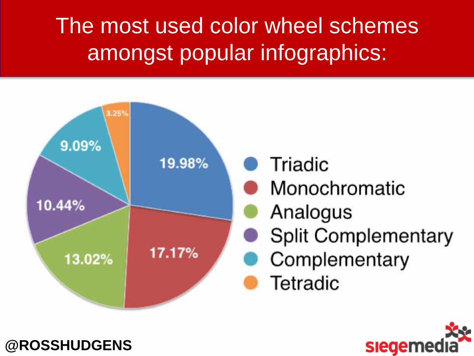
The most used color wheel schemes
amongst popular infographics:
@ROSSHUDGENS

What’s a Triadic Color Scheme?
A triadic color scheme
uses colors that are
evenly spaced around
the color wheel. Triadic
color harmonies tend to
be quite vibrant.
@ROSSHUDGENS

What’s a Monochromatic Color Scheme?
Monochromatic color
schemes are derived
from a single base hue
and extended using its
shades, tones and tints.
@ROSSHUDGENS

What Industries’ InfographicsDo Best on Twitter?
Anatomy of a “Perfect” Infographic
• <400 Words
• 800x3500+
• Features Blue
• Color Wheel Scheme
• On Health/Entertainment
Read More: http://siegemedia.com/infographics

PART 3:
CONTENT
PROMOTION.

@ROSSHUDGENS
What Days Covert Best for Outreach?Our Outreach Conversion Rates by Day
0% 2% 4% 6% 8%
MONDAY
TUESDAY
WEDNESDAY
THURSDAY

@ROSSHUDGENS
Monday Converts 80% Better Than Thursday.
0% 2% 4% 6% 8%
MONDAY
TUESDAY
WEDNESDAY
THURSDAY

Not sharing the link in our first email
increased our outreach conversions by 63%.
http://www.siegemedia.com/blogger-outreach

In analyzing thousands of
outreach emails, we found the
average converting subject line
to be 64 characters long.
Interactive for Search Engine
Journal: SEO content analysis tool
@ROSSHUDGENS

This differs from bulk
email marketing research,
which found 41-50 to be
the optimal length.
http://marketingsherpa.com/article/chart/subject-line-length-success

*Our sample did not include a test batch of “longer” emails.
In analyzing thousands of
converting emails, we also found
the average converting email to
be 83 words long.*

@ROSSHUDGENS
Our hypothesis? Long enough to
be truly customized, short
enough to be easily readable.

We surveyed lifestyle bloggers and found that
pitching 55 days in front of the holidays is optimal
in order to guarantee a post slot. Pitch now!
http://www.siegemedia.com/pitching-bloggers


http://bit.ly/siege-dal
Ross Hudgens, Founder, Siege Media
@RossHudgens http://siegemedia.com


![[Clement Hal] Clement, Hal - Needle 1 - Needle](https://static.fdocuments.net/doc/165x107/577cb1001a28aba7118b67ae/clement-hal-clement-hal-needle-1-needle.jpg)