
Responsive web-design
19
BECOME RESPONSIVE! Tips to make your design stand out. Responsive is all about enhancing user experience on all screen sizes, and here’s how!
-
Upload
sopan-ganage -
Category
Internet
-
view
79 -
download
0
Transcript of Responsive web-design
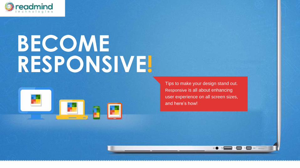
BECOMERESPONSIVE!
Tips to make your design stand out.
Responsive is all about enhancing
user experience on all screen sizes,
and here’s how!

1 Introduction
2 What is a responsive web design?
3 Responsive vs static web design.
4 Why choose responsive web design?
5 Good to know facts!
6 How can you make your design stand out?
7 Conclusion
CONTENT

STARTING WITH FACTS..By 2015,mobile web users will exceed
1,000,000,000.

You have no idea which device your
website is going to be viewed on..So
what do you do?

INTRODUCE”Responsive”
to your Web Design!

RESPONSIVEDESIGN 101
A website with responsive design
changes its appearance and layout to
suit the screen size it is being viewed
on.
The website content is coded using
standard HTML codes, and CSS is
added to target different device widths
with breakpoints.

RESPONSIVE OVER STATICThe set width of a website makes it
look the same on all devices, resulting
in horizontal scrolling; a big turn off
when you’re viewing it on mobile
devices.
The fluid grids and media queries used
to design responsive websites make
the website elements scalable based
on the device it is being viewed on.
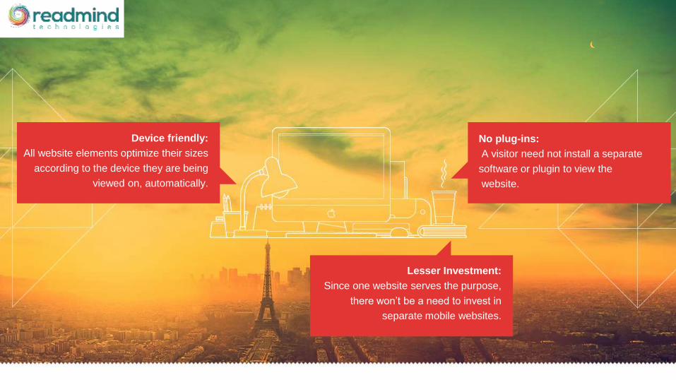
Device friendly:
All website elements optimize their sizes
according to the device they are being
viewed on, automatically.
No plug-ins:
A visitor need not install a separate
software or plugin to view the
website.
Lesser Investment:
Since one website serves the purpose,
there won’t be a need to invest in
separate mobile websites.
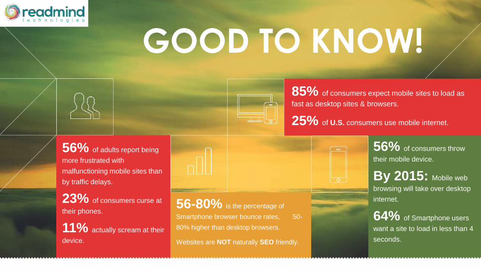
85% of consumers expect mobile sites to load as
fast as desktop sites & browsers.
25% of U.S. consumers use mobile internet.
56% of adults report being
more frustrated with
malfunctioning mobile sites than
by traffic delays.
23% of consumers curse at
their phones.
11% actually scream at their
device.
56-80% is the percentage of
Smartphone browser bounce rates, 50-
80% higher than desktop browsers.
Websites are NOT naturally SEO friendly.
56% of consumers throw
their mobile device.
By 2015: Mobile web
browsing will take over desktop
internet.
64% of Smartphone users
want a site to load in less than 4
seconds.
GOOD TO KNOW!

Since everyone is flocking towards
responsive, you need your website to
stand out. But, how?

Keep your website optimized at all times to offer
the same quality browsing experience across all
devices.
OFFER QUALITY!
Research layouts and pick the one best suited
for RWD. Avoid using complex divs, absolute
positioning and fancy flash or java script enabled
elements to help reduce load time and site
adjustment technicalities.
BE LAYOUT WISE!

BREAK IT UP WELL!
› Avoid making a text heavy website.
› Break up text by inserting spaces
and apt images.
› Make your website ready for the
popular resolutions (as follows).

© 1999 - 2014 IX Web Hosting. All rights reserved
FLEX THE IMAGES!
Flex all your images to a certain extent by using a
simple layout. Ensure all your site elements are
responsive by using adaptive sizing. A popular tool
in use for the same is
An alternative to the above would be storing
multiple size images to suit the varied screen
resolutions they are going to be viewed on; but this
takes up a lot of bandwidth.
200Kb
1382px x 778px
200Kb
1382px x 778px
30Kb
480px x 271pxAdaptive Images.

Make use of programs like GZIP to
compress all your website elements - text,
images, audio, video, etc.
Compressing lowers the number of bytes
sent per web page across various
networks to make your content easily
accessible and browsable on all devices.
COMPRESSING ISN’T BAD!

Get rid of all the excess
elements and offer only what is
vital.
Mobile devices don’t support
heavy websites, so remember to
eliminate a few elements from
your desktop ready website to
make it more mobile.
NO EXCESS BAGGAGE!

Keep your website live on the World Wide
Web in the most efficient manner by
handing over the technicalities to web
hosts like
Depending on the resource needs of your
website, you can pick from these hosting
plans:
› Shared Hosting
› Dedicated Server
› Reseller Hosting
› VPS
› Cloud Hosting
GET HOSTED!
IX Web Hosting.

Established in 1999, IX Webhosting offers
hosting services and domain services. With IX,
you’ll get the following benefits:
› Personal (and exceptional) customer support
› Guaranteed zero risk
› Cutting edge technology
› An experienced and interactive community.
And, to top it all, all of its plans come at affordable
prices. So host your website with IX, and enjoy
great services!
WHY IX WEB HOSTING ?
webhosting
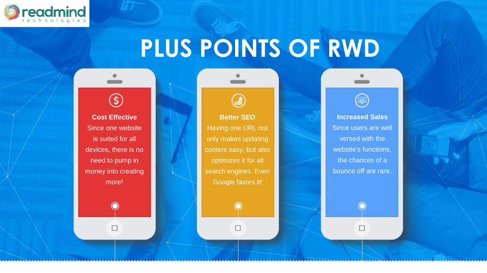
Cost Effective
Since one website
is suited for all
devices, there is no
need to pump in
money into creating
more!
Better SEO
Having one URL not
only makes updating
content easy, but also
optimizes it for all
search engines. Even
Google favors it!
Increased Sales
Since users are well
versed with the
website's functions,
the chances of a
bounce off are rare.
PLUS POINTS OF RWD

webhosting
RWD is the way new generation websites are going. Considering you might
just lose out on 50% of your traffic by not keeping up with the trends, it’s a
wise call to switch to ‘responsive’.
CONCLUSION