

Responsive images, an html 5.1 standard
71
Responsive Images An HTML 5.1 Standard CSS Day - March 17 th 2017 www.andreaverlicchi.eu - @verlok
-
Upload
andrea-verlicchi -
Category
Internet
-
view
95 -
download
4
Transcript of Responsive images, an html 5.1 standard
Responsive ImagesAn HTML 5.1 Standard
CSS Day - March 17th 2017
www.andreaverlicchi.eu - @verlok

Hello, #cssday!
• Front-end ArchitectYOOX NET-A-PORTER GROUPynap.com (we’re hiring!)
• Addicted to front-end development, performance optimization, UX, A11Y
• www.andreaverlicchi.eu@verlok on Twitter

• 2004 - Initial idea• 2008 - Working draft • 2011 - Last call• 2012 - Candidate recommendation
• 2014 - Recommendation
The HTML 5 era
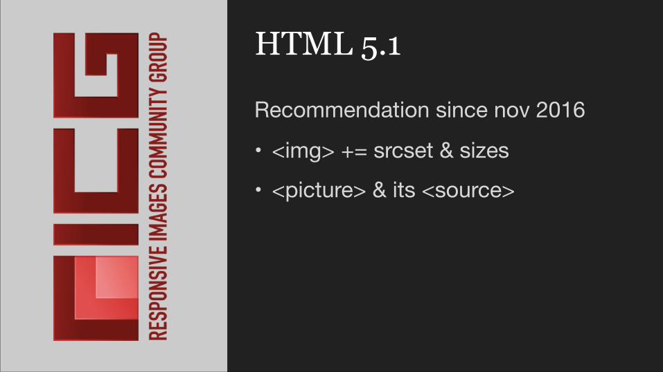
HTML 5.1
Recommendation since nov 2016
• <img> += srcset & sizes• <picture> & its <source>

Responsive design? Responsive images?

Responsive web design
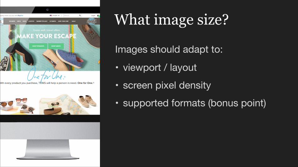
Images should adapt to:
• viewport / layout• screen pixel density• supported formats (bonus point)
What image size?

• Take a single big fat image• Serve it to every device in every
layout• Make the browser scale it down
Option A
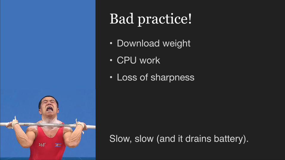
• Download weight • CPU work• Loss of sharpness
Bad practice!
Slow, slow (and it drains battery).
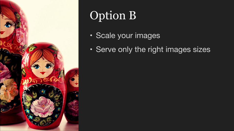
• Scale your images• Serve only the right images sizes
Option B
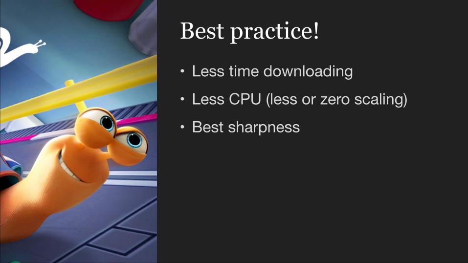
• Less time downloading• Less CPU (less or zero scaling)• Best sharpness
Best practice!
Screen density? Optimize for -?
hiDpi “Retina” displays
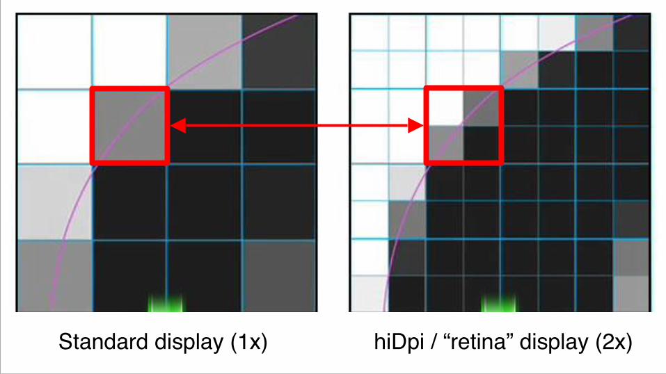
Standard display (1x) hiDpi / “retina” display (2x)
“A pixel is not a pixel” (Peter-Paul Koch)

Do we want our images to be stretched?

3 2 1
NO!
#1Support for hiDpi
displays
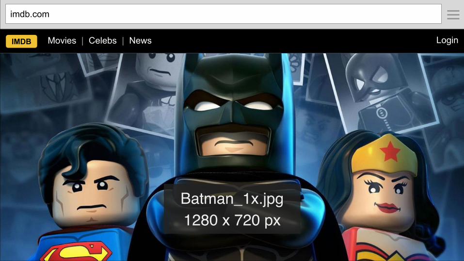
Batman_1x.jpg 1280 x 720 px
imdb.com
IMDB Movies | Celebs | News Login
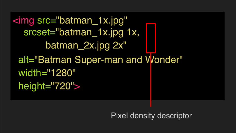
<img src="batman_1x.jpg"
alt="Batman Super-man and Wonder" width="1280" height="720">
srcset="batman_1x.jpg 1x, batman_2x.jpg 2x"
Pixel density descriptor

#2Support different
image sizes

batman_1024w.jpg 1024 x 576 px
batman_768w.jpg 768 x 432 px
imdb.com imdb.com
IMDB Movies | Celebs | News Login IMDB Movies | Celebs Login

VariableKnown by author when writing the code?
Known by browser when loading the page?
Viewport dimensions
no yes
Image size yes no
Screen density no yes
Source files’ dimensions
yes no
yes
yes
sizes attribute
srcset (w) attribute
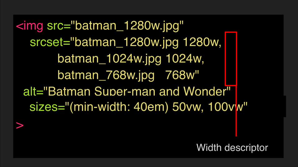
<img src="batman_1280w.jpg"
alt="Batman Super-man and Wonder" >
srcset="batman_1280w.jpg 1280w, batman_1024w.jpg 1024w, batman_768w.jpg 768w"
sizes="100vw"sizes="(min-width: 40em) 50vw, 100vw"
Width descriptor


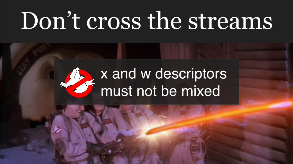
Don’t cross the streams
x and w descriptors must not be mixed

srcset
#3Support different image sizes
and ratios

batman_1024w_l.jpg 1024 x 576 px
batman_512w_p.jpg 512 x 576px
imdb.com imdb.com
IMDB Movies | Celebs | News Login IMDB Movies | Celebs Login

<picture>
</picture>
<img src="batman_512w_p.jpg" srcset="batman_512w_p.jpg 1x, batman_1024w_p.jpg 2x" alt="Batman Super-man and Wonder">
<source media="(min-width: 600px)" srcset="batman_1024w_l.jpg 1x, batman_2048w_l.jpg 2x">

#4Serve WebP to
supporting browsers (maybe)

WebP?
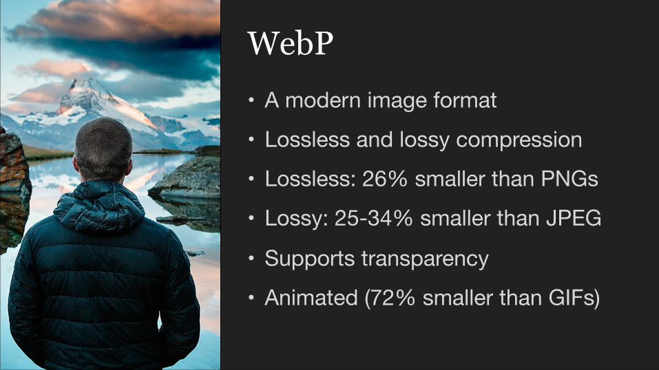
• A modern image format• Lossless and lossy compression• Lossless: 26% smaller than PNGs• Lossy: 25-34% smaller than JPEG
• Supports transparency• Animated (72% smaller than GIFs)
WebP
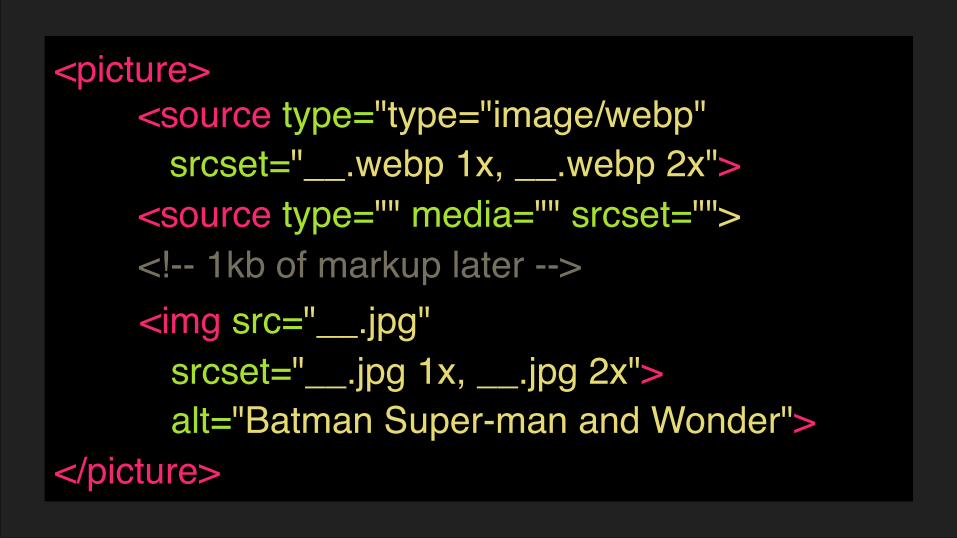
<picture>
</picture>
<img src="__.jpg" srcset="__.jpg 1x, __.jpg 2x"> alt="Batman Super-man and Wonder">
<source type="type="image/webp" srcset="__.webp 1x, __.webp 2x"><source type="" media="" srcset=""><!-- 1kb of markup later -->
#5 Understand how many
sizes you need
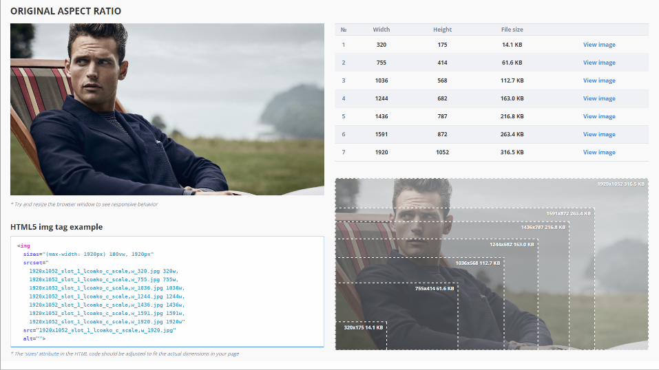
5A - Responsive Image Breakpoints Generator


5B - Do it yourself
Why?
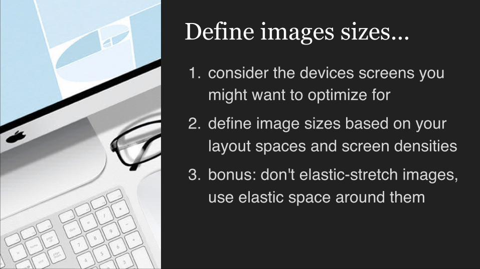
1. consider the devices screens you might want to optimize for
2. define image sizes based on your layout spaces and screen densities
3. bonus: don't elastic-stretch images, use elastic space around them
Define images sizes...

Device & orientation Container width
Screendensity
Physical pixels
iPhone 4/5/5s 320 2 640iPhone 6 375 2 750iPhone 5/5s landscape 568 2 1136iPhone 6 landscape 667 2 1334iPad 768 2 1536iPad landscape 1024 2 2048PC with 1280+ 1280 1 1280PC with 1280+ HiDPI 1280 2 2560
Screen widths & densities
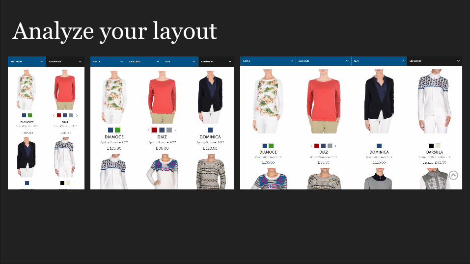
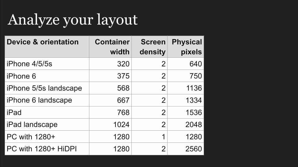
Analyze your layout
Device & orientation Container width
Screendensity
Physical pixels
iPhone 4/5/5s 320 2 640iPhone 6 375 2 750iPhone 5/5s landscape 568 2 1136iPhone 6 landscape 667 2 1334iPad 768 2 1536iPad landscape 1024 2 2048PC with 1280+ 1280 1 1280PC with 1280+ HiDPI 1280 2 2560
Analyze your layout

Device & orientation Container width
Screendensity
Physical pixels
Cols Images width
iPhone 4/5/5s 320 2 640 2 320
iPhone 6 375 2 750 2 375iPhone 5/5s landscape 568 2 1136 2 568iPhone 6 landscape 667 2 1334 2 667
iPad 768 2 1536 3 512iPad landscape 1024 2 2048 4 512
PC with 1280+ 1280 1 1280 4 320PC with 1280+ HiDPI 1280 2 2560 4 640
Analyze your layout
640
512
1
1
2
3
3
4
4
3
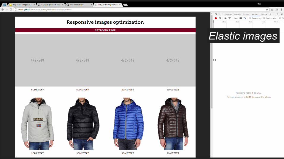
Elastic images

Elastic spaces
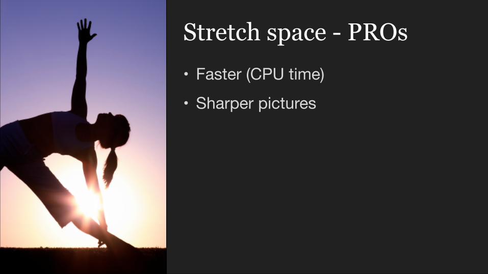
• Faster (CPU time)• Sharper pictures
Stretch space - PROs

• Best with flat background images• You might need to convince your
graphic designer / client
Stretch space - CONs
#6Generate scaled images
(in the cloud)
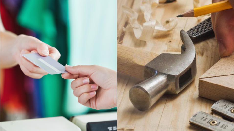

6A - Buy
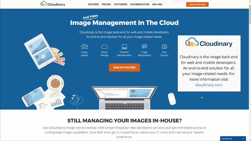

• Cloud Storage• Image Manipulation
• Resize
• Crop (face detection)• Conversion
• Powerful Admin• Fast Delivery


6B - Make

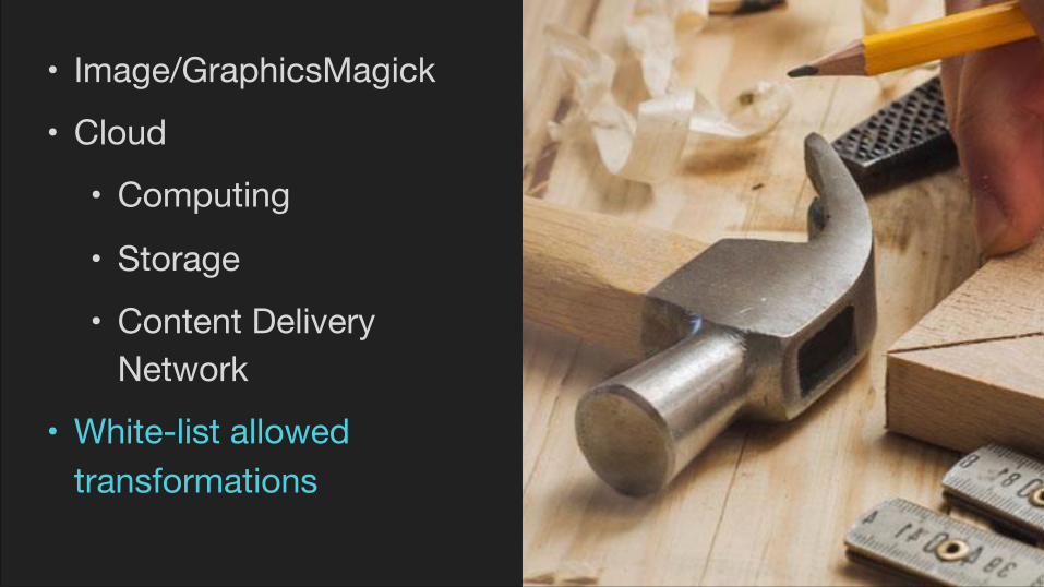
• Image/GraphicsMagick• Cloud
• Computing
• Storage• Content Delivery
Network• White-list allowed
transformations

(breathe)
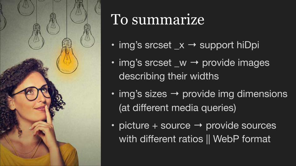
• img’s srcset _x → support hiDpi• img’s srcset _w → provide images
describing their widths• img’s sizes → provide img dimensions
(at different media queries)• picture + source → provide sources
with different ratios || WebP format
To summarize
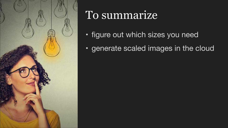
• figure out which sizes you need• generate scaled images in the cloud
To summarize

…psst…
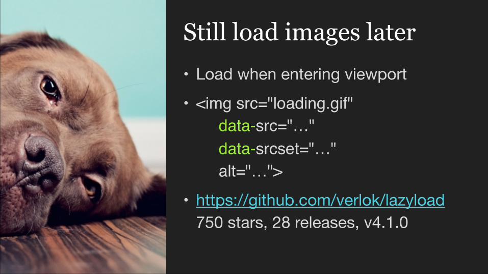
• Load when entering viewport• <img src="loading.gif"
data-src="…" data-srcset="…" alt="…">
• https://github.com/verlok/lazyload750 stars, 28 releases, v4.1.0
Still load images later

Questions?

.image {background-image: url(batman_1x.jpg);
}
@media (-webkit-min-device-pixel-ratio: 2), (min-resolution: 192dpi) { }
(min-resolution: 2dppx) {background-image: url(batman_2x.jpg);background-size: 800px 1000px;

• Srcset & Sizes by Eric Portishttps://ericportis.com/posts/2014/srcset-sizes/
• Responsive images in practicehttps://alistapart.com/article/responsive-images-in-practice
• WebP Image Formathttps://developers.google.com/speed/webp/
References

• Responsive breakpoints generatorhttp://www.responsivebreakpoints.com
• Manual calculations based on layouthttp://www.andreaverlicchi.eu/responsive-images-you-dont-need-picture-tag/
• Cloudinaryhttp://www.cloudinary.com
References