Responsive Flexbox Inspiration (Responsive Day Out)
42
Flexbox Zoe Mickley Gillenwater @zomigi Responsive Day Out June 2015 Inspiration Responsive
-
Upload
zoe-gillenwater -
Category
Design
-
view
317 -
download
3
Transcript of Responsive Flexbox Inspiration (Responsive Day Out)

Flexbox Zoe Mickley Gillenwater @zomigi Responsive Day Out
June 2015
Inspiration
Responsive

I work for


674,000+ properties�42 languages�54 currencies

Content extremes on Booking.com Shortest property name: 2 characters
Longest property name: 109 characters

How big do I make this thing?

%�em/rem�vw/vh

Relative units of measurement are your best guess at the
ideal, but they’re still a guess.

Flexbox gets us closer to the ideal, because it lets us design
without units.
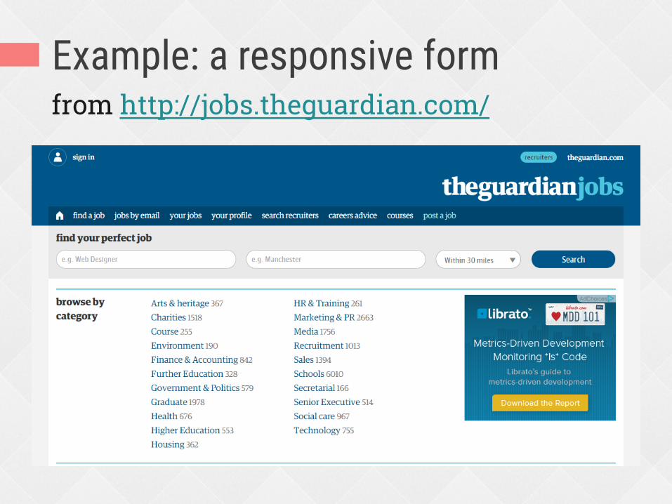
Example: a responsive form from http://jobs.theguardian.com/

My copy of that form Same floats, same percentage widths

The trouble with explicit sizing Since the select and button are sized by a percentage, not sized automatically by their content, this can happen:
Box too small for its content Box too big for its content

Use the flex property instead Tells browser starting size (including content size) and whether item can grow or shrink
width: 33.333% flex: auto
Fill up remaining space
width: 16.666% flex: none
Size to content exactly

Form fields are a pain in the butt The fields and button don’t all match each other exactly in height
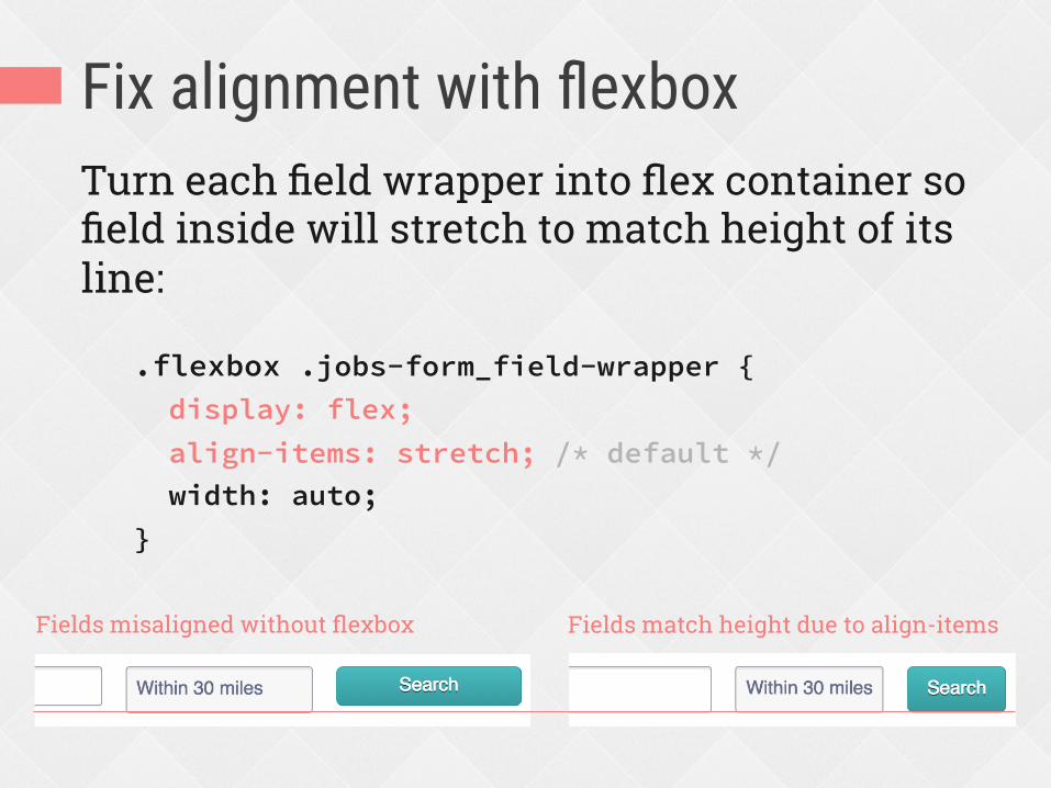
Fix alignment with flexbox Turn each field wrapper into flex container so field inside will stretch to match height of its line:
.flexbox .jobs-form_field-wrapper { display: flex; align-items: stretch; /* default */ width: auto; }
Fields misaligned without flexbox Fields match height due to align-items

Smarter sizing
Non-flexbox
Flexbox enhanced

Content-driven breakpoints aren’t perfect.

Automatic breakpoint with flexbox Booking’s responsive customer service form doesn’t use any media queries
http://www.booking.com/content/cs.html

All of the CSS for those 2 layouts form.cs-message { display: flex; flex-flow: row wrap; margin-right: -10px; } input.cs-message__text { flex: 1 0 40%; width: 43%; float: left; margin-right: 10px; padding: 8px 10px; }
1 property creates 2 responsive layouts, both always full width

Taking advantage of variable space Task: add a message about low availability of the room price shown: “We have only X left on our site!”
How about right here in this lovely big gap?

Taking advantage of variable space Problem: the gap is not always big enough to hold a sentence of text

Taking advantage of variable space Solution: use flexbox to place text beside price when space allows; otherwise, it can wrap below price

Taking advantage of variable space Non-flexbox Flexbox enhanced

Improved wrapping Non-flexbox Flexbox enhanced

Flexbox with float fallback .iw_mini_details_wrapper { display: flex; flex-wrap: wrap; justify-content: space-between; align-items: baseline; } .iw_mini_review_score_wrapper { float: left; } .iw_mini_price_wrapper { float: right; }
Flexbox properties on container override floating automatically in supporting browsers
Floating gets used by old browsers

Improved wrapping in RWD layout

Improved wrapping in RWD layout With float or text-align With flex or justify-content

These examples don’t look wrong or broken without flexbox. �
�Flexbox just enhances their sizing
and spacing to look better.

Flexbox can also enhance visual ordering.

Reordering mobile content
In RWD, narrow-view (mobile) stacking order doesn’t always match needed HTML order for wide-view (desktop) layout
Keep HTML order needed for desktop and use flexbox order property only on mobile, since browser support is better and layout is simpler there
Problem Solution

Example: moving a photo on mobile

Example: moving a photo on mobile Flexbox enhanced Non-flexbox

Reorder for good, not evil.

Reordering on The Guardian Stacking order you see when narrow is the HTML order, unchanged
1
2
3
4
5
6

Reordering on The Guardian Reordered using flexbox when wide
1 2 3
4 5 6
flex-direction: row-reverse
flex-direction: row-reverse

Flexbox requires a mental shift in how you think about and
approach layout.

RWD is not binary.�Responsiveness is a continuum.�
�Flexbox can help make your site
more responsive.

Flexbox is not ALL or NOTHING

Thanks!
Zoe Mickley Gillenwater @zomigi [email protected] zomigi.com | stunningcss3.com | flexiblewebbook.com
Photo credits: “oh.my.goshk” by Abulic Monkey and “A Cone Undone” by patersor on Flickr.