
Responsive Design in iMIS Part 2
32
Responsive Design in iMIS Part 2: Deep Dive Andrea Robertson Melissa Burpo
-
Upload
andrea-robertson -
Category
Technology
-
view
164 -
download
0
Transcript of Responsive Design in iMIS Part 2

Responsive
Design in iMIS
Part 2: Deep Dive
Andrea Robertson
Melissa Burpo

Agenda

overwhelming.
Responsive design can be…

Where should you begin?

Mobile First
Mobile First is the idea that web sites
should first be designed for mobile devices,
including only those tasks/items that website
visitors use most. Then as screen real estate
increases, add in tasks/features as needed
based on user priority.
http://www.digitalgov.gov/2013/09/30/mobile-first/

Mobile First
• For design and development, start with
the smallest size and work your way up
• Advantages:
– Focus on the content that you really need
– Faster performance for mobile

Mobile First Workflow
Starting with a small piece of the overall design:
1. Create sketches of the component at different
screen sizes.


Mobile First Workflow
Starting with a small piece of the overall design:1. Create sketches of the component at different
screen sizes.
2. Open the component in the browser at ~320px and make it look good.
3. Make the browser wider until the component looks bad. Use media queries to fix it.
4. Repeat step 3 until you reach the widest width.
5. Check to make sure all screen sizes still look good in your browser.
6. Test in real devices. Fix any issues.

Demo.container { max-width: 960px; /* ... */ }
@media (min-width: 500px) {.footer-content-section {
float: left;width: 50%;
} }@media (min-width: 768px) {
.footer .footer-social {width: 33.3333333333%;
}.footer .footer-promo-container {
width: 66.6666666667%; } }
@media (max-width: 768px) {.header-social {display: none !important;
} }

Start with the small screen first,
then expand until it looks like shit.
Time for a breakpoint!
Stephen Hay

Design Considerations
You may want to consider:
• Increasing base font size
• Making buttons bigger
• Providing secondary navigation
• Increasing width of desktop layout

Design Considerations
This is a good time to refactor:
• Inline styling
• Inline JavaScript
• Tables for layouts
• Text in images
• Replace image gradients and rounded
corners with CSS3

Internet Explorer 8 +
Responsive Design
• The problem:
– IE8 does not support media queries
– Only styles outside of a media query are
interpreted
– For mobile-first designs, they will get the
mobile experience

Internet Explorer 8Using a fallback class
• Our solution:
– Use Modernizr to detect Media Query
support
– Add class ‘no-mqs’ to the <html> tag
– Repeat any styles that apply to desktop
using a .no-mqs wrapper

Internet Explorer 8Using a fallback class
.nav-primary {text-transform: uppercase;
}
@media (min-width: 768px) {.nav-primary {
float: right;clear: right;margin-top: 9px;
}}
.no-mqs .nav-primary {float: right;clear: right;margin-top: 9px;
}

Use Sass and the Breakpoint plugin to
quickly generate media queries and
.no-mqs fallbacks
Sass + Breakpoint
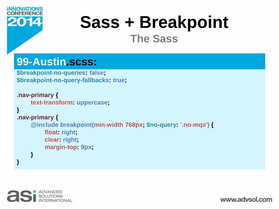
Sass + BreakpointThe Sass
$breakpoint-no-queries: false;
$breakpoint-no-query-fallbacks: true;
.nav-primary {
text-transform: uppercase;
}
.nav-primary {
@include breakpoint(min-width 768px; $no-query: '.no-mqs') {
float: right;
clear: right;
margin-top: 9px;
}
}
99-Austin.scss:

.nav-primary {
text-transform: uppercase;
}
@media (min-width: 768px) {
.nav-primary {
float: right;
clear: right;
margin-top: 9px;
}
}
.no-mqs .nav-primary {
float: right;
clear: right;
margin-top: 9px;
}
Sass + BreakpointCompiled CSS
99-Austin.css:

Testing


Testing
Recommendations
• Use real devices as much as possible
• Test in a wide range of screen sizes
• Try portrait and landscape orientations
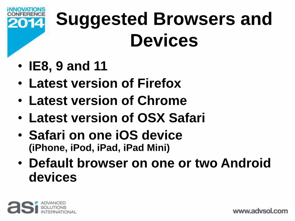
Suggested Browsers and
Devices
• IE8, 9 and 11
• Latest version of Firefox
• Latest version of Chrome
• Latest version of OSX Safari
• Safari on one iOS device (iPhone, iPod, iPad, iPad Mini)
• Default browser on one or two Android devices

Testing Tools
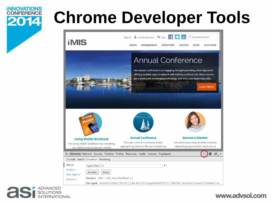
Chrome Developer Tools

Web Developer Extension
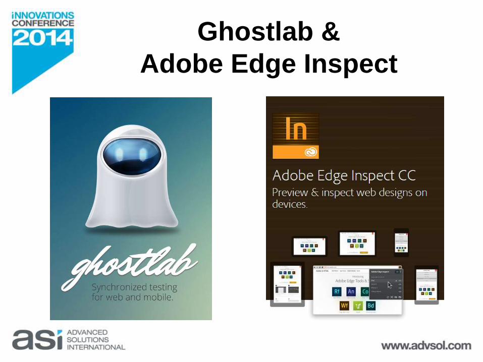
Ghostlab &
Adobe Edge Inspect
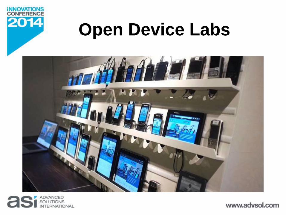
Open Device Labs

Design is about making things
good (and then better) and right
(and fantastic) for the people who
use and encounter them.
Matt Beale
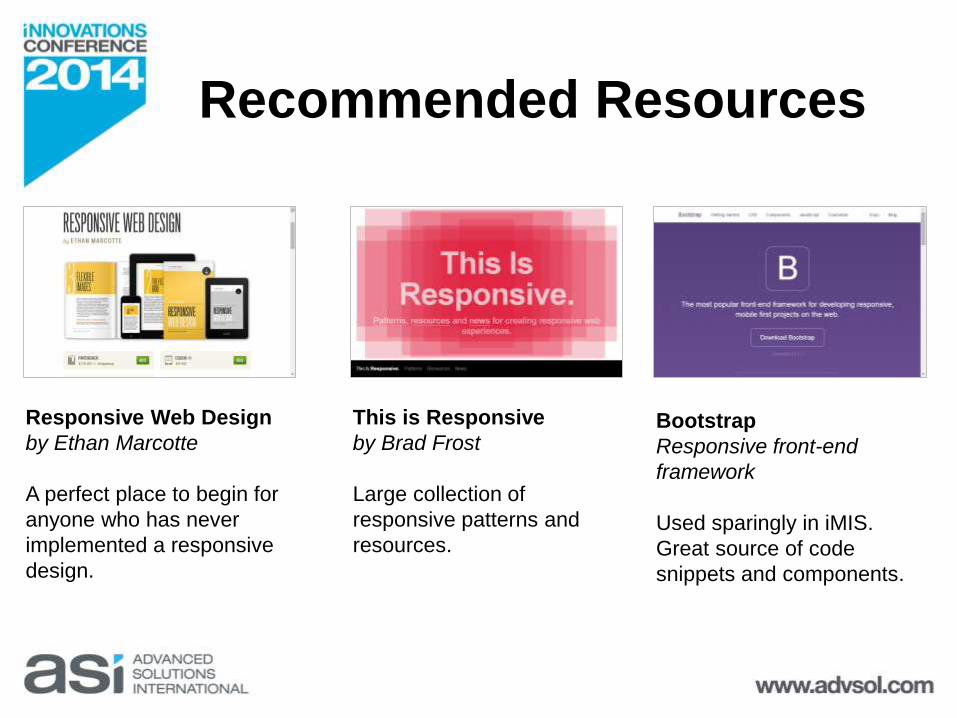
Responsive Web Design
by Ethan Marcotte
A perfect place to begin for
anyone who has never
implemented a responsive
design.
This is Responsive
by Brad Frost
Large collection of
responsive patterns and
resources.
Bootstrap
Responsive front-end
framework
Used sparingly in iMIS.
Great source of code
snippets and components.
Recommended Resources

Thanks!Andrea Robertson
@RoboAndie
Melissa Burpo@MelissaBurpo

![Dopis [IMiS/View] · Title: Dopis [IMiS/View] Author: nartnik Created Date: 9/26/2017 9:59:40 AM](https://static.fdocuments.net/doc/165x107/6070d6d914765216012ae044/dopis-imisview-title-dopis-imisview-author-nartnik-created-date-9262017.jpg)