

Responsive and Responsible
29
RESPONSIVE & RESPONSIBLE @vaibhavkanwal
-
Upload
vaibhav-kanwal -
Category
Design
-
view
4.368 -
download
1
description
Slides from my talk on Responsive Design at BarCamp 8 Delhi at TLabs, New Delhi on 4th August 2012 I talk on how Startups can use Media Queries to create device agnostic experiences using a single version of their websites/web apps References : Pragmatic Responsive by Stephanie Rieger in Nashville for Breaking Development 2011
Transcript of Responsive and Responsible
RESPONSIVE &
RESPONSIBLE@vaibhavkanwal
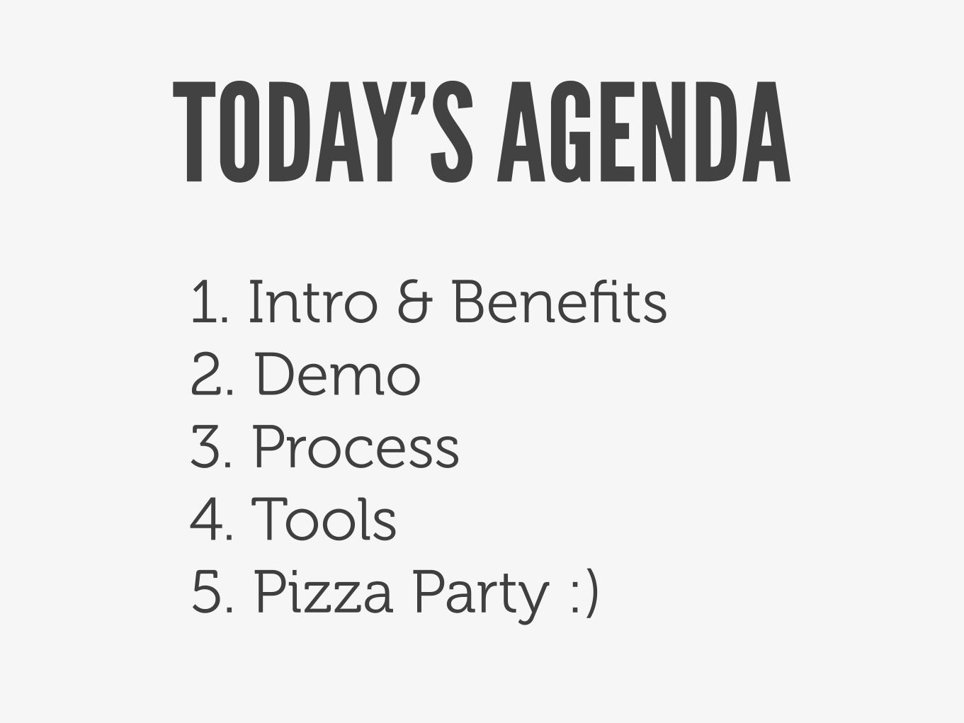
TODAY’S AGENDA1. Intro & Benefits2. Demo3. Process4. Tools5. Pizza Party :)
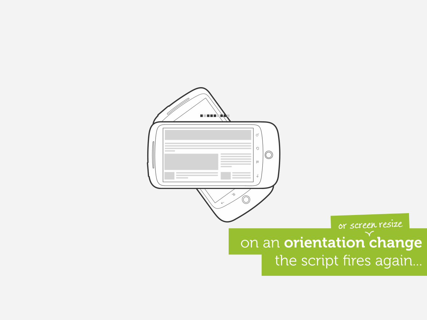
the script fires again... on an orientation change
or screen resize
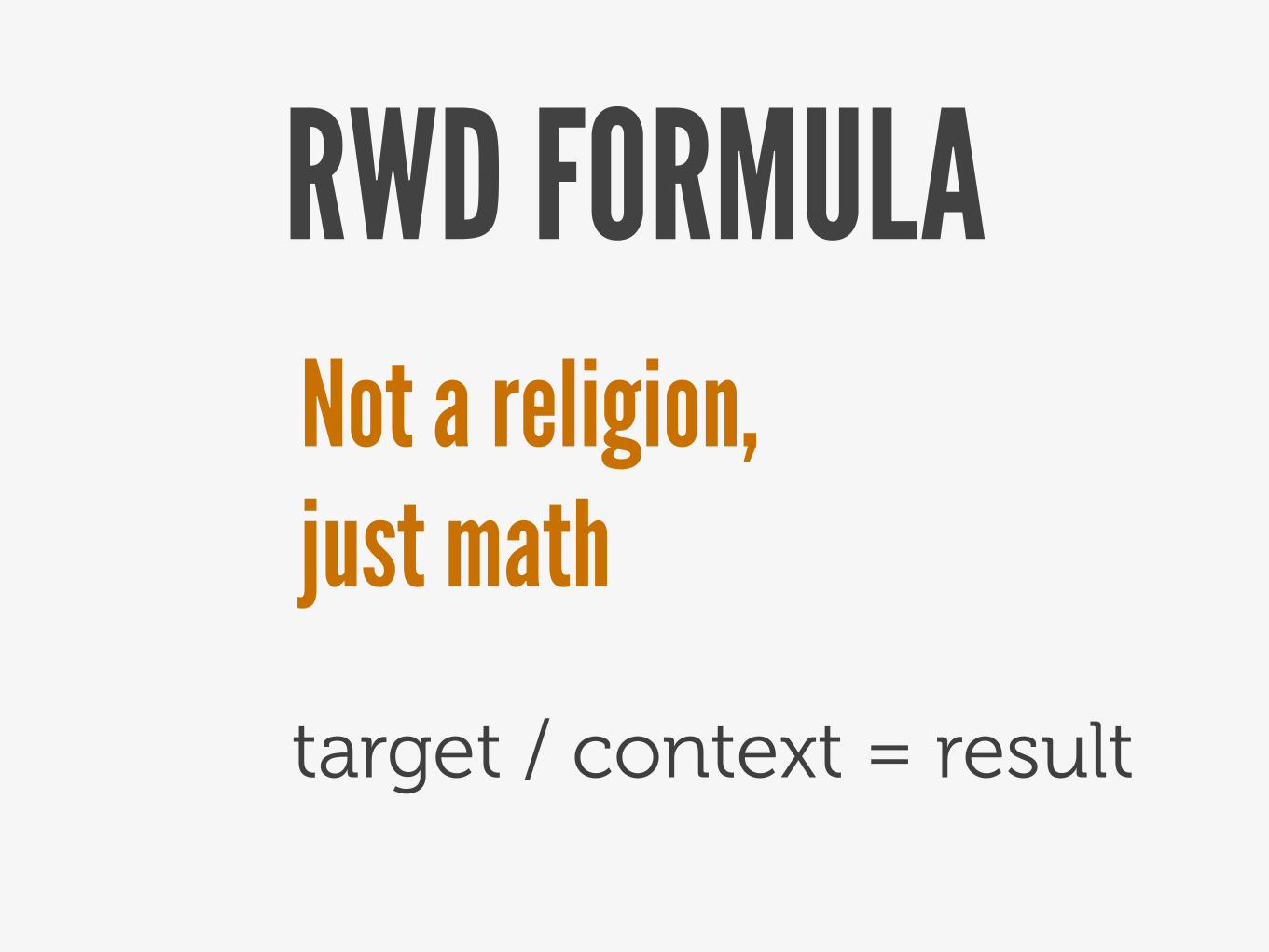
RWD FORMULANot a religion, just math
target / context = result
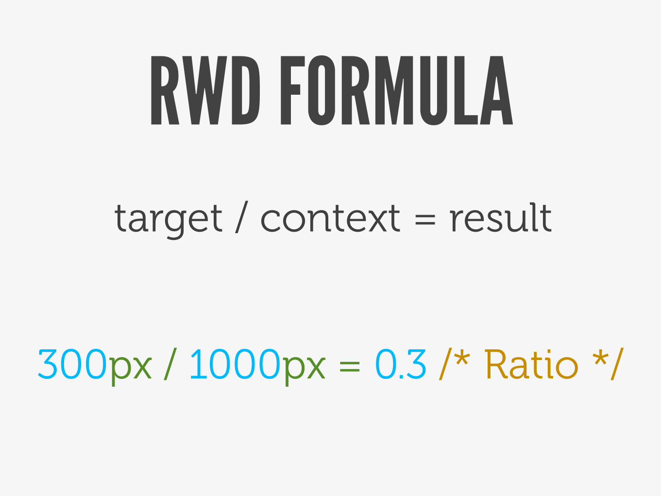
RWD FORMULAtarget / context = result
300px / 1000px = 0.3 /* Ratio */
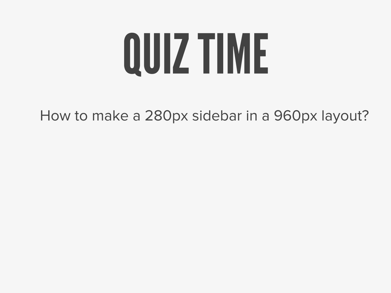
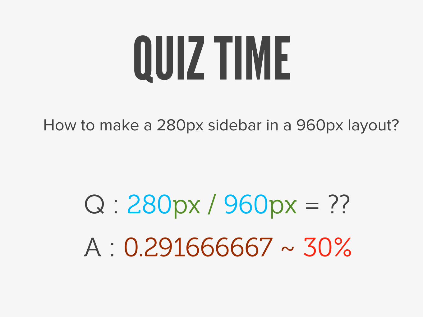
QUIZ TIMEHow to make a 280px sidebar in a 960px layout?
QUIZ TIMEHow to make a 280px sidebar in a 960px layout?
Q : 280px / 960px = ??
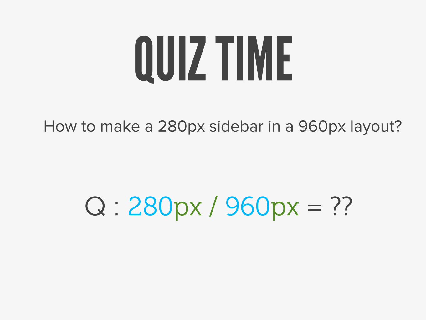
QUIZ TIMEHow to make a 280px sidebar in a 960px layout?
Q : 280px / 960px = ??
A : 0.291666667 ~ 30%
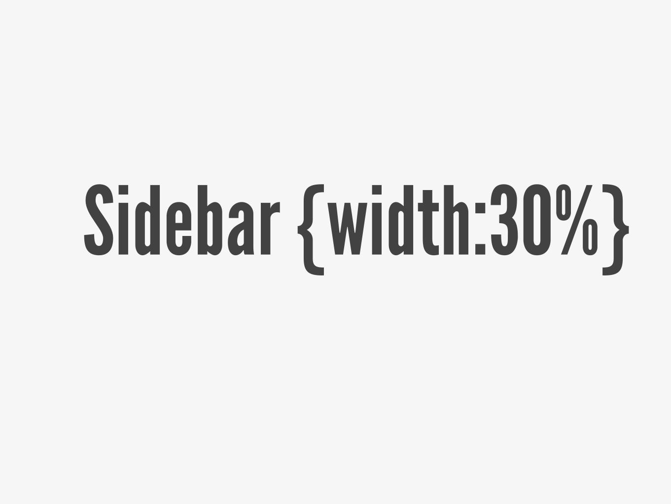
Sidebar {width:30%}
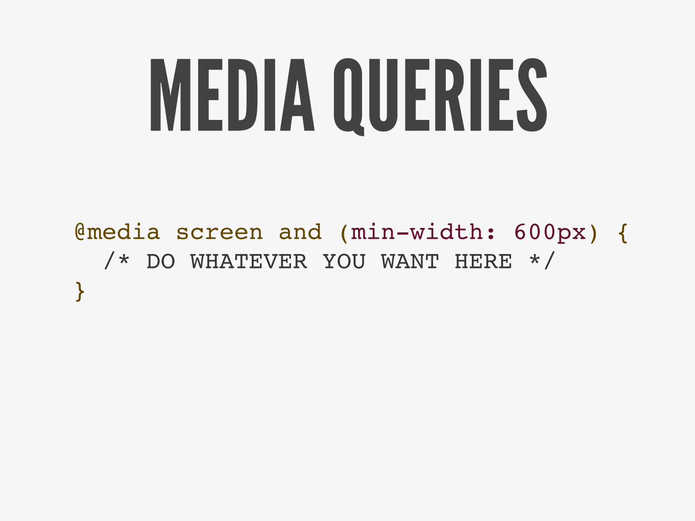
MEDIA QUERIES@media screen and (min-width: 600px) { /* DO WHATEVER YOU WANT HERE */}
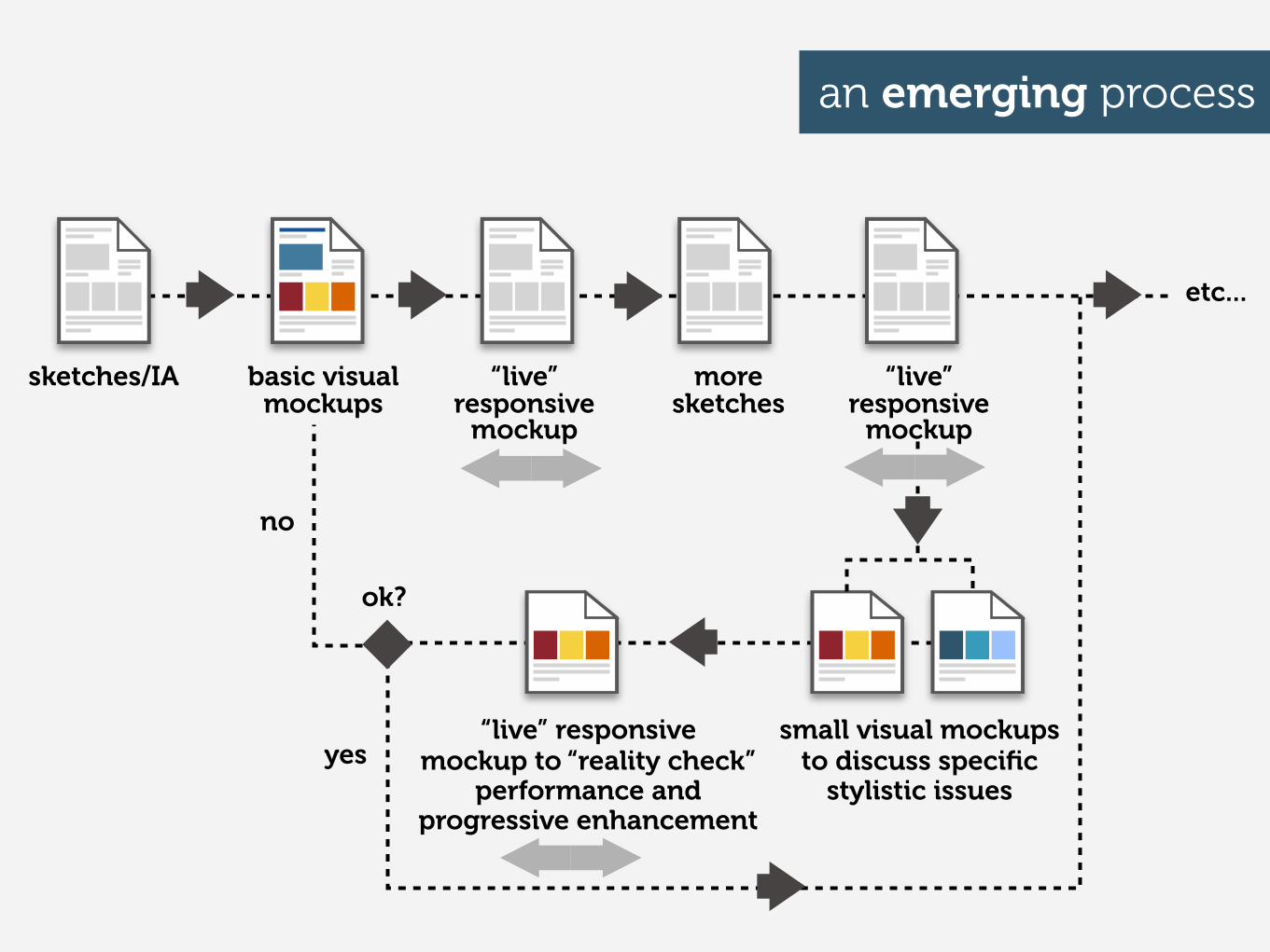
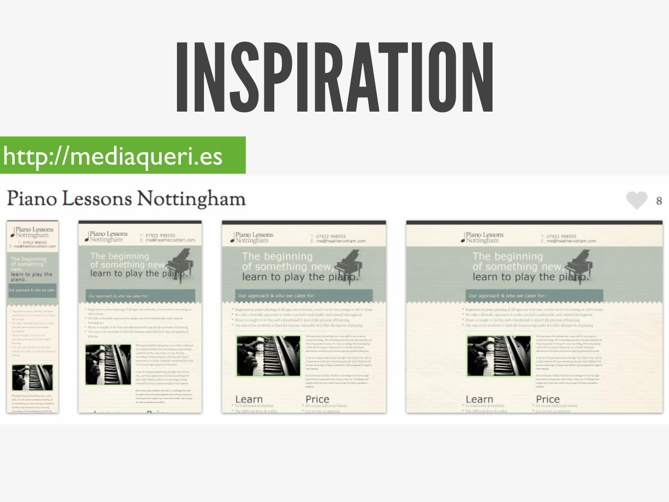
an emerging process
sketches/IA basic visual mockups
“live”responsive
mockup
more sketches
“live”responsive
mockup
small visual mockups to discuss specific
stylistic issues
“live” responsivemockup to “reality check”
performance and progressive enhancement
etc...
ok?
yes
no
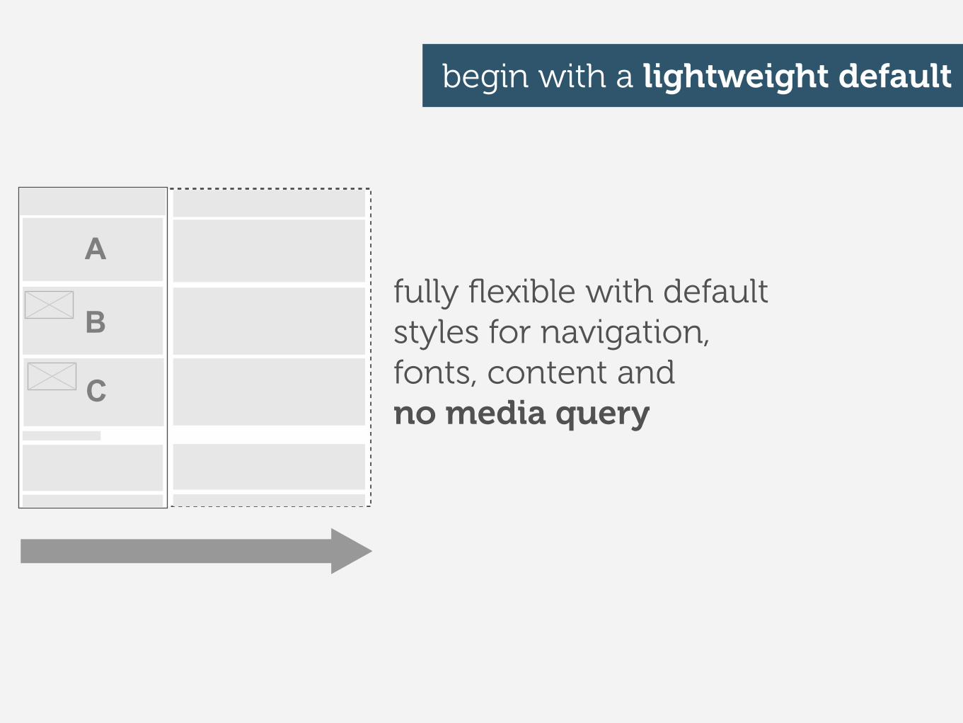
fully flexible with default styles for navigation, fonts, content and no media query
begin with a lightweight default
A
B
C
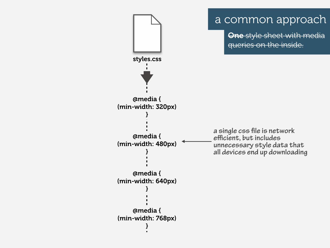
a common approachOne style sheet with media queries on the inside.
styles.css
@media {(min-width: 480px)
}
@media {(min-width: 640px)
}
@media {(min-width: 768px)
}
@media {(min-width: 320px)
}
a single css !le is network e"cient, but includes unnecessary style data that all devices end up downloading
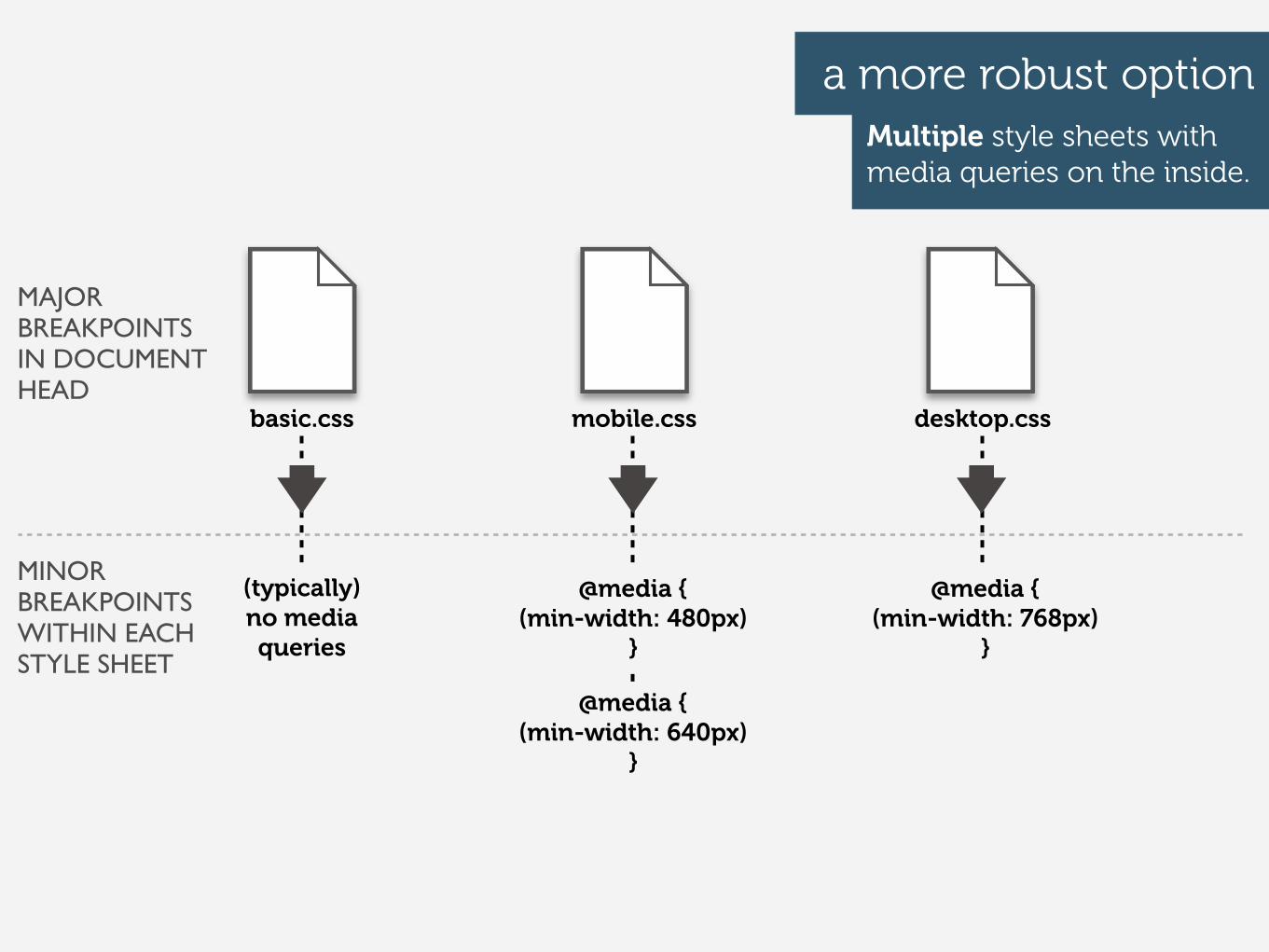
MAJOR BREAKPOINTS IN DOCUMENT HEAD
a more robust optionMultiple style sheets with media queries on the inside.
basic.css mobile.css desktop.css
MINOR BREAKPOINTS WITHIN EACH STYLE SHEET
@media {(min-width: 480px)
}
@media {(min-width: 640px)
}
@media {(min-width: 768px)
}
(typically) no media queries
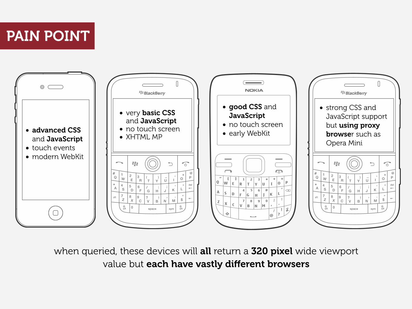
when queried, these devices will all return a 320 pixel wide viewport value but each have vastly di!erent browsers
• advanced CSS and JavaScript
• touch events• modern WebKit
• very basic CSS and JavaScript
• no touch screen• XHTML MP
• good CSS and JavaScript
• no touch screen• early WebKit
• strong CSS and JavaScript support but using proxy browser such as Opera Mini
PAIN POINT
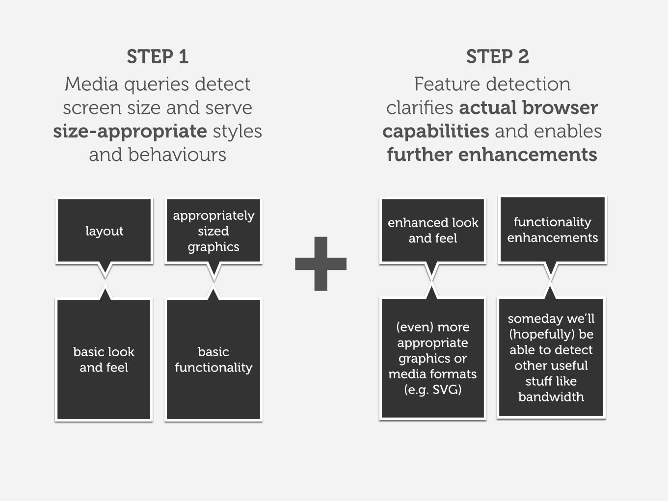
Media queries detect screen size and serve
size-appropriate styles and behaviours
layout
Feature detectionclarifies actual browser capabilities and enables further enhancements
appropriately sized
graphics
enhanced look and feel
basic lookand feel
functionality enhancements
basic functionality
+someday we’ll (hopefully) be able to detect other useful
stu! like bandwidth
(even) more appropriate graphics or
media formats(e.g. SVG)
STEP 1 STEP 2
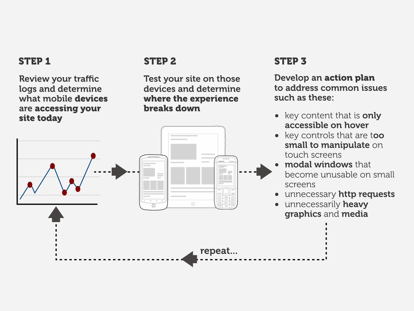
STEP 1 STEP 2 STEP 3
Develop an action planto address common issues such as these:
• key content that is only accessible on hover
• key controls that are too small to manipulate on touch screens
• modal windows that become unusable on small screens
• unnecessary http requests• unnecessarily heavy
graphics and media
Review your tra!c logs and determine what mobile devices are accessing your site today
Test your site on those devices and determine where the experience breaks down
repeat...
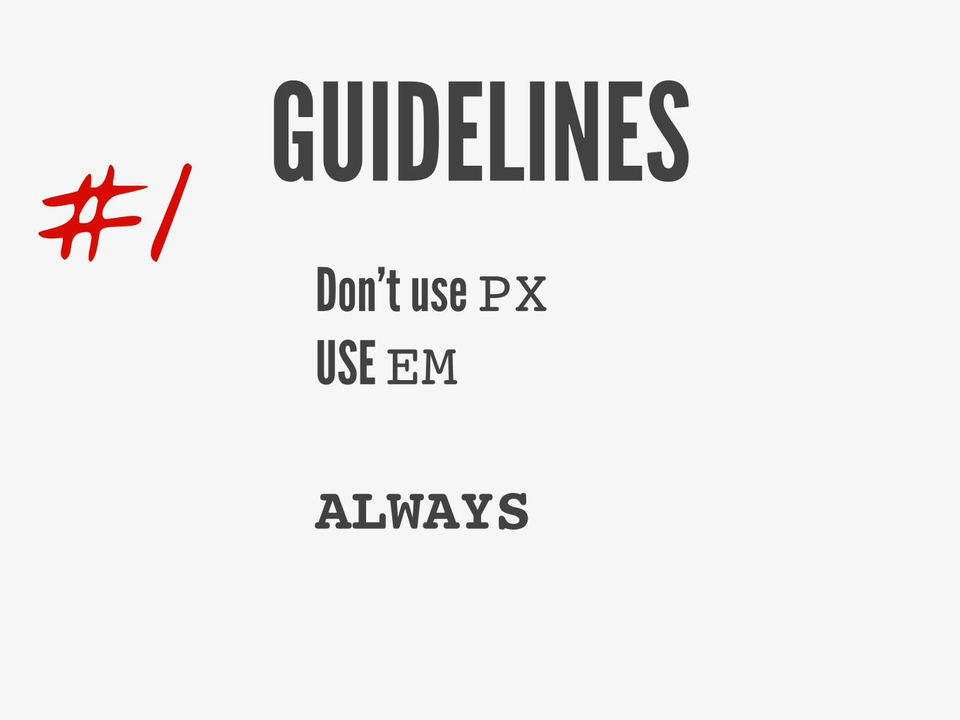
GUIDELINESDon’t use PXUSE EM
ALWAYS
#1
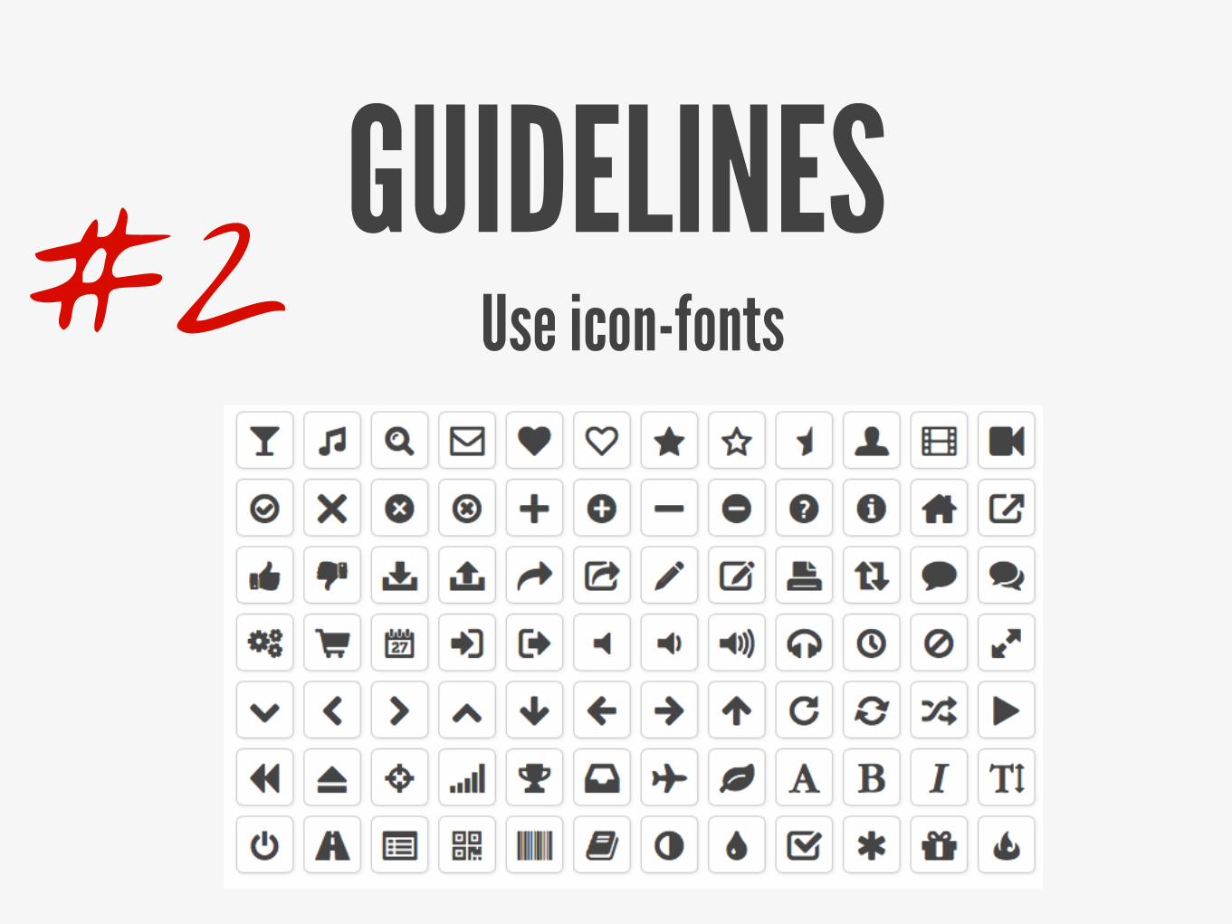
GUIDELINESUse icon-fonts#2
GUIDELINES
Typography
#3
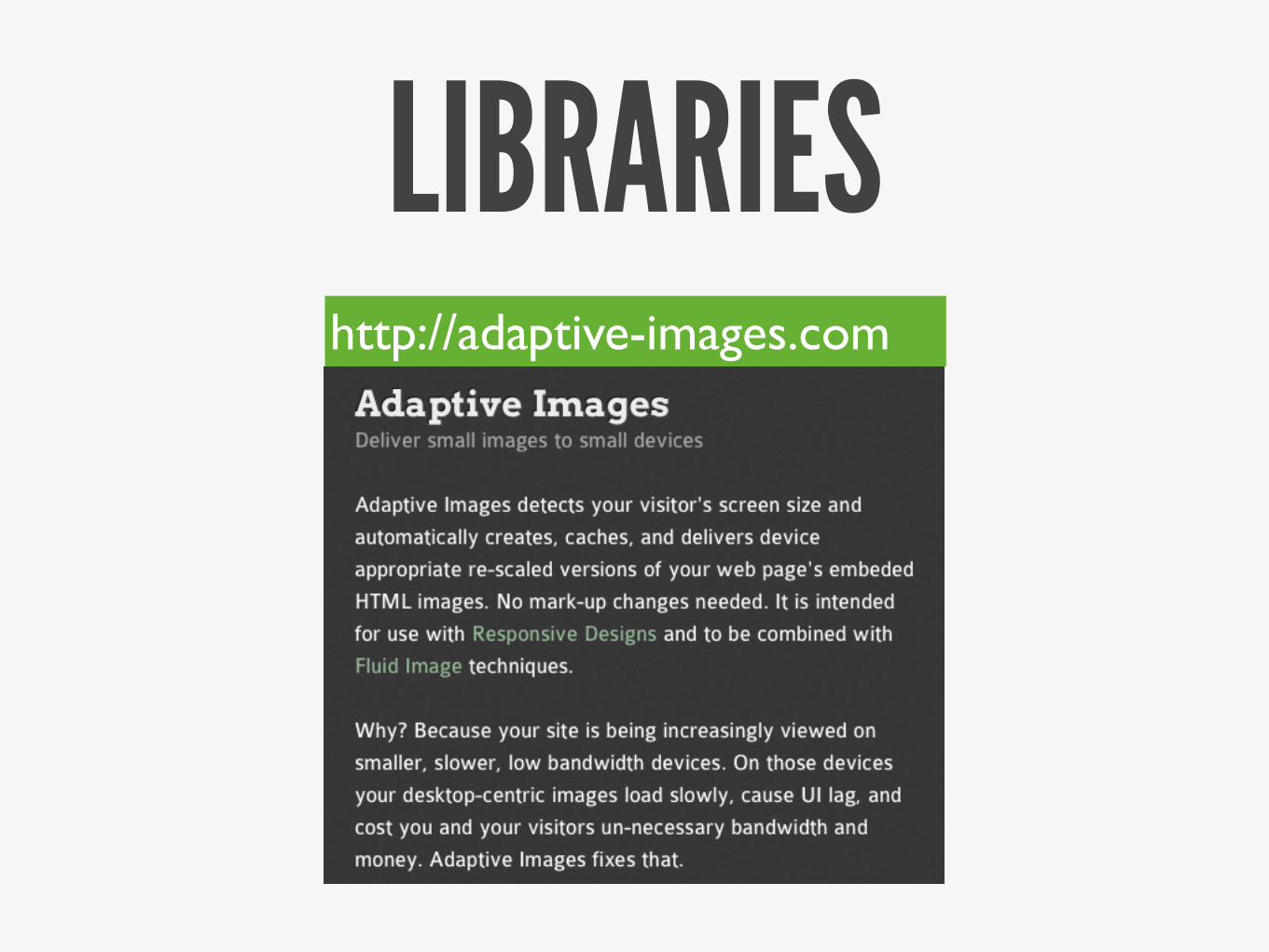
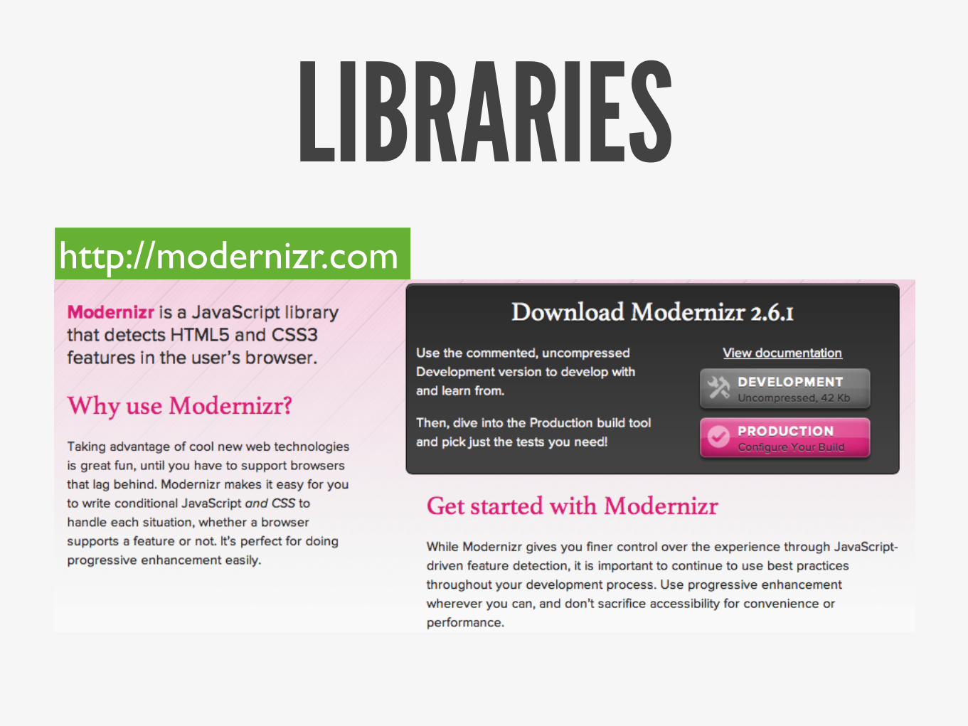
TOOLSEverybody loves free stuff!
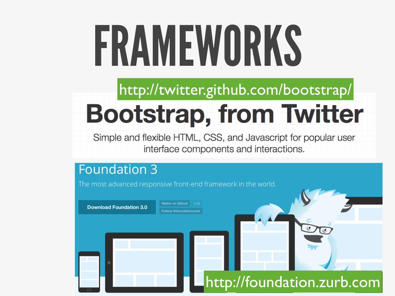
FRAMEWORKShttp://twitter.github.com/bootstrap/
http://foundation.zurb.com

TADA!Vaibhav Kanwalhttp://vaibhavkanwal.com@vaibhavkanwal