research and production college magazine
11
Preliminary exercise By Blue Copeland
-
Upload
blue-copeland -
Category
Documents
-
view
212 -
download
0
description
research and production college magazine
Transcript of research and production college magazine

Preliminary exercise
By Blue Copeland

College magazine research• I like this magazine
because the red masthead and t-shirt compliment each other.
• The text is clear and easy to read/understand
• The magazine is focused on the picture as the background is blurred slighty
I like this magazine because the block colour in the masthead makes it stand out and the font sans serif makes it look serious. The font is familiar and makes people feel comfortable and believe what they are reading.

Exampled fonts for masthead

This is the font I decided to use for my masthead, because it was bold and easy to read. Because the name of my magazine is ‘college fix’ I added a white stroke to make the letters stand out better & warped it to make it more funky.
Masthead

Font for text
• Stencil Std was the font I used for all the other text on my front cover (i.e. left third etc)
• To make each section look different I changed the colour of the text and out lined each one differently.

• This is the original medium close up image that I have used on my college magazine.
• On the magazine I have slighty edited the picture to make the brightness darker.

• My planned sketch.
Scanned flatplan
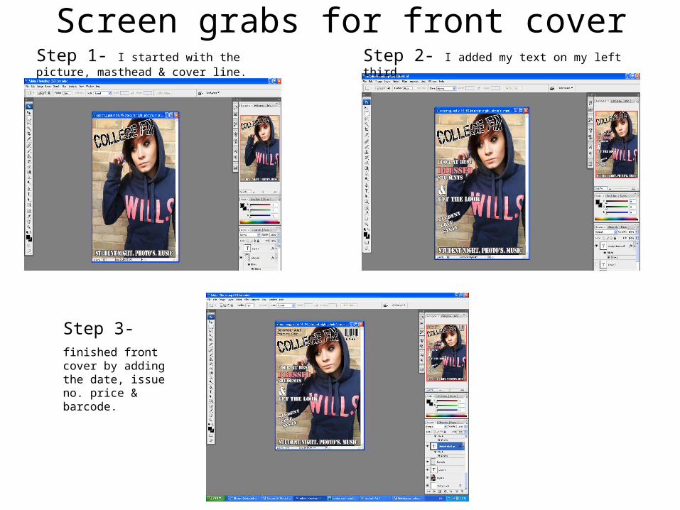
Screen grabs for front coverStep 1- I started with the picture, masthead & cover line.
Step 2- I added my text on my left third.
Step 3- finished front cover by adding the date, issue no. price & barcode.

Content page screen grabsStep 1- contents and sub heading
Step 2 -added page numbers and whats on
Step 3- added picture

My finished magazine front cover.

My finished contents page