Real Interest Rates, Imbalances and the Curse of Regional ...
49
Real Interest Rates, Imbalances and the Curse of Regional Safe Asset Providers at the Zero Lower Bound * Pierre-Olivier Gourinchas University of California at Berkeley , NBER, CEPR H´ el` ene Rey London Business School, NBER, CEPR Abstract The current environment is characterized by low real rates and by policy rates close to or at their lower bound in all major financial areas. We analyze these unusual economic conditions from a historical perspective and draw some implications for external imbalances, safe asset de- mand and the process of external adjustment. First, we decompose the fluctuations in the world consumption wealth ratio over long period of times and show that they anticipate movements of the real rate of interest. Second, our estimates suggest that the world real rate of interest is likely to remain low or negative for an extended period of time. In this context, we argue that there is a renewed Triffin dilemma where safe asset providers face a trade-off in terms of external exposure and real appreciation of their currency. This tradeoff is particularly acute for smaller economies. This is the ‘curse of the regional safe asset provider.’ We discuss how this ‘curse’ is playing out for two prominent regional safe asset providers: core EMU and Switzerland. * Nick Sander and Maxime Sauzet provided outstanding research assistance. We thank our discussant David Vines, Ricardo Caballero, Barry Eichengreen, Philipp Hartmann, ` Oscar Jord` a, Ralph Koijen, Martin Lettau, Richard Portes, Ken Rogoff, Andrew Sheng, Alan Taylor, David Thesmar and Gabriel Zucman for comments. All errors remain our own. Special thanks to ` Oscar Jord` a, Moritz Schularick and Alan Taylor for sharing their data with us. Contact email: [email protected]; [email protected];
Transcript of Real Interest Rates, Imbalances and the Curse of Regional ...

Real Interest Rates, Imbalances and the Curse of Regional Safe
Asset Providers at the Zero Lower Bound∗
Pierre-Olivier GourinchasUniversity of California at Berkeley , NBER, CEPR
Helene ReyLondon Business School, NBER, CEPR
Abstract
The current environment is characterized by low real rates and by policy rates close to or attheir lower bound in all major financial areas. We analyze these unusual economic conditionsfrom a historical perspective and draw some implications for external imbalances, safe asset de-mand and the process of external adjustment. First, we decompose the fluctuations in the worldconsumption wealth ratio over long period of times and show that they anticipate movementsof the real rate of interest. Second, our estimates suggest that the world real rate of interest islikely to remain low or negative for an extended period of time. In this context, we argue thatthere is a renewed Triffin dilemma where safe asset providers face a trade-off in terms of externalexposure and real appreciation of their currency. This tradeoff is particularly acute for smallereconomies. This is the ‘curse of the regional safe asset provider.’ We discuss how this ‘curse’ isplaying out for two prominent regional safe asset providers: core EMU and Switzerland.
∗Nick Sander and Maxime Sauzet provided outstanding research assistance. We thank our discussant David Vines,Ricardo Caballero, Barry Eichengreen, Philipp Hartmann, Oscar Jorda, Ralph Koijen, Martin Lettau, Richard Portes,Ken Rogoff, Andrew Sheng, Alan Taylor, David Thesmar and Gabriel Zucman for comments. All errors remain ourown. Special thanks to Oscar Jorda, Moritz Schularick and Alan Taylor for sharing their data with us. Contactemail: [email protected]; [email protected];

1 Introduction
The current macroeconomic environment remains a serious source of worry for policymakers. Global
real and nominal interest rates are at historical lows across advanced economies, both at the short
and long end of the term structure. Policy rates are close to or at their effective lower bound in all
major financial areas.1 Figures 1 and 2 report the nominal policy rates and long yields for the U.S.,
the Eurozone, the U.K. and Japan since 1980. Increasingly large amounts of wealth are invested
at zero or negative yields.2
Yet economic activity in many parts of the advanced world remains quite anemic, or insuffi-
ciently vigorous to sustain a normalization of monetary policy, as evidenced by the repeated delays
in the U.S. Federal Reserve’s ‘lift-off’. Figures 3 and 4 report the output gap of advanced economies,
as calculated in the April 2016 IMF’s World Economic Outlook database. While output gap cal-
culations are always imprecise, the figures indicate that, with the exception of Germany and the
U.K., most advanced economies remain significantly below their potential level of output.3
That, despite the aggressive global monetary policy treatment administered, levels of economic
activity remain so weak across the advanced world strongly suggests that the natural interest rate,
i.e. the real interest rate at which the global economy would be able to reach its potential output,
remains substantially below observed real interest rates. Far from being overly accommodating,
current levels of monetary stimulus may well be insufficiently aggressive because of the Zero Lower
Bound constraint on policy rates.4
Understanding whether natural rates are indeed low, for how much longer, and the source of
their decline has become a first-order macroeconomic question. In a celebrated speech given at the
IMF in 2013, five years after the onset of the Global Financial Crisis, Summers (2015) ventured that
we may have entered an age of ‘secular stagnation’, i.e. and era where output remains chronically
below its potential, or equivalently real rates remain above their natural rate. Not coincidentally,
the secular stagnation hypothesis was first voiced by Hansen (1939), ten years after the onset of
1This effective lower bound may well be negative. In this paper, and with a slight abuse of language, we refer tothe ‘effective’ lower bound as the ‘Zero Lower Bound’ (ZLB). It should be clear that there is no conceptual differencebetween a small positive and a small negative lower bound on policy rates.
2According to FitchRatings (2016), the total amount of fixed-rate sovereign debt trading at negative yields reached$11.7 trillion at the end of June 2016.
3Potential output data from other sources, such as AMECO or the OECD are broadly consistent.4Most central banks also deployed nonconventional monetary policy mostly in the form of asset purchases, or
forward guidance. While the evidence suggests these policies have contributed to stabilize the economy, they maynot have been sufficient to raise the natural rate above actual rates.
1

-5
0
5
10
15
20
25
1980 1983 1986 1989 1992 1995 1998 2001 2004 2007 2010 2013 2016
percent
U.S. Eurozone U.K. Japan
Financial Crisis Eurozone Crisis
Figure 1: Policy Rates, Eurozone, Japan, U.S. and U.K., 1980-2016. Sources: U.S.: Federal
Funds Official Target Rate; Eurozone: until Dec. 1998, Germany’s Lombard Rate. After 1998, ECB Marginal
Rate of Refinancing Operations; U.K.: Bank of England Base Lending Rate; Japan: Bank of Japan Target
Call Rate. Data from Global Financial Database.
-2
0
2
4
6
8
10
12
14
16
18
1980 1983 1986 1989 1992 1995 1998 2001 2004 2007 2010 2013 2016
percent
U.S. Germany U.K. Japan
Financial Crisis Eurozone Crisis
Figure 2: Long yields, Germany, Japan, U.K. and U.S., 1980-2016. Sources: U.S.: 10-year
bond constant maturity rate; Germany: 10-year benchmark bond; U.K.: 10-year government bond yield;
Japan: 10-year government bond yield. Data from Global Financial Database
2

-8
-6
-4
-2
0
2
4
1990 1993 1996 1999 2002 2005 2008 2011 2014
UnitedStates Eurozone Japan UnitedKingdom
Financial Crisis Eurozone Crisis
Figure 3: Output Gap (percent of potential output), Eurozone, Japan, U.K. and U.S.,1990-2015. Note: The graph shows the persistent decline in the output gap following the global financial
crisis and European sovereign debt crises. Source: World Economic Outlook, April 2016.
-8
-6
-4
-2
0
2
4
6
8
1990 1993 1996 1999 2002 2005 2008 2011 2014
France Eurozone Italy Spain Germany
Financial Crisis Eurozone Crisis
Figure 4: Output Gap (percent of potential output), Eurozone, France, Germany, Italyand Spain, 1990-2015. Note: The graph shows the persistent decline in the output gap following the
global financial crisis and European sovereign debt crises. Source: World Economic Outlook, April 2016.
3

the Great Depression.
This paper contributes to this debate along three dimensions. We start by asking whether
global real interest rates are likely to remain low and why. Using a novel empirical approach to
this question, we conclude that they will, for an extended period of time, and that global economic
activity is likely to remain muted. We argue that, as in other historical periods, most notably in the
1930s, this is the likely outcome of an extended and on-going process of deleveraging that creates
a ‘scarcity of safe assets.’
Next, we consider the question of global imbalances. Previous studies have emphasized that the
global imbalances of the 1990s and 2000s originated from a combination of low levels of financial
development and rapid economic growth in emerging market economies.5 If we enter an era of
secular low growth, does it follow that global imbalances should recede? We answer this question
in the negative: as argued in Caballero et al. (2015) and also in Eggertsson et al. (2015), global
imbalances ‘mutate’ at the Zero Lower Bound from a benign phenomenon to a malign one.6 At
the ZLB, external surpluses propagate stagnation as countries attempt to grab a higher share of
a depressed global aggregate demand via a more depreciated currency, increasing the potential for
negative spillovers and the prospect of currency wars.
The last part of our analysis focuses on safe assets providers. We argue that safe asset providers
must, in equilibrium, either be more exposed to global shocks with the incipient risk of large ex-post
losses, or choose to let their currency appreciate with potentially adverse immediate real effects.
Furthermore, we show that the terms of this trade-off worsen the smaller the safe asset provider
is, a phenomenon we dub the ‘curse of the regional safe asset provider.’ We document how this
‘curse’ has played out for two regional safe asset providers in recent years: Switzerland, and the core
members of the European Monetary Union (EMU), including Germany, but also the Netherlands,
Belgium and France. Looping back to our initial global focus, we argue that the curse of these
EMU safe asset providers contributes significantly to the headwinds faced by the global economy
and to the current pattern of global imbalances. We conclude by outlining some potential solutions.
Our empirical exercise begins by analyzing the consumption-to-wealth ratio in four advanced
economies: the United States, the United Kingdom, France and Germany, for which we have
5See Caballero et al. (2008), Mendoza et al. (2009) and Bernanke (2005).6Of course, there may be reasons linked to financial stability for which large imbalances might constitute a risk
even outside the ZLB.
4

data going back at least to 1920.7 We show that, at any point in time over the last century, the
aggregate consumption-to-wealth ratio contained a great deal of information about future short
term real rates. According to our empirical analysis, actual and natural real interest rates are
likely to remain low for an extended period of time: our point estimates suggest that short term
real interest rates could remain between -2% and 0% until 2021, with natural rates likely to be even
lower. Our findings provide a bleak assessment of the medium-run growth prospects in advanced
economies, and how difficult the return to prosperity may be for most advanced economies: we
may well be stuck at the ZLB for the foreseeable future.
Our approach requires minimal assumptions, likely to hold under very general circumstances.
In effect, we extract the historical information encoded in households’ decisions to consume out of
wealth. The consumption-to-wealth ratio tends to be abnormally low following periods of rapid
increases in wealth, as is often the case during episodes of financial exuberance. In the aftermath of
these booms, the return on wealth tends to be low or negative, and the consumption-to-wealth ratio
reverts to equilibrium. Our empirical results indicate that this low return on wealth is traceable in
large part to future low real risk-free rates.
We document two stark historical episodes where the consumption-wealth ratio was inordinately
low. The first episode starts in 1929 at the onset of the Great Depression and lasts until the second
World War. This is when Alvin Hansen first wrote about secular stagnation. The second episode
starts in 1997 and is still on-going. It is during this period that Larry Summers revived the concept
of secular stagnation.
What might cause a persistent decline in real interest rates? The literature emphasizes four can-
didate explanations (see Eichengreen (2015)): a slowdown in technological progress, demographic
forces, a savings glut, and a decline in investment, possibly due to a decline in its relative price. The
first force is well understood: a slower rate of technological progress reduces the marginal product
of capital. Demographic forces, especially a slowdown in fertility, or an increase in life expectancy,
also have the potential to increase savings, depressing equilibrium rates of return. The ‘savings
glut’ explanation has multiple components. On the trend side, it originates from the combination
of low levels of financial development in Emerging Market Economies and rapid economic growth
7Our measure of consumption consists of household’s aggregate consumption expenditures. Our measure of wealthconsists of households financial assets minus financial liabilities, plus housing and agricultural land. It does not includehuman wealth (the present discounted value of present and future non-financial income).
5
relative to Advanced Economies (see Bernanke (2005) and Caballero et al. (2008)). Low short
term real interest rates can also result from an increased demand for ‘safe assets’ (Caballero and
Farhi (2015)), especially in the aftermath of financial crises. An abundant body of empirical evi-
dence documents how households, firms, governments simultaneously attempt to de-lever in order
to repair their balance sheet after a major financial shock (see e.g. Mian et al. (2013) and Jorda
et al. (2013)). Post-crisis weakness in the banking sector which often shuts out small businesses
from credit markets, and the re-regulation of the financial sector which limits risk-taking and may
involve some degree of financial repression also contribute to low real interest rates (Reinhart and
Rogoff (2009)). A faster decline in the price of investment goods can also reduce natural rates of
interest, if the elasticity of the volume of investment to the real interest rate is not too high.
Our empirical method does not allow us to separately test these four hypotheses. However it
strongly suggests that the ‘savings glut’ explanation and de-leveraging dynamics played a large
role in the decline in real rates both in the 1930s and now, as in Eggertsson and Krugman (2012)
or Guerrieri and Lorenzoni (2011). Our findings are thus consistent with the view that the main
low-frequency drivers of global real interest rates are cyclical movements in the demand for safe
assets, in a context of limited supply, i.e. an environment of ‘safe asset scarcity ’.8
The second part of our paper considers more closely the implications of our findings for global
imbalances. Since the Global Financial Crisis, global imbalances have diminished but have not
disappeared altogether. Figure 5 reports current account surpluses and deficits for countries or
regions, scaled by world output since 1980. While U.S. current account deficits have decreased,
they remain sizable, at -0.66 percent of world GDP in 2015, representing around a third of all current
account deficits. On the funding side, two developments are noticeable. First, the surpluses of oil
producers have disappeared. Second, the Eurozone has become a major source of surpluses, with
a current account surplus of 0.61% of world output in 2015. Figure 6 reports current account
balances and surpluses for members of the Eurozone since 1993, as a fraction of Eurozone output.9
It is quite startling to observe that, since 2014, all Eurozone countries are running current account
8This terminology sometimes leads to some confusion. It should be clear that, in equilibrium, the supply of assets(safe or otherwise) always equals their demand. Instead ‘scarcity of safe assets’ refers to a situation where there iseither an autonomous increase in the demand for safe assets, or an autonomous decline in their supply, leading toan endogenous adjustment in their price (outside the ZLB) or in output (at the ZLB) so as to restore equilibrium inthese markets. See Caballero et al. (2016).
9In both graphs, the Eurozone consists of the 12 major members of the EMU for which we have consistent dataover that period.
6

surpluses or have a balanced position, and are projected to do so in years to come.
In Caballero et al. (2015) and Caballero et al. (2016), one of us argued that current account
imbalances mutate from ‘benign’ to ‘malign’ when the global economy hits the Zero Lower Bound.
Excess savings of surplus countries cannot be accommodated any longer by a decline in global real
interest rates. Instead, they push the global economy into a liquidity trap that depresses economic
activity. Surplus countries export their recession, at the expense of deficit countries. Moreover,
Caballero et al. (2016) argues that exchange rates become indeterminate at the Zero Lower Bound,
yet play a key role in the adjustment process, by shifting relative demand for domestic and foreign
goods. The analysis in that paper indicates a tight link between net foreign asset positions and
exchange rates: countries or regions running current account surpluses have a more depreciated
currency than under financial autarky, and correspondingly higher levels of activity, at the expense
of foreign countries. A direct and immediate implication is that the exchange rate becomes a key
variable to reallocate depressed global demand across countries, raising the prospect of ‘currency
wars’.10 This analysis suggests that a period of secular stagnation does not necessarily imply
that global imbalances should recede. Instead, imbalances at the ZLB have a greater potential to
destabilize the global economy.
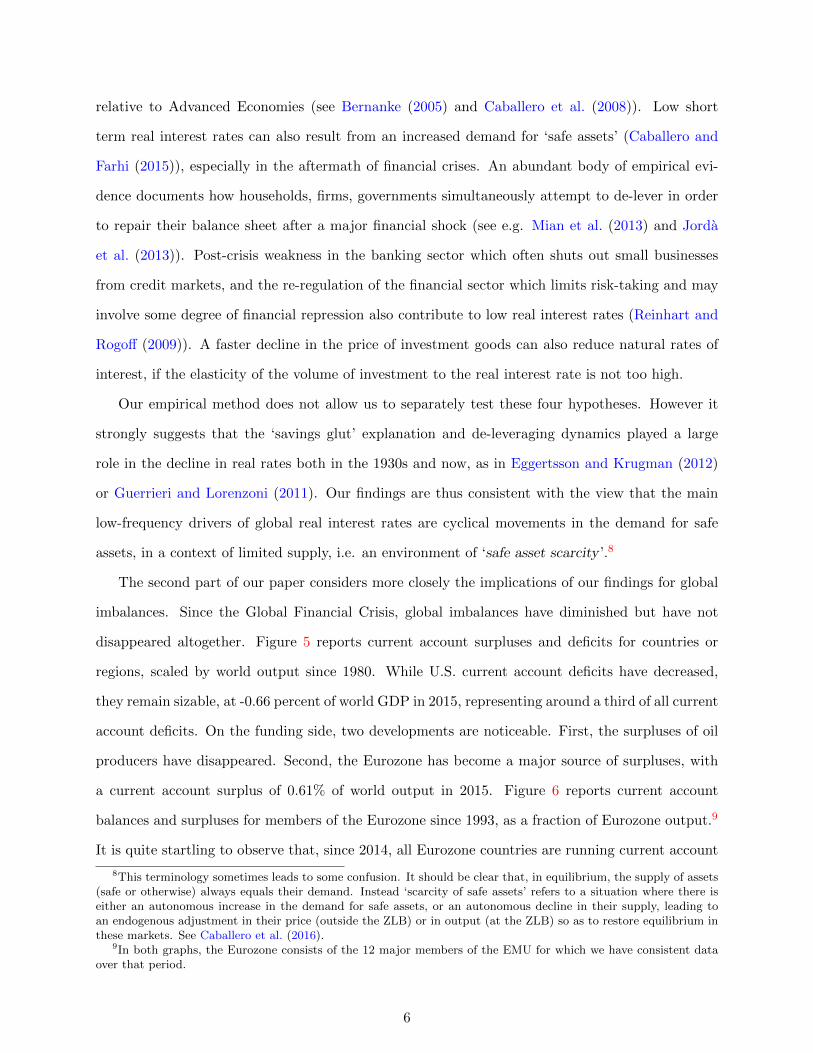
Indeed, Figure 7 illustrates that significant exchange rates movements have accompanied most
major central bank attempts to stimulate their economy since 2008. The figure reports the cumu-
lated rate of appreciation (+) or depreciation (-) of the euro against the US dollar, the Japanese
yen and the Swiss franc since January 2007. The figure illustrates the large recent gyrations in
exchange rates, especially in the dollar-euro rate after the implementation of the Federal Reserve’s
QE2 in October 2010 or the announcement of the ECB’s public sector purchase program (PSPP)
in January 2015; in the yen-euro rate following Abenomics in December 2013; or in the Swiss franc-
euro rate after the Swiss National Bank decided to put a floor on the bilateral rate (September
2011) and to abandon it (January 2015). The figure also illustrates the significant depreciation of
the Euro against the three other currencies since 2014, consistent with the surge in the Eurozone’s
current account surpluses.
In this context we ask how the growing demand for safe assets shapes external portfolios.
Gourinchas et al. (2010) explored the implications of being a world insurer for the United States’
10See Eggertsson et al. (2015) for a similar argument.
7

-2.50
-2.00
-1.50
-1.00
-0.50
0.00
0.50
1.00
1.50
2.00
2.50
1980 1983 1986 1989 1992 1995 1998 2001 2004 2007 2010 2013
%OFWORLDGDP
U.S. Eurozone 12 Japan OilProducers EmergingAsiaex-China China Restoftheworld
Financial CrisisAsian Crisis Eurozone Crisis
Figure 5: Global Imbalances, 1980-2015. Note: The graph shows Current Account balances as a
fraction of world GDP. Source: World Economic Outlook Database (April 2016), and Authors’ calculations.
WEO forecasts for 2015. Oil Producers: Bahrain, Canada, Iran, Iraq, Kuwait, Libya, Mexico, Nigeria,
Norway, Oman, Russia, Saudi Arabia, United Arab Emirates, Venezuela; Emerging Asia ex-China: India,
Indonesia, Korea, Malaysia, Philippines, Singapore, Taiwan, Thailand, Vietnam. Eurozone 12: Austria,
Belgium, Cyprus, Finland, France, Germany, Greece, Ireland, Italy, the Netherlands, Portugal, Spain.
-3%
-2%
-1%
0%
1%
2%
3%
4%
5%
1993 1996 1999 2002 2005 2008 2011 2014 2017
%ofEurozon
eOutpu
t
Germany Ireland Greece Portugal Italy
Spain France Netherlands Others Euro12
Figure 6: Eurozone Imbalances, 1993-2017. Note: The graph shows the current account balances of
Eurozone countries, relative to Eurozone output. Source: World Economic Outlook Database (April 2016)
and Authors’ calculations. WEO forecasts for 2015-2017. Euro 12: Austria, Belgium, Cyprus, Finland,
France, Germany, Greece, Ireland, Italy, the Netherlands, Portugal, Spain.
8
-60
-50
-40
-30
-20
-10
0
10
20
30
2007 2008 2009 2010 2011 2012 2013 2014 2015 2016
percent
Dollar-Euro Yen-Euro SwissFranc-Euro
Abenomics ECB QECHF FloorQE2
Figure 7: Global Exchange Rates, 2007-2016. Note: The graph shows the cumulated depreciation
(+) or appreciation (-) of the dollar, the yen, and the Swiss Franc against the euro since January 2007.
Source: Global Financial Database. The figure reports ln(E2007m1/E) where E denotes the foreign currency
value in euro.
-60%
-50%
-40%
-30%
-20%
-10%
0%
10%
20%
1952 1957 1963 1969 1975 1980 1986 1992 1998 2003 2009 2015
Net Foreign Assets Cum. Current Account
Figure 8: United States Net Foreign Asset Position and Cumulated Current Account,1952-2015. Note: The graph shows the U.S. net foreign asset position as a fraction of U.S. output and
the counterfactual obtained by cumulating current account balances since 1952Q1. Source: BEA, Flow of
Funds and Author’s calculations.
9

external portfolio. That paper argued that the structure of the U.S.’s external portfolio (gross assets
and gross liabilities) reflects its capacity to provide safe assets. With integrated financial markets,
asset prices and returns adjust so that, in equilibrium, the U.S. provides insurance to the rest of the
world. This is reflected in the fact that (a) the U.S. holds a leveraged position long in risky assets
and short in safe assets, relative to the rest of the world; (b) in normal times, the U.S. earns high
returns on its gross assets relative to its gross liabilities (the ‘exorbitant privilege’ of the United
States); (c) the U.S. experiences large capital losses in times of financial stresses (a phenomenon
we called the ‘exorbitant duty’). This last point is especially relevant in recent years. Figure 8
reports updated estimates of the U.S. net foreign asset position since 1952. Between 2007Q4 and
2015Q3, the U.S. external valuation losses represent $4.13 trillion, or a staggering 22.9% of 2015
U.S. GDP.11 Three episodes account for the bulk of these adjustments: in 2008Q4, following the
collapse of Lehman Brothers; in 2011Q3 during the Eurozone crisis, and in 2014Q4 when the dollar
appreciated substantially against the yen and the euro. As a result, the bulk of the U.S. cumulated
valuation gains since 1952, which reached 35% of US GDP at their peak in 2007, have dissipated.
An important message of Gourinchas et al. (2010) is that the status of safe asset issuer inevitably
comes with increased exposure to global shocks. In the current paper, we move away from the U.S.
and consider instead what the implications of our analysis are for regional safe asset providers. As
we argued in Gourinchas and Rey (2007a), net safe asset providers face a variant of the old ‘Triffin
dilemma’ (Triffin (1960)): faced with a surge in the demand for their (safe) assets, regional safe
asset providers must choose between increasing their external exposure, or letting their currency
appreciate. In the former case, the increased exposure can generate potentially large valuation
losses in the event of a global crisis, as documented in the case of the U.S.. In the limit, as the
exposure grows, it could even threaten the fiscal capacity of the regional safe asset provider, or the
loss absorbing capacity of its central bank, leading to a run equilibrium.12
Alternatively, a regional safe asset provider may choose to limit its exposure, i.e. the supply of
its safe assets. The surge in demand then translates into an appreciation of the domestic currency
which may adversely impact the real economy, especially the tradable sector. The smaller the
11In 2007Q4, the U.S. net foreign asset position was -$1.28 trillion. By 2015Q3, it reached -$9.03 trillion, a $7.74trillion decline, $3.61 trillion of which represents cumulated current account deficits, and $4.13 trillion (22.9% of U.S.GDP) valuation losses.
12See Maggiori et al. (2016) and Amador et al. (2015) for recent related analyses of the Triffin dilemma or thepotential for ‘reverse speculative attacks’. See also He et al. (2015) for a discussion of the issue of the determinationof the status of reserve assets in a world with competing stores of value.
10

regional safe asset provider is, the less palatable either of these alternatives is likely to be, a
phenomenon we dub the ‘curse of the regional safe asset provider.’
In light of these considerations, we revisit the recent experience of two European safe asset
providers: Switzerland, and core EMU, consisting of Germany, France, the Netherlands and Bel-
gium. The case of Switzerland illustrates nicely the terms of the basic trade-off: After fixing its
exchange rate against the euro in September 2011, the Swiss National Bank grew increasingly wor-
ried about its external exposure and the potential for future losses in the wake of the ECB’s PSPP.
In January 2015, in a surprise announcement, the Swiss National Bank chose to let the currency
float, a move that was followed by a sharp appreciation of the Swiss currency (see Figure 7).
The case of the core EMU is equally fascinating. In the run-up to the financial crisis, it acted
as a safe asset provider, with an extra twist. As documented by Hale and Obstfeld (2016), core
EMU countries invested in risky projects in peripheral Eurozone members, but also intermediated
foreign capital from outside the Eurozone into these countries, thereby increasing further their
exposure. Most of that increased exposure occurred via an expansion in core EMU banks’ balance
sheet and leverage (Miranda-Agrippino and Rey (2015)) and cross-border loans instead of portfolio
holdings. In the run-up to the Eurozone crisis, core EMU banks borrowed globally and lent to
peripheral Eurozone countries, earning small but positive excess returns in the process. With a
common currency, core EMU countries could not let their real exchange rate appreciate in response
to a surge in the demand for safe assets, except via gradual domestic inflation. Instead, they have
tended to absorb the increased exposure onto their national balance sheet.13
When the Eurozone crisis materialized, as in the case of the U.S. and other safe asset providers,
core EMU stood to realize substantial capital losses on its net external position, a combination of
losses on its gross external assets and capital gains on its external liabilities. With an exposure
structure similar to the U.S., rough calculations indicate that the valuation losses could have reached
a staggering 40% of output for Germany alone. Unlike the U.S., however, where the valuation losses
were immediately realized via changes in asset prices and currency price movements, resulting in
the sharp decline in the U.S. net foreign asset position documented in Figure 8, the protracted
resolution process of the European Sovereign Debt crisis mitigated the losses of the core EMU
13Some of that increase in financial sector exposure may also reflect risk shifting and expectations of bailouts usingtax payers money. This emphasizes the need for a very careful monitoring of financial fragilities and imbalances,especially for EMU safe asset providers.
11

countries but profoundly hampered the economic recovery of the region. Without a Eurozone
debt resolution mechanism for banks or sovereigns, and with the fear that markets might turn
on them, most peripheral eurozone members embarked on multiple rounds of private and public
deleveraging. The result has been a massive shift from current account balance in 2007 for the
Eurozone, to a current account surplus of 0.5% of world GDP in 2014, predicted to rise to 0.6% in
2015, as illustrated on Figures 5 and 6.14 If the Eurozone had been a closed economy, the resulting
deflationary forces may well have proven self-defeating, just like attempts to deflate one’s economy
at the expense of one’s trading partners were ultimately self-defeating during the Great Depression
under the Gold Exchange Standard. At the global Zero Lower Bound, the shift towards external
surpluses has lessened the burden of adjustment on the Eurozone, at the expense of the rest of the
world.
In summary, our analysis suggests that core EMU countries have not performed their role as
regional safe asset providers. Unlike the U.S. which saw its net foreign asset position deteriorate
substantially during the crisis, as U.S. Treasuries appreciated while external assets plummeted in
value, core EMU economies have not absorbed the banking losses that were on their balance sheet.
Instead they pushed back the losses onto the peripheral countries public sector balance sheet ex-
post which forced them to de-lever aggressively. This aggregate delevering, and the corresponding
surge in saving continues to have deleterious effects on the global economy. Given our finding that
real interest rates will remain low for an extended period of time, we consider that it would be
wise to steer away from policies that make us teeter on the edge of a global liquidity trap. Being a
regional safe asset provider may prove to be a curse not only to the core EMU, but to the Eurozone
at large, and to the global economy.
2 The Dynamics of Global Real Interest rates
As illustrated in Figures 1 and 2, both long and short rates have declined dramatically over the
last thirty years. A growing literature has attempted to understand the source of this decline and
14Figure 6 demonstrates that the bulk of the increase in the Eurozone current account surpluses does not comefrom core EMU. Core EMU current account surpluses increased modestly from 2.3% to 2.6% of the region’s outputbetween 2007 and 2015. Over that period, the rest of the Eurozone’s current account improved from -1.9% to 0.5%,representing 87% of the improvement in the Eurozone’s current account.
12

concludes that the decline in global real rates is likely to be quite persistent.15 In this paper, we
borrow from Gourinchas and Rey (2016) and propose a novel approach based on the low frequency
movements in the global consumption-to-wealth ratio.
2.1 The Global Budget Constraint: Some Elements of Theory
To fix ideas, denote beginning-of-period world private wealth Wt. Wt consists of private finan-
cial wealth (assets minus liabilities) as well as private non financial assets such as housing, non
incorporated businesses, land etc...16 The accumulation equation for the global economy is:
Wt+1 = Rt+1(Wt − Ct), (1)
where Ct denotes world private consumption expenditures and Rt+1 is the gross return on wealth
between t and t + 1. In this equation, all variables are in real terms so Rt+1 denotes the real
return on total wealth. Equation (1) is simply an accounting identity: it has to hold exactly period
by period. We add some structure on this equation by observing that, in most models, private
agents aim to stabilize the ratio of their consumption to their wealth.17 If the average propensity
to consume out of wealth is stationary, equation (1) can be log-linearized around the steady state
consumption-total wealth ratio C/W ≡ 1−ρw, where ρw < 1.18 Denoting ∆ the difference operator,
Et the expectation operator, rt+1 = lnRt+1 the continuously compounded real return on wealth and
following some simple manipulations as in Campbell and Mankiw (1989), Lettau and Ludvigson
15Barro and Sala-i Martin (1990) explores the converse question of why real interest rates were so high in the1980s. More recently, Laubach and Williams (2003, 2015) and Pescatori and Turunen (2015) attempt to measure the(unobserved) natural rate. Following Wicksell, they define the natural rate as “the real short-term rate consistentwith the economy operating at its full potential once transitory shocks to aggregate supply or demand have abated”(Laubach and Williams (2015), p 2). Hamilton et al. (2015) adopts a similar definition but a different estimationmethod, relying on a bivariate error correction model for U.S. and world interest rates.
16In the following discussion, we ignore human wealth, i.e. the present value of current and future labor income.We focus on private consumption and wealth, as opposed to national consumption and wealth, which includes publicconsumption and net wealth. Our results are largely unchanged if we use either concept, except during wars wherepublic consumption surges, while private consumption declines.
17For instance, if consumption decisions are taken by an infinitely lived representative household with logarithmicperiod utility u(C) = lnC, then the consumption wealth ratio is constant and equal to the discount rate of therepresentative agent.
18In steady state, C/W satisfies the following relation: ΓR
= (1 − CW
) ≡ ρw, where Γ denotes the steady stategrowth rate of total wealth and R the steady state gross return.
13

(2001) and Gourinchas and Rey (2016) we can derive the following fundamental relationship:
ct − wt w Et
∞∑s=1
ρswrft+s + Et
∞∑s=1
ρswrpt+s − Et
∞∑s=1
ρsw∆ lnCt+s (2)
≡ cwrft + cwrp
t + cwct ,
where ct and wt denote respectively (log) real consumption (resp. real wealth) per capita, rft
is the real short term risk-free return, rpt is the excess return.19 Equation (2) states that today’s
aggregate consumption to wealth ratio (the left hand side) is high if either (a) expected future
rates of return on wealth are high so that the denominator of C/W is expected to increase or (b)
expected future aggregate consumption growth is low, so the numerator of C/W is expected to
decline.
It is important to emphasize that the assumptions needed to derive this relation are minimal:
we started from the law of motion of private wealth, which is simply an accounting identity. In
particular, it holds with or without investment or production – these are simply factors that affect
the return on wealth. We then performed a log-linearization under mild stationarity condition.20
This simple equation conveys the message that today’s average propensity to consume out of wealth
encodes information about expected future consumption growth Et∆ lnCt+s, expected future safe
rates Etrft+s, or future risk-premia Etrpt+s. It also indicates how to construct the contributions
of each component, cwrft , cw
rpt and cwc
t as the expected present discounted value of each variable.
Since it is well-known that aggregate consumption is close to a random walk, so that its growth
rate ∆ lnCt+s is largely unpredictable, and excess returns are also volatile and difficult to predict,
we expect from equation (2) that the aggregate consumption to financial wealth ratio will provide
us with significant information about the expected path of future real risk free returns rft+s.
19The return on wealth can always be decomposed as r = rf +(r − rf
), the sum of the real risk-free rate rf and
an excess return r − rf . We don’t observe the excess return on wealth r − rf , so we proxy it with the excess equityreturn rp, adjusted with a noise parameter which we estimate to maximize the empirical fit of equation (2). SeeGourinchas and Rey (2016) for details.
20We also impose a transversality condition that simply rules out paths where wealth grows without bounds inrelation to consumption.
14

2.2 Interpretation
Equation (2) does not provide a causal decomposition: in general, the risk free and risky returns
as well as consumption growth are endogenous and interdependent. In Gourinchas and Rey (2016)
we discuss how different shocks are likely to impact the various terms on the right hand side of
equation (2) and summarize this discussion here:
• Productivity Shocks: persistent negative productivity shocks decrease future aggregate
consumption growth ∆ lnCt+s , which pushes up ct − wt (direct effect). There is an indirect
effect that goes in the opposite direction since lower productivity growth tends to reduce
equilibrium real interest rates, which pushes ct − wt down. The relative strength of the two
effects depends on the intertemporal elasticity of substitution (IES). With a low IES, real
rates respond more than consumption growth, hence the indirect effect is likely to dominate
and ct − wt will decline. If instead the IES is high, consumption growth responds more than
real rates, the direct effect dominates and ct − wt increases. More generally, we expect the
return component cwrft and the consumption growth components cwc
t to have opposite signs if
productivity shocks are a main source of fluctuations: low future interest rates would coincide
with low per-capita and total consumption growth.
• Demographics: a slowdown in population growth has a direct effect on the consumption-
wealth ratio via the decline in total consumption growth ∆ lnCt+s. This direct effect is
the same as that of productivity and pushes up ct −wt. Population growth may also have an
indirect effect on the consumption-wealth ratio via its effect on savings and global real returns.
If the lower population growth induces higher saving rates among currently alive generations,
the real interest rate will decline and this will tend to push down ct−wt. Similarly, increases in
life expectancy that reduce the ratio of workers to retiree may stimulate savings, as households
need to provide for a longer retirement life, pushing down real rates and reducing ct − wt.
Again, we expect opposite movements in the return and the consumption growth components:
low future interest rates would coincide with low total consumption growth (but not per-capita
consumption growth).
• Deleveraging shock: A deleveraging shock can be interpreted as an increase in the saving
propensity (see Eggertsson and Krugman (2012); Guerrieri and Lorenzoni (2011)). There
15

is ample evidence that saving propensities increase in the aftermath of financial crises, as
households attempt to repair their balance sheets (see e.g. Mian et al. (2013)). In equilibrium
this needs to be offset by a decline in the equilibrium real rate. The response of future total
consumption depends on whether the economy operates outside the Zero Lower Bound or not.
Outside the ZLB, investment is likely to increase. While current consumption growth would
be low initially, it would increase later as output increases. If the economy is at the ZLB,
aggregate demand may remain depressed, which would keep investment low and consumption
growth muted. Most of the impact of financial shocks is therefore likely to be reflected in the
return component cwrft .
• Demand for safe asset: A surge in the demand for safe assets should lead to a decline
in the real risk-free rate, and an increase in the risk premium, i.e. expected excess returns.
The first effect tends to reduce ct − wt while the second increases it. The overall effect on
consumption growth is unclear. We therefore expect to see the impact of an increase in the
demand for safe assets in a decline of the return component cwrft and an opposite movement
in the risk premium component.
We conclude that different primitive shocks have different effects on the various components on the
right hand side of equation (2) which we will exploit later to help us identify the relevant source of
the variation in the data.
2.3 Empirical implementation
We implement our empirical strategy in two steps. In the first step, we construct estimates of the
consumption-wealth ratio over long periods of time. We then evaluate the empirical validity of
equation (2) by constructing the empirical counterparts of cwrft , cw
rpt , cw
ct in that equation and
testing whether they accurately capture movements in the consumption wealth ratio (i.e. whether
ct−wt = cwrft +cwrp
t +cwct ). In a second step, we directly evaluate the forecasting performance of the
consumption-wealth variable ct−wt for future risk-free interest rates, risk premia and consumption
growth.
For the first step, we use historical data on private wealth, population and private consumption
for the period 1920-2011 for the United States, the United Kingdom, Germany and France from
16

Piketty and Zucman (2014a) and Jorda et al. (2016).21 We identify the risk-free return with
the ex-post real return on three-month Treasuries minus CPI inflation (both series obtained from
Jorda et al. (2016)), and the real return on risky assets as the total equity return for each country
minus CPI inflation (obtained from the Global Financial Database- see Appendix A for a detailed
description of the data). Over the period considered, these four countries represent a substantial
share of the world’s wealth. Moreover London, New-York and to a lesser extent Frankfurt are major
financial centers.
The dotted blue line in Figure 9 reports c−w, demeaned, for our 4-country aggregate since 1920
(G4).22 As expected, historical time-series on the consumption wealth ratio show little long run
trend but significant serial correlation. These long swings in the consumption-wealth ratio justify
the use of long time series.23
We identify two periods during which the consumption-wealth ratio was significantly depressed:
the first one spans the 1930s starting around the time of the Great Depression and ending at the
beginning of the 1940s. Interestingly, it is in 1939 that Professor Alvin Hansen wrote his celebrated
article about ‘secular stagnation’ (Hansen (1939)). The second episode of low consumption-wealth
ratio starts in the late 1990s with a pronounced downward peak in 2007 that is reversed during
the financial crisis. As this paper is being written, the consumption-wealth ratio remains depressed
for the G-4 aggregate. Not coincidentally, in the Fall 2013 at a conference at the International
Monetary Fund, Larry Summers, revived the idea of secular stagnation (Summers (2015)). From
an accounting point of view, a low consumption wealth-ratio can follow periods of low consump-
tion growth or periods of rapid wealth growth. In both cases (in 1928-29, then in 2007-08), the
consumption-wealth ratio decreases dramatically right before a financial crisis, then rebounded
during the crisis (1930 and 2009). This suggests that the movements in the consumption-wealth
ratio are driven mostly by the dynamics of wealth during boom-busts episodes.
We estimate each of the components on the right hand side of equation (2) using a reduced
form Vector Auto Regression (VAR).24
21The wealth data prior to 1920 for these three countries is somewhat imprecise. There appears to be a strongbreak in data before the 1920s, most likely due to the first World War.
22The appendix presents the raw data.23Over shorter time periods, ct − wt may exhibit a marked trend. For instance, over the 1970-2011 period, we
observe a large decline in ct − wt .24Note that our approach does not need to identify the various structural shocks driving the variables. Equation
(2) only requires that we construct present discounted forecasts of real rates, excess returns and consumption growth.
17

2.4 VAR Results
Figure 9 shows the consumption wealth ratio as well the components of the right hand side of
equation (2) for the G4.25 We further decompose total consumption growth ∆ lnCt into per capita
consumption growth ∆ct and population growth ∆nt and report separate components for the
expected present value of future population growth (cwn) and per-capita consumption growth
(cwcp).
The results are striking. First, we note that the fit of the VAR is very good.26 The grey line
reports the predicted consumption-wealth ratio, i.e. the sum of the four components cwrft + cwrp
t +
cwnt + cwc
t . We find that our empirical model is able to reproduce quite accurately the annual
fluctuations in wealth over almost a century of data. This is quite striking since the right hand side
of equation (2) is constructed only from the reduced form forecasts implied by the VAR estimation.
Second, most of the movements in the consumption-wealth ratio reflect expected movements in the
future risk-free rate, i.e. the cwrft component. By contrast, the risk premia cwrp
t , population growth
cwnt and per capita consumption growth cwcp
t components are often economically insignificant. it
follows that the consumption-wealth ratio today contains significant information on future real
risk-free rates, as encoded in equation (2). As discussed above, periods of low consumption-wealth
ratios are following periods of rapid asset price increases. Our empirical results indicate that these
are followed by extended periods of low (or negative) real risk-free interest rates. Moreover, we find
only weak evidence for the view that productivity growth or demographic forces are key secular
drivers of the real risk free rates since neither per capita consumption growth nor population growth
seem to matter much. Recall that if productivity or population growth were the main drivers of
the consumption wealth ratio, we would expect to find significantly negatively correlated direct
contribution of each of these (cwc and cwn ) with the real interest rate contribution (cwrf ). While
we find a negatively correlated contribution, it is economically small -and also not very robust.27
We assume a discount rate ρw = 0.96. Recall that ρw = 1 − C/W . This implies an average propensity to consumeout of wealth of 4%. Our calculations also estimate a ‘noise’ parameter for potential mismeasurement of the excessreturn on private wealth. We estimate this noise parameter by regressing ct − wt − cwrf
t − cwct on our estimate
of Et
∑∞s=1 ρ
swrpt+s. While this maximizes the overall fit of the decomposition, it does not affect the risk-free and
consumption growth contributions. See Gourinchas and Rey (2016) for details.25We use a wealth-weighted average of the riskfree rate of the U.S. and the U.K. for the risk-free rate, and of the
equity excess returns for the global excess return. Substantial price instability in the 1920s in Germany and Franceprevent us from using these countries’ real returns.
26The lags of the VAR are selected by standard criteria.27As discussed above, for the interest rate component to dominate the productivity or population growth terms
would require a very low intertemporal elasticity.
18

-.4
-.3
-.2
-.1
.0
.1
.2
.3
1920 1930 1940 1950 1960 1970 1980 1990 2000 2010
ln(c/w) Risk free comp.Risk premium comp. Cons. per cap. comp.Pop. growth comp. Predicted
Figure 9: Consumption Wealth: Real Risk-free rate, Equity Premium, Consumptionper capita and Population Growth Components. United States, United Kingdom,Germany and France, 1920-2011. Note: The graph reports the (log, demeaned) private consumption-
wealth ratio together with the riskfree, risk premium, consumption per capita and population growth com-
ponents. Estimates a VAR(2). Source: Private wealth from Piketty and Zucman (2014a). Consumption,
population and short rates from Jorda et al. (2016). Equity returns from Global Financial Database.
Similarly, our estimates indicate that the consumption-wealth ratio contains little information about
future equity risk premia. This is perhaps a more surprising result in light of Lettau and Ludvigson
(2001)’s findings that a cointegration relation between aggregate consumption, wealth and labor
income predicts reasonably well U.S. equity risk premia.28
Table 1 decomposes the variance of ct − wt into components reflecting news about future real
risk-free rates, future risk premia, and future consumption growth. It is immediate that the bulk
of the variation in c−w is accounted for by future movements in the real short term risk-free rate.
The fact that total consumption growth contributes negatively is consistent with the view that
the productivity slowdown may play a role: the contribution of consumption growth per capita is
28A number of factors may account for our result. First and foremost, ct−wt is stationary in our sample, hence wedo not need to estimate a cointegrating vector with labor income. Second, we consider a longer sample period, goingback to 1920. Thirdly, as argued above, our sample is dominated by two large financial crises and their aftermath,unlike theirs. Lastly, we view our analysis as picking up low frequency determinants of real risk-free rates whileLettau and Ludvigson (2001) seem to capture business cycle frequencies.
19

# percent G4
1 βrf 1.4062 βrp 0.0253 βc -0.336
of which:4 βcp -0.1685 βn -0.1686 Total 1.094
(lines 1+2+3)
Table 1: Unconditional Variance Decomposition of ct − wt
Note: βrf (resp.βrp, and βc) represents the share of the unconditional variance of c−w explained by futurerisk free returns (resp. future risk premia and future total consumption growth); βcp (βn) represents theshare of the unconditional variance of c− w explained by per capita consumption growth (populationgrowth). The sum of coefficients βcp + βn is not exactly equal to βc due to numerical rounding in the VARestimation. Sample: 1920-2011
negative. However productivity growth or population growth are unlikely to be the main drivers
of c− w unless they have a disproportionate effect on real risk free returns.
2.5 Predictive regressions
Our decomposition exercise indicates that the consumption-wealth ratio contains information on
future risk-free rates. We can evaluate directly the predictive power of cwt by running regressions
of the form:
yt+k = α+ βcwt + εt+k (3)
where yt+k denotes the variable we are trying to forecast at horizon k and cwt is the consumption-
wealth ratio at the beginning of period t. We consider the following candidates for y: the average
real risk free rate between t and t+ k; the average one-year excess return between t and t+ k; the
average annual real consumption growth growth per capita between t and t+k; the average annual
population growth between t and t+ k.
Tables 2 presents the results. We find that the consumption-wealth ratio always contains
substantial information about future short term risk free rates (panel A). The coefficients are
increasing with the horizon and become strongly significant. They also have the correct sign,
according to our decomposition: a low c− w strongly predicts a period of below average real risk-
free rates. By contrast, the consumption-wealth ratio has almost no predictive power for the equity
risk premium and very limited predictive power for per capita consumption growth. The regressions
20

U.S., U.K., France and Germany
Forecast Horizon (Years)
1 2 5 10
A. Short term interest rate
ct − wt .07 .10 .19 .22(.06) (.06) (.06) (.04)
R2 [.03] [.07] [.27] [.43]B. Consumption growth (per-capita)
ct − wt .06 .05 .02 .01(.04) (.04) (.02) (.02)
R2 [.06] [.06] [.02] [.00]C. Equity Premium
ct − wt .27 .20 .01 -.06(.25) (.18) (.11) (.11)
R2 [.02] [.02] [.00] [.01]D. Population Growth
ct − wt .02 .02 .02 .02(.01) (.01) (.01) (.01)
R2 [.07] [.13] [.18] [.24]
Table 2: Long Horizon Regressions. Note: The table reports point estimates, Newey-West corrected
standard errors and the R2 of the forecasting regression.
indicate some predictive power for population growth: a low c−w predicts a low future population
growth which suggests that the indirect effect (via changes in real risk-free rates) dominates the
direct effect, since the direct effect of a lower future population growth (and total consumption
growth) would be to increase c− w according to Equation (2).
Figure 10 reports our forecast of the risk free rate using the G-4 consumption-wealth ratio at 1,
2, 5 and 10 year horizon. For each year t, the graph reports rft,k = 1k
∑k−1s=0 r
ft+s, the average of the
one-year real risk-free rate between t and t+ k where k is the forecasting horizon. The graph also
reports the predicted value rft,k based on predictive regression (3). While the fit of the regression is
quite poor at 1-year, it becomes quite striking at 10-year. Our point estimates indicate that short
term real risk free rates are expected to remain around -2% for an extended period of time. The
last forecasting point is 2011, indicating a forecast of -2% until 2021 (bottom right graph).
2.6 Interpretation.
Taken together, our results suggest that boom-bust financial cycles are a strong determinant of
real short term interest rates. Wealth increases rapidly during the boom, faster then consumption.
Increased leverage, financial exuberance, and risk appetite fuel asset prices, bringing down c − w.
21

-.12
-.08
-.04
.00
.04
.08
.12
.16
.20
1920 1930 1940 1950 1960 1970 1980 1990 2000 2010
1-year ahead
-.10
-.05
.00
.05
.10
.15
.20
1920 1930 1940 1950 1960 1970 1980 1990 2000 2010
2-years ahead
-.06
-.04
-.02
.00
.02
.04
.06
.08
.10
1920 1930 1940 1950 1960 1970 1980 1990 2000 2010
5-years ahead
-.06
-.04
-.02
.00
.02
.04
.06
.08
1920 1930 1940 1950 1960 1970 1980 1990 2000 2010
actualfitted
10-years ahead
Figure 10: Predictive Regressions: Risk Free Rate, 1920-2010. Note: The graph reports
forecasts at 1, 2, 5 and 10 years of the annualized global real risk free rate from a regression on past ln(c/w).
Each graph reports, for each time t, the average short real interest rate between t and t+ k where k is the
forecasting horizon, together with the forecast at time t, based on cwt.
Two such historical episodes for the global economy are the roaring 1920s and the 2000s. In
the subsequent bust, asset prices collapse, collateral constraints bind, and households, firms and
governments attempt to simultaneously de-leverage, as risk appetite wanes. The combined effect is
an increase in saving that keeps future safe real interest rates low. An additional force may come
from a weakened banking sector and financial re-regulation or repression that combine to further
constrain lending activity to the real sector. Our estimates indicate that short term real risk free
rates are expected to remain low or even negative for an extended period of time. Since current
rates are constrained by the Zero Lower Bound, natural real interest rates might be even lower!
Our empirical results do not support directly the view that low real interest rates are the result
of low expected future productivity –since we don’t find much predictive or explanatory power for
future per capita consumption growth- or demographic forces. Instead, it points us towards the
global financial cycle boom/bust cycle, both in the 1930s and now. Under this interpretation, it is
the increased in desired savings, and the move away from risky asset that drive real interest rate
determination. Therefore, we view these empirical results very much in line with interpretations
22

of recent events that emphasize the global financial cycle (Miranda-Agrippino and Rey (2015),
Reinhart and Rogoff (2009), as well as the scarcity of safe assets (Caballero and Farhi (2015)).
3 Imbalances and The Curse of the Regional Safe Asset Providers.
If the scarcity of safe assets can drive equilibrium real interest rates down -potentially into a global
liquidity trap, with most advanced economies at the ZLB, their geographical distribution will
determine the pattern of global imbalances. As described in Gourinchas et al. (2010), the country
at the centre of the international monetary system acts as the world insurer and global liquidity
provider. As such, its external balance sheet is particularly remarkable, featuring large amounts of
liquid gross external liabilities and large gross mostly illiquid external assets. It follows that the
center country typically has a large long net position in risky assets and a large short net position
in safe liabilities. As shown in Figure 11, U.S. net exposure to risky assets amounts to about 10%
GDP in 2015Q4 after having reached 37% of GDP in 2007 Q4, while U.S. short net position in
safe liabilities amounts to around 58% of GDP in 2015Q4, having undergone a trend increase (in
absolute value) since 1984.29
This asymmetric composition of assets and liabilities explains largely the excess returns that the
US earns on its external position. But this exorbitant privilege (see Gourinchas and Rey (2007a))
comes with an exorbitant duty (Gourinchas et al. (2010)). In times of global stress the value of
the external assets of the U.S., dominated by risky investment, plummets while the value of its
liabilities remains stable or even appreciates. As the centre country provides insurance to the rest
of the world, its gross liabilities can be large relative to its own economic size. The properties of
the external balance sheet of the centre country therefore imply massive wealth transfers to the
rest of the world in troubled times. Since at least the summer of 2007, financial markets have
been in turmoil. The subprime crisis, followed by the default or near default of several investment
banks, insurance companies and nation states has driven volatility to levels not seen in the last
two decades. Inspection of the data on the net foreign asset position of the United States during
the period of the recent crisis is very revealing. As discussed earlier, Figure 8 reports updated
29Net exposure to risky assets is defined as FDI assets+ equity assets+ loans and portfolio debt to emerging marketsand euro area periphery - (FDI liabilities+ Equity liabilities). Net safe liability position is defined as Net ForeignAsset position - net risky asset position. The net safe liability position consists therefore of loans and portfolio debtassets to advanced economies (except euro area periphery) + gold and reserves - portfolio and bank liabilities.
23

-‐80,00%
-‐60,00%
-‐40,00%
-‐20,00%
0,00%
20,00%
40,00%
60,00%
United States -‐ Net exposure (% of GDP)
Net Risky Assets/GDP Net Safe Assets/GDP
Figure 11: US net exposure to risky assets and net position in safe liabilities as a %of US GDP, 1952Q1-2015Q4. Net exposure to risky assets is defined as (FDI assets+ equityassets+ loans and portfolio debt to emerging markets and euro area periphery) - (FDI liabilities+Equity liabilities). Net safe liability position is defined as Net Foreign Asset position - net riskyasset position (the net safe liability position consists therefore of loans and portfolio debt assetsto advanced economies (except euro area periphery) + gold and reserves - portfolio and bankliabilities)). For portfolio debt we use the geographical breakdown of the Coordinated PortfolioInvestment Survey (IMF). For bank loans and liabilities we use the US TIC data geographical distri-bution (https://www.treasury.gov/resource-center/data-chart-center/tic/Pages/ticlaim.aspx). Wecompute geographical shares from those two data sources and apply them to the IIP data.
estimates of the U.S. net foreign asset position since 1952. We observe three dramatic collapses of
the U.S. international asset positions as a fraction of GDP during the crisis: between 2007Q4 and
2009Q1 as the US investment banking world sank and the U.S. net foreign asset position declined
by about 24% of GDP; it initially bounced back but between 2011Q1 and 2012Q2, it declined
again by 20.5% of GDP as the Eurozone crisis was unfolding; finally between 2013Q3 and 2015Q3
it decreased by another 19% of GDP as the dollar appreciated substantially against the yen and
the euro, decreasing the dollar value of external assets. All in all, between 2007Q4 and 2015Q3,
we estimate that U.S. valuation losses represent $4.13 trillion, or a staggering 22.9% of 2015 U.S.
GDP.
3.1 Scarcity of Safe Assets and the Exorbitant Duty
Periods of turmoil come with massive movements in net foreign asset positions, especially that of
the center country providing insurance to the rest of the world. In the current configuration of the
International Monetary System, the U.S. is the main world insurer. There are however a number
24

of smaller or more regional safe asset providers such as Switzerland, or Germany and other core
eurozone economies. An important message of Gourinchas et al. (2010) is that the status of safe
asset issuer inevitably comes with increased exposure to global shocks.
As pointed out in Section 2 of this paper, one plausible interpretation of the current very low
real rates is that the world economy is characterized by a large demand for safe assets, driven in
part by post-crisis deleveraging dynamics. Indeed we found that low consumption-wealth ratios,
symptomatic of periods of financial exuberance and rapid wealth growth predict low future real
interest rates for an extended period of time. This sequence of events occurred at the time of the
Great Depression, as well as in the more recent period.30
Faced with a large demand for safe assets, safe asset issuers are confronted with an important
tradeoff. They can either choose to provide insurance to the rest of the region or world and thus
let their external balance sheet grow, together with their external exposure to global risk. Or they
can choose to limit the issuance of safe assets, letting the value of domestic asset rises and their
currency appreciate, thereby increasing the value of their limited supply of safe assets.
Gourinchas et al. (2010) argue that this trade-off is a variant of the old ‘Triffin dilemma’
(Triffin (1960)): on the one hand, limiting the supply of safe assets can have contractionary effects
on the economy as the currency appreciates; on the other hand, the increased external exposure to
macroeconomic risk can generate potentially large valuation losses in the event of a global crisis, as
described above in the case of the United States. In the limit, as external exposure grows, it could
even threaten the fiscal capacity of the regional safe asset provider, or the loss absorbing capacity
of its central bank, leading to a run equilibrium.31
For small regional safe asset providers, the tradeoff between real appreciation of their currency
and net external exposure to global risk is likely to be even less appealing: the smaller the country
is, the larger is the quantity of safe assets it has to provide to the rest of the world, in relation
to the country’s economic size– or the larger the appreciation of its currency has to be in order
to boost the value of these safe assets. The smaller the regional safe asset provider is, the less
palatable either of these alternatives is likely to be, a result we dub the ‘curse of the regional safe
30Shifts in the composition of institutional investors, increased size of the asset management industry (pensionfunds for example) and/or changes in financial regulation can also play a role in fostering higher demand for assetsand in particular safe assets.
31Gourinchas and Rey (2007a) already suggested the possibility of a run of international investors on the grossliabilities of the centre country in the case where its fiscal capacity would be put into question by internationalinvestors, stressing the parallel with the old ’Triffin dilemma’. See also Obstfeld (2011).
25

asset provider.’
Figure 12 illustrates the argument.32 The solid lines (blue) represent the trade-off curves be-
tween net exposure to global risks (in units of domestic output) and the appreciation of the domestic
currency, for a large and a small safe asset provider. The curse of the regional safe asset provider
is simply illustrated by the fact that the trade-off curve for the smaller country lies above that
for the larger one: the former faces a larger exposure (relative to its own size) and/or a larger
appreciation.33 The dashed (red) lines represent illustrative indifference curves: they capture the
notion that countries prefer both less net exposure and less appreciated currencies: utility increases
as we move towards the lower left part of the figure. Each country chooses a different optimal point
at the tangency between the indifference curve and its size-specific trade-off curve: point A for
the larger country and point B for the smaller one. As is clear from the figure, depending on the
shape of these indifference curves, countries may pick different ‘habitats’ on the trade-off curve.
For instance, as we have drawn the figure, the smaller country prefers less exposure and more ap-
preciation, relative to the larger country.34 There are good reasons to believe that larger economies
will be content with supplying the safe asset elastically and absorb the (comparatively smaller)
exposure, while smaller countries may prefer to let their real exchange rate appreciate more, in
order to avoid excessively high levels of external exposure. Smaller countries may be particularly
unwilling to let their external exposure grow too much, if this would threaten their solvency in case
of a bad enough shock. This could in turn potentially endanger their status as safe haven. In the
realistic case where small countries are competing with other safe asset providers (including poten-
tially large ones), they could easily lose their share of the exorbitant privilege to their competitors
by excessively expanding their exposure. Strategic complementarities between investors could even
open the door to run equilibria, to which smaller safe asset providers might be more vulnerable.35
What this suggests is that there are some potentially non-linear responses once exposure levels be-
come too elevated. Smaller safe asset providers are more likely to reach these levels if they attempt
32This discussion builds on Gourinchas et al. (2010).33A simple example illustrates the point starkly. Suppose the global net demand for safe asset is inelastic and
equal to S. For the country supplying the safe asset, it follows that S = E.d.Y where d is the net exposure, i.e. theratio of the domestic value of safe assets held abroad to domestic output, Y , and E is the value of the safe assetcurrency, with an increase reflecting an appreciation. This defines a trade-off curve d.E = S
Ythat is higher for smaller
economies (lower Y ).34This is only a relative statement. Since the smaller country faces a worse trade-off, point B features a more
appreciated currency and more exposure compared to point A. But the relative share of the adjustment changestowards more exchange rate flexibility.
35See Calvo (2013) for related arguments.
26

Figure 12: The Curse of the Regional Safe Asset Provider. Note: The solid (blue) line reports
the trade-off between net exposure (relative to own output) on the vertical axis and the appreciation of the
domestic currency on the horizontal axis. The dashed (red) line reports illustrative indifference curves when
countries prefer less external exposure and less appreciated currency. Point A corresponds to the optimal
choice of exposure and currency appreciation for a large safe asset provider. Point B is the corresponding
point for a small safe asset provider. A small safe asset provider under fixed exchange rates would end up
at point C instead.
to prevent an appreciation of their currency. A small safe asset provider may therefore subject
itself to a ‘value-at-risk constraint’, to avoid excessively risky exposure levels, and prefer to let its
currency appreciate.36
According to this analysis a small economy such as Switzerland (point B) will tolerate a more
appreciated currency than the U.S. (point A). If instead the small economy attempted to fix the
value of its currency, it would face very elevated exposure levels (point C). Such high levels of
exposure may eventually threaten the solvency of the country. For a small asset provider, this
discussion suggests that it seems optimal to retain some flexibility in the real exchange rate.
3.2 European safe asset providers
3.2.1 Switzerland
In light of these considerations, we revisit the recent experience of two European safe asset providers:
Switzerland and core EMU, which we will interpret here to mean Germany. The case of Switzerland
36Large safe asset providers may limit their issuance for a different reason, namely to manipulate their terms oftrade. See Kindleberger (2013) for a discussion of the role of the ‘benevolent hegemon’ in that context.
27

illustrates nicely the terms of the basic trade-off: after fixing its exchange rate against the euro in
September 2011, the Swiss National Bank grew increasingly worried about its external exposure.
The decline in the Swiss net external position between 2011Q2 and 2015Q1 was very large: it went
from 123% of GDP to 84% of GDP, with a peak of 143% in 2012Q3. In January 2015, in a surprise
announcement, the central bank chose to let its currency float, a move that was followed by a sharp
appreciation of the Swiss currency (see Figure 7). In Figure 13, we show the rapid growth of official
reserves and of the external risky assets of Switzerland (in particular FDI) after the beginning of
the global financial crisis. At end 2015, FDI and equity external assets amount to about three
times the Swiss GDP. On the liability side, banking deposits account for the lion’s share of the
Swiss external position as evidenced in Figure 14. External debt liabilities are very small due to
the lack of depth in the Swiss debt market, so that Swiss safe assets are effectively bank deposits.
Gross bank deposits and trade credit (the “other liability” category of the balance of payment)
reached almost 200% of Swiss GDP by end 2015. This is despite the fact that the Swiss Franc
was allowed to appreciate substantially, suggesting that the increased exposure would have been
even higher had the peg not been abandoned. Figure 15 shows the net exposure of Switzerland to
risky assets and the net position in safe liabilities. Both are decreasing in absolute value in recent
years though next exposure is still high (about 100% of GDP in net risky assets even if the net safe
position is zero) in 2015Q4. This decline in net exposure is to some extent misleading however.
The reason is that unlike for the U.S., the foreign exchange reserves of Switzerland are very sizable.
We included them in the safe assets (hence they decrease the net risky position and increase the
net safe position of Switzerland). But because of their currency composition, they carry significant
exchange rate risk (in Q2 2016 for example the SNB portfolio investments in foreign currency bonds
were dominated by euro investments (41%) and dollar ones (32%)).37 Since total reserves grew from
39% of GDP to 88% of GDP during the period 2011Q2-2015Q1, taking the associated risk into
account would increase very sizably the net risky exposure of Switzerland and decrease its net safe
liability position in the recent years.
37Source: http://www.snb.ch/en/iabout/assets/id/assets reserves
28

0.00%
100.00%
200.00%
300.00%
400.00%
500.00%
600.00%
700.00%
800.00%
2000 2003 2006 2009 2012 2015
Switzerland -‐ External assets composi5on (% of GDP)
RESA/GDP FDIA/GDP EQA/GDP DA/GDP OA/GDP
Figure 13: Swiss Gross External Assets, 2000Q1-2015Q4. Note: The graph reports the gross
external asset position of Switzerland as a % of GDP . RES: Reserves; FDI: Foreign Direct Investment; O :
bank loan and trade credit; D: Portfolio Debt; EQ : Portfolio Equity.
0.00%
100.00%
200.00%
300.00%
400.00%
500.00%
600.00%
700.00%
2000 2003 2006 2009 2012 2015
Switzerland -‐ External liabili1es composi1on (% of GDP)
FDIL/GDP EQL/GDP DL/GDP OL/GDP
Figure 14: Swiss Gross External Liabilities, 2000Q1-2015Q4. Note: The graph reports the
gross external liability position of Switzerland as a % of GDP . FDI: Foreign Direct Investment; O : bank
loan and trade credit; D: Portfolio Debt; EQ : Portfolio Equity.
29

-200.00%
-150.00%
-100.00%
-50.00%
0.00%
50.00%
100.00%
150.00%
200.00%
250.00%
300.00%
2001 2002 2003 2004 2005 2006 2007 2008 2009 2010 2011 2012 2013 2014 2015
Switzerland- Netexposure(%ofGDP)
NetRiskyAssets/GDP NetSafeAssets/GDP
Figure 15: Swiss net exposure to risky assets and net position in safe liabilities as a %of Swiss GDP, 2000Q1-2015Q4. Note: Net exposure to risky assets is defined as (FDI assets+equity assets+ loans and portfolio debt to emerging markets and euro area periphery) - (FDIliabilities+ Equity liabilities). Net safe liability position is defined as Net Foreign Asset position -net risky asset position (the net safe liability position consists therefore of loans and portfolio debtassets to advanced economies (except euro area periphery) + gold and reserves - portfolio and bankliabilities)). For portfolio debt we use the geographical breakdown of the Coordinated PortfolioInvestment Survey (IMF). For bank loans and liabilities we use the Locational Banking Statistics(BIS) geographical distribution. We compute geographical shares from those two data sources andapply them to the IIP data.
3.2.2 Core EMU
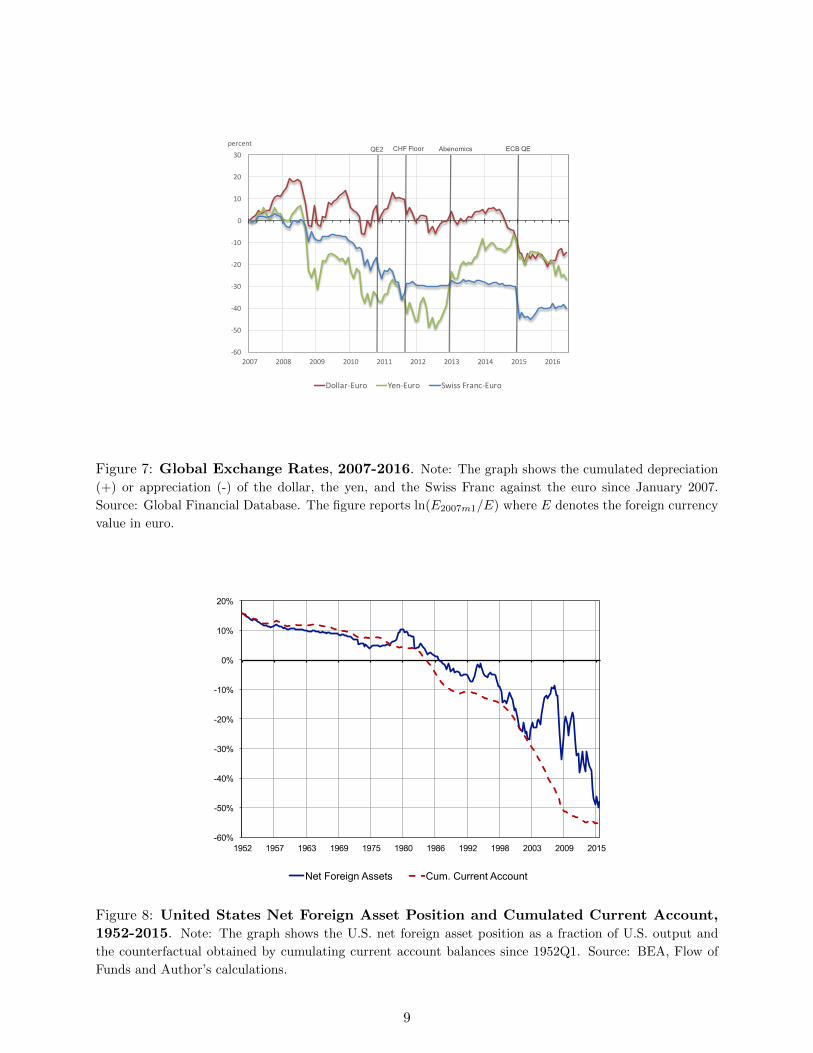
The case of core EMU is equally fascinating. In the run-up to the financial crisis, it acted as a
safe asset provider, with an extra twist. As documented by Hale and Obstfeld (2016), Germany
alongside other core Eurozone countries such as France, Belgium and the Netherlands, invested in
risky projects in peripheral Eurozone members, but also intermediated foreign capital into these
countries, thereby increasing further their exposure. Most of that increased exposure occurred via
an expansion in core EMU bank’s balance sheet and leverage (Miranda-Agrippino and Rey (2015))
and cross-border loans instead of portfolio holdings. In short, core EMU banks borrowed globally
and lent to peripheral Eurozone countries, earning small but positive excess returns in the process.
Importantly, because core EMU shares a common currency with the rest of the Eurozone, it cannot
let its currency appreciate in response to a surge in the demand for safe assets. Instead, it has to
absorb the increased exposure onto its national balance sheet. We illustrate how this trade-off has
30

0.00%
50.00%
100.00%
150.00%
200.00%
250.00%
300.00%
1960 1963 1966 1969 1972 1975 1978 1981 1984 1987 1990 1993 1996 1999 2002 2005 2008 2011 2014
Germany -‐ External liabili0es composi0on (% of GDP)
FDIL/GDP EQL/GDP DL/GDP OL/GDP
Figure 16: German Gross External Liability Position, 1960Q1-2015Q4. Note: The graph
reports the gross external liability position of Germany disaggregated by asset classes, as a % of GDP. FDI:
Foreign Direct Investment; O : bank loan and trade credit; D: Portfolio Debt; EQ : Portfolio Equity.
played out by considering in detail the external balance sheet of Germany.38
As can be seen from Figure 16, on the liability side the German external balance sheet has the
definite characteristics of a safe asset provider with a very large share of its gross liabilities being
either debt or bank liabilities (153% of GDP at end 2015). Over the period 1960-2015Q4, the share
of safe liabilities in total liabilities is always above 60% and is sometimes above 80%. Portfolio
equity and FDI account for a small share of liabilities. Interestingly the amount of safe assets held
by foreigners has increased sizably with the euro area crisis in 2010. What is remarkable however
is that on the asset side the portfolio is very symmetric in terms of asset classes, with the share of
FDI and equity hovering around 20 and 30% of total assets in recent years (Figure 17). A very large
proportion of German external assets are fixed income securities or bank loans. This is different
from the US which is invested heavily in FDI and portfolio equity and exhibits a very asymmetric
balance sheet structure in terms of asset classes. The riskiness of the bank loans and deposits may
be very different on the two sides of the German balance sheet however. Indeed, German banks
have extended large amount of credits to the euro periphery. At end 2003, the consolidated claims
of German banks on the euro area as a whole was about 92% of German GDP. At their peak in
July 2007 they amounted to an impressive 125% of GDP while the first warning shots of the global
38Similar trade-offs are present for the other core EMU members. However, Germany plays a prominent role inthat group.
31

0.00%
50.00%
100.00%
150.00%
200.00%
250.00%
300.00%
1960 1963 1966 1969 1972 1975 1978 1981 1984 1987 1990 1993 1996 1999 2002 2005 2008 2011 2014
Germany -‐ External assets composi3on (% of GDP)
RESA/GDP FDIA/GDP EQA/GDP DA/GDP OA/GDP
Figure 17: German Gross External Asset Position, 1960Q1-2015Q4. Note: The graph reports
the gross external asset position of Germany disaggregated by asset classes, as a % of GDP. FDI: Foreign
Direct Investment; O : bank loan and trade credit; D: Portfolio Debt; EQ : Portfolio Equity.
financial crisis were becoming more obvious.
In Figure 18 we look at the geographical composition of consolidated German Monetary and
Financial Institutions (MFIs) external claims.39 The share of German banks’ claims on the euro
area in total claims climbed by about 10 points (from 33% to 42% ) between July 2007 and
September 2009. The share of claims on the euro area periphery had been in constant rise from
2002 and up to 2009 while the share of claims on the core euro area countries, after dipping in 2005
and decreasing till 2007, resumed its growth from 2007 onwards. The years 2009-2010 constitute
turning points with German banks decreasing massively their exposures to the periphery. In Figure
19 we calculate the net risky exposure of Germany, including not only FDI and equity assets but
also portfolio debt as well as loans to emerging markets and to the periphery of the euro area
(using the locational statistics -not the consolidated ones- for consistency with the IIP data). The
German net risky position increased to reach about 100% of German GDP in 2015. At the same
time, German’s net safe liability position stabilized around -50% of GDP after having reached a
peak of about -70% of GDP during the euro area crisis. Hence the net risky and net safe position
39We looked both at consolidated data and non-consolidated data. Non-consolidated data are consistent with theexternal investment position data which uses balance of payment (residency) definitions but do not cover the fullexposure of Germany (based on a concept of ownership). A graph using non-consolidated data (data available since1994) looks very similar however as far as the movements in shares are concerned. Expected levels of exposures ofGerman banks to the euro area as a percentage of GDP are higher in the consolidated data however.
32

0.00%
5.00%
10.00%
15.00%
20.00%
25.00%
30.00%
35.00%
40.00%
45.00%
2002 2003 2004 2005 2006 2007 2008 2009 2010 2011 2012 2013 2014 2015
Claims of German Banks on Euro Area -‐ Decomposi7on (share of Total claims, consolidated data)
Claims on euro area/Total claims Claims on core countries/Total claims Claims on periphery countries/Total claims
Figure 18: Geographical composition of consolidated German MFIs external claims,2002Q1-2015Q4. Note: The graph reports the geographical composition of consolidated German MFI
external claims on euro area countries. The core is defined as Austria, Belgium, Finland, France, Luxem-
bourg, Netherlands. The periphery is defined as Cyprus, Estonia, Greece, Ireland, Italy, Latvia, Lithuania,
Malta, Portugal, Slovak Republic, Slovenia, Spain.
of Germany have common features with the U.S. ones. One important difference however comes
from the nature of the assets involved: in the case of the U.S., risky assets consist mainly of FDI
and equity. In the case of Germany, a sizable share of external assets are bank loans and portfolio
debt into risky markets, in particular into the periphery of the euro area.
German banks and investors were therefore loading up exposures on the countries of the periph-
ery of the euro area so that the riskiness of their banking (and portfolio) assets and liabilities was
very asymmetric. As a result, Germany was enjoying positive excess returns on its net foreign asset
position for most of the period between 1995 and July 2007, since the net international investment
position of Germany at market value exceeds the cumulation of current account surpluses or deficits
albeit only modestly. These small excess returns appear to turn negative from the spring of 2007
onwards as risk started to be repriced in the global economy as shown on Figure 20.
The official statistics report a large cumulated valuation loss of about 19% of GDP or about
BC492 bn between the international investment position and the cumulated current account deficit
of Germany between 2000 and 2015Q4. As pointed out by Busse and Gros (2016) however, there
are reasons to doubt the accuracy of these numbers.40 Using net investment income data, these
authors estimate that returns on German external assets exceeded returns on German external
40See also Schipper (2015) and Deutsche Bundesbank (2014).
33
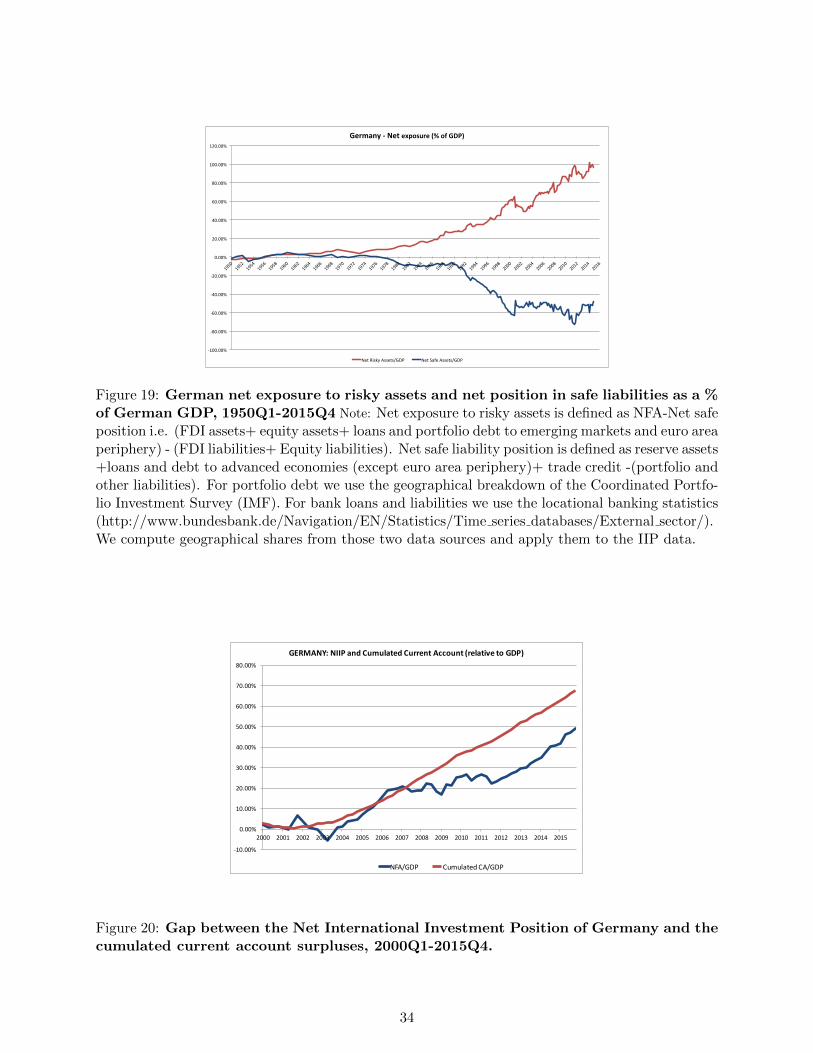
-‐100.00%
-‐80.00%
-‐60.00%
-‐40.00%
-‐20.00%
0.00%
20.00%
40.00%
60.00%
80.00%
100.00%
120.00%
1950 1952 1954 1956 1958 1960 1962 1964 1966 1968 1970 1972 1974 1976 1978 1980 1982 1984 1986 1988 1990 1992 1994 1996 1998 2000 2002 2004 2006 2008 2010 2012 2014 2016
Germany -‐ Net exposure (% of GDP)
Net Risky Assets/GDP Net Safe Assets/GDP
Figure 19: German net exposure to risky assets and net position in safe liabilities as a %of German GDP, 1950Q1-2015Q4 Note: Net exposure to risky assets is defined as NFA-Net safeposition i.e. (FDI assets+ equity assets+ loans and portfolio debt to emerging markets and euro areaperiphery) - (FDI liabilities+ Equity liabilities). Net safe liability position is defined as reserve assets+loans and debt to advanced economies (except euro area periphery)+ trade credit -(portfolio andother liabilities). For portfolio debt we use the geographical breakdown of the Coordinated Portfo-lio Investment Survey (IMF). For bank loans and liabilities we use the locational banking statistics(http://www.bundesbank.de/Navigation/EN/Statistics/Time series databases/External sector/).We compute geographical shares from those two data sources and apply them to the IIP data.
-10.00%
0.00%
10.00%
20.00%
30.00%
40.00%
50.00%
60.00%
70.00%
80.00%
2000 2001 2002 2003 2004 2005 2006 2007 2008 2009 2010 2011 2012 2013 2014 2015
GERMANY:NIIPandCumulatedCurrentAccount(relativetoGDP)
NFA/GDP CumulatedCA/GDP
Figure 20: Gap between the Net International Investment Position of Germany and thecumulated current account surpluses, 2000Q1-2015Q4.
34

liabilities even after the onset of the euro area crisis. When the crisis materialized and hit the
periphery of the euro area, Germany (and core EMU) stood to suffer substantial capital losses on
its net external position, a combination of losses on its gross external assets and capital gains on
its external liabilities.
Unlike the U.S. however, where the valuation losses were immediately realized via changes in
asset prices and currency price movements, resulting in the sharp decline in the net foreign asset
position (Figure 8), these losses do not seem to have materialized. With the crisis, risk was repriced
throughout the periphery but there were no large realized losses.41 Without a debt resolution
mechanism for banks or sovereigns within the Eurozone, and with the fear that markets might
turn on them, most peripheral eurozone members launched multiple rounds of private and public
de-leveraging. The protracted resolution process of the European Sovereign Debt crisis profoundly
hampered the recovery of the Eurozone.
Just for illustration purposes, we perform the following simple thought experiment. Imagine
that Germany had had the same external balance sheet structure as the US with a large share of
risky claims (FDI and equity instead of bank loans and portfolio debt) on the rest of world. We
ask: what would have been the order of magnitude of valuation losses that Germany would have
incurred between 2007Q4 and 2015Q3? German external assets stood at about 200% of GDP in
2007 while US gross external assets amounted to about 115% of GDP, out of which about 80% were
risky. Between 2007Q4 and 2015Q3, our estimates indicate that U.S. valuation losses represented
approximately $4.13 trillion, or 22.9% of 2015 U.S. GDP. Assuming a similar change in the value
of liabilities in the US and in Germany - both countries benefitted from safe haven effects and
have very similar net safe positions in 2007 Q4 (-50% of GDP for Germany and -47% of GDP for
the US)-, German losses would have been of the order of 40% of German GDP. We can perform a
perhaps less crude calculations by comparing the net exposures in risky assets for the US and for
Germany. In the US, net exposure to risky assets stood at about 38% in 2007Q4 (risky exposure,
just like that for Germany includes loans and portfolio debt assets to emerging markets and to the
euro periphery). For Germany it was about 68% for the same quarter. If Germany had undergone
a loss proportional to the US one, Germany would have had a valuation loss of about 41% of GDP,
which is very similar to the previous estimates. Whatever disagreement one might have about the
41Except in Greece, but Greece was only a small share of German external exposure.
35

actual losses on the German net foreign asset position during that period, they are very far from
40% of GDP. According to the official statistics – which as mentioned above are probably biased
upwards- German losses would be at most 19% of GDP.
Three points are important here. First, some of these valuation losses can ultimately be reverted
as the global economy recovers and safe asset providers –via their exposure– stand to gain dispro-
portionately from the subsequent recovery. Second, our point here is not to argue that Germany (or
other core EMU countries) should have shouldered such a staggering amount of losses. Rather, it
is that the external portfolio structure of regional safe asset providers can entail very large levels of
exposure which should be properly understood and monitored. Third, this portfolio structure is an
equilibrium phenomenon, emerging from market forces and expected returns. If German post-crisis
external returns are not very low, German pre-crisis external returns do not appear inordinately
large either: the yield difference between core and periphery investment appeared surprisingly low
in the run-up to the Eurozone crisis. This may have been the result of massive risk shifting on the
part of core-EMU financial institutions. It also suggests that safe asset providers are dispropor-
tionately vulnerable to periods of excessive risk appetite. Ultimately, this contributes to extremely
elevated exposure levels that make it very difficult to achieve a speedy resolution.
The result of the protracted deleveraging in the euro area has been a massive shift from current
account balance, to a current account surplus of 0.7% of world GDP, as illustrated on Figures 5
and 6. In terms of our earlier analysis, these deleveraging forces pushed the natural interest rate in
the Eurozone far below the rest of the world. If the Eurozone were a closed economy, the resulting
deflationary forces would have been self-defeating, just as attempts to deflate one’s economy at the
expense of one’s trading partners were ultimately self-defeating during the Great Depression. At
the Zero Lower Bound, instead, this shift towards surpluses has lessened the burden of adjustment
on the Eurozone, at the expense of the rest of the world.
In summary, core EMU has not performed its role as a regional insurer. Unlike the U.S. which
saw its net foreign asset position deteriorate a great deal during the crisis, as U.S. Treasuries
appreciated while external assets plummeted in value, core EMU has not absorbed the banking
losses on its balance sheet. Unrealized losses have been pushed onto the peripheral countries’
public sector balance sheet, forcing them to delever aggressively. This aggregate delevering, and
36

the corresponding surge in saving continues to have deleterious effects on the global economy.42
Given our finding that real interest rates will remain low for an extended period of time, we
consider that it would be wise to steer away from policies that make us teeter on the verge of a
global liquidity trap. Being a regional safe asset provider may prove to be a curse not only to core
EMU, but to the EMU as a whole, and to the global economy.
4 Conclusion
Several implications can be derived from our analysis. First, we analyze the long run historical
time series of consumption and wealth of four large economies accounting for much of international
financial and economic activity between the end of the 19th century and today (the United States,
the United Kingdom, France and Germany). We show that consumption wealth ratios tend to
predict future movements in real risk-free rates. The strength of our analysis comes in particular
from the fact that we do not superimpose any structural model on our data; all our results are
obtained using merely the intertemporal budget constraint of the world economy proxied by these
four countries. Economic common sense and our budget constraint say that low consumption-wealth
ratios today have to be an indication of future low returns on wealth or high future consumption
growth. After decomposing the return on wealth in a real rate component and an excess return
component and constructing the relevant VARs, we obtain a first-order result: consumption-wealth
ratios predict future real riskless rates. Furthermore, we identify two historical periods during which
the consumption wealth ratios have been unusually low: those are the two “secular stagnation”
periods (the 1930s and the current period). Both periods have been preceded by a period of
“financial exuberance” (the 1920s and the 2000s) were wealth has grown quickly. Both periods
have seen a major financial crisis followed by a period of deleveraging and low consumption. These
deleveraging periods during which we observe low consumption to wealth ratios announce low
future real rates. The bottom line is that our estimates indicate that the real rates should stay
low for several more years. Such a long period of low real rates has consequences ranging from the
sustainability of the business models of banks and insurance to the solvency of pension plans.
42Reinhart and Rogoff (2009) emphasize that besides deleveraging post-crisis weakness of the banking sector andin some cases post-crisis re-regulation of the financial sector (which may involve some degree of financial repression)are also important factors contributing to the weakness of the economy.
37

It also makes it more likely that several countries fall or stay in a liquidity trap. In a world
where many countries flirt with the ZLB, it is the reallocation of demand across geographical areas
that determines global imbalances as shown by Caballero et al. (2015) and Eggertsson et al. (2015).
There is therefore a large risk that countries pursue non-cooperative policies. Another important
message of our paper is that a world of low real rates also comes with unequal burdens. Safe
asset providers and in particular regional or small safe asset providers face a large demand for
their assets in times of turmoil. Building on Gourinchas et al. (2010), we show in section 3 of the
paper that such countries face a tradeoff between letting their exposure to world risk increase or
allowing their currency to appreciate in real terms. The tradeoff is starker for smaller economies
(such as Switzerland or core EMU countries) than for the United States as their exposure can
rapidly rise to several multiple of GDP. We dub this the ’curse of the regional safe asset providers.’
The recent experience of Switzerland comes to mind. Unlike the United States whose net foreign
asset positions has massively declined since 2007 (as insurance has been provided to the rest of
the world), core EMU countries have postponed or avoided losses on their external assets, forcing
euro area economies of the periphery to delever to make good on their external debt. Euro area
periphery countries’ deleveraging has translated into a large aggregate current account surplus of
the euro area, effectively exporting recession abroad.
What are the implications of our analysis? The issue of post-crisis deleveraging leading to
low levels of the real interest rate is central to the difficulties of the world economy. Hence our
econometric analysis supports the part of the “secular stagnation” literature which assigns the
current economic weakness to the post financial crisis debt hangover and overhang. Increased
public spending in particular seems likely to decrease the risk of falling into a liquidity trap. But
our analysis also suggests a particular role for countries issuing safe assets. Overcoming the “curse
of the regional asset provider” seems to be one of the most challenging issue.
First, if the Eurozone were to issue safe assets on a larger scale instead of relying only on Bunds,
French OAT, or on Swiss deposits, this would increase the supply of safe assets and presumably
increase the real rate. This should give impetus to a number of initiatives aiming at developing
euro-area safe assets, whether red/blue bonds (see Von Weizsacker and Delpla (2010)); ESBies (see
Brunnermeier et al. (2011)); or CDOs (see Corsetti et al. (2016)). Relying on a broader supply of
safe assets, whose safety is not aligned with geographical boundaries but rather spans the entire
38
euro area would avoid the destabilizing portfolio shifts occurring during periods of high risk. In
periods of volatility, endogenous market segmentation increases, hindering the proper transmission
of monetary policy and capital flows towards safe haven countries pushing them to either supply
insurance and increase their risk exposure or to real appreciation with recessionary risk. Overcoming
the curse of the regional asset provider can therefore be done by delinking the supply of safe asset
from a particular economy.
Second, having a mechanism which allows orderly loss-taking within the euro area would help
overcome the curse of the regional safe asset provider. When losses are not realized and deleveraging
drags on, recession takes hold and becomes self-defeating in a closed economy. In an open economy,
recession is exported abroad via current account surpluses. One could think of institutionalizing a
sovereign debt restructuring mechanism within the euro area to make sure that the current situation
does not reproduce itself in the future. By enabling an orderly write-down of debts, a sovereign
debt restructuring mechanism avoids long periods of deleveraging and resolves the problem of debt
overhang (see Corsetti et al. (2016) for a possible implementation). Paying particular attention
to the treatment of non-performing loans (NPLs) in the portfolios of banks could help avoid the
well-known phenomenon of zombie lending. Sovereign debt restructuring and NPLs write down
could in some cases lead to financial instability and contagion across the area. Safeguards in terms
of banking union (including deposit guarantees) if in place would help decrease the likelihood of
contagion.
Third, developing the Capital Markets Union would allow a quicker write down of losses. Were
risk to be shared through contingent assets -such as FDI and equity-we would not be facing the
protracted current period of recession associated with a long and painful deleveraging of the pe-
riphery. In that respect much remain to be done and in particular some major rethinking of the
legal infrastructure (bankruptcies).
Lastly, increased monitoring of core EMU banks and financial intermediaries would enable reg-
ulators and supervisors to avoid boom-bust cycles in financial markets. In this crisis, international
banks have borrowed globally and lent to peripheral Eurozone countries, earning small but positive
excess returns in the process. Core EMU countries have not let their real exchange rate appreciate
in response to a surge in the demand for safe assets. Instead, they have tended to absorb the
increased external exposure onto their national balance sheet. Some of that increase in financial
39
sector exposure may well reflect risk shifting and expectations of bailouts using tax payers money.
A very careful monitoring of financial fragilities and imbalances, especially for EMU safe asset
providers woudl decrease the probability of financial instability.
40

References
Amador, M., J. Bianchi, L. Bocola, and F. Perri (2015). Reverse speculative attacks. mimeo
University of Minnesota.
Barro, R. J. and X. Sala-i Martin (1990). World real interest rates. In NBER Macroeconomics
Annual 1990, Volume 5, pp. 15–74. MIT Press.
Barro, R. J. and J. Ursua (2010). Barro-ursua macroeconomic data. http://scholar.harvard.
edu/barro/publications/barro-ursua-macroeconomic-data.
Bernanke, B. (2005, March). The global saving glut and the u.s. current account deficit. Sandridge
lecture, virginia association of economics, richmond, virginia, Federal Reserve Board.
Brunnermeier, M. K., L. Garicano, P. R. Lane, M. Pagano, R. Reis, T. Santos, D. Thesmar,
S. Van Nieuwerburgh, and D. Vayanos (2011). Esbies: A realistic reform of europe’s financial
architecture. The Future of Banking , 15.
Busse, M. and D. Gros (2016, April). Returns to german savings invested abroad. http://voxeu.
org/article/returns-german-savings-invested-abroad.
Caballero, R. J. and E. Farhi (2015, February). The Safety Trap. NBER Working Papers 19927.
Caballero, R. J., E. Farhi, and P.-O. Gourinchas (2008, March). An equilibrium model of “global
imbalances” and low interest rates. American Economic Review 98 (1), 358–93.
Caballero, R. J., E. Farhi, and P.-O. Gourinchas (2015, October). Global Imbalances and Currency
Wars at the ZLB. NBER Working Papers 21670, National Bureau of Economic Research, Inc.
Caballero, R. J., E. Farhi, and P.-O. Gourinchas (2016, February). Safe Asset Scarcity and Aggre-
gate Demand. NBER Working Papers 22044, National Bureau of Economic Research, Inc.
Calvo, G. (2013). The liquidity approach and the price theory of money: Disentangling the mysteries
of financial crises.
Campbell, J. Y. and N. G. Mankiw (1989). Consumption, income and interest rates: Reinterpreting
the time series evidence. In O. J. Blanchard and S. Fischer (Eds.), N.B.E.R. Macroeconomics
Annual, pp. 185–215. Cambridge: MIT Press.
41

Corsetti, G., L. FELD, R. Koijen, L. Reichlin, R. Reis, H. Rey, and B. W. di Mauro (2016).
Reinforcing the eurozone and protecting an open society. Monitoring the Eurozone 2.
Deutsche Bundesbank (2014, May). Discrepancy between changes in foreign assets and the cumu-
lative financial account balance: unsuitable indicator of wealth losses. In Monthly Report.
Eggertsson, G. B. and P. Krugman (2012). Debt, deleveraging, and the liquidity trap: A fisher-
minsky-koo approach. The Quarterly Journal of Economics 127 (3), 1469–1513.
Eggertsson, G. B., N. R. Mehrotra, S. Singh, and L. H. Summers (2015). Contagious malady?
global dimensions of secular stagnation. Working paper, Brown University.
Eichengreen, B. (2015, May). Secular Stagnation: The Long View. American Economic Re-
view 105 (5), 66–70.
FitchRatings (2016, June 29). Brexit vote pushes negative-yielding debt to $11.7 trn. https:
//www.fitchratings.com/site/pr/1008156.
Gourinchas, P.-O. and H. Rey (2007a). From world banker to world venture capitalist: Us external
adjustment and the exorbitant privilege. In R. Clarida (Ed.), G-7 Current Account Imbalances:
Sustainability and Adjustment, Chicago, pp. 11–55. University of Chicago Press.
Gourinchas, P.-O. and H. Rey (2007b, August). International financial adjustment. Journal of
Political Economy , 665–703.
Gourinchas, P.-O. and H. Rey (2016, June). Global real rates: A long run approach. mimeo, UC
Berkeley.
Gourinchas, P.-O., H. Rey, and N. Govillot (2010). Exorbitant privilege and exorbitant duty.
mimeo, UC Berkeley.
Guerrieri, V. and G. Lorenzoni (2011, November). Credit crises, precautionary savings, and the
liquidity trap. Working Paper 17583, National Bureau of Economic Research.
Hale, G. and M. Obstfeld (2016). The euro and the geography of international debt flows. Journal
of the European Economic Association 14 (1), 115–144.
42

Hamilton, J. D., E. S. Harris, J. Hatzius, and K. D. West (2015, August). The Equilibrium Real
Funds Rate: Past, Present and Future. NBER Working Papers 21476, National Bureau of
Economic Research, Inc.
Hansen, A. H. (1939). Economic progress and declining population growth. The American Economic
Review 29 (1), pp. 1–15.
He, Z., A. Krishnamurthy, and K. Milbradt (2015, June). A model of the reserve asset. Technical
report, Stanford University, Graduate School of Business.
Jorda, O., M. Schularick, and A. M. Taylor (2013). When credit bites back. Journal of Money,
Credit and Banking 45 (s2), 3–28.
Jorda, O., M. Schularick, and A. M. Taylor (2016, April). Macrofinancial history and the new
business cycle facts. forthcoming NBER Macroeconomics Annual 2016.
Kindleberger, C. P. (2013). The world in depression, 1929-1939. 40th Anniversary edition. Uni-
versity of California Press.
Laubach, T. and J. C. Williams (2003). Measuring the natural rate of interest. Review of Economics
and Statistics 85 (4), 1063–1070.
Laubach, T. and J. C. Williams (2015). Measuring the natural rate of interest redux. Federal
Reserve Bank of San Francisco.
Lettau, M. and S. Ludvigson (2001). Consumption, aggregate wealth and expected stock returns.
Journal of Finance 56 (3), 815–49.
Maggiori, M., E. Farhi, et al. (2016). A model of the international monetary system. mimeo
Harvard University.
Mendoza, E. G., V. Quadrini, and J.-V. Rıos-Rull (2009, 06). Financial integration, financial
development, and global imbalances. Journal of Political Economy 117 (3), 371–416.
Mian, A., K. Rao, and A. Sufi (2013). Household Balance Sheets, Consumption, and the Economic
Slump. The Quarterly Journal of Economics 128 (4), 1687–1726.
43

Miranda-Agrippino, S. and H. Rey (2015). World asset markets and the global financial cycle.
Technical report, National Bureau of Economic Research.
Obstfeld, M. (2011, November). International liquidity: The fiscal dimension. Bank of Japan
Lecture, Monetary and Economic Studies.
Pescatori, A. and J. Turunen (2015). Lower for longer: Neutral rates in the united states.
Piketty, T. and G. Zucman (2014a). Capital is Back: Wealth-Income Ratios in Rich Countries
1700–2010. The Quarterly Journal of Economics 129 (3), 1255–1310.
Piketty, T. and G. Zucman (2014b, July). Wealth and Inheritance in the Long Run. CEPR
Discussion Papers 10072, C.E.P.R. Discussion Papers.
Reinhart, C. M. and K. S. Rogoff (2009). This time is different: Eight centuries of financial folly.
Princeton, NJ: Princeton University Press.
Schipper, U. (2015). Transaction and valuation effects on germany’s international investment po-
sition (iip)–new statistical approaches and iip trends. In IFC Satellite meeting at the ISI 60th
WSC, Rio de Janeiro, July, Volume 24.
Summers, L. H. (2015). Have we entered an age of secular stagnation? IMF Economic Review 63 (1),
277–280.
Triffin, R. (1960). Gold and the dollar crisis; the future of convertibility. New Haven: Yale University
Press.
Von Weizsacker, J. and J. Delpla (2010, May). The blue bond proposal. Policy brief, Brueghel.
44

Appendix
A Data Description
The data used in Section 2 were obtained from the following sources:
1. Consumption:
Real per-capita consumption going back to 1870 and covering the two world wars was taken from
Jorda et al. (2016) who in turn took the data from Barro and Ursua (2010). As this consumption
series is an index rather than a level, we convert it to a level using the consumption data from Piketty
and Zucman (2014a). To convert to a level we could use any year we have level data for but chose
to use the year 2006 (the year that the index of consumption was 100). In addition, the consumption
data was adjusted so that instead of being based on a 2006 consumption basket, it was based on a
2010 consumption basket to match the wealth data.
2. Wealth:
Real per capita wealth data was taken from Piketty and Zucman (2014b). The wealth concept used
here is private wealth. As such it does not include government assets but includes private holdings
of government issued liabilities as an asset. Where possible, wealth data is measured at market
value. Human wealth is not included. Private wealth is computed from the following components:
“Non-financial assets” (includes housing and other tangible assets such as software, equipment and
agricultural land), and net financial assets (includes equity, pensions, value of life insurance and bonds).
Prior to 1954 for France, 1950 for Germany, 1920 for the UK and 1916 for the USA, wealth data is
not available every year (see Piketty-Zucman’s appendix for details on when data is available for each
country or refer to Table 6f in the data spreadsheets for each country). When it is available is is based
on the market value of land, housing, other domestic capital assets and net foreign assets less net
government assets. For the remaining years the wealth data is imputed based on savings rate data
and assumptions of the rate of capital gains of wealth (see the Piketty-Zucman appendix for details
of the precise assumptions on capital gains for each country. The computations can be found in Table
5a in each of the data spreadsheets for each country).
3. Short term interest rates:
These were taken from Jorda et al. (2016) and are the interest rate on 3-month treasuries.
4. Long term interest rates:
These were taken from Jorda et al. (2016) and are the interest rate on 10 year treasuries.
5. Return on Equity:
This data is the total return on equity series taken from the Global Financial Database.
6. CPI:
CPI data is used to convert all returns into real rates and is taken from Jorda et al. (2016).
7. Population:
These were taken from Jorda et al. (2016).
Figure 21 reports consumption per capita, wealth per capita, the consumption/wealth ratio as
well as the short term real risk free rate for our G4 aggregate between 1920 and 2011.
45

0
5,000
10,000
15,000
20,000
25,000
30,000
0
40,000
80,000
120,000
160,000
200,000
1920 1930 1940 1950 1960 1970 1980 1990 2000 2010
real consumption per capita real wealth per capita
.14
.16
.18
.20
.22
.24
.26
1920 1930 1940 1950 1960 1970 1980 1990 2000 2010
consumption/wealth ratio
-.12
-.08
-.04
.00
.04
.08
.12
.16
.20
1920 1930 1940 1950 1960 1970 1980 1990 2000 2010
short term real interest rate (percent)
Figure 21: Real Consumption and Wealth per capita (2010 USD), Consumption WealthRatio and Short term real risk free interest rate, U.S., U.K., Germany and France,1920-2011.
46

The data used in Section 3 were obtained from the following sources:
1. United States: For the United States, the framework of Gourinchas and Rey (2007a,b),is used to
construct net and gross foreign asset positions at market value. Data is available from two sources: the
U.S. Department of Commerce’s Bureau of Economic Analysis (BEA), and the Federal Reserve Flow
of Funds Accounts (FFA). The BEA is the main source for recent data. It reports its International
Investment Position of the United States (IIP) annually since 1976, and quarterly since 2006. In
addition, the BEA reports quarterly flow data in the U.S. International Transactions (USIT) tables
since 1960 for some flow series, and 1982 for others. Following official classifications, we split the
foreign portfolio into four categories: debt (corporate and government bonds), equity, foreign direct
investment (FDI), and other. For assets, reserves are also presented as a separate category. The
“other” category includes mostly bank loans and trade credits. It also contains gold reserves. U.S.
GDP data are obtained at the quarterly frequency on an annualized basis from the BEA’s National
Income and Product Accounts (NIPA), Table 1.1.5. - Gross Domestic Product, Line 1. Current
account data are from NIPA Table 4.1, Line 33. Appendix B of Gourinchas and Rey (2007a), and
Appendix A of Gourinchas and Rey (2007b), provide a complete description of the data construction.
2. Germany: For Germany, net and gross foreign asset positions, as well as Current Account data, are
obtained from the Deutsche Bundesbank’s International Investment Position and Balance of Payments
series. Complete series are based on Euros, including for historical data, and are available at the annual
frequency from 1949, and the quarterly frequency from 2003Q4. We follow the same decomposition as
for the United States into debt, equity, FDI, and other (as well as reserves assets). “Other” is taken
as the difference between total external assets (liabilities) and the other 4 (3) categories. It contains
mostly bank loans, trade credits, as well as currency and deposits (which include Target 2 balances).
Quarterly GDP data on an unadjusted current-prices basis is from the Bundesbank as well as the Fed-
eral Statistical Office of Germany (Statistische Bundesamt), and is annualized on a rolling 4-quarter
window. Data are linearly interpolated over very short periods of time when needed. Risky assets
include FDI and equity assets, while safe liabilities contain debt and “other investment liabilities”
(from the official nomenclature, which is slightly more restrained than our “Other” category).German
banks data are obtained from the Deutsche Bundesbank as well, specifically the External position of
banks series. Those series provide details on the currency and geographical composition of banks’ bal-
ance sheets. The Bundesbank follows the BIS in providing two main types of classification: locational
banking statistics, which are based on the location of banks’ offices Banks in Germany (MFIs) series,
and consolidated banking statistics, which are based on the nationality of banking groups Claims of
German banks, including their foreign branches and subsidiaries vis-a-vis non-residents series. Con-
solidated data provide a perhaps more accurate picture of the foreign and currency risk exposure
of German Banks (concept of ownership), while locational data are more consistent with Balance of
Payments data (concept of residency). Finally, Target 2 balances data, which are part of the “Other
investment asset” category, are also obtained from the Deutsche Bundesbank, External position of the
Bundesbank series.
3. Switzerland: Data for the International Investment Position and Current Account of Switzerland are
available at the quarterly frequency from 2000Q1 from the Swiss National Bank (SNB), International
Economic Affairs division (Cube ID: auvekomq). We follow the same decomposition as for the United
States and Germany into debt, equity, FDI, and other (as well as reserves assets). “Other” is taken as
47

the difference between total external assets or liabilities and the other categories. It contains mostly
bank loans, trade credits, as well as currency and deposits. Quarterly GDP data is obtained from the
State Secretariat for Economic Affairs (SECO) of the Swiss Confederation. Non-adjusted data are
used, to be consistent with current account and net investment position data. We use data based on
the production approach, but figures are similar to expenditure and income-based approaches. GDP
is annualized using a rolling 4-quarter window.
48