RBioplot: an easy-to-use R pipeline for automated statistical analysis … · 2016-09-28 ·...
14
RBioplot: an easy-to-use R pipeline for automated statistical analysis and data visualization in molecular biology and biochemistry Jing Zhang and Kenneth B. Storey Institute of Biochemistry, Departments of Biology and Chemistry, Carleton University, Ottawa, ON, Canada ABSTRACT Background: Statistical analysis and data visualization are two crucial aspects in molecular biology and biology. For analyses that compare one dependent variable between standard (e.g., control) and one or multiple independent variables, a comprehensive yet highly streamlined solution is valuable. The computer programming language R is a popular platform for researchers to develop tools that are tailored specifically for their research needs. Here we present an R package RBioplot that takes raw input data for automated statistical analysis and plotting, highly compatible with various molecular biology and biochemistry lab techniques, such as, but not limited to, western blotting, PCR, and enzyme activity assays. Method: The package is built based on workflows operating on a simple raw data layout, with minimum user input or data manipulation required. The package is distributed through GitHub, which can be easily installed through one single-line R command. A detailed installation guide is available at http:// kenstoreylab.com/?page_id=2448. Users can also download demo datasets from the same website. Results and Discussion: By integrating selected functions from existing statistical and data visualization packages with extensive customization, RBioplot features both statistical analysis and data visualization functionalities. Key properties of RBioplot include: - Fully automated and comprehensive statistical analysis, including normality test, equal variance test, Student’s t-test and ANOVA (with post-hoc tests); - Fully automated histogram, heatmap and joint-point curve plotting modules; - Detailed output files for statistical analysis, data manipulation and high quality graphs; - Axis range finding and user customizable tick settings; - High user-customizability. Subjects Biochemistry, Bioinformatics, Computational Biology, Molecular Biology, Statistics Keywords R package, Bioinformatics, Biostatistics, Histogram, Joint-point curve How to cite this article Zhang and Storey (2016), RBioplot: an easy-to-use R pipeline for automated statistical analysis and data visualization in molecular biology and biochemistry. PeerJ 4:e2436; DOI 10.7717/peerj.2436 Submitted 15 June 2016 Accepted 12 August 2016 Published 28 September 2016 Corresponding author Kenneth B. Storey, [email protected] Academic editor Vsevolod Makeev Additional Information and Declarations can be found on page 13 DOI 10.7717/peerj.2436 Copyright 2016 Zhang and Storey Distributed under Creative Commons CC-BY 4.0
Transcript of RBioplot: an easy-to-use R pipeline for automated statistical analysis … · 2016-09-28 ·...
RBioplot: an easy-to-use R pipeline forautomated statistical analysis and datavisualization in molecular biologyand biochemistry
Jing Zhang and Kenneth B. Storey
Institute of Biochemistry, Departments of Biology and Chemistry, Carleton University, Ottawa,
ON, Canada
ABSTRACTBackground: Statistical analysis and data visualization are two crucial aspects in
molecular biology and biology. For analyses that compare one dependent variable
between standard (e.g., control) and one or multiple independent variables,
a comprehensive yet highly streamlined solution is valuable. The computer
programming language R is a popular platform for researchers to develop
tools that are tailored specifically for their research needs. Here we present an
R package RBioplot that takes raw input data for automated statistical analysis
and plotting, highly compatible with various molecular biology and biochemistry
lab techniques, such as, but not limited to, western blotting, PCR, and enzyme
activity assays.
Method: The package is built based on workflows operating on a simple raw
data layout, with minimum user input or data manipulation required. The package
is distributed through GitHub, which can be easily installed through one
single-line R command. A detailed installation guide is available at http://
kenstoreylab.com/?page_id=2448. Users can also download demo datasets from
the same website.
Results and Discussion: By integrating selected functions from existing statistical
and data visualization packages with extensive customization, RBioplot features
both statistical analysis and data visualization functionalities. Key properties of
RBioplot include:
- Fully automated and comprehensive statistical analysis, including normality test,
equal variance test, Student’s t-test and ANOVA (with post-hoc tests);
- Fully automated histogram, heatmap and joint-point curve plotting modules;
- Detailed output files for statistical analysis, data manipulation and high quality
graphs;
- Axis range finding and user customizable tick settings;
- High user-customizability.
Subjects Biochemistry, Bioinformatics, Computational Biology, Molecular Biology, Statistics
Keywords R package, Bioinformatics, Biostatistics, Histogram, Joint-point curve
How to cite this article Zhang and Storey (2016), RBioplot: an easy-to-use R pipeline for automated statistical analysis and data
visualization in molecular biology and biochemistry. PeerJ 4:e2436; DOI 10.7717/peerj.2436
Submitted 15 June 2016Accepted 12 August 2016Published 28 September 2016
Corresponding authorKenneth B. Storey,
Academic editorVsevolod Makeev
Additional Information andDeclarations can be found onpage 13
DOI 10.7717/peerj.2436
Copyright2016 Zhang and Storey
Distributed underCreative Commons CC-BY 4.0
INTRODUCTIONMolecular biology and biochemistry research heavily depends on the interpretation of the
data obtained from various lab techniques, such as western blotting, PCR and a wide
range of enzyme activity assays. A fully automated and comprehensive statistical analysis
and data visualization package is highly desirable for enhancing data processing efficiency
as well as reducing erroneous actions. Due to its relatively smooth learning curve, rich
resources and strong community support, the computer programming language R has
recently become a popular platform for data science in biological research. With both
strong built-in statistical functionality and third-party developed packages such as the
data visualization package ggplot2 (Wickham, 2009), as well as the stats package
multcomp (Hothorn, Bretz & Westfall, 2008), R has enabled the possibility of developing
data analysis packages specifically tailored for molecular biology and biochemistry.
The principal goal of the present R package RBioplot resides in the concept of
minimizing user input while presenting a comprehensive statistical and data visualization
solution, also with the option of high user-customizability. Therefore, automatic data
evaluation and processing is crucial. The package contains a statistical analysis module
(core function: rbiostats), a histogram plotting module (core function: rbioplot), a
heatmap module (core function: rbioplot_heatmap) a joint-point curve plotting
module (core functions: rbioplot_curve), and an axis range finding module (core
functions: autorange_bar_y and autorange_curve). For both statistical analysis and
data visualization modules, we have developed comprehensive workflows that
dynamically combine selected functions from the existing packages with new
functionalities specifically designed for the datasets obtained from the most popular lab
techniques in molecular biology and biochemistry. As a result, RBioplot conducts
statistical analysis and data visualization in a fully automated fashion with detailed reports
for statistical analysis and high quality image files as output files.
To minimize user intervention of the raw data and maintain consistency among the
modules, all the functions operate on an universal input data format (i.e., file type and
data points arrangement). Specifically, the input file is a data matrix (.csv) with rows for
the standard and independent variables (raw data, with biological replicates) and columns
for the dependent variable. All functions are also capable of properly processing datasets
with missing data points with no special action required from the user. Accordingly,
RBioplot is applicable to datasets obtained from a wide variety of molecular biology
and biochemistry lab techniques, including, but not limited to, western blotting, PCR
(both endpoint and quantitative PCRs), ELISA, as well as enzyme activity assays.
METHODS AND MODELSStatistical analysis moduleThe core function for the stats module is rbiostats. The function utilizes Student’s t-test
and analysis of variance (ANOVA) with post-hoc tests (e.g., Tukey and Dunnett’s tests)
to test significance of changes for two- and multi- group comparisons (Tukey, 1949;
Shapiro & Wilk, 1965), respectively. Since both tests are based on normal distribution,
Zhang and Storey (2016), PeerJ, DOI 10.7717/peerj.2436 2/14
Shapiro-Wilk test is used to test data normality for each data group (Dunnett, 1955).
Moreover, due to the fact that both Student’s t-test and the conventional ANOVA assume
equal variance between replicates among standard and independent variables, a variance
homogeneity test is needed. With the Shapiro-Wilk normality test in place, we use
Bartlett’s equal variance test for testing variance homogeneity, for which a normal
distribution is required (Bartlett, 1937). As such, for each dataset, the stats module tests
data normality and homogeneity prior to the significance tests by default.
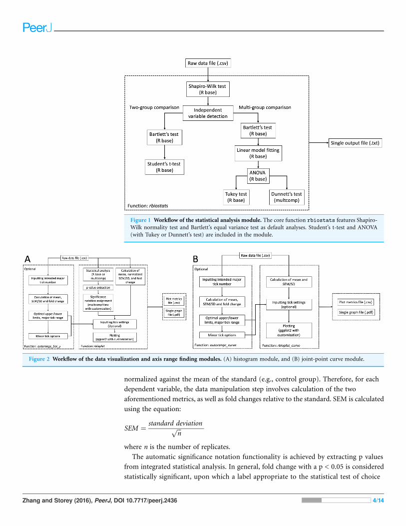
The workflow of rbiostats function can be viewed in Fig. 1. It is worth noting that,
for the same intended statistical test, the function is able to accept data files with more
than one dependent variables and conduct the tests for each individual variable at the
same time. Such configuration enables the capacity of processing grouped data sets
according to certain criteria, e.g., grouping the data for genes from the same pathway.
Upon designating the data file, rbiostats first conducts Shapiro-Wilk test to evaluate if
the data for the replicates within the same independent variable follow a normal
distribution. Then the Bartlett’s test of variance homogeneity is carried out. Upon both
the normality and equal variance tests being performed, rbiostats function proceeds
with the user-set statistical test of interest. The results for all the tests are written into a
single results file (.txt) per input dataset.
We have also added independent variable detection and statistical test verification
functionalities to the stats module. Specially, rbiostats function detects the total
number of unique independent variables (without replicates, e.g., number of
experimental groups) and verifies if the statistical test of choice is valid. For example, an
error message and a suggestion of the correct tests will be written into the results file if
Student’s t-test is set for a multi-group comparison where ANOVAwith a post-hoc test is
appropriate.
Histogram moduleHistograms are commonly used to visualize and compare data in molecular biology
and biochemistry lab techniques. Similar to the stats module, the histogram module is
capable of processing and plotting grouped bar graphs in a single figure per data file. The
popular R package ggplot2 serves as a foundation for the current module. Furthermore,
we have incorporated extensive modifications and new functionalities into ggplot2
and the associated syntax to realize high data interpretability and, if needed, user
customizability. The module is able to detect the number of dependent variables and
adjust the aesthetic of the plot accordingly, with dependent variable(s) as the discrete
value(s) for the x-axis. As a result, the core function rbioplot provides fully automated
data manipulation, significance notation assigning based on the integrated statistical
analysis, as well as interfaces for user-set graph title and axis labels. Figure 2A shows the
workflow of the function. The module outputs a high quality image file (.pdf format, for
size control) and a plot metrics file (.csv) as a reference.
For each dependent variable, the histogram module plots relative changes of the
mean of the replicates comparing to the standard (e.g., the control group), with error
bars representing either standard error of the mean (SEM) or standard deviation (SD)
Zhang and Storey (2016), PeerJ, DOI 10.7717/peerj.2436 3/14
normalized against the mean of the standard (e.g., control group). Therefore, for each
dependent variable, the data manipulation step involves calculation of the two
aforementioned metrics, as well as fold changes relative to the standard. SEM is calculated
using the equation:
SEM ¼ standard deviationffiffiffin
p
where n is the number of replicates.
The automatic significance notation functionality is achieved by extracting p values
from integrated statistical analysis. In general, fold change with a p < 0.05 is considered
statistically significant, upon which a label appropriate to the statistical test of choice
Figure 1 Workflow of the statistical analysis module. The core function rbiostats features Shapiro-
Wilk normality test and Bartlett’s equal variance test as default analyses. Student’s t-test and ANOVA
(with Tukey or Dunnett’s test) are included in the module.
Figure 2 Workflow of the data visualization and axis range finding modules. (A) histogram module, and (B) joint-point curve module.
Zhang and Storey (2016), PeerJ, DOI 10.7717/peerj.2436 4/14

is assigned to the corresponding bar in the histogram. Specifically, the asterisk is used
for both Student’s t-test and ANOVA with Dunnett’s test; whereas a lower case
Roman alphabet is used for ANOVA with Tukey’s test. For Tukey’s test, the function
multcompLetters from multcompView package is used to assign different letters to
the group exhibiting statistically significant difference (Graves et al., 2015). The
multcompLetter function automatically determines the letters based on the p values
for each comparison alphabetically to the standard and independent variables based on
the order of their appearance, i.e. the letter “a” is always given to the first variable in
the Tukey results report. However, Tukey’s test in R base outputs results in a format
optimized for easy interpretation. For example, “stress–control” will be written to the
results file when comparing the variable “stress” to “control” in Tukey’s test. In such
case, multcompLetter gives the letter “a” to “stress,” “b” to “control,” if the p value of
the comparison is less than 0.05. Such behavior is problematic when plotting since the
order of the letters is reversed in the histogram, for the layout of the bars representing
the standard and independent variables usually follows the same order presented in the
input data file, instead of the Tukey results report. To solve the issue, we have written a
function revsort that reverses the display order of the standard and independent
variables in a two-group comparison from Tukey’s test prior to executing
multcompLetter, e.g., “stress–control” becomes “control–stress” in the Tukey results
report after applying revsort function. Accordingly, the combination of revsort and
multcompLetter has enabled rbioplot to automatically assign significance notations
on the histogram for the Tukey’s test in the ideal order. Additionally, similar to
rbiostats, independent variable detection and statistical test detection are also
featured in the stats section of the histogram module.
Manipulation of right and left y-axis and minor tick functionalities are added to further
improve the readability of the histogram. Given that currently ggplot2 only offers left-side
y-axis, we incorporated custom-designed script to add the y-axis to the right-side of
the graph. Specifically, selected functions from packages grid (part of R base) and gtable
were used to copy and invert the mark position of the default left side y-axis to the
right side (R Core Team, 2016; Wickham, 2016). Furthermore, since on-axis minor tick is
unavailable in ggplot2 package, we have developed the following script as a workaround:
Ticks with only blank (invisible) labels are considered as minor ticks and added in
between the major ticks (i.e., ticks with visible labels). In the context of ggplot2 syntax,
the y-axis labels are set based on the results of the script. Moreover, the tick range (interval
of y-axis breaks) is calculated using following equation:
tick range ¼ major tick range
number of minor ticks � 1
Given that the histogram module plots fold change of the mean, the default major
tick range and number of minor ticks are set at 0.5 and 4. It is also worth noting that the
upper limit of the y-axis is automatically set at maximum mean + SEM/SD, with ample
space left for the inclusion of the significance notations. Furthermore, all the metrics
for y-axis are fully user customizable if needed (see axis range finding module section).
Zhang and Storey (2016), PeerJ, DOI 10.7717/peerj.2436 5/14
The package also includes a heatmap module with which users are able to produce simple
heatmaps. The core function rbioplot_heatmap operates similarly as the histogram
module and takes the exact same input file layout, with most of the arguments carried
over from the core function rbioplot of the histogram module.
Joint-point curve moduleJoint-point curve is commonly seen when visualizing data with dependent variables
representing a continuous relation, e.g., concentration series of an enzyme inhibitor.
We have developed a joint-point plotting module for such purpose. Built upon the
framework established in the histogram module, the core function of the current module
rbioplot_curve takes the input file in the same format as other functions in the
package. Instead of fold change, the function plots the mean with SEM/SD as the error bar
(when needed) for each independent variable against the continuous dependent variables
(i.e., x-axis values). Thus, SEM/SD values are not normalized based on the mean of the
standard (e.g., control). Unlike the histogram, statistical analysis is not featured in the
current module as significance notation is not required for the current purpose. The
workflow of the function is similar to rbioplot (Fig. 2B), but without the fold change
calculation, SEM/SD normalization or significance notation steps.
The rbioplot_curve function features default settings for major tick range and
minor tick number for both x- and y-axes, with the most carried over from the histogram
module. Specifically, major tick range and number of minor ticks for x-axis are set at
0.5 and 0 (no minor ticks), respectively; whereas the two metrics for y-axis are the same as
the default settings for the histogrammodule. However, due to lack of data normalization,
it is recommended to custom-set the values using the autorange_curve function from
the axis range finding module as a guideline (see axis range finding module section).
Similar to the histogram module, an image file (.pdf) and a plot metrics file (.csv) are
generated by the joint-point curve function. The module is also capable of evaluating
if the input data of interest requires manipulation (i.e., calculating mean and SEM/SD)
and/or error bar for plotting. Specifically constructed for visualising standard and one
or multiple independent variables, it is worth noting that only multi-curve plotting
(i.e., more than one variable) is supported for the joint-point curve module in the current
version (version 0.2.5).
Axis range finding moduleFunctions autorange_bar_y and autorange_curve are developed for user-
customizable axis range and tick setting functionalities for histogram and joint-point
modules, respectively. Both functions share the same range finding algorithm. A general
workflow for the range finding module is presented in Fig. 2A: Based on the user-set
intended major tick number (excluding the first tick), the function processes the input
data and generates the optimal major tick range with estimated lower and upper limit of
the axis, as well as all the available minor tick number options.
Regarding data processing, both functions feature the same process from their
counterparts in the plotting modules, i.e., autorange_bar_y calculates the fold change
Zhang and Storey (2016), PeerJ, DOI 10.7717/peerj.2436 6/14
of the mean and normalized SEM/SD, whereas autorange_curve only focuses on mean
and raw SEM/SD (when needed). The optimal major tick range of an axis is calculated
using the equations below:
Let
raw major tick range ¼ max �min
intended major tick number
And
i ¼ ceiling log10 raw major tick rangeð Þ½ �:Thus
optimal major tick range ¼ ceilingraw major tick range=10i
0:05
� �� 0:05 � 10i
Estimated upper limit of the axis is calculated using the equation:
upper limit ¼ optimal major tick range � ceilingmax
optimal major tick range
� �
And the estimated lower limit of the axis is calculated through the following equation,
if not using the default setting (zero):
lower limit ¼ optimal major tick range � floormin
optimal major tick range
� �
For all the equations in the current section, max is the raw maximum value (fold
change + normalized SEM/SD, or mean + SEM/SD); and min is the raw minimum value
(the default is zero; otherwise, fold change—normalized SEM/SD, or mean—SEM/SD).
It is worth noting that both floor and ceiling calculations follow the rounding rules
specific to R. With the specific properties of raw data, the resulted upper and lower limits
from the axis ranging finding module are only a close estimation for reaching the intended
major tick number and may present slight discrepancies. As such, user can either use
the range finding results directly for plotting, or utilize them as a guideline for fine-tuning
when applying custom tick range settings in the plotting modules.
Furthermore, based on the rounded major tick range obtained above, we have
developed an algorithm to automatically calculate all the minor tick options. In general,
the following equation is used:
minor tick options ¼ rounded major tick range
divsors of rounded major tick range� 1
As exhibited in the function above, the key step is to obtain all the divisors of
the calculated major tick range. While it is quite straightforward to automatically
determine all the divisors for an integer in R, doing so for decimal numbers requires a
more complex process. The basic principle is to scale the decimal number up by a
power of 10 to convert it to an integer, calculate the divisors, and then scale the results
back using the same scaling factor. We have written an intermediate function all_dvsr
Zhang and Storey (2016), PeerJ, DOI 10.7717/peerj.2436 7/14
to achieve such goal. Furthermore, a second scaling factor is included in the function to
cope with the scenario where the maximum number of the potential minor ticks is
less than four. For example, even if an integer, the major tick range “1” is applied with a
scaling factor of 10 when calculating the divisor, so that decimal divisors are calculated
for it, e.g., 0.1, 0.2, 0.5, etc. The divisor finding functionality is integrated in the
autorange_bar_y and autorange_curve functions. Thus, no additional user input
is required to acquire minor tick options. Accordingly, with the input data file and
user-defined major tick numbers, both axis range finding functions output the
estimated upper and lower limits, major tick range, and all minor tick options for
the axis (or axes) of interest, which can be further used in their respective data
visualization modules.
Given the unique characteristics of histogram and joint-point plots, specific
adjustments are also made to the two functions in the current module. For example,
autorange_bar_y only focuses on y-axis since range finding is only applicable to the
y-axis for histogram; whereas autorange_curve operates on either or both axes as
joint-point curve contain continuous values for the axes.
Availability and installationRBioplot is distributed under GPL-3 license through GitHub (https://github.com/
jzhangc/git_R_STATS_KBS.git).The R package devtools (Wickham& Chang, 2016) is used
to automatically install the package with all dependencies. After installing devtools
package, run the following command devtools::install_github ("jzhangc/git_
R_STATS_KBS/package/rbioplot") to install the package. An instruction, demo
datasets and sample output files are available at http://kenstoreylab.com/?page_id=2448.
RESULTS AND DISCUSSIONFor all case studies featured in this section, a working directory was designated using the
R base function setwd. The input files were stored to the working directory prior to
the analysis. The directory also served as the destination for all the output files generated
by RBioplot.
Case study 1: proteomic expression analysis (Western blotting)We use part of the data from a study by Zhang & Storey (2012) to demonstrate the usage of
the package for western blotting data analysis and visualization. In the study, western
blotting was used to investigate the protein levels of cell cycle regulators in the liver tissue
of wood frog (Rana sylvatica) under multiple stress conditions. Here we use RBioplot
package to generate Fig. 6 from the original study.
The raw data were obtained as enhanced chemiluminescence (ECL) signals and
Coomassie blue stained band intensities from the standardization protein bands.
The dataset contains the protein level of several key cyclins under dehydration—
rehydration cycle in the liver of the frogs. As such, the experimental conditions are
considered as independent variables, while the individual cyclin proteins are the
dependent variables. To prepare the input data file, we take the ratios of ECL and
Zhang and Storey (2016), PeerJ, DOI 10.7717/peerj.2436 8/14

Coomassie intensities for all four cyclins tested for all animal groups, and then group
them into a single data matrix (.csv). Table 1 shows the layout of the input data file.
The first column is dedicated to the animal groups (independent variables), and the ratio
values for the cyclins are presented starting from the second column. As shown in the
same table, the input file contains the raw ratio values for all biological replicates. With the
uneven number of biological replicates (n = 3–4) due to removal of outliers, the current
dataset also demonstrates Rbioplot’s capability of automatically processing data files with
missing values without additional data manipulation steps required from the user.
Given that the current dataset contains a standard and two independent variables,
an ANOVAwith post-hoc test is appropriate. According to the original study, here we also
use the Tukey post-hoc test to assess the changes of cyclins between all animal groups.
To conduct statistical analysis, we use the following command: rbiostats
("casestudy1.csv", Tp = "Tukey"). An output file (.txt) is then generated containing
the all the stats results, i.e., Shapiro-Wilk normality test, Bartlett’s equal variance test,
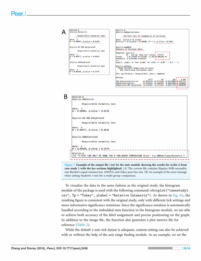
ANOVA, and Tukey’s test. Figure 3 shows the cyclin A portion of the report as an example.
As seen in Fig. 3A, p values for both Shaprio-Wilk and Barlett’s tests are greater than 0.05,
indicating normal distribution and equal variance, thereby suggesting the results of the
upcoming ANOVA with Tukey’s test are valid. Figure 3B shows the error message when
Student’s t-test is chosen for a multi-group comparison.
Table 1 Input file layout (.csv). (A) Data layout for the histogram module (case study 1). The first
column is used for independent variables. Dependent variables start from the second column. The raw
data points with biological replicates are presented. The current dataset also features missing values.
(B) Data layout for the joint-point curve module (case study 2). A truncated version is shown due to the
space limitation. The current dataset contains only one set of values for each animal group (i.e., no
multiple replicates). The dependent variables (fraction number) show a continuous relation.
(A)
Groups Cyclin A Cyclin B1 Cyclin D1 Cyclin E
Control 1 1 1 1
Control 1.19604093 0.709922771 0.829852824 1.121621622
Control 0.701239343 1.043122829 1.198614911
Control 1.090447809 0.713018827 1.086762242
40% Dehydrated 0.653315462 0.243093923 0.159298618
40% Dehydrated 0.92430544 0.615747952 0.169557985 0.611308901
40% Dehydrated 0.805826152 0.253410348 0.315173675 0.676607642
40% Dehydrated 0.510693792 0.313817882 0.665111318
Rehydrated 1.103239032 0.819114471 0.566761364 0.674198593
Rehydrated 0.687641907 0.757135246
Rehydrated 1.272757148 0.874822064 0.769900287
Rehydrated 1.248098927 0.840052737 0.64319508 0.776602925
(B)
Groups 5 6 7 8
Control -0.031439236 -0.010101098 -0.005330851 0.113880783
40% Dehydration 0.016252368 -0.008646114 -0.008334101 -0.006418122
Zhang and Storey (2016), PeerJ, DOI 10.7717/peerj.2436 9/14
To visualize the data in the same fashion as the original study, the histogram
module of the package is used with the following command: rbioplot("casestudy1.
csv", Tp = "Tukey", yLabel = "Relative Intensity"). As shown in Fig. 4A, the
resulting figure is consistent with the original study, only with different tick settings and
more informative significance notations. Since the significance notation is automatically
handled according to the imbedded stats function in the histogram module, we are able
to achieve both accuracy of the label assignment and precise positioning on the graph.
In addition to the image file, the function also generates a plot metrics file for
reference (Table 2).
While the default y-axis tick layout is adequate, custom-setting can also be achieved
with or without the help of the axis range finding module. As an example, we set the
Figure 3 Example of the output file (.txt) by the stats module showing the results for cyclin A from
case study 1 with the key sections highlighted. (A) The current file contains Shapiro-Wilk normality
test, Bartlett’s equal variance test, ANOVA, and Tukey post-hoc test. (B) An example of the error message
when setting Student’s t-test for a multi-group comparison.
Zhang and Storey (2016), PeerJ, DOI 10.7717/peerj.2436 10/14
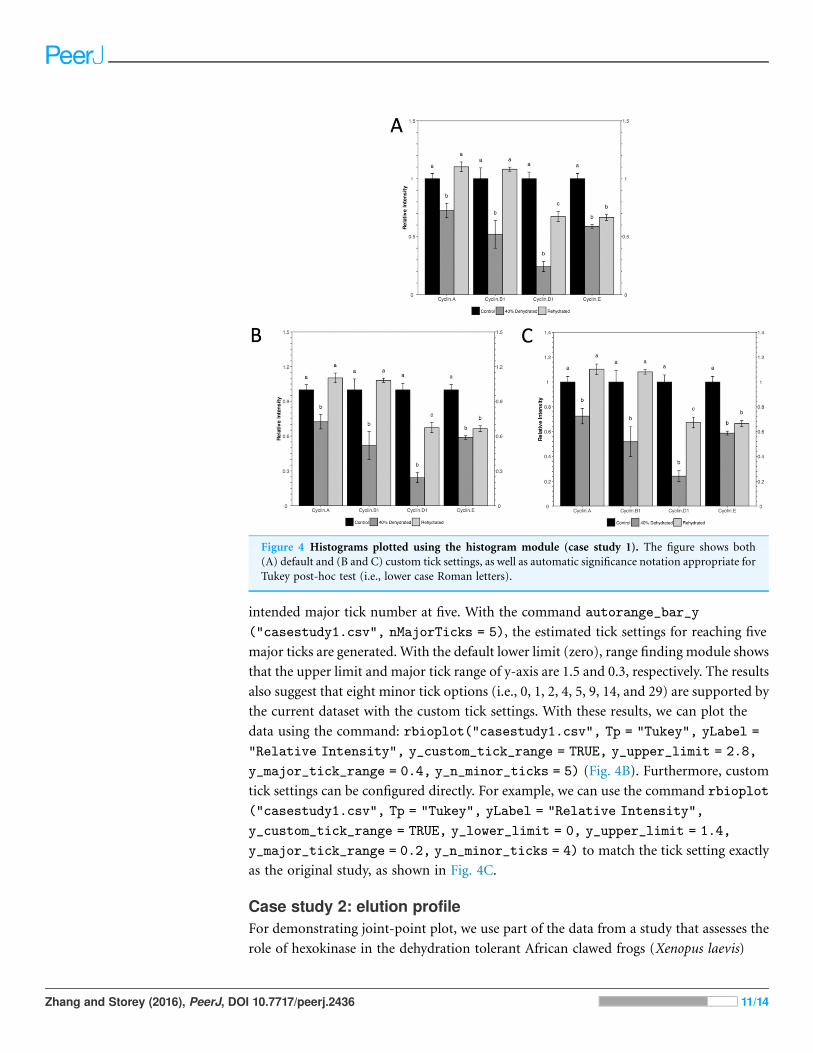
intended major tick number at five. With the command autorange_bar_y
("casestudy1.csv", nMajorTicks = 5), the estimated tick settings for reaching five
major ticks are generated. With the default lower limit (zero), range finding module shows
that the upper limit and major tick range of y-axis are 1.5 and 0.3, respectively. The results
also suggest that eight minor tick options (i.e., 0, 1, 2, 4, 5, 9, 14, and 29) are supported by
the current dataset with the custom tick settings. With these results, we can plot the
data using the command: rbioplot("casestudy1.csv", Tp = "Tukey", yLabel =
"Relative Intensity", y_custom_tick_range = TRUE, y_upper_limit = 2.8,
y_major_tick_range = 0.4, y_n_minor_ticks = 5) (Fig. 4B). Furthermore, custom
tick settings can be configured directly. For example, we can use the command rbioplot
("casestudy1.csv", Tp = "Tukey", yLabel = "Relative Intensity",
y_custom_tick_range = TRUE, y_lower_limit = 0, y_upper_limit = 1.4,
y_major_tick_range = 0.2, y_n_minor_ticks = 4) to match the tick setting exactly
as the original study, as shown in Fig. 4C.
Case study 2: elution profileFor demonstrating joint-point plot, we use part of the data from a study that assesses the
role of hexokinase in the dehydration tolerant African clawed frogs (Xenopus laevis)
Figure 4 Histograms plotted using the histogram module (case study 1). The figure shows both
(A) default and (B and C) custom tick settings, as well as automatic significance notation appropriate for
Tukey post-hoc test (i.e., lower case Roman letters).
Zhang and Storey (2016), PeerJ, DOI 10.7717/peerj.2436 11/14
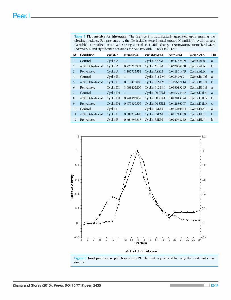
Table 2 Plot metrics for histogram. The file (.csv) is automatically generated upon running the
plotting modules. For case study 1, the file includes experimental groups (Condition), cyclin targets
(variable), normalized mean value using control as 1 (fold change) (NrmMean), normalized SEM
(NrmSEM), and significance notations for ANOVA with Tukey’s test (Lbl).
Id Condition variable NrmMean variableSEM NrmSEM variableLbl Lbl
1 Control Cyclin.A 1 Cyclin.ASEM 0.044782409 Cyclin.ALbl a
2 40% Dehydrated Cyclin.A 0.725225991 Cyclin.ASEM 0.062004168 Cyclin.ALbl b
3 Rehydrated Cyclin.A 1.102725551 Cyclin.ASEM 0.041801495 Cyclin.ALbl a
4 Control Cyclin.B1 1 Cyclin.B1SEM 0.09349969 Cyclin.B1Lbl a
5 40% Dehydrated Cyclin.B1 0.51947888 Cyclin.B1SEM 0.119637014 Cyclin.B1Lbl b
6 Rehydrated Cyclin.B1 1.081452203 Cyclin.B1SEM 0.018013365 Cyclin.B1Lbl a
7 Control Cyclin.D1 1 Cyclin.D1SEM 0.056794487 Cyclin.D1Lbl a
8 40% Dehydrated Cyclin.D1 0.241896859 Cyclin.D1SEM 0.043813224 Cyclin.D1Lbl b
9 Rehydrated Cyclin.D1 0.673655355 Cyclin.D1SEM 0.042886507 Cyclin.D1Lbl c
10 Control Cyclin.E 1 Cyclin.ESEM 0.045240584 Cyclin.ELbl a
11 40% Dehydrated Cyclin.E 0.588219496 Cyclin.ESEM 0.015748309 Cyclin.ELbl b
12 Rehydrated Cyclin.E 0.664993817 Cyclin.ESEM 0.024568233 Cyclin.ELbl b
Figure 5 Joint-point curve plot (case study 2). The plot is produced by using the joint-pint curve
module.
Zhang and Storey (2016), PeerJ, DOI 10.7717/peerj.2436 12/14

(Childers & Storey, 2016). Specifically, the joint-point curve module of the package is used
to plot the data from Fig. 1 of the original study.
The original figure depicts the hexokinase elution profile in the skeletal muscle of
both control and ∼40% dehydrated frogs using DEAE+ Sephadex column. The dataset
contains hexokinase activity for 20 eluted fractions for both animal groups. We use
the function rbioplot_curve to re-create the figure. Table 1 shows a truncated version
of the input data file layout, with animal groups as independent variables and fractions
as dependent variables. As shown in the table, the current data file only features a
typical set of values for each animal group. In such case, joint-point curve module
automatically detects and determines that the data can be plotted without error bar.
By using the command rbioplot_curve("casestudy2.csv",
x_custom_tick_range = TRUE, x_lower_limit = 1, x_upper_limit = 24,
x_major_tick_range = 1, x_n_minor_ticks = 0, y_custom_tick_range = TRUE,
y_lower_limit = -0.2, y_upper_limit = 1.2, y_major_tick_range = 0.2,
y_n_minor_ticks = 4), the figure created from Rbioplot includes the same major tick
range and lower/upper limits (0.2 and -0.2/1.2, respectively) of the original figure
(Fig. 5). The resulted figure also includes both-side y-axis with minor ticks.
Alternatively, axis range finding module can be used to further customize tick settings.
CONCLUSIONThe present work describes an R pipeline designed for comprehensive statistical analysis
and data visualization. By dynamically integrating new functionalities and customizations
to existing packages, RBioplot represents a fully automated and versatile data processing
solution for molecular biology and biochemistry.
ACKNOWLEDGEMENTSWe thank C.L. Childers for editorial review of the manuscript. K.B.S. holds the Canada
Research Chair in Molecular Physiology.
ADDITIONAL INFORMATION AND DECLARATIONS
FundingThe present study is supported by a Discovery grant from the Natural Sciences and
Engineering Research Council of Canada (NSERC) to K.B.S (grant number: 6793).
The funders had no role in study design, data collection and analysis, decision to publish,
or preparation of the manuscript.
Grant DisclosuresThe following grant information was disclosed by the authors:
Discovery grant from the Natural Sciences and Engineering Research Council of Canada
(NSERC): 6793.
Competing InterestsKenneth Storey is an Academic Editor for PeerJ.
Zhang and Storey (2016), PeerJ, DOI 10.7717/peerj.2436 13/14

Author Contributions� Jing Zhang conceived and designed the experiments, performed the experiments,
analyzed the data, contributed reagents/materials/analysis tools, wrote the paper,
prepared figures and/or tables, reviewed drafts of the paper.
� Kenneth B. Storey reviewed drafts of the paper.
Data DepositionThe following information was supplied regarding data availability:
GitHub: https://github.com/jzhangc/git_R_STATS_KBS.git.
REFERENCESBartlett MS. 1937. Properties of sufficiency and statistical tests. Proceedings of the Royal
Society of London A: Mathematical and Physical Sciences 160(901):268–282
DOI 10.1098/rspa.1937.0109.
Childers CL, Storey KB. 2016. Post-translational regulation of hexokinase function and
protein stability in the aestivating frog Xenopus laevis. Protein Journal 35(1):61–71
DOI 10.1007/s10930-016-9647-0.
Dunnett CW. 1955. A multiple comparison procedure for comparing several treatments
with a control. Journal of the American Statistical Association 50(272):1096–1121
DOI 10.1080/01621459.1955.10501294.
Graves S, Piepho H-P, Selzer L, with help from Dorai-Raj S. 2015.multcompView: visualizations
of paired comparisons. R Package Version 0.1-7. Available at https://CRAN.R-project.org/
package=multcompView.
Hothorn T, Bretz F, Westfall P. 2008. Simultaneous inference in general parametric models.
Biometrical Journal 50(3):346–363 DOI 10.1002/bimj.200810425.
R Core Team. 2016. R: a language and environment for statistical computing. Vienna: R Foundation
for Statistical Computing. Available at https://www.R-project.org/.
Shapiro SS, Wilk MB. 1965. An analysis of variance test for normality (complete samples).
Biometrika 52(3–4):591–611 DOI 10.2307/2333709.
Tukey JW. 1949. Comparing individual means in the analysis of variance. Biometrics 5(2):99–114
DOI 10.2307/3001913.
Wickham H. 2009. ggplot2: Elegant Graphics for Data Analysis. New York: Springer-Verlag.
Wickham H. 2016. gtable: arrange ‘Grobs’ in tables. R Package Version 0.2.0. Available at https://
CRAN.R-project.org/package=gtable.
Wickham H, Chang W. 2016. devtools: tools to make developing R packages easier. R Package
Version 1.11.1. Available at https://CRAN.R-project.org/package=devtools.
Zhang J, Storey KB. 2012. Cell cycle regulation in the freeze tolerant wood frog, Rana sylvatica.
Cell Cycle 11(9):1727–1742 DOI 10.4161/cc.19880.
Zhang and Storey (2016), PeerJ, DOI 10.7717/peerj.2436 14/14