R for Statistics 571 - University of Wisconsin–Madisonst571-1/r-stat571.pdf · · 2011-08-25R...
29
R for Statistics 571 Bret Larget August 25, 2011 1 Preliminaries Before the first discussion section, you ought to install R onto your computer. If you have laptop, install R on the laptop and bring it to discussion section. 1.1 Installing R To install R, connect your computer to the web and go to the Comprehensive R Archive Network (CRAN) http://cran.r-project.org/ or its US mirror site http://cran.us.r-project.org/ Click on the link to Linux, Mac OS X, or Windows, depending on your computer. (If you are a power user who wants to compile your own version from source code, there is a link for you too and you do not need these instructions.) 1.1.1 Mac OS X Click on the link to the latest version of the software (R-2.13.1.pkg as of this writing), download the 40 MB file, double-click on the resulting icon, and follow onscreen instructions. 1.1.2 Windows Click on the link named base and then on the link Download R 2.13.1 for Windows (or a more recent version). Double-click on the executable file R-2.13.1-win.exe (or more recent version) and follow installation instructions. 1.2 Installing Packages The easiest way to install a package is from within R when your computer is connected to the web. We will use the package lattice in the class. From the command line, you can type > install.packages("lattice") 1
Transcript of R for Statistics 571 - University of Wisconsin–Madisonst571-1/r-stat571.pdf · · 2011-08-25R...

R for Statistics 571
Bret Larget
August 25, 2011
1 Preliminaries
Before the first discussion section, you ought to install R onto your computer. If you have laptop,install R on the laptop and bring it to discussion section.
1.1 Installing R
To install R, connect your computer to the web and go to the Comprehensive R Archive Network(CRAN)
http://cran.r-project.org/
or its US mirror site
http://cran.us.r-project.org/
Click on the link to Linux, Mac OS X, or Windows, depending on your computer. (If you are apower user who wants to compile your own version from source code, there is a link for you too andyou do not need these instructions.)
1.1.1 Mac OS X
Click on the link to the latest version of the software (R-2.13.1.pkg as of this writing), downloadthe 40 MB file, double-click on the resulting icon, and follow onscreen instructions.
1.1.2 Windows
Click on the link named base and then on the link Download R 2.13.1 for Windows (or a morerecent version). Double-click on the executable file R-2.13.1-win.exe (or more recent version) andfollow installation instructions.
1.2 Installing Packages
The easiest way to install a package is from within R when your computer is connected to the web.We will use the package lattice in the class. From the command line, you can type
> install.packages("lattice")
1

which will open a dialog asking you to pick a server (there are several in the US, or travel somewhereexotic around the world). Pick the server, wait a few moments, and the package and any otherpackages which lattice depends on will also be insalled. If successful, there will be a message tothe screen indicating what was installed and the prompt will return.
In Windows and Macs, you can also install packages through a menu. On a Mac, the menuis named Packages & Data from which you select Package Installer. When you click on the GetList button, a box opens ask you to pick a CRAN server (unless you have already been to one thissession). Over 1000 package names will appear. You can use the search box to find the name ofthe package you are seeking, select it, and then click the Install Selected button. A similar processworks in Windows.
This is an excellent example of how the command line can be easier than the menu, but only ifyou already know the right command to type.
To prepare for discussion section next week, install R and the lattice package on your computer.
2 Basics
Prompts. When you start R, the first window that pops up is a console window with a prompt >.You type commands at the prompt, press return, and something happens. If you ever see a prompt+, this means that the previous command was incomplete and R is waiting for you to complete it.Most likely, your previous command included a left parenthesis ‘(’ that was not matched by a rightone ‘)’. Type something to complete the command, even if it results in a syntax error, and thencontinue. You can also press the Esc key one or more times to return to a new prompt.
Output. When R writes out an array of numbers to the screen, it labels each line with the positionin the array of the first element of the array between square brackets (for example, [1]). This labelis not part of the array.
> 100
[1] 100
> 1:100
[1] 1 2 3 4 5 6 7 8 9 10 11 12 13 14 15 16 17 18 19 20
[21] 21 22 23 24 25 26 27 28 29 30 31 32 33 34 35 36 37 38 39 40
[41] 41 42 43 44 45 46 47 48 49 50 51 52 53 54 55 56 57 58 59 60
[61] 61 62 63 64 65 66 67 68 69 70 71 72 73 74 75 76 77 78 79 80
[81] 81 82 83 84 85 86 87 88 89 90 91 92 93 94 95 96 97 98 99 100
Changing your workspace. R keeps all of the variables you create in memory as it runs. Whenyou end an R session, you may save your workspace. This allows you to have variables you havepreviously defined available without the need to create them all again from scratch. My recom-mendation, however, is to not save the workspace, but rather keep a text file with the commandsneeded to read in data and do any necessary manipulations, as well as analyses. In this way, youhave a record of what is there and can create the workspace from scratch. (More on this later.)
By default, R will use as its workspace the folder in which the executable program exists. Youwill most likely want to change the workspace to a new folder where you might keep data from
2
the textbook and your homework. You change the workspace for R under Windows by using theFile menu and selecting Change Directory... with your mouse. For Macs, the menu Misc hasthe selection Change Working Directory.... My advice is to have a folder where you keep workfor this course and to change the workspace to this folder each time you start R. You may want aseparate folder for each project or assignment.
Quitting R. To quit, you can type q() on a command line or you can quit through the File
menu. R will prompt you if you want to save your workspace.
Calculating with numbers. You can use R like a calculator. The * symbol stands for multi-plication and the ^ symbol stands for exponentiation. The colon operator : creates an array ofnumbers from the first to the second. R has a number of built-in functions such as mean(), sum(),median(), sd(), sqrt(), log(), and exp() that have obvious meaning. Note that log() com-putes the natural (base e) logarithm; use a second argument (log(1000,10) or log(1024,2), forexample) to compute the logarithm with a different base. Try these example.
> 2 + 2
> 12 * 3 - 10/2 + sqrt(16)
> 3^2
> 1:10
> sum(1:10)
> mean(1:10)
> sd(1:10)
> log(1000)
> log(1000, 10)
> log(1024, 2)
Calculating with arrays. R can do arithmetic operations on arrays. If you multiply an array ofnumbers by a single number, the multiplication happens separately for each number. You can alsoadd or multiply equal-sized arrays of numbers.
> 2 * (1:15)
> (1:10) + (10:1)
> (1:4)^2
Assigning variables. You can use the = sign to create new variables. Typing the name of avariable displays it.
> a = 1:10
> mean(a)
An alternative (and the original) to the = syntax is to use the key combination <- which wascreated to look like an arrow. Most R users do use the <- key combination and much available Rdocumentation written by others uses the arrow instead of the equal sign for assignment, but bothare valid methods. The equal sign is standard for assignment for most other computer languagesand it is my strong preference, but you may use whichever fits your style. One point of view is thatyou are only blessed with a certain number of key-strokes in life, and you do not want to wastethem. On the other hand, writing comments for code and using long and meaningful variable namesis worthwhile.
3

3 Entering Data
3.1 Entering Data Directly
Single variables can be entered directly into R using c() for concatenation.
> milk = c(3.46, 3.55, 3.21, 3.78)
> treatment = factor(c("Control", "Low", "Medium", "High"))
This is useful for very small data sets, but it generally more useful to use either a word processoror Excel to enter larger data sets in a format that can later be read into R.
3.2 Entering Data from a Text File
The commands read.table() and read.csv() can be used to read data from a text file. For thesecommands to work, the files to be read should be in the working directory for R, or you will needto specify a full path name. It is simplest to change the working directory for R to where the datafiles are.
The file cows.txt contains the cow data we encountered in class. This file is in a plain text file(not a Word or rich-text formatted file) which can be created in Windows using Notepad or on aMac using Text Edit (or with another program). The first row contains variable names, separatedby white space, which are spaces or tabs. Subsequent rows contain the data. Each row must containthe same number of fields, but it is not necessary to line up all of the data into neat columns.
The function that reads data into R from a text file in this format is read.table(). For historicalreasons, the default is to not include a header line, so we add the argument header=T (T for true)to let R know that the first line of the file contains a header row with variable names.
> cows = read.table("cows.txt", header = T)
> str(cows)
'data.frame': 50 obs. of 11 variables:
$ treatment : Factor w/ 4 levels "control","high",..: 1 1 1 1 1 1 1 1 1 1 ...
$ level : num 0 0 0 0 0 0 0 0 0 0 ...
$ lactation : int 3 3 2 2 2 1 1 1 3 3 ...
$ age : int 49 47 36 33 31 22 34 21 65 61 ...
$ initial.weight: int 1360 1498 1265 1190 1145 1035 1090 960 1495 1439 ...
$ dry : num 15.4 18.8 17.9 18.3 17.3 ...
$ milk : num 45.6 66.2 63 68.4 59.7 ...
$ fat : num 3.88 3.4 3.44 3.42 3.01 2.97 2.99 3.54 2.65 4.04 ...
$ solids : num 8.96 8.44 8.7 8.3 9.04 8.6 8.46 8.78 9.04 8.51 ...
$ final.weight : int 1442 1565 1315 1285 1182 1043 1030 1057 1520 1300 ...
$ protein : num 3.67 3.03 3.4 3.37 3.61 3.03 3.31 3.48 3.42 3.27 ...
The function str() shows the structure of the data we just read in. Notice that numerical variablesand categorical variables (factors) are distinguished. If levels of a categorical variable had beenstored as numbers, we would have needed to tell R to reclassify the variable as a factor.
R calls a rectangular array of data where rows are observations and columns are variables a dataframe.
4

3.3 Entering Data from an Excel Worksheet
Many of you may be more comfortable using Excel then a plain text editor. To enter data intoan Excel spreadsheet for subsequent entry into R, use the first row as a header row with variablenames and put the values of each variable in a column. After the data is entered, save the file asa comma-separated-variable file (CSV file, for short). Excel will ask if you really mean to do thisand warn you of all of the things you will lose of you do so, but disregard the warning and save thedata in this format nevertheless. The resulting file is a plain text file where each field is separatedby a comma rather than white space. This file can be read into R using the function read.csv().There is no need with this function to specify header=T.
> cows = read.csv("cows.csv")
> str(cows)
'data.frame': 50 obs. of 11 variables:
$ treatment : Factor w/ 4 levels "control","high",..: 1 1 1 1 1 1 1 1 1 1 ...
$ level : num 0 0 0 0 0 0 0 0 0 0 ...
$ lactation : int 3 3 2 2 2 1 1 1 3 3 ...
$ age : int 49 47 36 33 31 22 34 21 65 61 ...
$ initial.weight: int 1360 1498 1265 1190 1145 1035 1090 960 1495 1439 ...
$ dry : num 15.4 18.8 17.9 18.3 17.3 ...
$ milk : num 45.6 66.2 63 68.4 59.7 ...
$ fat : num 3.88 3.4 3.44 3.42 3.01 2.97 2.99 3.54 2.65 4.04 ...
$ solids : num 8.96 8.44 8.7 8.3 9.04 8.6 8.46 8.78 9.04 8.51 ...
$ final.weight : int 1442 1565 1315 1285 1182 1043 1030 1057 1520 1300 ...
$ protein : num 3.67 3.03 3.4 3.37 3.61 3.03 3.31 3.48 3.42 3.27 ...
4 Working with Data Frames
4.1 Access to Variables
The operator $ is used to specify variables within a data frame. For example, we can work with thevariable milk by typing cows$milk.
> cows$milk
[1] 45.552 66.221 63.032 68.421 59.671 44.045 55.153 46.957 63.948 65.994 57.603
[12] 63.254 57.053 69.699 71.337 68.276 74.573 66.672 72.237 58.168 48.063 60.412
[23] 45.128 53.759 52.799 76.604 64.536 71.771 59.323 62.484 70.178 48.013 60.140
[34] 56.506 40.245 45.791 59.373 54.281 71.558 56.226 49.543 55.351 64.509 74.430
[45] 68.030 46.888 53.164 53.096 50.471 66.619
> mean(cows$milk)
[1] 59.54314
Assuming that this variable is measured in kg/day and that the density of milk is 1.03 kg/liter, wecould add a new variable volume to the cow data set equal to the number of liters of milk producedon average each day.
5

> cows$volume = cows$milk/1.03
> str(cows)
'data.frame': 50 obs. of 12 variables:
$ treatment : Factor w/ 4 levels "control","high",..: 1 1 1 1 1 1 1 1 1 1 ...
$ level : num 0 0 0 0 0 0 0 0 0 0 ...
$ lactation : int 3 3 2 2 2 1 1 1 3 3 ...
$ age : int 49 47 36 33 31 22 34 21 65 61 ...
$ initial.weight: int 1360 1498 1265 1190 1145 1035 1090 960 1495 1439 ...
$ dry : num 15.4 18.8 17.9 18.3 17.3 ...
$ milk : num 45.6 66.2 63 68.4 59.7 ...
$ fat : num 3.88 3.4 3.44 3.42 3.01 2.97 2.99 3.54 2.65 4.04 ...
$ solids : num 8.96 8.44 8.7 8.3 9.04 8.6 8.46 8.78 9.04 8.51 ...
$ final.weight : int 1442 1565 1315 1285 1182 1043 1030 1057 1520 1300 ...
$ protein : num 3.67 3.03 3.4 3.37 3.61 3.03 3.31 3.48 3.42 3.27 ...
$ volume : num 44.2 64.3 61.2 66.4 57.9 ...
4.2 Subsets
It is frequently useful to partition data into smaller groups, often on the basis of the levels of acategorical variable. For example, with the cows data, we may want to calculate the mean proteinlevel for cows by treatment group. In R, we can get subsets of a data frame using the square brackets[ and ]. It may help you to think of the square brackets as a verbal such that. For example, todisplay the protein numbers for all cows in the control group, we can do the following
> cows$protein[cows$treatment == "control"]
[1] 3.67 3.03 3.40 3.37 3.61 3.03 3.31 3.48 3.42 3.27 3.31 3.32
which you can think of as listing the protein data for all cows such that the treatment group iscontrol. Note that two equal signs without a space == is a comparison operator (answer True orFalse for each comparison) and that a single equal sign will not work. Use = for variable assignmentand when specifying arguments in functions and == when asking if two items are equal to eachother.
The array cows$treatment=="control" has length 50 (the length of the cows$treatment vari-able) and the values are True and False. Inside the square brackets, only those elements corre-sponding to True are retained.
> cows$treatment == "control"
[1] TRUE TRUE TRUE TRUE TRUE TRUE TRUE TRUE TRUE TRUE TRUE TRUE FALSE
[14] FALSE FALSE FALSE FALSE FALSE FALSE FALSE FALSE FALSE FALSE FALSE FALSE FALSE
[27] FALSE FALSE FALSE FALSE FALSE FALSE FALSE FALSE FALSE FALSE FALSE FALSE FALSE
[40] FALSE FALSE FALSE FALSE FALSE FALSE FALSE FALSE FALSE FALSE FALSE
We could find the mean of each group in turn.
> mean(cows$protein[cows$treatment == "control"])
6

[1] 3.351667
> mean(cows$protein[cows$treatment == "low"])
[1] 3.378462
> mean(cows$protein[cows$treatment == "medium"])
[1] 3.242308
> mean(cows$protein[cows$treatment == "high"])
[1] 3.341667
There is a shortcut using the functions split() which partitions a variable into a list for each levelof a factor and sapply() which applies a function to each element of a list.
> sapply(split(cows$protein, cows$treatment), mean)
control high low medium
3.351667 3.341667 3.378462 3.242308
Notice that the ordering of the levels of treatment is alphabetical. Here, it makes sense to order bylevel. The reorder() function in the lattice package can be used for this purpose.
> cows$treatment = reorder(cows$treatment, cows$level)
> sapply(split(cows$protein, cows$treatment), mean)
control low medium high
3.351667 3.378462 3.242308 3.341667
The first argument to reorder() is the factor whose levels should be reordered, the second argumentis a quantitative variable of the same length as the first argument. The new order is from lowest tohighest mean value for each level of the factor.
The square brackets can also be used to find subsets of a data frame. Here, the command hasthe form data frame[row subset,column subset]. For example, to show columns 1, 7, and 11 for thefirst five cows, we could do the following.
> cows[1:5, c(1, 7, 11)]
treatment milk protein
1 control 45.552 3.67
2 control 66.221 3.03
3 control 63.032 3.40
4 control 68.421 3.37
5 control 59.671 3.61
7

4.3 Simple Lattice Plots
The lattice package is loaded using this command.
> library("lattice")
The graphics function in lattice are particularly useful for displaying data separately for each groupof a categorical variable. Compare the commands for showing a density plot of all of the proteinmeasurements
> plot(densityplot(~protein, cows))
protein
Den
sity
0.0
0.5
1.0
1.5
2.0
3.0 3.5 4.0
●● ●● ●● ● ●●● ●● ●● ● ●● ●● ● ●●● ●● ●●● ●● ● ●●● ●●● ●● ●● ●● ●● ●● ● ● ●
with density plot of protein for each treatment group in a different panel
> plot(densityplot(~protein | treatment, cows))
protein
Den
sity
0
1
2
3
3.0 3.5 4.0
●● ●● ●● ● ●●●●●
control
3.0 3.5 4.0
●● ●●● ●● ● ●●● ●●
low
3.0 3.5 4.0
●●● ●●● ●●● ●●● ●
medium
3.0 3.5 4.0
● ●● ●●●● ●● ●● ●
high
8
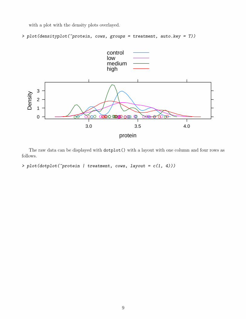
with a plot with the density plots overlayed.
> plot(densityplot(~protein, cows, groups = treatment, auto.key = T))
protein
Den
sity
0
1
2
3
3.0 3.5 4.0
●● ●● ●● ● ●●● ●● ●● ● ●● ●● ● ●●● ●● ●●● ●● ● ●●● ●●● ●● ●● ●● ●● ●● ● ● ●
controllowmediumhigh
The raw data can be displayed with dotplot() with a layout with one column and four rows asfollows.
> plot(dotplot(~protein | treatment, cows, layout = c(1, 4)))
9

protein
3.0 3.2 3.4 3.6 3.8
●● ●● ●● ● ●●● ●●
control
●● ● ●● ●● ● ●●● ●●
low
●●● ●● ● ●●● ●●● ●
medium
● ●● ●● ●● ●● ● ● ●
high
5 Bar Graphs
We will create bar graphs in R using barchart() in the lattice package. Begin by loading thelattice package.
> library(lattice)
The first argument to barchart() is a formula of the form y ~ x where y is an array with thefrequencies and x is an array with the names of the groups. By default, barchart() may not extendbars down to 0. (Why, Deepayan, why?!?) To remedy this poor and misleading default behavior,barchart() should always include an additional argument origin=0. Note the general behaviorof functions in R: if arguments are not named, their position in the list of arguments determineswhich argument it is interpreted as. But, if the argument is named, it can appear anywhere in thelist. Here is a simple bar graph for the fruit fly recombination data.
In addition, the commands shown here include the function plot() wrapped around the com-mand to make plots. This is not necessary (but not harmful) when typing lattice plotting commandsdirectly into R, but is needed for documents like this one where R reads commands in from a file.
10

> freq = c(216, 428)
> type = c("recombinant", "parental")
> plot(barchart(freq ~ type, origin = 0))
freq
0
100
200
300
400
parental recombinant
This plot can be customized by adding additional arguments to specify, for example, labels onthe x- and y-axes (with arguments xlab and ylab), a title (with argument main), and color (withargument col).
> plot(barchart(freq ~ type, origin = 0, xlab = "Type", ylab = "Frequency",
+ main = "Male Offspring Types", col = "red"))
Male Offspring Types
Type
Fre
quen
cy
0100200300400
parental recombinant
The next example is very similar, but uses a data frame to hold the frequencies and multiplefactors. Note the use of paste() to paste together the level names for color and wing and factor()
to create a new factor with the four combinations of color and wing.
> frequency = c(226, 202, 114, 102)
> color = c("white", "red", "red", "white")
> wing = c("normal", "miniature", "normal", "miniature")
> phenotype = c("parental", "parental", "recombinant", "recombinant")
> my.data = data.frame(frequency = frequency, color = color, wing = wing,
+ phenotype = phenotype)
> plot(barchart(frequency ~ factor(paste(color, wing)), data = my.data,
+ origin = 0, xlab = "Genotype", ylab = "Frequency", main = "Male Offspring Genotypes"))
11

Male Offspring Genotypes
Genotype
Fre
quen
cy
050
100150200
red miniature red normal white miniature white normal
The documentation on barchart() is available by typing ?barchart at the prompt. Like mostlattice documentation, it is incomplete (any mention of the argument origin?) and assumes morefamiliarity with R than beginners typically possess.
6 Binomial Probabilities
The two primary functions for computing binomial probabilities are dbinom() which computesprobabilites at individual values and pbinom() which computes sums of binomial probabilites. Thefunction sum() may be used in conjunction with dbinom() also to compute sums of binomialprobabilities. Specifically, dbinom(k,n,p) calculates P(X = k) when X ∼ Binomial(n, p) andpbinom(k,n,p) calculates P(X ≤ k).
The second homework set had a couple questions with X ∼ Binomial(5, 0.7). Here are severalexample calculations.
Find P(X = 4).
> dbinom(4, 5, 0.7)
[1] 0.36015
Find P(X ≤ 4) using both dbinom() and pbinom().
> sum(dbinom(0:4, 5, 0.7))
[1] 0.83193
> pbinom(4, 5, 0.7)
[1] 0.83193
Find P(X ≥ 3) using both dbinom() and pbinom(). Note that P(X ≥ 3) = 1 − P(X < 3) =1− P(X ≤ 2).
> sum(dbinom(3:5, 5, 0.7))
[1] 0.83692
> 1 - pbinom(2, 5, 0.7)
12

[1] 0.83692
The entire distribution can be found by giving more than one value for the first argument.
> dbinom(0:5, 5, 0.7)
[1] 0.00243 0.02835 0.13230 0.30870 0.36015 0.16807
The second and third argument can also be replaced by sequences. For example, here is P(X = 0)for n = 1, 2, 4, 8, 16, 32 and p = 0.5 and P(X = 5) for n = 10 and p = 0.1, 0.2, . . . , 0.9.
> dbinom(0, 2^(0:5), 0.5)
[1] 5.000000e-01 2.500000e-01 6.250000e-02 3.906250e-03 1.525879e-05 2.328306e-10
> dbinom(5, 10, (1:9)/10)
[1] 0.001488035 0.026424115 0.102919345 0.200658125 0.246093750 0.200658125
[7] 0.102919345 0.026424115 0.001488035
7 Binomial Random Variables
The function rbinom() generates pseudo-random numbers. This series of commands will generate10,000 different binomial random variables, each with n = 8 and p = 0.2. The table() functionwill display how many outcomes of each value were sampled.
> s = rbinom(10000, 8, 0.2)
> table(s)
s
0 1 2 3 4 5 6 7
1678 3375 3001 1423 422 88 12 1
8 Graphing the Binomial Distribution
To graph the binomial distribution, we will write a function to do the job. Once the function iswritten, you can put it into a file, use source() to read it into R when desired, and then haveaccess to it. It is also possible to construct the graph separately each time, but writing and saving afunction is a good way to reduce repetitive typing of complicated series of commands. The functiongbinom() is defined in the file gbinom.R. It includes quite a few complicated features. We willdescribe the function writing in more detail with a simpler example.
We create a function in R using function(). We will use xyplot() from lattice to do thework. We can write the function so that by default, it shows the entire distribution, but includesan argument scale which will cause the graph to be drawn from the 4 SDs below to 4SDs abovethe mean.
The following two graphs show the effects of setting scale.
> source("gbinom.R")
> plot(gbinom(1000, 0.3))
13

Binomial( 1000 , 0.3 )
x
prob
abili
ty
0.000
0.005
0.010
0.015
0.020
0.025
0 200 400 600 800 1000
> plot(gbinom(1000, 0.3, scale = T))
Binomial( 1000 , 0.3 )
x
prob
abili
ty
0.000
0.005
0.010
0.015
0.020
0.025
240 260 280 300 320 340 360
9 Graphing the Likelihood
The following example shows how to use xyplot() with argument type="l" to graph a line rep-resenting the likelihood and then log-likelihood from the fruit fly data in class. We use seq() tocreate an array of the values for which we want to compute the likelihood and dbinom() for thevalues themselves. The first two arguments to seq() are the start and end values and the thirdargument is the difference between points. Here we evaluate p from 0.2 to 0.45 in steps of size 0.001.Optional arguments to xyplot() include lwd=2 to make the line width twice as large as normal,
14

xlim=c(0.2,0.45) to force the limits of the x-axis to span these values, and ylab to specify a labelfor the y-axis. In the second plot, log() is the natural logarithm.
> p = seq(0.2, 0.45, 0.001)
> y = dbinom(216, 644, p)
> plot(xyplot(y ~ p, type = "l", ylab = "Likelihood", lwd = 2, xlim = c(0.2,
+ 0.45)))
p
Like
lihoo
d
0.00
0.01
0.02
0.03
0.25 0.30 0.35 0.40
> plot(xyplot(log(y) ~ p, type = "l", ylab = "log-Likelihood", lwd = 2,
+ xlim = c(0.2, 0.45)))
15

p
log−
Like
lihoo
d
−30
−20
−10
0.25 0.30 0.35 0.40
10 Confidence Intervals
The text describes a method for building confidence intervals that uses a small adjustment to thesample proportion. The calculations are simple enough, but we can write a function in R to do allthe steps for us. Here, we select the name of the function to be p.ci and the two arguments to bex and n, the summary statistics form the sample. Here is code to create a function to do the work,and then an application of it using data from lecture. The function return() specifies the valuethat is returned by the function. By default, it is whatever object is created last, but an explicituse of return() make reading the function easier. Note that c() is a common utility function usedto concatenate (combine) different objects into one. In this case, c() concatenates expressions forthe lower and upper endpoints of the confidence interval.
> p.ci = function(x, n) {
+ p.prime = (x + 2)/(n + 4)
+ margin.error = 1.96 * sqrt(p.prime * (1 - p.prime)/(n + 4))
+ return(c(p.prime - margin.error, p.prime + margin.error))
+ }
> p.ci(212, 644)
[1] 0.2940355 0.3664583
11 Hypothesis Tests
The method for hypothesis tests we have explored so far is the binomial test. R’s version of thistest is binom.test(), the first argument of which is the count x and the second of which is the
16

total sample size n. Additional arguments are p which is the null proportion (default value is0.5) and alternative which must be one of "two.sided" (the default), "less", and "greater".As with any argument in an R function which specifies a list of possible values, you need onlytype enough characters to distinguish it for other options (but for code clarity, typing the wholething is helpful). For one-sided tests, the calculated p-value is the sum of binomial probabilitiesless than x for alternative="less" and the sum of binomial probabilities greater than x foralternative="greater". For alternative="less", binom.test() computes the p-value as thesum of all probabilities with outcomes less than or equal to the probability of x under the nullhypothesis. This behavior is consistent with a likelihood-based approach to inference, but differsfrom the method presented in lecture in which at least as extreme as is interpreted as at least as farfrom the mean as and not at most as probable as. For the specific example in lecture, this resultsin a difference, but most of the time, the calculations will be the same.
Here, for example, is the result if we changed the problem and there had been 60 left-handedoffspring from 270 total and the null hypothesis p = 0.25. Using the method in lecture, X ∼Binomial(270, 0.25) so E(X) = 67.5 and outcomes at least as extreme as 60 are those 60 and belowor 67.5 + 7.5 = 75 or higher. The p-value is
> sum(dbinom(c(0:60, 75:270), 270, 0.25))
[1] 0.3251164
using the distance-from-the-mean definition of extreme and
> binom.test(60, 270, p = 0.25, alternative = "two.sided")
Exact binomial test
data: 60 and 270
number of successes = 60, number of trials = 270, p-value = 0.3251
alternative hypothesis: true probability of success is not equal to 0.25
95 percent confidence interval:
0.1740749 0.2765797
sample estimates:
probability of success
0.2222222
12 Creating Tables
The function matrix() will make a table of numbers, here filled with counts in a contingency table,using rownames() and colnames() to add the names for each category. This code creates a tablefor the data from Example 9.3-1.
> fish = matrix(c(1, 49, 10, 35, 37, 9), 2, 3)
> rownames(fish) = c("Eaten", "Not Eaten")
> colnames(fish) = c("Uninfected", "Lightly Infected", "Highly Infected")
> fish
Uninfected Lightly Infected Highly Infected
Eaten 1 10 37
Not Eaten 49 35 9
17

The first argument to matrix() is an array of the data in the matrix by columns. (If the data isentered by row, add the argument byrow=true to the matrix() command.) The second and thirdarguments are the number of rows and number of columns of data; the command could have beencalled matrix(c(1,49,10,35,37,9),nrow=2,ncol=3). If only one of these dimension commands isspecified, R will compute the other using the size of the data. Like all R functions, if the argumentsare not named, R interprets based on their position in the list of arguments. Named arguments canappear anywhere in the list.
13 Bar Graphs
We use barchart() from the lattice package to make stacked bar graphs to display contingencytables. By default, barchart() draws horizontal bars; set horizontal=F makes the bars vertical.The function t() will transpose a matrix; transposing the input matrix will cause the other variableto be the one used for the main division of the data. The argument ylab can be set to change thelabel on the y-axis (and xlab has the same obvious behavior). The argument auto.key works formay lattice packages to add a key to a graph. Here, we specify the key to be written in columnsacross the top of the graph. One command creates an object which is then plotted with plot().Compare the use of fish and t(fish) in these next two plots.
> library(lattice)
> fish.plot = barchart(t(fish), horizontal = F, auto.key = list(columns = nrow(fish)),
+ ylab = "Frequency")
> plot(fish.plot)
Fre
quen
cy
0
10
20
30
40
50
Uninfected Lightly Infected Highly Infected
Eaten Not Eaten
> fish.2.plot = barchart(fish, horizontal = F, auto.key = list(columns = ncol(fish)),
+ ylab = "Frequency")
> plot(fish.2.plot)
18

Fre
quen
cy
0
20
40
60
80
Eaten Not Eaten
Uninfected Lightly Infected Highly Infected
13.1 Mosaic Plots
The text introduces the idea of a mosaic plot which shows nearly the same information as the stackedbar graphs, but each bar is rescaled to the same size so that the graph highlights comparisonsbetween relative frequencies and not absolute frequencies. The function mosaic() below handlesthe conversion from frequencies to relative frequencies, so you can just call mosaic() on a matrix(or its transpose).
> mosaic = function(x, ...) {
+ col.sums = apply(x, 2, sum)
+ for (j in 1:ncol(x)) x[, j] = x[, j]/col.sums[j]
+ my.plot = barchart(t(x), horizontal = F, ylab = "Relative Frequency",
+ auto.key = list(columns = nrow(x)), ...)
+ plot(my.plot)
+ }
Here is an example of its use.
> mosaic(t(fish))
19

Rel
ativ
e F
requ
ency
0.0
0.2
0.4
0.6
0.8
1.0
Eaten Not Eaten
Uninfected Lightly Infected Highly Infected
14 Chisquare Test and G-Test
The function chisq.test() will carry out a χ2 test. The only argument you need to include is thematrix.
> chisq.test(fish)
Pearson's Chi-squared test
data: fish
X-squared = 69.7557, df = 2, p-value = 7.124e-16
For the G-test, there is no built-in function in base R. An internet search will undoubtedly findsomeone who has made the function available. However, coding a few line of R code to find theexpected counts in each table and then the values of the test statistics (for both G- and χ2 tests) isinformative. The following code uses the function apply() to apply the sum() function to both rowsand columns to find the marginal counts and the %o% operator to form the outer sum of the arraysof row and column counts. In the example with a 2-array for rows and a 3-array for columns, theouter sum will be a 2× 3 matrix where each element is the product of the corresponding values forthe row and column. Dividing this table by the sum of all elements of the table gives the expectedcounts. The three arguments for apply() are a matrix, a number to indicate the dimension (1for rows, 2 for columns), and a function to apply to each row or column. The observed countsand expected counts now be combined to find both test statistics. The following function takes amatrix as an argument, computes both the χ2 and G − test test statistics, and returns a list withthe expected counts, the values of the test statistics, and the p-values. In R, a list() is an objectthat can contain any number of potentially different types of items. Components of a list can beaccessed with $ and the name of the component. For example, to print only the matrix of expectedvalues, one could append $expected to the name of the returned value from this function.
20
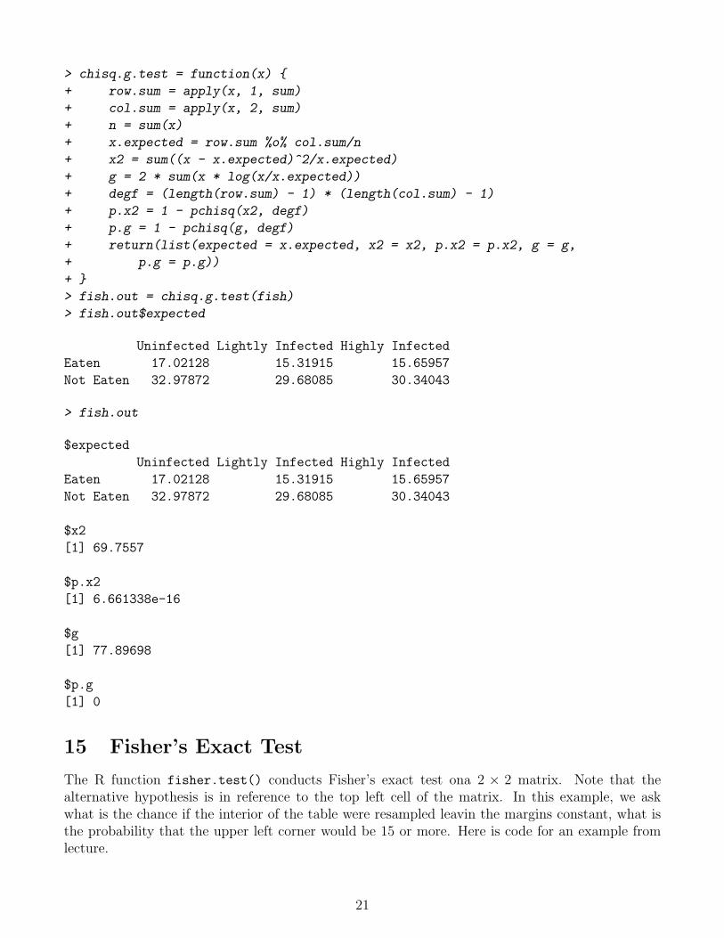
> chisq.g.test = function(x) {
+ row.sum = apply(x, 1, sum)
+ col.sum = apply(x, 2, sum)
+ n = sum(x)
+ x.expected = row.sum %o% col.sum/n
+ x2 = sum((x - x.expected)^2/x.expected)
+ g = 2 * sum(x * log(x/x.expected))
+ degf = (length(row.sum) - 1) * (length(col.sum) - 1)
+ p.x2 = 1 - pchisq(x2, degf)
+ p.g = 1 - pchisq(g, degf)
+ return(list(expected = x.expected, x2 = x2, p.x2 = p.x2, g = g,
+ p.g = p.g))
+ }
> fish.out = chisq.g.test(fish)
> fish.out$expected
Uninfected Lightly Infected Highly Infected
Eaten 17.02128 15.31915 15.65957
Not Eaten 32.97872 29.68085 30.34043
> fish.out
$expected
Uninfected Lightly Infected Highly Infected
Eaten 17.02128 15.31915 15.65957
Not Eaten 32.97872 29.68085 30.34043
$x2
[1] 69.7557
$p.x2
[1] 6.661338e-16
$g
[1] 77.89698
$p.g
[1] 0
15 Fisher’s Exact Test
The R function fisher.test() conducts Fisher’s exact test ona 2 × 2 matrix. Note that thealternative hypothesis is in reference to the top left cell of the matrix. In this example, we askwhat is the chance if the interior of the table were resampled leavin the margins constant, what isthe probability that the upper left corner would be 15 or more. Here is code for an example fromlecture.
21
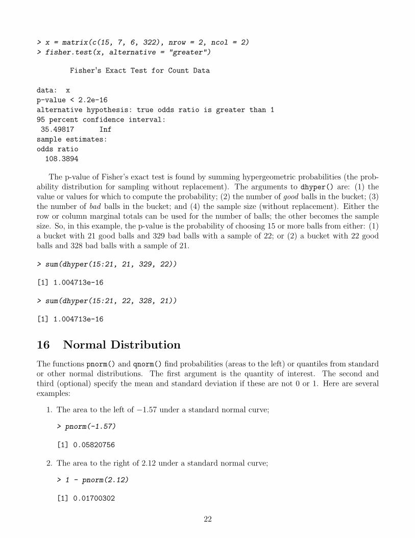
> x = matrix(c(15, 7, 6, 322), nrow = 2, ncol = 2)
> fisher.test(x, alternative = "greater")
Fisher's Exact Test for Count Data
data: x
p-value < 2.2e-16
alternative hypothesis: true odds ratio is greater than 1
95 percent confidence interval:
35.49817 Inf
sample estimates:
odds ratio
108.3894
The p-value of Fisher’s exact test is found by summing hypergeometric probabilities (the prob-ability distribution for sampling without replacement). The arguments to dhyper() are: (1) thevalue or values for which to compute the probability; (2) the number of good balls in the bucket; (3)the number of bad balls in the bucket; and (4) the sample size (without replacement). Either therow or column marginal totals can be used for the number of balls; the other becomes the samplesize. So, in this example, the p-value is the probability of choosing 15 or more balls from either: (1)a bucket with 21 good balls and 329 bad balls with a sample of 22; or (2) a bucket with 22 goodballs and 328 bad balls with a sample of 21.
> sum(dhyper(15:21, 21, 329, 22))
[1] 1.004713e-16
> sum(dhyper(15:21, 22, 328, 21))
[1] 1.004713e-16
16 Normal Distribution
The functions pnorm() and qnorm() find probabilities (areas to the left) or quantiles from standardor other normal distributions. The first argument is the quantity of interest. The second andthird (optional) specify the mean and standard deviation if these are not 0 or 1. Here are severalexamples:
1. The area to the left of −1.57 under a standard normal curve;
> pnorm(-1.57)
[1] 0.05820756
2. The area to the right of 2.12 under a standard normal curve;
> 1 - pnorm(2.12)
[1] 0.01700302
22

3. The 0.975 quantile of the standard normal distribution;
> qnorm(0.975)
[1] 1.959964
4. The cutoffs for the middle 99% of the standard normal distribution;
> qnorm(c(0.005, 0.995))
[1] -2.575829 2.575829
5. The area between 90 and 105 for the N(100, 42) distribution;
> pnorm(105, 100, 4) - pnorm(90, 100, 4)
[1] 0.8881406
6. The lower and upper quartiles of the same distribution;
> qnorm(c(0.25, 0.75), 100, 4)
[1] 97.30204 102.69796
17 Graphs for Quantitative Data
The following examples show examples of histograms, density plots, box-and-whisker plots, and dotplots for the female sockeye salmon mass data set. First, read in the data. There is a single variablenamed mass.
> salmon = read.table("sockeye.txt", header = T)
> str(salmon)
'data.frame': 228 obs. of 1 variable:
$ mass: num 3.09 2.91 3.06 2.69 2.88 2.98 1.61 2.16 1.56 1.76 ...
Histogram. The first argument is a formula specifying the variable to graph. The second argu-ment is the name of the data frame where the variable can be found. Note the arguments nint tosuggest using 25 intervals and xlab to set the label on the x-axis. The function plot() is need forthis to execute when read in from a file, but is optional when typing at the command line.
> library(lattice)
> plot(histogram(~mass, salmon, nint = 25, xlab = "Body Mass (kg)"))
23

Body Mass (kg)
Per
cent
of T
otal
0
5
10
1.0 1.5 2.0 2.5 3.0 3.5
Density plot. The density plot draws a curve which is estimated by averaging many (50 bydefault) histograms, with the breakpoints shifted slightly for each. I usually bump this number upusing the argument n=201 so that the resulting curve appears smoother. To suppress the plottingof points (useful when the sample size is enormous), add the argument plot.points=F.
> plot(densityplot(~mass, data = salmon, xlab = "Body Mass (kg)",
+ ylab = "Density", n = 201))
Body Mass (kg)
Den
sity
0.0
0.2
0.4
0.6
0.8
1.0
1 2 3 4
●● ●● ● ●● ●● ●● ●● ●●● ●●●● ●● ●●● ● ●● ●● ●● ●● ●● ● ● ●● ●●● ●● ● ●● ●● ● ●● ●● ●● ● ● ●●●● ● ●● ●●●●● ● ●●●●●● ● ●● ●● ●● ●●● ●● ●● ●● ●● ●● ●●● ●● ●●● ●● ● ●● ● ●● ●● ●● ● ● ●● ●●● ● ●● ●●● ● ● ●●● ● ● ●●●● ●● ●●● ●●● ●● ●● ●● ● ●●●● ●● ●● ●● ● ● ●●●● ● ●●● ● ● ●● ●● ●● ●●● ●●● ●● ●●●● ●● ●● ●● ●●●● ● ●● ●● ●● ●● ●● ●● ●● ●●● ●●●
Box-and-Whisker Plots. A box and whisker plot represents the middle half of the data, betweenthe 0.25 and 0.75 quantiles, with a box. The center of the box includes a point at the median.
24

Whiskers are drawn left and right to extreme points; here, the largest and smallest individualvalues between the fences, where there are invisible fences to the left and right of the box a distance1.5 IQR (interquartile range units) from the ends of the box. In other words, if the lower andupper quartiles are q0.25 and q0.75, the lower fence is at q0.25− 1.5(q0.75− q0.25), the upper fence is atq0.75 + 1.5(q0.75− q0.25), the left whisker extends to the smallest value to the right of the lower fence,the right whisker extends to the largest value to the left of the upper fence, and any observationsbeyond the fences are marked individually.
> plot(bwplot(~mass, data = salmon, xlab = "Body Mass (kg)"))
Body Mass (kg)
1.5 2.0 2.5 3.0 3.5
● ●● ●●● ●●
Dot Plots. A dot plot is simply a plot of dots on a number line for each value. To reduce plottingpoints on top of one another, the argument jitter.y adds a small bit of random noise to eachpoint in the y direction. jitter.x is also available.
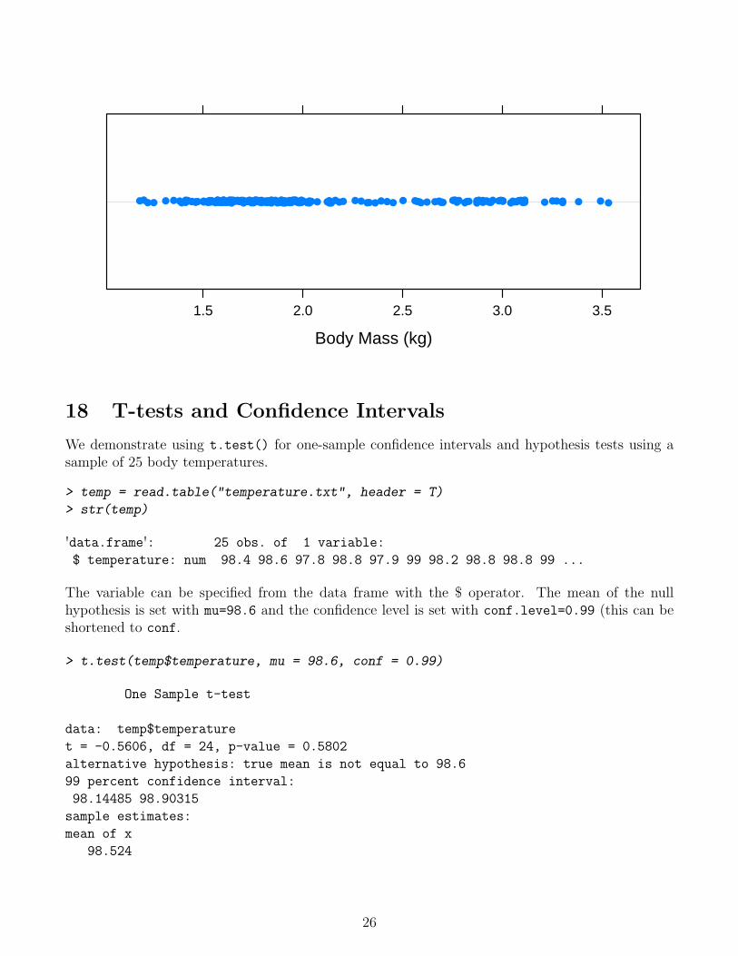
> plot(dotplot(~mass, data = salmon, xlab = "Body Mass (kg)", jitter.y = T))
25
Body Mass (kg)
1.5 2.0 2.5 3.0 3.5
●● ●● ● ●● ●● ●● ●● ●●● ●●●● ●● ●●● ● ●● ●● ●● ●● ●● ● ● ●● ●●● ●● ● ●● ●● ● ●● ●● ●● ● ● ●●●● ● ●● ●●●●● ● ●●●●●● ● ●● ●● ●● ●●● ●● ●● ●● ●● ●● ●●● ●● ●●● ●● ● ●● ● ●● ●● ●● ● ● ●● ●●● ● ●● ●●● ● ● ●●● ● ● ●●●● ●● ●● ● ●●● ●● ●● ●● ● ●●●● ●● ●● ●● ● ● ●●●● ● ●●● ● ● ●● ●● ●● ●●● ●●● ●● ●●● ● ●● ●● ●● ●●● ● ● ●● ●● ●● ●● ●● ●● ●● ●●● ●●●
18 T-tests and Confidence Intervals
We demonstrate using t.test() for one-sample confidence intervals and hypothesis tests using asample of 25 body temperatures.
> temp = read.table("temperature.txt", header = T)
> str(temp)
'data.frame': 25 obs. of 1 variable:
$ temperature: num 98.4 98.6 97.8 98.8 97.9 99 98.2 98.8 98.8 99 ...
The variable can be specified from the data frame with the $ operator. The mean of the nullhypothesis is set with mu=98.6 and the confidence level is set with conf.level=0.99 (this can beshortened to conf.
> t.test(temp$temperature, mu = 98.6, conf = 0.99)
One Sample t-test
data: temp$temperature
t = -0.5606, df = 24, p-value = 0.5802
alternative hypothesis: true mean is not equal to 98.6
99 percent confidence interval:
98.14485 98.90315
sample estimates:
mean of x
98.524
26
19 The Bootstrap
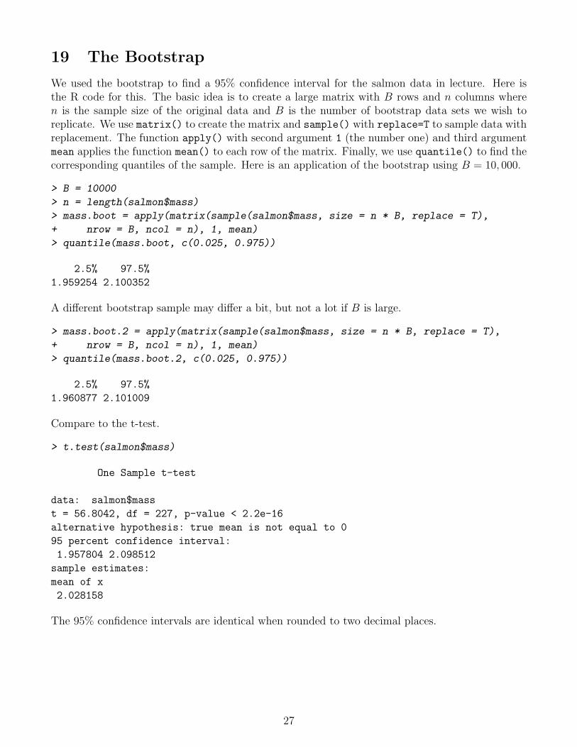
We used the bootstrap to find a 95% confidence interval for the salmon data in lecture. Here isthe R code for this. The basic idea is to create a large matrix with B rows and n columns wheren is the sample size of the original data and B is the number of bootstrap data sets we wish toreplicate. We use matrix() to create the matrix and sample() with replace=T to sample data withreplacement. The function apply() with second argument 1 (the number one) and third argumentmean applies the function mean() to each row of the matrix. Finally, we use quantile() to find thecorresponding quantiles of the sample. Here is an application of the bootstrap using B = 10, 000.
> B = 10000
> n = length(salmon$mass)
> mass.boot = apply(matrix(sample(salmon$mass, size = n * B, replace = T),
+ nrow = B, ncol = n), 1, mean)
> quantile(mass.boot, c(0.025, 0.975))
2.5% 97.5%
1.959254 2.100352
A different bootstrap sample may differ a bit, but not a lot if B is large.
> mass.boot.2 = apply(matrix(sample(salmon$mass, size = n * B, replace = T),
+ nrow = B, ncol = n), 1, mean)
> quantile(mass.boot.2, c(0.025, 0.975))
2.5% 97.5%
1.960877 2.101009
Compare to the t-test.
> t.test(salmon$mass)
One Sample t-test
data: salmon$mass
t = 56.8042, df = 227, p-value < 2.2e-16
alternative hypothesis: true mean is not equal to 0
95 percent confidence interval:
1.957804 2.098512
sample estimates:
mean of x
2.028158
The 95% confidence intervals are identical when rounded to two decimal places.
27

20 Randomization Test
In lecture on October 21, we explored the randomization test to test if two population means wereequal. Here is R code to read in the data set using read.csv() which expects a text file where thefirst line is a header line with variable names and subsequent lines have data. Values on each lineare separated by commas.
> pscorp = read.csv("pseudoscorpions.csv")
> str(pscorp)
'data.frame': 36 obs. of 2 variables:
$ mating: Factor w/ 2 levels "Different","Same": 2 2 2 2 2 2 2 2 2 2 ...
$ broods: int 4 0 3 1 2 3 4 2 4 2 ...
To carry out the randomization test, we will write a special function that will compute the meanof the first 20 observations, the mean of the next 16 observations, and return the difference.
> f = function(x) {
+ return(mean(x[1:20]) - mean(x[21:36]))
+ }
Next, we create an array to store the difference in means for each randomized data set. We willdo this R = 100, 000 times. We will the array with missing values (NA) which we will replace.
> R = 100000
> out = rep(NA, R)
The function sample() with only one argument consisting of an array returns a random permu-tation of the elements of the array. We think of this as the first 20 elements being the one randomlysampled group and the next 16 as the second group. This command rerandomizes one time andcalls f() to find the difference in means.
> f(sample(pscorp$broods))
[1] 0.0375
Now, we ask R to do this R = 100, 000 times with the for() command. The variable i is set toeach value from 1 to R, and the difference in means for that particular rerandomization is storedin out[i]. The test statistic is found by applying f() to the original data (which works becausethe data is ordered with the Same group having the first 20 observations and the Different grouphaving the final 16 observations). The p-value is the proportion of randomized differences in samplemeans that are less than this test statistic.
> test.stat = f(pscorp$broods)
> for (i in 1:R) {
+ out[i] = f(sample(pscorp$broods))
+ }
> p.value = sum((out <= test.stat))/R
> p.value
[1] 0.01515
28

21 Two-sample T-test
Compare the previous result to the two-sample independent t-test.
> sample1 = with(pscorp, broods[mating == "Same"])
> sample2 = with(pscorp, broods[mating == "Different"])
> t.test(sample1, sample2, alternative = "less")
Welch Two Sample t-test
data: sample1 and sample2
t = -2.3424, df = 28.883, p-value = 0.01313
alternative hypothesis: true difference in means is less than 0
95 percent confidence interval:
-Inf -0.3911856
sample estimates:
mean of x mean of y
2.200 3.625
22 Graphs to Compare Distributions
The following graph compares the distribution of the number of broods for each group with his-tograms. The vertical bar in the formula specifies the variable on the left to be split accordingto the variable on the right and displayed in different panels. The layout argument specifies onecolumn and two rows (so the histograms are aligned vertically, making them easier to compare).
> plot(histogram(~broods | mating, data = pscorp, layout = c(1, 2),
+ breaks = seq(-0.5, 7.5)))
broods
Per
cent
of T
otal
0
10
20
30
0 2 4 6
Different0
10
20
30Same
29