Quiz 1.coccweb.cocc.edu/srule/MTH105/homework/0stat.pdf · Quiz 2. Like the last quiz, find the...
13
Quiz 1. Start off by finding COCC’s “Fact Book” (you can find this by going to the COCC website and typing “Fact Book” into the search box there). Locate the most recent one. Read through this fact book until you locate the data on the three types of faculty members (Full Time, Adjunct, and Part Time). 1. (1 point) Using technology, create a pie chart for that data (if you need help, check the “resources” page for how – to videos!). Be sure to include: a. (1 point) A title for your chart (include the year in the title); b. (1 point) A legend so the reader knows which slice is which; c. (1 point) Numerical data labels (either percentages or counts, your choice). Now find the oldest COCC fact book on the school’s website. 2. (4 points) Repeat number 1 for this data. 3. (2 points) Give me one reason why someone who works at COCC might be interested in this data. There are a couple of ways you can submit: • You can copy your graphs into a word document, then type your answer to number 3 there, and then submit the document to BB when you’re finished. • Alternatively, you can take screen shots (don’t forget Snipping Tool, if you have Windows!) of your graphs and drop them into a word document, as well. I tend to do this, since when you copy graphs over from Excel, sometimes the formatting gets wonky.
Transcript of Quiz 1.coccweb.cocc.edu/srule/MTH105/homework/0stat.pdf · Quiz 2. Like the last quiz, find the...

Quiz 1.
Start off by finding COCC’s “Fact Book” (you can find this by going to the COCC website and typing “Fact Book” into the search box there). Locate the most recent one. Read through this fact book until you locate the data on the three types of faculty members (Full Time, Adjunct, and Part Time).
1. (1 point) Using technology, create a pie chart for that data (if you need help, check the “resources” page for how – to videos!). Be sure to include:
a. (1 point) A title for your chart (include the year in the title); b. (1 point) A legend so the reader knows which slice is which; c. (1 point) Numerical data labels (either percentages or counts, your choice).
Now find the oldest COCC fact book on the school’s website.
2. (4 points) Repeat number 1 for this data.
3. (2 points) Give me one reason why someone who works at COCC might be interested in this data.
There are a couple of ways you can submit:
• You can copy your graphs into a word document, then type your answer to number 3 there, and then submit the document to BB when you’re finished.
• Alternatively, you can take screen shots (don’t forget Snipping Tool, if you have Windows!) of your graphs and drop them into a word document, as well. I tend to do this, since when you copy graphs over from Excel, sometimes the formatting gets wonky.

Quiz 2.
Like the last quiz, find the most recent COCC Fact Book. Locate the section on “ethnic breakdown”.
1. (1 point) Using technology, create a pie chart for that data (if you need help, check the “resources” page for how – to videos!). Be sure to include:
a. (1 point) A title for your chart (include the year in the title); b. (1 point) A legend so the reader knows which slice is which; c. (1 point) Numerical data labels (either percentages or counts, your choice).
2. (1 point) Using the same data, create a bar graph for that data. Be sure to:
a. (1 point) Include a title for your graph (include the year in the title); b. (1 point) Ensure the y – axis starts at 0%; c. (1 point) Make the bars touch (no spacing between).
3. (2 points) Which graph do you prefer and why?
There are a couple of ways you can submit:
• You can copy your graphs into a word document, then type your answer to number 3 there, and then submit the document to BB when you’re finished.
• Alternatively, you can take screen shots (don’t forget Snipping Tool, if you have Windows!) of your graphs and drop them into a word document, as well. I tend to do this, since when you copy graphs over from Excel, sometimes the formatting gets wonky.

Quiz 3.
Like the last quizzes, find the COCC Fact Book webpage. Locate the section on Tuition and fees. For all available years, find the cost per credit for an in – district COCC student.
1. (3 points) Using technology, create a line graph that data (if you need help, check the “resources” page
for how – to videos!). Be sure to include: a. (2 points) A title for your chart (include the years in the title); b. (2 points) a y – axis that starts at 0; c. (2 points) labeled x and y – axes.
2. (1 point) By what percent higher is the most recent in – district per credit tuition compared to the
earliest on record?
There are a couple of ways you can submit:
• You can copy your graphs into a word document, then type your answer to number 3 there, and then submit the document to BB when you’re finished.
• Alternatively, you can take screen shots (don’t forget Snipping Tool, if you have Windows!) of your graphs and drop them into a word document, as well. I tend to do this, since when you copy graphs over from Excel, sometimes the formatting gets wonky.

Quiz 4. In class, we looked at how to apply a “Margin Of Error” (MOE) to a predictive statistic. If you recall, we had to
do this because any time a sample is drawn (even if done properly), the resulting summary statistic will vary a little bit from the true value you’re trying to estimate. The margin of error, assuming you got good data, takes care of that difference.
Here’s a whimsical example: do you like Reese’s Pieces? Yeah, me too.
Have you ever thought “Hmmmm…I wonder what fraction of the candies in those bags are orange1?” Of course you haven’t. But this is precisely the kind of question that researchers ask all of the time. They need to estimate the percentage of patients who get better on a certain medication, or the number of likely voters who will actually vote, or the percentage of invasive grasses in a certain wilderness zone. The catch, as you may have guessed, is that the researchers can’t ask everybody, or count everything. If they could they’d know exactly the answer they were looking for. But they can’t – in most cases, it’s too expensive and time consuming. So, they draw a sample, which is less that 100% certain. However, the MOE allows them to be more certain then they would with just a single sample figure. OK, back to the whimsy…suppose a researcher needs to know what percentage of Reese’s Pieces (overall) were orange. So, since she can’t check every single one, she draws a random sample of 30 of them. Here’s what she got!
(In case you want to use the simulator that I got the image at left from, here’s the link: http://www.rossmanchance.com/applets/OneProp/OneProp.htm?candy=1. You’ll find, as you take my classes, that simulations are wonderful ways of exploring the word around you. Ask any airline pilot!). You might notice (after looking a the bottom of that candy machine there) that 10 out of the 30 candies were orange, which would be 1/3, of them, or about 33%. So, should we say that 1 out of every 3 Reese’s Pieces are orange? You could2. But it’s not quite right. Here’s why….
Suppose another researcher has the exact same idea as the first one – and he sets out to estimate the percentage of Reese’s pieces that are orange. His budget’s a little better, thought, and he’s able to check 100 candies. It’s a little harder to see, but this researcher got 53 out of 100 orange. So who’s right? Some of you might say that this researcher is “righter” since his sample is bigger. Assuming the sample is drawn randomly, that’s a good argument. But neither researcher is “right” – both of their results have a little bit of “offness” to them. Check it out…I’ll do three more samples, of varying numbers of candies checked, and you can see the results:
number orange: 109
number total:
200
% orange: 54.5%
number orange: 12
number total:
25
% orange: 48%
number orange: 521
number total:
1000
% orange: 52.1%
1 Don’t Google it! Yet, anyway. ☺ 2 News media does. More on that in a minute.

So what do we say the answer is? One way to answer would be to combine all the results, or take a weighted average. But, even if you did that, you’d have error, right? (*) It’s time to stop avoiding the unavoidable! Let’s attack the idea of a margin of error! Look back to the first set of results: 10 out of 30 orange, or about 0.33 orange. The MOE for an experiment with that many trials (30) is
about 17%...so you’d have to say that “I’m statistically confident that there are about 33% 17% orange Reese’s Pieces in a bag.” 3 Said a different way, “I’m statistically confident that there are between 16% (33% - 17%) and 50% (33% + 17%) orange Reese’s Pieces in a bag.” Remember, you have to do this because there is uncertainty! Any time you can’t sample an entire population (that is, check every Reese’s Piece), you must express the uncertainty. Let’s do it again! (**) In the second set of data, we got 53 out of 100 orange (53%). The MOE for an experiment with that many
trials is about 10%, so you’d have to say that “I’m statistically confident that there are about 53% 10% orange Reese’s Pieces in a bag”, or, more understandably, “I’m statistically confident that there are between 43% and 63% orange Reese’s Pieces in a bag.” Two things to note:
1. (2 points) As the sample size goes up, the MOE shrinks. Why do you think that is? 2. (2 points) Notice that the percentages that we got originally (ignoring the MOE) are different (33% and
53%). Why would they be? Seems they should be the same, no? OK – you ready to try your own? You bet! Here are some more simulations I ran! Sample Size Percentage
Orange MOE Conclusion?
200 54.5% 7% “There are likely between 47.5% and 61.5% orange Reese’s Pieces in a bag.” 25 48% 19.5% 3. (2 points) You answer this one!
1000 52.1% 2% 4. (2 points) You answer this one, too! What you just learned about are called confidence intervals – a range of values that you feel “confident” will contain the number you’re looking for. In this one, you were interested in finding out what percentage of Reese’s Pieces were orange. A quick Google Search tells me that 50% should be. Notice that 50% isn’t the actual percentage we ever actually got with one of our experiments (we got 33%, 53%, 54.5%, 48%, and 52.1%). However… (2 points) In how many of the confidence intervals that we constructed did the number 50% fall? Use all 5 from up there: the two we did in the paragraphs marked “*” and”**”, as well as the three in the table. That’s the power! And I know that analyzing candy’s kinda silly – but this mathematics is the same used in way more important analyses (for example, this one…or this one). Welcome to the awesome world of statistics!
3 You’ll calculate WHY in MTH 244!

Quiz 5. Here’s the headline from a recent Gallup Poll:
Two claims have been made here: that Americans’ trust in the government handling of 1) domestic and 2) international issues are at “new” or “record” lows. Here’s a graph that accompanied the poll:
That type of graph is called a “time-series graph”. They’re used pretty frequently in news media, when you
want to measure an independent variable against the passage of time. Let’s use this poll to address the claims above. Start by finding the Gallup report!
1) (1 point) What’s the margin of error (MOE) for this poll? As usual, they’ve hidden it down near the
bottom. 😊
2) (2 points) Why must we use a MOE when discussing the results of this poll? Hint: did Gallup ask every single voting-age American when collecting this data?
3) (4 points…1 point for each) Use your MOE from 1) to construct the confidence intervals for the percentage of voting-age Americans with a “great deal” or “fair amount” of trust in the Federal government to handle domestic problems in both early 2019 (the last data points on the graph) and late 2018 (the second-to-last data points on eh graph).
4) (3 points) Based on the intervals you just created, is the headline correct? Is Americans’ trust of
government at a new low, with respect to domestic and international issues? Why or why not?

Quiz 6.
In the US, according to the CDC (http://www.cdc.gov/ncbddd/adhd/data.html), 5% of school – aged children are believed to have ADHD. A random sample of 1,005 school – aged children is taken, of those in the sample, 8% (with a
margin of error of 4%) have ADHD (the study was done to see if ADHD rates have increased significantly) .
1. (1 point each) Match each term in the column at left with its corresponding value in the column at right.
_____ The population of interest A. 5% of schoolchildren with ADHD
_____ The sample B. 8% of schoolchildren with ADHD
_____The variable of interest C. 1005 schoolchildren
_____ The value of the statistic D. The presence or absence of ADHD in schoolchildren
_____ The value of the parameter E. 4%
_____ Margin Of Error F. Schoolchildren
2. (2 points each) Since 8% is larger than 5%, it might be tempting to think that our sample’s ADHD rate is higher than the population’s. Fill in the blanks in the following sentence using the given margin of error to show why that thought is not necessarily true:
“The percentage of ADHD (based on data from the sample) is between ___________ and _____________.”
3. (extra 1 point…I’ll sneak these in every once in a while; if you try it and get it wrong, it won’t count against
you!) Of the three percentages listed above, one is very hard to believe that the CDC actually achieved through their research. Which one, and why?

Quiz 7.
When I fired up Firefox on 1.14.15, this greeted me:
Go ahead and read the article that was linked to this (if you need the link, it’s in the footnotes4). 1. (2 points) After reading the first paragraph (and, if you noticed, the headline), what does the above tagline
(“Poor pay double in taxes”) refer to? Make sure to explain what is being “doubled”, according to their claim.
Now – I looked up a few definitions for us to use so that the rest of this quiz flows logically:
• “Tax – a sum of money demanded by a government for its support or for specific facilities or services, levied upon incomes, property, sales, etc.” (source)
• Poor – The income threshold for a family of 5 is defined as about $28,500 per year, pre – tax. If a family of 5 falls blow that, they are “poor”. (source)
• Rich – Minimally, the “top 1%” earn about $500,000 per year. This figure appears to be somewhat universal as the definition of “rich”. (source)
2. (4 points…2 for each) So, suppose someone earning $28,500 annually pays (as stated in the article) 10.9%
in income tax, and someone earning $500,000 annually pays 5.4%. How much tax (in dollars) does each person actually pay? Go ahead and round off to the nearest dollar – the IRS does. ☺
OK – so we can see that the original screen shot was a tad misleading. Maybe they meant something
else…maybe they meant that the entire population of “poor” pays double in total taxes what the rich pay. Let’s examine that…according to this, there are 20% of families defined as “poor” and only 2% of families defined as “rich”.
Assuming the same size of families (5), that gives us roughly 316,000,000 x 20% 5 or about 12.6 million “poor
families” and 316,000,000 x 2% 5 or 1.3 million “rich families”. I’m using averages here, but that’s OK, assuming the averages are correct.
3. (4 points…2 for each) Use these numbers and the average tax amounts you got in number 2 to see if the total amount of tax paid by the “poor” is double the total amount of tax paid by the “rich”. Is it?
4 http://www.ibtimes.com/poor-families-pay-double-state-local-tax-rate-rich-study-1782956
Quiz 8.
A few weeks ago, we were doing some experiments where we were dealing cards out of well-shuffled decks, and
then looking at the average number of cards it took until certain events happening (“until we got a repeated suit” and
“until we saw all suits at least once”). A wonderful question popped up in class that day (one that I get fairly often
when we run this experiment), so I wanted to make sure we answered it - watch this video, and I’ll show you where
the question came from!
So, thinking like a statistician, I realized that I needed these experiments done both ways – I needed to deal some decks where I reshuffled each time, and others where I just kept dealing off the top of the deck I had already shuffled once. So, the first thing I thought of was, “I’ll just have my awesome students do a bunch of trials and see how the data comes out!” And then I realized that, if I did that to you near the end of the term, you’d likely attack me while I
was commuting to school. 😊 So, I built an Excel simulator to do it for us! You can download it next to this quiz’s link.
Watch this video to get a good look at our data collection! Once you’ve got a bunch of trials (a “bunch” means the
percentages are fairly stabilized), watch this video! Make sure to build that graph with me!
a. (1 point) Include your graph for the “Cards Until Repeated Suit” as your answer to this question! Make
sure that it speaks for itself – you can just model what you do after what I did in the video, or get more
creative, if you like!
OK! Next experiment! Head on over to the “Cards Until All Suits” tab! b. (1 point) Repeat question a. for this second experiment!
c. (1 point) At this point, do you think it matters which way you deal for the “Cards Until Repeated Suit”?
Why or why not? Write either “yes” or “no”, and then at least one sentence supporting your answer.
d. (1 point) Do you think it matters which way you deal for the “Cards Until All Suits”? Why or why not?
Feel free to simply point to your previous answer if you use the same one. 😊
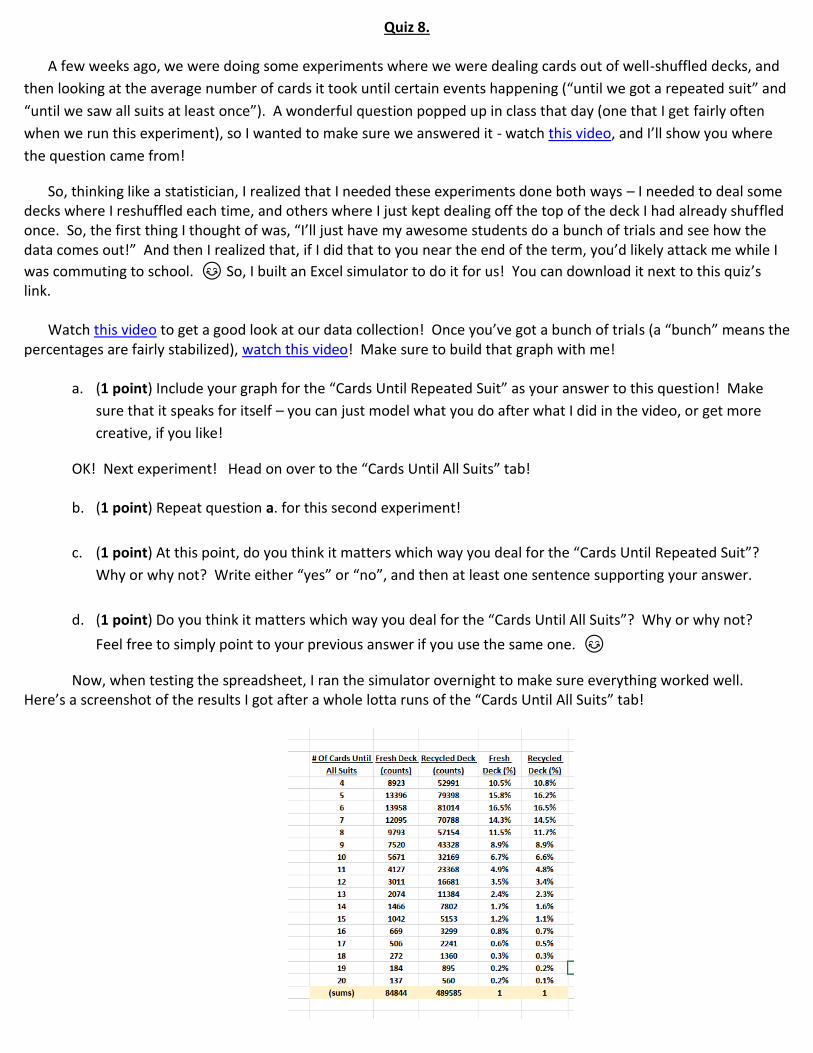
Now, when testing the spreadsheet, I ran the simulator overnight to make sure everything worked well. Here’s a screenshot of the results I got after a whole lotta runs of the “Cards Until All Suits” tab!

Now, something got my attention: the percentages of the two methods of dealing were close – but not the same. And, they had seemed to stabilize. So, for example, if you look at the % of the time we got 5 cards, it’s 15.8% for the fresh deck and 16.2% for the recycled deck (others are similarly “close but not exactly equal”).
That got me thinking: what if there is a difference in the methods that’s there, but so small that it’s hard to see easily? In stats, this is called a “small effect size”. So, we’ll see if there’s one there right now!
We know that any statistic needs to have a margin of error (MOE) attached to it. So, that 15.8% and 16.2% need to have a “plus-or-minus” margin (since they’re based off a sample, they’re imperfect – even though the sample is huge). What we’re going to do now is construct the MOE for each – I’ll do it for the fresh deck, and then you’ll do it for the recycled one!
This formula is one you’ll derive in later stat classes5, but for here, we’ll just trust it and use it (check the footnote for a justification, if you like!).
First, let’s define the variables!
p = percent of the time we see the 5-card deals q = 100% - p n = sample size.
So, for the 5-card “fresh deck” case, p = 0.158, q = 0.842, and n = 84844
Fresh Deck MOE (for 5 cards) = 2* p*q
n = 2* 0.158*0.842
84844 0.0025
So, this tells use that the MOE is about 0.25%. Pretty small! But that’s because there are so many trials.
For the recycled deck, the MOE is just about exactly the same!
e. (1 point) Add and subtract the MOE for the fresh deck to the 15.8% to create its confidence interval. List
the low and high values as your answer here.
f. (1 point) Repeat the last question for the recycled deck!
Now, as we learned – if two parameters are meaningfully different, then their confidence intervals will not overlap. If they do overlap, then we can’t make a distinction between them.
g. (1 point) Do these confidence intervals overlap? Just “yes” or “no” here. 😊
h. (3 points) What does that tell you about the two ways of shuffling (with respect to 5-card hands)? Should
we be concerned if students decide to use the “recycled deck shortcut”? Why or why not?
5 In case you wanna see where it comes from right now! https://youtu.be/EPBAwQd2Cy4

Quiz 9.
A few of you amazing students have been asking me about something that we keep seeing whenever we go diving into online statistical methods:
What, exactly, is this “95% confidence” of which they speak?
1. (2 points) Do a little Googling and let me know what you come up with! What does 95% confidence mean (in relation to a statistical study)?
Now, if you’re like me, whatever definition or explanation you found might be a little fuzzy. So, I figure we’d
explore a little simulation to help drive the point home. What we’ll do here is try to approximate the average birth weight of an American baby (ABWAB), using the ideas
of confidence intervals (CIs). If you remember from class, the ABWAB would be an example of a parameter…that is, the measure of an entire population (and, since it’s the measure of a population, we’ll never know it!). A “confidence interval” is just a range of values between which you are “confident” whatever parameter you’re studying actually lies.
And, if you remember from class, a confidence interval is just found by adding and subtracting a margin of
error from and to a statistic!
Please start by opening the spreadsheet that accompanies this quiz! You’re viewing the ABWABs of 20 randomly selected American newborns6, along with a bar graph of that sample.
Now – press key a few times. Each time, you get a new “sample of 20 babies”. You see how their weights change each time? The bar graph and corresponding statistics change, too!
Now we’ll build the confidence interval for each sample! In cell B12, type =E7-E8. Then, in cell D12, type
=E7+E8. The number you just got are the ends of the confidence interval (CI!) Wahoo! Here’s mine right now!
So, I’m 95% confident that the ABWAB is between 7.2 pounds and 8.05 pounds. Cool!
6 Actually, what you’re looking at is a sample of 20 numbers I generated using the “known” values for the weights of newborns. By “known”, I mean that, after hundreds of millions of births, doctors have pretty much figured that they have the parameter values for the ABWAB. In reality, of course these numbers wouldn’t be calculated – they’d be measured in a study!

But what if I select 20 more babies? What do I get then?
Huh – now I’m 95% confident that it’s between 7.02 pounds and 7.89 pounds. Next 20 babies?
OK, hang on – how can all of these be right? You have to rethink what a CI’s job is! It’s a “between” calculation – a range of value that, likely, the
parameter falls in between! For example, the weight 7.8 pounds is in each of those CIs up there, yes?
Go ahead and press a few more times and see how everything changes. When you’re bored of doing that, I want you to gather some CI’s!
2. (4 points) Give me twenty CI’s for the ABWAB. Press at least once after constructing each CI so that you get new baby data each time. Please take screenshots of the intervals like I did above and plaste them into a word document!
OK...so you have 20 CI’s. Great! Now, we need to drive home what the term “95% confident” means... …it is “known” that the ABWAB is about 7.67 pounds7. Take a look at your CI’s: 3. (1 point) What percent of the CI’s that you constructed contain the value 7.67?
I’ll bet that you got pretty close (if not exactly) equal to 95%. 😊 Of course, that’s just your 20 CIs. But it gets better! Please click on the tab “Randomized Results”. Here, I’ve created 20 CI’s (identical, in construction, to the 20 you just created). However, instead of giving you the values of the endpoints, I’ve done the CI’s graphically. You’ll also see a vertical line through 7.67; this line represents the “known” average ABWAB. Do you see, at right, now 19 out of 20 of the Cis contain the ABWAB 7.67 pounds? That’s 95% of them!
Lemme re-randomize!
7 After many millions of births, the MOE has shrunken to, essentially, zero. Again, in reality, you never know the parameter.

95% again! 1 missed, and 19 caught it! Once more, with feeling!
We got 90% that time! OK – I think I see where this needs to go! Let’s find that 95%! Click on over to the last sheet!
This sheet’s been keeping track of all of the data you’ve been generating ever since you started this quiz. Rad! In particular, it’s kept track of the cumulative percentage of the time your intervals “caught” the true ABWAB. 4. (1 point) Take a screen shot of that “% confidence” distribution and include it as your answer here!
5. (2 points) (w) Find the weighted average of that data. What do you get? Make sure to explain how you do it!
So cool!
This means that, if we repeatedly construct CI’s around randomly selected data sets, we can expect around 95% of them to contain the true population mean.
Radness! And that, my fine friends, is the definition of 95% confidence. 😊
Caveat: in this quiz, I cheated a little: I “know” that the ABWAB is 7.67 pounds, In reality, you don’t
(remember – you don’t ever know parameters, in practice). But that’s the badass part of confidence – mathematically, it doesn’t matter: 95% of the intervals that are
created will contain the parameter anyway.
But…which 95%? Ah, my friends…that’s for your MTH 243/MTH 244 instructor to explain8. 😊
8 And oh, how I wish that were me. 😊