Quick Reference for Creating Histograms in Excelweb.ics.purdue.edu/~durbin/Labs/Lab3a/Guide to...
3
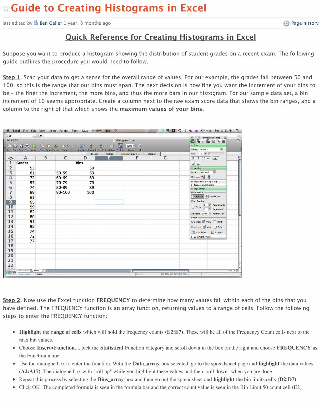
Page history Guide to Creating Histograms in Excel last edited by Ben Geller 1 year, 8 months ago Quick Reference for Creating Histograms in Excel Suppose you want to produce a histogram showing the distribution of student grades on a recent exam. The following guide outlines the procedure you would need to follow. Step 1 . Scan your data to get a sense for the overall range of values. For our example, the grades fall between 50 and 100, so this is the range that our bins must span. The next decision is how fine you want the increment of your bins to be – the finer the increment, the more bins, and thus the more bars in our histogram. For our sample data set, a bin increment of 10 seems appropriate. Create a column next to the raw exam score data that shows the bin ranges, and a column to the right of that which shows the maximum values of your bins. Step 2 . Now use the Excel function FREQUENCY to determine how many values fall within each of the bins that you have defined. The FREQUENCY function is an array function, returning values to a range of cells. Follow the following steps to enter the FREQUENCY function: Highlight the range of cells which will hold the frequency counts (E2:E7). These will be all of the Frequency Count cells next to the max bin values. Choose Insert>Function..., pick the Statistical Function category and scroll down in the box on the right and choose FREQUENCY as the Function name. Use the dialogue box to enter the function. With the Data_array box selected, go to the spreadsheet page and highlight the data values (A2:A17). The dialogue box with "roll up" while you highlight these values and then "roll down" when you are done. Repeat this process by selecting the Bins_array box and then go out the spreadsheet and highlight the bin limits cells (D2:D7). Click OK. The completed formula is seen in the formula bar and the correct count value is seen in the Bin Limit 50 count cell (E2)
Transcript of Quick Reference for Creating Histograms in Excelweb.ics.purdue.edu/~durbin/Labs/Lab3a/Guide to...
My PBworks Workspaces umdberg Steve Durbin account log out help
Wiki Pages & Files
VIEW EDIT
Page history
Search this workspace
Guide to Creating Histograms in Excellast edited by Ben Geller 1 year, 8 months ago
Quick Reference for Creating Histograms in Excel Suppose you want to produce a histogram showing the distribution of student grades on a recent exam. The followingguide outlines the procedure you would need to follow. Step 1. Scan your data to get a sense for the overall range of values. For our example, the grades fall between 50 and100, so this is the range that our bins must span. The next decision is how fine you want the increment of your bins tobe – the finer the increment, the more bins, and thus the more bars in our histogram. For our sample data set, a binincrement of 10 seems appropriate. Create a column next to the raw exam score data that shows the bin ranges, and acolumn to the right of that which shows the maximum values of your bins.
Step 2. Now use the Excel function FREQUENCY to determine how many values fall within each of the bins that youhave defined. The FREQUENCY function is an array function, returning values to a range of cells. Follow the followingsteps to enter the FREQUENCY function:
Highlight the range of cells which will hold the frequency counts (E2:E7). These will be all of the Frequency Count cells next to themax bin values.Choose Insert>Function..., pick the Statistical Function category and scroll down in the box on the right and choose FREQUENCY asthe Function name.Use the dialogue box to enter the function. With the Data_array box selected, go to the spreadsheet page and highlight the data values(A2:A17). The dialogue box with "roll up" while you highlight these values and then "roll down" when you are done.Repeat this process by selecting the Bins_array box and then go out the spreadsheet and highlight the bin limits cells (D2:D7).Click OK. The completed formula is seen in the formula bar and the correct count value is seen in the Bin Limit 50 count cell (E2)
Create a page
Upload files
Share this page
You don't have permission to change this page's
folder.
Add Tags
Copy this page
Check for plagiarism
Navigator
Laboratories
optionsPages Files
LOADING…
SideBar
BERG HomeWho We AreUpcoming MeetingsNEXUS CalendarNEXUS Development PageThermo PagesBERG Camera SignupMain Data Page (secure)Instructor Reflections PERG HomeChERG Home
Edit the sidebar
Recent Activity
Project NEXUS UMCPedited by Joe Redish
Project NEXUS UMCPedited by Joe Redish
Project NEXUS UMCPedited by Joe Redish
Project NEXUS UMCPedited by Joe Redish
Project NEXUS UMCPedited by Joe Redish
Project NEXUS UMCPedited by Joe Redish
NEXUS-Physics Mathematical Modeling …edited by Joe Redish
More activity...
http://umdberg.pbworks.com/w/page/59932874/Guide%20to%20Creating%20Histograms%20in%20Excel#view=edit
Step 3. Now copy the array function down to the other Frequency Count cells. This is a bit different than typical cellcopying:
With the Frequency Count cells still highlighted (E2:E7), click on the FREQUENCY function into the formula bar (i.e.,=FREQUENCY(A2:A17,D2:D7))Propagate the function by typing Control-Shift-Enter on a PC (type Command-Return on a Mac).
The$frequency$values$should$now$3ill$the$cells$next$to$the$bin$increments.$Note$that$your$3irst$bin$increment,$50,$holds$all$the$grades$at$50and$below.$The$next$bin,$59,$holds$measurements$from$50@59,$and$so$on.
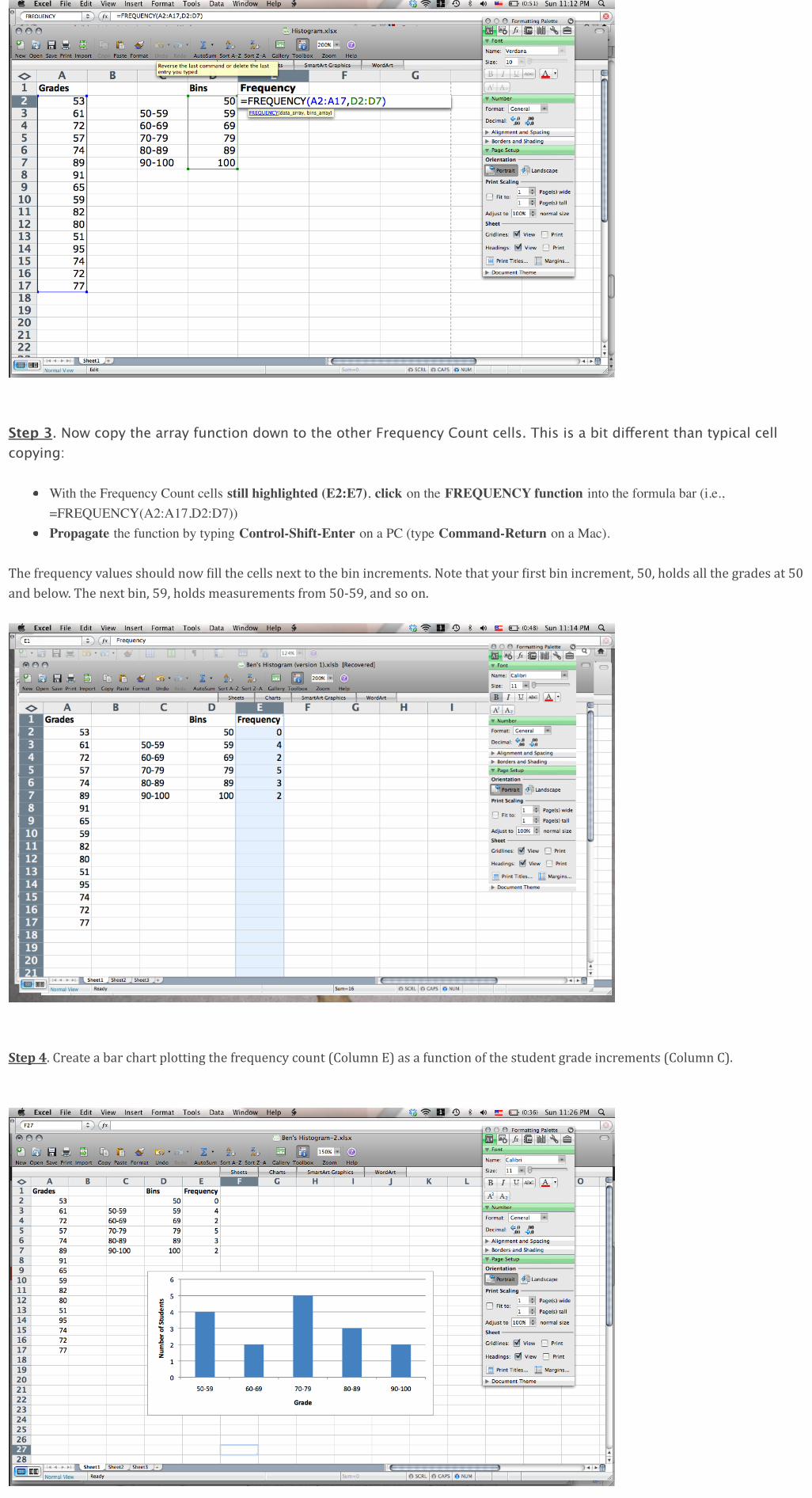
Step%4.$Create$a$bar$chart$plotting$the$frequency$count$(Column$E)$as$a$function$of$the$student$grade$increments$(Column$C).

0/20000/2000
Printable version
PBworks / HelpTerms of use / Privacy policy
About this workspace Contact the owner / RSS feed / This workspace is public
Comments (0)
Add a comment
Add comment