question 2
29
HOW SUCCESSFUL IS THE COMBINATION OF YOUR MAIN AND ANCILLARY TEXT? VICKIE HOYLE
-
Upload
vickiehoyle17 -
Category
Social Media
-
view
38 -
download
0
Transcript of question 2

HOW SUCCESSFUL IS THE COMBINATION OF YOUR MAIN AND ANCILLARY TEXT?
VICKIE HOYLE
THE BRIEF THAT WE CHOSE
A promotion package for the release of an album, to include a music promo video, together with two of the following three options:
a website homepage for the band a cover for its release as part of a digipak
(CD/DVD package); a magazine advertisement for the digipak
(CD/DVD package).

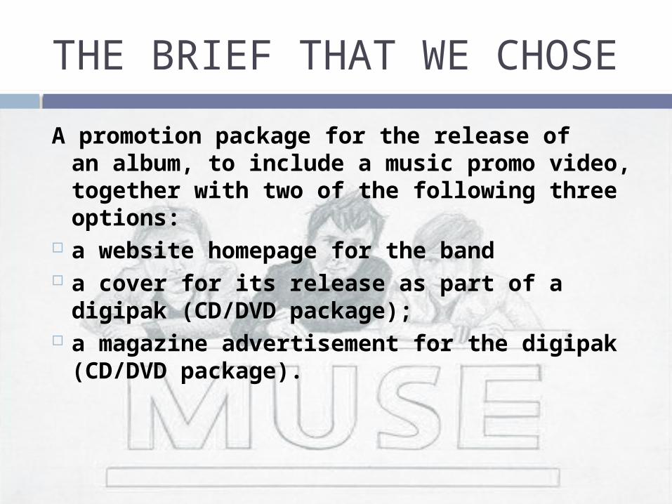
THE MAGAZINE ADVERTISEMENT:RESEARCH
For the magazine advertisement research I decided to look at previous magazine posters created by artists from many genres, in order to see if techniques used vary from genre to genre.

THE MAGAZINE AD: RESEARCH
THE MAGAZINE AD:RESEARCH

THE MAGAZINE AD:RESEARCH
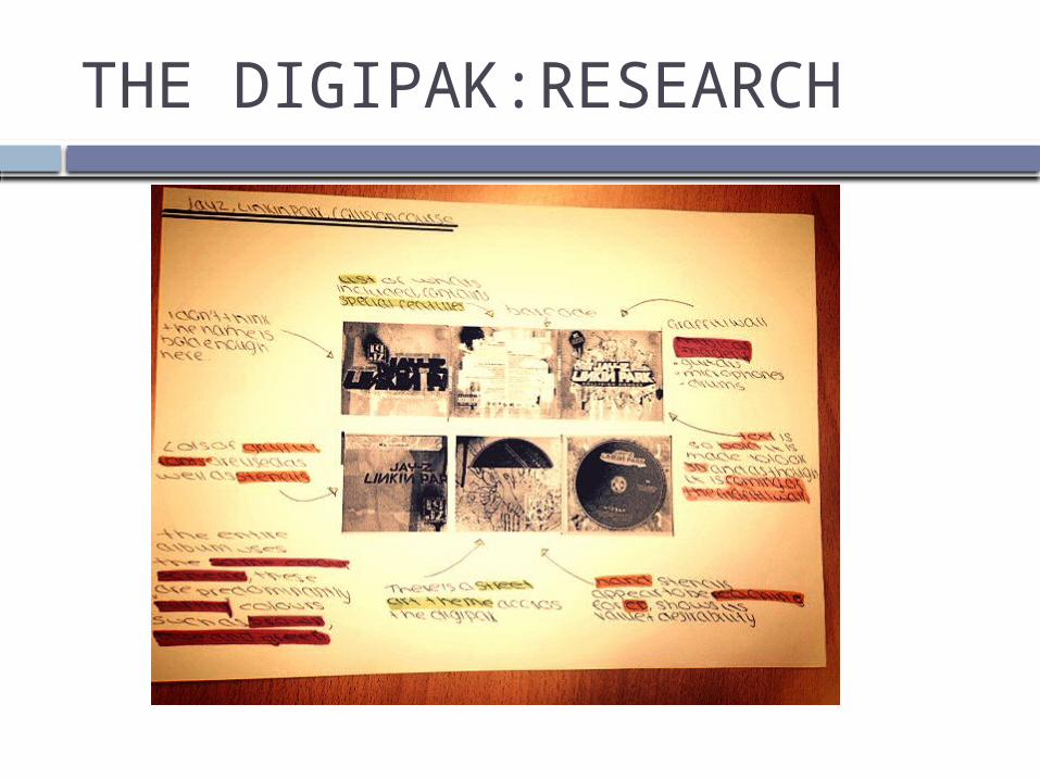
THE DIGIPAK:RESEARCH
For the digipak research I decided, again, to look into previous examples by artists, including looking at examples by the band who performs our song, Muse.

THE DIGIPAK:RESEARCH
THE DIGIPAK:RESEARCH

THE FINAL PRODUCT:MAGAZINE AD

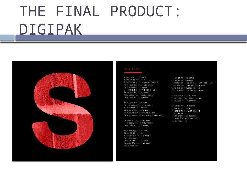
THE FINAL PRODUCT: DIGIPAK
FRONT COVER
BACK COVER
THE FINAL PRODUCT: DIGIPAK

LINKING THE THREE PRODUCTS:GENRE
Although there are many versions of the song “feeling good”, we decided to go with the version by Muse. In this case Feeling good fits into the rock genre and we wanted to transpose this rock genre “look” across our magazine and digipak. We felt that it was important as it would allow the target audience to easily identify it from other genres, for example pop music products normally feature the band/artist’s face.

AESTHETIC CONVENTIONS OF ROCK MUSIC GENRE
To be able to do this we had to research into the aesthetic conventions of the rock genre. These are;
Extremes of colour, either very dark or very bright
More of a focus on the band name rather than a picture of band members
Often an abstract/symbolic image is used
LINKING THE THREE PRODUCTS:GENRE
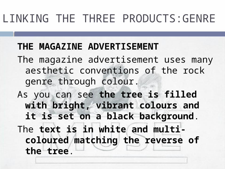
THE MAGAZINE ADVERTISEMENTThe magazine advertisement uses many
aesthetic conventions of the rock genre through colour.
As you can see the tree is filled with bright, vibrant colours and it is set on a black background.
The text is in white and multi-coloured matching the reverse of the tree.
LINKING THE THREE PRODUCTS:GENRE
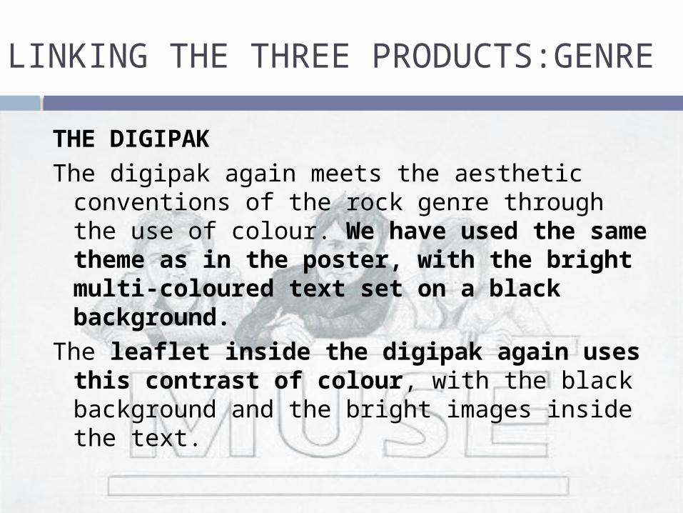
THE DIGIPAKThe digipak again meets the aesthetic
conventions of the rock genre through the use of colour. We have used the same theme as in the poster, with the bright multi-coloured text set on a black background.
The leaflet inside the digipak again uses this contrast of colour, with the black background and the bright images inside the text.
LINKING THE THREE PRODUCTS:GENRE

THE MAIN PRODUCTOur main product contains the song
“feeling good” and is therefore in the rock genre, although our product doesn't contain generic conventions of a rock music video.
LINKING THE THREE PRODUCTS:GENRE
LINKING THE THREE PRODUCTS:GENRE
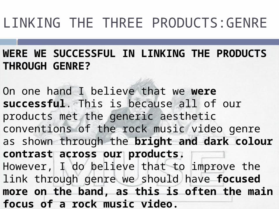
WERE WE SUCCESSFUL IN LINKING THE PRODUCTS THROUGH GENRE?
On one hand I believe that we were successful. This is because all of our products met the generic aesthetic conventions of the rock music video genre as shown through the bright and dark colour contrast across our products.However, I do believe that to improve the link through genre we should have focused more on the band, as this is often the main focus of a rock music video.

LINKING THE THREE PRODUCTS:PAST PRODUCTS
WERE WE SUCCESSFUL IN LINKING THE PRODUCTS THROUGH GENRE?
In terms of mise en scene perhaps we also should have found a darker location, although the band scene is in black and white. Extending from this point, the band members perhaps should have also been older, again to match the aesthetic conventions of the rock music genre.

LINKING THE THREE TEXTS:LYRICS
OUR INSPIRATIONThe inspiration for the tree came from the
lyrics in the song “blossom in the trees” and “scent of the pine”.
We decided that this would be a more intriguing and provocative way of combining the texts for the audience.
LINKING THE THREE TEXTS: LYRICS
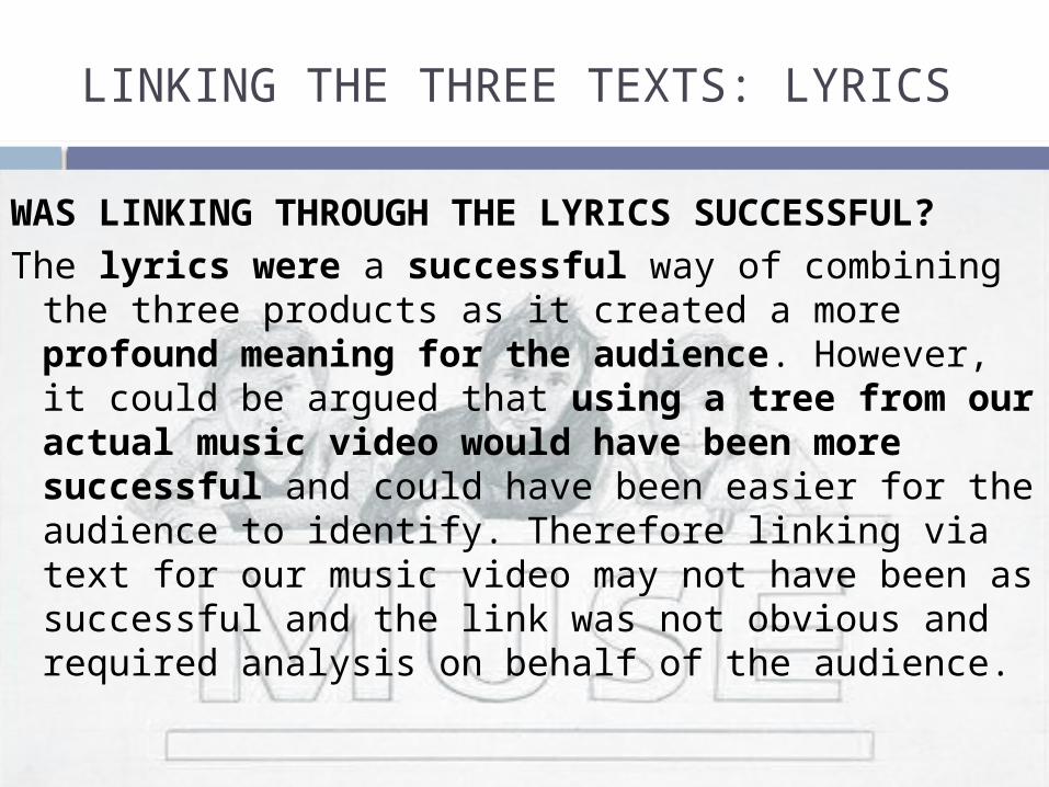
WAS LINKING THROUGH THE LYRICS SUCCESSFUL?
The lyrics were a successful way of combining the three products as it created a more profound meaning for the audience. However, it could be argued that using a tree from our actual music video would have been more successful and could have been easier for the audience to identify. Therefore linking via text for our music video may not have been as successful and the link was not obvious and required analysis on behalf of the audience.

LINKING THE THREE PRODUCTS: HOUSE STYLE
COLOURWe decided to go with a colour scheme of
black, white and multicolour. This is because we wanted to transpose past Muse themes into our texts. Both the magazine advert and the digipak contain the colour scheme mentioned above. In our main product however, the colour scheme is represented to the audience metaphorically.

LINKING THE THREE PRODUCTS: HOUSE STYLE
COLOURThe colour is represented metaphorically
in our main text through the use of semiotics, which I researched into earlier. The colour black represents the death of our male protagonist. The use multicolour representing the blend of emotions represented by the mugger, who isn’t just a hardened criminal.

TARGET AUDIENCE
All three of our texts relate to the past work of Muse and would therefore appeal to our target audience. Where Muse used bright colours in its past magazine posters and digipaks, we followed the theme. This is therefore successful because our target audience would easily identify it.

TARGET AUDIENCE
CONCLUSION
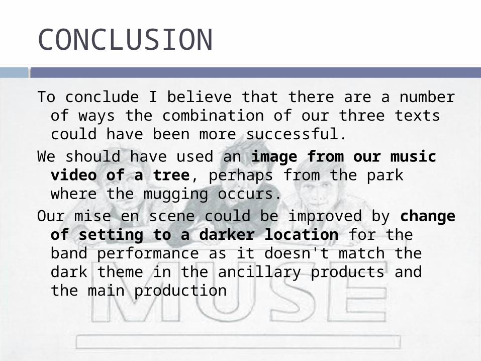
To conclude I believe that there are a number of ways the combination of our three texts could have been more successful.
We should have used an image from our music video of a tree, perhaps from the park where the mugging occurs.
Our mise en scene could be improved by change of setting to a darker location for the band performance as it doesn't match the dark theme in the ancillary products and the main production

CONCLUSION
Our casting could also be improved, both our ancillary products fit nicely with the conventions of the rock music video genre. The band stands out as not fitting with the conventions as the band members should have been older and into their 20s.
CONCLUSION
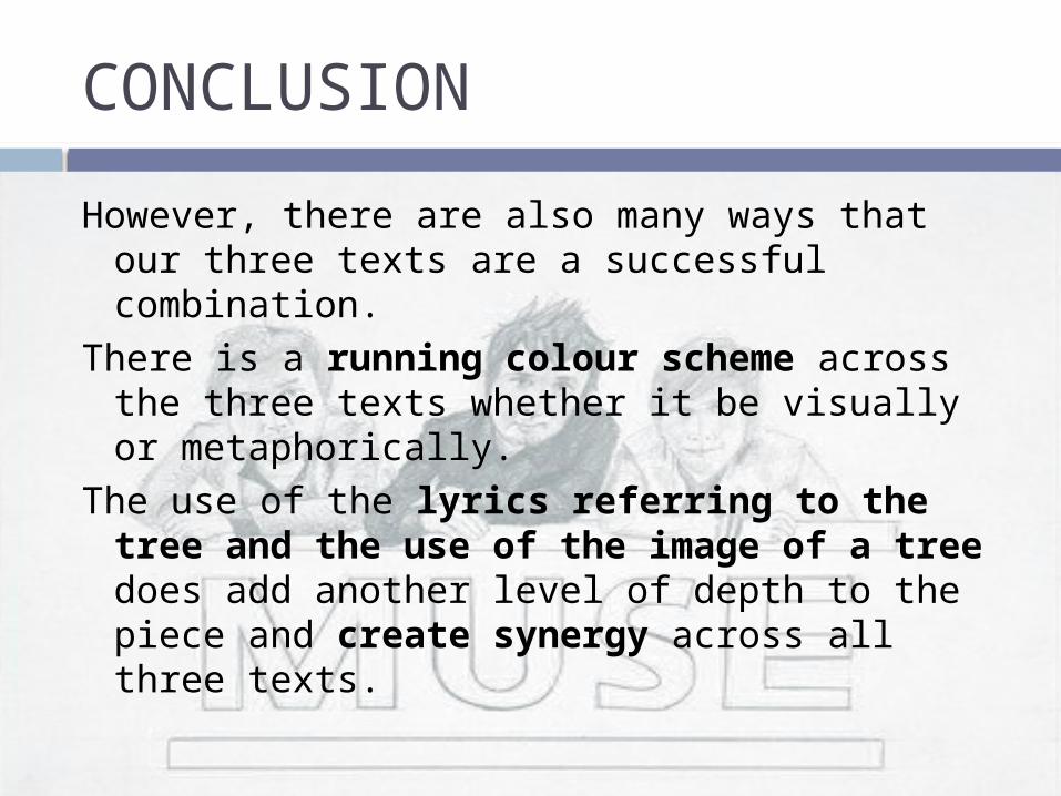
However, there are also many ways that our three texts are a successful combination.
There is a running colour scheme across the three texts whether it be visually or metaphorically.
The use of the lyrics referring to the tree and the use of the image of a tree does add another level of depth to the piece and create synergy across all three texts.

CONCLUSION
The tree being used across the magazine advertisement and the digipak will allow the audience to easily identify the products as being connected, therefore it will be more noticeable in shops.
We have also displayed the logo on both the magazine advertisement and the digipak. We kept the logo very similar to the original so again it will be easily identifiable. However perhaps the logo should have been shown at the beginning of our music video to create further synergy.