
Qt Quick for Qt Developers · PDF file · 2017-06-20property string product: "Qt...
24
Qt Quick for Qt Developers QML Structures Based on Qt 5.4 (QtQuick 2.4)
Transcript of Qt Quick for Qt Developers · PDF file · 2017-06-20property string product: "Qt...

Qt Quick for Qt Developers QML Structures
Based on Qt 5.4 (QtQuick 2.4)
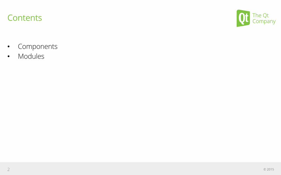
Contents
• Components • Modules
© 2015 2
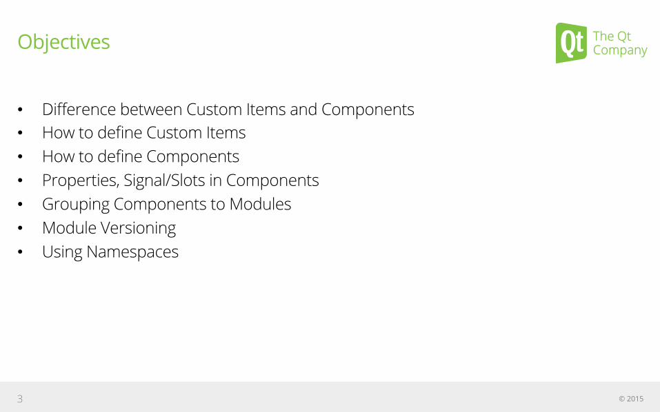
Objectives
• Difference between Custom Items and Components • How to define Custom Items • How to define Components • Properties, Signal/Slots in Components • Grouping Components to Modules • Module Versioning • Using Namespaces
© 2015 3

Components
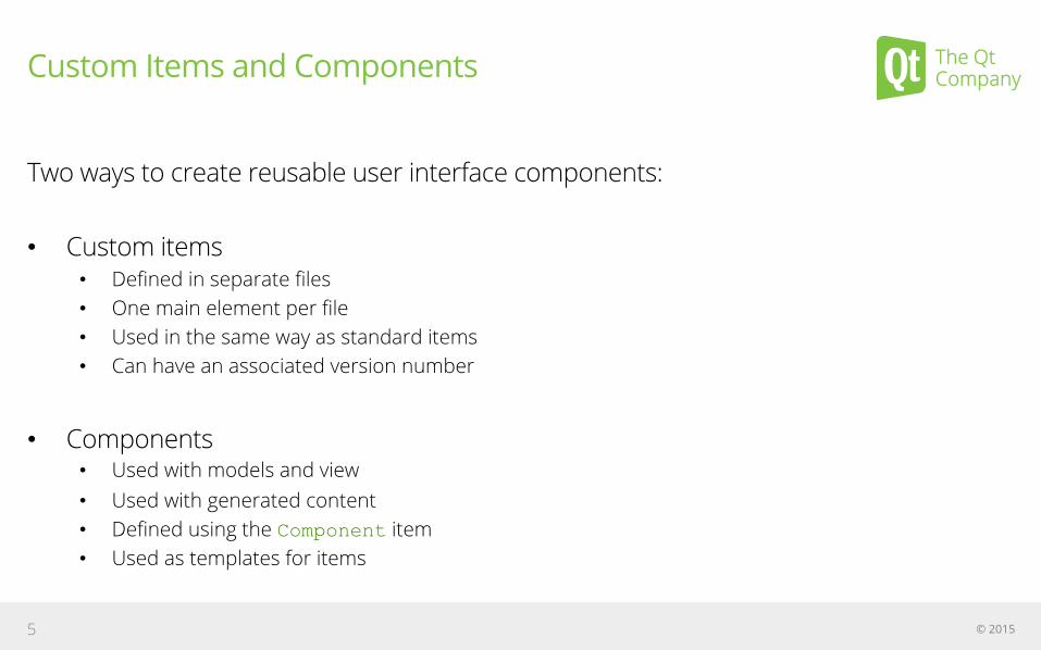
Custom Items and Components
Two ways to create reusable user interface components:
• Custom items • Defined in separate files • One main element per file • Used in the same way as standard items • Can have an associated version number
• Components • Used with models and view • Used with generated content • Defined using the Component item • Used as templates for items
© 2015 5
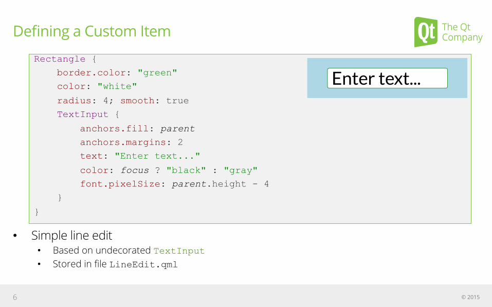
Defining a Custom Item
• Simple line edit • Based on undecorated TextInput • Stored in file LineEdit.qml
© 2015 6
Rectangle {
border.color: "green"
color: "white"
radius: 4; smooth: true
TextInput {
anchors.fill: parent
anchors.margins: 2
text: "Enter text..."
color: focus ? "black" : "gray"
font.pixelSize: parent.height - 4
}
}

Using a Custom Item
• LineEdit.qml is in the same directory • Item within the file automatically available as LineEdit
© 2015 7
Rectangle {
width: 400; height: 100; color: "lightblue”
LineEdit {
anchors.horizontalCenter: parent.horizontalCenter
anchors.verticalCenter: parent.verticalCenter
width: 300; height: 50
}
}
Demo: qml-modules/ex-modules-components/lineedit/use-lineedit.qml

Adding Custom Properties
• LineEdit does not expose a text property • The text is held by an internal TextInput item • Need a way to expose this text • Create a custom property
Syntax: property <type> <name>[: <value>]
© 2015 8
property string product: "Qt Quick"
property int count: 123
property real slope: 123.456
property bool condition: true
property url address: "http://qt.io/"
See Documentation: QML Object Attributes
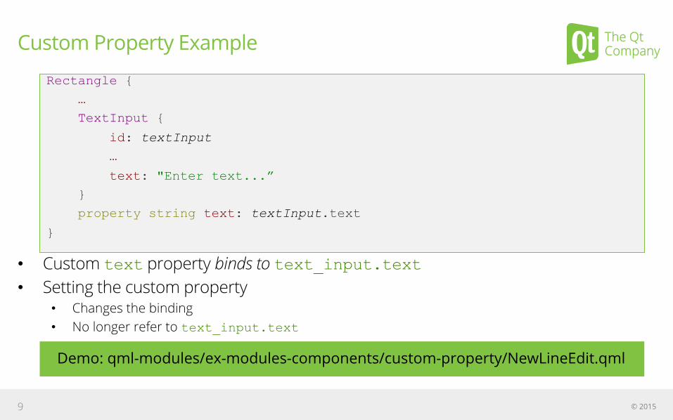
Custom Property Example
• Custom text property binds to text_input.text • Setting the custom property
• Changes the binding • No longer refer to text_input.text
© 2015 9
Rectangle {
…
TextInput {
id: textInput
…
text: "Enter text...”
}
property string text: textInput.text
}
Demo: qml-modules/ex-modules-components/custom-property/NewLineEdit.qml
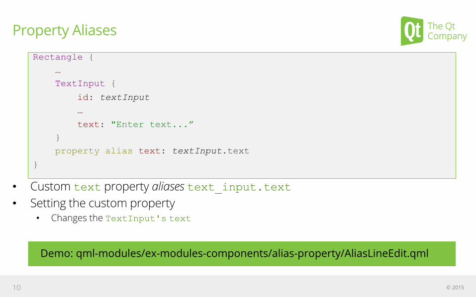
Property Aliases
• Custom text property aliases text_input.text • Setting the custom property
• Changes the TextInput's text
© 2015 10
Rectangle {
…
TextInput {
id: textInput
…
text: "Enter text...”
}
property alias text: textInput.text
}
Demo: qml-modules/ex-modules-components/alias-property/AliasLineEdit.qml

Adding Custom Signals
• Standard items define signals and handlers • e.g., MouseArea items can use onClicked
• Custom items can define their own signals • Signal syntax: signal <name>[(<type> <value>, ...)] • Handler syntax: on<Name>: <expression>
• Examples of signals and handlers: • Signal clicked
• Handled by onClicked • Signal checked(bool checkValue)
• Handled by onChecked • Argument passed as checkValue
© 2015 11

Defining a Custom Signal
© 2015 12
Item {
…
MouseArea {
…
onClicked: if (parent.state == "checked") {
parent.state = "unchecked";
parent.checked(false);
} else {
parent.state = "checked";
parent.checked(true);
}
}
signal checked(bool checkValue)
}
Demo: qml-modules/ex-modules-components/items/NewCheckBox.qml

Emitting a Custom Signal
• MouseArea's onClicked handler emits the signal • Calls the signal to emit it
© 2015 13
Item {
…
MouseArea {
…
onClicked: if (parent.state == "checked") {
parent.state = "unchecked";
parent.checked(false);
} else {
parent.state = "checked";
parent.checked(true);
}
}
signal checked(bool checkValue)
}
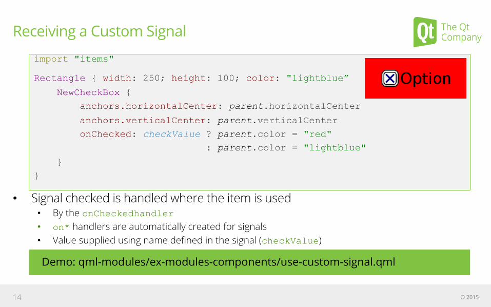
Receiving a Custom Signal
• Signal checked is handled where the item is used • By the onCheckedhandler • on* handlers are automatically created for signals • Value supplied using name defined in the signal (checkValue)
© 2015 14
import "items"
Rectangle { width: 250; height: 100; color: "lightblue”
NewCheckBox {
anchors.horizontalCenter: parent.horizontalCenter
anchors.verticalCenter: parent.verticalCenter
onChecked: checkValue ? parent.color = "red"
: parent.color = "lightblue"
}
}
Demo: qml-modules/ex-modules-components/use-custom-signal.qml
Modules
Modules
Modules hold collections of elements: • Contain definitions of new elements • Allow and promote re-use of elements and higher level components • Versioned
• Allows specific versions of modules to be chosen • Guarantees certain features/behavior
• Import a directory name to import all modules within it
© 2015 16
See Documentation: QML Modules
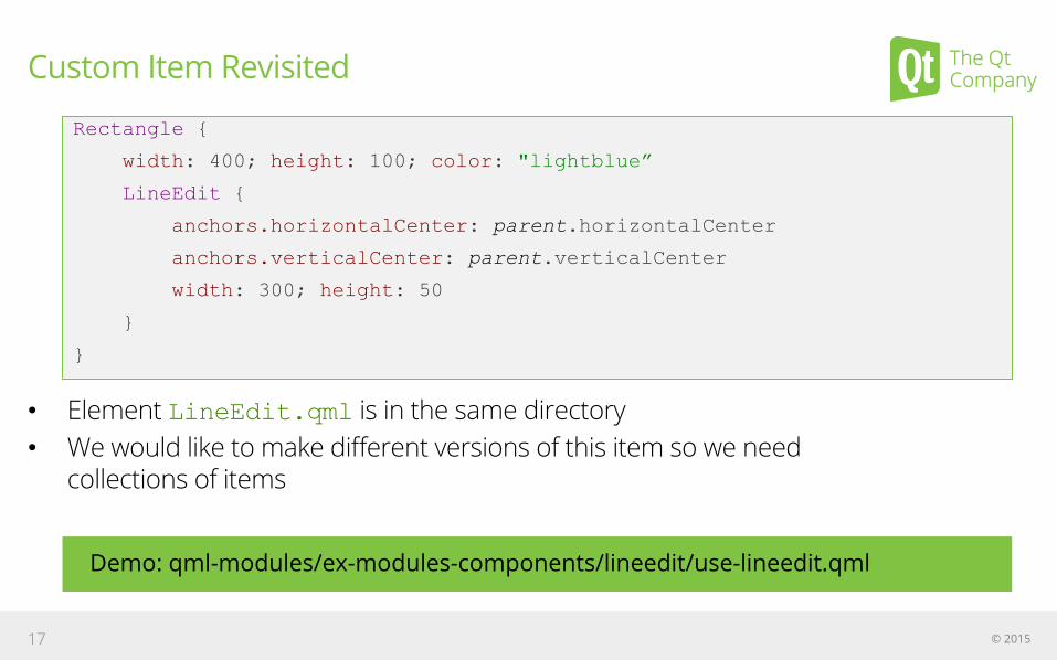
Custom Item Revisited
• Element LineEdit.qml is in the same directory • We would like to make different versions of this item so we need
collections of items
© 2015 17
Demo: qml-modules/ex-modules-components/lineedit/use-lineedit.qml
Rectangle {
width: 400; height: 100; color: "lightblue”
LineEdit {
anchors.horizontalCenter: parent.horizontalCenter
anchors.verticalCenter: parent.verticalCenter
width: 300; height: 50
}
}

Collections of Items
• Importing “items” directory • Includes all the files (e.g. items/CheckBox.qml) • Useful to organize your application • Provides the mechanism for versioning of modules
© 2015 18
Demo: qml-modules/ex-modules-components/use-collection-of-items.qml
import "items”
Rectangle {
width: 250; height: 100; color: "lightblue”
CheckBox {
anchors.horizontalCenter: parent.horizontalCenter
anchors.verticalCenter: parent.verticalCenter
}
}
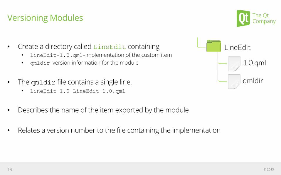
Versioning Modules
• Create a directory called LineEdit containing • LineEdit-1.0.qml–implementation of the custom item • qmldir–version information for the module
• The qmldir file contains a single line: • LineEdit 1.0 LineEdit-1.0.qml
• Describes the name of the item exported by the module
• Relates a version number to the file containing the implementation
© 2015 19

Using a Versioned Module
• Now explicitly import the LineEdit • Using a relative path • And a version number
© 2015 20
Demo: qml-modules/ex-modules-components/versioned/use-lineedit-version.qml
import LineEdit 1.0
Rectangle {
width: 400; height: 100; color: "lightblue”
LineEdit {
anchors.horizontalCenter: parent.horizontalCenter
anchors.verticalCenter: parent.verticalCenter
width: 300; height: 50
}
}
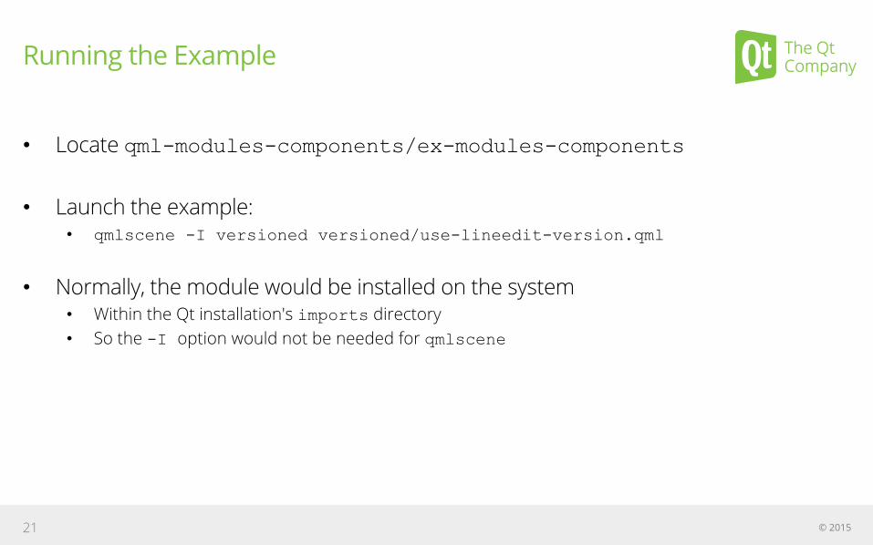
Running the Example
• Locate qml-modules-components/ex-modules-components
• Launch the example: • qmlscene -I versioned versioned/use-lineedit-version.qml
• Normally, the module would be installed on the system • Within the Qt installation's imports directory • So the -I option would not be needed for qmlscene
© 2015 21
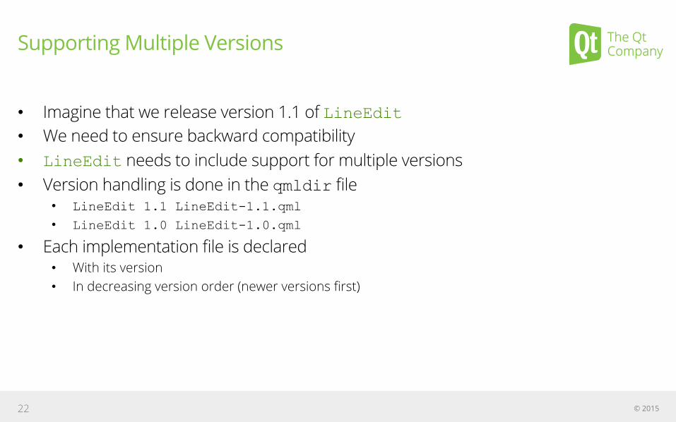
Supporting Multiple Versions
• Imagine that we release version 1.1 of LineEdit • We need to ensure backward compatibility • LineEdit needs to include support for multiple versions • Version handling is done in the qmldir file
• LineEdit 1.1 LineEdit-1.1.qml
• LineEdit 1.0 LineEdit-1.0.qml
• Each implementation file is declared • With its version • In decreasing version order (newer versions first)
© 2015 22

Importing into a Namespace
• import...as... • All items in the Qt module are imported • Accessed via the MyQt namespace
• Allows multiple versions of modules to be imported
© 2015 23
Demo: qml-modules/ex-modules-components/use-namespace-module.qml
import QtQuick 2.4 as MyQt
MyQt.Rectangle {
width: 150; height: 50; color: "lightblue”
MyQt.Text {
anchors.centerIn: parent
text: "Hello Qt!"
font.pixelSize: 32
}
}
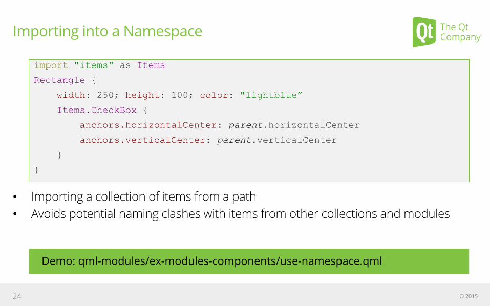
Importing into a Namespace
• Importing a collection of items from a path • Avoids potential naming clashes with items from other collections and modules
© 2015 24
Demo: qml-modules/ex-modules-components/use-namespace.qml
import "items" as Items
Rectangle {
width: 250; height: 100; color: "lightblue”
Items.CheckBox {
anchors.horizontalCenter: parent.horizontalCenter
anchors.verticalCenter: parent.verticalCenter
}
}